Categories B2B

How to Set Up Google Analytics for WordPress

Have you ever wondered what people actually do when they enter your WordPress website?

Have you thought about which website pages they tend to stay on longest, what campaigns bring them there, and which of your website pages convert the best?

Google Analytics can help you understand all of this information and more. By simply installing a Google Analytics plugin on your WordPress website, you can start collecting this data immediately. With help from a plugin, adding Google Analytics to WordPress is a painless process.

If you’d rather not install a plugin for this purpose, there are other ways to integrate Google Analytics with your website too — as long as you’re comfortable with code.

In this guide, we’ll walk you through how to install Google Analytics in WordPress with two different methods. In a handful of steps, you can uncover insights about your website visitors — including what is and isn’t working for them — to improve the user experience, increase conversions, and learn about your audience.

Measure your performance with HubSpot's free WordPress plugin

Google Analytics for WordPress: What Can You Track?

Whether you’re looking for details about who is visiting your site, what they’re doing while on your site, or how long they’re staying on specific pages, Google Analytics provides you with the report you need. The tool allows you to track many interactions between your website and visitors.

Let’s review some more of the specific types of reporting Google Analytics provides:

Real-time Activity

Realtime reports show you current activity on your website, including where visitors enter your website and the actions they take on your site. You can also see how users are getting to your site, what pages they’re visiting, and whether they’re converting. This report is useful for monitoring the immediate results of a campaign, social media post, or real-world event.

Acquisition

Acquisition reports will help you understand where your visitors are coming from. This information is helpful when setting up your marketing campaigns because it can show you exactly what’s working best for your acquired visitors. It also tells you which users are new and which are returning.

Engagement

Engagement reports help you understand how users are interacting with your website. It includes page views, scrolling activity, time-on-page, interactions with media, and other important events. Google Analytics groups user activity by sessions — a session can be understood as a single visit to your website.

This report also tracks conversion rates. You can compare them to your goal and understand which CTAs are working. You’ll learn more about which CTAs and landing pages on your site are successful and what keeps your visitors most engaged.

Monetization

Monetization reports track your revenue from purchases, subscriptions, and advertisements on your site. It also shows you how users move through the checkout process and how they engage with your product pages.

Retention

Retention reports monitor how well your website retains visitors — in other words, how often users return to your website after their first visit, and for how long. You can also view retention by cohort. A cohort is a group of users that share a characteristic, like the date of their first session.

Demographics

The demographics report will help you understand who your visitors are. It reports users by age, language, location, gender, and topics of interest.

Tech

Tech reports show you the technology that visitors use to access your website, including device category (desktop, mobile, or tablet) and accessing application (web browser or mobile application). This information can help guide your optimization efforts based on which technologies your users prefer.

Analytics Specific to Your Plugin

In addition to the plethora of information that you receive from Google Analytics, your chosen plugin will also provide you with unique insights. For example, let’s review what ExactMetrics provides. Some of these insights and features come standard with other analytics plugins in the WordPress library as well.

In-Depth Performance Reports. These reports provide you with in-depth performance details, such as bounce rates, referrals, page views, organic searches, and more, for each post and page on your website so you can segment your analytical data in a way that makes sense for your website and business.

Real-Time Stats. You’ll be able to review real-time statistics any time you open the plugin. Some of these stats include the current number of visitors on your website, your acquisition channels, and the source of your current traffic.

Custom Dimension Tracking. You can create custom dimensions to get specific data that matters to you and your business. For example, you can create custom dimension tracking about certain events and types of user engagement that are important to you.

Set Permissions Based On User Roles. If you have a large team, or team of people with different qualifications and needs when it comes to your analytics, you can set permissions based on user roles. This way you can ensure only the right people can make changes.

How to Set Up Google Analytics for WordPress

To add Google Analytics to your WordPress site, you can either go with a plugin or opt for a manual approach. We’ll review both methods, starting with the plugin.

But, whichever method you choose, make sure you have an active Google Analytics account. To sign up for Google Analytics, first create a Google account. If you already have a Google account, you’re off to a great start because that’s the only way you can use Google Analytics.

Sign in to your Google account, then head to the Google Analytics sign-up page and click Start measuring.
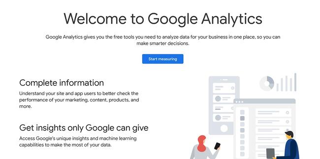
wordpress google analytics: sign up page for google analytics

On the Account Setup page, fill in the necessary information. Your Account Name will be the Google Analytics profile name for your website. You can choose whatever name you like, but we recommend using your business name.

Next, check your preferred boxes under Account Data Sharing Settings to control how Google may share your data, then click Next.

Under Property Setup, provide a name for your first Google Analytics property. You can make this your website’s domain name for now. Click Next.

Finally, under About your business, you can provide additional information about your company. This section is optional. To complete setup, click Create.

You’ll now be taken to your analytics dashboard. On this screen, under Choose a platform, click Web (since you’re tracking a website).

wordpress google analytics: data stream setup

You’ll be asked to set up a data stream, which is a source of data from a website or an app. Fill in the required fields and click Create stream. This provides you with a measurement ID, a string of characters you’ll use to send your website tracking data to Google Analytics. If you go with a plugin, you may need to add this information to the plugin, so it’s a good idea to keep this tab open.

wordpress google analytics: measurement id for google analytics

Now that your Google Analytics account is ready, let’s learn how to link it to your WordPress site with a plugin.

Set Up Google Analytics With a WordPress Plugin

Depending on the Google Analytics plugin you choose, setup may differ slightly. For the sake of this example, we’re going to review how to set up the ExactMetrics plugin. Whichever plugin option you end up picking for your site, the process will look fairly similar.

First, you’ll need to install and activate ExactMetrics on your site. (Not sure how? See our guide to installing WordPress plugins.) Once that’s done, select the new ExactMetrics option from your WordPress dashboard, then click Launch Setup Wizard.

wordpress google analytics: exactmetrics setup prompt

Click through the setup screens until you’re prompted to sign in to Google and grant the plugin your desired permissions. Then, on the Connect Google Analytics to Your Website screen, choose the view you created previously and click Complete Connection.

After clicking through some additional screens, you’ll be ready to use Google Analytics with WordPress. View your analytics under ExactMetrics > Reports.
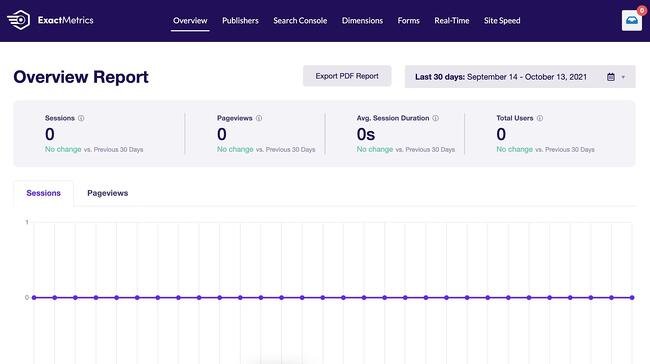
wordpress google analytics: exactmetrics reporting page

Some plugins may require you to insert the tracking code yourself if they don’t come with the same level of automation. You can find this tracking information by going to your Google Analytics admin tab (the cog icon in the bottom left corner of the dashboard), then choosing Data Streams under the desired account and property.
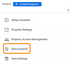
wordpress google analytics: data streams option in the google analytics dashboard

Then, click your data stream. You’ll see your Measurement ID in the top right corner. Further down under Tagging Instruction, you’ll also see your Global Site Tag, a block of code to add analytics to your website in the <head> section of your HTML.

The easiest way to add this script to your HTML is with the Insert Headers and Footers plugin — this lets you add tracking code without directly modifying your files, which could break your site.

Set Up Google Analytics Without a WordPress Plugin

Those who would rather not use a plugin and are comfortable editing WordPress theme files directly can choose this next method instead. Before continuing, back up your WordPress site in case something goes wrong in the process.

Since this method also requires you to change theme files, we also recommend making your edits to a child theme so that you can update the parent theme without losing your modifications.

To get your tracking code, go to your Google Analytics admin tab (the cog icon in the bottom left corner of the dashboard) and choose Data Streams under the desired account and property. Select the data stream you want, then scroll down to Tagging Instruction. Open the Global Site Tag accordion and copy the code.
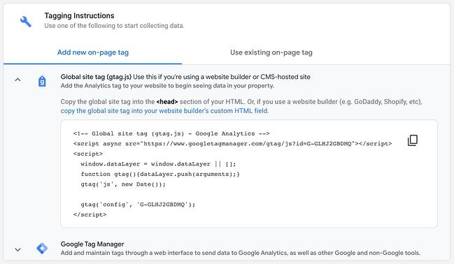
wordpress google analytics: tracking code for google analytics

Next, you’ll paste this code into your active theme’s header.php file. Edit this file however you prefer — you can download the file and re-upload it to your server, or edit the file through WordPress under Appearance > Theme Editor.

In header.php, paste your tracking code just above the closing </head> tag (pictured below) and save your changes.
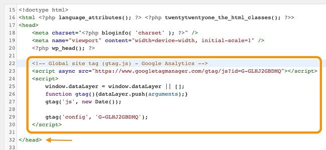
wordpress google analytics: tracking code pasted into the wordpress header.php file

This code will send tracking information from your website to Google Analytics.

Use Google Analytics to understand your WordPress site.

Google Analytics provides you with insights and data that can help you drastically improve the state of your website. You can learn more about what your visitors enjoy and discover more about who they are, so you can continue to tailor your content to their needs.

With WordPress, installing Google Analytics on your website is quick and easy. In just minutes, you can start collecting the information that you need to enhance user experience and increase conversions on your WordPress website.

Editor’s note: This post was originally published in November 2018and has been updated for comprehensiveness.

Use HubSpot tools on your WordPress website and connect the two platforms  without dealing with code. Click here to learn more.

Categories B2B

How Many Visitors Should Your Site Get?

Whether you’re working with an online business or a brick-and-mortar bolstered by an online presence, one question is destined to come up: how many visitors should your site get?

Some tracking software makes it easy to gather metrics, but what does it all mean? A screen of numbers doesn’t magically transform into a successful marketing strategy and more visitors. Understanding and interpreting your site’s analytics (users, sessions, bounce rate, etc.) is the key to building, adjusting, and implementing the proper plan for growth.→ Download Now: SEO Starter Pack [Free Kit]

To understand how many visitors your site should get, you will need to:

  • determine how many visitors are typical to websites in your industry
  • establish a goal based on the variables (industry, size, user experience) of the company
  • create a reasonable plan with actionable steps to execute a successful marketing strategy

How many visitors does a website typically get?

It depends. With the number of websites available on the web, it would be impossible to narrow this question down to one answer. Fortunately, there are tools and resources to help you make an educated guess.

Before diving into monthly website visitors, it could help to understand the breakdown of website traffic. As of 2019, the statistical data platform Statista outlined the distribution of worldwide website traffic by its source. The breakdown is as follows:

  • Direct (55%)
  • Search (29%)
  • Referral (13%)
  • Social (2.5%)
  • Paid Search (0.5%)

As you analyze other companies and industries, you can assume that typically, over half of their visits come from direct searches. Most visitors are landing on a particular webpage because they typed the URL into the address bar. Understanding that more than half (55%) of visitors come from direct traffic and more than a quarter (29%) come from search engine result pages (SERPs), use this knowledge when combing through the metrics of other companies.

How do you find these statistics? Platforms such as SimilarWeb, SEMRush, Ahrefs, and Alexa offer website traffic information for many domains. While these websites will push out an impressive list of metrics, take this information with a grain of salt. Unless the information is coming from the company, and even then, you can’t assume that the data is foolproof.

The following table compares traffic breakdowns from SimilarWeb (SW) and SEMRush (SEM) for five companies.

Company

Total Visits

Pages Per Visit

Bounce Rate

SW

SEM

SW

SEM

SW

SEM

Black Enterprise

2.48M

1.6M

1.42

1.57

79.08%

67.32%

Hello Fresh

9.47M

8.3M

5.81

3.41

43.43%

47.84%

Alibaba

101.19M

66.2M

5.23

3.99

43.38%

49.84

Amazon

2.65B

3.3B

8.66

7.05

35.54%

37.49%

Youtube

35.11B

20.8B

11.4

3.75

20.96%

48.22%

You’ll find that the same website differs in every single metric provided by Similar Web and SEMRush. While you can’t assume which platform is more accurate than the other, you can use a combination of information from different sources to make an educated guess and average.

Amazon (amazon.com) and Youtube (youtube.com) are two of the most visited websites globally. While SimilarWeb doesn’t offer monthly visitor data with their free version, SEMRush does. For August 2021, the platform lists Amazon and Youtube domains with 669.2M and 1.6B unique monthly visitors, respectively. To clarify, 1.6 billion different people made their way onto the Youtube website in August 2021 — according to SEMRush.

While the numbers will vary, you can still create a snapshot of how many visitors a website typically gets. Unfortunately, it is harder to find this information for small and medium-sized businesses versus large corporations.

How do you scale this information to your business? There are a series of factors to consider when determining how many visitors your site should get and setting a “good” number as your goal.

How many unique visitors per month is good?

The answer to this question depends on a few factors. First, are you evaluating a B2B, B2C, or hybrid company? B2B companies have a target audience of other businesses and organizations. B2C companies target direct consumers. One can infer that the potential for more unique monthly visitors for B2C companies is greater than that of B2B companies simply because their target audience is exponentially larger. B2B companies use niche marketing to sell particular products or services to a specific group of businesses while B2C companies focus their strategy on the needs, interests, and challenges of people in their everyday lives.

Taking note of the business model, determining how many monthly unique visitors is “good” for your company depends on your answers to the following questions:

  • What is the standard in your industry?
  • How much content do you produce?
  • How well is your content strategy working?
  • What is the search volume for your targeted topics?
  • How competitive are your target keywords?

What is the standard in your industry?

To make an accurate guess of where your company should be, determine the industry standard. To do this, evaluate your competition. Using tools like the previously mentioned SimilarWeb and SEMRush, you can create a general overview of your competitors, and use these statistics to establish an average for your industry.

How much content do you produce?

The more content you have available on your site, the more opportunities you create for visitors to find it. How much new content are you producing? One? Three? Five or more? The size of your team will affect the amount of content you’re able to create. If you find that you’re unable to produce new content, consider expanding the size of your team to meet your needs.

How well is your content strategy working?

To fix something, you need to know if it’s broken. Evaluate whether your content strategy is working. Are you ranking for your keywords? Have you seen an increase in views over the last few months? Where is the bulk of your traffic coming from? Once you can determine how your site is currently performing, you can take active steps to create an effective content strategy.

What is the search volume for your targeted topics?

Search volume for your targeted topics is directly related to the demand for that information, product, or service. High search volume can mean more visitors; however, this is directly affected by the competitiveness of your keywords.

How competitive are your target keywords?

A combination of these factors affects your website’s unique visitors per month, but it boils down to competition. The more competitive your target keywords, the harder it is to rank on the first page of a SERP. The more competitive the industry, the greater the chances of having potential website visitors split among the competition.

Other factors that can affect your number of unique visitors per month are security, accessibility, mobile-friendly web pages, and user experience.

Security

Establishing a safe and secure website with an SSL certificate can boost your reputation and relationship with future consumers. Not only does it mean less time worrying about potential security incidents, but it allows your visitors to insert their information into your systems with confidence.

Accessibility

Fifteen percent of the world’s population are persons with disabilities. Many still use the web, and businesses must ensure that their content is accessible. Accessibility is not a feature, and making your website convenient to all visitors is not a bonus but a necessity.

Mobile-Friendliness

If your site isn’t mobile-friendly for cell phone users, you’re cutting off a large portion of potential visitors. In 2019, the World Advertising Research Center (WARC) estimated that around 2 billion people accessed the internet via only their smartphones. The report also stated that this number will be equivalent to 3.7 billion people (or 72.6%) by 2025.

User Experience

Click-through rate and bounce rate are metrics that help determine the user experience on your website. Evaluate them together. While a high click-through rate is positive, a high bounce rate is negative. Click-through rate is the percentage of people who visit your page after it comes up in a search. Bounce rate is the percentage of people who arrive and leave your web page quickly after landing on it. A high bounce rate sends search engines a signal that your content isn’t relevant to the users and negatively affects your rank.

Once you can evaluate your industry, website, and content strategy, the next step is to set goals and execute them.

Setting Reasonable Goals For Website Traffic

Focus on the word “reasonable.” A goal to reach 10,000 monthly visitors next month might not be a stretch if you garnered 9,000 visitors this month; however, if your website receives an average of 2,500 monthly visitors, this goal might be less probable. Setting a realistic and attainable goal is the key to creating the proper marketing strategy for your business.

Define Your Goal

First, define your goal. Analyze your current metrics and that of your competitors. Let’s use HelloFresh and other meal kit delivery services as an example. The company’s direct competitors include Home Chef, Blue Apron, and Sunbasket. The ranking for their monthly unique visitors, according to SEMRush, is as follows for August 2021:

  • HelloFresh (4.9 Million)
  • Home Chef (2 Million)
  • Blue Apron (1.2 Million)
  • Sunbasket (696.6K)

As previously mentioned, do not analyze these numbers as fact. They are a guide. If a new meal kit delivery service looked at the monthly unique visitors for these companies, they’d get an average of 2.1 million monthly views. Now, this can be a goal for the future but not the immediate future.

A monthly goal for a small business receiving 5000 unique monthly visitors could be 10% or 500 new visitors. Set goals with a content plan in mind. With this goal in place, you can use it to determine the success of your content strategy.

Build a Content Plan Around MSV

Monthly search volume (MSV) is the number of times a specific keyword is entered into a search engine each month. MSV allows you to anticipate the amount of traffic available for a particular keyword term. Armed with this knowledge, you’ll be able to gauge which keywords are worth targeting for your content strategy. You’ll also be able to assess the needs of potential clients and customers and cater your content to them.

Some free online keyword tools that help calculate MSV include Google Keyword Planner, Ahrefs Keyword Generator, and Answer the Public.

Determine a Publishing Cadence

In conjunction with creating your content strategy, lay out a schedule. How often you update your website is key to attracting more visitors because you increase the number of opportunities to land on your page. At the bare minimum, you want to post new content to your website every week. The amount of content is, of course, dependent on the size of your team and audience. The more resources you have, the more content you can create. The larger your audience, the more content you should create.

While determining a publishing cadence is necessary, it is equally important to stick to it and remain consistent.

Assess Your Performance

The first step to assessing your goals is having a data reporting software set up. Once you do, it’s time to see if your unique monthly visitors increased. Whether or not you met your goal, ask yourself the following questions to review your progress:

  • Did your unique monthly visitors increase or decrease? By what percent?
  • Are you ranking for targeted keywords?
  • Was there a trend (increase or decrease) in visitors across your industry?

An increase or decrease in your unique monthly visitors isn’t enough to gauge the complete success of your goal or content strategy. Are you ranking for your targeted keywords? If yes, your content strategy is working, and your location in SERPs can lead to further increases in the future. If not, reassess and adopt new SEO methods for growth.

When assessing your performance, it might also be necessary to measure factors out of your control, for example, industry trends. Was there a mutual dip in unique monthly views among you and your competitors? It is possible that your keyword MSV wasn’t as high as in previous months. A decrease in MSV for your keywords is out of your control. However, it is your responsibility to pivot and discover what your target audience is searching for.

How many visitors should your site get?

In content strategy and marketing, consistency is key. How many visitors should your site get? Ultimately, it comes down to how consistent you are in the tips featured above. Do you keep up with industry best practices to guide your knowledge on MSV? Do you periodically evaluate your content to boost your SEO? Are you updating your information to guide your goals?

There is no magic number when it comes to monthly website visitors. Evaluate your website and use your current metrics to determine where you want to be in one, six, or 12 months from now. Changes rarely happen overnight. Set reasonable goals with realistic timelines, and you’ll eventually see growth.

Editor’s note: This post was originally published in September 2009 and has been updated for comprehensiveness.

marketing

Categories B2B

Data Visualization: Tips and Examples to Inspire You

It’s no secret that data can be very powerful — when you can actually understand what it’s telling you, that is.

It’s not easy to get clear takeaways by looking at a slew of numbers and stats. You need to have the data presented in a logical, easy-to-understand way so you can apply your learnings in an effective way. That’s where data visualization comes in.

Download Now: An Introduction to Data Visualization for Marketers [Free Guide]

In this article, we’ll offer you applicable ways to ensure your data visualization is effective, and provide examples for inspiration along the way.

What is data visualization?

Data visualization allows you to organize data in a way that’s both compelling and easy to digest.

It’s about representing data in a visual context, such as a chart or a map, to help anyone viewing it better understand the significance of that data.

How does data visualization work?

Whereas data shared via text can be confusing (not to mention bland), data represented in a visual format can help people extract meaning from that information more quickly and easily.

Data visualization allows you to expose patterns, trends, and correlations that may otherwise go undetected, too.

Static vs. Interactive Data Visualization

Data visualization can be static or interactive. For centuries, people have been using static data visualization like charts and maps.

Interactive data visualization is a little bit newer: It lets people drill down into the dirty details of these charts and graphs using their computers and mobile devices, and then interactively change which data they see and how it’s processed.

Time Series Visualization

In addition to static and interactive data visualization, you may also hear the term time series visualization. Time series visualization is what it sounds like — visuals that track data, or performance, over a period of time.

This is important because a major reason why people want to focus on data visualization is to show changes in variables over time.

Time Series Data Visualization Examples

There are many ways to use time-series data visualization — you’ll learn more about these below, but here’s a quick list to give you a better understanding of which visuals are considered time series visuals.

  • Line chart
  • Bar chart
  • Area chart
  • Bullet graph

Data Visualization Best Practices

While determining how you’ll visualize your data, one of the first things you’ll want to do is keep the following best practices in mind.

  1. Choose the best visual for your data and its purpose.
  2. Ensure your data is easily understandable and viewable.
  3. Offer necessary context for your audience in and around your visual.
  4. Keep your visual as simple and straightforward as possible.
  5. Educate your audience with your visuals.

Featured Guide: An Introduction to Data Visualization

data visualization cover

Learn how to apply data visualization best practices in your marketing with this free guide.

1. Line Chart

data visualization line chartImage Source

Use a line chart to display your data over the course of time to view trends and intervals. You can do this with a single, or multiple, data point(s).

2. Bar Chart

bar chart data visualizationImage Source

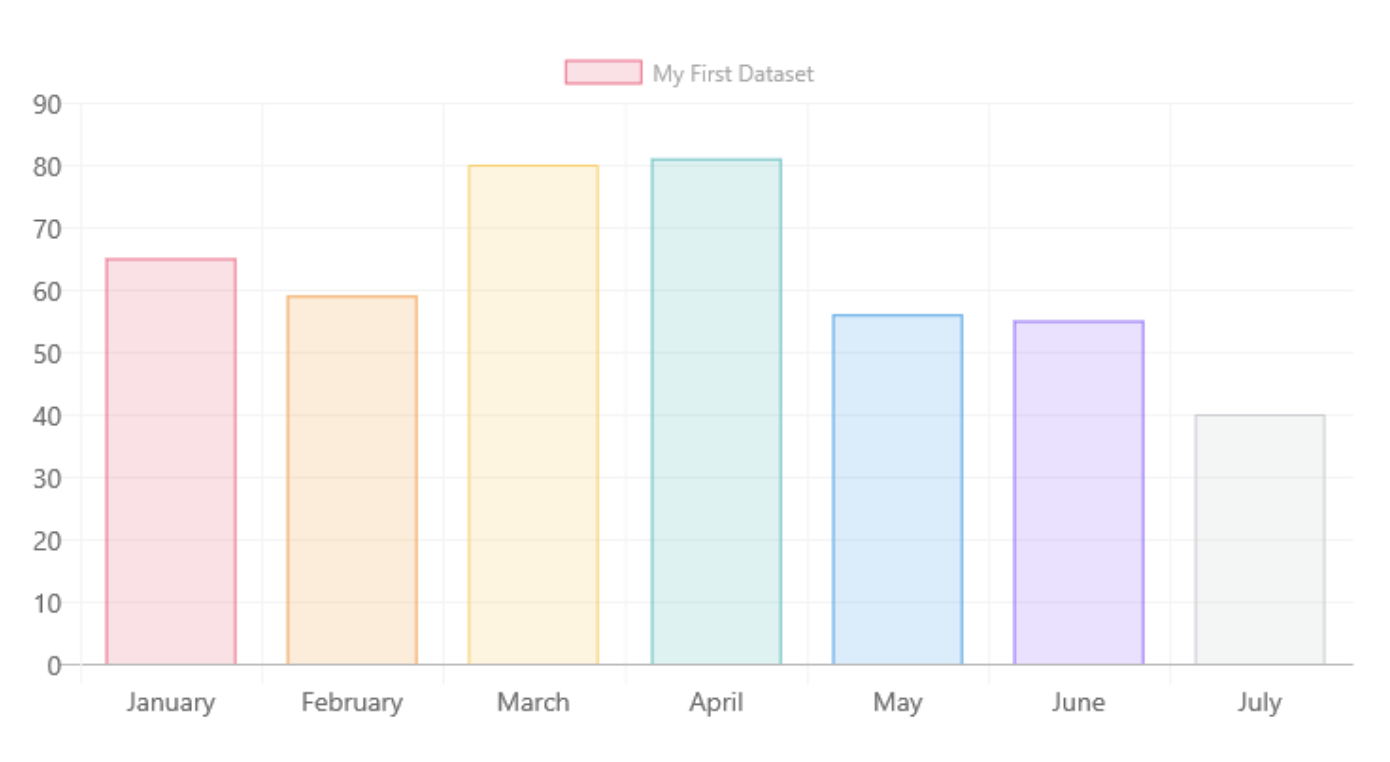
Use a bar chart to compare groups or categories while also displaying clear values.

Wondering how you could use this? Say you’ve been using Casted for your content marketing and need to report on which medium is performing best. You can pull data reports from the dashboard to visualize the data for key stakeholders.

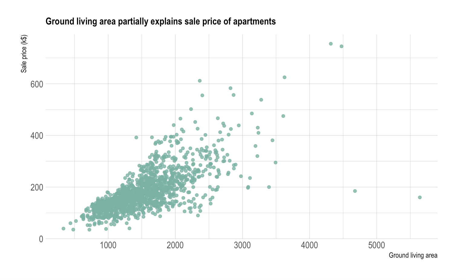
3. Scatter Chart

scatter plot data visualizationImage Source

Use a scatter chart to show the values of two different variables as points on a chart.

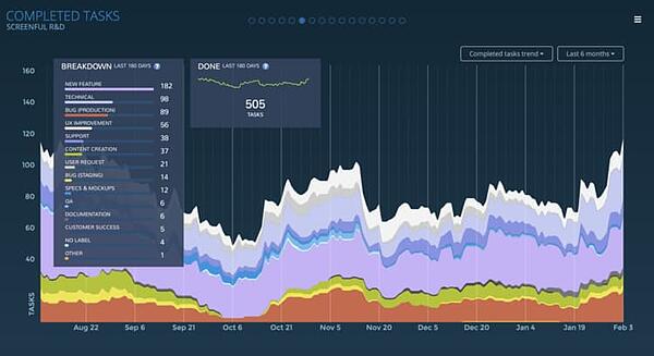
4. Area Chart

data visualization area chartImage Source

Use an area chart in a similar way to how you’d use a line chart.

The difference is that the area below the line is filled with color and/ or texture with an area chart. Both area and line charts display the evolution of a value.

5. Map

data visualization mapImage Source

Use a map to display data that are geographically located and to show the distribution and proportion of data in specific areas.

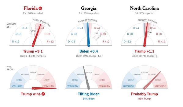
6. Indicator

data visualization indicatorImage Source

Use an indicator if you want to display your data with visuals like a gauge or ticker which will clearly show which direction things are moving over time.

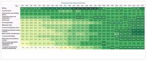
7. Pivot Table

data visualization pivot tableImage Source

Use a pivot table to summarize a large amount of information while specifically highlighting the most critical data for audience members.

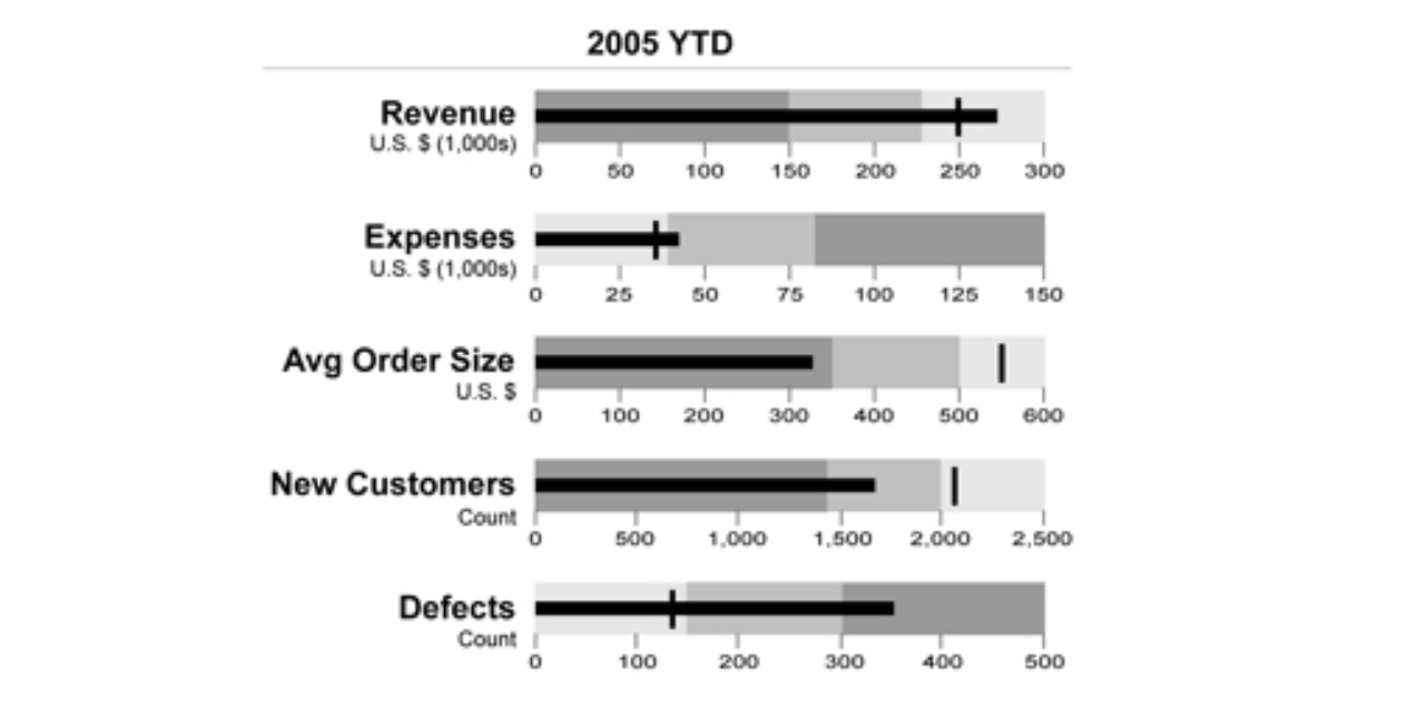
8. Bullet Graph

bullet graph data visualizationImage Source

Use a bullet graph or chart in a similar way to how you’d use a bar chart. The main difference is that a bullet graph allows you to include more detailed information and data in a way that doesn’t look or feel cluttered.

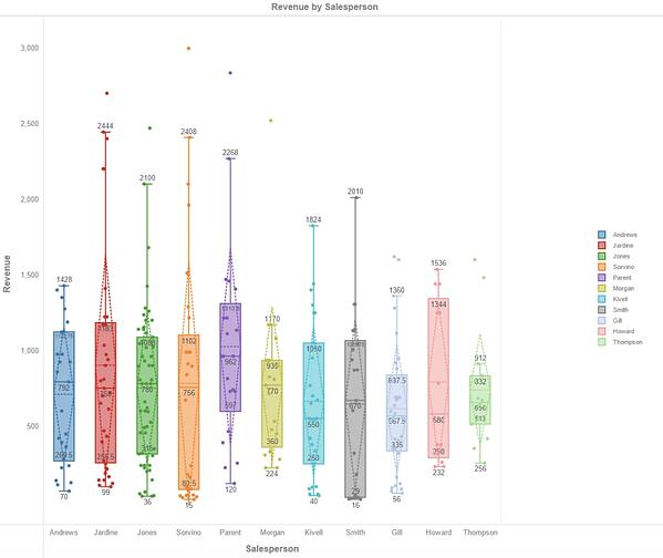
9. Box Plot

data visualization box plot

Image Source

Use a box plot to view the distribution of your data — you’ll have one box plot for each attribute you’re displaying.

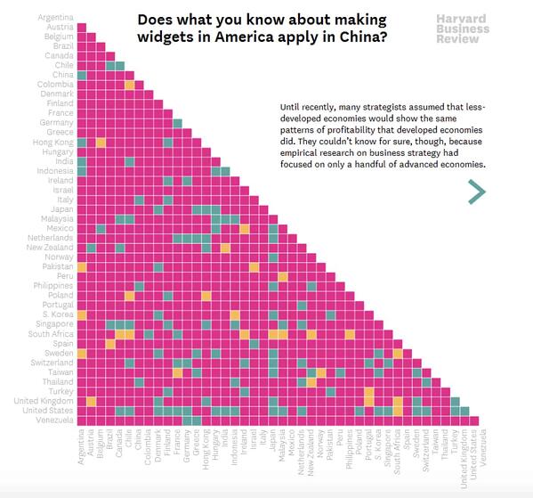
10. Matrix

data visualization matrix

Image Source

Use a matrix to display the relationships between hundreds or thousands of data points, variables, and more to understand their interactions all in one location.

Ready to feel inspired? Let’s take a look at some great examples of interactive and static data visualization.

Examples of Data Visualization

Below are 16 examples of data visualization, split into two major sections: interactive and static data visualization.

Examples of Interactive Data Visualization

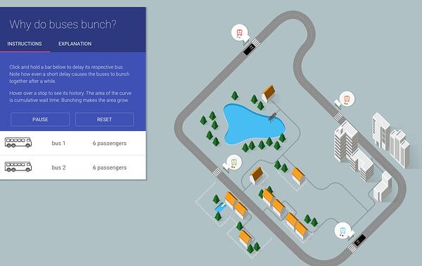
1. Why Buses Bunch

Here’s an example of a complex data set boiled down in a way that looks and feels like a game. In this visualization, Setosa is showing how “bus bunching” happens, i.e. when a bus gets delayed and later causes multiple buses to arrive at a single stop at the same time.

interactive data visualization example

Image Source

Telling this story in numbers alone would be pretty difficult — instead, they turn it into an interactive game that makes the data easier to understand. While the buses rotate along a route, you can click and hold a button to delay a bus. Then, all you have to do is watch to see how even a short delay causes the buses to bunch together.

2. Languages in the World

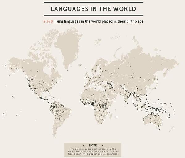
This interactive by DensityDesign introduces the non-linguist to the many world languages. All 2,678 of them.

interactive data visualization example

Image Source

This piece allows you to explore common language families, see which languages are most frequently spoken, and view where languages are spoken around the world.

This is visual storytelling: taking an in-depth subject and breaking it down in an easy-to-understand way.

3. Percent of U.S. Population by Age Group

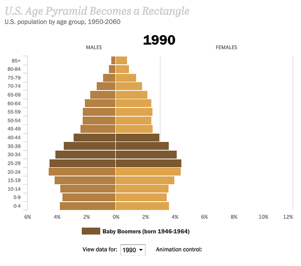
This is an example of how to present a single data set in a compelling way. Pew Research created an animated GIF composite to show shifts in population demographics over time. It’s an effective way to tell a larger story in a neat package.

interactive data visualization examples

Image Source

Plus, this type of micro-content is easy to share on social or embed in blogs, extending the content’s reach.

If you want to make a GIF of your own using Photoshop, here’s a step-by-step tutorial.

4. The Complete History of the NFL

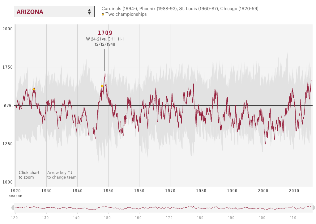
In this interactive visualization below, an “Elo rating” — a simple measure of strength based on game-by-game results — has been calculated for every game in the history of the National Football League (NFL).

interactive-data-visualization-example-4

Image Source

That’s over 30,000 ratings in total. Viewers can compare each team’s Elo to see how each team performed across decades of play.

5. U.S. Thanksgiving on Google Flights

This visual is powered by Google Trends. It tracked flights as they flew to, from, and across the United States on the day before Thanksgiving.

interactive data visualization examples

Image Source

The visualization starts at the very beginning of the day and plays like a movie as time goes on, showing flights moving around the country.

Without showing any numbers besides the time, viewers can see which times were most popular for international flights, domestic flights, and flights to/ from different hubs around the country.

6. What’s Really Warming the World?

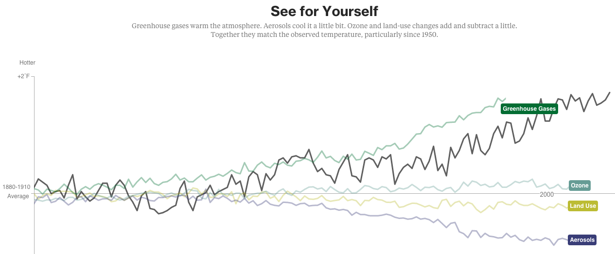
Ever heard a version of the advice, “Don’t simply show the data tell a story with it”? That’s exactly what this visualization from Bloomberg Business does — and it’s the interactive part that makes the story move along from beginning to end. The visual disproves theories that claim that global warming can be explained by natural causes.

The first thing you’ll see is the observed temperature as it’s risen from 1880 to present day.

bloomberg climate change data visualization example

Image Source

As you scroll down, the visualization takes you through exactly how much different factors contribute to global warming in comparison to what’s been observed, adding a richer layer of storytelling. The conclusion the authors want viewers to draw is made very clear.

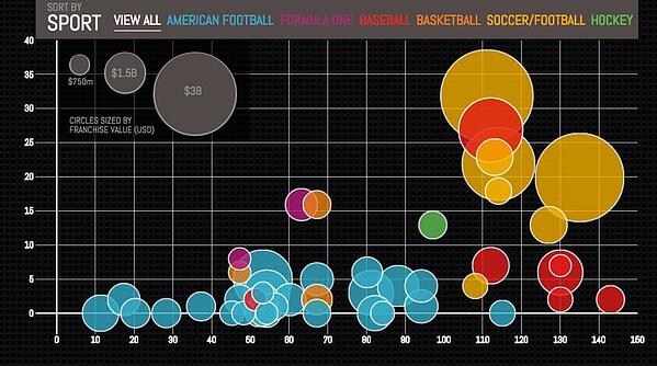
7. Most Valuable Sports Franchises

Here’s an example of telling a deeper story by adding data.

interactive data visualization example

Image Source

The interactive visual lets users see the number of years each team has competed, as well as the number of championships won. This offers a more comprehensive view of each team’s history and success as a franchise.

8. U.S. Wind Map

Here’s a visual similar that shows the wind speeds and directions in the U.S. in real-time back in 2015.

interactive data visualization example

Image Source

It’s a great example of intuitive design: Speed is represented by lines moving slowly or quickly, and direction is represented by which way the lines are moving. It’s immediately clear what the general trends are without any need for numbers unless you click into the map itself. Plus, capping the number of variables at two makes it even easier to follow.

Examples of Static Data Visualization

9) Where News Audiences Fit on the Political Spectrum

This visual shows data organized on a distribution plot — this is an effective visual choice because it allows viewers to see where each media outlet lies on a spectrum.

media polarization static data visualization example

Image Source

On a spectrum, the distance between each media outlet is significant. If these outlets were just listed one after the other in a table, viewers wouldn’t be able to see where each one stood in context.

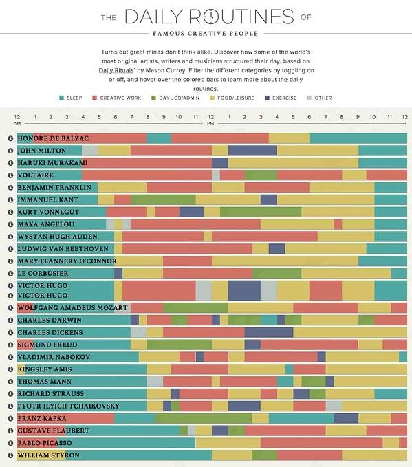
10. The Daily Routines of Famous Creative People

Using information from the book Daily Rituals by Mason Currey, the site showcases the daily schedules of famous creatives broken down by time and activity.

static data visualization example

Image Source

Not only is this an example of engaging data (you can explore the schedules by individual activity), it’s also an effective editorial piece for a brand.

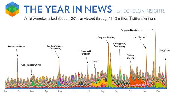
11. The Year in News

Echelon Insights created this visual to depict the most talked-about news stories of 2014 on Twitter.

What do 184.5 million tweets look like? Cool spin art!

static data visualization example

Image Source

12. The Depth of the Problem

When you want to illustrate scale, static data visualization can be a great way to make your point. The infographic below from The Washington Post is incredibly long … and that’s on purpose.

In this case, they’re showing how crazy far a deep-sea signal from an airplane can be detected by comparing that depth to tall buildings, the maximum depth of known mammals, the depth of the Titanic wreck, and so on.

static data visualization example

Image Source

It’s a great use of simple visuals and color gradients. Finally, adding data to a news story (in this case, the missing Malaysian airliner) provides necessary context.

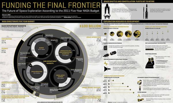
13. Funding the Final Frontier

While the infographic above is pretty simple, there are ways to create well-designed infographics that deliver a large amount of data. The secret? A simple and clean format that makes it easy for readers to understand the data.

static data visualization example

Image Source

This infographic, created by GOOD Magazine and Column Five, breaks down NASA’s five-year budget to show how and where the money will be spent. Plus, it has an on-theme design — an all-around win.

14. Caritas Kontaktladen Annual Report

Not all data visualizations need to be animated. When real-world data is visualized with real-life examples, the results can be stunning. The designer of this visual took a unique approach to the data contained in the annual report.

static data visualization example

Image Source

The organization provides support to drug addicts in Austria, so Luttenberger focused on communicating the mission through real-life visuals. For example, this shopping cart visualization represents how much of life’s necessities a welfare recipient can afford each day.

15. Austria Solar Annual Report

While there are many ways to visualize data, using the information subject to actually create the data visualization can be pretty profound.

This annual report from Austria Solar uses actual solar power to bring the company’s data to life through solar-activated inks on the page.

The good examples of data visualization above are great to reference while you develop your approach. However, it’s also important we consider the less effective ways to go about data visualization so you know what to avoid — so, let’s cover some bad examples next.

Bad Data Visualization Examples

There are many ways in which data visualization can go wrong.

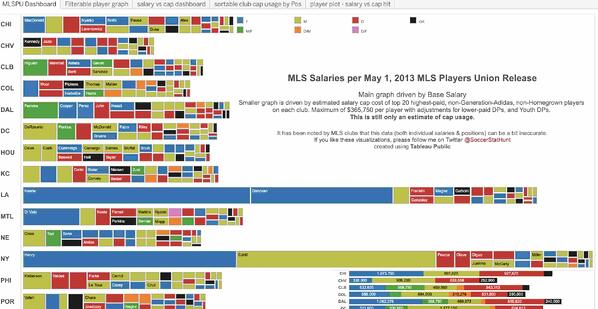
For instance, look at this data visualization example of MLS salaries in 2013. The sheer amount of information on this chart makes it difficult to read.

bad data visualization examples

Image Source

Additionally, the scale of the variables requires audience members to zoom in significantly to read the data. Some of the boxes that are being used to depict data appear to be vertical while most are horizontal — this also makes the information confusing to read.

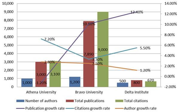
When you include a number of completely different variables within a single visual, it also becomes complicated for audience members to understand — the following chart is an example of this.

bad data visualization examples

Image Source

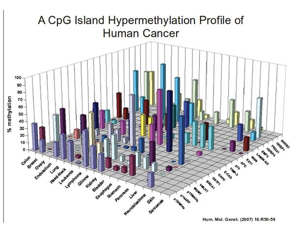
Something else you’ll want to do is make sure you’re not making your visual more complicated than it needs to be. For example, this chart has a number of variables that are depicted by 3D bars. This graph doesn’t need to be 3D — in fact, it simply makes the information more difficult to understand and view.

Bad-Data-Visualization-Examples-2

Image Source

Lastly, let’s review some data visualization tools to help make this process simpler.

Data Visualization Tools

There are a number of data visualization resources available today but the following list is here to help get you started. Don’t be afraid to test out a few options to determine which option suits your needs (and data) best.

1. HubSpot

HubSpot offers several options for data visualization, specifically within Reports. You can create graphs and charts in many ways depending on your preference.

There’s also a Dashboard and Reporting add-on that can ease the process of data visualization. Lastly, HubSpot allows you to manage your data and dashboards, as well as customize them, in a way that suits your specific needs.

2. Tableau Desktop

Tableau Desktop’s data visualization software offers live analytics with interactive dashboards so you’re able to easily spot trends, patterns, and insights.

There are easy-to-make maps, indicators, and many more visuals, as well as straightforward analytics which allow you to derive actionable information from calculations, reference lines, and forecasts as a result of your visuals.

3. Chartio

Chartio’s data visualization tools offer users 15 types of charts to choose from with multiple variations, and even more options if you know how to use data programming languages.

With Chartio, you can bring all your data together from locations like Amazon Redshift, browse your data with the Visual SQL solution, create and manage customized charts and visuals, and easily share them (via web page, Slack, PDF reports for email, etc.).

4. Databox

Databox provides a number of ways to upload your data and efficiently create visuals to derive conclusions.

There are over 70 integrations that can help you quickly and easily create visuals with pre-built dashboards and reports. You can also create custom metrics. Databox then allows you to connect to Google Sheets or an SQL database, or you can push it via API to view and share your data.

5. Google Chart Tools

Google Chart Tools allow you to visualize live data on your website (and mobile) with the help of a number of interactive, customizable charts and data tools. The most common way to use Google Charts is with simple JavaScript that you embed in your web page. And by using the DataTable class, you can easily switch between chart types.

Grow Better With Data Visualization

With data visualization, you’ll be able to identify, discuss, and act on insights in an easier and more effective way.

So, look to the examples above for inspiration (and as a reference for what to avoid, too!) and experiment with the many tools available to determine what works best for your needs and goals.

Editor’s Note: This post was originally published in March 2015 and has been updated for comprehensiveness.

Blog - Data Visualization [List-Based]

Categories B2B

How to Write a Great Value Proposition [4 Top Examples + Template]

Your value proposition is the core of your competitive advantage. It clearly articulates why someone would want to buy from your company instead of a competitor.

It’s also one of the most important conversion factors (learn all about conversion best practices with this free guide). A great value proposition could be the difference between losing a sale — and closing it.

So how do you actually write a value proposition that’s strong enough to lift conversion rates and sales? In this article, you’ll learn the definition of a value proposition, what a value prop isn’t, examples of some of the best value props we’ve seen and tactics to create amazing value props.

Ready to dive in?

→ Download Now: 15 Free Value Proposition Templates

Your value proposition is a unique identifier for your business. Without it, buyers won’t have a reason to purchase what you sell. They may even patronize a competitor simply because that business communicates its value proposition clearly in its marketing materials and sales process.

While your value prop should help differentiate you from the rest of the industry, keep in mind it’s not a slogan, tagline, or mission statement. Those types of copy are important accessories to your brand, but your potential customers and employees don’t choose one business over the other solely based on these elements.

Your value proposition goes deep into the problems you want to solve for buyers, and what makes your product or service the perfect solution.

The Elements of a Value Proposition

There are three main elements of a value proposition: the headline, the subheadline, and a visual element.

The elements of a value proposition

Headline

The headline of your value proposition describes the benefit the customer will receive as a result of making a purchase from your business. The headline can be creative and catchy, but it should be clear and concise, first and foremost.

Subheadline or Paragraph

The subheadline or paragraph should explain in detail what your company offers, who it serves, and why. In this section, you can elaborate on the information in the headline.

Visual Element

In some cases, a video, infographic, or image may convey your value proposition better than words alone can. Enhance your message with these visual elements to capture your audience’s attention.

Taking these three elements into consideration, you’ll be able to make your own after you build a value proposition canvas.

The value proposition canvas is made up of two major components: the customer profile and the value map.

Value Proposition Canvas Visual

Customer Profile

The customer profile makes up the first half of the value proposition canvas. When performing this exercise you’ll want to start with this section first so that their wants and needs can influence the overall value proposition canvas.

The customer profile consists of three areas that we’ll detail below.

Customer Jobs

What is the task your customer needs to complete or the problem they’re trying to solve with your product or service? The answer to this question sums up the “customer job” or the purpose of your product or service in the eyes of the customer.

Customer Expectations

No matter what you sell, your ideal customer will have an expectation of what that product or service will do for them. In this section, you’ll use research to explain what your customers expect from you in order to purchase your product.

Pain Points

As your customer completes their “customer job,” what pains do they experience? Do they take any risks while they do the customer’s job? Do they experience any negative emotions? These pain points should be considered so that you include the most helpful products and services on the value map side of the value proposition canvas.

Value Map

In this section of the value proposition canvas, three specific sectors help describe what the business offers to the customer.

Gain Creators

These are features your products or services have that make the customer happy. Think creatively about the elements of happiness your customers experience. Consider their financial and social goals as well as their psychographics.

Pain Relievers

In the section above, we discussed customer pains. This section will define exactly how your business will help them overcome those pain points.

Products & Services

While this section won’t list every single product or service your company offers, it should include the ones that will create the most gain and alleviate the most pains for your customers.

Determine Value Proposition-Customer Fit

Once you’ve completed the value proposition canvas exercise, the next step will be to determine how your value proposition fits within the customer profile. To do this, you’ll use a ranking process that prioritizes products and services based on how well they address the customer profile.

To better visualize these tools, here’s a couple templates to follow when formatting a value proposition.

Value Proposition Templates

Featured Resource: 15 Value Proposition Templates

hubspot 15 free value proposition templatesDownload for Free

We’ve crafted 15 templates to help you create an amazing value proposition for your brand – and pairing each of them with an example of how they may look for a real business. Click here to download these free value proposition templates for your business.

Now that we’ve reviewed the elements, visual tools, and templates — let’s look at some brand examples that effectively identify and satisfy its customer needs.

Value Proposition Examples

Because value propositions are typically internal information and rarely stated publicly, finding a value proposition example to model yours after can be difficult. We’ve taken the liberty of using the value proposition canvas and applying it to some successful companies that have been recognized by the American Customer Satisfaction Index (ASCI).

In these examples, you’ll see real-world instances of customer gains and pains aligned with well-known products and services offered by these companies.

1. FedEx: Manage Your Home Deliveries

Headline: Manage Your Home Deliveries

Subheadline/Paragraph: Sending and receiving packages is convenient and safe for individuals who want to ship ideas and innovations across the globe.

Visual Element:

value proposition examples: FedEx

Image Source

Customer Profile for FedEx

  • Customer Jobs: FedEx customers want to share ideas and innovations with other individuals by shipping goods around the world.
  • Gains: Customers want a hassle-free way to return online orders and are looking for a safe and secure way to receive their packages.
  • Pains: Returning a package at a FedEx shipping center can be inconvenient, and managing home deliveries can be a hassle.

Value Map for FedEx

  • Gain Creators: Customers can drop off their FedEx packages at places they shop most like Walgreens or Dollar General, and have peace of mind knowing where their package is at all times.
  • Pain Relievers: Thousands of FedEx drop-off locations across the country, receive notifications when a package is en route and inform the driver where to leave the package.
  • Products & Services: FedEx Drop Box locations make returning packages convenient, and the FedEx Delivery Manager reroutes or reschedules deliveries to work with the customer’s schedule.

2. LG: State-of-the-art Living Experience

Headline: State-of-the-art Living Experience

Subheadline/Paragraph: LG SIGNATURE delivers an innovative product design that creates an exceptional living experience for people who want to achieve a state-of-the-art living experience.

Visual Element:

value proposition examples: LG Signature

Image Source

Customer Profile for LG

  • Customer Jobs: LG customers want simple, yet innovative technology that helps them achieve a state-of-the-art living experience.
  • Gains: Customers have an intuitive and responsive experience with each appliance they interact with inside their homes.
  • Pains: There are too many unnecessary buttons and features on appliances that get in the way of a simple living experience

Value Map for LG.

  • Gain Creators: Customers can use technology to enhance their home experience without needing to read a manual.
  • Pain Relievers: LG offers a simple design that focuses on the user and their lifestyle.
  • Products & Services: LG SIGNATURE delivers an innovative product design that creates an exceptional living experience.

3. Subaru: The most adventurous, most reliable, safest, best Subaru Outback ever.

Headline: The most adventurous, most reliable, safest, best Subaru Outback ever.

Subheadline/paragraph: The 2022 Subaru Outback takes drivers to the most adventurous places in style with the most advanced safety technology.

Visual element:

value proposition examples: Subaru

Image Source

Customer Profile for Subaru

  • Customer Jobs: Subaru customers want to explore the world’s most adventurous places in a reliable and safe vehicle
  • Gains: Customers want to explore the land in a stylish and spacious SUV and look for advanced technological elements in their vehicles that enhance performance and safety
  • Pains: The safest vehicles are not the most visually appealing, and some SUVs aren’t equipped for all-weather or all-terrain environments

Value Map for Subaru

  • Gain Creators: Subarus have a stylish exterior and interior with ample ground clearance that protects the vehicle against damage from the environment and advanced technology to reduce crashes and make long road trips safer.
  • Pain Relievers: Subarus have a rugged blacked-out trim for style and protection, 9.5-inch ground clearance for better stability and performance, driver-assist technology that helps drivers see better, prevent crashes, manage cruise control, and brake automatically in emergency situations.
  • Products & Services: The 2022 Subaru Outback with standard eyesight assist technology, automatic pre-collision braking, adaptive cruise control, lane-centering, and is one of the brand’s most popular models.

Samsung: Get Ready to Unfold Your World

Headline: Get Ready to Unfold Your World

Subheadline/paragraph: This is everything you’d want in a premium, durable, 5G smartphone. Then we made it unfold — revealing a massive screen so you can watch, work and play like never before.

Visual element:

value proposition examples: Samsung Galaxy

Image Source

Customer Profile for Samsung

  • Customer Jobs: Samsung customers are tech-savvy and follow the latest trends, driven by efficiency and aspirational lifestyles.
  • Gains: Customers want an all-in-one way to enjoy media, work productively, and have a fun experience all in the palm of their hands.
  • Pains: Common smartphones have size limitations that strain entertainment viewing, gameplay, and work capabilities.

Value Map for Samsung

  • Gain Creators: Samsung offers a unique and expansive design with capabilities beyond that of an average smartphone, offering the most advanced technology to help customers perform tasks to fulfill work and play.
  • Pain Relievers: Samsung provides a smartphone that displays content in tablet-like viewing and displays up to three apps simultaneously.
  • Products & Services: One of Samsung’s most popular phones is the Galaxy Z Fold3 5G folding 6.2-inch smartphone with dynamic AMOLED 2X screens, ultra-thin glass with S Penfold edition, and super-strong lightweight armor aluminum frame.

You’ve seen some brilliant value proposition examples, now let’s break down how to make your own.

Step 1: Identify your customer’s main problem.

While this will require some upfront research, you can get a head start on this aspect of the value proposition by speaking with different members of your team. Customer service reps, marketing specialists, and salespeople can fill in the gaps about what problems your customers are looking to solve by using your product or service.

For example, let’s say your business sells tax software on a subscription basis and automated templates are included in the software package. Your ideal customer is looking for an affordable and user-friendly way to access complicated tax documents for their business. In this example, your business’s offerings could be the solution they need.

Step 2: Identify all the benefits your products offer.

This step can be as simple as listing out every product you sell and describing its primary benefit. The benefit should be concise and focused on a single customer need.

In our tax software example, you’d list each tax template, explain the benefit it provides, and why a customer would need it.

Step 3: Describe what makes these benefits valuable.

Next, add another sentence that explains why this benefit matters to the customer.

Using the same example above, the value would be that customers have affordable tax documentation at their fingertips — something that would normally cost them thousands of dollars.

Step 4: Connect this value to your buyer’s problem.

Next, pair the buyer’s problem to the elements that make your product or service valuable. Do they align? If so, you’re ready to refine your value proposition to differentiate your offerings from the competition. If they don’t align, repeat the steps above until you find a valid buyer need and a viable solution your business offers to meet that need.

There’re three templates we think do an excellent job of connecting value to buyer pain points:

Step 5: Differentiate yourself as the preferred provider of this value.

Finally, polish your value proposition to make it unique. Is there a specific customer service offering your business provides that others don’t? Do you offer any additional services that other companies charge for? These elements can help differentiate your value proposition from competitors while keeping the focus on the buyer’s needs.

Once you understand these steps, you can easily implement them into value proposition templates as follows.

Value Proposition Templates

  • Steve Blank Method

Instead of focusing on the features themselves, Blank saw the need to emphasize the benefits derived from the features in a simple sentence. By following this formula you’ll connect the target market and their pain points to the solution:

“We help (X) do (Y) by doing (Z)”

  • Geoff Moore Method

Moore provides a template that’s more specific in identifying the industry categories alongside the benefits customers value. This makes a more clear value proposition formula as follows:

“For [target customer] who [needs or wants X], our [product/service] is [category of industry] that [benefits]”

  • Harvard Business School Method

According to HBS a value proposition is executed best when it answers the following questions:

What is my brand offering?

What job does the customer hire my brand to do?

What companies and products compete with my brand to do this job for the customer?

What sets my brand apart from competitors?

Now that we’ve gone through steps and templates to follow, there’s some tactics we think you should keep in mind.

1. Conduct research to determine the value proposition of your competitors.

Because your value proposition is the differentiating factor between your business and the competition, it’s important to research the propositions of your closest competitors. You can use the value proposition canvas in this post to determine how each company meets the needs of your buyer persona.

Be honest here — it’s tempting to focus on the areas in which your competition doesn’t excel, but you’ll have a better idea of where your product or service fits within the market if you key in on your competitors’ strengths.

2. Explain the value of your products and services.

You’re probably familiar with outlining the features and benefits of your product and service offerings. This tactic takes that concept a step further. By matching the benefits of your offerings to specific values that your customers have, you’ll be able to align what your business provides with what your customers need.

3. Describe the benefits your ideal customer will experience when they choose your product or service over the competition.

When crafting this part of your value proposition, include details about how your product or service will benefit the customer and use examples where you can. Videos, photos, and live demonstrations are all effective ways to illustrate your value proposition because they show the customer exactly what they can expect from your business.

4. Develop a unique value proposition for each buyer persona you serve.

Ideally, you’ll be focusing your marketing efforts on a specific target audience. You’ll also find that this audience will have different needs based on their buying behaviors. Buyer personas can help you segment your larger audience into groups of customers with similar desires, goals, pain points, and buying behaviors. As a result, you’ll need a unique value proposition for each persona. Different products and services you offer may solve certain customer pain points better than others, so developing a value proposition for each persona will better serve each one.

5. Test your value proposition with your audience using various marketing channels.

Each of these tactics will likely be developed internally by your team which means you’ll want to validate your work with your target audience. Your value proposition will be communicated through various marketing channels like your website, social media accounts, video, audio, and in person. Test your proposition with members of your audience (both existing customers and non-customers) using each of these channels. Tools like UserTesting can help you streamline this feedback process so that you can implement changes quickly to finalize your value proposition.

We know the makings of a value proposition, so how can you make it a good one? Here’s the last three tips we have for you.

What makes a good value proposition?

Clear Language

Your value proposition should aim to address a primary customer need. This limited focus helps keep your value proposition clear and easy to understand. With just one main idea to comprehend, your audience will be able to quickly decide whether or not your product or service will be the best solution for them.

Specific Outcomes

Next, you’ll want to communicate the specific outcomes your customer can expect to receive from your product or service. Will they save time? Demonstrate how. Will their workflow become more manageable? Show a before and after workflow diagram. The specific outcomes will be critical components of your value proposition as they’ll exemplify exactly how your customers will use your solution to solve their problems.

Points of Differentiation

Not only are your potential customers evaluating your business’s offerings based on their own needs, but they’re also comparing what you offer against competitors. As a result, your value proposition will need to include detailed points of differentiation. These key points will help customers understand exactly what sets your company apart.

Compose a Remarkable Value Proposition

The factors that influence a potential customer to become a loyal customer are limited. Whether your industry has a lot of opportunities to differentiate (like retail) or virtually no unique identifiers (like dairy), you’ll find that a value proposition will help you understand your ideal customer and position your business as the best solution for their needs. Use the tactics, tips, framework, and examples in this post to craft your unique value proposition.

Editor’s note: This post was originally published in June 2018 and has been updated for comprehensiveness.

value-proposition-templates

Categories B2B

Using Noindex, Nofollow HTML Metatags: How to Tell Google Not to Index a Page in Search

Indexing as many pages on your website as possible can be very tempting for marketers who are trying to boost their search engine authority.

But, while it’s true that publishing more pages that are relevant for a particular keyword (assuming they’re also high quality) will improve your ranking for that keyword, sometimes there’s actually more value in keeping certain pages on your website out of a search engine’s index.

… Say what?!

Stay with us, folks. This post will walk you through why you might want to remove certain webpages from the SERPs (search engine results pages), and exactly how to go about doing it.

Free Guide: How to Run a Technical SEO Audit

De-Indexing a Page from Google

There are a few occasions where you may want to exclude a webpage — or a portion of a webpage — from search engine crawling and indexing like:

  • To prevent duplicate content (when there is more than one version of a page indexed by the search engines, as in a printer-friendly version of your content) from being indexed
  • To treat admin and login pages for internal use unless they’re meant to be used by a community
  • For a thank-you page (i.e., the page a visitor lands on after converting on one of your landing pages) where the visitor gets access to whatever offer that landing page promised, such as a link to an ebook PDF

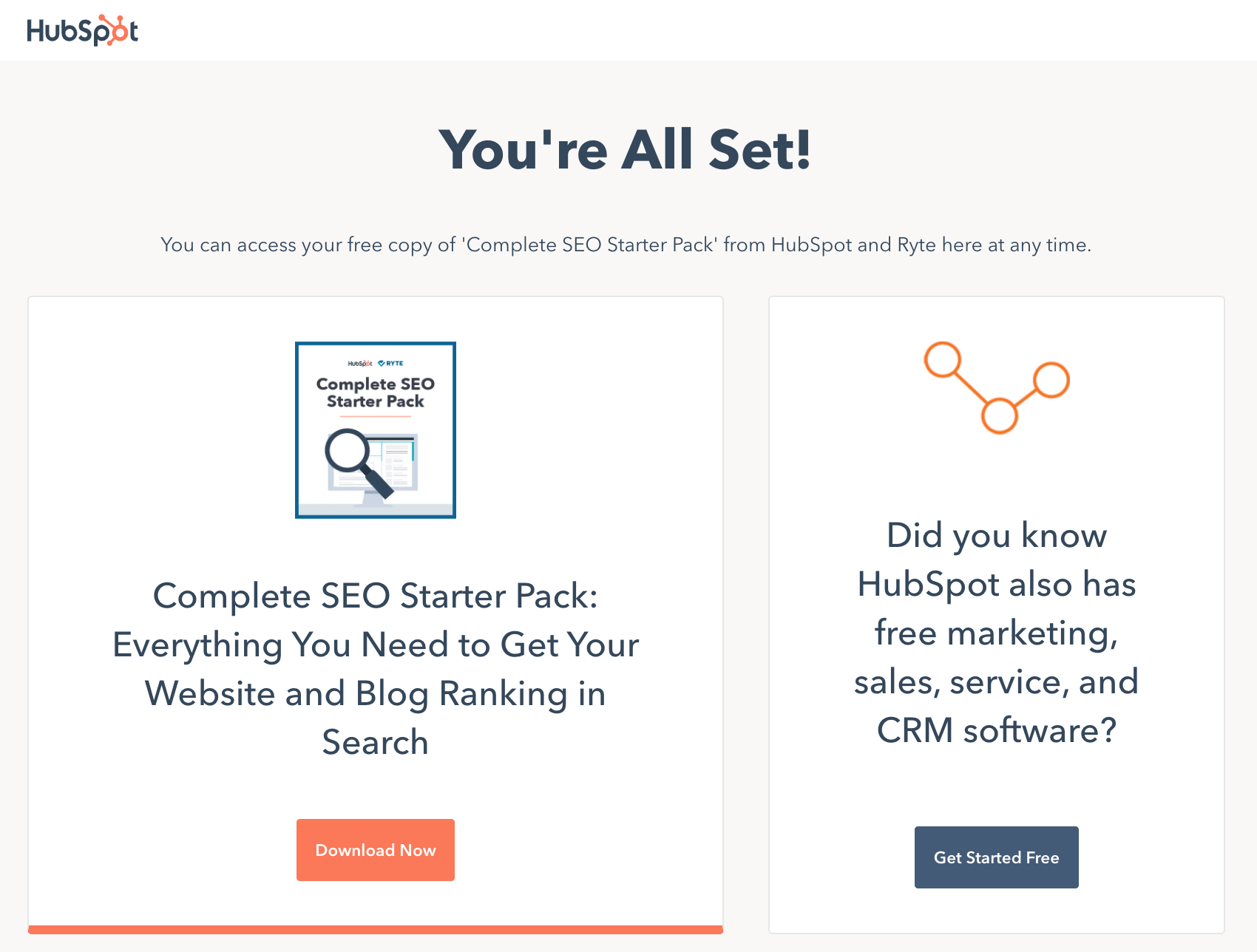
Here’s what the thank-you page for our SEO tips ebook looks like, for example:

HubSpot SEO Starter Pack thank-you page

You want anyone who lands on your thank-you pages to get there because they’ve already filled out a form on a landing page — not because they found your thank-you page in search.

Why not? Because anyone who finds your thank-you page in search can access your lead-generating offers directly — without having to provide you with their information to pass through your lead-capture form. Any marketer who understands the value of landing pages understands how important it is to capture those visitors as leads first, before they can access your offers.

Bottom line: If your thank-you pages are easily discoverable through a simple Google search, you may be leaving valuable leads on the table.

What’s worse, you may even find that some of your highest-ranking pages for some of your long-tail keywords might be your thank-you pages — which means you could be inviting hundreds of potential leads to bypass your lead-capture forms. That’s a pretty compelling reason why you’d want to remove some of your web pages from SERPs.

So, how do you go about “de-indexing” certain pages from search engines? Here are three ways to do it.

3 Ways to De-Index a Webpage From Search Engines

Robots.txt to De-Index

Use if: You want more control over what you de-index, and you have the necessary technical resources.

One way to remove a page from search engine results is by adding a robots.txt file to your site. The advantage of using this method is that you can get more control over what you are allowing bots to index. The result? You can proactively keep unwanted content out of search results.

Within a robots.txt file, you can specify whether you’d like to block bots from a single page, a whole directory, or even just a single image or file. There’s also an option to prevent your site from being crawled while still enabling Google AdSense ads to work if you have them.

That being said, of the two options available to you, this one requires the most technical kung fu. To learn how to create a robots.txt file, you’ll want to read through this article that explains exactly how to do it..

HubSpot customers: You can learn how to install a robots.txt file on your website here, and learn how to customize the contents of the Robots.txt file here.

If you don’t need all the control of a robots.txt file and are looking for an easier, less technical solution, then this second option is for you.

Htaccess No Index No Follow to De-Index

Use if: Your website is running on Apache, and mod_headers is enabled, this is a quick solution.

In this circumstance, you could attach this single line to your .htaccess file:

Header set X-Robots-Tag “noindex, nofollow”

To signify that your website can be indexed, but never shown in any Google search results.

Meta No Index No Follow to De-Index

Use if: You want an easier solution to de-indexing an entire webpage, and/or de-indexing the links on an entire webpage.

Using a metatag to prevent a page from appearing in SERPs — and/or the links on a page — is both easy and effective. It requires only a tiny bit of technical know-how — in fact, it’s really just a copy/paste job if you’re using the right content management system.

The tags that let you do these things are called “noindex” and “nofollow.” Before I get into how to add these tags, let’s take a moment to define and distinguish between the two. They are, after all, two completely different directives — and they can be used either on their own, or alongside one another.

What is a “noindex” tag?

When you add a “noindex” metatag to a webpage, it tells a search engine that even though it can crawl the page, it cannot add the page into its search index.

So any page with the “noindex” directive on it will not go into the search engine’s search index, and can therefore not be shown in search engine results pages.

What is a “nofollow” tag?

When you add a “nofollow” metatag to a webpage, it disallows search engines from crawling the links on that page. This also means that any ranking authority the page has on SERPs will not be passed on to pages it links to.

So any page with a “nofollow” directive on it will have all its links ignored by Google and other search engines.

Like I said before, you can add a “noindex” directive either on its own, or together with a “nofollow” directive. You can also add a “nofollow” directive on its own, too.

When to Use “noindex” and “nofollow” Separately

Add only a “noindex” tag when you don’t want a search engine to index your web page in search, but you do want it to follow the links on that page — thereby giving ranking authority to the other pages your page links to.

Paid landing pages are a great example of this. You don’t want search engines to index landing pages that people are supposed to pay to see, but you might want the pages it links to benefit from its authority.

Add only a “nofollow” tag when you do want a search engine to index your web page in search, but you don’t want it to follow the links on that page.

There aren’t too many examples of when you’d add a “nofollow” tag to a whole page without also adding a “noindex” tag. When you’re figuring out what to do on a given page, it’s more a question of whether to add your “noindex” tag with or without a “nofollow” tag.

When to Use “noindex, nofollow” Together

Add both a “noindex” and “nofollow” tag when you don’t want search engines to index a webpage in search, and you don’t want it to follow the links on that page.

Thank-you pages are a great example of this situation. You don’t want search engines to index your thank-you page, nor do you want them to follow the link to your offer and start indexing the content of that offer, either.

How to Add a “noindex” and/or a “nofollow” Metatag

Step 1: Copy one of the following tags.

For “noindex”:

<META NAME=”robots” CONTENT=”noindex”>

For “nofollow”:

<META NAME=”robots” CONTENT=”nofollow”>

For both “noindex” and “nofollow”:

<META NAME=”robots” CONTENT=”noindex,nofollow”>

Step 2: Add the tag to the <head> section of your page’s HTML, a.k.a. the page’s header.

If you’re a HubSpot customer, this is super easy — click here or scroll down for those instructions specific to HubSpot users.

If you’re not a HubSpot customer, then you’ll have to paste this tag into the code on your webpage manually. Don’t worry — it’s pretty simple. Here’s how you do it.

First, open the source code of the web page you’re trying to de-index. Then, paste the full tag into a new line within the <head> section of your page’s HTML, known as the page’s header. The screenshots below will walk you through it.

The <head> tag signifies the beginning of your header:

head tag at beginning of header

Here’s the metatag for both “noindex” and “nofollow” pasted within the header:

meta tag in header for noindex nofollow

And the </head> tag signifies the end of the header:

end head tag

Boom! That’s it. This tag tells a search engine to turn around and go away, leaving the page out of any search results.

No Index No Follow in HubSpot

Adding the “noindex” and “nofollow” meta tags is even easier. All you have to do is open the HubSpot tool to the page you want to add these tags to and choose the “Settings” tab.

Next, under Advanced Options and click into “Head HTML.” In the window below, paste the appropriate code snippet. In the example below, I’ve added both a “noindex” and a “nofollow” tag since it’s a thank-you page.

no index no follow in hubspot

Press “Save,” and you’re golden.

Successfully No Index No Following a Page

You’ve just magically erased your page from search engine results. Now, you can start capturing more of those lost leads again.

Now, keep in mind that you won’t see results instantaneously. Your changes won’t kick in until the next time a search engine crawls your page. Depending on how often you typically publish new pages on your website, it actually could take a few weeks. The more frequently you publish content, the more often search engines will crawl your site. The best way to keep track of how frequently Google visits your website is to examine your crawl stats in Google Webmaster Tools.

Bottom line: If you notice that your page is still appearing in Google’s search results even with the “noindex” tag, it’s probably because Google hasn’t crawled your site since you added the tag. You can request that Google recrawl your page using the Fetch as Google tool.

Also, note that some search engines’ web crawlers might interpret these directives differently than Google does, so your page might still appear in results from other search engines. But for Google, it’ll work just fine — once it does get around to crawling your website.

Regardless, you’ll be able to sleep a little easier knowing you’ve ultimately made your website a better place for your marketing.

Editor’s note: This article was originally published July 2016 and has been updated for comprehensiveness.

seo audit

Categories B2B

What is a YouTube Pre Roll Ad [+9 Examples to Inspire You]

Even if you aren’t completely sure what a pre roll ad is, odds are you’ve seen a few of them.

Click on any YouTube video and, more often than not, a short advert will automatically play before the video. This is known as a pre roll ad. Here’s an example: 

A pre roll ad on YouTube

For consumers, these ads can feel like a digital thorn in the side. But for marketers, these short adverts can pack a powerful punch in terms of brand awareness and ad recall.

→ Access Now: Video Marketing Starter Pack [Free Kit]

Let’s learn more about pre rolls ads, how to get these ads on YouTube, and look at some effective examples in action.

There are three main types of pre roll ads on YouTube:

  • Bumper: Available in select markets, bump ads are non-skippable, six-second ads.
  • Skippable: In a skippable video ad, viewers are given a choice to skip the ad after the initial five seconds. In order to work, these ads must be more than 12 seconds long.
  • Non-skippable: In a non-skippable video ad, viewers are not given a choice to skip the ad. These ads can be a maximum of 15 seconds.

There are many benefits to incorporating pre roll ads in your digital marketing strategy. To start, let’s look at the medium — YouTube.

YouTube is the second most popular website in the world (behind Google, which owns YouTube). In fact, users worldwide collectively consume 1 billion hours worth of videos on it each day.

Yes, you read that right — 1 billion hours in a single day.

With so many people watching, it’s the perfect opportunity to engage with potential customers. Just a handful of seconds is enough to expose viewers to a brand and create an impression — making it a great addition to your “top of the funnel” marketing strategy.

Second, one of the biggest hurdles for marketers is reaching the right people at the right time. YouTube makes this process easy with targeting. Powered by Google Ads, you can target your audience by interests, topics, demographics, geography, keywords, and language.

For example, suppose you own a yoga studio and you currently offer a free yoga class for new members. You could target your audience by their location and demographics, and select categories that mirror their interests, such as “Health & Fitness” or “Yoga Lovers” (psst: these are actual categories from Google Adwords).

Perhaps the biggest hurdle to pre roll adverts is, well, making them. Here are nine examples to help you brainstorm the best way to delight your YouTube viewers without getting in the way of their chosen video.

9 Exceptional Pre Roll Ads on YouTube

1. Lyft

Campaign: #HowtoHuman

If you’re like me, you’ve fumbled through a few post-lockdown conversations in your day-to-day life. Lyft decided to showcase these awkward encounters under a humorous lens for their campaign #HowtoHuman.

In this ad, we hear the internal monologue of a man who isn’t sure how to talk to his Lyft driver after a year in hibernation (“Just say hello! Maybe wassup? Or howdy there?”).

The advert is not only funny, but it also leans into the category of “how to” videos that are popular on YouTube. But what really makes this advert shine is its relatability. We’ve all felt out of practice with day-to-day interactions — so why not laugh about it.

2. The General

Campaign: Driving Without Insurance is a Bad Idea

What happens if you get a tattoo with a cold? Watch this six-second advert to find out (hint: it’s not pretty).

Just like getting a tattoo with a cold is a bad idea, so is driving without insurance. The General does a stellar job in conveying this message with humor and a touch of absurdity. If you have a few more seconds to spare, check out the extended version of this ad featuring the legend himself, Shaq.

3. Dove

Campaign: #WashtoCare

Many call-to-actions ask you to click a button, subscribe to a newsletter, or visit a website. But have you ever been called to wash your hands?

Dove‘s #WashtoCare campaign conveys a poignant message: the act of washing your hands is actually an act of compassion for yourself, your loved ones, and the world.

Dove’s ad is not only timely, but also hits at a simple truth about today’s consumers: they are belief-driven. Increasingly, consumers want to see brands improve the world along with making a profit. Dove aligns with this shift, stating, “Washing your hands is the best way to show you care. No matter what soap you use.”

4. Domino’s Pizza

Campaign: #FreesNotFees

We all know giveaways are a great way to delight customers and increase engagement, and Domino‘s does just that for its #FreeNotFees campaign.

The ad pinpoints a common pain point for customers — ordering food, navigating to the checkout, and feeling slighted by all of the hidden fees. By flipping the experience on its head (offering surprise freebies instead), viewers are enticed to order from Domino’s the next time dinner rolls around.

Of course, the close-up of the gooey chocolate lava cake doesn’t hurt, either. 

5. Sketchers

Campaign: You’ll Never Want to Stop Walking

Imagine walking for days upon days and… enjoying it. According to Sketchers, that dream could become a reality with their GO WALK 6 shoes.

Viewers are left with one question: could the shoes really be that comfortable? It’s the sense of intrigue that makes the advert so engaging. Of course, the distressed husband, the oblivious wife, and the tumbleweed rolling in the background make for a funny lasting impression, too.

6. Vistaprint

Campaign: Ready for Anything

Small business owners are often warned to “be ready for anything.” But what if that “anything” was a large asteroid about to hit the Earth? That’s the premise of Vistaprint‘s Ready for Anything advert.

The ad starts with a business owner opening a package of brochures and stickers for her new yoga studio. Before you know it, the asteroid scorches right through the studio.

In an extreme act of adaptability, the business owner buys a new batch of marketing materials from Vistaprint — this time for a hot yoga studio.

While funny and ludicrous, the ad also reflects on the importance of adaptability and resilience in business. Vistaprint wants you to know that it will be a steadfast partner in times of uncertainty, and such honesty signals confidence and builds trust.

7. Chewy

Campaign: All the moments

Do you know the saying, “Look good, feel good?” That extends to our pets, too.

While videos of cute, soapy dogs in the bathtub play on screen, Chewy artfully narrates its breadth of products, from shampoos and toothbrushes to grooming tools. In the last few seconds, we shuffle through a variety of homes, all of which have a blue Chewy box sitting on the front stoop.

Sure, there’s some psychology to adding animals to ads. But where Chewy exceeds is capturing both the excitement of getting a package delivered with the love we have for our pets. Sounds like a winning combo.

8. H&M

Campaign: #HMConscious

What makes H&M different from other fashion brands at the mall? All it takes is one listen to this ad to find out.

This ad is effective because it shines a light on H&M’s unique selling proposition (USP): to create great fashion in a sustainable way. And in the age of fast fashion, this USP certainly takes a loud stance.

Remember, some of the most effective ads don’t push consumers to buy or do something. Sometimes, simply sharing your brand story and what makes you different from the rest can be just as powerful.

9. Mercedes-Benz

Campaign: Mercedes-AMG GT S

Mercedes-Benz targets the Singapore market in this bumper ad for a new two-door sports car. The video uses swift video cuts and a roaring engine to engage its viewers’ senses. This way, its audience can actually see and hear the intensity of reaching 60 MPH in only 3.8 seconds.

Pre roll ad rates

How much does a pre roll ad cost? Like most other types of online advertising, it depends. 

The cost of YouTube ads is based on views. Each view can cost between $0.10 and $0.30, depending on your industry and target keywords.

You set yourself a budget of what you are willing to spend per day, which can be as little or as much as you want. For instance, a business may allot $10 per day for its YouTube advertising budget, and then raise or lower this rate according to its goals.

YouTube will also ask you to set a maximum figure you are willing to pay per day. This means you can avoid any surprises should you find more people watching your ad than anticipated.

And remember, you only pay when somebody engages with your ad. For example, a viewer may watch your skippable ad for 30 seconds, or click on your website. If no action is taken, you don’t pay. Not a bad deal, right?

How to Get Pre Roll Ads on YouTube

By now, you probably have a few ideas for a pre roll ad. Now let’s outline the steps to bring your idea to YouTube.

1. Shoot a video and upload it to YouTube.

To state the obvious, you first need to create a video that will become the pre roll ad. Once the video is shot and edited, upload it to your YouTube channel (not your personal account).

2. Create a new campaign in Google Ads.

Now you’re ready to create a new campaign in Google Ads. First, go to your Google Ads account. If you don’t have one, you can sign up through Gmail.

In the dashboard, select “+New Campaign.”

Next, you will be prompted to select a goal, such as leads or website traffic. Choose whatever goal you’d prefer.

Under campaign type, select video. Now you have the option to choose a campaign subtype, including a bumper ad, a skippable ad, or a non-skippable ad.

Pre roll ad settings in Google Adwords

Lastly, enter a name for your campaign.

3. Define your budget.

It’s time to crunch the numbers. You can set your budget per day or for the entire campaign. Setting a daily budget can help ensure you have an even distribution of your ad spend throughout your campaign.

Then, input the start and end date. Some marketers leave the end date open and stop the campaign manually when needed.

4. Select where your pre roll ad will (and will not) play

Now it’s time to decide where your pre roll ad will (and will not) play. These options are known as networks. Since we want the ad to appear in videos on YouTube, select “YouTube videos.”

Next, choose the locations of the users you want to target. You can also exclude certain locations.

Lastly, choose the languages that your target audience speaks.

5. Choose your targets.

Here comes the fun part — choosing your targets.

In this step, you have the opportunity to target your audience based on demographics, including gender, age, parental status, and household income.

Further refine your audience using the Audiences section. Here you can choose the type of videos most relevant to your ad by inputting keywords and topics, such as Finance, Health, or Food & Drink.

As in our earlier example, if you are the owner of a yoga studio running a new membership deal, you could choose Health or Beauty & Fitness as a topic.

You can also choose specific Placements for where you want your ad to play. This means you can target specific videos and channels on YouTube, such as those that feature yoga workouts.

It’s a good idea to run multiple campaigns to target different groups of users to see who is most engaged, rather than including everyone you want to target in one single campaign.

6. Place a bid

Next, determine the max price you will pay for each view. On YouTube, a view is when someone watches your ad for at least 30 seconds (or in its entirety for videos under 30 seconds). You can always increase or decrease this figure later.

7. Create the Pre Roll Ad

At last, your ad is ready to run. Well, almost.

Remember the video you created in step one? Now it’s time to copy and paste its URL into Google Adwords. Then, select the video ad format, such as a bumper ad or skippable in-stream ad.

Next, input the URL where you want people to go when they click your ad. This could be a custom landing page or the homepage of your website.

Finally, you have the option to create a call-to-action button that appears over your pre roll ad, and a companion banner that appears to the right of the YouTube video.

Once you’re satisfied with your ad, click Create Campaign.

Final Thoughts

As a part of a video marketing campaign, pre roll ads are effective vehicles to boost brand awareness and ad recall. And, when done correctly, you can provide an interesting or entertaining break to viewers, who may convert to customers.

Discover videos, templates, tips, and other resources dedicated to helping you  launch an effective video marketing strategy. 

Categories B2B

9 A/B Testing Examples From Real Businesses

Whether you’re looking to increase revenue, sign-ups, social shares, or engagement, A/B testing and optimization can help you get there.But for many marketers out there, the tough part about A/B testing is often finding the right test to drive the biggest impact — especially when you’re just getting started.

So, what’s the recipe for high-impact success?

Truthfully, there is no one-size-fits-all recipe. What works for one business won’t work for another — and vice versa.

But just because you can’t replicate the same test and expect the same result doesn’t mean you can’t get inspired by other companies’ tests.

In this post, let’s review how an hypothesis will get you started with your testing, and review excellent examples from real businesses using A/B testing. While the same tests may not get you the same results, they can get you inspired to run creative tests of your own.

Free Download: A/B Testing Guide and Kit

A/B Testing Hypothesis Examples

A hypothesis can make or break your experiment, especially when it comes to A/B testing. When creating your hypothesis, you want to make sure that it is: 

  1. Focused on one specific problem you want to solve or understand
  2. Able to be proven or disproven
  3. Focused on making an impact (bringing higher conversion rates, lower bounce rate, etc.)

When creating a hypothesis, following the “If, then” structure can be helpful, where if you changed a specific variable, then a particular result would happen. Here are some examples of what that would look like in an A/B Testing Hypothesis: 

  • Shortening contact submission forms to only contain required fields would increase the number of sign-ups. 
  • Changing the call-to-action text from “Download now” to “Download this free guide” would increase the number of downloads. 
  • Reducing the frequency of mobile app notifications from 5 times per day to 2 times per day will increase mobile app retention rates.
  • Using featured images that are more contextually related to our blog posts will contribute to a lower bounce rate. 
  • Greeting customers by name in emails will increase the total number of clicks.  

Let’s go over some real-life examples of A/B testing to prepare you for your own. 

1. HubSpot’s Site Search

Most websites contain a search bar at the top of the page that gives users the ability to search for a specific topic or term.

Based on previous data, HubSpot found that non-bounce desktop users who engage with search have a 163.8% higher blog lead conversion rate than those who do not. However, only a very small percent of blog traffic interacts with the search bar. That’s why HubSpot decided to test the visual prominence and functionality of the site search bar.

HubSpot used three variants for this test, using offer thank you page views as the primary metric.

For variant A, the site search bar increased visual prominence and altered the placeholder text to “search by topic.”

HubSpot site search A/B test variations.

For variant B, the search bar had increased visual prominence, the placeholder text was altered to “search by topic,” and the search function searched the blog, rather than the whole site.

For variant C, the search bar had increased visual prominence, the placeholder text was changed to “search the blog,” and the search function searched the blog, rather than the whole site.

HubSpot site search bar altered language from A/B test.

As a result, HubSpot found that all three variants increased the conversion rate. However, variant C showed a 3.4% increase in conversion rate and a 6.46% increase in users who engage in the search bar.

2. Groove’s Landing Page Design

Every marketer will have to build a landing page at some point. But building a landing page that’ll convert is hard.

Groove experienced that first hand when the company learned one of its landing pages was only converting at 2.3%.

However, Groove wasn’t sure why the page wasn’t converting. To figure it out, its team went on a journey. They looked up resources and talked to marketing experts to figure out why their site wasn’t working.

That’s when the company learned that the messaging was all wrong. To figure out how to appeal to its customers, Groove decided to reach out and actually talk to real users.

Then, when the team rebuilt their landing page, they focused on copy first, and design second. Only when the copy was completely finished and approved did they start the visual aspect of designing.

Overall, the tweaks to messaging ultimately doubled their conversions to 4.7%.

Groove's old landing page compared to its new landing page.

Image Source

3. Csek Creative Homepage Design

The copy on your homepage is important because it helps users decide whether they want to continue looking deeper into your site.

In this example, a digital agency decided to test the tagline on its homepage. Ultimately, the goal was to decrease the bounce rate.

Before the A/B test, Csek’s tagline read: Csek Creative is a Kelowna based digital agency that delivers the results that make business sense.”

Csek Creative control landing page language.

Image Source

To make the copy less vague and more explanatory of the services it offered, Csek Creative changed the verbiage to: “Csek Creative is a digital agency that helps companies with their online and offline marketing needs.”

Csek's newly written tagline on its homepage.

Image Source

Expecting minor results, this change actually resulted in an 8.2% increase in click-throughs to other pages on the site.

4. Humana’s Site Banners

Many landing pages showcase large banners at the top of the page. That’s valuable real estate, and if the banner isn’t optimal, it could end up doing more harm than good.

That’s why Humana, a healthcare insurance provider, decided to test its landing page banners.

In the control, Humana had been using a banner that displayed a lot of copy, a weak CTA, and no clear and concise message.

Humana control banner for its A/B test.

Image Source

However, for variation B the company decided to simplify the message. This variation ended up receiving 433% more clickthroughs than the control.

Humana A/B test variation site banner.

Image Source

Humana didn’t stop there. Once variant B became successful, the company decided to make it the new control and wanted to test the CTA.

With variation C, Humana switched the CTA language to include language that was a harder sell, such as “Shop.” The company decided this would be a good approach because customers signing up for Medicare have a limited window to make a decision.

Humana uses a harder sell for its CTA on its landing page.

Image Source

The change in language resulted in a 192% increase in clickthrough.

Email A/B Testing Example

5. HubSpot’s Email vs. In-App Notification Center

Gathering reviews from users isn’t always an easy task. That’s why HubSpot decided to A/B test ways to reach out to customers. The methods tested? In-app notifications versus email.

HubSpot decided to send an in-app notification and email alerting users that they were the champion user of the month and would receive a $10 gift card if they left a review on the Capterra site.

For variant A, HubSpot sent a plain text email to users.

HubSpot's plain text email requesting users leave a review.For variant B, HubSpot used a certification, templated email.

HubSpot's templated email asking customers to leave a review.

For variant C, HubSpot sent an in-app notification.

HubSpot's in-app notification to users requesting they leave a review.

HubSpot found that unlike with emails, in-app notifications are often overlooked or missed by users. The emails outperformed in-app notifications by 1.4x. From both emails, 24.9% of those who opened the email left a review, compared to 10.3% of those who opened the in-app notification.

6. Unbounce’s Tweet vs. Email CTA

On most landing pages, marketers typically ask users for an email address to deliver their content offers.

However, Unbounce decided to test whether customers would rather give an email address or just tweet about a product.

Both options have pros and cons for the company. Asking for an email address means your company can build a list of potential prospects while asking people to tweet can build viral momentum and increase social exposure.

The first landing page in this A/B test asked users to give their email address in exchange for an ebook.

Unbounce a/b landing page example asking users for an email address.

Image Source

The second landing page asked users to send a tweet in exchange for the ebook.

Unbounce landing page a/b testing example

Image Source

Overall, people far preferred giving out an email address. In the end, the email landing page had a 24% conversion lift.

Mobile A/B Testing Example

7. HubSpot’s Mobile Calls-to-Action

HubSpot uses several different calls-to-action in its blog posts. For instance, on this blog, you’ll notice anchor text in the introduction, a graphic CTA at the bottom, and a slide-in CTA when you scroll through the post.

However, on mobile, these CTAs might seem intrusive. That’s why HubSpot tested mobile CTAs.

Previous A/B tests revealed that HubSpot’s mobile audience was 44% more likely to click through to an offer landing page and 18% more likely to convert on the offer if all CTAs were stripped from blog posts and there was only one CTA bar at the bottom of the page with no ability to exit.

So, HubSpot decided to test different versions of the bottom-of-the-page CTA bar, using thank you page views as the primary metric and CTA clicks as the secondary metric.

HubSpot used four variants for this test.

For variant A, the control, the traditional placement of CTAs remained unchanged.

For variant B, the CTA had a maximize/minimize option so readers could dismiss the CTA. This could be accomplished by an up/down caret.

HubSpot tests bottom of the page CTA bar on mobile.

For variant C, the CTA had an X that would completely dismiss the CTA from the post. At this point, there would be no formal CTA on the blog.

HubSpot bottom of the page CTA with an exit option.

For variant D, the CTA had no X or minimize/maximize option.

HubSpot bottom of the page CTA bar.

Overall, variant B saw a 7.9% increase, variant C saw an 11.4% decrease, and variant D saw a 14.6% increase.

From those numbers, HubSpot was able to project that using variant D on mobile would lead to about 1,300 additional submissions each month.

8. Houseparty’s Mobile Onboarding Design

Houseparty is a social app where users can have face-to-face conversations with their close friends. The business had a goal to incrementally improve the functionality and design of the app without causing significant dips in metrics, so it opted to use multiple A/B tests. 

One of the things Houseparty aimed to improve was the onboarding funnel and how users are prompted to add friends through push notifications. Originally, users received permission requests to access their phone contacts with little context, and most users clicked “Don’t Allow” (as shown in the image below), making it difficult to connect with friends on the app. 

mobile a/b testing example from houseparty

Image Source


After running A/B tests to improve this experience for customers, Houseparty notifies users of pop-up notifications and their context before they occur to understand why giving access is important (as shown in the image below). 

mobile a/b testing example: houseparty app

Image Source

The final version, which was A/B tested, found that users sent 2X more friend requests on their first day, and there was a 15% increase in permissions to access contacts. 

9. HelloFresh Menu Display

HelloFresh is a meal kit subscription service that delivers recipes to global users. As its user base grew, its recipe count grew, but it became more difficult for users to navigate through the app and find what they needed. 

The business set out to redesign its menu pages for a seamless user experience while also drawing attention to upselling opportunities. HelloFresh ran an experiment that compared the impact of the original control menu display to a new version. The image below shows the control menu display. 

a/b testing on mobile: hellofresh

Image Source

And the image below displays the variant and final version, which contributed to a 7% increase in upselling revenue. 

mobile a/b testing example: hellofresh

Image Source

A/B Testing Takeaways for Marketers

A lot of different factors can go into A/B testing, depending on your business needs. However, there are a few key things to keep in mind: 

  • Every A/B test should start with a hypothesis focused on one specific problem that you can test. 
  • Ensure you’re testing a control variable (your original version) and a treatment variable (a new version that you think will perform better). 
  • You can test various things, like landing pages, CTAs, emails, or mobile app designs. 
  • The best way to understand if your results mean something is to determine statistical significance once the experiment is over. 
  • There are a variety of goals to focus on for A/B testing (increased site traffic, lower bounce rates, etc.), but they should be testable and able to be supported or disproven. 
  • When testing, ensure you’re splitting your sample groups equally and randomly, so your data is viable and not due to chance. 
  • Take action based on the results you obtain.

These companies all saw these amazing results because they started testing. If you want to get the same results, you’ve got to get started, too. For more information, be sure to check out the on-demand webinar “Optimize Your Online Marketing Channels,” hosted by Optimizely and HubSpot.

Editor’s note: This post was originally published in October 2014 and has been updated for comprehensiveness.

The Ultimate A/B Testing Kit

Categories B2B

The Ultimate Guide to LinkedIn Groups

You know LinkedIn — the professional, polished, responsible sibling of the social media sphere. Considering the social network has 722 million+ members, you almost certainly already have a profile.

What’s unique about this social network is that its users are focused on professional connections. This means LinkedIn users are primed for social selling, and there are ample opportunities to find, connect, and build relationships with potential prospects on the network.

Free Guide: How to Use LinkedIn for Business, Marketing, and Networking  [Download Now]

LinkedIn Groups are a great way to connect with people within your industry and get the most out of this massive network. Let’s explore what they are, how to join one, and some best practices to follow.

Groups represent a targeted opportunity to build your personal brand and professional community on LinkedIn.

Only members of a given group can view, post, or comment on conversations within that group. Groups can set their own admissions criteria and establish admins as gatekeepers.

LinkedIn Group dashboard

By default, your Group affiliations show up at the bottom of your LinkedIn Profile under the ‘Interests’ section. You can edit the visibility for specific groups –– just one of the many ways to customize how your LinkedIn profile represents your personal and professional brand.

Unlisted Groups don’t appear in search results, and only fellow group members will see the group’s information on your Profile. These more private communities require a direct link or admin invitation for access.

Best Practices for Navigating LinkedIn Groups

To get the most out of LinkedIn Groups communities, be a good community member. Consider that your Golden Rule in this ecosystem. Let your work and your insight speak for themselves –– avoiding blatant self-promotion or outright spam.

Other best practices for becoming a valued group member include:

  1. Contribute first – Bring value to the group. This builds trust and offers greater value to you long-term as well. Jumping in with an off-topic post or link to your own content is a great way to get banned or panned [/ignored].
  2. Listen and engage – Unless you’re the Group’s founder and creator, remember that you’re joining an ongoing conversation. Take some time to listen and observe. Pay attention to topics, tone, and who the group recognizes as experts or authorities. Try liking and commenting on a few posts before you spout off some contrarian or opposing views.
  3. Encourage discussion – Ask questions. Then listen and respond, seeking to further the conversation.
  4. Keep it professional – People are on the platform for work, remember? If you wouldn’t say it to a colleague or your boss in person, don’t say it here.
  5. Think before you link – LinkedIn is pretty clear about this. Any URL to commercial sites that try to sell a product or service will be reported and removed, as will those redirecting to inappropriate/spam-like content.
  6. Use a tool – Want to capitalize on the time you spend acclimating yourself to a LinkedIn Group and its particular community? Consider Leadjet. It’s a browser extension that helps salespeople work faster and more efficiently. You can also leverage HubSpot’s integration with LinkedIn’s Sales Navigator to keep track of your LinkedIn prospects.
  1. Look for Groups directly in the Search bar, just as you would find connections, companies, or anything else on LinkedIn.

    ow to Find Groups on LinkedIn step 1

  2. On the search results page, click on the “Groups” filter option.

    ow to Find Groups on LinkedIn step 2

  3. Look through the groups and click on the ones you’re interested in joining.

ow to Find Groups on LinkedIn step 3

If you’re not sure which group you want to join and want to browse through all the available groups on LinkedIn, try the LinkedIn Groups Directory.

It’s essentially a shortcut to the Groups search results page and allows you to browse over 2 million active Groups.

The downside of this option is that you cannot filter your results by industry, region, interests, or connections.

How to Join Groups on LinkedIn

You can join a Group on LinkedIn by click “Request to Join” on a Group’s home or profile page.

how to join groups on linkedIn

Your request goes directly to the Group Admins, who evaluate your fit for the Group.

If a connection invites you to join a group, simply click ‘Accept’ on the invite from your inbox or notifications screen, just as you would a standard Connection request.

Where are my Groups on LinkedIn?

You can find the Groups you belong to by clicking on the ‘Work’ grid on your Navigation bar, or visiting linkedin.com/groups.

click on "work" grid to find linkedin group

LinkedIn Groups impact the appearance of your LinkedIn Profile in several ways.

As mentioned, people looking at Groups can see which of their connections are already members. As seen in the example below.

where to find your groups in linkedin

Additionally, the ‘Interests’ section at the bottom portion of your Profile displays your interests, which includes your Group memberships.

where to find your groups in linkedin via interests section

If you’ve been on LinkedIn for a while, you may have some outdated or inactive Group memberships. You can curate what displays on your Profile by leaving Groups that no longer interest you.

Want to continue receiving messages from certain Groups but don’t want them to appear on your profile? There’s a feature for that.

On the page listing all of your Group affiliations, click the three dots to the right of any Group listing and select “Update your settings.”

how to update your linkedin group settings to display or hide a group

Once you land on that page, toggle “Display group on profile” to “No,” which maintains your membership but hides it from the ‘Interests’ section of your profile.

the settings interface for a linkedin group

This ensures that only fellow members or people searching directly for that Group can potentially see your affiliation.

Unlisted Groups, on the other hand, are not publicly searchable and will not appear on your profile, except to other Group members. Potential members can only see or access the Group after receiving an invitation from a current member or Admin.

Best Groups to Join on LinkedIn

Whatever your industry, role, or goal for joining LinkedIn Groups, there’s likely no shortage of curated recommendations for the best Groups.

Start by looking for groups that match your industry and interests by searching for relevant titles, keywords, or phrases.

It’s also helpful to think beyond immediate or explicit professional affiliations. Don’t limit yourself to only joining groups directly related to your industry. Alumni groups are often both particularly active and helpful – especially if you’re trying to break into a new field or build relationships in a new region.

Seek out groups that your ideal customers belong to. Then, be an active, engaged member of the groups you join to maximize the potential for meaningful networking and social selling.

Get started with one or two groups in your industry, and another based on where you went to school or personal interests.

Think of them as digital versions of groups and spaces you’d consider visiting offline, too. Begin observing the conversations, looking for ways to contribute, and assessing how you might fit into the Group’s community.

Editor’s Note: This post was originally published in January 2021 and has been updated for comprehensiveness.

New Call-to-action

Categories B2B

How COVID-19 Impacted Customer Service & What’s Next [Data + Expert Tips]

We all know the importance of customer service for retaining customers and scaling a business — and it’s only increasing in value over time.

Consider, for instance, what happened when I called CorePower Yoga’s customer service team last week to complain about an incorrect charge to my account. What could’ve been a stressful and frustrating experience turned into me actually upgrading my membership.

That’s the power of good customer service — it’s where your customers’ loyalty starts, or ends.

Unfortunately, the past two years have been anything but easy on customer service teams. While customers’ expectations for customer service hit an all-time high, customer service reps simultaneously saw more difficult calls and increased escalations in 2020.

HubSpot’s Industry Data, for instance, shows a consistent rise in support tickets since the beginning of the pandemic — from 6% in March of 2020 to over 90% as of August 2021:

Image Source

However, as customers’ challenges and requests increased exponentially as a result of the pandemic, most service teams were still struggling to adjust to a fully remote setup. (Imagine the stress of a conversation with an unhappy customer from your kitchen table, where you might lack a strong phone connection or easy access to peers for help. Yikes.)

All of which is to say: COVID-19 had a strong impact on customer service, and in 2022 and beyond we’ll continue to see the ramifications of the pandemic on what customers expect from customer service, and how service reps will need to adjust to handle those new expectations.

Here, I spoke with six experts in the customer service industry to gather insights into the future of customer service. Let’s dive in.

→ Free Download: 5 Customer Survey Templates [Access Now]

How COVID-19 Impacted Customer Service

1. Service reps needed to adjust business offerings to meet new customer demands.

Microsoft’s Worldwide Support Leader Kirsten Gudmundson told me it’s vital service teams learn to adjust to their customers’ unique needs, which might be different than they were pre-pandemic.

“Listen, learn, evolve — quickly,” Gudmundson told me. “During the pandemic, our customers’ needs were evolving at warp speed as many had to quickly go through a digital transformation to stay relevant.”

Gudmundson adds, “It was imperative that we actively listened and adjusted our offerings to meet new customer demands and identified innovative ways to engage with customers.”

The pandemic required all businesses to re-route existing strategies and refocus their efforts. If you work for a B2B customer service team, then, it’s important to keep in-mind that part of your job is exhibiting patience and empathy when working with your customers.

kirsten gudmundson quote on how covid impacted customer service

Additionally, the ‘rule book’ you followed pre-pandemic might not work anymore. Part of the challenge of the service industry today is having the flexibility to alter your approach — and your business offerings — as you identify better ways to serve your customers.

As Gudmundson points out, “By making it easy for customers to get support and proactively providing services, we gave customers peace of mind, which allowed them to focus on this critical pivot point for their business.”

2. Burnout across service organizations increased.

According to a 2020 Gallup report, 76% of employees experience burnout on the job at least sometimes, and 28% say they are burned out ‘very often’ or ‘always’ at work.

Burnout has increased dramatically as a result of the pandemic. Work-life balance has blurred significantly. Additionally, some employees feel pressure to remain online to prove their working to their managers — and still others need to adjust to working from home while also taking care of their children or dealing with other household responsibilities.

Unfortunately, service employees are particularly at-risk of burnout. As researcher Kristina Hultgren writes, “call centre jobs are notorious worldwide for their high levels of turnover, absenteeism, employee burnout and emotional exhaustion.”

Kevan Gammage, Global Director of Customer Support at Brandwatch, told me he’s seen burnout increase for his own team after joining Brandwatch at the beginning of 2021.

“For us, the pandemic has been a bit of a ride,” Gammage says. “It seems like customers have been reasonable in understanding that our team is also impacted by COVID, but that only carries so far.”

“Our reps have certainly had to work under more pressure in general, and burnout has been a constant threat in our world. For example, our team has seen the type of tickets we get become much more technical in nature and subject.”

To deal with burnout, Gammage told me he’s needed to become more intentional about how he creates a connected environment for the team, even if that environment is fully remote.

Additionally, he told me, “We do our best to avoid burnout by encouraging our folks to take advantage of unlimited vacation. We also like to give the team specific self-development time to work on things that are more personal, like self-development or mentoring from teams they aspire to work in. So far, so good — but we have to continue to be creative for the team.”

kevan gammage quote on how covid impacted customer service

3. Customers became more familiar with communication tools like Zoom and Google Meets.

Fatima Sbeih, Beautiful.ai’s Director of Customer Success, told me her team’s customer support requests nearly doubled at the beginning of the pandemic.

Sbeih says, “As a remote collaboration tool, new users adopted Beautiful.ai early in the pandemic as they transitioned to working from home. As a result, [our] customer support requests nearly doubled, leading to longer response times and adjusting priority levels for support tickets. This — coupled with the inherent collaboration challenges of remote work — resulted in a backlog of tasks.”

Sbeih told me, “Clear and concise internal communication became an even higher priority than before, as did the mental health of my team to ensure everyone felt supported.”

To ensure strong internal communication on your own support team, consider investing in powerful customer service tools, such as HubSpot for help desk software or JIRA for bug reporting.

Sbeih told me one of the most notable improvements to customer service that she’s seen has been a more geographically diverse talent pool that aligns with customers’ timezones. She notes that this has decreased wait times for first-time responses, and allowed for calls to be scheduled within business hours for each team.

As your team became more comfortable with remote software in 2020, so did your customers. This is a major benefit for remote support teams, as customers are more efficient at submitting and responding to requests on communication platforms outside of traditional phone calls. 

As Sbeih puts it, “customers became more comfortable with communication tools like Zoom and Google Meets, enabling easier assistance.”

4. Remote support coaching became a requirement.  

As people adjusted to this ‘new normal’, tensions were high. Along with the daily challenges they faced at their companies, customers also dealt with the extreme pressures of a global pandemic.

All of which is to say: 2020 wasn’t an easy year for anyone in a customer-facing role.

As HubSpot’s Team Lead of Customer Support in Berlin Takeaki Fujita puts it, “customer-facing teams were on the frontline for managing customer frustrations — which can be stressful for customer support teams to manage.”

Additionally, Fujita points out that the loneliness and isolation of a remote lifestyle can also impact the productivity of support reps. “Without teammates ‘on the floor’ for guidance, support escalations can increase if the rep feels stuck with no one to turn to for help … and this can slow down how quickly we can manage customer queries as a result.”

takeaki quote on how covid impacted customer service

To mitigate the loneliness and frustration for your team, you might consider offering remote coaching for your support reps. As Fujita told me, championing collaboration within and across teams, encouraging transparency, and keeping communication channels open is vital for enabling reps to share knowledge and learn from one another.

Fujita adds, “Empowering reps with recurring virtual support and proactive coaching can lay the foundations for effective, personalized support interactions, which can only help our customers to grow better.”

5. Service reps needed to develop or nurture a stronger sense of empathy in their customer interactions.

When a customer is calling a customer service representative, they’re usually facing a challenging, frustrating, or disruptive situation. In 2020, it became increasingly important for service reps to lead with empathy in their conversations with customers.

As Moz’s Customer Support Lead Natalie Alexis puts it, “Early on, we saw an increase in customers seeking help for their businesses to survive. To better assist those dealing with the impact of the pandemic, our services had to evolve so we aimed to lead with more empathy in our interactions — this brought a sense of camaraderie with our customers.”

“But as the pandemic has persisted,” Alexis adds, “we’ve seen the impacts of the sustained stress on our customers. We’ve continued to focus on providing empathic service while acknowledging the increasingly stressful times we live in.”

alexis quote on how covid impacted customer support

Empathy is the ability to put yourself in someone else’s shoes. This is particularly critical for customer support reps. To help your team develop empathy, consider how you might show them what your customers experience on a daily basis.

If you sell software, for instance, you’ll want to ensure your customer support reps have all been trained in how to use your software — the challenges they experience as they learn how to use your tools will help them understand and relate to your customers’ challenges, as well. 

Alnaica Augustave, an EMEA Customer Specialist at HubSpot, agrees that empathy has never been more critical in the support industry. She says, “COVID-19 has had an impact on customer service — particularly in the way of working and interacting with customers to have open communication and listening.”

Augustave adds, “We have seen an increase in customer service volume shifts with COVID-19, and in order to reduce customer frustration and anxiety, we have adjusted our infrastructure and focused on listening, increasing our empathy during this period.”

So … What’s Next?

Gammage told me that the pandemic has forced his support organization to learn how to roll with the punches — and this flexibility is going to remain necessary moving forward.

As Gammage puts it, “Going forward, I think that the expectations of customers will still be high, but reps should expect to have even more touchpoints with customers.”

You’ll want to ensure your customers are offered diverse options when it comes to getting in touch with your support team — for instance, perhaps you offer live chat, Messenger on Facebook or Instagram, SMS text messages, and a phone line. To streamline these processes, consider a tool like MobileMonkey, which enables you to see all customer messages in one place.

Additionally, as the remote customer support world continues to evolve, it’s vital you remain open to change and willing to adjust your team’s processes to fit the new needs of your customers.

As Sbeih told me, “Customer service has been, and will continue to be, successful in remote and hybrid environments. Work-from-home flexibility, retention, productivity, and work-life balance will continue to see improvements. However, the adjustment will remain a challenge for those who aren’t self-starters and may require extra support.”

Ultimately, it’s imperative your team listen to your customers and iterate over time to continue providing reliable, helpful solutions to their problems.

Remember: Your business’ success starts and ends with good support, so it’s vital you invest in your support team for the long-haul, particularly as the world adjusts to a world post-pandemic. 

Click me

Categories B2B

What Is First Contentful Paint? + An Action Plan to Improve It

If you could improve your website’s performance by 10%, would you?

Site performance scoring is a complex web of metrics, and First Contentful Paint (FCP) is just one factor Google considers when evaluating page load speed. Responsible for 10% of a website’s overall performance score, FCP plays an important role in creating a positive user experience for visitors.

A site’s First Contentful Paint (FCP) is the total time it takes a page to load from the moment the request is sent to the point that any content is rendered on the screen.

→ Download Now: SEO Starter Pack [Free Kit]

The higher the FCP score, the slower the content loads. When visitors think a page takes too long to load, it can be a major red flag. In a study by Top Designs Firms, 42% of people said they would leave a poorly functioning website.

But a low FCP score shows that the page is loading quickly, which means content will be delivered sooner. And fast-loading content is one way to keep visitors scrolling your site. In fact, Deloitte found that a 0.1-second improvement in load time increased conversions by 8.4% for retail sites and 10.1% for travel sites.

When a millisecond makes a difference, it’s best to do whatever you can to improve your site speed. So let’s take a look at how to lower FCP to make your site as fast and user-friendly as possible.

What is First Contentful Paint?

First Contentful Paint (FCP) is the amount of time it takes for a user to see the first content on a website, whether it’s images, text, logos, background graphics, or non-white <canvas> elements. FCP evaluates how users experience a website’s page load speed by measuring what people actually perceive, rather than the results of a speed test tool.

In the timeline below, you can see FCP play out in the second frame when the first text and image elements appear on the screen.

First contentful paint timeline for web search

Image Source

First Contentful Paint is one of six metrics tracked in the Google Lighthouse Performance report, along with Time to Interactive, Speed Index, Total Blocking Time, Largest Contentful Paint, and Cumulative Layout Shift. Each metric measures an aspect of page load speed.

Lighthouse First Contentful Paint performance report

Image Source

First Contentful Paint is an important metric for judging the page load timeline because it marks the point where a user can see that something is happening on the screen. Without this reassurance, a user might leave the page to browse a faster website.

First Contentful Paint differs from the Core Web Vitals Largest Contentful Paint (LCP) because LCP measures the time it takes for the largest element on a website to become visible. On the other hand, FCP measures the first element to load, which isn’t necessarily the largest element.

A quick LCP helps assure people that the main content is useful to them. But a fast FCP reassures people that something is happening on the page, which can keep them around long enough for the rest of the page to load.

How to Test First Contentful Paint

FCP can be measured in the lab (pre-release) and in the field (real-world users).

Testing FCP in the lab is a good way to work out issues before your site goes live, but it isn’t the most accurate way to evaluate performance. That’s where field testing comes in, showing you how people interact with your site when there are differences in devices, network connections, and user interactions.

You can use the following tools to test First Contentful Paint:

Field Tools

Lab Tools

For this article, let’s walk through what it looks like to run a test with Lighthouse – an open-source, automated tool for improving the quality of web pages. (If you’ve never run this audit before, follow the link for easy step-by-step instructions).

Once you run the test for a given URL, Lighthouse opens a new tab to share the site performance overview. In the example below, the site is performing well in SEO and Accessibility but needs work on Performance and Best Practices.

Lighthouse site performance overview

Image Source

Going deeper, the audit also gives scores for each of the six performance metrics, including First Contentful Paint (FCP). In the test shown below, the FCP score is 2.5 seconds – a time that “needs improvement.”

Lighthouse web page performance metrics including First Contentful Paint

Image Source

But you need to know what makes a “good” score in order to improve FCP.

The Ideal First Contentful Paint Speed

Google recommends a First Contentful Paint scoring of 1.8 seconds or less in order to provide your site visitors with a good browsing experience.

First contentful paint scoring

Image Source

But what determines your FCP score?

Like all things Google, there’s a method to the metric. Your FCP score is determined by comparing your site’s FCP time to FCP times for real sites, using data from the HTTP Archive. You can dive deeper to see how Lighthouse determines thresholds and metric scores.

When evaluating your FCP score, Google says “a good threshold to measure is the 75th percentile of page loads, segmented across mobile and desktop devices.” This helps get an accurate representation of the user experience.

If your site has a poor FCP score, there are steps you can take to shave off seconds and create a faster site that visitors want to scroll through. But first, let’s explore what leads to a poor score.

What Causes High First Contentful Paint

Large text files, slow server response time, and multiple page redirects can all contribute to a high First Contentful Paint score. If you have a high First Contentful Paint (FCP), it’s likely due to one of these factors:

  • Slow font load time
  • Slow server response times (TTFB)
  • High request counts and large transfer sizes
  • Render-blocking resources
  • Unused or inefficient CSS
  • Script-based elements above the fold
  • Lazy loading above the fold
  • Not inlining images above the fold
  • Excessive DOM size
  • Multiple page redirects

But keep in mind, the Lighthouse Performance score is a weighted average of all the metric scores – and the FCP makes up 10% of that total. As a result, the heavily weighted scores will have a larger impact on your overall Performance scoring. Here’s a look at how the other Lighthouse metrics are weighted:

Lighthouse web performance score weight for first contentful paint

Image Source

If your overall Performance score needs improvement, it can be best to spend time optimizing for Total Blocking Time or Largest Contentful Paint before tackling First Contentful Paint. As you implement good development practices across the site, it’s likely your FCP score will lower.

But if you want to improve FCP, you can take a few targeted steps to move from a red to a green score.

How to Improve First Contentful Paint

It’s not always simple to improve a First Contentful Paint (FCP) score. But with the right action plan in place, it’s easier to prioritize the major errors that have the greatest impact. Let’s break down how to go about it.

1. Create a list of high-priority issues.

The first step to lowering the FCP score for any site is to run the list of lab and field tests shared above to understand exactly what you need to work on.

Let’s hop back into the Lighthouse performance report from earlier. If the FCP score “needs improvement,” it’s best to reference the opportunities or diagnostics recommendations in the report. To see all of the recommendations, toggle to the “All” tab. Or for recommendations specific to the First Contentful Paint (FCP) score, toggle to the “FCP” tab.

First contentful paint opportunities and diagnostics

Image Source

The above test shares two opportunities to improve FCP: eliminate render-blocking resources and ensure text remains visible during the Webfont load.

By learning the top issues affecting FCP, you’ll have a list of where to focus and what to fix.

2. Learn what to ignore.

Another helpful feature of the Lighthouse performance report is letting you know what you don’t need to focus on. This list is generated under the “Passed audits” section of the performance report.

First contentful paint passed audits in Lighthouse

Image Source

While it’s okay to ignore these non-issues, know that Google constantly updates the metrics used to evaluate page load speed. It’s good practice to routinely run tests to ensure site performance is on track – you may need to prioritize a “passed audit” one day.

3. Work with your web team to fix issues.

Once you know what issues to pay attention to, it’s simply a matter of taking action to improve the ones impacting First Contentful Paint (FCP).

This post won’t get into the weeds of web development. But these detailed guides from Google are excellent resources for understanding each factor that affects page speed and performance. If one is impacting your FCP score, you can take a look to learn how to fix the issue.

Whether your First Contentful Paint (FCP) score is showing red, yellow, or green, there are always improvements to be made. It’s the fun – and sometimes, frustrating – part of web development.

But remember, small changes can have a big impact. Reducing server response times, compressing images, and being aware of the elements above the fold can lower your FCP score, speed up your site, and ensure site visitors have a faster, longer browsing experience.

marketing