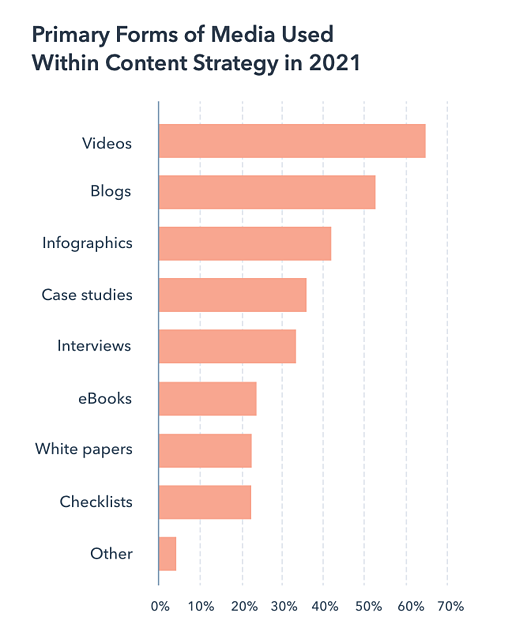
When you’re sifting through your News Feed, what tends to catch your attention? More likely than not, it’s YouTube videos, pictures, animated GIFs, and other visual content, right?
While text-based content is always important when seeking answers to a question, creating visuals such as infographics, charts, graphs, animated GIFs, and other shareable images can do wonders for catching your readers’ attention and enhancing your article or report.
I know what you might be thinking: “I don’t know how to design awesome visuals. I’m not creative.”
Hi. I’m Bethany, and I will be the first to tell you that I’m not naturally artistic. And yet, I found a strength in data visualization at HubSpot, where I’ve spent most of my days creating infographics and other visuals for blog posts.
So, while I wouldn’t say I’m naturally artistic, I have learned how to create compelling visual content. So can you.
And you can do this by learning color theory. Consider this your introductory course, and we’ll be covering the following topics:
What is color theory?
Color theory is the basis for the primary rules and guidelines that surround color and its use in creating aesthetically pleasing visuals. By understanding color theory basics, you can begin to parse the logical structure of color for yourself to create and use color palettes more strategically. The result means evoking a particular emotion, vibe, or aesthetic.
While there are many tools out there to help even the most inartistic of us to create compelling visuals, graphic design tasks require a little more background knowledge on design principles.
Take selecting the right color combination, for instance. It’s something that might seem easy at first but when you’re staring down a color wheel, you’re going to wish you had some information on what you’re looking at. Understanding how colors work together, the impact they can have on mood and emotion, and how they change the look and feel of your website is critical to help you stand out from the crowd — for the right reasons.
From effective CTAs to sales conversions and marketing efforts, the right color choice can highlight specific sections of your website, make it easier for users to navigate, or give them a sense of familiarity from the first moment they click through.
But it’s not enough to simply select colors and hope for the best — from color theory to moods and schemes, finding the right HTML color codes, and identifying web-accessible colors for products and websites, the more you know about using color, the better your chances are for success.
Read on for our designer’s guide to color theory, color wheels, and color schemes for your site.
Color Theory 101
Let’s first go back to high school art class to discuss the basics of color.
Remember hearing about primary, secondary, and tertiary colors? They’re pretty important if you want to understand, well, everything else about color.
Primary Colors
Primary colors are those you can’t create by combining two or more other colors together. They’re a lot like prime numbers, which can’t be created by multiplying two other numbers together.
There are three primary colors:
Think of primary colors as your parent colors, anchoring your design in a general color scheme. Any one or combination of these colors can give your brand guardrails when you move to explore other shades, tones, and tints (we’ll talk about those in just a minute).
When designing or even painting with primary colors, don’t feel restricted to just the three primary colors listed above. Orange isn’t a primary color, for example, but brands can certainly use orange as their dominant color (as we at HubSpot know this quite well).
Knowing which primary colors create orange is your ticket to identifying colors that might go well with orange — given the right shade, tone, or tint. This brings us to our next type of color …
Secondary Colors
Secondary colors are the colors that are formed by combining any two of the three primary colors listed above. Check out the color theory model above — see how each secondary color is supported by two of the three primary colors?
There are three secondary colors: orange, purple, and green. You can create each one using two of the three primary colors. Here are the general rules of secondary color creation:
- Red + Yellow = Orange
- Blue + Red = Purple
- Yellow + Blue = Green
Keep in mind that the color mixtures above only work if you use the purest form of each primary color. This pure form is known as a color’s hue, and you’ll see how these hues compare to the variants underneath each color in the color wheel below.
Tertiary Colors
Tertiary colors are created when you mix a primary color with a secondary color.
From here, color gets a little more complicated, and if you want to learn how the experts choose color in their design, you’ve got to first understand all the other components of color.
The most important component of tertiary colors is that not every primary color can match with a secondary color to create a tertiary color. For example, red can’t mix in harmony with green, and blue can’t mix in harmony with orange — both mixtures would result in a slightly brown color (unless of course, that’s what you’re looking for).
Instead, tertiary colors are created when a primary color mixes with a secondary color that comes next to it on the color wheel below. There are six tertiary colors that fit this requirement:
- Red + Purple = Red-Purple (magenta)
- Red + Orange = Red-Orange (vermillion)
- Blue + Purple = Blue-Purple (violet)
- Blue + Green = Blue-Green (teal)
- Yellow + Orange = Yellow-Orange (amber)
- Yellow + Green = Yellow-Green (chartreuse)
The Color Theory Wheel
Okay, great. So now you know what the “main” colors are, but you and I both know that choosing color combinations, especially on a computer, involves a much wider range than 12 basic colors.
This is the impetus behind the color wheel, a circle graph that charts each primary, secondary, and tertiary color — as well as their respective hues, tints, tones, and shades. Visualizing colors in this way helps you choose color schemes by showing you how each color relates to the color that comes next to it on a rainbow color scale. (As you probably know, the colors of a rainbow, in order, are red, orange, yellow, green, blue, indigo, and violet.)
When choosing colors for a color scheme, the color wheel gives you opportunities to create brighter, lighter, softer, and darker colors by mixing white, black, and gray with the original colors. These mixes create the color variants described below:
Hue
Hue is pretty much synonymous with what we actually mean when we said the word “color.” All of the primary and secondary colors, for instance, are “hues.”
Hues are important to remember when combining two primary colors to create a secondary color. If you don’t use the hues of the two primary colors you’re mixing together, you won’t generate the hue of the secondary color. This is because a hue has the fewest other colors inside it. By mixing two primary colors that carry other tints, tones, and shades inside them, you’re technically adding more than two colors to the mixture — making your final color dependent on the compatibility of more than two colors.
If you were to mix the hues of red and blue together, for instance, you’d get purple, right? But mix a tint of red with the hue of blue, and you’ll get a slightly tinted purple in return.
Shade
You may recognize the term “shade” because it’s used quite often to refer to light and dark versions of the same hue. But actually, a shade is technically the color that you get when you add black to any given hue. The various “shades” just refer to how much black you’re adding.
Tint
A tint is the opposite of a shade, but people don’t often distinguish between a color’s shade and a color’s tint. You get a different tint when you add white to a color. So, a color can have a range of both shades and tints.
Tone (or Saturation)
You can also add both white and black to a color to create a tone. Tone and saturation essentially mean the same thing, but most people will use saturation if they’re talking about colors being created for digital images. Tone will be used more often for painting.
With the basics covered, let’s dive into something a little more complicated — like additive and subtractive color theory.
Additive & Subtractive Color Theory
If you’ve ever played around with color on any computer program, you’ve probably seen a module that listed RGB or CMYK colors with some numbers next to the letters.
Ever wondered what those letters mean?
CMYK
CMYK stands for Cyan, Magenta, Yellow, Key (Black). Those also happen to be the colors listed on your ink cartridges for your printer. That’s no coincidence.
CMYK is the subtractive color model. It’s called that because you have to subtract colors to get to white. That means the opposite is true — the more colors you add, the closer you get to black. Confusing, right?
Think about printing on a piece of paper. When you first put a sheet in the printer, you’re typically printing on a white piece of paper. By adding color, you’re blocking the white wavelengths from getting through.
Then, let’s say you were to put that printed piece of paper back into the printer, and print something on it again. You’ll notice the areas that have been printed on twice will have colors closer to black.
I find it easier to think about CMYK in terms of its corresponding numbers. CMYK works on a scale of 0 to 100. If C=100, M=100, Y=100, and K=100, you end up with black. But, if all four colors equal 0, you end up with true white.
RGB
RGB color models, on the other hand, are designed for electronic displays, including computers.
RGB stands for Red, Green, Blue, and is based on the additive color model of light waves. This means, the more color you add, the closer you get to white. For computers, RGB is created using scales from 0 to 255. So, black would be R=0, G=0, and B=0. White would be R=255, G=255, and B=255.
When you’re creating color on a computer, your color module will usually list both RGB and CMYK numbers. In practice, you can use either one to find colors, and the other color model will adjust accordingly.
However, many web programs will only give you the RGB values or a HEX code (the code assigned to color for CSS and HTML). So, if you’re designing digital images or for web design, RGB is probably your best bet for choosing colors.
You can always convert the design to CMYK and make adjustments should you ever need it for printed materials.
The Meaning of Color
Along with varying visual impact, different colors also carry different emotional symbolism.
- Red — typically associated with power, passion, or energy, and can help encourage action on your site
- Orange — joy and enthusiasm, making it a good choice for positive messaging
- Yellow — happiness and intellect, but be wary of overuse
- Green — often connected to growth or ambition, green can help give the sense that your brand is on the rise
- Blue — tranquility and confidence, depending on the shade — lighter shades provide a sense of peace, darker colors are more confident
- Purple — luxury or creativity, especially when used deliberately and sparingly on your site
- Black — power and mystery, and using this color can help create necessary negative space
- White — safety and innocence, making it a great choice to help streamline your site
Worth noting? Different audiences may perceive colors differently. The meanings listed above are common for North American audiences, but if your brand moves into other parts of the world, it’s a good idea to research how users will perceive particular colors. For example, while red typically symbolizes passion or power in the United States, it’s considered a color of mourning in South Africa.
While it’s possible to create your website using a combination of every color under the rainbow, chances are the final product won’t look great. Thankfully, color experts and designers have identified seven common color schemes to help jumpstart your creative process.
Let’s examine each in more detail.
1. Monochromatic
Monochromatic color schemes use a single color with varying shades and tints to produce a consistent look and feel. Although it lacks color contrast, it often ends up looking very clean and polished. It also allows you to easily change the darkness and lightness of your colors.
Monochromatic color schemes are often used for charts and graphs when creating high contrast isn’t necessary.
Check out all the monochromatic colors that fall under the red hue, a primary color.
2. Analogous
Analogous color schemes are formed by pairing one main color with the two colors directly next to it on the color wheel. You can also add two additional colors (which are found next to the two outside colors) if you want to use a five-color scheme instead of just three colors.
Analogous structures do not create themes with high contrasting colors, so they’re typically used to create a softer, less contrasting design. For example, you could use an analogous structure to create a color scheme with autumn or spring colors.
This color scheme is great for creating warmer (red, oranges, and yellows) or cooler (purples, blues, and greens) color palettes like the one below.
Analogous schemes are often used to design images rather than infographics or bar charts as all of the elements blend together nicely.
3. Complementary
You may have guessed it, but a complementary color scheme is based on the use of two colors directly across from each other on the color wheel and relevant tints of those colors.
The complementary color scheme provides the greatest amount of color contrast. Because of this, you should be careful about how you use the complementary colors in a scheme.
It’s best to use one color predominantly and use the second color as accents in your design. The complementary color scheme is also great for charts and graphs. High contrast helps you highlight important points and takeaways.
4. Split Complementary
A split complementary scheme includes one dominant color and the two colors directly adjacent to the dominant color’s complement. This creates a more nuanced color palette than a complementary color scheme while still retaining the benefits of contrasting colors.
The split complementary color scheme can be difficult to balance because unlike analogous or monochromatic color schemes, the colors used all provide contrast (similar to the complementary scheme).
The positive and negative aspect of the split complementary color model is that you can use any two colors in the scheme and get great contrast … but that also means it can also be tricky to find the right balance between the colors. As a result, you may end up playing around with this one a bit more to find the right combination of contrast.
5. Triadic
Triadic color schemes offer high contrasting color schemes while retaining the same tone. Triadic color schemes are created by choosing three colors that are equally placed in lines around the color wheel.
Triad color schemes are useful for creating high contrast between each color in a design, but they can also seem overpowering if all of your colors are chosen on the same point in a line around the color wheel.
To subdue some of your colors in a triadic scheme, you can choose one dominant color and use the others sparingly, or simply subdue the other two colors by choosing a softer tint.
The triadic color scheme looks great in graphics like bar or pie charts because it offers the contrast you need to create comparisons.
6. Square
The square color scheme uses four colors equidistant from each other on the color wheel to create a square or diamond shape. While this evenly-spaced color scheme provides substantial contrast to your design, it’s a good idea to select one dominant color rather than trying to balance all four.
Image Source
Square color schemes are great for creating interest across your web designs. Not sure where to start? Pick your favorite color and work from there to see if this scheme suits your brand or website. It’s also a good idea to try square schemes against both black and white backgrounds to find the best fit.
Image Source
7. Rectangle
Also called the tetradic color scheme, the rectangle approach is similar to its square counterpart but offers a more subtle approach to color selection.
Image Source
As you can see in the diagram above, while the blue and red shades are quite bold, the green and orange on the other side of the rectangle are more muted, in turn helping the bolder shades stand out.
Image Source
No matter which color scheme you choose, keep in mind what your graphic needs. If you need to create contrast, then choose a color scheme that gives you that. On the other hand, if you just need to find the best “versions” of certain colors, then play around with the monochromatic color scheme to find the perfect shades and tints.
Remember, if you build a color scheme with five colors, that doesn’t mean you have to use all five. Sometimes just choosing two colors from a color scheme looks much better than cramming all five colors together in one graphic.
1. Prioritize the user experience, first.
Before you add color to your website, app, product, or packaging, get the basic design downpat in greyscale.
This lets you focus on what matters most: User experience. Instead of focusing on the color scheme of your overall site or the hue of specific buttons or links, make sure everything works like it’s supposed to. Make sure links aren’t broken, product pages are up-to-date and email opt-ins are ready to go.
Here’s why: Even the best-looking website or product with perfect color selection won’t be enough to keep visitors if they can’t find what they’re looking for.
2. Leverage natural inspiration.
Once your site operations are solid, it’s time to start selecting colors.
Not sure what looks good? Take a look outside. Nature is the best example of colors that complement each other — from the green stems and bright blooms of flowering plants to azure skies and white clouds, you can’t go wrong pulling context from natural colors and combinations.
3. Set a mood for your color scheme.
With a few color choices in mind, consider the mood you want your color scheme to set. If passion and energy are your priorities, lean more toward red or brighter yellows. If you’re looking to create a feeling of peace or tranquility, trend toward lighter blues and greens.
It’s also worth thinking negatively. This is because negative space — in either black or white — can help keep your design from feeling too cluttered with color.
4. Consider color context.
It’s also worth considering how colors are perceived in contrast.
In the image below, the middle of each of the circles is the same size, shape, and color. The only thing that changes is the background color.
Yet, the middle circles appear softer or brighter depending on the contrasting color behind it. You may even notice movement or depth changes just based on one color change.
This is because the way in which we use two colors together changes how we perceive it. So, when you’re choosing colors for your graphic designs, think about how much contrast you want throughout the design.
For instance, if you were creating a simple bar chart, would you want a dark background with dark bars? Probably not. You’d most likely want to create a contrast between your bars and the background itself since you want your viewers to focus on the bars, not the background.
5. Refer to your color wheel.
Next, consider your color wheel and the schemes mentioned above. Select a few different color combinations using schemes such as monochrome, complementary, and triad to see what stands out.
Here, the goal isn’t to find exactly the right colors on the first try and create the perfect design, but rather to get a sense of which scheme naturally resonates with your personal perception and the look of your site.
You may also find that schemes you select that look good in theory don’t work with your site design. This is part of the process — trial and error will help you find the color palette that both highlights your content and improves the user experience.
6. Use the 60-30-10 rule.
Often used in home design, the 60-30-10 rule is also useful for website or app design. The idea here is to use three colors: A main color for 60% of your design, a secondary color for 30% of your design and an accent color for the last 10%.
While these aren’t hard-and-fast numbers, they help give a sense of proportion and balance to your site by providing a primary color with secondary and accent colors that all work together.
7. Draft multiple designs.
Draft and apply multiple color designs to your website and see which one(s) stand out. Then, take a step back, wait a few days and check again to see if your favorites have changed.
Here’s why: While many designers go in with a vision of what they want to see and what looks good, the finished product often differs on digital screens that physical color wheels — what seemed like a perfect complement or an ideal color pop may end up looking drab or dated.
Don’t be afraid to draft, review, draft again and throw out what doesn’t work — color, like website creation, is a constantly-evolving art form.
Put simply? Practice makes perfect. The more you play with color and practice design, the better you get. No one creates their masterpiece the first time around.
Color Tools
There’s been a lot of theory and practical information for actually understanding which colors go best together and why. But when it comes down to the actual task of choosing colors while you’re designing, it’s always a great idea to have tools to help you actually do the work quickly and easily.
Luckily, there are a number of tools to help you find and choose colors for your designs.
Adobe Color
One of my favorite color tools to use while I’m designing anything — whether it’s an infographic or just a pie chart — is Adobe Color (previously Adobe Kuler).
This free online tool allows you to quickly build color schemes based on the color structures that were explained earlier in this post. Once you’ve chosen the colors in the scheme you’d like, you can copy and paste the HEX or RGB codes into whatever program you’re using.
It also features hundreds of premade color schemes for you to explore and use in your own designs. If you’re an Adobe user, you can easily save your themes to your account.
Illustrator Color Guide
I spend a lot of time in Adobe Illustrator, and one of my most-used features is the color guide. The color guide allows you to choose one color, and it will automatically generate a five-color scheme for you. It will also give you a range of tints and shades for each color in the scheme.
If you switch your main color, the color guide will switch the corresponding colors in that scheme. So if you’ve chosen a complementary color scheme with the main color of blue, once you switch your main color to red, the complementary color will also switch from orange to green.
Like Adobe Color, the color guide has a number of preset modes to choose the kind of color scheme you want. This helps you pick the right color scheme style within the program you’re already using.
After you’ve created the color scheme that you want, you can save that scheme in the “Color Themes” module for you to use throughout your project or in the future.
Preset Color Guides
If you’re not an Adobe user, you’ve probably used Microsoft Office products at least once. All of the Office products have preset colors that you can use and play around with to create color schemes. PowerPoint also has a number of color scheme presets that you can use to draw inspiration for your designs.
Where the color schemes are located in PowerPoint will depend on which version you use, but once you find the color “themes” of your document, you can open up the preferences and locate the RGB and HEX codes for the colors used.
You can then copy and paste those codes to be used in whatever program you’re using to do your design work.
Finding the Right Color Scheme
There’s a lot of theory in this post, I know. But when it comes to choosing colors, understanding the theory behind color can do wonders for how you actually use color. This can make creating branded visuals easy, especially when using design templates where you can customize colors.
Editor’s note: This post was originally published in October 2018 and has been updated for comprehensiveness.