Categories B2B

13 Confirmation Email Examples I Love (For Your Inspiration)

I once signed up for an event and totally forgot about it in an hour. But when I opened my inbox later in the day, I found a shiny email confirming my registration for the event.

This confirmation email reminded me about the event with all the necessary context. It also gave me the option to add the webinar to my calendar — so that I wouldn’t forget it again.

It linked the speakers’ social profiles to connect with them beforehand.

Win, win, and win!

That’s just a small glimpse of the impact confirmation emails can create for you.

If you’re looking for some inspiration, I’ve curated a list of 13 awesome confirmation email examples with a few best practices to help you get started.

We’ll cover:

→ Download Now: The Beginner's Guide to Email Marketing [Free Ebook]

13 Best Confirmation Email Examples to Emulate

Let’s break down some of the best confirmation email examples to give you some awesome inspiration for creating your own. I’ve sourced different types of confirmation emails and will highlight what I liked in each one.

1. B2B Bite

This subscription confirmation email for Jason Bradwell’s newsletter is one of the best I’ve ever read. Bradwell is a B2B marketer specializing in podcast marketing for SaaS brands.

With this welcome email, he gives you a warm welcome into his newsletter, B2B Bite, and sets the stage for future editions.

The email expresses gratitude for subscribing. And it also gives you the option to unsubscribe without any hard feelings!

What I like: This email maintains a warm and positive tone all throughout. It invites people to follow Bradwell on other platforms and spread the word about his newsletter — all without sounding pushy or promotional.

More importantly, the email gives you a record of which ID you signed up with, the source, and everything you submitted while subscribing.

2. Superside

I found this awesome registration confirmation email from Superside for one of their webinars. Unlike the usual registration emails, this example has lots of color, visuals, and appeal to it.

The cover image gives you all the crucial details about the event upfront. And the body text shares more helpful insights for attendees.

What I like: The email shares detailed instructions to make it super convenient for folks to join the webinar. From completing the next steps to adding the event to your calendar, you have everything in one place.

Plus, the message ends with a gentle nudge to invite others to the show and connect with the speaker (Tracey Wallace) on Twitter. A perfect, polite way for them to grow awareness without being pushy.

3. The Saturday Solopreneur

When I subscribed to Justin Welsh’s newsletter, I expected a standard confirmation email like most other creators. But this email stood out in my inbox because Welsh shares such a wonderful note to welcome new subscribers.

Welsh is a content creator and business consultant for solopreneurs. With this email, he shares a perfect message to learn more about him and what you can expect from the newsletter.

What I like: The first thing I noticed was how neatly formatted and scannable this email looks.

Besides the core message, I love that the email also invites you to share a few things about yourself — making it a two-way conversation. The best part: The message sets clear expectations for future editions of this newsletter.

4. Demostack

Demostack’s email confirming my registration for their Demo HQ Day event is another great example to emulate. It has a minimal design with hardly any text.

That way, you can quickly note the event details and join the webinar with a single click.

What I like: This is a great example of a confirmation email if you’re a sucker for minimal design. The email isn’t overloaded with text but shares only one guideline for attendees.

It also includes the event’s cover image to create brand recall in case people come across more posts on social media.

Plus, there’s an option to quickly add the event to your calendar on Google, Outlook, or Yahoo.

5. Thriving Virtual Bookkeeper Blueprint

Another confirmation email example comes from Thriving Virtual Bookkeeper Blueprint. This is a text-only email sent to confirm participation in a webinar.

It re-iterates the purpose of the webinar and shares specifics about where and when it’ll happen. Shoutout to Ayman Nazish from Analyzify for contributing this example!


What I like: Not every marketer has the design skills to create beautiful emails. This example works best if you don’t have the skills, resources, or time to design a fancy confirmation email. Simply follow this structure:

  • Welcome invite.
  • Confirm registration.
  • Name and purpose of the event.
  • Time and link/venue to attend.

6. Notion

I received another email confirming my registration for a meet-and-greet event hosted by Notion’s Bangalore chapter. This email had all the necessary details about the event and shared a few guidelines for those attending.

The message also included a form for participants to provide some information to the event organizers — so you know they’ll personalize the experience for you.

What I like: One of the best things about this confirmation email was how scannable it looks. It uses emojis and text highlights to make the message quickly readable.

The email also gives you a couple of guidelines without making it overwhelming for attendees.

What I particularly liked about this email was the element of surprise. The Notion team kept the venue a surprise and only revealed the location in this confirmation email. So, attendees had to open the email to know where to go — clever!

7. Wild Alaskan Company

Most order confirmation emails are purely transactional, with details about the items you’ve shopped for.

But this email from Wild Alaskan Company is an impressive example of how you can build a strong rapport with customers from the start.

It’s a personal note from the brand’s founder where he shares anecdotes from his own life that led to the creation of this brand. It also includes key details about the subscription with links to learn more about the company.

Shoutout to Corina from ZeroBounce for contributing this example!

What I like: The warm and personal tone of this message makes the email unique and memorable. Unlike other order confirmation emails, this one tells you a story — along with other order details — to get customers pumped about starting a subscription.

8. Whale

If you want to make your registration confirmation emails a part of Gmail’s native interface, then this email from Whale is an excellent example.

The team creatively used the “add a note” feature in Google Calendar to send personalized invites with all the details about the event.

What I like: This is such an easy example to emulate because you can send a Gmail-native invite and add some additional context for the event.

I liked how Stijn, Whale’s CEO, shared the key themes he’ll cover in the webinar and how it’ll help attendees.

9. Investors Club

Here’s an example of a confirmation email from Investors Club’s newsletter subscription.

The email shares details about the number of emails subscribers will receive every week and the themes they’ll cover. It also includes an option to manage email preferences to opt out of any of these emails.

The clear language and structure make it super easy to read, even if you’re in a hurry.

Shoutout to Elena Buetler from Investors Club for contributing this example!

What I like: It’s a great confirmation email template for companies that send multiple weekly emails. Instead of overwhelming people with one email after another, you can inform them right away about all the emails you’ll send.

And the chance to opt out of any of these emails is a great add-on.

10. Marketing Examples

Harry Dry’s Marketing Examples newsletter is popular among marketers. But you can also learn a thing or two from his newsletter confirmation email. It’s crisp, clear, and clever.

Dry is a marketer and messaging expert known for his neatly curated newsletters with several examples. In this message, he tells you the cadence with which he sends each edition and nudges you to respond to the email to get all of them in your primary inbox.

What I like: I love how this confirmation email is short yet meaningful. He mentions the effort it takes him to create each edition so you can know you’re getting value-packed emails.

He also adds a link to another newsletter for subscribers to explore more content.

11. Nouveau

If you need a template to create appointment confirmation emails, then follow this example from Nouveau. This short email only has four elements:

  • Brand logo.
  • Appointment details.
  • A quick note from the business.
  • The exact location to visit.

It also has options to contact the brand and add this appointment to my calendar.

What I like: I like how this confirmation email includes all the essential details I need when booking an appointment. This helps me plan my schedule without feeling confused or overwhelmed with any detail.

12. Connor Gillivan

This confirmation email example from Connor Gillivan welcomed me as a new subscriber to his newsletter. Gillivan is an SEO expert and runs an SEO-focused agency, TrioSEO.

This email follows a different structure, where Gillivan first talks a bit about himself and his career. The second half of the message shares the type of content he’ll share and what you’ll learn from his newsletter.

What I like: This email has a great structure. It tells me two things about the newsletter:

  • Who’s the creator.
  • What’s in it for me.

Gillivan also builds credibility for himself by adding links to his work and past projects. I can also check out more resources to learn from him.

13. Trunk Club Custom

While looking for appointment confirmation emails, I came across this awesome example from Trunk Club Custom. The message starts with a note from the brand about their clothes and what they’re offering.

The email also includes details about when and where your appointment will happen.

What I like: The best part about this email is its design. I love that the email has two distinct sections. The first includes a note from the brand and an image. The other offers specific details about the appointment and guidelines.

How to Write a Confirmation Email: An Actionable Playbook

Ready to create confirmation emails for your brand?

Let’s discuss a few best practices to help you write confirmation emails for different use cases, like subscriptions, registrations, appointments, and more.

Create a structure.

Prepare the groundwork for your confirmation emails by creating a layout and visualizing this structure.

Whether you’re designing emails or writing a simple text message, you need a structure defining what details you’ll share first and which ones will come later.

Include all necessary information.

Double-check that your confirmation email contains all the information the recipient will need to follow through with whatever they just signed up for. If it is a webinar, event, appointment, or meeting, include the time and location or link.

Outline any further steps that are required of the recipient, such as replying to the email, making a payment, confirming the appointment, or responding to a survey.

Make it personal.

When writing the email copy, keep the tone personal and welcoming. Your emails should create a sense of excitement and encourage people to learn more about you or your brand.

So, share a story or add pictures to create a personal appeal in your emails.

Add some personality.

Don’t make confirmation emails boring. Write quirky copy to add some personality to these emails and use emojis to call out specific details (if this aligns with your brand identity).

You can use pop-culture references (just be sure your audience is aware of them) and add punch lines to make these emails memorable.

Emphasize user convenience.

Always think from the users’ perspective to deliver a convenient experience. If you’re sending an on-site appointment confirmation email, include your location and contact details.

If you’re sending an event invite confirmation, include options to add the event to the calendar. If you’re sending a subscription confirmation email, be sure to make unsubscribing or managing emails easy.

Promote your brand (gently).

Include links to your social media pages and/or website, ask recipients to share your offering with their friends and colleagues, or tell some of your company’s story.

These things are not the focus of a confirmation email, but it’s never a bad idea to drop these details into an email that is most likely to be opened by recipients.

Automate confirmation emails.

Besides these best practices, remember that automation is your best friend for sending confirmation emails. You can’t manually send emails to everyone who registers for your event or books an appointment.

Instead, you need a powerful email automation tool like HubSpot to automatically trigger emails when people take a defined action.

Simply set up your email template with personalized fields, and HubSpot will send the mails when triggered.

Your Appointment is Confirmed!

You’re all set to create confirmation emails for your events, newsletters, and other use cases. Save any of these examples for future reference.

Remember to start by creating a structure for your email template. Then, write user-friendly copy to resonate with your audience. Finally, use HubSpot’s email automation tool to schedule your emails for the right triggers.

New Call-to-action

Categories B2B

50 Ecommerce Statistics To Know in 2024 [New Data]

Ecommerce is businesses selling products online, and people buying those products online.

Consumers and businesses alike are making more and more purchases online, and that’s only expected to increase, especially so on social media.

Download Now: Free State of Marketing Report [Updated for 2024]

Below I’ve compiled a list of ecommerce statistics that will help you understand the potential impact of using the practice, as well as its growth potential throughout 2024 and beyond.

Table of Contents


General Ecommerce Statistics

  1. The average number of products bought per online order is 4.95. (Statista, 2023)

  2. The global conversion rate of online shoppers is 1.9%. (Statista, 2023)

  3. High-performing retail businesses are more likely to invest a given amount of their sales in digital and ecommerce. (Boston Consulting Group, 2023)

  4. A majority of social media marketers (68%) use social media to drive traffic to products on its own website. (HubSpot, 2024)

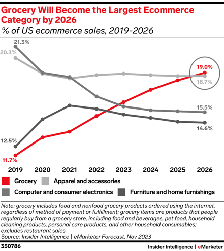
  5. eMarketer predicts that Grocery will become the largest ecommerce category in the U.S. by 2026. (eMarketer, 2024)

    grocery ecommerce-1
    Image Source

  6. There was a 20% increase in consumers shifting to ecommerce channels in 2020. (McKinsey, 2023)The average cart abandonment rate is 70.19%. (Baymard, 2023)

  7. Amazon is the biggest e-commerce company worldwide with a 1.34 trillion USD market cap. (Statista, 2023)

  8. Free delivery is the main reason 45% of shoppers head online. (Data Reportal, 2023)

  9. Most marketers say they have an employee responsible for managing social commerce. (HubSpot, 2024)


Social Media Ecommerce Statistics

  1. 87% of sellers say social selling has been effective for their business this year. (HubSpot, 2023)

  2. 59% of social sellers say their company is making more sales through social media this year than last year. (HubSpot, 2023) 

    social media accounting for more sales-1
    Image Source

  3. High performing salespeople are 12% more likely to use social media when selling. (HubSpot, 2024)

  4. More than half of social media marketers use social media to sell products directly within social media apps. (HubSpot, 2024)

  5. 50% of marketers plan to increase their investment in selling products directly in social media apps in 2024. (HubSpot, 2024)

  6. Facebook, Instagram, and YouTube are the platforms social media marketers most commonly use for social selling. (HubSpot, 2024)

  7. Instagram, TikTok, and Facebook offer the highest ROI for social selling. (HubSpot, 2024)

  8. Social media is 3rd place in terms of channels where consumers are most receptive to advertising. (Integral Ad Science, 2024)

  9. Social media marketers who sell products directly through social media apps say Facebook and YouTube have the highest ROI. (HubSpot, 2024)

Ecommerce Growth Statistics

  1. Retail ecommerce sales are projected to reach more than eight trillion dollars by 2027. (Statista, 2023)

  2. 84% of social media marketers predict that, in 2024, consumers will buy products from brands directly in social media apps more than third-party websites and brand websites. (HubSpot, 2024)

  3. Gartner predicts that 80% of B2B sales interactions will occur on digital channels by 2025. (Gartner, 2020)

  4. eMarketer predicts that global retail media ad spend will reach $140 billion this year, which makes up 20.3% of all digital ad spend. (eMarketer, 2023)

  5. The revenue in the US ecommerce market is forecasted to increase by 475 billion USD between 2024 and 2028. (Statista, 2023)


Consumer Behavior and Demographic Ecommerce Statistics

  1. 19% of consumers have reached out to customer service via DMs in the past 3 months, up 45% from 2022. (HubSpot, 2023)

    social media dms image
    Image Source

  2. A majority of consumers (82%) say they’re satisfied with their most recent social shopping experience. (HubSpot, 2023)

  3. Adults aged 18 to 24 make up the largest share of ecommerce shoppers in the U.S. (Statista, 2023)

  4. China has the highest number of consumers shopping on social networks. (Statista, 2023)

  5. The total revenue of online retail in Asian countries totaled 1.7 trillion USD in 2023. (Statista, 2023)

  6. The most common reason for cart abandonment among consumers is extra costs for things like shipping and taxes. Needing to create an account is the 2nd. (Forbes, 2023)

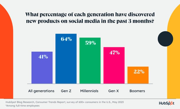
  7. Gen Z, Millennials, and Gen X prefer finding products on social media over any other channel. (HubSpot, 2023) 

    consumer social media product discoveryImage Source

  8. Just 47% of social media users feel comfortable buying through social media apps. (HubSpot, 2023)

  9. 42% of consumers trust social media platforms with their personal card information. (HubSpot, 2023)

  10. Facebook wins among social media users when it comes to social media shopping. It’s the most popular app for in-app purchases, they say it offers the best in-app shopping experience, and it’s the most trusted. (HubSpot, 2023)

  11. TikTok is the least trusted platform among consumers for in-app shopping. (HubSpot, 2023)

  12. A majority of consumers only somewhat agree that the products they buy directly on social media will come as described/depicted. (HubSpot, 2023)

  13. The main concern consumers have about buying products directly within social media platforms is that the sellers aren’t legitimate companies/are a scam. (HubSpot, 2023)


B2B Ecommerce Statistics

  1. 79% of B2B buyers say they prefer to place repeat orders online. (Sana Commerce, 2023)

  2. The main hurdle B2B buyers face with online purchasing is lack of accurate information on delivery times. (Sana Commerce, 2023)

  3. 65% of B2B companies across all industries offer ecommerce capabilities. (McKinsey, 2023)

  4. 80% of B2B companies say they hold their ecommerce channel to the same or higher standard as other channels. (McKinsey, 2023)

  5. More than 1/3 of B2B buyers say they’re willing to spend $500,000 or more on digital channels, and 15% say they’re comfortable making purchases of more than $1 million online. (McKinsey, 2023)


B2C Ecommerce Statistics

  1. Global B2C ecommerce revenue is projected to grow to 5.5 trillion USD by 2027. (International Trade Administration, 2024)

  2. The most popular B2C e-commerce segments are consumer electronics, fashion, and furniture. (International Trade Administration, 2024)


Mobile Ecommerce Statistics

  1. Smartphones account for 66% of online orders. (Statista, 2023)

  2. Mobile retail e-commerce sales in the U.S. are expected to reach more than 560 billion by the end of 2024. (Statista, 2023)

  3. Mobile Retail ecommerce sales in the U.S. will exceed 450 billion USD by the end of 2024. (Statista, 2024)

  4. Apple Pay is the most used mobile payment format among U.S. consumers. (Statista, 2023)

  5. 60% of US adults believe that mobile shopping is a necessity for online shopping convenience. (eMarketer, 2022)

  6. 80% of consumers worldwide visit a retailer’s website from their smartphone while shopping in-store. (eMarketer, 2023)

  7. Business Insider predicts that mobile commerce will account for 42.9% of e-commerce sales in 2024. (Business Insider, 2022)

state-of-marketing-2024

Categories B2B

9 Sponsorship Email Examples I Love (For Your Inspiration)

When I was working as an in-house marketer, our team spent months in preparation for a massive industry event.

In the run-up to the big day, one of the biggest challenges was finding sponsors for the show.

Emails went unanswered. Pitches were ignored. Nothing seemed to click.

That’s when we put all our creative instincts into creating the perfect sponsorship emails. And these emails secured positive responses, bringing actual sponsors for the show.

→ Download Now: Sponsorship Proposal Template

If you’re struggling to find sponsors for your next big show, I’ve been where you are. That’s why I’ve curated nine of the best sponsorship email examples to help you perfect your pitch and bag that sponsorship.

We’ll cover:

The Best Sponsorship Request Email Examples

Let’s look at these nine excellent sponsorship email examples and learn different elements you can emulate. I’ve collected a few real-life email examples and sponsorship email templates you can customize.

1. WTSFest

sponsorship email example from Women in Tech SEO festival

Areej AbuAli, the founder of Women in Tech SEO, hosts the WTSFest every year. This on-site event happens in multiple locations and brings together 500+ women working in the field of tech SEO. Areej shared this email she sent to a potential sponsor interested in contributing to this event.

What I Liked About This Sponsorship Email

This is a winning email because of its brevity. The message opens with a quick elevator pitch for the event. Areej gets straight to the point and briefly highlights what makes WTSFest a unique opportunity for the potential sponsor.

The email takes only a couple of sentences to zoom in on the biggest value proposition for sponsors: one of a kind, with an all-women speaker line-up and attendees. The brochure is a great way to share more details and answer questions/objections without making the email too wordy.

2. The Wall Street Women Forum

sponsorship email request

I found another great sponsorship email example shared by Saranya Balachandran, the Content Marketing Lead at Ionixx Technologies. Saranya sent an email exploring the possibility of sponsoring an event hosted by the Wall Street Women Forum.

On the left, you’ll see the response she received from the event organizers. This email shares a high-level overview of the event and answers the critical question: what’s in it for sponsors?

What I Liked About This Sponsorship Email

The response from the Wall Street Women Forum’s team was crisp yet detailed. It covers all the key details about the event: when, what, who, and where. Plus, sponsors can also check out the event’s agenda.

More importantly, the email specifically highlights the benefits for sponsors. It also includes a more comprehensive brochure sharing more insights that sponsors would be interested in. and I particularly liked that the message invites sponsors to get in touch with the event co-chairs to discuss more details.

3. SaaS Sponsorship

sponsorship email example template

If you think your potential sponsors are too busy to read a long email or go through a brochure, then this email can be a great template for you. It’s concise and creates interest without giving away too many details.

What I Liked About This Sponsorship Email

This example works great if you want to keep your message simple and short. It’s a brief pitch inviting potential sponsors to explore opportunities over a chat. So, the email highlights only essential information sponsors need: what’s the event for and what the key benefits are.

4. Healthcare Sponsorship

sponsorship email examples, healthcare sponsorship

I believe emails requesting sponsorships should have two parts:

  • What the event is about.
  • Why sponsors should care.

This email template addresses both parts well. It gives you a brief description of the event, attendees, and themes to be covered. And it gives you three clear points of what you get as a sponsor.

What I Liked About This Sponsorship Email

I love that this email is easily scannable and delivers a convincing pitch, even if you skim through the message. It also has a personal tone with first-person pronouns and nudges sponsors to explore possibilities for contributing to the show.


5. Big Event Sponsorship

sponsorship email examples, big event sponsorship

Big events typically include sponsors in different tiers with varying packages and benefits. If you’re targeting sponsors for multiple levels/tiers, then this email is great to give people a quick overview of the event. It encourages them to check out the brochure or deck and learn more about different packages.

What I Liked About This Sponsorship Email

If you’re doing cold email outreach to find sponsors, you have to set some context around who you are and why you’re reaching out. I like this example because it starts by establishing credibility for the sender.

The message doesn’t beat around the bush. Instead, it takes very few words to emphasize the main CTA (view sponsorship packages). And it ends by highlighting that it’s a location-specific event — an important detail for companies trying to enter this territory or build their stronghold.

6. Data Analytics Event

sponsorship email examples, data analytics sponsorship

While most sponsorship request emails rinse and repeat the same set of benefits, this example takes a different approach. It explains how companies can strengthen their brand image and reinforce their business values by sponsoring the event.

The message essentially banks on the quality and central theme of the event rather than highlighting flashy marketing and similar perks.

What I Liked About This Sponsorship Email

This email positively influences companies to sponsor the event by highlighting how both businesses are driven by mutual values. It also gives sponsors the promise of interacting with key opinion leaders and potential customers in the industry.

7. Innovation in Fintech

sponsorship email templates

If you’re giving sponsors access to a niche audience, it’s best to lead your sponsorship request with this focus. This example is entirely centered around the fintech vertical and promises sponsors great opportunities to reach a niche audience of professionals and businesses in this space.

What I Liked About This Sponsorship Email

This email can catch sponsors’ attention with one compelling sentence: Sponsoring this Expo would position your brand at the forefront of the fintech revolution. It’s an aspirational opportunity—one that would excite brands to explore sponsorship opportunities.

The message also highlights all the benefits specifically aimed at the fintech industry. Its focused messaging stands out from generic pitches.

8. Sustainability Event

sponsorship email examples, sustainability sponsorship

What if you create a sponsorship email the same way you write a LinkedIn post? Open with an intriguing hook, contextualize your idea, make the offer, and end with a gentle CTA. I love this example because it follows this structure and delivers a compelling message without sounding pushy or too direct.

What I Liked About This Sponsorship Email

This email opens with an idea that sponsors could relate to. This opening sentence sets the stage for the event and draws readers’ attention to the rest of the pitch.

The message doesn’t spotlight the same old benefits for sponsors. Instead, it focuses on the event’s mission and how sponsors can become a critical part of this mission. It also sheds light on the audience attending the show for sponsors to see if it aligns with their business.

9. Cybersecurity for Enterprises

sponsorship email examples

I’ve also found that opening your sponsorship emails with an ambitious promise can be a creative way to reel people in. Give them a view of what they’ll achieve by contributing to your event, then share more details about how you’ll make it happen — like in this example.

What I Liked About This Sponsorship Email

I like how this example opens with a unique proposition to provoke a sense of intrigue among readers. The messaging also speaks from the sponsors’ perspective and highlights what’s in it for them. Plus, it mentions a key benefit: positioning each sponsor as a thought leader in the industry.

How to Write an Email for Sponsorship

I’ve read, analyzed, and written dozens of sponsorship emails. Some worked well, and some tanked. After evaluating all my experiments with these emails, I’ve narrowed down my best tips for writing sponsorship emails.

email for sponsorship

Emphasize your shared brand values.

High-decibel marketing campaigns won’t impress sponsors. They want to know the core values of your event and how they align with their brand.

I recommend highlighting your business values at the start of the email with a personal touch. You should show that you’ve done your research about them and understand their mission. Present these values to resonate more with your prospects and nudge them to have a conversation.

One of the biggest value-driven benefits you can highlight for sponsors is that they can get behind a cause they truly believe in.

This way, you can also build long-term partnerships with these sponsors instead of creating a transactional relationship for a one-off event.

Share specific insights about your audience.

Another decisive factor for sponsors is knowing who they’ll reach, aka the audience. You can’t simply write a line or two describing the kind of folks attending your show and call it a day. Give sponsors more context about participants and explain how they can benefit from this specific audience.

This clarity on your event audience will add more value to your sponsorship proposal. It can make your pitch instantly appealing if the audience aligns with a company’s target market.

Plus, this audience research shows you’ve put enough thought into curating a world-class experience for a highly niche group of people instead of making it open for all.

Create a sense of exclusivity.

You can increase the perceived value of the sponsorship opportunity by offering some exclusive benefits or early access to your event. Build a sense of urgency and hype to make your offer sound more exciting to prospects.

For example, you can provide exclusive rights to host the first session or early access to the tickets. This time-bound offer can also fast-track decision-making and encourage sponsors to take the spot before the opportunity goes away.

Sign off with a single call-to-action.

You should conclude your sponsorship request with a clear CTA highlighting the immediate next step. Don’t confuse readers with multiple CTAs, like “let’s discuss more” and “check out our packages.” You have to make it easy for them to proceed and learn more about this opportunity.

Remember to steer clear of pushy messaging. You have to encourage them to explore the sponsorship packages instead of using promotional words.

A Tried-and-Tested Sponsorship Email Template

Here’s a pre-made sponsorship email template you can use to create your first set of emails.

Subject: Become a sponsor for [Event]!

Hey [Sponsor’s Name],

I’ve been following [Sponsor Company] for a few years now, and I recognize your commitment to [specific values or mission]. That’s why I’m reaching out to you with an exciting opportunity to showcase your passion for this cause by becoming a part of [event name].

Here’s why I believe it’s a great opportunity for your brand:

  • Benefit #1
  • Benefit #2
  • Benefit #2

I’d love to give you the exclusive offer of [mention exclusive offer] and a platform to partner with key industry leaders and decision-makers.

Would you be keen to discuss more details about this partnership? Please book time here to learn more about our sponsorship packages.

Best,
[Your signature]

Securing Sponsorships Made Easy with Email Examples

Finding sponsors is no mean feat — and I say this from my experience of spending weeks of trial and error to secure sponsorships for our event.

But with these handpicked examples, you now know how to write sponsorship emails that make people tick and engage in further conversation.

So, bookmark this post for the next time you’re reaching out to potential sponsors and need a pinch of inspiration to write your messages.

sponsorship proposal template

Categories B2B

AI in Digital Marketing — The Complete Guide

ChatGPT and Google Bard have entered the chat. You’re missing the party if you haven’t joined the conversation around artificial intelligence (AI) in digital marketing.

Download Now: 100 ChatGPT Prompts for Marketers [Free Guide]

Perhaps you’re exploring AI on your own, or your boss asked you to report back on ways to implement AI in your work (welp!). Whatever your motivation, I’m here to help.

I’ll break down what AI in digital marketing is, how to use it, examples, pros and cons, and marketing strategies that benefit from AI.

Table of Contents

AI uses machine learning and large-language models (LLM) to analyze big data and turn it into actionable insights, automated actions, and content.

AI can even interact with customers who perform a specific behavior on your website, like clicking a button or liking a social media post.

What does this mean for you? With AI, you can analyze customer behavior, predict outcomes, automate marketing tasks, and create and personalize marketing content.

New AI tools are coming on the market every day. They promise to help marketers do their jobs faster, smarter, and more easily. Since these tools are still emerging, not every one is a home run, and the number of tools to research is overwhelming.

We’ve surveyed over 1,000 marketers to see how they use AI in their jobs and where it impacts them.

Pro tip: If you’re a HubSpot user, check out our new AI tools. We have a new content assistant and ChatSpot tools to streamline your day-to-day. Many of our features use AI, including SEO, call recordings, social media, data management, and more.

Get started with HubSpot Content Assistant.

How do digital marketers use AI?

In our survey, 64% of marketing professionals said they use AI tools in some form in their jobs, but the purpose and level of integration can vary widely. Just 21% of marketers said it’s extensively integrated into their daily workflows.

So, how are they using it? Our research found that the top three uses of AI in digital marketing are:

  1. Data analysis/reporting (used by 40% of marketers).
  2. Research, like market research or summarizing articles (39% of marketers).
  3. Content creation (38% of marketers).

Let’s take a closer look at the potential uses of AI in digital marketing.

Ways to Use AI in Digital Marketing

1. Data Analytics

Struggling to make sense of large data sets? Most digital marketing tools give you analytics, but marketers often have to export and piece together data from different platforms like puzzle pieces to get the big picture.

AI can collect and sift through large amounts of data from multiple marketing platforms and summarize the findings.

This will help you save time when strategizing and developing marketing assets for your campaigns.

Pro tip: HubSpot Sales Hub has conversational intelligence capabilities to help you understand how your team performs on customer calls through data-driven insights.

Learn how to use account-based marketing recommendations powered by AI.

2. Content Creation

Digital marketers can instruct AI to write marketing content, including captions, social media posts, email copy, and even blog copy. Beyond writing, marketers can use AI for multimedia like images, audio, and even video.

It’s important to note that most AI-generated content isn’t ready for publishing immediately. Most marketers today use generative AI as a starting point — whether that’s ideation, an outline, or a few paragraphs to ignite your creativity.

Just 6% of marketers using AI say that they publish AI-generated content with no changes. You should always fact-check, edit, and adjust AI’s writing to make it sound more human and on-brand.

Pro tip: HubSpot’s AI-powered Content Assistant helps you generate blog ideas, create outlines, and write blogs or marketing emails.

3. Reducing Admin Work

Like any professional role, digital marketers spend a significant amount of time sitting in meetings and doing administrative tasks.

HubSpot’s State of Artificial Intelligence report uncovered the number-one benefit of using AI in marketing: it saves them time.

In fact, business professionals save an average of two hours and 24 minutes per day by using AI and automation tools.

AI tools can tackle manual tasks like scheduling meetings, summarizing articles and research, and taking notes.

For example, 63% of marketers are using AI tools to take notes and summarize meetings. These functions aren’t sexy, but they free up a marketer’s time to spend on more important, creative parts of their jobs.

3. Content Personalization

Of marketers using AI, 71% say it helps them personalize the experience customers get with their company.

This means AI can change the customer’s experience depending on their online behavior or whether or not they’ve filled out a form for your company.

For example, dynamic content changes depending on the user — their name, occupation, online behavior, etc.

AI analyzes a user online and gives them a more personal experience with marketing assets, including web pages, social media posts, and emails.

6Sense is one example of a tool that leverages AI to sift through intent data. You can then understand who in your audience is looking to make a purchase so you can personalize the marketing experience.

4. Media Buying

Another way to use AI in marketing is through media buying. Gone are the days when junior media buyers hand-select websites or billboards to advertise on.

Instead, adtech platforms use AI to choose the most effective ad and media placements to reach a target audience and maximize ROI.

If you use Google Ads, you’ve already encountered the AI feature that assists with the auction process.

Other standalone AI tools like Pattern89 provide recommendations on your ad spend and enable you to target the right audience to increase performance.

Pro tip: You can also leverage AI to help you write engaging ad copy in a fraction of the time.

Campaign Assistant is a free AI-powered app that can help you generate ad copy for Google, Facebook, and LinkedIn with ease — all with just a few simple prompts.

5. Chatbots

One use of AI in marketing that we’ve seen for years is chatbots. Chatbots, created with natural language processing (NLP), can answer common questions, nurture leads, schedule demo calls, and more.

A chatbot can personalize the customer journey during the stage when they’re consuming marketing content. This tool can also answer customer questions.

Let’s look at Drift, for example. The company has trained its chatbot to answer questions, even outside of a pre-programmed path. This way, if a person has a question that isn’t loaded into the system, the user will still get an answer.

Pro tip: Looking to better understand how AI-powered chatbots can answer customer questions? HubSpot Academy can help. This course describes the difference between rule-based and AI-powered chatbots.

6. Automated Email Marketing Campaigns

Automated email marketing has also been around for years. However, AI tools can help produce more engaging email content and learn about your email list behaviors.

The goal is to have your marketers spend less time researching and brainstorming so they can focus on sending successful campaigns.

As AI expands and improves, automated email marketing software becomes even more important to include in your marketing stack.

HubSpot Content Assistant can help you create marketing emails. Write a prompt about what you’d like to promote — from a discount to a webinar to a blog post — and AI can generate a message with the right tone.

7. Predicting Customer Behavior

Another great use of AI in digital marketing is to forecast customer behavior and sales.

AI can predict the outcome of marketing campaigns by using historical data, such as consumer engagement metrics, purchases, time-on-page, email opens, and more.

AI helps marketers understand the predicted outcome of their campaigns and marketing assets and forecast outcomes. These insights help marketers develop better, more dynamic campaigns that produce sales and boost ROI.

8. Improving Customer Experience

Digital marketing is all about the customer experience, and AI can help marketers deliver the best experience for their visitors to convert them into leads.

AI can help increase customer retention and loyalty, delight customers with personalized content, and improve assets.

AI Marketing Pros and Cons

While AI has a lot of great benefits, it’s still an emerging technology and has some drawbacks. Let’s examine some of the advantages and disadvantages of AI in digital marketing.

Pros of AI in Digital Marketing

1. Increased ROI

As you can see, the main goal of using AI in digital marketing is to increase performance and ROI for your campaigns.

Rather than running an ineffective ad for an entire campaign, you can harness data analytics and insights to produce better marketing assets in real-time.

This saves your marketing team time and money, allowing them to work more efficiently and increase profits. Cutting staff time and production costs also boosts your ROI.

2. Speed and Efficiency

I’ll say it again: Two-thirds of marketers say that time savings is the biggest advantage of generative AI in marketing. How much? Marketers report that they save over three hours for every piece of content that they produce with AI.

This frees up your time and capacity to do more and invest your time where it matters most, but it also helps your brand.

All marketers know that being first in a market is a major advantage.

Whether you’re spinning out social media campaigns based on pop culture moments or launching digital campaigns, the ability to pivot and launch campaigns in days or even hours is pure gold.

3. Better Customer Experience

Another advantage to using AI in marketing is that it can improve your relationship with your customers.

The more personalized your recommendations are and the deeper your relationships are, the more likely they’ll become repeat buyers.

AI can also identify customers at risk of churn and put them in an automated marketing campaign to get them to re-engage with your company.

4. Data-Based Marketing Decisions

AI can make scaling your business easier, using data to analyze, predict, and create marketing assets that sell. See how your team can use artificial intelligence and automation in this course from HubSpot Academy.

Cons of AI in Digital Marketing

1. Content Quality and Accuracy

While generative AI has come a long way, its content isn’t flawless. Factual errors are a particular issue: 47% of marketers say that generative AI has provided them with inaccurate information.

If you’re going to use AI to generate content without having a human edit it, you may see a drop in the quality. The success of AI is reliant on high-quality data that is accurate and timely.

Without a human editor, AI can produce content with factual inaccuracies, bias, or a divergent tone from your brand. Using AI requires human oversight so these types of mistakes don’t happen.

2. Privacy

As marketing assets have become more personalized through the years, customers are beginning to value privacy more and more.

With AI, some of these techniques require using a customer’s cookies and previous internet behavior to predict future purchases.

If your marketing team downloads and uses AI software, you’ll need to be sure you comply with privacy laws, such as GDPR.

3. Copyright Concerns

As a new technology, the legal framework for AI is still being built. Generative AI tools are trained on public content from thousands of companies, so it’s possible they could generate content that’s a little too close to your competitor’s.

Copyright laws are written around human authorship, so it’s unclear if you actually own AI-generated content in the same way.

4. Evaluating Non-Quantifiable KPIs

It might be hard to get buy-in to invest in AI at your company because there are non-quantifiable KPIs at play.

Certain metrics will be easy to track, but others — like improving the customer experience, increasing brand awareness, or improving reputation — will be much harder. That’s why it’s important to have the right measurement tools in place.

Examples of AI in Digital Marketing

At this point, you might be wondering, “Okay, but how does this look in practice?” Let’s review some real-life examples of how big media companies have used AI in their digital marketing.

1. Netflix

If you’re in marketing, you know you have to deliver the right message to the right person at the right time. Netflix uses AI to do this. How?

On a Netflix Tech Blog, the company explains how it uses previous viewing history to determine the artwork for recommended movies or TV shows.

For example, if you’ve watched a lot of one actor’s movies, they might recommend another movie they’re in. But if the artwork doesn’t show off the actor, you may click away.

So, when the movie is recommended to this specific viewer, the artwork will showcase that actor.

Or maybe a viewer tends to watch more comedies than romances. When Netflix recommends a movie, they might change the artwork to show off comedic scenes versus romantic moments from the film.

Let’s take a look at how Netflix would recommend the movie Good Will Hunting to someone who watches romance movies versus the artwork they’d use to recommend the movie to someone who watches comedies.

Image Source

So, why does Netflix do this? The goal is to increase conversion rates and improve the customer experience on their platform.

2. Spotify

Spotify uses a similar approach to Netflix. The company will use AI to understand a user’s music interests, podcast favorites, purchase history, location, brand interactions, and more.

Then, customized playlists and recommendations are curated for each user.

This type of content personalization has helped major media companies like Spotify become top streaming platforms. But the personalization doesn’t end there.

Spotify will also send automated email marketing messages with personalized recommendations.

The goal? Create automated marketing messages and assets that will convert a user because the message is specific to that customer.

3. Amazon

Two major use cases for AI in marketing are forecasting sales and analyzing data. Amazon uses AI to do just that.

When you go on Amazon, there is a recommended products section that uses predictive analytics to determine if a customer is likely to make a purchase.

This helps the marketing teams at Amazon know what products to place in front of which customers. Plus, they can predict how well a product will sell based on their recommended product campaigns.

This type of AI helps increase conversions, improve customer satisfaction, and measure the overall success and ROI of various marketing campaigns.

How to Use AI in Digital Marketing

If you haven’t started deploying AI in your digital marketing strategies, this is your year. Now, 46% of marketers feel overwhelmed by the prospect of integrating AI tools into their daily process or workflow.

But the best way to eat an elephant, as Desmond Tutu once said, is one bite at a time.

I’ve learned through experience that the best way to make any large organizational change is through a strategic, systematic, and empathetic approach.

1. Define your goals.

Before starting out, determine what goal or objective you want to reach. Do you want to make your campaigns more effective? Do you want to save your team time or money?

Don’t skip this step — you can’t determine success without defining your goals and quantifiable KPIs.

2. Audit your infrastructure.

To start, put together a small team to analyze your current tools and infrastructure and find opportunities for adoption.

Write a report with all possible areas of implementation, potential outcomes, and what resources you would need to make it happen.

Assess the quality, quantity, and accessibility of your data to see how suitable it is for AI applications. Don’t forget to identify potential challenges or negative outcomes along with the positive.

You can’t throw out your marketing playbook and replace it with AI strategies overnight, so identify your top two to three areas where you want to test initially.

These don’t all have to be huge initiatives like overhauling your email marketing — small things can add up. For example, I love using AI tools for note-taking from meetings and transcribing interview recordings.

3. Audit staff capabilities.

Another area you should assess is whether your staff has the training and knowledge to implement these programs.

You’ll likely need to invest in training for your current staff, hire a consultant, or create a new position to drive forward your AI initiatives.

Case in point, 62% of marketing leaders say they’ve already considered hiring an employee specifically for AI, and 40% of those who haven’t say they plan to.

Your team likely already has some worries they could lose their jobs to AI, so make sure to position this as an opportunity for your team to reskill, learn, and become better marketers.

4. Select the right AI marketing tools.

Once you’ve identified your goals and top areas for implementation, it’s time to build your toolbox. Your current tools may already offer an AI feature, but it’s smart to look at all of the options on the market.

First, decide whether you’ll use an out-of-the-box AI solution versus a custom one. An example of an out-of-the-box AI solution would be Jasper, ChatGPT, or Google Bard.

A custom solution, which you can create with APIs for an open-source AI like Llama 2, can be a powerful solution for long-term success. You can connect and train AI on your proprietary data or train a GPT on your own voice and style.

This approach takes additional expertise, so you’d need to work closely with a consultant or your IT department.

5. Test and analyze AI.

At last, it’s time to test the waters. Take your top two to three areas of implementation and launch your programs. Set a timeframe and some target KPIs to watch so you can compare results.

For instance, if you want to test AI-written and AI-placed social media ads, run a trial period of a month. Monitor and edit the content throughout the month and document the process.

Once you’re done, compare the performance of AI-generated, human-generated, and AI-assisted content to see how it did and create a plan moving forward.

6. Build a culture of innovation.

As I mentioned, getting your team on board is key with any new technology change. Ask your team for feedback, bring them along in the process, and assure them that AI is intended to make them better, not replace them.

Harnessing the Power of AI

Marketing teams can scale their operations with AI, and it doesn’t have to break the bank.

However, it’s important to keep in mind the limitations of AI, even as the technology continues to get better over time in the changing marketing landscape.

While you might be able to use it to aid several marketing campaigns (and should), it isn’t replacing marketers just yet.

New call-to-action

Categories B2B

Professional Email Address: How to Create One in 2024 [+ Examples]

If you want to be taken seriously, a professional email address is necessary.

You might love your old AIM address from high school, but if your clients, partners, or other professional contacts receive an email from “[email protected],” there’s a good chance it’ll go straight into the trash.

That said, coming up with a professional address isn’t always easy. To help you figure out how to set up a professional email address for your business, I tried a handful of the top email address generators available today.

Below, I’ll go through some of the most important do’s and don’ts I’ve learned throughout my marketing career before walking you through three of my favorite email name-generation tools.

Get Started with HubSpot's Email Marketing Software for Free

How to Create a Business Email Address

Unprofessional Email Address Examples

Professional Email Address Ideas and Examples

Email Name Generators

1. Choose your email host.

If you want a custom domain for your business, you’ll first need to purchase a domain and hosting site.

One way to create a business email address is to look for a hosting package with a business email. An email address usually costs extra, but many users set up their business email this way because it can be easier than other options.

If you opt for this approach to creating a business email, you must go to your hosting site and set up your email. Usually, this means going to the “Email” section of your hosting site and choosing an email (see tips and examples below).

Alternatively, another way to set up email is to go through G-Suite rather than your hosting platform (this is what we do at HubSpot). Google will walk you through this process, and it’s also pretty straightforward.

2. Connect your email to an email client.

Next, if you choose to host your email through your hosting platform, you must connect your email address to an email client.

To do this, start by logging into your hosting platform. Then, go to the “Email” section and find a button that says “Set up Mail Client” (or something to that effect).

This will walk you through setting up your email with Outlook, Gmail, or any other mail app.

3. Connect your email to your marketing automation software.

Finally, you’ll want to ensure your marketing automation platform has access to your email.

To do this with HubSpot, you can follow these instructions.

If you use another system, you’ll want to go to your settings and look for a “Domains” or
“Email Sending” button. Then, follow the steps to connect your email.

Unprofessional Email Address Examples

We’ve covered the basics of setting up an email address from a technical standpoint. But what address should you choose?

I can tell you firsthand that avoiding an unprofessional email address is critical. Before we dive into ideas to inspire your professional email address, let’s review common mistakes you should make clear of.

Nicknames

Even if your colleagues call you by nickname, you should still leave nicknames and alter-egos from your professional email address.

For example, your name is Daniel Johnson, but your coworkers, friends, and family call you Danny or DJ.

While you may like being called by those nicknames, the following email addresses would still be inappropriate:

To make a good impression, keep your personal and professional lives separate. Your close coworkers can still refer to you by your nickname.

Still, your business email address must reflect your professional name, especially if you’re emailing someone for the first time or giving your contact information to a potential lead.

What does this look like in practice? Instead of using a nickname, use some combination of your first name, last name, and/or initials, such as:

Company Position

Though it’s acceptable to include your profession in your business email, you should avoid having your current role. After all, your position within the company can change over time, and your email address is expected to remain the same.

Plus, your job title may only capture a handful of your skills, and the person you’re contacting may not be interested in those particular skills. As such, I’d suggest that you avoid creating an email address like these:

Remember, you can always include your job position in your email signature. But it’s best to combine your name and initials in your email address. Plus, it’s also shorter and easier to read.

Numbers

Most names are not unique. Especially if you have a fairly common name, finding an email address that hasn’t been taken yet can be hard. As such, some people may be tempted to include numbers in their email addresses.

However, this can do more harm than good.

When creating email addresses, avoid adding lots of extra numbers like this:

Usernames like these often come across as unreliable and untrustworthy. They can even set off spam filters, meaning your emails will be sent straight to the recipient’s junk folder.

Instead of numbers, you can use periods or underscores — but do so sparingly because too many punctuation marks or symbols can also trigger spam filters.

If you choose this route, use only one or two punctuation marks in your email address. For example, the following formats are acceptable for a professional email:

Professional Email Address Ideas and Examples

Now that you know how to set up your business email (and what to avoid when crafting an address), let me share some of my favorite ideas and examples to help you choose your naming conventions.

Combine your names.

Pro Tip: A period is a great option if you want to break up your first and last name.

Shorten your names.

Best for: If your name is longer, it’s often worth coming up with a shortened version.

Combine your name with your profession, city, or degree.

What we like: Adding a profession, city, or degree to your email address can effectively differentiate yourself.

Email Name Generators

In my experience, it can be challenging to settle on a professional email address. So, if you’re still struggling to figure out how to set up a professional email address, I’d suggest taking a look at some of the email name generators below:

1. Romarto

Romarto is one of the simplest email generators I’ve used. Just enter your first and last name, and the generator tool will come up with different combinations you can use for your address.

You can also add your profession or city to get more options.

I tried out Romarto, putting my first and last name into the generator. I had the option to include my middle name, profession, and the city I live in.

From there, Romarto created dozens of options that I could use for my email, mixing and matching different elements of my name and profession. This is an excellent option with plenty of outputs if you feel stuck.

Image Source

Best for Romarto is an excellent option for busy professionals seeking a quick and easy email generation tool.

2. 4MeNearMe

Another option I tried was 4MeNearMe. This free email address generator works similarly to Romarto, except it lets you add your email host.

I tested 4MeNearMe. Similar to Romarto, I had the option to share my name, profession, and area. I could also include the email server I planned to use, like Gmail.

The results appeared cleanly in tables, separated by what combinations of information the algorithm used.

Image Source

Pro tip: If you’re looking for a tool to add an email host, 4MeNearMe is the way to go!

3. GetMara.com

Finally, GetMara.com is another excellent tool to help you choose your professional email address.

As you can see in the screenshot below, GetMara allows users to add their company’s domain to craft the correct business email address for their organization.

GetMara.com had fewer fields to fill out. All I had to do was put in my name and company name. As a result, I had fewer options to choose from than the other two email generators. However, constraints can be helpful.

If you’re looking for a shortlist, GetMara.com is the way to go.

Image Source

What we like: GetMara lets you generate over 50 different email addresses, helping you identify the best possible option.

Crafting the Perfect Professional Email Address

In sum, there are a few key takeaways I’ll leave you with when it comes to creating your professional email address:

  • Stick to a variation of your real name, and avoid nicknames.
  • Don’t use numbers because they can result in your email getting flagged as junk mail.
  • If you must use punctuation or symbols, do so sparingly, using only periods and underscores.
  • Keep your professional and personal lives separate.

Choosing a professional email address can be challenging. Fortunately, there are still plenty of ways to choose a solid, professional email address — and my experience has taught me that they’re well worth the effort.

Editor’s note: This post was originally published in October 2018 and has been updated for comprehensiveness.

email marketing free

Categories B2B

21 of the Best Free Google Sheets Templates for 2024

Google Sheets templates help you create better spreadsheets while saving you valuable time. And it’s no secret to anyone who knows me that I love a good formula to keep manual math to a minimum (and, therefore, data as accurate as possible).

→ Access Now: Google Sheets Templates [Free Kit]

So, what do Google Sheets templates do? Short of reading minds, a template knows what you need and offers it with minimal manual input, giving you the ability to focus on more important things — like analyzing and translating the data itself.

In this post, I’m touching on the most important templates you’ll need to efficiently use Google Sheets for business — including templates for project management, reporting, people management, and customer tracking.

You’ll explore:

Let’s get started.

Why should you use Google Sheets templates for business?

Google Sheets templates are valuable business tools that can be used by teams of any size. Whether you’re a business just starting out or an established enterprise firm, using Google Sheets templates is highly beneficial.

Even if not a primary business tool, they can supplement other tools. For instance, you might use a free CRM to track customer information, then use a Google Sheets invoice template to quickly create invoices for each customer.

Let’s explore the top benefits of using Google Sheets templates for business.

Google Sheets templates are free to use.

Google Sheets templates are free and cover a wide variety of needs without forcing anyone to spend big bucks on a subscription to Excel or other platforms. When you sign up for a Google Workspace account, you get immediate access to these templates.

Google Sheets templates make collaboration easy.

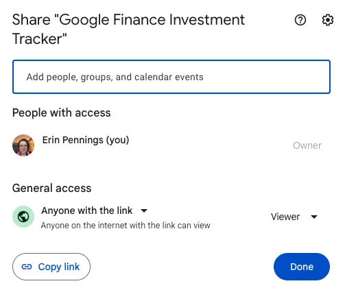
What I love about Google Workspace and Google Sheets templates, in particular, is how they allow your team to collaborate seamlessly and easily. By clicking the “Share” button at the top right-hand corner of a document, you can give team members access to the file.

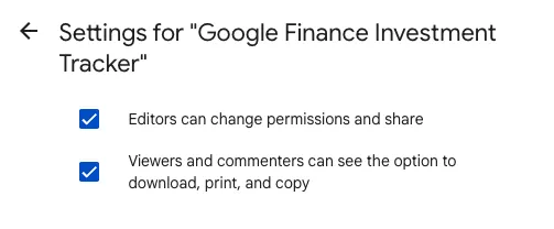
You can also limit the collaboration aspect to commenting or viewing only and limit people’s ability to download, print, or copy the document.

Adapting these settings provides a great option for sensitive documents that only a few people should edit.

Google Sheets templates are intuitive to use.

Using a Google Sheets template doesn’t require much experience with spreadsheets. You don’t need to know advanced formulas and functions to make them work for you.

All you have to do is plug in your numbers and populate the fields. The document will generate a report or calculate a total based on the built-in fields.

Google Sheets templates are customizable.

Using a Google Sheets template doesn’t mean that you’re stuck with its look and feel. You can easily change the fields, the colors, and the fonts using Google Sheets’ built-in tools to give your sheets a brand-specific look and feel.

There’s no data loss.

Another great benefit of using Google Sheets templates? Unless a freak accident happens with Google’s servers, it’s nearly impossible to lose data.

Google Sheets stores everything in the cloud, including a version history of the document. You can always revert to a previous version if something happens.

If your laptop crashes or you lose an internet connection, Google Sheets simply freezes the copy until you’re online again. You’ll still want to take a few precautions, such as enabling offline editing and downloading a copy of important documents to your local drive.

How to Find Templates in Google Sheets

Ready to find a few templates that you can start using right now for your business? There are two common ways you can find and use free Google Sheets templates.

1. Google’s Built-In Template Gallery

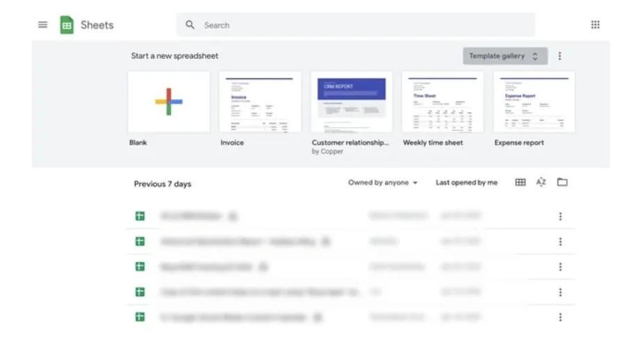
On your browser, go to Google Sheets. Click Template Gallery at the top right. Explore the templates to find the right one for you.

Image Source

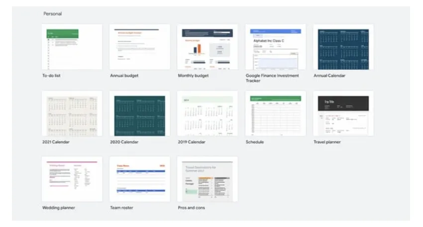
You’ll find different templates for your personal, work, project management, and education needs. Here’s an example of what the Personal template library looks like.

Image Source

2. Add-Ons

Another way to find free templates in Google Sheets is to download and install the Vertex42 add-on. Here’s how.

  • Open an existing Google sheet, or type “sheets.new” into your address bar to create a new one.
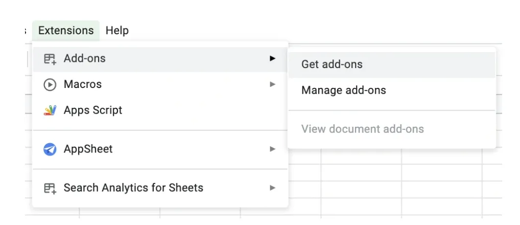
  • On the top left menu, go to Extensions, then Add-ons, then Get add-ons.

Image Source

  • Type “Vertex42” into the search bar, and click enter.
  • Install the add-on.

Image Source

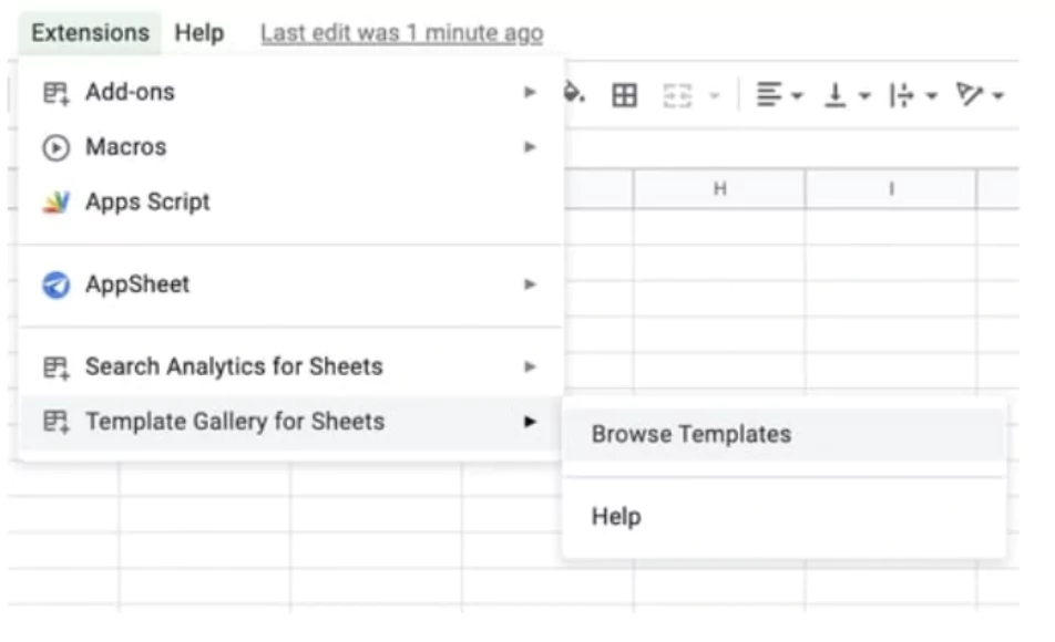
  • To access the templates, click on Extensions, then Template Gallery for Sheets.
  • From there, click Browse Templates.

Image Source

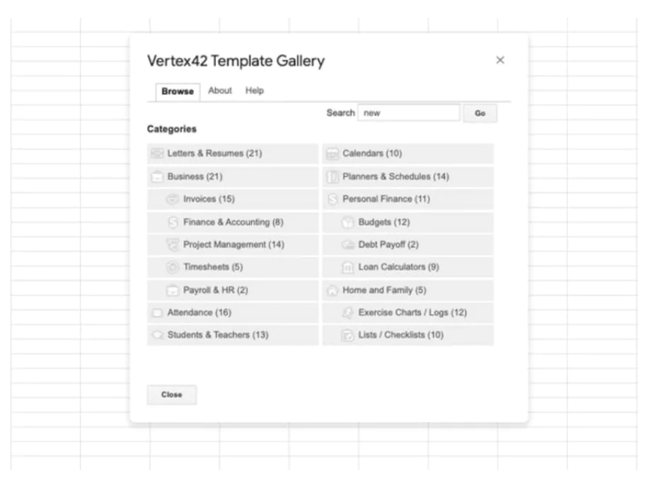
Here, you will find templates that can help with almost everything you need — creating an invoice, an income/expense tracker, or a dashboard to manage your projects.

Image Source

Let’s look at some of the free Google Sheets templates you may find useful for your business.

Google Sheets Templates

Whether you send invoices to clients, track website analytics, or create expense reports, you probably work with spreadsheets, which can feel frustrating or tedious when you’re under a time crunch.

Fortunately, Google Sheets offers a wide variety of pre-built templates, allowing you to more quickly and effectively create reports and analyze data. Here are some of the best Google Sheets templates you can start using now.

  • Google Sheets Templates for Finances
  • Google Sheets Templates for Reporting and Analytics
  • Google Sheets Templates for Customers
  • Google Sheets Templates for Project Management
  • Google Sheets Templates for Leading a Team

Google Sheets Templates for Finances

One of the most common ways to use spreadsheets is as a tool for bookkeeping and invoicing. Here are some of my favorite ready-to-go templates that save you time and make it easy to:

  • Invoice clients.
  • Maintain an annual business budget.
  • Generate financial statements.
  • Create expense reports.
  • Generate purchase reports.

Best of all? You don’t have to create or choose any formulas that will help you calculate this data.

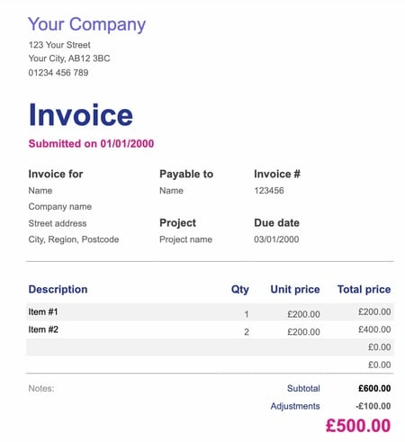
1. Invoices

If you’re a freelancer or work for a small business, this invoice template simplifies the process of using invoices to bill clients for services.

It provides space for all the necessary information and looks more professional than a plain spreadsheet. Plus, the template is customizable, so you can create a theme that aligns well with your brand image.

Click here to use this template.

Image Source

Best for: Freelancers and small businesses.

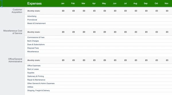
2. Annual Business Budget

More in-depth than it initially appears, this template has tabs for setup, income, expenses, and summary at the bottom, and each includes several subcategories. It’s a good option if your budget requires a lot of customization and many moving parts.

Click here to use this template.

Image Source

What we like: This budget template provides all the essentials while allowing you to customize it to fit your business’ needs.

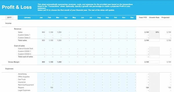
3. Financial Statements

The financial statements template is an all-in-one resource to keep track of business transactions, profits, and losses. If you work for or own a small business and need to manage your finances, this template makes the process easier and less prone to human error.

Click here to use this template.

Image Source

Best for: Tracking how your small business is doing.

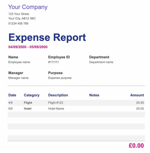
4. Expense Report

Knowing how much you spend is essential for running a successful business. But it’s often easy to forget to record these expenses with the amount of work you have to do every day. This simple expense report template makes it easy to record all expenses — yours and those of your employees.

Click here to use this template.

Image Source

What we like: This template makes it easy to hold you and your team accountable for your expenses.

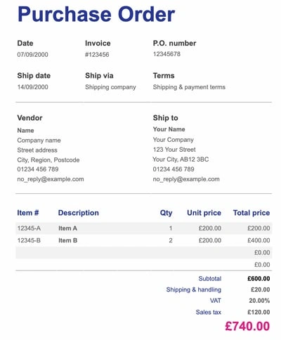
5. Purchase Order

This template is a lifesaver for professionals in charge of tracking orders, saving time, and avoiding the headaches that come with monitoring supplies or shipments.

Click here to use this template.

Image Source

What we like: This template is simple and straightforward for all purchasing needs.

Google Sheet Templates for Reporting and Analytics

Reporting dashboards are typically built into a wide variety of software products, such as Marketing Hub. However, if you don’t have the budget, you can easily create one using a Google Sheets template.

The below templates automatically gather data from Google Analytics, putting the information in a highly digestible, visual format that you can share.

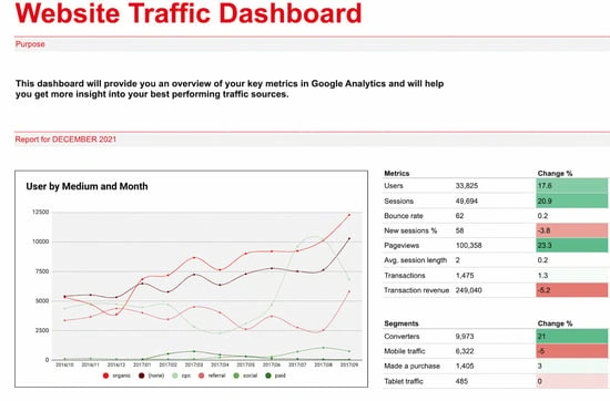
6. Website Traffic Dashboard

If you analyze website traffic with Google Analytics, this template is a fantastic supplemental tool to pull that data into an organized report. Better still, you can use the dashboard template with the Supermetrics Google Sheets add-on to monitor and analyze data from PPC, SEO, social media, and website analytics.

Click here to use this template.

Image Source

Best for: Collecting and analyzing website traffic to see your strengths and areas for improvement.

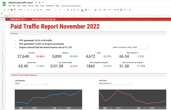
7. Website Paid Traffic Report

If you’re looking for a way to demonstrate paid ads’ influence on your business, this template makes analyzing and reporting on paid traffic relatively seamless. It automatically collects data on your paid sources from Google Analytics and provides a clean chart with important information, including PPC’s percentage of goal conversions, total traffic, and bounce rate.

You can also adjust the template to compare different periods, different channels, or segments.

Click here to use this template.

Image Source

Best for: Companies using Google Analytics who want reports on their paid advertisements.

Google Sheet Templates for Customers

If you don’t have access to a CRM yet or your business is still growing, you can use spreadsheets to track customer information and see your growth. The Google Sheets templates below give you a CRM and a sales dashboard without paying the cost typically needed for such software.

However, as your business starts to grow and you earn more customers, you’ll want to switch over to a dedicated CRM.

8. CRM

CRMs help you organize contacts and automate an effective sales and marketing process. However, if you’re a small company just starting out, you might not feel ready to implement a fully established CRM.

This CRM template is a great place to get your feet wet, saving data automatically so you never lose information. Plus, you can share with coworkers, which helps encourage collaboration between your sales and marketing departments.

Click here to use this template.

Image Source

Best for: Small businesses to keep all customer data in one place.

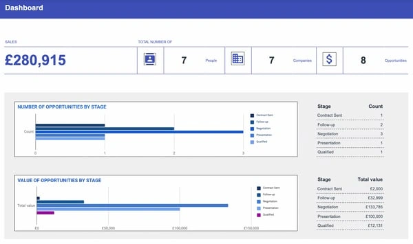
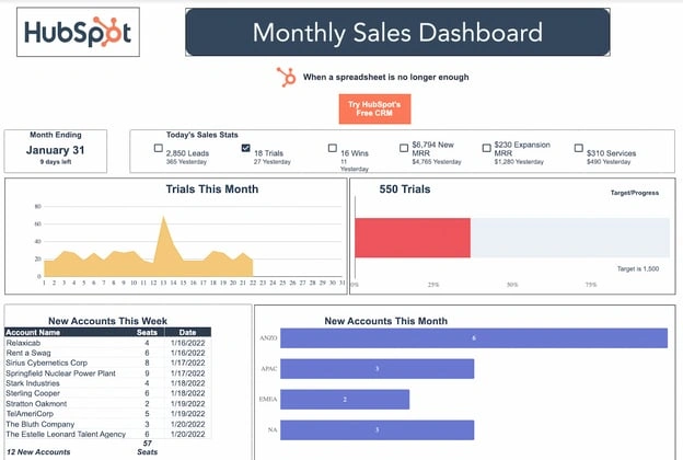
9. Sales Dashboard

This template helps salespeople manage their leads, sales, and revenue all in one place, with multiple tabs feeding your data into a main dashboard. Plus, it features an “instructions” tab to get you up to speed on using the sheet.

Click here to use this template.

Image Source

Best for: Individual sales reps to track their leads and sales.

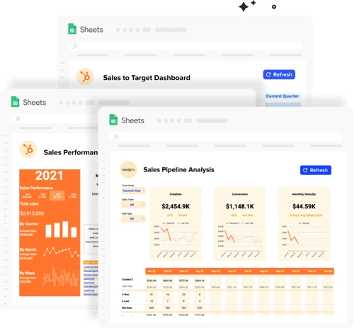
10. Sales Operations Dashboard

This template contains all the pre-built dashboards a sales manager, analyst, or operations specialist needs to monitor performance and maximize revenue. You can use this template to gain full visibility into your sales pipeline, set and track sales targets, and compare sales KPIs across monthly, quarterly, and yearly periods.

Want to supercharge your dashboard? Connect it to your live HubSpot sales data using the Coefficient add-on for Google Sheets. You’ll always have real-time charts and sales metrics to make better decisions.

Click here to use this template.

Image Source

What we like: This is the perfect way for small businesses to keep track of their sales.

Google Sheet Templates for Project Management

Google Sheets project management templates offer cost-effective alternatives to buying project management software.

You can use them to keep track of your project timeline, create Gantt charts, build product roadmaps, and even generate action lists that you can color-code and categorize.

Pro tip: If you’re managing multiple projects, simply duplicate the initial tab and keep all projects in a single spreadsheet.

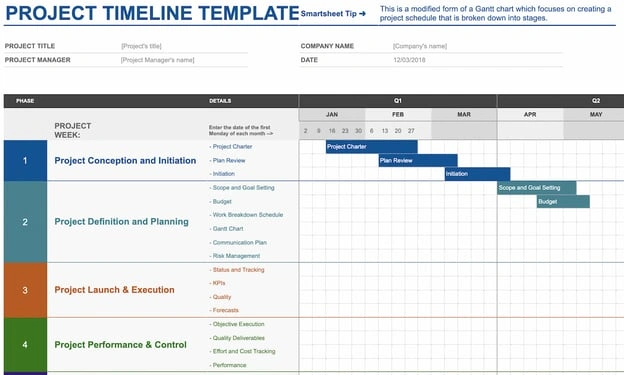
11. Project Timeline

Whether this is your first significant project or you’ve been managing projects for years, this timeline template is a valuable tool for organizing each project step, allowing you to visually break up a daunting project into smaller pieces.

Click here to use this template.

Image Source

What we like: This template provides everything you need to plan and organize any project.

12. Project Tracking

If you’re juggling many projects simultaneously, this project-tracking template takes project management to the next level, enabling you to organize your tasks into categories by date, deliverables, status, cost, and hours.

Best of all, you can prioritize and visualize your projects, reducing your time management stress.

Click here to use this template.

Image Source

What we like: This template allows you to include sufficient detail for each project while helping you see everything on your plate at once.

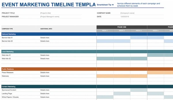
13. Event Marketing Timeline

Promoting an event? This event marketing template offers organization and structure. It also features categories that include local and national marketing, PR, and web marketing, with subcategories ranging from an email newsletter to impact studies.

Click here to use this template.

Image Source

Best for: Storing all your event marketing preparations in one place.

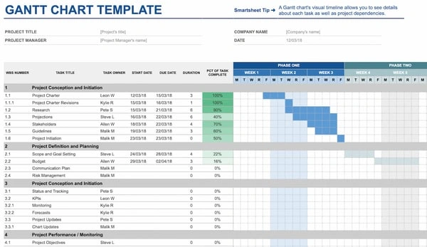
14. Gantt Chart Template

When you’ve got a complex project with overlapping components, timing is one of your primary concerns. This Gantt chart template can help you visualize all steps and delegate essential tasks more efficiently. While there are a variety of different Gantt chart templates out there, Google Sheets is a good place to start and makes collaboration straightforward.

Click here to use this template.

Image Source

Best for: Keeping complicated projects with lots of people and moving parts organized.

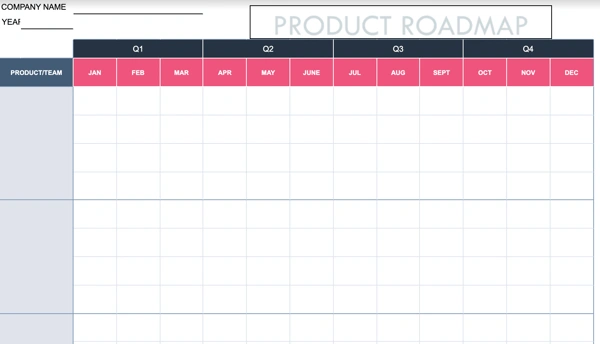
15. Product Roadmap

Roadmaps help your team understand the direction you want a project to take. This product roadmap template makes it easy to create a calendar summary of your project and the milestones of your product development process.

Click here to use this template.

Image Source

What we like: The calendar view gives you and your team a clear “big picture” view of what needs to be done and when.

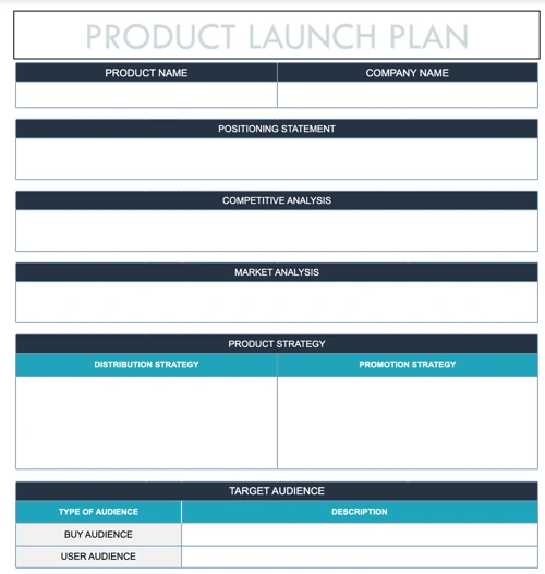
16. Product Launch Plan

This template makes it easy to organize the best product launch possible with fields to help you outline your market and competitive analysis, project strategy, key messaging, and who your target audience is.

Click here to use this template.

Image Source

What we like: This template ensures you don’t miss anything as you prepare to launch a new product.

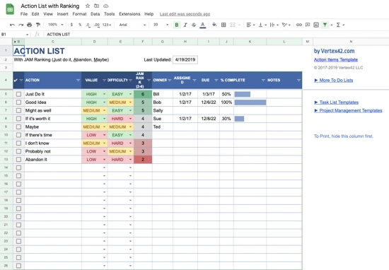
17. Action List With Ranking

Managing a project requires tracking daily actions to ensure you don’t lose focus. This action list template gives you a tool to prioritize the most important tasks on your list and makes sure your team is on the same page.

Click here to use this template.

Image Source

What we like: The “value” and “difficulty” columns allow you to visually rate each task and then prioritize accordingly.

18. Project Budget

Most project managers create budgets for each of their projects outside of the general business budget. This project budget template offers a simple yet effective option to quickly estimate how much revenue a project might generate and how much it would cost.

While other Google Sheets budget templates might have more detail to them, this spreadsheet is great for focusing on the essentials.

Click here to use this template.

Image Source

Best for: Keeping track of a specific project’s budget.

Google Sheet Templates for Leading a Team

Google Sheets templates make it easier and simpler to manage a team without multiple emails or Slack check-ins. These templates allow you to set employee shifts and track how many hours employees spend on certain projects. And because these templates are collaborative, your employees can fill out forms at their convenience.

19. Employee Shift Schedule

This template simplifies the task of keeping track of who works what hours and how much each employee gets paid. Including slots for employees’ names, hours worked, and monthly wages keeps your paycheck process straightforward and organized.

Click here to use this template.

Image Source

Best for: Leaders who manage teams with shifts and hourly wages or who work with multiple freelancers/contractors.

20. Weekly Timesheet

Like the employee shift schedule, the weekly timesheet helps you track time and know how much to pay employees or subcontractors. Plus, this weekly timesheet template allows you to quickly find out how much time each employee spends on a project.

Click here to use this template.

Image Source

What we like: This template is a great way of keeping track of how employees use their time.

21. Contact List

This template comes in handy if you want to create a contact list database, making it easy to store your contact information (say, phone number and email address), your employees’ contact information, and those of emergency services like the ambulance or fire department.

Click here to use this template.

Image Source

Best for: Keeping important contact information all in one place.

Start Using Free Google Sheets Templates

No matter what your job is, using a suitable spreadsheet simplifies the process and makes it a more enjoyable experience.

So what are you waiting for? Get started with using these free Google Sheets templates to save time and effort, and download ten additional ones to exponentially improve your productivity.

Editor’s note: This post was originally published in January 2018 and has been updated for comprehensiveness.

business google sheets templates

Categories B2B

41 Landing Page Design Examples to Inspire Your Own in 2024

How do you convince visitors your website is worth their time? There are so many elements that a top-notch landing page design needs, and making those elements the “best” they can be often depends on what your landing page goals are.

Access hundreds of Website Themes & Templates on HubSpot

If you’re looking to up your landing page game, knowing what goes into a great one is helpful.

In this piece, I’ll explain how to make a landing page work in your favor and provide you with a list of landing pages I love so you can see these impressive designs in action and implement their tactics on your own landing pages.

Pro tip: HubSpot’s free CMS tools enable you to create your own website from scratch, with plenty of customization options available so you can tailor your website to your branding.

What makes a landing page effective?

Different industries have different conversion rates, but it’s 2.35% on average.

However, with awesome landing pages, you can raise that number to 5.31% or even more, according to WordStream’s study.

Image Source

The best part? Over 30 landing pages can get you seven times more leads compared to sites with less than 10—no need to say more about the impact of a good landing page.

But what makes a landing page suitable?

Let’s go through five key factors.

Catchy Headlines

Make a headline that grabs attention. It should be around ten words short and tell visitors what they’ll get from your page.

Image Source

Use numbers, be specific, and choose strong words.

If you need some inspiration for word choice, I found a fantastic OptinMonster blog post with 700+ converting and attractive words.

From the long list, I chose this one because catchy terms keep me engaged every time:

Image Source

Pro tip: Emotional headlines grab attention. For example, “Master Time Management” is transparent, but “Best Tool for More Time with Your Kids” hits differently, straight to the heart.

Eyeflow Design

Make sure your page looks neat and is easy to use.

First, categorize everything you can.

Then, put up excellent videos or pictures that fit your brand. Don‘t use too many colors and elements — it can make things messy and make it hard to notice what’s important.

Play with neutral colors, contrast, white space, and directional cues to make your CTA pop.

Here’s a bit of inspo from Duda:

Image Source

Scroll down to see pictures with the same colors and fonts, keeping the brand’s style consistent.

Image Source

Pro tip: Consider spicing things up with new elements like VR, AR, or 3D images. Shopify’s research showed a 94% increase in conversions with these visuals.

Short and Sweet Writing

Just like with headlines, keep your landing page text brief. In this case, we’re talking around 250-300 words — unless you’re selling something super complex.

The shorter text makes it 11.8% easier to read and understand.

Keep it simple and direct.

Explain why your offer matters to them.

When writing landing page content, start with an outline.

I love Patrick Cumming’s LinkedIn carousel, where he shared the AIDCA outline for crafting effective landing page content.

Image Source

Also, don‘t be boring or too pushy with your CTA. Instead of “Sign up for a Trip,” go for “Join the Trip of Your Life.” It’s more fun and promises something amazing ahead.

Pro tip: Don’t sound like a robot. If your copy is too ChatGPT-ish, most people will probably leave the site (including me :)). Show you care by writing in a way that connects with your audience.

Testimonials and Reviews

Include quotes from happy customers or stories about good experiences. It helps people trust that your thing is great.

You can use different types of testimonials — short quotes, video stories, case studies, ratings, before-and-after pictures, social media posts, influencer endorsements, employee feedback, expert recommendations, or interactive content.

And who says you need to choose one type only?

Very Good Copy mixes both video and written testimonials, and it works great:

Image Source

According to the Reputation X study, business needs more than just showing up in search results:

  • 49% of people want at least a four-star rating.
  • People read about 7 reviews before trusting a business.

Trust leads to purchases, and online reviews can make or break that trust.

Pro tip: Try to use video testimonials whenever possible. 93% of marketers think videos work as well or even better than other content types.

I like it when there’s a real person talking on a site — way cooler than reading quotes and names, especially on some new site where you end up Googling if that person is even real.

A/B Testing

You need to regularly do checkups to see what’s working on your landing page.

A/B testing helps you compare two web page styles with the same web address. Some visitors see one style, and the rest see another. By looking at how well each version does, you can pick the one that works better.

Keep changing little things on your page to make sure it’s always a crowd-pleaser. Whatever the problem is, A/B testing can help you figure it out and find the best solution.

Use quality tools for this purpose to find out where users are having trouble. For instance, with our Marketing Hub and CMS Hub, you can A/B test your landing pages.

Image Source

Pro tip: If your page is in multiple languages, you can run a test for each language version with our software.

Now, check out the best 41 landing pages to inspire yourself.

41 Examples of Great Landing Pages

1. Shopify

Image Source

Like many of the other landing pages in this post, Shopify’s trial landing page for sellers keeps it simple. It’s not too text-heavy but still manages to persuade users by noting a few key points about its top-notch product.

Visitors come away knowing that Shopify is an all-in-one platform that is easy to use and trusted by many.

Why This Landing Page Works

  • Clean interface: The user-oriented headline is just a few words, for example, and the page relies on simple graphics and short paragraphs to communicate the trial’s details and benefits.
  • Concise CTA: There are only a few fields you need to fill out before you get started. All of this makes it easier for you to quickly get started selling online with their tool.

What Could Be Improved

  • Emphasizing security: The last column states that the platform is safe, but doesn’t explain why. Instead, it mentions that over a million businesses use it. A few words that speak to site security would improve this section since the number of vendors is already stated at the top of the page. Additionally, it would eliminate friction for visitors with security concerns.

2. Great Jones

Image Source

Great Jones offers up a landing page that’s as beautiful as its Dutch Ovens. It’s very aspirational and taps into all of our ideal kitchen dreams.

Why This Landing Page Works

  • Use of color: Great Jones’ site is colorful, just like its cookware. The use of bold colors quickly draws visitors in and makes the cookware stand out.
  • Prominent CTA: You can’t miss the $10 Off coupon. Who wouldn’t want a discount on these gorgeous pots?

What Could Be Improved

  • Rollover descriptions: With so many pans and utensils pictured at once, it would be great if users had the ability to view the name of the item. That way, they could find it easier on the site when they’re ready to buy.

3. Muzzle

Image Source

Muzzle, a Mac app that silences on-screen notifications, fully embraces this show-and-tell mentality on their otherwise minimal landing page.

Landing pages help users decide whether or not your product or service is actually worth their precious time and energy.

What better way to clearly and straightforwardly communicate your value proposition than by confronting visitors with the very problem your app solves?

Why This Landing Page Works

  • Show rather than tell: Visitors to the page are greeted with a rapid-fire onslaught of embarrassing notifications in the upper left of the screen. Not only is the animation hilarious, but it also manages to compellingly convey the app’s usefulness without lengthy descriptions.
  • Cohesive visual experience: Even the text on the page is a muted gray color, mirroring the function of the product.

What Could Be Improved

  • Could be difficult to read: While the light gray text on the white background is great at mimicking the product’s function, it may be harder to read for some.

4. DoorDash

Image Source

Takeout enthusiasts are no doubt familiar with DoorDash, the app that lets you order food from a variety of restaurants from your phone.

Well, instead of customers, this landing page is geared towards recruiting partners and Dashers who make the deliveries.

Why This Landing Page Works

  • Emphasizes dasher autonomy: This landing page really plays up that Dashers are independent and free to work when they want.
  • User-friendly: Just enter your address in the search bar, and voila! Instantly find the best local restaurants near you.

What Could Be Improved

  • Advantage over competitors: DoorDash is not the only delivery game in town. They could highlight what sets them apart from a competitor like UberEats.

5. Wise

Image Source

Wise allows you to send or receive money in different currencies and countries. Its landing page separates customers into two categories — either Business or Personal. You‘re not distracted by options that don’t apply to you.

There’s even a short video to show visitors how the service works before they try it. Since they’re dealing with money, it’s important to get the customer experience right the first time.

Why This Landing Page Works

  • Highlights safety: The security information is out front and center on this page, helping to ease any hesitancy a potential customer might have and assuring them that Wise is a safe service to use to send and receive money.
  • Emphasizes value: In several places on the page, in both text and video, Wise reiterates that it’s less expensive than transferring money through a traditional bank.

What Could Be Improved

  • Adding an FAQ: Putting an FAQ section at the bottom would be great, especially for such finance-related stuff where people often have many questions.

6. Airbnb

Image Source

To help convert visitors into hosts, Airbnb offers a search bar pop-up. You can enter additional information about your potential accommodations into the fields to get an even more customized estimation.

Image Source

If you visit the page already convinced, the clear call-to-action at the top of the page makes it easy to convert on the spot.

Why This Landing Page Works

  • Personalization: Airbnb shows you right at the start what you could potentially earn based on your area and the size of your home. This is useful for potential new hosts who may still be figuring out how much they should charge and what they can expect to earn.
  • Straight to the point: Minimal information against a clean white backdrop keeps the focus sharp.

What Could Be Improved

  • Nothing: The page is clear and concise, reassures potential hosts Airbnb is safe to use, and offers a personalized experience.

7. Wag!

Image Source

Wag! is a service that connects dog owners with dog walkers and sitters. This page gets right to the point with a large font encouraging prospects to join and puts the sign-up form prominently on the right half of the page.

The green background color makes the white font and other elements on the page pop. The addition of a QR code on the form is also a nice touch, enabling visitors to scan it, quickly download the app, and sign up.

Why This Landing Page Works

  • Efficient form: Leaving the form field open on the page means visitors don’t even have to click on a CTA to access it. The QR code further expedites the process.
  • Emphasizes credibility: Including caretaker photos and the fact that more than 400,000 caretakers currently use the service nationwide makes Wag! more trustworthy.

What Could Be Improved

  • It’s not compelling: Unlike DoorDash mentioned earlier, Wag! makes no mention of why people should join. What are the perks? Are the hours flexible?

8. Wistia

Image Source

Right off the bat, you notice the baby blue background with the pop of darker blue in the form of an “Explore Plans” button. The page gets right into the action with a video describing the services.

Why This Landing Page Works

  • Ease of use: The form itself allows users to quickly fill it out by linking to their Google account. Doing so enables the autofill feature, which cuts down on friction for the user.
  • Capitalizes on visuals: As a video host, Wista does a great job of showcasing its capabilities using a variety of mediums. There are colorful graphics, videos, and even a link to marketing-focused cartoons.

What Could Be Improved

  • Including an FAQ: Testimonials are great, but sometimes customers have a few concerns that could be answered quickly with an FAQ section. That way, they can decide whether or not to sign up without having to leave the page to search for answers.

9. Webflow

Image Source

Webflow, a design tool for web developers, packs a lot of information into just one GIF. As with Muzzle, Webflow also gets right to the point and demonstrates what its tool can do, rather than just talking about it.

The animated GIF is visible in the same frame on the website, so users can see how the product works and sign up without scrolling.

Why This Landing Page Works

  • Show rather than tell: Being able to view Webflow’s tool in action gives potential customers a clear idea of not only what it does but how their user experience will be.
  • Removes risk: In several places on the landing page, visitors are reminded that the service is free. There’s no trial to sign up for. They can build their site for free and decide whether or not to sign up for a plan when they’re ready to launch.

What Could Be Improved

  • Nothing: This landing page is the perfect balance of information, usability, and visuals.

10. Talkspace

Image Source

Talkspace, an online therapy service, really focuses on trustworthiness with this landing page. All of the information on this page emphasizes that customers will have access to licensed therapists.

It drives home that the service is secure and confidential. This is a great way to reassure those who may be hesitant to participate.

Image Source

Image Source

The use of shapes is also a clever idea. Overall, the layout is clean, inviting, and informative.

Why This Landing Page Works

  • Color palette: Calming pastel colors perfectly match the brand’s message.
  • Provides value: In addition to providing details about how Talkspace works, this page also provides several mental health resources and articles.

What Could Be Improved

  • Nothing: This page has a great user interface and serves as a great starting point for mental health resources.

11. Nauto

Image Source

Nauto, a data platform for self-driving cars, helps make autonomous driving safer for companies that manage fleets of self-driving vehicles.

Naturally, its customers would need all kinds of information to sell them on this platform. Nauto has it packaged into a super-simple ebook.

Its landing page gives you both a brief contact form and some preview statistics to prove why this resource is so important.

Image Source

The green “Submit” button might’ve even been on purpose (on the road, green means go, after all).

Why This Landing Page Works

  • Simplicity: No distractions on this landing page, which is perfect given the company’s focus on safe, self-driving vehicles.
  • Smart white space usage: Nauto effectively uses a white background, showcasing a clean and purposeful design.

What Could Be Improved

  • The form: 10 fields is too overwhelming.

12. Industrial Strength Marketing

Image Source

Right off the bat, this landing page pulls me in with a compelling, punchy header: “Don’t Make Me Zoom.” It directly speaks to a common experience most of us have had when we‘re browsing on our phones or tablets — and it’s a little sassy, too.

But that‘s not the only thing keeping me interested in this landing page. Notice how the color red is strategically placed: It’s right at the top and bottom of the form, drawing you even closer to the conversion event.

Image Source

Why This Landing Page Works

  • Voice: The language is punchy and relatable, quickly drawing the reader in.
  • Minimalist: The black and white color scheme with just a few pops of red really makes the sign-up sheet stand out. Additionally, the minimalist design works beautifully on mobile and desktop, with no pinching required.

What Could Be Improved

  • Nothing: Both the mobile and desktop versions illustrate the perfect execution of a minimalist layout, which helps the reader navigate the site with ease.

13. Inbound Emotion

Image Source

Even if you don’t speak Spanish, you can still appreciate the conversion capabilities of this HubSpot partner site. My favorite feature of the page? The form stays in a fixed, prominent position as you scroll through the site.

I also love the simple layout and warm colors.

Why This Landing Page Works

  • Fixed form: Having access to the form while scrolling provides a better user experience. No need to scroll back up to the top of the page to find it.
  • Simple interface: The layout is simple but effective. The use of only two shades of orange gives a monochrome feel and keeps the focus on the benefits of the ebook.

What Could Be Improved

  • Make the form brief: There were six items to fill out, not including the checkboxes option at the end. Longer forms could be a turnoff for some visitors.

14. IMPACT Branding & Design

Image Source

Full disclosure: IMPACT is a HubSpot partner — but that‘s not why they’re included here.

IMPACT’s landing pages have long been a source of design inspiration.

I love the simple layout of the page, from the large headline copy and detailed featured image, to the outline that surrounds the form, to the colors and fonts that are very pleasing to the eye.

Image Source

The free guide IMPACT is offering for download here also doesn’t emphasize the download itself in the blue button that allows you to submit your filled-out form.

Rather, IMPACT is inviting you to “generate more conversions” — putting the focus on what you stand to gain as a result of reading the guide.

Why This Landing Page Works

  • Clever messaging: You’re not downloading an ebook. You’re learning how to “generate more conversations.” This rephrasing is far more enticing than simply putting a regular download button.
  • Simple use of color and fonts: The blue tones work really well on this landing page, giving it variety while keeping the look cohesive. Since there’s lots of text on the page, a simple font is perfect.

What Could Be Improved

  • Nothing: This page encourages downloads in a clever way using a simple layout and colors.

15. Unbounce

Image Source

It‘s no surprise Unbounce made this list — they’ve actually written the book on creating high-converting landing pages.

Although there are many amazing things about this landing page, I absolutely love the sidebar menu and lots of visuals.

Unbounce is really skilled at providing visitors with the information they need, but also what they didn’t know they needed until they landed on the site.

Why This Landing Page Works

  • Gives visitors options: When it comes to accessing the course, users can either click the main button above the upper half of the page or, if they’ve been scrolling, click on the course from the sidebar on the left. Eliminating the need to scroll back up to the top of the page.
  • Sometimes more is more: In addition to the course, Unbounce provides visitors with industry-specific reports and answers to other landing page-related topics. Providing even more useful information sets Unbounce up as a trusted authority in their field.

What Could Be Improved

  • The descriptions: The course offers several modules, and it would be helpful if some offered a brief description. The sidebar menu offers a course list, but a short sentence summarizing what visitors can expect to learn would be helpful.

16. Bills.com

Image Source

Often, people think landing pages are static pages on your website. But with the right tools, you can make them interactive and personalized.

Take the example above from Bills.com. To see if you’d benefit from their consultation, you answer three questions before you are shown a form.

Then, you answer two more questions, like the one below:

Image Source

Image Source

And here’s the final landing page form where you fill out your information:

Image Source

I‘m not sure how the algorithm works (or if there’s one at all), but while I was filling it out, I had some anxiety about not qualifying.

Once I found out I did, I was excited to fill out the form, which I’m sure most people who are in debt and using this tool are.

By making this offer seem more exclusive before the form appeared on the landing page, I’d bet that Bills.com increased conversions pretty significantly.

Why This Landing Page Works

  • Exclusivity: Everyone likes to feel special, which is why exclusivity works so well. The page gives the impression that the offer isn’t given to just anyone. You have to qualify first.
  • Interactivity: Anytime you can get users to interact with the page, even if it’s something as simple as using a form with a sliding bar question.

What Could Be Improved

  • More color: While the site is geared toward not-so-fun topics like bills and debt, it doesn’t mean it has to be boring. The gray leaves much to be desired.

17. Zillow

Image Source

Zillow did something very similar to Bills.com with their landing page. It starts with a simple search bar asking for a neighborhood, city, ZIP code, or address. Sounds creepy, but don’t worry.

This form field is set on top of a hero image featuring a woman stepping out from home.

Of course, the address itself won‘t be enough to get a true appraisal value of a home. It just denotes the home’s neighborhood. It’s a bit like playing The Price is Right.

You can guess how many homes in the area are worth and then type in an address to see how close you are. If you want to learn more info about a property, Zillow then prompts users to sign up to continue.

Why This Landing Page Works

  • Simple access: Users can get all the information without signing up.
  • Establishes authority on the topic: Zillow has access to so much housing and neighborhood data. It’s no wonder they are one of the top home search sites in the nation.

What Could Be Improved

  • Nothing: The Zestimate page is simple but effective. Those with concerns about what a Zestimate is and how it’s calculated have easy access to the homebuying FAQ on the second half of the page.

18. Landbot

Image Source

Landbot, a service that creates chatbot-based landing pages, puts its own product front and center on its chat-fueled landing page.

Visitors are greeted by a friendly bot —complete with emojis and GIFs —that encourages them to provide information in a conversational format instead of via a traditional form.

Why This Landing Page Works

  • It’s fun: From the bright colors to the GIFs, this page keeps visitors engaged and entertained.
  • Show, not tell: By having the chatbot right on the page, doing its thing, potential customers can see exactly what they’re getting. The whole experience simulates what it’s like to use Landbot’s product.

What Could Be Improved

  • Nothing: Landbot’s use of a live demo, testimonials, highlighted integration features, and detailed breakdown of how the product works leaves new customers ready to sign up at first glance.

19. Webprofits

Image Source

Like Industrial Strength Marketing mentioned earlier, Webprofits also makes great use of a predominantly black, white, and red color scheme. The result is a clean layout that makes great use of the pops of color on the page.

It’s a testament to the organization’s expertise in digital marketing and UX design.

Image Source

They also make it easy for you to figure out what Webprofits actually does. The rest of the page offers detailed case studies.

Why This Landing Page Works

  • Informative, but not overwhelming: There’s a lot of information and text on this page, but the use of well-placed graphics and videos helps break things up.
  • Multiple CTAs: Placing the same CTA throughout the page makes it so visitors don’t have to scroll all the way to the top to “Talk with Webprofits” or “Get in Touch.”

What Could Be Improved

  • Nothing: Webprofit makes great use of the long landing page format, packing in all the pertinent information visitors would need in one place with a visually appealing experience.

20. Native Poppy

Image Source

Sometimes, you‘ve just got to stop and admire a landing page for being beautiful. Using high-resolution photography and lots of white space, Native Poppy’s landing page is a pleasure to look at.

Aside from its beauty, the page has some great elements: a clear and delightfully pink CTA, an informative “How It Works” section, testimonials, and an FAQ at the bottom.

Best of all, it plays with language, ditching the phrase “become a subscriber” for “become a wild flower.” I don’t know about you, but I’d much rather be a “wild flower” over a subscriber any day.

Image Source

Image Source

Why This Landing Page Works

  • Captures brand voice: The layout of Wild Poppy mirrors the whimsical vibe of the brand. From the photos, font choice, and “wild flower” subscription, all the messaging works in harmony.
  • Persuasive: By highlighting all the perks and discounts of being part of the subscription program, it entices customers to join.

What Could Be Improved

  • Form visibility: While there are multiple CTAs, it would have been nice to have the form fields on the page for faster sign-up or as a pop-up after clicking.

21. Conversion Lab

Image Source

While I wouldn’t typically include an example of a homepage with a form on it in a post about landing pages, this website is special. The homepage is the entire website — the navigation links just take you to the information below.

When you click “Get My Free Consult,” the entire page darkens to highlight the form. See what it looks like before you click on the photo above.

Image Source

And, when you click that CTA, check out how the form appears:

It’s a similar function when clicking on any of the headings on the page. Instead of taking you to a different page, it simply jumps to the corresponding section on the homepage.

I love how you don’t have to leave the page to fill out the form or view any of the features, creating a seamless user experience.

Why This Landing Page Works

  • Creative: Having a homepage that also functions as various landing pages makes Conversion Lab unique. Best of all, it still provides a pleasant user experience.
  • Organized layout: Despite having the homepage and landing pages as one, the page doesn’t feel cluttered or busy at all.

What Could Be Improved

  • Form placement: It would be nice if the form maybe opened up on one side so visitors could still read the content on the rest of the page.

22. Taboola

Image Source

The first thing that grabs attention on the Taboola page is the big headline in capitalized letters. The message really stands out against the dark background, and I love the pop of the yellow bubble around the CTA button.

Plus, there‘s a super easy-to-spot “Learn More” button, so you don’t have to scroll through the whole page for more info.

Why This Landing Page Works

    • Bold message: The big headline immediately convinces visitors.
    • Simplicity: Clear and simple design makes it easy to understand and navigate.
  • Color combination: The black, yellow, and white combo is effective for improving readability and conveying a modern and energetic vibe.

What Could Be Improved

  • Nothing: The page is already great with its clear message and eye-catching colors.

23. Casper

Image Source

Casper usually has big discounts right on the main page that change depending on the season and collection.

For instance, in this example, we can see the final snooze sale offering a 30 percent discount on everything, perfect for those in need of a new mattress or bedroom upgrade.

The design is minimalistic and kinda relaxing, matching their vibe of selling good, quality sleep.

Keep scrolling, and you’ll find a cool section I love on the site — UGC. Those TikTok videos make the site feel real and leave you wanting to try products.

Image Source

Why This Landing Page Works

  • Quick access: Product categories are right at the page’s center, making it easy to find things quickly.
  • Highlighted CTA: The “Shop Now” button catches the eye with its vibrant red color against the light tones.
  • User-generated content and reviews: Real TikTok videos and customer feedback make the site authentic and trustworthy.

What Could Be Improved

  • No pop-up chat: The chat button only pops-up on the mobile version. It would be great if it was also on the desktop for easy access to customer support.

24. Merrill Edge

Image Source

If you need inspiration for your finance site, check Merrill Edge.

The first thing you notice here is a personal retirement calculator that prompts you to click and make some calculations. Although it seems like a calculator at first, it’s actually an image that you need to click, leading you to the real calculator.

In my opinion, that’s a minor drawback.

The combination of colors is effective, showcasing the colors of the US.

Why This Landing Page Works

  • Matching colors: The page has nice colors that match the US flag, making it visually appealing.
  • Sign-up form: The sign-up form is right there, easy to see, making it simple to get started.
  • Dual search bars: With two search bars — one for quotes and another for site navigation — finding information is simple and efficient.

What Could Be Improved

  • Visual appeal: The website would be more attractive if it had more images. Even though finance and stocks involve a lot of written information, adding pictures can make the content more engaging and easier to understand.

25. Munchery

Image Source

For discovering awesome recipes, check out Munchery. When you land on the website, there’s a handy search bar where you can find the recipe you want with just one keyword.

I love the cool, dark background with real people enjoying their food at a table.

Right below the search bar, there’s a subscribe button and a chance to win a free gift worth $154 — super enticing!

When you scroll down, you’ll find neatly organized recipes, from burgers and grilling to vegetarian dishes.

Why This Landing Page Works

  • Easy recipe search: Find recipes quickly with a simple keyword search.
  • Attractive colors: The vibrant orange colors break the monotony of black and white.
  • Clear categories: Well-organized recipes and simple navigation.

What Could Be Improved

  • Nothing: Munchery has a great page setup, making it easy to find what you need while looking pretty cool.

26. Zoom

Image Source

When you go to Zoom’s page, the first thing you see is the Zoom AI Companion. The page is simple, showing how this AI makes you better at your job.

The buttons like “Sign Up” and “Contact Sales” are easy to find, so you don‘t have to search around. On the right side, there are cool sliding pictures, showing real people, numbers, and features. It’s a friendly start, inviting you to explore more.

Why This Landing Page Works

  • Nice colors: The white and blue combo looks fresh and clear.
  • Credibility: Partners and trust site reviews give the site credibility and trust.
  • Good copy: The short and snappy writing is on point—easy to understand and grabs attention.

What Could Be Improved

  • Information overload: The abundance of information and resources on a single page might be a bit overwhelming for users.

27. Domo

Image Source

Domo turns data into super-smart decisions. The landing page is user-friendly and packed with helpful information.

And the colors? Soothing baby blue and vibrant orange — so easy on the eyes.

Cool visuals, quotes from happy customers, and buttons like “Watch Demo” and “Try Free” are right where you need them.

Domo also highlights industry recognition and real ROI stats, emphasizing the platform’s credibility.

Why This Landing Page Works

  • Clear menu: Easy navigation with categorized sections.
  • Engaging visuals: Images, quotes, and logos improve visual appeal and credibility.
  • Simple actions: Prominent buttons encourage immediate engagement.

What Could Be Improved

  • Nothing: This page is clear and uncomplicated. It’s easy to absorb information and visuals.

28. Netflix

Image Source

Netflix’s landing page cannot be simpler and better at the same time.

It strategically places the email sign-up feature right in the center. After you enter your email, it takes you to the account setup or login page (if you already have an account).

Crystal-clear CTA and slick, streamlined steps ensure hassle-free navigation for users of all ages.

Why This Landing Page Works

  • Easy talk: Netflix talks in simple words. No need for a dictionary — just straightforward info.
  • No puzzle: Everything in the offer is laid out neatly and cleanly.
  • Attractive design: Cool movie and series pics in the background, and that irresistible red and black combo makes the page look fantastic.

What Could Be Improved

  • Pricing plan: It would be a good idea to put the prices where people can easily see them, instead of FAQs.

29. Constant Contact

Image Source

Upon opening Constant Contact, I fell in love with the clear and organized layout.

The tagline, “This year, don’t just hit send–send hits,” also caught my eye immediately.

Simple. Effective. Amazing.

Explore what you need by entering your email and testing out a 14-day free trial.

Also, you can’t miss the badge proudly declaring Constant Contact as the top email marketing agency in summer 2023, so you know they mean business.

Although there are many colors on the site, Constant Contact strikes that sweet balance for an awesome user experience.

Why This Landing Page Works

  • Cool words: The writing is catchy and makes you want to learn more about the offer.
  • Easy to get around: Finding stuff is easy because of flawless organization and categorization.

What Could Be Improved

  • Communication choices: You can call or email for help, but adding a chat option would offer a better way to communicate.

30. WordStream

Image Source

Talking about good copies, WordStream also knows how to capture attention with a single catchy sentence.

Right on the landing page, there’s a freebie with the Google Ads Performance Grader. The laptop flaunts a bold image, drawing attention to quick audit reports and tempting you to hit the “Grade My Account” button.

If you keep scrolling through the page, you’ll see the Free Keyword Tool and many helpful blog posts.

Trust builds up with impressive stats on LocaliQ’s success, while features like demo scheduling and newsletter sign-ups improve the overall experience.

Why This Landing Page Works

  • Effective messaging: Clear and compelling copy on the landing page to communicate the value proposition.
  • Visual appeal with data: Engaging graphs and numbers for credibility and persuasive impact.
  • Bullet points: Quick and easy scanning of key information.

What Could Be Improved

  • Contact section: It’d be good to add an email option in the contact section, as many users prefer email communication over phone calls.

31. Lyft

Image Source

The Women+ Connect by Lyft page looks cool and has a girly vibe — nice pics, minimalistic design, catchy messages, and a clear layout.

It talks about rides for women and how they can make money with Lyft. The words are short and simple, saying women can drive on their own terms.

Lyft’s landing site also talks about fun things like different ways to travel and special benefits for members.

Why This Landing Page Works

  • Clean design: A simple, clutter-free design for easy navigation.
  • Real-life pictures: Images with real people add an authentic feel.
  • Easy option exploration: Find and understand all choices with a user-friendly layout.

What Could Be Improved

  • Nothing: I don’t want to play favorites, but the girly vibe on this landing page is just awesome. Everything is clear, easy to find, and super cool.

32. OptinMonster

Image Source

OptinMonster is one of those sites that might not sweep you off your feet in terms of design, but its functionality is top-notch. I like the tidy layout — everything is well-categorized and structured.

There are pictures and videos next to the explanations to help you understand the features better.

When you scroll down a bit, you can see the results and figures constantly cycling and updating.

Image Source

Why This Landing Page Works

  • Page sections: Well-organized page sections and categories.
  • Live chat: If you have further questions, you can get answers immediately.
  • Testimonial slider: Real customer opinions in a cool sliding format, making it look attractive and reliable.

What Could Be Improved

  • The copy: The copy would be better with a stronger emphasis on “you” instead of relying heavily on “our” or “we.”

33. Codecademy

Image Source

Codecademy‘s landing page is a mix of authenticity and functionality. They kick things off with a real person’s testimonial, adding immediate credibility.

“Build your tech career” copy screams ambition right from the headline.

But what really rocks here are the videos featuring real learners sharing success stories. That’s the most relatable inspiration and motivation to get intrigued.

I also love the color scheme on the site. White, blue, and yellow always make me happy for some reason. They have a good vibe and can influence people to choose your service.

Why This Landing Page Works

  • Testimonials: Video testimonials of previous successful learners give you a real feel of what’s possible.
  • Content: The landing page clearly shows what Codecademy has without making you read a lot.
  • Nice colors: The mix of white, blue, and yellow looks good and makes you want to stick around.

What Could Be Improved

  • CTA: The first button you notice on this page says “Compare prices.” However, it’d be good to replace it with a more engaging option like “Become the best tech expert in the country.”

34. Semrush

Image Source

I can’t get enough of Semrush’s landing page for a few key reasons.

Firstly, they promise measurable results from online marketing, setting the tone and message right away.

The central search bar makes it super easy to jump into action by entering keywords or URLs. Right below, we can see partnership muscles with global giants like Amazon, Tesla, and Samsung.

The breakdown of services into categories with visuals and bullet points is informative and easy to catch. The testimonials and numbers add weight to their claims, showcasing the platform’s popularity and awards.

Something that’s too cool to ignore is the CEO’s presentation with a cartoonish hat.

Image Source

Semrush simply knows how to make it playful and professional at the same time.

Why This Landing Page Works

  • Visual and Informative: Clear categories, images, and bullet points for an effortless understanding of the content.
  • Credibility: Impressive testimonials and numbers highlight the platform’s popularity and accolades.
  • Coolness: The CEO’s presentation adds a fun and cool vibe that sticks in your memory.

What Could Be Improved

  • Nothing: No complaints at all.

35. Eiger Extreme by Mammut

Image Source

The most interesting site I explored is definitely the Mammut website for Eiger Extreme. The way they use moving pictures and that science lab font is absolutely fantastic.

I like how the top menu stays in place while you scroll down.

The small animations, like the temperature dropping, are also amazing and engaging.

Image Source

As you keep scrolling, different parts of the page show up, and it’s easy to add things to the cart. The page has good pictures and sounds, telling a story about adventures.

So, once you open the site, you won’t feel like you’re in a typical online store; it will make you want to go outside and explore. And that’s the best part of it.

Why This Landing Page Works

  • Visually appealing: Moving pictures and special fonts look amazing.
  • Fun animations: The little things, like the temperature dropping, make the site fun to check out.
  • Tells a story: The pictures and sounds tell a neat story about adventures.
  • Unique: Something you haven’t seen before.

What Could Be Improved

  • Loading and scrolling issues: The page takes a while to load — it’s a bit frustrating. It also stutters a bit when scrolling.

36. Hint

Image Source

Hint’s landing page is a showstopper with its lively aesthetic. The imagery of ingredients and bottles pops against the serene baby blue background.

Placing the one-dollar-per-bottle offer in the focus is a brilliant move, instantly grabbing attention and interest.

There’s also an ability to put bottles into your cart directly from the landing page—not a common but definitely a convenient feature.

Why This Landing Page Works

  • Smart offer placement: The one-dollar-per-bottle deal grabs attention right away.
  • Easy shopping: Adding items from the landing page is super handy.
  • Consistent brand look: The colors stay true to the brand’s product.
  • Organized sections and categories: Each part of the site is neatly laid out for a user-friendly experience.

What Could Be Improved

  • Shift focus: Instead of so many discounts and offers, I’d like to see the product’s qualities and benefits to provide people with a reason to buy.
  • Real-life images: It would be good to include images of influencers and UGC showcasing how people enjoy the product. It makes it more relatable and appealing to potential customers.

37. Linkfluencer

Image Source

Linkfluencer helps you succeed on LinkedIn.

I like the friendly video from the founder explaining how things work. The whole site feels real with actual people, testimonials, and success stories.

The site is well-designed, using dark blue as the primary color to align with LinkedIn’s aesthetics.

B2B sites should always have some valuable resources for free, so they put a free guide button at the end of the page.

Why This Landing Page Works

  • Real and genuine: The friendly video with the founder and testimonials makes the site feel real.
  • Credibility boost: Conference images show Linkfluencer is involved and knows their stuff.
  • Effective copies: The content is clear and gets the message across.

What Could Be Improved

  • Autoplay video: The video starts right away, and I don’t like that. It would be better if you could choose whether you want to watch it or not.
  • No chatbot: It’d be good to have a chatbot for instant replies and help.

38. Chanel

Image Source

The Chanel landing page screams luxury. But not luxury like kitsch and tastelessness, but luxury like elegance and timeless sophistication. The landing page showcases various collections, one below the other.

Each collection features background images of fragrances, jewelry, eyewear, watches, and fashion shows.

If you want to learn more about each, there’s a “See more” button that takes you to more details.

What I particularly like is the option to enable high contrast, turning the entire site into a dark mode. It is a thoughtful and eye-friendly feature.

Image Source

Why This Landing Page Works

  • Luxurious style: The page looks classy and fancy, perfectly in line with the brand’s image.
  • Good overview: The page provides a clear and systematic display of collections.
  • Chat: Live chat option for quick assistance.
  • Dark mode: You can switch to a dark mode for a more comfortable viewing experience.

What Could Be Improved

  • Layered navigation: One button leads to another button until you finally reach the information/product you want.

39. Lamborghini

Image Source

Lamborghini’s landing page features a dynamic background with scenes of cars, car parts, and the whole production process.

The site looks great, with a simple layout and clear categories. You can also see the latest Lamborghini news right on the main page, keeping enthusiasts informed and engaged.

The website focuses more on pictures than words, which makes it enjoyable to explore.

Why This Landing Page Works

  • Background videos: Big moving videos show cool car stuff, making the page interesting.
  • Easy layout: The site is simple and easy to use, with clear categories.
  • Lots of pictures: The website has many images, making it attractive.
  • Nice colors: The landing page is mostly black, with bright-colored cars breaking the monotony.

What Could Be Improved

  • Nothing: No issues at all. Lamborghini’s site scrolls smoothly despite the motion background, with no glitches.

40. Apple

Image Source

The Apple landing page boasts the best design among all companies selling similar products.

Typically, pages for brands selling devices aren‘t stunning. I mean, don’t get me wrong — they’re all high-quality — but Apple has the most beautiful look.

The landing page is well-organized, with easy-to-spot sections. They always showcase the newest product first, taking up most of the landing page.

Why This Landing Page Works

  • User-friendly navigation: It’s easy to explore, making it hassle-free for visitors.
  • Visual focus: More pictures, less text, giving a visually appealing experience.
  • Spotlight on new products: The latest items in the main focus for quick attention.
  • Concise and impactful writing: Short, effective sentences to keep you interested.

What Could Be Improved

  • Nothing: This page serves as an amazing starting point for anyone looking for a new device.

41. Hubstaff

Image Source

Hubstaff’s landing page brings value, has a clear CTA, and includes trust-building elements like partnerships and testimonials.

The page uses cool visuals, important stats, and key features to highlight how great Hubstaff is. What I especially love is focusing on the benefits, not only the features.

The “Free 14-day trial” stands out in the blue button on the white top bar, making it easy for users to notice.

Why This Landing Page Works

  • Sharp look: Sleek design with different shades of blue and easy-to-read fonts.
  • Good pictures: Awesome choice of images with real people, keeping it genuine and relatable.
  • Smart layout: Well-placed CTA and account creation fields.

What Could Be Improved

  • FAQ: It’d be good to add an FAQ section on the landing page to address common user queries.

Landing Page Ideas

A well-optimized landing page can transform prospects into leads by gathering information that can help you better understand, market to, and delight visitors.

Since landing pages are crucial for conversions, it‘s important to make sure they’re well-planned, designed, and executed.

Here are a few things to keep in mind when creating landing pages:

  • Appealing aesthetics. Giving your landing page color and a clean UI can only help. Visitors will want to learn more about your products and see evidence of the value you’re offering. Take a look at #18 on our list, Landbot, for a great example of a stunning web page.
  • Less is more. Let the offer or images do most of the talking, but be sure to include any and all descriptive headlines and supporting text to make your landing page clear and compelling. HubSpot’s Campaign Assistant does the heavy lifting for you and generates landing page copy in a few clicks. This goes for just about all the components on the page: try white space, simple copy, and shorter forms.
  • Keep visitors on the page. By removing the main navigation or any distracting backlinks, it’s less likely there will be any lead generation friction that could cause visitors to abandon your page.
  • Offer social sharing options. A simple way of getting visitors to engage with your landing page is to include social media sharing buttons so that they can spread your content to their social followers. After all, customers are the center of your marketing flywheel.
  • A/B testing. Landing pages are important to get right, and since consumer psychology can sometimes be surprising, it’s always better to experiment with different versions of your pages to see which has the highest conversion rate (CVR). Test the positioning of the offer, kinds of CTAs, or even the color scheme.
  • Call-to-action. The CTA is where the meat of the landing page is, or the tipping point where prospects become contacts. CTAs could ask visitors to subscribe, download, fill out a form, share on social media, and more — but, overall, CTAs are necessary for getting your audiences more engaged with your offering. To generate leads, CTAs should be bold and eye-catching, but most importantly, they need to effectively communicate value.

Creating Landing Pages That Shine

Landing pages aid in growing your customer base and increasing conversions. Create a page that delights customers with a user interface so great they continue to come back for more.

This article was originally published on April 2, 2020, and has been updated for comprehensiveness.

New Call-to-action

Categories B2B

How to Create an Infographic in Under an Hour — the 2024 Guide [+ Free Templates]

Wouldn’t it be great if creating infographics was as simple as writing text-based blog posts? Usually, it would take a lot of time, effort, and skill to make them — but that doesn’t have to be the case.

In fact, with a plethora of tools that make design much more accessible to people without complex or expensive tools, I find that it’s getting easier to create impactful graphics. That, combined with the importance of visual content in marketing today, means that even if it’s overwhelming, you shouldn’t throw in the towel just yet.

→ Download Now: 15 Free Infographic Templates

That’s why we decided to do most of the work for you. HubSpot’s Free Infographic Templates in PowerPoint make it easy to create high-quality, professional infographics in under an hour.

You can add your own content to premade outlines in a cinch. And if you need a helping hand, we’ll show how to personalize your infographic in PowerPoint in this post. Keep reading to learn how to make a memorable and effective infographic with ease.

Table of Contents

If you prefer watching, this video shows the process of creating an infographic step-by-step:

1. Choose your desired infographic template.

First things first, you have to choose an infographic template appropriate for representing your data.

The important thing is to choose a template that specifically works for the type of data set/content you want to present.

As you saw pictured above, you can download our 15 infographic templates in PowerPoint and choose the template that will best help you communicate your data.

HubSpot 15 free infographic templates resource

Download for Free

Choosing a template before creating a goal for your infographic can speed up your infographic creation process. First, it helps you visualize how you will organize and present your data. This can help you narrow your focus before you get into designing your infographic.

Next, infographic templates have premade sections or modules to help you structure your content. This makes it easy to understand how your information will fit within each section to give your infographic a logical flow.

Starting with a template can also spark creative ideas for your infographic and inspire original ways to tell your visual story.

Other important qualities I recommend considering as you choose a template include:

  • Whether your infographic is using quantitative, qualitative, or categorical data.
  • How complex your data set is.
  • Whether the infographic design elements align with your brand.
  • Accessibility, including readability for all audiences.

Some of your template options in the offer linked above include a timeline, flowchart, side-by-side comparison, and a data-driven infographic.

Pro tip: Choose a template that offers a range of layout options for different types of information. A template with diverse layouts can help you create more visually engaging and informative infographics.

Types of Infographics

So, what types of infographics are out there? I’ve compiled a list of some of the most common so you can choose an infographic template that suits the story you want your data to tell.

Side-By-Side Comparison Infographic

This infographic design can help prove the advantage of one concept over another. Or, you can simply explain the differences between two competing entities.

How to make an infographic example: Side-By-Side Comparison Infographic, HubSpot

Download this Template

Use this type of infographic for: Showing the head-to-head differences between two options or ideas.

Flowchart Infographic

This design is perfect for presenting a new workflow for your organization, how a linear or cyclical process works across your industry, or walking people through a decision. I love seeing these types of flowcharts when brands have a humorous take on something. They also ramp up the fun factor with a playful way to show how one conclusion is completely obvious.

Creating an infographic example: Flowchart Infographic, HubSpot

Download this Template

Use this type of infographic for: Highlighting a decision tree or process.

Pro tip: If your brand is playful, your conclusions could be “Yes” and “Yes, but in red.”

Timeline Infographic

This design can tell a chronological story. This is great for showing the history of a business, industry, product, or concept.

How to make an infographic example: Timeline Infographic, HubSpot

Download this Template

Use this type of infographic for: Sharing a timeline to illustrate a journey from where you were to where you are now.

Graph-Based Infographic

This design is perfect if you’re publishing a high volume of data and statistical information, making it a good fit for expert-level audiences. I love looking at these because they make it easy to review data and see how different categories or responses compare.

Creating an infographic example: Graph-Based Infographic, HubSpot

Download this Template

Use this type of infographic for: Simplifying or comparing massive amounts of data.

Image-Heavy Infographic

This design caters to content creators who are trying to reveal trends and information from shapes, designs, or photography — rather than just numbers and figures. They usually fall on the complex side of things, but these infographics are worth the effort. You can compare and contrast multiple types of information in one image.

How to make an infographic example: Image-Heavy Infographic, Information is Beautiful

Image Source

Use this type of infographic for: Displaying a variety of information sources and categories to paint a comprehensive picture.

A word of caution: Be sure to consider where people will interact with your infographic so you can determine if it’s an appropriate size and sufficiently readable on different types of devices. Something like this image may work better in print than online.

2. Decide on a goal for your infographic.

Once you have the template you want to use, it’s time to get into the details. Without a clear goal, your infographic may include too much information or fail to convey your message.

Your goal should include the purpose of your infographic. Do you want to educate, persuade, inform, or inspire your audience?

An infographic can help you:

  • Quickly summarize complex topics.
  • Simplify complicated processes.
  • Highlight research or survey results.
  • Condense long-form content, like blog posts or case studies.
  • Analyze and compare different products or concepts.
  • Boost awareness about a topic.

And an infographic is for more than just presenting information. So, your goal should also include a desired action or response you want to elicit from your audience. Do you want them to sign up for a newsletter, visit a website, or take another desired action?

Critically thinking about goals for your infographic helps you align each infographic with larger marketing targets.

3. Identify the audience for your infographic.

One of the most important parts of creating an infographic is defining your audience.

Image Source

Infographics don’t sell themselves on design alone. They’re ultimately about communication. You need to deliver “info” that’s just as compelling as the “graphic,” and to do that, you need to know the audience your infographic intends to reach.

According to Harvard Business Review, five possible audiences can change how you choose and visualize your data: novice, generalist, managerial, expert, and executive. Start by comparing your infographic’s ideal reader with one of these five audiences — which one applies to your reader?

Another way to look at this is that by identifying your audience, you can determine how advanced your information should be. For example:

  • A novice audience might need data that has a more obvious meaning.
  • A generalist may want to see how the information ties into the big picture.
  • A managerial audience might need to see how different groups or actions affect one another.
  • An expert might be more interested in getting into the weeds of your numbers and posing theories around them.
  • An executive has more in common with a novice audience in that they only have time for the simplest or most critical information and the impact it’ll have on the business.

In my experience, the audience is the most important part of communicating your data and information. So, once you identify who you want to see your infographic, dig deeper into that persona. You should understand what interests that audience, what motivates them, and what specific information they need.

Then, think about how and where they’ll see your infographic. Will it be on a website, shared on social media, or presented at a conference? Then, I like to look at the potential ways to leverage the heck out of my content. To that end, I recommend that you take time to consider how you repurpose your infographic with your different channels in mind.

The bottom line here? The platform and situation should influence the design and format of your infographic. Keeping these details in mind will make your infographic stand out and make an impact.

Pro tip: Take audience awareness a step further by conducting research or gathering feedback from your target audience. These details make it easier to tailor your infographic to their specific needs.

4. Collect your content and relevant data.

Creating an infographic that is effective means collecting the data.>

Image Source

Using the audience you’ve chosen above, your next step is to organize all the content and data you’ll use in the infographic. You can either collect third-party data or use your own original data.

Choose your data.

For your data to be compelling, you must provide proper context. So, when collecting your data, make sure you have an idea about the story you want to tell. Data for the sake of data won’t add value to your infographic at all.

Choose data that’s interesting and gives a good understanding of the topic. You can compare numbers or look at trends over time to tell a story with your data.

I always like to look at abnormalities and see what might have caused them. For example, a spike in website traffic from one month to the next doesn’t mean much — until, say, you reveal that traffic was on a steady decline over the previous three months. Suddenly, you have a story of how you were able to reverse a downward trend.

Organize your data.

Creating an infographic means organizing your data in a way that makes sense to your audience.

Image Source

Make sure to organize your data in a way that makes sense so your audience can understand the story without having to work too hard. To do this, spend some time thinking about what data points are most important and create a structure that emphasizes that data.

One of my favorite strategies is starting with a quick outline of your data story. Then, I match data points with each relevant section of the outline.

Cite your sources.

Most importantly of all, if you use third-party data, be sure you properly cite your sources — just like you would in any other good piece of content.

Beyond that, try to keep your infographic uncluttered by a ton of different source URLs. A great way to cite your sources is to include a simple URL at the bottom of your infographic that links to a page on your site.

You can also list the individual stats used in your infographic and their sources on a landing page. But if you do, don’t forget to link your landing page to an offer that includes your free infographic.

With these tips, your infographic will look clean and professional, and people will be able to access the sources no matter where the infographic gets shared or embedded. It may even drive visitors back to your site.

Pro tip: Think about different types of charts and graphs to present your data. Look for chances to turn complex statistics or concepts into easy-to-understand visualizations.

5. Download your template to PowerPoint.

For the sake of time (remember, our mission is to create an infographic in under an hour), I’m going to create an infographic with PowerPoint.

This is the easiest tool to use because it’s widely accessible software that’s already on most computers, so you can work on your infographic even without an internet connection. The user interface is also familiar and user-friendly, making it easy for beginners.

This example is based on steps and best practices from our guide, How to Create Effective Inbound Marketing Campaigns.

I’ve picked the “World’s Greatest Timeline” infographic template from our collection of infographic templates. This template is best suited for my data set since it will allow me to outline each step of the campaign creation process in chronological order.

world’s greatest timeline infographic template example

If you’re ready to get started, just open the infographic template in PowerPoint. This will create a new presentation based on the selected template. Then, you can start customizing.

6. Customize your infographic.

This is the most time-consuming part — plugging in the content you already have. With the right template, this step will go fast. All you need to do is replace the placeholder text and graphics with your own information.

Come up with a catchy title, plug in your data/content, and adjust your font sizes and formatting. Feel free to switch up the graphics and colors, too, so they’re relevant to your brand and the data you’re providing. To customize the look of the infographic even more, you might add or change the colors or font styles to your liking.

Take a peek at the example below to see how I changed the text and updated the font colors to match HubSpot’s branding:

running an inbound marketing campaign infographic example

Remember, the template is just a starting point, and you can customize it however you want, using PowerPoint’s tools to create different types of visuals to support your data. (Want a cheat sheet on how to use PowerPoint’s tools? Download our free infographic templates.)

As you adapt the template, focus on making sure the visuals are readable, make sense in the order they’re shared, and support and enhance your data.

Pro tip: I recommend using consistent visual cues such as icons, color schemes, or illustrations to create a consistent visual language for your infographic and reinforce your brand. What’s more, if you plan to use infographics on a regular basis, consider creating a style guide for your infographics.

7. Include a footer with your sources and logo.

Finally, include a link to your source (mine is here) and the company logo. This way, people will recognize your content if it gets shared on social media or embedded on other websites.

After all, one of the main benefits of creating infographics is their shareability. These details will also make your infographic feel more credible and authentic.

creating an infographic, header and footer example

Pro tip: Contributor details or acknowledgments can also boost the trustworthiness of your infographic.

8. Promote and publish your infographic.

The only thing left to do is to publish and promote your awesome new infographic. A few recommendations for promotion:

Publish your infographic on your blog.

Publishing an infographic on your blog improves the visual appeal of your content and gives your audience a tool to understand complex or new concepts. But that’s not all. It can also give your SEO and user engagement a boost. (And, don’t forget to include your list of sources!)

Add a Pinterest button.

Want to go viral? Making it easy for people on your site to “pin” can give you added exposure. And if you’re going this route, don’t forget to add a caption for Pinterest sharing to help draw interest and boost engagement.

running an inbound marketing campaign infographic made in under an hour

Create and add an embed code.

The easier you make it for people to share your infographic, the more likely you are to get those shares. Check out how we did it below.

Share This Image On Your Site

<p><strong>Please include attribution to blog.hubspot.com with this graphic.</strong><br /><br /><a rel=”noopener” target=”_blank” href=’https://blog.hubspot.com/marketing/create-infographics-with-free-powerpoint-templates’><img src=’https://blog.hubspot.com/hs-fs/hubfs/free_infographic_template_custom-1.png?t=1519094621186&width=1138&height=3412&name=free_infographic_template_custom-1.png’ alt=’free_infographic_template_custom-1′ width=’660px’ border=’0′ /></a></p>

With the infographic complete and published, that’s a wrap. It won’t take you long to create some impressive infographics of your own once you get started — but before you begin, we’ve got some tools to make the creative process even smoother.

How to Make an Infographic for Free

Now, you may be wondering how much making an infographic will cost. The good news is you can make engaging and effective infographics for free with many tools on the market. Here are some of our favorites.

1. Canva

creating an infographic, free infographic templates: Canva template

Image Source

Canva is a design platform that can help you create a variety of media like presentations, blog graphics, and posters in addition to infographics. It’s easy to get started using one of their templates.

The tool works by simply dragging and dropping the elements that you’d like to use into place. Once you’re satisfied with your graphic, you can easily download it in a variety of formats to share with your team.

What I like: I’ve been obsessing about Canva since I first discovered it in 2015. I love how easy it is to use and how much Canva is doing to stay ahead of the curve with new capabilities and tools that, in turn, make it easy for creators to develop trendy visual content.

2. HubSpot

creating an infographic, free infographic templates: HubSpotImage Source

As we showcased earlier, HubSpot’s free, customizable infographic templates make it easy to quickly create new visuals for your project. Simply download the template and open it in PowerPoint.

From there, you can replace text by typing into the template and change the colors to suit your brand’s palette. Our offer comes with step-by-step directions to ensure a hiccup-free experience.

Branding and color schemes are crucial in creating a memorable and cohesive visual identity for organizations. They help establish brand recognition, build trust, and communicate the desired message to customers.

HubSpot’s color palette generator is a tool that allows you to select a primary color and automatically generates a complementary palette, ensuring consistency and professionalism in branding across various marketing channels.

What I like: Well, we may be biased, but our templates are pretty great. They give people with limited design know-how and less time the ability to create impactful graphics that wow their colleagues and clients.

3. Piktochart

creating an infographic, free infographic templates: PiktochartImage Source

Piktochart is a free online tool to help you create infographics with zero design experience required. Where Piktochart shines is its many offerings to help visualize data. The free version gives you access to pie charts, maps, bar charts, and pictographs to display data in a variety of formats.

Users have the option to upload a CSV, Google Sheet, or Excel file into the graph maker or opt to copy/paste into the template. The brand stands by its user-friendliness, aiming to help novices create infographics in 30 minutes or less.

Piktochart makes creating an infographic easy with built-in methods for importing data.

Image Source

What I like: Piktochart offers a ton of different designs and styles and has an easy learning curve. I’ve found that creating professional-looking infographics is as easy as choosing a style and updating it. Plus, with built-in chart-making capabilities, it takes my numbers and turns them into graphics that make sense with little to no manipulation on my part.

4. Snappa

how to make an infographic, free infographic templates: SnappaImage Source

Snappa’s infographic maker pushes the limits of creating media on the fly — claiming users can make infographics in just five minutes. Snappa offers a variety of ready-made templates and an easy drag-and-drop builder to help users quickly create the content they need.

Users have the option to add and take away graphics, text, and stock images to customize their creations. Once completed, the finished product can be easily downloaded for use. Snappa also makes it easy to repurpose the infographics you’ve made by offering several formats for social sharing.

What I like: Snappa has (dare I say) a “Snappy” how-to video demonstrating how to repurpose their templates into something that fits your brand. Their templates are fresh and easy to use.

5. Venngage

how to make an infographic, free infographic templates: Venngage

Image Source

Similar to others on this list, Venngage uses a drag-and-drop editor to help users create infographics without any design experience. Start with a template, then customize colors, text, and shapes as you see fit.

Venngage also has a robust stock photo library, with an impressive 40,000 icons and images available for use, plus another 3 million from Pixabay. The only drawback is that the collaboration features and brand kit are only available with paid tiers.

What I like: When you first sign up, Venngage asks a few questions about how you plan to use its designs and tailors the page based on your preferences, making it easy to quickly find an infographic template to customize.

6. Visme

how to make an infographic, free infographic templates: VismeImage Source

Visme helps users make graphics in three easy steps: choose a template, upload or input your data, and customize. If you prefer to start a graphic from scratch, there is also an option to swap specific portions of your infographic using blocks instead of using a full template.

Once finished, users can opt to share their project with a link or download the infographic in a variety of formats. While the basic version of Visme is free, you’ll need to opt for a paid tier for access to the brand kit feature.

What I like: In addition to Visme’s templates, I love that they have design blocks you can use to quickly assemble your infographic, which makes it easy to pick and choose parts of a template that work for you and adapt to other areas. What’s more, if you plug in your website, it can extract your logo, fonts, and brand colors and start adapting templates to fit your brand.

Ready to get started? Here are some guidelines you should keep in mind.

Tips for Creating a Great Infographic

1. The information you communicate matters more than its design.

You can make the most visually appealing infographic of the year, but if it doesn’t clearly communicate a purpose or message, then what’s the point?

Not to say that the infographic’s design is unimportant, but the information available on it should always be the priority. A good infographic tells the audience what they need to know and adds more depth or dimension when coupled with a good design.

So when I develop content for infographics, I start with that exactly — the content — and ask three questions:

  1. Why are we creating this infographic?
  2. What do we want the person looking at it to walk away knowing?
  3. What is the minimum amount of information that they need to get the story?

2. Know who you’re making the infographic for.

I realize I’ve already touched on the different types of audiences you write for, but it’s such an integral part of content creation that I wanted to reiterate it once more.

Regardless of what type of content you’re creating, it’s important to know your audience. This is true for copy, content, audio, video, and images. That’s why before I start writing or creating anything, I spend some time thinking about the audience profile:

  • Who are they?
  • What do they already know?
  • What do they want to know or do?
  • How will this piece of content help them along the way?

Armed with that, it’s much easier to create content that appeals to your audience.

3. Avoid adding clutter to your infographic.

It’s easy to get carried away with icons, graphics, and word art. Trust me. I know — been there, done that, got the t-shirt. But, here’s the thing: If it’s distracting your reader, then it defeats the purpose of the infographic in the first place.

So, how do you keep it simple? To keep my infographics looking clear and skimmable, I keep the reader in mind. They shouldn’t have to think too hard to find the information they need. Your infographic can also point to an “aha!” moment.

Truthfully, infographics aren’t always something you throw into your content. Once I see the infographic in a designed format, I often pare down the information to simplify it even further.

And, if I’m not sure if it’s simple enough or has the right information, I find that stepping away from the design for a bit can give me the clarity I need. When in doubt, I ask a trusted friend to take a look and share their perspective.

4. Ensure the visuals add value to your data.

Echoing our last point, the visuals that do make it to your infographic should be there to add value to the data beside it — this is the concept behind information design.

Whether you’re using graphs, diagrams, icons, or real-life imagery, I always remind clients that the goal is to take the key messages and provide enough context to tell the story.

This is especially true when you’re using numerical values. This way there’s an emotional element behind the messaging, not just bolding percentages.

5. Test for readability and user experience.

Web accessibility is becoming an increasingly important conversation, so it’s something that every design should take into consideration.

So, before you share your infographic, make sure it’s legible and accessible to a wide range of users. Test the font size, color contrast, and readability on different screens and devices.

I always keep in mind that a huge amount of people are looking at content on their mobile devices, which means it’s important to make sure the information is as clear on a small screen as on a large desktop monitor.

To that end, also make sure you’re considering any usability factors like navigation and calls-to-action.

Share Your Professional Infographic Today

This whole thing took me under an hour to put together — much less time (not to mention more professional looking) than it would’ve taken if I’d started from scratch. Plus, it’s less expensive than hiring a designer and using the resources you might want to save for larger campaigns.

Editor’s note: This post was originally published in May 2020 and has been updated for comprehensiveness. This article was written by a human, but our team uses AI in our editorial process. Check out our full disclosure to learn more about how we use AI.

New Call-to-action

Categories B2B

10 Survey Email Examples I Love (for Your Inspiration)

I recently had a pleasant experience at a local restaurant. Everyone I interacted with was friendly, the service was fast, and my food was excellent.

Not long after I got home, I saw an email from the restaurant in the inbox. It was a request to take a survey to tell them about my experience. And I was more than thrilled to share my positive feedback.

As a bonus, I was also entered to win a gift card just for sharing my opinion.

For businesses of all industries and sizes, sending surveys is essential. Surveys inform everything from customer experience to product ideation to marketing strategy. But you need to make sure you’re distributing them the right way.

→ Download Now: The Beginner's Guide to Email Marketing [Free Ebook]

Whether you want to collect data for market research or run a customer satisfaction survey, promoting your survey in an email is a direct way to generate responses.

Below, I compiled a list of the best survey email examples I’ve received from companies. I also broke down the successful elements of these emails and created a template for you to send your survey email.

The Best Survey Emails: 10 Examples to Copy

To find the best survey email examples, I scoured my inbox. Why? I wanted to see surveys that got an actual customer (me) to open the email and respond to the survey.

And because survey emails come in different shapes and forms, I’ve organized them into the following categories:

  • Rewards-based.
  • Time-based.
  • Requesting help.
  • Embedded.
  • Survey reminder.

Here are my favorite survey emails that landed in my inbox and the elements I think you should emulate in your following emails.

Rewards-Based

1. Birdy Grey

Subject line: Your chance to win $1,000!

I found myself on the Birdy Grey website a lot last year (shout out to my fellow 2024 brides) and eventually became a customer, so, naturally, I ended up on their email marketing list.

The bridesmaid dress company recently sent a survey to its list that offered a chance to win an Amazon gift card worth $1,000.

Birdy Grey knows that asking for feedback means asking people to take time out of their days (10 minutes, to be exact) so they get right to the point.

The body copy is short, and the reward is bolded to emphasize the potential winnings you may get by completing the survey. I also appreciate how big and clear the CTA button is.

What I liked: $1,000 is a lot of money for anyone, but this reward is especially enticing for brides whose finances may be taking a hit from planning a wedding.

2. Contra

Subject line: $500 for your thoughts on pricing 🤑

This survey email example from Contra leads with the reward. Making “$500” the first thing people see in the email’s subject line is a great way to grab subscribers’ attention immediately.

I also like the personalization and explanation for why they’re running a survey — to help them build a product that “gets you paid what you’re worth.” As a freelancer, this is music to my ears.

Contra is a tool for freelancers, and they make that clear in all of their messaging, including this survey email.

What I liked: The graphic in the email’s body is eye-catching and on-brand with Contra’s overall style. More importantly, the image links to the survey.

This is an exciting way to prompt subscribers to take the study, especially considering it poses a question.

Time-Based

3. H-E-B

Subject line: Tell us what you think – 3 min survey

If you’re unfamiliar with H-E-B, it’s a Texas-based grocery chain. Last year, Food & Wine even named it the best supermarket in the US.

And I’ve got to say, the store’s email marketing is as top tier as its national ranking. I shop at H-E-B weekly, both in-store and curbside, and I receive this survey email after every curbside order pickup.

In the subject line, it’s wise to let subscribers know that the survey shouldn’t take more than three minutes to complete. The body copy is clear and straightforward, too.

It starts with a question to get you thinking, then prompts you to take the survey to help them improve your future trips to the store.

What I liked: The grocery store sends this survey email before I leave the parking lot, increasing the chances that I’ll respond while my experience is on my mind.

4. Quince

Subject line: Question for you

While the subject line for this email from Quince doesn’t explicitly say how long the survey will take, to me, it’s implied. When I read the subject line, “Question for you,” I expect to answer one quick question.

The entire email is short and sweet, from the subject line to the body copy. It even includes a chance at a reward for completing the survey: a $50 gift card.

In my experience, gift cards are an excellent way to entice customers to complete your survey.

What I liked: This email almost looks like a personal email from a co-worker when I see it in my inbox. Some people may not like this because it doesn’t stand out as much as other brand marketing emails, but I appreciate the simplicity.

Requesting Help

5. Superpath

Subject line: 🚨 We need your help: Our annual salary survey is live

There are a handful of situations where I think it’s appropriate to use the urgent alarm emoji (your store’s 20 percent off sale is not one of them), and this email from Superpath fits the bill.

Superpath is a membership community and an incredible resource for the content marketing industry.

Every year, they release a salary survey that helps content marketers (full-time employees and freelancers like myself) understand market rates and negotiate better pay.

To conduct this survey, Superpath needs data from the community, and they send emails like the one above to generate responses.

What I liked: Superpath is community-driven, so it makes sense to be transparent when asking the community for help. After all, the survey results will be informative for community members, so we’re happy to contribute.

6. Spindrift

Subject line: Your ideas, our next flavor. Help Spindrift create the next big thing!

Instead of asking for feedback, sparkling water brand Spindrift took their survey email further by asking customers to help them choose which flavors to add to their lineup.

Putting your customers in the driver’s seat creates a sense of excitement. Using “your ideas, our next flavor” in the subject line is a compelling way to increase email open rates.

If you’re a fan of the brand, participating in this survey would be a fun way to get involved and have a voice in the brand’s future products.

What I liked: Rather than offering a chance to win a gift card or a large sum, Spindrift discounts your next purchase for completing its survey.

This guaranteed reward ensures respondents get something in return for the time spent providing feedback.

Embedded

7. Wave

Subject line: Would you recommend Wave?

Want to increase the number of responses to your survey? Embedding your survey within the email makes it even easier for customers to respond because it reduces the steps they must take to participate.

Take the survey email I received from my invoicing software, Wave.

For starters, I like that it’s personalized with my first name. Second, it’s a straightforward email asking me to rank how likely I’d recommend Wave to a friend.

When you click on Wave’s embedded survey, it links to a survey landing page where you can add more detailed feedback before you submit your response:

What I liked: As a Wave user, I can tell that this email survey came from the platform because the branding is consistent.

This familiarity reassures me that the survey is legit and not spam and that Wave cares about how it presents itself to its customers.

8. Mangools

Subject Line: Mangools needs your help!

Mangools, an SEO tool I used to use, sent this survey email to collect feedback from former customers. The message is short and to the point, but you can respond to the survey immediately since it’s embedded in the email.

The question in this email is just one of the survey questions. Clicking on the embedded survey question leads to the complete eight-question survey on Typeform.

On average, people are willing to answer between seven to 10 questions when completing a survey, so this survey from Mangools hits the sweet spot.

What I liked: Besides the convenience of the survey being embedded in the body of the email, I liked how quick it was to respond. This survey only took me about a minute to complete (one minute less than the estimated time they listed!).

Survey Reminder Emails

9. Accounting Today

Subject line: Your reminder to take our survey

The first line of this email from the publication Accounting Today sums up exactly why you must send a survey reminder: we all get busy.

Emails get lost in people’s inboxes, especially emails from brands, so it’s a good idea to send a few reminder emails for surveys that must be completed by a specific date.

This survey reminder email offers a simple message and nudges customers to take their survey.

The email also outlines the different ways to take the survey — either click the CTA button or copy and paste the survey link in your browser — and what respondents will receive for their time.

What I liked: This was the first time I’d seen an optional donation in lieu of a gift card for participating in a survey. If you know your customers are charitable, this could be an excellent way to encourage survey responses.

10. Adobe

Subject line: Reminder: Sam, Adobe needs your feedback

Here’s another survey reminder email from Adobe I found in my inbox.

I find reminder emails like this one helpful because, oftentimes, I miss the original email. The subject line grabs my attention by using my name and refreshes my memory about the survey.

The body of the email starts with a personalized introduction and then describes why they’re collecting feedback. I also like how Adobe used bullet points to outline the potential prizes for participating.

Bulleted lists are much easier to scan if you’re skimming an email.

What I liked: As a chronic worrier and overthinker, I appreciate the reassuring message at the bottom of this email.

Adobe lets subscribers know that if they complete the survey, they are automatically entered into the drawing and can ignore the reminder email.

How to Write a Survey Email (+Template)

After analyzing survey emails from my inbox, here are the elements I’ve found work best. I’ve also included a template that you can copy for your next survey email.

Subject Line

The goal of promoting your survey in an email is to generate responses, so the subject line is arguably the most important part. Come up with a survey email subject line that entices your customers to not just open the email but also take the survey.

When brainstorming subject lines, consider what your goal is. Do you want to collect feedback to make their experience better? Are you looking for feature ideas for your product?

Emphasize how important your customers’ input is by asking for their help in the subject line.

If your goal is to get as many responses as possible to increase your sample size, you’re probably offering a reward. In this case, highlight the reward in your subject line.

In my experience, seeing a monetary reward in an email’s subject line makes me open it immediately.

Personalization

Personalization starts with addressing your customers by name, but it goes beyond that. Your surveys will produce more specific and useful results if you are sending them to the right people.

Use segmentation to create different surveys for different scenarios. For example, in the survey email example from Mangools that I shared above, the survey was sent to former customers.

Collecting feedback from people who are no longer customers of your product helps you understand why people left and what you could do to improve your product or bring customers back.

Body Copy

A survey from HubSpot found that 10-14 minutes is the ideal length for a survey. Factor this in mind when writing your email body copy — you don’t want to add more time to the experience if you don’t have to.

Keep your message short and straightforward. Let your customers know that you’re looking for feedback and how it will benefit them. Bonus points if you can give them an estimate for how long the survey will take them to fill out.

Survey CTA

After you’ve convinced customers to open your survey email, the next most important element is the survey CTA. You want to make it as easy as possible for customers to take your survey, so don’t hide the link or bury the lead.

Add a clear and easy-to-find CTA button to your body copy. Or, better yet, embed your survey into the email.

Emphasizing the Reward

If you’re offering a reward for taking the survey, wrap up your email with a reminder of what the reward is. Emphasize the reward by using a bold font or a graphic so it stands out if people are skimming their emails.

Sending a Reminder

If you need responses or feedback by a certain date, plan to send at least two reminder emails. Structure one as a follow-up to your original survey email and another as a “last chance” to respond.

Even if your survey doesn’t need to be completed by a certain date — for example, if you collect customer feedback on an ongoing basis — it doesn’t hurt to remind customers to share their thoughts.

Survey Email Template

Hi [First Name],

Your opinion is valuable to us. To help us improve your experience, we put together a short survey for you to share your thoughts. It shouldn’t take more than one or two minutes, tops!

The best part? You’ll be automatically entered for a chance to win a $100 gift card.

Please submit your response by [date] to be entered into the drawing.

Thanks!

[Your Team]

Sending Your Survey

Survey emails are an essential part of customer research. When you have deeper knowledge about your customers, their opinions, and their wants or needs, you can tailor everything from your marketing to your products to them.

In my experience, the survey emails that I was most likely to take grabbed my attention with a solid subject line, offered a reward and made it quick and easy to participate.

When sending your survey over email, remember the essential elements of email structure.

Your subject line should be enticing and customer-focused, the reward (if you’re offering one) is emphasized, and the CTA to take the survey must be straightforward and easy to find.

New Call-to-action

Categories B2B

Online Marketing: The Who, What, Why, & How of Digital Marketing

As a millennial marketer, I can tell you quite a bit about the internet — we practically grew up together!

Not only has a lot changed about the internet since I was an elementary schooler but it’s also changed how we shop, making online marketing crucial for businesses. 

As of 2024, there are  2.71 billion online shoppers, about a third of the world’s population. So, offline marketing can’t be your only strategy for driving sales because you need to meet audiences where they’re already spending time: on the internet. 

Enter digital marketing — in other words, any form of online marketing. If you’re curious about the ins and outs of online marketing, you’ve come to the right blogger. I’m here to answer your questions about all things digital marketing. Keep reading to learn more.

So, how do you define digital marketing today?


A seasoned inbound marketer might say inbound marketing and digital marketing are virtually the same thing, but trust me when I say there are some minor differences.

In conversations with marketers and business owners in the U.S., U.K., Asia, Australia, and New Zealand, I’ve learned a lot about how those small differences are being observed across the world.

How does a business define digital marketing?

At this stage, digital marketing is vital for your business and brand awareness. It seems like every other brand has a website, and if they don’t, they at least have a social media presence or digital ad strategy.

Don’t believe me? Well, our 2024 State of Marketing Survey found that Social media is the highest ROI marketing channel and will see the most growth in 2024. 

Digital content and marketing are so common that consumers now expect and rely on it as a way to learn about brands. 

Because digital marketing has so many possibilities, you can get creative and experiment with a variety of marketing tactics on a budget.

Overall, digital marketing is defined by using numerous digital tactics and channels to connect with customers where they spend much of their time: online.

The best digital marketers have a clear picture of how each digital marketing campaign supports their overarching goals.

And depending on the goals of their marketing strategy, marketers can support a larger campaign through the free and paid channels at their disposal.


A content marketer, for example, could create a series of blog posts that generate leads from an ebook.

A social media marketer might help promote those blogs through paid and organic posts on the business’s social media accounts, and the email marketer could create an email campaign to send those who download the ebook more information on the company.

I’ll talk more about these specific digital marketers in a minute.

There are a few major benefits of digital marketing: 

  1. You can focus your efforts on only the prospects most likely to purchase your product or service.

  2. It’s more cost-effective than outbound marketing methods.

  3. Digital marketing evens the playing field within your industry and allows you to compete with bigger brands.

  4. Digital marketing is measurable.

  5. It’s easier to adapt and change a digital marketing strategy.

  6. Digital marketing can improve your conversion rate and the quality of your leads.

  7. You can engage audiences at every stage with digital marketing.

Let’s dive deeper.

1. You can focus your efforts on only the prospects most likely to purchase your product or service.

If you place an advertisement on TV, in a magazine, or on a billboard, you have limited control over who sees the ad.

Of course, you can measure certain demographics — including the magazine’s typical readership or the demographic of a certain neighborhood — but it’s still largely a shot in the dark.

Digital marketing allows you to identify and target a highly-specific audience with personalized and high-converting marketing messages.

For instance, you might use social media targeting to show ads to a certain audience based on variables like age, gender, location, interests, networks, or behaviors.

Alternatively, you might use PPC or SEO strategies to serve ads to users who’ve shown interest in or searched for specific keywords related to your product, service, or industry. 

Ultimately, digital marketing helps you conduct the research necessary to identify your buyer personas and refine your strategy to ensure you’re reaching prospects most likely to buy.

2. It’s more cost-effective than outbound marketing methods.

Digital marketing helps you track day-to-day campaign performance, so you know what channels are performing well and which aren’t, helping you optimize your campaign budgets for high ROI.

The same can’t be said for traditional forms of advertising. It doesn’t matter how your billboard performs  — it still costs the same, even if it doesn’t convert. 

Plus, with digital marketing, you have complete control over where you choose to spend your money. Perhaps you spend money on design software to create high-converting Instagram content rather than paying for PPC campaigns.

A digital marketing strategy allows you to pivot continuously, ensuring you never waste money on channels that don’t perform well.

By and large, digital marketing is a more cost-effective solution and provides unique opportunities to ensure you get the most bang for your buck.

For instance, if you work for a small business with a limited budget, you might try investing in social media, blogging, or SEO – three strategies that can give you high ROI even with minimal spending.

3. Online marketing evens the playing field within your industry and allows you to compete with bigger brands.

If you work for a small business, it’s likely difficult for you to compete with the major brands in your industry, many of which have millions of dollars to invest in campaigns.

Fortunately, there are plenty of opportunities to outrank the big players through strategic digital marketing initiatives.

For instance, you might use long-tail keywords to create high-quality content that ranks on search engines. Search engines don’t care which brand is the biggest, but it does care about prioritizing content that resonates best with target audiences. 

4. Digital marketing is measurable.

While traditional advertising can be helpful for specific goals, its biggest limitation is measurability.

This is one of the biggest benefits of digital marketing, as it can give you a start-to-finish view of all the metrics that matter to your company — including impressions, shares, views, clicks, and time on page.

Unlike most offline marketing efforts, digital marketing allows marketers to see accurate results in real-time.

If you’ve ever put an advertisement in a newspaper, you’ll know how difficult it is to estimate how many people flipped to that page and paid attention to it. There’s no surefire way to know if that ad was responsible for any sales at all.

On the other hand, with digital marketing, you can measure the ROI of pretty much any aspect of your marketing efforts.

Here are some examples:

Website Traffic

With digital marketing, you can see the exact number of people who have viewed your website’s homepage in real-time by using digital analytics software available in marketing platforms like HubSpot.

You can also see how many pages they visited, what device they were using, and where they came from, amongst other digital analytics data.

This intelligence helps you prioritize which marketing channels to spend more or less time on based on the number of people those channels drive to your website.

For example, if only 10% of your traffic is coming from organic search, you know that you probably need to spend some time on SEO to increase that percentage.

With offline marketing, it can be difficult to tell how people interact with your brand before they interact with a salesperson or make a purchase.

With digital marketing, you can identify trends and patterns in people’s behavior before they’ve reached the final stage in their buyer’s journey, meaning you can make more informed decisions about how to attract them to your website right at the top of the marketing funnel.

Content Performance and Lead Generation

Imagine you’ve created a product brochure and posted it through people’s letterboxes — that brochure is a form of offline content. The problem is that you have no idea how many people opened your brochure or threw it straight into the trash.

Instead, imagine you have that brochure on your website. You can measure exactly how many people viewed the page it’s on, and you can use a form to collect the contact information of those who downloaded it.

It’s twofold: you measure how many people engage with your content and generate qualified leads when people download it.

Attribution Modeling

An effective digital marketing strategy combined with the right tools and technologies allows you to trace all of your sales back to a customer’s first digital touchpoint with your business.

We call this attribution modeling, and it allows you to identify trends in the way people research and buy your product, helping you to make more informed decisions about what parts of your marketing strategy deserve more attention, and what parts of your sales cycle need refining.

Connecting the dots between marketing and sales is hugely important.

According to LinkedIn, 87% of sales and marketing leaders say collaboration between sales and marketing enables critical business growth, but misalignment between both teams can damage financial performance.

If you can improve your customer’s journey through the buying cycle by using digital technologies, then it’s likely to reflect positively on your business’s bottom line.

5. It’s easier to adapt and change an online marketing strategy.

A lot of work goes into developing a marketing strategy. Generally, you will follow through with that strategy until completion, allow it to take effect, and then judge its results.

However, things do not always go according to plan. You may realize halfway through that a calculation was off, an assumption was incorrect, or an audience did not react how they were expected to.

Being able to pivot or adjust the strategy along the way is highly beneficial because it prevents you from having to start over completely.

Being able to change your strategy easily is a great benefit of digital marketing. Adapting a digital marketing strategy is a lot easier than other, more traditional forms of marketing, like mailers or billboard advertising.

For instance, if an online ad isn’t delivering as expected, you can quickly adjust it or pause it to yield better results.

6. Online marketing can improve your conversion rate and the quality of your leads.

As digital marketing makes it simpler to measure your marketing efforts, this makes improving your conversion rate simpler as well. Being able to measure the effectiveness of each tactic helps you develop better strategies.

Continuously refining your methods improves your conversion rate. Investing in online marketing ensures that everything is optimized for the highest amount of conversions.

Additionally, all leads do not offer the same value for your business. Digital marketing allows you to target a specific audience that will yield higher-quality leads that are more likely to become customers.

Connecting your business with the most valuable leads will directly improve your conversion rate.

7. You can engage audiences at every stage with digital marketing.

It’s essential to begin engaging your audience as early as possible. Making a connection at the first stage of the buyer’s journey helps push the lead through the customer funnel.

Using digital marketing allows you to accomplish that from start to finish and at every point in between.

Online channels allow you to follow the entire buying journey of your customers. Understanding and analyzing how customers are move and operate is important for converting leads.

Digital marketing allows you to track them through that process. And, even if they don’t convert in the early stages, it at least helps ensure they have made a connection with your business.

Here’s a quick rundown of some of the most common digital marketing tactics and the channels involved in each one.

1. Search Engine Optimization (SEO)

This is the process of optimizing your website to “rank” higher in search engine results pages, thereby increasing the amount of organic (or free) traffic your website receives.

The channels that benefit from SEO include websites, blogs, and infographics.

There are a number of ways to approach SEO in order to generate qualified traffic to your website. These include:

  • On-page SEO: This type of SEO focuses on all of the content that exists “on the page” when looking at a website. By researching keywords for their search volume and intent (or meaning), you can answer questions for readers and rank higher on the search engine results pages (SERPs) those questions produce.
  • Off page SEO: This type of SEO focuses on all of the activity that takes place “off the page” when looking to optimize your website. “What activity not on my own website could affect my ranking?” You might ask. The answer is inbound links, also known as backlinks. The number of publishers that link to you, and the relative “authority” of those publishers, affect how highly you rank for the keywords you care about. By networking with other publishers, writing guest posts on these websites (and linking back to your website), and generating external attention, you can earn the backlinks you need to move your website up on all the right SERPs.
  • Technical SEO: This type of SEO focuses on the backend of your website, and how your pages are coded. Image compression, structured data, and CSS file optimization are all forms of technical SEO that can increase your website’s loading speed — an important ranking factor in the eyes of search engines like Google.

For a real-life example on how to successfully implement SEO into your digital marketing strategy, check out our case study on Canva here:

2. Content Marketing

This term denotes the creation and promotion of content assets for the purpose of generating brand awareness, traffic growth, lead generation, and customers.

Want to learn and apply content marketing to your business? Check out HubSpot Academy’s free content marketing training resource page.

The channels that can play a part in your content marketing strategy include:

  • Blog posts: Writing and publishing articles on a company blog helps you demonstrate your industry expertise and generates organic search traffic for your business. This ultimately gives you more opportunities to convert website visitors into leads for your sales team.
  • Ebooks and whitepapers: Ebooks, whitepapers, and similar long-form content helps further educate website visitors. It also allows you to exchange content for a reader’s contact information, generating leads for your company and moving people through the buyer’s journey.
  • Infographics: Sometimes, readers want you to show, not tell. Infographics are a form of visual content that helps website visitors visualize a concept you want to help them learn.
  • Audio or visual content: Television and radio are popular channels for digital marketing. Creating content that can be shared online as a video or heard on the radio by listeners can greatly broaden your potential audience.

Stumped? Download 150+ content creation templates by clicking below: 
digital marketing guide

Download These Templates

3. Social Media Marketing

This practice promotes your brand and your content on social media channels to increase brand awareness, drive traffic, and generate leads for your business.

If you’re new to social platforms, you can use tools like HubSpot to connect channels like LinkedIn and Facebook in one place.

This way, you can easily schedule content for multiple channels at once and monitor analytics from the platform as well.

On top of connecting social accounts for posting purposes, you can also integrate your social media inboxes into HubSpot, so you can get your direct messages in one place.

The channels you can use in social media marketing include:

  • Facebook
  • Twitter
  • LinkedIn
  • Instagram
  • Snapchat
  • Pinterest

Many marketers will use these social media platforms to create a viral campaign. Partnering with a popular content creator or taking part in a trend that resonates with a wide audience is a viral marketing strategy.

The purpose is to create something shareworthy in the hopes that it will organically spread across a social media channel.

Don’t know how to get started with social media marketing? Download our free social media content calendar to get your social strategy up and running.
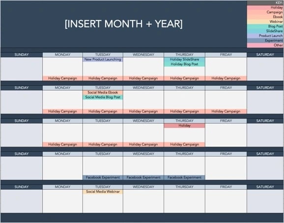
 

social-media-calendar

Download These Templates

4. Pay Per Click (PPC)

PPC drives traffic to your website by paying a publisher every time your ad is clicked.

One of the most common types of PPC is Google Ads, which allows you to pay for top slots on Google’s search engine results pages at a price “per click” of the links you place. Other channels where you can use PPC include:

  • Paid ads on Facebook: Here, users can pay to customize a video, image post, or slideshow, which Facebook will publish to the news feeds of people who match your business’s audience.
  • Twitter Ads campaigns: Here, users can pay to place a series of posts or profile badges to the news feeds of a specific audience, all dedicated to accomplishing a specific goal for your business. This goal can be website traffic, more Twitter followers, tweet engagement, or even app downloads.
  • Sponsored Messages on LinkedIn: Here, users can pay to send messages directly to specific LinkedIn users based on their industry and background.

PPC can be hard to grasp at first, so we’ve created a beginner-friendly guide to get you started. Download it below: 
How to use Google Ads for your business

Download This Guide

5. Affiliate Marketing

This is a type of performance-based advertising where you receive a commission for promoting someone else’s products or services on your website. Affiliate marketing channels include:

This is part of the relatively new wave of influencer marketing. Creating a campaign using influencers can be a highly effective form of affiliate marketing. Finding the right content creators can take your digital campaign to the next level.

6. Native Advertising

Native advertising refers to advertisements that are primarily content-led and featured on a platform alongside other, non-paid content.

BuzzFeed-sponsored posts are a good example, but many people also consider social media advertising to be “native” — Facebook advertising and Instagram advertising, for example.

7. Marketing Automation

Marketing automation refers to the software that automates your basic marketing operations. Many marketing departments can automate repetitive tasks they would otherwise do manually, such as:

  • Email newsletters: Email automation doesn’t just allow you to automatically send emails to your subscribers. It can also help you shrink and expand your contact list as needed so your newsletters are only going to the people who want to see them in their inboxes.
  • Social media post scheduling: If you want to grow your organization’s presence on a social network, you need to post frequently. This makes manual posting a bit of an unruly process. Social media scheduling tools push your content to your social media channels for you, so you can spend more time focusing on content strategy.
  • Lead-nurturing workflows: Generating leads, and converting those leads into customers, can be a long process.You can automate that process by sending leads specific emails and content once they fit certain criteria, such as when they download and open an ebook.
  • Campaign tracking and reporting: Marketing campaigns can include a ton of different people, emails, content, webpages, phone calls, and more. Marketing automation can help you sort everything you work on by the campaign it’s serving and then track the performance of that campaign based on the progress all of these components make over time.

8. Email Marketing

Companies use email marketing as a way of communicating with their audiences. Email is often used to promote content, discounts and events, as well as to direct people toward the business’s website.

The types of emails you might send in an email marketing campaign include:

  • Blog subscription newsletters.
  • Follow-up emails to website visitors who downloaded something.
  • Customer welcome emails.
  • Holiday promotions to loyalty program members.
  • Tips or similar series emails for customer nurturing.

Learn more about email marketing with our free guide: 
email-guide-1

Download This Guide

9. Online PR

Online PR is the practice of securing earned online coverage with digital publications, blogs, and other content-based websites. It’s much like traditional PR but in the online space.

The channels you can use to maximize your PR efforts include:

  • Reporter outreach via social media: Talking to journalists on Twitter, for example, is a great way to develop a relationship with the press that produces earned media opportunities for your company.
  • Engaging online reviews of your company: When someone reviews your company online, whether that review is good or bad, your instinct might be not to touch it. On the contrary, engaging company reviews helps you humanize your brand and deliver powerful messaging that protects your reputation.
  • Engaging comments on your personal website or blog: Similar to how you’d respond to reviews of your company, responding to the people reading your content is the best way to generate productive conversation around your industry.

If you don’t have a dedicated PR team, it can be hard to get started. Luckily, we’ve got you covered. Download our free PR kit below: 
Inbound Public Relations Guide Ebook-1

Download This Guide

10. Inbound Marketing

Inbound marketing refers to a marketing methodology wherein you attract, engage, and delight customers at every stage of the buyer’s journey.

You can use every digital marketing tactic listed above throughout an inbound marketing strategy to create a customer experience that works with the customer, not against them.

Here are some classic examples of inbound marketing versus traditional marketing:

  • Blogging vs. pop-up ads
  • Video marketing vs. commercial advertising
  • Email contact lists vs. email spam

11. Sponsored Content

With sponsored content, you, as a brand, pay another company or entity to create and promote content that discusses your brand or service in some way.

One popular type of sponsored content is influencer marketing. With this type of sponsored content, a brand sponsors an influencer in its industry to publish posts or videos related to the company on social media.

Another type of sponsored content could be a blog post or article highlighting a topic, service, or brand.

12. Search Engine Marketing (SEM)

When a potential lead is searching for a product or business related to yours, it’s a great opportunity for a promotion. Paid advertising and SEO are two great strategies for promoting your business to capitalize on those future leads.

Search engine marketing is another way to increase website traffic by placing paid ads on search engines. The two most popular SEM services are Bing Ads and Google Ads.

These paid ads fit seamlessly on the top of search engine results pages, giving instant visibility. This is also an example of effective native advertising.

13. Instant Messaging Marketing

Marketing your products through messaging platforms is a fast way to reach potential leads, even for those who haven’t offered up their cell phone number.

It’s a simple way to let your audience know about flash sales, new products, or updates about their orders. If your customers have questions or need more information, it’s also a convenient way for them to connect to customer service.

You can send messages directly to a mobile phone via text or on platforms like Facebook Messenger or WhatsApp.

The digital marketer focuses on each channel’s key performance indicators (KPIs) to properly measure performance. For example, a digital marketer in charge of SEO might measure their website’s organic traffic. 

At small companies, one person might own many digital channels and tactics described above, while larger companies typically have a specialist focused on one or two brand channels.

Here are some examples of these specialists:

SEO Manager

Main KPIs: Organic traffic

SEO managers work to rank a business on Google SERPs.

Using various SEO strategies, this person might work directly with content creators to ensure the content is high-quality and up to Google’s standards, even if the company also posts this content on social media. 

Content Marketing Specialist

Main KPIs: Time on page, overall blog traffic, YouTube channel subscribers

Content marketing specialists are digital content creators. They might keep track of a blogging calendar, or develop a content strategy that includes video.

They often work with people in other departments to ensure products and campaigns are supported by promotional content on all digital channels. 

Social Media Manager

Main KPIs: Follows, Impressions, Shares

A social media manager’s role depends on each company and industry. But above all, social media managers manage social media by establishing a posting schedule for the company’s written and visual content.

They might also work with a content marketing specialist to develop a strategy for which content to share on social media. 

(Note: Per the KPIs above, “impressions” refers to the number of times a business’s posts appear on the newsfeed of a user.)

Marketing Automation Coordinator

Main KPIs: Email open rate, campaign click-through rate, lead-generation (conversion) rate

A marketing automation coordinator helps choose and manage the software a marketing team uses to understand customer behavior and measure business growth.

Many of the marketing operations described above might be executed separately, so it’s important for there to be someone who can group these activities into individual campaigns and track performance. 

Inbound Marketing vs. Digital Marketing: Which Is It?

Inbound marketing is a methodology that uses digital marketing assets to attract, engage, and delight customers online.

Digital marketing, on the other hand, is simply an umbrella term to describe online marketing tactics of any kind, regardless of whether they’re considered inbound or outbound.

Digital marketing is often compared to inbound marketing, but it doesn’t differentiate between ‘inbound’ and ‘outbound’ methods.

It’s more of an umbrella term for all marketing that involves digital communication, while inbound marketing is more of a strategy.

Digital outbound tactics put a marketing message in front of as many people as possible online — regardless of whether it’s relevant or welcomed.

For example, the garish banner ads you see on websites that push a product or promotion to people who aren’t necessarily ready to receive it. 

Marketers who employ digital inbound tactics use online content to attract their target customers by providing assets that are helpful to them.

One of the simplest yet most powerful inbound digital marketing assets is a blog, which allows your website to capitalize on the terms which your ideal customers are searching for.

Does online marketing work for all businesses?

Digital marketing can work for any business in any industry. Regardless of what your company sells, digital marketing still involves building buyer personas to identify your audience’s needs, and creating valuable online content.

However, that’s not to say all businesses should implement a digital marketing strategy in the same way.

B2B Digital Marketing

If your company is business-to-business (B2B), your digital marketing efforts are likely centered around online lead generation, with the end goal being for someone to speak to a salesperson.

The goal of your marketing strategy might be to attract and convert the highest quality leads for your salespeople via your website and to support digital channels. 

Beyond your website, you’ll probably choose to focus your efforts on business-focused channels like LinkedIn, where your demographic is spending their time online.

B2C Digital Marketing

If your company is business-to-consumer (B2C), depending on the price point of your products, it’s likely that the goal of your digital marketing efforts is to attract people to your website and have them become customers without ever needing to speak to a salesperson.

You’re probably less likely to focus on ‘leads’ in their traditional sense and more likely to build an accelerated buyer’s journey from when someone lands on your website to when they make a purchase.

This can mean that your product features are higher up in the marketing funnel than it might be for a B2B business, and you might need to use stronger calls-to-action to inspire purchases. 

For B2C companies, channels like Instagram and Pinterest are often more valuable than business-focused platforms like LinkedIn.

What types of digital content should I create?

The kind of content you create depends on your audience’s needs at different stages in the buyer’s journey.

You should start by creating buyer personas (use these free templates, or try makemypersona.com) to identify what your audience’s goals and challenges are in relation to your business.

On a basic level, your online content should aim to help them meet these goals, and overcome their challenges.

Then, you’ll need to consider when they’re most likely to be ready to consume this content in line with their stage in the buyer’s journey. We call this content mapping.

With content mapping, the goal is to target content according to:

  1. The characteristics of the person who will be consuming it (that’s where buyer personas come in).
  2. How close that person is to making a purchase (i.e., their lifecycle stage).

In terms of the format of your content, there are a lot of different things to try. Here are some options we’d recommend using at each stage of the buyer’s journey:

Awareness Stage

  • Blog posts. Great for increasing your organic traffic when paired with a strong SEO and keyword strategy.
  • Infographics. Very shareable, meaning they increase your chances of being found via social media when others share your content. (Check out these free infographic templates to get you started.)
  • Short videos. Again, these are very shareable and can help your brand get found by new audiences by hosting them on platforms like YouTube.

Consideration Stage

  • Ebooks. Great for lead generation as they’re generally more comprehensive than a blog post or infographic, meaning someone is more likely to exchange their contact information to receive it.
  • Research reports. Again, this high-value content type is great for lead generation. Research reports and new data for your industry can also work for the awareness stage, though, as they’re often picked up by the media or industry press.
  • Webinars. As they’re a more detailed, interactive form of video content, webinars are an effective consideration stage content format as they offer more comprehensive content than a blog post or short video.

Decision Stage

  • Case studies. Having detailed case studies on your website can be an effective form of content for those ready to make a purchasing decision, as it helps you positively influence their decision.
  • Testimonials. If case studies aren’t a good fit for your business, having short testimonials around your website is a good alternative. For B2C brands, think of testimonials a little more loosely. If you’re a clothing brand, these might take the form of photos of how other people styled a shirt or dress, pulled from a branded hashtag where people can contribute.

1. Define your goals.

When you get started with digital marketing, it’s critical to identify and define your goals since you’ll craft your strategy with them.

For instance, if your goal is to increase brand awareness, you might want to focus on reaching new audiences via social media.

Or maybe you want to increase sales on a specific product — if that’s the case, it’s more important you focus on SEO and optimizing content to get potential buyers on your website in the first place.

Additionally, if sales are your goal, you might test out PPC campaigns to drive traffic through paid ads.

Whatever the case, it’s easiest to shape a digital marketing strategy after you’ve determined your company’s biggest goals.

2. Identify your target audience.

We’ve mentioned this before, but one of the biggest benefits of digital marketing is the opportunity to target specific audiences – however, you can’t take advantage of that benefit if you haven’t first identified your target audience.

Of course, it’s important to note your target audience might vary depending on the channel or goal(s) you have for a specific product or campaign.

For instance, perhaps you’ve noticed most of your Instagram audience is younger and prefers funny memes and quick videos — but your LinkedIn audience is older professionals looking for more tactical advice.

You’ll want to vary your content to appeal to these different target audiences.

If you’re starting from scratch, feel free to take a look at How to Find Your Target Audience.

3. Establish a budget for each digital channel.

Your budget will depend on the elements of digital marketing you use. 

If you’re focusing on inbound techniques like SEO, social media, and content creation for a pre-existing website, the good news is you don’t need a big budget at all.

You can aim to create high-quality content your audience will want to consume, where the only investment you’ll need is your time.

You can get started by hosting a website and creating content using HubSpot’s CMS.

For those on a tight budget, you can get started using WordPress hosted on WP Engine, using a simple theme from StudioPress, and building your site without code using the Elementor Website Builder for WordPress.

With outbound techniques like online advertising and purchasing email lists, there is undoubtedly some expense. What it costs comes down to what kind of visibility you want to receive as a result of the advertising.

For example, to implement PPC using Google AdWords, you’ll bid against other companies in your industry to appear at the top of Google’s search results for keywords associated with your business.

Depending on the keyword’s competitiveness, this can be reasonably affordable or extremely expensive, which is why it’s a good idea to focus on building your organic reach too.

4. Strike a good balance between paid and free digital strategies.

A digital marketing strategy likely needs both paid and free aspects to truly be effective.

For instance, spending time building comprehensive buyer personas to identify your audience’s needs and creating high-quality online content that converts them, you’ll likely see strong results despite minimal ad spend. 

However, if paid advertising is part of your digital strategy, then the results might come even quicker.

Ultimately, aim to build your organic (or ‘free’) reach using content, SEO, and social media for more long-term, sustainable success.

When in doubt, try both, and iterate on your process as you learn which channels — paid or free – perform best for your brand.

5. Create engaging content.

Once you know your audience and have a budget, it’s time to start creating content for the various channels you will use.

This content can be social media posts, blog posts, PPC ads, sponsored content, email marketing newsletters, and more.

Of course, any content you create should be interesting and engaging to your audience because the point of marketing content is to increase brand awareness and improve lead generation.

6. Optimize your digital assets for mobile.

Another key component of digital marketing is mobile marketing.

In fact, smartphone usage as a whole accounts for 69% of time spent consuming digital media in the U.S., while desktop-based digital media consumption makes up less than half — and the U.S. still isn’t mobile’s biggest fan compared to other countries.

This means optimize your digital ads, web pages, social media images, and other digital assets for mobile devices is essential.

If your company has a mobile app that enables users to engage with your brand or shop for your products, your app falls under the digital marketing umbrella, too.

Those engaging with your company ovia mobile devices need to have the same positive experience as they would on a desktop. This means implementing a mobile-friendly or responsive website design to make browsing user-friendly on mobile devices.

It might also mean reducing the length of your lead generation forms to create a hassle-free experience for people downloading your content on the go.

As for your social media images, it’s important to always have a mobile user in mind when creating them, as image dimensions are smaller on mobile devices and text can be cut-off.

There are lots of ways you can optimize your digital marketing assets for mobile users, and when implementing any digital marketing strategy, it’s hugely important to consider how the experience will translate on mobile devices.

By ensuring this is always front-of-mind, you’ll be creating digital experiences that work for your audience, and consequently achieve the results you’re hoping for.

7. Conduct keyword research.

Digital marketing is all about reaching targeted audiences through personalized content — all of which can’t happen without effective keyword research.

Conducting keyword research is critical for optimizing your website and content for SEO and ensuring people can find your business through search engines.

Additionally, social media keyword research can also help market your products or services on various social channels.

You’ll still want to conduct keyword research even if you don’t have a full-time SEO strategist. Try creating a list of high-performing keywords related to your products or services, and consider long-tail variations for added opportunities.

8. Iterate based on the analytics you measure.

Finally, to create an effective digital marketing strategy for the long term, it’s vital your team learn how to pivot based on analytics.

For instance, perhaps after a couple of months you find your audience isn’t as interested in your content on Instagram anymore — but they love what you’re creating on Twitter.

Sure, this might be an opportunity to re-examine your Instagram strategy as a whole, but it might also be a sign that your audience prefers a different channel to consume branded content.

Alternatively, perhaps you find an older web page isn’t getting the traffic it used to. You might consider updating the page or getting rid of it entirely to ensure visitors are finding the freshest, most relevant content for their needs.

Digital marketing provides businesses with incredibly flexible opportunities for continuous growth — but it’s up to you to take advantage of them.

I’m ready to try online marketing. Now what?

If you’re already doing digital marketing, you’re likely reaching some segments of your audience online. No doubt you can think of some areas of your strategy that could use a little improvement, though.

That’s why we created a step-by-step guide to help you build a digital marketing strategy that’s truly effective, whether you’re a complete beginner or have a little more experience.

Next, let’s look at some examples of digital marketing that will be sure to inspire you.

1. Lego’s Rebuild the World Campaign

digital marketing examples: lego

Image Source

This is a great example of a digital marketing campaign because it says something about the brand. In this campaign, Lego takes a stance on important global issues as a way to connect with its audience.

Nowadays, it’s becoming increasingly important for companies to discuss global issues and show alignment with their customers in that way. The major play of this campaign is to help share the brand’s story and messaging.

Given that 82% of customers shop from brands that share their values, this was a good move for the toy brand.

Pro-Tip: Consider a cause or concern important to your target audience. Then find a way to incorporate your stance on the matter in your marketing to show viewers that you share in their values. 

2. Dove’s Reverse Selfie Campaign

digital marketing examples: dove

Image Source

As we continue to learn how social media affects children, especially young girls, Dove decided to send a message. The Reverse Selfie campaign shows the reverse of what a teen girl did to prepare for a selfie and photoshop the picture.

The purpose is to increase awareness of how social media can negatively impact self-esteem.

This is an excellent example of what marketing content can look like when you know your audience intimately.

By knowing its audience of real women, many of them parents, Dove was able to bring light to an often overlooked consequence of the growth of social media.

What I Like: Dove’s campaign shows the importance of knowing your audience to create relatable, understandable, and compelling content.  

3. Jennifer Lopez’s #InTheMorningChallenge

digital marketing examples: jennifer lopez

Image Source

In this social media campaign, Jennifer Lopez created a dance challenge to promote her new song. With this challenge, fans would do the same dance in their pajamas and in dress up clothes.

This was a successful social media campaign as the video had over 16 million views and over 5,000 posts.

Using social media is a great way to engage your audience and get them to participate with your brand one-on-one.

What I Like: The #InTheMorningChallenge is a great example of a challenge that is fun and simple enough for fans to participate in on their own. When creating a challenge or trend to promote your brand, remember K.I.S.S. (Keep It Simple Sweetheart).  
4. Always’ #DayoftheGirl Campaign

digital marketing examples: always

Image Source

This is another digital campaign focused on emotional marketing. With this campaign, Always asked their own employees what tips they would give to girls. T

he women offer their valuable insight in a way meant to inspire everyone for International Day of the Girl, an international holiday that occurs annually in October.

Again, this isn’t a campaign where the product is mentioned much, but that isn’t the point. The point of this digital campaign was to inspire its audience.

What I Like: With that message, they could reach even more people, increase brand awareness, and show their audience that the brand aligns with their values.

5. Topicals – Email Marketing

Topicals, a skincare company, uses email marketing as part of a digital marketing strategy. The image below displays a marketing email that advertises a subscribe and save deal, where people get 20% off refills if they choose to subscribe.
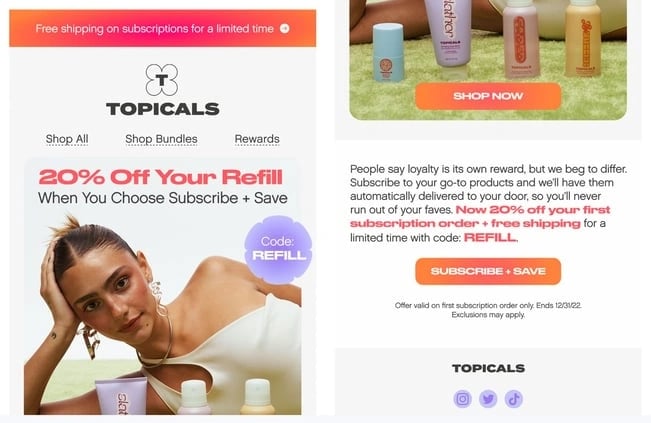
digital marketing examples: topicals email newsletter

Image Source

Pro-Tip: Notice how Topicals uses bold letters and colors to emphasize their deals and CTA button. Make sure to do the same in your own emails.

6. Ashley White – Affiliate Marketing

Ashley White is an esthetician who uses affiliate marketing. In her Twitter profile, she includes a link to a personal Linktree page where she shares referral codes and discounts for people that shop with her codes and links. 
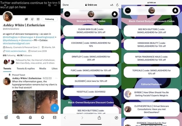
digital marketing examples: skinclasshero affiliate marketing

Image Source

What I Like: As she markets herself as an ambassador for these companies, the businesses generate brand awareness as someone visiting her Linktree might be inspired to try a new brand (and an influencer recommendation can make this inspiration even more powerful). 

7. Samsonite – Search Engine Marketing

Search engine marketing is a great example of digital marketing, where brands bid on keywords and showcase ads for their products in SERPs when someone queries a related keyword. 

The image below is an example from Samsonite, where a query for the word “luggage” surfaces various luggage options from known brands that have created ads to feature their products front and center in search results. 
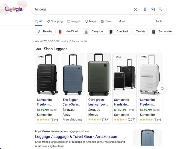
digital marketing examples: samsonite search engine marketing

Image Source

8. Yes Williamsburg – Sponsored Ad 

Yes Williamsburg uses native advertising within its Instagram feed to share a paid sponsorship with a local Brooklyn business.

The Reel is tagged as a paid partnership, but it appears organically in a users feed like a standard post. The ad is also in line with Yes Williamsbug’s usual content of sharing information about unique local businesses for people to try. 

Pro-Tip: Today’s audiences (especially Gen-Z) do not like to be blatantly advertised to, so creating content that feels organic and natural is more helpful than content that feels like an advertisement. 

9. HubSpot Blog – Content Offers

Content offers are a form of digital marketing where businesses share helpful content with site visitors that it knows will benefit them.

For example, the HubSpot Blog often features content offers and learning material for people to learn more about the blog topic. 

For its blog post 11 Marketing Strategies for Black Owned Businesses, readers that want to know more about developing a marketing strategy can download an ebook for further learning. 
digital marketing examples: hubspot blog content offers

Image Source

10. For Keeps Bookstore – Local Business SEO

A search engine optimization strategy for many local businesses is an optimized Google My Business profile to appear in local search results when people look for products or services related to what you offer. 

For Keeps Bookstore, a local bookstore in Atlanta, GA, has optimized its Google My Business profile for local SEO so it appears in queries for “atlanta bookstore.”
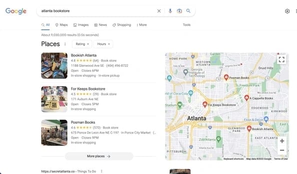
digital marketing examples: for keeps bookstore local SEO marketing

Image Source

Integrate Digital Marketing Into Your Strategy

Any opportunity where you can connect to your audience is an opportunity to convert a lead or acquire a customer.

Digital marketing creates so many more of those opportunities by allowing you to reach prospective buyers through a wide variety of channels.

Whether it’s social media platforms, websites, text messages, or any online medium, it’s an invaluable way to promote your business, service, or product.

Editor’s Note: This blog post was originally published in September 2019, but was updated for comprehensiveness.