Categories B2B

Top 6 Social Media Marketing Challenges in 2024, According to 1,500+ Marketers [+ How to Face Them]

I’m not sure which social platform is winning the algorithmic gymnastics competition this year. Is it Instagram? Maybe TikTok?

Either way, it seems like all of our favorite channels are actively competing for gold, which presents quite the range of social media marketing challenges for us.

Download Now: The 2024 State of Social Media Trends [Free Report]

From algo updates to unpredictable trends, we’re always left wondering: Which platforms will provide the highest return? Where’s our audience hanging out now? And how can we create content they’re actually interested in?

These are all fair questions. In fact, our latest social trends report shows that they’ve manifested into the biggest challenges social media marketers are facing this year.

Here’s what the data says.

Top 6 Social Media Marketing Challenges in 2024

HubSpot’s Social Trends Report 2024, top six social media marketing challenges; creating engaging content, keeping up with features and algorithm updates, finding ideas for new content, reaching their target audience, creating content that generates new leads, keeping up with new trends

1. Creating engaging content.

As someone who creates content, I can tell you firsthand that creating good content is hard. And the standard for good content is always changing.

It looks like I’m not alone in this thinking because our survey shows that 17% of marketers said creating engaging content would be their biggest challenge this year.

The key to high-quality content creation is meeting your audience at the intersection of what they care about most and what’s trending on their favorite platforms.

Sprinkle in a few fickle social algorithms, and you’ve created one of the most complicated recipes of all time.

That’s why it’s no surprise to me that this feels like a pressure point for marketers.

How to Overcome This Challenge

Rachael Samuels, director of social media at Sprout Social, believes dedicating time, resources, and headcount towards social media is vital for long-term success.

As she puts it, “The social landscape is becoming increasingly saturated with new networks and seemingly endless potential audiences to engage. Social teams of one are no longer enough to keep up with the demand.”

top six social media marketing challenges; creating engaging content; as consumer preferences and expectations continue to grow, social marketers require greater investment in their teams and resources to be successful; Rachael Samuels, director of social media at Sprout Social

Samuels adds, “As consumer preferences and expectations continue to grow, social marketers require greater investment in their teams and resources to be successful.

Brands must ensure social is prioritized as a critical communication tool and provide their teams with the resources needed to produce creative, relevant, and authentic content.”

As a former social media team of one, I wholeheartedly agree that lack of time and resources are blockers for content creation.

However, if you’re not in a position to increase your social media headcount, here are a few more ways you can beat the engaging content challenge:

  • Repurpose content across channels to get the most bang for your buck. For example, take one of your 1,800-word blog posts and rework it into punchy short-form content for channels like Instagram or TikTok. HubSpot’s free AI paragraph rewriter is great for this.
  • Use social media AI tools to streamline content planning, creation, and posting across your social channels — and to open up time for more creativity.
  • Pull tips from the video below on how to create an effective social media content calendar:

2. Keeping up with features and algorithm updates.

I already mentioned the fickle social algorithm, and here it is again, rearing its not-so-pleasant head in challenge number two.

Our data shows that 16% of marketers are having trouble keeping up with new social media features and algorithm updates.

After looking at just one example of Facebook’s algorithm from Meta, I get it. (Not the algorithm, but why this is giving social media marketers a headache.)

Facebook algorithm example

Source

And coming from a blogger who has been quietly beefing with Google over their all-too-regular algorithm changes, you can trust and believe that I understand the struggle.

How to Overcome This Challenge

As marketers, we can’t stop the algorithms from changing. But we can take steps to be proactive, stay informed, and adjust our content to meet new demands. Here’s how:

  • Get to know the algorithms on your most frequently used channels. It’ll be easier to navigate the changes if you already know the basics about how things operate.
  • Stay up to date on the latest algorithm changes. Sources like HubSpot (cough, cough), Sprout Social, and Hootsuite are great resources here.
  • Create content your audience wants to engage with. Content relevance is a big ranking factor for most algorithms, regardless of platform.
  • Post on social media at the right time. The more engagement, the better your chances of showing up in-feed — so catch your audience online early and often.

3. Finding ideas for new content.

Based on our survey, 16% of marketers also reported that finding ideas for new content is a big challenge this year.

Why? It can be exhausting (and tricky) to consistently pitch new ideas for social platforms, especially when they already feel overcrowded with content.

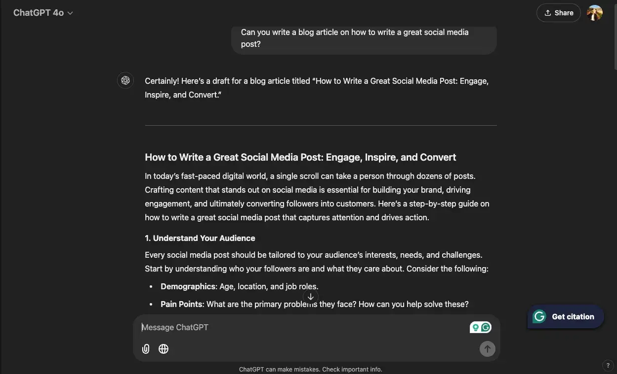
Luckily, we’re at a point now where we can tap AI to help generate new content ideas if we’re feeling stuck. In fact, the below ChatGPT prompt is one of my favorites as a writer:

“Give me [number] of [content type] ideas about [topic] that would appeal to [target audience].”

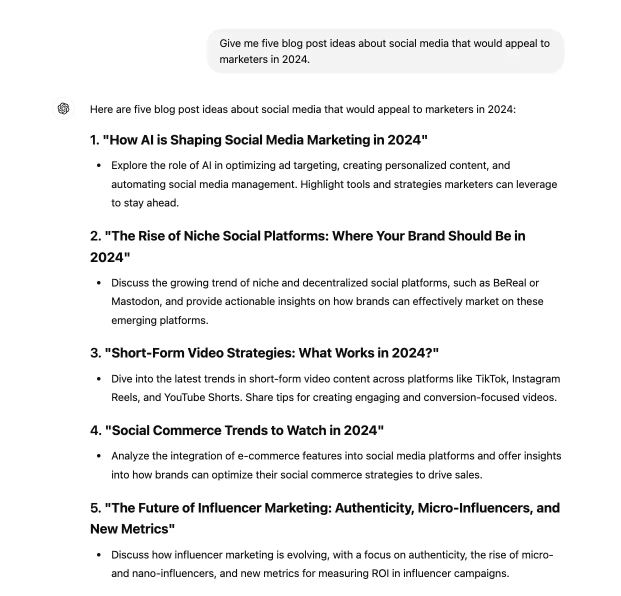
Here it is with the blanks filled in: “Give me five blog post ideas about social media that would appeal to marketers in 2024.”

And here’s the response I got:

ChatGPT response example that gives me five blog post ideas about social media that would appeal to marketers in 2024

I also talked to an expert about this challenge — let’s see what she recommends.

How to Overcome This Challenge

Christina Garnett, former principal marketing manager at HubSpot, suggests researching what already exists when looking for new ideas.

“When trying to find the new you must consume and see what kind of content is already available and then look for gap opportunities.

Are there questions not being answered? Different perspectives not being shared? Maybe the content exists but not in a format that is tailored for a specific learner or audience,” says Garnett.

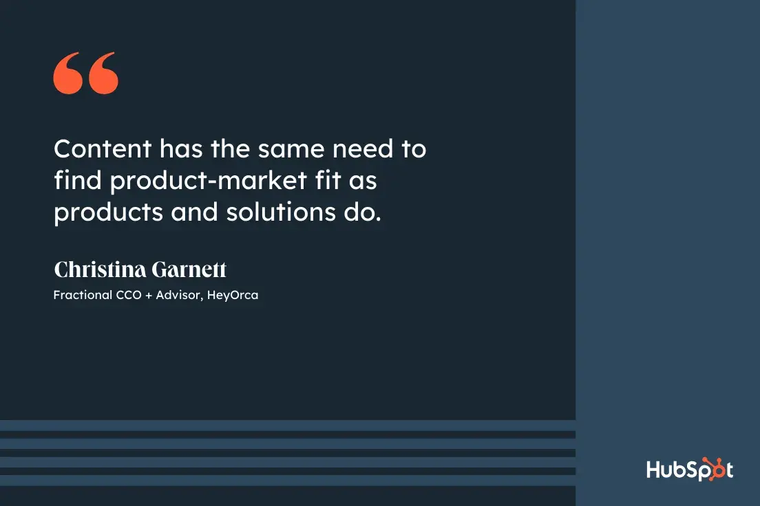
top six social media marketing challenges; finding ideas for new content; content has the same need to find product-market fit as products and solutions do; Christina Garnett, fractional CCO and advisor, HeyOrca

She adds, “Once you determine what you can create, you need to determine who needs it, and how it can best be packaged to improve their experience. Content has the same need to find product-market fit as products and solutions do.”

4. Reaching their target audience.

Up next, 15% of marketers also identified reaching their target audience as one of their top social media challenges.

Creating engaging content and finding new ideas is great, but what’s the point if your audience never sees it? (Like if a tree falls in the forest, and no one is around to hear it … )

The good news is we already have a great piece on the blog that explains how to find your social media target audience. I’ll summarize a few of the action items below.

How to Overcome This Challenge

  • Identify or create buyer personas. Think about who your current customers are. What are their jobs? Age? Income?
  • Find out where your audience is most active. This will help you prioritize which social media platforms to focus on.
  • Look at your competitors. Who are they appealing to? Who’s responding to their posts and engaging with them?
  • Survey your customers. Ask what type of content they consume, what social media sites they like, or who they follow.

Then, use all of this info to meet them where they are on social.

5. Creating content that generates leads.

Lead generation is also proving to be a hurdle in 2024. 14% of those surveyed report creating content that generates leads as a top social media challenge this year.

Lead generation is a job all on its own. Group that with content creation, trend monitoring, and community management, and you’ve just described the duties of the quintessential social media marketer.

To take some of the pressure off, here’s how you can build a strong social media lead gen strategy.

How to Overcome This Challenge

To start, consider driving your audience from certain social platforms back to dedicated landing pages, or track clicks on specific CTAs for each of your social media campaigns.

Let’s say you’re running a campaign aimed at driving revenue towards a new product offering, create a product landing page and link to it on each of your social profiles. That way, you can track how many clicks come from each page, and alter your strategy accordingly.

For example, if you’re seeing most clicks coming from Facebook, that may indicate that it’s a good idea to put paid advertising behind your Facebook strategy.

Speaking of paid advertising, social media ads and influencer marketing are also powerful ways to generate leads through social media.

Talkwalker’s former CMO Elena Melnikova emphasizes the importance of reading the room when creating ads for social media:

“Too commercial, and this young audience will scroll past your brand, looking for the next dance routine. Read the room. Follow the trends. Be spontaneous,” notes Melnikova.

top six social media marketing challenges; finding ideas for new content; read the room, follow the trends, be spontaneous; Elena Melnikova, CMO, Rossum

And when it comes to influencer marketing, Melnikova says:

“Savvy brands will work with influencers to create content. And with the majority of TikTok influencers being Gen Z, they‘ll understand how to ensure their content stands out, and increase a brand’s engagement figures.”

6. Keeping up with new trends.

Last but certainly not least, our data shows that 14% of marketers cited keeping up with new trends as one of their top challenges for this year.

At this point, almost everything materializes as a trend — whether it’s a new platform, an old meme, or even just a sound (I’m looking at you, TikTok).

But the reality is this: Every trend isn’t a good fit for every brand.

Sometimes the most popular social platform isn’t the right place to find your audience. Or maybe your customers aren’t familiar with, and therefore wouldn’t appreciate, that trending phrase that everyone is using in their videos this week.

(For example, I said “sometimes, you need to eat an entire cucumber” to my mom yesterday, and she had no idea what I was talking about. Shoutout to @logagm on TikTok.)

The constant struggle between what’s current and what resonates with your audience makes it difficult to determine which trends to tap into.

How to Overcome This Challenge

I have two nuggets of advice for this one.

First, find a way to keep a pulse of the latest social media trends.

Follow industry leaders like Sprout Social, sign up for expert newsletters like The Marketing Millennials, or see what your audience is currently talking about on forum sites like Reddit.

Also, track the latest news and releases from your favorite social media channels (or curate a network of insiders like Annie-Mai Hodge on LinkedIn) to be the first to know about new features and algorithm updates.

The second is to choose the methods with the highest ROI. And if you don’t know how, take a look at HubSpot’s free lesson on How to Measure Social Media ROI to learn more.

Like I said earlier, it’s not worth it for every brand to hop on every trend. If it can tie back to your audience’s interests and your biggest business outcomes, you’re in the right place.

Challenge(s) Accepted

There you have it! The six biggest challenges that social media teams are facing in 2024.

Now that you know which challenges you’re up against, take the time to brainstorm solutions that will help you level up your social media strategy — for next year and beyond.

Editor’s note: This post was originally published in November 2021 and has been updated for comprehensiveness.

Categories B2B

The Holiday Hustle: Why B2B Marketers Shouldn’t Hit Snooze in Q4

There’s a shift occurring; in our businesses, homes, and media. 

You all see the signs. Things are changing all around us. 

The Holiday season is upon us! 🎅❄☃🎆

I love this time of year, personally. It means time with family and some high-quality excuses for whipped cream consumption. 

For B2B marketers, however, we mistakenly believe content engagement slows to a halt. 

Let’s talk turkey. 🦃

B2B Professionals Still Consume Content in Q4

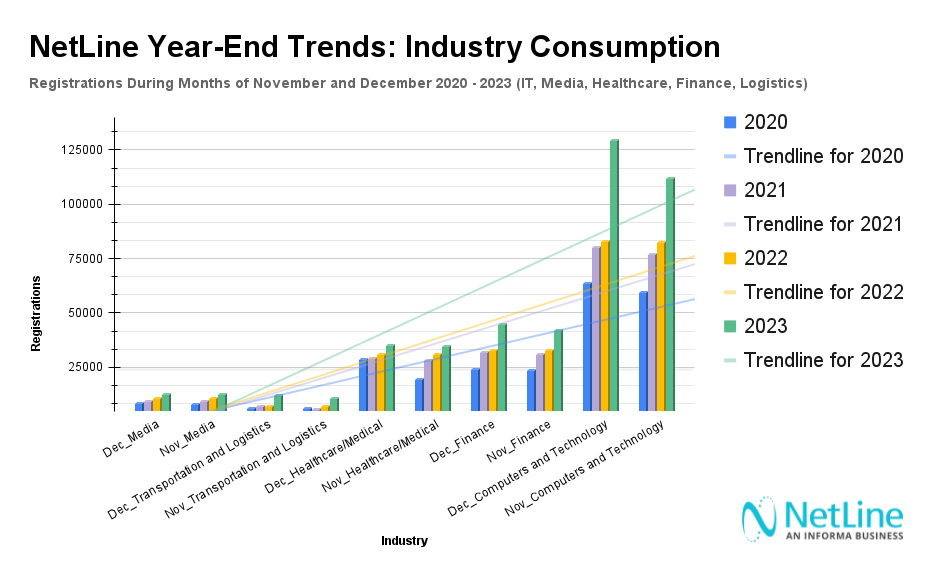
We may feel like the final days of the calendar year mean business activity dies, but recent data from NetLine reveals a different story.

While October is historically the month where consumption rates peak, November and December remain prime months for strategic content marketing and sales engagement.

Thus, contrary to popular belief, B2B professionals remain highly active in the year’s final weeks. 

NetLine’s data shows remarkable consistency:

Here’s how November and December registration averages stack up against January through October registration averages.

  • 2020: 📉4.3% lower ⬇
  • 2021: 📈10% higher ⬆
  • 2022: 📉4.5% lower ⬇
  • 2023: 📈11.1% higher ⬆

(It’s also worth noting that November 2024 is pacing at a similar rate to 2021 and 2023.)

The data suggests that many B2B professionals are using this time to reflect, plan, and prepare for the upcoming year. 

It’s not a major surprise in this case, but it is certainly worth further exploration.

Industry-Specific Engagement Trends

Some industries demonstrate particularly strong end-of-year content engagement.

  • Technology: +15% content requests from November to December
  • Finance and Healthcare: Significant spikes as budgets finalize
  • Transportation and Logistics: Doubled engagement since 2020

Each sector shows unique patterns, but the overarching trend remains consistent: professionals are actively seeking insights and strategic information.

How Much Does Content Consumption Shift from November to December? Content Format Comparison (2020-2023)

Not all content formats maintain equal appeal. 

Below is a comprehensive table that includes total registrations, Month-Over-Month (MoM) differences, and percentage deltas for each content format since 2020.

Content Format November Total Registrations December Total Registrations MOM
Delta (%)
eBook 1.5M 1.4M –4.71%
Guide (Merged) 454k 437k –3.87%
Cheat Sheet 231k 228k –1.52%
White Paper 190k 177k –7.03%
Article 148k 149k +0.96%
Webinar 65k 79k +20.68%
Playbook 42k 48k +13.74%
Report 38k 36k –6.94%
Tips and Tricks Guide 30k 28k –4.75%
Research Report 25k 24k –4.50%

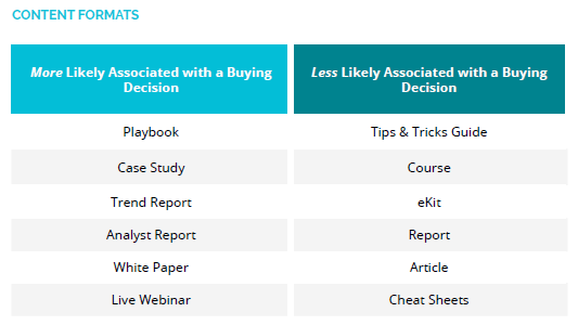
The four formats I want to focus on are smack dab in the middle of this table: White Papers, Articles, Webinars, and Playbooks. 

Of this group, Articles are the format least associated with a purchase decision.

For our purposes, we’ll dive further into the three formats with greater intent signals: White Papers, Webinars, and Playbooks. 

I highlight these formats due to their high association with purchase intent according to NetLine’s 2024 State of B2B Content Consumption and Demand Report.

The significance here is that B2B professionals registering for these formats are likely preparing for investment in 2025.

Of the three, White Papers are the only format with a significant drop-off. 2021 saw a massive, probably COVID-driven spike, but the format has declined 29.4% since.

Considering that B2B marketers upload more White Papers to NetLine’s platform compared to any other format, this is something marketers must be aware of.

Meanwhile, Webinars and Playbooks have experienced steady, year-over-year growth, with Webinars up 20.6% and Playbooks up 13.7%, respectively.

They hit on some of the key factors marketers and sellers would want to know:

  • High Popularity of Format
  • High Association of Purchase Intent
  • Increased Consumption of Format in December Compared to November

What’s the Point?

If you observe prospects engaging with Webinars and/or Playbooks in the month of December, get in touch with them.

The likelihood of this user making an investment in the near future is higher and therefore should be prioritized.

These figures highlight the most significant growth and declines among content formats.

Understanding Who is Consuming During the Holidays

We’ve demonstrated that B2B professionals remain highly active in content consumption during November and December.

Industries like Technology, Finance, Healthcare, and Transportation show notable engagement spikes with high-intent formats like Webinars and Playbooks seeing increased interest in December

All in all, these signals indicate it’s prime time for marketers to prioritize outreach.

But to whom should you be reaching out to?

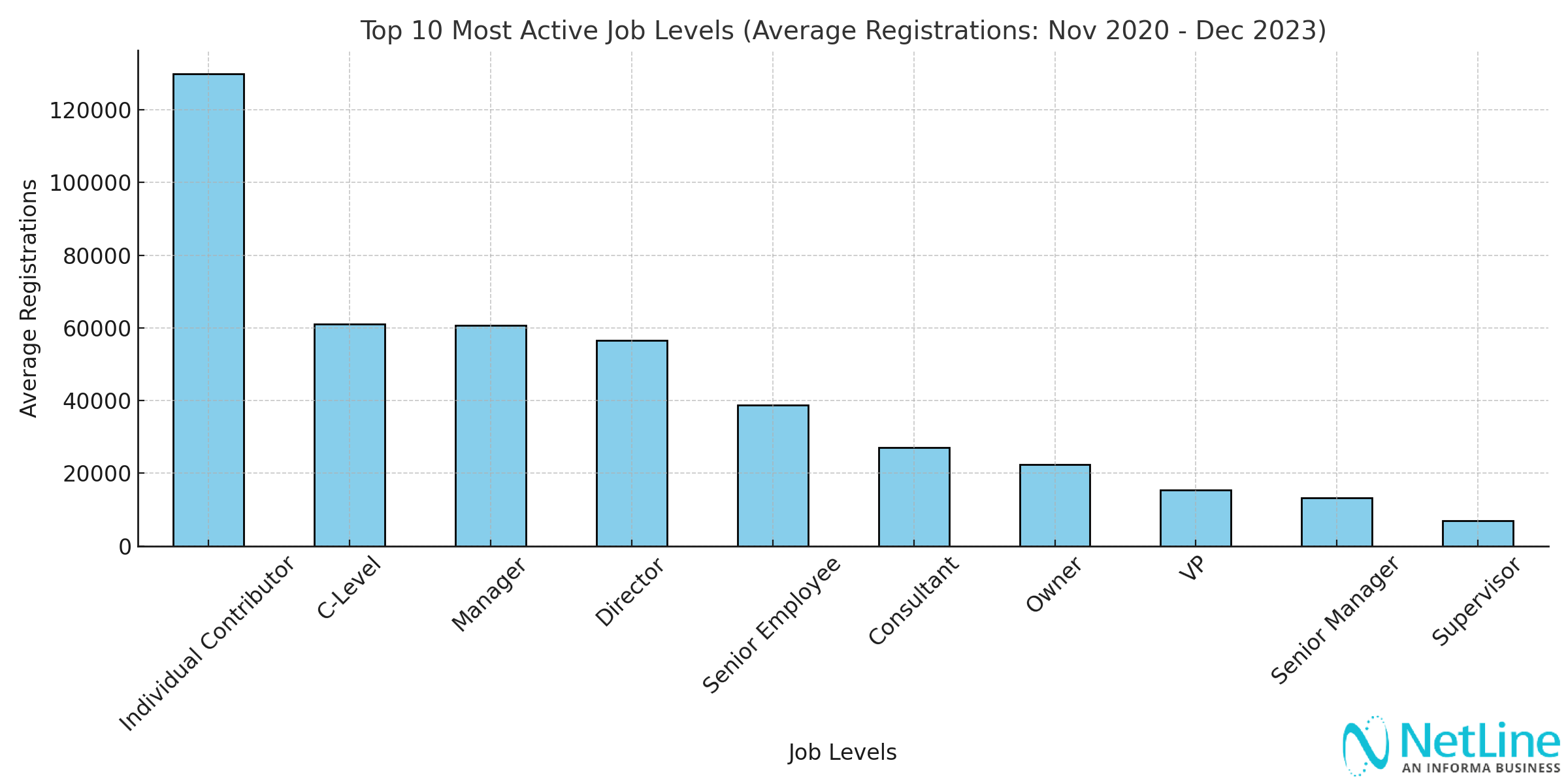
Individual Contributors will always be the most prolific content consumers. They could be involved in the buying committee, but chances are they’re just using your content today to level up.

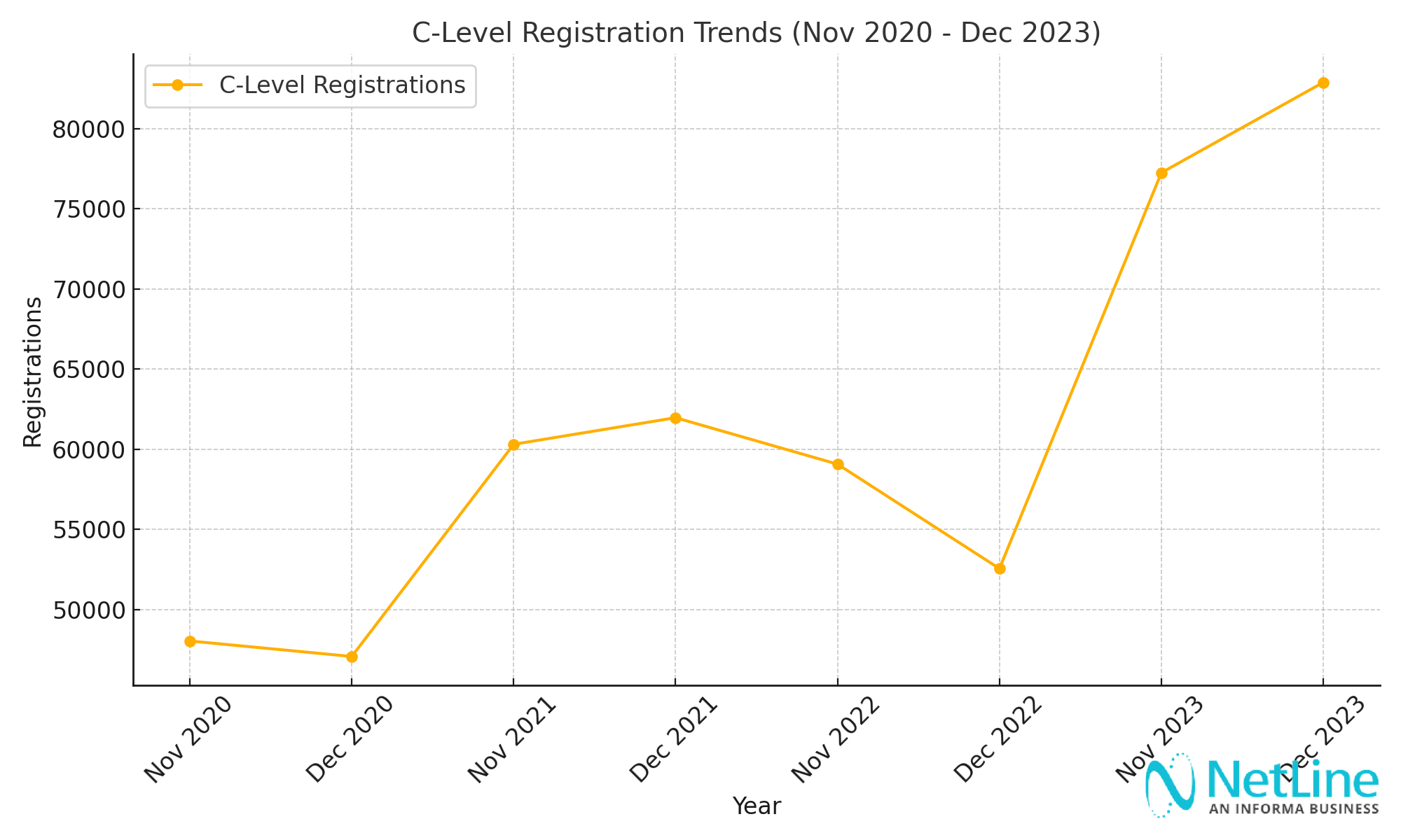
Throughout the year, the C-Level consumes more content than many expect, especially in the months of November and December.

Here are a few nuggets worthy of being called out:

  • C-Level and Director content consumption has grown 28% from November 2021 to November 2023
  • November typically sees individual contributors leading engagement
  • December becomes dominated by decision-makers finalizing strategies

That last bullet is proven by the progression of consumption across the C-Level.

Notice that in years unaffected by a pandemic (2020) or the onset of inflation and recession (2022), C-Level professionals consistently show higher content engagement in December than in November.

We’re still collecting November 2024 data but I’m eager to see what December’s trends look like in the first week of January.

The bottom line here: the C-Suite is looking ahead to the new year. December is a perfect moment to capture their attention. 

Which Words Drive Engagement?

Regardless of Job Level, seizing the opportunity can come down to using the right word or two to strike at the right moment.

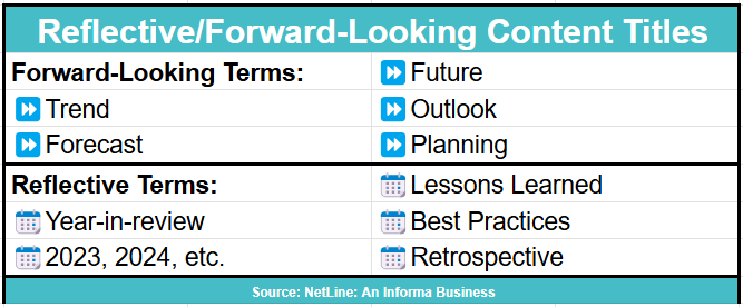
NetLine’s analysis revealed that most registration at this time of year revolves around “Reflective/Forward-Looking Content Titles”.

Reflective/Forward-Looking Content Titles are defined as titles containing keywords that indicate content focused on retrospection, trends, forecasts, or planning for the future.

These titles front assets featuring topics likely to resonate with B2B professionals preparing for the next year or reflecting on past performance.

Here’s an idea of which terms drove the most registrations in November and December.

Strategic keywords can significantly boost content registration. 

Push your content to be both forward-thinking and actionable in the moment. It’s a tricky balance, but absolutely worthwhile.

It’s Beginning to Look a Lot Like Q4…❄

While competitors might be slowing down, you shouldn’t be.

Smart marketers are capitalizing on these final weeks as B2B professionals actively consume and prepare for 2025, and seeking strategic insights.

To take advantage of these insights, focus on these actionable recommendations:

  1. Double Down on Engagement: Don’t wind down—gear up for Q4 opportunities
  2. Prioritize Interactive Formats: Focus on webinars and playbooks
  3. Create Targeted Content: Develop ROI-driven, future-focused assets
  4. Leverage Seasonal Keywords: Use reflective and forward-looking language

Five weeks remain in 2024—make them count.

Categories B2B

How Content Audits Help The HubSpot Blog Age Backwards — A Peek Into Our Process

In 2023, my team and I began working on perhaps one of the most ambitious content audits ever conducted on the HubSpot Blog. We’ve run content audits in the past — but not like this.

We ran the audit in three phases:

  • Phase 1 addressed our oldest content.
  • Phase 2 evaluated our lowest-performing content.
  • Phase 3 assessed the value of our topic clusters.

When it was all said and done, we audited over 10,000 blog post URLs and over 450 topic clusters.

Free Guide: How to Run a Technical SEO Audit

In this post, I’m going to focus on phase one of our audit. I’ll walk you through how we audited our oldest content and how we took action. Plus, I’ll share the results we found.

But first, let me give you some background on why we decided to run an audit of this magnitude.

Why We Audited

It all started in early 2023. At the time, my team was called the Historical Optimization team and we sat at the intersection of HubSpot’s SEO and Blog teams.

We were responsible for updating and optimizing our existing blog posts and finding growth opportunities within our library. (We’ve since evolved into what is now the EN Blog Strategy team.)

In case you’re new here, the HubSpot Blog is HUGE.

For context, the blog was home to 13,822 pages in February of 2023, the month we began our audit. Ahrefs’ Mateusz Makosiewicz even declared it as the “biggest corporate blog … ever” in an SEO case study earlier this year.

9 Surprising Takeaways From Analyzing HubSpot’s SEO Strategy by Ahrefs’ Mateusz Makosiewicz, HubSpot’s top organic competitors

Image Source

While we are fortunate to have a high domain authority and drive millions of visits per month, having a blog of this size does not come without challenges.

As our library ages, the amount of opportunity for new content across our blog properties and clusters shrinks.

So, we decided to audit our library to find opportunities for optimization.

We hypothesized that we could uncover “greenspace” and “quasi-greenspace” — topics that we have covered but haven’t capitalized on that well — by auditing the oldest 4,000 URLs in our library.

Although this was only about a third of our content library, we believed we’d be able to unearth some traffic opportunities and give our blog a boost.

Around the same time, we started to feel the effects of Google’s March 2023 Core Update that emphasized experience, which our Technical SEO team immediately started addressing.

However, another part of that algorithm update emphasized content freshness and helpfulness. In other words, how cutting-edge and useful our content is to our readers.

This is where we really felt a sense of urgency.

Because we had 4,000 URLs with published dates ranging from 2006 to 2015, we already knew that this chunk of content was not fresh or helpful.

So, we got to work and audited those blog posts over the course of ten weeks.

Eventually, we added phases two and three to our plan so we could further address unhelpful content and clusters.

How We Audited Our Oldest Content

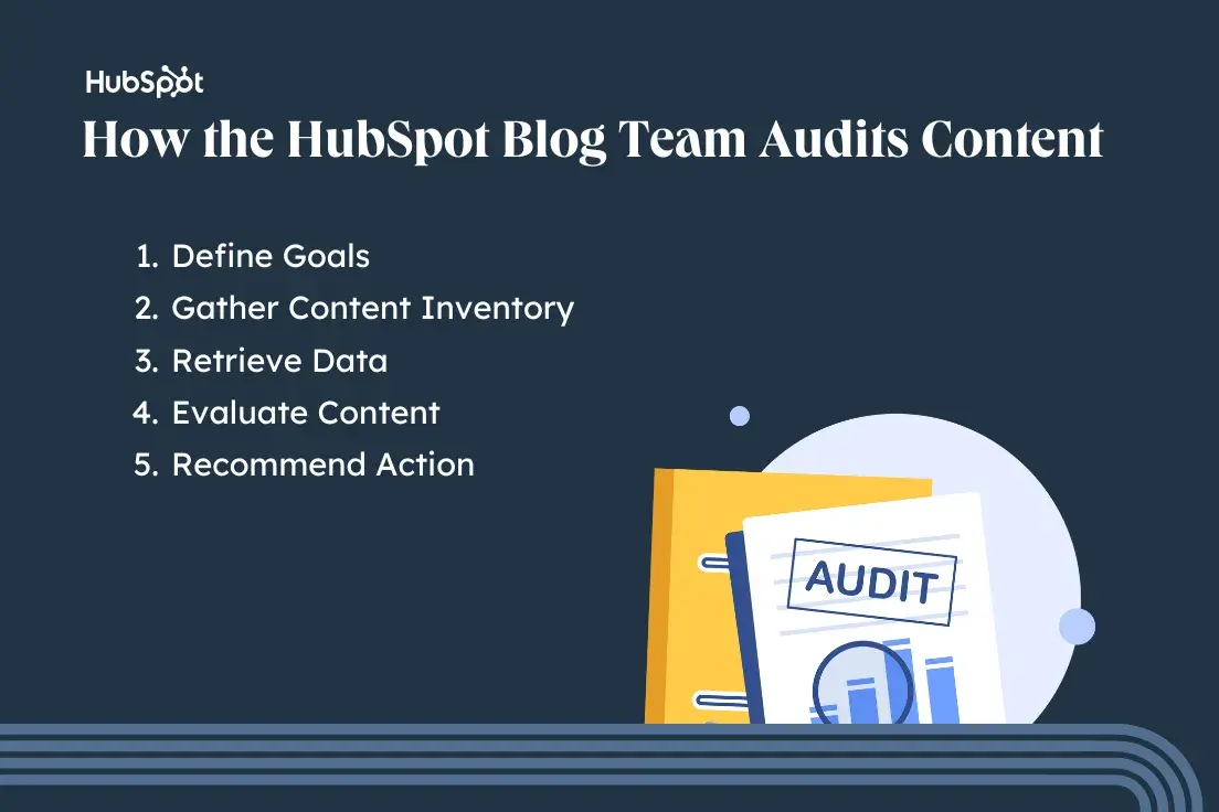
how the HubSpot Blog team audits content; define goals, gather content inventory, retrieve data, evaluate content, and recommend action

1. Define our goals.

Before we started auditing the content, it was important for us to determine the objectives.

For some publishers, the goal of a content audit may include improving on-page SEO, enhancing user engagement, aligning content with marketing goals, or identifying content gaps.

For this particular audit, it meant uncovering “greenspace” and “quasi-greenspace” in our blog library, and improving our overall content freshness.

We also had to determine the scope of our audit.

There’s no right or wrong way to approach this. Depending on your goals and the size of your website, you could audit the whole thing in one go.

You could also start with a small portion of your site (such as product pages or specific topic clusters) and build out from there.

Since HubSpot has such a large content library, we opted to limit this audit to our oldest 4,000 URLs. Not only was this more manageable than reviewing all of our content in one audit, but this also targeted URLs that were more likely to benefit from an update or prune.

We also did this knowing that we would later address the rest of our library during phases two and three.

2. Gather our content inventory.

Once we established our goals and scope, we had to gather the oldest 4,000 blog posts and put them into a spreadsheet.

This process can vary depending on the tools and CMS you use. Here’s how we did it using Content Hub:

1. Log into HubSpot and navigate to the Blog page in Content Hub.

2. Navigate to the Actions drop-down and click Export blog posts.

3. Select File format and click Export. This will send all of your blog post information to your email. You will also get a notification in HubSpot once your export is ready.

4. Download your export and open it in your preferred spreadsheet software (I’m usually a Google Sheets girlie, but I had to use Microsoft Excel since the file was so large).

5. Review each column in the spreadsheet and delete the ones that are not relevant to your audit. We immediately deleted the following:

  • Post SEO title
  • Meta description
  • Last modified date
  • Post body
  • Featured image URL
  • Head HTML
  • Archived

6. Once the irrelevant columns were removed, the following remained:

  • Blog name
  • Post title
  • Tags
  • Post language
  • Post URL
  • Author
  • Publish date
  • Status

7. Filter the Post language column for EN posts only. Delete the column once the sheet is filtered.

8. Filter the Status column for PUBLISHED only. Delete the column once the sheet is filtered.

9. Filter the sheet by Publish date from oldest to newest.

10. Highlight and copy the first 4,000 rows and paste them into a separate spreadsheet.

11. Name the new spreadsheet
Content Audit Master.

If you’re feeling fancy, you can also create a custom report in Content Hub and select only the fields you want included in the audit so you don’t have to filter as much when setting up your spreadsheet.

3. Retrieve the data.

After compiling all of the content needed for our audit, we had to collect relevant data for each blog post.

For this audit, we kept it pretty simple, only analyzing total organic traffic from the previous calendar year, total backlinks, and total keywords.

We did this because our recommended actions for each URL were determined during post-evaluation. (We’ll cover this in the next step.)

We obtained organic traffic data from Google Search Console and used a VLOOKUP to match each URL with its corresponding number of Clicks.

Then, we got backlink and keyword data by copying and pasting our audit URLs into Ahrefs’ Batch Analysis tool and exporting the data into our spreadsheet.

At the time of our audit, the Batch Analysis tool could only analyze up to 200 URLs at once, so we had to repeat this step 20 times until we had data for each URL.

Luckily, Ahrefs has rolled out a Batch Analysis 2.0 tool since then, which can analyze up to 1,000 URLs at once. So, if we were to do a similar audit in the future, it would take much less time to retrieve this data.

4. Evaluate the content.

Next, we assessed each piece of content by using the collected data. Then, we evaluated the post itself to determine the following:

  • Type of Content
  • Freshness Level
  • Organic Potential

Type of Content

The HubSpot Blog is home to many different types of blog posts, each serving a unique purpose. Labeling each post helped us determine its relevance and became a key factor in our decision to update or prune.

While this isn’t an exhaustive list of all the content types you could find on the HubSpot Blog, we narrowed it down to the following for the purposes of this audit:

  • Educational: A topic that can educate the user on a pain point or problem they know they have.
  • Thought Leadership: A topic that can educate the user on a pain point or problem they didn’t know they had until an expert drew it to their attention.
  • Business Update: A HubSpot-related piece of news or a press release that is likely not evergreen.
  • Newsjacking: An industry-related piece of news or a press release that is likely not evergreen.
  • Research: A collection of data or the results of an experiment that is used to educate the reader. This topic may or may not be evergreen, but the content is not and needs updates to stay fresh.

Freshness Level

Because the posts in this audit hadn’t been updated in a long time, none of them could be considered 100% “fresh.” However, we took different types of freshness into account when determining what action needed to be taken on the URLs.

For example, some topics, such as Google+, are so outdated that an update would be silly. However, plenty of topics were still evergreen, even though our content was not.

The following scale helped us make decisions on whether the URL had value with regard to freshness:

  • Outdated: The topic is outdated, and an update may not be possible.
  • Stale: The topic is evergreen, but it would need an extensive update to make the content more competitive.
  • Relatively Fresh: The topic is evergreen, and it would only need a moderate update to make the content competitive.

Organic Potential

To determine the organic potential of each URL, we had to ask ourselves the following question: Will anyone search for the content on Google?

  • Yes: Someone would definitely search for this, so we’ll need to optimize/recycle the content.
  • No: Someone would not search for this. There’s no point in optimizing/recycling the content since there’s no possible focus keyword.

For all of the posts marked “Yes” for organic potential, we recommended a focus keyword for the re-optimized content to compete for. We did this by evaluating the existing title, slug, and content. Then, we did some keyword research on Ahrefs and reviewed the Google SERP for that query.

We also included the focus keyword’s monthly search volume (MSV) to help prioritize which updates to perform first. We did this by plugging the recommended keyword into Ahrefs’ Keywords Explorer and adding the MSV to our master sheet.

For an extra layer of caution, we also checked for cannibalization on all posts marked “Yes” for organic potential. There are a few ways to do this:

  • Do a site search and see if any URLs come up for the focus keyword.
  • Plug the focus keyword into Google Search Console to see if any URLs come up.
  • Plug the focus keyword into Ahrefs’ Keyword Explorer, scroll down to Position History, search your domain name, and filter for Top 20 and your desired time frame (I usually check the last six months). If multiple URLs are found, that may indicate cannibalization.

If the focus keyword was flagged for cannibalization, we either found a different focus keyword or noted that the URL should be redirected to the fresher post.

If no cannibalization was found, then we had the green light to move forward with updating the post.

5. Recommend an action.

Once a post was completely evaluated, we turned the insights into action items.

Each URL was placed into one of the following categories:

  • Keep: No action is needed because both the content and the URL are good.
  • Optimize: The content is good but outdated in terms of freshness or SEO practices. Keep the spirit of the article, but refresh and re-optimize to improve performance.
  • Recycle: The content is not salvageable, but the URL still has value (in terms of backlinks or keyword opportunity). Create new content from scratch, but retain the URL.
  • Prune: Neither the content nor the URL has value from an organic standpoint.

Audit Insights

Out of the 4,000 URLs we audited, 951 (23.78%) were categorized as posts with organic potential and recommended for optimization or recycling. Additionally, 2,888 URLs were recommended to be pruned. That’s about 72.2% of the audit.

These posts either did not have organic potential, posed a cannibalization risk, or were so outdated that there was no point in updating them.

The remaining 161 URLs either did not require any action or had already been redirected.

How We Took Action

The action taken for a URL was determined by its potential for organic traffic.

The URLs with organic potential were delivered to our Blog team and recommended to be optimized or recycled.

Meanwhile, the URLs with no organic potential were delivered to our SEO team and recommended to be archived or redirected.

First, let’s walk through how we took action on the posts recommended to be optimized or recycled.

Taking Action on Content with Organic Potential

Before addressing any of the 951 posts with organic potential, we needed to figure out the following:

  • Our capacity for strategic analysis and brief writing
  • The capacity of our in-house writing staff and available freelancers
  • Our capacity to edit the updates

We coordinated with stakeholders and determined we only had the bandwidth to update 240 posts in 2024 (in addition to the dozens of blog posts we update each month). This initiative was internally known as the “De-Age the Blog Project” and was led by my EN Blog Strategy teammate Kimberly Turner.

Once we knew how many posts we could take on, we had to narrow down which ones to prioritize. We did this by evaluating the complexity of the lift required for each post update:

  • Simple Update: The content updates needed are relatively light, making them suitable for freelancers.
  • Complex Update: The content updates needed are heavy, making them better suited for in-house writers.
  • Recycle: Content is not salvageable, but the URL is. Rewrite the post from scratch, but retain the URL.
  • No Opportunity: Pass on updating.

We originally prioritized updating the simplest URLs first, but later pivoted our strategy to tackle the URLs with the highest MSV potential, regardless of update complexity.

We did this because we wanted to get the most we could out of our updates.

De-Age the Blog Results

Initially, we projected that these updates would be complete by the end of H1 2024, but we had to shift our strategy … again.

Like many other publishers, we felt the effects of Google’s March 2024 Core Update as well as the introduction of AI Overviews.

After having placed the De-Age the Blog Project on hold while we addressed the issues, we deprioritized the project entirely in favor of higher-impact workstreams.

SEO, am I right? It always keeps you on your toes.

Despite sunsetting the project before it was complete, we were still able to perform 76 post updates. Six months after the updates were implemented, the cumulative monthly traffic for these posts had increased by 458%.

This goes to show that even updating a small portion of URLs can make a big difference.

Taking Action on Content with No Organic Potential

While the De-Age the Blog Project was taking place, we also took action on the 2,888 URLs that were recommended to be pruned.

Since the initial audit didn’t include recommendations on how to prune, we had to go back and re-review each URL to determine how we would prune.

Here’s how we evaluated the posts:

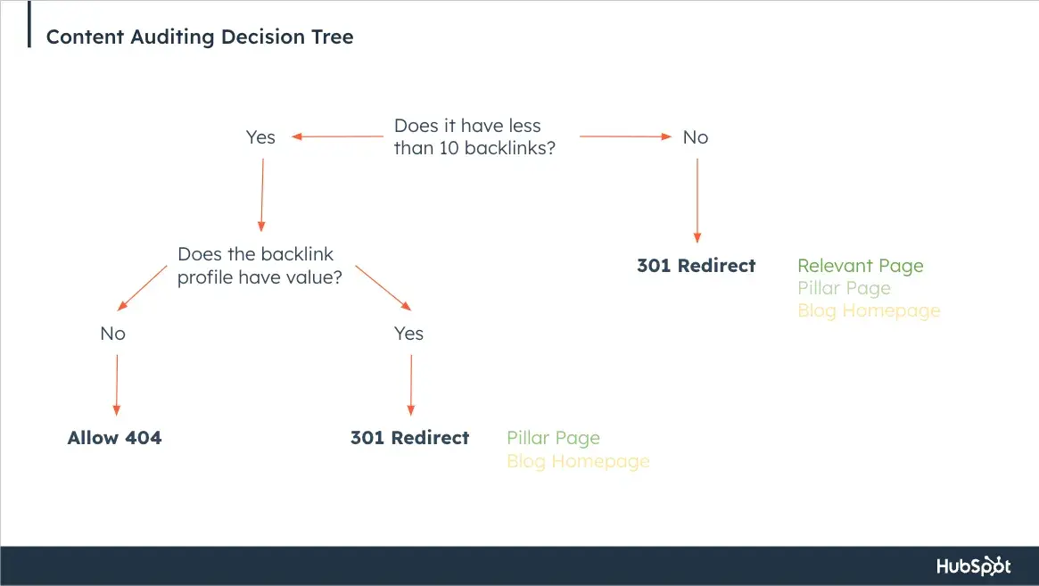
  • Archive (404): The URL has less than 10 backlinks and the backlink profile does not have value.
  • Redirect (301): The URL has more than 10 backlinks and/or the backlink profile has value.

How exactly did we determine the backlink profile value? Rory Hope, HubSpot’s head of SEO, recommended we follow these steps:

1. Login into Ahrefs and submit the URL into Ahrefs’ Site Explorer search bar.

2. Select Overview from the left-hand sidebar.

3. Scroll down and click Backlink Profile.

4. Scroll down further and select By DR under Referring Domains.

5. Analyze and investigate any referring domains that are > 50.

6. Navigate to the Referring Domain you’re investigating > 50 by clicking the number.

7. Analyze the Referring page.

Select Redirect (301) if:

  • The Referring page link is from a domain that still receives Domain traffic.

Select Archive (404) if:

  • The Referring page link appears to be “spammy.” You can determine this by asking the following questions:
  • Does this website only publish low quality guest post (SEO-led) content from lots of different topics?
  • Does this website still publish content? If not, ignore it.
  • The Referring page is from a website that you see linking to a lot of EN Blog posts, through a RSS style automated linking system.

Additionally, all URLs labeled “Redirect (301)” required a new URL to be redirected to.

When choosing a new URL, we did our best to pick the most relevant and similar page. If we couldn’t find one, we redirected to the pillar page of the cluster that the post belonged to.

If for some reason, the URL didn’t belong to a cluster or there wasn’t a pillar page, we redirected it to the HubSpot Blog homepage.

Decision-making for some content types was easier than others. For example, we were able to automatically assign 301 redirects to URLs that were flagged for cannibalization during the initial audit. We also automatically assigned 404s to URLs with less than 10 backlinks labeled as Newsjacking and Business Updates.

Everything else was manually reviewed to ensure accuracy. To make the evaluation process easier, we followed this decision tree:

the HubSpot Blog team’s content auditing decision tree

It took my team about two and a half weeks to ensure that every URL had the correct label. In the end, we had 1,675 URLs assigned to be redirected and 1,210 URLs assigned to be unpublished and archived.

Once each URL was evaluated, we were finally ready to take action.

After coordinating with Rory and Principle Technical SEO Strategist, Sylvain Charbit, we decided to prune the URLs in batches instead of all at once. That way, we could better monitor the impact of redirecting and archiving a large quantity of content.

Originally, we planned to implement our prune in five batches over five weeks, allowing us time to monitor performance during the weeks in between.

Batches one and two contained URLs meant to be archived and unpublished, and batches three through five contained URLs designated for 301 redirects.

Because there were so many URLs to unpublish and archive, we worked with developers on HubSpot’s Digital Experience team to create a script that would automatically unpublish and archive URLs and redirect them to our 404 page.

Then, we were able to implement the 301 redirects with the Bulk URL Redirect tool in Content Hub.

Note: Although we were able to work through this process internally and finish before our deadline, I want to acknowledge that manually evaluating over 2,000 URLs can be tedious and time-consuming.

Depending on your resources and the scope of your audit, you may want to consider hiring a freelancer to help your team work through a task this large.

Content Pruning Results

While we successfully implemented each batch, this process didn’t come without a few road bumps.

Midway through our pruning schedule, Google rolled out the March 2024 Core Algorithm Update. We ended up placing our pruning schedule on hold so we could better monitor performance during the update.

Once the update was complete, we resumed the rest of our prune until it was complete.

Because of the volatile search landscape in 2024, we didn’t see the traffic gains we’d hoped to see once the prune was complete. However, we did celebrate a massive win for overall content freshness on the blog.

At the start of our audit in 2023, we calculated the freshness of our content library by looking at each URL’s publish date and quantifying the number of days since they were updated.

For example, say the current date is November 12, 2024, and you have a post that was last updated on February 19, 2008. Based on the 2024 date, the post from 2008 is 16.7 years old or 6,110 days.

Once we had all of the ages for every post on the HubSpot Blog, we averaged those numbers to determine the average age of our content library, which was 2,088 days (5.7 years).

Since pruning 2,888 URLs (and updating hundreds of URLs from the audit and beyond), the HubSpot Blog’s average age has dropped to 1,747 days — that’s 341 days younger than when we started.

As content freshness and helpfulness play an even greater role in search algorithms, being nearly a year younger can make a big difference.

What’s Next?

Earlier in this post, I mentioned that this audit is only one of three that my team has worked on in 2024.

Our phase two audit focuses on the lowest-performing posts that were not included in phase one, totaling over 6000 URLs. Then, phase three assesses the value of our Blog’s topic clusters.

We’re still taking action on the results from these audits, but I’m so excited to share the process and insights when they’re complete.

Ultimately, content auditing is a job that is never truly done — especially when working with large libraries. You finish one audit, then it’s on to the next.

Although the work can be tedious, the rewards of improving content quality, user experience, and performance make it worth the effort.

Categories B2B

B2B Newsletter Marketing: How It Differs From Email Promotions & What Brands Can Learn from Independent Producers

If you’re like me, you only open a small fraction of the (dozens? hundreds?) email newsletters you’ve subscribed to. So I set out to find what those really good newsletters, the ones you open on the regular, have in common.

Email newsletters have been floating around in the zeitgeist for some time now, especially as more writers have left online publishers to make it on their own.

Download Now: The Future of Newsletters [Free Report]

I talked to a half dozen experts in the field, including both technical and content specialists, to tease out the difference between B2B newsletter marketing and other types of emails, guide you through best practices, and uncover some takeaways from indie newsletters that you can apply to your own brand.

Table of Contents

What is B2B Newsletter Marketing

B2B newsletters can be broadly defined.

One business might send bi-weekly how-to guides and best practices in its industry; another might send weekly interviews with master marketers (that was a shameless plug for a newsletter I sometimes write for).

What’s most important to understand is how B2B newsletters differ from traditional email marketing. If your inbox is even half as full as mine is, you’ve got a steady stream of emails about sales, new product alerts, and reminders to purchase that new gadget you put in an online shopping cart and promptly abandoned.

Those traditional marketing emails are important to your overall marketing strategy, but today we’re talking about an entirely different beast.

I spoke to Lia Haberman, who founded and writes the successful ICYMI newsletter and teaches social media marketing and influencer marketing at UCLA. She says that “the difference between email marketing and [B2B] newsletters is really a difference between performance marketing and content marketing.”

She explains that the primary goal of performance marketing, like email marketing, is to drive conversions. “You’re trying to generate leads, to increase sales. There’s a point to the email that extends beyond the email itself.” These emails might be tied to a particular campaign or initiative.

“B2B newsletters focus on providing value within the mail itself. The subscriber doesn’t need to click out to get the value of whatever the newsletter is promising.”—Lia Haberman, Creator economy expert and founder of the ICYMI newsletter

Newsletters, like content marketing, “focus on providing value within the email itself. The subscriber doesn’t need to click out to get the value of whatever the newsletter is promising.”

This may sound counterintuitive, but a regular newsletter cadence establishes your brand as an authority in its field.

And if you’re giving your potential customers real value that serves their purposes instead of yours, congrats, you’re well on your way to building trust.

Why Start a B2B Newsletter

The real question, as I learned researching this article, is perhaps, “Why shouldn’t you start a B2B newsletter?”

Starting a newsletter can deliver a great return on investment and build and nurture your target audience — but not if you go into it with unrealistic expectations or limited resources.

Newsletters require consistency and dedication — not just to create regular content, but to ensure deliverability, something that may require advanced technical knowledge.

Newsletters are a long game, so if you need immediate marketing results, look elsewhere. And if you can’t or don’t want to commit to a long-term relationship (we’ve all been there) with your audience, newsletters aren’t going to be a great fit.

Enough of the negativity. Here’s six benefits to starting a newsletter:

1. Build trust with your audience.

A regular drumbeat of newsletters builds long-term relationships and creates an opted-in audience — the people who are enthusiastic to hear from you.

2. Establish thought leadership.

Take HubSpot’s Masters in Marketing newsletter as an example. Every week, we interview a marketer who is breaking new ground and innovating in the field.

It reinforces HubSpot as a source for thought leadership and high-quality marketing expertise that you can’t get anywhere else.

3. Take advantage of the monetization potential.

Contrary to popular belief, making money from your newsletter doesn’t necessarily require tens of thousands of subscribers.

Ferrari — admittedly a brand whose fans have a little more money to burn than the average bear — has just 5k subscribers to its Ferrari Market Newsletter.

The paid subscription options range from $10/month to $90/year (presumably this is chump change if you drive a Ferrari). The yearly revenue attributed to just the newsletter is reportedly between $2 and $4 million.

4. Leverage high-impact sponsorship opportunities.

If you have a dedicated niche audience that has value to other brands, you can sell space in your newsletter.

Evaluate your brand and your audience to make sure that the sponsorships reinforce the trust you’re building — if you run a cat-sitting company, sell sponsorship space to the maker of your cats’ favorite treats, not to a meal delivery service.

5. Use audience segmentation to give readers what’s most valuable to them.

Audience segmentation is arguably more valuable than adding new subscribers, Alexis Grant tells me — though she cautions that segmentation and adding subscribers aren’t mutually exclusive, and that “it’s easy for a list to get stale if you don’t add new people.”

“I think segmentation is more valuable than adding more subscribers — though you want to do a bit of both.”—Alexis Grant, founder, They Got Acquired newsletter

Grant runs the newsletter They Got Acquired, and she uses audience segmentation tools like RightMessage to “serve people exactly what they want.” When you sign up for They Got Acquired’s newsletter, there’s an optional survey to identify niche demographics like founders looking to sell within the year.

One of Grant’s goals is to get more users on her platform, called They Got Acquired Data, which provides data and insights that can be used to identify comps, grow buyer lists, and strengthen your negotiations.

That platform will likely be more valuable to a founder looking to sell within the year than somebody looking to sell within five years, and Grant can tailor her content accordingly.

6. Establish a direct line to decision-makers.

A niche audience can be targeted-networking gold.

Take Al Iverson’s Spam Resource newsletter, which focuses on email marketing and deliverability. Iverson told me that he only has around 1,300 subscribers — but they were the perfect 1,300 people to reach out to during a recent job search.

“My newsletter gave me a direct line to over a thousand connections in my industry — which was instrumental in finding my next career opportunity.”—Al Iverson, Founder, Spam Resource newsletter

“My newsletter gave me a direct line to over a thousand connections in my industry,” he says. “It was instrumental in finding my next career opportunity.”

How to Create a B2B Newsletter People Want to Read

Content Strategy

I spoke with several experts and heard the same thing over and over again: Write good newsletters that serve your audience — not your brand. (If you want more examples, I compiled a list of 23 of my fav marketing newsletters.)

Haberman suggests hiring writers with a journalistic or creative background in order to write the kind of personable newsletter that people will be excited to open.

“Marketers can be great writers,” she says, “but the mindset of a marketer and the mindset of a writer are two different things.”

Marketers will naturally come from the “perspective of advocating for the best interests of the company.” Writers will ask themselves, “What does the audience want to hear from me?” versus “What is the message that I have to deliver?”

“Ask yourself, ‘What does the audience want to hear from me?’ versus ‘What is the message that I have to deliver?’”—Lia Haberman, Creator economy expert and founder of the ICYMI newsletter

Former HubSpotter and founder of Newsletter Examples Brad Wolverton echoes Haberman’s recommendations. “Think like a journalist,” he suggests. “Your job is to share the most useful information.”

The information in your newsletter should be curated, of high value to your audience, and should strike a balance between branded and external content.

Lessons for Brands

  • Invest in creativity. That requires more than just hiring creative people to write content — it requires giving them trust and freedom, too. That can be a hard pill for brands to swallow, but consumers don’t want an email from a well-oiled marketing department. They want voice, creativity, and a sense of the face(s) behind the newsletter.
  • Resist the urge to be self-serving. It’s tempting to use newsletters to drive website engagement and nothing more. Think about what your audience wants, and find the right balance of branded and external content. It will build your credibility, trustworthiness, and authenticity.

Technical Strategies

Most email marketing platforms include some level of technical support, but I wanted to know what you should keep in mind as you’re shopping around for the right platform and getting started with a newsletter.

So I talked to Kaylee Jenzen, a technical marketing manager here at HubSpot who has worked on The Hustle and other HubSpot newsletters.

Jenzen suggests that you consider:

  • Deliverability optimization. This includes making sure that your emails aren’t so long that they get clipped by certain email providers, managing DNS records and unsubscribes, and inbox placement strategies (i.e., how to make sure you don’t land in the promotions tab of subscribers’ Gmail inboxes.
  • Shared or dedicated IP addresses. Jenzen says that this comes down to a strategy decision. If you’re running a small newsletter or don’t send regular emails, you’ll benefit from a shared IP address and “the additional outflow of emails from other senders.” But “it’s a double-edged sword,” she says. “If you have a bad sender who’s sending out spammy or even malicious emails, it can affect your ability to place within an inbox.”
  • Image and formatting best practices. It’s a common misconception, Jenzen says, that a large file size for an image will necessarily hamper your deliverability. But there are things to be aware of; for instance, sometimes the alt-text for an image can find its way into the plain-text version of an email.

Independent newsletter operators have a wealth of AI personalization tools available to them. (All the major email platforms I’ve used, including HubSpot’s, include AI personalization tools.)

Lessons for Brands

  • Don’t cut corners on technology. As Jenzen told me, “You get what you pay for.” Not every newsletter needs the Cadillac of email marketing platforms, but if you try to save some money by using a platform that doesn’t serve your technical needs, you can risk seriously damaging your brand.
  • Use AI. Personalization is a great way to lean into AI. Let artificial intelligence use data to provide a personalized experience — your readers aren’t a monolith, and AI lets you treat them like the individual people they are. Use real people to give the personality and contextual information that AI can’t.

B2B Newsletter Marketing Best Practices

B2B newsletters, like anything else in marketing, is a growing and evolving field. Use this three-pronged list of best practices as a guide, whether you’re starting a newsletter from scratch or revamping an existing one.

I’ve also included a few examples of newsletters I think do a particularly good job with content strategy and audience engagement. (Technical optimization is a bit harder to judge, since it all takes place under the hood.)

Content Strategy

The content strategy for newsletter marketing should fit comfortably within your overall marketing strategy, but to recap a few guidelines from the experts I spoke with, prioritize:

  • A values-first approach that serves your readers
  • Balanced promotional content
  • Consistent voice and format
  • Provide creator-driven content

In original HubSpot research from September 2024, we asked 500+ newsletter operators about their most commonly used content strategies:

  • Your personal opinions, tips, or hot takes on your industry or topic of interest (28%)
  • Expert advice or tips (quoting someone you didn’t interview other than yourself) (16%)
  • News or trends (14%)
  • Expert advice or tips (quoting someone you did interview other than yourself) (12%)
  • Data, research, experiments, or studies that you’ve gathered or run (11%)
  • Data, research, experiments, or studies cited from third-party or outside brands (11%)
  • User-generated content with quotes, tips, comments, text, or other elements sourced from your subscribers or audiences (8%)

We also asked what type of content drives the most engagement.

Our findings are consistent with the expert advice in this article: Readers want emails from real people with real opinions.

By every metric, content based on your personal opinions and perspectives and original data and research drive the highest engagement.

Graph entitled “What Content Types Drive the Highest Engagement?”

Get inspired: Check out The Publish Press, a thrice-weekly send with the latest news for creators, and WTF is SEO?, which shares advice and interviews on SEO for news and publishers.

How to: We’ve got a detailed step-by-step guide on how to create an email newsletter and tips for creating great content.

Audience Engagement

Audience engagement might be measured in different ways depending on your priorities (for instance, one of my colleagues wrote about how The Hustle prioritizes click-through rate over open rates).

  • Trust-building tactics, like centering the readers’ wants and needs
  • Personalization techniques
  • Segmentation strategies
  • Response management

Get inspired: Check out FINGERS, a newsletter about drinking in America, which is highly lauded for its engagement; and of course The Hustle, which I would read every day even if I didn’t work here.

How to: We’ve compiled 22 of the best newsletter tools for engaging subscribers.

B2B Newsletter Best Practices. Content Strategy: Take a values-first approach and serve your readers. Balanced promotional content. Consistent tone and voice. Provide creator-driven content. Audience Engagement: Use trust-building tactics — newsletters are a long game. Use AI for personalization and segmentation. Establish a process for managing responses. Technical Optimization: Integrate your newsletter and CRM. Follow best practices for deliverability optimization and monitoring. Consider whether you want a shared or dedicated IP address.

Technical Optimization

Technical optimization often requires deeper technical know-how.

Since it’s likely that your email marketing platform of choice will provide some technical support, I haven’t gone into detail here — but here are a few things to keep in mind and ask questions about as you get your newsletter off the ground:

How to: We’ve got a free downloadable guide with email marketing best practices and a planning template.

B2B Newsletter Statistics

In HubSpot’s recent survey of 500+ newsletter operators, we gathered some statistics that can inform your B2B newsletter decisions.

Keep in mind that these are independent newsletter operators and content creators, not brands, so your mileage may vary.

Key B2B Newsletter Findings

Most newsletter operators aren’t making a living out of it.

Just 5.45% of respondents earn more than $3k a month from their newsletter, and 38.4% make between $0 and $100 each month.

Graph entitled “Average Monthly Newsletter Earnings.” 15.76% earn $0; 22.64% earn $1 - $100; 13.17% earn $101 - $300; 12.62% earn $301 - $500; 12.01% earn $501 - $1,000; 8.32% earn $1,001 - $1,500; and 5.45% earn more than $3,000.

Running a newsletter is a lot of work.

Like, a lot of work: An incredible 73.46% respondents said that running a profitable newsletter can easily become a full-time job.

Be sure you do the calculus in your marketing strategy so you don’t put more resources into a newsletter than you can reasonably get out of it.

Paid subscriptions are the top source of newsletter revenue.

We asked respondents to identify the top three money-making tactics, and 26% said paid subscribers, 20% said freemium, and 13% said that ads and sponsorships were their top revenue source.

Graph entitled “Top 3 Revenue-Generation Tactics for Email Newsletter Creators.” 26% say that paid subscribers earn them the most revenue; 20% say freemium subscribers (subscribers who buy products, services, or memberships); and 13% say ads/sponsorships (a mix of fixed rates for ad/sponsored content slots plus commissions for high performance).

Stay on top of current trends.

Nearly 62% of respondents said that newsletters that don’t integrate video, audio, or interactive elements will fall behind in less than three years.

Readers want to hear from people — not brands. If you’re writing on behalf of a brand, keep Haberman’s advice in mind about hiring creative writers or getting into a reader-focused mindset.

Narrow your target audience.

Your newsletter can’t be all things to all people, and you’ll be better positioned if you embrace that.

Over 51% of respondents said that the broader your target audience, the lower your ROI. Look for a niche that only you can fill, and you’ll be able to get more value out of fewer subscribers.

Graph entitled “Select Email Newsletter Trends.” 73.46% say, “Running a profitable newsletter can easily become a full-time job.” 61.42% say, “Newsletters that aren’t integrating video audio, or interactive content will fall behind within 3 years.” 53.62% say, “Readers prefer newsletters from independent people rather than businesses.” 51.20% say, “The broader your audience target for subscribers, the lower your ROI will be.”

B2B Newsletter Trends

Here’s what experts see as growing trends in B2B newsletters:

  • Creator-led content. Lia Haberman says she understands that businesses might be hesitant to hand over the reins to a brand newsletter to a single content creator. She quotes Washington Post TikTok guy Dave Jorgenson, who has spoken about creating a WaPo Cinematic Universe in which he introduces new “characters” — i.e., other content creators — so that the creative burden doesn’t rest solely on him. Apply that principle to newsletters by introducing readers to multiple writers.
  • Focus on personalization. Personalization doesn’t just mean adding first names to the subject line (although that is a valid tactic!). As Grant demonstrates, AI segmentation tools can bring real, measurable value to your brand by giving readers content tailored to them.
  • Emphasis on trust-building. This is admittedly a tough one, because marketers’ natural inclination is to promote the brand. But writing for your readers, rather than your brand, sets you up for long-term marketing wins.
  • Value-driven monetization. There’s plenty of opportunities to monetize your newsletter, but proceed with caution. Is it providing real value to your readers? If the answer is “no,” you risk alienating them.

I also asked experts what emerging practices they’re seeing in the field. Keep an eye on:

  • Integrating newsletters with other marketing channels.
  • Using advanced segmentation techniques, especially as AI is becoming better at this.
  • Incorporating multimedia content.

B2B Newsletter Marketing for Brands

Independent newsletter operators and writers currently have an edge in the B2B newsletter marketing game, as readers are clearly prioritizing personality- and creator-driven content.

That doesn’t mean that there’s not room for your brand to jump on the B2B newsletter marketing bandwagon, though — it just means that there’s lots of opportunity to pave your own way and adapting these lessons to your own creative marketing strategies. 

Categories B2B

Holiday Marketing: 27 Steps, Tips, & Examples to Get Your Brand in the Spirit

You know how I know I’m in the right field? While most people are excited about holiday decorations, foods, music, parties, and deals this time of year, I’m excited about — holiday marketing.


Holiday campaigns are arguably your brand’s biggest chance of the year to get creative and connect with your audience on a heartfelt, human level.

Plus, it’s your chance to get your share of the roughly $902 the National Retail Federation predicts the average consumer to spend this year and hit your revenue goals.

Download Now: Free Marketing Plan Template [Get Your Copy]

Haven‘t started planning your holiday marketing campaign yet? Don’t panic.

I’ve mapped out a comprehensive guide of everything you need to launch a holiday marketing campaign this season, including surefire holiday marketing ideas and brilliant examples from this and recent years.

Table of Contents

Note: In this article, I’ll focus on fall and winter holidays like Thanksgiving, Diwali, Hannukah, Christmas, Kwanzaa, and New Year’s Eve, as well as retail holidays (Black Friday, Small Business Saturday, Cyber Monday, Giving Tuesday, Green Monday). 

But you can really use these steps for your holiday marketing year-round.

1. Define your campaign goals.

Before you start creating a holiday marketing campaign, determine what you’re looking to achieve. Do you want to boost sales before the end of the year or maybe grow your Instagram following for the next year?

Take what you want to do and flesh it out to be SMART – specific, measurable, attainable, relevant, and time-bound. This framework leaves less room for ambiguity in whether you accomplished what you were supposed to or not.

Depending on what you want to get out of your campaign, your holiday marketing goals might look something like this:

  • Generate 1,000 new email subscribers by December 30, 2024.
  • Generate 5,000 sign-ups for our app by November 30, 2025.
  • Collect $50,000 in donations for charity XYZ by December 25, 2024.
  • Increase sales by $100,000 by December 30, 2024.

Here’s a simple formula to help you get started:

Generate [number] leads focused on [topic/product] by [date]

You can also use this free goal-setting template to summarize your holiday marketing goals, calculate your greatest marketing need, and set deadlines.

2. Define your target audience.

Along with your goals, your target audience plays a massive part in where and what you do with your holiday marketing.

The more information you can gather about the people you’re trying to reach, the better. Where are they hanging out on social media? Do they prefer to consume information on their desktop or mobile? What do they care about this time of year?

This will help you make smarter marketing decisions when it comes time to create content and plan promotions.

If you already have a few buyer personas in place for your marketing efforts, you‘ll want to start by narrowing your focus. Do your goals pertain to all segments of your audience? If not, weed out the folks you don’t need to include.

If you don’t already have buyer personas or want to create campaign-specific personas, check out our free buyer persona templates.

3. Identify your offer.

Your offer is the center point for all of your holiday marketing. It could be a specific product or service, a sale, or something digital like an ebook, report, template, online course, video, tool, etc.

Whatever it is, ensure it’s of true value to your audience and aligned with your goal.

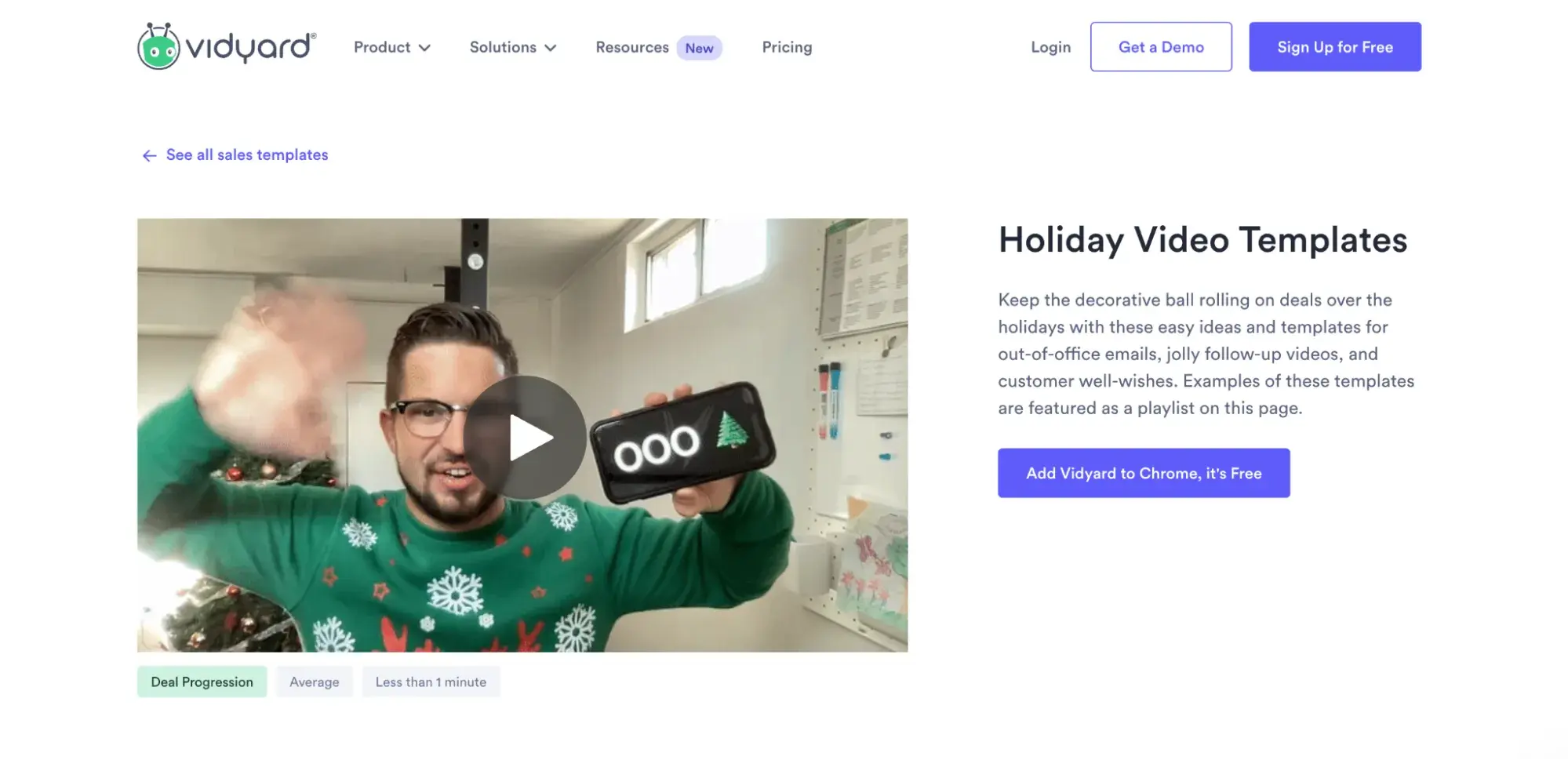
Vidyard is no stranger to great holiday marketing, but this campaign was particularly clever if you ask me.

A few years ago, the video software company ran a holiday campaign where it offered users “holiday video templates” in its free Google Chrome extension.

Screenshot showing an example of a video made with Vidyard’s holiday video template

Image Source

The extension included templates for three videos sales reps could send to videos before and during their holiday time off, as well as seasonal effects like snow and festive hats you could apply to make the videos more fun.

Looking at this, I think it’s safe to say the goal of the campaign was to boost extension installations, and holiday templates were a unique way to get them.

Using our goals from earlier, here are some other examples to consider:

  • If you’re trying to generate subscribers, the offer would be a subscription to your sales emails (and perhaps a discount or promotion as an incentive).
  • If you’re trying to increase app downloads, perhaps it’s a free gift or special holiday feature (like Vidyard).
  • If you’re trying to collect $50,000 in donations, the offer may be a thank-you gift or a donation match.
  • If you’re trying to increase sales, the offer would be a sale, discount, or promotion.

4. Define your timeline.

The holidays are hectic times for both marketers and consumers. People are working longer hours, trying to plan time off, searching for the perfect gifts, and spending more time with family and friends.

Considering this, it’s best to give your business an extended runway to develop your holiday marketing campaign and actually run it once it’s live.

In my experience, this means giving yourself at least one month before the holiday or launch of your campaign to plan and build. However, if it’s large-scale or high-profile, like a major product launch, this timeline should ideally extend to at least three months.

“At least” are the keywords here. The last thing you want to do is rush execution and put out a mediocre campaign or get a great one ignored before people simply don’t see it in time.

From here, start outlining your promotion plan (we’ll get into that in the next step) and when you’ll release what.

A consistent, well-thought-out promotion timeline will help pique and maintain your audience’s curiosity, ultimately nurturing them toward taking advantage of your offer.

5. Design a promotion plan.

“If you build it, they will come,” — said no marketer ever. Now that your offer has been finalized, it’s time to get the word out.

Here are some of the promotional tactics to consider for your holiday marketing campaign:

Social Media

According to Sprout Social’s Q4 2024 Sprout Social Pulse Survey, 89% of shoppers say a brand’s social media content directly influences their holiday purchasing.

On top of that, 42% of consumers say they plan to use social media more than they did last year to find gifts this year.

So, if you’re not using social media for your holiday marketing, you are sorely mistaken.

Wherever you‘re sharing your content, you’ll need a place to organize and plan your distribution strategy. For that, check out this free social media content calendar.

Pro tip: Team up with influencers.

69% of consumers trust recommendations from influencers and their family and friends over brands themselves. And social media is their bread and butter.

Teaming up with trusted influencers or creators in your space to publish original content, launch an exclusive collaboration, or even run a contest can arguably do more for your holiday marketing than other mediums.

Beauty influencer Aditya Madiraju, for example, recently teamed up with cosmetic brand Anatasia Beverly Hills to develop and launch a limited edition lip combo for the Hindu festival of lights, Diwali.

It sold out in 14 hours.

Learn more about your options in Influencer Marketing Strategy: How to Build a Plan Creators & Customers Will Love [+ Templates].

Pay Per Click (PPC)

Whether on social media, search engines, or otherwise, PPC ads help brands bypass algorithms and get in front of their target audiences.

With so much competition during the holiday seasons, this kind of exposure could mean the difference between hitting or missing your goals.

If your budget allows, use search to target the product names you’re trying to sell or social media to get your promotional content in front of your target audience.

The best part about social ads is there are formats that allow people to fill out a lead form or even buy directly from it.

Email Marketing

Contrary to what many say, email marketing is not dead. In fact, according to the 2024 HubSpot State of Marketing, it’s still the second-highest ROI-driving channel.

Email is unique among digital mediums as it’s a direct, personal line to your audience. It’s a gated, exclusive space with less noise and more opportunity to connect with your audience personally.

This is especially valuable during the holidays when so many brands are vying for the same attention.

If you already have a list of people you know will be interested in your offer, that’s great. If not, you can slice and dice your database to go after a more specific group.

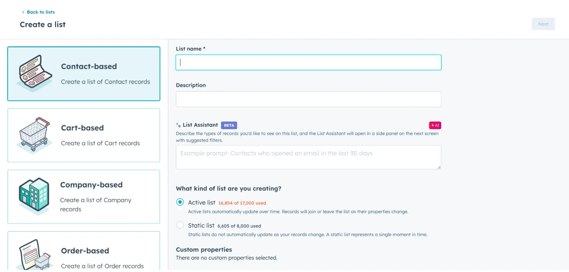
For HubSpot users, segmenting your database is easy with active lists and our AI list assistant. You can use the tool to define criteria based on contact records, company information, or previous behavior or tell the assistant what you’re looking for to see what filters it suggests.

Screenshot showing HubSpot’s active list-building tool.

Once you’ve squared away your recipients, you can start the email creation process. Here are some noteworthy best practices to keep in mind:

  • Subject line. Your subject line is your one chance to get someone to open your email. If there’s something of extreme value in your message, like a discount or a time-sensitive deal, put that front and center. Or keep it short and snappy to pique curiosity. Use emojis to draw the eye. Get more subject line tips and examples here.
  • Body copy. The body of your email should be compelling but concise, much like the copy on your landing page. You want to give the reader enough information to make them want to take the next step. So, summarize the value and also incorporate personalization whenever possible. (HubSpot personalization tokens can help with this.) Here are some great examples of email personalization in action.
  • Call-to-action. What do you want your customers to do after reading your email? Keep your message focused on that one goal.

Also, it’s the holidays! I know I’m a marketing nerd, but a good seasonal email design or festive visual always gets my attention and interest, like this Thanksgiving campaign from Nothing Bundt Cakes.

Screenshot of a Thanksgiving-themed marketing email from Nothing Bundt Cakes

Need some help crafting yours? Tools like Canva can help you create holiday graphics for your emails, while our free Holiday email templates can be used right in HubSpot.

Content Marketing/Blogging

Blogs are one of the oldest forms of content marketing, and while it can be harder to get noticed in the space with so much competition, it still has a unique value to offer marketers.

Depending on the nature of your holiday offering, blogging can educate people about it in detail, create a new page for you to link to on social media, and get indexed in search engines.

6. Create your follow-up plan (if relevant).

What will happen to your leads once you‘ve generated them? Or, after someone makes a purchase, how will you keep the relationship alive?

Before you launch your campaign, it’s best to design a plan for qualifying and nurturing your leads to purchases or return business.

Consider looking into retargeting ads or email sequences (which can be automated with HubSpot Workflows) and how they’ll fit into your greater marketing goals.

7. Create your holiday marketing assets.

Depending on what you’ve outlined for your campaign, you may need to create graphics, videos, and blog articles, among other things. Now’s the time to get those rolling.

Regardless of the finer details, a landing page is a smart asset to prioritize. This gives your offer somewhere to “live” – a page for people to go for more information, take action, or for you to send traffic from your promotions.

Every landing page will look different depending on your brand, but here are a few essential best practices to keep in mind as you create yours:

  • Have a compelling headline. This is how you’re going to capture the attention of potential visitors.
  • Include interesting visuals. Your landing page shouldn’t just be a jumble of text. Think about how you can provide visual context for your offer.
  • Highlight the benefits of your offer. This could be in the form of a video or a bulleted list. Whatever the form, the goal is to drive home what the visitor can expect to get from this offer and why it matters.
  • Include steps for taking action. This is how people actually get the offer. Depending on what it is, it could be clicking “shop now” to go to your product catalog, filling out a form, or even instructions to visit you in stores with an address or a call-to-action to your “store locator.”

If you need more guidance on what goes into a great landing page, check out this roundup of 41 brilliant landing page designs.

8. Take the campaign live.

You’ve got all the pieces; now it’s time to send them out into the world.

Pro tip: We recommend building a “soft launch” into your timeline. This gives you time before you initiate any promotion to truly QA test all of your assets and ensure that everything functions as it should.

9. Measure and report.

Remember those goals we set in step one? Now is the time to review your metrics and determine whether you achieved them.

If you didn’t, don’t beat yourself up; it happens to all of us. Take a deep breath and start diving into what might not have worked.

Analyze where people dropped off in your email sequences or after seeing your social media ads. Determine how many of your blog articles they read or if people even viewed the landing page. Take note of these details and use them to inform your next holiday marketing campaign.

Now that you know how to plan your holiday marketing campaign, what should it look like?

Holiday Marketing Tips for 2024

Here are seven versatile holiday marketing tips to incorporate into your campaign.

1. Lean into relatable experiences.

The holiday season is steeped in traditions that many hold near and dear to their hearts. Incorporating these into your holiday marketing can help pique interest and get your message to resonate on a deeper level.

Holiday traditions and imagery to consider:

  • Snowmen, snowflakes
  • Meals with family and friends
  • Shopping and gift-giving
  • Light displays and candles
  • Santa Claus and elves
  • Turkeys, Candy Canes

The idea is to strike an emotional chord. After all, humans tend to buy more with their hearts than their heads.

Etsy is a master of this, as seen in their commercials from 2020 and this year.

2020: “Gift Like You Mean It”

2024: “Gifts That Say ‘I Get You’”

2. Support a cause.

The holidays are a season of giving. In addition to looking for gifts for their loved ones, many people want to donate to causes and charities they care about.

Building a campaign around a cause you and your audience are passionate about taps into this urge and provides a welcome outlet to fulfill it.

This cheeky holiday campaign from The Body Shop does a lot right, including giving back.

The commercial ends by saying that for every gift set sold, The Body Shop would provide one day of safe water for a family in Ethiopia in partnership with WaterAid.

3. Create a sense of urgency.

At the end of the year, time is of the essence. Capturing this sense of urgency is a great way to build hype and elicit action from your audience.

For example, you could run a 12-day campaign (of sales, giveaways, announcements, etc.), playing off of the beloved carol, “12 Days of Christmas.”

Or you could count down to the holiday you’re focusing on with different daily surprises.

You could also sell a seasonal or limited-edition product (like Dunkin) that can only be purchased during a specific time period. When your holiday marketing is time-bound, people are more prone to FOMO.

4. Emphasize social media — but still think multi-channel.

As discussed earlier, social media has huge pull during the holiday season. But while it should be a major part of your campaign, it shouldn’t be the only part.

Conventional wisdom tells us that people rarely purchase after just one interaction with a brand. While the exact number varies depending on your audience, it usually takes multiple touchpoints to make a sale, so you can’t rest on just one medium or asset.

Tap into email marketing, PPC, influencer marketing, and even traditional advertising if your budget allows. Identify the platforms where your audience consumes content and get your message there.

5. Offer a deal, incentive, or premium.

According to Capital One, price is the biggest factor in purchase decisions for 89% of Americans. In fact, the same report found discounts are a major factor for 74% of U.S. online shoppers. Don’t sleep on this insight.

During the holidays, people expect deals, discounts, and specials. Not offering one as part of your holiday marketing is a quick way to get ignored.

6. Make gift-giving easier.

Few things are more stressful this time of year than trying to find the right gift for the people in your life.

Whether it is a partner, friend, child, or even coworker, making gift-giving easier with your holiday marketing is a surefire way to grab attention and build trust with your audience.

What might this look like?

  • Publish gift guides on your blog or social media.
  • Group products into gift bundles.
  • Offer gift cards, certificates, or subscriptions.

Macy’s did a great job here, teaming up with an influencer to publish a gift guide to Instagram:

7. Incorporate humor.

As fun as it is, the holiday season can also be stressful. Any levity you can add to your holiday marketing is appreciated. Plus, it’s the most popular type of content on Instagram and several other platforms.

Amazon is no stranger to cracking a joke in its holiday marketing:

Holiday Marketing Campaign Examples

Tips and processes are cool and all, but some actual holiday marketing ideas would be great, right? Let’s look at some of the most memorable campaigns from various industries in recent years and why they work.

1. Coca Cola: Holiday Caravan

Despite facing backlash for its AI-generated holiday commercial, Coca-Cola still hopes to deliver holiday cheer to cities across the United States with its Holiday Caravan.

The bright red, holiday-themed truck is making stops across in 14 states and inviting fans of all ages to “stop by for a chance to snap a photo with Santa, enjoy an ice-cold Coca‑Cola, and get your very own personalized Coca‑Cola Zero Sugar can!”

The brand ran commercials and social media ads promoting the campaign, like this one I caught in my Instagram Stories.

Screenshot showing an Instagram Story ad run by Coca-Cola as a part of its 2024 holiday marketing. Screenshot showing an Instagram Story ad run by Coca-Cola as a part of its 2024 holiday marketing.

Why it works:

  • Capitalizes on beloved holiday traditions (i.e. taking a photo with Santa)
  • Creates an in-person experience
  • Incorporates personalization
  • Wraps all the warm holiday fun in Coke branding and lets them enjoy their products simultaneously.

2. American Express: “Small Business Saturday”

Screenshot showing the Small Business Saturday landing page

Image Source

“Small Business Saturday” is a retail holiday on which Americans are encouraged to buy from small businesses rather than the big brands typically highlighted on Black Friday, Cyber Monday, etc.

What many don’t know is that the day actually started in 2010 as a holiday marketing campaign by American Express (AMEX).

Now in its 15th year, the campaign urges buyers to “shop small” and, in turn, support the dreams and growth of millions of small businesses nationwide.

On top of that, for every purchase made using an American Express card, the company donates $1 to charity — this year, it’s the U.S. Chamber of Commerce Foundation to support recovery efforts for small businesses impacted by Hurricanes Helene and Milton.

AMEX runs commercials and magazine ads (yes, those still exist!) for the campaign, promotes it on social media, and encourages entrepreneurs and consumers alike to spread the word with hashtags like #smallbusinesssaturday, #shopsmall, and #smallbizsaturday.

Overall, the idea struck such a chord it became more of a movement than a marketing campaign and has been embraced by many without any connection to AMEX.

Why it works:

  • Fits in perfectly with the average consumer’s natural holiday buying habits
  • Aligns with AMEX’s culture of supporting small businesses
  • Gives back to a relevant charity
  • Unites people around a cause regardless of whether they are an AMEX cardholder
  • Thinks multi-channel
  • Taps into social media and user-generated content (UGC) using hashtags

3. Chewy: “Chewy Claus”

Screenshot showing the Chewy Claus landing page

Image Source

Pet supplies retailer Chewy’s Chewy Claus holiday marketing campaign has been a popular one for many years. In it, pet owners are asked to share their pet’s holiday wish list for the chance to have it granted by Chewy Claus.

Then, for every letter/wish list the company receives, it will also donate one pound of pet food and supplies to Greater Good Charities to help pets in need (up to 600,000 pounds). This year, Chewy is also sponsoring adoptions with the campaign.

The company promoted Chewy Claus with a landing page on their website, social media posts, and a related holiday commercial.

Why it works:

  • Capitalizes on beloved holiday traditions (i.e., Writing a letter to Santa)
  • Offers the chance of possibly getting everything your pet (or fur baby) wants for the holidays
  • Aligns perfectly with the Chewy brand
  • Gives back to a relevant charity their customers would care about

4. TJX: “Bring Back the Holidays”

Back in 2017, TJX (the parent company behind retailers Marshalls, TJ Maxx, HomeGoods, and others) took what may seem like a counterintuitive approach to its holiday marketing.

Rather than encouraging people to come out and shop like many competitors, the company told its shoppers (and employees) to stay home and spend time with their loved ones by closing its doors on Thanksgiving.

This followed the trend of many big businesses opening their doors on Thanksgiving itself to get a head start on the holiday rush — but this consumerist push didn’t sit well with many, including TJX.

So, rather than promoting a product, the brand promoted values. Even in 2024, seven years later, the group’s stores remain closed on Thanksgiving and Christmas Day.

Why it works:

  • Leans into family values shared by its audience
  • It’s counter-intuitive, so it stands out

5. Starbucks: “Red Cup Day”

Screenshot showing the Starbucks Red Cup Day landing page

Starbucks has been losing money for multiple years this year, but it hopes its annual Red Cup campaign will help.

Seasonable holiday cup designs have been a staple of the brand since 1999, but starting in 2022, it began hosting “Red Cup Day” — a day when customers who order a handcrafted holiday beverage at a participating U.S. Starbucks store receive a free limited-edition reusable red cup, made with 95% recycled material.

After that, anyone who returns to the store with their cup (or any reusable cup) will receive a $0.10 discount on their beverage, plus 25 bonus Stars in the Starbucks Rewards app.

Why it works:

  • Fit in perfectly with the average Starbucks customer’s buying behavior
  • Creates an in-person, group experience
  • Comes with a free, limited edition freebie
  • Promotes loyalty and encourages return business by offering a discount with the cup
  • Promotes sustainability and aligns with Starbucks’ promise to reduce waste by 50% by 2030.

6. Office Max: “Elf Yourself”

I still remember seeing Office Max’s first “Elf Yourself” holiday marketing campaign in 2006 — and, honestly, it cracks me up to this day.

For the campaign, the office supplies retailer set up a website where audiences could upload pictures of themselves and their friends to create a hilarious personalized video of them dancing as holiday elves. The video could then be shared as an eCard (remember those?) and on social media.

This level of personalization was the first of its kind, and the campaign has lasted the test of time. Today, the website has evolved into a mobile app and includes VR capabilities that can bring your elves to life in any room using your phone camera.

Why it works:

  • Capitalizes on beloved holiday imagery (a.k.a. Santa’s elves)
  • Creates personalized content
  • Universal appeal — you don’t have to be an Office Max shopper to appreciate it — which makes it a great awareness play.
  • Extremely shareable and memorable

7. Fairlife: “Holiday Hot Chocolate Kit Giveaway”

In its holiday marketing campaign, milk brand Fairlife shows audiences how its products not only fit into family traditions but also make them better.

Making hot chocolate on a cold winter night? Baking holiday cookies or leaving some out for Santa? Fairlife’s milk makes those moments even more “magical” by offering more protein and less sugar than regular milk alternatives.

On its landing page, the company shares hot chocolate recipes using its products, shares UGC from #fairlifeholidaymoments, and runs a contest to win a “holiday hot chocolate kit.”

Screenshot showing the Fairlife holiday marketing landing page

Fairlife promoted the giveaway across social media.

Why it works:

  • Capitalizes on beloved holiday/winter traditions (i.e. Enjoying hot cocoa, baking holiday cookies)
  • Offers unique value in the form of recipes
  • Encourages UGC
  • Runs a giveaway to generate leads and offer a fun treat to audience members

8. Macy’s: ”Believe”

Between the Thanksgiving Day Parade in New York City and its popular Christmas displays, Macy’s is a staple of the holiday season in the United States. Its “Believe” campaign only added to that reputation.

“Believe” started in 2008 and ran consecutively for over a decade.

Macy’s Believe Campaign ad from 2008 showing a small child putting her letter to Santa in a red mailbox.

Image Source

In it, “believers” of all ages were invited to visit a Macy’s store to write and drop letters to Santa into bright red, Macy’s branded letterboxes or submit them online.

For every letter collected from early November through Christmas Eve, Macy’s would then donate $1 to the Make-A-Wish foundation to help grant the wishes of children with critical illnesses.

Personally, I loved this campaign, even as a young adult. I’ve written letters with my mother, late cousin, and other loved ones over the years, and it’s always been a sweet moment of reflection that takes me back to my childhood. I’m sure many could say the same.

Why it works:

  • Capitalizes on beloved holiday/winter traditions (i.e., writing a letter to Santa)
  • Supports a charity their customers and most of the general public would care about
  • There’s no purchase necessary, but it does get people into stores or onto the Macy’s website with the potential to shop.
  • Offers a fun, seasonal, in-person experience.

10. Google: “Santa Tracker”

Now, this one’s simple and sweet.

In 2004, Google launched “Santa Tracker,” a website that simulates and “tracks” Santa Claus’ location as he travels the world on Christmas Eve. 

Image showing Google’s Santa Tracker from past years.

Image Source

The tracker is usually animated and colorful, catering to children, and it also allows them to play, watch, and learn through a variety of Christmas-themed activities.

Why it works:

  • Incorporates well-known holiday lore (a.k.a. Santa traveling around the world on Christmas Eve)
  • Low maintenance for Google. (Like Santa himself, the website only needs to work one night a year.)
  • Interactive and free
  • Boosts Google traffic

11. IKEA Canada: “Assemble Together”

In this commercial from IKEA Canada, audiences are brought into a familiar experience for most.

It’s the holiday season, and the room is filled with family. Some are cooking, some chatting, some setting the table, and some playing games, but all of them are enjoying each other’s company as music and IKEA products fill the space.

What makes this ad different (at least in North America) is that the family is South Asian, and the decor appears to mix Christmas and Diwali elements.

This campaign is simple, but it sends two powerful messages. One, IKEA offers many different things to facilitate your holiday gatherings, and two, no matter what your background, many of our celebrations look the same.

“Assemble Together” ran for six weeks in 2021 via traditional television, digital channels, and social media.

Why it works:

  • Capitalizes on beloved holiday traditions (i.e., gathering with your family for dinner)
  • Highlights IKEA products in a subtle way
  • Showcases the diversity of IKEA’s audience and the common ground they all share

(Also, this is more just a Ramona thing, but it uses an absolutely iconic Bollywood song that instantly resonates with anyone from a South Asian background.)

12. McDonald’s: “Reindeer Ready”

Reindeer Ready” is a multichannel, UK-based holiday campaign by McDonald’s that started in 2018. In this campaign, McDonald’s locations in the UK and Ireland play off a regional tradition of leaving carrots by offering Reindeer Treats (a.k.a. a bag of carrots) for free on Christmas Eve.

The fast food giant has run several commercials around the campaign over the years and also recently introduced Reindeer Ready Live — an augmented reality (AR) app that lets users take a picture or video of their living room and then insert an augmented reality reindeer.

Graphic promoting Reindeer Ready Live, a holiday marketing campaign by UK McDonald’s.

The result is a personalized “caught on camera” clip of the reindeer snacking on its McDonald’s treats, which can then be saved or shared on social media.

Why it works:

  • Incorporates a local holiday tradition
  • Incorporates personalization
  • Creates a memorable real-life experience
  • Encourages user-generated content

‘Tis the Season to Get Creative

Holiday marketing isn’t just about driving sales — it’s an opportunity to connect with your audience on a deeper, more emotional level.

By leaning into the festive spirit, tapping into relatable traditions, and offering genuine value, you can make your brand stand out (and be remembered) during the busiest time of the year.

Categories B2B

Best Times to Post on YouTube in 2025 [Research]

Despite the rise in popularity of short-form video, I was surprised to discover that YouTube sees the highest usage among social media platforms by video marketers, surpassing TikTok and Instagram.

According to HubSpot Blog research, YouTube was the most successful social media platform in 2023, growing by 79% year-over-year.

Of the marketers surveyed, 95% said YouTube has an average or high ROI and the majority will invest more in this social channel.

Download Now: The 2024 State of Social Media Trends [Free Report]

With so much emphasis placed on the platform, I thought it was important to find out what times and days video publishers saw the best results so you can optimize the best time to upload YouTube videos.

Keep reading to learn what I discovered.

Table of Contents

I know creating a video for YouTube isn’t an easy task. First comes ideation, then scripting, followed by filming, and finally editing — and that’s just at a high level. Imagine doing all that work just to upload a video that doesn’t get much traction.

When you’re first starting out, you’re bound to struggle. However, if you’ve been at it for a while and are still not getting any traction from your videos, your upload time could be the culprit.

best times to post on youtube: using clip creator to make AI videos

Use HubSpot’s AI Clip Creator to improve your YouTube video production.

We surveyed 1,500+ marketers for our Social Media Trends Report and asked them, “What’s the best time to post on YouTube?

Here’s the breakdown:

  • 24% of respondents said 6 PM to 9 PM.
  • 22% of respondents said 12 PM to 3 PM.
  • 20% of respondents said 3 PM to 6 PM.

bar graph of best times to post on youtube

Note: Respondents were instructed to answer in their current time zone.

As for the best days, data shows that Saturday is the most popular day for marketers, followed by Friday and Sunday.

I think one way to explain this is that on the weekends, consumers are burnt out from the week and looking for entertainment. The weekend also gives consumers more time to explore the platform and discover their favorite content.

Other video platforms like TikTok and Instagram focus on short-form content, making it easy for consumers to get what they need during breaks throughout the day. YouTube, however, requires a bigger time commitment if you’re making longer-form videos.

Bear in mind, though, that YouTube is prioritizing YouTube Shorts and its short-form videos are gaining popularity.

When is the worst time to post on YouTube?

Wondering when you shouldn’t post on the platform? According to our research, Mondays and Tuesdays aren’t so popular among marketers.

Only 9% of marketers surveyed said Mondays were the best time to post on the video platform and another 9% chose Tuesdays, making these two days tie for last place.

As for the worst times, here’s the breakdown:

  • 6 AM to 9 AM.
  • 9 PM to 12 AM (midnight).
  • 9 AM to 12 PM.

Only 22% of respondents said an early morning posting (between 6 AM and noon) offered the best results.

Does it matter what time you post on YouTube?

I think the answer to this is both yes and no. Yes, it does matter what time you post on YouTube in the short term because it will impact how many views your video gets within the first few hours.

Optimizing your views during this time period can help you generate more traffic to your content and help the growth of your channel.

However, it doesn’t play a huge role in the long term. Say your video was posted at 3 AM, that has little impact on how many views it can garner over the next couple of months or years.

Unlike a platform like Instagram where fresh content is key to success, novelty is not the biggest ranking factor on YouTube — relevance is.

This means that even if your video may not perform well initially, if it’s the most relevant video to a user’s query, it can quickly gain traction. So I recommend your first priority be to make videos that are relevant and of good quality.

I think another trend to consider is AI. In 2023, 71% of marketers said they used generative AI for content creation and that it performed better than content made without it.

A whopping 87% planned on using AI tools for content creation in 2024 and the majority (26%) said they think YouTube will have the most promising generative AI features.

If you’d like to leverage AI for your videos, check out HubSpot’s AI Clip Creator to enhance and accelerate your video production.

How to Find Your Channel’s Best Time to Post

Your Analytics dashboard is the best place to find the most accurate and reliable data on your channel — including the best time to post.

If your channel generates enough traffic, you’ll gain access to an advanced report which shows you when your viewers are most active on the platform.

I think this will be especially insightful so that you can post videos when your audience is online, which may not coincide with the trends I cited earlier.

find the best times to post on youtube with youtube analytics

To access this page, follow these steps:

  1. Open YouTube Studio.
  2. Click on Analytics.
  3. Open the Audience tab and view your report.

With this personalized information, you’ll be able to find the best time to upload YouTube videos.

Posting Videos on YouTube

Digging into the data showed me that knowing the best times and days to post on YouTube isn’t meant to be a strict rule on when you should post.

Instead, I recommend you use this data as a guide to optimize your channel for short- and long-term success.

I’ve learned that the most important part of leveraging YouTube for your brand is making content that is high quality and relevant to your audience.

And with YouTube soaring in popularity and potential revenue, it’s worth the investment to do it right.

Editor’s note: This post was originally published in May 2022 and has been updated for comprehensiveness.

Categories B2B

Chart Your Leadership Path With These 10 Management Styles

Growing up, I was only exposed to one type of management style. My baseball coaches were some of the most ruthless and demanding people I’ve ever met, pushing our team to our physical and emotional limits.

When I started doing internships in college, I expected my managers to be like my coaches. Since the stakes are higher in a business, I was scared to mess up.

But to my surprise, my managers in the working world were the complete opposite of my coaches. For the first time, I experienced different management styles.

→ Free Guide: The Marketing Manager Playbook [Download Now]

Your management style impacts the team you oversee and sets the tone for your workplace environment.

Check out this overview of the top management styles to learn the pros and cons of each and how each style impacts your team’s performance.

1. Visionary Management Style

management style, visionary management

A visionary manager casts a vision for a purpose and direction their employees can believe in. They inspire their team to work hard to execute that vision.

I think a visionary management style works best when the leader has excellent communication and charisma to communicate their long-term vision.

When they succeed, they’ll gain buy-in and intrinsic motivation from employees.

When they don’t, they risk disengagement and underperformance.

Visionary leadership works best when managers give their employees autonomy and freedom in executing the vision.

If you want to employ this style, I recommend you empower your team to take risks and make decisions to work toward your shared goal.

2. Autocratic Management Style

management style, Autocratic management

Autocratic management is the most top-down approach to management — employees at the top of the hierarchy hold the power to make decisions.

Once a decision is made, autocratic leaders expect acceptance and execution from their team.

I think the benefits of an autocratic management style are fast decision-making and clear direction, both useful during a crisis or when training an inexperienced team. With clear directives and close supervision, an autocratic style can raise productivity quickly.

The risk of an autocratic management style is that employees may experience low morale if they don’t understand or have a chance to contribute to the vision.

Turnover is likely if employees don’t feel engaged and empowered. When implemented poorly, autocratic management can limit innovation and creativity.

Example of the Autocratic Management Style in Action: Satya Nadella, Microsoft

Microsoft CEO Satya Nadella is known as a clear and decisive leader who guided Microsoft from a struggling tech company to a market leader.

Nadella explains the benefit of clear, direct management this way:

“The most important attribute that any leader needs to have — and it is often underestimated — is the need to create clarity when none exists. You don’t need a leader when everything is well-defined, and it’s easy.”

Being an autocratic leader doesn’t mean that Nadella doesn’t consider employees’ points of view. He is also known for his empathy and embracing a growth mindset at Microsoft. But, when it comes to hard decisions, I respect that he takes full responsibility and leads with transparency.

3. Democratic Management Style

management style, democratic management

In democratic management, the majority rules. Managers let their employees participate in the decision-making process because they value their team’s diversity of ideas and understand that people are the key to a team’s success.

Democratic managers ultimately approve decisions but allow employees to shape and influence their decision-making.

I’ve found many employees prefer a democratic management style because they have a larger stake in and influence on the work they are doing.

But, when executed poorly, a democratic management style can be inefficient.

Consulting an entire team about a decision can slow down progress. Favoritism of choosing one employee’s ideas over another can also cause factions and frustrations.

If you want your employees to feel like they’re all leaders of your team, I suggest you make sure you are genuinely incorporating feedback and justifying your decisions.

Example of the Democratic Management Style in Action: Reed Hastings, Netflix

 No Rules Rules by Reed Hastings, democratic management style example

Image Source

One example of a democratic management style is Reed Hastings, executive chairman and co-founder of Netflix.

During his 25 years as CEO, Hastings empowered Netflix employees to share innovative ideas from any department or level, even encouraging employees to go above their boss’s head when necessary.

In his book No Rules Rules, he shares how he built a culture of freedom and responsibility using continuous improvement and transparent communications.

Hastings also incorporates some elements of a visionary management style.

Before streaming existed, he needed to convince employees and investors that streaming would replace DVD rentals and led the company through that transformation.

4. Transformational Management Style

management style, transformational management

Transformational management is one of the most popular leadership styles, embraced by business leaders from Alphabet’s Sundar Pichai to Proctor & Gamble’s Jon Moeller.

Transformational managers believe that change and growth are the only way to stay ahead of the curve, so they constantly challenge their employees to perform better. They motivate employees to keep raising the bar, leading to improved team performance.

The best transformational leaders continue to push employees while equipping them with the support and resources they need.

These teams are innovative, so they can adapt to drastic industry changes. But they can also risk moving too fast and spreading themselves too thin.

As a people manager, I believe it’s important to understand the limits of how far you can push your employees before they start to burn out.

Example of the Transformational Management Style in Action: Pam Bump, HubSpot

Pam Bump is the head of content innovation, research, and growth at HubSpot. She oversees HubSpot Media’s Content Innovation and Research team and identifies as a transformational manager.

“Before I was a manager, I always jumped at major problem-solving opportunities, ambiguous requests from leadership, and identifying big bets for my companies. Now, as a manager, I encourage my team to do the same,” Bump explains.

Bump’s approach follows a long tradition of transformational management at HubSpot from founding leaders like Dharmesh Shah.

One challenge of transformational management is balancing individual and team goals, but a successful manager can accomplish both.

“To balance ambitious overall, transformative team-wide goals, and individual teammate needs, I check in with my direct reports about their growth, what they’re working on, and work that can help them grow their skills or visibility while also supporting team goals,” shares Bump.

Beyond weekly 1:1s, Bump also holds semi-regular career chats to discuss their personal long-term goals and the tactics they can use to get there.

5. Transactional Management Style

management style, transactional management

Transactional managers use incentives and rewards — like bonuses, stock options, or promotions — to motivate their employees to perform well. Their motto is “If you do this for me, I’ll do this for you.”

A transactional management style relies on extrinsic motivation, where employees are motivated to reach a goal by the promise of an external reward.

Research shows that extrinsic motivation can boost productivity and help employees reach goals in the short term. However, studies show that a balance of intrinsic and extrinsic motivation works best to motivate employees.

Potential pitfalls of transactional management include lower creativity and employees becoming over-reliant on extrinsic rewards. I think it can also lead to a focus on short-term results over long-term success and loyalty.

6. Coaching Management Style

management style, coaching management

Just like a sports coach, a coaching manager strives to improve their employees’ long-term professional development. I love how they have a passion for teaching and watching their employees grow.

They remain positive and patient through short-term failure, as long as the team is learning and improving. The best coaching managers may adapt their approach according to an employee’s communication style and needs.

Leaders with a coaching style have two main focuses: overseeing employees’ individual development and bringing a team together as a collaborative force.

The best teams are the most united, and an employee experiences the most professional growth when both their coach and teammates invest in their development.

Example of the Coaching Management Style in Action: Jamie Juviler, HubSpot

Jamie Juviler is a marketing manager for HubSpot’s Website Blog team and strives to help his team produce their best work while also pursuing their personal goals.

“I spend a lot of my time thinking about how to help my reports develop in their areas of interest and align their strengths with the needs of the team,” says Juviler.

“I want to manage individuals who are happy with their career growth, since they’ll be more invested in their work and willing to make a bigger impact than those who feel limited by their day-to-day tasks.”

You can learn more about Juviler’s management journey and approach here.

7. Servant Management Style

management style, servant management

Servant managers put people first and performance second. They prioritize their customers’ and employees’ well-being over team results.

One key element of servant management is leading by example: Servant leaders demonstrate humility and aren’t afraid to roll up their sleeves and work alongside their teams.

I think the benefits of a servant management style are high trust in and respect for the leader. Teams with a servant leadership style often win over customers with a people-over-profits mentality.

One potential pitfall of servant leadership is that a focus on service may undermine results. This could make employees complacent, leading to average or even sub-par work.

Example of the Servant Management Style in Action: Joaquín Duato, Johnson & Johnson

Do Better Talks | Servant leadership and the builder mindset | A conversation with Joaquín Duato

Joaquín Duato, chairman and CEO of Johnson & Johnson, identifies as a servant leader.

“It’s very important to realize that you are leading on behalf of others. Servant leadership is not about you; it’s about others,” he shares. “That’s a principle that we try to instill in every single leader at Johnson & Johnson.”

To successfully adopt a servant management style, Duato advises that all managers must listen well and make an effort to connect with employees.

8. Brave Management Style

management style, brave management

A brave management style, defined by author Brené Brown, is characterized by empathy, vulnerability, and trust.

The idea is that brave managers can build trust and lead with courage by vulnerably sharing their own struggles and failures amidst uncertainty.

“The number one consequence of a lack of brave leadership and courageous culture is we tap out of the hard conversations that we need,” says Brown.

“When people are afraid of being put down or ridiculed for trying something and failing, or even putting forward a radical new idea, the best you can hope for is a kind of status quo.”

In her book Dare to Lead, Brown describes brave management with this acronym:

  • Boundaries. Do I respect my own boundaries and others?
  • Reliability. Do I follow through on what I said I was going to do?
  • Accountability. Do I hold myself accountable?
  • Vault. Do I share information that isn’t mine to share, or do I keep it in a vault?
  • Integrity. Do I act from a personal code of integrity?
  • Nonjudgment. Am I nonjudgmental when someone asks for help?
  • Generosity. Am I generous toward myself and others?

By following these principles, I’m confident brave managers can build trust within their team and work toward shared goals, based on shared values.

9. Laissez-Faire Management Style

management style, laissez-faire management

Laissez-faire is French for “leave alone.” Laissez-faire managers monitor their team’s activities, but they remain hands-off. They expect their team to do their jobs with broad autonomy and only seek guidance when they need help.

Laissez-faire management is the opposite of micromanagement. Some employees thrive with autonomy and are happier and more motivated.

But, the flip side of laissez-faire management is that employees can suffer from a lack of guidance and vision. In turn, their work performance suffers, and underperforming employees could get away with doing the bare minimum work.

On the plus side, with autonomy some employees are happier and more motivated to succeed. It’s a double-edged sword, in my opinion, and has to be implemented in the right environment with the right team to be successful.

Example of the Laissez-Faire Management Style in Action: Warren Buffet, Berkshire Hathaway

Legendary executive and investor Warren Buffet is one of the best examples of laissez-faire management in recent history.

In his 2022 letter to shareholders, he wrote, “Our goal in ownership is to make meaningful investments in businesses with both long-lasting favorable economic characteristics and trustworthy managers. When large enterprises are being managed, both trust and rules are essential. Berkshire emphasizes the former to an unusual — some would say extreme — degree.”

10. Situational Management Style

management style, situational-faire management

Finally, I learned that many managers find that they don’t fit exactly in one management style. They may blend several styles together and adapt their approach for each employee and what that employee needs in the moment.

Since every team member has different communication styles and needs, an individualized situational approach can be incredibly effective in giving each person exactly what they need.

Example of the Situational Management Style in Action: Kaitlin Milliken, HubSpot

Kaitlin Milliken, senior program manager at HubSpot, found that situational management works best to lead her team.

“Throughout my career, I’ve found myself changing how I lead based on who I’m working with. Some folks want hands-on management. Others operate best with lots of autonomy,” she explains.

Milliken says she likes situational leadership because she can work with people who have varying experience levels.

“Someone new to the field may need more mentorship. An expert may just want to know about our organizational quirks. Since I naturally adapt to what other people need, this type of leadership fits my style,” she says.

Effective Management Styles for a Thriving Team

Management is one of the hardest jobs in the working world.

But I think my takeaway from writing this article can offer some comfort:

Management style is not one-size-fits-all. Different people will manage their teams differently, and different teams want different leadership styles.

The point is to find the style that feels authentic to you and helps your team succeed. The examples above show how various types of management styles can lead to thriving teams.

After sharing the most popular leadership styles and the pros and cons of each, I hope you feel better equipped to lead your team through both the challenging and successful times.

Editor’s note: This post was originally published in July 2018 and has been updated for comprehensiveness.

Categories B2B

12 Web Design Best Practices & Guidelines for Usability in 2025 [+ Expert Tips]

I used to be a content writer for a small web design agency, and my first piece was about website design best practices.

I remember my manager going through it and telling me, “All good, but web design isn’t just about making things look good.”

Back then, I was young and fresh, and honestly, that sounded totally backward.

Made no sense. For me, design was all about what I saw. I mean, it’s visual, right? So, of course, the look should be everything.

Access hundreds of Website Themes & Templates on HubSpot

Well, any web designer hearing this would probably be ready to pull their hair out.

Today, I get it. Front and center, web design is about functionality, user experience, and ensuring every element on the page has a purpose.

So, let’s dive into the top web design best practices for 2024 to make your site do the work — convert visitors into paying clients. I’ll also cover key design guidelines and requirements that you should keep in mind, too.

1. Select a typography that’s easy to read and skim.

Typography refers to how letters and characters (type) are arranged and presented on the page. Since website typography affects not only how we read but how we feel about text on a web page, it’s important to pick carefully.

Ideally, you want a typeface that is:

  • Easy to read
  • Easy to skim
  • Accessible to all users
  • Legible across multiple devices and screen sizes

You also want it to match the look and feel of your brand.

For example, the luxury fashion brand Burberry refreshed its logo for the first time in 20 years in 2018. It replaced the old serif typeface with a bold, all-caps, sans serif typeface and dropped the knight emblem.

The result was a simpler and more modern-looking logo that’s easier to read on any screen — and that reflects changes in the company to become more transparent and appeal to a younger generation.

Burberry’s logo from 2018

Image Source

But then, in February 2023, creative director Daniel Lee introduced Burberry’s new logo again. This time, we’re talking about something completely different — a modern blue design that nods to its British heritage.

Burberry’s new logo from 2023

Image Source

Why did this change happen?

Fashion brands often refresh their logos when a new creative director steps in, reflecting their vision. When Lee joined in October 2022, he aimed to honor Burberry’s past while embracing the future. He called the logo “a modern take on British luxury” and “a new chapter for the brand.”

While I personally liked the first version a bit more, the second logo and its typography have a story and meaning.

2. Be mindful of auto-translation.

Test how auto-translation will affect your site’s content.

Many users will rely on translation tools to navigate your site, so ensure your design doesn’t create confusion or miscommunication. Pay attention to layout, spacing, and typography — translated text must fit well and remain legible.

Let’s bring it to life.

I translated HubSpot’s site from English to German. The result? A polished translated site with no extra spaces, weird letters, or structural issues. Everything looks neat, just like the original:
HubSpot’s homepage translated from English to German

“At Wrike, we use TT Norms Pro for its clean, modern aesthetic and readability across devices — accessibility is essential. It’s neutral, builds trust, and has multilingual character sets, so materials look polished even after translation,” shares Elisa Daniela Montanari, head of organic growth and website strategy at Wrike.

According to Montanari, a great font should be adaptable to different platforms, pages, and audiences.

“With TT Norm Pro‘s clean lines, it doesn’t compete against our visuals and messaging but complements it,” Montanari says.

3. Choose a color scheme that suits your brand.

Like typography, color can affect not only how we understand and interact with content but how we feel about it. Your color scheme should, therefore, check off the same boxes as your website typography. It should:

  • Reinforce your brand identity.
  • Make your site easy to read and navigate.
  • Evoke emotion.
  • Look good.

Buzzfeed, for example, uses the primary colors yellow and red to grab users’ attention and get them excited about the content. It reserves the use of the primary color blue — which is associated with trust — exclusively for links and CTA buttons. Both emotions are ideal to evoke for a media site.
BuzzFeed homepage

Image Source

I recently came across a great piece by Greg Merrilees, CEO and Founder of Studio1 Design, highlighting the importance of finding the right balance.

He suggests considering color harmonies — when picking a color palette, start with your dominant color and then layer it. Darker colors grab attention first and carry more visual weight, so you’ll want to move back to lighter colors from there.
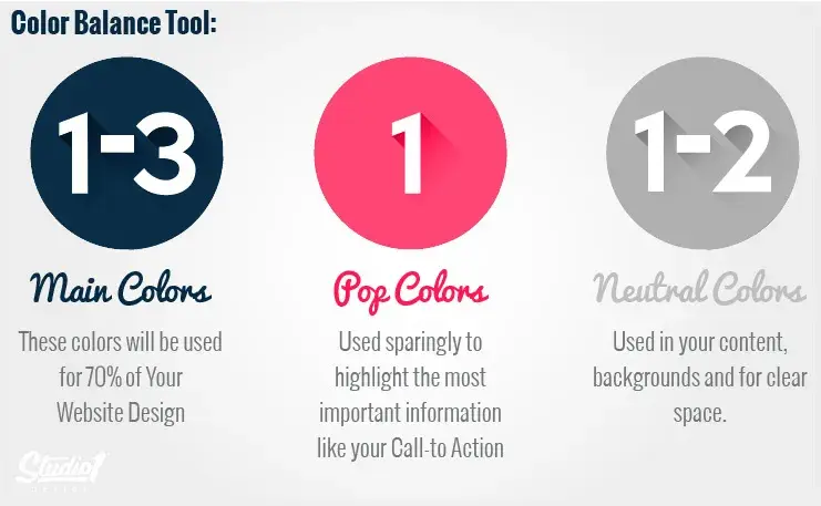
Website design tips by Studio1 Design

Image Source

4. Use white space to break up text and other elements.

Whitespace provides users with visual breaks as they process a website’s design or content, which is aesthetically pleasing but also offers other benefits.

By minimizing distractions, whitespace makes it easier for users to focus, process information, and understand what is important.

That means you can use whitespace to avoid causing information overload or analysis paralysis — and to emphasize important elements on the page.

This might help persuade users to take a specific action, like sign up for a newsletter, shop your latest collection, and more.

For example, Eb & flow Yoga Studio uses whitespace to lead users toward a specific action: to sign up for three weeks of classes. Notice that whitespace doesn’t mean the absence of color or imagery.

Instead, it means that every element on the page is positioned strategically, with lots of space in between, to avoid overwhelming or confusing visitors.

Eb & Flow Yoga Studio homepage

Image Source

One of the best insights I’ve come across on this topic comes from Sean Lee-Amies, CEO and founder at Square One Digital, who explained it perfectly.

“Take Google for example. They’re massive. There’s no end of things they could talk about, and yet the only thing on their homepage is a logo, a search bar, and two buttons,” Lee-Amies says.

“Whitespace is always the first casualty of a web design created by people who haven’t yet learned to use a less is more approach to content and communication.”

5. Use texture to add personality and depth.

Resembling a three-dimensional, tactile surface, web textures aim to replicate the physical sensation of touch with another sensation — sight.

They’re a great design alternative to solid color backgrounds, particularly if you want to add personality and depth to your site.

Take a look at the texture on the homepage for the Santa Barbara-based restaurant Mony’s Tacos below.

It looks like chalk drawn on a blackboard, doesn’t it?

I don’t know about you, but I can almost feel the chalk on my fingers just by looking at it. It‘s the perfect look for a restaurant that aims to be California’s preferred Funk Zone choice for Mexican delights.
Mony’s Mexican Food homepage

Image Source

6. Add images to engage and inform readers.

Striking a balance between text and images is essential in website design. Incorporating visuals can make your content more informative, engaging, and memorable. It’s easier for some people to learn and process information visually.

Here‘s a unique example of breaking up text with images from a cosmetic company’s website. This shows how endless the possibilities of incorporating imagery into your website design are.
La Roche-Posay homepage

Image Source

Images should be part of your entire website, not just the homepage, but must be used carefully and in balance.

The design team at Dgtl Infra, for example, creates blog posts with images every 200-300 words and sees 40% more shares than text-heavy articles. They aim for a 60/40 text-to-image ratio.

This balance keeps readers engaged without sacrificing substance. The team uses a mix of infographics, product shots, and relevant stock images.

Every image should serve a purpose. Randomly inserted visuals can do more harm than good. Each should either illustrate a point or provide a visual break at a natural pause in content.

7. Simplify your navigation.

Navigation is one of the most important design elements on a website. It impacts whether visitors arrive on your homepage and browse or click the “Back” button. That’s why it’s important to keep it as simple as possible.

Many websites opt for a horizontal navigation bar. This navigation style lists the major pages side by side and is placed in the website header.

Take the navigation bar on Blavity as an example. The main navigation categories (Entertainment, Culture, Small Business, Blavity U, Blavity Brands, Digital Cover) are clearly labeled and easy to notice.
Blavity homepage

Image Source

The use of a dropdown menu for the “Blavity” category adds a layer of organization without overwhelming the user with too many options at once. This is a subtle visual cue that helps to guide the user’s navigation.

The search bar found its place in the top right corner, providing a convenient way for users to find specific articles or topics.

8. Make your CTAs stand out.

CTAs are elements on a web page, advertisement, or another piece of content that encourages the audience to do something. The call to action could be to sign up, subscribe, start a free trial, or learn more, among many others.

You want your CTAs to pop in your website design. To make that happen, consider how you’re using color as well as other elements like background color, surrounding images, and surrounding text.

Square provides an excellent call-to-action example. Using a smooth video background, Square shows how unique and future-oriented its product is. Against this dramatic backdrop, the white “Get Started” CTA awaits your click, as well as “Contact Sales” in catchy blue color.
Square’s homepage

Image Source

Damon Culbert from Add People also suggests animating CTAs but in balance.

He says that a subtly animated button that wiggles or pulses after a delay can capture attention without being intrusive. Triggering such animations only after a user has spent time on the page ensures the interaction feels timely and relevant.

This technique, similar to well-timed pop-ups, respects the user’s browsing flow while effectively drawing their focus toward conversion.

While the design of a button is important, we can’t overlook its content: the text it contains. Yevhenii Tymoshenko, CMO at Skylum, touched on this during our conversation, saying:

“We recently redesigned the layout of our website by placing CTAs at the top and the bottom of the page. We also reworded them to be more actionable. Now they say ‘View Plans’ and ‘Explore App,’ speaking to the customer directly without using pushy language like ‘Buy Now.’ As a result, our conversion rates increased by 12%,” Tymoshenko says.

Skylum homepage

Image Source

9. Optimize for mobile.

We’ve already discussed how important it is for your website to be responsive. That might mean altering or removing some elements that would clutter smaller screen sizes or negatively impact load time.

For an example of one of the best website designs, compare Etsy’s homepage on desktop vs mobile. On the desktop, you’ll see a navbar with categories. Hovering over each category will reveal a dropdown menu.
Etsy desktop version

Image Source

On mobile, this collapses behind a hamburger button, which improves the appearance and performance of the mobile site. You’ll also notice that the images are larger — perfect for tapping with your finger on a mobile screen.
Etsy mobile version

Image Source

Claire Escobedo from Online Optimism says that one of the main mistakes she sees in mobile design is a lack of accessible features. This includes things that violate WCAG standards and features like hover effects that impact a site’s functionality.

She continues, “You can’t hover on a phone! You have to account for mobile interactions when designing for any site accessed on a mobile device, which these days is pretty much all sites.”

According to Escobedo, just because your site navigation functions well on desktop doesn’t mean it will transfer to mobile.

“A beautiful mega menu is nice for a laptop user, but how is a mobile user going to access those same four tiers of links?” Escobedo notes.

10. Limit the options presented to users.

According to Hick’s Law, increasing the number and complexity of choices will increase the time it takes for a person to make a decision. This is bad news in website design.

If a website visitor is presented with too many options, they might get frustrated and bounce — or they might pick an option you don’t want, like abandoning their cart. That’s why it’s important to limit the number of options presented to a user.

For example, when a visitor lands on Shawn Michelle’s Ice Cream homepage, they have three clear options: learn about the company, explore the flavors, or check out the catering menu.

It‘s clean, with all the key info easy to find. Does a site like this need anything more? Absolutely not. Everything’s right there, making it easy for customers to get what they need, reducing the chance they’ll leave frustrated.

This is a perfect example of Hick’s Law in UX design.
Shawn Michelle’s Homemade Ice Cream homepage

Image Source

Pro tip: Don’t have the time to follow the rules? You can always download a pre-built website template that will provide a sound foundation for your site.

11. Prioritize functionality over aesthetics.

“Design should support content and functionality — not the other way around. The vast majority of users are going to your site for the information that’s there, not for the way it looks.

As a designer, I know how great it is for a website to look nice, but it can never come at the expense of making sure that your website is functional and understandable for all users.” says Escobedo.

Concentrate on functionality instead of just aesthetics. Create solutions that are easy to use, dependable, and practical, putting the needs of users front and center.

12. Choose the content your users understand.

Website content should be straightforward and doesn’t require all your brainpower to get it and deliver value at the same time. Since that’s not an easy task at all, I hit up Damon Culbert again for advice:

“In order for people to spend time and energy doing something, like sit and read through all the features of a new product or service, you have to create a compulsion within them to do so,” Culbert says.

According to Culbert, strong visuals allow people to invest time and energy into learning more about something you want to sell.

“B2B services are a great example of this; they’re often very complex, and non-experts don’t understand them. It might take a non-expert an hour or more of reading just to get a basic understanding,” Culbert says. “Or they could look at a visual that gets them there in five seconds or less.”

A good example is BuzzSumo’s homepage. It delivers a clear, concise message with visuals like magazine excerpts and social media screenshots, making it obvious what they do — even for first-time visitors.
Buzzsumo’s homepage

Image Source

My final point: People don’t spend money on things they can’t understand if they add value or not. This is why commercially successful companies invest in marketing and sales intelligence tools, mapping out their customer’s buyer journeys and hiccups along the way.

Now, you could spend years studying the ins and outs of web design.

But for the sake of giving you a jumping-off point, we’ve assembled a list of the fundamental guidelines and best practices you can apply to your next website redesign or website launch.

1. Simplicity

While the appearance of your website is certainly important, most people aren’t coming to your site to evaluate how slick the design is. They want to complete some action or find some specific piece of information.

Therefore, unnecessary design elements (i.e., those that serve no functional purpose) will only overwhelm and make it more difficult for visitors to accomplish what they’re trying to accomplish.

From a usability and UX perspective, simplicity is your best friend. If you have all the necessary page elements, it’s hard to get too simple. You can employ this principle in a variety of different forms, such as:

  • Colors. Basically, don’t use a lot. The Handbook of Computer-Human Interaction recommends using a maximum of five (plus or minus two) different colors in your design.
  • Typefaces. The typefaces you choose should be highly legible, so nothing too artsy and very minimal script fonts, if any. Again, keep the text color minimal and always ensure it contrasts with the background color. A common recommendation is to use a maximum of three different typefaces in a maximum of three different sizes.
  • Graphics. Only use graphics if they help a user complete a task or perform a specific function (don’t just add graphics willy-nilly).

Here’s a great example of a simple but effective homepage design from HERoines Inc.
HERoines Inc homepage

Image Source

2. Visual Hierarchy

Closely tied to the principle of simplicity, visual hierarchy means arranging and organizing website elements so that visitors naturally gravitate toward the most important elements first.

The goal is to lead visitors to complete a desired action, but in a way that feels natural and enjoyable. By adjusting the position, color, or size of certain elements, you can structure your site in such a way that viewers will be drawn to those elements first.

The Semrush website is a great example of how visual hierarchy should look. The prominent placement of the “Start now” button, coupled with clear typography and ample white space, ensures that it stands out.

Secondary elements, such as the input field and headline, support the primary CTA and provide context. This well-executed visual hierarchy makes the website easy to navigate and understand its purpose.
Semrush homepage

Image Source

3. Navigability

Planning out intuitive navigation helps visitors find what they’re looking for.

Ideally, a visitor should land on your site and not have to think extensively about where to click next. Moving from point A to point B should be as frictionless as possible.

Here are a few tips for optimizing your site’s navigation:

  • Keep the structure of your primary navigation simple (and near the top of your page).
  • Include navigation in the footer of your site.
  • Consider using breadcrumbs on every page (except your homepage), so users remember their navigation trail.
  • Include a search bar near the top of your site so visitors can search by keywords.
  • Don’t offer too many navigation options per page.
  • Include links within your page copy, and make it clear where those links go.
  • Don’t make users dig too deep. Try making a basic wireframe map of all your site pages arranged like a pyramid: Your homepage is at the top, and each linked page from the previous forms the next layer. In most cases, it’s best to keep your map no more than three levels deep.

One more pointer: Once you‘ve settled on what your site’s main (top) navigation will be, keep it consistent. The labels and location of your navigation should remain the same on every page.

This leads us nicely to our next principle below.

4. Consistency

In addition to keeping your navigation consistent, the overall look and feel of your site should be similar across all of your site’s pages.

Backgrounds, color schemes, typefaces, and even the tone of your writing are all areas where consistency has a positive impact on usability and UX.

That‘s not to say every page should follow the same layout. Instead, create different layouts for specific types of pages (e.g., landing pages, informational pages, etc.).

By using those layouts consistently, you’ll make it easier for visitors to understand what type of information they’re likely to find on a given page.

In the example below, you can see that Airbnb uses the same layout for all of its “Help” pages, a common practice. Imagine what it would be like from a visitor’s perspective if every “Help” page had its own, unique layout.

There would probably be a lot of shoulder shrugging.

Airbnb Help Center

Image Source

5. Responsivity

60% of page global views are from mobile devices like smartphones and tablets, according to Statista.

To provide a truly great user experience, your site has to be compatible with the many different devices that your visitors are using. In the tech world, this is known as responsive design.

Responsive design means investing in a highly flexible website structure. On a responsive site, content is automatically resized and reshuffled to fit the dimensions of whichever device a visitor happens to be using.

This can be accomplished with mobile-friendly HTML templates or by creating a special mobile site.

Escobedo points out that one of the biggest issues she frequently encounters is pages that are way too long.

Avoid endless mobile scrolling by making content collapsible or including links to other pages instead of repeating content on the page.

In addition, make sure your external links open in new tabs and that you aren’t using text that’s too small to read on mobile.

6. Accessibility

The goal of web accessibility is to make a website that anyone can use, including people with disabilities or limitations that affect their browsing experience. As a website designer, it’s your job to think of these users in your UX plan.

Like responsiveness, accessibility applies to your entire site: structure, page format, visuals, and both written and visual content.

The Web Content Accessibility Guidelines (WCAG), developed by the Web Accessibility Initiative and the World Wide Web Consortium, set the guidelines for web accessibility. In a broad sense, these guidelines state that websites must be:

  • Perceivable. Visitors are aware of the content on your site.
  • Operable. The functionality of your website should be possible in different ways.
  • Understandable. All content and alerts can be easily understood.
  • Robust. Your website is usable across different assistive technologies, devices, and browsers.

“At Online Optimism, we adhere to a minimum of WCAG Level A for all website builds, with most of our sites adhering to Level AA and some to AAA,” says Escobedo.

Escobedo shares a few easy accessibility tips, including:

  • Adding alt text for all non-decorative images.
  • Using descriptive link text.
  • Using visual cues like underlines for links.
  • Enabling focus states.
  • Not hiding information or functionality in hover states or in images without alt text or descriptions.
  • Using form field labels.

For a deeper dive into this topic, see our guide to web accessibility.

7. Conventionality

A big challenge in web design is balancing originality with your expectations. Most of us are expert internet users, and there are specific conventions we’ve grown accustomed to over time. Such conventions include:

  • Placing the main navigation at the top (or left side) of a page.
  • Placing a logo at the top left (or center) of a page.
  • Making the logo clickable, so it always brings a visitor back to the homepage.
  • Having links and buttons that change color/appearance when you hover over them.
  • Using a shopping cart icon on an ecommerce site. The icon also has a number badge signifying the number of items in the cart.
  • Ensuring image sliders have buttons users can click to manually rotate slides.

While some might opt to throw these out the window for the sake of uniqueness, this is a mistake. There’s still plenty of room for creativity within the constraints of web conventionality.

Let’s briefly consider another field of design: architecture. Building codes ensure people can safely use spaces. Architects don’t ignore these rules because they ensure safety and comfort. No matter how impressive a building looks, if the stairs are uneven or you can’t exit during a fire, you’d rather stay outside.

In the same way, you can craft a memorable experience while meeting user expectations. If you violate what users anticipate, they may feel uncomfortable or even frustrated with your site.

8. Credibility

Sticking to web conventions lends your site credibility. In other words, it increases the level of trust your site conveys. And if you’re striving to build a site that provides the best user experience possible, credibility goes a long way.

One of the best methods to improve your credibility is to be clear and honest about the product or service you‘re selling. Don’t make visitors dig through dozens of pages to find what it is you do. Be up-front on your homepage, and dedicate some real estate to explaining the value behind what you do.

Another credibility tip: Have a pricing page linked on the homepage. Rather than force people to contact you to learn more about pricing, list your prices clearly on your site. This makes your business appear more trustworthy and legitimate.

Here’s an example of an effective pricing page from the Moz website:
Moz pricing

Image Source

9. User-Centricity

At the end of the day, usability and user experience hinge on the preferences of the end-users. After all, if you’re not designing for them, who are you designing for?

So, while the principles detailed in this list are a great starting point, the final key to improving the design of your site is to conduct user testing, gather feedback, and implement changes based on what you’ve learned.

And don’t bother testing usability by yourself. You’ve already invested a lot of time into your design, which brings your own biases into the equation. Get testers who have never seen your site before, the same as any first-time visitor.

Here are a few user testing tools to get you started:

  • Website Grader. Our free tool evaluates your website based on several factors: mobile, design, performance, SEO, and security. It then offers tailored suggestions for improvement. You can learn more about Website Grader in our dedicated blog post.
  • Crazy Egg. Track multiple domains under one account and uncover insights about your site’s performance using four different intelligence tools — heat map, scroll map, overlay, and confetti.
  • Loop11. Use this tool to easily create usability tests — even if you don’t have any HTML experience.
  • The User Is Drunk. Pay Richard Littauer to get drunk and review your site. Don’t believe me? We tried it.

For even more helpful options, see our list of the best user testing tools.

Now, we understand the principles and best practices that should guide you throughout the design process. In the next section, let’s run down the essential page elements that you should strongly consider including in your design plan.

1. Header and Footer

The header and footer are a staple of just about every modern website. Try to include them on most of your pages, from your homepage, to your blog posts, and even your “No results found” page.

Your header should contain your branding in the form of a logo and organization name, menu navigation, and maybe a CTA, and/or a search bar if well-spaced and minimal.

On the other end, your footer is where many users will instinctively scroll for essential information. In your footer, place contact information, a signup form, links to your common pages, legal and privacy policies, links to translated versions of your site, and social media links.

2. Menu Navigation

Whether it’s a list of links across the header or a tidy and compact hamburger button in the corner, every website needs a guide for navigation positioned at the top of at least your homepage and other important pages. A good menu limits the number of clicks to reach any part of your website to just a few.

To reduce clutter, you might consider making some or all menu options a dropdown menu with links within it, as can be seen on HubSpot’s homepage.
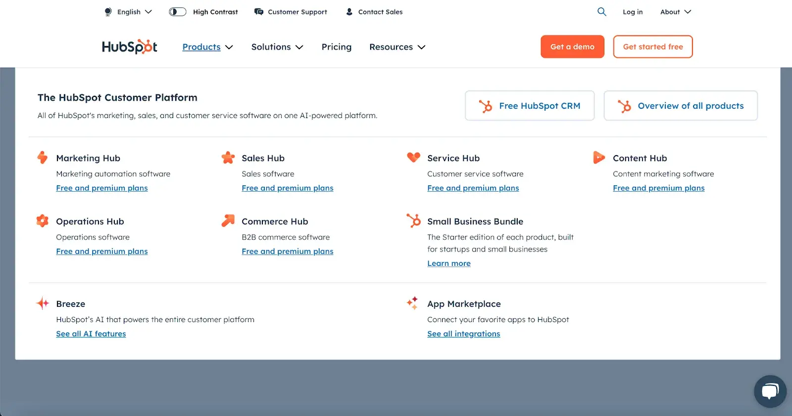
HubSpot menu navigation

3. Search Bar

In addition to menu navigation, strongly consider placing a search bar at the top of your pages, so users can browse your site for content by keyword.

If incorporating this functionality, make sure your results are relevant, forgiving of typos, and capable of approximate keyword matching.

Most of us use a high-quality search engine every day, be it Google, Amazon, YouTube, or elsewhere. These all set the standard for your own site search.

4. Branding

Remember the conventions we’ve discussed?

One that you see practically everywhere is a logo in the top left corner. On first landing, many visitors’ eyes will instinctively shift to this region to check they’re in the right place. Don’t leave them hanging.

To reinforce this notion, incorporate your company branding into every element you add, piece of content you post, and color scheme you create.

That’s why I recommend establishing brand guidelines if you haven’t already. Check out our style guide for a reference.

Pro tip: Create a unique online presence with the HubSpot Brand Kit Generator, which allows you to easily customize logos, icons, and color palettes by entering your business name, industry, and slogan.

5. Color Palette

Color choice plays a major role in your site’s usability and UX as well. This decision tends to be more subjective than other requirements in this list.

But, like everything else we’ve discussed, try to simplify — limit your color selection to 3-4 prominent colors at most.

Starting a color palette from scratch can be surprisingly difficult the first time. We seem to intuitively pick up on which colors work well together and which don’t, but we stumble when trying to pick from the infinite combinations available.

The solution? Try a color palette that’s been shown to work on other websites. Take influence from your favorite sites, and see our list of our favorite website color schemes to get started.

P.S. There are many free website design tools that can suggest color palettes and do a lot of the heavy lifting for you, so be sure to check it out for inspo if you’re feeling stuck.

6. Headings

Headings are key to establishing the visual hierarchy we discussed earlier, especially on text-heavy pages.

As users skim your pages, you need, a clear and to-the-point heading to alert readers to stop scrolling after finding what they want.

Use only as many headings as there are distinct sections of your page, as too much blown-up and bolded text will dampen this effect.

7. Clear Labels

Whenever a user takes an action on your website, it must be obvious exactly what they’re doing and/or where they’re going. All buttons should have clear text or an icon to precisely and concisely signal their purpose.

The same goes for in-text links and widgets (simple interactive elements, like dropdowns and text forms).

For example, a button linking to a pricing page should just read “Pricing” — anything beyond that (e.g., “See our prices”, “Check out the pricing page for a deal”) is superfluous. A search bar/button only needs a search glass icon (🔍) and perhaps also the word “Search” to denote its purpose.

User testing can be a major help here. While you yourself know what all of your interactive page elements do, the same can’t be said for a new user.

Testing will give valuable insight into what users think your labels mean beyond your own perspective.

8. Visuals and Media

When incorporating static images, gifs, videos, and other media into your pages, remember to be consistent and intentional in your choices.

These elements will draw attention over most other text and will likely stay in users’ minds, so choose wisely.

Here’s just one example of effective media on a homepage. Notice how every image complements the page aesthetic and supports the offer of personalized fitness training with results.
Fitlab homepage

Image Source

Also, all images and videos should be optimized for search engines and include descriptive alt text for accessibility.

9. Calls to Action (CTAs)

Having a pleasing website is great, but how do you know whether your visitors are actually doing what you want? Are they engaging with your content? This is where CTAs come into play.

A CTA is any page element that prompts user action. The action could be adding a product to a card, downloading a content offer, or signing up for an email list.

Make your CTA elements prominent in the visual hierarchy, but not intrusive or distracting like many click-through ads tend to be.

If you need ideas for sleek CTAs that drive more conversions, see our CTA examples list.

10. Whitespace

As I mentioned above, sometimes it’s about the elements you don’t include. After reading these guidelines and requirements, you may feel tempted to stuff your pages with all the bits and bobs needed for a flawless UX.

Don’t forget that your viewers need room to digest all this new info, so give your elements room to breathe.

But, how much whitespace should you have? That’s another personal call, and varies from site to site. So, user testing is handy here as well.

What are people focusing on? Do they feel overwhelmed with the density of content? Once again, it all ties back to our first guideline, simplicity.

Focus on Design that Puts Users First

If you add up all of my advice here, there’s one main takeaway to keep in mind — the visitor is number one, and you are number two.

I know this sounds a bit harsh, like you’re putting your own desires and visions aside. But when creating a site, you simply need to imagine that you’re dealing with a first-time visitor.

Someone who’s dropped in like a parachutist and needs to quickly find what they’re looking for, or they’ll just leave your “destination” and keep “flying.”

Once you get this mindset, designing the entire web layout will be easy.

If we go back to the beginning, you’ll remember that I once thought it was all about aesthetics. Today, I’ll tell you that’s partially true. Yes, we still want it to look good, but if it’s not functional, beauty means nothing.

Simplicity. Smooth experience. No labyrinths. No confusing routes. That’s what the visitor needs. And that’s what your website must provide.

Editor’s note: This post was originally published in May 2021 and has been updated for comprehensiveness.


Categories B2B

Building a B2B Video Marketing Strategy With Impact — Here’s Everything I Learned

I remember once sitting in a quarterly marketing review meeting, watching competitors‘ video campaigns flash across the screen.

My initial skepticism turned to curiosity as I saw how they were connecting with audiences in ways our traditional content never had. Each campaign told a story that spoke directly to a decision-maker’s challenges and needs.

That‘s when it hit me: B2B video marketing isn’t just another checkbox in our marketing strategy — it’s a fundamental shift in how we engage with our audience.

→ Access Now: Video Marketing Starter Pack [Free Kit]

Think about it: An engaging explainer video can transform a confused prospect into an interested lead while a well-crafted customer story can turn a hesitant decision-maker into a confident buyer.

In this guide, I’ll walk you through the evolution of B2B video marketing. You’ll discover how to craft a strategy that resonates with decision-makers at every stage of their journey, find the sweet spot between engagement and professionalism, and build a video presence that drives real business results.

No more guessing games or following the crowd — just clear, actionable insights to help you create videos that actually work.

Table of Contents

B2B videos aren’t just ‘nice to have’ anymore.

Pull up on any corporate website today, and you’ll likely see a ‘play’ button within seconds. This isn’t just an aesthetic choice — web visitors expect this now.

The latest data shows why: despite 2023 being a year filled with layoffs and budget cuts, video consumption has proved to be surprisingly immune to economic headwinds.

Total watch time for business content increased by 44% compared to 2022, according to the 2024 State of Video Report.

B2B video marketing is signaling the death of big-budget corporate productions.

From the trends I’m seeing, those glossy, expensive corporate videos just aren’t cutting it anymore.

Small brands armed with just a webcam are putting out about 15 videos a year, going toe-to-toe with bigger and more established brands.

And here’s what really catches my eye: viewers are gravitating toward educational content that tackles actual problems — this type of content now makes up 47% of all business videos out there.

Viewers are flocking to this type of content, seeking guidance and practical solutions.

B2B videos are bringing higher conversion rates.

When companies embed email sign-up forms within these videos, 23% of viewers take action, a conversion rate that outshines traditional CTAs, which average around 13%.

This shift isn’t just about getting more clicks; it signals a deeper change in what audiences expect from brands. Rather than a sales pitch, they’re looking for a teacher, a guide, and a problem-solver.

What’s driving this transformation?

With 93% of businesses now calling video essential to their marketing strategy, industry experts point to two major catalysts: AI’s role in enhancing video creation and an audience increasingly drawn to video for its immediacy and depth.

Businesses are using AI to streamline video production, from automated editing to personalized content generation, allowing marketers to produce high-quality, targeted videos at scale.

Here’s a snapshot of different AI use cases in the video production workflow:

AI in video creation, b2b video marketing

Image Source

AI tools also enable advanced audience insights, which help craft more relevant and engaging content.

For marketers, the takeaway is clear: effective video marketing isn’t about budget — it’s about adopting a mindset that embraces AI’s potential to make content creation faster, smarter, and more aligned with audience demands.

B2B vs. B2C Video Marketing

While both B2B and B2C video marketing are powerful tools, ‌they’re each geared toward meeting different audience needs and marketing goals.

B2B video marketing takes a strategic, targeted approach. It aims directly at business decision-makers to guide them through longer sales cycles.

As Kean Bartelman, associate creative director at Lemonlight, explains, “B2B audiences are often more willing to invest time in longer videos. There’s more patience because the content is focused on delivering depth and insight, which aligns with their needs.”

This longer format, often 2-10 minutes, allows for detailed exploration of solutions and business value propositions.

However, the landscape is evolving. Bartelman notes, “We’re seeing a recent trend where many B2B clients are asking us to bring a B2C feel to their creative. They want more flair, more cinematic elements, and an overall approach that’s engaging and entertaining.”

This shift reflects a blending of traditional B2B educational content with the engaging storytelling styles often seen in B2C.

In my experience being part of video campaigns for a SaaS platform, I’ve seen the direct impact of well-executed B2B video marketing.

By implementing detailed product demonstration videos with clear ROI calculations, we increased the number of qualified leads by 30% and reduced the sales cycle by nearly three weeks.

The key was focusing on addressing specific pain points and featuring real customer success stories that resonated with multiple decision-makers in the buying process.

B2B vs. B2C Video Marketing

Image Source

B2C video marketing, on the other hand, is a fast-paced, emotion-driven approach that relies on quick engagement and lifestyle aspirations to drive consumer actions.

It prioritizes entertainment and immediate emotional connection, typically through short-form videos.

For example, watching this Etsy video, I immediately feel the playful, relatable tone that’s geared toward individual shoppers like me — definitely a B2C vibe.

The whole “Where’s Wally” concept is such a clever way of connecting with those of us who know what it’s like to feel lost in a crowd yet deeply seen by people who truly know us.

The video is all about gifts that say, “I get you,” which speaks directly to me as a consumer looking for something special and personal.

It‘s not a corporate message; it’s a friendly nudge that Etsy is the place to find those one-of-a-kind items that make someone feel truly understood.

The decision-making process centers on individual consumers making quicker purchases based on emotional drivers.

Calls-to-action are more direct and immediate, such as “Shop Now” or “Tag a Friend,” with success measured through immediate sales and social engagement metrics.

According to HubSpot’s 2023 Video Marketing Report, B2C brands using short-form video content see 30% higher engagement rates compared to traditional marketing methods.

optimal length of short-form form marketing videos

Image Source

This shows how powerful video content can be for brands that want to make real connections with their customers and get them to buy right away.

Mastering video marketing demands a clear understanding of the divide between B2B and B2C landscapes — something I’ve seen define campaign success repeatedly.

While B2B video marketing campaigns navigate complex, multi-stakeholder journeys, B2C content drives swift, emotion-driven decisions.

pull quote on brb video marketing landscape changing

Yet, the landscape is evolving. B2B videos now borrow from B2C’s playbook, incorporating dynamic storytelling while maintaining their strategic focus.

The result? A sophisticated approach that honors platform dynamics and audience behaviors while pushing creative boundaries.

1. Video builds trust with buyers.

While traditional content marketing is effective for delivering insights, video goes a step further by fostering a more personal connection with buyers.

From my experience, video engages buyers on a uniquely personal level — seeing a product in action makes it feel more real and relatable than any description ever could.

When buyers experience a product through video, they’re not just informed; they’re reassured, which is exactly what they need when making complex, high-stakes decisions in a B2B context.

ServiceNow’s AI-driven explainer video is a prime example of how video content can be a powerful trust-builder.

In this video, Now Assist is shown tackling familiar workplace challenges in real-world scenarios, making it clear that ServiceNow deeply understands the everyday needs of its B2B customers.

This approach builds trust by allowing buyers to envision the product’s impact in their own workflows, moving beyond theory to practical, relatable use cases.

Rather than relying on abstract promises, the video demonstrates specific, valuable outcomes like enhanced productivity and streamlined processes, offering viewers a reassuring glimpse of the tool’s potential in action.

Short-form social videos are increasingly trusted, with 63% of B2B buyers turning to them for making informed decisions. ServiceNow’s polished, concise video aligns perfectly with this preference.

By balancing brevity with substance, the video respects the viewer’s time while delivering enough detail to inspire confidence.

This focus on real-life applications and immediate benefits makes the product feel more tangible, positioning ServiceNow as a trusted, customer-centric provider.

For B2B buyers facing complex purchasing decisions, this type of video content is exactly what builds trust, credibility, and, ultimately, a stronger connection with the brand.

2. Video reveals valuable insights about buyer preferences.

Video analytics provide unique visibility into buyer behavior through detailed engagement data that traditional metrics, like page views, simply can’t match.

Viewer retention graphs show exactly where prospects focus or lose interest, while heat maps and rewatch patterns reveal which features capture attention and where clarification may be needed.

When I look at video analytics, I’m always struck by how much they reveal about buyer preferences. For instance, seeing exactly where someone pauses or rewinds gives us insights into what resonates most.

Recently, I was reviewing a Wistia video analytics demo, and it highlighted just how powerful these tools can be.

The heat maps didn’t just show where people watched — they revealed precisely which sections viewers skipped or rewatched. This level of detail helps me pinpoint what works and what doesn’t in a way that’s almost impossible with other data.

For example, realizing that viewers drop off at a specific point in a video shows me where we might need to restructure content to keep their interest.

Or, when I noticed that a certain section was being rewatched frequently, it became clear that this part was especially engaging or needed further emphasis earlier in the video.

The option to use A/B testing for different video edits also means we can try out changes and immediately see which version performs better, allowing us to continuously improve the content.

By tuning into these moments, we’ve been able to refine our messaging to better align with what buyers are truly looking for.

These video-specific insights allow teams to optimize everything from product messaging to the flow of sales presentations, resulting in more targeted outreach and shorter sales cycles.

3. Video empowers teams to deliver value-driven content.

Video enhances both sales and support interactions by enabling scalable personalization.

Research shows that 94% of buyers prefer demos tailored to their specific use case, and 38% are less likely to purchase if they must contact sales for basic demonstrations.

Video allows sales teams to create reusable, customizable demos that buyers can access on demand, meeting this expectation for personalization.

This video strategy also streamlines support. By creating a library of tutorial videos, support teams can reduce response times, empowering customers to find answers independently.

In addition to boosting operational efficiency, video creates a more satisfying experience for buyers, enabling them to engage with tailored content at their convenience.

4. Video attracts new customers through social proof.

Video testimonials, case studies, and reviews showcase real customer experiences in uniquely compelling ways.

I’ve watched a couple of testimonial videos that bring a level of credibility that text alone just can’t match — seeing customers speak directly to their success stories creates an authenticity that resonates.

For instance, the recent testimonial from Televox, a leading Nordic telephony company, captures exactly how impactful video can be. In it, Elizabeth, their RevOps Manager, shares how using HubSpot transformed Televox’s customer relationships, driving a 150% increase in new direct sales over three years.

Hearing specifics like these, coupled with her excitement about the results, brings a level of authenticity that’s hard to convey in text alone.

As she shares Televox’s story of streamlined communication and improved customer experiences, it’s easy for viewers to envision similar successes for their own companies. Watching someone speak proudly about measurable outcomes builds a deeper sense of trust.

The impact is clear: 95% of medium-sized businesses report at least a 10% boost in conversion rates when using video testimonials in their campaigns.

When prospects see and hear real customers like Elizabeth sharing their experiences with genuine enthusiasm and tangible results, they can start to imagine their own success with the solution.

From quick testimonials on social media to in-depth case studies for complex solutions, video social proof has the power to build trust and drive results by making success stories feel real and attainable.

5. Video drives personalized ABM strategies.

“A lot of ABM marketers are stuck with two choices: what works doesn’t scale, and what scales doesn’t work,” explains Adam Shoenfeld, CEO of Keyplay.

This ABM paradox — where focusing on a few high-value target accounts delivers results but lacks scalability, while broad campaigns often lead to low conversion rates — can be addressed through video marketing.

Video provides a scalable way to deliver personalized, high-impact messages to target accounts.

For example, ABM teams can create customized product demos to address industry-specific pain points or executive messages that build credibility with stakeholders.

Throughout the account journey, from initial awareness videos addressing niche challenges to solution demonstrations for evaluation teams, video enables deeper connections with priority accounts.

By combining personalization with visual storytelling, video helps ABM marketers reach high-value accounts effectively while maintaining scalability.

Companies that adopt multi-format video strategies have seen engagement metrics like video completion rates and meeting bookings with target accounts increase, highlighting video’s role as a powerful tool for ABM success.

Building a B2B Video Marketing Strategy That Delivers Results

After joining a B2B video marketing team, I quickly learned that creating an effective video strategy was about much more than making great videos.

We needed to understand our audience, map each video to their buying journey, and, ultimately, tie everything back to real business outcomes.

Here’s a glimpse into what worked, what didn’t, and the actionable steps we discovered along the way.

Step 1: Figure out what your audience really wants.

When we started, our first instinct was to jump straight into customer interviews. But in the B2B world, people are busy.

Scheduling one-on-one chats with decision-makers wasn’t realistic. So, we took a step back and decided to try a quick survey instead.

We kept our survey short and to the point. Questions focused on the types of videos they wanted, preferred lengths, and which platforms they used most (like LinkedIn or YouTube).

To increase responses, we offered something small but valuable — early access to our upcoming video series.

The responses were surprising. Short, concise videos were clearly preferred. People wanted practical “how-to” content instead of sweeping overviews. This simple change in our approach made all the difference.

Next, we turned to metrics for a reality check. We looked at average view durations, drop-off points, and conversion rates across our platforms.

It turned out that our most-watched videos were under two minutes, and viewers tended to drop off fast if the content didn’t get to the point. So we decided to prioritize short, impactful videos moving forward.

Step 2: Understand your audience. Who’s watching, and what do they care about?

One of the biggest challenges in B2B is knowing that no single person makes a decision alone. Each deal involves multiple stakeholders, each with unique concerns.

Our goal was to map out what these different groups needed, which led us to segment our videos by role:

  1. C-suite executives wanted big-picture value and impact — they didn’t have time for details.
  2. Technical evaluators were the opposite. They needed specifics and wanted us to get into the nitty-gritty of features and functionality.
  3. End-users preferred “how-to” videos so they could envision how the product would fit into their day-to-day tasks.

Working closely with our sales team was a huge advantage here. They provided firsthand insights into the common questions and objections each group had, helping us design videos that directly addressed these needs.

Key takeaway: If you’re building your strategy, don’t just create general videos for “the buyer.” Map out your audience segments and tailor content for each group’s specific concerns and preferences.

Step 3: Craft a content strategy that guides the buyer’s journey.

Once we knew what each stakeholder needed, we structured our videos around the B2B buying journey.

Our goal was to guide viewers along each step of their decision-making process, aligning content with their shifting priorities.

  • Awareness Stage: Here, we created short thought leadership videos that tackled industry-wide challenges. We kept these high-level to build credibility without overwhelming viewers.
  • Consideration Stage: For this phase, customer testimonials and product overviews became our go-to. We showcased real solutions to real problems, helping prospects envision the value of our offering.
  • Decision Stage: Detailed product demonstrations and technical guides worked best here. By getting granular, we reassured decision-makers that our product had the features they needed.

Pro tip: For each stage in your buyer’s journey, create videos that reflect where prospects are mentally. Early on, build trust. As they move toward a decision, focus on specifics and differentiation.

Step 4: Set goals and measure success.

One of the biggest revelations for us was that video engagement metrics alone don’t tell the full story. To really see if our videos were effective, we needed to look at the bigger picture.

We broke our goals into three main areas:

  • Engagement. Metrics like average view duration, completion rates, and social shares helped us understand what topics captured attention.
  • Lead generation. We tracked conversions tied directly to video views, such as form completions or demo requests. These metrics showed us when our videos were driving pipeline growth.
  • Revenue. By tracking which videos influenced pipeline and closed deals, we saw exactly how much our videos contributed to revenue — a real eye-opener for the whole team.

Key takeaway: When setting goals, think beyond views. Track how each video contributes to leads and revenue, not just engagement. It’ll reveal which content truly drives results.

Step 5: Align the team, bringing marketing, sales, and product together.

Video isn’t just a marketing asset — it needs input from sales and product, too. Regular check-ins across these teams were essential. We set up a centralized content library to keep everyone aligned.

Here’s what it included:

  • Brand guidelines. To keep visuals and messaging consistent.
  • Approved messaging. To ensure everyone speaks the same language in front of the customer.
  • Performance insights. Sharing data with the sales team gave them talking points and insights into what prospects responded to most.

Working together kept the content grounded in real customer needs, not just marketing ideals.

Pro tip: Hold regular check-ins with sales and product teams to keep your videos relevant and useful. This alignment makes each video more impactful and ensures everyone is on the same page.

Step 6: Balance quality and budget.

When we first started, we didn’t realize how quickly costs could stack up. We soon learned that a hybrid approach was the best way to balance quality and budget:

  1. In-house production. For regular product updates and quick demos, we set up a simple in-house studio. It kept costs down without sacrificing too much quality.
  2. Agency partnerships. For bigger pieces — like brand introductions and customer stories — we brought in an agency. It was pricier, but the high stakes justified it.

To keep spending in check, we tracked cost per view, cost per lead, and cost per acquisition. These metrics kept us focused on content that delivered the best ROI.

Pro tip: Define a budget for each type of video. Use in-house resources for simpler content and agencies for high-impact pieces. Track costs closely to ensure each video contributes to your goals.

Looking Back: What We Would Do Differently

One of the biggest opportunities we missed was not using AI-powered video creation tools earlier on.

While we were juggling between expensive agency work and basic in-house content, tools Clip Creator could have transformed our approach to B2B video production.

clip creator interface

Our team spent months struggling with ‌scalability challenges — particularly when we needed to create localized product demos for different market segments.

Had we known about Clip Creator then, we could have turned one master script into multiple versions, each tailored to specific industry use cases, without the resource strain we experienced.

Looking at our video strategy now, it’s clear that AI-powered tools could have helped us maintain consistent quality across all our content, not just our big-budget pieces.

The ability to create professional-grade videos for every stage of the buyer journey while maintaining brand consistency and compliance would have significantly improved our content velocity.

Creating Genuine Connections

Initially, I thought expertise in video marketing meant mastering high-end equipment and complex production techniques.

However, after digging into the data and trends, I found that true success lies in crafting genuine connections through storytelling.

One of my biggest revelations was realizing the transformative potential of AI in video production.

Looking back, I see how AI-powered tools could have streamlined our entire process, allowing us to maintain consistent quality across all content, not just in high-budget projects.

In video marketing, change is constant. As you implement this strategy, adopt a routine of quarterly strategy reviews, closely tracking performance, and adjusting your approach based on data and evolving audience needs.

By keeping your strategy flexible and audience-focused, you’ll turn your B2B videos into an essential part of your B2B marketing toolkit.

Categories B2B

How to Humanize AI Content So It Will Rank, Engage, and Get Shared in 2025

I still remember my first taste of artificial intelligence (AI).It was “SmarterChild,” a chatbot available on AOL Instant Messenger (AIM) and Windows Live Messenger in the early 2000s that you could have a “conversation” with when your real friends weren’t online.

But honestly, even as a preteen, I could see that it needed a lesson in humanizing AI content.HubSpot's AI Search Grader: See how visible your brand is in AI-powered search  engines.

While SmarterChild could ask how I was and tell jokes, the exchanges felt, well, robotic. It couldn’t learn or remember information over time, and it had trouble navigating human quirks like slang and shorthand. It also seemed to always throw out the same canned phrases, like it was the star in an ‘80s sitcom.

Thankfully, much of this has improved today, but the challenges (and importance) of capturing human candor and understanding remain — especially for marketers.

Let’s unpack how to maintain your human touch while still reaping the benefits of AI content as a marketer.

Table of Contents

The Rise of AI Content

According to Pew Research, 55% of Americans use AI at least once a day.

It’s running our wearable fitness trackers and curating our Daily Mixes on Spotify. It’s giving us product recommendations on Amazon and sending those pesky emails we never read to the spam folder. And the impact doesn’t stop there.

HubSpot’s State of AI found that 62% of business leaders say their company invests in AI and automation tools for employees.

In fact, the number of marketers who use AI in their roles has jumped from 21% to 74% year over year, with more than 74% believing most people will use AI in the workplace by 2030.

But why exactly?

Horizontal bar chart showing what marketers use AI to accomplish

Source

Simply put, AI can help people in various industries automate or expedite repetitive tasks (e.g., email automation), increase efficiency, lower costs, improve analysis, and be more productive overall — especially marketers.

So, should you use AI content?

The short answer is yes — but I say this with many asterisks. Let me explain.

As a writer and marketer, I pride myself on being able to spin up copy that converts, emails that engage, and blog articles that get readers nodding their heads. But that doesn’t mean it comes quickly or easily.

Keeping up with a full marketing calendar is hard. Every piece of content has a workflow that includes planning, research, writing, editing, staging, promotion, and analyzing.

AI content can help expedite this process, with 83% of marketers saying AI helps them create significantly more content than they could without.

Horizontal bar chart showing what content marketers create with AI.

Image Source

What kind of content are marketers generating? Check out The Top Types of AI-Generated Content in Marketing [New Data, Examples & Tips].

A good friend, former HubSpotter, and Head of Content at Ashby, Anum Hussain, agrees, saying, “I‘m not sure I’ll ever see AI go from 0 to 100 on a content initiative, but for all of us who face empty page syndrome, getting from 0 to 50 is a huge productivity unlock.”

But that doesn’t mean you can just mindlessly copy-paste whatever ChatGPT, Claude, or even HubSpot’s Breeze gives you. It needs to be edited and “humanized.”

Why does AI content need humanization?

Our research shows that 86% of marketers using AI take time to edit the content it produces. (And I can’t tell you how much of a sigh of relief it was to read this.)

Despite the operational positives we discussed, AI is plagued by concerns about plagiarism, bias, data security, and the potential for government regulation. In other words, raw AI content can be very problematic as it is derivative by nature.

You see, AI content generators are built on existing content commonly gathered from the Internet. This is how they “learn.” Every time you enter a prompt or query into a tool, AI simply reaches into this knowledge bank and picks out what it thinks is most relevant to what you want.

That means it just compiles things already out there. There’s no guarantee that your results will be different from what the tool produces for another user or even from what’s already published online.

It also certainly won’t be written with your brand’s voice or differentiators in mind, or offer the expertise, experience, authoritativeness, or trustworthiness (EEAT) Google SERP demands of the pages it ranks.

Smart editing or taking the time to humanize your content can put all these concerns to rest. So, how do you do it?

How to Humanize AI Content

Whether you’re a social media manager writing captions or a content manager writing articles and website copy, learning how to humanize AI content is critical to future-proofing your content strategy. Here are seven tips on how to do it well.

To help illustrate them, I asked ChatGPT to write me a blog article about how to write a great social media post.

Screenshot showing the results of a prompt requesting ChatGPT to write a blog article about creating a social media post.

1. Add personal stories and insights.

AI knows many things, but you know what it doesn’t? Your personal thoughts, insights, and experiences.

When you ask it to create content for you, it may respond in a casual tone, but it’s likely just stating facts — like a textbook or instruction manual.

That said, personal stories, references, or lessons can not only engage your audience with something relatable, but they add depth and originality to your content. It’s all about thought leadership.

Melanie Deziel, Content Consultant and Co-Founder & Chief Learning Officer of Creator Kitchen likes to share both personal wins and losses when editing AI content. 

She shared with me, “We can take the raw materials we get from a tool like ChatGPT and infuse not just valuable lessons we’ve learned but also relatable mistakes we made along the way. We can add context to our revelations, realizations, failures, and pivots by sharing the emotions that surround those experiences.”

Let’s look at our example. In my sample article, ChatGPT gave me the following for an intro:

Screenshot showing an introduction written by chatgpt about writing social media posts.

Pretty generic, right?

I’d humanize this AI content by bringing in a relatable anecdote about doom scrolling when I can’t sleep or talking about a successful social media strategy I’ve worked on to establish credibility. I could also add a section on the current state of social media with my own predictions and opinions.

ChatGPT laid a foundation, but all of these personal touches would give it flair. Something they can’t get anywhere else.

Pro tip: Have fun with it!

Deziel continued, “While ChatGPT’s LLM may have a good handle on the prescriptive rules of grammar and syntax, we have to know when and how to break those rules for maximum impact.

“We can include puns, sarcasm. We can make plays on words and include humorous asides (or… asides that we think are humorous, anyway.) We need to  intentionally manipulate sentence length with melodic mastery and break the monotony with unexpected word choices.”

“We have to get loosey-goosey with our punctuation choices, inserting ellipses to force a breath and peppering our pages with em-dashes to mirror the stop-and-start nature of our chaotic thought patterns… and we say things like ‘loosey-goosey.’

In short, we have to do what hasn’t been done. And an LLM, by design, cannot. “

2. Incorporate original, visual examples.

Like personal insights, examples give AI content more substance. But they can also make the information shared easier for your audience to understand, especially if it’s educational.

Returning to our sample, ChatGPT listed this as one of its steps for creating a great social media post:

Screenshot showing advice  written by chatgpt about writing social media posts.

“Use visuals to boost engagement” is pretty self-explanatory, sure, but showing real-life examples where this was done well would really drive the point home. Plus, it would help break up text, making your piece easier to skim and also giving readers something more fun to engage with.

To humanize this section, I’d embed actual social media posts from brands my audience admires and explain why they were successful. This is something I do frequently in my articles:

Screenshot showing how the author includes real-life examples in her blog articles.

I’d also be careful not to repeat examples included in competing content and be mindful of diversity and inclusion as I made my selection.

The idea here is to avoid the obvious and show my audience something fresh to inspire their own social posts.

Pro tip: Pull examples from your own body of work whenever you can.

Consider your brand’s case studies, testimonials, or portfolio and what can support the content. These examples are unlikely to appear in similar content by your competitors, and, once again, they help showcase your personal expertise on the subject matter.

3. Edit into the first person.

Third-person writing is a tell-tale sign that you used AI.

This style can read as formal, boring, and impersonal, hurting you with Google’s EEAT regulations. To avoid all this, try rewriting your AI content into the first-person perspective — meaning using pronouns like I, me, and we.

My teammate and managing editor of the HubSpot Website Blog, Jamie Juviler, actually turns back to AI to help him do this.

He explains, “Sometimes AI helps me make my writing sound more human. For example, if I have a paragraph written in the third person, I’ll ask ChatGPT to convert it to the first person with minimal changes to the copy itself.”

This saves Juviler a great deal of time, especially since he can use the same tool that generated the content in the first place — no need to hop around other documents or tabs.

Pro tip: Put your title in the first person as well.

Juviler continues, “I also do the same with post titles and email subject lines — run them through ChatGPT and prompt it to make the wording more unique to my voice. Doing this makes readers more likely to engage with the content if the headline is from my perspective, versus a generic title.”

In the case of my social media article, ChatGPT turned “How to Write a Great Social Media Post: Engage, Inspire, and Convert” into:

  • “How I Write Engaging Social Media Posts That Inspire and Convert”
  • “My Guide to Crafting Social Media Posts That Engage, Inspire, and Convert”
  • “How I Create Social Media Posts That Stand Out, Engage, and Drive Results”

Screenshot showing how chatgpt rewrote a blog title to be in the first-person.

This is also a great hack for brainstorming titles for your editorial calendar. Learn how to create yours.

4. Shift to an active voice.

Along with third-person, AI content generators tend to lean on passive voice. And like my old friend SmarterChild, it sounds extremely robotic.

For example, in my article, ChatGPT passively wrote: “If you’re celebrating a milestone, express excitement. If you’re discussing a tough topic, show empathy.”

This could be more dynamic and engaging if shifted to active voice becoming: “Express excitement when you celebrate a milestone and show empathy when you discuss tough topics.” Review your AI content for these opportunities.

5. Fact check everything.

As we discussed earlier, AI tools pull information from all over the place. Who knows if what it tells you will be credible or up-to-date? In fact, they recognize this.

Why do you think most tools even come with a disclaimer like this one from ChatGPT? “ChatGPT can make mistakes. Check important info.”

Screenshot showing chatgpt’s quality disclaimer.

Heed their warning, people. Fact-check everything AI writes for you.

That means both quantitative (dates, statistics, etc.) and qualitative facts. Also, be mindful of how old the information is. While a statistic may be true and from a reputable source, it’s likely no longer relevant if it’s from a decade ago.

A quick hunt in a search engine should be all you need to confirm or deny information AI gives you, but you can also try tools like Google’s Fact Check Tools or Longshot to speed up the process.

Pro tip: If you have original data or research, incorporate it. This is another example of information no other competitor or AI will have.

6. Get more specific with your prompts.

Ok, so. So far, all of the advice I’ve shared is reactive. They are things you can do after AI’s generated your content, but there are proactive actions you can do as well.

I can pretty much summarize them all by saying, “Get more specific with your prompts.” But that’s not helpful, so let’s unpack things a bit.

I often compare using AI to working with a freelancer. Whenever you hire a freelance writer, you give them a creative brief of what you’re looking for, right? You don’t expect them to deliver the desired results if they don’t know what you want. The same should go for AI.

Improving your AI writing prompts — telling the tool exactly what you want to see — improves the chances that the results will match your needs and brand voice.

In our conversation, Anum Hussain drove this home, saying, “Ultimately, training AI tools can be similar to new hire onboarding. Providing examples, editing work, and asking for specific edits/changes helps train the tool to work more and more in your style over time.”

“At the end of the day, it’s a tool, and we are the humans to guide it.”

Here are five key things you can do.

Give AI a persona to adopt.

If you want AI to write in the first person as an expert, you must tell them who they are. In your prompt, include who the author is, what they do, and perhaps even a bit of their experience.

It’s also smart to include details about your brand or business, such as:

  • Your product/offering
  • What makes it different (specific features, capabilities, etc.)
  • Company Mission
  • Company Values

This information will help your AI tool better understand the perspective it should adopt when writing.

Describe your audience.

Next, you also need to tell your tool who the audience is. Who are you trying to reach with this content? You can share a full buyer persona with your AI tool if you’d like, but at a minimum, you want to include:

  • Age
  • Location
  • Company, job title, industry (if B2B)
  • Goals
  • Personal challenges
  • Pain points you solve

Describe your brand voice.

How should the content AI creates sound? Should it be friendly? Authoritative? Funny? Detail it in your prompt so the tool can act accordingly.

Read: How to Create a Content Style Guide [+ Free Guide & Examples]

Include examples.

Better than just telling AI what you like, show them. Do you have a certain piece of content that you really admire or would like to emulate? Perhaps there’s a piece that performed well that you’d like to recreate the magic of.

Share them in your prompt. Include links or upload files as inspiration with your prompt. Hussain is a fan of this feature available on ChatGPT Plus.

Screenshot showing ChatGPT’s file upload and link sharing options

She shares, “Relying on an AI tool to know your voice without any intelligence to go off of but the web will likely result in a tone that isn‘t a fit for you or your brand. When starting a new prompt, I upload documents of past work I’ve written.”

“That way, it can model the format, structure, and tone I want. There’s still editorial work to do, but it helps get us much closer to what we’re looking for.”

Share terms and phrases to exclude.

It makes sense to tell your tool what you want, but explaining what you don’t want helps make the parameters even clearer. If there are particular phrases or topics you’d like to avoid (i.e., the name of a competitor), state that in your prompt.

No information is too much when it comes to your AI prompt. While it may take you longer to prepare these details before going into production, you’ll be much more likely to save time editing because of it.

Pro tip: If you’re a HubSpot user, using Breeze can eliminate much of the work involved in prompting.

While Breeze’s inherent purpose isn’t to create “human-like” content, we built it with a particular marketing and sales context in mind that makes it better at doing so.

Screenshot showing what the blog article generator looks for HubSpot’s Breeze AI.

Source

Our team focused on prompt engineering, so the tool knows how to provide more details from your portal about the customer, company, or use case at hand when generating content, even if you don’t specify it in your prompt.

This goes for blog articles, emails, social posts, website copy, and even SMS text messages.

7. Use an AI humanizing tool.

Ok, I know. This is a lot of manual effort. If you don’t have the resources, there are some AI tools dedicated to humanizing content to execute these tasks for you.

In the next section, I’ll share four of the best.

Free AI Content Humanization Tools

Note: These AI tools are not for generating new content but specifically for making the content better.

If you’re looking for tools to create content from scratch, check out our article, AI Content Generators: I Tested 5 of the Best; Here’s What I Found.

1. Ahrefs

Screenshot showing Ahref’s free AI text humanizer tool.

According to Ahrefs, its AI text humanizer is built on a language model that learns communication patterns, grammar, and vocabulary from text data fed into it.

It then uses that insight to generate human-like text based on what you enter, producing one, three, or five variants at a time. I tried it out with my article from ChatGPT, and here’s what I found.

The good:

  • The edits weren’t dramatic, which makes sense since the original article was pretty casual in tone, but the changes it did make were impactful. For example, it changed “Start by understanding who your followers are and what they care about.“ to “Begin by identifying who your followers are and what matters to them.” It’s a small but clarifying edit.

The bad:

  • I could only enter about half of the content, meaning there is an undisclosed word or character limit.
  • Formatting is removed when you enter text, so you’ll have to reformat it before use.
  • The tool detects AI-generated content. It gave me a note at the top of my results that read: “80% of your text is likely AI-generated.” This seems unnecessary because why would you mean “humanizing” your content if AI didn’t write it?

Overall, it is a helpful, easy-to-use free tool, but the user experience could be better. With the undisclosed word limit, it’s also most useful for shorter content needs like website copy, social media posts, or specific passages.

2. Writesonic

Writesonic’s free AI text humanizer works similarly to Ahref’s in that you simply copy and paste your text and hit a button to get results—but with some nice little extras.

Screenshot showing the tone options in Writesonic’s AI content humanizer tool.

The good:

  • After entering my text, I could choose from 14 different tones of voice (i.e., engaging, persuasive, friendly, etc.). This option makes the tool that much more useful for a variety of content marketing purposes. Not every tone is right for every campaign or medium and being able to specify what you need definitely makes you feel more confident in the results it will deliver.
  • I could also choose from 24 languages, including English, Spanish, Japanese, Swedish, Turkish, and Hindi.
  • There is a 200-word limit, and it showed me how many I was over or under. The tool wouldn’t run unless I was under this limit. The transparency of the word count was great to see and doesn’t leave you wondering if you did something wrong like Ahrefs.

The bad:

  • I tried two different tones: simplified and luxury. At first, I was fairly impressed. The simplified version definitely removed some more formal language and replaced it with more universal alternatives (e.g., replacing “audience” with “followers”). However, when I switched to “Luxury,” the results were pretty much unchanged.

Screenshot showing the results of Writesonic’s AI humanizer in the “simplified” tone of voice.

Screenshot showing the results of Writesonic’s AI humanizer in the “luxury” tone of voice.

  • Writesonic maintained more formatting than Ahrefs when entered, but it was all removed after editing. This makes it difficult to skim and evaluate the results.
  • There were some grammatical issues (i.e., missing commas) in the results.

Regarding UX, Writesonic’s AI text humanizer is a step up from Ahrefs. I appreciate their transparency about the word limit, and the results are decent, but the customization options seem to be more for show at the moment.

I also got hit with a form after my third test generation. You need to sign up to keep using the tool for free.

3. Surfer

Next up, I tried Surfer’s free AI content humanizer, which is currently in beta.

Screenshot showing the Surfer’s free AI content humanizer.

The good:

  • Out of the options I tried, Surfer has the highest word limit at 500 — but this appears to be a lifetime limit. Like Writesonic, Surfer is transparent about the limit, so I wasn’t left guessing.
  • It maintains and preserves text formatting throughout the humanization process — Huge win! This includes header and paragraph tags.

The bad:

  • There are some grammatical issues (i.e., missing commas and inconsistent capitalization) in the results.
  • No customization options for tone, language, etc.
  • Like Ahrefs, the edits were minimal, with the tool noting that the copy already read as a human wrote it. This is understandable, but if I’m coming to this tool, clearly, I’d like to see it improved further. I’d like to have to seen the tool do more.

4. Scribbr

While not designed as a “humanizer” like the other tools, Scibbr’s free paraphraser tool can used for these purposes in a crunch.

Screenshot showing Scribbr’s free paraphrase tool.

The good:

  • I could copy and paste text or upload a document to be paraphrased.
  • I could paraphrase in 26 different languages.
  • The tool has two modes I could choose from: standard and fluency.
  • Toggling the “synonyms” options allows you to control how much of the specific language you’d like to change.
  • Preserves most formatting throughout the process.
  • Allows you to choose specific words to “rephrase” in the results. When you click on the highlighted word, you can then select the alternative you like best.
  • Edits are substantial.

Screenshot showing the rephrase options in Scribbr’s free paraphrase tool.

The bad:

  • This has the lowest word limit out of those I tested, with a limit of just 125 words.
  • With this tool’s significant edits, there is a higher risk of losing focus keywords when using this for content marketing.

Master the Balance Between AI and Humanity

As we enter a future where AI becomes an even greater force in content creation and marketing, the key to success is balance.

AI offers incredible speed, efficiency, and scalability, but it’s the human touch — our personal voices, wins, losses, and experiences — that makes content great. It’s what breathes life, personality, and authenticity into your message and builds trust with an audience.

It’s the X factor that makes them want to follow you on social media, buy from you, and recommend your brand.

By blending personal insights, unique examples, careful editing, and more thoughtful prompting, we can create content that resonates deeply with our audiences while leveraging the best that technology has to offer.