Categories B2B

Everything You Need to Know About YouTube Affiliate Marketing in 2024 (+ Expert Tips & Examples)

If I were a creator, one of the first channels I’d explore is YouTube affiliate marketing.

Think about it: Whether you’re sharing a tutorial or a product review, you can add affiliate links to every YouTube video description you create.

Not only that, but you can also stack multiple links to products you recommend without having to put them all in one “link in bio.”

Plus, you don’t have to worry about viewers leaving your page to go search for your product recommendations. Instead, all they need to do is scroll down while watching your video.

→ Free Templates: How to Use YouTube for Business [Download Now]

While affiliate marketing is often seen on other channels like Instagram, TikTok, or blogs, creators sometimes overlook YouTube as a worthwhile affiliate channel.

So, I want to explore whether or not YouTube affiliate marketing works and how to do it well, according to experts.

Table of Contents:

Like other affiliate channels, YouTube affiliate marketing relies on custom links to track the sales you generate from promoting to your audience.

On average, creators earn anywhere from $100 to $5,000 per month in affiliate revenue, according to data from Statista.

And while other channels like Instagram or blogs can be used for affiliate marketing, the industry’s investment in video is one reason creators and marketers should consider YouTube for their affiliate marketing platform of choice.

In fact, 52% of marketers leverage YouTube as part of their social strategy as video becomes a higher priority. You can learn more about YouTube marketing in this HubSpot Academy course.

YouTube Affiliate Marketing Pros and Cons

While I’ve watched many YouTube videos and purchased products using creators’ affiliate links, I’ve never experimented with YouTube affiliate marketing myself.

I was curious to learn what makes YouTube a good channel for affiliate marketing, who it’s best for, and why other channels may work better, so I talked to a few marketing experts.

Pro: Building Trust (with Users and Google)

The first advantage is that it allows creators to reflect their personalities and demonstrate their expertise and qualifications more easily.

“In the age of AI, consumers no longer follow text recommendations at face value,” suggests Austin Tuwiner, head of growth at Geniuslink and a long-time affiliate marketer and YouTuber.

“It’s more about who is behind those words. By establishing a history of videos and expertise in a niche, you will become an industry leader and a go-to source for information.”

Jesse Lakes, CEO and co-founder of Geniuslink, reiterates that trust is a factor not only with your audience but also with Google.

“YouTube’s search API isn’t experiencing the havoc caused by Google’s recent updates for website search, where many affiliate-based websites are getting penalized, unlisted, or just seeing their traffic radically drop,” he says.

Pro: Clickable Links

I don’t know about you, but one of my pet peeves about Instagram is not being able to click on links unless they’re in the bio.

When I get product recommendations from an influencer’s video or post, I’m sometimes deterred from visiting someone’s “link in bio” if it means having to click away from what I’m doing.

One of the greatest benefits of using YouTube for affiliate marketing is that it allows you to add many links to the video’s description.

Instead of having to click away from the video or open a new tab to search for the product mentioned, you can simply scroll down a bit to click on the affiliate links.

Plus, Lakes suggests that regular YouTube users are already familiar with the act of finding a product link, so there’s no need to “train” your audience to perform a specific behavior.

Pro: Long-form Content

Another advantage of using YouTube for affiliate marketing is the ability to thoroughly discuss and consistently feature the product in videos.

This is due to the long-form nature, suggests Samantha Zink, founder of Zink Talent, an influencer talent agency.

“Unlike static images or quick videos on platforms like Instagram or TikTok, YouTube allows for a vlog-style approach, providing ample time to showcase and sell the product effectively,” says Zink.

She adds, “Longer-form videos offer more opportunity to engage the audience and highlight the product‘s benefits. YouTube’s audience tends to appreciate vlog-style content, fostering a deeper connection and potentially increasing purchase likelihood.”

Con: Platform Risk

Like all other social media channels, you don’t own your audience. YouTube isn’t immune from algorithm changes, and most creators rely on the algorithm to drive traffic to their videos.

Tuwiner highlights this risk, saying that, “Even if you master the algorithm, it can change at any time, sending your traffic and affiliate commissions downhill.”

If you’re like me, this might make you a little uncomfortable and will be a risk that you have to weigh as you move forward with your affiliate marketing.

Con: Production Time

Another consideration while pursuing YouTube affiliate channels is that it usually takes much more time and resources to create content for YouTube than other channels.

Creating a long-form, high-quality video requires recording (which usually entails multiple takes), editing, and then optimizing for YouTube search.

Depending on the type of content you create, you may not want to spend a lot of time making this kind of video.

However, Tuwiner suggests that if the ROI is good enough, the time investment is worth it.

Con: Limited Tools

Lakes also suggests another potential disadvantage of using YouTube affiliate channels is the lack of platform-specific tools.

“YouTube has been trying to roll out tools for improved product recommendations but the general consensus so far has been that they aren’t great or very rewarding,” he says.

Affiliate Marketing Done Well

So, how does affiliate marketing on YouTube look in practice? I found some videos that demonstrate how to execute YouTube affiliate marketing successfully.

Life With Mar

Product reviews are some of the best types of videos for affiliate marketing, and I wanted to include an example of a product review video demonstrating how to successfully use YouTube as an affiliate channel.

Below is a clothing review and try-on video created by blogger and YouTuber Life With Mar.

In this video, Marlene Srdic, the creator behind the channel, reviews multiple items from the lifestyle brand Quince. I personally am a fan of that brand, so I was curious to hear someone else’s unfiltered opinion.

In the video, Srdic shares multiple outfits that she put together using pieces from her Quince haul. However, she also pairs the Quince pieces with clothing and accessories from other brands and adds those affiliate links to her description.

As you can see in the screenshot of her video description below, Srdic adds affiliate links and codes for everything she is seen wearing in the video, even if she doesn’t specifically mention it.

Image Source

In fact, Srdic shared with me that link organization is key for YouTube affiliate marketing.

“I usually number them on the screen and in the description box so people can find them easily,” she says. “I also try to describe the product if the product name itself isn’t super clear.”

Why I think it works: Finding organic ways to include as many affiliate links as possible is a smart move on Srdic’s part. But it’s also helpful for viewers like me who may be looking for more shopping recommendations.

And when it comes to making recommendations that your audience trusts, authenticity is key, says Zink.

“The key is to authentically incorporate affiliate products into your content, ensuring that each mention feels natural and genuine,” suggests Zink. “By consistently featuring the product across multiple videos, viewers will develop trust in your endorsement and believe that you genuinely use and love it.”

Linus Tech Tips

How-to videos and tutorials are another type of video that works well for affiliate marketing. One channel that successfully shares these types of videos is Linus Tech Tips, an industry leader in consumer tech.

Here’s an example of one of their successful tutorial videos, which has 12 million views and counting:

I like this video because it’s a helpful tutorial for anyone interested in building a PC. But from a marketing perspective, it also offers an organic opportunity to link to specific products and parts mentioned throughout the video.

Why I think it works: Building a gaming computer is not an easy task. It involves many steps and many parts. This video solves both problems by breaking down the process step by step, mentioning every part involved, and letting viewers know where they can buy those parts.

This video also integrates both active and passive recommendations, which Lakes suggests are the main categories of affiliate links you can use on YouTube.

Active recommendations are the recommendations for the products and services used or highlighted directly in the video.

Passive recommendations are typically seen in the second half of the description.

These are typically the same for each video and can help answer more general questions and recommendations, such as what gear was used to create the video or what products or services the creator regularly recommends.

Affiliate Marketing Blunders

It can also be helpful to see how *not* to do affiliate marketing on YouTube.

Out of curiosity, I searched YouTube for “freelancing tools” to find a video that recommended freelancing products and services and included affiliate links.

I clicked on the first one I saw. (Since this is for research purposes and not to shame anyone, I have blocked out the channel name).

Image Source

The entire video lacks personalization. In addition to featuring stock video clips and quick product demos, I’m fairly certain it uses an AI voiceover to read its list of recommendations.

When it comes to the affiliate links, it’s clear that they were just dumped into the description in the order they were listed with no additional personalization.

Image Source

All of this to say, if I were in the market for new freelancing tools to add to my tech stack, would I trust the recommendations that came from this video? The answer is no.

There’s nothing compelling about this video from a viewer’s perspective.

While the thumbnail that says “13 Best Tools for Freelancers for 2024” may have encouraged me to click the video, hearing a robotic voiceover made me want to exit immediately.

What I’d Change: This video comes from a company channel and not a creator, but I think it would be worthwhile to designate someone from the company to be the face of the YouTube channel.

I am way more likely to trust a human who’s suggesting their favorite tools over a faceless, voiceless computer making recommendations.

As Zink says, “Affiliate marketing thrives with creators who possess the skill for selling, regardless of the size of their following. It’s crucial for them to cultivate a loyal audience deeply invested in their recommendations.”

Does YouTube Affiliate Marketing Actually Work?

If you’re comfortable creating long-form videos and investing time into the channel, affiliate marketing on YouTube is worth it.

However, there’s one caveat: you have to build an audience *before* you try monetizing your videos. For affiliate marketing to work, you must first get traffic and views on your videos. This takes time and dedication.

You’ll have to figure out what types of videos drive the most traffic, try out various thumbnail designs to see what attracts viewers, and experiment with different content structures to understand your retention rate.

Lakes suggests, “Until you are actually getting some views on your videos, some engagement in your comments, and your subscriber count is beginning to grow regularly, it’s not worth focusing on affiliate marketing.

Once you prioritize subscriber growth, views, and retention rate, you can gradually start adding affiliate links for products or services that make the most sense for your videos and audience.

Growing and understanding your metrics is also important if you want to get into YouTube ads, too. You’ll need to know what your CPM, or cost per 1,000 impressions, is to see how much advertisers will pay to reach your audience.

To sum it up, YouTube affiliate marketing works.

From what I’ve seen, you must put in the work to create valuable video content and build an audience. But once you do, YouTube affiliate channels can be a great way to increase your revenue and exercise your influence.

Featured Resource, YouTube for Business Kit: 18 Free YouTube Templates, 18 design, planning, and video description templates for YouTube. Download for Free

Categories B2B

27 Best About Us and About Me Page Examples of 2024 [+Templates]

An About page is the perfect place to learn the ins and outs of a brand. It tells you their mission, values, journey, and what others think about them.

But condensing all of this into a few paragraphs is a tall order.

You need a solid structure and a creative layout for your About Us page to leave a lasting impression on visitors — and keep them coming back for more.

→ Download Now: About Us Pages Guide [Free Lookbook]

I reviewed dozens of About Us and About Me pages to handpick 26 awesome examples for your inspiration. You’ll also find ready-to-use About page templates to get started in minutes.

But first, I’ll share my best tips for writing and designing a stellar About page.

We’ll cover:

Featured Resource: Our 29 Favorite About Us Pages

Download the guide to review what we love about these amazing about us page examples, plus a few tips about how to make one of your own.

What makes a good About page?

A good About page shares your unique story and gives people a glimpse into what it’d be like working with you (as an individual or company).

It should be equally fun and meaningful to resonate with the intended audience. You can document your journey of starting a business with visuals to make the page more appealing.

There’s no one-fits-all structure for About pages because they’re personal to you and your company. However, I’ve curated seven best practices after reviewing some of the best About pages.

Let’s break down the step-by-step process to design a stellar About page.

How to Write a Winning About Page: A Plug-and-Play Guide

I looked at dozens of About pages to understand exactly what goes into creating a beautiful yet functional page introducing you/your company.

I’ve condensed all my learnings from this exercise into a 7-step guide for building an excellent About page.

1. Establish your mission statement.

Your About page can and will be more comprehensive than a single mission statement.

However, to draw people in, you need to succinctly state your goals up top.

What is your business here to do? Why should your website visitors care? This information gives readers something to remember about your company long after they leave your website.

I found that the best About pages quickly tell you the individual/company’s big-picture goals. Here’s a great example from Cosmix — the About page gives you a six-word summary of their biggest goal and shares their three core values.

2. Create a narrative around your story.

Every business has a story to tell.

Even if you’re running a startup with a brief history, you’ll want to share why you started this company in the first place and how you’re planning to reach your goals.

Talk about how you reached where you are today and what you plan to accomplish next.

Miro’s About page shares a short snippet about the company’s origin story. It perfectly explains the problems that nudged their founder, Andrey Khusid, to build the tool and how it’s achieving this purpose.

💡 Pro tip: Isolate the milestones before your company’s founding and use them to give readers some backstory on your current venture.

3. Outline how you’ve evolved.

There’s no shame in admitting how your business strategy — or even your way of thinking — has evolved since you began. In fact, talking about your pivots makes your story more layered and intriguing.

An About page is the perfect place to talk about where you started, how you’ve grown, and the ideals that have helped your organization mature.

Use these moments to show people that you’re always ready to change and adapt to the needs of your industry.

Buffer’s About page shares a complete timeline of events in the company’s history — from 2010, when it was first created as a group project, to its present-day milestones.

4. Emphasize your “aha!” moment.

Every good company was founded on an idea — something the current marketplace might not yet offer. And that’s what makes your story truly unique.

Think about the idea that made all of this happen and use this “aha!” moment as a focus point when telling your company story.

What was a challenge you faced while developing your company? How did this challenge or discovery shape what you are today?

The best way to create an aha! moment is to make it personal — share the exact story of what you struggled with. Here’s an awesome example by Chutnefy where the founders wrote a personalized letter to share where it all began.

5. Talk about your audience.

Your About page shouldn’t talk only about you.

You want to share your story while also telling your audience what’s in it for them. Turn the spotlight on your audience by explaining what you’re trying to achieve to make their lives easier and better.

Think of it as a way to show prospects that you know them and that you can help them. Trainn’s About page highlights what’s in it for users, emphasizing its unique differentiator.

6. Share your brand values.

Potential employees are a secondary audience of your company’s About page.

And your About page gives them a glimpse of what it’s like working at your company. It should explain why anyone should join your team.

That’s why you can highlight your core brand values and illustrate how you work as a team. Done right, this allows you to hire job candidates who align with everything your company represents.

Your values speak a lot about your business and set clear expectations for those who want to work with you. Canva does a great job at sharing its core values with a short explanation of what each value means for your team.

7. Add social proof.

Create credibility in your About page by adding customer logos, employee testimonials, media coverage, and more. Consider giving a shoutout to your most successful clients and linking to a case study.

This social proof gives people a better perspective on your brand and creates a positive impression. Here’s how Webflow cites a few media snippets on its About page to gain people’s trust and give them more insights about the brand.

7 Tips for Designing a Beautiful + Functional About Page

A brilliant About page design goes beyond just incorporating your company color schemes. The visuals, fonts, and colors you use can make a huge difference for end-users.

Here are seven tips for designing an About page that makes people tick!

1. Choose a good color palette.

Humans have a natural response to different colors, and the colors you choose can impact your conversion rates. That’s why you need to design your About page with color psychology in mind.

For instance, blue connotes security, strength, wisdom, and trust. Both BlueCross BlueShield’s logo and web page make use of the color to reinforce that their patients are in knowledgeable hands.

2. Humanize your brand with visuals.

Your About page’s visuals can humanize your brand and resonate better with your audience. What’s even more important is to use visuals of real people, not stock photos. For instance, HubSpot’s About page has an image of our founders.

And let’s not forget the cute dog beside our CTO! This photo makes our brand warm to users and helps us show the faces behind the HubSpot brand.

Go a step further by using videos to tell your company’s story. People seek connection, and there’s no better way to connect than to appear on camera.

Here’s an example of a video from HubSpot’s About Us page:

3. Choose some awesome staff photos.

Most About Us pages include photos of staff — whether that be the C-suite, the founders, or all members of your team. If possible, opt for professional headshots on a neutral background.

Ideally, your team’s photos will have a similar color scheme to your company’s colors. Make sure both headshot backgrounds and your team’s outfits do not clash with the colors already on your site.

Literal Humans’ About page shares a great example of how you can show your team on the page — it includes each employee’s image, title, location, and a short blurb about them.

4. Use readable fonts.

Finding quality fonts is crucial when designing an About Us page. If you want to use more than one font, tools like fontpair will provide you with excellent font combinations.

Additionally, you want to make sure your font is accessible to individuals with disabilities. This ensures all your visitors have a rich experience when going through your About page.

Image Source

5. Avoid long paragraphs and sentences.

Long sentences and paragraphs make your content difficult for readers to consume. As a general rule, your paragraphs shouldn’t exceed 3-4 lines, and each sentence should be under 20 words.

Bonus: Shorter blocks of text make your page easily scannable across different screen sizes!

6. Make the page responsive.

Not everyone will visit your page on their desktop browsers. Many will visit from their tablets and smartphones. Responsive design makes sure your page looks great on all devices.

There are several paid tools to check your page responsiveness. But if you prefer free tools, this responsive design checker is an excellent option for testing the appearance of your About Us page on 26 ​​screen sizes.

7. Improve page load time.

No matter the size of your business, you’ll want your About page to load fast. If your page takes too long to load, visitors will click away.

You can check your page speed using Google’s PageSpeed Insights. If you find your About page takes too long to load, consider reducing the size of your images.

About Us Page Templates and Examples

About Us Templates

You can easily create an About Us template for your company website. No matter your business, your About page should include:

  • A mission statement. This describes the purpose of your business as it relates to the industry or market you serve.
  • A vision statement. Outline the future of your business in this section.
  • Your values. Core values help the reader connect with you and your business on a personal level.
  • A target market summary. Your site visitors want to know that they’re in the right place and that your company can help them.
  • A brief company history. Besides piquing your visitors’ interest, a brief company history can help the press describe your business accurately.

After you write a draft, you can use one of HubSpot’s done-for-you website templates to create your page layout. You can install and customize these templates in minutes.

Done-for-you About Us Page Templates

While the copy is an important element of your About page, you’ll also want to showcase your brand story and identity to the world. I’ve curated these About page templates to help you create a compelling user experience.

1. Touraza Template (WordPress)

If you want something with a little flavor, the Touraza template is a tasteful choice. With the “meet the team” section near the top, geometric designs, and striking typography, you’ll be able to showcase the humans behind your brand.

2. Logan Template (Shopify)

This template makes use of large images in a modern layout to break up the ample white space. The result: a clean and enjoyable reading experience.

The top of the page puts the brand story (or other introductory text) first, supported by a large image that speaks for itself. The pops of color can be customized to your brand style, drawing emphasis to your CTA.

3. Munchies Template (WordPress)

This theme is great for small businesses with a brief company history. You can start by explaining your mission concisely, then jump right into important links.

4. Mobirise Template (WordPress)

This visually compelling page allows you to disperse information evenly. The excellent use of white space means there’ll be no giant wall of text to impede readability for your web page visitors.

You can briefly describe your history at the top of the page. The three icons allow you to lay out your most important values. Plus, the page features a carousel, so you can include headshots and titles for your teammates.

Best About Us Page Examples

1. Yellow Leaf Hammocks

Good stories humanize your brand, providing context and meaning for your offering. What’s more, good stories are sticky — which means people are more likely to connect with them and pass them on.

Yellow Leaf Hammocks tells users about its product by describing how the hammocks empower artisan weavers and their families. The company breaks down different pieces of the story into sections that combine words and easily digestible graphics.

What I love: Yellow Leaf put their storytelling skills to work on their About page. They use descriptive and emotive copy and gorgeous graphics. I find that an About page with a story works harder for their business than a generic one.

2. Eight Hour Day

Some people think About Us pages have to sound formal to gain credibility and trust. Well, that’s not entirely correct because most people find it easier to trust not-so-formal human beings. So keep your About page friendly and real.

Take inspiration from Eight Hour Day. They humanize their brand by showcasing the people behind the company.

What I love: Introducing the founders with inviting photos on this About Us page drives home the point that Nathan and Katie are “two individuals with a passion for creativity — creativity makes us happy.”

3. Apptopia

People want to know what your business does and how it can help them. After all, if people can’t figure out what you do, how will they know they need your product or service?

So, skip the industry lingo — that’s what Apptopia does on its About Us page. Their simple but polished language effectively communicates the company’s offering while still allowing the average person to understand it.

What I love: Apptopia uses short and punchy sentences to explain complex products and ideas in a way that isn’t patronizing. I appreciate how the copy on this About Us page leads with empathy.

4. Moz

Instead of following the classic About Us script, try something different. Take Moz, for example. A lot has happened since they founded the company in 2004. This page shares the company’s milestones using a fun and clean design.

Moz’s About Us page incorporates clear headers, concise blurbs, and little graphics to break up the text.

What I love: When looking at this page, I noted the humble references to how Moz received funding, how it switched its brand positioning — and, most importantly, how it switched back to its original model.

This speaks volumes about the importance of honesty and humility for your customers.

5. Yokel Local

On its About page, Yokel Local spotlights its clients, its story and mission, and the team behind the brand.

This last element is vital because Yokel Local knows that its vibe wins over prospective clients. After all, when you hire an agency, you’re hiring its people. And people have personalities.

What I love: Because “Yokel Local” is a bit of a kooky name that gives people pause, the company pokes fun at it by providing the definition.

This leads to photos of the team at work (and at play), the agency’s story, its mission and values, and the people who make the magic happen.

I love how this page ties the banding of the page together.

6. Nike

Nike began on the campus of the University of Oregon at the hand of the college’s track coach, Bill Bowerman.

Even though he no longer works at the company, one of his beloved quotes still stands at the bottom of Nike’s About Us page:

“If you have a body, you are an athlete.” This bold sentence, referenced by the asterisked “athlete” in the words right above it, sheds important light on Nike’s audience.

The brand may be big today, but Nike is all about the rising stars whom the company depends on, according to the rest of its About Us page, to “expand human potential.”

What I love: Nike clearly knows its audience and makes its mission obvious to them as soon as they land on the About Us page. There’s no question that the visitor is in the right place and understands exactly what Nike has set out to do.

I also love that the page shows off the design of their shoes.

7. Bulldog Skincare

The best About Us pages use a good mix of colors, have personality, and stay true to a company’s unique brand voice. Let’s look at Bulldog, a skincare brand for men.

The About page is pithy and leads with a cute bulldog — fitting the name and the brand. It also states the purpose of the products — to help customers from waking up with the (admittedly adorable) wrinkly face you see when you visit Bulldog’s website.

What I love: Bulldog isn’t afraid to have fun with its brand. I find that this humor makes this About Us page anything but typical. It primes visitors for a story in a way that makes them immediately feel connected to Bulldog’s mission and vision.

8. Doomtree

Made up of talented artists with thriving solo careers, Doomtree brings these musicians together to work on creative projects as a crew.

The group “started as a mess of friends in Minneapolis, fooling around after school, trying to make music without reading the manual.”

As soon as you arrive on Doomtree’s About page, you’re greeted with big, bold photos of those friends.

As you scroll down, you get more interaction with the crew’s events and music tracks. That makes sense because it gives visitors an instant sample of Doomtree’s product.

Pro tip: Find ways to use multimedia elements. If a picture is worth a thousand words, a video will be worth many times more. Consider combining your unique story with audio and visuals like Doomtree.

9. Below the Fold

Below the Fold is a company committed to “sharing news stories you aren’t hearing anywhere else.”

With that in mind, the big headline on the About page introduces the company’s purpose. Further down, you’ll find four core values, how the business generates revenue, and more details about the team behind the scenes.

What I love: This page gets straight to the point about what Below the Fold is, who it serves, and why it exists. The simple design lacks color, embellishments, and sensational imagery.

These choices make it easier for me to focus on what the company has to say — a direct nod to the mission statement.

10. Ceros

Ceros’ About Us page is interactive and engaging. As you scroll, you see a timeline of the company’s achievements since 2006.

Next, there’s the awesome design of awards the company has received. This positions Ceros as the choice brand for potential job seekers.

What I love: Ceros keeps the text on the page short and sweet, with powerful statements like “our mission is to inspire & unlock creativity.” I’m immediately drawn in without distractions.

11. Sweet Loren’s

From start to finish, Sweet Loren’s About Us page is playful, engaging, and colorful. The page starts with a 60-second video and even incorporates cookie dough-scooping gifs.

As you scroll, you’ll move through some of Sweet Loren’s impressive values, including inclusivity and refusing to compromise.

What I love: Sweet Loren’s yummy products are last on the page, ensuring you’re fully primed to purchase only after learning about Sweet Loren’s mission.

Every photo also features the product, which showcase their offerings and make me hungry.

12. TalEx

TalEx began when two women left a major recruiting firm to build their own. TalEx has since seen unprecedented growth at 4,900% in the first three years. The company’s About page captures this history and more.

What I love: The company’s emphasis on social responsibility takes up nearly half the page, making this core value clear. The statement explains TalEx’s commitment to donate 5% of its annual net profit to philanthropic organizations.

When I visit the site, I know immediately that giving back is important to the team at TalEx.

13. LoveBug Probiotics

LoveBug Probiotics’ page effectively includes all the information you’d need on the company to make an informed purchasing decision.

That includes how the founder came up with the idea, her personal ties to the vision, and the science behind her probiotic.

While the products are science-backed, the About Us page doesn’t confuse visitors with difficult-to-understand facts. Instead, the page is straightforward and helpful.

What I love: This About Us page features an image of the founder’s four young children wearing “Chief Fun Officer,” “Chief Giggle Office,” “Chief Silly Officer,” and “Chief Humor Officer” T-shirts.

There aren’t many pages with cuter introductions than that.

14. Brown and Coconut

Sometimes, simpler is better — as is the case with Brown and Coconut. This About Us page features a few paragraphs of text outlining the brand’s story and vision.

Brown and Coconut’s About page uses no-fuss language to describe the business.

What I love: Rather than ending with a CTA directing visitors to its products, the co-founders choose to include a CTA for visitors to follow the business on its social channels, thus promoting a more effective, long-term lead generation strategy that starts with brand awareness.

15. Kuno Creative

Kuno Creative’s About page effectively focuses on what makes the company different: its people.

While the first paragraph describes the origin of the digital marketing agency, black-and-white headshots of all its employees take most of the page up, along with descriptions of each member.

What I love: If you’re unsure what you want to include on your About Us page, consider noting how Kuno Creative focuses on its people, rather than its product. I find that this approach offers a great way to humanize your brand.

About Me Page Templates and Examples

About Me Template

About me pages vary‌, but most great pages include a few standard elements. Make sure you include the following information on your page.

  • Your purpose: This describes your purpose for doing the work you do. What gets you out of bed each morning? Try using the Ikigai map for guidance here.
  • Vision statement: Who are you, and where are you headed? Believe it or not, people are looking to you for leadership‌. Show them how you’re leading your life and what inspires you to move forward.
  • Your core values: Personal core values help the reader connect with you and find common ground.
  • Personal statement: Whether you share your hobbies, family life, or fun facts, a brief personal summary helps the reader relate to you on a personal level.

Next, you’ll see these elements in action in the examples below.

Done-for-you About Me Page Templates

1. Coax Template (WordPress)

The Coax template allows the typography and copy to take center stage.

This text-centric approach highlights your personal accomplishments and sells your services. Consider laying out content like a resume with big subheads on the left and descriptive text on the right.

Plus, this template is powered by Elementor, a page builder that makes customization easy.

2. One-page Portfolio Template

Instead of a wall of text, this About Me page is neatly divided into separate sections. The text at the top of the page allows you to describe your mission and background.

The icons in the next section call attention to three specific services you provide. Further down the page, you can explain those services in greater detail. You can also include photos to show what you can do.

3. Beckham Template

Your About Me page should provide a highlight of your accomplishments, as well as an overview of your service. This template can help you put your best foot forward.

The Beckham template includes a suggested place to link your resume, as well as sections to show off previously completed projects.

Near the bottom of the page, you can show off important numbers. That includes how many clients you have, how many projects you’ve completed, and how much coffee you drank.

4. Calvin Template

For personal websites, consider placing your contact information front and center. Your visitors shouldn’t have to search to see how they can reach out.

The Calvin template makes integrating your contact information and personal story seamless. This template leads with email and phone numbers, and you can outline your services before including links to your work.

Best About Me Page Examples

1. Joe Payton

The style and tone of your About page should match the services you provide. Let’s look at Joe Payton’s website as an example.

Not only do Joe’s illustrative self-portraits give him a personal brand that customers will remember, but they also show his expertise as a designer and animator. His website visitors can learn what he does in an easily digestible way.

What I love: Joe freely expresses his values as a creative professional on a well-organized page. He tells a story that guides the reader through each section, without having them scroll endlessly to the bottom of the page.

I also love the art throughout.

2. Aja Frost

All right, we might be biased in highlighting this professional, as Aja is our very own director of English growth at HubSpot. Nonetheless, the ingenuity she brings to the company isn’t lost on her website’s About Me page.

Being a data-driven professional, Aja knows her clients are looking for more than her writing skills.

They want to see how her content has performed. With that in mind, her About Me page tells a story of her career growth, which peaks — no pun intended — at an impressive line graph showing the result of an SEO strategy she implemented for the HubSpot Blog.

What I love: Aja understands the value of being personable even in a digital space like an About Me page. She closes out her About page with a personal note on what she does in her spare time — a great way to humanize yourself in the eyes of your potential customers.

3. Madison Butler

Madison Butler is an HR change-maker “committed to deconstructing the status quo and rebuilding corporate America, one organization at a time.” She does this through her DEI work and her advocacy.

Her About page, which doubles as the site’s homepage, calls this out at the very top in one bold statement: “I am here to ensure organizations know how to make space for everyone.”

What I love: Madison’s About page is effective because it stays true to her mission while being simple, effective, and to the point. The second sentence, “You belong here,” underscores the inclusivity of Butler’s mission and work.

I like how this page showcases Butler’s personality.

4. Sara Dietschy

This professional YouTube content creator has an eclectic collection of videos related to technology and culture and expresses that diversity all over her About Me page.

Besides the vibrant self-portrait at the top of the page, Sara’s first sentence tells you just how many people subscribe to her channel: 835,000.

This is an important number to know for her potential video advertisers and collaborators who want to know how much exposure they’d get by working with her or advertising on her channel.

What I love: The color text on her page highlights key information. This helps the reader navigate the page and understand what’s important for them to know.

5. ShaDrena

ShaDrena is a graphic artist whose mission is to “visually build creative rebellious brands beyond a logo.”

In three sections — about, bio, and random facts — the audience gets the full ShaDrena experience, which is more than just design. It’s also about voice and personality.

As a self-described “creative hustler,” “rule-breaker,” and “designer of dope brands,” the language ShaDrena uses on her site comes across as edgy and authentic.

What I love: ShaDrena’s About page is counterintuitive to what someone might expect from a graphic artist. ShaDrena presented most of the content in black, white, and gray, which puts all the focus on the composition of her design.

6. Marc Ensign

On his About page, Marc Ensign takes his work seriously without taking himself too seriously.

Marketers know there’s value in keeping a casual tone in the content they create, but to attract customers, you need to prove you have discipline and integrity. This often proves to be a tough balance to get right.

What I love: Marc Ensign nails the balance between friendly and formal with a confident opening statement. This draws me in and establishes Marc as a relatable partner to work with.

7. Miracle Inameti-Archibong

With an excellent design that emphasizes her copy, Miracle Inameti-Archibong’s site is a master class on how to do a one-page website well.

Miracle presents the content with large, clear images, bold colors, dynamic angles and blocks, and simple typography.

What I love: Miracle’s About Me section spans over a decade, but it’s laid out in just four sentences. I can easily understand her career span without being overwhelmed with excess information.

8. Haley Shapley

Haley is a freelance writer and editor who uses a single-page format for her website to showcase her personality, writing samples, and professional services.

The site also features a very cool animated video effect in the background, creating a sense of space and movement.

What I love: Haley leads with an important number: She can write over 100 articles a year. Starting with an impressive data point helps show her level of experience.

I also love how being strong and “shapely” are a central part of her brand.

9. Amy Blaschka

Amy Blaschka’s portfolio features plenty of white space, balanced out with a bright blue header that really pops and orange buttons for conversion actions (i.e., “Let’s talk”).

Her use of video to explain what she does also helps her stand out in a crowded space.

What I love: To showcase her creativity and individuality, Amy has a list of bullet points of things she loves and things she doesn’t love.

She also provides website visitors with three (yes, three!) different versions of her bio: a short one (under 75 words), one that’s longer (under 150 words), and her full bio, which takes up an entire page.

By doing this, she’s showing her talent for crafting messaging and educating prospective customers about who she is. Very sneaky, Amy!

10. Cathy Derus

Cathy Derus’ site features bold images and crisp text.

The site also highlights Cathy’s appearances in major media outlets and publications, like Entrepreneur and Cosmopolitan.

What I love: Cathy’s about section features a full-page image of Cathy on her laptop, with a brief text introduction directly to the right of her.

Instead of breaking up the image with text, Cathy overlays the text on the actual image, so website visitors get the feeling they are actually in her office with her.

I find that this is a great way to build credibility.

11. Matt Gray

Matt is a serial entrepreneur who now manages a portfolio of “soulful businesses.”

His website promotes the paid courses he’s developed for entrepreneurs and the one-on-one coaching he provides to those looking for a more personalized touch.

Matt’s site provides plenty of content to help visitors understand who he is and what he does. The focus of the site is very simple: to get visitors to convert by signing up for his email newsletter.

What I love: Below the bio section, Matt breaks down his offerings in a simple 1-2-3 format, providing something for everybody.

Lower on the page, I can find a mailing list sign-up form with a commitment of what subscribers will receive by signing up.

12. Iryna Fedchenko

Iryna, a digital entrepreneur and lifestyle influencer, uses her About page to share her story and successful collaborations with notable brands.

With a simple white background, her stunning images take mainstage. She offers samples of her work on the same page, along with brand logos for social proof and numbers demonstrating her reach.

What I love: This is a great example of an About page for a personal brand because the brand itself is about her.

She shows off her accomplishments while inviting website visitors to explore her work, follow her on social, or reach out to work with her.

Frequently Asked Questions on About Pages

1. How do I write an About Us page?

Here’s a plug-and-play guide to creating an About Us page:

  • Establish your mission statement.
  • Create a narrative around your story.
  • Outline how your brand has evolved.
  • Emphasize your “aha!” moment.
  • Talk about your audience.
  • Share your brand values.
  • Add social proof.

2. What is the point of an About Us page?

An About Us page gives your audience a closer look at your brand. It shares your brand’s mission, values, and story to tell people what you’re building and why.

This page gives prospects a complete picture of your business and encourages potential employees to join the team. It’s also a good place for investors to learn more about your brand.

3. How do I write an About Me page example?

When writing an About Me page, remember to let your personality shine through and share your skills, experiences, interests, and more.

You can also add visuals to make the page more intriguing for your audience and show them both your business + fun side!

Tell the World All About You

Now that you’ve seen examples, it’s time to build your own About page. With a good story to tell, creative copy, humility, and digestible visuals, you’re on your way to an eye-catching user experience.

You’ll be standing out from a sea of About Us and About Me pages in no time. So, tell us, what makes you different? We’re eager to learn more about you.

Editor’s note: This post was originally published in October 2020 and has been updated for comprehensiveness.

New Call-to-action

Categories B2B

23 Blog Format Examples That Drive ROI (+ Expert-Backed Takeaways & Tips)

As a blog writer, I see good and bad blog format examples every day.

While I like to think that the content is the only thing that draws people to a blog post and keeps them reading, I know that the layout and blog format also play a huge factor.

Download Now: How to Start a Successful Blog [Free Guide]

Images, text, and links need to be optimized just right — otherwise, readers might abandon your blog post if it’s not appealing and easy to follow or doesn’t generate more interest.

That’s why I’ve compiled some of the best blog format examples to help you design the perfect blog for your readers.

Blog Layout Tips

Coming from a blog writer and reader, I know that your blog layout is just as important as the content inside.

Not only is blog layout important for the reader experience, but some elements can also help you optimize your blog for search and make it easier to share.

If you want to improve your blog layout, I have a few tips to make it interesting and easy to read.

1. Create catchy titles.

Your blog title is the first thing people see.

Whether they’re scrolling through the search results or skimming your blog homepage, the headline must be strong enough to pique their interest.

Make sure your blog title is not only interesting but also accurately describes the article’s topic.

In my experience, I usually come up with at least five different title options when I’m drafting a new blog post.

And here’s good news for those who are particularly verbose: Research shows that longer is better when it comes to length.

A study by Backlinko found that blog headlines between 14 and 17 words generated the highest number of social shares.

2. Make it visual.

If you’ve written a long blog post, break up large chunks of text with images, infographics, videos, and charts.

Not only does this keep readers visually engaged, but interactive blog formats drive time on page.

According to benchmark data from Databox, the average time on page for a B2B blog post is one minute and 30 seconds. The average time on page for a B2C blog post is one minute and 26 seconds.

Here’s an example of how that looks on one of HubSpot’s blog posts:

Image Source

Educational content, like posts that explain why/what and include varied media, can also drive backlinks.

A content study conducted by Backlinko and BuzzSumo found that blog posts with infographics received 25.8% more links than those without.

Data aside, think about what you’d prefer when reading a blog post: 2,000 words of text with no visual breaks or a long blog post that uses educational or interactive graphics to help tell the story.

3. Make it skimmable.

In addition to using strong visuals throughout, you should also ensure your blog post is easy to read.

In my experience, if I can’t digest the main talking points with one quick scroll, then I’m more likely to leave the page.

You can improve your blog format by adding more structure and organization. Start by adding a table of contents or a quick summary at the top of your post.

Then, add plenty of headers and subheads to separate each section or idea.

Quick SEO tip: When formatting your blog post, your title should be in H1, headings should be in H2, and subheadings are in H3 and H4.

You should also be mindful of spacing and readability. To break up large amounts of text, add plenty of line breaks between thoughts and use bullet points when listing things.

4. Write long-form content.

If you want to increase your blog posts’ shareability, try making them longer.

Brian Dean of Backlinko found that blog posts with over 1,000 words received 56% more social media shares than content with less than 1,000 words.

Image Source

Essentially, the more you write, the more information people will find interesting and want to share on social media. More social media shares can lead to more traffic to your blog post.

As someone who regularly writes 2,000-word blog posts, I can tell you that the key to writing long blog posts is to make sure you’re actually providing value.

Value-packed blog posts are more shareable and engaging than those that don’t teach or provide the reader with anything.

If you can share something original — such as proprietary data, first-hand experience, or unique visuals — you’re giving the reader a reason to stay on your blog or take another action on your site.

That’s because you’re providing something they can’t find on another blog.

5. Include strong CTAs.

A common mistake I see on blogs is not including a call-to-action (CTA).

You may write the most interesting and informative article, but if you don’t tell the reader what to do next, they’ll simply move on.

It’s essential to include a CTA on every blog post.

A CTA encourages readers to take another step. This could be checking out more posts, downloading your latest ebook, or subscribing to your newsletter.

Depending on your goals, a blog can sit anywhere in your marketing funnel. Most blogs are set up to be top-of-funnel (TOFU), meaning they generate traffic by covering topics people want to learn about.

However, I’ve seen plenty of blogs that are formatted to be powerful lead-generation tools.

HubSpot, for example, excels at weaving in relevant CTAs throughout every post. Like this one, which encourages readers to download free templates:

Image Source

Blog Format Examples

1. HubSpot

blog format examples, hubspotImage Source

HubSpot’s blog finds a way to pack a lot of exciting content into the page while still being easy on the eyes.

Notice that, above the fold, it features one blog post with a large image, title, and CTA to read more. The featured image is unique to the brand, with an appealing combination of photography and graphics to draw the eye.

To the right, there’s a list of top posts to engage readers with the wide variety of content on the blog. This makes it easy for readers to connect with HubSpot or learn more.

Plus, there’s consistency. As you scroll down the page, each section is visually consistent, no matter what topic, podcast, video, or blog post you’re looking for. This strategy can help you build brand trust.

2. Alloy

When I first landed on Alloy’s blog, it was clear the blog format was built with user experience in mind.

On the homepage, I could easily navigate to certain topics through tags or use the search function to find something specific.

On the individual blog posts, there’s a built-in sidebar that functions as a table of contents. This feature improved my reading experience by allowing me to seamlessly jump around to different topics within the article.

Image Source

3. Lendio

Lendio, a small business loan marketplace, has an active blog with topics that cover everything small business owners need to know about business loans, finance, and running a business.

One great thing about its blog format is its use of relevant CTAs.

In the blog post example below, Lendio integrated its business loan calculator into a post about getting a business loan.

Image Source

Not only is the calculator an interactive way to engage readers, but it also provides value and demonstrates what Lendio can offer.

4. Pluralsight

Image Source

Pluralsight is a great reminder that you don’t have to get super fancy with your blog format.

The clean fonts, for example, match the logo and stay in line with the brand’s clear, informative voice. The grid structure and headers for each section make it easy to understand what is on the blog.

I also like the list of topic filters, which makes it easy to find blog posts you’re interested in reading.

5. Pando

Image Source

An important aspect of a well-designed blog is a consistent color scheme and style. After all, 80% of consumers say that color boosts a brand’s recognition.

It’s interesting to see how color consistency can unify the more diversified elements of design.

Pando, a blog that explores the startup cycle, incorporates a set palette of colors — orange, green, pale blue, lavender, and deep yellow — in several sections of its site. These colors appear in the background, highlight bars, and certain text areas.

However, it also uses several different fonts — all of which look seamless when tied together by a cohesive color scheme.

6. Creative Circle

Image Source

If you’re looking for a blog format that drives time on page, it’s the estimated time to read feature.

Anytime I see an estimated time at the top of the post — in this example, it says the article will be a six-minute read — I can make the decision if I want to continue reading.

It also tells me how much content and information I can expect to find; a longer read means the post goes in-depth on a topic.

Adding this to your blog layout can improve your readers’ experience and improve your time on page.

How?

While some people may drop off upon seeing that, the readers who stay will help drive up your average time on page. Plus, you can use this metric as an indicator of people’s interest in the topic.

7. Bit.ly

Image Source

I’m a fan of Bitly’s blog format for a couple of reasons.

For starters, the orange accent color used in the imagery showcases cohesive branding. This motif ties together every blog post on the home page and shows me that they take their blog seriously.

Second, I like that the company seamlessly integrates a CTA box on the blog homepage. Not only is this a smart way to generate leads right away, but it also helps readers understand what you do.

Often, when I stumble upon a company’s blog after seeing one of their articles in the search results, I leave unsure of what they do.

8. Golde


Image Source

I love the way Golde uses images to communicate effectively.

Using the brand name as a starting point for its blog, “The Golden Hour,” Golde makes a featured image the focus of each post.

Featuring compelling images that showcase the brand’s product is a great way to improve the click-through rate of your blog.

The gorgeous photography uses yellow and green tones in each photograph. This creates a consistent, warm, and appealing feel that draws you into each blog post.

Once you click on a post, this blog makes perfect use of the space below the text to highlight products, recipes, and other useful resources.

Inspiring Examples of Beautiful Blog Homepage Design

1. Help Scout

Image Source

Sometimes, the best blog designs are also the simplest. Help Scout, makers of customer service software, uses a unique but minimalist design on its blog that we love — it limits copy and visuals and embraces negative space.

What we particularly like about this blog is its use of featured images for all posts, including the “Most Recent Posts” section that highlights recent or particularly popular entries.

These images catch the reader’s eye and signal what the post is about. And it works — everything about this blog’s design is clean and readable.

2. Microsoft Work & Life

Image Source

Full disclosure: We’ve totally gushed over Microsoft’s microsites before.

We can’t help it — what better way to revitalize an old-school brand than with a blog that boasts beautiful, interactive, and inspiring branded content?

Microsoft Work & Life is also a prime example of how a business blog can be a major asset for an overall rebrand. In recent years, Microsoft has worked to humanize its brand, largely in response to a rivalry with Apple.

The “Work & Life” microsite has a simple tagline — “Learn how we’re helping people stay connected, engaged and productive — at work, at school, at home, and at play.” It’s the softer side of Microsoft, so to speak.

When you’re trying to convey a certain brand message, you can use your blog to communicate it — both aesthetically and content-wise.

3. Design Milk

Image Source

Design Milk, an online contemporary design outlet, uses a simple blog layout to highlight its posts.

If the arrow beside “Read” at the top left points down, you can scroll through featured images and teaser text for a variety of articles.

If the arrow beside “Read” points up, you see a perfect showcase of blog topics and highlighted posts.

That’s an internal link strategy, which helps to encourage readers to stay on the site longer.

The social icons at the top of each post are a pleasant addition to the overall look and feel of the site. They’re easy to spot and make it easy to share Design Milk’s content.

(And to learn more about adding social buttons to your blog, check out this post.)

4. Webdesigner Depot

Image Source

With a name like “Webdesigner Depot,” it’s no wonder that this design news site is visually appealing.

One thing that we particularly like is the responsive images on each individual post. The subtle motion of the image as readers scroll over a range of articles helps catch visitors’ eyes, which can improve your blog’s click-through rate.

And, check out the effective use of the featured image to highlight the most recent article. This approach immediately draws the viewer into the blog’s most recent content.

What’s more, the color scheme, background, and fonts are all consistent — which keeps this blog looking professional but still distinct from the basic blog templates you might be used to seeing.

5. Mashable

Image Source

Mashable breaks its content into three noticeable sections on the homepage:

  • New posts get attention with a large featured image and three highlighted blocks.
  • Posts for each section get attention with a featured image at the top of two to three columns with a short list of headlines underneath.
  • Then, “Trending” posts show up to the right, with bold text on top of a shadow box graphic.

This multi-pronged approach to displaying content can help readers decide which kind of news matters to them the most.

They can quickly choose between attention-grabbing top stories, the hottest posts, or stories on the topic they’re most interested in.

The “Related Stories” that end each post are also a great feature to connect readers to more of the content they’re looking for.

6. Brit + Co

Image Source

Everything about the Brit + Co homepage says clean, warm, and welcoming. It’s free of clutter, making the content more digestible, and the blog layout is extremely organized.

We dig the seasonality of the site, too — from avocado jack-o-lanterns on the first of October to dinner recipes for Valentine’s Day. Adorable and replete with colorful, fun photos to illustrate each story’s content.

The subtle “This Week’s Stories” header also serves as a nice way to promote popular content without being too in-your-face about it.

Plus, with such great visuals, we took note of the nod to Pinterest. That icon is important to include when your blog incorporates so much attractive imagery.

7. Tesco Food Love Stories

Image Source

We love the colorful, consistent design of the Food Love Stories from British grocery chain Tesco.

Remember how we keep harping away at brand consistency? Check out the way this brand naturally incorporates the logo into its photography and featured video.

What Tesco has achieved is a great balance of simplicity and boldness. The layout is minimal but not dull. Warm and welcoming shades underscore each content highlight and recipe, and the photos add dashes of color throughout the site.

This is a great example of how the right imagery can achieve an appealing “less-is-more” appearance, especially if that fits in with your overall brand concept.

8. 500px

Image Source

The photography blog, 500px, leads with one featured article and big, bold, high-definition photos to draw the reader in. That makes it pretty clear what the blog is about — it shares valuable content on photography paired with gripping visuals.

Plus, how cool is it that the social links are right there, obviously displayed above the fold?

They keep readers engaged with the content and make it easy to share the photography. Plus, content with images gets more than double the engagement on Facebook as posts without images do.

9. Wired

Image Source

The more topics you have on your blog, the more chaotic the experience can be for your readers. That’s why we like the refreshing simplicity of Wired’s blog design.

Depending on the size of your screen, there could be eight or more headlines above the fold alone, but this design is still easy to scan and dig in.

Every post includes a featured image to draw you in. Then, striking font choices make it quick to understand the category, author, and headline for each post at a glance.

If your blog started simple and you’re having a hard time making it work as it grows, this blog offers great inspiration for a redesign. You can also use this workbook to redesign your blog website.

10. Crayon

Image Source

Many blogs want to show readers a little bit of everything they offer.

But depth can be just as enticing to readers as breadth. If you want your visitors to dive into what your blog writers have to say, this blog design gives them an easy choice — just start reading.

With an extended teaser in the header, the Crayon blog’s focus above the fold is the latest post. As you scroll down, they’ll find a grid with more content from the blog.

I also like the color coding by topic, which makes it easy to locate blogs of interest at a glance. You can see more text-forward blog design examples here.

11. Black Travelbox

Image Source

Black Travelbox makes personal care products for travel. The company has done a great job of connecting its portable balms, conditioners, and more with the joy of travel.

Plus, the folks at this company’s “Travel and Slay” blog know a thing or two about brand consistency across channels.

The blog has a simple color scheme and matching fonts to create a unified user experience from the shop to general content. At the same time, it throws in bold, colorful images to catch readers’ attention.

Visit the website and have a scroll — we think it’s pretty cool how the images vary, but each blog entry highlights a different “travel crush.” Then, it packs each post with bright photographs, smart interviews, and joyful stories.

12. Pixelgrade

Image Source

Pixelgrade is a design studio that creates stunning WordPress themes for creative people and small businesses.

Their blog format does a great job of highlighting one of their most recent or popular blog posts, alongside a clear CTA and a short excerpt.

What I like best is that the design of the page is 100% in line with their brand. If you like the design of their blog, chances are you’ll also want to try one of their smart and beautifully designed WordPress themes.

For more WordPress blog design ideas, check out this post about WordPress themes for bloggers.

13. BarkPost

Image Source

We kind of like dogs here at HubSpot. So when a blog dedicated to life as a dog owner came across our radar, it got our attention.

BarkPost, the blog of canine subscription box company BarkBox, is a great example of design for many reasons. First, look at the big, fun font in every header — it’s quick and easy to read, even from a mobile device.

Adorable images make the posts for each topic noticeable, too — and, of course, all in the brand-matching, trustworthy blue.

We also like that BarkPost draws attention to its sister companies.

Whether you’re interested in doggie dental care or the best food for your pup, this fun blog design makes it easy for dog parents and lovers alike to find the latest news and resources.

14. Goodwill Industries International

Image Source

Who says nonprofit organizations can’t blog? Nay, they should. Check out this ultimate nonprofit marketing guide to make yours great.

In this example, Goodwill’s clean, colorful navigation (again — the trustworthy blue) draws the reader to the important elements of this blog.

The posts are also neatly positioned and easily accessible to readers. Visitors can pick the type of information that matters to them the most by choosing a topic using the simple buttons in the graphic above the fold.

Finally, we love the emphasis on personal stories on the Goodwill blog. This design has long-form teasers that lead readers into this organization’s programs. This approach makes it easy to learn why so many people chose to support Goodwill.

15. Springly

Image Source

Keeping the nonprofit blogging train going is Springly, which makes excellent use of an editorial-style blog format by highlighting popular blog posts and including a sidebar that offers a CTA to subscribe to the company’s email newsletter.

This blog has a simplistic design with concise text and a clear color palette for nonprofits looking for useful resources.

Each article card features the first name and picture of the author, shining the spotlight on its contributors.

Placing time and people at the forefront aligns with what most nonprofits focus on. This approach makes the blog more valuable to those who are most likely to contribute and use it.

Still looking for more inspiration and ideas? Click here to check out over 70 more examples of website blogs, homepages, and landing page designs.

Use These Blog Design Examples to Build Your Best Blog

Creating a beautiful blog isn’t just about looks.

If you want your readers to really fall in love, the design of your blog should match the needs and expectations of your users. What’s most important to them? And what does your blog offer that no one else can?

Don’t just skim through these inspiring blog designs. Use them as a springboard to imagine how your blog can both connect with your audience and improve your blog design. Then, watch your readership grow.

Editor’s note: This post was originally published in 2013 and has been updated for comprehensiveness.

New Call to action

Categories B2B

Social Media SEO: 10 Social Media Strategies to Boost SEO

Often, social media and SEO conversations happen separately.

Social media is meant to build relationships and engage with your audience, while SEO seems more scientific, with specific keyword analyses to attract as many eyes as possible.

→ Download Now: SEO Starter Pack [Free Kit]

However, these two facets of inbound marketing can work together to amplify each other’s results. In this blog, you’ll realize that compromise is in sight.

This guide will help any marketer integrate their efforts across both platforms.

Below, we’ll cover the following topics:

Now you know the difference between social media and SEO. So, let’s dive into social media SEO.

What is social media SEO?

Social media SEO allows you to optimize your social profiles so you can better attract potential customers through search. SEO best practices will vary across platforms.

However, the goal remains the same: finding the right audience for your brand and exposing them to products they could buy.

While social media management and SEO optimization tend to be two very different strategies, they can complement each other. Leveraging both can help you gain traffic from a variety of different sources.    

Our survey in January, involving 1,528 social media marketers, emphasized the growing importance of social media in 2024.

42% strongly agreed that people now prefer finding brands on social media rather than traditional search engines.

What’s more, our findings suggest that in 2024, more people will buy directly from social media apps than from other channels. 82% said they’d choose social media over a brand’s website, and 84% said the same compared to third-party sites like Amazon.

It’s becoming increasingly clear: Social media is not only a place to connect with friends anymore. It’s a connection spot between businesses and customers.  
And will social search replace search engines?

No, both hold their ground because they serve different purposes.

People use Google to find an answer to a question. On the other hand, they use social media to discover answers to questions they haven’t yet thought of.

The difference between search engines and social media platforms is blurring.

10 Social Media SEO Strategies

1. Social Sharing Buttons on Your Website

There’s a lot of debate regarding the use of social media sharing buttons. Are they powerful tools or just unnecessary clutter?

Well, social sharing buttons can be effective if you place them strategically — for instance, on blog posts.

Grammarly does a great job using this method:

Social sharing buttons on Grammarly

Image Source

In other scenarios, social sharing buttons might not yield any results.

For instance, a VWO study suggests that removing those buttons from landing pages can increase click-through rates by 11.9%.

VWO success storyImage Source

This indicates that while blog posts benefit from social sharing buttons, pages with clear goals may perform better without them. Conducting A/B tests can help you determine the best placement for social sharing buttons on your site.

2. Integrated Keyword Strategy

As mentioned earlier, the line between search engines and social media platforms is blurring. Take the keyword strategy you use for your website and apply it to your social media engagement when appropriate.

Do research and find what keywords are most popular for a particular platform you use.

For instance, in January 2023, Statista found that “how to…” keywords were the most searched terms on TikTok during the examined period. Following closely behind was the term “what is…” with an index value of 10. 

tiktok-1Image Source

Once you write the list of the top keywords for your social media posts, you can start creating them. But, don’t overload your posts with too many keywords.

Instead, be aware of how you are wording social media messages. By incorporating keywords into social media content, you can increase the reach of your messages.

Here’s how to identify the right keywords for each platform:

  1. Reflect on phrases that people might use to describe your business if they couldn’t recall its name. For instance, for a productivity tool, users might search for terms like “task manager” or “organizer app.”
  2. Opt for more specific terms if there is significant competition. For example, a “budget-friendly travel app” might yield better results than simply a “travel app.”
  3. Select keywords that align with the associations you wish to establish. For instance, if you offer discounts, use something like “discount app,” “best deal,” etc.
  4. Revisit any previous SEO keyword research to incorporate relevant terms. Keywords that performed well in web searches may also be effective on social media.
  5. Tailor your keyword selection to suit the nuances of each platform. For instance, a restaurant might use keywords like “best restaurant in New York” on Facebook to attract guests, while on LinkedIn, terms like “hospitality jobs in New York” could attract talent.

3. Include Links in Social Profiles

The links in social media messages, such as tweets and Facebook status updates, are traditionally no-follow links. This means they don’t pass any SEO authority to the site they’re linking to.

But, before we continue, let me first debunk two myths about nofollow links:

  • Nofollow links are useless. They may not boost your site’s authority, but they can still drive traffic and potential customers.
  • Nofollow links hurt your site. Not true. When used correctly, they can even improve your search ranking and shield you from penalties.

For example, comments on social networks or forum posts should have a nofollow link. It tells search engines that these links “aren’t meant for advertising purposes.”

On the other hand, it’s important to understand that the URL in the actual bio of a social media account is a follow link.

Make sure you are taking advantage of these extra opportunities to draw your audience to your site.

4. Incorporate Links Into Video and Presentation Content

Our stats suggest that short-form videos, like those on TikTok and Instagram Reels, have given the biggest ROI this year, with 36% of respondents choosing them. So, sharing links to TikTok and Instagram is a good idea for better engagement.

You can do the same on other social media platforms, too. For example, on LinkedIn, you can use carousels to break down your blog article into a few engaging slides and link back to that article.

HubSpot's carousel on LinkedInImage Source

You have two options for adding links to videos or presentations:

  • If the social media platform allows, you can embed them directly into the video or slides.
  • You can place the links in the description below/above the video or slides.

Both methods provide extra information or resources to your audience, improving their engagement with your content.

5. Optimize Social Profiles

Think of social media profile pages as extensions of your website.

Just as you would optimize website pages for page titles and keywords, audit your social media profiles to ensure they mirror your website’s search engine optimization strategy.

This can fall under your About Us, Services, Products, or the other editable sections to help search engines further understand your website’s relationship to those keywords.

Here are some tips on how to optimize it:

  • Don’t be anonymous — a profile pic is a must to establish credibility. Use eye-catching, high-quality images.
  • Regularly update your cover photo on Facebook, Twitter, and LinkedIn. For instance, you can announce events or new releases.
  • Add social badges to your website and email signatures to direct traffic to your profiles. 
    Use SEO-friendly keywords in the About section. Remember — only the first 140 characters show up in search results, so lead with essential info.
  • Link your website in your bio sections and make sure your website is mobile-friendly.
  • Verify your account to get a verification badge. It helps to distinguish it from fake or fan accounts with your name. This study shows that verified badges on social media greatly affect how much consumers trust profiles and their posts.  They also help make commercial posts more acceptable. 

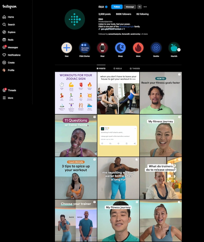
HubSpot's InstagramImage Source

6. Building Links and Social Media Reach

Search engine optimization has long been about inbound links to your website. While inbound links are still significant, a secondary metric for marketers looking to increase search traffic should be social media reach.

In order to get more people to share your content on social media, you need to increase the number of fans or followers of your account.

However, don’t pay for fake followers or likes, as the platform will likely catch and penalize you.

The Artios’ study came up with concerning results — the number of fake followers is getting higher every year. Across platforms such as Instagram, TikTok, and Twitter, there’s a rising trend of people seeking to purchase fake followers. 

Fake followers statistics

Image Source

But trust me, buying followers doesn’t work. Sure, your numbers might look good, but what about the engagement? It’s practically non-existent.

10k followers but only getting 10 likes per post? Doesn’t add up, right?

Purchased likes are worthless as well. Those bots won’t engage with your content, care about your brand, or turn into real customers.

Instead of enjoying fake fame, grow your reach through quality content creation and engagement. You will build not only social media reach but also inbound links.

7. Establish Relationships

Similar to sales, relationships are huge for driving inbound links and social media attention. Building relationships using social media can open opportunities for guest blog posts and other link-building opportunities.

You can also implement this by polling followers to drive engagement and responding to comments to show users there are real people behind the screen.

Example of brand interacting with followers in the comments

Image Source

You can also nurture relationships by setting up groups/communities. 
For instance, consider creating a Slack community where you can post valuable content and initiate discussions in an #announcement channel.

Also, create a Facebook or LinkedIn Group, host live events on X, Instagram, or TikTok, and interact with your audience to keep them engaged and informed.

According to our research, Facebook is the most effective platform for communities, with 48% preference, followed closely by YouTube at 46% and Instagram at 40%.

Engage with your followers as much as possible and wherever possible. These activities provide you with more opportunities to share additional links with your users.

8. Boost Your Content Creators’ Profiles

Search engines pay close attention to the creators of the content on a web page. In addition to the web, search engine crawlers pull information from social media platforms to better inform the credibility of the author.

Include author bios in your articles or blogs that are linked to their social media profiles and tag them with each new piece of content they produce.

Author bio exampleImage Source

9. Increasing Positive Mentions

As previously shown, having a robust social media presence can create a positive relationship with your audience.

A critical aspect of achieving this is to have online mentions that grow your brand’s visibility and positive awareness.

mention-1Image Source

Having a good social listening system can help you understand what customers are saying about you, manage your reputation, keep an eye on competitors, and plan your content better.

Based on the Social Media Today survey, nearly 61% of businesses currently have a social listening system in place to monitor keyword mentions.

And, if you see some content has good engagement, don’t be afraid to recycle it or repurpose it. You can extend the content’s life by recirculating it.

Google reports that positive online mentions can help determine whether your site is relevant in search queries.

Encourage positive mentions through engaging content and customized posts to the platform.

10. Collaborating with Influencers

Influencers shape the market today, so make the most of it.

According to Statista, influencers wield significant power over purchasing decisions. For instance, in Italy, 24 percent of shoppers admitted to buying products based on influencer recommendations in 2023.

Chart showing the influence of influencers from Statista

Image Source

Here are several ways to collaborate with influencers:

  • Pay them for featuring your brand.
  • Use them in advertisements.
  • Give them free products for reviews.
  • Co-create products or launch new lines.
  • Run giveaways together.
  • Invite them to your brand’s events.
  • Establish a brand ambassador program for long-term relationships.

Overall, teaming up with influencers is a smart way to make more people aware of your brand, connect with your target audience, and drive meaningful engagement and conversions.

Social Media SEO Strategies in Action

Now that we understand social media SEO strategies in theory, let’s explore how they work in practice and how popular brands implement them.

1. Adobe: Link Promotion & Influencer Collab

Adobe shares a short video on LinkedIn to promote its AI assistant.

Image Source

In this post, Adobe has embraced two of the strategies we discussed earlier.

Firstly, it uses video content to promote a link directing users to its website to learn more about the AI Assistant.

Furthermore, the video itself is crafted by Justice Shepard, a popular influencer in the tutoring community with 1.7 million followers on TikTok.

But this post wasn’t an exception.

Influencer promoting Adobe Illustrator through short-form video

Image Source

Adobe often uses influencer marketing through short-form videos, and it works pretty well.

HubSpot’s data shows that 57% of Gen Z and 42% of millennials like learning about products through short-form videos. Social media marketers agree — it’s their go-to format, with 83% finding it most effective.

2. Girl Power Marketing: Casual Chatting & Engaging Through Comments

If I had to choose a brand that truly values every single comment on its page, Girl Power Marketing would be at the top of my list — always and forever.

It’s nearly impossible to find a follower comment without a response.

And with over 100k followers, just imagine the sheer volume of comments they need to keep an eye on.

Yet, they still do. 

Girl Power Marketing responds to followers’ comments.

Image Source

I love how these comments aren’t generic or boring — they feel personalized, like friendly advice or casual chatting.

“Just do the damn thing! Let go of the fear, and the idea of being perceived, and the idea of people finding you cringe. Have fun with it and be yourself. The more you try to manufacture a personal brand, the less authentic it becomes,” says Annie-Mai Hodge, founder of Girl Power Marketing.

Girl Power Marketing responds to followers’ comments.Image Source

This approach is a great example of how to maintain good engagement, attract new followers, make people love you, and ultimately improve social media SEO.

3. Ahrefs: Building Bridges With Creators

Ahrefs proudly showcases its blog writers with engaging introductions and profile pictures. Beneath each picture, there are buttons that directly connect to the writers’ social platforms.

Writer’s bio on AhrefsImage Source

Just like Ahrefs did, ask your writers or employees to mention your company name and share their work/pieces on social media.

It helps build trust with Google and shows your brand is authentic and legitimate.

LinkedIn profile of Ahrefs' employee Image Source

Also, you’ll notice Ahrefs often shares or reposts creators’ posts on their LinkedIn. And what’s the purpose of this action? They improve their social media SEO and credibility by showing a strong connection with the creators.

Ahrefs reposting the creator's postImage Source

In this way, Ahrefs also sends a clear message to its followers — that it values diverse voices and appreciates everyone’s efforts.

Getting Started With Social Media SEO

Whether social media has been a tactic in your SEO strategy or not, hopefully, you have gained a stronger understanding of how to link the two.

The content and product already exist. Now, it is up to you to implement these tips by working across teams and collaborating.

At the end of the day, each strategy will need to be tailored to your brand, so play around with the ten tips above to see which sticks.

SEO Starter Pack

Categories B2B

5 Psychological Tactics to Write Better Emails

Welcome to Creator Columns, where we bring expert HubSpot Creator voices to the Blogs that inspire and help you grow better.

I’ve tested 100s of psychological tactics on my email subscribers. In this blog, I reveal the five tactics that actually work.

You’ll learn about the email tactic that got one marketer a job at the White House.

You’ll learn how I doubled my 5 star reviews with one email, and why one strange email from Barack Obama broke all records for donations.

→ Download Now: The Beginner's Guide to Email Marketing [Free Ebook]

5 Psychological Tactics to Write Better Emails

Imagine writing an email that’s so effective it lands you a job at the White House.

Well, that’s what happened to Maya Shankar, a PhD cognitive neuroscientist. In 2014, the Department of Veterans Affairs asked her to help increase signups in their veteran benefit scheme.

Maya had a plan. She was well aware of a cognitive bias that affects us all—the endowment effect. This bias suggests that people value items higher if they own them. So, she changed the subject line in the Veterans’ enrollment email.

Previously it read:

  • Veterans, you’re eligible for the benefit program. Sign up today.

She tweaked one word, changing it to:

  • Veterans, you’ve earned the benefits program. Sign up today.

This tiny tweak had a big impact. The amount of veterans enrolling in the program went up by 9%. And Maya landed a job working at the White House

Boost participation email graphic

Inspired by these psychological tweaks to emails, I started to run my own tests.

Alongside my podcast Nudge, I’ve run 100s of email tests on my 1,000s of newsletter subscribers.

Here are the five best tactics I’ve uncovered.

1. Show readers what they’re missing.

Nobel prize winning behavioral scientists Daniel Kahneman and Amos Tversky uncovered a principle called loss aversion.

Loss aversion means that losses feel more painful than equivalent gains. In real-world terms, losing $10 feels worse than how gaining $10 feels good. And I wondered if this simple nudge could help increase the number of my podcast listeners.

For my test, I tweaked the subject line of the email announcing an episode. The control read:

“Listen to this one”

In the loss aversion variant it read:

“Don’t miss this one”

It is very subtle loss aversion. Rather than asking someone to listen, I’m saying they shouldn’t miss out. And it worked. It increased the open rate by 13.3% and the click rate by 12.5%. Plus, it was a small change that cost me nothing at all.

Growth mindset email analytics

2. People follow the crowd.

In general, humans like to follow the masses. When picking a dish, we’ll often opt for the most popular. When choosing a movie to watch, we tend to pick the box office hit. It’s a well-known psychological bias called social proof.

I’ve always wondered if it works for emails. So, I set up an A/B experiment with two subject lines. Both promoted my show, but one contained social proof.

The control read: New Nudge: Why Brands Should Flaunt Their Flaws

The social proof variant read: New Nudge: Why Brands Should Flaunt Their Flaws (100,000 Downloads)

I hoped that by highlighting the episode’s high number of downloads, I’d encourage more people to listen. Fortunately, it worked.

The open rate went from 22% to 28% for the social proof version, and the click rate, (the number of people actually listening to the episode), doubled.

3. Praise loyal subscribers.

The consistency principle suggests that people are likely to stick to behaviours they’ve previously taken. A retired taxi driver won’t swap his car for a bike. A hairdresser won’t change to a cheap shampoo. We like to stay consistent with our past behaviors.

I decided to test this in an email.

For my test, I attempted to encourage my subscribers to leave a review for my podcast. I sent emails to 400 subscribers who had been following the show for a year.

The control read: “Could you leave a review for Nudge?”

The consistency variant read: “You’ve been following Nudge for 12 months, could you leave a review?”

My hypothesis was simple. If I remind people that they’ve consistently supported the show they’ll be more likely to leave a review.

It worked.

The open rate on the consistency version of the email was 7% higher.

But more importantly, the click rate, (the number of people who actually left a review), was almost 2x higher for the consistency version. Merely telling people they’d been a fan for a while doubled my reviews.

4. Showcase scarcity.

We prefer scarce resources. Taylor Swift gigs sell out in seconds not just because she’s popular, but because her tickets are hard to come by.

Swifties aren’t the first to experience this. Back in 1975, three researchers proved how powerful scarcity is. For the study, the researchers occupied a cafe. On alternating weeks they’d make one small change in the cafe.

On some weeks they’d ensure the cookie jar was full.

On other weeks they’d ensure the cookie jar only contained two cookies (never more or less).

In other words, sometimes the cookies looked abundantly available. Sometimes they looked like they were almost out.

This changed behaviour. Customers who saw the two cookie jar bought 43% more cookies than those who saw the full jar.

It sounds too good to be true, so I tested it for myself.

I sent an email to 260 subscribers offering free access to my Science of Marketing course for one day only.

In the control, the subject line read: “Free access to the Science of Marketing course”

For the scarcity variant it read: “Only Today: Get free access to the Science of Marketing Course | Only one enrol per person.”

130 people received the first email, 130 received the second. And the result was almost as good as the cookie finding. The scarcity version had a 15.1% higher open rate.

Email A/B test results

5. Spark curiosity.

All of the email tips I’ve shared have only been tested on my relatively small audience. So, I thought I’d end with a tip that was tested on the masses.

Back in 2012, Barack Obama and his campaign team sent hundreds of emails to raise funds for his campaign.

Of the $690 million he raised, most came from direct email appeals. But there was one email, according to ABC news, that was far more effective than the rest. And it was an odd one.

The email that drew in the most cash, had a strange subject line. It simply said “Hey.”

The actual email asked the reader to donate, sharing all the expected reasons, but the subject line was different.

It sparked curiosity, it got people wondering, is Obama saying Hey just to me?

Readers were curious and couldn’t help but open the email. According to ABC it was “the most effective pitch of all.”

Because more people opened, it raised more money than any other email. The bias Obama used here is the curiosity gap. We’re more likely to act on something when our curiosity is piqued.

Email example

Loss aversion, social proof, consistency, scarcity and curiosity—all these nudges have helped me improve my emails. And I reckon they’ll work for you.

It’s not guaranteed of course. Many might fail. But running some simple a/b tests for your emails is cost free, so why not try it out?

This blog is part of Phill Agnew’s Marketing Cheat Sheet series where he reveals the scientifically proven tips to help you improve your marketing. To learn more, listen to his podcast Nudge, a proud member of the Hubspot Podcast Network.

New Call-to-action

Categories B2B

The Science of Productivity: How to Get More Done in a Day

It’s estimated that a shocking 60% (or less) of work time is spent productively, according to Atlassian. Time is our scarcest resource, yet we spend so much of it doing things that are unproductive — usually without meaning to.

Emails, meetings, endless notifications… We’re indeed being pulled in more directions than ever before, but it’s not just technology holding us back from making the most of our time. In many cases, we are the ones responsible for our own lack of productivity.

As a freelance remote worker, I’ve had to tango with my self-sabotaging productivity quirks more than most. I used to blame my workload and environment; it wasn’t until I was completely in control of those factors that I was left with the realization that I was the problem all along.

Like you, I’m more successful and happy when I’m productive. We’re all on the hunt for the magic bullet solution; this has led to the endless production of AI productivity tools and life-hack lists. How can we produce more while doing less?

We look over at the person who seems to get it all done while still managing to have a life, and we ask ourselves: What does she know that I don’t? Is there a secret to high productivity?

With some work, many of the barriers to productivity are solvable. However, to truly enhance productivity, you need to first understand it. Here’s what science says.

Table of Contents

  • The Science of Productivity
  • 9 Science-Proven Ways to Get More Done in a Day
  • Data-Backed Productivity Tools

The Science of Productivity

“Productivity is the art and science of reshaping yourself and the world around you in a way that makes the world work better,” shares author and organization expert Frank Buck, Ed.D.

“While the literature on productivity is massive, it all points back to that one definition. Psychological research dating back to at least 1966 (J.B. Rotter) suggests that those who feel they can control their surroundings act upon those beliefs, persist longer, and achieve greater results,” Buck concludes.

Society has long been aware of a shared desire to improve productivity, yet the modern world has moved us further away from that dream.

Technology provides constant, endless distractions — and we feed into this by being subconsciously addicted to information.

Scientists have discovered that the dopamine neurons in our brains treat information as a reward.

While this makes sense evolutionarily — having access to relevant information like the location of food sources means we make better decisions and are more likely to survive — it also means we’re naturally attracted to distractions outside our primary objectives.

Insert: our phones. Smartphones are a distraction disaster. Here’s how to overcome the hurdles that technology presents.

9 Science-Proven Ways to Get More Done in a Day

A quick Google search will show you that most productivity lists recommend artificial intelligence software (AI). I’ll share some of the top AI productivity tools in a minute, but I encourage you to take AI tools with a warning.

An unproductive person throwing AI apps at their workload is like applying wax to a car before washing the dirt off. All of the AI capabilities in the world won’t boost productivity if you still undermine your own success. Start with these tips instead.

1. Use a to-do list.

Create a task list for yourself that includes ALL of your to-do’s, no matter how small. Each item on your list should be independently achievable. Break big tasks into small, individual steps.

The benefits are three-fold:

  • Know what needs to be done. Task creation is a step in the decision-making process, and it’s more time-consuming than it looks on the surface.
  • Remove the risk of forgetting. Relying on a mental to-do list creates unnecessary strain and stress, and trying to ad-lib your workload will result in missed tasks and poor time management.
  • Create a workload that you can achieve. Writing unachievable task lists creates the feeling that you’re perpetually behind, and the inability to estimate your work output will eventually create a genuine problem. Technology writer Steven K. Roberts nicknamed this “The Roberts Law of Fractal To-Do List Complexity: Each item on a list is merely the title of another list.”

Why It Works

Imagine if you wanted to make a loaf of bread. You would never choose to guess and stumble your way through the process: “What comes next? Milk? I wonder how much I should use?”

No one would choose that path, yet many people approach their workload with this ad-lib mentality. A to-do list is like a recipe for your work, and it’s extremely effective when used properly.

Harvard Business Review says there are endless upsides to using to-do lists, with the only potential downside being that they don’t go far enough to push us to follow through.

“If every time we added an item to our to-do lists we also came up with a plan to specify what actions we need to take and when those actions need to be taken, that would help minimize the odds of our to-do lists becoming graveyards of unfinished items,” researcher E. J. Masicampo shared with Harvard Business Review.

Testing It Out

I’m no stranger to to-do lists. I fell in love when I was in college. I’m confident my to-do lists are the only reason I graduated, held down a job, wrote a book, or have ever done anything else productive in my life.

However, the Harvard Business Review interview made me realize that I wasn’t leveraging the full potential of to-do lists by not adding a timeframe to my intentions.

Normally, I create a to-do list for the week but don’t assign those tasks to a specific day. For the upcoming week, I tried assigning each task to a day of the week. I didn’t adhere to this perfectly, but this did eliminate the decision-making part of my morning, where I thought about what I felt like working on.

2. Just get started.

While it’s human nature to postpone tasks that feel intimidating, it’s incredibly counterproductive. Simply starting a task is a surefire way to kickstart your productivity.

For some, this might mean diving right in, even if you’re not sure where to begin. HubSpot UX Editor Beth Dunn told me that when she gets writer’s block, she just opens Google Docs and starts typing away, even if the words don’t mean anything.

For others, it might mean splitting big projects into smaller ones. HubSpot Co-Founder and CTO Dharmesh Shah said he likes to “deconstruct” the large problem at hand into smaller, bite-sized chunks.

Each of the individual, smaller things seem surmountable on their own, and it calms him to know that if he conquers all of those small things, he’s essentially conquered the big thing.

Why It Works

According to a study by award-winning psychology researcher, Dr. John Bargh, before we embark on big projects, our brains attempt to simulate real, productive work by focusing on small, mindless tasks to pass the time.

Consequently, this prevents us from getting real work done. Now it makes sense why my college dorm room was never cleaner than during finals week!

Once you get over that hump of starting, there’s good news: We feel naturally compelled to finish a task once we’ve already started, thanks to the Zeigarnik Effect.

According to Social Psychology and Human Nature, the Zeigarnik effect is “the tendency to experience intrusive thoughts about an objective that was once pursued and left incomplete.”

Testing It Out

I tested this theory out by making a strict plan for my Monday morning workload. In advance, I decided:

  • What I would work on.
  • Where I’d work from.
  • Exactly what time I’d begin working.
  • Which music I would listen to.

This amount of structure was foreign so I felt some natural resistance to it, but it did keep me from falling into the trap of busy work at moments in the day. When I woke up and thought about my day, I had immediate clarity.

3. Work with others.

Make yourself a part of a group, and you’ll be impacted by the focus and good habits of those around you. This can be done in person at the office or in a coworking space, or you can virtually co-work 24/7 through platforms like Study Together.

Why It Works

When you see others modeling good habits, there’s subconscious pressure to conform. You’re less likely to bust out your phone and browse social media posts when everyone in your direct vicinity is doing their work.

It’s a grown-up version of peer pressure, which Brett Laursen, Ph.D. said is really defined as influence. When interviewed on the American Psychological Association’s podcast Speaking of Psychology, Dr. Laursen said that “peer pressure follows people across their whole life course” and can be positive.

Testing It Out

As a remote freelance writer, I haven’t experienced coworkers in seven years. I’m accustomed to working alone, but I still eagerly tested out the virtual coworking space Study Together.

While this group was designed for students, I still carry a backpack and love a library work session as much as anyone, so I entered the virtual coworking session on a Saturday morning along with 213 others in my study room (pictured below: me about to enter my study room).

Image Source

When I joined, there were an astounding 17,801 members active across all rooms. I was surprised to feel a sense of belonging as a result of the group size. We all worked silently alongside each other, and I really enjoyed the effect this had.

However, I think it’s much more powerful in person.

It’s important to note that coworking can also work against your productivity. The psychology of peer influence works both ways, so if you’re surrounded by unfocused individuals, you may feel yourself being negatively impacted.

4. Work in sprints.

We all know that an eight-hour workday isn’t meant to be swallowed in one bite; it needs to be broken up, but how? Improve productivity by breaking your day into predetermined work sessions with planned breaks.

Why It Works

Have you ever heard of the “basic rest-activity cycle” humans experience when we sleep? Physiologist Nathaniel Kleitman, the pioneering sleep researcher who co-discovered REM sleep, is also well known for observing that humans alternate progressively between light and deep sleep in 90-minute periods.

According to a Harvard Business Review article by Tony Schwartz, Kleitman found that we operate by that same 90-minute rhythm during the day by moving progressively through periods of higher and lower alertness.

After working at high intensity for more than 90 minutes, writes Schwartz, we begin relying on stress hormones for energy. The result: Our prefrontal cortex starts to shut down, and we start losing our ability to think clearly and reflectively.

“We move from parasympathetic to a sympathetic arousal — a physiological state more commonly known as ‘fight or flight,’” Schwartz says.

So instead of artificially overriding periods of low alertness with caffeine, sugary foods, and stress hormones, you can better manage your time at work by respecting the human need for rhythmic pulses of rest and renewal.

Testing It Out

I’m a seasoned sprint worker, so I didn’t need to test this technique. However, I was surprised to learn that this has yielded results across diverse fields.

A man named Anders Ericsson conducted a study of elite musicians and found they don’t necessarily practice more — they just practice more deliberately.

They focus their energy in packets,” says Gregory Ciotti in an explanation of Ericsson’s study.

This means “periods of intense work followed by breaks, instead of diluting work time over the whole day. They don’t rely on willpower — they rely on habit and disciplined scheduling.”

Ericsson’s study of elite violinists found they tend to follow 90-minute periods of hard work with 15- to 20-minute breaks.

Rest periods get a bad rap in today’s working world, but it turns out they are integral to high productivity over long periods.

5. Don’t eliminate old habits; change them.

For some of us, it’s bad habits like checking email every few minutes or opening up social media that cost us (and others) precious productivity time.

Sometimes, these habits become so automatic that we don’t even realize we’re doing them. Identify the habit that disrupts your productivity the most and replace it with something else.

Why It Works

Pulitzer Prize-winning reporter Charles Duhigg spent years researching the power habits have over us. He found that rather than trying to eliminate an old habit, people find more success in changing that habit by replacing it with a new, less destructive one.

Why? Because every time you have an urge and you do something about it, the reward you get from it creates a neurological pathway in your brain.

When you repeat that action and experience the same reward again, that neurological pathway gets a little bit thicker; and the next time, even thicker. The thicker that pathway gets, the easier it is for impulses to travel down it.

So when you try to extinguish a habit completely, you’re actually trying to use willpower to destroy a neural pathway. It’s possible, but it’s ineffective.

So if you’re having trouble eliminating a habit that’s keeping you from being productive, here’s what Duhigg suggests you do:

  1. Diagnose the “cue” or the urge that sets off the habit.
  2. Diagnose the reward you get from doing that habit.
  3. Replace your habit with an activity that’s both triggered by the old cue and delivers the old reward or a version of it.

See the full flow chart here.

Testing It Out

When my brain buffers and I want a quick dopamine hit, I reach for my phone without thinking. Instead of trying to quit this behavior, I replaced checking my phone with checking my laptop background.

Using Canva, I created a collage of images that cause feelings of gratitude, happiness, and anticipation. Instead of reaching for my phone, I now press “windows+M” (to minimize all tabs) and get a dopamine hit that makes me feel grateful, centered, and excited about the plans I have ahead.

Image Source

Not only do I waste less time on my phone, but I’ve also replaced my normal social media scroll with something that leaves me feeling better.

6. Create productive rituals.

Speaking of building better habits, Schwartz says the best way to get things done “is to make them more automatic so they require less energy.”

As President and CEO of The Energy Project, he advises his clients to develop rituals: highly specific behaviors done at precise times that, over time, become so automatic that they require no conscious will or discipline.

For example, Schwartz makes a habit of immediately writing down new tasks he needs to accomplish and new ideas that occur to him. That way, he never has to walk around preoccupied with the burden of remembering something.

David Allen, productivity consultant and author of the best-selling book Getting Things Done, would agree: “People don’t capture stuff that has their attention. And it keeps rolling around in the organizational psyche as well as the personal psyche, draining energy and creating incredible psychic residue.”

According to Allen, when people say they’ll do something but don’t write it down, it goes into a black hole.

“That would be fine if it were just one thing, but it’s hundreds of things … Your head is for having ideas, not holding them,” Allen says. “Just dumping everything out of your head and externalizing it is a huge step, and it can have a significant effect.”

Why It Works

We mentally pick up pieces of information all day and let them slosh around our subconscious minds. Emails, tasks that you realize need to be completed — they accumulate like picking up groceries at the store until your arms are overflowing and you start to drop things.

Without rituals that dictate when you answer that email, which order to tackle your to-do list, and every other micro-decision in your day, you’re repeatedly half-handling tasks all day long.

Another version of Schwartz’s philosophy is what Harvard Business Review’s Gretchen Gavett calls OHIO: Only Handle It Once.

For example, when you go through your email, decide immediately what to do with each one — immediately respond to the ones that need answering, and delete the unimportant ones on the spot. Never read an email and think, “I’ll circle back to this later.”

Rituals are theorized to be the secret to productivity and happiness itself. In an age of choice, rituals are the key to happiness,” The Guardian’s Tomiwa Owolade writes.

Testing It Out

For a week, I applied the OHIO technique to my inbox management system. I was guilty of checking emails around the clock just to feel updated, but I never replied to them right away. Without realizing it, I was handling every email multiple times.

This goes directly against the OHIO principle, so for a week, I only checked my email at the beginning and end of my workday, and I handled every email immediately.

My inbox anxiety essentially disappeared, and I replied to everything in a more timely manner. After a week of testing this, I removed my email accounts (both work and personal) from my phone altogether to make this a part of my routine.

7. Leverage peak productivity hours.

Everyone’s willpower is limited and generally stronger at the beginning of the day when they haven’t expended any energy yet.

You can leverage these peak productivity hours by scheduling your most important or most difficult tasks for the beginning of the day when you have the greatest willpower to avoid distractions.

Why It Works

Studies have concluded that willpower is a finite resource. Acts of self-control, like trying to remember to respond to an email or ignoring distractions, leave us with decreasing willpower throughout the day.

According to Lia Steakley of Stanford Medicine’s Scopeblog, “as with physical exercise, using your self-control muscles may be tiring, but over time the workout increases your strength and stamina. So, what starts out difficult becomes easier over time. New behaviors become habits, temptations become less overwhelming, and willpower challenges can even become fun.”

As you build habits like responding to emails right away and writing down all your to-do’s, you’ll eliminate the fear of forgetting — and therefore, the burden of remembering.

The result: more energy, more willpower, and better productivity.

Testing It Out

At the end of my workday, I reviewed my to-do list for the following day. I identified tomorrow’s most important task and decided to complete it first.

I usually like to work through my to-do list based on my mood, so it was hard to force myself to work on a specific task. In complete honesty, I didn’t succeed on my first attempt, but I tried again.

Even though I didn’t achieve 100% success, prioritizing my workload still made me feel less stressed and more in control of my day.

8. Time-blocking technique.

Time blocking is the process of determining exactly when you’ll work on a specific task and scheduling those tasks as if you’re scheduling a meeting.

These tasks are added to your Google Calendar, and you will show up at the predetermined time and do the planned work.

Why It Works

Most of us wouldn’t skip a meeting just because we didn’t feel like going, but we treat our own work tasks like this all the time.

When we say to ourselves, “I’ll work on X first thing tomorrow,” and then we fail to follow through, our confidence and ability to execute our intentions dwindles. Time blocking builds the muscle that restores this ability to follow through.

Cal Newport, author of the acclaimed book Deep Work, advocates for detailed time blocking of your entire work day. “A 40-hour time-blocked work week, I estimate, produces the same amount of output as a 60+ hour work week pursued without structure,” says Cal Newport.

Time blocking is perhaps the most impactful way to improve time management. Follow-through is improved, as is the quality of your focused work.

Testing It Out

A task I’ve been procrastinating on is updating my financial Google Sheets (fun, I know.) For weeks, I’ve been thinking, “Just do it. You’ll thank yourself when tax time comes around.” However, I still haven’t made any concrete progress on this task.

I time blocked three hours on my Google Calendar for next week to handle this. Even though I haven’t completed the task yet, having put it on my calendar makes me feel less anxious because I know it will be handled by the end of the allotted time.

9. Task batching.

Identify repetitive tasks in your workload and condense these to-do’s into a single task.

Here’s a task batching example: If you want to publish a post on LinkedIn every day, you can wake up every morning, come up with a posting idea, write it, and hit “publish.”

Or, you can batch this task once a week: For two hours every Monday morning, you can come up with seven post ideas, write them all, and schedule them to publish for the rest of the week.

Not only do you sidestep writer’s block every day, but the repetition naturally speeds up the rate at which you create this content.

Why It Works

Task batching will help you complete your tasks in a more efficient way while reducing multitasking.

The human brain isn’t wired to multitask; it can reduce your productivity by up to 40%. The inverse of multitasking is monotasking: focusing on a single task, removing distractions, and completing the task at hand.

As a side effect, this task management technique also helps you improve the efficiency of your work. Inefficiencies in your workflow aren’t always easy to spot when you work on a task periodically.

When you force yourself to repeat a process several times in a row, you naturally find time-consuming steps that can be condensed or handled by AI productivity apps.

Testing It Out

Like most entrepreneurs, content creation is a part of marketing my business.

It’s something I tend to postpone because it’s not a part of my client deliverables. Pinterest is one of my business’s most important channels, and I used to schedule pins week by week.

Using the task batching technique, I planned two months of content creation at once. I created all of the pin images, wrote the descriptions, and scheduled them.

It was a lengthy process, but it was a relief to know that this to-do was off my plate for the foreseeable future.

While batching this task, I discovered just how much time I was wasting when completing it week by week. I’ve adjusted my process permanently.

Data-Backed Productivity Tools

With the psychology understood and our personal habits examined, it’s time to look at the tools and AI apps that can help take our productivity even further.

Pomodoro Timer

Remember physiologist Nathaniel Kleitman, who said that we work better in cycles? Make cycles a part of your routine with a Pomodoro timer.

The Pomodoro Technique is a method developed by Francesco Cirillo, which breaks blocks of time down into chunks of work and breaks.

You can use any time configuration, but a popular one is 25 minutes of work with a 5-minute break, then taking a 15-minute break every four work cycles.

Don’t use your phone timer as a timer; instead, install a browser extension like the Pomodoro® Assistant Google Chrome extension. It’s free and displays how much time is left in your time block on your screen, removing the temptation to check your phone.

Here’s what pops up on your computer when you’ve earned a break. Each red dot represents a completed work session:

Image Source

What I like: I never feel guilty or wonder if I’ve “earned” a break when using my Pomorodo timer; I rely on data instead of emotions, and it takes all of the guesswork out of structuring my day.

AI Productivity Tools

In 2009, Apple invented the catchy phrase “there’s an app for that.” Now, there’s an AI tool for that, too. Here are some popular tasks and the AI productivity tools that assist with them:

  • Try AI transcription apps like Fathom.
  • Automate repetitive tasks with tools like Bardeen.
  • Analyze data with tools like Tableau.
  • Handle project management with tools like ClickUp.
  • Draft emails with tools like HubSpot AI.

Image Source

Best for: Speeding up refined processes, doing mundane tasks, or automating repetitive tasks.

Task Management Software

Task tracking is an important tool in your productivity arsenal, and there’s a task management app for every style and preference.

Here are some of my favorite task management apps, which all have free versions with premium upgrades available (except for HubSpot Tasks, which is free):

These project management tools also incorporate AI. We compare them in our AI project management tools analysis.

Task management is never more important than when you’re working on collaborative projects. All of these apps work for individuals as well as teams.

What I like: I love seeing project updates at a glance and the flexibility to capture all ideas via endless media, attachments, and notes.

News Feed Eradicator

Anyone who works in social media management or content creation knows what a double-edged sword social media is for productivity.

If being on social media is a part of your job, you can make it less of a productivity black hole with the free News Feed Eradicator Google Chrome extension.

This tool blocks out the news feed of social media websites, while still allowing you to answer messages, converse in groups, reply to comments, etc.

Image Source

Best for: People who need social media as a part of their day-to-day work but want to limit how time-consuming it is.

BlockSite

Is there a specific website that sabotages your productivity?

Make it inaccessible using the app BlockSite. BlockSite is a free tool that’s available on Google Chrome, Firefox, Safari, the App Store, and more.

The free version allows you to block three websites, and you can upgrade to add more.

Image Source

What I like: This fosters a level of self-awareness and reflection that’s healthy and productive.

Do your distractions require a firmer hand? The “GO ‘FREAKING’ WORK” (expletive removed) Google Chrome extension does the same thing but offers a verbal insult every time you open up a blocked website.

Getting Started

Which of these techniques will change your life?

I can say with utter confidence that OHIO (only handle it once) has already changed my life; I’ve found myself fitting it into conversation and recommending it to everyone. There was a similar “love at first sight” effect when I discovered to-do lists and the Pomodoro technique years ago.

Whether you’re pursuing academic success, need help focusing on specific tasks, or just want to get your valuable time back, these tips will help you regain some control over how you spend your time.

Who knows what potential is hiding underneath all of your unproductive habits.

That extra time may just move mountains, alter your career, or completely change your life. Better start today!

New Call-to-Action

Categories B2B

The Ultimate Guide to Content Marketing in 2024

In this guide, I will show how you can use content marketing to attract, educate, engage, and delight your target audience.

We’ve applied what you’ll learn for over a decade, causing us to attract millions of monthly visitors to HubSpot.com.

Image Source

Besides our website content, our practical content marketing approach helps us get millions of YouTube views.

So, if you want to learn how content marketing can

  • Improve brand awareness,
  • Establish your company as an industry leader,
  • Increase conversions,
  • Get you more revenue,

— then this is the guide for you.

Click here to sharpen your skills with the help of our content marketing  workbook.

Whether you’re devising or refreshing your strategy, this guide will help you reassess your process and come up with new ways to create and share content with your audience.

Here‘s what we’ll cover:

What is content marketing?

The definition of content marketing is simple.

Content marketing is the publishing of written and visual material online with the purpose of attracting more leads to your business.

These materials can include blog posts, ebooks, infographics, videos, web pages, and more.

However, content marketing is not the publishing of a thin piece of content that offers little value. The focus is on making valuable materials your audience can discover themselves while they browse.

Today, outbound marketing strategies (marketing tactics that interrupt your audience) aren’t as effective at resonating with and converting audiences. This is where inbound, the opposite of outbound, shines.

A common way of using inbound is by creating a narrative for your content — or telling a story. In doing so, your content will feel more authentic, engaging, and tailored to your audience.

So, what defines content marketing anyway?

Why is content marketing important?

2024 HubSpot research shows that 29% of companies use content marketing.

Let’s explore some reasons companies do this.

1. Modern consumers prefer informational content over intrusive Ads.

Years back, the Content Marketing Institute found that 70% of consumers prefer to learn about a product or service via an article rather than an ad.

This is still true today because 44% of buyers consume three to five pieces of content before engaging with a vendor.

These stats suggest consumers like me would actively avoid unsolicited marketing messages, such as cold calling and paid ads.

For instance, I didn’t mind buying a YouTube Premium subscription to block interruptive ads.

And I’m not alone.

One study revealed 290 million people use ad blockers on their desktops.

2. Less costly but more effective lead generation method.

Demand Metric established that content marketing generates over three times more leads than outbound marketing and costs 62% less on average.

Anecdotal evidence proves this is still correct.

A popular entrepreneur, Alex Hormozi, recently revealed that he and his wife, Leila, spend about $70,000 monthly to produce 160 content pieces.

This content saves the Hormozis over $2 million that they’d have spent on paid ads to get leads.

Besides the Hormozis, 67% of B2B marketers say content marketing was an effective lead generation strategy in 2023.

3. Builds Brand Awareness

Content marketing expands your reach and increases your chances of being discovered by a new audience.

The result? You increase your brand recognition and recall.

To maximize this benefit, publish and distribute your content consistently.

4. Builds Trust and Establishes Brand Authority

Consistent sharing of educational content positions you as an expert advisor.

It shows your audience that you value them and are interested in their success.

This grows brand trust, keeps you top of mind, and makes your audience more likely to choose you when ready to make a purchase decision.

Content Marketing Statistics

In September 2023, HubSpot surveyed 1,400+ B2B and B2C marketers across 14 countries and 23 industries. Here is some of what they said:

  • 30% of marketers will start using short-form videos in 2024.
  • 56% of marketers using TikTok will increase their investment next year, the highest on any platform.
  • 45% of marketers use AI for ideas and inspiration, 31% create outlines, 18% to draft their content, and 6% use AI to write content.
  • 14% of marketers say creating content that generates leads is one of their top challenges.
  • 87% of social sellers say social selling is effective, and 59% say they made more sales on social media in 2023 than 2022.
  • 24% of marketers with effective strategies in 2023 list increasing revenue and sales as their top goal for 2024.
  • 16% of marketers plan to try experiential marketing (engaging audiences in real life.
  • with pop-ups and events) and influencer marketing for the first time.

To get more insights, download the 2024 State of Marketing Report.

Now let’s look at types of content marketing.

Types of Content Marketing

There are many types of content marketing you can incorporate into your strategy. Here are some of the most common.

1. Online Content Marketing

Online content marketing refers to any material you publish online, but more specifically, it refers to your web pages.

A strong online content marketing strategy will help you rank higher in the search engine results pages (SERPs). The outcome? You get in front of the right people at the right time.

HubSpot’s homepage is one example. This page immediately engages visitors with specific content about our products.

2. Social Media Content Marketing

With over 4.5 billion global social media users, it’s easy to understand why many businesses invest in social media marketing.

There are many platforms to work with, including Facebook, Instagram, Pinterest, X, LinkedIn, and Snapchat. Each platform offers several ways to create and share content, such as photos, live videos, pre-recorded videos, and stories.

Featured Resource: Social Media Content Calendar

3. Infographic Content Marketing

Infographics display content, information, and data in an easy-to-understand graphic format. With a mix of simple wording, short statements, and clear images, infographics are a great way to communicate your content effectively. They work well if you’re trying to simplify an educational or complex topic so all audience members can understand it.

Featured Resource: 15 Free Infographic Templates

4. Blog Content Marketing

Blogs are a powerful type of inbound content that allows you to be creative in your choice of topic and writing.

With a blog, you can promote your related content with links, add social share buttons, and incorporate product information.

Featured Resource: Start a Successful Blog

5. Podcast Content Marketing

Experts predict that over 71 million people will listen to podcasts in 2025.

That’s 10 million more than the current listeners across the Spotify and Apple Podcast platforms. For this reason, many businesses and media outlets create and share their own podcasts.

Podcasts allow for a lot of creativity, as they can be about any topic of choice.

Plus, you decide on other factors related to the podcast. These factors include the cadence of episodes, podcast guests, where you advertise the podcast, and each episode’s length.

Featured Resource: How to Start a Podcast

6. Video Content Marketing

According to Wyzowl research, 91% of businesses use video as a marketing tool.

Video marketing can help build a strong bond with your audience, boost conversions, and improve ROI. You may choose to share your video content on social media platforms, landing pages, or on a co-marketer’s website.

Featured Resource: The Ultimate Video Marketing Starter Pack

7. Paid Ad Content Marketing

Paid ads can help you reach a broad audience and allow you to position yourself in all the places you want to be seen — paid ads are especially beneficial when paired with inbound marketing.

There are many places you can share paid ads, including on social media, landing pages, banners, and sponsored content.

Featured Resource: The Ultimate Google Ads PPC Kit

Content Marketing and SEO

When creating content for your blog, making it helpful is a start.

However, “helpful content” is not enough to guarantee online visibility. A 2023 report by Ahrefs shows that 96.55% of content gets no organic search traffic from Google.

To join the winning 3.45%, you may need to invest in SEO. SEO is the optimizing of a website to make it visible in the results of search engines like Google and Bing.

Implementing SEO is beneficial for your content because 85.19% of all blog traffic comes from organic search. Our State of Marketing also shows SEO (16%) and content marketing (14%) are the two top channels that drive the biggest ROI.

To attract traffic from organic search, I recommend you learn how to create an SEO strategy. That said, below are some high-level tips for bolstering your content marketing efforts using SEO.

  • Start a blog. Having a blog on your website increases your indexed pages, which improves your chances of ranking on Google.
  • Conduct keyword research. Identify terms or phrases your target audience is likely to use when searching for information.
  • Create high-quality content. Google prioritizes content that provides value to users. Such content must also satisfy a user’s search intent. My recommendation? Aim to create content that wins you a heap of praise from readers. Then, strategically incorporate related keywords and do on-page SEO to improve your ranking chances.
  • Build backlinks. Backlinks refer to links from other websites that point to your site. They’re historically considered a major Google ranking factor. Google recently claimed it’s deemphasizing backlinks as a ranking factor. However, a recent Backlinko study reveals that pages with lots of backlinks (still) rank above pages with fewer backlinks.

Content Marketing and Social Media

Beyond SEO, social media is another channel brands use to distribute their content. Data from our 2024 State of Marketing Report shows:

  • Social media shopping tools (e.g., Instagram Shops) drive 16% ROI.
  • 14% of marketers want to sell directly on social media.
  • Facebook (29%), Instagram (29%), YouTube (26%), and TikTok (24%) have the strongest ROI.

Like blogging, social media is easy to set up. Unfortunately, many brands go about it the wrong way.

Here are a few tips to help you nail your social media marketing game.

Don’t use social media for overt product promotion only.

Smart marketers use social media to interact with their audience. They also use it to build an online community around their brand.

Whatever your goal is, remember to stick to the basics of content marketing. Prioritize helpful educational content over intrusive promotional content.

Focus on a few high-impact channels.

From text-based platforms like LinkedIn and Facebook to video-based platforms like YouTube and TikTok, there are over a dozen social media platforms in the market.

And it’s tempting to focus on all of them. But this approach will prove ineffective unless you have a huge budget and team.

Alternatively, research the social media platforms that your target audience uses frequently. Then, focus on about three of them.

Infuse humor and personality.

Audiences crave funny content.

According to our State of Consumer Trends Report, it’s the number one type of content they want the most from the brands they patronize.

It’s difficult to inject humor into long-form articles while maintaining professionalism. However, it’s easier to achieve this on social media. Here’s an example from our social media team:

Next, let’s talk about how content marketing works and look at some content marketing examples.

How does content marketing work?

Content marketers attract an audience with compelling stories and by sharing valuable information. They also use content channels to build community.

So, content marketing for business isn’t just a technique or strategy but a unique form of communication. With that in mind, people have different needs at different stages in the buying process.

To make sure your content meets a need at every stage, you’ll want to think about your conversion funnel.

Top of the Funnel (TOFU)

The top of the funnel is to build awareness with your content.

At this stage, your target audience might know they have a problem, but they aren’t sure how to solve it. As such, you can focus on broad pain points and common questions.

TOFU content should pull potential customers in to help them better understand a specific problem. This gives you a relevant opportunity to introduce them to your solution.

Common challenges for TOFU content include competition, balancing educational and promotional content, and tracking ROI.

To address these issues, create a content strategy that grabs the attention of a specific audience. Your strategy will also help you create a plan that aligns content topics and formats with business goals.

Then, create a list of KPIs to track your content performance.

Useful content types at the top of the funnel include:

  • Blog posts.
  • Social media posts.
  • Short-form video.
  • Podcasts.
  • Infographics.
  • Checklists.
  • Ebooks.
  • Webinars.
  • Video ads.

Middle of the Funnel (MOFU)

Once a prospect passes to the middle of the funnel, they’re considering your product. They may have visited your site more than once, or they’re engaging with your social media accounts. They might have signed up for your email newsletter.

MOFU content should build a relationship with that person. At this point, they understand their problem and are comparing possible solutions.

So, your content should educate them on the specifics of your solution and show how it meets their unique needs.

This is also an important moment to build trust. A prospect might not be ready to buy, so pay attention to changes in user behavior.

It can be tempting to make assumptions or go for a quick conversion, but that can damage the relationship. Instead, offer in-depth information and value to nurture your lead.

Great middle-of-funnel content types include:

  • Email newsletters.
  • Product demos.
  • Landing pages.
  • White papers.
  • Case studies.
  • Longer-form videos.
  • Blog posts.
  • Interactive content.
  • Webinars.

You may have heard that social media is just top-of-funnel content.

However, more users are making purchases on social media, and it’s also a popular channel for customer service and support.

So, be sure to create MOFU social posts and let prospects know you’re ready to help them on this channel.

Bottom of the Funnel (BOFU)

Bottom-of-funnel content helps your prospect decide and, ideally, convert.

This stage focuses on conversion. BOFU content should make it easy to test a product, understand pricing, and make a purchase.

Content that converts should drive action and create a sense of urgency. Prepare to respond to common objections and other blockers that can impact sales with your content.

Personalization can add to the impact of your content at this stage. Creating powerful CTAs is also important.

Bottom-of-funnel content types include:

  • Personalized emails.
  • User-generated content, like customer testimonials.
  • Case studies.
  • Pricing pages.
  • Competitor comparison blog posts.
  • Video demos.
  • White papers.
  • Remarketing campaigns.

Check out this post for more on how to align your content with the buyer journey.

Now, let’s cover your content marketing strategy.

Implementing your strategy makes your content marketing efforts impactful. The result? You reach your target audience, convert leads, and generate sales.

Let’s dive into the steps you’ll want to work through in order to develop an effective content strategy.

1. Find your target audience.

Creating content for a broad audience sounds like a good idea. But it’s hard to stand out with content that appeals to everyone.

Instead, focus on a niche of people with specific interests and needs. This can help you build a community with your content. To get started, look at your buyer personas.

Then, answer the following questions about your target audience to help you narrow down the right content for them:

  • What do they need from you?
  • What challenges are they looking to overcome?
  • Why do they need your product or service?
  • How can you help them succeed?
  • Where do they spend their time?

2. Set SMART goals.

The next part of your content marketing strategy is to set SMART goals. These should be specific to your business — they’ll likely complement your broader marketing strategy and company goals.

Here are some SMART goal examples and SMART goal templates to help you get started.

3. Determine your KPIs.

Next, set key performance indicators (KPIs) for your SMART goals. KPIs are quantifiable data points you can use to measure your actual performance against your goal.

SMART GOAL

RELATED KPI

Brand awareness

Site traffic, social media followers, subscription sign-ups, mentions (by customers and partners)

Revenue

Daily sales, site traffic

Conversions

Conversion rate, shopping cart abandonment rate, associated shipping rate trends, competitive price trends

Brand loyalty

Returning customers, promoters, product reviews, referrals

Customer engagement

Likes, shares, follows, mentions, backlinks

Rapport and trust

Returning customers, promoters, followers, mentions

Strategic partners

New partnerships, mentions, backlinks

4. Decide on the type of content and content formats.

Next, you want to choose the type of content you’ll create and your top content formats.

Types of content are the broad categories of content you plan to produce. Content formats are the specific presentation methods within a content type.

For example, blog posts are a content type. But, a blog can include content formats like listicles, how-tos, thought leadership, product reviews, and more.

To get started, run a content audit to see what kind of content is already resonating with your customers.

You may also want to do some competitive analysis and look at industry trends. This research can help you figure out what content strategy will work best for your business.

Then, look back at the various content we reviewed earlier and your target audience research to decide on content types and formats.

5. Choose your content channels.

Once you’ve decided on the type of content you’ll market with, it’s time to choose your specific content channels.

Where will you share your content? Where will it live and be shared from?

For some of the content types, the channel you need to work with will be obvious. For example, if you’re creating Facebook content, your channel will be the social platform itself.

6. Set a budget.

Now, set your budget. Think about the type of content you’re creating and which channels you’re marketing that content on.

Then, ask yourself the following questions to figure out your budget:

  • Do you need to purchase any software or technology to create the content? Think about tools like Adobe Photoshop, a subscription to Canva, or a camera to take high-quality photos and videos.
  • Do you need to hire any content marketers or designers (such as artists, writers, editors, designers)?
  • Do you need to pay for ad space?
  • Do you need access to specific tools or resources to enhance or measure your specific type of content?

Make note of how your responses impact your budget — whether that’s an increase or decrease in what you may have already estimated.

7. Create a content publishing schedule.

To ensure you’re consistently producing content and sharing it with your prospects and customers, use a social media calendar or an editorial content calendar.

This will help your team stay on top of all the content your team is creating as well as allow you to schedule it ahead of time.

Use a free editorial calendar to schedule and optimize your marketing content and help boost conversions.

8. Create and distribute the content.

Create and distribute your content so your audience members can consume it — and possibly convert.

This step is about more than creating high-quality content. Keep learning to make your content useful and engaging. Practice writing headlines, make the most of the latest content trends, and build skills in the media that your audience favors.

Next, optimize your content so it’s easy for your audience to find. SEO is a useful skill for searchability. And, every social media platform is unique, so check out tips to succeed on channels like Instagram, TikTok, and LinkedIn.

Finally, promote your content on email, social media, and more. Connect with influencers, build co-marketing partnerships, and post ads to get more eyes on your best content.

9. Analyze and measure results.

Lastly, analyze and measure your results. Figure out what’s not working and make adjustments to enhance your content marketing efforts and reach your audience.

Look at your SMART goals and KPIs to track the success of your content marketing strategy. Did you achieve your goals and KPIs? Were you close to reaching them, or were you off in your estimations?

Here are some tools to help you with your content marketing strategy analytics and results:

Now, let’s look at some content marketing examples.

Content Marketing Examples

The following examples will give you a better understanding of how you can incorporate content into your marketing strategy.

1. Example of Instagram Content Marketing

Image Source

Glossier’s Instagram account is on-brand and complements the rest of its marketing content. Even if the page didn’t say “Glossier” anywhere on the profile, customers would likely still know the profile belongs to this brand.

The Instagram page shares the Glossier product line, displays different products, and shows how to use each product. The profile feels and looks uniquely Glossier and depicts members of their wide customer base.

2. Example of Infographic Content Marketing

HubSpot created this infographic to show how people can get more blog subscribers. The infographic is on-brand, well-organized, and easy to read. It clearly shares information about the topic in a digestible manner.

3. Example of Blog Content Marketing

Image Source

Expedia has a blog that shares travel-related information. The brand publishes hotel recommendations, great places to visit, and travel activities to explore around the globe.

Expedia regularly publishes its blog content to keep readers interested and engaged. It includes a wide range of topics related to any type of trip you could imagine.

The blog is on-brand, and all articles relate to the travel technology company’s goal and mission of boosting brand awareness and gaining customers.

They do this by linking to their services and writing about customers who have already had positive experiences with the company.

Pro tip: You can create on-brand blog posts with the help of HubSpot’s Free AI Content Writer.

4. Example of Podcast Content Marketing

Image Source

Harvard Business Review (HBR) has a weekly podcast called HBR IdeaCast, which features industry leaders in both business and management. You can either subscribe to receive their hundreds of podcasts or pick those you want to listen to.

The podcast is on-brand and complements the rest of HBR’s published content.

It also serves as a great way for HBR to connect with their target audience, enhance brand awareness, and gain more followers through a medium that differs from their typical work (e.g., podcast versus HBR article).

5. Example of Video Content Marketing

Much of Dollar Shave Club’s video content has gone viral. Their marketing efforts are on-brand, humorous, and entertaining.

By establishing a name for itself via online video content, Dollar Shave Club has experienced impressive growth and brand recognition.

6. Example of Paid Ad Content Marketing

Image Source

Revolve — a clothing and accessories company — uses paid and sponsored ads on social media (like this one on Facebook) to reach their target audience while they browse their news feeds.

The content ads feature some of their products and details about their free shipping and return policy to drive target audience members to their site (and, hopefully, convert them into paying customers).

HubSpot’s Campaign Assistant can help you craft a marketing campaign for your preferred platform. Powered by AI, you can tell the software about your campaign and choose a tone of voice that aligns with your brand.

With just a few clicks, you’ll receive compelling copy that highlights your unique selling points and includes the desired CTA.

7. Example of X Content Marketing

Image Source

HubSpot uses X (formerly Twitter) to market software as well as create a community among customers, target audience members, and industry leaders and experts.

HubSpot shares product information, relevant tips, industry knowledge, and original research on X. HubSpot also interacts with users and makes sure anyone in need of customer support knows exactly where to go for help.

8. Example of TikTok Content Marketing

Image Source

Chipotle is an active brand on TikTok — the company uses the platform to reach and engage its customers and target audience members.

Besides reacting to others’ Chipotle-related TikTok content, the brand posts TikToks of their menu items, recipes, people enjoying their food, their restaurants, and more. They have over 2.3 million followers and over 53 million likes.

9. Example of Viral Content Marketing

Image Source

This viral content marketing example was one that came from a TikTok video. Nathan Apodaca’s original TikTok video included him sipping Ocean Spray cranberry juice while skateboarding and listening to “Dreams” by Fleetwood Mac.

Because of the viral video, TikTok used part of Apodaca’s video in their ads, and Ocean Spray used Apodaca in their ads.

As a result, Ocean Spray saw a bump in sales and brand awareness, Fleetwood Mac’s “Dreams” was number one on iTunes, and there were thousands of videos posted by other TikTok users who bought the cranberry juice and recreated Apodaca’s original video.

Traits of Effective Content Marketing

With so many companies creating and publishing content online, it’s essential to go beyond the bare minimum.

A secret?

HubSpot strives to meet the following criteria to make sure our content meets our readers’ needs. The result? Millions of visits to our blog posts and web pages per month.

You can achieve similar results for your company if your content:

1. Provides value beyond your product offerings.

Content marketing isn’t just about sharing your products to get readers to become customers.

It’s important to offer value that empowers your customers to execute tasks more efficiently, such as making their businesses more profitable or shortening their morning routine.

Whatever the case may be, strive to create content that gives a solution for your customers’ most urgent needs.

Your product may be a solution, but if you’re not explicitly writing a product page, you should only incorporate product mentions if they make sense.

In the blog post below, hair care brand Curlsmith helps readers understand how to reach the right balance between high-protein and high-moisture products.

It doesn’t mention its products until the very end; instead, it educates the reader first.

2. Targets readers’ specific buying journey stage.

Providing value and answering customers’ needs is only a part of the story. In each piece of content, you should also target your customers’ specific buyer’s journey stage.

There are three stages of the buyer’s journey: awareness, consideration, and decision. In the awareness stage, buyers are still researching their issues.

In the consideration stage, they’re researching solutions. In the decision stage, they’re about to pick a provider.

If you’re writing a “What is [X]?” post, then the person who’s reading that article is likely not ready to decide about their provider. They are still in the awareness stage, completing research so that they can find out who offers a solution.

Conversely, if you’re writing a product page, the reader who visits that page has already researched potential products and found you as a possible provider.

That means you should pitch your product at every turn, reiterating your value proposition and differentiating yourself from the competition.

For example, Perfame isn’t shy about highlighting its products’ most valuable features. It claims it makes handcrafted and affordable perfumes that have a higher concentration of oils.

Image Source

3. Demonstrates a consistent brand voice and image.

Image Source

No matter if you’re creating a blog post, web page, or ebook, your visitors should be able to tell who you are immediately upon consuming your content.

Your brand shouldn’t sound as if ten different people are writing for you, even if that may be the case.

That’s why it’s critical to create both a writing style guide and a brand style guide. Both documents will confirm that:

  • Your brand visuals look the same across all platforms and devices.
  • Your brand tone and voice sound the same across all written communications.

Once you create both, share them with your content writers and your freelance or in-house designers.

Your content marketing publications will be much more cohesive and consistent, which will keep readers coming back to you as a resource and make you look more polished and professional.

4. It’s timely and engaging.

Do your customers typically plan their financials at the start of the year?

If you’re a finance startup, you might publish a blog post in January about budgeting quarter-over-quarter to prevent clerical errors and avoid overspending.

At the end of the post, you might include a prompt to check out your software or lead users to a template they can download after providing their email.

This is one example of content marketing that is timely and engaging. If you know your customers’ behavioral and spending patterns throughout the year, it’s critical to capitalize on that.

Publish blog posts and offers that capture them at the right time and answer their immediate needs. You’ll be ahead of the companies that publish similar content later on — and oftentimes, being first is all you need to win a customer over.

Now that we’ve seen the top traits of effective content marketing, let’s dive into the best resources you can use to learn more about it.

There are thousands of tools today that qualify as excellent content marketing resources. For the sake of this article, we’re going to keep things simple by providing a handful of our favorite options.

  1. HubSpot Academy offers free education on how to become an effective content marketer.
  2. HubSpot’s Free Content Creation Resources gives you access to resources that will propel your content marketing strategy toward success.
  3. Content Marketing Institute has some of the best content marketing online education, print, and events available today.
  4. Blog articles on content marketing, trends, strategies, and tips by industry experts (like HubSpot).
  5. Podcasts about content marketing, such as This Old Marketing, or business trends, such as HBR IdeaCast, can inspire your content marketing strategy.
  6. Google Trends allows you to search for trends across broad topics like content marketing or for niche topics within content marketing.
  7. Ebooks and case studies have insights about content marketing or content marketing strategies, like this one by Mention.
  8. You can track the latest content marketing statistics on a reputable database source like Statista.
  9. Easy to use visual content and design software, such as Canva.
  10. Free or paid social media management tools, such as HubSpot, Buffer, or Sprout Social, to help you create and share your social content.
  11. Free or paid content and project management tools, like Trello or Asana, can help you plan and organize your content marketing strategy.
  12. Free or paid marketing software connects your content marketing team, plan, strategy, and results to your greater marketing plan (and even your CRM).
  13. Free or paid email marketing software, like HubSpot or Mailchimp, handles all aspects of your email campaigns and content.
  14. Your network on platforms like Twitter or LinkedIn lets you connect with those in your industry to discuss relevant trends, answer each other’s questions, and provide or ask for feedback.

And speaking of tapping into your networks on sites like Twitter and LinkedIn, here’s some inspiration from a few of the greatest content marketers to follow on both platforms today.

3 Content Marketers to Follow on LinkedIn

1. Luvvie Ajayi Jones

Luvvie Ajayi Jones is a best-selling author, digital strategist, podcast host, and speaker. She’s known for combining humor with her experiences and background in marketing, communications, and new media.

Her LinkedIn content inspires people on topics like work culture, authenticity, leadership, content, marketing strategy, and more.

2. Zontee Hou

Zontee Hou is a digital marketer, strategist, speaker, and consultant.

She works with scaling companies to help them establish effective marketing strategies that work for their unique goals and audiences.

On her LinkedIn profile, Hou shares her expertise in content marketing, social media marketing, marketing analytics, and digital marketing.

3. A. Lee Judge

Lee Judge is a co-founder and digital marketing strategist at Content Monsta.

He’s also a podcast and video producer, speaker, and rev ops practitioner.

On his LinkedIn profile, he covers a wide range of topics related to lead generation, social media marketing, how to apply marketing analytics and data, digital experiences, multi-channel marketing, the importance of sales and marketing alignment, and more.

3 Content Marketers to Follow on X

4. Ann Handley

Ann Handley, Head of Content at MarketingProfs, is a bestselling author and speaker. She offers education and training around marketing that businesses can learn from and apply.

She offers in-person and virtual training for companies on content marketing, storytelling, lead generation, and branding — topics she also discusses and shares content about on her X page.

5. Neil Patel

Neil Patel is a bestselling author, marketing expert, speaker, and website and SEO consultant. He’s a thought leader and industry expert in content and digital marketing.

His X page includes information about his training and services, industry trends, marketing strategy tips and resources, and questions/conversational topics meant to engage followers and other industry experts.

6. Guy Kawasaki

Guy Kawasaki is a marketing strategist, author, entrepreneur, venture capitalist, podcast host, and the chief evangelist of Canva.

On his X account, Kawasaki asks followers thought-provoking business questions and provides links to and information about new podcast episodes, industry trends, marketing strategy tips, and insights based on his experiences.

Engage Your Target Audience With Content Marketing

With effective content marketing, you can reach your target audience and increase conversions.

There are several ways to market with content to boost revenue, grow your brand awareness and recognition, and build relationships with your prospects and customers.

And don’t forget to extract more value from every piece of content you create.

To get started, decide which type of content works best for your business and audience and develop a content marketing strategy to begin boosting your bottom line today.

Editor’s note: This post was originally published in August 2019 and has been updated for comprehensiveness.

New call-to-action

Categories B2B

Revealing the True Intentions of B2B Marketers: Key Takeaways from NetLine’s 2024 Content Report

Having a pulse on the state of content consumption and demand is not just an advantage—it’s a necessity.

Fresh off of our recognition at the 2023 KIller Content Awards, we’re thrilled to announce the latest edition of our award-winning annual report.

Introducing NetLine’s 2024 State of B2B Content Consumption and Demand Report

For years, NetLine has taken the line that we let the data speak for itself.

This year, however, (likely spurred by Chrome’s sunsetting of third-party cookies) we wanted to make sure the quality of our first-party data was front and center.

Further emphasizing this was David Fortino, NetLine’s Chief Strategy Officer, as he called attention to it in this year’s introduction to the 2024 State of B2B Content Consumption and Demand Report

“Before you read on, there is a key distinction to callout that sets this report apart from other industry studies: This report is not a summary of survey findings.

When we say we have insights into what B2B professionals actually want and need, we mean it.”

An Analysis of 6.2 Million First-Party Content Registrations

Indeed, this report—our eighth—is the totality of more than 6.2 million first-party content registrations.

The 2024 report dives deep into the behaviors of B2B professionals, backed by an unprecedented analysis of the consumption of more than 45,000 individual content assets from the past year.

Let’s begin with one of the more “controversial” subjects in modern marketing and NetLine’s bread and butter: Gated content.

Marketers May Hate Gates, But Users Are Unbothered

Contrary to the narrative surrounding it, our findings reveal demand for gated B2B content increased 14.3% YOY—a clear sign that high-quality, gated content remains a critical tool in the marketer’s arsenal for capturing first-party intent signals.

Since 2019, demand has risen by 77%, a figure that stands in direct defiance of what many marketers believe: That users don’t consume gated content.

In 2021, the wise Andy Crestodina tweeted, “Don’t hate the gate.”

He had good reason to say it, too—users told him they didn’t hate gates.

As third-party cookies become deprecated, we need to have a plan of action around how to best keep in touch with our prospects and buyers.

Gating middle- and bottom-of-funnel content is a great way to alert you and your team of which individuals and accounts may be progressing toward a purchase decision.

Does this mean you should gate EVERYTHING?

Of course not.

As Robert Rose wrote on the subject in September 2023, “You can’t create content to both move a buyer in their journey AND create an audience member of your content.”

Said differently, you need it all: Gated and Ungated content.

35% of B2B Buyers Intend to Make Investments Within Next 12 Months

WIth the introduction of INTENTIVE in June, we at NetLine suddenly had access to an entirely new group of buyer intent signals.

By leveraging our extensive buyer-level intent insights, we’ve identified that, despite economic uncertainties, the propensity for B2B purchases remains strong.

An impressive 35.2% of B2B buyers anticipate making purchase decisions within the next 12 months, marking a 5.3% YOY increase.

There’s even more good news. 9.4% of respondents stated their plans to invest within the next three months, a 6.8% YOY increase from 2022.

Our research continues to validate the connection between content engagement and investment readiness, solidifying the idea that increased content consumption correlates with approaching purchase decisions.

We articulated this further on page 35 of the report in our Content Format Intent Matrix.

Ultimately, the takeaway is clear: A significant portion of the B2B market is ready to engage, provided that marketers and sellers can effectively interpret and act on the right signals.

Be vigilant in listening to your intent data and be ready to act when your prospects are in position to move ahead.

The Consumption Gap Widens…Again

First “coined” in NetLine’s inaugural 2017 report, The Consumption Gap is the measure of two distinct actions; between when a user requests an asset and when they download it.

This year’s report shows the Consumption Gap now at 31.2 hours.

Last year’s report revealed a big surprise: The Consumption Gap shrank in 2022.

This was short-lived, however.

For years, as registration volume grew, we’ve seen the Consumption Gap widen. Unless something drastic changes in the future, 2022 will likely be an anomaly – destined to be the data point we look back on and wonder what caused such a deviance.

This insight into the delay between content request and consumption offers a crucial reminder of the need for patience and precision in follow-up engagement strategies.

Remember: Unless your contact has explicitly requested that you get in touch with them, it’s best to wait at least two days before asking about whether or not they’ve enjoyed the content.

Otherwise, chances are they haven’t even opened it.

Interest in AI Content Soars

It was bound to happen sooner or later.

Shortly after last year’s report was released, I had a conversation with Ann Handley. She quickly asked why there wasn’t anything that touched on AI.

I told her the truth: NetLine didn’t have much to report on at the time.

This certainly changed in 2023, demand for AI-related content exploded by more than 5.5x from 2022.

If current patterns hold true, we expect demand to double in 2024.

eBook Dominance Continues

eBooks have once again emerged as the most sought-after content format among B2B professionals, accounting for 39.5% of all content demand.

This preference highlights the ongoing need for in-depth, accessible, and comprehensive resources that support decision-making processes across industries.

The format’s ability to initiate and sustain engagement marks eBooks as a cornerstone in B2B content strategy, marrying the art of capturing interest with the science of fostering meaningful progress toward purchase decisions.

The popularity of eBooks has had a ripple effect on other formats. Book Summaries, Cheat Sheets, and Tips and Tricks Guides have all seen greater interest in recent years.

This gets back to the idea of what we shared about the C-Suite and how everyone, regardless of seniority, craves simple, straightforward content. Intent signals aside, the formats designed to deliver the most information in the most concise manner wins.

Preparing for a Successful 2024

We all know how important B2B content is. If you didn’t, you certainly wouldn’t be reading this sentence.

Cliches aside, what our 2024 report does drive home is how important B2B content is in the present and future state of digital marketing.

Thanks to AI and innovative buyer-level insights, the door is open to exciting new ways of connecting with buyers, further identifying the content to create, and smartly assisting in its production.

As we chart our course through 2024 and beyond, the insights from this year’s report arm us with the knowledge to navigate the complexities of B2B marketing with confidence and creativity.

We invite you to dive into the full report to discover the nuances and narratives shaping B2B content consumption today.

And as always, we’re excited to see how you leverage these insights to forge deeper connections, drive meaningful engagements, and achieve unparalleled growth in the B2B space.

NetLine’s 2024 Content Consumption Report is now available for download.

Categories B2B

70 AI Prompt Examples for Marketers to Use in 2024

Garbage in, garbage out. While that’s certainly true of coding, that now applies to marketers who want to make the most of AI. I’ve written dozens of iterations of the same prompt, refining my query until I could strike the right balance.

When used right, AI saves me time on routine tasks and sparks my thinking. I can then focus on sprucing up the bot’s output or funnel my energies to the more creative, engaging parts of my job.

However, the right prompts are essential to make the most of AI’s capabilities.

In this article, I’ll share examples of AI prompts marketers that marketers can use to make the job easier. We’ll also share essential data on how marketers are using AI today.

What we’ll cover:

Download Now: 5 Essential Resources for Using ChatGPT at Work [Free Kit]

How do AI prompts work?

All AI tools share a commonality: “great prompt = great output.”

A great AI prompt is specific, straightforward, filled with relevant information, and uses complete sentences. If your AI prompts deviate from the above qualities, the odds of getting unusable responses increase.

AI Prompts in Marketing Today

Our recent State of AI survey shows that hundreds of marketers benefit from artificial intelligence solutions. We surveyed 1,350 U.S. business professionals.

Marketers from our survey found that AI helped their teams automate manual tasks, save time, create personalized content, and better understand customer needs. That all relies on writing prompts that are specific and clear.

ai prompt data

We asked marketers for their most effective when writing prompts for general AI. Of respondents, 53% suggested offering relevant context or background information. That includes specifying the target audience, describing the themes to cover, and providing additional notes.

Other best practices included using follow-up prompts to expand on previous outputs (43%) and providing specific prompts (45%). Another 55% recommended experimenting with different prompts to see what works best for your specific use case.

ai prompt data

When using generative AI to write copy, the majority of marketers (51%) needed to write three prompts in order to achieve the desired result. When writing messages, 63% of respondents said they only needed to make minor edits to the text.

So, the prompts you use make all the difference. To learn more about how marketers leverage AI, download the State of AI report.

Marketers use AI for more than one purpose. They can use it to brainstorm entire processes or series if done correctly. So, as you find inspiration for your AI prompts, ‌try them out in HubSpot’s Content Assistant.

ai prompts, hubspot content assistantJoin the waitlist for HubSpot’s Content Assistant today

This content assistant tool natively integrates with the HubSpot products you know and love, allowing you to toggle between manual and AI content creation to generate copy for blogs, emails, and more.

Now, let’s explore the different prompts you can use for your marketing strategy.

Marketing AI Prompt Examples

Examples of AI Prompts for Marketers

ai prompt examples

Educational Prompts

These prompts are useful for writing drafts of top-of-the-funnel content about popular topics. Here are some examples:

1. What is [topic]? Write a blog post of [number] words introducing the reader to [topic].

2. Briefly explain the stages of the [topic].

3. List the key elements of effective [topic].

4. What is the difference between [topic 1] and [topic 2]?

5. Outline how [topic] trends have influenced [another topic].

Informative Prompts

Informative prompts let you generate content that offers valuable insights to readers on a topic. Here are a few examples:

6. Create content for our help page that explains how [popular software feature] works.

7. Explain what [your company] can learn from [competitor] optimization of its user experience.

8. What are some popular myths about [topic]? Write a strong essay under 1,000 words that dispels all myths.

Listicle Prompts

These prompts help you outline ideas and create drafts for a list blog post or social media post. See some examples below.

9. List [number] must-have tools for beginner [topic] enthusiasts.

10. List [number] blog post titles on the benefit of an effective [topic].

11. List the major themes in our recent customer review below: [review].

12. List [number] common misconceptions about [topic] and debunk them.

13. List [number] frequently asked customer questions about our [topic]. Provide answers under 100 words to each question.


Technical Prompts

AI tools help write drafts of technical materials. Below are some technical AI prompts.

14. Write a [user manual] for [product feature] that guides users through its use.

15. Attached is the raw data of a survey we conducted. Our company’s name is [name]. We surveyed [user groups]. Analyze the survey data and outline the key findings.

16. Create a business proposal for a new content management system in a hypothetical company. Address costs, timelines, and expected benefits.

Art AI Prompts

Creating great art with AI is both a science and an art. Before creating an art prompt, you need to set up an account with tools like Midjourney. Here’s how an AI expert, Ruben Hassid, recommends you do this:

1. Open Midjourney and Discord accounts.

  • Google Midjourney.
  • Click Join Beta.
  • Create a Discord account.
  • Subscribe to any of their plans.

2. Use Midjourney.

  • Invite Midjourney to your channel.
  • Start a prompt with “/imagine.”
  • Use descriptive words and techniques.
  • Select the best variation out of 4.
  • Upscale it or create variations of it.

3. Upscale the image or create variations.

U = Upscale = Make an image bigger.

V = Variation = 4 new images based on that one.

U1 = Upscale the top left image.

U2 = Upscale the top right image.

U3 = Upscale the bottom left image.

U4 = Upscale the bottom right image.

V1 = Create 4 variations from the top left image.

V2 = Create 4 variations from the top right image.

V3 = Create 4 variations from the bottom left image.

V4 = Create 4 variations from the bottom right image.

AI prompt examples, using AI to create art

Examples of AI art prompts

17. An image for a [content type] showing a researcher engrossed in their work.

18. An image of a bold [color] lady for a web page. Lady should wear a jacket, look forward, smile, have dark hair, fold her hands, and stand in a library setting.

19. An image of nine professionals in a Zoom call setting. Blur the images a bit. Place the image of a [color] man in front of the image. The man should have a bold, bright smile and should be in a suit.

20. Image of cartoon researching with their computer. A ghost caricature behind the cartoon shows the researcher is a ghostwriter.

Examples of AI Prompts for Lead Generation

Lead generation is attracting prospects to your business and increasing their interest in becoming customers.

AI can empower marketers to attract more potential customers based on buyer persona characteristics if specified in the AI prompt. The following examples showcase how to get those customized results.

21. Generate ideas for a new product launch in [month] that incorporate the theme of [season] and [tone].

22. Brainstorm content ideas for a blog post about [topic] in [number] of words or fewer that is search engine optimized in formatting using H2s and H3s accordingly.

23. Suggest high-volume keyword clusters for [topic] to optimize search engine rankings.

24. Identify popular trends in the industry of [product or service] that an audience of [target audience] will be interested in this [upcoming season].

25. Generate ideas for an upcoming marketing campaign about [new product] with a marketing mix comprising [product] [price] [place] [promotion channels].

26. Suggest [number] ways to improve website traffic during [holiday season].

27. Identify potential target audiences in [location] that would be interested in buying [product] to solve [pain point].

28. Suggest new strategies for lead generation in [market] and [industry].

29. Generate ideas for creating a viral social media campaign using recent [social media platform] trending audios or popular memes from [month] [year].

30. Identify new channels for advertising [product] aside from [current platforms already in use].

Examples of AI Prompts for Social Media Posts

Did you know that AI can recognize different social media platforms? Marketers benefit from using AI prompts for their preferred channels instead of basing strategy on generalizations.

Here are some excellent examples to follow for social media drafts.

AI prompt example for social media post

Image Source

31. Write a tweet promoting a new product suited for a target audience in [industry] and [location].

32. Generate a post for Instagram featuring a customer testimonial about [product] in under [number] words.

33. Write a Facebook post introducing a new product feature and rephrase its current description to sound more exciting and effective: [insert current product description text].

34. Create a LinkedIn post promoting a new job opening in [number] words or less with a strong call-to-action at the end.

35. Draft a Pinterest post featuring a new product line and provide tips on improving product photography for [type of aesthetic].

36. Write a YouTube video description for a new product review that links to [insert links] for viewers to go to the product landing page for more information.

37. Draft a TikTok video script showcasing a product demonstration for 2 minutes at maximum.

38. Create a Snapchat story promoting a limited-time offer and describe the type of stickers or filters that can improve it.

39. Write a blog post title to promote a new social media campaign in [number] characters or less.

40. Draft an email subject line to promote a new blog post that feels personal, enticing, and not spammy.

Examples of AI Prompts for Podcast or Video Content

Developing ideas for podcasts or videos on your own can be exhausting. Thankfully, AI can provide ideas for them and even walk you through the script and development process if you specify it in your prompt.

See the different prompts that can help you create multimedia content.

41. Draft a podcast episode about the latest [industry] trends and innovations that contains [number] minutes of dialogue.

42. Produce [number] of topics for a video series featuring interviews with thought leaders in [industry].

43. Develop a podcast episode discussing the benefits of [products or services] divided into four chapters.

44. Create a video series that showcases customer success stories.

45. Produce a podcast episode on the history and evolution of [brand or industry].

46. Develop a video series on best practices for using [products or services] in [number] of different ways.

47. Create a podcast episode that features an expert roundtable discussion on [industry topics].

48. Produce ideas for a video series featuring a behind-the-scenes look at your company’s operations.

49. Develop a podcast episode that offers tips and advice on succeeding in [industry] as an entrepreneur.

50. Create a video series highlighting the impact of [products or services] on the lives of customers or clients in [demographic].

Examples of AI Prompts for Content Promotion

ai prompt examples 2

Marketers looking for more effective ways to promote their products or services can use AI for best practices. Explore the different channels, tips, and methods this technology can yield using solid AI prompts.

51. Suggest the best time and day of the week to publish a blog post about [topic].

52. Write a press release announcing a new product launch geared toward [target audience] that sounds confident, exciting, and interesting.

53. Generate ideas for outreach emails to promote a new product, including [number] of attention-grabbing subject lines and [number] of clear calls-to-action.

54. Write a guest post for a popular industry blog discussing the impact of [product] on [marketing strategy].

55. Suggest the [number] best hashtags for a social media campaign on [social media platform] to reach [target audience].

56. Draft a script for a 60-second podcast ad [for service/product] that has a friendly tone and witty humor fit for [target audience characteristics].

57. Create a landing page for a new product promotion divided into [number] sections about different benefits based on this description: [insert new product description].

58. Write a script for a TV commercial involving [number] actors in [setting] that promotes [product/service].

59. Draft a product description for an ecommerce site that is [number] sentences long and enticing to [target audience].

60. Generate ideas for cross-promotion with other businesses in the [market], specifically with brands such as [brand names].

Examples of AI Prompts for Repurposing Content

AI can allow marketers to reuse and refresh outdated content to make something new or more useful in the current year — a process we call historical optimization.

When making AI prompts for content repurposing, be creative and see how you can transform your old work into something new.

ai prompt example of repurposing content

Image Source

61. Repurpose a blog post into a video script using this article: [insert old blog post].

62. Turn a webinar into a podcast episode using this pre-existing transcript: [insert old webinar transcript].

63. Repurpose an ebook into a series of [number] blog posts using this pre-existing text: [insert old ebook content].

64. Generate ideas for updating an outdated infographic on [topic] for [year].

65. Rewrite a blog post into a series of [number] social media post series for [social media platform].

66. Turn an old product page into a landing page for a new product using this pre-existing copy: [insert old product page content].

67. Generate ideas for repurposing a white paper into a video series about [topic] using this pre-existing text: [insert old whitepaper content].

68. Rewrite an old email campaign into a new one with updated messaging suited for [season] [year].

69. Turn a research report into a series of social media posts using this information: [facts from the research report].

70. Generate ideas for repurposing an old product demo into a webinar.

Use Thorough AI Prompts for Thorough Results

AI is becoming incredibly useful for marketers in more ways than one. When you leverage this technology, make sure you’re using specific and concise prompts to yield the results your team seeks.

Experiment with different AI tools and AI prompts to find the best results for your needs.

New call-to-action

Categories B2B

21 Email Newsletter Examples We Love Getting in Our Inboxes

It’s often challenging to navigate the information overload you experience, thanks to the never-ending updates from social media, news, and emails.

Click here to download our free lookbook that's packed with our favorite email  newsletters.

Subscribing to the right email newsletter ensures you get the information you need in your inbox. Like a hot knife through butter, the best email newsletters help you cut through the clutter to ensure you don’t miss out on anything important.

This blog post provides tips and tricks for creating a newsletter that delivers value to subscribers. I also include examples of exemplary newsletters and explain what makes them work.

The curation serves to level up the journalistic quality of your content, which results in two things:

  • Increases the value you provide.
  • Improves your authority and credibility in your audience’s eyes.

While newsletters and email marketing can be effective, many newsletters flop. 

These newsletters become an uninteresting mush of content people automatically ignore, archive, delete, or straight up unsubscribe from. And this isn’t great for you, your metrics, or your company’s success.

So, if you’re considering creating an email newsletter, keep reading. In this post, we’ll cover:

  • Email Newsletter Ideas
  • Email Newsletter Design
  • 21 Top Email Newsletter Examples

Email Newsletter Ideas

Email newsletters can include a weekly round-up of blog posts, case studies regarding your product or service, upcoming company events and webinars, or even a behind-the-scenes look at your company.

Of course, you don’t want to create a newsletter just to create one — instead, you should thoroughly research what your audience might prefer and what your company is well-suited to offer.

You’re in luck if you’re looking for inspiration for a general email newsletter. Here’s a list of some of our favorite ideas for email newsletters:

  • Round-up of popular or recent blog posts or videos.
  • New job openings at your company.
  • New case studies or product launches.
  • Membership/customer deals and promotions.
  • New best practices or tips.
  • Industry news.
  • Quotes.
  • Recent survey results related to your industry.
  • Internal employee news, including anniversaries, promotions, and birthdays.
  • Listicles (e.g., “10 Best Vacation Spots of 2020” if you work for a travel publication).
  • A team spotlight with pictures and bios.
  • Photos or stories customers have shared.
  • Behind the scenes at your company or interviews with company executives.
  • Monthly business recap.
  • New training opportunities.
  • Frequently Asked Questions (FAQs) and Answers.
  • Upcoming webinars or recordings of past webinars.

Let’s now explore some newsletter designs to inspire the aesthetic of your newsletter.

Featured Guide: Email Newsletter Design Examples Lookbook

best email newsletter examples, Brainpickings

Image Source


This free guide teaches you how to build an email newsletter from scratch and includes dozens of examples from real businesses.

Email Newsletter Design

While you can get creative with the structure of your email newsletter, the general anatomy typically includes:

  • Your logo or masthead.
  • A featured image and other eye-catching visuals.
  • Top stories.
  • Additional content and promotions following.
  • An email footer with social links and subscription information.

best email newsletter anatomy

From a design standpoint, your company’s newsletter should truly reflect your brand.

For instance, if your website features a minimalist design and clean, plain black-and-white text, you want to avoid creating a super colorful newsletter, which might confuse new subscribers.

However, there are a few best practices you can employ to ensure your design is up to par regardless of your audience’s preferences:

  • Clean, crisp images (no blurry images).
  • Text (use same text throughout), company logo, and icons.
  • Try filters, memes, or videos.
  • Make the call-to-action (CTA) clear and obvious — and just have one (e.g., “Click here to shop” or “Click here to read”).
  • Create a hierarchy with a CTA early on.
  • Mobile-responsive.
  • Test the length of your newsletter to ensure it’s not too short or too long for your audience.

Of course, the design of your newsletter will depend on your brand, as well as the message.

For instance, if your newsletter primarily focuses on visuals of new products, you should create a colorful, attention-grabbing newsletter. Alternatively, if it’s a round-up of recent blog posts, you could try a more minimalist look to mimic the appearance of a letter.

You should A/B test whichever design(s) you choose to ensure they resonate with your audience.

If you’re unfamiliar with designing emails, I recommend looking into pre-made templates. If you’re a HubSpot customer, the email tool will have a bunch of pre-made templates.

However, if you still need to figure out your newsletter design, there’s nothing better than looking at examples for further inspiration.

Take a look at the following newsletters that were outstanding, and consider using some of their design elements as inspiration for your own.

Anchor21 Top Email Newsletter Examples

Each newsletter on this list works for different reasons. Some have exceptional design, some have exceptional copy, and some have exceptional CTAs, but all are exceptional at satisfying their subscribers’ needs.

1. The Hustle

The Hustle is a daily newsletter that promises “business and tech in 5 minutes or less.”

While there are many business and tech newsletters out there, what makes The Hustle remarkable is its tone, which is at the intersection of information and humor.

Take two recent headlines as an example:

  • “The con man who sold the Eiffel Tower — twice.”
  • “Why you almost never see the clock at the mall.”

best email newsletter examples, The Hustle

Image Source

What I like: Despite targeting the business and tech audience, The Hustle often uses informal language such as “dude” or “damn” in its newsletter. I love this informal tone! I feel connected to the news and the writers. Plus, puns and witty humor in the headings and content make this email newsletter the favorite of startups and entrepreneurs.

The Hustle also allows subscribers to customize the content they receive to fit their interests.

Most of The Hustle’s readers hope to scale their startups or are looking for a business idea. The witty tone blended with knowledgeable insights makes it one of this competitive niche’s most influential and most-read email newsletters.

Further, the newsletter is structured with the best stories at the top. And the best part: The stories start with captivating titles.

The formula of great content + unique tone + personalization works well for The Hustle’s audience as they’ve grown to more than 2.5 million subscribers.

The Hustle stands out from others in its style and unique content. It doesn’t target only startups and entrepreneurs but has also grabbed massive eyeballs from company execs, growth managers, salespeople, and marketers.

Best for: That said, it isn’t just limited to the tech niche. SaaS businesses can also imitate this type of email newsletter to address industry problems, potential solutions, and benefits to reach out to the masses.

2. Atlas Obscura

best email newsletter examples, Atlas Obscura

Image Source

Atlas Obscura’s newsletter provides more than travel recommendations—it also delivers compelling stories about the world to your inbox.

Atlas Obscura is a perfect email newsletter guide for frequent travelers who want to explore off-beat locations around the globe.

What I like: I love a scary story, weird fun fact, or creepypasta. With stories like “Spotting Squid in the Tides of Oahu” and “Dreaming of Spaghetti and the Sea,” the Atlas Obscura newsletter is a portal for exploration.

They do an excellent job of writing attention-grabbing headlines and finding unexpected, delightful details — library apartments, haunted coffee, and 19th-century skulls are just a few examples.

Their unique value proposition lies in the quirky subject and the short but captivating headlines like “Deadly Shortcuts” and “World’s Oldest Edible Ham.”

What’s most appealing about this newsletter is the style and story plots. I know I’m in for a treat, and I never get bored exploring these mysterious travel tales.

Combining interesting stories, captivating photos, and incredible destinations, the Atlas Obscura newsletter reels me in.

Along with the exciting content it covers, Atlas Obscura is unique in its flexibility in choosing newsletter types. The site offers six different types of newsletters, including weekly, daily, or twice-weekly.

It’s a win-win situation for both the readers and the newsletter provider.

Best for: Atlas Obscura is a great inspiration for businesses with large audiences and a wide variety of topics to cover. Notice how they have categorized the topics based on locations, archives, and even podcasts.

Businesses covering such large topics can segment their audiences by allowing them to navigate the resources they want to read.

3. Buffer

best email newsletter examples, Buffer

Buffer does a great job at keeping the newsletter concise, making it easy for readers to get the knowledge they need with a skim.

They understand that readers want to catch up on the fast-paced and ever-changing social media landscape, so they break down the newsletter into easily navigable sections and short phrases.

What I like: The newsletter is packed with information without feeling overwhelming due to its simple and organized structure.

One thing worth noticing is its simple yet powerful design. At the core, it has a white background with basic fonts that are spaced and include bullets.

Furthermore, Buffer’s newly revamped email newsletter has a short yet powerful intro that covers an index of what’s included in this email.

Another noteworthy thing is their “zero-click content.” Instead of summarizing various topics with a “Read More” CTA, the email shares a single cover story with a large description and a CTA that says “Dive Deeper.” It’s a great way to interest your readers in a single topic instead of distracting them with multiple blog posts.

What’s most effective is their social media manager’s advice at the end that most businesses will love to turn their attention to.

Buffer’s newsletter is a perfect example of how to gain more subscribers using a simple design but powerful content and structure.

Best for: SaaS businesses that want to bring their visitors to their blogs can look up to Buffer’s newsletter strategy. Moreover, the latest trends and industry insights can interest the readers in further reading.

4. The Washington Post The 7

best email newsletter examples, Washington Post The 7

Image Source

The news is overwhelming, and trying to scroll through Twitter to catch up on what’s happening can lead to distractions. The Washington Post understands this and created “The 7” to break down the seven most important stories of the day.

The idea of the two supposed “dead media” — news and email — coming together to deliver something valuable makes this newsletter worth reading.

What I like: Like everyone else, I’m busy. I don’t always have the time to pursue the Washington Post’s home page (let alone a physical newspaper). With this newsletter, I get exactly seven stories sent to my inbox every weekday morning. And it takes merely three minutes to cover this 400-word newsletter.

The listicle format makes the newsletter skimmable. Under each story, they include bulleted points like “why this matters,” “why now,” and “the numbers” to get the point across succinctly. Complex news is made digestible.

I love The 7’s short yet informative and detailed articles. What sets this newsletter apart from others is its end goal, which is to get more readers to consume the content from the newsletter instead of jumping on the site.

Lastly, the heavy heading texts followed by thin fonts and a clear CTA make this newsletter sober yet effective.

Best for: Newsletters focused on delivering succinct content to their readers should follow this example. Whether news, blog posts, or stories, making your content easily digestible is vital for a successful newsletter.

5. Why We Buy

best email newsletter examples, Why We Buy

Image Source

Why We Buy is a biweekly (twice a week) newsletter in which “Customer Whisperer” Katelyn Bourgoin shares tips that help marketers understand buyer psychology. 

The newsletter comes across as fun and engaging, with real-life examples and scenarios from brands most people are familiar with. 

What I like: Each newsletter edition is bite-sized. I finished reading it in less than four minutes. In those few minutes, readers learn one core thing about their customers that’d help improve their marketing efforts.

Best for: Marketers and business owners who want to sell more by truly understanding the science behind what makes people buy things.

6. The New York Times Cooking

best email newsletter examples, The New York Times Cooking

A picture is worth a thousand words, says the adage. This couldn’t be truer for newsletters — if your content lends itself to imagery, use it to your advantage, like The New York Times Cooking newsletter. 

The New York Times may be known for delivering news, but it also has a robust cooking section packed with creative, multicultural recipes that are beautifully photographed.

Highlighting new recipes from different chefs, The New York Times Cooking newsletter is always fresh. They expertly include a variety of recipes so readers get value out of finding something new to try.

What I like: I love a good recipe. But with so many sites out there and so many types of cuisine, making a choice can sometimes feel like a burden. The New York Times Cooking offers a curated option that always keeps me inspired. 

When I open the newsletter, I’m welcomed with a mouth-watering image that will entice you to scroll down further. Plus, the clean and uncluttered design makes reading more skimmable.

The lengthy blog text is engaging, personal, and conversational for the readers. However, the newsletter is shorter than other similar magazine newsletters. This email newsletter wins in its yummy visuals and enriching content.

Best for: This newsletter styling is perfect for businesses that engage with their readers using more visuals than text. For instance, a graphic design or fashion company may want to display more visuals and appealing elements than text.

7. Quartz Daily Brief

best email newsletter examples, Quartz Daily Brief

Image Source

What I like: The newsletter is straightforward, like a brief, without being dry, and it uses visuals like charts to help pique the reader’s interest.

Sections for need-to-know news, what to watch for, top reads, and surprising discoveries keep things organized. The breadth of material means I can choose from various topics to investigate further.

Though the newsletter has limited visuals, I never find it dry or boring. What differentiates it from similar newsletters is the lack of index or heavy-font headlines.

Yet that doesn’t turn away the reader. The same-sized but bold text points out that the stories are addressed to the readers individually. Quartz Daily uses a formal yet provocative tone that allures readers upon first reading.

Further, I’m tempted to read each section because of the engaging insights and enriching content. Lastly, there are not many links that could distract me from scrolling further.

Best for: Here’s another excellent example of a newsletter heavily focused on sharing written content, such as news, blog posts, or stories. Keep the focus on the content while making it easy for readers to navigate and consume.

8. Moz Top 10

best email newsletter examples, Moz Top 10

Image Source

Moz Top 10 is a semi-monthly roundup of top pieces of content about marketing. Essential to any marketer, Moz Top 10 links to key marketing content with actionable insights. The content is not just their own; they also link to external sources.

Moz Top 10 is perfect for busy marketers who would choose to discard the daily digests from their inboxes. Moz sends a newsletter every two weeks with ten new stories to share.

What I like: From a design point of view, the newsletter resembles Moz’s styling and brand image. To take things to the next level, Moz uses the first person to make the content more friendly. Finally, their end goal is not just to send visitors to Moz’s blog but to add value for the readers.

The newsletter provides digital marketing and SEO content examples, including how brands can take stands on issues and backlink index comparisons. These examples allow me to learn from the real world, something I love as a marketer. 

Best for: Personal and insightful newsletters like this can be replicated by digital marketing agencies that don’t merely aim to push traffic to their website. Consider sending targeted news regularly with more time in between. This allows readers to find the value in your content without being overwhelmed.

9. Vox Today Explained

best email newsletter examples, Vox Today Explained

Image Source

Today Explained is a daily email meant to quickly get its readers up to speed with the most compelling stories from the day. The content ranges from the day’s top news to fun stories from all over the web.

What I like: I’m always amazed by this newsletter’s content curation. Instead of hopping on to different sources, I can collectively read news from a single source. They do a great job balancing their content with external sources, and the stories they choose are always really high quality.

The newsletter usually contains a detailed main story followed by other stories I can read outside of the email. To add authenticity, a senior editor typically writes the newsletter stories.

Finally, the white background blends well with yellow CTAs to add a captivating flare.

Best for: This text-rich email newsletter style is perfect for businesses with multiple categories and insightful stories to share with readers.

10. TheSkimm

best email newsletter examples, TheSkimm

Image Source

If you want to stay up on what’s happening in the world and have some delightful writing delivered to your inbox first thing in the morning, look no further than TheSkimm.

It’s a daily roundup of what’s happened in the news in short, punchy paragraphs.

The best part? You don’t have to click out of the email to read the news if you don’t want to — although they do link to their sources if you want to read further.

What I like: As evident from their logo, TheSkimm puts more focus on women than men. That’s why this newsletter has more women subscribers between the ages of 22 and 34 than any other group. This newsletter shows me the power of knowing my audience and inspires my writing. 

What follows next is the curated content that’s skimmable and divided into nice bits and pieces. Finally, the newsletter uses fewer links and no screaming CTAs to direct their readers to the blog.

For your own email marketing, TheSkimm is the place to go if you’re looking for writing inspiration or for emails without much visual content.

Best for: Businesses can learn the art of being engaging without any visuals or hard selling from this email newsletter. Businesses with a narrow niche but a large pool of content can leverage the styling and tonality of this email newsletter type.

11. Below the Fold
best email newsletter examples, Below the Fold

Image Source

Below the Fold is a weekly newsletter from Acciyo that surfaces essential and interesting stories that simply aren’t making headlines due to the crowded, never-ending news cycle we all experience daily.

Acciyo’s editorial team handpicks great news stories that they believe deserve “front-page love” but are being beaten out by an “infinite scroll of breaking headlines” — stories that range from how investors are profiting from emergency room bills to how one Mexican company turned prickly pear into sustainable fuel.

What I like: The editors at Below the Fold “unfold” the news stories in the form of conversational storytelling. The newsletter establishes a relationship with readers using a friendly tone.

The long, crispy headlines set the initial stage for me to dive in further. Their editorial team collects information from various reputable sources to build the final content.

They understand the importance of using bold words and sentences. I can easily see what matters most based on text alone. 

Best for: The copy of Below the Fold offers a great example of how to share substantial content compellingly through storytelling. If you want to draw your readers in through stories, take a deeper look at this newsletter.

12. The Ringer

best email newsletter examples, The Ringer

Image Source

Remember Grantland, the sports and pop culture blog owned by ESPN, which sports journalist Bill Simmons started? In October 2015, ESPN announced it would be ending the publication of Grantland.

Shortly thereafter, Simmons formed Bill Simmon Media Group and recruited a bunch of former Grantland staffers to launch a brand new newsletter called The Ringer in March 2016.

Although The Ringer was written and run by many former Grantland employees, it is a different project from Grantland’s.

Where Grantland focused on sports and pop culture, The Ringer branches out into other areas like tech and politics. Jon Favreau, a former speechwriter for President Barack Obama, is among the contributors.

I like their focus on experimentation: “We want to have fun, take chances, analyze, theorize, obsess, and try not to take ourselves too seriously,” said Editor-in-Chief Sean Fennessey.

Another differentiator? The Ringer’s website was developed in partnership with the publishing platform Medium — which means the newsletter reflects a clean, minimal design.

What I like: The Ringer is a unique newsletter for tech, sports, and pop culture. I love this newsletter’s diverse content, which includes discussion forums and top stories from sports professionals.

The short snippets of text with external links provide value to the readers.

This type of email is great for engaging the audience in a discussion thread. Further, the “share and subscribe” button provides more value to the audience.

The editorial team at The Ringer uses a formal and informative tone to engage with its sports-buff audience.

Best for: This type of newsletter works well for businesses with audiences interested in long discussion threads apart from spending some time on informative blogs and articles.

13. The Marginalian

best email newsletter examples, The Marginalian

Image Source

The Marginalian (previously Brain Pickings) is one of the most interesting newsletters out there. In fact, its founder and writer, Maria Popova, calls it an “interestingness digest.” It records the week’s most interesting articles and pieces focused on art, literature, and philosophy.

Every Sunday morning, subscribers get the past week’s most unmissable articles about creativity, psychology, art, science, design, and philosophy — a wide variety of topics that appeal to a wide audience. At its core, it explores what it means to live a good life.

The Marginalian extends audiences’ marginal thinking with thought-provoking subjects. This long-text newsletter covers diverse topics with clear visuals.

What I like: For me, this newsletter’s conversational yet formal tone sets it apart. While using casual phrasing, the editorial team at The Marginalian uses advanced vocabulary (so you might need a dictionary by your side).

From the design point of view, the newsletter closely resembles the website. Both the website and newsletter provide similar experiences in terms of font, color, and spacing.

The white background perfectly complements the yellow CTAs and red heading texts.

Best for: If you want to offer a seamless reading experience with a clear CTA at the end, The Marginalian is an excellent example of how to do this. Lead your audiences to the end with a few hyperlinks, finally offering them the click.

14. The New Yorker Recommends

best email newsletter examples, The New Yorker

Image source

The New Yorker Recommends is a weekly newsletter highlighting what their staff reads, watches, and listens to. It is packed with curated recommendations for books, movies, TV shows, and music.

The core strength of this newsletter lies in its content. Every week, the editors at The New York Recommends pick a topic from its archives and craft it into a story.

Having staffers select their own recommendations gives this newsletter a personalized, hand-curated feel that helps readers connect with the content.

What we like: I’m a big New Yorker fan. That goes beyond their iconic tote bags and extends to their newsletter. I love the deep dive into an initial long-form story followed by a few recommendations at the second fold of the newsletter.

The New Yorker personalizes the tone and builds a relationship with its audience. Thereafter, editors share the most popular recommendations, such as events and the best books to read.

Just like National Geographic, The New Yorker Recommends has multiple newsletter options to choose from. Apart from the daily and weekly newsletters, they offer satirical or humor-rich email newsletters.

Best for: This type of newsletter example is perfect for businesses that have a large audience, even if it’s a broad niche. For instance, a blog focused on the reviews and recommendations for SaaS products can personalize the content and create multiple newsletters around different subjects.

15.Polygon Patch Notes

best email newsletter examples, Polygon

Polygon Patch Notes shares the staff’s picks for new movies, TV shows, video games, comics, manga, and tabletop RPGs. The newsletter also links to a free new game and highlights top stories on Polygon, ranging from reviews to guides.

The mix of curated staff picks and top stories in a simple format makes this an easy-to-digest newsletter.

Polygon Patch Notes also employs a personable tone, making the read relatable and fun rather than overly businesslike and bland.

What I like: There are a lot of things to love in this short newsletter. First, the starting sentence is concise yet engaging. Second, they share top stories in a second person, conversational tone. The hyperlinks in the newsletter are natural and align well with the content.

Further, the blend of the brand’s color palette with the light fonts makes it perfect to read for the eyes. Finally, I love the reviews and recommendations around a single show, game, or topic.

Best for: This design is great for newsletters focused on a niche topic, aiming to catch readers’ attention and direct them to your blog.

16. Marketing BrewNews+ Audio

best email newsletter examples, Marketing Brew

Marketing Brew sends daily emails covering social media, marketing, tech, brand strategy, etc.

What I like: As a marketer, I love to start my morning with a cup of coffee and this newsletter. The newsletter is handy to marketers and content creators as it covers the latest news happening in the industry. Since the newsletter is sent out daily, readers are always up-to-date with the latest. 

Although their stories are loaded, the Marketing Brew newsletter still makes room for stories they’re jealous of — adding extra value for readers. 

The newsletter also contains a job board for marketing job opportunities. 

Best for: Marketers, influencers, and content creators who want to keep up with happenings within their industry.

17. Cut The Fluff

best email newsletter examples, Cut The Fluff

Image Source

Cut The Fluff is a weekly newsletter that centers around helping creators and writers go from confused to confident self-editors.

In this newsletter, Erica Schneider shares stories from her personal and professional life that break down editing one’s writing into actionable processes.

What I like: As the name suggests, each newsletter edition wastes no time getting to the point. Each concept is explained plainly, followed by specific steps readers can take to make their writing stand out.

The newsletter also contains extra resources, like Canva templates and Loom recordings, that help me do my best work.

Best for: If you want to build authority around a single topic and be the go-to person for said topic.

18.The Strategist

From New York Magazine, The Strategist curates deals, shopping advice, and discounts. The newsletter does a great job of including relevant shopping information and paying attention to the trends. The Strategist also includes various products and services to shop for, casting a wide net. What I like: The newsletter starts with different sections covering the best deals and discounts, followed by top stories worldwide. The Strategist is a perfect example of an effective email structure with a simplistic design. The writing style is personal (second person) and blended with relevant visuals. Though the Strategist covers various discounts and deals, it doesn’t fluff the newsletter merely with the deals. Instead, they share stories about various social issues and topics related to what’s happening around the globe. Best for: The newsletter works well for ecommerce sites, deals, and discount retailers that release weekly offers for their audiences. Plus, the insightful news and stories offer relevant, valuable content to subscribers.

From New York Magazine, The Strategist curates deals, shopping advice, and discounts.

The newsletter does a great job of including relevant shopping information and paying attention to the trends. The Strategist also includes various products and services to shop for, casting a wide net.

What I like: The newsletter starts with different sections covering the best deals and discounts, followed by top stories worldwide. The Strategist is a perfect example of an effective email structure with a simplistic design. The writing style is personal (second person) and blended with relevant visuals.

Though the Strategist covers various discounts and deals, it doesn’t fluff the newsletter merely with the deals. Instead, they share stories about various social issues and topics related to what’s happening around the globe.

Best for: The newsletter works well for ecommerce sites, deals, and discount retailers that release weekly offers for their audiences. Plus, the insightful news and stories offer relevant, valuable content to subscribers.


19. The Curiosity Chronicle

best email newsletter examples, The Curiosity Chronicle

Over 700,000 people receive The Curiosity Chronicle in their inbox every week. The newsletter discusses frameworks, tools, and the mindset needed to build a wealth and healthy life.

What I like: The Curiosity Chronicle usually contains a summary at the start of the email. This top-level summary helps me know what to expect before I commit my time. It also helps that an estimated read time is included at the start of each letter. 

If I don’t have the time to read, I can listen to the audio version of the newsletter on my commute or as I clean my house. 

And if you want to catch up on previous newsletter editions, you can easily find them on the website linked in the email.

Best for: Marketers, businesses, and content creators who have much to say but don’t want to waste too much of their audience’s time. You can provide alternative means for readers to catch up or enjoy your newsletter on their tight schedules.

20. Workable

best email newsletter examples, Workable

One of the best business newsletters is from Workable. One thing distinguishing Workable from other brands is that they use the same colors across social media, website, and email designs.

What I like: I love this newsletter’s personable tone.I get emails from a personal email address. Plus, they also get to see the sender of the newsletter with an image at the bottom.

The tone of the copy is actionable and direct. In the first fold of the email, they address a problem, while the second fold of the email provides a potential solution with some recent trends and numbers.

The most effective element of this newsletter is its logo and vibrant images that tune well with the headings. The text in the newsletter is more conversational and approachable.

Finally, the CTAs in trademark green with concise text send out a loud and clear message without being pushy.

Best for: This newsletter is a great inspiration for businesses that want to send more readers to their blogs naturally. If they have a problem–solution email in mind, Workable is their best bet to learn from.

21. Contentment

best email newsletter examples, WorkWeek’s Contentment newsletter

The last (but not least) on the list is WorkWeek’s Contentment newsletter, written by Tracey Wallace.

The newsletter focuses on content marketing wisdom and contains helpful tips and tricks to help content marketers across various industries improve their work.

What I like: The newsletter’s curated content contains research-backed recommendations from top marketers that help readers cultivate the necessary content marketing skills.

I also get to develop myself and my marketing career with their advice on building the soft skills needed to thrive in a fast-paced work environment.

Best for: Beginner to intermediate marketers who want to level up.

Creating an Email Newsletter Your Subscribers Love

Even though newsletters are one of the most common types of emails to send, they are actually some of the hardest to do right.

We hope these examples give you some quality inspiration so you can create newsletters your subscribers love to get in their inboxes.

newsletterexamples_0