Here’s a startling reality: while 88% of marketers believe AI and automation are essential for meeting customer expectations, they’re only using about 56% of the tools they buy.
This disconnect raises important questions: Are marketers investing in the wrong tools, or are they simply not harnessing their full potential?
I spoke to several marketing experts to understand how they are integrating AI into their core stack and what areas there are still room for improvement.
From an 82% increase in email conversion rates to dramatic improvements in customer engagement, their insights reveal that the right approach to AI can transform your marketing operations.
Let’s explore their top learnings and some key tips for making the most of AI in your MarTech strategy.
Table of Contents
The State of AI and MarTech Today
We must accept that generative AI is becoming a core part of our organizations, integrated into almost every area.
It’s here to stay and will only keep spreading, whether we like it or not. So, instead of trying to dodge it, think about how you can make the most of it.
One of the best comments on this topic came from marketing expert Jessica Apotheker in one of her TED Talks.
Apotheker notes that, in the past 15 years, marketing has evolved from a set of general skills to more specialized skill sets.
That includes digital marketing or marketing technology. Now, she notes, generative AI has transformed the core of marketing activities.
Quite a fascinating discovery — and I think this could make a huge difference in our productivity and overall effectiveness as marketers.
Nevertheless, let’s dive into concrete marketers’ routines where AI and MarTech are teaming up today.
1. Lead Generation and Nurturing
Before AI BDRs and automation, manually handling lead generation was a total grind. If you’ve ever been in that position, you know how draining it can be. Luckily, AI stepped in to make this process smoother and more manageable.
Here’s how AI is making this process smoother and more manageable. 👇🏼
Predictive Lead Scoring
Predictive lead scoring helps marketers prioritize leads based on their likelihood to convert. Tools like HubSpot’s Lead Scoring Software actually handle this job for marketers.
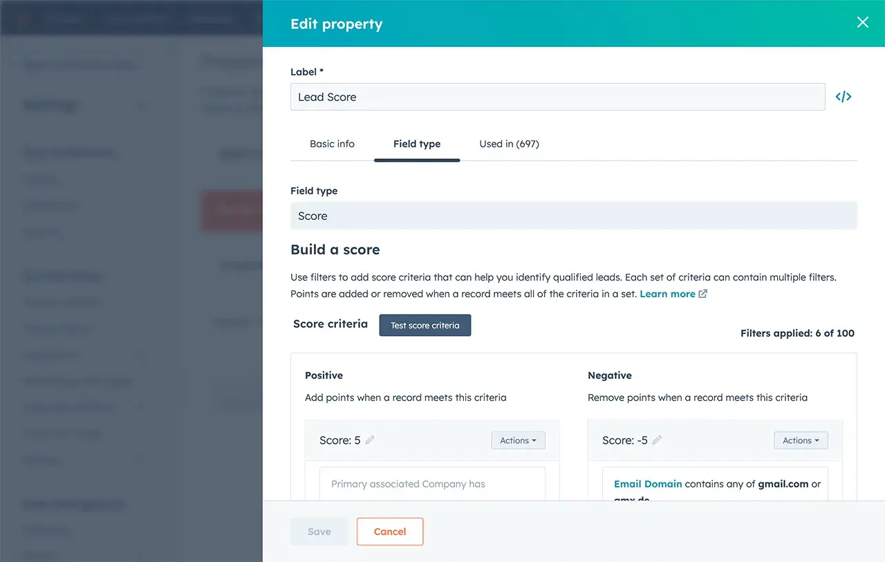
Such tools use machine learning to analyze and optimize lead scores based on behavioral patterns and pre-defined criteria and automatically highlight “warm” leads. Plus, it is self-trained and adjusts as your business grows.
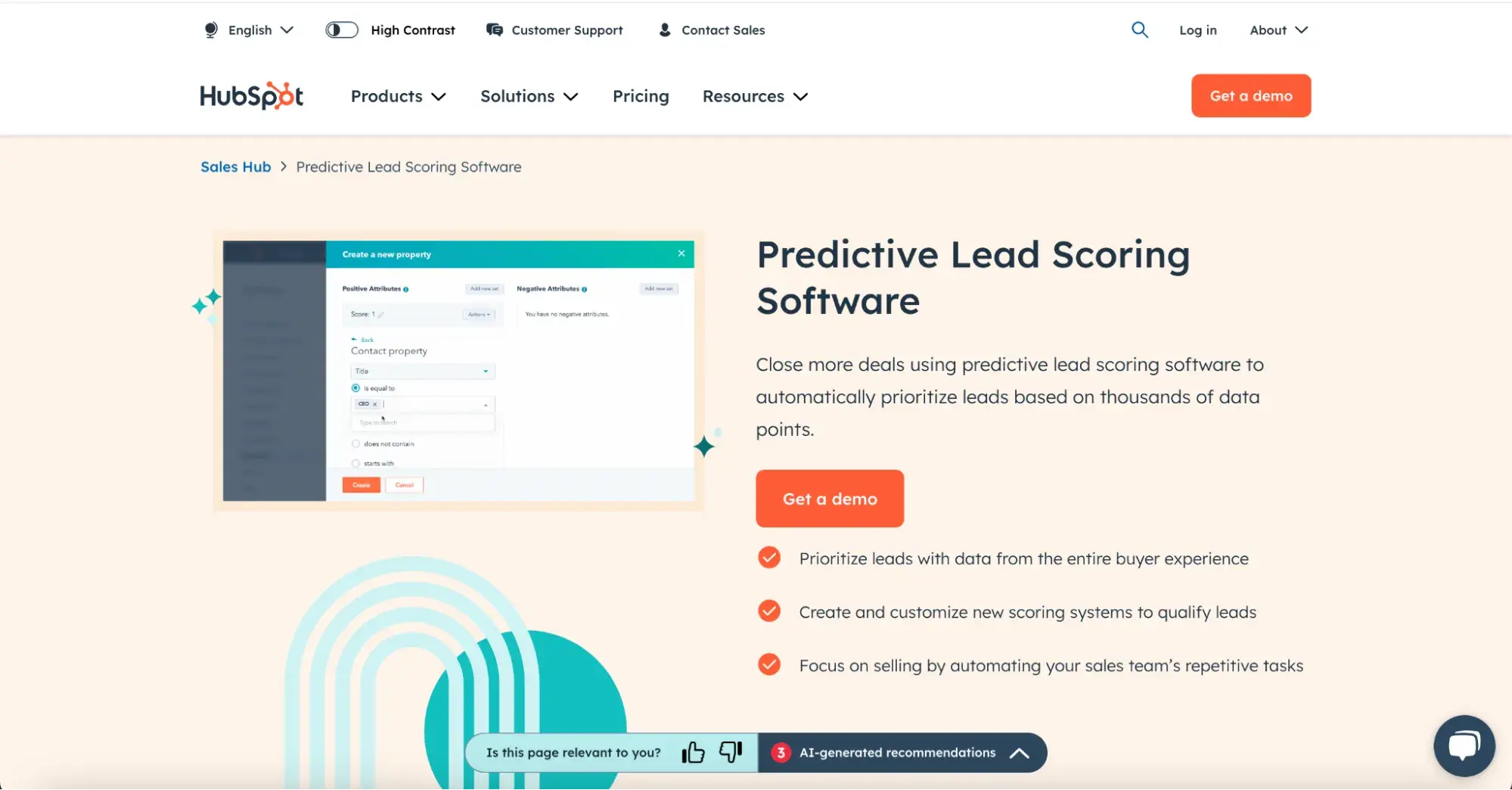
Pro tip: HubSpot’s scoring options let you switch between traditional scoring, where you set criteria like form submissions or page views, and predictive scoring, which uses AI to prioritize leads based on behavior patterns.
This flexibility means you can go hands-on or let AI do the work, depending on what fits your goals best.
Automated Email Marketing
AI in email marketing uses data analysis to personalize content, optimize subject lines, automate follow-ups, and segment audiences.
By tailoring emails to each recipient’s behavior and preferences, AI makes campaigns more engaging and effective, driving higher open and conversion rates.
A great example of AI-powered email personalization:
Revolve boosted its email effectiveness using Cordial AI and 16 data points to tailor recommendations for each customer.
Previously, they sent generic product blocks, but now each email offers 32 unique product suggestions — like items in abandoned carts, favorite brands, and trending products by location.
Testing showed these personalized emails doubled engagement, with a 65% increase in click-to-open and click-to-conversion rates, setting the stage for big revenue gains.
Pro tip: Always leverage behavior-based triggers — like abandoned carts or product views — to automatically send follow-ups, creating a great experience that keeps customers engaged without overwhelming them.
I recommend Mailchimp for this purpose, especially if you’re automating personalized campaigns on a large scale.
It helps you welcome new contacts, recover abandoned carts, and win back lost customers with AI-generated automation and ready-to-go emails that you just need to check and send (very often, they don’t even need any tweaks).
2. Content Creation and Distribution
Making and sharing content is another super time-consuming task. AI lends a hand of help here, too.
Content Creation
AI has changed how we create content across various formats, not just text. It can now generate videos for TikTok, YouTube, and Instagram Reels.
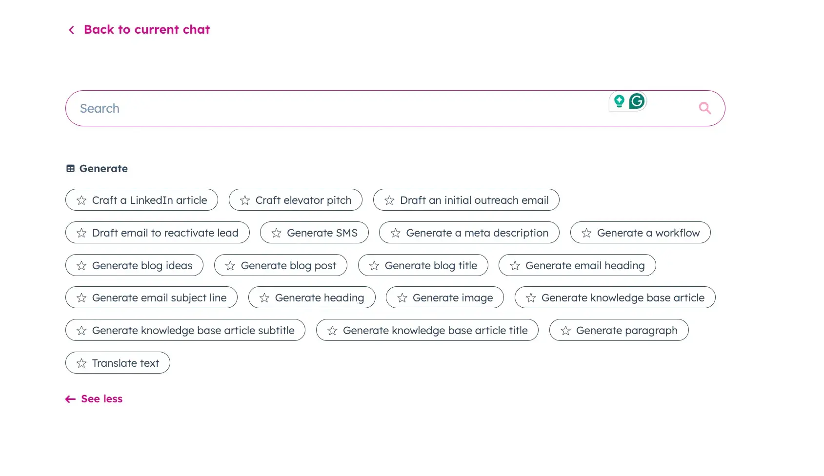
For my writing tasks, I mostly rely on Breeze, HubSpot’s AI tool designed for marketing and sales, and ChatGPT 4o. Breeze Copilot automates all sorts of content, like blogs and case studies, and allows you to brainstorm ideas for titles and crisp subheadings.
What I love most about it is the pre-made templates and prompts that make kicking off tasks and brainstorming way easier.
Regarding creating video content, InVideo has always been my go-to because it can whip up amazing videos even from the briefest description.
For example, I asked it to make a before-and-after video of a home office makeover:

I just had to pick the audience, choose my preferred style, and decide on the format based on the social media platform.

And here’s the result:
Overall, a good job considering the minimal description. What I feel is missing is a before and after comparison, but that’s my fault for not providing a more detailed prompt.
Pro tip: When using AI tools, get specific with your prompts. The clearer you are about what you need, the better the results will be.
Content Optimization
AI tools are also game changers when it comes to making our existing content shine. It analyzes what works by identifying popular keywords, suggesting relevant topics and headlines, ensuring content is easy to read, checking for plagiarism, and predicting how well it will perform.
I caught up with Irina Maltseva, the Growth Lead at Aura, and she gave me the scoop on how AI is helping her out:
“AI tools like AI Content Helper by Ahrefs and Clearscope have seriously sped up marketing tasks, especially SEO and content creation. Before AI, I’d spend hours manually researching keywords, analyzing competitors, and hoping my client’s content hit the mark.
Now, AI handles the heavy lifting — giving me real-time keyword suggestions, content tweaks, and ranking insights instantly. Instead of guessing and waiting weeks for results, you can optimize as you go, saving time and boosting accuracy.”
One of the tools I use for this purpose is Surfer SEO. Its real-time content-scoring feature is brilliant. Surfer compares your content to top-ranking pages and gives solid suggestions for improving keywords and structure.
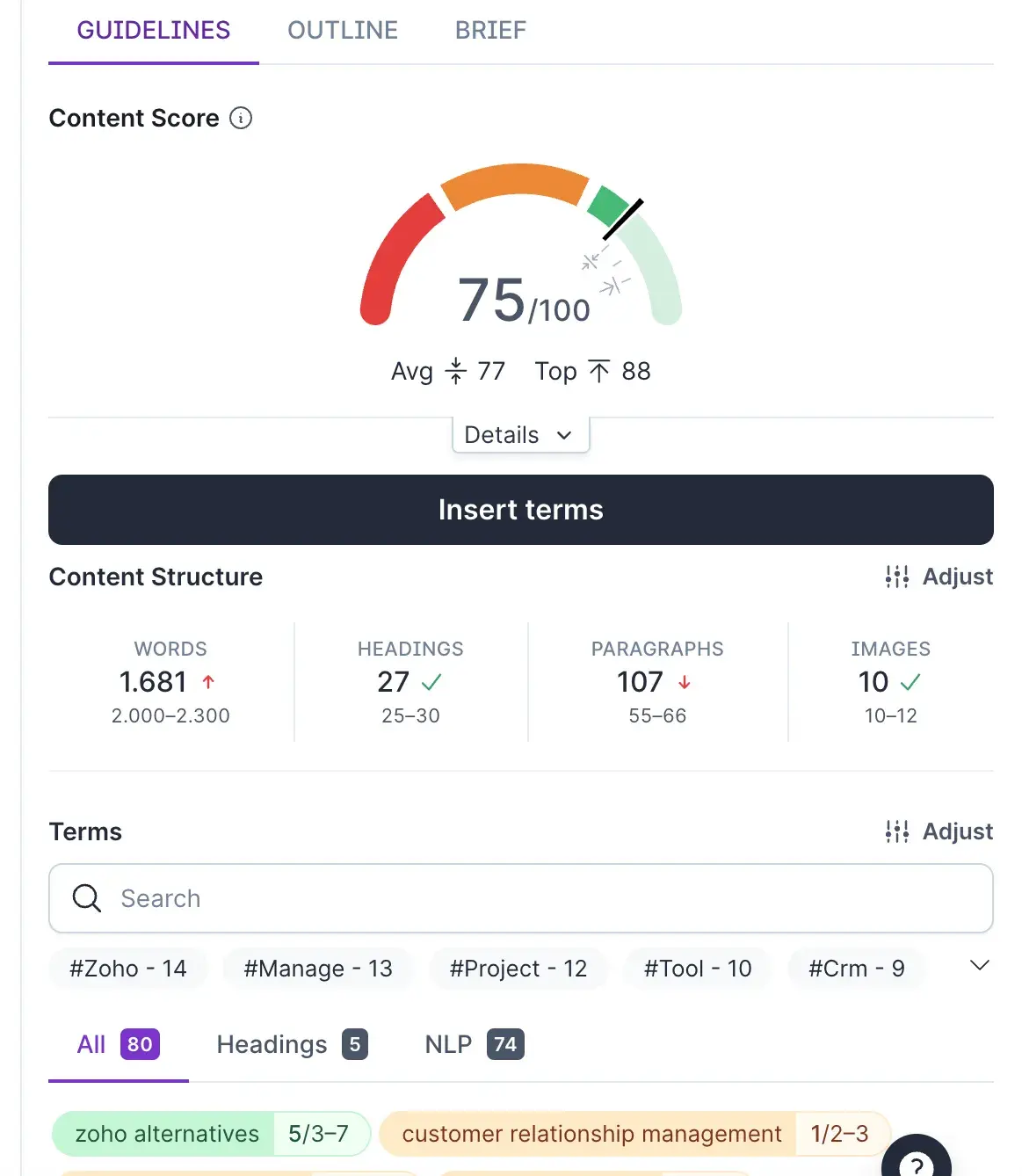
Pro tip: When it comes to Surfer SEO specifically, while we all want that score to be green and over 90, sometimes that’s just not realistic. If you push too hard, you’ll end up with keyword stuffing and a lot of fluff, which you definitely want to avoid. So, use it as a guide, but don’t rely on it too heavily.
And another pro tip — always keep your content fresh. Regularly update it based on the latest trends and AI suggestions.
Social Media Management
Every social media manager knows how much AI has made our lives easier, especially when it comes to scheduling and creating content.
Besides all of that, detailed performance analytics with suggestions on what to improve is something we all need.
For this purpose, I love HubSpot’s AI Social Media Post Generator, which helps me turn my raw ideas into polished posts for Facebook and Instagram.
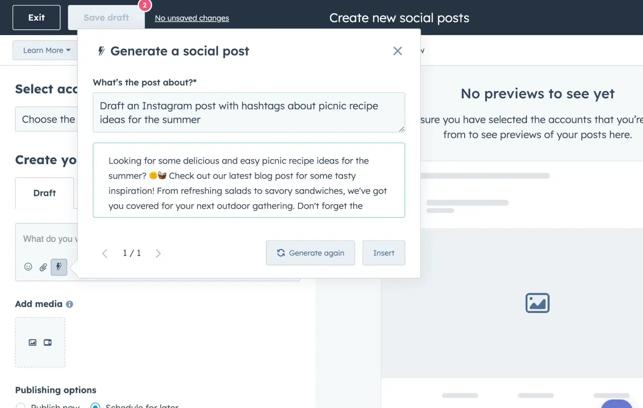
It adjusts the tone of voice to match your brand, saving you time on editing and making sure your posts stay within character limits while balancing emojis and hashtags without going overboard (which is something I really like).
Plus, the tool lets you schedule multiple AI-assisted posts without the hassle of manual updates. It also tracks how your posts perform, giving you insights into what resonates with your audience.
Pro tip: Try out A/B testing for your social media posts. It’s a great way to find out what works best and refine your strategy over time.
3. Customer Experience and Support
AI brought better customer interactions and support, too. Now, people get messages that feel natural and personal, making the whole experience more realistic.
Here’s how AI actually helps.
Chatbots
First up, chatbots.
Machine learning empowers them to learn from interactions and make predictions. AI-powered chatbots offer 24/7 availability, scalability, cost-efficiency, and improved customer experience.
When it comes to AI chatbot tools, I swear by Drift. Its ability to let leads schedule meetings directly from a chat is nothing but brilliant.
Here’s the story proving it:
1Password saved 16,000 support hours in just six months using Drift and deflected 75% of support inquiries.
Before implementing Drift, their customer support struggled with long response times and inefficient processes.
This integration improved efficiency, allowing agents to focus on complex issues and resulting in a 4.6+ customer satisfaction score (CSAT) and 4X+ ROI.
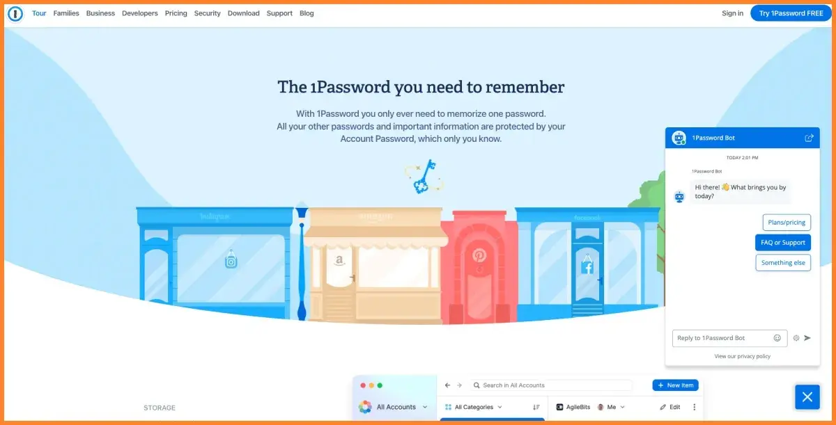
And if you’re in e-commerce or a similar field, I’d wholeheartedly recommend ManyChat.
I’ve used it to create interactive experiences for my clients, especially on Facebook Messenger, and it’s simply great.
There’s nothing better than letting AI handle general questions, like delivery times, so you’re not stuck answering the same thing over and over. I also love how easy ManyChat’s templates are to tweak and set up.
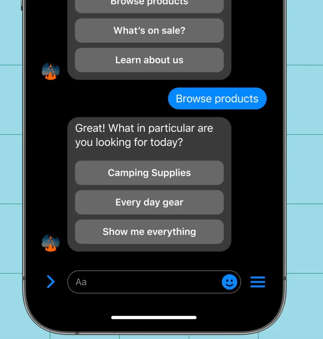
Pro tip: Run A/B tests with different conversation flows or scripts to see which ones get the best responses or conversions. Testing can show you which prompts, tone, or CTA drives better results.
Sentiment Analysis
AI helps businesses understand customer feelings through sentiment analysis. It monitors social media and online reviews to gauge brand perception.
Brandwatch is one of the best tools for this purpose. It stands out with its ability to analyze conversations across multiple platforms in real time.
For me, the best part of it is Listen, its emotion analysis tool that identifies anger, disgust, fear, joy, surprise, or sadness using a custom Logistic Regression model.
Analyzing over 2 million posts, it examines features like words, phrases, slang, and emojis to predict the dominant emotion in text, achieving an accuracy of 60-70% for most queries.
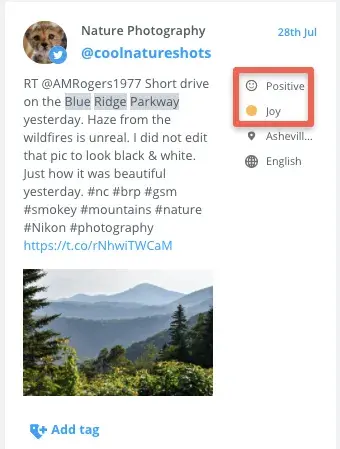
Thanks to this deeper insight, businesses can react appropriately to customer feelings, address negative sentiment quickly, and improve overall brand perception before it all “escalates” due to negative reactions.
Pro tip: Use sentiment analysis in conjunction with other analytics tools. For example, compare sentiment data with sales figures or customer feedback to gain deeper insights into how emotions impact business outcomes.
4. Advertising Campaigns
AI analyzes data quickly, so marketers can show personalized ads to the right people at the right time. This technology helps automate ad buying, improve ad designs, and run A/B tests, which boosts engagement and gets better results.
Here’s how it exactly works:
Streamlined Ad Creation
AI tools make ad creation easier by testing colors and fonts to find what works best for different audiences, helping remove personal biases. AI is doing brilliant work in this area, backed by many positive case studies.
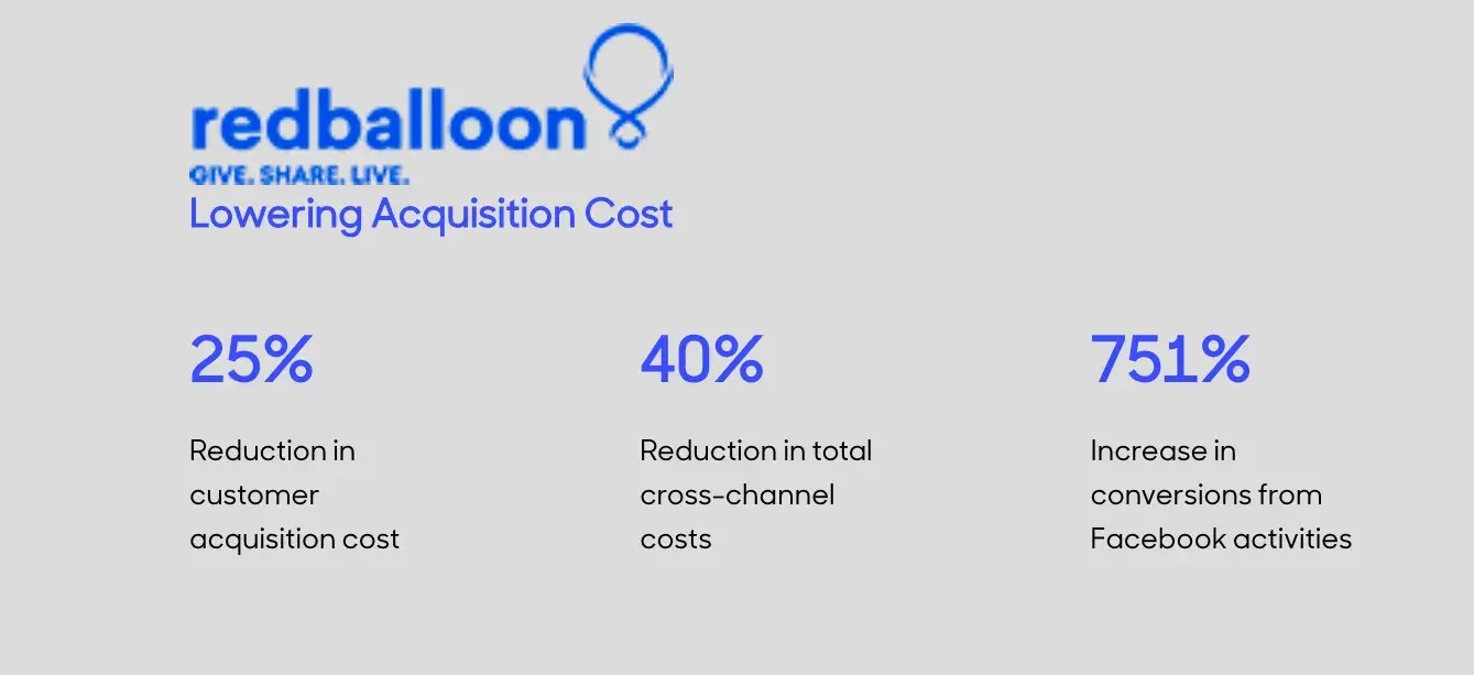
For example, RedBalloon, Australia’s top online experience retailer, used Albert AI to optimize its ads and tackle rising customer acquisition costs, which peaked at $50.
By executing over 6,400 keywords in 24 hours, they expanded their audience reach from 1% to 99%, achieving a 25% reduction in acquisition costs, a 40% decrease in total cross-channel costs, and a 751% increase in Facebook conversions.
Final result? An impressive 3434% ROAS on new shopper campaigns.
Pro tip: Set clear metrics for success — such as CTRs or conversion rates — and let the AI run tests over a defined period. Use the insights gained to adjust your campaigns quickly. For example, if one headline consistently outperforms others, make it your primary choice.
Ad Creative Optimization
AI boosts ad creative optimization by testing various ad versions to pinpoint the most effective ones.
For instance, Facebook Ads Manager uses AI to analyze performance metrics, helping marketers find the visuals and CTAs that resonate best with their audience.
Its latest feature, Meta Advantage, automates ad performance with machine learning even further, achieving impressive results:

Similarly, Google Ads allows users to create multiple ad variations — different headlines, descriptions, and display URLs — and automatically rotates them to gather performance data.
All this fosters ongoing improvement in conversion rates, as the best-performing ads achieve higher engagement over time.
Pro tip: Upload diverse creative assets and switch to data-driven attribution for better bidding. Consider advanced inputs like new customer acquisition goals and profit data to refine your strategy.
How to Implement AI Into Your Marketing Tech Stack
To avoid jumping into AI thoughtlessly by trying to quickly implement everything, you need to start with a plan and a strategy.
Eight steps I recommend you to follow:
1. Assess your current MarTech stack.
Step one is to check your MarTech stack and analyze each tool to see where AI can fill gaps.
For example, if data analysis is a major time sink, try looking into an AI tool that can quickly interpret and visualize data.
As you review each tool, think about its compatibility with AI. I usually check if the tool has any built-in AI features or if it can connect easily with other AI platforms.
It’s important to see if it’s flexible enough to grow with your needs or if it’s too limited to adapt as AI tech evolves. This step helps avoid investing in tools that could end up outdated or expensive to upgrade down the line.
2. Define clear objectives.
When defining objectives for AI in marketing, I begin by pinpointing the specific outcomes I want to achieve. Boosting customer engagement, driving higher conversions, or streamlining our marketing budget?
Note: Always make sure these goals aren’t standalone. And when I say “standalone,” I mean they need to be in sync with the broader business strategy.
For example, if the company is focused on expanding its customer base, I’d aim to use AI to improve engagement and personalize experiences that attract but also retain new users.
And if my goal is to improve efficiency, I’d go with AI tools that reduce manual work but at the same time cut costs. With this alignment, I ensure that AI isn’t just a flashy add-on but a strategic part of my approach to reaching my business milestones.
3. Build a strong data foundation.
To build a solid data foundation, you’ve got to keep the company’s data clean, accurate, and consistent. I do this by regularly checking and cleaning up the data, like getting rid of duplicates and updating old customer contact info.
I also enforce strict privacy and security measures, like encryption and access controls, to stay compliant with GDPR and protect sensitive info. Plus, I bring together data from different sources — CRM systems, social media, and sales databases — into one data warehouse or data lake.
When you lay down such a solid foundation, you’re setting the stage for effective AI implementation and better decision-making.
4. Select the right AI technologies.
Different AI tools use different algorithms for specific tasks.
For example, machine learning (ML) looks at past data to find patterns and make predictions. It checks a customer’s purchase history and can guess what they might want to buy or do next.
On the other hand, natural language processing (NLP) focuses on understanding human language. It analyzes customer feedback to see how people feel, summarizes long texts for quick insights, and runs chatbots that answer customer questions in real time.
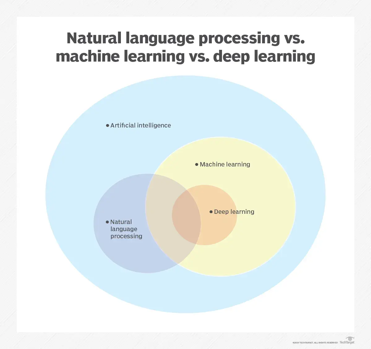
Finally, deep learning is a subset of machine learning that uses neural networks with many layers to process data. It’s brilliant at handling complex tasks like image and speech recognition.
For example, a deep learning model can be trained on huge amounts of image data for object or face recognition.
5. Choose the right AI tools.
When picking the right AI tools, look at things like cost, ease of use, scalability, and how well they integrate with what you already have.
Sometimes, ready-made solutions won’t cover all your needs. That’s when you might consider building custom AI models.
For instance, a tailored model can help predict customer churn by analyzing specific data patterns unique to your business.
Friendly advice: It’s easy to get caught up in the AI trend with all the new tools out there, but stay focused and don’t spend money on things you might not need.
Write down which tools will bring you value and which ones might just be a waste. Look for options that offer free trials or demos so you can test them before committing to any costs.
Join a free training program for small business owners and marketing professionals looking to improve their strategies with AI. Learn to boost content creation, personalize customer experiences, and ethically evaluate AI tools while developing skills to craft effective prompts and optimize your marketing efforts.
6. Train your team.
Your team needs to understand what data literacy is and how to read insights. Consider running workshops or online courses that focus on effectively reading and analyzing data.
Next, offer training on AI concepts and tools. Set up sessions where team members can learn how to use specific AI tools that matter for your business.
Finally, tackle the ethical side of AI, including issues like bias and privacy. Host discussions or training sessions to ensure your team is aware of these challenges and knows how to use AI responsibly.
Here, I have to quote the brilliant Jessica Apotheker again:
“You need to identify the true artists, the true differentiators, the true innovators of your function. Now, if you‘ve ever worked in marketing, you know who these people are. They are the ones that always disagree with you.
Now you take these people, and you need to strategically reskill them to use AI well, for example, to be inspired by new ideas, to be inspired by new trends, to also crack fast prototypes, to multiply their impact once they’ve cracked a great idea.
“But you must protect them and teach them to use AI to generate and originate original ideas. For that, they have to use their human brain to keep those human juices flowing, and that, in turn, will protect the identity of your brand and your differentiation in the market.”
7. Start small, scale smart.
Begin with pilot projects that are small and manageable to test the waters. This allows you to experiment without overwhelming your resources.
For instance, start by segmenting your email list based on customer behavior and using AI to tailor content for each group.
Use an iterative approach to refine your AI initiatives based on feedback and results. After launching your personalized campaign, gather data on open rates and engagement. Use this feedback to tweak your messaging and targeting if needed.
Also, track key metrics to assess how AI impacts your overall marketing performance — e.g., monitor conversion rates and customer retention to see if the AI-driven changes lead to better outcomes.
8. Monitor and optimize.
Regularly track how your AI initiatives are performing to see what’s working and what isn’t.
Make adjustments as needed to improve results. If you find that certain campaigns, like targeted ads or chatbots, aren’t performing as expected, tweak your messaging, targeting, or the algorithms in use.
If a tool isn’t delivering as promised, reach out to customer support for help or consider switching to a different solution if necessary.
Also, keep up with the latest advancements in AI and MarTech. Subscribe to industry newsletters, attend webinars, or join professional groups to stay informed about new tools and trends.
Tips for Making the Most of AI in Your MarTech Operations
I don’t want to leave you hanging without some awesome expert perspectives, so I’ve put together a few more brilliant tips and case studies that the HubSpot team achieved with AI.
1. Make your customer chat feel more personal.
The customer chat today needs to feel like you’re talking to a real person.
The more you can make it natural and friendly, the better. Plus, it’s super important to give customers the answers they need directly in the chat without making them dig through your site.
And here’s what Kyle Denhoff, Sr. Director of Marketing at HubSpot, says on this topic:
“Provide a better customer experience by improving on-site chat. Create a personal, more contextualized experience for customers looking for information instead of having to manually navigate our knowledge base.”
HubSpot’s marketing team has tested AI chat features, highlighting their importance for better customer interactions and increased sales. ⤵️
HubSpot Engages 3,500 Users in Week #1 with AI Chat
How did the experiment start?The initiative kicked off with a focus on website chat because it had great potential for providing real value to users.
Since many customers reach out through chat for support and product inquiries, they decided to target high-traffic pages, like the knowledge base, for their initial testing.
In just the first week, they engaged with 3,500 customers and gathered some valuable insights from those interactions.
What was the process like? Once the AI chat was live, they assigned a dedicated team to oversee the project and collect data for training.
They started with the chatbot on the knowledge base pages, analyzing historical conversations to help the AI better understand customer needs.

The first use case was all about chat, but it quickly expanded to include the in-app pricing page, which aimed to guide prospective customers through product options and pricing.
By the second week, they had already processed over 1,000 inquiries through the AI!
What were the results? During the testing phase, they saw a dip in customer satisfaction at first, dropping to 70% as the AI learned from real interactions.
However, as the “AI got smarter,” customer satisfaction scores climbed back up to 85%, eventually matching those of human interactions.
This really reinforced the idea that, when properly trained, AI can seriously improve the customer experience and boost conversion rates.
2. Create hyper-personalized emails.
I don’t even need to tell you that you shouldn’t use “Dear Customer” as an intro, right? Instead, use the customer’s name. But even that’s not enough.
Try to go beyond that — reference something recent, like, “I saw you downloaded our eBook on digital marketing. Which part do you like the most?”
Tailor your messages to their interests. Small touches, like birthday greetings — “Happy Birthday, Sarah! Here’s a discount” — make a difference. Follow up on purchases with, “Hi John, hope you’re enjoying your coffee maker! Have you tried any recipes?”
Finally, ask for feedback: “Are you happy with it, or is something not quite right? Either way, let us know!”
These tips will help you connect better with customers. Kyle Denhoff backs that up by saying:
“We worked with the AI / MarTech team to create personalized outreach emails for quality contacts in our database. These hyper-personalized emails increased the response rate significantly.”
But it doesn’t just boost the response rate. HubSpot’s AI experiment revealed that personalized emails can significantly increase conversions, too. ⤵️
The AI Strategy That Increased Email Conversion Rate By 82%
How did the experiment start?HubSpot kicked things off by identifying projects with the best potential ROI. They used a straightforward 2×2 matrix to narrow down their focus to about 10-15 key ideas.
Suggestions came through Google Forms, and they kept everything organized on Slack.
Their mantra? Speed over perfection — get it out there quickly, then tweak it as needed.
What did the process look like? Once they had their ideas lined up, HubSpot formed a centralized AI team and jumped into an iterative process.
They launched each project right away, gathered feedback, and made adjustments to the AI models based on real-world usage.
This allowed them to craft personalized AI-driven emails that really resonated with specific users.
What were the results? The results were stunning.
By customizing emails for specific audiences, HubSpot saw a huge jump in campaign engagement and an awesome 82% increase in their email conversion rate.
3. Let AI handle the data while you tell the story.
Yes, AI is great for managing data, but don’t let it “take your chair.” You’re still the one responsible for shaping the narrative and connecting with your audience.
While AI sifts through numbers and spots trends, it’s up to you to turn those insights into something relatable and engaging.
As Irina Maltseva says: “Don’t just use AI tools as a quick fix — blend them into your overall workflow. AI should give you insights, but it’s your human touch that makes the content engaging and authentic.
Basically, let AI handle the data, but you handle the storytelling. That way, you get the best of both worlds — speed and optimization without losing the personal touch.”
AI is here. Are you?
Let’s finally stop using the phrase “AI is the future of marketing.” It’s the present. It takes a lot of work off our plate.
Sure, we might not spend that extra time on meditation or just zoning out, but we definitely have more time to A/B test, ideate, and even unlock extra money from manual work in the past.
It all starts with bringing AI into your marketing tech stack. Use it wisely, and there’s no way you won’t see the benefits.
![]()

![Download Now: The Annual State of Artificial Intelligence in 2024 [Free Report]](https://i4lead.com/wp-content/uploads/2024/12/b72f2b25-8cc9-4642-9a1b-1e675d3d273b-7.png)
![→ Access Now: Video Marketing Starter Pack [Free Kit]](https://i4lead.com/wp-content/uploads/2024/12/8f27c677-d952-4663-8787-bf65c6a1ecf2-1.png)


![Download Now: The Annual State of Artificial Intelligence in 2024 [Free Report]](https://i4lead.com/wp-content/uploads/2024/12/b72f2b25-8cc9-4642-9a1b-1e675d3d273b-6.png)


![Free Ebook: The Marketer's Guide to TikTok for Business [Download Now]](https://i4lead.com/wp-content/uploads/2024/12/2c7242e4-ad54-4f63-8627-a15aa6a2ea50.png)


![Download Now: How to Be More Productive at Work [Free Guide + Templates]](https://i4lead.com/wp-content/uploads/2024/12/5ab914ce-204e-40ef-acfe-d7bfec642e1a.png)


