Let’s say a salesperson comes up to you and says, “Here’s something you should know about.” If you don’t see this person as a trustworthy, knowledgeable source, you probably have no reason to listen.
Let’s replace the salesperson with your cousin Dave. The odds of you listening to what Dave has to say likely goes up, depending on your relationship with Dave and the topic he’s leaning into.
Now let’s replace Dave with an expert in the field who has done extensive research on the topic using a variety of credible sources. This expert also has the background to simplify and provide context to the topic. Now you have a reason to listen (and not just because you’re related).
Done well, an email newsletter is like the expert in the field of your email marketing efforts.
The curation serves to up-level the journalistic quality of your content, which results in two things:
- Increases the value you provide
- Improves your authority and credibility in your audience’s eyes
When people first start doing email marketing, they often assume they need an email newsletter. However, newsletters are only effective when done well.
“It’ll have everything our customers care about, all in one place,” they rationalize. “Our list will be different — people will actually look forward to getting our newsletter,” they argue. “Since we’re only sending it once a month, it’ll be a breeze to put together,” they say.
And while all of those things may become true for a few lucky individuals, lots of email newsletters flop. They become an uninteresting mush of content people automatically ignore, archive, delete, or straight up unsubscribe from. And this isn’t great for you, your metrics, or your company’s success.
So if you’re thinking about creating an email newsletter, keep on reading. In this post, we’ll cover:
- Ideas to make your newsletter an effective one
- Design tips that help ensure a great reading experience
- Examples of newsletters that are crushing it (to draw inspiration from)
Email Newsletter Ideas
Email newsletters can include a weekly round-up of blog posts, case studies regarding your product or service, upcoming company events and webinars, or even a behind-the-scenes look at your company.
Of course, you don’t want to create a newsletter just for the sake of creating one — instead, you should do thorough research on what your audience might prefer, and what your company is well-suited to offer.
If you’re looking for general email newsletter inspiration, you’re in luck. Here’s a list of some of our favorite ideas for email newsletters:
- Round-up of popular or recent blog posts or videos
- New job openings at your company
- New case studies or product launches
- Membership/customer deals and promotions
- New best practices or tips
- Industry news
- Quotes
- Recent survey results related to your industry
- Internal employee news, including anniversaries, promotions, and birthdays
- Listicles (i.e. “10 Best Vacation Spots of 2020” if you work for a Travel publication)
- A team spotlight with pictures and bios
- Photos or stories customers have shared
- Behind-the-scenes at your company, or interviews with company executives
- Monthly business recap
- New training opportunities
- FAQ (Frequently Asked Questions) and answers
- Upcoming webinars, or recordings of past webinars
Next, let’s explore some newsletter designs to inspire the aesthetic of your newsletter.
Featured Guide: Email Newsletter Design Examples Lookbook
 Learn how to build an email newsletter from scratch, and see dozens of email newsletter examples from real businesses with this free guide.
Email Newsletter Design
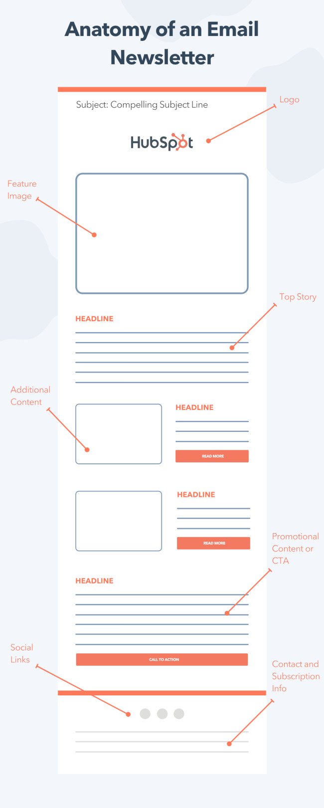
While you can get creative with the structure of your email newsletter, the general anatomy typically includes:
- Your logo or masthead
- A featured image and other eye-catching visuals
- Top stories featured at the top
- Additional content and promotions following
- An email footer with social links and subscription information
 From a design standpoint, your company’s newsletter should be a true reflection of your brand. For instance, if your website features minimalist design and clean, plain black-and-white text, then you don’t want to create a super colorful newsletter, which might confuse new subscribers.
There are a few best practices, however, you can employ to ensure your design is up-to-par regardless of your audience’s preferences:
- Clean, crisp images (no blurry images)
- Text (use same text throughout), company logo, and icons
- Try filters, memes, or video
- Make the CTA clear and obvious — and just have one (i.e. “Click here to shop” or “Click here to read”)
- Create a hierarchy with CTA early-on
- Mobile-responsive
- Test the length of your newsletter to ensure it’s not too short or too long for your audience
Of course, the design of your newsletter will depend on your brand, as well as the message. For instance, you might want to create a colorful, attention-grabbing newsletter if it largely focuses on visuals of new products — alternatively, if it’s a round-up of recent blog posts, perhaps you try a more minimalist look to mimic the appearance of a letter.
Of course, you’ll want to A/B test whichever design(s) you choose, to ensure they resonate with your audience.
I’d also recommend looking into pre-made templates if you’re not familiar with designing emails. If you’re a HubSpot customer, you’ll have a bunch of pre-made templates in the email tool.
However, if you’re still unsure about your newsletter design, there’s nothing better than looking at examples for further inspiration.
Take a look at the following newsletters that knocked it out of the park, and consider using some of their design elements as inspiration for your own.
Each newsletter on this list is fabulous for different reasons. Some have exceptional design, some have exceptional copy, some have exceptional calls-to-action … but all are exceptional at solving for their subscribers’ needs.
1. The Hustle
The Hustle is a daily newsletter that promises “business and tech in 5 minutes or less.”
While there are a ton of business and tech newsletters out there, what makes The Hustle remarkable is its tone at the intersection of informational and hilarious.
Take two of their most notable headlines from 2020 as an example:
- “The man feeding a remote Alaska town with a Costco card and a ship”
- “The economics of vending machines”
The Hustle also allows subscribers to customize the content they receive to fit their interests (see the “Snippets” section in the example below).
The formula of great content + unique tone + personalization works well for The Hustle’s audience as they’ve grown to more than 1.5 million subscribers.

2. NextDraft
NextDraft is a daily email written by a man named Dave Pell, which is a curation of the best web content of the day. As Pell describes it, “Each morning I visit about fifty news sites and from that swirling nightmare of information quicksand, I pluck the top ten most fascinating items of the day, which I deliver with a fast, pithy wit that will make your computer device vibrate with delight.”
You can tell he’s a great writer. His copywriting is one of my favorite things about the newsletter. It starts with the subject line, which is usually a play on words or a clever one-liner on the top news of the day. It then extends to the body of the email itself, which is always descriptive, accurate, and clever. Finally, the minimalist design is fantastic.
Not only is content delivery is clear, organized, and digestible, but also the inclusion of social share buttons underneath each story is brilliant. Rather than assuming that the reader is going to make it to a social sharing option at the bottom of the newsletter, Pell provides them with multiple opportunities throughout. Social engagement can play a big role in growing your newsletter, as every share on social opens up a valuable opportunity to attract more subscribers.
For those who’d rather read news like this in a mobile app, the NextDraft app is free in Apple’s app store.

[Click here to see the entire email.]
3. REI
REI, the recreational sports outfitter, is a model of success in several areas of content marketing — and their membership email is no exception.
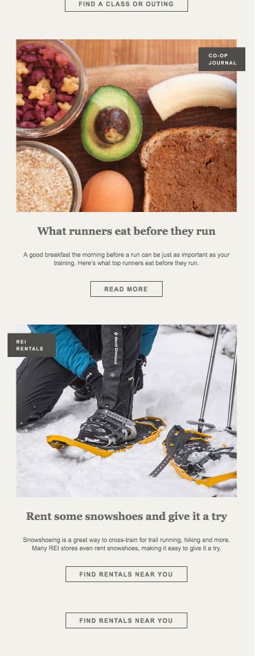
We included this email newsletter on our list because it does what many ecommerce and consumer product vendors find challenging: promote good products with good content. In the newsletter example below, you’ll see how REI delivers many different types of material to its subscribers, and each type relates to one another. Following the seasonal product offerings at the top of the email, the company offers trainings to help educate readers on its new products and blog posts for even more insight into the outdoor lifestyle.
Did you notice something else about this newsletter? It’s dedicated entirely to runners. Catering your email newsletter to a single audience — even if that audience belongs to an even bigger buyer persona — can help you tell a story in your email that resonates with the recipient from start to finish.

4. Austin Kleon
Not to play favorites, but this newsletter from Austin Kleon is one I really look forward to. First, I love the simplicity. It’s not flashy, nor is it overly promotional. That’s the hallmark of a successful email newsletter: The most effective newsletters aim to educate, not sell.
I also love the overall informal tone he takes, as it makes it feel as though you’re hearing from a friend. If you’re looking to lower the barrier between your company and your audience, consider using language that is friendly and inviting, not buttoned-up and jargony.

[Click here to see the entire email.]
5. FandangoNOW
FandangoNOW is a movie streaming app that allows you to build a library of purchased and rented movies around your interests. And it uses the below email newsletter as part of its customer retention strategy.
The email below offers movie suggestions for the weekend, making it a well-timed newsletter if it lands in your inbox on Friday afternoon. In addition, its design is easy to digest, despite being so graphic-intense. Using numbered icons and consistent “Buy” and “Rent” CTAs in corners of each movie tile, the email compartmentalizes a lot of content while still connecting each movie to the FandangoNOW brand.

6. InVision
InVision’s newsletter is a weekly digest of their best blog content, a roundup of their favorite design links from the week, and a new opportunity to win a free t-shirt.
Not only is their newsletter a great mix of content, but I also love the nice balance between images and text, making it easy to read and mobile-friendly. They make great use of animated GIFs in their emails. I also love the clever copy on their call-to-action buttons:
- “Cat GIFs on Every Page”
- “Set Your Sights”
- “Why So Serious?”
In addition to classic CTA buttons, they engage their audience at the bottom of every newsletter with a “You tell us!” text CTA.

7. Community.is
Community.is is a handcrafted newsletter created for people who “put people at the center of their work.” This unique concept attracts a variety of readers from executives at ad agencies, to community managers at startups, to marketers and creatives of all shapes and sizes.
In an effort to cater to their melting pot of subscribers, Community.is adopted a three-tier format: Short, Mid, and Long. While an executive may only have time to skim the short stuff, a marketer might be looking for a more in-depth read to spark some inspiration for their next campaign. Organizing a newsletter in this way helps ensure that you’re serving the distinct needs of your audience without it being too confusing.

[Click here to see the entire email.]
8. Vox Sentences
Vox Sentences is a nightly email meant to quickly get its readers up to speed on the best stories from the day. The content ranges from the day’s top news to fun stories from all over the web. They do a great job balancing their own content with external sources, and the stories they choose are always really high quality.
You can read Vox’s entire newsletter from start to finish and get a great sense of the stories they’re covering — but you can also click through to any of the linked stories to get a more in-depth approach.

9. Fizzle
Fizzle’s newsletter is aimed at entrepreneurs who want weekly tips on building a business sent directly to their inbox and all in the email itself. Although they have a business blog and a podcast, what makes Fizzle’s newsletter unique is that the email content is independent from those other content assets. In other words, it’s written entirely for their subscribers.
The copywriting style makes the newsletter unique and appealing, too: It’s casual, honest, and written like the author is writing to a friend. The writing gives off the vibe of real, down-to-earth business advice — without the fluffy stuff. At the same time, it’s written with clear headers and sub-headers to break it up, and the important stuff is bolded, making for easy skimming.

10. TheSkimm
If you want to stay up on what’s happening in the world and have some delightful writing delivered to your inbox first thing in the morning, look no further than TheSkimm. It’s a daily roundup of what’s happened in the news in short, punchy paragraphs.
The best part? You don’t have to click out of the email to read the news if you don’t want to — although they do link to their sources if you want to read further.
For your own email marketing, TheSkimm is the place to go if you’re looking for writing inspiration or for emails without much visual content.

11. Medium
Medium is a blog-publishing platform that has been continuously building momentum since its launch in 2012. Publishing on the site has really picked up in the past few years, and nowadays, there are a ton of people publishing posts on the site every day.
Of course, that means there’s a lot of content for the average person to filter through. To help bring great content to the surface, Medium uses email newsletters. And after I open this newsletter every day, I end up going to visit several Medium posts without fail. (Mission accomplished for Medium, right?)
Here’s why: The newsletter feels pretty minimal. Because of the way that Medium uses colors and section dividers, they’re able to give you a ton of content in one email without it feeling overwhelming. Plus, they offer both a daily and a weekly version of the digest, allowing users to opt in for the email frequency they feel most comfortable with.

12. BrainPickings
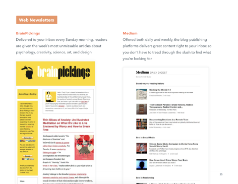
BrainPickings is one of the most interesting newsletters out there. In fact, the folks who write it call it an “interestingness digest.” Every Sunday morning, subscribers get the past week’s most unmissable articles about creativity, psychology, art, science, design, and philosophy — topics that are really appealing to a wide audience. At its core, it explores what it means to live a good life.
This is one of the longest newsletters I’ve ever read, but what makes it still work well is how high quality and well packaged the content is.
(Bonus: Check out the delightful microcopy in the top right-hand corner.)

[Click here to see the entire email.]
13. Litmus
You’d hope that an email marketing testing company would have great emails … and Litmus definitely does. While the content of the emails is certainly interesting, I’m especially digging the design. The blocks of color help break up the newsletter into sections that are easy to differentiate.
I also like that the text calls-to-action at the end of each post’s description don’t just say something generic, like “Read this post.” Instead, they are matched with specific actions related to the post’s content, like “Get the checklist” and “Discover why you should test.”

14. General Assembly
There are a lot of creative things you can do with images in your emails, from designing your own custom graphics to creating animated GIFs. General Assembly, an organization that helps expand professionals’ skill sets, likes to employ tactics like these in their newsletter.
From their attractive and minimal layout to their concise copy and helpful information, this is a great example of a newsletter that gives subscribers quick information in an easily scannable format.

15. The Ringer
Remember Grantland, the sports and pop culture blog owned by ESPN that was started by sports journalist Bill Simmons? In October 2015, ESPN announced it would be ending the publication of Grantland. Shortly thereafter, Simmons formed Bill Simmon Media Group and recruited a whole bunch of former Grantland staffers to launch a brand new newsletter in March 2016 called The Ringer.
Although The Ringer is written and run by many former Grantland employees it’s a different project than Grantland was. Where Grantland focused on sports and pop culture, The Ringer branches out into other areas like tech and politics. Jon Favreau, a former speechwriter for President Barack Obama, is among the contributors. I like how focused they are on experimentation: “We want to have fun, take chances, analyze, theorize, obsess, and try not to take ourselves too seriously,” said Editor-in-Chief Sean Fennessey.
Another differentiator? The Ringer’s website was developed in partnership with publishing platform Medium — which means the newsletter reflects that clean, minimal design.

[Click here to see the entire email.]
16. Hacker Newsletter
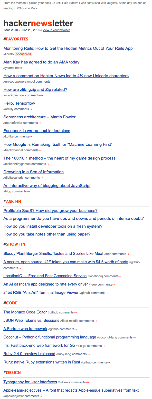
Many marketers don’t frequent Hacker News, but they should still check out this hand-picked curation of the social network’s top stories of the day.
Why? The newsletter is clean and minimal, but still sends a ton of really great content its subscribers’ way. The way it distills potentially overwhelming information is by bucketing content into sections. The newsletter also looks very similar to the site, so for those who love the site and how it’s laid out, the newsletter feels like a comforting, familiar way to consume content.
[Click here to see the entire email.]
17. Below the Fold
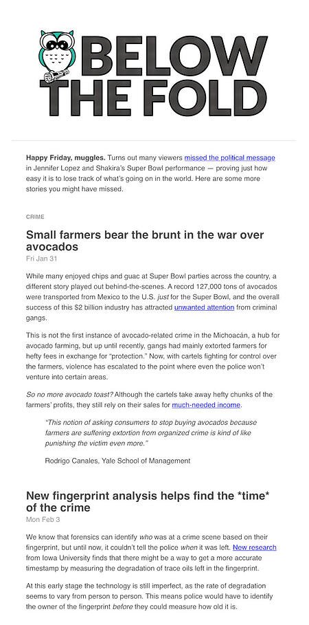
Below the Fold is a weekly newsletter (from Acciyo) that surfaces important and interesting stories that simply aren’t making headlines due to the crowded, never-ending news cycle we all experience day in and day out.
Acciyo’s editorial team handpicks great news stories that they believe deserve “front-page love” but are being beaten out by an “infinite scroll of breaking headlines” — stories that range from how investors are profiting from emergency room bills, to how one Mexican company turned prickly pear into sustainable fuel.
What I love most about Below the Fold is not just that I get to read super interesting stories that would be hard to find on my own, but that the mission behind their newsletter is unique and creates new value for their readers. They’re not just curating content on a single topic; they’re appealing to an audience who’s tired of reading the same headlines across their feeds and want to know what else is happening in the world.
Some of their most engaged sends are weeks where one story dominates coverage, preventing other important stories from reaching people. It’s easy to get caught up in what’s trending and miss what else is happening in the world. They do a great job of communicating a mission that truly differentiates them and creates value readers won’t get anywhere else.
18. #SEOFOMO
Things can change quickly in the world of SEO, so fear of missing out (or, affectionately dubbed, FOMO) is a real mood among professionals immersed in the industry.
That’s why Aleyda Solis, an expert in the space, started the newsletter: “#SEOFOMO was born with the goal to share the type of newsletter I wished to receive myself as an SEO consultant.”
The newsletter itself is comprehensive, containing search- and algorithm-related news, curated articles, guides and resources, and open SEO jobs.

Creating an Email Newsletter Your Subscribers Love
Even though newsletters are one of the most common types of emails to send, they are actually some of the hardest to do right. We hope these examples gave you some quality inspiration so you can create newsletters your subscribers love to get in their inboxes.


