In early 2020, the world as we knew it was flipped upside down. Businesses were forced to pivot in the face of the pandemic, and as a result many companies adopted a remote work culture.
Remote work changed the way organizations and teams worked — and even how companies communicated to prospective customers and acquired new business. Employees leaned into virtual designs, presentations, and events to communicate both internally and externally.
The graphic design landscape, as a result, has changed dramatically over the past year.
Now, presentations need to work harder than ever to connect, engage, and inspire audiences into action. In fact, over 35 million PowerPoint presentations are given each day to over 500 million audiences — but 79% of those audiences believe most presentations they see are boring.
To help you crush your next presentation deck, we’ve rounded up the top presentation design trends of 2021, as predicted by creative industry experts and presentation power-users.
Here, learn from three creative experts from leading companies in the tech space on the four biggest presentation design trends that will emerge in 2021.
1. There will be increased empathy found in design.
Marissa Latshaw, Founder of Latshaw Marketing, says: “Impactful, inspiring design starts with empathy.
Empathy is one of the most powerful tools in the creative toolbox. The good news is that empathy — the ability to feel, understand, and respond to the feelings of others — is innate in us all. Our job as creators is to harness this empathy for better design, marketing, and storytelling.
Empathy boosts creativity. The empathy/creativity connection is strong — as shown in many studies over the past decade. One study asked participants to create and name a potato chip product for pregnant women. Before beginning the task, half of the participants were told to envision how the consumer would feel while eating the snack. The other half were asked to imagine what the consumer would think. An independent jury found the product concepts of the first, feelings-focused, empathy-activated group to be more original than the control group.
Empathy is also vital for inclusivity. More than ever, we want to communicate with others in a way that is genuinely inclusive. An empathetic approach ensures we understand the goals, needs, fears, and values of all the people we wish to engage (beyond just the way they relate to our brand or product). This is a call for us all to become proactive about inclusivity, and it starts with empathy.
Empathy creates connection. From in-home fitness giant Peloton to the new voice-based, social network Clubhouse, we are constantly finding new and innovative ways to connect with one another.
Both brands demonstrate empathy as they address the palpable and growing need for connection. They re-imagined how we work out and share conversations in a more socially-connected way.
Designing anything — from a presentation to an ad campaign — is no different. Each is an opportunity to reimagine and innovate how we engage and connect with the world.
Empathy helps us to stand out by standing in another’s shoes. Creating one-of-a-kind, empathy-driven experiences ultimately brings us closer together and inspires action.”
2. Designers will lean into radical simplicity.
Eliot Garcia Weisberg, Creative Director at Airbnb, talks to us about all things radical simplicity.
He says, “Despite its incredible power to connect us, teleconferencing stunts audience energy and empathy. Attention — already a fleeting resource — is further divided between the screens, speakers, slides, and sounds of the virtual landscape.
The feedback loop from audience to presenter is nearly dead. The impact of environmental design is lost. In our new world, the value of a single pixel on the cluttered screens of remote audiences is immense. And the screens themselves— their quality and colors— vary wildly from member to member.
The key to designing for the ‘new normal’ is embracing radical simplicity. A designer must reduce a slide to its core idea, then push to simplify even further. They musk ask themselves — ‘Do I really need to show this?’ Then challenge themselves every time the answer is ‘Yes.’
Slide counts will be drastically reduced. Superfluous icons will fade away. Bullets will become a distant memory. Subtle textures will be replaced by solid colors. We’ll see a shift away from image masks and bold text over photos. Instead, we’ll see full-screen photographs or simple statements that make their point obvious and drive core concepts home.
We’ll spend more time on the speaker— full screen— than ever before. Their delivery, from tone to inflection, will become a design element. Rehearsals will replace design reviews.
The end result will feel much more human. And, if successful, radically simple.”
3. Great design will hold the viewers’ attention.
“For decades, the job of creative designers, writers, and videographers was to get attention. Cut through the noise. Deliver ads that stand out. Use creativity as a hook,” Adam Morgan, Adobe’s Executive Creative Director, says about holding an audience’s attention.
He adds, “But in today’s ultra-connected digital world, that hammer and nail approach isn’t always the answer. People choose what they want. The trend I’m seeing today is to hold attention. Less push and more pull. We have to create experiences that provide real value to an individual — not just catch their attention with shock value or clickbait.
“We have to create communities where people want to consume our brand experiences. We have to know those individuals and groups, what they care about, and provide new information wrapped in an emotional blanket. We have to stand for things they value.”
Rather than a hard sell, we have to share a story that they believe in and be open and transparent with why it matters to them.
What this means for creative teams is that you can’t just make it pretty or funny. You have to think deeply about what your brand means to customers and then create immersive experiences that connect. It’s no longer just about the creative craft of colors and fonts and icons. It’s about stories and meaning and authenticity and purpose. Don’t just get attention with your work. Hold attention. So that you can build brands that grow and last.”
4. Designers should use clean, minimalistic fonts and calming colors.
Lastly, we tapped into Beautiful.ai’s Creative Director Anuja Kanani’s expertise to unravel one more presentation design trend for 2021.
Kanani says, “Choosing the best colors for a presentation, and good presentation fonts, are two of the most important elements of deck design. Each design decision— shapes, words, and images— affect the way your audience feels about the presentation, but colors hold the most influence.
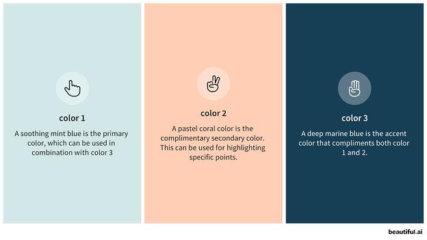
Taking the place of bold, bright primary colors, 2021 has warranted more relaxed, muted colors following the chaos of 2020. Not only are low-saturated and pastel colors more calming, they’re more organic and natural, perhaps making audiences feel more at ease and confident in the presentation in front of them.
Using a consistent, complimentary color theme strategically can help position your brand in the mind of your customers,” adds Kanani. She recommends limiting your presentation to 3-4 colors in your palette, with one accent color to highlight key points and bring balance and harmony to your presentation.

The trend of minimalism extends to good presentation fonts, too. Seasoned presenters are opting for clean minimal fonts, such as Open Sans or Jost, and rejecting traditional fonts like Arial or Times New Roman in 2021.
Kanani adds, “Custom typography improves your brand recognition, while selecting different weights or styles can help control the narrative on each slide.”
Presentation Graphics
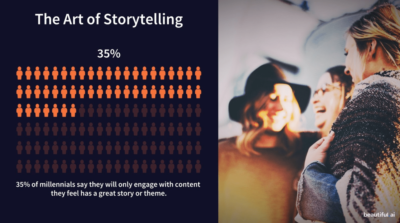
You’ve probably caught onto the fact that over-complicated slides are a thing of the past. Studies show that 35% of millennials say they will only engage with content they feel has a great story or theme, so to avoid boring them into a snooze, use visuals to control your narrative.
Presentation graphics, or rich visuals, can help you paint a picture in bite-sized chunks so that your audience can digest the information you’re presenting to them.
Kanani says, “Engaging, inspiring visuals in presentations make your content compelling, eye-catching, and helps convey your story beautifully.”
Choosing rich icons, diagrams or infographics, and quality photos are powerful tools to help make your presentation more memorable and impactful.
 Ultimately, design is an art, not a science. However, ideally you can use these trends as inspiration for your own branded designs in 2021 and beyond.
![]()

![→ Free Download: 4 PowerPoint Presentation Templates [Access Now]](https://i4lead.com/wp-content/uploads/2021/04/2d0b5298-2daa-4812-b2d4-fa65cd354a8e.png)
