If you write, edit, or manage content for a brand, you likely run into lengthy content discussions over everything from voice to exclamation marks and em dashes. At least, I’ve done my fair share of debates with colleagues over language preferences.
But is it trivial? I don’t think so. After all, there’s a difference between “you shall not pass” and “you shall not pass!” The latter gives me chills — Ian McKellen did a great job — but only if the writer hasn’t doused the webpage with exclamation marks.
In my years of having first-hand contact with content for HubSpot and other brands, I’ve found that each content creator comes with their own preferences. And while you can’t take those away from them, you can tell them what you like to reach common ground so they can represent your brand in their own way.
Now, you can either share your preferences with back-and-forth feedback over their draft, or you can prepare a content style guide that sets them in the right direction from the start.
I prefer the latter (less hand-holding!), so I’m going to share all I’ve learned about content style guides in this blog. As a bonus, I’ve also gathered insights from industry experts to help you make well-rounded decisions.
Table of Contents:
- What is a Content Style Guide?
- Style Guide vs. Brand Guide
- How to Create a Writing Style Guide
- What to Include in Your Style Guide [+ Checklist]
- What Not to Include in Your Style Guide
- How to Get Others to Use Your Style Guide
- Writing Style Guide Examples
What is a Content Style Guide?
A content style guide, also called an editorial style guide, is a document that sets the standard writing, grammar, and punctuation conventions people working for an organization should follow to maintain a consistent tone and style across its entire online presence.
Content style guides get down to the nitty-gritty. Yes, even whether you should capitalize the “a” after a colon.
Why are content style guides important?
While I love discussing language preferences, debating about the same thing over and over feels like solving a Rubik’s Cube with only one color — it’s repetitive and unproductive.
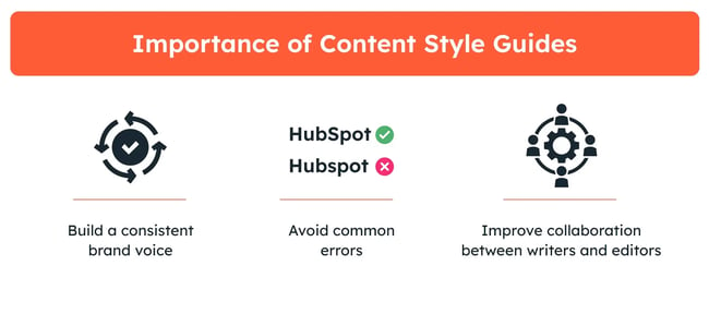
That’s why I recommend creating a content style guide if you’re working with freelance writers and editors (and even for in-house marketers). Specifically, it helps:
- Build a consistent brand voice. While you may want to connect with your audience on a personal level, each writer can have their own interpretation of what that entails. With a content style guide, I can fill the gaps with the exact tone of voice I’m looking for.
- Avoid common errors. HubSpot has always been spelled with a capital “H” and a capital “S” in between. That said, many external contributors used variations like “Hubspot” or “Hub spot” when I edited the HubSpot blog. With a content style guide, you can point out common errors to ensure they don’t go unnoticed.
- Improve collaboration between writers and editors. Having donned both the editor’s hat and the writer’s pen, I know that harsh feedback can be a blow to a writer’s confidence. With a detailed style guide, I’ve been able to address quality problems without pointing fingers.
Both guides play an important role in how potential consumers view, interact, and remember your brand.
Now that we’ve gone over the basics, let’s explore how I’d go about creating a content style guide for your brand.
1. Use a style guide template.
A writing style guide covers a lot of important content — from brand values to formatting guidelines. While you can take a stab at it by starting from scratch, I recommend using a tried-and-tested style guide template to get started.
If you want to get started quickly, consider using HubSpot’s free style guide template. It covers all the basics you need to get the brain juices flowing, and you can later expand upon it as you see fit.
Alternatively, you can check out the writing guide examples I’ve listed below and choose one as your starting point to customize it and make it your own.
2. Review your brand’s mission and values.
I usually find a brand’s mission statement and core values to be of great help whenever I start filling the style guide template. They give me a solid idea of how the brand aims to form connections with its audience.
For instance, if a brand stands for transparency, I believe that its style guide should promote adding accurate and transparent product descriptions instead of overselling or overhyping the products.
If what your brand says and what it practices doesn’t match up, readers can (and they will, trust me) see the disconnect — it’s like watching a TV show with bad lip-syncing.
Take it from Maddy Osman, founder of The Blogsmith, who knows how seriously brands should take conveying values like inclusivity through their content.
“We wanted our content practices to reflect what The Blogsmith stands for, and needed to find a way to get a team with diverse backgrounds on the same page,” says Osman.
To nurture these values, Maddy got the ball rolling by laying down clear-cut guidelines in her style guide.
“I sat down with team members to brainstorm what inclusivity would look like on paper — the things we normally don‘t account for in day-to-day speech. Whether it’s listing alternatives to outdated words like blacklist or manpower or examples of people-first language.”
Sharing brand values isn’t just talking the talk — it’s about walking the walk, and a style guide is a great roadmap to keeping everything in sync.
3. Create buyer personas for your target audience.
Imagine a conversation with a baby boomer and Gen Z-er. The way you communicate with them will likely be different. That’s why I love creating buyer personas to have a better idea of how to approach the target audience.
A buyer persona is a semi-fictional, research-based representation of your target customer. It includes their demographics, behavior patterns, motivations, and goals. If you haven’t created a buyer persona before, I recommend HubSpot’s persona generator to get started.

Amanda Price, content manager at Imagefix, is also totally on board: “Understanding who we’re communicating with is just as important as understanding our brand itself.”
Price adds that with a fleshed-out buyer persona a style guide “stops being about abstract rules and starts being a proper and useful tool to build a real connection with our readers.”
Your editorial guide doesn’t need to go as in-depth into buyer personas as documents created for the sales and marketing teams. Still, I’ve learned that you need to include the following information on each persona at a minimum if you’re working with freelance writers:
- Brief explanation of the target audience.
- Pain points of the target audience.
- How the audience likes to be communicated with.
- The solutions your brand provides for the audience.
- The preferred writing style (formal, conversational, etc.).
With these details in the style guide, I provide ample context for the internal and external contributors to inform the content they’re writing.
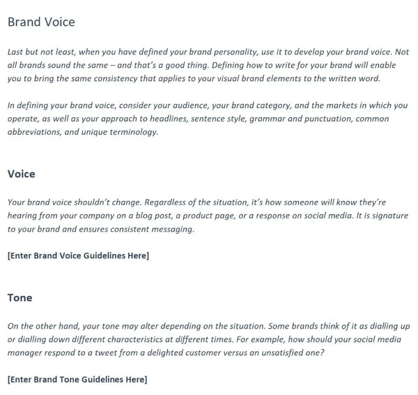
4. Define your company’s voice and tone.
Once I determine my target audience, I start working on the tone and voice — which might appear confusing at first since they seem like identical concepts.
Here’s how I differentiate the two based on my experience:
- Voice. The brand voice captures the unique personality, perspective, and style of your brand — it doesn’t change through your content. For instance, Coca-Cola’s brand voice is positive, and Starbucks’ is expressive.
- Tone. The brand tone refers to how you express your voice. For instance, you can be positive and matter-of-fact, as in “you did it,” or positive and enthusiastic, as in “you absolutely crushed it.”
While I never change brand voice, I think tweaking the tone works wonderfully to adapt your message according to the medium. For instance, I prefer a casual tone for social media and a formal tone for technical white papers.
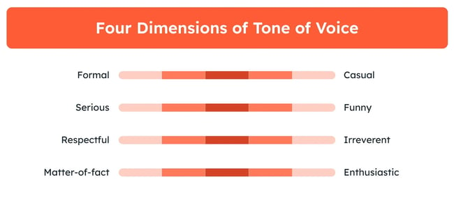
To decide the tone and voice, I find Nielsen Norman Group’s four dimensions of tone of voice incredibly helpful:
- Formal versus casual
- Serious versus funny
- Respectful versus irreverent
- Matter-of-fact versus enthusiastic
Your desired tone can be either at extreme ends or somewhere in between. For instance, I might opt for a casual, serious, respectful, and enthusiastic tone of voice for a SaaS brand.
That should provide a balance of professionalism, excitement, respectfulness, and friendliness, which aligns with most SaaS products.
In contrast, if I’m developing a content style guide for a tech firm, I might opt for a matter-of-fact (instead of enthusiastic) tone to communicate factually.
Still, it’s all up to your exact preferences, so flesh it out as you see fit.
Once you’ve reached a decision, I recommend adding guidelines surrounding the voice and tone to help the content creators better understand what you’re looking for. For instance, you can mention your:
- Preferred perspective. Can writers write in the first person? Or do the writers need to default to a third-person perspective?
- Writing style. Do you want to come across as a friend or a teacher? For the former, I recommend a conversational style with casual phrases. For the latter, you may need a mix of formal style with matter-of-fact language.
- Favorite phrases: To be as clear as possible about my preferred tone and voice, I typically include my favorite phrases in the style guide to help the writers connect the dots and better understand what I’m looking for.
I particularly stress on adding your favorite phrases because it helps clarify the desired tone and voice you want.
5. Decide on a reference style manual.
Save yourself some time and settle most of the formatting and grammar-related discussions once and for all by picking a reference style manual and sticking with it.
It saves you the trouble of doing your own research and coming up with industry-wide conventions for every special use case. You won’t regret it, I promise.
Most modern businesses adopt the Associated Press Stylebook (AP) or the Chicago Manual of Style. While both manuals are beneficial, I find the AP Stylebook a better fit for online media, as most news organizations use it (it’s also easier to memorize, in my opinion).
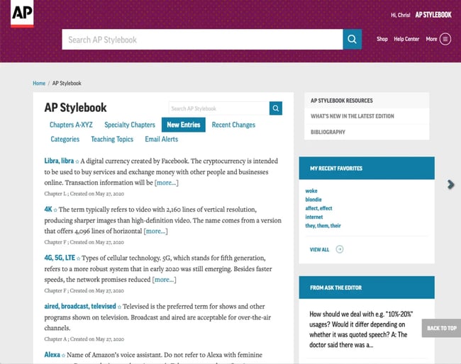
Additionally, AP Style suits contemporary brands wanting to come across as friendly. For instance, Bernard Meyer, senior director of communications and creative at Omnisend, shares that he prefers AP Style as it helps Omnisend come across as friendlier and less formal.
Note: I recommend purchasing an online subscription for whichever reference manual you end up going for. In my experience, employees are more likely to reference these tools when provided with an online subscription that contains a search function instead of a paper book through which they have to flip to find their answers.
6. List troublesome words and branded phrases.
To maintain consistency throughout the business, I like having a distinct section in the content style guide that includes specific spellings and capitalizations for frequently used words and phrases.
You can start with your company name. For instance, It’s HubSpot, not Hubspot or Hub spot.
Besides that, I also note down phrases, slogans, or tag lines associated with the brand. For example, KitKat’s slogan, “Have a break, have a KitKat,” uses a comma in between the phrases, not a period. You can similarly add your brand’s specific phrases with their preferred spelling, punctuation, and capitalization.
Moreover, when I was the blog editor at HubSpot, I also compiled a list of “commonly troublesome words” with inconsistent capitalization and spelling to ensure the contributors stayed consistent in their submissions.
Instead of debating how to spell, capitalize, or hyphenate a confusing word, writers could head over to the list and decide on proper usage for:
- Common words: ecommerce vs. e-commerce
AP Style prefers “e-commerce,” but I lean towards “ecommerce” as it’s getting rather popular, like “email.” - Job titles: Director of Marketing vs. director of marketing
AP style recommends using title case if the job title comes before the proper name and lowercase if it comes after it. I do the same. - Degree titles: Bachelor of Arts vs. bachelor of arts
AP style recommends using “Bachelor of Arts” in formal usage. That said, I default to using “bachelor’s degree” and “master’s degree” for readability.
Note: If the audience prefers specific English variations (British English or American English), I also recommend adding a list of problematic words like — center vs. centre, color vs. colour, and apartment vs. flat — to ensure your language choice mirrors your target audience.
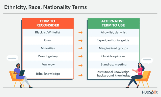
Additionally, you can also list words and phrases your brand wants to avoid for inclusivity. For example, instead of using “blacklist,” I recommend writers use “blocklist.” Similarly, use gender-neutral words like “first-year students” instead of “freshmen.”
7. Establish guidelines for graphics.
I know I told you earlier not to get into the nitty-gritty with visual guidelines. This is still true. Your design team or agency should create a separate brand design style guide that addresses more nuanced visual things (can you tell I’m not a designer?).
You should, however, add a little information to your written style guide if your writers are ever responsible for creating visual assets and/or copyediting visual assets created by designers.
Here are some common questions I’ve received over the years from writers and editors (that you should address with your style guide).
- Where can writers source images, and how do they properly attribute them?
- How many images should a writer add per blog post?
- Do we need to add alternative text for images? I love to include it to help people with visual disabilities.
- Can you add screenshots?
- When should images align to the right, to the left, or in the center?
- Should text wrap around images?
- Do you have any recommended image dimensions, file size, and file type for graphics?
All of your image-related guidelines for writers belong in this section. If I’ve access to a paid stock photo website, I prefer mentioning it in this section to ensure it is put to use.
8. Share your formatting recommendations.
Want to know a surefire way to give your editor a mild heart attack? Try submitting a document with formatting that resembles a maze. To protect your editors from getting burned out, I recommend including formatting guidelines for submissions, such as:
- Body text. What’s your preferred font style, size, and color?
- Headers. How many heading and subheading levels can writers go to? I’ve found that it’s better to limit online content to the h4 level.
- Hyperlinks. Do writers need to hyperlink a single word, more than two words, or a specific keyword? Should writers extend the hyperlink to articles (a, an, and the) in front of the target word?
- Lists. Should lists be numbered or bulleted? Do you want periods at the end of the lists?
- Bold, italic, or quotation marks. Do you want to reserve bold or italic for emphasis? Or do you prefer quotation marks?
- Special cases. How do you handle numerals, ranges, and en dashes? Is it acceptable to replace “and” with an ampersand (&)? Do you use acronyms in parentheses when making a first reference?
With consistent formatting, your readers will be able to skim and digest your information more easily.
9. Describe your SEO requirements.
With so much noise surrounding search engines, search engine optimization (SEO) is always a tricky part of the content style guide. That said, since some of the external contributors may be used to keyword spamming, I prefer laying out some of the essential SEO requirements.
You don’t need to go in-depth here. Heck, an in-depth SEO guide can be even longer than your content style guide. Instead, I use this section to answer more or less the common SEO-related questions from content creators.
So, here are my recommendations for the SEO section:
- Keyword usage. Share instructions on how the writers need to incorporate keywords into content, including their placement in titles, body text, and alt text. I recommend explaining how they should handle awkward keywords as well.
- Content structure. Let the writers know how to organize content for search engines. For instance, I like to have descriptive headers for search crawlers and skimming readers.
- Internal and external linking. Describe how writers should incorporate relevant internal and external links in the draft. I also recommend giving them a link-to-word ratio (e.g., one internal link for every 500 words).
- Content length. Mention the recommended length for different types of content. If you’re using an SEO tool for word count recommendation, let the writers know if it’s a strict limit or if they have some leeway.
- Meta titles and descriptions. Explain how the writers can optimize meta titles and meta descriptions to accurately represent the content and improve click-through rate in search engine results pages (SERPs).
In addition to these sections, I also include links to external sources like HubSpot’s guide to SEO to ensure writers can find answers to their questions from reputable sources.
10. Add recommended methods to source reliable data.
Do you know that humans have an attention span of only eight seconds? You might agree because you might have heard this statistic countless times in prominent newspapers, industry blogs, and from friends and family. At least, I have.
Luckily, it’s false. BBC busted this widespread myth in 2017. That said, I still see writers repeating this incorrect information to back up their arguments — which reflects a lot about those arguments.
If you want your brand to come across as honest, transparent, and trustworthy, I recommend including a section in your writing style guide detailing how you want the contributors to source their statistics.
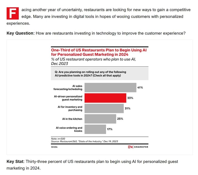
Based on my experience as a managing blog editor, you should outline the following at a minimum:
- Recommended data sources. Share your preferred industry sources. My personal favorites include eMarketer, Gartner, McKinsey & Company, and PwC.
- Preference for original data. To avoid made-up statistics like the eight-second human attention span and other issues affecting your trust with readers, I ask writers to always find, gauge, and link the original study. In most cases, the original study of a made-up statistic either doesn’t exist or appears unverifiable.
- Usage of recent, current data. If the market landscape in your industry changes rather frequently — as is the case in marketing — I would like to limit the data included to less than two years old. That said, it can vary from industry to industry, so adjust your expectations accordingly if there are no recent developments.
While that helps address most data-sourcing questions, you’ll still get one more question: Can I get relevant statistics and data from competitors?
Personally, I find it acceptable as long as the competitor’s information is reliable and verifiable. That said, it’s up to you to decide.
If you’re worried about search engine optimization (SEO), Osman, who is also ranked among the top 100 content marketers by Semrush, shares that she’s not “against using data from competitors. But you have to be careful from an SEO perspective if the data you’re referring to is a keyword competitor.”
Beyond that, it also depends on your brand’s core values. Meyer prefers to include “helpful data even if the data comes from our competitors” because Omnisend wants to come across as a customer-centric brand.
11. Outline prohibited topics.
While most internal contributors are mindful of sensitive topics, you may need to provide detailed guidance to freelance writers to avoid alienating your readership.
Even if you’re not working with external contributors, I’ve learned that including a list of sensitive topics also helps onboard new team members, so it’s a great addition to a content style guide.
While the sensitive topics might vary from industry to industry, my recommendations for sensitive topics include:
- Religion and politics. I always instructed the writers to steer clear of these two topics entirely.
- Legal considerations. Tell the writers to avoid legal counsel in most cases. Instead, suggest linking relevant legal resources to asking the readers to contact a lawyer.
- Controversial social issues. When talking about sensitive issues, such as immigration, suggest the contributors rely on experts instead of sharing a personal opinion that may evoke strong emotions in readers.
12. Give examples to solidify the writing style guide.
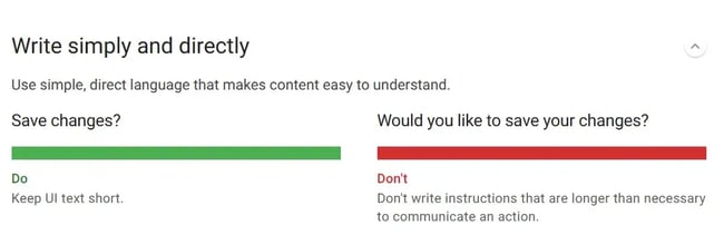
If you follow all the steps I’ve outlined so far, you’ll be close to completing a detailed content style guide. The only thing remaining is adding examples — some of which you may have added already.
In my experience, adding examples of high-level concepts with do’s and don’ts is one of the best ways to convey what you want. That said, make sure to add specific examples so they help the writers rather than confuse them.
Meyer agrees, “The more specific you can make [your style guide], the better your team will understand how to adopt it effectively.”
Osman also prefers adding examples. According to her, “style preferences make a lot more sense to writers when they see them executed in actuality — much like a case study.”
Here’s how I like to give examples in an editorial style guide:
- Use do’s and don’ts. Add an incorrect example and then mark it up to show how a writer could fix it.
- Include visual examples. For formatting and graphics, I prefer adding visual examples to help the contributors visualize what the brand requires.
- Preferred text. I find that writers are more likely to succeed in nailing down the brand tone and voice if you provide examples of it in practice.
All said and done, I think of a style guide as an evolving document, so you can edit the style guide, flesh out examples, and add nuances over time as a situation calls for it.
What to Include in Your Style Guide [+ Checklist]
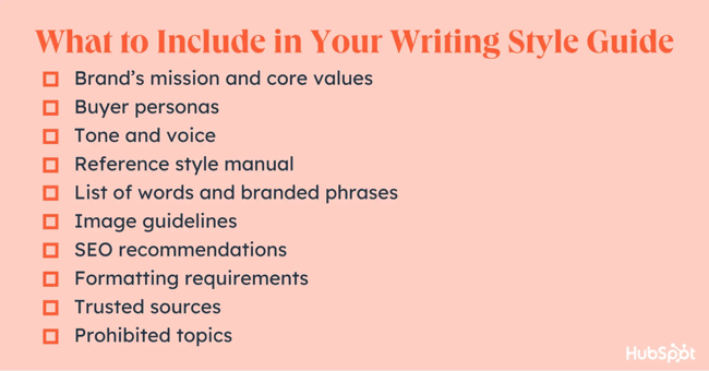
To ensure you add the relevant information and elements, here is a quick refresher of what you’ll want to include in your content style guide.
I recommend using the following checklist to help you get going.
What Not to Include in Your Style Guide
While I’ve mentioned all the stuff you should have in your content style guide, there are also topics you should leave out to make it usable on a day-to-day basis. The following are common sections that are fine to leave out of your content style guides.
Content Operation Notes
While I know that content operations are the backbone of your content creation process, they don’t belong in the content style guide.
They don’t add value to the content your writers will create. Instead, content operation notes should be part of your standard operating procedures (SOPs).
Visual Style Recommendations
Your company’s logo, typography, and color palette are extremely important for your brand. However, a content style guide isn’t the place to provide details about them.
Instead of cramming the writing style guide with design elements, logo variations, and preferred typography, use a separate brand and visual style guide to convey the brand identity elements.
Training Materials
It’s easy to lose yourself when fleshing out SEO recommendations, inclusivity practices, or language preferences — trust me, I know. That said, you don’t want the content style guide to be too long. It should be digestible and usable.
So, instead of including training materials in the style guide, prepare additional documents writers can explore for specific guidance. For example, if you want your content creators to use inclusive language, I recommend relying on HubSpot’s inclusive language guide.
How to Get Others to Use Your Style Guide
If you put in all this work to create a comprehensive style guide, it’d be a real bummer if no one used it.
Here’s the truth: Some people just aren‘t going to use it, no matter how easy you make it for them to do so. So, just accept that. But after you’re done grieving, here are a few things I suggest you do to increase the likelihood of adoption:
1. Involve other people in its creation from the get-go.
While freelancers won’t mind specific rules, in-house contributors may have to adjust their existing writing processes to comply with new rules, which may result in an unwillingness to embrace the change.
While some opposition will always be there, I’ve learned that getting a few people together from multiple teams to help create the style guide as a group resolves many of these differences.
2. Make it easy to find and use.
At HubSpot, we’ve made our style guide available on our internal repository. As a result, my colleagues and I can find it, bookmark it, and even access it whenever, wherever. Plus, I can also use Ctrl + F to find what I’m looking for.
3. Keep updating it.
Your style guide is intended to be a living document. As new style questions arise from writers about proper usage, I ask the editors to reach a solution and ensure that it’s reflected in an updated version of the style guide.
Writing Style Guide Examples
If you want to see a writing style guide in action, here are a few examples of writing style guides I have liked from well-known companies like Google, Shopify, and Intuit.
1. Google
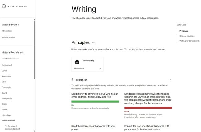
In Google’s style guide, I noticed that Google is very explicit in its principle of creating clear, accurate, and concise text. The company offers clear directives to write simply and directly, address users clearly, and more.
Google’s team also skillfully demonstrates examples of what website owners should or shouldn’t do. For example, instead of saying “buffering,” Google recommended using “preparing video” to avoid technical jargon that a layperson might not understand.
What I liked: I found Google’s style guide to be extremely easy to digest. It followed a pattern of do’s and don’ts, provided examples, and explained the reasoning behind it to get the point across.
2. Intuit
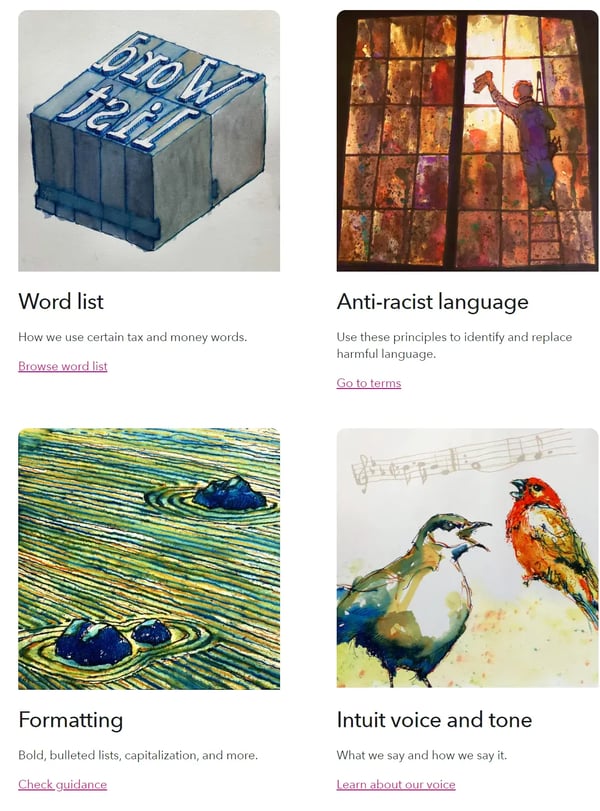
While exploring Intuit’s style guide, I found a lengthy word list — which seems appropriate since Intuit deals with financial topics. Plus, their guidelines regarding anti-racist language and formatting are on point as well.
Similarly, Intuit’s voice and tone section contains a lot of explanations of their brand’s core values, which might help writers in shaping their content. That said, I’d have loved to see some voice and tone examples illustrating their brand personality.
What I liked: I loved their detailed word list. It provided explicit instructions on handling common financial terms, abbreviations, and acronyms — which are a lot!
3. Shopify
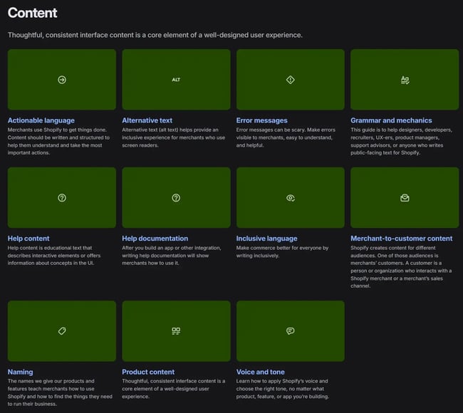
I found Shopify’s content style guide to be very extensive. It walks the writers through voice and tone, inclusive language, grammar, and other style-related guidelines.
Unlike Intuit, I noticed that Shopify was more clear about its voice and tone requirements — they even included do’s and don’ts with examples to explain how to match Shopify’s tone.
What I liked: Despite covering a range of style preferences, I appreciated that Shopify included an example for each concept.
4. Microsoft
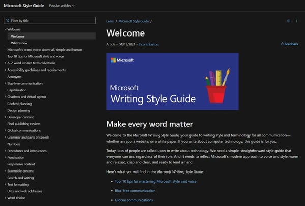
Like Shopify’s, Microsoft’s content style guide is also extensive, covering everything from proper nouns to bias-free communications. I also liked the examples Microsoft included. That said, Microsoft tried to stay minimalist and didn’t include examples for everything like Shopify.
What I liked: I found Microsoft’s style guide easier to navigate using the sidebar. You can filter the list of entries by title to find stuff faster.
5. Apple
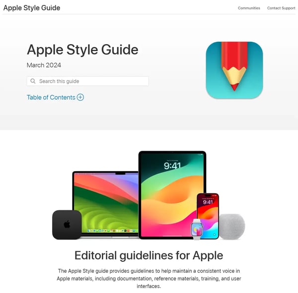
Unlike other style guides, I was surprised to see Apple’s style guide isn’t extensive — it only contains details specific to Apple’s ecosystem. Besides that, it suggests users follow the Chicago Manual of Style and Merriam-Webster’s Collegiate Dictionary.
What I liked: While many content marketers might not prefer it, I liked Apple’s minimalist approach since a style guide is typically for things where you deviate from a reference manual.
6. Mailchimp
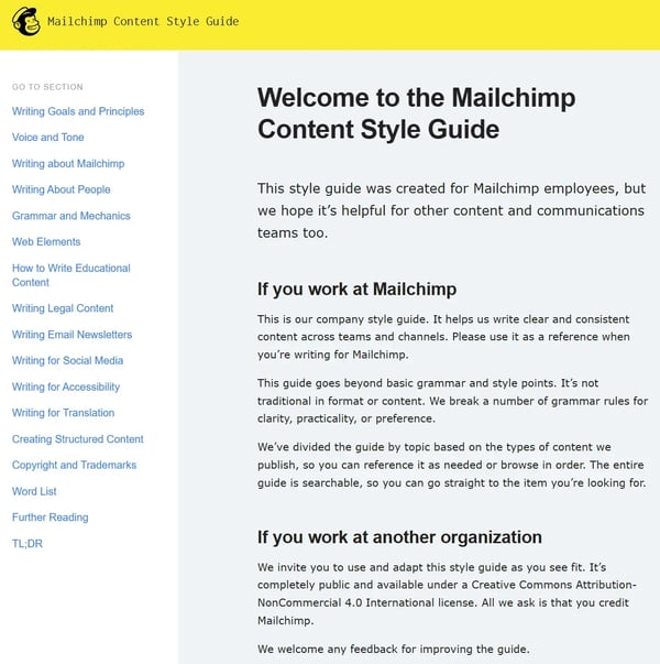
While I’m generally not a fan of including media-specific guidelines in a style guide, Mailchimp does a great job. Since its style guide isn’t based on a single formal document, it was able to add process guidelines without overwhelming readers.
What I liked: I loved Mailchimp’s word list as it outlines exactly how to handle troublesome words in a minimalist way.
7. Yokel Local
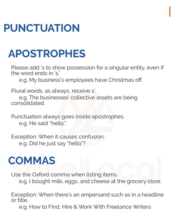
This example comes from HubSpot Partner Yokel Local. I was impressed by its simplicity since it states brand guidelines Yokel Local wants the in-house contributors and freelancers to follow without going into the weeds.
What I liked: While Yokel Local remained minimalist, I loved that it still included examples to help readers.
Polish Your Editorial and Content Style
There you have it — a neat walkthrough of how to create an even neater style guide. While creating a content style guide takes some time, my experiences have taught me that it greatly reduces the inconsistencies in your content and communication.
Plus, with a documented style guide, you have an easier time scaling up your content efforts without lowering content quality (trust me, it makes a huge difference).
But as I said before, a content style guide is a living document, so you’ll have to continually polish it as required to keep it up-to-date. Don’t worry — it’s not as daunting as it sounds. The more you do it, the easier it becomes.
And if you want your content team to look at it more often, remember to get them involved in the updating process. After all, fostering a culture around caring for and respecting the guidelines is just as important as laying them out.
Editor’s note: This post was originally published in May 2015 and has been updated for comprehensiveness.
![]()

![Free Download: How to Create a Style Guide [+ Free Templates]](https://i4lead.com/wp-content/uploads/2024/05/76520ae5-1a3b-4055-9e8e-95e150b90965.png)
