Creating a resume from scratch can be a pain, particularly when you have limited design experience and your resume doesn’t extend beyond Times New Roman 1-inch margins in terms of flair.
You want your resume to appear professional, but you also don’t need it to look exactly the same as every other resume in the stack.![→ Download Now: 12 Resume Templates [Free Download]](https://i4lead.com/wp-content/uploads/2023/01/4ec95757-585e-40cf-9189-6b3885074e98-1.png)
Fortunately, you don’t need to attempt any tricks you learned in a Photoshop 101 class to create a sleek and attention-grabbing resume.
Google Docs offers five templates with impressive design elements to help you portray a level of professionalism and originality in your resume. Even if you have the design all set, these templates provide formatting inspiration and fill-in-the-blank sections to ensure you don’t forget critical information, like your address or prior awards.
Take a look at these five Google Doc resume templates to choose one best suited for your desired role, or to get some inspiration before designing your own.
1. Swiss
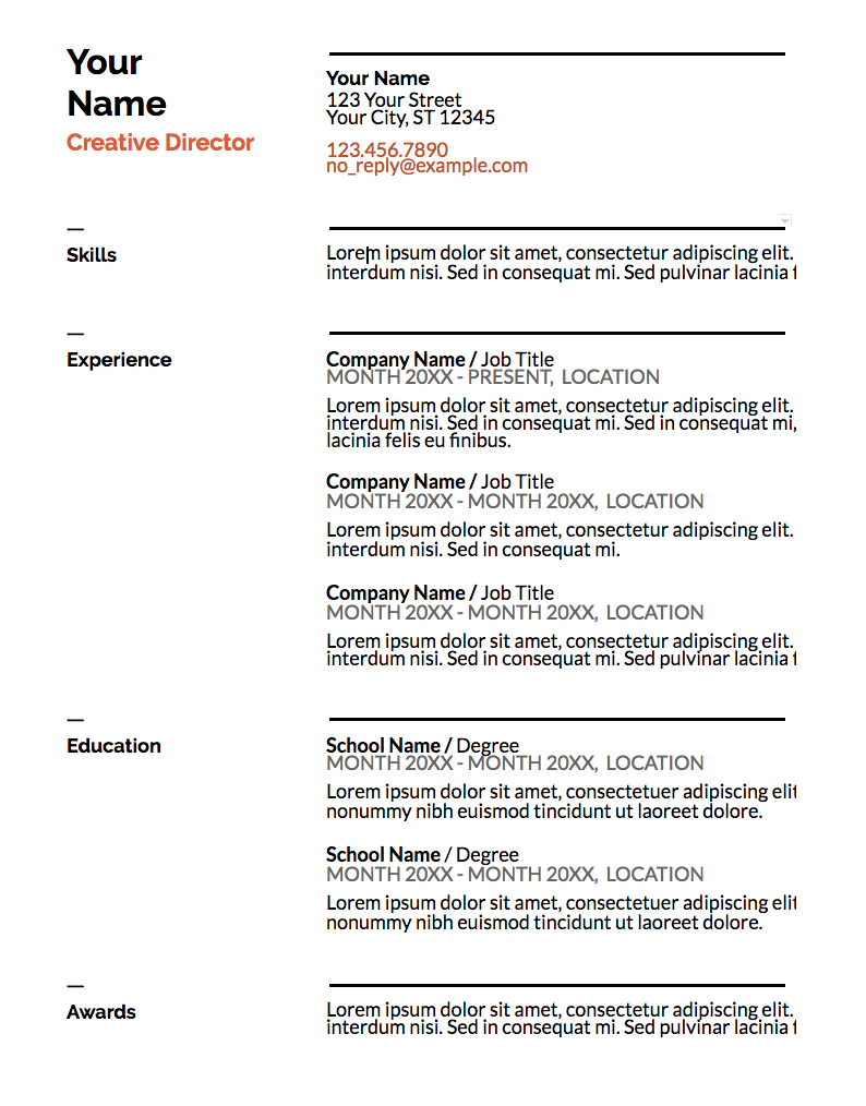
The Swiss resume template is mostly traditional in style, but the color and bold lines make it appear more modern and impressive. The dark lines above and below each segment organize your sections effectively, and the small lines above each section title add some unique style. The simple color, right below your name, suggests you’re someone who pays attention to detail. This template is a solid option if you need a resume for a conservative role but also want to showcase some personality.
2. Serif
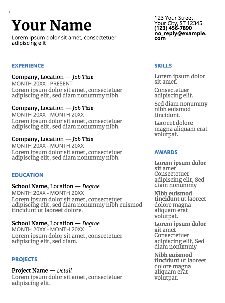
The colors used for each headline, and the two parallel columns with plenty of white space in between, suggest that you’re someone who’s organized and creative. This resume template is a good option for high school or recent college graduates with less work experience, since the template provides categories to showcase accolades and accomplishments outside the workplace.
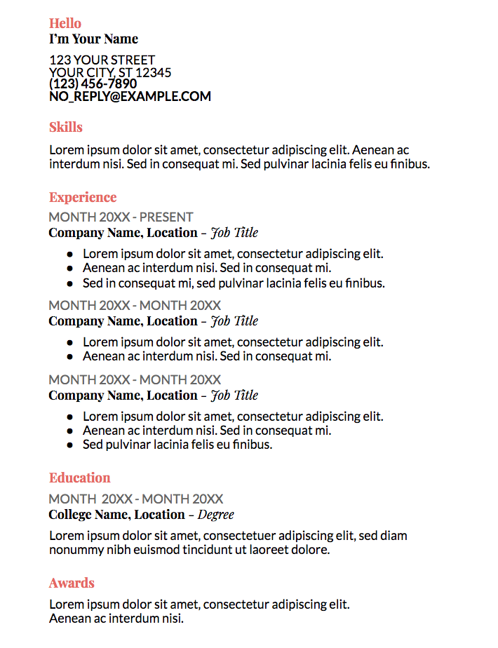
3. Coral
The color used in the coral template isn’t overbearing or immature, but still spices up an otherwise basic resume. The formatting, with all the information left-indented in one column, looks clean and straightforward. This option is ideal if you’re applying for a corporate job but still want to seem fresh and unique.
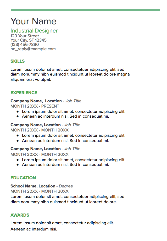
4. Spearmint
With the bold green line at the top of the page, this template conveys someone who’s spirited and artistic. The consistency of the title colors is appealing and polished. Spearmint is a fantastic option for anyone who’s applying for a creative role, such as a web designer or creative director.
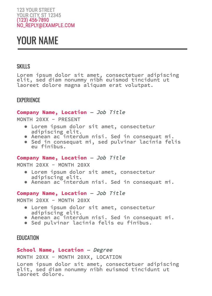
5. Modern Writer
You’ll only want to choose the statement-making Modern Writer as your template if you’ve got a good reason for it — for instance, if you’re applying for a web developer role, the font (which looks a bit like code) makes sense. The bold pink and Source Code Pro font are less ideal for a traditional role, but Modern Writer is a good option if you’re applying for a role that applauds uniqueness.
![]()

