It’s common for people to visit websites without converting — maybe they’re conducting product research, educating themselves on your brand, or weighing out the advantages of your product versus one of a competitor.
All of these actions are normal but they’re not always ideal for your business — you want those visitors to stay on your site and convert (e.g. provide their contact details, sign up for your newsletter, or make a purchase).
One way to help accomplish this — and avoid customers coming and going without converting — is with the help of exit intent pop ups.
In other words, exit intent pop ups know when one of your visitors is about to leave your website — they serve a visitor a valuable offer/ message that’s designed to keep them on the page (and, hopefully, influence them enough to convert).
How do exit intent pop ups work?
Imagine a visitor is on your ecommerce site — they’re browsing your product line. They then decide they want to exit the web page they’re on and they move their cursor out of the frame/ boundaries of your website. But a pop up appears with an offer (e.g. coupon code, free ebook, free trial, etc.) that they stay on the page to read. They click your CTA and convert in the way you intended them to.
So, exit intent pop ups make it possible to retain visitors on your site for longer periods of time, increase conversions, decrease cart abandonment rates, grow your email subscriber list, and more.
What about exit intent pop ups on mobile sites?
Your target audience is bound to browse your site via mobile device. But if exit intent pop ups work by tracking cursor movements, then how does this strategy work on mobile devices?
Exit intent pop ups will often appear on mobile devices after one of two actions are completed by visitors.
1) A visitor scrolls down your web page at a normal pace, but then rapidly scrolls back up to the page.
2) A visitor presses the “Back” button on the screen.
How to Implement Exit Intent Pop Ups
The easiest way to implement exit intent overlays on your web pages is with the help of a tool specifically designed to do just that.
Let’s take a look at the features and benefits you can get out of one of these tools by looking at an example.
Exit Intent Pop Up Software: HubSpot Exit Intent Forms
Price: Free forever, $45/mo (Starter), $800/mo (Professional), $3,200 (Enterprise)
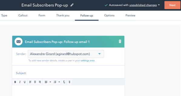
HubSpot’s Exit Intent Forms track visitor mouse movements and clicks on your website and then display your form when visitors appear to be leaving. In addition to showing your customized exit intent form, HubSpot can send automated emails (e.g. cart abandonment) and re-engagement campaigns or content.
Implementing exit intent forms with HubSpot is simple and quick — you simply embed your exit intent messaging on your website. HubSpot also allows you to customize your message, theme, and pop up timing.
With HubSpot, you can also:
- Customize your exit intent form’s location, branding, and messaging.
- Trigger email campaigns once visitors leave your website to reengage them.
- Integrate with your other systems for marketing, forms, and meeting scheduling without the need for additional development (e.g. Zapier, Shopify, WordPress, etc.).
Other tools on the market to help with exit intent pop ups are Optinmonster, Sleeknote, and Informizely.
Why would you use an exit intent pop up?
When they’re used and shared on the right web pages at the right time, exit intent pop ups are an effective strategy for increasing revenue. This is because they help you lower cart abandonment and increase retainment, form submissions, and subscriptions on your website.
To better understand how exit intent pop ups work, put yourself in the shoes of your website visitors for a moment. Imagine you’re browsing a website with a specific product that you like and/or believe can help you resolve a challenge you’re facing.
But you then say to yourself, “Ehh, I’ll think about it and come back to this later.”
You move your cursor to the top of the screen to exit the page. But suddenly, a pop up appears on the screen — it’s a coupon for 20% off your first purchase.
You’re likely going to consider applying that coupon code and purchasing the product now, right?
Exit intent pop ups work by providing customers and website visitors with the value that they wouldn’t otherwise have had on the landing, web, or ecommerce page.
An important piece of information to note is that exit intent pop ups should be used when people haven’t already taken action — this feels redundant and impersonal to your visitors.
For instance, if someone already clicked your CTA to subscribe to your newsletter — which shares discount codes and information about product deals — then you shouldn’t show them an exit intent pop up with that offer.
Exit Intent Popup Examples
In this section, we’ll review some of the best exit intent pop up examples.
Best Exit Intent Pop Up Examples
Here are some of the best exit intent pop up examples for lead generation to inspire and guide your exit intent pop up creation.
1. Cart Abandonment Exit Intent Pop Up Example
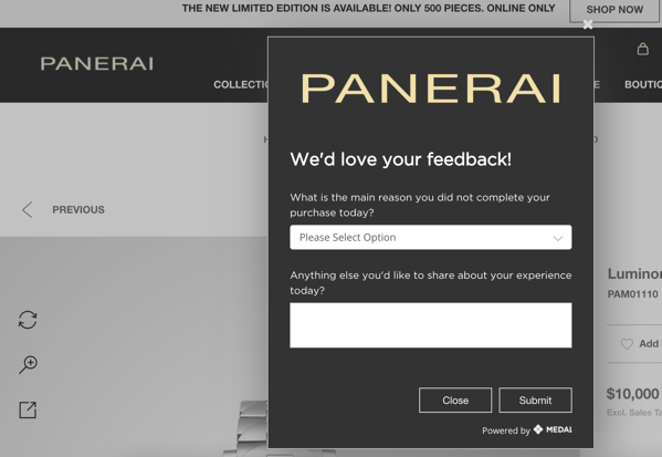
Why it’s effective: This cart abandonment exit intent pop up is effective because it appears on the page the moment someone who has an item in their cart moves their mouse towards the “exit” button on the screen.
Not only does it remind visitors that they are leaving items in their shopping cart, but it also asks for feedback about why the visitor is deciding to move forward without making a purchase.
This is unique and powerful because it shows visitors that the company cares about them on a personal level — they want to know their opinions, challenges, feedback.
These are the types of customer experiences that leave a good impression on visitors and leads even if they don’t complete a purchase. You’re offering them a personal experience that may lead them to come back in the future or promote your business among their networks by word-of-mouth.
2. Email/ Newsletter Subscription Exit Intent Pop Up Example
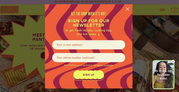
Why it’s effective: The moment you scroll back to the top of the page and move your mouse out of Omsom web page’s framework, a bright exit intent pop up appears with a form so visitors can sign up for the Omsom newsletter.
The pop up is well-timed, on-brand and eye-catching (even for someone who has the intention of leaving the page), and clearly states the value a lead will get out of submitting the form (getting the latest brand information, recipes, tips, and “hot takes”).
3. Discount on Purchase Exit Intent Pop Up Example
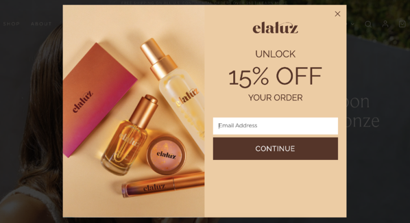
Why it’s effective: If you go to leave the Elaluz landing page an offer appears on the screen with a 15% off discount. Whether a visitor was thinking about moving forward with a purchase at that moment in time, the coupon is enticing for anyone on the site.
In addition to influencing purchase behavior with the coupon code, it also requires an email address — meaning those visitors who want the code must convert whether they use the code that day or not.
4. Exclusive Offer Exit Intent Pop Up Example
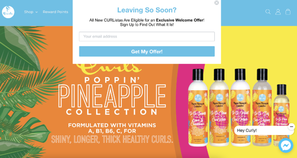
Why it’s effective: When you go to leave Curls’ landing page, you’re shown an exit intent pop up that asks you if you’re leaving. It then succinctly tells the visitor what they’ll be getting out of submitting the form.
In addition to this exit intent pop up’s timing being effective, it’s also located in an ideal spot — it’s at the top of the page, where a visitor who’s leaving the page naturally has to move their cursor. Lastly, it’s unique because it makes the offer a surprise — visitors know they’re getting an “exclusive offer” but they don’t know exactly what that offer is which is exciting and enticing.
5. Resource Offer Exit Intent Pop Up Example
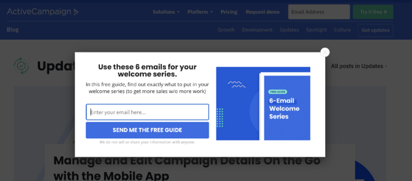
Why it’s effective: When you’re on ActiveCampaign’s blog and you go to leave the page, an exit intent pop up appears with educational resources. It’s a free guide with six emails for your “welcome series”.
Not only is ActiveCampaign positioning itself as valuable because they have helpful information to share with their target audience, but the company is also positioning itself as a thought-leader in the industry.
Additionally, although the offer is free, visitors who want it have to submit their email address ¸— meaning, a new lead and contact for the business.
Other Ideas for Exit Intent Pop Ups
These aren’t the only five types of exit intent pop ups you can create and implement. You can offer your target audience anything you believe they’ll find valuable, whether it drives leads or not — here are some more ideas:
- Free shipping
- Contest entry
- Blog subscription
- Customer experience survey
- Course or lesson
- Customized offer of some kind based on past buying experiences
- Product demo
Increase Conversions With Exit Intent Pop Ups
Exit intent pop ups are a simple yet powerful marketing and lead generation strategy. Once you implement them, you’ll be able to retain more audience members on your website and increase conversions and revenue.
![]()

