Categories B2B

How to Become a Content Creator in 2024: Steps, Tips, and Industry Truths

Fact: In 2024, basically everyone is a content creator, but not everyone is a “content creator” — at least not in the sense we’re talking about here.

Content creators are members of the creator economy, committed to building and monetizing their personal brands and audiences.

Download Now: 150+ Content Creation Templates [Free Kit]

With a reputation for offering flexibility, creative freedom, and low cost to entry, “content creator” can sound like a breezy dream job. But it’s far from easy, and those who succeed deserve their flowers.

Want to be one of them? Though I haven’t earned the title “content creator” personally, content is a pillar of my life. And I certainly know the tricks of the trade. Here’s what you need to know to become a content creator and some important truths to remember.

Table of Contents

Truth #1: The creator economy is crowded.

According to our 2024 Consumer Trends Report, one in five consumers consider themselves content creators or influencers in some form. That number jumps to 45% when we zero in on Gen Z and Millennials. But what do they do exactly?

A content creator is someone who consistently creates content on a specific topic or for a particular audience. This content can be entertaining, helpful, or educational, written, visual, or auditory.

Now, I know. This seems like a vague “catch-all” definition. Under it, you could say “content creators” have existed for centuries.

But we’re not talking about traditional performers, artists, or media folks (i.e., journalists, comedians, photographers, videographers) here.

When we say “content creators” in 2024, we mean:

Sure, the media and artists can create content too. Just look at The Dancing Weatherman, Nick Kosir.

But the title “content creator” is really reserved for individuals who focus on creating content for their digital audience and generating income through sponsorships, affiliations, and collaborations. People like Mr. Beast.

Screenshot showcasing the popular channel on YouTube, Mr. Beast. He is a perfect example of a successful content creator.

Image Source

(I mean, I highly doubt the 207 million people Linktree found claiming to be content creators worldwide all fall into this bucket. True content creators are a totally different beast. Get it?)

We also don’t mean content marketers like myself.

Content Marketers vs Content Creators

Yes, both content marketers and creators produce content to reach audiences. But there are key differences.

Content creators tend to work for themselves. Their efforts go toward building their own brands and public personas as well as creating content primarily on social media. (More on that in the next section.)

Content marketers tend to work for others. They are professionals who implement various content marketing tactics to promote other products, brands, or offerings.

This may entail creating social media content. However, it also includes articles, videos, slide decks, infographics, podcasts, website pages, emails, ad copy, and white papers.

Interested in learning more about content marketing? Check out our free Content Marketing Certification in HubSpot Academy.

What types of content can a creator make?

The world is a content creator’s oyster when it comes to the types of content they can make, especially thanks to artificial intelligence (AI).

But the most common are blog posts, podcasts, or a mix of videos, photos, and graphics on social media.

The medium or type really depends on the creator, audience, platform, or even the subject matter. For example, take a “gamer.”

If a gamer showcases a new video game, their audience will likely want to see what the game looks like. They’ll want to see the graphics in action and hear feedback on what it’s like navigating and playing. Video is best suited to meet these needs.

With 10.8 followers, streamer KaiCenat posts videos like this frequently on Twitch.

Screenshot of a gameplay video on Twitch streamer KaiCeNat’s profile.

Image Source

But of course, Twitch is not the best platform for every creator or content.

Where do content creators post their content?

Statistically speaking, Epidemic Sound found TikTok to be the top platform for generating income among creators, followed by YouTube. However, what platform works for you depends on your brand and audience.

Here are some of the most popular by creator type:

Consider our gamer example again. Gamers typically share things like gameplay, reviews, and hacks. Knowing this, streaming on Twitch or posting videos to YouTube makes more sense than Instagram or a podcast.

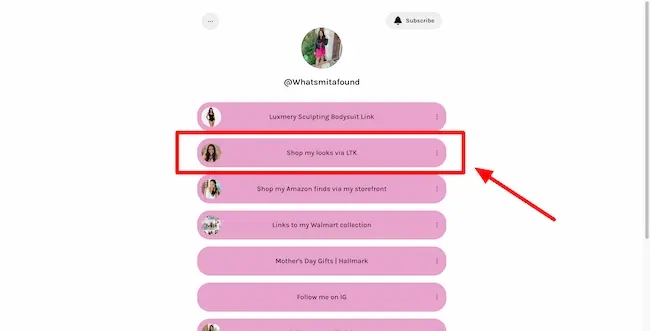
On the other hand, a fashion blogger is probably turning to Instagram and an LTK page to enable their followers to shop most easily. Think creator Smita Patel.
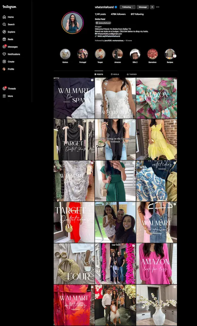
Screenshot showing Fashion blogger Smita Patel’s Instagram account.

Image Source

Screenshot showing Fashion blogger Smita Patel’s LTK page linked on her profile.

But that’s enough of the basics. Let’s get to the good stuff.

How to Become a Content Creator

Truth #2: Like all good things, becoming a skilled content creator will not happen overnight, and many people will never get there.

Being a content creator requires boundless dedication and, in an algorithm-driven world, sometimes a bit of luck. But with these steps, you’ll certainly put your best foot forward in achieving your goals.

Regardless of the specifics, there are some foundational steps to becoming a truly successful content creator. Here, I’ve broken the process down into eight steps.

1. Uncover your niche and audience.

If you’re considering becoming a content creator, you likely already have an idea of the topics you want to discuss or the audience you want to reach.

Maybe you have a background as a social media manager and want to share tips with small businesses and entrepreneurs. Or perhaps you paid off a ton of debt and want to share your personal finance tips with new college grads.

Creator Christine Buzan started her career in print media and marketing, assisting on fashion photoshoots. Today, she teaches nearly 800k followers on Instagram how to pose and look their best in photographs.

Whatever you choose to focus on will be your niche or positioning, and all the content you create should align. But don’t feel pressure to settle into a niche right away.

Content creator Vanessa Lau shares that you don’t necessarily need to have a niche as soon as you get started.

“If you are just starting out, I would say that experimenting with a broader niche and broader audience is going to help you accelerate the journey of finding that niche over time,” she shared on her YouTube channel.

“The mistake that I see a lot of aspiring content creators making is they stress so much about finding a niche to the point where they don’t create any content at all,” she said.

Translation: Put your ideas out into the world and see what hits and what doesn’t.

2. Develop your style and personal brand.

Ask yourself:

  • How do you stand out?
  • What makes your content different?
  • How will it look and feel?
  • What would make someone be able to recognize it even if it wasn’t on your platform?

Your brand is what makes your content unique and special. This could include the colors and fonts you use but also music, words, or taglines. It could also be your personal style of presenting information.

The creator who immediately comes to mind for me in this respect is Lilly Singh.

Lilly Singh first became a public name as YouTuber IISuperWomanII, sharing satirical skits and vlogs about growing up in a South Asian family.

But even as her career progressed beyond this niche — acting and producing films, authoring books, and being one of the first women ever to host a late-night talk show — her signature brand and humor remained.

The key to finding your style and personal brand like Lilly? Be yourself.

Content creator Erica Schneider has built a large following on X (formerly Twitter) by sharing writing and editing tips. These are common topics, but Schneider stands out by weaving her voice and personality into everything she shares.

She suggests creators show up as themselves too.

“Sounds simple, but it’s easy to lose your voice in a sea of templated tips,” she posted. “Let your personality out. Add your unique flare. Take a stance for or against something.”

Audiences may click on your content for the information, but they come back for the personality.

Pro Tip: Other creators’ styles can inspire you, but don’t copy them. Find something that genuinely resonates with your personality and let it shine through in your content.

And, remember, style can be anything. Don’t force humor or sarcasm just because “everyone else is doing it.” Do what you’re comfortable with, and you’ll find your audience quickly.

3. Determine your platform(s).

As we discussed earlier, there are dozens of platforms to post your content. But where will you find the most success?

When deciding which one(s) to focus on, consider three things: your niche, your audience, and your content format.

Niche

Some topics are more prevalent on particular platforms than others. Furthermore, some platforms are better suited to action (such as shopping) than others.

Consider your subject matter and the action someone would usually take after learning about it. Would they want to subscribe to know more? Would they want to buy something?

You’ll want where you post your content to make sense for what you’re talking about and your audience’s behavior.

Target Audience

Posting content is pointless if it’s not getting seen by the right people. You need to meet your target audience where they already are. Publish content where they hang out.

Say you’re targeting Gen Z. YouTube, Instagram, and TikTok are the social media platforms they frequent the most. Trying to reach baby boomers? Turn to Facebook. Corporate executives? Maybe your platform is LinkedIn.

Dig deep into the nuances of your target audience and buyer persona to determine where they are actively visiting. This is the fastest and easiest way to get in front of them and build a following.

Content Format

Make sure the platform you choose is optimized for your preferred content format.

For instance, if your topic calls for long-form videos, YouTube is likely your best option over TikTok, which has a maximum duration of 30 minutes.

If you share primarily static graphics, then YouTube would make no sense. Opt for Instagram.
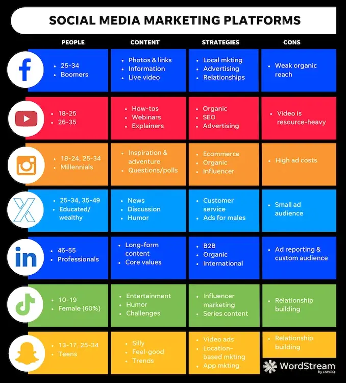
Chat comparing popular social media channels for content creators and marketers at a high level.

Image Source

4. Create a content calendar.

Next, sit down and make a list of the content you plan to publish.

Success as a content creator depends on consistency. You must regularly share content related to your niche to grow and maintain your audience and relevance. So, plan ahead.

Create a content calendar for as far into the future as you can. I recommend mapping out at least two weeks and having your content ready a week before publishing so you aren’t left scrambling at the last minute.

HubSpot has a social media calendar template to help you get started.

5. Invest in any necessary tools.

For most content creators, a smartphone is the only thing they need to get started. But, if you have the means, some additional tools can give your content that little extra something.

Visual content may mean investing in graphic design software (i.e., Canva or Adobe Illustrator) or video editing tools (like CapCut). Maybe it’s a ring light or a studio backdrop.

For copy, perhaps, it’s a pro subscription to Grammarly or, for podcasts, audio editing software like Descript.

Take some to think through what might be beneficial and get your toolbox together.

6. Create!

Now for the fun part — actually creating your content.

You’ve been waiting for this, so enjoy and give it your all.

Perfection is the enemy of productivity. So don’t let it stop you from getting content published.

Bloopers and mistakes are human, and people love creators who are human. So don’t be afraid if you fumble your words or forget a point. These little things can actually make content more engaging.

Plus, the sooner you ship content, the sooner you can start analyzing what works and what doesn’t.

7. Track performance and refine.

Hitting “post” or “publish” doesn’t mean you’re done with your content. Now you need to track its performance and use that information to guide future creations.

What posts got the most views, comments, likes, and shares? What wasn’t as popular? These insights help you know what to lean into in the future.

If you’re a HubSpot user, our free Marketing Analytics tools makes tracking many of these social metrics easy.

8. Create a portfolio.

Creating for the sake of creating is great, but if you can get paid for it, that’s even better. So, this last step is all about money.

Influencer Marketing Hub says one in ten influencers makes upwards of $100k a year.

How do they do this? Well, some platforms like YouTube will pay you for creating content when you’ve built a large enough audience and engagement. But if you’re not at the level yet, you need to establish brand deals or collaborations.

A brand deal can come in many forms:

  • Sponsored Post or Ad: A brand pays you or offers a free product in exchange for a post about their product on your platform.
  • UGC: A brand pays you to create a piece of content for them to use on their platforms or in ads.
  • Affiliation or Partnership: You talk about a brand or product and get a commission if someone buys through your referral link.

(For a deeper dive, check out our article “Affiliate Marketing for Beginners: What You Need to Know.”)

Regardless of the arrangement, a portfolio is often the first step in making it happen.

When one of your creations performs well, or you’re simply proud of it, document it in a portfolio.

Having a collection of your best work makes it easier to pitch brands you would like to work with or simply share what kind of content someone can expect.

Pro Tip: Need help building an online portfolio? HubSpot’s Content Hub is a great free solution.


Once you get going, remember these tips to start leveling up your game as a content creator.

1. Stay true to your brand/niche.

Once you find your brand/niche, stay true to it.

Creating content on a topic or product that is completely irrelevant to your audience or area of expertise is not only ineffective but confusing.

The content you share should be a natural fit. You should be able to speak confidently about the topic or product and with genuine passion.

Success as a content creator is all about trust and authenticity. People follow creators and influencers because they feel connected and believe they have their best interests in mind.

If something you post is off-brand or simply going in for a hard sell, your audience won’t buy it — literally and figuratively. So, be strategic about the content you post and the deals you accept.

Popular productivity expert Ali Abdaal has done a great job of staying true to his niche.
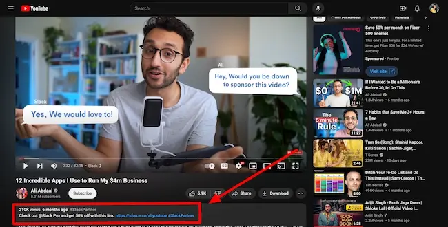
Screenshot showing how productivity expert and creator Ali Abdaal incorporates affiliate content into his videos.

Image Source

In this video, Abdaal shares 12 productivity tools, including messaging app Slack. As a Slack Partner, he includes an affiliate link in the video’s description, offering viewers a generous discount and earning him a commission.

Now, clearly, Adbaal benefits from talking about the tool. But because it is within his niche and gives his audience relevant value, that doesn’t matter.

2. Read content about your industry every day.

Creating great content that resonates with your target audience means staying current in your industry.

This sets them up nicely to understand what’s going on in the world and how that shapes their audience’s mindset. It also enables them to react quickly and get in on trending topics or memes to stay relevant.

The Marketing Millennials — a meme account beloved by myself and many of my teammates is a master of this. Take this post after the launch of Taylor Swift’s latest album, The Tortured Poet’s Department.

Subscribe to newsletters, listen to podcasts, set up alerts, and read industry publications and blogs.

Also, ask your audience what they’re reading and watching these days and follow suit. By discovering where your audience spends time online, you can learn even more about the topics and types of content they’re drawn to.

3. Write on the regular.

As content thought leader and author Ann Handley says, “Everybody writes.”

Successful content creators understand the importance of exercising their writing muscles, even if they’re not bloggers or writers by focus.

Doing so helps flesh out ideas and identify nuggets that could come to fruition later. It is also needed for creating video scripts, podcast notes, and snappy post captions.

Get in the habit of writing by doing it daily or every other day. I‘m not saying you need to write a polished, 1500-word essay on an industry-relevant topic daily. Rather, set aside 10 or 15 minutes to jot down some thoughts and ideas.

Content creator Zak Sherman shared his daily writing routine, demonstrating that you don’t need to write essays to practice writing. Even sending an email can be an exercise in crafting your words and finding your voice.
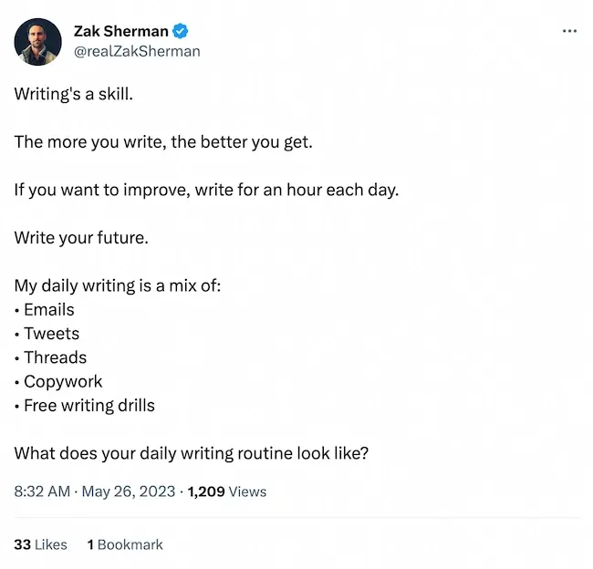
Screenshot of a tweet from creator Zak Sherman.

Image Source

If you run into writer’s block (even the best of us do), leverage HubSpot’s Free AI Content Writer to get you going.

4. Study your audience.

Truth #3: Content creators are often at the mercy of their audience; sometimes, those needs and expectations can feel limiting.

But ultimately, your audience is why you have the platform and influence you do. You‘ll find new opportunities to help and create if you continuously listen to them.

One of the most important qualities of all successful content creators is that they know their audience inside and out. Keep a pulse on yours.

Tracking and analyzing specific metrics can help determine if your content resonates with your audience.

For instance, a high open rate tells you your subject line spoke to your subscribers if you have a newsletter. A high click-through rate lets you know that people wanted to know more about what you wrote about.

Look for key behaviors, interests, and trends and respond accordingly with your content.

If you’re still stuck, ask your audience directly. Tools like SurveyMonkey or even Instagram Polls and Question Stickers make it easy to reach an engaged audience.

The people who are genuinely invested in your content and brand will be more than happy to share feedback.

5. Curate other people’s content (when it makes sense to).

There’s no shortage of people curating content these days.

In fact, curation is built into most platforms in the form of “shares,” “retweets,” and “repost with your thoughts.”
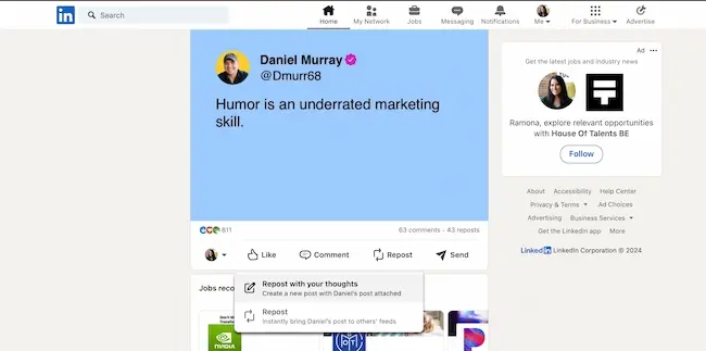
Screenshot showing LinkedIn’s repost button on the platform.

But successful content creators know it’s not enough to simply republish relevant news as is. Sharing how the information is relevant to you is key.

Freelance writer and content creator Kat Boogaard offers a weekly newsletter to subscribers who want her tips and insights on freelancing. One section of the newsletter is dedicated to other relevant resources.
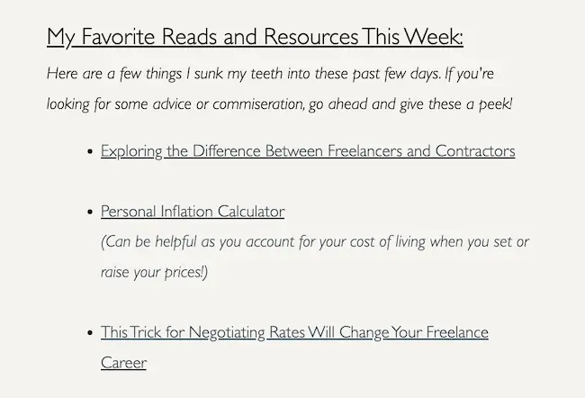
Screenshot showing how you can curate content in an email newsletter

Image Source

Get in the habit of curating content when you have something valuable to add.

Now that you’ve started scouring the internet regularly for industry news, you probably have a wider depth of knowledge than you think.

6. Offer solutions, not just commentary.

While sharing your thoughts is important, don’t stop there.

The people consuming your content aren’t interested in just hearing you talk — at least not all the time. They come looking to satisfy specific needs. Provide actionable tips and walk them through the solutions you’re suggesting.

This is a tip Stylist Nina Walder regularly implements in her content.

Here, you’ll notice she verbally tells viewers to “save and follow for more tips.” She also includes steps to access her free course in the caption.

This is similar to what content marketers do when publishing an article and ending with a call-to-action to a relevant offer. We give readers value through the article content and provide them with direction on what to do next with the offer.

7. Understand your metrics and key performance indicators (KPIs).

I can’t lie to you: I don’t like metrics. I often try to run from them, but they catch up to me as they’re crucial to reaching any goal. That includes becoming a successful content creator.

Publishing content doesn‘t mean you’ll automatically catapult to fame. Rather, your audience and impact will hopefully improve and grow slowly.

Tracking KPIs is how you monitor that growth is happening and ensure that it does. Let me explain.

A KPI is a specific metric you’ve chosen to measure how well your content is doing against your goals. For example, if I want to reach more people on YouTube, my KPI may be channel subscribers. To reach my goal, I would:

  1. See where my subscriber number sits currently.
  2. Set a number and a date by which I would like to reach it.
  3. Look at the subscriber number regularly (say weekly) to ensure my work is leading to that growth.

Some other KPIs that content creators might track include:

  • Number of impressions or views
  • Number of shares
  • Number of comments
  • Number of followers
  • Click-through rate (if you have a link or call-to-action present)

Monitoring metrics can also help your plan and refine your content strategy.

8. Network at every opportunity.

Great content creators know they didn’t get where they are today alone. It’s also thanks to those who taught, inspired, and pushed them to think differently. They know that there is always more to learn and to be open to new ideas.

Networking forces you to do just that. It‘s a time to connect but also listen to outside points of view.

Never miss an opportunity to get in the room with fellow creators and learn from them. That means online (they aren’t called social networks for nothing) but also in person. Attend conferences, meet-ups, and workshops.

Have business cards or your QR codes handy to stay in touch. These connections can lead to learning and professional opportunities.

9. Question everything.

Great content creators are curious by nature; curious about their existing knowledge as well as the world around them. It’s these thoughts that lead to engaging content.

So, get in the habit of questioning the status quo.

Pro Tip: Don’t be afraid to play devil’s advocate. Taking a less popular view on a topic can be difficult at first, but it helps you stand out and attract an audience who will be interested in what else you have to say.

Critical thinkers make great content creators.

‘Create’ Your Own Destiny

Truth #4: Not everyone has what it takes to be a content creator.

But don’t let this scare you.

Becoming a content creator essentially means becoming an entrepreneur, and the scale of your success is in your hands.

It takes confidence to put yourself out there, but humility is needed to recognize that you have to put the work in to stand out from the competition.

It takes originality, authenticity, fierce dedication, keen strategy, and a great deal of self-management, resilience, and organization.

Just know that being a successful content creator starts with passion.

If you are passionate about your niche and audience and the value or message you have to share with the world, the steps outlined above will be a breeze.

And more than anything, you’ll be in a prime position to launch a well-thought-out and fruitful content creation career.

content templates

Categories B2B

On Writing a Tagline (and Pitching It, Too)

Welcome to Creator Columns, where we bring expert HubSpot Creator voices to the Blogs that inspire and help you grow better.

Peggy, Lou, and Dawn are characters on Mad Men, the 60s period drama about one of Madison Avenue’s most prestigious, albeit fictional, advertising agencies. Peggy is one of the firm’s copywriters, responsible for writing (and pitching) ad copy. Lou is her boss, the creative director. Dawn, a secretary, keeps everyone organized.

Download Now: 3-Step Pitching Structure [Free eBook]

The trio are meeting about a new account, a watch company called Accutron.

“Oh,” says Peggy. She’s looking at Lou. “You didn’t pick a tagline.”

“Sure, I did.” Lou looks at his secretary. “Dawn, what did I say?”

Dawn flips through her notes. “You said, ‘Just In Time To Be On Time.'”

“That wasn’t one of the choices—” Peggy interjects. “I think that was a digression.”

“How about ‘Accutron Is Accurate,’” Lou says. “That was one of the choices, I’m positive.”

Peggy lowers her chin. “I like ‘It’s Time For A Conversation,'” she says. She’s smiling, making eye contact. She’s selling now. “I think that one’s more finished.”

The director looks back at her. He’s peering over his glasses now. “And I think you’re putting me in the position of saying, I don’t care what you think.”

When you finish writing a tagline, it’s not done.

It’s not done until someone else reads it, nods, and says, “That’s the one.”

Indeed, every creative person is a salesperson, too. In copywriting — or any advertising discipline, for that matter — the powers that be must buy into your work, your idea or concept or turn of phrase.

“To sell work I could be proud of,” said art director George Lois, “I’ve had to rant, rave, threaten, shove, push, cajole, persuade, wheedle, exaggerate, flatter, manipulate, be obnoxious, be loud, occasionally lie, and always sell, passionately!”

That’s one approach, I guess. But what if you’re not in a position to “threaten” or “shove” or “push” your boss? Or, what if acting this way — aggressive and domineering — feels unnatural to you? Or uncomfortable? Or, erm … illegal? Then keep reading because this Mad Men scene provides some alternative advice, some timeless wisdom I, as a copywriter, wish I’d known sooner:

Chicago, 2014.

I feel nervous. I shake out my hands, take a breath, and knock on the door.

I hear my CEO’s muffled voice. “Come in.”

I crack the door and peek through the opening. “Hey, Rick,” I say. “I’m a bit early—”

Rick is looking at his monitor, typing. “No problem.” He looks up and smiles. “Early is good.” He slurps some coffee. “Come on in.” He puts the mug down with a thud. “Close the door.”

I purse my lips, nod, and step into his office, closing the door behind me. Rick gestures at one of the chairs in front of his desk. “Have a seat,” he says. I sit down. “How’s your first week going?”

I’m a copywriter, four days into my first role at Rick’s marketing agency. It’s a small, busy shop, specializing in lead-gen websites. I was hired on the back of my direct marketing experience and told I’d be focusing on writing conversion assets — landing pages, email campaigns, banner ads — but I could be tapped for other projects, too.

“Oh,” I say, “I love it here. Everybody’s been so welcoming.”

“Great to hear.” Rick crosses his arms and leans back. “I’ve got a project for you.”

“Sure.”

“I want you to write us a new tagline.”

He has some more coffee. “Or would it be a slogan?” He put the mug down. “I dunno.”

The difference is nuanced but taglines and slogans aren’t interchangeable. Basically, a tagline supports the goals of a business while a slogan supports the goals of a specific campaign. A tagline is a branding tool. A slogan is a marketing tool. A tagline should differentiate the brand — and it’s there for the long haul: could be years, or even decades. A slogan should express the campaign’s specific idea or message — and it has a shorter shelf life. A tagline is more or less perennial. A slogan will change with every campaign.

“I think a tagline,” I say. “If it’s for the business in general.”

“Yes, a tagline,” Rick says. “Can you bring me a few options by next week?” he asks. “Is that enough time?”

Writing a tagline doesn’t have to be complicated.

It can be. That is, you can make it so … but it can also be simple.

You can’t make it easy, unfortunately. It’s still creative work, fraught with decisions and self-doubt and, sometimes, agony. But having a process — a series of clear, reliable steps — can make it simple, less daunting.

For example, most taglines are synthesized expressions of either:

So, to write a tagline, simply start by writing out your PS or USP in as many words as necessary. Then, edit for brevity and concision: cut the word count in half once, twice, three times. Doing fine. Keep going until you’re left with a sentence, one line. Then, put down the ax. It’s time to finesse, to make your tagline attractive to the masses:

  • Make it clear. No fancy jargon, please. Fancy words are usually big. And a big word will never impress The Reader as much as a big idea, clearly expressed. Good copy, first and foremost, is understood.
  • Make it beneficial. During his career, copywriter John Caples tested thousands of headlines. “The best headlines appeal to people’s self-interest,” he said. So, act accordingly. Your tagline is the headline for your business. Tell folks what’s in it for them.
  • Make it amusing. Puns, rhymes, wordplay, metaphors. These things are fun. People like fun. (We remember it, too.)

Done? Fantastic! Now, rinse and repeat. Go again, and again, and again. Quality comes from quantity because volume is illuminating: the more you write, the less precious and more objective you’ll be about each line, which is the point.

“The fewer ideas you have,” said screenwriter Scott Dikkers, “the more weight each idea holds in your mind.”

Indeed, as a copywriter, fetishizing one “darling” tag is counterproductive. Stifling your ideation prevents you from doing your best work. Instead, have many tags, many options. Don’t start with only three or four or five. There’s not enough there, not enough slack. You’ll be forced to settle. Better to start with 20 or even more — and pare down. The more you cut, the better. Eventually, you’ll start cutting ideas you actually like. This is the mark of true progress.

“Kill your darlings,” said Stephen King. “Kill your darlings, even when it breaks your egocentric little scribbler’s heart.”

Yes, kill your darlings. It’s the only way to produce your finest work, which is also the only work you should be putting in front of clients. If you’re asked to bring “a few options,” each one must be viable.

If you wouldn’t want an idea to get picked, don’t bring it to the table. I learned this the hard way:

“Next week is fine,” I tell Rick. “I’ll turn it around.”

A week later, I’m in his office again. This time, I have a handful of tags for him to review.

“Great work, Ed—” he says, flipping through the deck I created. “What’s your favorite?”

I had one, the clear winner in my opinion. “This,” I say without hesitation, pointing at the screen.

Rick’s face turns sour. “Eh,” he says, “I prefer this one.” He’s pointing somewhere else. “Let’s go with this one.”

I lower my chin. “I really like this one,” I say. I’m smiling, making eye contact. I’m selling now, explaining my decisions: the clarity of the message, the inclusion of a benefit, the creativity of the phrasing. “It’s gotta be this one,” I say, pointing at my option.

Rick looks back at me. He’s pursing his lips now. “Yeah,” he says, pointing at his option, “it’s this one for me.”

Murphy’s Law tells us, “Anything that can go wrong, will go wrong.”

Copywriter’s Law tells us something similar:

“Any idea that can be picked, will be picked.”

“Why would you put something in front of me that you don’t want me to pick?” says Lou.

“Because you told me to give you two ideas,” says Peggy.

Lou takes a beat. “You apparently only gave me one.”

bottom-cta-3-step-pitch

Categories B2B

How to Write a Creative Brief in 11 Simple Steps [Examples + Templates]

The first step in any successful project is drawing up a game plan with a clear objective. It’s one of the reasons marketers love creative briefs.

A creative brief acts as a roadmap that takes a project from ideation to completion. It ensures the scope, timeline, key stakeholders, and purpose of the project are communicated clearly.

The creative brief is the single source of truth for everyone working on a project. If questions come up or tasks become unclear, the creative brief will steer things in the right direction.

→ Free Download: Creative Brief Templates

The Purpose of a Creative Brief

Whether you’re a consultant pitching a creative brief to a client, or a project manager presenting a brief to your team, start by speaking with the project stakeholders.

These discussions will help you understand the company’s mission, project goals, and challenges your team faces. Then, you’ll have enough information to write a compelling brief that focuses on what’s really important to your company or client.

The idea of a creative brief sounds simple, but it can be hard to wrap a lot of important details into just a few pages. Therefore, a creative brief is typically comprised of eight sections that can fit on one to two pages.

How a Creative Brief Works

Creative briefs are pretty standard documents within just about every marketing, advertising, or design team.

For smaller projects that live in-house (like designs, templates, marketing assets, etc.) the brief is owned by the team who will be executing on the information in the brief.

This is usually the creative team, but this team can fall within the brand department or even live within marketing.

For more advanced, long-term projects that involve an agency, the creative brief is owned by the creative team or agency who will be executing the work.

This is because they’ll work closely with the stakeholders on the project to understand what is needed, plus they’ll bring their own expertise and competitive research to the brief that the internal team may not have access to.

These types of creative briefs aren’t rare, but they are created infrequently due to the nature of the projects they support. So for this post, we’ll focus mostly on the day-to-day creative briefs that you’re likely to use often. Here’s how they work.

Step 1. The teams who need assistance from the creative team will retrieve the creative brief template from a repository like OneDrive, Google Drive, or an online form.

Step 2. The team that is requesting the project will complete the brief according to their team’s needs and goals. The completion of the creative brief starts with the team requesting the project so that they can explain their vision and goals clearly to the creative team.

Step 3. From there, the brief is sent back to the creative team to review. They’ll be looking for timelines, resources, and budget requirements.

Step 4. If they have any questions, they’ll go back to the team who wrote the brief and finalize the details.

Step 5. After that, the project is kicked off, sometimes with the help of a project manager, who will check-in with stakeholders on the project and keep everything on schedule, within scope, and within budget.

Step 6. Once the project is complete, both teams will review the deliverables against the creative brief to ensure everything is completed correctly.

The format of every company’s creative brief might vary slightly to suit the needs of the project or client. Below is a simple outline that will be the foundation of your creative brief.

It includes the most important steps in the creative process and information that’ll be relevant to stakeholders involved in the project.

Once you’re fully informed and ready to write, use the following steps to draft yours. To make it even easier, I’ve included a fill-in-the-blank template in the last step.

1. Decide on a name for the project.

The first step in developing a creative brief is deciding on a project name. This might sound simple, but it’s one of the most critical components of a creative brief.

If you’re building a campaign around a brand new product or service, the campaign name will be the first time many members of your team will be introduced to it.

Referring to the campaign (and therefore product or service) by the correct name prevents the game of telephone from happening. Without a specific and clear campaign name, people will make up their own terminology which can alter the intent of the campaign.

To create a project or campaign name for your creative brief, keep it creative and brief. A few words or a short sentence should work just fine.

If you’re launching a product, identify what the call to action will be for the target audience, then center the name around that. Here are a few examples of fictional campaign names:

  • The Search for Adventure Campaign- A scavenger hunt-themed amusement park.
  • The Don’t Forget Your Memories Campaign – A photo frame company.
  • The “What’s hotter than Pepperco hot sauce?” Campaign – A hot sauce brand.

2. Write about the brand and summarize the project’s background.

Another simple, yet essential section is the company background. If you work in an agency setting, this is non-negotiable as your team is likely handling several client campaigns at once.

However, if you’re developing a creative brief for an in-house project, you’ll still want to include this part. New hires on your team, freelancers, and vendors will appreciate the background that your internal team is already privy to.

The company background shouldn’t be a general history of the company or a copied and pasted paragraph from the about page. Instead, tailor this to the project at hand.

Set the scene with one or two sentences that sum up the brand’s mission. Follow this with a few sentences that give background on the brand and what led to the development of the project.

While some creatives have put this information all together in a quick paragraph, others separate it with headers like “Brand Statement” and “Background.”

Here are some questions to consider when writing a company background for your creative brief:

  • Has the company launched a campaign like this before?
  • Why is the company choosing to launch this campaign right now?
  • What’s happening in the market and how will this campaign respond to it?

3. Highlight the project objective.

Here is where the creative brief gets more specific. The project objective should briefly explain the purpose of the project, the timeline, and the audience it’ll target. This can be done in a sentence or two, but you can get creative and stylize it in sections.

This part of the creative brief will be helpful in emphasizing why the project needs to happen. The goal aspects will help you and your team align on the project’s expectations.

If the company or client hasn’t identified any major challenges, you can focus this section on goals and objectives. Explain what a successful project looks like and how it will benefit the company.

Pro Tip: Writing a project objective is very similar to writing a goal, so take a look at this blog post for more detail on goal and objective writing.

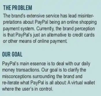
Here’s an example of a sample creative brief for PayPal that offers separate sections for “The Problem” and “The Goal”:

creative-brief_3

4. Describe the target audience.

Next, it’s time to define the target audience for the project. This is the segment of your market that will directly benefit from the product or service being launched.

You can take audience segmentation a step further by identifying a primary and secondary audience. Doing so will give your team more freedom to explore creative ideas that might resonate with one group more than the other.

When crafting the target audience section, be sure to include the following:

  • Demographics – Simple demographic information gives your team insight into exactly who the audience is. This includes data points like age, income, education, ethnicity, and occupation.
  • Behaviors – Buying behaviors, trends, and other customer history make up the target audience behaviors. These provide important context to the creative brief because they explain where the customer is in their buyer journey.
  • Psychographics – This is how the audience thinks and feels about your brand and the product or service you sell, in general.
  • Geographics – Digital, physical, and hybrid campaigns will benefit from having geographics stated explicitly in the creative brief so that media buyers can price ad slots in each market.

Pro Tip: Your creative brief shouldn’t be too long, and this section can take up quite a bit of space. To make this section more digestible, consider using buyer personas.

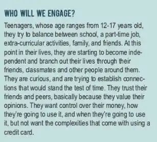
Here’s how the sample brief for PayPal noted above thoughtfully explains a new product’s target audience:

PayPal sample brief target audience

5. Interpret the competitive landscape.

Knowing what your competitors are doing is advantageous for the whole team.

You can use competitive data to come up with ideas that haven’t been tried yet, learn from their failed projects, or build a project that improves on a strategy they’ve used in the past.

Include a quick list of competitors with similar product or service offerings.

Briefly list a few things your company has in common with them, how your brand has differentiated itself already, and a few areas where this project can help you get ahead.Get Your Free Templates

6. Prepare the key message.

The key message can be the most difficult part of the creative brief to develop because just about every stakeholder will have a different opinion of what it should be.

To get buy-in faster, try this simple trick. Ask yourself “We’re launching this project, so what?” The “so what?” is your key message. It explains why your target audience should stop what they’re doing and pay attention to your campaign.

The key message includes the pain point, what the audience’s experience might be like without the pain point, and the benefit they’ll receive as a result of your company’s solution.

This framework places the customer in the spotlight of the campaign. Instead of telling them what this product or service could do for them, it positions them as the main character in the journey from problem to solution.

7. Choose the key consumer benefit.

If you’re launching a new product, there are likely several features and benefits that the target audience will experience when they decide to purchase it. However, it’s very difficult to structure a campaign around several different features.

That’s why marketers and creatives use something called a key consumer benefit (KCB) in the creative brief to keep everyone aligned on the primary benefit being communicated.

To choose the right KCB, you’ll want to get input from the project stakeholders and rely on consumer data to guide the decision.

Pro Tip: Your KCB won’t always be the fanciest feature of your product. The benefit that solves the biggest problem for your audience is a great choice for the KCB.

8. Select an attitude.

The tone and voice of your campaign create the overall attitude and that should be consistent throughout every creative element that’s being developed.

Identifying a few adjectives that describe the attitude of the campaign can help copywriters draft copy that sends the correct message within the right context.

Graphic designers can use colors and techniques to portray the tone and voice as well.

In this section of the brief, you should also note the appropriate voice for your audience. While some audiences, like those in the business world, prefer more formal language, others might engage more with a casual, relatable tone.

To substantiate your decision to choose a particular brand voice and tone, you could write something like, “Our brand voice is a casual and carefree tone because it speaks to younger Gen-Z audiences.”

Pro tip: Use a thesaurus to find specific words that evoke nuanced emotions and attitudes for a hyper-targeted campaign.

9. Determine the best call to action.

Finally, your audience needs something to do once they see your campaign. The good thing about CTAs is that they don’t have to be physical actions.

A CTA could have a goal to change thoughts and perceptions about your brand which doesn’t require the audience to do anything at all.

Your creative brief might include several different CTAs, especially if you have a primary and secondary target audience. But it’s a good idea to have one primary CTA that drives the project objective we talked about earlier.

10. Draft the distribution plan.

When the project is done, you’ll need to make sure your audience actually sees it. List a few channels or platforms on which you plan to announce the launch, as well as any promotional content you plan to create.

When drafting this section, think about your target audience. Don’t waste time on a promotional strategy that they won’t see.

For example, if you’re promoting a project to Gen-Z, you’ll want to invest in social media rather than billboards or newspaper ads.

11. Share the creative brief with stakeholders.

Once you’ve drafted a creative brief, share it with the team you’ll be working with. You’ll also want to circulate it around the company via Slack, email, or presentations.

If you’re a consultant working outside of a client’s company, encourage your clients to share the brief internally.

As you or your clients spread awareness, you should be open to answering questions or taking feedback from colleagues in case they have any great ideas.

This strategy will improve team alignment, increase support of the project, and ensure that all of your colleagues are on the same page.

Follow Along with HubSpot’s Free Creative Brief Templates

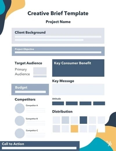
creative brief template


Download Now

Creative Brief Templates

Having trouble with the flow and organization of your brief? Here are simple templates that could help. Copy and paste into a document and fill in the blanks. You can also add to the templates or adjust them as needed for your project.

basic Creative Brief Template Example

Download More Creative Brief Templates

[Inset company or client logo at the top along with the project name.]

COMPANY BACKGROUND:

For ___ years, ______ [Brand Name] has been serving customers in the ____________ [group/job field/geographical area] with ____________________ [product or service].

[Brand Name] has made achievements including __________,__________, and ___________. We have also launched marketing campaigns that have touched on ____________,________, and ____________. With the launch of _________ [project name] they hope to ___________.

PROJECT OBJECTIVE:

With this project, the company aims to solve problems related to ____________________, while also expanding on ___________ and improving on _____________.

TARGET AUDIENCE:

Our target audience is ____ [gender], in the age range of _ and _, and live areas like ____, _____, and ______. They enjoy _____, dislike ______, and might work in fields like _____, _____, and _____. They want more of ________ and their daily pain points include ________.

Their favorite products might include _______ and ______. They learn about these products through channels including ________, _________, and _______.

COMPETITORS:

Our three biggest competitors [are/will be] ________, ________, and _______. These competitors offer _____, ______, and ______. We are ahead of them in _____ and ______, but we are behind when it comes to product offerings like __________ and _________.

KEY MESSAGE:

The target audience is experiencing __________ [pain point], but with our newest project ___________, they’ll get to experience _________ [new experience without the pain point]. That’s what makes ______ [solution] an unrivaled solution within the market.

KEY CONSUMER BENEFIT:

________ [feature] is the best way for our target audience to experience _____ [benefit].

ATTITUDE:

[Include three to five adjectives that describe the tone and voice of the project.]

CALL TO ACTION:

When the target audience sees our campaign, they will [feel/think/do] _________.

DISTRIBUTION:

We will promote the launch on platforms and channels that our demographic regularly engages with. These will include ________, ________, and _______.

We will also release content including _______, _______, and ________ to gain attention from our audience and inform them of the project.

Below are a few messages we will use:

  • _________________________________________________.
  • _________________________________________________.
  • _________________________________________________.

Here are more templates to consider:

1. Simple Campaign Creative Brief

2. Video Creative Brief

3. Simple Client Creative Brief


Types of Creative Briefs

Creative briefs serve several purposes in the communications field. Marketers, designers, and advertisers use them differently. Depending on your role, your team, and the project you’re working on, one might be more effective than the other. Below are some of the most common types of creative briefs used across industries today plus examples of what they might look like.

1. Marketing Creative Briefs

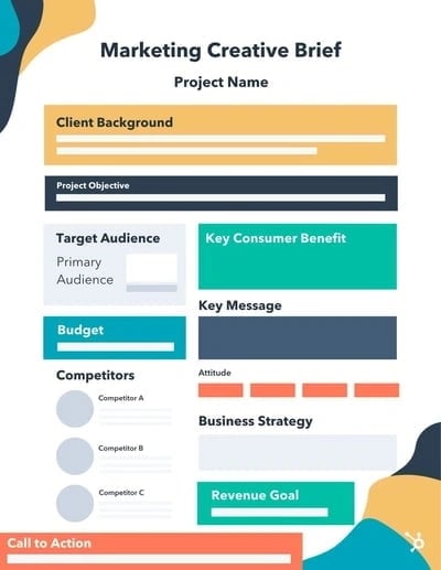
A marketing creative brief is most commonly used to bring campaigns to market. This type of creative brief can be used for both new and existing campaigns. Broad business goals and strategies to accomplish them are usually included in this type of creative brief. It’s also not uncommon to see revenue goals and a budget included in a marketing creative brief.

Simple Marketing Creative Brief Example

Simple Marketing Creative Brief Example

2. Product Design Creative Briefs

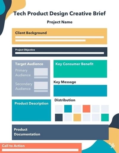
Product design creative briefs outline the go-to-market strategy for a new product or feature launch. Product marketers are responsible for developing this type of brief. Developed in conjunction with the product manager, the product design creative brief will describe the features and benefits of the product and how the audience will benefit from them. Unique features of this type of creative brief include product documentation and product descriptions.

Product Design Creative Brief Example

Tech Product Design Creative Brief Example

3. Advertising Agency Creative Briefs

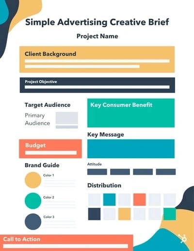
Advertising agencies develop creative briefs often for the various clients they serve. These briefs are concise and include the client’s brand guidelines as well as the specific project guidelines. A budget may also be included in the brief so that all teams can make wise decisions about the tactics they recommend for the client. An account manager or supervisor develops the creative brief and shares it with client stakeholders before the agency begins working on the project.

Advertising Agency Creative Brief Example

Advertising Agency Creative Brief Example

Creative Brief Examples

1. Creative Request Template

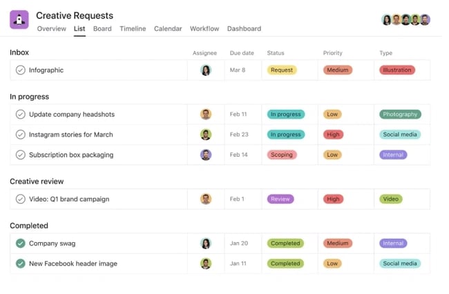
Creative Brief Examples: creative request template from Asana

For the day-to-day management of creative projects, using a creative request template in Asana acts as a dynamic take on a traditionally static creative brief. With a few tweaks to suit your business’s needs, this template flows through each stage of the project while specifying tasks, deliverables, and key points that need to be included in the project. Moreover, Asana provides several types of views that make this template easy to look at from a calendar view, list view, board view, and timeline view so you’ll always know the progress of your project in relation to the creative brief.

When to Use This Creative Brief:

This creative brief example is great for marketing, brand, creative, and design teams who handle a large backlog of projects with stakeholders on many different teams. Use this brief for both ad-hoc and regularly occurring projects.

2. Creative Brief Presentation Template

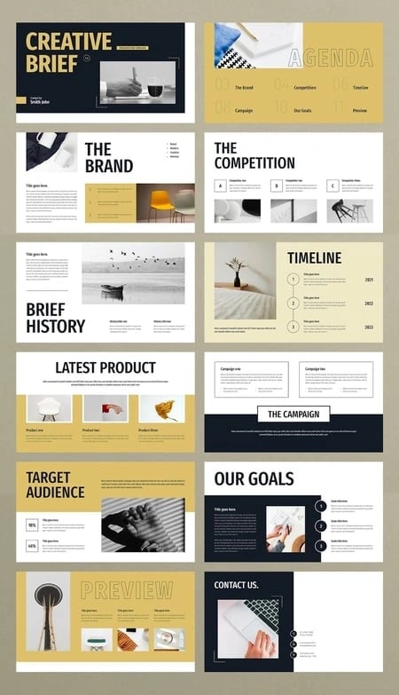
Creative Brief Examples: Creative brief presentation template

This creative brief example was designed by TemplateForest. It’s a visual-forward example of a brief that works well for long-term projects like building a business or refreshing a brand. This longer brief includes a variety of information from internal brand insights to an external competitive analysis.

When to Use This Creative Brief:

Use this creative brief when you’re partnering with a creative agency on bigger projects. They can use this layout to inspire a creative brief that fits the needs of your business.

3. Red Bull

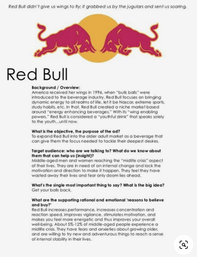
red bull creative brief

Image source 

This creative brief is straightforward and simple. The only eye-catching visual is the use of the brand’s logo. However, all the necessary information is included. 

When to Use this Creative Brief

Use this kind of brief when you want a straightforward document detailing your brand’s longterm creative projects.

4. Quaker 

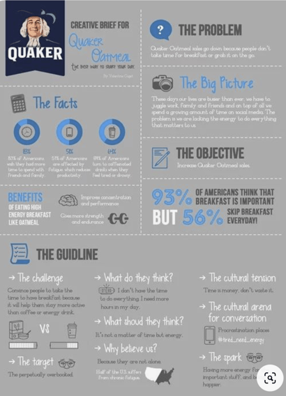
Quaker Oats Creative BriefImage source

This Creative Brief by Quaker lays out the brand’s problem, plan, and guidelines and includes visually appealing graphics to drive home the brief’s point. 

When to Use this Creative Brief

A brief like the one above is most useful if your organization is embarking on a long-term project or if there’s a lot of information and data that needs to be conveyed in an understandable manner.

5. Graphic Design Creative Template 

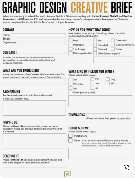
Graphic Design Creative Template

Image source

This template is designed to allow graphic designers to gather important information from clients so that they designer can create a product that is aligned with the client’s vision.

When to Use this Creative Brief 

Briefs like this work best when working with clients on detailed projects. 

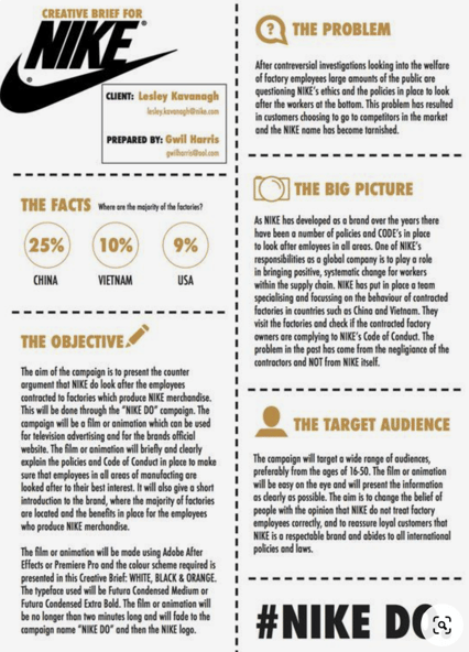
6. Nike Creative Brief

Nike Creative Brief

Image source

This creative brief example for Nike features all the crucial information a brief should include while utilizing the Nike logo and symbols to create visual interest. 

When to Use this Creative Brief 

A brief like this serves the same purpose as the Quaker brief. If you have a lot information to convey, including symbols and interesting colors will help the information stick out and remain top of mind. 

Streamline Projects with a Creative Brief

Scope creep happens to the best of us. Projects get bigger, stakeholders are added, and the objective of the project seems to morph as time goes on.

Streamline your next product launch or marketing and advertising campaign with a creative brief. As a result, you’ll find that your team is more aligned with the project’s goals.

We’ve even provided free creative brief templates to get you started — download them below.

Editor’s note: This post was originally published in July 2019 and has been updated for comprehensiveness.

New Call-to-action

Categories B2B

This Newsletter Growth Trend Is Straight from Wall Street

Welcome to Trends, a weekly newsletter with the zestiest business trends and actionable insights for entrepreneurs.

So you’re cruising along on Instagram, and see an ad for a newsletter that grabs your attention.

You give the ad a click, and enter your email to subscribe.

That publisher has aced everything up until that point with:

  • An enticing message on their ad
  • Placed in front of you on the right platform
  • A landing page that got you to convert

But after you click “subscribe”, something a little different happens…

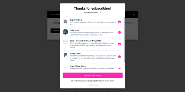
Image 1_ Screen shot of Sparkloop widget

SparkLoop’s co-registration widget. Tricky dicky.

Free Download: Scale Your Business with Email Newsletters

This publisher (who you only know from the ad they served you moments ago) is recommending other newsletters.

All of the newsletters are pre-selected, and unless you read very carefully, you’re likely to hit the big pink box at the bottom of the screen and move on with your life.

But let’s look at the newsletters that were recommended:

  • An AI healthcare newsletter 💊
  • A travel deals newsletter ✈️
  • A newsletter about the Greek real estate market 🇬🇷
  • A newsletter for entrepreneurs 📈
  • And a sports newsletter 🏈

Um. What. 

Moments later, your inbox looks like this.

Image 2_ First inbox view

Here’s what’s happening:

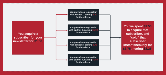
👉 The newsletter you wanted to subscribe to is getting paid by every newsletter they’re recommending, so long as you meet some “engagement” criteria (more on that later).

👉 At a minimum, they’re off-setting the ad spend they used to acquire you, but they might be earning more from recommendations than they’re spending on ads —

Which makes them profitable before you ever even receive a newsletter from them.

This, ladies and gentlemen, is “audience arbitrage”.

And it’s either the best or the worst trend to ever grab the newsletter industry, depending on who you talk to…

Arbitrage Is What Now?

If you’re not a securities trader, you may not know what arbitrage means, so let’s break this down.

In the case of securities (where arbitrage is a formidable strategy) it means simultaneously buying a security and selling it at a higher price.

Don’t worry. We’ll explain. Source: Tenor

But this concept extends to other commodities as well.

For instance, Ebay and Amazon have made retail arbitrage incredibly popular over the last decade. Here’s how it works:

  • People run around town, buying up name-brand shit at liquidation / clearance sales.
  • Then they sell it on Amazon at market price for a profit.

According to Andy Craig, Amazon expert and founder of AdHabit, “You can make good money. It can be a good side-hustle. But it’s not really a business.”

Now, thanks to co-registration tools like SparkLoop and Beehiiv’s newsletter recommendation widgets, the same thing is happening with newsletters.

And audiences are the commodity.

Image 4_ Arbitrage chart

Here’s a visual aid to explain the process.

Does This Really Work?

Arthur Freydin, an e-comm growth expert and owner of Newsletter Blueprint, set out to do this with a totally automated newsletter — Today’s Workout.

Arthur uses a number of platforms, but his recipe boils down to:

  1. Acquisition: Meta Ads
  2. Monetization: SparkLoop (a newsletter referral platform)
  3. Automation: Make.com (a no-code workflow platform)

After clicking on one of Arthur’s Meta ads, subscribers are:

👉 Funneled to a WordPress landing page.

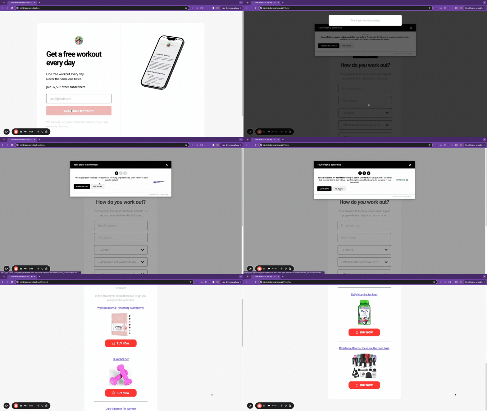
👉 Monetized immediately upon signup with SparkLoop’s co-registration widget (this is the true audience arbitrage piece).

👉 And for good measure, they’re monetized three more times with offers by Uptick, ClickBank, and Amazon.

Image 5_ Popup GIF

Holy mother of popups. Source: Today’s Workout onboarding flow.

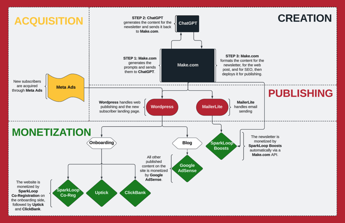
But the true magic lies in how Arthur is able to send out an automated newsletter every day without touching a thing:

👉 Make.com generates a prompt for ChatGPT to write a “fitness workout of the day”.

👉 ChatGPT writes all of the content for that day’s post, and sends it back to Make.com.

👉 Make.com formats the content for a web post and an email newsletter, including SEO considerations.

👉 Then Make.com retrieves referral boosts (recommendations in the email for other newsletters) for placement in the email from SparkLoop via API so that day’s send can be monetized.

👉 Finally, Make.com automatically publishes the web version to WordPress (which is monetized via Google AdSense), and sends the newsletter version out to subscribers using MailerLite (which is monetized by SparkLoop).

Here’s how the whole thing looks:

Image 6_ Automation flow chart

Holy moly. Well crafted. 👏

This entire thing took Arthur about a week to set up. He’s netting ~$1.2k per month (~70% margin) — and he reckons if he took some more time to hone it, he could increase earnings 3X or more.

So What’s The Catch?

While audience arbitrage using co-registration seems like a no-brainer for newsletter monetization and growth, it comes with substantial risks.

Risk #1: Your Brand 

“Co-registration completely disregards the human experience,” announced Adam Ryan, former President of The Hustle, and co-founder of the community-centric media brand Workweek on stage at a recent conference…

…which was sponsored by SparkLoop. 😬

“Publications forget that their audiences are people.”

So if you’re trying to make a quick buck with a throwaway brand, it can work — as long as you keep your subscriber acquisition cost below your rate of monetization.

But if you’re trying to build trust with your audience, it’s probably not a good idea to group yourself in with a bunch of random newsletters chaotically crowding the inbox of your ideal subscriber (who you just spent time and money to strategically acquire).

Image 7_ Second inbox view

Risk #2: Your Sender Health

While this is an issue for everyone, it especially impacts those who are using co-registration tools for growth as well as monetization.

When quick-moving or unassertive audiences accidentally sign up for six newsletters (when they only meant to sign up for one), they’re in for a heck of a surprise in their inbox.

And what happens when you start sending people a ton of unwanted emails?

Your sender health and deliverability goes to shit. 

Which means you might start landing in spam with the subscribers who genuinely want to hear from you, or with new rules that Google and Yahoo recently implemented, you could get shut out of inboxes completely.

“Proceed with extreme caution when it comes to co-registration tools like SparkLoop,” says Tyler Cook, email deliverability expert and founder of Hypermedia Marketing.

Risk #3: Opaque Engagement Reporting

When you’re monetizing your newsletter with co-registration platforms like Beehiiv and SparkLoop, you only get paid for a successful referral when the subscriber meets the engagement criteria set by the newsletter you’re recommending.

But those metrics often get incorrectly reported at the individual level, and there are a number of ever-evolving ways email service providers are protecting receiver data (a whole ‘nother topic…).

So it’s kinda like trusting a blindfolded accountant to do your books. They might get some of it right, but there’s really no way to know.

And for those in growth mode? Get ready for hoards of unqualified subscribers.

So while it’s definitely the newsletter strategy du jour, audience arbitrage may not have what it takes to survive.

New call-to-action

Categories B2B

I Tested 9 Popular AI Image Generators. Here’s the Scoop for Marketers

Part of the reason I went into marketing is because I love creating. It’s also why the topic of the best AI for images intrigues me. 

I love writing (surprise), cooking, design, and photography. I also used to paint and sew. But thanks to artificial intelligence (AI), you no longer have to be a lifelong creative to turn an idea into a visual reality. 

Download Now: The Annual State of Artificial Intelligence Report

AI image generators help anyone create visuals that are weird, wonderful, and … weirdly wonderful. (Remember the Willy Wonka debacle in Glasgow?)

But how exactly do they work and what’s the best AI image generator for marketers? I tested the top options for you. Here’s the scoop.

Table of Contents

How do AI image generators work? 

Plagiarism is a big concern with even the best AI image generators. And it makes sense considering the very nature of how they work. AI image generators create by reimagining things that already exist. They don’t copy. They borrow and recycle. 

How It Works:

  1. The AI is “trained” on millions of existing images, descriptions, and captions available across the internet. This is how it “learns” what things look like and what they are called. 
  2. When you enter a prompt into a tool, the AI reaches into its memory of those images and captions. 
  3. The AI produces an image or selection of images it believes fit your prompt. 

Think of it like a contemporary singer sampling a song from a bygone era. They’ve made it their own, but pieces of the original are still there and recognizable. 

(Author’s note: Britney Spears’ Bollywood sample in “Toxic” will always be a work of art on its own, of course.) 

How I Tested the Best AI for Images

AI image generation can get pretty wild. You can create images in any style and of practically anything. 

For instance, I made one of “a photorealistic orange rabbit wearing a traditional Indian sari and playing an acoustic guitar” using Google’s Gemini

An orange rabbit wearing a traditional indian sari playing an acoustic guitar, generated by Google Gemini
Then I asked for an electric guitar:

An orange rabbit wearing a traditional indian sari playing an electric guitar, generated by Google Gemini

Why exactly? Well, as I’m sure many people justify their oddball AI creations: Because I could.

For the purpose of this article, I focused on a common marketing use case: creating an original image for a blog article.

I tested nine of the most popular AI image generators and evaluated them on their speed, ease of use, and image quality.

To fairly compare the options, I also eliminated variables by:

  • Using the same prompt
  • Requesting the same edit to the original prompt

I also ran each tool three times after each prompt, giving them a fair opportunity to deliver. Consider these my “trials.” This is science after all. 

The prompt: “Generate an image of a young marketing executive presenting information on a television screen in front of a small group of teammates”

The edit: Generate a photo-realistic image of a young marketing executive presenting information on a television screen in front of a small group of teammates.

Let’s get started. 

The Best AI Image Generators

1. Midjourney

Midjourney is considered one of the most powerful generative AI tools out there, so my expectations for its image generator were high. It focuses on creating artistic and stylized images and is popular for its high quality.

Pricing: $10-120 per month, depending on the plan. 

Test Results:

I’m used to the chatbot setup of ChatGPT, so Midjourney wasn’t what I expected. 

To create, you have to join the Midjourney Discord channel (similar to Slack). From there, you use keyboard commands within chats to have the Midjourney bot perform your desired tasks.

In this instance, I had to join a  “newbie” chat (there were several to choose from) and enter the command “/imagine” followed by my prompt. Then, the Midjourney bot processed my request (and sometimes those of others simultaneously.)

It delivered four images with each trial. 

Screenshot of Midjourney Discord channel

From there, I could click numbered buttons underneath the images to get “upscales” (U) or variations (V) of a particular image. It isn’t entirely clear to a “newbie” what an upscale or variation means. 

Screenshot showing how Midjourney ai image generator allows you to "upscale" images

Personally, I wasn’t the biggest fan of this process. Anyone in the chat can see your prompt and results and even download them for their own use. Your results could also quickly be buried by others, and you’d have to scroll up to find them. 

Speaking of results, they were quick but varied in quality. 

Screenshot showing little variety in images generated by Midjourney

The AI delivered a variety of styles and included some diversity in its human subjects (no glaring issues with features), but it produced the same settings and poses in each option. 

Screenshot showing how Midjourney delivers a variety of styles when one is not specified

Also, there was no clear way to edit the images created. I tried responding to the bot to no avail. 

My second prompt resulted in less photo-realistic images — even though I specified that’s what I wanted:

Screenshot showing how Midjourney ai image generator delivered illustrative results when photo-realistic was specified

upclose look at Midjourney's "photorealistic" results

Overall, I have to say I was disappointed by Midjourney. Navigating was frustrating and didn’t produce the quality I expected from the hype.

Someone with more experience in Discord or prompting it might yield better results, but it didn’t win me over. 

What I like:

  • Fast (images in under 60 seconds)
  • Multiple images at once

What can be improved:

  • User-friendliness
  • Privacy
  • Editing capabilities
  • Image style variety
  • Photo-realistic quality

Best For: Artistic endeavors, marketers with advanced technical knowledge, web developers, or those comfortable within Discord who can learn to navigate the nuances of prompts. 

2. DALL-E 3

Owned by OpenAI (the company behind ChatGPT), DALL-E is a pioneer in image generation. 

DALL-E3, the latest iteration of the tech, is touted as highly advanced and is known for generating detailed depictions of text descriptions. This means users can create original images and modify existing ones based on text prompts.

Pricing: It is available to ChatGPT Plus, Team, and Enterprise users, as well as developers through the API, starting at $20 per month.

Test Results:

Unlike most tools on our list, DALL-E3 generated only one image at a time. 

Screenshot showing how DALL-E3 ai image generator delivers just one image at a time

In a world where a search engine can find millions of pictures in seconds, this is highly limiting and, honestly, underwhelming. But the image quality was impressive. 

Screenshot showing how DALL-E3 ai image generator results appeared to lack diversity

It showed detailed, realistic portrayals of people and had no visible difficulty replicating fingers or eyes, as we often see with AI. It also allows users to edit specific image details:

Screenshot showing how DALL-E3 ai image generator allows you to request specific edits

For example, I requested that the main subject of the image above shift to a woman of color and that the information on the television screen be changed to an Instagram profile. 

Screenshot showing image generated by DALL-E3 post-edits, showing spliced in differences.

After editing, the photo wasn’t as seamless. You could see where the AI spliced in the new content and certainly did not use an Instagram profile, but I digress. 

As you may be able to guess from my requested edit, where DALL-E3 fell short was its lack of diversity and variety. 

After running two more trials with my initial prompt, the settings of the image stayed the same — a generic, corporate office, while main subject in all of the images looked very similar as well, and most noticeably, all White or European. 

While the results for the initial prompt were quite photo-realistic, I ran my second prompt. 

Screenshot showing the lack of diversity in DALL-E3's human subjects

The results were consistent, and the diversity issue also remained. Out of curiosity, I ran one more test in a new chat window and found that all images were now of men, but again, they all appeared to be White or European. 

I was able to request changes to make the people in the image more racially diverse, but it took several tries. 

DALL-E3 is considered some of the best AI for images.

Stereotyping and bias are common concerns with AI image generators, and that may be an issue with DALL-E3. 

What I like:

  • High-quality images (crisp, detailed)
  • Realistic human depictions 
  • Ability to edit image details

What could be better:

  • Only one photo per prompt
  • Lack of diversity without additional prompting
  • Lack of variety in the setting
  • Lack of control over specifications (dimensions, style, etc.) 

Best For: Brands that would benefit from ChatGPT’s greater AI abilities. In my opinion, the cost is not worth it just for image generation, especially considering some of the amazing free options in this list. 

Pro Tip: If you find yourself getting the same results with each regeneration, or requesting edits proves fruitless, try opening a new chat window. 

3. Microsoft Designer

Designer is an AI image generator from Microsoft. It’s positioned as a tool to help you “create social media posts, invitations, digital postcards, graphics, and more, all in a flash.” Many say it’s a Canva competitor, and I can see why. 

Designer uses DALL-E2 to generate images from text prompts, but you can also start with one of the built-in templates or tools. 

Its user-friendly templates include stickers, collages, greeting cards, and social media posts. Users can also perform everyday editing tasks like removing a background from an image. 

Pricing: Everyone gets 15 free generations per day, but this jumps to 100 with a Microsoft Copilot Pro membership for $20 per month. 

Test Results:

Coming from DALL-E3, I was immediately pleased to see Designer deliver four images with each run of my test prompt. I was also happy to see the diversity in gender, race, and even setting. 

Screenshot showing examples of Microsoft Designer's Diverse human subjects and variety of image staging.

Screenshot showing examples of Microsoft Designer's Diverse human subjects and variety of image staging.

Microsoft Designer is some of the best AI for images.

Like DALL-E3, the Designer results were realistic from the start (with no face or feature issues), but most still had an illustrative stroke. 

Nevertheless, after running my second prompt, the results remained similar: 

Screenshot of Microsoft Designer's results showing diversity and accurate human portrayals.

Once I found an image I liked, Microsoft Designer let me download, copy, edit, or use it in another design on the platform:

Screenshot showing Microsoft Designer's editing abilities

What I like:

  • Multiple images at once
  • High-quality images (crisp, detailed)
  • Accurate depictions of people
  • Lots of diversity (both in people featured and in style/setting of image)

What could be better:

  • All images are square by default
  • “Photo-realistic” images still have an illustrative look 

Best For: Microsoft Designer is a great free option for almost anyone, but it’s especially valuable to teams looking for design flexibility or those heavily invested in social media. Microsoft Designer makes it easy to create graphics using its images. 

4. Adobe Firefly

Firefly is design giant Adobe’s answer to generative AI. It can generate art or photo-style images in four common aspect ratios (square, portrait, landscape, and widescreen), and it allows users to select or upload resources for reference.

Pricing: Free for 25 credits per month, but premium plans offer more credits starting at $4.99 per month. 

Test Results:

Honestly, Firefly immediately blew me away. 

Not only was it the fastest tool, but it also delivered four images in various styles, with a diverse group of subjects and some of the most photo-realistic results I’ve seen. 

Screenshot showing Adobe Firefly's realistic ai image results

The depictions of humans were mostly realistic, but as I ran my additional trials, I did spot flaws like missing faces or choppy cut-outs in the backgrounds.

Adobe Firefly is some of the best AI for images.

Since Designer has a built-in option for photos, I deviated a bit from my experiment. I ran the initial prompt under the art filter to evaluate the differences.

Screenshot showing Adobe Firefly's impressive art results

Again, they were striking. The results were a mix of vectors and illustrations that employed bold colors, precise details, and visual depth for beautiful results.  

The platform also let me edit the images, generate more based on one I liked, and use any of the images in an Adobe Express design. 

Screenshot showin Adobe Firefly's editing options

What I like:

  • Free
  • Fast 
  • Multiple images at once
  • High-quality, photo-realistic images (crisp, detailed)
  • Accurate depictions of people (mostly)
  • Lots of diversity (both in people featured and in style/setting of image)
  • Easy-to-use images in a design
  • Edit specific details of images

What could be better:

  • Have to inspect closely for flaws
  • More image styles

Best For: Great option for anyone, especially as a free tool. Both the artistic and photo results are top-notch and easy to repurpose into design inside and outside of Adobe. 

5. Canva Magic Design

Canva’s AI image generator, Magic Design, brings the power of AI to the masses. You can use it to generate images, graphics, or videos in square, vertical, or horizontal aspect ratios, and you can choose from over 20 visual styles.

Pricing: All users get 10 free Magic Designs over their lifetime, but if you want more, varying usage limits are available in Pro, non-profit, and Education accounts, starting at $120/year. 

Test Results:

With the initial prompt, Canva delivered four graphic/illustrated images in each trial. Many figures were simple vectors without any defining features, reminiscent of 1990s clip art.

You can see the results of each trial circled in the same color. 

Screenshot of Canva Magic Design's results shows all vectors when style is not specified.

Upon entering my “photo-realistic” prompt, the results changed accordingly but left much to be desired. 

Screenshot of Canva Magic Design results leaves a lot to be desired in terms of variety and human depiction

The AI appeared to struggle with recreating finer details like hands, fingers, eyes, and on-screen content.  

Nevertheless, if you find an image you like, you can easily use it in a new design within the Canva platform. 

What I Like: 

  • Fast
  • Easy to use
  • Lots of visual styles
  • Offers video

What could be better:

  • Photo-realistic results
  • Depictions of people
  • Attention to detail

Best for: Those already investing in Canva Pro. This can be useful for art, vectors, or social media designs. 

6. Meta AI

Meta AI is a free intelligent assistant from the parent company of Facebook and Instagram. The company claims the chatbot is “capable of complex reasoning, following instructions, visualizing ideas, and solving nuanced problems,” including generating images.

Pricing: Meta AI is free for all Facebook users.

Test Results:

Meta AI is set up as a chatbot, and upon entering my test prompt, I was floored. 

Screenshot showing Meta AI's vibrant, diverse results

With each trial, Meta delivered four images — all vibrant, detailed, and in various settings. They also featured diverse groups of people. 

Meta AI is some of the best AI for images.

Looking closely at the faces, you can see some imperfections. But, for the most part, the images could easily be used in smaller sizes without any concern.

Meta AI also allows you to click into an image to request edits (though this will change the entire image, not just a part, like with DALL-E3).

Screenshot showing Meta AI's editing options

Or you can animate the images with the click of a button.

GIF showing Meta AI's animation capabilities

What I like:

  • Free
  • Fast 
  • Multiple images at once
  • High-quality, photo-realistic images (crisp, detailed)
  • Accurate depictions of people (mostly)
  • Can animate results with the click of a button
  • Lots of diversity (both in people featured and in style/setting of image)

What could be better:

  • Specific edits
  • Images are watermarked 

Best for: Small digital graphics for social media, eBooks, or otherwise. 

7. Gemini

Gemini, formerly Bard, was launched by Google in December 2023. Similar to competitor ChatGPT, Gemini responds to text prompts as a chatbot. 

However, taking a page out of the Google search engine playbook, it can natively understand images, audio, video, and code. In other words, you can upload a video and ask Gemini to summarize it.

Pricing: It’s free, but “For Business” accounts are available with Google Workspace. Gemini Advanced is also available with a Google One AI Premium plan for $19.99 per month. 

Test Results:

This test was short but not necessarily sweet.

After entering my test prompt, I was met with a message saying, “We are working to improve Gemini’s ability to generate images of people. We expect this feature to return soon and will notify you in release updates when it does.”

Screenshot of the error message delivered by Gemini when attempting to generate images of humans

The ability to create images of people was removed in February 2024, noting that “some of the images generated are inaccurate or even offensive.” 

Understandably, Google took precautions by turning off the feature but, of course, that makes Gemini unusable in our marketing use case.

Gemini can still create images (A la my orange rabbit from earlier), but the instances are specific and cannot include human beings. 

What I like: 

  • Easy to use 
  • Free
  • Images are high-quality

What could be better:

  • On the slower end
  • No depictions of people, not even animated

Best for: Creative, abstract, or illustrative images


8. Jasper Art 

Jasper is a platform trusted by over 100,000 leading brands and agencies, including Wayfair, Ulta, and MorningStar. 

Its AI image generator, Jasper Art (only available under Pro plans), promises users the perfect picture to match their messaging.

It offers high-resolution, 2,000-pixel images, royalty-free commercial use, and unlimited generations, all without a watermark.

Pricing: Jasper Art starts at $49 per month per seat or ($39 per month per seat with annual payment), but a 7-day free trial is available.

Test Results:

I learned you can start creating from scratch with “free form” or with a “template” which includes categories like food photography, ink art, news graphic, and storybook photography. 

In “free form,” Jasper Art allows you to refine your creation with a mood (i.e., calm, gloomy, or whimsical), medium (i.e., collage or ink), style (i.e., pop art or art deco), keyword (i.e., black & white or close-up), or language. 

Screenshot showing Jasper Art's UI

For this experiment, however, I stuck to “free form” and left all of the refinements empty. 

Jasper delivered four images and took just a few seconds, but, to be honest, the results were lackluster. 

The “young executives” all appeared older and were men with lighter skin tones. Few women were in the photos, and if there were, they were in the background. This was consistent throughout my trials, so, like DALL-E3, I had concerns about AI bias. 

Screenshot showing Jasper Art's results, with many glaring human feature errors

Furthermore, Jasper struggled with recreating features like hands and fingers. One image even appears to have an elf leg coming out of a man’s hip onto a table. 

Jasper Art may not be the best AI for images if you're looking for human depictions. 

Screenshot showing the lack of diversity in Jasper AI's photo results

Like other tools, Jasper’s results were photo-realistic, but to confirm, I reran the prompt using the keyword filter “photorealistic.” The results were unchanged. 

Jasper Art may not be the best AI for images if you're looking for human depictions. 

I also experimented with the styles (specifically pop art and acrylic paint) to see how the tool handled those.

Screenshot showing Jasper AI's pop art results

Pop art was true to its name, but Jasper appeared to have difficulty with acrylic paint, delivering images that looked half vector and half photo-realistic. 

Screenshot showing inaccuracy with Jasper Art's "photorealistic" results

If you like an image, Jasper Art lets you download it in three different sizes, copy it to your clipboard, or share it to X (formerly Twitter), Facebook, or Reddit. 

What I like:

  • Easy-to-use
  • Multiple images at once 
  • Offers templates
  • Offers high-resolution downloads

What could be better:

  • Difficulty recreating human features
  • Lack of diversity 
  • Concerns of bias 

Best For: Abstract or creative images. It’s worth playing around with, if you already pay for Jasper Pro, but wouldn’t pay just for Jasper Art.

Pro Tip: In “free form, ”Jasper AI offers to “enhance your prompt” with the click of a button. It expanded my prompt and passed the 400-character limit while allowing me to edit before generating my images. While I didn’t use this feature in the experiment, Jasper’s assumptions seemed to match the pictures it produced. 

Reviewing the more detailed prompts may give you more insight into the image it will create by default. 

9. Getimg.ai

While researching this article, I found Getimg.ai in a Reddit discussion. Redditors raved about it, so I had to see why. With a paid plan, it can generate photorealistic, artistic, or anime-style images, up to 10 at a time. 

Pricing: Free for 100 credits per month, or paid plans beginning at $12/month which unlock more credits and features.

Test Results:

Getimg.ai generates four images by default on a free plan, and it can deliver up to 10 with a premium plan. It’s also transparent about its speed, displaying how long it takes to generate each image. The images I created took under 30 seconds.

Screenshot showing Getimg's UI and results

My immediate reaction: Zero diversity. Except for one or two subjects, everyone in the photos is a white man, and many of them look like they could be cousins, brothers, or even twins. 

In other words, Getimg.ai seems to use the same face repeatedly in one image. 

If this works for you, the tool lets you like, download, generate similar images, or use them in a design. With a paid plan, you can also convert the image into a video. 

Screenshot showing a lack of variety in the faces generated by Getimg

As the tool defaults to photorealistic, I once again deviated from my test edit to run the prompt in other built-in styles.

“Anime” delivers some beautiful creative images that are very much in line with what you’d expect from the Japanese style. In contrast, “Artistic” is reminiscent of characters in a video game. I personally expected them to look more like paintings or illustrations.   

Screenshot showing Getimg's artistic results.

What I like:

  • Generous free plan
  • Easy to use
  • Fast (and transparent about generation speed)
  • Multiple images at once
  • Can upload reference images and tell it what not to generate with a “negative prompt”
  • Multiple aspect ratio options 

What could be better:

  • Diversity (in demographics as well as the setting of the photo)

Best For: Creative or artistic images. Brands or marketers targeting younger audiences interested in Anime

Put the best to the test!

What you consider the best AI for creating images is subjective. In my opinion, many of the free tools have more to offer marketers than the paid ones. 

I was particularly impressed by Adobe Firefly. It delivers some of the most realistic photos and professional-looking artistic images on the list, and it allows you to edit specific details. 

For a marketer who is likely using an AI image generator to create an original image for content or a digital graphic, it more than gets the job done at no cost. On top of its creative prowess, it’s hard to top. 

Categories B2B

The 23 Best Graphic Design Portfolios I’ve Ever Seen, & How to Start Your Own

A great graphic design portfolio doesn’t do the work for you, but as an ever-running marketing tool, it can change your life by reeling in new opportunities.

AI-generated design as well as online design platforms like Canva are impacting graphic design hiring, making your portfolio more important than ever before.

Download Now: 150+ Content Creation Templates [Free Kit]

So whether you‘re a full-time graphic designer or dabbling in graphic design as a freelancer, it’s critical to create a tailored graphic design portfolio to showcase your work to potential clients.

To that end, I’ve created a list of over 20 impressive graphic design portfolios, instructions on how you can create your own, and tips to curate the perfect space for your unique work.

Table of Contents

It’s important to note that while there’s definitely still a place for physical portfolios, graphic designer websites can really offer a host of advantages when done well.

With a decade in the floral design industry, I know from experience how quickly you can share your expertise and create a great impression with an online body of visual work at hand. Mine is simple and has ads on it, but the landing page represents my abilities in pavé design, wedding work, and high style.

graphic designer website, website portfolios are an advantage in any industry

Image Source

Whatever your design industry, a portfolio is essential for proving your skills. It’s also a chance to:

  • Share your design process.
  • Talk about design or industry specialties.
  • Showcase your unique style.
  • Demonstrate your range of design skills.

A graphic design portfolio, like a resume, will also include contact information. It may also feature case studies from past employers.

Why do graphic designers need a portfolio website?

Most portfolios are graphic designer websites now. Beyond just sharing your work, it’s a 24/7 branding opportunity that works while you sleep or hit the streets with your physical portfolio.

These websites also create ways to connect with clients, help graphic designers build communities, and share their work with potential fans around the world. In many ways, it’s a major advantage to get one set up, and you can start with any site builder from ContentHub to Wix.

What to Include in a Graphic Design Website

So what does a graphic design portfolio website need to include to stand out?

Your portfolio is much more than proving you know how to use Photoshop. Many graphic designers will include logos, typography, print design, or web design in their portfolios, too.

graphic designer website, demonstrating range of design skills

Image Source

Some of the best graphic design portfolios often also include:

As you’ll see below, the most powerful graphic designer portfolios balance personal vision with standout client samples.

Let’s look at some graphic design portfolio website examples to inspire and motivate your portfolio development. Whether you’re a traditional graphic designer or experimenting with new media, there’s something here for everyone.

1. Jessica Walsh

graphic designer website, jessica walsh website portfolio

Image Source

The design industry is highly competitive. It takes eye-catching imagery and typographic finesse to create a portfolio that draws top clients like Apple, Benefit, and Levis.

This portfolio comes from a designer who’s been named one of Ad Age’s “Top 10 Visual Creatives,” among many other accolades. Currently a design professor, creative director, and head of creative agency &Walsh, this designer’s portfolio on Behance makes great design the focus.

Why I love this graphic designer’s website:

  • Walsh’s approach to type is bright, graphic, and complex.
  • Lush, colorful photography and illustrations.
  • This graphic designer is an expert with negative space.
  • Uses careful visual composition to draw the eye and make a statement.

2. Morag Myerscough

graphic designer website, morag myerscough website portfolio

Image Source

Bright graphics, animations, and clean design make this an exceptional graphic design portfolio.

This approach is great for designers who lean into the art of design. It also works for designers who take on more experimental or site-specific projects.

Why I chose this graphic design portfolio:

  • Myerscough’s aesthetic is unique and this image-focused site quickly communicates her style. I love that she was able to marry the site’s visual design with her own aesthetic.
  • Short sections of copy connect her visual brand to her background, professional experience, and personal philosophy.
  • The combination makes the site feel like it shows the whole designer, not just a visualization of the work she does for clients.

3. Heather Shaw

graphic designer website, heather shaw website portfolio

Image Source

This graphic design portfolio website includes samples of book and website designs, branding, and more. It’s good for designers who work in many different media but want to present a cohesive portfolio.

Why I chose this graphic design portfolio:

  • Heather Shaw’s portfolio is super clear and easy to navigate.
  • It shows a wide range of skills and approaches to solving client problems, but it’s also visually consistent when the variations could easily have been disjointed.
  • The designer also uses text effectively to explain each project and to encourage further engagement with the work.

4. Mike Mills

graphic designer website, Mike Mills website portfolio

Image Source

Mike Mills is a talented designer, artist, and filmmaker, known for his punk aesthetic and original style.

His portfolio is a reflection of his diverse interests and skills. The website offers a quick lesson in clean design, with easy-to-understand headers, professional photography, and crisp layout.

Why this is a great example of a graphic design portfolio website:

  • Mills has found a way to include samples of design that span from the 90s to today. This could easily feel disjointed or overwhelming. Instead, it’s a beautiful and cohesive portfolio with exceptional attention to detail.
  • When you’re a design beginner creating your first graphic design portfolio, you quickly learn the importance of editing. A logo for your first-year graphic design class might have been your best work then. It shows that you know how to use Illustrator or other design software alternatives. But five years later, you have to ask — does that logo belong in a professional portfolio?
  • As your body of graphic design work grows, you’ll find yourself making tough decisions about what to include, and just as important, what to leave out of your portfolio.

5. Mohamed Samir

graphic designer website, mohamad samir website portfolio

Image Source

Samir’s work includes branding, typography, posters, and print design. So, this graphic design portfolio zeros in on a tight collection of award-winning designs.

This graphic design portfolio is on Behance. This makes it a good fit for graphic designers who want an online presence without designing their own website.

Why I love this graphic designer’s website:

  • Besides the high quality of the design work, this portfolio shows a diverse range of approaches to typography and style.
  • It also shows a consistent vision and passion for visual communication.
  • The printed design work is also well-photographed. While the designer could have added a digital file instead, the photographs give you a better sense of the final polished design.

6. Gail Anderson

graphic designer website, gail anderson website portfolio

Image Source

Image quality matters. And if your portfolio pieces include a lot of detail, you may get stumped with your online portfolio design.

This graphic design portfolio website has a simple left-hand navigation.

So, with each click, you have a chance to see detailed posters, book covers, and more at a scale that shows how they look for print while also being easy to scroll on a mobile phone.

Why I chose this graphic design portfolio:

  • Anderson’s work is smart and timeless. Each piece shows her dedication to the depth and value of design thinking, technical skill, and passion for design.
  • The side navigation leaves lots of room to enjoy high-resolution images of her highly detailed works.

7. Gleb Kuznetsov

graphic designer website, gleb kuznetsov website portfolio

Image Source

Kuznetsov’s portfolio combines product design, user experience, and graphic design to create something entirely new.

This Dribble-hosted portfolio has over 50 images, which could be overwhelming. But they’re split into seven easy-to-understand projects.

This makes it a great graphic design portfolio example for designers who want to show long-term or complex projects.

Why this is a great example of a graphic design portfolio website:

  • From the images to his brief “About” statement, this designer makes his unique vision and personality part of the work and its presentation.

8. Stefan Sagmeister

graphic designer website, stefan sagmeister website portfolio

Image Source

Sagmeister is a legend in the design world, and his website reflects the curiosity and power of the designer.

The home page features a grid of images with text that appears as you scroll over each image. With a click, you’re presented with images and/or videos that show the details of each project.

The site is a mix of collaborations, art projects, and more traditional design, like the corporate identity for the Jewish museum.

Why this is one of the best graphic design portfolio websites I’ve ever seen:

  • This portfolio site doesn’t just show the quality and technical ability of the designer. It also gives any client working with Sagmeister a sense of what the design process might be like.
  • The “answers” section of the site is full of useful advice for no matter where you are in your designer journey.

9. Lotte Niemenen

graphic designer website, lotte niemenen website portfolio

Image Source

Great designers often let the work do the talking. That’s certainly true here, with a streamlined graphic design portfolio that calls attention to client deliverables.

When text is present, it adds to the value of the work, like sharing what parts of the design process their team completed. This is a great portfolio format for designers doing graphic design work like:

  • Logo design
  • Branding
  • Packaging
  • Product design

Why I chose this graphic design portfolio:

  • This group of work is simple and to the point. It also shows off a wide range of skills and tactics with a consistent vision.
  • Be sure to take a closer look at the website navigation — it’s clean and exciting while adding to the functionality of the site.

10. Luke Choice (Velvet Spectrum)

graphic designer website, luke choice and velvet spectrum website portfolio

Image Source

3D animation is an exciting design form that‘s growing in popularity. But if you’re a client who’s not in the market for an animated billboard, it may be difficult to figure out how you might use this creative form for your business.

This site is a great example of a portfolio that educates with simple text, graphics, and video. It gives both a quick look and a deep dive into how this designer approaches his art form.

Why I chose this graphic design portfolio:

  • If you‘re doing something interesting and new, it may be a selling point. Truly new ideas can also challenge or frustrate people who don’t feel “in the know.” This means that your portfolio can‘t just sell your designs. It also needs to teach viewers about the new format you’re using and why you think it’s important.

11. Sophia Yeshi

graphic designer website, sophia yeshi website portfolio

Image Source

A clear header and tile design emphasize work samples from this powerful graphic designer. Major brands, including Google, Nike, and Comcast, use Yeshi’s unique illustrative voice to speak for their brands.

While the tiles emphasize the designer’s unique style, you can click on each tile to get the full details about each project. This is a great approach for designers who want to share the deeper story behind each project while still making the site easy to navigate.

Why I love this graphic designer’s website:

  • A distinct style is important in graphic design. That said, it can be tough to show how many ways you can apply that distinct style in a business context.
  • This website portfolio makes that point clear, while still making graphic design the focus.

12. Eduardo Nunes

graphic designer website, eduardo nunez website portfolio

Image Source

Designers often have a muse — someone or something that inspires and motivates them when the designing gets tough.

Sometimes that inspiration can serve as a starting point for your portfolio design, as it did for this design portfolio example.

The landing page starts with a quote from Ansel Adams, “There is nothing worse than a sharp image of a fuzzy concept.”

Then, using clean motion graphics and fresh design, Nunes points to a central theme, a philosophy that guides his design approach. This leads every site visitor on a journey through his portfolio.

Why I chose this graphic design portfolio:

  • This portfolio shows intense work, focus, practice, and care.
  • It‘s an excellent model for anyone who wants to show the world what they’re creating and why.

13. Stefanie Brüeckler

graphic designer website, stefanie brüeckler website portfolio

Image Source

This portfolio includes packaging design, illustration, and web design as well as graphic design and branding work. It’s one of my favorite graphic designer websites because it’s clean and easy to navigate.

This makes it a great example for designers who aren’t sure how to organize all the work they want to include in their portfolio.

Why I love this graphic designer website example:

  • Brückler’s graphic design portfolio focuses on the tiniest of details to create an excellent user experience.
  • From the simple page-loading animation to the thoughtful use of motion graphics, this designer hones in on the stunning details.
  • It also shows a lot of different examples of work at a glance.

14. Chip Kidd

graphic designer website, chip kidd website portfolio

Image Source

Book cover designer Chip Kidd’s graphic design portfolio website uses lightbox-style pop-ups. Popups make it easier to focus on each book cover.

This is a smart way to narrow in on the visuals with a graphic design site while still making it easy to see all the work in one place.

Kidd uses a range of different styles for book covers, and it’s edited in a way that makes this range look natural and exciting instead of chaotic.

Why this is a great example of a graphic design portfolio website:

  • The dark background makes this graphic designer’s style pop.
  • The simple side navigation gives users a quick path to learn more about the designer and his work.

15. Ryan Dean Sprague (Pavlov)

graphic designer website, ryan dean sprague (pavlov) website portfolio

Image Source

This Texas designer‘s style is heavily influenced by music, so his portfolio features illustration and design work that’s bright, evocative, and fun.

This portfolio website shines because it keeps the UX and site structure super simple. This puts the focus on a tight curation of exciting design samples.

Why this is a great example of a graphic design portfolio website:

  • This graphic design portfolio is a vivid display of individuality that also shows clients how this designer can help them sell their product or brand.
  • If you have a distinct illustration or design style, how “good” your work is may be the tough sell for your portfolio. Instead, you may need to focus on showing the client how you can do your best work for their needs.

16. Kim Dero

graphic designer website, kim dero website portfolio

Image Source

Hands down, I think Kim Dero does a stellar job of making his website portfolio look yummy. It’s such a smart choice because it’s the perfect backdrop for his focus on food and beverage design.

Try the contact page — even the satellite dishes look juicy.

Why I love this graphic designer website example:

  • Kim Dero takes full advantage of his international flair, leaning into a citrus and foliage aesthetic that carries through to teas, alcohols, and sugars on his Work page.
  • He makes sure to highlight the smaller design details, such as the various mandalas, that could be looked over in larger product images so you can see them more closely.

17. Alex Trochut

graphic designer website, alex trochut website portfolio

Image Source

This graphic design portfolio is also a home for Trochut’s product design, animations, music, and NFTs.

It’s a great example for multimedia artists who want to present their work on a single website. It also works for creators with a big collection of work to show.

Why I love this graphic designer website example:

  • The four-column layout of this site shows image thumbnails of varying sizes. Each column moves at a different pace as you scroll down the page.
  • This motion feels dynamic and exciting and reinforces this designer’s original takes on color, type, and layouts.

18. Leandro Assis

graphic designer website, leandro assis website portfolio

Image Source

Sometimes a graphic design portfolio isn‘t just about a style — it’s about a vibe. This exceptional portfolio comes from designer Leandro Assis.

From brand identity to hand lettering to package design, this portfolio displays a wide range of design skills and original style.

Why this is a great example of a graphic design portfolio website:

  • This portfolio is enticing to the eyes. It’s fun, bright, and a little wild.
  • What makes this portfolio excellent isn‘t just the quality of the work, it’s the experience. Fun icons, engaging UX, and lots of white space make this bold and playful site a pleasure to peruse.

19. Peter Tarka

graphic designer website, peter tarka website portfolio

Image Source

If you’re a self-taught graphic designer, you might have less guidance on where to start with your portfolio website. Look no further for inspiration than the interactive design portfolio for Peter Tarka.

Best known for captivating 3D motion graphics like the ones featured in the video below, Tarka started with a love of architecture and vector graphics that’s grown to a career working with top brands like Spotify, Google, and LG.

Why I love this designer’s website:

  • The fewer clicks it takes to show people what you‘re doing the better. This site isn’t just low-click, it’s no-click.
  • A simple scroll shows you the work, client, and completion date for 15 exceptional portfolio pieces.
  • If you want to see more, a quick click at the top-right brings you to more work samples, links to other portfolio sites, and contact information.

20. Tobias van Schneider

graphic designer website, tobias van schneider website portfolio

Image Source

This graphic design portfolio website uses a range of type sizes and contrasts to emphasize the ideas it communicates. This is a great approach for entrepreneurial designers. It’s also smart for anyone who collaborates in their design work.

Why I love this graphic designer’s website:

  • A sticky header and big blocks of color and text make this graphic designer website interesting to explore.
  • This site also uses scale well. It combines big images with both big and small text to emphasize each client project.

21. Aries Moross

graphic designer website, aries moross website portfolio

Image Source

There are many ways to play up a unique style, and this graphic design website highlights this designer’s recent work as well as a full project archive. This is a great example for designers who also do illustration.

Why I chose this graphic design portfolio:

  • Moross uses space effectively on this site.
  • It’s easy to get an immediate sense of the designer’s distinct style.
  • The simple navigation helps users refine their search to target a specific type of work, like hand-drawn fonts or editorial design.

22. LingK

graphic designer website, lingk website portfolio

Image Source

LingK’s portfolio features their latest project while also showing other industry niches. The structure of the website helps prospective clients quickly decide if they want to work with this designer.

Why this is a great example of a graphic design portfolio website:

  • It can be tough to convey how campaign materials for a complex event, like a wedding or conference, work together.
  • This designer effectively shows the breadth and depth of work for each project and makes it easy to see the value of each deliverable.

23. Nisha K. Sethi

graphic designer website, nisha k. sethi website portfolio

Image Source

Sethi’s portfolio is simple and straightforward. It puts the spotlight on each design project. The “About” section also tells a clear story that encourages further questions and conversation.

It can be tempting to tell an audience everything on your website. But a great portfolio should offer enough samples to entice clients to reach out and learn more. You don’t want to add so much that it overwhelms. This website is a great example of offering just enough.

Why I love this graphic designer website example:

  • This graphic design example combines hand-lettering, printmaking, and other media with digital design.
  • While this designer works in a range of media, their portfolio shows a strong voice that is effective across many channels.

Where to Find Inspiration for Your Design Portfolio

Looking for more design portfolio inspo? Grab the Hubspot Design Lookbook (it’s a free download) for over 70 examples of incredible websites, landing pages, and blogs.

Then, explore this list of successful designers and design studios. They are all great design resources for your personal portfolio website. You may find a perfect model to emulate or smaller aspects you’d love to incorporate.

Paula Scher

graphic designer website, paula scher design work

Image Source

Paula Scher is one of the heavy hitters in graphic design, having shaped brandwork for Microsoft, Adobe, Tiffany & Co., Citibank, and the list goes on and on.

Her work is smart while still being accessible, and she likes to inhabit the space between fine art and pop culture. Her ability to make work that is both recognizable and bold have won her hundreds of awards in the industry.

Michael Bierut

graphic designer website, michael bierut design work

Image Source

Michael Bierut lives on the academic side of great design and is currently a senior critic for graphic design at the Yale School of Art.

He has worked for such legendary brands as Mastercard, Saks 5th Avenue, The New York Times, and Princeton University. He served as the President of the American Institute of Graphic Arts (AIGA) from 1988 to 1990, and later won the AIGA Medal itself in 2006.

Chermayeff & Geismar & Haviv

graphic designer website, chermayeff & geismar & Haviv design work

Image Source

Chermayeff & Geismar & Haviv specialize in trademark and identity, focused on idea-driven design since 1957.

They’ve created some of the best known trademarks around the world, such as the Animal Planet elephant above, the NBC peacock, The Warner Brothers shield, and National Geographic’s yellow rectangle.

Wolff Olins

graphic designer website, wolff olins design work

Image Source

Wolff Olins is a global brand consultancy that has snagged the attention of a number of contemporary brands and delivered world-class branding.

Their clients include the growing social media giant TikTok as well as Uber, Instacart, and The Met. They are passionate about doing the best work of their lives, driving impact, and making a positive change in the world with their clients.

Milton Glaser

graphic designer website, milton glaser design work

Image Source

Milton Glaser is the powerhouse mind behind the typeface of New York Magazine and the perennial I (Heart) NY campaign. Milton Glaser Inc. more recently contributed key artwork for the final season of Mad Men.

Since the 1970s, Glaser and his visionary crew have designed and illustrated over 300 posters for clients ranging from publishing to commercial products to civil enterprise.

David Carson

graphic designer website, david carson design work

Image Source

David Carson is known for taking the rules and scattering them to the winds in pursuit of great design from the standpoint of, “Why not?”

In 2014 he was awarded the AIGA gold medal, and has an innovative approach of using typography as the art itself instead of just as writing.

He pulls inspiration from urban art forms such as graffiti and rap, and has worked with a seemingly endless array of clients from American Airlines to MTV and Prince to Xerox.

1. Curate your best work and show a wide breadth of skill.

graphic designer website, show a breadth of skills

Image Source

Lindsay Burke, a HubSpot poduct designer, emphasizes the importance of quality over quantity when it comes to curating a graphic design portfolio.

She says, “I recommend selecting your strongest projects and making these the primary focus of your portfolio website.”

Ideally, your portfolio will feature your sharpest, most impressive 10-20 designs — undoubtedly, someone pursuing your portfolio won‘t have the time to look at more, and if your first couple of projects are impressive enough, they shouldn’t need to.

But it‘s equally critical you show potential clients your versatility. If you’ve dabbled in logo design as well as video animation, it’s good to include both kinds of projects in your portfolio.

2. Choose the right platform to showcase your work.

Investing in a quality website with a custom domain URL will pay off in the long run by demonstrating your professionalism to potential clients.

graphic designer website, squarespace is a popular website platform

Image Source

Having your own website helps you organize your portfolio to suit all your business needs — for instance, perhaps you’ll include Projects, About Me, and Contact sections so visitors can peruse your content and then contact you without ever leaving the site.

Take a look at this list of the best website builders if you need help choosing a platform for your portfolio.

3. Include a professional case study or client recommendations.

Lindsay Burke told me it’s incredibly valuable to write out a case study to complement any website visuals.

She says, “Through a written case study, your site visitors can get a sense of your project’s background, the problem you were aiming to solve through design, and the process you took to arrive at a final deliverable.”

graphic designer website, a visually interesting case study

Image Source

To cultivate a strong case study, consider including the background of the project, the problem, the process, your deliverable, and any next steps.

In the process section of your case study, Burke suggests including research, experience mapping, persona development, wire-framing, sketching, usability testing, and iteration.

Plus it will impress future clients if you can include recommendations from prior employers, which allows you to display a level of professionalism.

4. Integrate your personality.

As you can see in the examples in the above section, each portfolio is drastically different depending on the artist‘s unique style.

Someone checking out Tobias van Schneider’s portfolio will expect something vastly different from someone looking at LingK’s site.

Make sure your portfolio — including layout, background, and website title — reflects who you are as a designer.

5. Describe the creative process.

Each designer has a unique process when working with clients — and the sooner a potential client can learn about your process, the better.

It’s important you include context, so visitors can get a sense of how you handle challenges, and how your designs solve real-world problems.

Plus, including a description of your creative process can help a potential client figure out whether you’re capable of handling the scope of their project.

For instance, they might be unsure of your ability to handle graphic designs for mobile until they read how you single-handedly brainstormed and created the designs for another client’s mobile site. In this case, context is critical.

6. Show non-client work or side projects.

Amanda Chong, a former HubSpot designer, says, “Side projects are a great way to demonstrate your will to take initiative and your ability to balance multiple things at once. They’re also a great way to show some of the more experimental, creative ideas that you might not be able to show through your day-to-day work.”

If you‘re just starting out, it’s acceptable to include side projects or non-client work so potential customers can get a sense of your ability and style.

Consider incorporating school work, a logo you designed for your aunt’s company, or an internal design you created for your current company — ideally, your designs will negate any concerns potential clients have over your lack of career experience.

1. Help a local business or startup with its design and brand.

One of the easiest ways to begin building your client base is by contacting nonprofits or local businesses in your area.

Perhaps you think a local restaurant needs a new menu logo, or you want to help a gift shop with their online marketing materials.

Projects like these will help you better understand local marketing challenges and give you time to develop your skills in those areas. You never know what a pro-bono project could lead to next.

2. Create content for your own personal brand.

As you build personal brand content, take the time to make sure your marketing materials are cohesive and sleek.

graphic designer website, designs for personal branding

Image Source

Design a unique logo for your brand. Next, start building your website, and add that same design across various materials, including your business card and resume.

This is also a great time to start a branded social media account, and to create posts that show off your design skills and interests.

Clients are more likely to work with you if they can see the type of high-quality work you’re able to create for yourself.

3. Redesign an existing website.

Don’t wait for your dream client to give you a call. Instead, create a complete website redesign for a well-known brand to prove your skills to future clients.

This is a well-known strategy already used by plenty of designers — just take a look at some of the impressive Behance mock-ups for brands like RyanAir.

graphic designer website, ryanair redesign concepts by behance

Image Source

When I spoke to Amanda Chong about this tactic, she told me, “If you‘re creating mockups for established brands to use as part of your portfolio, it’s important to pair this with a case study or description of the process that helped you arrive at your proposed design.

Chong added, “Mockups are great at showing your visual design skills, but don’t necessarily demonstrate your ability to work in a real-world context, so you’ll want to take the time to explain how you would have approached it in a true business setting.”

4. Create graphic design materials for a made-up company.

If your designs are impressive enough, potential clients won’t care that you created them for a fictitious company. In fact, you could impress them with your innovation and creativity.

graphic designer website, designs for fictional businesses

Image Source

Consider showing your skills by putting together a creative brief for a fake company, complete with wireframes and sketches. Other projects you can create for imaginary companies include:

  • Branding
  • Style guides
  • Posters
  • Billboards
  • Social media ads
  • Apparel graphics
  • Wrapping paper
  • Brochures and email newsletters
  • Simple GIFs
  • Animated infographics
  • Trade show booths
  • Branded wall art
  • Pitch decks
  • Book covers
  • Packaging

In due time, real companies will take notice.

5. Design a logo for a brand you love.

Stick to the type of content you enjoy designing. If you’re particularly adept at making logos, and are often inspired by the logos used by real brands, consider designing an alternative logo for a brand you like.

graphic designers website, seattle seahawks redesign concept

Image Source

For example, take a look at these inspiring reimagined NFL logos. While these NFL teams probably won’t make the shift, they‘re great examples of the designers’ skills and creativity.

6. Create a stock theme for WordPress.

WordPress, a popular content management system, allows users to develop stock themes. Best of all, if your theme is approved, you can sell it as a premium theme for extra cash.

Begin by studying WordPress’s most popular themes, and consider how you can create an impressive alternative. Take a look at WordPress’s Theme Review Requirements and this overview of how to create a child theme to learn more.

7. Take part in a design challenge.

To get inspired, practice your skills, or interact with other designers in a community and build your portfolio at the same time, think about participating in a design challenge.

Design challenges can also help you uncover skills you didn’t know you had by forcing you to step outside your design comfort zone.

There are various daily, weekly, or monthly challenges that will send you prompts on things to design — for instance, try checking out the Daily UI Design Challenge or The Daily Logo Challenge.

You’ve done the work, and now you’re pulling together your graphic design portfolio. Try these tips to make your graphic design portfolio stand out.

1. Show your versatility.

A portfolio should show a range of different works, so you want to highlight what you can do. Some clients prefer a more streamlined look, while others are looking for more experimentation.

If you have clients from different industries, include some work from each industry. Then, edit your portfolio based on the kind of client you’re showing your portfolio to.

For example, if you’re meeting with a client in real estate, show work samples from similar industries.

You’ll also want to show anyone who sees your portfolio what you can do. So, if you create design logos, books, and motion graphics, include a little bit of everything in your portfolio.

2. Display your best work.

That said, try to limit your portfolio to your best work. Don’t include a piece in your portfolio just to show that you can do it.

The way that you edit your portfolio shows that you understand your strengths and know how to play them up. So, edit your portfolio to include only your best work.

If you’re great with one skill set but not as good with another, edit your portfolio to spotlight that skill. If possible, create portfolio pieces that show many skill sets at the same time.

For example, if you love hand lettering, a poster could emphasize your graphic design skills alongside this unique ability.

graphic design portfolio tips

3. Include case studies.

I can’t say it enough: include case studies. They tell the illuminating story of how you get your clients to their goals: their ideas, your ideas, your suggestions and why, the compromises that worked, and how you completed the work.

Every client is unique and will teach you something new, so as you continue to work with different clients, build up a collection of these stories.

In other words ,they lay out in plain view what goes on in your big, beautiful brain to future clients.

Learn from my mistakes, and try not to throw anything away without documenting it. That page of thumbnails might not be much to look at on its own, but this kind of work in progress is a great way to show prospective clients how you solve problems.

When you present case studies in your portfolio, start with the initial problem your client approached you with. Next, show what the conversation and ideation process looked like over time.

As you pull your case study together, don’t forget to include the solution you delivered.

4. Make it clean and easy to navigate.

Design is about more than visual skills: it’s about communicating. So, the format of your portfolio — whether it’s printed or online — should be clear and simple to scan.

graphic designers website, website that is clean and easy to navigate

Image Source

This point is especially important for graphic designer websites. It can be tempting to build a website that shows off the latest trends or to add Easter eggs that people need to hunt for.

There’s a fine line between art and design, and those approaches can be super inspiring. But building a complex site can also mean that clients in a hurry could miss some of your best work.

For example, a graphic designer once sent his portfolio to a creative director friend of mine. They liked the designer’s drawing but didn’t see much of the graphic design or web work that he talked about in his resume.

With a little digging, they found a URL in one of the sketchbook drawings, and that URL led to his website.

This hide-and-seek process was cool, but it wasn’t clear or easy to navigate. This scenario could have been a missed opportunity for that designer.

5. Prominently display contact information.

If someone wants to talk to you, there are many places they can find you online.

But you want to make it easy for them. You don’t want to miss an important meeting because a client reached out to you with an email you don’t check anymore.

Most graphic designer websites have a contact page that has your contact information. Once you add this to your site, be sure to check that the links and forms are working.

6. Display your unique personality.

There are thousands of successful graphic designers out there, and you might be competing against some of them for your next client. So, the best tip for a great portfolio is to be yourself.

graphic designers website, displaying personality in a graphic designer portfolio

Image Source

Whether you have a feel for typography or are talented with color, show off the way that you see the world in your graphic design portfolio.

Think about every detail, and then execute to the best of your ability. Whether it’s the first version of your portfolio or the 200th, make it feel like something only you could create.

The Best Graphic Design Portfolios are Never Finished

You’ve learned about the value of a graphic design portfolio and checked out some of the best portfolio examples.

You read about how to create your portfolio, then you scanned some smart ideas to build on the graphic design work you’ve already completed.

So what’s next?

Even the best graphic design portfolios need constant updates. Keep in mind that while your first graphic design portfolio may be complete, portfolio building won’t ever really end.

What do you want to tackle for your next project? Social media to promote your new portfolio? A new resume or professional bio to attract clients? The possibilities are endless.

Editor’s note: This post was originally published in March 2019 and has been updated for comprehensiveness.

content templates

Categories B2B

Rule the Streets: How to Create a Billboard Advertising Strategy That Grabs Attention

Whether commuting by car, bus, or train, I find myself watching the world — and billboard ads — go by. Billboard advertising has come a long way, from signs painted on barn roofs to sleek, powerful advertisements and multimedia sensations.

Billboard advertising isn’t your typical inbound marketing strategy. It relies on the customer coming to the ad instead of sending it to the customer. However, I find it’s a powerful way to build brand awareness, support other marketing channels like blogging, online lead offers, and SEO, and reach new audiences.

I’ll share everything I know about billboard advertising in this article, including my secret weapon for low-cost billboard advertising, to help you maximize your out-of-home (OOH) marketing efforts.

Download Now: Free Ad Campaign Planning Kit

Table of Contents

Billboard locations are based on traffic — how many people will see the billboard — and are usually located beside busy roads, at offramps, near train stations, and in cities where many people pass by them daily.

Billboards are examples of out-of-home (OOH) advertising, similar to bus shelters, wallscapes, and posters.

Overall, billboards tend to have more views (impressions) than other marketing methods due to high-traffic locations, making billboard advertising great for brand awareness.

Types of Billboards

Today’s billboards are far more than just large signs on poles. There are five major types of billboards you can use in your OOH marketing campaigns, and some billboards cross categories.

1. Static Billboards

Some static billboard advertising becomes landmarks.

Image Source

These are the classic, large outdoor advertising displays you see along highways and busy urban areas. They feature a single, unchanging image or message.

Older billboards used to be hand-painted, but today’s static billboards are usually preprinted and pasted on in sections similar to wallpaper or printed on large vinyl sheets (often called vinyl billboards) and stretched across the sign for a smooth look. However, some static billboards are more creative in design.

Static billboards are effective for brand awareness and long-term advertising campaigns. They provide a constant visual presence that can reinforce your brand message over time. Some have even become protected landmarks, like the Pepsi-Cola sign in Queens.

2. Digital Billboards

3D billboard advertising display from Meta.

Image Source

Digital billboards are a dynamic form of outdoor advertising. Unlike static billboards, they use LED screens to display multiple eye-catching ads that include animations, changing images, videos, and even live updates.

My favorite feature of digital billboards is the ability to change the message quickly. If I need to update my ad or run a time-sensitive campaign, digital billboards make it possible without the hassle and cost of printing new materials. This flexibility is invaluable for promotions, special events, or providing real-time information.

3. Three-Dimensional (3D) Billboards

Three-dimensional billboards incorporate 3D elements like special effects to create a more immersive experience for viewers. While digital billboards create 3D effects through visual illusion, there are also physical 3D billboards with sculptural pieces (static or animated) added to them for more interest.

This heightened level of engagement is perfect for brand awareness campaigns, product launches, or any advertisement where you want to make a lasting impression.

4. Mobile Billboards

Mobile billboard advertising truck advertising a Las Vegas show.

Image Source

Mobile billboards display ads on moving vehicles like trucks, buses, or cars. They take the message directly to the audience by traveling through various routes, which offers more reach than stationary billboards and puts the messaging at eye level.

One thing I love about these billboards is that you can use them to target specific areas or demographic groups. For instance, if I want to reach a particular neighborhood, I can schedule my mobile billboard to travel through those areas at peak times.

5. Interactive Billboards

Volvic Juiced interactive billboard advertising display.

Image Source

Interactive billboards grab attention through a sense of novelty and incorporate touch screens, motion sensors, QR codes, augmented reality, and even smell to create a participatory experience for viewers.

Unlike passive traditional billboards, I can use interactive billboards to invite people to engage directly with my ads with real-time feedback and a multi-sensory experience that can leave a lasting impression on passersby.

Scented billboards in this category are becoming more common in large cities. Generally, they are placed near restaurants, coffee shops, bakeries, and fast-food chains to draw in consumers with yummy smells. One of the most famous examples is the Smells Like McDonald campaign, where the company used the smell of fries to attract pedestrians.

Fragrance and beauty companies can also leverage these billboards to give potential customers a preview of their latest scents.

Does Billboard Advertising Work?

Digital optical illusion 3D billboards revived interest in billboard advertising. Billboard ads of every type are still effective, even in the age of social media and online digital ads. They have unique features that online ads can’t replace, like:

  • Constant visibility. Unlike online digital ads that I can block or skip, billboards are always on display, making my message consistently visible to everyone who passes by.
  • High reach. Billboards reach a large audience because they’re positioned in high-traffic areas.
  • Impactful presence. Billboards’ sheer size and bold designs make them stand out in busy environments and create lasting impressions on viewers.
  • Geographic targeting. I can choose prime locations that align with my target audience’s daily routes to maximize engagement. For example, “exit now for” messages near offramps to my stores.

Mark Pierce, CEO and founding partner of law firm Wyoming Trust and LLC Attorney, shares that billboard ads are highly effective for his firm, “We want to be a name or brand that feels approachable and familiar to our audience without hitting them over the head. Billboards are a low-lift complement to achieving this.”

While billboard rental costs can be higher than digital advertising, they offer many benefits. The scale of the audience alone can significantly boost brand awareness and conversions.

Mia Anderson, a fashion expert and a founder of women’s fashion brand ChicSew, notes that “These campaigns often lead to an uptick in sales and customer inquiries, indicating that billboards effectively generate interest and drive consumer action.”

Further, she sees an increase in in-store foot traffic quickly following the launch of her billboard campaigns.

Billboard Advertising Statistics

Billboard ads are better accepted than online ads. OAAA research shows that 85% of people find OOH ads like billboards useful. In comparison, a Statista survey shares that online ads annoy 40% of users.

Plus, viewers remember out-of-home ads better. OOH Today found that out-of-home ads create more recall than:

  • Print ads.
  • Online ads.
  • Podcasts and radio.
  • Live and streaming television.

Bar graph showing OOH ads having higher recall for consumers than other channels.

Image Source

Plus, consumers take action after seeing billboards. The OAAA research shows that 65% of viewers took action (like visiting a website or searching online) after seeing a digital billboard.

The most common billboard ads, with nearly 1.7 million ads displayed in the United States, are mobile billboard ads, likely because they are cost-effective compared to traditional billboards.

Those results may be why top brands are increasing their OOH advertising spending. In fact, OOH advertising revenue grew by 6.8% to $1.94 billion in the first quarter of 2024.

All that spending is driving the global digital billboard market, which is expected to increase to around $20.2 billion over the next five years.

Billboard Advertising Cost

Costs for billboard advertising primarily depend on:

  • Billboard location.
  • Total traffic in the area.
  • Estimated number of people who will see your advertisement.

Geopath, a nonprofit organization, uses technology and media research to estimate the weekly impressions of every billboard in the country. Using that information, it assigns every out-of-home advertising opportunity an OOH rating, which ultimately determines its value and cost to advertisers.

OOH advertising companies that own the billboards pay Geopath for the information and base their rates on those ratings.

I’ve found that the average cost typically runs around $910 for four weeks, but big markets have big costs. For example, an ad could cost $50,000 for a day in Times Square, New York. Overall, digital billboard costs start at a much lower price than other billboard ads. While some can charge as little as $100 per month, the average cost of a four-week campaign is $417.

According to Geopath, up to 10 determining factors make up an OOH rating and, therefore, the cost of each billboard advertising opportunity. However, the three main factors do the bulk of the work.

Circulation

The number of people passing the billboard each week is called circulation, and it’s calculated from data provided by local transportation authorities.

Demographics

The characteristics of the audience make up the demographics. Geopath uses information from local transportation authorities and travel surveys to figure out the age, gender, income level, and other characteristics of people passing the billboard.

Impressions

Where circulation is a potential audience measure, impressions are an estimate of how many of that audience will actually see the billboard ad. It’s calculated based on many factors, including:

  • Billboard size.
  • How close it is to the road.
  • Billboard visibility.
  • Traffic speed beside the billboard.
  • The billboard’s circulation.

Billboard ad design fees can start at $150 per hour, and the complexity of your desired design matters, too. For example, if I plan to create a 30-second 3D animation for my digital billboard advertising, the costs could start at $1,000 per minute.

Beyond renting advertising space on an existing billboard, there’s also the cost of designing and constructing the billboard if you’re getting creative with your billboard. Depending on what kind of billboard you want to create, this could cost anywhere from $2,000 to over $100,000.

Pro Tip: Self-service digital billboard ads are a low-cost option.

I promised my secret weapon for low-cost billboard advertising, and I keep my promises. A great way to start billboard advertising is with self-serve digital billboards.

Companies like Blip offer ads starting as low as $5 a day in some cases. You adjust the combination of impressions, location, and budget per day to fit your needs.

Billboard Advertising ROI

Billboard ads are profitable. Spiceworks’ 2022 study shows that digital billboards deliver a 38% ROI. Traditional billboards also have good ROI, with a 40% return on investment.

Gabriel Lukov, Head of Inbound Growth at enterprise software firm Businessmap, says they get an average ROI of 5:1 on their billboard advertising investments.

Meeting your ROI goals means researching and planning how to measure results. For example, adding a CTA with a unique URL for your billboard ad can help you track conversions.

While billboard advertising can’t match the ROI of some forms of content marketing like email (which has an incredible ROI of 3,800%), brand recognition is one of the most powerful reasons to advertise with a billboard. If that’s your focus, you may want to measure ROAS (return on ad spend) instead of ROI.

Pro tip: Use our ROI calculator.

Using an ROI calculator is a great way to help determine your budget if you plan to direct traffic to your website.

Billboard Design Tips and Examples

Easy-to-read and attention-grabbing billboard ads come from following solid billboard advertising design guidelines.

Here are my favorite billboard design tips for creating effective billboard ads.

1. Tell a (short) story.

Take viewers on a journey with your billboard through imagery and maybe some text. However, most drivers only have time to read a few words, so I try to show the essence of an idea rather than describe it with text.

For example, Apple’s iPhone challenges gather stunning images from iPhone users that highlight the product’s photography features. At the same time, they also add inspiration to public billboards.

BMW’s 3D billboard advertising campaign.

Image Source

A story doesn’t have to be complex to be exciting. This 3D digital billboard example from BMW tells the story of their latest model heading out for a quick drive while focusing on action.

2. Make it bold and simple.

You only get a few seconds to deliver your message to drivers and passersby. I recommend keeping your billboard design simple to reach the highest number of viewers (and potential customers). After all, people are often driving past your billboard at 70 mph.

Choose bold fonts in large sizes set against contrasting background colors. Colors should stand out to viewers and enhance visibility. For example, I avoid earth tones like greens and browns for billboards near a lot of trees.

Nike’s 3D billboard advertising campaign at Shinjuku digital billboard.

Image Source

Specsavers made an impact using simple text and color, plus a 3D prop. If your message is the most important part of your billboard, use design decisions like font, layout, and color to draw attention to it.

3. Consider the location.

I’ve lived in my current neighborhood long enough to foster a certain sense of pride. So, when I wander by authentic billboards that work with my location, I always pay attention.

Using sports, nicknames, nuances, or inside jokes related to the area can make the billboard (and brand) feel in touch with the community.

The popularity of the Shinjuku digital billboard in Tokyo, Japan, makes it an attraction for visitors and hosts many high-end creative ads, like this Nike example.

Some billboard advertising sticks around long enough it becomes a landmark and part of the community. For example, Portland stag billboard has become part of the local identity.

White Stag’s static billboard advertising display in Portland.

Image Source

4. Make it interactive.

Depending on my billboard’s location, I may be able to design it so it interacts with its surrounding environment. This strategy makes my ad stick out among the noise and grab the attention of passersby.

For example, Intel and Genvid collaborated on Project Monarch, which created an interactive game that allowed viewers to play it via their mobile devices and see the results on the billboard.

Interactive billboard advertising campaign dubbed Project Monarch from Intel and Genvid.

Image Source

5. Make it memorable.

OOH advertising needs to stand out from the hustle and bustle of a regular commute (or the monotony of a long road trip), and my billboards shouldn’t be any different.

I design my billboards to tell a story or share a call to action in exciting and memorable ways through emotion. Whether I use humor, outrage, empathy, or desire, emotional marketing tactics improve recall for my billboard designs.

Businesses aren‘t the only ones looking to advertise. I’ve also seen proud moms congratulating recent graduates, wedding proposals, and fans trying to save streaming shows on billboards.

Static billboard advertising display marriage proposal.

Image Source

While some of these efforts may not be right for your brand, they bring smiles and news attention, and many of these local efforts end up going viral.

Looking for more inspiration? Check out these edible billboard examples.

Out of Home Advertising: The Marketing You Never Knew You Needed

Billboard advertising may not be a common marketing strategy, but in my experience, it’s a highly effective way to promote your products and boost brand awareness.

My billboard design tips and examples are a great starting point to create your next billboard campaign. Who knows? Maybe your billboard will catch your next customer’s attention during their commute.

Improve your website with effective technical SEO. Start by conducting this  audit.  

Categories B2B

Get Past the ATS With These Resume Templates [+ Tips]

I can honestly say that, so far in my career, I’ve never witnessed such a high competition for marketing roles on LinkedIn, both full-time and freelance, as now.

And I’ve seen countless comments and got tens of email replies from hiring managers, saying that they’re overwhelmed as they’ve received over a hundred applications.

→ Download Now: 12 Resume Templates [Free Download]

No wonder that to make sense of it all and spot relevant candidates, companies are looking for ways to streamline the recruitment process. For them, applicant tracking systems are a blessing. However, for some inexperienced candidates, they can feel like a nightmare.

Luckily, getting past these automatic resume filtering systems is certainly attainable if you know how they screen CVs. Let’s take a look.

Table of Contents

What is an applicant tracking system (ATS)?

Human resource departments receive hundreds of resumes. To make their lives a little easier, they use computer software called ATS.

These solutions help recruiters process large volumes of CVs and pick the most suitable candidates. Applicant tracking systems come in handy in the initial screening phase and eliminate resumes that aren’t a good fit for the position.

One of the most important things that candidates should know about the ATS is that it lets employers filter resumes based on keywords. That’s why it’s vital to tailor your CV to specific roles. Only after passing the initial screening will the resume be reviewed by a recruiter.

ATS Friendly Resume Templates

Let’s now look at some ATS-friendly templates. Each one describes a different role.

Marketing Manager — ATS Resume Template

ATS resume template; marketing manager CV

When you go through all the templates, you’ll probably notice one thing — they are all well-formatted and minimalistic. The days of fancy designs are over. Now, it’s all about specificity and relevancy. This trend shines through in this resume.

Each section has a clear heading, making scanning easy, which I really like. The design is clean and easy to read. It doesn’t include any acronyms, which an ATS might not be able to understand — a big plus.

What I like: While it’s important to create a resume which can go through an ATS, it’s also key to remember that if it passes initial screening it will be reviewed by a recruiter. I like that this resume incorporates the needs of both situations.

For the latter, you need to ensure that it nicely demonstrates your achievements, preferably backed by numbers as shown in this template — “increased site traffic by 15%.”

Executive Assistant — ATS Resume Template

ATS resume template; executive assistant CV

This template includes a short professional summary. It’s one of the elements required by the ATS system, so it’s great. It’s short and to the point, which I like. It’s well formatted and features a good overview of all positions held, which are succinctly summarized.

What I like: I like that this resume includes skills specific to the job. These can also be treated as keywords, improving the candidate’s chances of being selected — or at least getting through initial screening.

Early-stage Marketing Professional — ATS Resume Template

ATS resume template; a free marketing resume template from HubSpot

First of all, I like the idea behind this free HubSpot resume template. It specifically targets applicants who are relatively new to the job market, so I can imagine how many Gen Z’s could benefit from it.

These candidates might find it hard to demonstrate their job-fit and skills without having a lot of previous professional experiences. I can imagine how mind-boggling it could be to simultaneously think about pleasing ATS.

What I like: I like that this CV template, under each header, features guidelines instead of a fictional summary, past roles, etc.

The instructions clearly say that the resume must be to-the-point and concise. This will not only make it easier for an ATS to scan the contents, but it will also make it simple to navigate by recruiters.

HR Professional — ATS Resume Template

ATS resume template; example of an ATS-friendly CV for an HR specialist

The fictional applicant is an experienced HR professional. However, to keep it under one page, they only discuss their two most recent roles.

The descriptions are quite detailed, so there’s a lot of room for natural use of the right keywords. Also, the “Skills & Competencies” section is super-scannable both for the ATS and the human eye.

What I like: This CV is an ideal blend of detail and conciseness. It shows how a senior specialist can keep their resume within one page.

Pro tip: Check out these free resume templates for Microsoft Word.

Testing It Out

Now, I am going to try to create an ATS-friendly resume. I am applying for the senior content marketing manager position at Whatagraph. You can see the job posting below:

ATS resume template; example of a marketing job post on LinkedIn

I am going to use one of the free resume templates from the section above as my starting point. Next, I’ll upload it to Resume Worded, a resume scanner, and check the suggestions it has for me to help make it pass ATS.

Before you dive into this experiment with me, bear in mind that I did not spend a lot of time on following ATS guidelines in the first version of the CV. I wanted to make sure all the information is there, but left room for Resume Worded to show me how I can make it better.

My initial resume got a score of 30 out of 100, which is quite low. After applying the suggested changes, I was able to double my score. Using the features available on the free plan, I got a 64 out of 100. I’m pretty happy with it. If I were to use the paid version with premium tips, I would get that number even higher.

Without further ado, let’s jump into the whole process.

Here’s the initial version I created using one of HubSpot’s free resume templates:

ATS resume template; my first version of the CV, before ATS optimization

After uploading it to Resume Worded, I got plenty of suggestions as well as information on what I already did correctly:

ATS resume template; updating your CV with information from the resume scanner

Image Source

ATS resume template; brevity as one of the factors you need to account for while creating a ATS friendly resume

Image Source

Here are the changes I implemented, according to the tool’s suggestions:

  • I re-worked the experiences from paragraph-based descriptions into bullet points.
  • I checked the CV for passive voice use.
  • Resume Worded suggested adding an additional section to increase the word count. The first version of the resume was about 30-40 words shorter than the industry average. So, I decided to add an “Awards and Achievements” section.
  • I added extra information on education.
  • I removed the “filler” words. Suggestions included changing terms like “notable increase” to just “increase.” However, I only found two or three in the entire document, so I don’t think they were detrimental to my score.

ATS resume template; be specific about your achievements to increase your chances of being selected

Image Source

Here is the changed version of the resume, along with the new score:

ATS resume template; CV updated with suggestions from the resume scanner

Image Source

ATS resume template; score I received after updating the CV with suggestions from the resume scanner

Image Source

What I think: Overall, I think it’s a useful tool. Some of the suggestions were helpful and easy to implement, while others I disagreed with. For example, it told me the dates might be in an incorrect format, which isn’t true. I only included months and years, so this couldn’t even result from the E.U./U.S. disparity.

The tool also suggested using more numbers and stats — I already had eight. Considering the length of the resume, that’s plenty. But I appreciate the fact that it puts a lot of emphasis on quantifying your achievements. Ultimately, it will be a human making the final decision — not software.

What I don’t fully agree with is how the tool defines “repetitive” words. It underlined two crucial terms when you’re applying for a senior content marketing role — “website traffic and conversion rates.”

I used these twice; once in the Summary to show a high-level achievement, and once in one of the role descriptions to demonstrate results for the specific company.

ATS resume template; suggestions regarding the repetitive use of words

Image Source

Tips for Creating an ATS-Friendly Resume

1. Add a relevant headline.

Your resume won’t make it past the automatic evaluation if you don’t add an accurate title next to your name and surname. So, what should you focus on?

Make sure you include the specific job title that you’re applying for, as well as a few choices of keywords related to the qualifications listed in the job description. Naturally, make sure that they match your skill set or experience,” says Rob Boyle, marketing operations director at recruiting firm Airswift.

Boyle recommends doing all of this in a single sentence — ideally, one that only takes up one line. For example, it could be something like “Experienced cross-platform Mobile Developer with proficiency in Python and Java and strong UI/UX design knowledge.”

Boyle says that with a strong resume headline, the ATS and human reviewers will see from the very beginning that you have the core skills for the role. And “this, ultimately, will entice them to read on.

2. Use the keywords from the job ad, along with their variations.

When I asked Anna Williams, human resources director at Digital Silk, about her single most important tip for getting past an ATS, she said:

With more than 15 years of experience dealing with ATS systems, I’d advise candidates to consider the importance of mirroring job description keywords. ATS filters resumes for specific phrases relevant to the role you’re applying for.”

Williams says that a lot of candidates already know that they should use relevant phrases. However, many of them miss one important detail — using variations of these keywords.

“Let’s take the example of a ‘project manager’ role. An ATS might also search for terms like ‘project coordinator’ or ‘project leader.’ Therefore, incorporating synonyms or alternative phrases for your job title can increase your resume’s visibility,” Williams says.

At the same time, since your CV should be a one-pager, think about how you can avoid keyword stuffing.

“If a job description mentions ‘project management’ multiple times, consider how you can reflect this term, without overusing it, in your resume,” Williams told me. “Use phrases like ‘managed multiple projects concurrently,’ to align your experiences with the job.”

Similarly, any unique terminologies or skill-specific words used in the job description should be reflected in your resume wherever genuinely applicable.

3. Include storytelling and prioritize results.

I can’t underline this tip strongly enough — today’s ATS systems can understand sentences thanks to natural language processing (NLP), so don’t limit yourself to using “dry” statements or generic descriptions.

“When it comes to crafting ATS-friendly resumes, what I have found effective is incorporating storytelling elements into your bullet points. Rather than just listing job duties, try framing your accomplishments as mini-stories that showcase your skills and experiences in action,” says Mohamed Mezian, founder of Augurisk.

For instance, Mezian points to the phrase “Managed social media accounts.” Instead, you could say, “Elevated brand engagement by 30% through strategic content curation and audience engagement tactics.”

Mezian says that this not only makes your resume more engaging for human evaluators, it also helps ATS better analyze the impact of your work and increase your chances of making it through the initial screening process.

“Remember, behind every bullet point lies an opportunity to tell your professional story in a compelling and memorable way,” he concludes.

4. Mirror the “Requirements” section.

Jarir Mallah, HR Manager at a rapidly growing tech startup Ling, uses ATS on a daily basis to grow their team.

“While most candidates are aware that their resumes should include keywords relating to the job description, I recommend prioritizing those found in the ‘Requirements’ section of the listing,” he says.

Mallah underlines that, instead of stuffing their resume with buzzwords used in the job posting’s “Responsibilities” section, candidates should focus on mirroring the “Requirements.”

“Companies are, first and foremost, looking for candidates meeting essential skill sets and qualifications. So, this strategy significantly improves the chances of passing ATS scans.”

5. Structure the document for quick parsing.

Preparing your resume’s format is a surprisingly overlooked strategy. Liza Griffen, Director at recruitment agency Tyler Griffen, agrees.

“Most recruiters know about including keywords, but not everyone considers how an ATS reads the file’s format. A straightforward yet innovative approach is to structure your resume with a ‘Core Competencies’ section right after the introductory profile,” Griffen says.

She suggests using a concise bulleted list, with each point mentioning a common industry term.

“This method not only highlights your expertise right off the bat, making it impossible for the ATS to miss. It also caters to the scanning algorithms of ATS systems, which are designed to pick up and categorize information presented in simple, digestible formats,” Griffen says.

Griffen tells me that you can significantly improve your visibility in candidate searches by placing this section at the front of your resume.

6. Be careful about using graphic elements.

Now that I’ve mentioned formatting text, I must also mention other contents of your resume — i.e., those that can’t be parsed to plain text.

Before you submit your resume, search for elements that would go missing if all the icons or images were dismissed.

To give you an example, look at the image below. It’s a popular stylistic choice for displaying skills.

Be careful about submitting it to a company if it has to go past an ATS, as you have no certainty that the system will know how to “read” this section.

ATS resume template; example of a graphic element that could be illegible for an ATS

Image Source

Nick Derham, IT recruitment specialist at Adria Solutions, agrees, and shares his perspective.

“If you are creating a resume to upload to an ATS, you should aim for a lightly formatted CV without text boxes, illustrations, images, or charts. Focus on crafting a resume that is concise and easy to read, even if it seems too simple or boring,” Derham says.

Derham admits that advising candidates to upload an “ugly” resume sounds like an unpopular opinion, but he says there’s a reason for this.

Like most recruitment companies, Adria Solutions uses an ATS to make sure they supply the right candidates to clients.

“When we do so, we remove all candidates’ personal and contact information and use our own company-branded candidate sheets. Since most ATS won’t allow us to upload several documents, we copy and paste the information from the candidates’ resumes, so all creative resume formats are gone,” Derham explains.

Candidates have more control over how their data is processed and what the hiring manager sees if they upload a simple but concise resume. “Even if it’s uglier,” Derham concludes.

7. Create two copies of your resume.

This one might surprise you a little, but it’s worth creating two versions of your resume.

As aptly put by CIO, “an aesthetically pleasing resume with headers, different fonts, and visuals won’t do much to impress an ATS. Save that for the human recruiter or hiring manager by creating a second copy of your resume in a plain text format that will be easy for the ATS to scan.”

It might be a little more time-consuming, but it will pay off!

In the example below, save the first for when you get in contact with a person, but submit the first to be scanned by ATS:

Resume example with image and formatting and without to be compatible for ATS

Image Source

8. Personalize your resume for each job you apply to.

Whenever I visit LinkedIn and see an interesting job opening, I also immediately notice the overwhelming number of applicants.

And these applications have been sent within an hour or so from the job appearing on LinkedIn. This makes me think that most of these applicants use the “easy” apply button without tailoring their profile.

This will never work with an ATS; your resume must be tailored.

Angela Tait, people operations strategist and founder of Tait Consulting, says,

“Especially with an applicant tracking system, using keywords and direct sentences is a surefire way to submit a relevant and catchy resume. Tweaking your resume with each job application, while a bit more time-consuming, can make the difference between landing an interview or getting lost in the piles of applicants.”

She also shares an example:

“When I’m recruiting for an HR manager position for leaves I get a lot of resumes from people in HR, but when I look at their experience, they have nothing listed specific to leaves, which makes me assume they may not have experience. If I were using an ATS, it’s unlikely that the resume would even end up on my desk since it lacks the keyword ‘leaves.’”

9. Pro-tip for office-based roles: Include your zip code.

You’ve probably noticed that a growing number of companies require employees to be in a specific location. Even if they list a position as “remote” they usually add “within the U.S.,” “California,” or other. That’s why you should consider including your zip code — especially if it’s an office-based role you’re applying for.

Matt Collingwood, managing director at VIQU IT Recruitment, says,

“Many applicant tracking systems use AI to read resumes, pulling your key information such as your zip code to search whether you would be suitable for a job. Normally, recruiters will look for candidates within 20 miles of the client’s office, so if you don’t quote a zip code, you won’t appear in this ‘near’ radius search.”

10. Quantify your accomplishments with numbers and metrics.

You have to remember that at some point, your CV will end up in the hands of a recruiter (if you make it ATS-friendly, of course).

That’s why you cannot focus only on optimizing it for the tracking system, you also have to impress the hiring person.

Rahul Vij, CEO at Web Spero, says, “Applicant tracking systems love keywords, but simply including general skills from the job description isn’t enough to make you stand out. Instead, quantify your achievements using metrics that showcase the impact you’ve made in previous roles.”

For instance, Spero notes instead of just listing “social media marketing,” you can mention something like “Increased brand engagement by 20% through targeted social media campaigns.” This approach demonstrates not just the skill but how effectively you’ve applied it.

11. Proofread to check for errors.

This should be a no-brainer, but many candidates forget about it — make sure your CV is free from errors. This will increase your chances of having your resume accepted by an ATS. Since the system relies on specific words, if you make a spelling mistake it won’t be able to understand them.

Tim Elliott, president and COO at Mr. Moxey’s, says, “If you submit your resume with a spelling error, you’ll likely miss the opportunity, as your resume may not rank for the relevant keyword you misspelled.

Tools like Grammarly are good for helping you note and remove grammar errors from your write-up. It also provides quick suggestions on the corrections that are available.”

Elliot also emphasizes the importance of readability, pointing to the Hemingway app. “Your text must be easy to read for the required grade. If your resume has complex language, the ATS might find it hard to categorize you in the specific job,” he says.

12. Avoid the functional format at all costs.

Forget the functional resume format, which focuses primarily on your abilities without tying your skills back to your work history — it’s a big mistake.

Lisa Hagendorf, founder at Centerpiece Public Relations, says, “Not only are functional resumes considered ‘ATS incompatible,’ but recruiters distrust them. If you use a functional resume, hiring professionals assume you have something to hide — which is never good.”

She says it’s better to opt for a hybrid or reverse-chronological resume format, which displays information in a clear hierarchy, and it’s something that ATS appreciates.

These resume formats are not only conducive to applicant tracking systems, but their layout makes it easy for recruiters to quickly skim your resume and understand your career story and the value you have to offer, Hagendorf says.

“If your previous experience doesn’t support your new job goals, you’re better off using the professional summary section of your combination resume to highlight your relevant skills, rather than resorting to a functional resume format,” Hagendorf adds.

ATS Resume Template as a Good Starting Point

I realize that the job market these days is tough — there are thousands of candidates “fighting” for one position. This only raises the stakes when it comes to getting past the first phase, before a human even gets a glimpse of your application.

You might be a perfect candidate for a role, but if you don’t tick all the ATS boxes, you won’t get through the initial screening process.

You can use an ATS resume template as a starting point and use the tips I gathered for this piece to boost your chances of getting through to the next recruitment stage.

I’d like to once again emphasize that the times when you’d send the same version of your resume to multiple companies are long gone. Generic CVs no longer make an impact, as they lack the personal touch and won’t make you stand out.

Instead of wasting time creating a pixel-perfect resume design, focus on getting its content right — this will get you much further. Good luck!

New Call-to-Action

Categories B2B

How Studying B2B Content Consumption Patterns Can Drive 2024 Success

Consumption habits change. 

For the past eight years, our annual State of B2B Content Consumption Report has shed light on these behaviors and the potential insights they offer. When applied appropriately, these findings can be a keystone of effective content strategies. 

But each report has so much to deliver and limited time.

This year, we’ll be diving deeper into some of the most prominent stats, findings, and insights from our 2024 State of B2B Content Consumption and Demand Report.

In this article, we’ll delve into the major shifts in content consumption patterns observed over the past year and explore their implications for B2B marketers.

Key Highlights

  1. Total registrations increased by 14.3% year-over-year.
  2. Demand for gated content has risen 77% since 2019.
  3. The Consumption Gap widened by 2.5 hours in 2023, a reversal of last year’s shrinking.
  4. eBooks remain the most popular content format, representing 39.5% of all demand with registrations increasing by 34.5%.
  5. Webinars saw a 7.6% year-over-year increase in registrations; on-demand webinars grew by 56.7%.
  6. C-level consumption represented 12.7% of audience demand, growing 7.9% year-over-year.
  7. Demand for AI-related content increased 5.5 times year-over-year.

Demand Just Keeps Growing

2023 saw a 14.3% rise in total content consumption. 

This surge is particularly pronounced in the IT sector, which experienced a 25% increase, while the manufacturing industry saw a notable 10% rise in registrations.

The Five-Year Story

Some believe the growth from 2019 to be an arbitrary figure. Some think it’s just a stat to make NetLine look good. 

Perhaps that’s all true. But the fact remains that it’s still true and it tells a worthwhile story.

When COVID hit in March 2020, we wondered whether or not our 2019 retrospective (aka the 2020 report) would still have merit in a world turned upside down.

Four years later, the throughline remains unchanged: B2B content consumption continues to rise. 

Why Does This Matter?

For B2B marketers, these increases indicate a consistent and growing appetite for content among professionals, especially in key sectors like IT. 

Marketers must capitalize on this trend by producing more high-quality content to meet the rising demand. 

Understanding which industries are most active can also help in tailoring content strategies to target these high-engagement sectors. 

For a deeper look into your industry, we recommend taking a look at Audience Explorer. This free, real-time tool allows you to break down audience content consumption by Job Area and Industry—as well as filtering options by Region, Company Size, and Job Level—with real-time data from the past 180 days.

The Ever-Widening Consumption Gap

The Consumption Gap—the time between when content is requested and when it’s actually consumed—is one of the most intriguing stats we report on each year. 

2022 saw the gap shrink by 4.6 hours. 2023 was more in line with the trendline.

The gap increased by 8.7% in 2023—from 28.7 hours to 31.2 hours. 

So what’s causing this delay? 

  • Swift ROI demands due to economic pressures.
  • Balancing short-term needs with long-term goals.
  • Increasing workloads with fewer resources and time.
  • Professionals face higher expectations with limited means.

In our estimation, however, the growing complexity of the buying process is the primary driver of the Consumption Gap’s widening.

A whopping 59% of B2B buyers now involve at least four people in their buying committee.

25% include at least seven.

Why Does This Matter?

Does it take four people to open one document? Of course not.

But the amount of discussion, consideration, and planning that each team member requires is certainly a recipe for a slowdown.

Let’s take a look at how consumption differs by Job Level.

NetLine’s 2024 State of B2B Content Consumption and Demand Report

Consumption Gap by Job Level

Name Hours
Contractor 47.5
Owner 45.9
Executive VP 36.9
C-Level 34.0
Consultant 33.7
Supervisor 31.5
Manager 29.2
Individual Contributor 29.1
Director 28.9
Senior Manager 27.0
Senior Employee 26.8
Senior Director 26.1
VP 22.9
Senior VP 17.7

What the Data Tells Us
Job Levels such as Contractors (47.5) and Owners (45.9) show slower content consumption, indicating lower engagement or urgency. 

Conversely, roles like Senior VP (17.7) and VP (22.9) are more responsive, demonstrating higher engagement and eagerness to consume content. 

While each role features different priorities and content consumption behaviors across job levels, it’s clear that Vice Presidents should be viewed as key members of the buying committee. 

Perhaps these professionals should be held in higher regard compared to their C-Suite superiors.

The data also confirms the need for marketers and GTM teams to approach their target accounts with a multi-thread strategy.

Multithreading in sales involves engaging multiple decision-makers or employees of influence within a target organization. This approach helps sales teams navigate complex B2B buying dynamics, reducing reliance on a single contact and increasing the likelihood of a favorable decision.

As you would expect, each person within every account is proceeding at their own pace—even if the corporate pace is being set by someone else. Understanding and adapting to these varied consumption patterns is crucial for effectively engaging each member of the buying committee.

Now let’s look at how each Industry differs.

NetLine’s 2024 State of B2B Content Consumption and Demand Report

Consumption Gap by Industry

Industry Hours
Travel/Hospitality/Entertainment 38.2
Corporate Services 38.1
Real Estate 36.6
Retail and Consumer Goods 34.4
Insurance 33.8
Service Industry 33.5
Healthcare/Medical 33.3
Finance 33.2
Legal 33.2
Media 32.6
Education 32.2
Utility/Energy 32.1
Non-Profit/Organizations 31.2
Advertising/Marketing 29.9
Transportation and Logistics 29.9
Manufacturing 29.8
Agriculture 28.4
Computers and Technology 28.0
Telecommunications 27.9
Aerospace/Aviation 27.8
Biotech and Pharmaceuticals 27.6
Construction 25.9
Government 25.1
Automotive 21.5

Deductions from the Data

Professionals in the Automotive (21.5), Government (25.1), and Construction (25.9) industries show higher engagement and eagerness to consume content. While it’s surprising for many Americans to see Government professionals acting quickly (hey, we’re having fun here), these pros need easily accessible information.

Industries with higher numbers, like Travel/Hospitality/Entertainment (38.2) and Corporate Services (38.1) aren’t in as big of a rush to consume. This trend highlights the varying urgency and content consumption behavior across industry.

Can We Shorten the Consumption Gap?

An excellent question.

The easiest way to answer this is with another question. Is your content so good and so relevant that it absolutely needs to be consumed immediately?

If the answer is no, then you have your first answer to shortening the consumption gap. 

It’s also worth asking if it matters. Some content begs to be consumed right away, whether due its seasonality, newsworthiness, or its fleeting nature. But some content doesn’t need to be opened right away. It’s good for marketers and sellers to remember this. 

When we log off for the day at our day jobs, we remain human beings and consumers in the world. We know that there are things that need our attention now and others that can be tended to later. Your audience, prospects, and buyers are no different. This is why we believe so deeply in buyer-level intent. 

Advice for B2B Marketers and Sellers

For roles with higher engagement, such as Senior VPs and VPs, provide concise, actionable insights through executive summaries and strategic reports to meet their quick consumption needs. 

Moderately engaged roles like Directors and Managers should be targeted through relevant content like case studies and how-to guides. For less engaged roles, like Contractors and Owners, adopt a nurturing approach with in-depth content that can be broken into bite-size chunks.

  • Employ multi-channel strategies, including personalized emails and social media, to maintain interest and stay in their periphery. 
  • Leverage analytics to track content effectiveness and adjust strategies accordingly. 
  • Respect their time constraints by highlighting key takeaways in easily consumable formats like videos and podcasts.

The Bottom Line on Going from Consumption to Conversion

Patience is key. 

Our prospects need time to digest and discuss the content they’ve requested. Don’t be surprised when after less than 24 hours they’re completely unaware of anything you’re talking about. Rushing them with follow-ups could backfire. 

Give them space and time to consume the content, and plan your follow-up strategy accordingly.

Content Format Preferences

Webinars saw a 7.6% year-over-year increase in registrations, with on-demand webinars netting a 56.7% increase.

Those are great numbers…but eBooks remain the most popular content format for B2B professionals by leaps and bounds. [FLAG]


Representing 39.5% of all demand and with total registrations increasing by 34.5%, eBooks are the belle of the ball in the B2B world. Why? Because they’re convenient.

But unless you’re a TikTok star, popularity doesn’t pay the bills. What’s more interesting about the format is what we can learn from the “typical” consumption progression of its consumers. 

Maybe eBooks are TikTok stars after all…

Why Does This Matter?
Users are three times more likely to request an eBook than Guides, the second most popular format. Automatically, this makes eBooks a powerful tool for building awareness at the top of the funnel. 

More importantly, we found that eBooks were linked to a greater likelihood of purchase within the next six months (comparing 2023 to 2022). This demonstrates their effectiveness in driving conversions. 

Because eBooks are relatively straightforward to produce (writes the man who knows just how much work goes into one) creating eBooks that address the specific questions and pain points across the buying committee is a smart move. Our team did this in January by releasing the 2024 Content Trends & Planning Guide.

This approach ensures marketers can deliver valued and relevant information to all stakeholders, facilitating smoother decision-making and significantly increasing the likelihood of securing a purchase.

Tailoring content to these complex decision-making ecosystems not only aligns with the realities of modern B2B buying but also enhances the effectiveness of marketing efforts in driving conversions. ​

Implications for Marketers

Understanding these shifts in content consumption patterns is essential for adapting marketing strategies. 

Here are some actionable ways to leverage these insights:

  1. Diversify Your Content Formats
    The popularity of webinars and ebooks suggests that professionals are looking for both interactive and in-depth content.

    By offering a variety of content formats, marketers can cater to different preferences and stages of the buyer’s journey, ultimately driving higher engagement and conversion rates.

    Invest in creating a mix of webinars, ebooks, and whitepapers to cater to different preferences and stages of the buyer’s journey. Each format has its unique strengths and can drive engagement in different ways.

    Why This Matters
    Diverse content formats ensure that you meet the varied preferences of your audience, increasing the chances of engagement and conversion.
  2. Leverage Personal Profiles on Social Media
    Encourage employees, especially senior leaders, to share and engage with content on LinkedIn. Personal profiles are favored by algorithms and can significantly enhance the visibility and reach of your content.


Why This Matters
Leveraging the reach of individual profiles allows you to tap into broader networks and achieve higher engagement compared to branded accounts alone.

  1. Optimize Content for Preferred Channels
    Leverage LinkedIn for distribution while maintaining strong email campaigns and utilizing industry-specific websites to reach a broader audience.

    Why This Matters
    Channel optimization ensures that your content is delivered through the most effective mediums, enhancing reach and engagement.
  2. Create Evergreen Content
    Develop content that remains relevant over time to ensure sustained engagement. This approach not only maximizes the value of your content but also strengthens your brand’s authority and presence.Why This Matters
    Evergreen content provides long-term value, keeping your audience engaged and coming back for more.

Learn the Latest B2B Consumption Trends

The 2024 B2B Content Consumption Report provides a comprehensive overview of the evolving habits of B2B professionals. 

By understanding these shifts, marketers can adapt their strategies to meet the changing needs of their audience. In our next piece, we’ll explore how understanding consumption patterns is crucial for leveraging intent data to enhance content marketing efforts.

By integrating these insights into your content strategy, you can stay ahead of the curve and ensure your marketing efforts are both relevant and impactful. 

Stay tuned for our next article, where we’ll dive deeper into the role of intent data in shaping effective content strategies.

Categories B2B

Is it Worth Using ChatGPT to Write Your Resume? Let’s Find Out

ChatGPT this, ChatGPT that. Well, I’m here to add to the AI noise (but in a good way, I promise).

I’ve seen a lot of discourse on LinkedIn about ChatGPT resumes and other professional use cases for AI.

Since the job market is on fire right now, I decided to do a little digging myself to see how helpful ChatGPT really is for resume writing.

→ Download Now: 12 Resume Templates [Free Download]

Table of Contents

For those of you who appreciate a good visual: Watch me in real-time as I test out a couple of ChatGPT resume prompts to build my own resume.

Should you use ChatGPT to write your resume?

In my opinion, it’s not really a matter of should vs. should not.

ChatGPT can be a great resource to help you write or update your resume if you use the right prompts.

AI gives you three main superpowers:

  • Speed: Tools like ChatGPT can create content quickly and save you time.
  • Agility: AI can help you adjust your tone and language for your audience.
  • Clarity: You can simplify complex sentences, ideas, and topics with AI.

But as we all know — with great power comes great responsibility.

I wouldn’t suggest relying solely on AI to help you land an interview. When it comes to your resume, you’re still going to have to do some of the heavy lifting.

However, ChatGPT can help make things a little lighter for you.

How to Use ChatGPT to Write a Resume

1. Use ChatGPT to create a professional summary.

Let’s kick this off with a professional summary.

I like to include a brief bio at the top of my resume to describe who I am and what my areas of expertise are. This is especially useful when the job application doesn’t require a cover letter.

To create a professional summary using ChatGPT, I used the following prompt:

Write a professional summary for a resume that describes a marketer with 8 years of experience in content strategy, writing, and editing. Limit the summary to 3-4 sentences, and make the tone conversational but professional.

Here’s the output I received:

I have to say, this is pretty solid. There are some areas I’d tweak based on my own preferences (I don’t use “adept” in conversation, for example). I’d also shorten some of the sentences for flow.

While ChatGPT could do some of this for me, I’d rather add my own personal touches — and I recommend you do the same.

Prompt(s) I Used:

  • Write a professional summary for a resume that describes [your role] with [years of experience] in [areas of expertise]. [Include additional instructions related to format, length, and tone].

2. Use ChatGPT to expand on your work experience.

After my summary, I dive right into work history on my resume.

For this prompt, I’m going to start with some of my overarching responsibilities and see if ChatGPT can add more substance.

Here’s my input:

Generate bullet points to summarize my experience overseeing the content strategy for a large-scale blog property and writing compelling copy for marketing professionals.

And here’s the output I received:

Sometimes, it can be hard to put your work experience into words. I can see this output being a helpful source of inspo as you’re writing.

Prompt(s) I Used:

  • Generate bullet points to summarize [experience/work history].

3. Use ChatGPT to pull compatible skills from your experience.

Next, I reserve some space for my education and skills. I don’t need help on the education side, but I will tap ChatGPT to help tease out skills based on my work history.

I started with this prompt:

Curate a short, bulleted list of professional skills for my resume based on my experience as a blog editor, writer, and project manager.

Here’s the output I received:

Not bad. However, I want to make sure my skills align with the role I’m applying for. To do so, I followed up with this prompt:

Align these skills with the following job description.

Then, I copied and pasted the job description.

Here’s the output I received:

The alignment aspect of this prompt is very useful. Part of creating a strong resume is including relevant keywords based on the job overview.

Together, these two prompts help tie your skills back to the role (which means the hiring manager doesn’t have to).

Still, I’ll include another plug here to rewrite your ChatGPT outputs in your own words. AI is great, but your voice is even better.

Prompt(s) I Used:

  • Curate a list of professional skills for my resume based on [work history/experience] in [format].
  • Based on the first output: Align these skills with the following job description. [Copy/paste the job description].

4. Use ChatGPT to write a cover letter.

OK, so your cover letter isn’t technically part of your resume. However, I figured I’d include it since many jobs are still asking for them.

I decided to use two methods to write a cover letter with ChatGPT. First, I used the job description as my guide.

I started with this prompt:

Write a cover letter for a Blog Manager position at a B2B SaaS company based on the below job description. Format the cover letter for email, limit the cover letter to 3 paragraphs, and make the tone conversational but professional.

Then, I copied and pasted the job description (not pictured for length).

Here’s the output I received:

Next, I asked ChatGPT to incorporate a couple of my specific accomplishments into the cover letter.

I used this prompt:

Incorporate these accomplishments into this cover letter: Drove nine consecutive months of organic goal attainment and ten months of YOY growth at my previous company.

Here’s the output I received:

This is another helpful starting point. I see some long sentences that need cleaning up, and it’s a little broad in describing my qualifications.

I could use ChatGPT for help with that too, but I’d suggest taking it from here to add more specific details about your experience.

I say this because your cover letter is supposed to help you stand out to hiring managers. And you don’t want to risk sounding like all of the other candidates who may have used ChatGPT to write theirs.

Take the extra time to refine the output so it reflects your personality and maps your unique skill set back to the role.

Prompt(s) I Used:

  • Write a cover letter for [position] at [company] based on the below job description. [Include additional instructions related to format, length, and tone]. [Copy/paste the job description].
  • Based on the first output: Incorporate these accomplishments/skills into the cover letter: [list accomplishments/skills].

Speaking of cover letters, ChatGPT can help you write job application emails, too.

How to Use ChatGPT to Update Your Resume

1. Tailor your resume to a specific job description.

Sometimes, you’ll need to adjust your resume to reflect a particular industry or role, and ChatGPT can help.

To demonstrate, let’s use a section of the sample resume I created earlier with this prompt:

Rewrite the professional summary on my resume to align with a marketing position in the healthcare industry. Mention my 5 years of health communication experience and plain language writing skills. Limit the summary to 3-4 sentences, and maintain the conversational but professional tone.

Then, I copied and pasted my professional summary into the chat.

Here’s the output I received:

You’ll notice I asked ChatGPT to “simplify this summary” after the first answer because it was too wordy for me. Keep in mind that it may take a few tries to get your desired response.

Prompts I Used:

  • Rewrite [section of resume] to align with [position] for [industry/company]. [Include additional instructions related to format, length, and tone].

2. Proof your resume for grammar (and tone).

This prompt is pretty straightforward. Once your resume is complete, you can use a prompt like this one to proof it before hitting send:

Proofread my resume for any spelling or grammatical errors. Shorten long sentences, maintain a neutral but professional tone, and rewrite any complex words and phrases in plain language.

Here’s the output I received:

ChatGPT did a nice job tightening up the copy. I’d likely use this prompt again for copywriting tasks outside of just my resume.

Prompts I Used:

  • Proofread my resume for any spelling or grammatical errors. [Include additional instructions related to specific proofing areas like length and tone].

ChatGPT Resume Example

And … drum roll, please … there you have it! Here’s the full ChatGPT resume we just created.

ChatGPT resume, full resume

Here are a few next steps I’d do from here:

  • Rewrite certain sections (like the work experience bullets) to add specificity based on my responsibilities.
  • Include the rest of my work history and add more skills to represent the range of my expertise.
  • Review and copy edit line-by-line to polish it up. You know, so it sounds more like me and less like AI.

Best Practices for ChatGPT Resumes

Based on this experience, here are my top three best practices to get the most out of your ChatGPT resume outputs.

  • Provide as much detail as possible in your prompt. Your ChatGPT results are only as good as your inputs. Be as specific as you can in your request, and if that doesn’t work, try bullet #2.
  • Keep asking until you’re satisfied with the output. AI is far from perfect. Continue to adjust your prompts, use more prescriptive instructions, or restart the conversation to get the results you want.
  • Don’t copy/paste the exact response into your resume. Please don’t do this. Imagine you and 25 other candidates use the same ChatGPT resume language for a job application. Chances are none of you get hired.

Pro tip: Looking for even smarter results? ChatSpot combines the power of ChatGPT with unique data sources (including the HubSpot CRM).

ChatGPT, write me a conclusion for this.

(I didn’t actually ask ChatGPT to write one for me, but I could’ve.)

Anyway, landing a new role is a lot of work, so you might as well work smarter — and not harder — with AI. Just don’t let it interfere with your ability to showcase who you are on your resume.

New Call-to-Action