“He once ran a marathon because it was on his way. Sharks have a week dedicated to him. Mosquitoes refuse to bite him purely out of respect.”
Have you heard of him before? Yes, he’s “The Most Interesting Man in the World”— a fictional character that drinks Dos Equis beer and stars in the company’s viral commercials.
The commercials — which make me laugh every time — are part advertisement, part comedy skit and have a similar theme so fans always know when they’re watching a Dos Equis advertisement.
The company targets its audience of sophisticated beer drinkers in an engaging, creative, and humorous way through TV, social media, and YouTube. The unique campaign created fans around the world that helped spread it across multiple platforms, so much so that people even dress up as the commercial’s main character for Halloween.
Dos Equis may not have been 100% sure that their campaign would take off the way it did, but they had a good idea about its potential popularity.
Similarly, there is no guaranteed way to ensure your content goes viral, but there are certain steps you can take to give your marketing campaign the best chance at success.
Many marketers hope for a campaign to go viral — meaning it’s recognized, widely-accepted, and influential. But there’s no guaranteed formula. However, if you think about some of your favorite viral marketing campaigns, you’ll notice some common features. Marketers wanting to reach a bigger audience should keep these attributes in mind when creating their next campaign:
1. It appeals to a target audience.
A successful viral marketing campaign considers the target audience. For any campaign to go viral, it needs to resonate with the audience and make them feel so strongly about your content that they decide to share it with their family, friends, and followers.
Determine who your target audience is in the earliest stages of your campaign creation. To achieve this, ask questions such as: Who do I want to connect with? What content would they feel passionate about? What are their hopes, dreams, and values? Why would they care about my campaign? What will can I do to make them want to share my content with their social network?
2. It has a strong visual strategy.
Viral marketing campaigns require a visual strategy — this guides potential customers to understand your brand through the use of images.
A campaign should tell a story and that story is best told using visual elements that resonate with your audience. Your visual strategy needs to be compatible with your brand and target audience — it should be interesting, informative, and contain some element of intrigue, such as humor or hope.
3. It’s highly creative.
Think about your favorite viral marketing campaign. What sets it apart from others?
Marketing campaigns don’t go viral unless they have a unique, interesting, and innovative idea behind them — your campaign needs to be something new and attention-grabbing.
4. It has emotional appeal.
Have you seen the Dove Real Beauty Sketches campaign? It makes you feel frustrated, insecure, strong, and confident in just a few minutes.
Each commercial shows a person sitting behind a curtain describing their appearance while an artist — who cannot see them — draws their portrait. After the individual is done describing his or her features and the portrait is complete, the curtain is removed. The artist then draws a second portrait of the individual based off what they actually see.
After the second portrait is finished, the artist places the two drawings next to each other. As you can probably imagine, the portrait derived from the individual’s self-description is less attractive than what the artist draws in the second portrait.
In fact, in each video throughout the campaign, the portrait that the artist creates is a much brighter and more realistic depiction of the individual. This is a message about self-esteem and the beauty within all of us.
The campaign went viral because of its relatability and emotional appeal. You need to make your audience feel something — otherwise, why would they want to share your content?
5. It’s easy to share and promote.
Thanks to the internet and social media, sharing and promoting your content with the rest of the world is pretty simple. You don’t need huge sums of money to produce successful photo or video content that can be consumed by the greater population.
For something to actually go viral, it needs to be shared over and over again. This means you and your company need to share the content first in as many places — and in as many ways — as possible. Then, you need to make it easy for your audience to share it as well.
Enable sharing, embedding, and downloading capabilities on all of your content so your viewers can tag their parents on Facebook, message their best friends on Instagram, or download your video so they can easily turn your content into a memorable GIF. Create calls-to-action or elements that encourage people to send it to their friends.
Think about asking a celebrity to promote your content if an influencer would fit with your overall message and add value to your campaign. For example, viewers may find your insurance commercial more entertaining and share-worthy if Peyton Manning or Brad Paisley are singing.
6. It’s published at the right time.
You should also consider the date and time that you share your content. Marketers use major holidays — such as Christmas — as well as major events, like the presidential race and the Super Bowl, to their advantage.
More people are scrolling through their social media feeds, watching TV, and keeping up with current events during these times which causes marketers to spend more money on their campaigns.
Similarly, anyone who uses a platform like Instagram knows what I’m talking about when I say the date and time of your posts matter.
For example, if you post on a Saturday at 8 p.m., most people are out at dinner, seeing a movie, or just hanging out with friends — meaning they are most likely not browsing their newsfeed … at least not as much as they do on Tuesdays.
After all of this sharing and promoting, you need to wait and see whether or not people latch onto your content. If so, you could have created a viral campaign. If not, you may have to try again.
Read this blog to learn about the reasons why some older campaigns stand the test of time.
The Advantages of Viral Marketing Campaigns
Creating a viral marketing campaign isn’t an easy or predictable achievement. But if your campaign does go viral, it can mean thousands or even millions of new people being introduced to your brand and buying your products — money in the bank!
For example, the Dollar Shave Club’s campaign video went viral, which made them a household name. They were then acquired by Unilever for $1 billion — not bad.
Here are a few more advantages of producing viral content:
1. They can build your brand.
When a marketing campaign goes viral, your audience automatically learns about your company, products, services, and brand. This includes people who may not have ever heard about your company otherwise. This is how some small companies make their “big break” and how large companies stay relevant.
2. They don’t require a large budget.
Some of the most successful viral content is created on a low budget. These days, individuals and companies of any size can film high-quality video and take professional-looking photos all on an iPhone.
Many content creators, or people who simply upload a random video, have found themselves become famous almost overnight. It’s not about the resources and budget — it’s all about what catches the attention of the internet. Marketers don’t always need a large-scale production with a celebrity to make their campaign funny, surprising, relatable, or informational.
Fun fact:Jonathan Goldsmith, the man behind the “Most Interesting Man in the World” commercials, had only done a few gigs prior getting his big break when the campaign went viral.
3. They get your brand in front of a new (and larger) audience.
Campaigns are considered “viral” when they have a large reach. Companies may experience an increase in sales, greater engagement on social media, and a boost in conversation about their brand and products.
This is exactly what happened for Smart Water when they brought Jennifer Aniston on board for their campaign in 2012. The video has over 6 million views on YouTube, and their humorous campaigns have done so well with the public that Aniston was featured in them through 2017.
3 of the Most Famous Viral Campaigns
Now that we have reviewed the features of successful viral campaigns and how to launch one yourself, let’s dive into some of the most popular viral campaigns ever created.
Old Spice: “The Man Your Man Could Smell Like”
Old Spice found that women are the ones to purchase men’s personal hygiene products, so they created an ad that spoke directly to this audience.
The “Old Spice Man” talks directly to the audience in a bold, confident, and humorous way. He tells women that anything is possible when your man uses Old Spice — all while he sails the ocean shirtless, turns sports tickets into diamonds, and rides a white horse on the beach.
This campaign went viral because … well … humor works. It was so successful that it even increased sales for the brand. The commercial has received over 55 million views on YouTube, won an Emmy for Outstanding Commercial at the Creative Arts Primetime Emmy Awards, and won the Film Grand Prix at the Cannes Lions International Advertising Festival.
ALS: “Ice Bucket Challenge”
The ALS Ice Bucket Challenge began four years ago and was created to raise awareness for the debilitating disease. For the challenge, you had to pour ice cold water over your entire body and then nominate a friend to do the same. This became a movement that raised $115 million in the summer of 2014 alone. Because … who doesn’t want to watch a family member or friend pour freezing cold water on their head?
Celebrities from around the world started participating, challenging their famous friends, donating, and raising awareness. There was an Ice Bucket Challenge hashtag that gained popularity allowing for the videos to spread easily over multiple social media channels.
Most importantly — the challenge is fun and makes participants feel like a part of a bigger movement, which is why it remains relevant years later.
Always “#LikeAGirl”
This video became a major hit because it directly addressed how phrases that are so commonly used can be detrimental to someone’s self image and confidence. In the video, various men, women, and young boys are asked to “run like a girl” or “fight like a girl”. Then young girls are asked to do the same, with a very different approach: They show strength and confidence in their movements.
It made viewers recognize how quickly we use female-oriented phrases as insults, and that doing something #LikeAGirl should be seen as inspiring and brave.
The original TV commercial that came out in 2014 has over 65-million views on Youtube, and the hashtag — #LikeAGirl — remains popular today.
For more great examples of viral video marketing campaigns, check out this blog.
Conclusion
There is no roadmap for making your content “go viral.” You can review what has been successful in the past and try to emulate this, but ultimately, it’s about creating great content that connects with your audience and makes them want to share it. Do this, and you just might find that your brand is the one everyone is talking about.
![]()

![Download Now: Social Media Trends in 2021 [Free Report]](https://i4lead.com/wp-content/uploads/2021/05/3dc1dfd9-2cb4-4498-8c57-19dbb5671820.png)
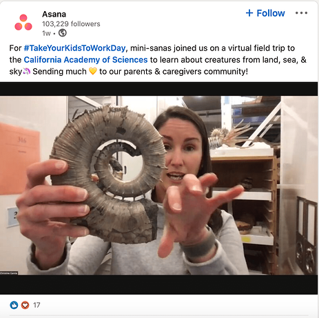 So, how will brands deal with more demand for thoughtful conversational marketing? A mix of
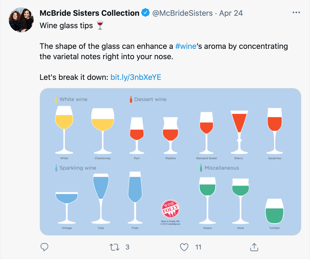
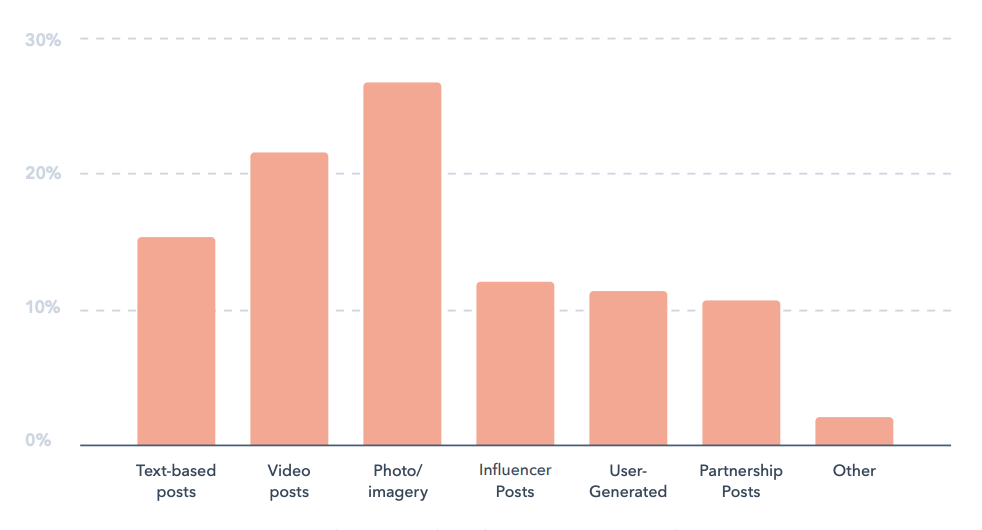
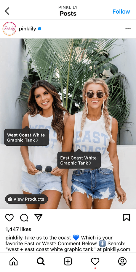 For consumers, this adds convenience. For brands that couldn’t build their own ecommerce store, the online shopping tools noted above are providing new opportunities to effectively sell products online.
  While some brands have spoken directly about their thoughts related to COVID-19 or other news items, others have shown authenticity by zoning on their customers through user-generated content or customer testimonials.










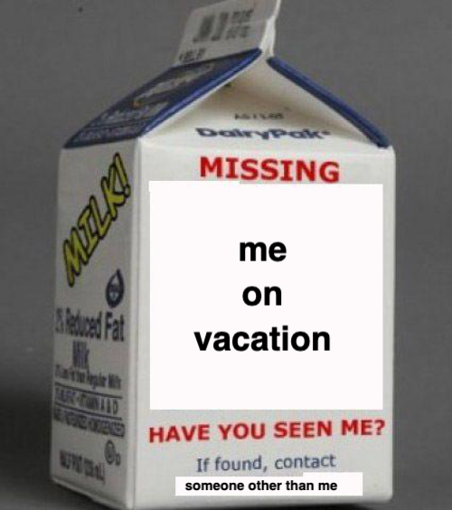
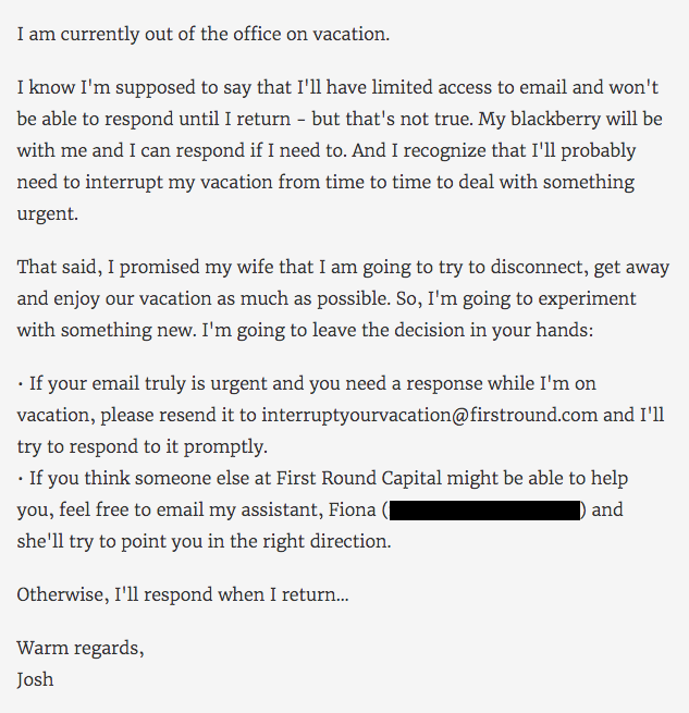

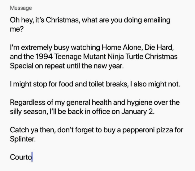 There’s no shame in using Christmas to indulge in your childhood movie tastes, but there is shame in not sharing that adorable side of yourself when people are trying to reach you during the holidays.






![Download Now: How to Use Twitter for Business [Free Kit]](https://i4lead.com/wp-content/uploads/2021/05/190da11f-58c6-41d5-a397-843618741e09.png)
