Categories B2B

Everything You Need to Know About Marketing Operations in One Place

One of my favorite movies is “School of Rock,” which also happens to be one of 2003’s best films. In the movie, Jack Black poses as a substitute teacher at a private school, and, after noticing the students are musically talented, he turns the 10-year-olds into a fully-fledged rock band.

When assigning roles to the students, he approaches the class president and deems her band manager because she had the organizational skills needed to help the band run smoothly. “Summer,” he says, “You’re in charge of the whole thing.”

When I think about marketing operations, I think of this quote — without a team, businesses that depend on technology would have a less-than-seamless experience carrying out their duties. In this post, learn more about marketing operations and why these teams are essential to a business.

→ Download Now: Free Marketing Plan Template

What is marketing operations?

Marketing ops enable the greater marketing team to run efficiently. They also can scale their operations as the company grows larger.

The people involved in marketing operations align and optimize all processes, from data reporting to strategy implementation, to build a foundation that reinforces and supports marketing efforts, and makes it easier to achieve goals by implementing systems to ensure marketers are best equipped to succeed at their jobs. 

Marketing ops can be considered a crucial element of your business, and below we’ll discuss why.

Why is marketing operations important?

Without marketing operations, it would be tough for marketing teams to complete essential activities effectively. 

For example, as technology is necessary to carry out most marketing tasks, a team to manage the complexity of that technology and ensure it works as it should is also necessary — which is exactly what marketing ops is

Here are some examples of situations that can be rectified by having a marketing operations team: 

  • Your investments in marketing technology don’t provide the solutions you thought they would.
  • You want to streamline data reporting and metrics tracking to understand ROI.
  • Strategy execution is a timely process, and you want to lower the amount of time it takes from start to finish. 

At HubSpot, the marketing ops team is responsible for supporting the systems and processes that enable the marketing team to perform optimally in their roles. This includes everything from permissions, conversational marketing, user data, forms, and email operations. 

An essential function of how well a marketing ops team works is proper management. So, in the next section, we’re going to talk about marketing ops management and what it entails.

Marketing Operations Management

Marketing operations management creates the framework for how marketing ops and teams do their jobs. This management will make strategic decisions on marketing activities and develop an optimized strategy that dictates beginning to end systems that will contribute to success. 

As a point of reference, marketing operations is the process of strategizing and optimizing, while marketing ops management defines how that strategizing and optimizing will happen. 

Since marketing operations management aims to increase efficiency, ops teams often have a hand in content planning and campaign analysis. Now that we understand what marketing ops is and what they do let’s talk about the details of a marketing ops strategy.

Marketing Operations Strategy

Marketing ops team members need to have an expansive skill set. Some of the typical activities this department deals with are email operations, systems analysis, customer data and marketing, user operations, and lead rotation. 

All of these roles come together to align the process and platforms needed to carry out marketing tasks for the greater marketing team.

When thinking about a marketing ops strategy, think about the problems the marketing ops team needs to solve. For instance, it’s common for marketing operations strategies to solve the needs of customers, stakeholders, and the employees of your company.

Below we’ll go over how to create a marketing operations strategy for your own business.

To understand what a marketing operations strategy is, we’ll start with an example: Let’s say a marketing ops team wanted to make email marketing a more valuable process for both parties involved (customers and marketers).

1. Identify what you want your operations strategy to accomplish for stakeholders.

The first step in defining a marketing ops strategy is outlining significant goals. For instance, your marketing ops team might decide to send email marketing messages, enabling sales to source quality leads, and identifying key marketers to execute that process are three goals they have for quarter one.

When you identify those major goals, make sure you also determine which stakeholders you are targeting. You might be targeting one group or many, but being clear about who you’re planning for will make sure your plan is actionable and valuable.

2. Determine actionable steps in your plan that will help you reach your goals.

Then, the team would look at how these tasks would help them complete their goals. For instance, the team would ask themselves, “How will enabling teams to effectively send email marketing help us reach our goals?” and estimate with an answer such as, “We should see a decrease in email churn rate.”

Determining these steps will help your marketing ops team stay organized as they work through their tasks. Additionally, by outlining these steps, your team can figure out what needs to be done and the resources required to see success.

3. Figure out a measurable metric to determine the success of your strategy.

The next step in strategizing is to identify how the team would measure the success of the project. In this example, the team might conclude, “We will calculate churn by dividing the number of contacts who unsubscribed from emails in a month by the number of unique email recipients in a month.”

When you figure out a measurable metric, you’ll be able to keep track of the strategy’s success as your team works through the plan. The metric will remind your team of the goal you want to accomplish and what stakeholders want to see as a result of your plan.

4. If needed, communicate how colleagues can take part in refining your strategy.

With the goal and measuring metric identified, your next step is to outline what this change would mean for affected colleagues, such as the team members who create and distribute email marketing messages.

The team might conclude that “Marketers can expect an easier email guideline process, a more effective format and to receive a form to offer input about how to make that happen.”

5. Assign team members to specific tasks that will contribute to the completion of your goals.

Having that set in place, what’s next for the marketing ops team is to assign team members specific tasks to help them achieve their goals. For instance, one team member might be in charge of redefining email marketing contact lists. Another might be in charge of auditing the current workflows in place for email marketing.

As team members complete these tasks, they would check them off in a centralized space so the entire team can stay updated on the project’s status.

Marketing operations teams are equally effective with their strategies and management capabilities as Summer’s character in “School of Rock.” With her processes, the group was able to obtain their own rehearsal space and offer music classes.

Marketing ops can come up with ways to increase customer satisfaction and ease the job of marketers. Their strategies make marketing activities and duties accessible to all, and because of that, are an essential part of a business.

Marketing Plan Template

Categories B2B

Permalinks: What They Are & How to Structure Them for Max SEO Value

What comes to mind when you think of SEO?

“Permalink” probably isn’t the first or second thing, maybe not even the 10th thing.

→ Download Now: SEO Starter Pack [Free Kit]

The truth is, though, permalinks and SEO have a lot more in common than you may realize, and — when done correctly — can play an important role in improving your website’s ranking. Luckily, they are also simple to master.

Let’s get into how permalinks work, how to create them, and set them on WordPress.

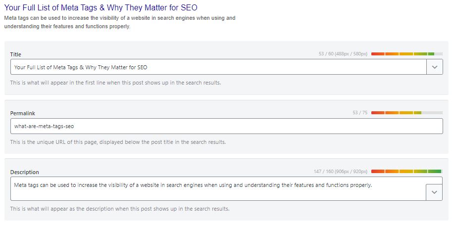
Let’s break down this post’s permalink.

Permalink structure example

You first have your domain (and subdomain in some cases) which is where your website lives. It’s followed by the path, which indicates the location of the page. In this example, the article is located under the “Marketing” category.

The last part of your URL is the slug – an essential part of your permalink and vital for SEO because it tells search engines how to index your site.

Each component creates a permanent link leading to a specific page on your website that is unlikely to change, hence the name “permanent.”

When you don’t customize your URLs using permalinks, you get a randomized ID. The problem is that this isn’t attractive to site visitors and isn’t optimized for search engines.

Let’s say you’re blogging about sponsored tweets and their value. Would you rather have the URL look like this:

yourdomain.com/sponsored-tweets-guide

Or like this:

yourdomain.com/post-id?=5726fjwenfkd

Probably the first one, right?

Great slugs should include the keywords targeted in the post. Take our example above: “sponsored-tweets-guide.”

From this permalink, the reader (and Google) know the page houses a guide to sponsored tweets and is targeting the keyword “sponsored tweets.” This makes it easier for readers to find and share your content.

In addition, using keywords with high monthly search volume (MSV) in your slug can help you increase your ranking.

That’s why when using a content management system (CMS) like CMS Hub or WordPress, you want to think about your permalink structure early on in your web development process.

What’s the difference between a permalink and a URL?

A URL is a web address that directs a web browser to the location of a page or file. It can include a domain name only, or also include the path, slug, and other information depending on the page you are accessing.

A permalink, on the other hand, refers to a specific URL structure, a tool made popular by bloggers for sharing and SEO purposes. While every permalink is a URL, not every URL is a permalink.

The Best Permalink Structures

With several permalink structures to choose from, think about your content and your audience to determine what format will work best.

For instance, a news site can greatly benefit from having a slug that includes a date and title. This lets readers know quickly by scanning what the post is about and when it was written.

On the flip side, if you manage a blog that prioritizes evergreen content and has pages that get constantly updated, you’ll likely want to avoid having any dates in your titles.

That can signal to readers that your content is old and therefore, irrelevant. Instead, have a simple slug that only includes your article title.

It’s all about using a structure that will benefit you (and your users) in the long run. Once you decide on a permalink structure, you can set it up in your CMS.

How to Make a Permalink

To make a permalink, all you need is:

  • Your domain name
  • Your slug
  • Your path (if you have several topic categories and want to organize your content)

Then, there are a few best practices to keep in mind when deciding on your permalink structure:

  • Keep it short – Avoid articles like “the,” “a,” “an” and create a slug that’s a shorter version of your title. E.g.: If your article is titled, “How to Create an Instagram Story,” your slug can simply be /Instagram-story.
  • Include your main keywords – Optimize your slug by including your keywords. Make sure the keyword you use directly relates to the content on the page.

Now, in terms of where you go to create your permalink, that’s typically on your CMS. The ideal time to set your permalink structure is shortly after developing your site but before any posts go live. However, you can also do this at any point.

If you decide to change old URLs to reflect your new structure, be sure to update all backlinks or set up redirects for those pages.

So, you’re probably wondering how to optimize a permalink for WordPress. We’ll cover that next.

Using Permalinks with WordPress

When you create a post in WordPress, the permalink will not be optimized unless you have already set the structure. Otherwise, it will look like a random ID.

You can find the permalink on the page post while you’re editing, as seen in the example below.Permalink in WordPress blog post editing

Changing permalinks is a fairly simple process, and you won’t need to install plugins to do so. You can select from a few structures or customize your own.

More on this in the next section.

1. Open “Settings” and click on ‘Permalinks.”

How to change permalink structure on WordPress

Image Source

The first step in structuring your permalink is to open the “Settings” section of your WordPress dashboard. This should bring you to a list of options with various subheadings.

Once you click on this option, you’ll be taken to a screen with a variety of options to choose from. Depending on your preference of how you want your post to be archived and searched, you can pick the one that most aligns with your goal.

2. Choose a permalink structure option.

WordPress permalink settings

Image Source

Here are the different choices you’ll have and what they mean:

  • Default — Avoid this default option if you’re looking for maximum SEO value. It’s the post identification number, with no other information.
  • Day and name — This option sets up the slug to be the day the post went live and the name of your post. A good reason to use this is if you have multiple posts of the same name but want the differentiator to be the date it was posted.
  • Month and name — The same as the previous option, this time with the month being displayed. If you have a monthly column, such as a “Favorites” or “Best Of”, this is a great option.
  • Numeric — Numeric is another choice that’s safe to ignore, as this structure is all numbers and provides little SEO value. If you’re archiving posts numerically, as a way to look back and see previous posts, numeric is the choice for you.
  • Post name — Choosing this route is an okay method for SEO, but not the best, as Google likes to focus strictly on keywords when ranking posts.

Learn more about that “custom structure” option next.

3. Consider creating a custom permalink structure.

If you’re not too excited about the structures WordPress offers, you can create your own permalink structure in minutes.

You’ll create a formula for your permalink structure, and every time a post goes live, it will follow that formula.

For example, let’s say you have a lifestyle blog and a travel category (i.e., path) under which you post about your latest vacations.

If you wanted to set the structure to be the category followed by the year and post name, here’s what you would put in the box:

/%category%/%year%postname%/

Permalink custom structure settings in WordPress

Image Source

Each custom structure is separated by a backslash, and each tag starts with the percent sign.

You can find all of the structure tag options available to you on WordPress here.

When creating permalinks, the main thing to keep in mind is focusing on SEO (i.e., keywords) and user experience. They’re the virtual key (pun intended) to making sure your content is found by the people you want to reach.

Editor’s Note: This post was originally published in October of 2019 and has been updated for comprehensiveness.

marketing

Categories B2B

Infographic Resumes: 6 Hiring Managers Weigh In

The modern job search is incredibly competitive, and technology has made it easier for your resume and job application to be overlooked and discarded before you even make it to the interview.

Luckily, technology is also here to help. There’s no longer a template for how to apply for a job — you can use social media, websites, and even interactive campaigns to get your name noticed by a recruiter.

One resume format you may not have considered? Infographics. A highly engaging and visually appealing infographic that explains your skills and qualifications might help you stand out in the crowd and serve as a work sample when applying for a job.→ Download Now: 15 Free Infographic Templates

It’s important to note that an infographic resume won’t be appropriate for all job applications. If you submit a resume in this format through an automated system, you could disqualify yourself if the technology can’t read visual information, so it’s best to stick to the format prescribed by the job posting.

Additionally, while an infographic resume might be a good idea for a more design-related role, it’s likely not a good idea for most non-design roles. Here, we’ll explore what six hiring managers have to say about infographic resumes — plus, how to make one for yourself.

How to Make an Infographic Resume

1. Start with a good structure. 

You’ll want to start by figuring out which tool you’re going to use to create your infographic. You might choose to create one in Powerpoint, or use pre-made infographic resume templates on a design website like Canva or Venngage

Once you choose your tool, you’ll want to identify a good structure. Do you want your name and a brief opening description at the top? Would you prefer to put the Education section at the beginning, or end? Are you going to include previous positions, or focus on just the current one? 

Additionally, you might want to figure out whether you’re going to focus more on icons and images, or data. 

For instance, take a look at the differences between these two Venngage infographic resume templates

Template for an infographic resumeTemplate for an infographic resume

In the first Kyle Fisher example, you’ll see he’s structured it so there’s plenty of white space; he’s also highlighted creative and software skills, and left space for hobbies. 

In the second Linda Jackson example, on the other hand, you’ll see technical skills and educational training take up the majority of the space on the resume, along with work experience at the bottom. 

When comparing these two infographic resumes, you’ll see the structure is vastly different. Similarly, consider the role for which you’re applying and which information is critical to demonstrate on your resume as it relates to the role — and which you can skip. 

2. Take note of everything you want to include in your infographic resume. 

Once you’ve chosen a structure, pull up an existing resume and take note of everything you want to transfer over to the infographic resume. 

For instance, if you want your infographic resume to be data-heavy, write down a few key metrics related to your current role, such as “43% YoY growth” or “12% increase in MRR”. It’s easier to design your infographic resume once you know what you’ll need to include. 

3. Choose a good color scheme. 

A cohesive color scheme is a critical component of any good design, and this is no exception. Consider using clean, complementary colors — like white, black, and orange, or yellow and teal — to help your resume stand out without becoming too distracting. 

4. Have a strong opener. 

This is a best practice for any resume, but particularly for an infographic, you’ll want to start with a good, powerful opener. In the examples below, for instance, I put: “Passionate, creative, and driven Elon graduate with leadership experience and strong communication skills.” 

Ultimately, your opener is your value proposition — what will you bring to the role that the hiring manager can’t find elsewhere? 

5. Use good design principles. 

Finally, an infographic resume should use the same design principles as anything else. 

These include: 

  • Creating balance, using either symmetrical or asymmetrical designs. 
  • Leveraging contrast to highlight certain elements. 
  • Using movement to create a narrative and provide a high-quality user experience. 
  • Ensure there’s unity in your design — i.e. your composition’s elements are in agreement. 

Take a look at Everything You Need to Know About the Principles and Types of Design for additional information regarding design principles.

6 Hiring Managers’ Opinions on the Infographic Resume

To explore when — if ever — infographic resumes are a good idea, I reached out to a few HubSpot recruiters to get their take. 

Kenny Nestle, a HubSpot G&A Recruiter, told me: “I personally love infographic resumes. It’s different and stands out from your typical resume, and it’s easy on the eyes.”

Nestle adds, “I’ve had candidate share graphics on the types of roles they’ve supported, as well as metrics related to their current role.”

Devon Brown, an Executive Recruiting Manager at HubSpot, echoes Nestle’s perspective, telling me, “I love when candidates use infographics as an opportunity to highlight their creative or design abilities.”

However, she urges candidates to ensure their design is clean and easily digestible. “It has to be formatted in a way that makes it just as easy to read as a typical resume,” Brown advises. “The flow of information, and how it’s presented, is critically important if a candidate chooses to go this route.”

Not every recruiter feels that infographics are a good idea. Technical Recruiter Sarah Magner, for instance, says, “I could see why people applying for design, marketing, or branding roles might use an infographic to set themselves apart, but I’ve always found them to be a bit distracting. Plus, the graphics can take away from the actual content on the resume.”

“I’d prefer an easy-to-read resume over a pretty one,” Magner adds. 

Tríona O’Sullivan, HubSpot’s Global Marketing Recruiter, agrees with Magner that infographic resumes are typically not a good idea. She told me, “It can be great to see the creative side, but sometimes a candidate can spend so much time designing the template that they miss out on key information, details aren’t aligned, or there are really obvious spelling and grammar issues in the mix.”

O’Sullivan adds, “Given how competitive and busy the job market is today, it’s more important to ensure your resume is easy to review, and states your experience and achievements clearly and quickly, since that’s what someone is going to look for first when reviewing.”

Amelia Towle, HubSpot’s Head of Brand Infrastructure & Design Team Manager, spoke with her Design team on the potential merits of an infographic resume, but agrees that it’s typically not a good idea. Towle told me, “If I think about the purpose of a resume, it’s a document that your intended audience typically wants to scan as quickly as possible to glean information in an efficient way. If you drastically alter the format, you are perhaps forcing extra cognitive load on a busy recruiter who is just trying to narrow down a potentially vast pool of applicants.”

Additionally, Towle told me that if a big company is using software to scan resumes, changing the layout might result in the resume being impossible for the scanner to interpret. 

Ultimately, she believes infographics are typically unwise, unless it fits the business for which you’re applying: “If it’s a huge HubSpot-sized organization, you might be shooting yourself in the foot by altering format beyond what is expected. But if it’s a tiny agency that is solely design-focused, it might be helpful to stand out.”

Towle adds, “Infographics-for-the-sake-of-infographics has arguably had its day, so in that case, you might want to conceive of something new.”

Finally, there are some recruiters who don’t necessarily care one way or the other. As HubSpot Marketing Recruiter Erica Matos told me, “I don’t really care about what a resume looks like — instead, I look at the content and make sure they have experience that aligns with what I’m looking for. I’d always love something visually appealing, but if I can’t clearly gauge the candidate’s actual experience, it’s not going to help them get the job.”

You’ll only want to create an infographic resume if it makes sense for the role. If the role is design-related, then an infographic resume can help you display some of your skills.

However, even if the role is design-related, there are some risks associated with infographic resumes — including difficulty downloading or viewing across devices, and the design elements detracting from the resume itself. 

For this reason, you might consider alternative methods to showcase your skills.

For instance, O’Sullivan told me, “While I don’t love super creative infographic style resumes, I love when someone hyperlinks to their portfolio or website, etc. That’s an amazing way to showcase both their experience and their thought process when it comes to applying for roles. If I see a hyperlink for one, 99% of the time, I will go and check that out.”

If you do choose to create an infographic resume, take a look at a few of these examples for inspiration. 

Infographic Resume Examples

1. The colorful, graphic-heavy infographic resume. 

The resume I created below uses plenty of visuals and numbers to highlight relevant information. For instance, there’s a graph to showcase the blog posts I’ve written that have earned a spot on the first page of Google; there’s a large “12” to highlight the years of content creation under my belt; and there’s even an image of 10 stick figures to demonstrate my individuality. 

Example 1 for an infographic resumeConsider how you might use one font, and a complementary color palette, to create a similar infographic. I designed this one using one of HubSpot’s free infographic templates, so feel free to create the same one using the templates, as well. 

2. The data-heavy infographic resume. 

In the following infographic resume (also created using HubSpot’s templates), you’ll see I’ve highlighted most of my accomplishments using data — such as the 45% YoY growth, 1,400 additional subscribers, or 24,000 hours managing deadlines. 

I also used icons of a smiley-face, pencil, and painter to demonstrate some of my skills in more visual form. 

Example 2 for an infographic resume

What do you think? Ready to take your resume to the next level? Grab some starter templates below.

New Call-to-action

Categories B2B

9 Breadcrumb Tips to Make Your Site Easier to Navigate [+ Examples]

In the fairy tale Hansel and Gretel, two children drop breadcrumbs in the woods to find their way home. Nowadays, you probably don’t experience too many lost-in-the-wood experiences, but I’m willing to bet you’ve felt disoriented on a poorly designed website.

In web design, breadcrumb navigation is a way to show your users their location and how they got there. Like Hansel’s breadcrumbs, it helps users retrace their path and see where they are in the greater scheme of your site.

Download Our Free UX Research & Testing Kit

While you can style breadcrumbs however you’d like, they tend to look the same across websites that use them. Here’s a simple example of breadcrumbs from the HubSpot Knowledge Base:

an example of breadcrumb navigation on the hubsot knowledge base website

Jakob Nielsen, co-founder of the acclaimed Nielsen Norman Group, has been recommending breadcrumb navigation since 1995, and makes a strong point for their usefulness and efficiency: “All that breadcrumbs do is make it easier for users to move around the site, assuming its content and overall structure make sense. That’s sufficient contribution for something that takes up only one line in the design.”

If your business’s website is multi-layered, you might consider implementing breadcrumb navigation to make your site easier to navigate. However, like any design element, there’s a right and wrong way of doing it. Here, we’ll explore nine tips and examples to ensure you’re creating the most effective breadcrumb navigation for your users.

Breadcrumb Navigation Tips and Examples

1. Only use breadcrumb navigation if it makes sense for your site’s structure.

Breadcrumb navigation has a linear structure, so you only want to use it if it makes sense with your website’s hierarchy. If you have lower-level pages that are accessible from different landing pages, using breadcrumb navigation will only confuse readers who keep accessing the same pages from different starting points. Additionally, if your site is relatively simple, with only a few pages, you probably don’t need breadcrumb navigation.

2. Don’t make your breadcrumb navigation too large.

Your breadcrumb navigation is a secondary tool to your primary navigation bar, so it shouldn’t be too large or prominent on the page. For instance, on DHL’s website, their primary navigation bar is large and recognizable, with columns like “Express” “Parcel & eCommerce” “Logistics”, etc. Their breadcrumb navigation is the smaller section below that reads, “DHL Global | > Logistics | > Freight Transportation”. You don’t want your users to mistake your breadcrumb navigation as the primary navigation bar.

an example of breadcrumb navigation on the DHL website

3. Include the full navigational path in your breadcrumb navigation.

I Googled “Elon University Non-Degree Students” to reach this landing page, but Elon is smart to include the full navigational path, including “Home” and “Admissions”. If you leave out certain levels, you’ll confuse users and the breadcrumb path won’t feel as helpful. Even if users didn’t begin on the homepage, you want to give them an easy way to explore your site from the beginning.

an example of breadcrumb navigation on the elon university website

4. Progress from highest level to lowest.

It’s important your breadcrumb navigation reads left to right, with the closest link to the left being your homepage, and the closest link to the right being the user’s current page. A study by Nielsen Norman Group found users spend 80% of their time viewing the left half of a page and 20% viewing the right half, making a strong case for left-to-right design. Plus, the link closest to the left will appear as the beginning of the chain, so you want it to be your highest-level page.

5. Keep your breadcrumb titles consistent with your page titles.

To avoid confusion, you’ll want to remain consistent with your page and breadcrumb titles, particularly if you’re targeting certain keywords in those titles. You also want to clearly link your breadcrumb titles to the page. If the breadcrumb title doesn’t have a link, make it clear. Nestle effectively labels its breadcrumb titles to match the page titles. “Areas of impact & commitment”, for instance, reads the same in the breadcrumb navigation as it does on the page.

Nestle also does a good job differentiating links from non-links with different colors — the links are blue, while the non-links remain gray.

example of breadcrumb navigation on the nestle website

6. Get creative with design.

The traditional breadcrumb navigation looks like this: Home > About Us > Careers. However, you don’t need to follow the traditional path if you feel a different design could appeal more to your audience, or look better on your site.

For instance, Target uses breadcrumb navigation in their product pages (because who wouldn’t get lost in the virtual shoe section?), but uses “/” symbols and simple black and grey text. In this case, the subtle design variation makes sense for their site’s aesthetic.

an example of breadcrumb navigation on the target website

7. Keep it clean and uncluttered.

Your breadcrumb navigation is simply an aid for the user, and ideally shouldn’t be noticed unless the user is looking for it. For this reason, you don’t want to clutter your breadcrumb navigation with unnecessary text.

Eionet, for instance, could do without their “You are here” text. While meant to be helpful, the text clutters the page. With the right design, a breadcrumb navigation should be noticeable enough without an introduction.

an example of breadcrumb navigation on the eionet website

8. Consider which type of breadcrumb navigation makes the most sense for your site.

There are a few different types of breadcrumbs you might use — location-based, attribute-based, and history-based. Location-based breadcrumbs show the user where they are in the site’s hierarchy. Attribute-based breadcrumbs show users which category their page falls into. Finally, history-based breadcrumbs show users the specific path they took to arrive at the current page.

Bed Bath & Beyond uses attribute-based breadcrumb navigation to show users which category their product page falls under, so users can click back to “Kitchen” or “Small Appliances” to peruse similar items. This type of breadcrumb navigation is most effective for Bed Bath & Beyond customers. When you’re creating a breadcrumb navigation, consider what’s most useful for your site’s visitors.

an example of breadcrumb navigation on the bed bath and beyond website

9. Know your audience.

Best practices in breadcrumb navigation urge web designers to place the navigation at the top of the page — but Apple, one of the most valuable companies of all time, defies this logic by putting their breadcrumb navigation at the bottom of their site. Ultimately, it’s critical you know your audience. Apple’s customers are typically tech-savvy, and would likely find the navigation if they needed it. Consider your customers’ needs, and implement A/B testing if you’re unsure.

an example of breadcrumb navigation on the apple iphone x website

Breadcrumb Navigation in HTML and CSS

Not only are breadcrumbs useful — they’re also easy to add to your website with a bit of HTML and CSS code.

Let’s start with the HTML, which we’ll use to make the links themselves. The easiest way to do this is to organize your links in an unordered list (<ul>) element, with each list item (<li>) comprising a link in the breadcrumb series until the final item, which denotes the current page.

Here’s an HTML template for breadcrumbs that you can use:

Notice how I’ve also enclosed the unordered list in an HTML <nav> (navigation) element, and added a class and an ARIA label to its opening tag. This is optional, but helps make your page more accessible to screen readers and search engines.

Of course, this HTML alone isn’t enough — right now, we just have a bulleted list of links. By adding CSS, we can achieve the breadcrumb look that we’re looking for. Apply the following CSS to the HTML above:

Together, this code generates a basic breadcrumb navigation area that can be used on any site — see the final result below. I’ve also added some additional styling for a cleaner look. To see how the breadcrumbs look without this styling, comment out the code at the bottom of the CSS tab.

See the Pen Breadcrumbs in HTML and CSS by Christina Perricone (@hubspot) on CodePen.


Breadcrumb Navigation in Bootstrap CSS

Bootstrap CSS also offers a way to create breadcrumbs without needing to add custom CSS. To do this, use the Breadcrumb component like so. Here’s an example from the Bootstrap 5 documentation:

See the Pen Breadcrumbs in Bootstrap CSS by Christina Perricone (@hubspot) on CodePen.

This is just the basics of breadcrumb navigation in Bootstrap — see the Bootstrap breadcrumb documentation to learn all the details.

Design to Help Users Navigate Your Site

Ultimately, breadcrumb navigation is an effective tool to make your site easier to navigate, but you want to follow design best practices to ensure you’re leveraging the tool’s helpfulness. For additional UX advice, check out our Ultimate Guide to UX Design.

Editor’s note: This post was originally published in September 2018 and has been updated for comprehensiveness.

ux templates

Categories B2B

The Beginner’s Guide to Brand Pillars

Although the practices of marketing and branding have been around for centuries, the industries started to shift in the 1990s.

The digital age came about and companies began to market their brands more than their products with the goal of giving their company a personality.

As a millennial born in the early 90s, I grew up at the same time as the digital revolution. In fact, millennials have a reputation for spending all day on their phones and being lazy.

However, I’d argue that as the digital age and technology began to evolve, so did society’s work expectations. Businesses, and even employees, are expected to be a brand in and of themselves that has value and positively impacts society (instead of just selling products).

As a marketer or business owner, you might be wondering, “How can I create a brand that my audience connects with?”

In this post, we’ll discuss how to create brand pillars that clearly communicate your brand identity to your audience.

For example, brand pillars can be core values, important strengths, or aspects of a brand that support or add dimension to the core idea of “Who are you?”

Essentially, these brand pillars can be anything that your customers find important — perhaps it’s innovation, reliability, on-time delivery, etc.

Brand pillars are meant to differentiate your brand and should be valued and endorsed by your customers. When someone asks why your customers like your brand, they’ll probably be able to list off your brand pillars if you’re clearly communicating your brand well.

These pillars should be decided on strategically to provide better products or services to your customers.

I know this might sound slightly conceptual. Brand pillars can be easier to understand when we break them down into categories.

Below, let’s learn about the five brand pillar categories you can use to determine your own brand pillars.

What are the five brand pillars?

The main brand pillars are purpose, perception, identity, values, and brand experience.

1. Purpose

Purpose can be described as the mission and foundation of your company. It will answer questions like “Why did you start your company?” and “What are you hoping to achieve?”

Think about this strategically. What do you want to communicate to your audience as your purpose? What do you want to communicate to employees or potential employees? Knowing your purpose will help you hire employees who align with your mission and correctly target your audience.

Purpose can even be described as the culture of your company. For example, at HubSpot, our culture is about growth-minded individuals who have HEART (they are humble, empathetic, adaptable, remarkable, and transparent). The acronym HEART is one of our brand pillars as a company.

2. Perception

Perception is about how your customers perceive your company/brand. You’ll want to either evaluate how current customers view your brand, or if you’re a new company, write down some characteristics that you’d like customers to associate with your brand.

This could be something like hospitality or leadership. If these are your perception brand pillars, then you want customers to view you as a leader in your industry that is a trusted, good host (this makes sense for a hotel, for example).

3. Identity

This brand pillar is about who you are as a brand. A brand is something you are, it’s not something you have. It’s all about your personality as a company.

For example, an identity brand pillar could be something like “cheeky” or “bold.” This means that you want customers to see you like a cheeky personality. The reason to define this brand pillar is so you have a guiding light for how to be human and interact with your customers.

4. Values

Your values are about communicating your overall position to your audience. What’s important to you as a company? How do you want to make a difference? This could be something like valuing integrity and ownership.

5. Brand Experience

Lastly, brand experience is a pillar that will help you promote your products and services. People use products and services when they like a brand. When there are so many options to choose from these days, customers will choose to buy from companies they like. This means you need to create a positive customer experience and association with your overall brand.

By using these brand pillars as a basis, you can create a brand identity that sets you apart from your competition. Companies that fail most likely haven’t considered what their brand pillars are and how they align.

If you have a robust strategy, but you don’t have a purpose or identity, people won’t feel compelled to purchase from you. On the other hand, if you promise that you value user experience, but the perception is off, then you also won’t find success.

In the next section, let’s review how you can use these categories to define your brand pillars.

How to Determine Your Brand Pillars

To determine your brand pillars, you should ask yourself a series of questions to come up with the top characteristics that you want to communicate to your audience.

Purpose

  • Why did you/are you starting your company?
  • What do you want to accomplish?
  • How do you want to serve your customers?
  • What value do you offer to customers that support your mission and vision?

Your purpose should serve as a magnet for employees and customers who share similar values. It will also provide a hook to tell your company’s story and differentiate yourself from your competition.

Perception

  • What role do you play in your customer’s mind?
  • What do they perceive your value to be?

This pillar could be something like education. Perhaps people view you as a place they go to learn about your industry. This is completely owned by your audience and how they interpret your brand through messaging and reputation and management.

Identity

  • What’s your culture like?
  • What’s your point of view?
  • What kind of tone of voice do you use in communication?
  • What are your convictions and behaviors that define your brand?

Defining your voice and brand is about strategizing how you want to speak to your audience on several platforms. The brand personality signals what employees might be like, how they behave, who your customers are, etc.

Values

  • What’s important to you in your interaction with your audience?
  • What do you value above all else, even before your own financial interests?

Again, this pillar will help define what you care about as a company.

Brand Experience

  • How do customers interact with you at each touchpoint?
  • What kind of experience do you want customers to have?
  • What makes your customer experience better than your competitors?

This pillar will define much of your perceived personality and reputation.

When creating your brand pillars, think about what your customers get from you. Do they get convenience, higher quality, time savings, etc.?

To determine your brand pillars, think about your brand strategy and come up with things that clearly define your personality, voice, customer experience, your purpose, and how people will perceive your brand.

Brand Pillar Examples

1. Hilton Brand Pillars

Hilton’s brand pillars are very clearly stated on its website. They value hospitality, integrity, leadership, teamwork, ownership, and now (sense of urgency).

These are stated as their values, but they’re really brand pillars that showcase how the company wants to be perceived, what their identity is, what the customer experience is like, and what they value.

2. Patagonia Brand Pillars

Patagonia is a brand that has personality and purpose. Their mission is to inspire and implement solutions to the environmental crisis (this is their purpose). Additionally, Patagonia offers a minimalistic style and values simplicity and utility (this is their personality and values).

3. Nike Brand Pillars

Since it was founded, Nike has been consistent in its brand pillars. They are all about competition and surpassing one’s limits. All the company’s advertising, messaging, and investment decisions support that personality and value.

Brand pillars are a great way to define and differentiate your company from the competition. It’s not just about making products anymore — it’s about having a voice and point of view that offers value to its customers.

New Call-to-action

Categories B2B

How to Build a Marketing Technology (Martech) Stack That’ll Grow With You

What will your marketing team look like six months from now? Or a year from now? How many people will you add? What new tools, systems, and data will you need?

There are a lot of potential questions you can ask about the future of your business, but there is one certainty: you’ll deal with more data, more people, more processes, and more complex problems as you grow.

But how do you deal with that in your marketing team? That’s where marketing technology, or martech, comes in. By automating tasks and removing obstacles from your team’s workflows, marketing tech empowers your team to waste less time on menial tasks, allowing your business to grow more efficiently.

Download Now: HubSpot's Annual State of Marketing Report

When you put it all together, you get a marketing technology stack: a collection of tools that your team uses to do their best work every day.

As your team and business scales, it’s important to create a martech stack that streamlines your day-to-day processes. In this post, we’ll go over everything you need to know about martech and how to build a marketing tech stack that will stay with you as you grow your business.

Marketing technology can be used by any type of marketer — even non-digital marketers. One martech tool is typically used for a different marketing discipline.

Here are a few examples of disciplines and a martech tool that can be used for them.

Instead of adopting a plethora of different tools, some marketers choose to adopt an all-in-one solution such as Marketing Hub.

How is technology used in marketing?

Technology is used by marketers to execute their marketing campaigns. Marketers use software to automate marketing tasks and collect data so they can get insights related to campaign activity and their impact on customers.

For example, say that your team spends a significant amount of time emailing customers. The action feels repetitive, and it’s keeping people away from more pressing assignments. You may choose to use an email automation software, so less time is spent sending emails.

You also want the software you use to track data related to those emails, so you gain an understanding of how your users interact with them.

In brief, marketers use technology to make their jobs easier and understand their levels of success. The technology that marketers use in their campaigns is known as their marketing tech stack.

Let’s say that you primarily focus on SEO and paid ads on social media. You would add the following tools to your marketing tech stack: Moz for SEO and HootSuite for social media management.

Alternatively, you can adopt an all-in-one solution such as Marketing Hub to take care of both your SEO and social media marketing strategies.

For instance, Marketing Hub’s SEO tool will assist you in optimizing your site with its built-in keyword research tools, as well as as-you-type optimization advice while you’re creating content.

Marketing tech SEO tool from HubSpot

Its social media management tool will take care of everything related to social media — including post creation and audience engagement analytics. You can even reply directly to comments from the tool.

Marketing tech social media management tool from HubSpot

Overall, the technology you choose will help you execute your campaigns from start to finish.

But with so many to choose from, it can be difficult to build a martech stack that works for your team. Let’s go over how you can build an effective stack.

How to Build a Marketing Tech Stack

There is no out-of-the-box method for building your martech stack. Your company is unique, and your perfect marketing stack is not going to look exactly like anyone else’s.

This is the time for choosing the right tech tools for your team and setting them up in a way that your future team can use and understand. To do so, take the following steps.

1. Identify your primary marketing strategies and goals.

Before ever choosing a martech tool, you’ll need to outline your marketing strategies. It doesn’t have to be complicated, either: you simply need to have an idea of the basic strategies that you want to implement.

If you already have an established marketing team, take a look at the strategies that are currently in place. This will help you gauge, from the get-go, the types of tools you need.

Here’s an example. Let’s say that you want to increase organic traffic to your website. The strategy for that would be SEO. Next, you want to capture leads. So you would invest in a website redesign strategy that highlights your calls-to-actions more efficiently.

Jot these strategies down in a document, then include ideas for possible tools you can use to implement the strategies. If you don’t know which tools you use, simply write that you’ll list them after further research.

Example 1

  • Goal: Increase organic traffic
  • Strategy: SEO
  • Tools: To be determined

Example 2

  • Goal: Get more visitors to convert
  • Strategy: Redesign the website
  • Tools: To be determined

2. Survey your team to find out their challenges.

Next, sit down with your team and find out the challenges they encounter when trying to execute their day-to-day duties.

What adds more time to their workflow? What makes their job harder?

While the conversation should be open-ended, try to connect their challenges to your marketing goals. For instance, if you want to increase organic traffic, ask what specifically your team finds challenging when trying to optimize the website. If they say keyword research takes too much time, then you’d know that you’ll need a keyword research tool specifically.

Jot these challenges down in the same document you’ve already started. Keep it simple — just a sentence or a few bullet points will do.

Example 1

  • Goal: Increase organic traffic
  • Strategy: SEO
  • Challenges: Keyword research takes too much time
  • Tools: Keyword research tool that quickens the process

Example 2

  • Goal: Get more visitors to convert
  • Strategy: Redesigned website
  • Challenges: Unable to add CTAs because of the outdated backend system
  • Tools: A new content management system that allows the team to add CTAs to any page

3. Establish an estimated budget.

Building your dream martech stack means nothing if you can’t afford it. As you begin to determine the types of tools you’ll need, think about the funds you’ll allot for them.

You can go several ways about this. You can determine a budget per tool or per strategy. Alternatively, you can choose a budget overall for the entire team in a yearly, quarterly, or monthly basis.

Choosing a monthly budget is the best choice for small businesses without a dedicated finance team. Most tools are available on a monthly subscription basis, which makes it easier to drop one if it doesn’t work for the team.

You can also choose a budget per strategy. For instance, you can decide you’ll invest $200 a month in SEO tools.

Be sure to take into account the amount of seats you’ll need for the tool, or ensure the team is open to sharing one subscription. Most times, sharing a single subscription will work without a problem, and you can save a significant amount of money.

4. Research the tools you’ll consider for your martech stack.

Now that you have your strategies, your tool ideas, and your budget, it’s time to research the actual products you’ll add to your martech stack. If you’re a marketing leader, you can leave this task to individual team members, because they’ll be the ones using the tools.

It’s helpful to look at product curation posts to get a general idea of the offerings that are out there. For the keyword research challenges in your team, for example, you can look at a list of keyword research tools. If you’re looking for a new CMS, you should look at a list of the best CMS systems.

From there, you can investigate pricing, product reviews, and general fit for your team.

Make a list of the tech tools in a spreadsheet and include pricing and a general description of the product. From there, refine the list until you’ve decided on the tools you want to try out, and be sure to specify whether the tool needs a monthly or yearly subscription.

5. Consider non-marketing tools to add to your tech stack.

When we talk about the martech stack, we’re often caught up in marketing-specific tools. But there are a wide range of “general” tools that are useful for a marketing team.

Project management tools, collaboration platforms, and data sync software solutions are just a few of the products you can consider. Anything that cuts time from a complicated workflow is worth exploring. Google Drive would be an example, and so would Asana.

Add these products to your martech list, including the pricing and a brief description.

6. Compile the data that you’ll transfer into the tools.

After you’ve purchased the tools, it’s time to transfer the data. Already have a list of leads? How about Microsoft Word documents you’d like to import into Google Drive for collaborative editing?

Compile all of them in folders. Assign a type of data to each team member. For instance, one team member can compile the contacts from a conference. Another team member can compile the current templates you use for your social media posts. Another can compile all of the copy from the website for the website redesign.

When it’s time to sign up for the tools and adopt them, you can transfer these files and data and more easily pick up where you left off.

7. Assign one team member to create a workflow per tool.

Now that it’s time to adopt the martech tools, you don’t want to throw it out to your team without a workflow. That’s an easy way to end up with a subscription that no one is using.

Assign one team member to explore one specific tool. This team member will jot down workflow steps for using the tool effectively and write a step-by-step tutorial with screenshots. After, schedule a meeting for the team member to carry out a live tutorial.

Why? You can establish the best way to use the tool without a lot of guesswork. The process will be scattered and haphazard if everyone starts using the tool at once. By having a single uniform process, you can guarantee that every team member is using the tool to its fullest extent.

8. Analyze the tools’ success and switch solutions if necessary.

You don’t want to end up with an unused martech stack. Always audit your tools for their success — whether they effectively streamline workflows, automate tasks, and help your team do their work in a better way.

If not, there’s no shame in cancelling your subscription and going for another solution. Take a look at product curation posts, or research individual tools you may have heard of from other marketing leaders.

Let’s go over a few tips you should apply when building your martech stack.

Martech Stack Tips

As you build your marketing tech stack, you’ll be pulled in all sorts of different directions. When your business is growing, you’ll be tempted to add more complexity to address urgent gaps.

We’ve been there. HubSpot’s marketing operations team is all too familiar with the challenge of dealing with more and more as our team grows.

We’ve learned a lot along the way — so we gathered insights from HubSpot’s resident operations experts to ask what they wish they would have known when growing HubSpot’s own marketing tech stack.

1. Strategy first, technology second.

As companies grow, it can be tempting to rely on technology to support processes that are still evolving. Usually, this happens when a team adopts powerful tools that have a lot of potential, and they try to mold their systems around it.

HubSpot’s marketing operations team has made this mistake, too, and with an important takeaway: What sets apart truly powerful tech stacks isn’t just about the technology.

“The tools themselves won’t make you successful but rather how you use them,” explains Kerri Harrington, Marketing Ops Analyst here at HubSpot.

Harrington has worked closely with HubSpot Partners, consulting many who were in the midst of building their tech stacks. She taught them to think about their tech stack not as the powerhouse behind their systems, but a vehicle to efficiently and effectively execute their strategy.

If you are still developing your strategy, she says, try drawing out and visualizing your tech stack. This gives you an opportunity to think critically about each tool, the purpose it serves, and where there is any overlap or duplication in your tools.

2. Keep systems simple.

Have you heard of the “keep it simple, silly” (KISS) principle? The term, originally coined by an aeronautical engineer in the US Navy, states that simplicity guarantees the greatest levels of user acceptance and interaction.

The term is used often in software design, for example, where function and instruction creep can make products unmanageable over time.

How do you prevent this happening in your own company as it continues to grow? Put your current strategy down on paper, and review the value of every stage of your process with your leadership team. Consider what processes could be done more efficiently, and what could be eliminated altogether.

“The #1 driver of complex business systems is complex business rules,” says Mark Metcoff, Director of Marketing Technology at HubSpot. “If you can simplify your go-to-market strategy as much as possible, then regardless of how you structure your systems, you’ll be heading in the right direction.”

3. Aim for medium-term solutions.

In an ideal world, every decision you make about your tech stack today will work seamlessly for your team for years to come.

In reality, though, you are probably going to change systems a dozen times over the next few years if you continue to scale. You shouldn’t worry about picking your forever tech, but do not settle for a tool that will become obsolete in 6 months, either.

“Aim for the medium-term,” Metcoff suggests. “The costs of switching systems has never been lower, thanks to the emergence of more persistent datastores like customer data platforms that can underlie front-office facing systems, and iPaaS solutions that allow you to integrate front-office providers for easy data transfer.”

4. Document everything, and document it well.

Imagine opening your spice cabinet, ready to cook up a chicken curry, to find that nothing in the cabinet is labeled. Every spice and herb is in the same colored jar, with no ingredient label or expiration date.

Unless you have a noteworthy sense of smell, this project would not be very easy or enjoyable.

This is what it’s like to step into a new role only to realize that your new team’s processes and database have not been properly documented. This is common among growing companies, because as your database grows and your systems evolve, it’s easy to end up with a lot of clutter, data integrity issues, and confusion.

Many will skip right over this — who likes to document? Who has the time to ‘waste’ a day of innovation to do seemingly admin work? We get it — But for the sake of your future team, make sure you take the time to lay down the right foundation for data architecture.

“I can’t tell you how many times we have to review the history of a change or ‘walk through’ the last couple of years on a topic,” says Maggie Butler, Builder Marketing Team Manager at HubSpot. “It gets really, really hard if no one has documented anything.”

One incredibly valuable resource HubSpot had during one of its growth spurts, she says, was the documentation built by our engineers that detailed in simple language how the logic and code worked. Aim for this level of documentation to be comprehensive across all applications, and easily accessible for everyone on your team.

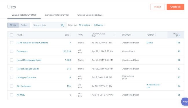
In terms of marketing tools, our Lead Management tool embodies the ‘document everything’ mantra. The tool can be used to create a database of all customer information, where you can view chronological timelines of every interaction customers have had with you.

5. Choose point solutions that serve a single purpose.

A point solution is a product or service that addresses one very specific need in a marketing organization. Sometimes, you just need a piece of software to do a specific thing really, really well. There’s no shame in it.

The data sync software included in Operations Hub is a great example of this. If you use multiple different apps to execute your marketing strategy, keeping track of customer data from each app can be a tedious process. The data sync tool can integrate with your CRM to streamline this process by syncing customer data from your favorite apps into one up-to-date database.

But keep in mind that every piece you do add to your infrastructure comes with its own compliance risks, technical challenges, maintenance and upkeep, and general administration.

“Also look closely at whether or not it needs to be integrated into your tech stack,” explains Metcoff. “Sometimes point solutions work just fine in a silo.”

If you have any point solutions in your current stack, think about how it fits into the bigger picture: how does it interact with the rest of your technologies, and what do you need to do to keep it running?

6. Aim for ease of use, but don’t sacrifice the necessities.

There are a lot of options out there — so don’t settle for less than what you need. At the end of the day, you need to choose a system that’s easy for your team to pick up and use, but still has the power and flexibility you need to get things done.

The challenge with today’s marketing automation tools is that they offer either enterprise-grade power or consumer-grade ease-of-use, but never both. As a result, many still go with the safe bet — overpriced, overly complicated, and under-utilized tools — which translates to spending more time on systems than on your customers.

Best Marketing Tech Stack

The best marketing tech stack for your business is entirely tailored to your needs, but there are a few tools we recommend — especially if you’re just building out your marketing team.

Let’s take a look at a martech stack for general use, attracting site visitors, converting site visitors, and engaging leads. These martech tools are essential for running a high-performing marketing team.

Collaboration: Google Drive

Google Drive allows your team to collaborate on documents, spreadsheets, and folders — all on the cloud. There’s no need for anyone to download any software on their laptop. The best part is that losing work is nearly impossible with Google Drive.

Pricing: Free

Alternatives: OneDrive, Dropbox

Communication: Slack

Slack is an instant messaging platform that’s specifically designed for work (and not leisure chatting). This tool makes it easy for your marketing team to share quick updates, send files, and communicate live if necessary. With Slack, there’s no need to send emails that can be covered in a quick conversation.

Pricing: Free; $6.67/user/month (Pro); $12.50/user/month (Business +); Custom (Enterprise Grid)

Alternatives: Google Chat, Microsoft Teams

Project Management: Asana

Project management is the heart and soul of marketing. Whether your team is scheduling campaigns, managing complicated workflows, or working on a project-to-project basis, you don’t want anything to fall through the cracks. Asana makes it easy by providing a collaborative space for your team to check off tasks and share project updates.

Pricing: Free; $10.99/user/month (Premium); $24.99/user/month (Business)

Alternatives: Trello, Freedcamp, Project.co

Asset Creation: Canva

Canva offers a wide range of helpful templates to help your marketing team create assets for anything. Social media posts, Facebook banners, posters, infographics, presentations, flyers, and brochures can all be created with Canva. The best part is that you can start for free, and there’s virtually no learning curve. You can sign up and start using it right away.

Pricing: Free; $199.99/year (Pro); $30/user/month (Enterprise)

Alternatives: Visme, Snappa, Adobe Creative Cloud (recommended for advanced users)

Stock Images: Unsplash

Stock images are used in any type of marketing material, such as blog posts, banners, flyers, and brochures. It’s illegal to use images you find online unless they’re under a Creative Commons license. Some of these images are also not of professional quality. Unsplash is a great option for getting access to and downloading high-quality stock photos for free.

Pricing: Free

Alternatives: Pexels, Shutterstock (Paid), Getty Images (Paid), iStock Photos (Paid)

Image Optimization: Toolur

After you download stock images, it’s important to compress them so that they don’t slow down your website. There are many image compression tools out there, but Toolur is one of the best. You can upload up to 25 images at a time, choose different compression methods, set image quality, and resize them all to a preset width. Competitors only allow you to upload an image at a time or try to upsell you by restricting compression options.

If you’re optimizing GIFs, we recommend Ezgif.com.

Pricing: Free

Alternatives: Squoosh.app, TinyJPG

Grammar Checker: Grammarly

Publishing error-free copy is paramount to presenting your business professionally online. With Grammarly, you can take all the manual work out of copy-editing your work. Although it’s still recommended to give your pieces one final read-through before publication, Grammarly will catch most errors.

Pricing: Free; $12/month (Premium); $12.50/user/month (Business)

Alternatives: ProWritingAid, Hemingway App

Content Management and Blogging: CMS Hub

If you don’t yet have a website or blog and need to create one, you’ll need a scalable CMS system to power your website. If you already have a website but the CMS is clunky and hard-to-use, you’ll also need to seek a replacement that makes it easier to publish and update content.

CMS Hub is one of the best options in the business. You can build landing pages, create forms, add pop-up CTAs, publish blog posts, and see all of your performance metrics in one easy-to-use platform. It’s integrated with Marketing Hub, allowing you to seamlessly connect your other marketing initiatives to your website. Because it’s an all-in-one solution, there’s no need to pay for plugins and add-ons that slow down your site.

Pricing: $270/month (Professional); $900/month (Enterprise)

Alternatives: WordPress, Joomla, Drupal

Website Visitor Analytics: Google Analytics

Knowing who’s visiting your site, when they’re visiting, where they’re visiting from, and whether they bounce off is critical to understanding and improving your overall website performance. Google Analytics also helps you measure your organic traffic, see top landing pages, and see top exit pages.

Pricing: Free

Alternatives: StatCounter (Paid), Simple Analytics (Paid)

Web Page Analytics: Google Search Console

While Google Analytics is an excellent way to measure overall website performance, Google Search Console takes it a step further by providing analytics page-by-page. You can use it to see your top queries for either the whole site or a specific page, compare time periods, and compare two or more URLs on your site.

Pricing: Free

Alternatives: Ahrefs (Paid), Moz (Paid)

Website Analytics Dashboard: Google Data Studio

You’d create a dashboard for nearly anything in marketing: email marketing performance, landing page performance, user acquisition stats, and more. For those, you’d be better off with a dedicated reporting dashboard software.

For creating dashboards on website analytics, however, Google Data Studio is a budget-friendly tool that automatically imports data from Google Analytics. This makes it an easy choice for current Google Analytics users. Simply choose the data you want to show and configure it using the drag-and-drop dashboard editor.

Pricing: Free

Alternatives: HubSpot’s Dashboard and Reporting Software (included in Marketing Hub), Databox (Paid)

Email Marketing: Marketing Hub’s Email Marketing Tool

Marketing Hub’s free email marketing tool allows you to create rich HTML emails without writing a single line of code. You can also personalize the emails using smart rules and A/B test campaigns to increase click-through-rates. The tool is integrated with all of Marketing Hub’s features — so a lead from any form on your website automatically turns into a subscriber.

Pricing: Free

Alternatives: Constant Contact (Paid), MailChimp (Paid)

Marketing Automation: Marketing Hub

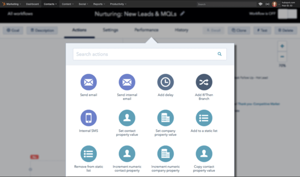
Marketing automation allows you to nurture leads with drip campaigns that are triggered based on a lead’s specific action. Marketing Hub allows you to automate campaigns and personalize workflows with segmentation logic. You can also score leads, send leads to sales, and trigger internal notifications.

The workflows feature is included in the Professional and Enterprise subscription tiers.

Pricing: $800/month (Professional); $3,200/month (Enterprise)

Alternatives: Marketo

SEO: Ahrefs

SEO has many facets: keyword research, backlink-building, competitive research, and rank tracking. But you don’t want to pay for different tools to do each one of those things. Ahrefs has a keyword explorer, rack tracker, and site explorer where you can audit the inbound links pointing to your competitors.

Pricing: $99/month (Lite); $179/month (Standard); $399/month (Advanced); $999/month (Agency)

Alternatives: Moz, SEMRush

Technical SEO: Screaming Frog

A robust technical infrastructure can take your website from serviceable to outstanding. Screaming Frog is an essential tool for finding 404 errors, identifying broken links, generating sitemaps, finding duplicate content (which can greatly harm your rankings), and analyzing your pages’ metadata.

Pricing: Free; $211 USD/year

Alternatives: DeepCrawl, Ahrefs, Moz

SEM (Paid Ads): Google Ads

When considering an SEM tool to add to your martech stack, there’s no better option than Google Ads. This tool allows you to place sponsored results on the search engine results pages (SERPs), and also allows you to display ads on Google’s display partners.

Pricing: Varies (Pay-Per-Click)

Alternatives: Media.net, AdRoll

Social Media Marketing: Marketing Hub’s Social Inbox

Social media marketing is critical for growing your follower base and increasing lead generation. It’s important to use a tool that allows you to post, comment, and manage your brand across multiple platforms.

Marketing Hub’s social media tool empowers your team to do all of this and more. You can schedule posts up to three years in advance, analyze your performance on social platforms, monitor brand mentions, and participate in the conversations that most matter to you. It’s included in the Professional and Enterprise subscription tiers.

Pricing: $800/month (Professional); $3,200/month (Enterprise)

Alternatives: HootSuite, SproutSocial

Video Marketing: Wyzowl

If your team does any video marketing, you’ll need a video marketing tool to help you create engaging videos that increase brand awareness and effectively explain your product. Wyzowl makes it easy because you don’t have to hire a videographer, animator, script writer, and voiceover actor to create polished, shareable videos.

Pricing: Available upon request

Alternatives: Testimonial Hero, Content Beta

Webinars: ON24

Webinars are an important tool for B2B marketers and an effective way to generate leads. If your team runs webinars or is planning to, ON24 is a top option for creating engaging webinars, gauging your event’s performance, and identifying potential leads.

Pricing: Available on request

Alternatives: GoToWebinar, Zoho Meeting

Conversion Rate Optimization: Optimizely

A conversion rate optimization tool will help your team ensure that your CTAs are designed to drive conversions. The Optimizely Digital Experience Platform allows you to experiment with colors, placement, and design of your CTAs. You can also test your website’s personalization options and deliver highly tailored recommendations to your website users.

Pricing: Available on request

Alternatives: Google Optimize, Crazy Egg

Build a Martech Stack that Helps You Grow Better

With all of the tools available these days, there is no need to use clunky, complex, and time-consuming legacy software. We believe you shouldn’t have to sacrifice productivity to get power, because the best tools combine both power and ease-of-use. When you focus on delighting your customers and creating great experiences instead of managing your software, you will grow better.

Editor’s note: This post was originally published in December 2019 and has been updated for comprehensiveness.

state of marketing

Categories B2B

The Ultimate Guide to Writing a Cover Letter

Nowadays, companies have a computerized system that puts resumes through an online scanner which will automatically reject some applicants and push other applicants through depending on their qualifications.

So, What does this mean for you as a job seeker? Well, the cover letter attached to your application is more important than ever.

Have you been asked to attach a cover letter to your job application? Perhaps you’re struggling to write one that lands an interview or have no clue what one is at all.

Whichever situation you’re in, we’ve crafted this ultimate guide to cover letters. You’ll find out how to write one that gets read, what to include, and browse tons of templates to gain inspiration.

Are you ready to land the job of your dreams through a perfectly crafted cover letter?

Awesome!

You can dive straight in, or jump to the section you’d like to read.

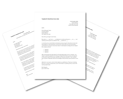
→ Click here to access 5 free cover letter templates [Free Download]

How Long Should a Cover Letter Be?

Okay, so you’re all fired up and ready to craft the cover letter of the hiring manager’s dream. That’s great! But how do you manage the fine balance between in-depth and overwhelming?

A good cover letter is long enough to communicate why the recruiter should pick you … but not long enough to bore them to the point where they’ll need a strong coffee.

One page is usually enough to cover everything you’ll need to include, without losing the recruiter’s attention and having your cover letter tossed into the trash.

Let’s go into those items in more detail:

Your Name and Address

Kick off your cover letter by adding your name and address to the document.

This step is pretty self-explanatory, but it allows the recruiter to easily connect your cover letter to your resume (especially if they’re being printed).

Your name and address also make it easier for the recruiter to get in touch with a job offer. And that’s the aim of our letter, right?

Their Name and Address

Similarly, you should add the name and address of the company or person you’re writing to.

This shows you’ve done your research and allows the hiring manager to receive your letter if it’s sent to a generic company email address.

The Date of Writing

Make it easier for the hiring manager to file your application by including the date on your cover letter.

Even if you’re not successful this time around, the company might store your letter and refer back to it when they’re hiring for another position!

Why You’re Writing the Letter

We know that the aim of a cover letter is to persuade the hiring manager you’re the best fit for their job. But, be sure to open your letter strongly, with 1-2 sentences that’ll grab their attention and quickly make them realize they’re reading a cover letter.

Something like this will usually do the trick:

“I’m writing to discuss the content strategist role at HubSpot.”

Why You’re a Perfect Fit for the Job

The next section of a cover letter structure is the fun part — it’s where you’ll convince the hiring manager they should hire you — and not the person whose resume is behind yours.

In this section, answer these questions:

  • Why should this company hire you?
  • What skills do you have that will help complete the job better than anyone else?
  • What makes you a good employee?
  • What extra qualifications do you have that are relevant to the role?

Once you’ve answered these, the recruiter will have a solid understanding of who you are, and (hopefully) be convinced to hire you!

What You Can Offer the Company

Have you ever heard the advice to “always sell yourself in a job application”? That concept can be applied to cover letters, but remember that recruitment isn’t all about you.

Businesses measure success in terms of results. The company looking for a new employee will want to know what they bring to the table and how they’ll shape their business’ future. New candidates are rarely brought on board solely for the soft skills listed in their resume.

That’s why this part of your cover letter structure is arguably the most important.

In less than two paragraphs, show the business what you can do — and prove you’ve done it before (preferably with examples).

Not only does this give you the opportunity to show off your skills, but the company can picture the success you’ll bring to their business by hiring you.

Your Availability

In the marketing world, we’re always told the importance a call-to-action can make. But, don’t leave them to your blog posts: Explain your availability to the person reading your cover letter for the best chances of a follow-up call.

Great cover letters end with a brief section on the candidate’s earliest start date. You could also include your availability for an interview and tell them you’re happy to answer any questions they may have.

How to Address a Cover Letter

Earlier, we mentioned the importance of addressing the hiring manager by their name and address. This proves you’ve done your research and ensures the cover letter lands in the right place.

Personalized content does 42% better than non-personalized, so including the first name of the recruiter can go a long way.

But in a world where privacy is held close to our chest, you might need to do a bit of digging before revealing the name your letter should be addressed to.

Luckily, you can use the power of the internet to do this. To find their:

Name

Head over to LinkedIn and find the company’s profile page. You can do this by entering their name into the search bar or searching for a link to their LinkedIn page on the company’s website.

Then, click the number of employees to see all employees who are on LinkedIn:

HubSpot LinkedIn company page

You’ll then be greeted with a list of all people (with a LinkedIn profile) that work for your target company. Simply work your way through this list to find the most relevant contact, or search

  • Hiring manager
  • HR manager
  • Recruitment manager

… to find the most suitable name to address in your cover letter.

Address

You can find the address of the company you’re looking to submit a job application to by finding the About or Contact page on their website.

This should be in their navigation bar, but can also be found by Googling their URL and “contact”.

On this page, you should find an address for the company. If not, don’t worry. Simply call one of the numbers listed or send an email to their support team. Ask for the company’s general careers email address, and use this on your cover letter.

Opening a Cover Letter

Great job! You’ve done all of the digging you’ll need to write a cover letter. It’s easy from here.

After you’ve addressed the cover letter to the most relevant person, we’ll need to open the letter with something relevant.

“Dear Ms. H.Spot” (using your own initials, of course) will keep it professional.

But, if you’ve struggled to unveil the hiring manager’s name, stick with “Dear Sir/Madam” or “Dear Hiring Manager”.

How to Close a Cover Letter

Once you’ve followed the above cover letter structure and explained your availability, it’s time to wrap it up.

If you’ve addressed the letter personally, end with “Thanks”.

If you haven’t, opt for “Sincerely”.

Then, sign the cover letter with your full name.

Should You Include Salary Requirements?

Talking about money is a tricky subject. Some feel uncomfortable discussing wages in the first interaction with a company, so it’s best to avoid discussing salary requirements in your cover letter unless it’s stated as a requirement.

Including salary requirements in your cover letter could set a bad tone. Instead, allow your letter to show off your skills and make a convincing argument as to why they should hire you.

Save the money talk until your interview!

Are Cover Letters Necessary?

Cover letters are often a required field for online job applications. But do you really need to include one if it’s optional, you’re sending your resume through email, or applying in-person?

While a few years ago the answer wasn’t clear cut, in today’s age cover letters are more important than ever.

In 2017, just 26% of recruiters considered cover letters important in their decision to hire an applicant. That means they were influential in hiring decisions, but not essential.

However, according to 2021 research, 83% of recruiters agree that, although not strictly necessary, a well-written cover letter gives you the opportunity to demonstrate that you are a great fit for the company you are applying for. Additionally, in a separate question, 83% of respondents claimed that a great cover letter can secure you an interview even if your resume isn’t good enough.

If those stats aren’t enough to convince you of its importance, 74% of recruitment decision-makers prefer to receive job applications that include cover letters apart from resumes. And even if submitting a cover letter is optional, 77% of recruiters will give preference to candidates who did send a cover letter.

Plus, since 69% of surveyed workers believe getting a job in 2021 will be much harder or somewhat harder than in previous years, adding a cover letter to your application is a great way to stand out.

Especially since only 35% of candidates attach a cover letter to their application when it’s optional and only 38% of candidates submit a cover letter when it’s required.

Writing a cover letter will allow you the chance to communicate with the hiring manager. You’re given more space to tell them why you’re the perfect fit for their job, meaning you don’t have to rely on bullet-pointed lists in your resume.

Cover letters also help to build your personal brand. By going the extra mile (even when it’s not required), you’re proving key skills like being a hard worker, having good communication, and taking initiative.

In short: Cover letters aren’t absolutely necessary, but they do have stark advantages. If there’s an option to upload one when applying for any job, do it — even if it’s not required!

How to Write a Cover Letter

Writing a cover letter can be tricky. Even the best writers can struggle with communicating their skills in the right manner, but these tips will help you create a job-winning document.

The structure of your cover letter is arguably the most important thing about writing one.

Not only does a good structure help you to organize your points effectively, but it can help a hiring manager to quickly review the details you’re sharing.

7 Tips for Writing Great Cover Letters

So, you’ve crafted a cover letter and you’re almost ready to hit send.

Now, wait a minute …

Before attaching to your resume and hoping for the best, use these seven tips to make sure your cover letter is as great as can be:

1. Don’t babble.

Earlier, we mentioned how the best cover letters strike the perfect balance in their length.

Our best tip for writing cover letters is to avoid any babble. Don’t add fluff that fails to add anything of value. Not only are you wasting your time by writing it, but you’re wasting the hiring manager’s time, too.

You want to keep the recruiter’s attention, which can be easily lost through babbling. Cut the jargon and corporate-speak that hiring managers have heard before. (Like “leverage” and “thinking outside the box”.)

Yes, professionalism is important, but be harsh and critical when editing your cover letter. If a sentence doesn’t add value, get rid of it!

2. Tailor it for the company and position you’re applying for.

The one-size-fits-all approach doesn’t fit well with cover letters.

You’re applying for different roles at various companies, but don’t let a change in name and address be the only amendments you make.

Remember that a cover letter should explain why you should be hired for a specific role instead of anyone else. It’s highly unlikely that multiple companies will hire for exactly the same position, so take some time to personalize your cover letter for every position you’re applying for.

3. Add more value than your resume.

Although cover letters are used in partnership with resumes, be wary of falling into the trap of making them carbon copies of one another.

Cover letters that regurgitate everything already explained on a resume are useless. Instead, use the documents to compliment each other by:

  • Including new skills.
  • Elaborating on how your qualifications would help you in the role.
  • Sharing how specific experience gives you an advantage over other candidates.

If you need to include the same thing in both documents, add “as listed in my resume …” rather than copy and pasting the same content.

Put yourself in your recruiter’s shoes: Reading the same thing multiple times would be annoying, right? (Remember, we don’t want to bore them!)

4. Include data-backed examples.

When referencing experience from your resume, use your cover letter as an opportunity to explain in detail — with examples.

Examples allow the company to picture the success you could bring if they hired you, rather than the person next in their resume pile. But, data-backed examples give an extra edge.

Let’s use an example. Which of these options is more impressive?

  1. I increased leads for the company.
  2. I increased leads by 35% in one month through a single blog post, which became the company’s biggest revenue source.

It’s option B, right?

5. Tell a story.

Following on from the previous step, you could elaborate on your data-backed examples by telling a story.

Storytelling helps with relatability and gives a hint of your personality in a cover letter. It also makes the recruiter remember your cover letter amongst a sea of other one-page documents in their review pile.

However, this cover letter tip comes with a warning: Don’t overdo it, and make it relevant. Remember what we said about babbling?

Including a story about how you adopted your pet cat is unlikely to influence someone into hiring you. On the other hand, a story on how you created a company’s blogging strategy to achieve your data-backed results is.

6. Get a second pair of eyes on it.

Even the best writers make occasional mistakes, but some hiring managers can be strict with grammatical errors — even if you’re not applying for a role where writing features heavily in your daily to-do’s.

That’s why our sixth cover letter tip is to get a second pair of eyes on it.

Email it to a friend or ask a family member to glance over it before you hit “send”. Ask them to highlight any spelling mistakes or suggestions to improve how you’re communicating with the person reading it.

You never get a second chance to make a first impression. Seeing as though a cover letter is one of the first documents a recruiter sees, try to make it perfect!

7. Be unique.

Finally, make your cover letter unique.

If you’re applying for a creative role, experiment with colors, subheadings, and layouts.

If you’re applying for more of a traditional role, be wary. Not everyone is a fan of bright, bold cover letters, but you can scope your limits by getting a feel of their company culture.

Are they strict and professional, or does the company like to have fun? (You can usually get a feel of this from their website or social media profiles.)

Testing the level of uniqueness can be a case of trial and error. If you’re not getting great reactions from your cover letter, revise and try again.

Cover Letter Examples

We understand that inspiration can go a long way. That’s why we’ve created a one-stop-shop for cover letter examples, which are available to view here.

You’re also free to browse our collection of cover letter samples for extra inspiration on formatting your cover letter and learning from those who’ve helped to land dream jobs.

Conclusion

Congratulations! You’ve now got a fantastic cover letter!

Don’t forget to send it with your resume for each job you apply for.

You’ll soon be flooded with responses to your application — including compliments on the contents of your cover letter, job offers, or invites to interview!

Editor’s note: This post was originally published in September 2018 and has been updated for comprehensiveness.

Professional Cover Letter Templates

Categories B2B

How to Use Instagram Insights (in 9 Easy Steps)

Data helps you understand your audience. It tells you how they do things, what they prefer, and who they are. You can certainly make business decisions based on gut feeling, but you’re much more likely to hit the mark when you can validate assumptions with cold, hard facts.

Data and analytics help you measure the impact of your marketing efforts across different channels to see if there’s something you need to do differently — like target a different audience, post at a certain time of day, or experiment with a new content format.

Social media isn’t any different than other aspects of your marketing in the sense that it can be measured and improved upon. That’s why you’ll be able to create a more effective Instagram strategy using Instagram Insights.

Click Here to Subscribe to HubSpot's Marketing Blog

Here are the analytics on this channel that marketers need to know and understand — and how to use them.

View Instagram Insights: Accounts Reached Page on Instagram

To use Instagram Insights, you must first have a business profile. If you’re already using a personal account, you can switch to a business profile. Here’s how to convert your account in a few simple steps.

1. Create a Facebook Business Profile for the same persona if you haven’t already.

An Instagram business profile will allow you to access additional features and tools to help you grow your audience. However, in order to set up an Instagram Business Profile, you’ll need to have a Facebook Page for your business. It’s through Facebook that you add payment credentials and more. Click here for instructions for setting up your Facebook Page if you don’t already have one.

2. Make sure your Instagram profile is public. Private profiles cannot be used as business ones.

You want to grow your audience and have your posts seen by Instagram users who are not familiar with your brand. For this reason, your Instagram profile will need to be made public before you convert it to an official Instagram Business Profile. Here are the steps:

Step One: Navigate to your profile and tap the hamburger icon in the top-right corner.

Convert Instagram to Business Profile: Tap Hamburger Menu

Step Two: Tap the gearshift wheel icon to access your Settings.

Convert Instagram to Business Profile: Gearshift Wheel Icon for Settings

Step Three: Select “Privacy.”

Convert Instagram to Business Profile: Privacy in Settings Menu

Step Four: Flip the toggle next to “Private Account” on.

Convert Instagram to Business Profile: Instagram Private Account Toggle

Your Instagram profile is now public.

3. Return to your Settings page and tap “Account.”

Return to your Settings page by clicking the hamburger icon and tapping the gearshift wheel icon. Alternatively, you can use the back button on your phone to get there.

Tap Account in the Settings menu.

Convert Instagram to Business Profile: Account in the Settings Menu

4. Select “Switch Account Type” and choose “Switch to Business Account.”

Convert Instagram to Business Profile: Switch to Business AccountBy choosing Switch to Business Account, you’re effectively converting your Instagram Profile into an Instagram Business Profile.

5. Follow Instagram’s prompts to set up your business profile.

You will be asked to review and change details about your business including business category, contact information, and more. You’ll also be prompted to select the Facebook Page you want to be associated with your profile (from Step 1).

6. Tap “Done.”

Once your set up as a Business Account, you can begin to use Instagram Insights. Here’s how to get started.

1. Open the hamburger menu and click “Insights.”

To view insights into your overall Instagram account, start by visiting your profile. Then, at the top, click the hamburger icon and select Insights from the menu.

View Instagram Insights: Navigating to Insights from the Instagram Menu

From there, you’ll reach the Recent Highlights page where you’ll see some general information about how people are engaging with your profile, like how many followers you gained or lost in the past week.

View Instagram Insights: Recent Highlights Page on Instagram

Next, we’ll get into the more specific profile insights you can explore.

2. Measure reach.

Click the Accounts Reached section. Reach reflects the number of unique users that have seen any of your Instagram posts.

View Instagram Insights: Accounts Reached Page on Instagram

Within this category, you’ll see insights for:

  • Impressions – How many times your posts were seen.
  • Account Activity – Profile visits, website taps, and other activity.
  • Top Posts – The posts that generated the most reach and engagement.
  • Top Stories – The Instagram Stories posts that generated the most reach and engagement.
  • Top IGTV Videos – The IGTV videos that generated the most reach and engagement.

Some of these insights can be expanded for more insights.

3. Track profile visits and followers.

On the Accounts Reached page under Account Activity, you’ll be able to see Profile Visits.

Profile Visits reflects the number of times your profile has been viewed.

4. Determine website clicks.

Website Taps can also be found under the Account Activity section. This insight reflects the number of times any links you’ve included in your business profile have been clicked.

5. Track content interactions.

Navigate back to Recent Highlights and tap Content Interactions. This will bring up a page that shows how your content is performing in terms of engagement, breaking down the metrics by content type.

View Instagram Insights: Content Interactions Page on Instagram

Likes speaks for itself, reflecting the number of users who liked your post. As with likes, Comments reflects the number of comments left on your post. Saves highlights the number of unique users or accounts who saved your post or clicked the bookmark-like icon that appeared below it in their feeds.

6. Track your followers.

Navigate back to Recent Highlights and click Total Followers. You’ll then reach the Follower Breakdown page.

View Instagram Insights: Follower Breakdown page on Instagram

This page reflects how many followers you’ve gained or lost over the past week, as well as the average times of day when your followers are using Instagram — data that can be highly beneficial when planning posts.

7. Learn which actions were taken on your post.

To view insights for a specific Instagram post, start by visiting your profile. Tap on the post you’d like to look into, then click View Insights below the image.

These insights indicate the number of actions that users took on your profile as a result of seeing your post — things like visiting your profile, then taking an action like clicking on your website link or following you.

View Instagram Insights: Instagram Insights Actions Feature

Source: Instagram

8. Use “Discovery” to see where your post showed up in feeds.

As the name might suggest, these insights indicate where your post was seen — or discovered — the most, including how many accounts weren’t already following you when they first saw the post.

This section includes metrics on Impressions, which reflect the number of times your post was discovered from a particular place within Instagram, like the user’s home feed, a search, your profile, a location tag, or a hashtag.

View Instagram Insights: Instagram Insights Discovery Feature

Source: Instagram

Discovery insights also include data on a post’s reach — which reflects the number of unique accounts that saw your post.

9. View Story insights.

Finally, Instagram users with a business profile are able to view insights into their ephemeral Stories.

To view your Story insights, navigate back to Insights and scroll down to Content You Shared section on the Recent Highlights page.

Scroll down to the Stories section, and you’ll be able to see insights for older stories, as well as any that have not yet expired.

Next, we’ll get into the more specific insights you can explore.

Impressions

This insight represents how many times your Story was seen.

When viewing these insights, keep in mind that you’re able to add multiple images or videos to your Story. When you do this, every piece of visual content in your Story is counted as a single photo or video in your post.

Let’s say you add six photos to your Story. Whether someone only views one or views all six, Instagram only counts your entire Story having received one impression.

The same goes for Story content that has been viewed by a single user more than once. Instagram still only counts that interaction as the entire Story having received one impression.

Reach

This insight reflects the number of unique users that have seen your Story.

Taps Forward

This insight reflects the number of times a user taps your Story photo or video to skip to the next piece of media.

Taps Back

This insight reflects the number of times a user taps your Story photo or video to go back to the previous piece of media.

Replies

This insight reflects the number of times users send messages through the Send Message text box on your Story.

Replies on Instagram Stories

Swipe Aways

This insight reflects the number of times users swipe to skip to the next account’s Story — not to be mistaken for “tap forward,” which reflects users skipping ahead to your next piece of Story media.

Exits

This insight reflects the number of times a user leaves the Stories section entirely to return to the home feed.

Measuring Your Effectiveness With Instagram Insights

Now that you know how to access data to inform your strategy with Instagram Insights, you can analyze that data and determine what’s working for your audience (and what’s not). From there, creating content that gets a ton of engagement will be a lot easier as you consider those benchmarks.

Editor’s Note: This post was originally published in January 2018 but has been updated for comprehensiveness.

hubspot marketing blog

Categories B2B

How to Use Pinterest to Promote Your Business or Blog [Free Templates]

When I was getting married, one of the main tools that helped me plan was Pinterest. In fact, that’s usually the number one place I go to when I’m planning a party.

However, Pinterest isn’t just used for event planning. You can use the social media platform as a way to market your business, drive traffic to your website, and increase sales.

I’m not the only one who goes to Pinterest when I need new ideas. In fact, more than 200 billion pins have been saved on Pinterest. And 90% of weekly Pinners make purchase decisions on Pinterest.

That’s why it’s important for businesses and marketers to be active on the platform. Read on to learn how you can use Pinterest to meet your business and marketing goals.

Free Resource: 12 Pinterest Templates for Business

Why Use Pinterest for Business?

As noted above, regular Pinterest users often leverage the platform to help inform their purchasing decisions. But that’s not the only reason to use Pinterest for Business.

Pinterest streamlines conversion.

Pinterest effectively operates as a massive, visual search engine filled with images tailored to specific user interests. As a result, if users are looking at your Pinterest page, chances are they’re already curious about what you’re selling — and are more likely to click through.

Pinterest boosts traffic.

Because each pin you make can contain a link back to your website, it’s easy for users to click through and boost your overall traffic, in turn raising your search engine rank.

The caveat? Great pin content is critical — if users aren’t inspired, they won’t click.

Pinterest engages users.

The core concept of Pinterest revolves around users creating and sharing pins of things they’re interested in with like-minded people — which means they’re already engaged when they log into the site. If your page aligns with their interests, they’re happy to visit your site, share your posts, and help boost your brand’s reach.

How to Set Up Your Pinterest for Business Account

If you’re new to Pinterest, then you’ll need to create a business account to get started. Don’t worry, this is a simple process as outlined below.

  1. Head to pinterest.com/business/create.
  2. Add your business name and website.
  3. Customize your profile.
  4. Claim your other accounts.

Let’s break down each step in more detail.

1. Head to pinterest.com/business/create.

Enter your email and a password and then select “Create Account” to get started. If you already have a personal Pinterest account, make sure you’re logged out.

Pinterest log in

2. Add your business name and website.

Next, Pinterest will ask for your business name, business type, and your website details. If your brand doesn’t fit into a listed category, don’t worry — just select “I’m not sure.”

Create an account pinterest

3. Customize your profile.

Next up is customizing your profile. Here you can add a profile picture, display name, user name, and information about your brand that will help Pinterest users find your board.

Pinterest customize profile

4. Claim your other accounts.

Last but not least? Claim your website name and any other accounts to ensure you get attribution and analytics for all of your content on Pinterest, even if you posted it before creating a Pinterest for Business account.

claim your account pinterest

Once your business account is set up, it’s time to start diving into the strategy of how you’re going to use your page to grow your business.

Is Pinterest for Business free?

Pinterest for Business is free, and it’s worth taking the time to make an account, since it allows you to directly link your brand with your Pinterest page to drive increased traffic and conversion.

With your business account set up, you’re ready to get started using Pinterest for Business. Here are six best practices to keep in mind:

1. Determine the type of content you want to post.

As with any social media site, it’s important to understand your target audience. What type of content do they want to see on Pinterest?

More importantly, think about the type of content that they’ll engage with. Is it infographics, tips and tricks, or perhaps blog posts? To find this out, do some research into the type of content they currently pin on their pages.

Additionally, make sure that you don’t sell yourself with every pin. You should share relevant and helpful information on your page as well. When you have a good idea of what your audience wants or needs to see, creating pins will be easier.

2. Consider your design.

Now that you know what you want to post, it’s important to consider what your images look like. Your designs should be pleasing to the eye and stand out in a sea of images on your audience’s page.

Additionally, your images need to follow your brand guidelines. If you don’t have a designer on hand, you can utilize tools like Canva to get started.

3. Optimize your pins.

When you’re ready to start posting on Pinterest, remember to optimize your pins. You might be wondering, “How do I optimize my pins?”

Use the following checklist to get started:

  • Include a URL (could be a link to a blog post)
  • Use keywords in titles, descriptions, and image file names
  • Create boards that are aligned with your keywords
  • Arrange your boards and choose a board cover image
  • Use hashtags
  • Add a call to action
  • Add a Pinterest widget to your site
  • Respond to follower comments
  • Follow popular boards and comment
  • Create a board dedicated to your blog posts

These tactics will help you grow your business with Pinterest and help your posts be discovered.

4. Learn about categories.

On Pinterest, you can assign each board to one of 36 categories. These categories help your pins become discovered.

For example, since I was interested in finding wedding ideas when I was engaged, most of the pins that showed up on my feed were pins that were tagged in the wedding category.

You can scroll through the categories and see which ones are related to your business. This could even help you come up with board ideas.

5. Use rich Pins.

Rich Pins offer a way to provide more information about pinned images. For example, the Product Pins subset of rich Pins lets you add pricing information, product details, and other data to help engage users and drive conversion.

6. Leverage Pinterest Lens.

Pinterest Lens is available as part of the platform’s mobile app on both Apple and Android devices. It allows users to take a picture of any object and discover similar items on Pinterest. For businesses, Pinterest offers a way to improve contextual marketing: Take a picture of your product, see what Pinterest returns and then leverage similar tags to help capture user interest.

Once you’ve thought about this strategy, it’s time to create your boards. If you blog, think about blog topics and create boards surrounding those topics.

Let’s dive a little deeper into how to use Pinterest for your blog.

1. Create infographics.

A great way to use Pinterest to promote your blog is through infographics. If you have blog posts centered around an infographic, post it on Pinterest.

Additionally, you can repurpose old blog posts into infographics. Pinterest is a great place to repurpose content and reach a new audience that might not have read your post.

2. Choose the best blogs to post.

You don’t need to promote every single blog post on your Pinterest. Instead, just choose the ones that make the most sense for the platform. For example, choose blogs that have engaging images, great downloadable offers, or have an infographic.

Additionally, think about your board topics. You should promote blogs that relate to your boards.

3. Customize your images.

When you create a pin, it’s important to use engaging, custom images. To promote a blog, you can use your featured image and include customized text.

For instance, many pins that promote blog posts include the title of the blog on the custom image. The title is a great way to draw people in and get them interested in your blog post.

4. Write an optimized pin description.

When you write the description for a pin promoting a blog post, it’s important to tell people what to expect in the post.

While you want to leave some mystery and pique their interest without giving away too much, they need to know what it’s about.

5. Engage with Pinners.

Pinterest is all about engagement and interest driven by images. To maximize your brand’s impact, you need to regularly engage with Pinners who follow your board.

This means regularly pinning new content, re-pinning great content from your followers, and taking the time to directly answer any questions asked on your blog by Pinterest users.

6. Use a sound SEO strategy.

As noted above, Pinterest is effectively a visual search engine — but just like a text-based search engine, keywords are critical. To ensure your pins get noticed, use solid SEO practices. Make your blog title the same as your board title, include relevant keywords for all of your blog posts and images descriptions, and make sure you’re also using keywords in any image “alt” tags.

Pinterest for Business Examples

So what makes a great Pinterest for Business board? Here are six standout examples.

1. HubSpot

HubSpot Pinterest board

HubSpot’s Pinterest page generates more than 4.5 million views per month and offers a host of great content to Pinners including infographic templates, content creation tips, and even career advice. It’s a one-stop shop for all things marketing.

2. Bossy

Bossy Pinterest Board

Bossy is a growing, female-founded beauty brand with a focus on attention-capturing, long-lasting lipsticks and a Pinterest page that showcases its commitment to diversity.

3. Ruggable

Ruggable Pinterest Board

Ruggable’s value proposition is simple: Washable rugs for any space. These rugs are changeable, durable, spill-proof, and easy to clean — so it’s no surprise that its Pinterest page generates more than 10 million views per month.

4. Etsy

Home Decor Pinterest Board

This custom-made market store has made significant market inroads and is now using Pinterest to showcase some of its most popular items. Looking for something unique? Something that makes a statement? Chances are you’ll find it on Etsy — and see it on Pinterest.

5. Bustle

Bustle Pinterest board

Bustle is on the leading edge of social zeitgeist, and has a Pinterest page to match. With a mix of celebrity content, human interest stories, recipes, and fashion advice, Bustle captures user attention immediately.

6. Asutra

Austra Pinterest Board

Committed to creating clean, accessibly-priced, wellness products, this women-owned and led brand has made the move to Pinterest and is already seeing almost 200,000 views per month.

Pin It to Win It

When it comes to marketing your business, Pinterest for Business offers a way for your brand to win market share and generate organic customer interest. The picture-driven nature of the site can help shift the conversion away from simple to conversion and instead inspire your audience to use your products and services in their lives — or just inspire them in general.

With a practical, step-by-step approach, it can be your products and services that users are pinning – and purchasing.

Pinterest Templates

Categories B2B

The 4 Most Important Pages on Your Website (& How to Optimize Them)

When you’re knee-deep into the design of your website, it’s hard to admit this fact: Some of the pages on your website are more important than others.

Okay, many of you probably find that fairly obvious — but I’m surprised how rarely content managers and web designers actually apply this knowledge to their websites to improve conversions.

I’m all about low-hanging fruit and taking on the easiest tasks that will have the biggest results. What I’m about to describe in this article has the potential to improve your site dramatically with just a few, critical changes.

Free Resource: Website Optimization Checklist [Download Now]

In this post, I’ll explain how to optimize each one of these pages. And if your most-visited pages are different from the ones listed above, you’ll still learn a framework for optimizing any of the important pages on your website.

What is website optimization?

You’ve probably heard the word “optimize” most commonly used in phrases like “search engine optimization” (SEO) and “conversion rate optimization” (CRO). I’m actually referring to something broader here, but the advice that I’m delivering will help to enhance both of those.

The optimization I’m going to explain will create user optimized pages. In the pursuit of SEO and CRO, it’s easy to overlook the broader, big-picture idea. First and foremost, a site must be optimized for the user. The best place to see big results quickly is to start optimizing the most visited pages of your site.

Let’s get right into it. Every website is different, but generally speaking, here are the four most important (and often most-visited) pages on a website:

Home Page

The home page is the first impression of your business to potential customers. And although your time limit on making an amazing impression is several times longer online than it is in real life (62 seconds on average is spent by people viewing a website) you’ll want to make every second count.

It’s tempting to put every remotely relevant fact about the business on the home page, but resist the urge. Remember, your home page is the first step of the journey — not the final destination. The copy, design, and visuals should guide the visitor to their next step, or the call-to-action.

About Page

Customers, investors, candidates for hire, and even competitors might all use your about page to learn more information about your company. An about page typically includes a brief company history, mission or vision statement, executive leadership bios, and a few impactful client testimonials.

Blog Page

It’s no secret that blogging is a tried-and-true method to optimize a website for keywords related to a business. Rather than loading up several product pages for each individual keyword you want to rank for, a blog can serve as a more efficient way to weave storytelling, product mentions, and sign up links together in order to answer potential customer inquiries, solve problems, and pose your product or service as the preferred solution.

Contact Us Page

For many small businesses and freelancers, the contact us page serves as the lead-driver of a website. This is usually their bread-and-butter and how these businesses make money. Whether your business includes a contact form, a calendar scheduler, an appointment booking app, a phone number, or an email address, this is where future customers make the decision to get a hold of a representative of the business to learn more about the products and services.

How to Optimize A Web Page

The broad framework for optimizing your site for conversions is the same across your home page, About page, blog, and Contact Us page. There are two simple goals for every page, and the specifics of optimizing those pages will flow from these goals.

The first goal is all about the user, and the second is all about you. Here we go:

Provide information the user is looking for.

Remember, we’re focusing on the user. Why are they on the page to begin with? To answer this question effectively, let’s dive deeper into some facts we’ll want to know first:

  • Where did they come from? The idea here is to understand how the user got to your site, so you can deliver relevant content.
    • Did they come from a search engine? (If so, what did they search to find you?)
    • An email? (What kind of email? Who sent it?)
    • A referral on another website? (What site was it? How long has it been referring to your URL?)
  • What do they need to know? A single page can deliver a limited amount of information, so you need to determine what that information is going to be. You want them to know something so that they will do something (which is addressed in the next question). Remember: Less is more on a web page. The more information you load up on your main pages, the less likely the user is to remember any of it. Give them less, and they’re more likely to remember — and do — what you want them to.

Pro Tip: Use visuals such as explainer videos, diagrams, hero shots, and so on to help condense a lot of information to a single page. To get the most out of your visuals, make sure you correctly optimize your images and videos.

Once you answer the question of what the user’s looking for, you’re halfway there. That brings us to question two.

Identify a goal for the user once they find the information.

Now, you need to ask the user to do something. This is where most pages fall short. One of the critical components of a web page is its call-to-action (CTA), and many website owners don’t realize that every single page of a website should contain at least one CTA.

The point of a home page or product page isn’t for the user to visit and leave. The point of content marketing isn’t for user intake, but rather, for user marketing. If you retain only one thing from this article, let it be that every web page needs a CTA.

Why am I so insistent on this? Because every bit of knowledge you share on your website demands some response. So, what is it that you want the user to do? Visit another page on your site? Watch a video? Complete a form? Sign up for a free trial? Any or all of these can become your goal for the user, just make sure to give them one or two options per page that are clearly and starkly defined.

Web Page Optimization Examples

Example of an Optimized Website Home Page

HubSpot’s home page is well laid out and hosts a clear CTA, front and center. A user is on the HubSpot home page for a reason, and perhaps that reason is to grow their business. The headline speaks to the question “what am I looking for?” and the CTA buttons tell me, the user, what I’m supposed to do next.

HubSpot homepage optimized for conversions with a clear CTA

Now, let’s see what HubSpot has going on on the About page.

Example of an Optimized Website About Page

A user might click on the About page for a variety of reasons. A few might be:

  • They want to figure out what exactly the business does.
  • They want to work for the business.
  • They want to make sure the business is legitimate.
  • They want to see if the business serves a specific niche or location.
  • They want to analyze the business’s success.

I could go on and on. There are a ton of reasons that could bring a user here, but they all boil down to the desire for information. Let’s see what HubSpot does. Here is the company’s About page:

The user likely wants to know the information about the company, and in response, they can scroll the page to learn more about the mission, history, and products.

Along the way, the user will want more detailed information which means the CTAs will need to become more specific to help guide them to that info. The more granular and detailed the information, the more correspondingly detailed the CTA becomes. Halfway down the page, I see a video about the HubSpot story featuring CEO Brian Halligan.

There’s more. There’s a block of content about each HubSpot product including the CRM, each Hub, and integrations. I can click any of these to learn more about the ones that can help grow my business.

HubSpot About page continues featuring products and links to each one.

Finally, no matter how far I scroll down the page, the sticky header menu includes an orange CTA for me to Get HubSpot for free.

HubSpot about oage featuring a sticky header with a bold CTA

This is an example of an About page optimized to drive engagement, increase conversions, and enhance the brand. The page is as much about the user as it is about the company itself because along the way, the user is receiving value.

Example of an Optimized Website Blog Page

Even though the HubSpot blog is one of the most popular digital publications, there are still some practical applications you can use to optimize your own blog page if you have a smaller following. Although there are several articles a visitor can choose from across a variety of topics, you’ll notice specific CTAs that invite users to sign up for the blog newsletter, download a report, explore more topics, and finally, subscribe to their blog of interest.

HubSpot Blog page optimized for subscription and newsletter sign up conversions

Sprinkle the CTAs throughout your blog home page for a more natural approach. As readers scroll, you don’t want them to be bombarded with next steps, but you don’t want to leave them wondering what they should do next. Balance the user experience on your blog with a sticky header CTA and one or two primary CTAs.

Example of an Optimized Website Contact Us Page

Granted, HubSpot uses its contact page a bit differently than you might use yours. Whereas a contact page might be the end goal you want for your visitors, HubSpot optimizes product and landing pages to draw in leads and sign-ups for specific products it offers.

There’s still an opportunity for a potential customer to get into the sales pipeline from the contact page though. HubSpot includes a sales line, customer support, and a chatbot to get users to the best point of contact.

HubSpot website contact us page that is optimized for conversions using CTAs

For customers, new employees, or candidates interviewing with the company, they can find the addresses and phone numbers of the global offices. Similar to the other three pages, the stick header menu includes a CTA to sign up for HubSpot for free.

Tips for Optimizing Each Page

Now that you have a framework for optimizing your pages and a couple of examples, here are a few, more specific tips to help you optimize each of the four most important pages.

1. Home Page

  • Use a big headline and place the most important information front and center. A home page may allow for several different CTAs — make it easy for the user to choose by making CTA buttons large and easy to click.
  • Provide flow. Make it obvious where the user is supposed to go and what they are supposed to do next.
  • Make the Navigation Menu Clear. Oftentimes, a visitor uses the home page as a way of finding where on the site she wants to go. For this reason, you should make the navigation menu very clear.

2. About Page

  • Deliver the most important and relevant information above the fold. The user is on your About page for a reason — answer their question(s) without making them scroll.
  • Include at least one CTA. Remember, most people aren’t just looking for more information, they’re seeking a deeper level of engagement.

3. Blog

  • Organize information on your blog clearly, and make sure that information satisfies the reasons users might be on your blog. Most users will want to read the most recent articles, so provide these. You may also want to organize categories on the blog home page, such as “most recent,” “most popular,” or other forms of categorization.
  • Include CTAs that make it easy for the user to subscribe to the blog, download a free resource, and so on. Even though the user came to get information, you want them to get engaged and connected. (Click here for 8 types of CTAs you can try on your blog.)
  • Provide CTAs in the core design of your blog so they appear on each individual blog post. In my experience, most blog visitors land on individual blog articles through organic search, instead of landing on your blog’s “home” page. To get these users engaged, put CTAs on the sidebars, in the footer, and in other places. (Learn how to pick the perfect CTA for each blog post here.)

4. Contact Us Page

  • Put the information the user is looking for above the fold — an email address, phone number, contact form, map, mailing address, and so on. Of all four of these web pages, the Contact Us page implies the most detailed level of intent on the part of the user.
  • Use CTAs that allow the user to contact you easily (since, presumably, that’s why they came to your Contact Us page). Make the CTA really obvious, and engage them by gratifying their intent instantly, using CTA copy like ”Chat now” or “Email now”.

Ask the User to Act On Your Content

As a website owner, you’re in the business of not just disseminating information, but soliciting a response, too. To engage your visitors and boost conversions on your site, here’s how to optimize pages like a pro: Look at your most visited pages, understand the reason users are there, provide valuable information, and ask them for an action in return. Regardless of your most-visited pages or even the nature of your website, you can create more engaged users with this optimization framework. Try it out — use the checklist below to get started.

Editor’s note: This post was originally published in December 2014 and has been updated for comprehensiveness.

New Call-to-action