Categories B2B

12 Bad Link Building Practices & What to Do Instead

Gaining inbound links from other websites is one of the best ways to improve your website’s rankings on search engines. However, link building can require a significant investment of time and resources and it may be tempting to take shortcuts.

However, following bad link building practices could land you in Google “jail” and cost you traffic and sales. Most times, you might even have to bear the extra cost of hiring professionals to help you recover your website.

In this post, we’ll cover what bad link building practices are and what to do instead.

→ Download Now: SEO Starter Pack [Free Kit]

1. Buying Links

Several sites and services help you buy text links on other sites that pass SEO credit. However, there is also a black market in link buying that is much less formal, more secretive, and less organized. We wouldn’t recommend either one.

This is probably the most tempting bad link building strategy because you get to control what sites you are getting links from and analyze these sites to ensure you’re not placing links in bad neighborhoods. You can also place links within relevant content and use anchor text for the keywords you are trying to rank for.

But — and it’s a big but —Google explicitly states that exchanging money for links to manipulate PageRank may be considered part of a link scheme and a violation of Google’s Webmaster Guidelines.

So maybe you’ll get away with it, maybe you won’t. Either way, we don’t advocate buying links.

What to do Instead

Buying links is not only a black hat SEO practice — it’s an expensive one. Instead of spending thousands of dollars on links that could bring you trouble, you could invest the money by hiring a writer to help you create quality content or getting more traffic to existing content through paid ads.

2. Targeting Domain Authority Over Website Relevance

Although Domain Authority (DA) gives a good idea about how likely a website will appear on the search engine result page (SERP), it shouldn’t be your number-one factor to consider when looking for backlinks.

If you focus on DA, you’d only be getting backlinks from a limited number of websites, and this could cause you to have an unnatural link profile.

What to do Instead

Build links with as many relevant websites as possible, irrespective of their domain authority.

You can think of these links as the connections or relationships we build in real life. Some of these connections grow stronger with time. We might outgrow some. We might need some for only a particular chapter of our lives, and so on. The same can be said of inbound links.

Also, a backlink is relevant when it’s from a site that covers subjects similar to yours, not because of its domain authority.

3. Not Personalizing Your Outreach Email

Gone are the days when you could hit up editorial teams with the “I was reading your piece on xxx and loved it so much. We just created an article that talks about xxx. It would be a valuable resource for your audience. Can you link to it?” request, and expect them to reply.

Not only are these templates old-fashioned,  but they also show a lack of effort on your part.

Website managers see these types of emails in their inboxes every day and are more than willing to send them all into the junk folder.

What to do Instead

Personalize your outreach emails so that each one of them is unique. It might take you more time to do this, but it’s usually more rewarding.

Using the recipient’s name in the email isn’t the only way to personalize your outreach email. For example, you could mention something you read in the news about the company you’re pitching, or show how you can be of unique value to their business.

good link building practice: personalized outreach emailImage Source

4. Not Creating Link-Worthy Content

The simple truth is that if there are no valuable blog posts or pieces of content on your website, it will be hard to get backlinks. This is often the case for websites that prioritize quantity over quality.

What to do Instead

Instead of creating a ton of articles that nobody wants to read, you should focus on creating fewer pieces that are carefully aligned with your business and supported by keyword research.

When creating new pieces of content, you should also think about how to make them different from articles that already rank for your target keywords. A great way is to conduct original research and studies to uncover new stats and findings that your audience would find helpful.

5. Borrowing Links

Most websites today no longer allow people to comment on their posts. Why? Because many people leave a link to their website in the body of their comment.

This practice is known as link borrowing. These link borrowers often resort to inserting their keywords where their name is supposed to go. And many people automate or just cut and paste such comments all over the web.

bad link building practice: borrowing links in commentsImage Source

If you allow comments on your website, it’s essential to have a spam filter that catches these comments.

Link borrowing might get you a short-term burst in rankings. But these are not high-quality links and won’t provide long term advantage.

What to do Instead

You could volunteer to become a case study and get a backlink once the study is published. Another option is to create an updated version of an existing guide or report.

6. Using the Wrong Tools

No one sets out on a mission to fell a tree with a pack of razors — well, unless they want to waste their time and effort. The same can be said of your link building efforts. It’s possible to do everything manually, but you’d be wasting a ton of resources.

What to do Instead

You need the right tools to make your link building efforts worthwhile. While some of these tools might be expensive, they’re usually worth it in the end. For starters, you’d need to invest in project management, SEO, and blogger outreach tools.

7. Having Only One Link Building Strategy

Although you might be experiencing a bit of success with a particular method of link building, it’s never the best choice to put all your eggs in one basket. The online world changes every time, and a single link building method can quickly become less effective.

What to do Instead

If you have the resources, it’s better to look for alternative link building strategies that can work for your business. For example, have you been having success with guest blogging? Then, you can complement that strategy by becoming a source for journalists looking for experts to feature in their articles.

8. Begging for Links

Beggars send emails to people they don’t know asking for links.

I recently received a really creative email. The person introduced himself as a big fan of my writing and suggested that “based on reading what I write,” I should check out this new social networking site. First, he wrote about how awesome the site was (without any explanation why). Then, he suggested that I write about it because everyone else who did it received floods of traffic. Finally, he got very offended when I responded that I wasn’t interested and that he should be more upfront about his link begging intentions.

Of course, begging comes in many forms. Not all are as creative as this guy. Most people just send emails to web admin asking them to link to them. While begging is one way to build links, it is ineffective and the fastest way to annoy a web admin.

What to do Instead

Instead of begging for links, create content your target audience would find valuable and share without being asked. And if you ever need to email web admins to ask for a link, ensure your email is personalized and your article is better than the one they already link to.

9. Link Bartering or Trading

I’ll link to you if you link to me. I’ll buy your services if you buy mine. I’ll show you mine if you show me yours.

How much easier do you think you can make it for Google to detect that you didn’t earn that link? Google’s power is that it detects patterns. This is a pretty easy pattern to catch: “Site B links to Site A. Site A links to Site B.”  

Of course, bartering or trading links gets more creative by saying, “I’ll link to you if you link to him, and I’ll link to this other guy if he links to you, etc.” There are even networks you can join to facilitate this process.

Participating in these link building rings is even riskier than regular bartering. It’s believed that Google labels websites into “neighborhoods,” and there are bad neighborhoods that you don’t want to live in. By interlinking with websites in a bad neighborhood, Google will think you, too, are bad.

What to do Instead

Build meaningful relationships with other web admins in your niche. First, get on their radar by linking out to helpful content and resources that they create. Then, as time passes, they’ll likely return the favor by linking to your website too.

10. Poor Internal Linking

You can’t expect people to link to your content when you don’t link to it yourself. Not only does poor internal linking make it hard to get backlinks, but it also makes it difficult for search engines to rate your web pages.

Poor internal linking also doesn’t let you get the most of your backlinks’ “link juice” across to other relevant web pages on your website.

What to do Instead

Create a proper internal linking strategy. Start by sketching your website to identify your major pages and topics. Next, look at the most common topics you write about and find how to connect them to your website’s major pages. Finally, think of any other page that could link to your ranking page.

11. Bribing

Many companies try to bribe web admins and bloggers for links. Basically, companies offer to send them stuff if they link to the company. Although harder for Google to detect, this isn’t a great practice. In fact, the FTC frowns upon this.  

What to do Instead

Do everything else but bribe web admins or bloggers. Instead, you could build a free tool, become a source to journalists, create new content, and so on.

12. Disregarding Broken Links

Broken links reduce a website’s value. The 404 message can also cause visitors who are excited to read an article to become easily frustrated. Unfortunately, many website owners don’t pay as much attention to broken links on their websites.

Paying attention to broken links, especially on your competitor’s website, can help your link building efforts.

What to do Instead

Reach out to websites with broken outbound links and ask them to replace them with a link from your website. Your content would add value to the webmaster’s website and help fix the broken link error.

Say Goodbye to Bad Link Building Practices

There’s no point in trying to build links if you’re not going to do it the right way. So, if you’ve been engaging in any of the bad link building practices mentioned above, it’s time to stop. Instead, test the alternative strategies and see what tactic works best for you.

Editor’s note: This post was originally published in July 2009 and has been updated for comprehensiveness.

marketing

Categories B2B

28 Case Study Examples Every Marketer Should See

Putting together a compelling case study is one of the most powerful strategies for showcasing your product and attracting future customers. But it’s easier said than done. In this post, we’ll go over the definition of a case study and the best examples to inspire you.

Download our free case study templates here to help you display your company's  success.

A case study proves how your product has helped other companies by demonstrating real-life results. Not only that, but case studies typically contain quotes by the customer, so it’s not just a marketing advertisement where you praise your own product. Rather, other companies are praising your company — and there’s no stronger marketing material than a verbal recommendation or testimonial. A great case study is also filled with research and stats to back up points made about a project’s results.

There are myriad ways to use case studies in your marketing strategy. From featuring them on your website to including them on a sales presentation, a case study is a strong, persuasive tool that shows customers why they should work with you — straight from another customer. Writing one from scratch is hard, though, which is why we’ve created a collection of case study templates for you to get started.

Fill out the form below to access the free case study templates.

There’s no better way to generate more leads than by writing case studies. But without case study examples to draw inspiration from, it can be difficult to write impactful studies that convince visitors to submit a form.

Marketing Case Study Examples

To help you create an attractive and high-converting case study, we’ve put together a list of some of our favorites. Take a look, and let these examples inspire your next brilliant case study design.

These case studies clearly show the value proposition of each product and also demonstrate how each company benefited in both the short and long term using quantitative data. In other words, you don’t get just nice statements, like “This company helped us a lot!” You see actual change within the firm through numbers and figures.

You can put your learnings into action with HubSpot’s Free Case Study Templates. Available as custom designs and text-based documents, these templates can be uploaded to your CMS or sent off to prospects as you see fit.

case study templateDownload These Free Case Study Templates

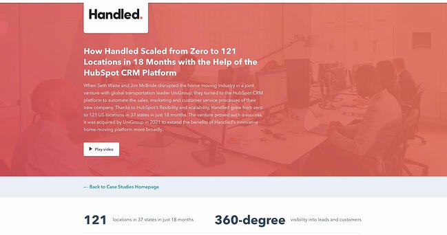
1. “How Handled Scaled from Zero to 121 Locations in 18 Months with the Help of the HubSpot CRM Platform,” by HubSpot

Case study example from HubSpotWhat’s interesting about this case study is the way it leads with the customer. That reflects a major HubSpot cornerstone, which is to always solve for the customer first. The copy leads with a brief description of why the CEO of Handled founded the company and why he thought Handled could benefit from adopting a CRM. The case study also opens up with one key data point about Handled’s success using HubSpot, namely that it grew to 121 locations.

Notice that this case study uses mixed media. Yes, there is a short video, but it’s elaborated upon in the additional text on the page. So while your case studies can use one or the other, don’t be afraid to combine written copy with visuals to emphasize the project’s success.

Key Learnings from the HubSpot Case Study Example

  • Give the case study a personal touch by focusing on the CEO rather than the company itself.
  • Use multimedia to engage website visitors as they read the case study.

2. “Transforming the Airport Experience by Putting Passengers First,” by IDEO

Case study example from IDEOHere’s a design company that knows how to lead with simplicity in its case studies. As soon as the visitor arrives at the page, they’re greeted with a big, bold photo and the title of the case study — which just so happens to summarize how IDEO helped its client. It summarizes the case study in three snippets: The challenge, the impact, and the outcome.

Immediately, IDEO communicates its impact — the company helped Toronto Pearson International Airport respond to the COVID-19 pandemic — but it doesn’t stop there. As the user scrolls down, the challenge, impact, and outcome are elaborated upon with comprehensive (but not overwhelming) copy that outlines what that process looked like, replete with quotes and additional visuals.

Key Learnings from the IDEO Case Study Example

  • Split up the takeaways of your case studies into three easy snippets: The challenge, the impact you had, and the outcome.
  • Always use visuals and images to enrich the case study experience, especially if it’s a comprehensive case study.

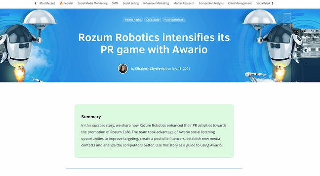
3. “Rozum Robotics intensifies its PR game with Awario,” by Awario

Case study example from AwarioIn this case study, Awario greets the user with a summary straightaway — so if you’re feeling up to reading the entire case study, you can scan the snapshot and understand how the company serves its customers. The case study then includes jump links to several sections, such as “Company Profile,” “Rozum Robotics’ Pains,” “Challenge,” “Solution,” and “Results and Improvements.”

The sparse copy and prominent headings show that you don’t need a lot of elaborate information to show the value of your products and services. Like the other case study examples on this list, it includes visuals and quotes to demonstrate the effectiveness of the company’s efforts. The case study ends with a bulleted list that shows the results.

Key Learnings from the Awario Robotics Case Study Example

  • Create a table of contents to make your case study easier to navigate.
  • Include a bulleted list of the results you achieved for your client.

4. “Chevrolet DTU,” by Carol H. Williams

Case study example from Carol H. WilliamsIf you’ve worked with a company that’s well-known, use only the name in the title — like Carol H. Williams, one of the nation’s top advertising agencies, does here. The “DTU,” which stands for “Discover the Unexpected,” immediately generates interest because you want to find out what the initials mean.

Carol H. Williams keeps your interest in this case study by using a mixture of headings, images, and videos to describe the challenges, objectives, solutions, and achievements of the project. The case study closes with bullet points that summarize the key benefits Chevrolet’s Discover the Unexpected Journalism Fellowship earned during the project.

Key Learnings from the Carol H. Williams Case Study Example

  • If you’ve worked with a big brand before, consider only using the name in the title — just enough to pique interest.
  • Use a mixture of headings and subheadings to guide users through the case study.

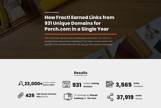
5. “How Fractl Earned Links from 931 Unique Domains for Porch.com in a Single Year,” by Fractl

Case study example from FractlFractl uses both text and graphic design on their Porch.com case study to immerse the viewer in a more interesting user experience. For instance, as you scroll, you’ll see the results are illustrated in an infographic-design form as well as the text itself.

Further down the page, they use icons like a heart and a circle to illustrate their pitch angles, and graphs to showcase their results. Rather than writing which publications have mentioned Porch.com during Fractl’s campaign, they incorporated the media outlets’ icons for further visual diversity.

Key Learnings from the Fractl Case Study Example

  • Let pictures speak for you by incorporating graphs, logos, and icons all throughout the case study.
  • Start the case study by right away stating the key results, like Fractl does, instead of putting the results all the way at the bottom.

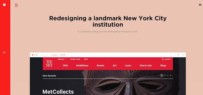
6. “The Met,” by Fantasy

Case study example from FantasyWhat’s the best way to showcase the responsiveness and user interface of a website? Probably by diving right into it with a series of simple showcases— which is exactly what Fantasy does on their case study page for the Metropolitan Museum of Art. They keep the page simple and clean, inviting you to review their redesign of the Met’s website feature-by-feature.

Each section is simple, showing a single piece of the new website’s interface, so that users aren’t overwhelmed with information and can focus on what most matters.

If you’re more interested in text, you can read the objective for each feature. Fantasy understands that, as a potential customer, this is all you need to know. Scrolling further, you’re greeted with a simple “Contact Us” CTA.

Key Learnings from the Fantasy Case Study Example

  • You don’t have to write a ton of text to create a great case study. Focus on the solution you delivered itself.
  • Include a CTA at the bottom inviting visitors to contact you.

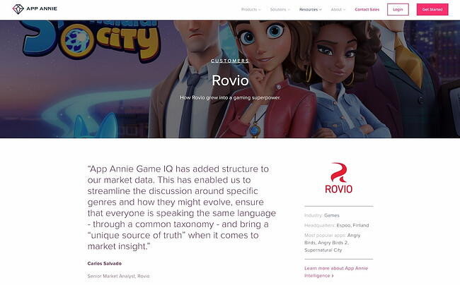
7. “Rovio: How Rovio Grew Into a Gaming Superpower,” by App Annie

Case study example from App AnnieIf your client had a lot of positive things to say about you, take a note from App Annie’s Rovio case study and open up with a quote from your client. The case study also closes with a quote, so that the case study doesn’t seem like a marketing material written by your marketing team but a story that’s taken straight from your client’s mouth. It includes a photo of a Rovio employee, too.

Another thing this example does well? It immediately includes a link to the product that Rovio used (namely, App Annie Intelligence) at the very top of the case study. The case study closes with a call-to-action button prompting users to book a demo.

Key Learnings from the App Annie Case Study Example

  • Feature quotes from your client at the beginning and end of the case study.
  • Include a mention of the product right at the beginning and prompt users to learn more about the product.

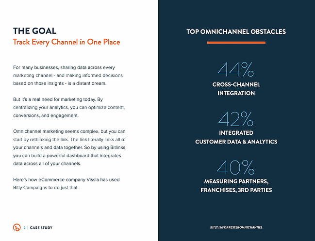
8. “How One Ecommerce Business Solved the Omnichannel Challenge with Bitly Campaigns,” by Bitly

Case study example from BitlyBitly takes a different approach to text-heavy case studies, by providing their case study of ecommerce company Vissla in PDF form. The case study is clean and easily scannable, with sections divided into “The Goal”, “Top Omnichannel Obstacles”, and images of “The Set-Up” and “The Launch.” The downloadable PDF format makes the case study feel like an exclusive behind-the-scenes look, and uses colors and text that align with Bitly’s brand.

Since the PDF opens in a separate browser, it’s easier for the viewer to avoid distractions as they scroll through the pages.

Key Learnings from the Bitly Case Study Example

  • A PDF case study is an excellent way to sum up the key facts of a study.
  • Use a horizontal format in the PDF to gibe a greater sense of space and keep it under ten pages.

9. “In-Depth Performance Marketing Case Study,” by Switch

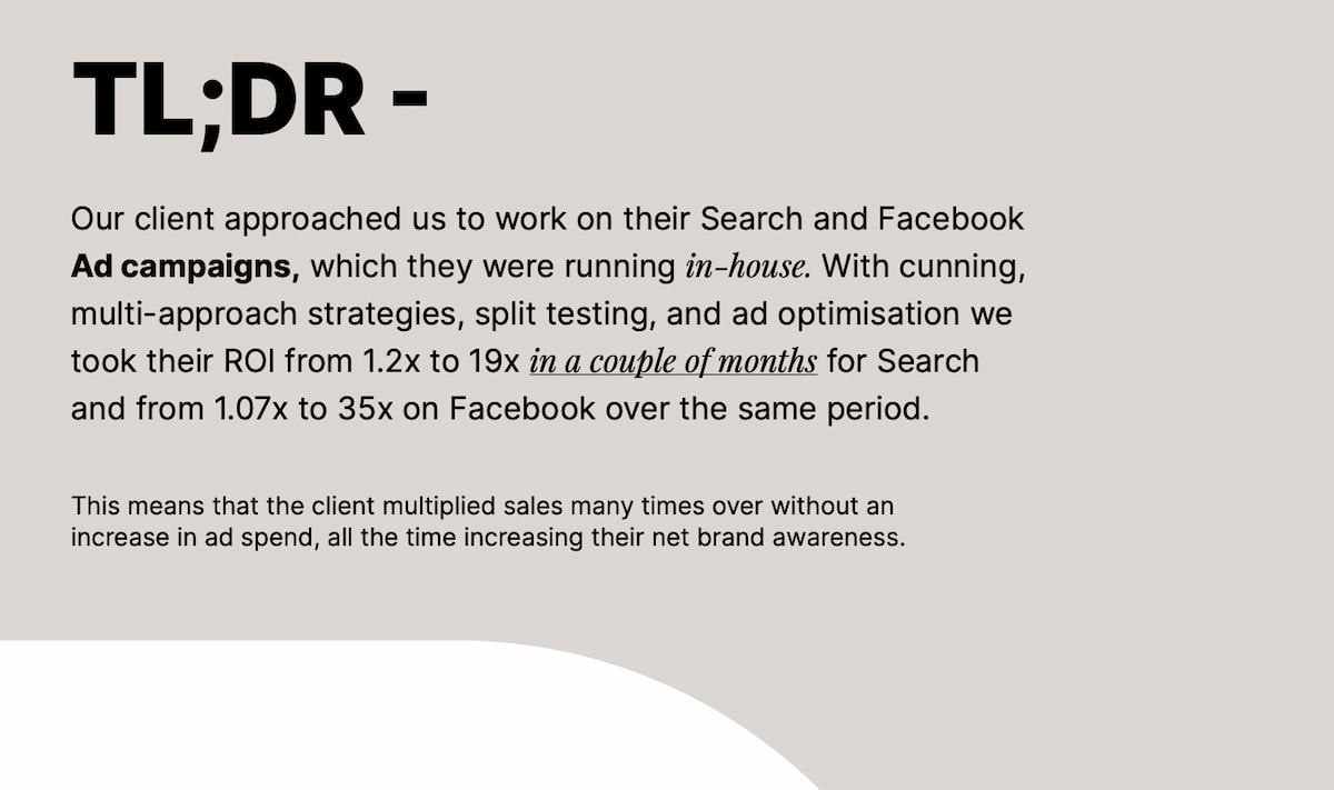
Case study example from SwitchSwitch is an international marketing agency based in Malta that knocks it out of the park with this case study. Its biggest challenge is effectively communicating what it did for its client without ever revealing the client’s name. It also effectively keeps non-marketers in the loop by including a glossary of terms on page 4.

The PDF case study reads like a compelling research article, including titles like “In-Depth Performance Marketing Case Study,” “Scenario,” and “Approach,” so that readers get a high-level overview of what the client needed and why they approached Switch. It also includes a different page for each strategy. For instance, if you’d only be interested in hiring Switch for optimizing your Facebook ads, you can skip to page 10 to see how they did it.

The PDF is fourteen pages long but features big fonts and plenty of white space, so viewers can easily skim it in only a few minutes.

Key Learnings from the Switch Case Study Example

  • If you want to go into specialized information, include a glossary of terms so that non-specialists can easily understand.
  • Close with a CTA page in your case study PDF and include contact information for prospective clients.

10. “Gila River,” by OH Partners

Case study example from OH PartnersLet pictures speak for you, like OH Partners did in this case study. While you’ll immediately come across a heading and some text when you land in this case study page, you’ll get the bulk of the case study through examples of actual work OH Partners did for its client. You will see OH Partners’s work in a billboard, magazine, and video. This immediately communicates to website visitors that if they work with OH Partners, their business will be visible everywhere.

And like the other case studies here, it closes with a summary of what the firm achieved for its client in an eye-catching way.

Key Learnings from the OH Partners Case Study Example

  • Let the visuals speak by including examples of the actual work you did for your client — which is especially useful for branding and marketing agencies.
  • Always close out with your achievements and how it impacted your client.

11. “Facing a Hater,” by Digitas

Case study example from DigitasDigitas’ case study page for Sprite’s #ILOVEYOUHATER campaign keeps it brief while communicating the key facts of Digitas’ work for the popular soda brand. The page opens with an impactful image of a hundred people facing a single man. It turns out, that man is the biggest “bully” in Argentina, and the people facing him are those whom he’s bullied before.

Scrolling down, it’s obvious that Digitas kept Sprite at the forefront of their strategy, but more than that, they used real people as their focal point. They leveraged the Twitter API to pull data from Tweets that people had actually tweeted to find the identity of the biggest “hater” in the country. That turned out to be @AguanteElCofler, a Twitter user who has since been suspended.

Key Learnings from the Digitas Case Study Example

  • If a video was part of your work for your client, be sure to include the most impactful screenshot as the heading.
  • Don’t be afraid to provide details on how you helped your client achieve their goals, including the tools you leveraged.

12. “Better Experiences for All,” by HermanMiller

Case study example from HermanMillerHermanMiller sells sleek, utilitarian furniture with no frills and extreme functionality, and that ethos extends to its case study page for a hospital in Dubai.

What first attracted me to this case study was the beautiful video at the top and the clean user experience. User experience matters a lot in a case study. It determines whether users will keep reading or leave. Another notable aspect of this case study is that the video includes close-captioning for greater accessibility, and users have the option of expanding the CC and searching through the text.

HermanMiller’s case study also offers an impressive amount of information packed in just a few short paragraphs for those wanting to understand the nuances of their strategy. It closes out with a quote from their client and, most important, the list of furniture products that the hospital purchased from the brand.

Key Learnings from the Digitas Case Study Example

  • Close out with a list of products that users can buy immediately after reading the case study.
  • Include accessibility features such as closed captioning and night mode to make your case study more user-friendly.

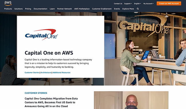
13. “Capital One on AWS,” by Amazon

Case study example from Amazon AWSDo you work continuously with your clients? Consider structuring your case study page like Amazon did in this stellar case study example. Instead of just featuring one article about Capital One and how it benefited from using AWS, Amazon features a series of articles that you can then access if you’re interested in reading more. It goes all the way back to 2016, all with different stories that feature Capital One’s achievements using AWS.

This may look unattainable for a small firm, but you don’t have to go to extreme measures and do it for every single one of your clients. You could choose the one you most wish to focus on and establish a contact both on your side and your client’s for coming up with the content. Check in every year and write a new piece. These don’t have to be long, either — five hundred to eight hundred words will do.

Key Learnings from the Amazon AWS Case Study Example

  • Write a new article each year featuring one of your clients, then include links to those articles in one big case study page.
  • Consider including external articles as well that emphasize your client’s success in their industry.

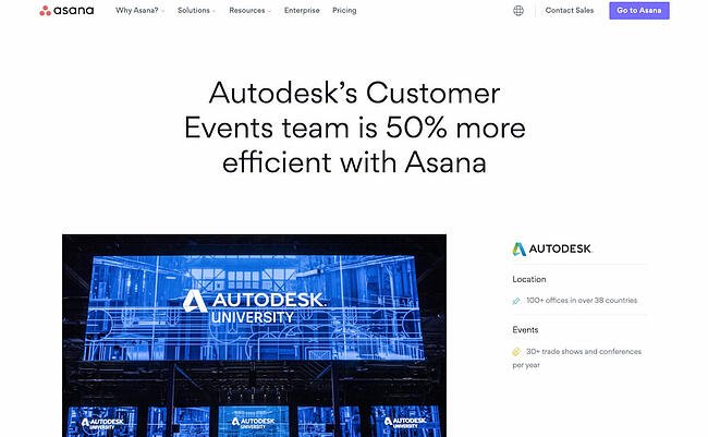
14. “Autodesk’s Customer Events team is 50% more efficient with Asana,” by Asana

Case study example from AsanaWhile Asana’s case study design looks initially text-heavy, there’s good reason — it reads like a creative story, and is told entirely from the customer’s perspective. For instance, Asana knows you won’t trust its word alone on its impressive product, so they let Joël St-Pierre, Head of Project Management Office at Autodesk, tell you instead: “Accountability, visibility, and discoverability are advantages that come from proper project management and using the right tools.”

Every once in a while, Asana features a quote from St-Pierre to break up the wall of text and humanize the case study. The entire case study reads like an in-depth interview, and captivates the reader through creative storytelling. Even more, Asana includes in-depth detail of how Autodesk uses Asana, including setting automation rules and leveraging the app’s native form tool.

Key Learnings from the Asana Example

  • Include quotes from your clientthroughout the case study.
  • Provide extensive detail on how your client worked with you or used your product.

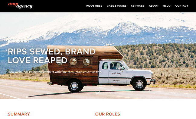
15. “Rips Sewed, Brand Love Reaped,” by Amp Agency

Case study example from Amp AgencyAmp Agency’s Patagonia marketing strategy aimed to appeal to a new audience through guerilla marketing efforts and a coast-to-coast roadtrip. Their case study page effectively conveys a voyager theme, complete with real photos of Patagonia customers from across the U.S., and a map of the expedition. Personally, I liked Amp Agency’s storytelling approach best, which captures viewers’ attention start-to-finish simply because it’s an intriguing and unique approach to marketing.

Key Learnings from the Amp Agency Example

  • Open up with a summary that communicates who your client is and why they reached out to you.
  • Like in the other case study examples, you’ll want to close out with a quantitative list of your achievements.

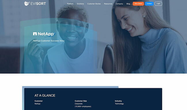
16. “NetApp,” by Evisort

Case study example from EvisortEvisort opens up its NetApp case study with an at-a-glance overview of the client. It’s imperative to always focus on the client in your case study — not on your amazing product and equally amazing team. By opening up with a snapshot of the client’s company, Evisort immediately places the focus on the client.

This case study example checks all the boxes for a great case study that’s informative, thorough, and compelling. It includes quotes from the client and details about the challenges NetApp faced during the COVID pandemic. It closes out with a quote from the client and with a link to download the case study in PDF format, which is incredibly important if you want your case study to be accessible in a wider variety of formats.

Key Learnings from the Evisort Example

  • Place the focus immediately on your client by including a snapshot of their company.
  • Mention challenging eras, such as a pandemic or recession, to show how your company can help your client succeed even during difficult times.

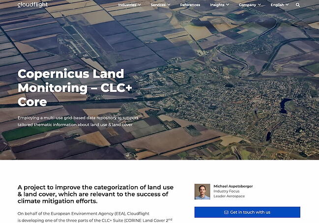
17. “Copernicus Land Monitoring – CLC+ Core,” by Cloudflight

Case study example from CloudflightIncluding highly specialized information in your case study is an effective way to show prospects that you’re not just trying to get their business. You’re deep within their industry, too, and willing to learn everything you need to learn to create a solution that works specifically for them.

Cloudflight does a splendid job at that in its Copernicus Land Monitoring case study. While the information may be difficult to read at first glance, it will capture the interest of prospects who are in the environmental industry. It thus shows Cloudflight’s value as a partner much more effectively than a general case study would.

The page is comprehensive and ends with a compelling call-to-action — “Looking for a solution that automates, and enhances your Big Data system? Are you struggling with large datasets and accessibility? We would be happy to advise and support you!” The clean, whitespace-heavy page is an effective example of using a case study to capture future leads.

Key Learnings from the Cloudflight Case Study Example

  • Don’t be afraid to get technical in your explanation of what you did for your client.
  • Include a snapshot of the sales representative prospects should reach out to, especially if you have different sales reps for different industries, like Cloudflight does.

18. “Valvoline Increases Coupon Send Rate by 76% with Textel’s MMS Picture Texting,” by Textel

Case study example from TextelIf you’re targeting large enterprises with a long purchasing cycle, you’ll want to include a wealth of information in an easily transferable format. That’s what Textel does here in its PDF case study for Valvoline. It greets the user with an eye-catching headline that immediately shows the value of using Textel. Valvoline saw a significant return on investment from using the platform.

Another smart decision in this case study is the highlighting of the client’s quote by putting it in green font, and doing the same thing for the clients’ results. If you’re in a hurry, you can also take a look at the “At a Glance” column to get the key facts of the case study, starting with information about Valvoline.

Key Learnings from the Textel Case Study Example

  • Include your client’s ROI right in the title of the case study.
  • Add an “At a Glance” column to your case study PDF to make it easy to get insights without needing to read all of the text.

19. “Hunt Club and Happeo — a tech-enabled love story,” by Happeo

Case study example from HappeoIn this blog-post-like case study, Happeo immediately opens with a quote from the client, then dives into a compelling heading: “Technology at the forefront of Hunt Club’s strategy.” If you’re investigating Happeo as a solution and consider your firm to be technology-driven, this would immediately make you want to know why the client chose to work with Happeo. It also effectively communicates the software’s value proposition without sounding like it’s from the in-house marketing team.

Every paragraph is a quote written from the customer’s perspective. Later down the page, the case study also dives into “the features that changed the game for Hunt Club,” giving Happeo a chance to highlight some of the platform’s most salient features.

Key Learnings from the Happeo Case Study Example

  • Consider writing the entirety of the case study from the perspective of the customer.
  • Include a list of the features that convinced your client to go with you.

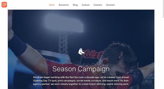
20. “Red Sox Season Campaign,” by CTP Boston

Case study example from CTP BostonWhat’s great about CTP’s case study page for their Red Sox Season Campaign is their combination of video, images, and text. A video automatically begins playing when you visit the page, and as you scroll, you’ll see additional embedded videos of Red Sox players, a compilation of print ads, and social media images you can click to enlarge. At the bottom, it says “Find out how we can do something similar for your brand.” The page is clean, cohesive, and aesthetically-pleasing, inviting viewers to appreciate the well-roundedness of CTP’s campaign for Boston’s beloved baseball team.

Key Learnings from the CTP Case Study Example

  • Include a video in the heading of the case study.
  • Close with a call-to-action that makes leads want to turn into prospects.

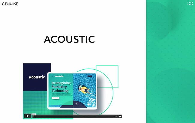
21. “Acoustic,” by Genuine

Case study example from GenuineSometimes, simple is key. Genuine’s case study for Acoustic is straightforward and minimal, with just a few short paragraphs, including “Reimagining the B2B website experience,” “Speaking to marketers 1:1,” and “Inventing Together.” After the core of the case study, we then see a quote from Acoustic’s CMO and the results Genuine achieved for the company.

The simplicity of the page allows the reader to focus on both the visual aspects and the copy. The page displays Genuine’s brand personality well, while offering the viewer all the necessary information they need.

Key Learnings from the CTP Case Study Example

  • You don’t need to write a lot to create a great case study. Keep it simple.
  • Always include quantifiable data to illustrate the results you achieved for your client.

22. “Using Apptio Targetprocess Automated Rules in Wargaming,” by Apptio

Case study example from ApptioApptio’s case study for Wargaming summarizes three key pieces of information right at the beginning: The goals, the obstacles, and the results. Readers then have the opportunity to continue reading — or they can walk away right then with the information they need. This case study also excels in keeping the human interest factor by formatting the information like an interview.

The piece is well-organized and uses compelling headers to keep the reader engaged. Despite its length, Apptio’s case study is appealing enough to keep viewer’s attention. Every Apptio case study ends with a “recommendation for other companies” section, where the client can give advice for other companies that are looking for a similar solution but aren’t sure how to get started.

Key Learnings from the Apptio Case Study Example

  • Put your client in an advisory role by giving them the opportunity to give recommendations to other companies that are reading the case study.
  • Include the takeaways from the case study right at the beginning so prospects immediately get what they need.

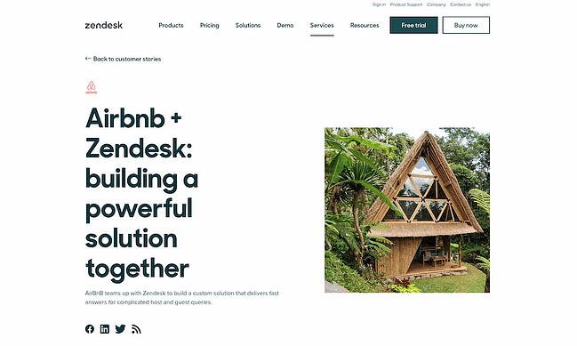
23. “Airbnb + Zendesk: building a powerful solution together,” by Zendesk

Case study example from ZendeskZendesk’s Airbnb case study reads like a blog post, and focuses equally on Zendesk and Airbnb, highlighting a true partnership between the companies. To captivate readers, it begins like this: “Halfway around the globe is a place to stay with your name on it. At least for a weekend.” The piece focuses on telling a good story, and provides photographs of beautiful Airbnb locations. In a case study meant to highlight Zendesk’s helpfulness, nothing could be more authentic than their decision to focus on Airbnb’s service in such great detail.

Key Learnings from the Zendesk Case Study Example

  • Include images of your client’s offerings — not necessarily of the service or product you provided. Notice how Zendesk doesn’t include screenshots of its product.
  • Include a call-to-action right at the beginning of the case study. Zendesk gives you two options: to find a solution or start a trial.

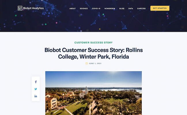
24. “Biobot Customer Success Story: Rollins College, Winter Park, Florida,” by Biobot

Case study example from BiobotLike some of the other top examples in this list, Biobot opens its case study with a quote from its client, which captures the value proposition of working with Biobot. It mentions the COVID pandemic and goes into details about the challenges the client faced during this time.

This case study is structured more like a news article than a traditional case study, and this format can work in more formal industries where decision-makers need to see in-depth information about the case. Be sure to test different methods and measure engagement.

Key Learnings from the Biobot Case Study Example

  • Mention environmental, public health, or economic emergencies and how you helped your client get past such difficult times.
  • Feel free to write the case study like a normal blog post, but be sure to test different methods to find the one that best works for you.

25. “Discovering Cost Savings With Efficient Decision Making,” by Gartner

Case study example from GartnerYou don’t always need a ton of text or a video to convey your message — sometimes, you just need a few paragraphs and bullet points. Gartner does a fantastic job of quickly providing the fundamental statistics a potential customer would need to know, without boggling down their readers with dense paragraphs. The case study closes with a shaded box that summarizes the impact that Gartner had on its client. It closes with a quote and a call-to-action to “Learn More.”

Key Learnings from the Gartner Case Study Example

  • Feel free to keep the case study short.
  • Include a call-to-action at the bottom that takes the reader to a page that most relates to them.

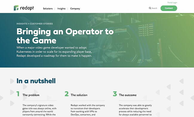
26. “Bringing an Operator to the Game,” by Redapt

Case study example from RedaptThis case study example by Redapt is another great demonstration of the power of summarizing your case study’s takeaways right at the start of the study. Redapt includes three easy-to-scan columns: “The problem,” “the solution,” and “the outcome.” But its most notable feature is a section titled “Moment of clarity,” which shows why this particular project was difficult or challenging.

The section is shaded in green, making it impossible to miss. Redapt does the same thing for each case study. In the same way, you should highlight the “turning point” for both you and your client when you were working toward a solution.

Key Learnings from the Redapt Case Study Example

  • Highlight the turning point for both you and your client during the solution-seeking process.
  • Use the same structure (including the same headings) for your case studies to make them easy to scan and read.

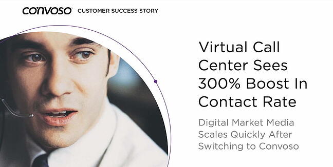
27. “Virtual Call Center Sees 300% Boost In Contact Rate,” by Convoso

Case study example from Convoso

Convoso’s PDF case study for Digital Market Media immediately mentions the results that the client achieved and takes advantage of white space. On the very second page, the case study immediately presents more impactful results. It’s colorful and engaging and closes with a spread that prompts readers to request a demo.

Key Learnings from the Convoso Case Study Example

  • List the results of your work right at the beginning of the case study.
  • Use color to differentiate your case study from others. Convoso’s example is one of the most colorful ones in this list.

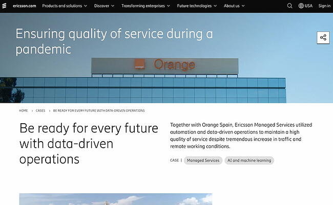
28. “Ensuring quality of service during a pandemic,” by Ericsson

Case study example from EricssonEricsson’s case study page for Orange Spain is an excellent example of using diverse written and visual media — such as videos, graphs, and quotes — to showcase the success a client experienced. Throughout the case study, Ericsson provides links to product and service pages users might find relevant as they’re reading the study.

For instance, under the heading “Preloaded with the power of automation,” Ericsson mentions its Ericsson Operations Engine product, then links to that product page. It closes the case study with a link to another product page.

Key Learnings from the Ericsson Case Study Example

  • Link to product pages throughout the case study so that readers can learn more about the solution you offer.
  • Use multimedia to engage users as they read the case study.

Start creating your case study.

Now that you’ve got a great list of examples of case studies, think about a topic you’d like to write about that highlights your company or work you did with a customer.

A customer’s success story is the most persuasive marketing material you could ever create. With a strong portfolio of case studies, you can ensure prospects know why they should give you their business as opposed to a competitor.

Editor’s note: This post was originally published in August 2018 and has been updated for comprehensiveness.

New Call-to-action

 
New Call-to-action

Categories B2B

How to Add YouTube Videos to Your Website: A Step-by-Step Guide

Video adds value to your website, and the right videos can help drive increased traffic and conversion. As noted by Forbes, users retain 95% of the message when they watch videos compared to just 10 percent by text, making video a great starting point to streamline connection with prospective customers.

Your best bet for videos? YouTube. With more than two billion logged-in monthly users, YouTube videos now reach 74% of adults in the United States — so it’s no surprise that the platform is used by almost 90 percent of marketers to drive user interest. Ready to leverage video on your site and capture the growing YouTube marketplace? Here’s a step-by-step guide.

→ Download Now: 7 YouTube Video Description Templates [Free Prompts]

The Benefits of Adding Video to Your Website

Video rules the digital media marketplace, but popularity alone isn’t enough to drive widespread adoption. In practice, YouTube videos come with key benefits for your site, including:

Improved User Engagement

As noted above, visitors to your site retain more information when viewing videos than reading text. This makes it possible to drive improved user engagement by creating compelling content they’ll remember long after they leave your site — and will hopefully bring them back again. YouTube also incorporates features to increase engagement, like sharing options and playlists.

Reduced User Frustration

If users have to scroll through walls of text just to find the basics of your brand or understand your value proposition, chances are they won’t stay long. An embedded YouTube video provides a quick rundown of your site as soon as users arrive.

Simplified Storytelling

What’s your story? What sets you apart from the competition? This is what prospective customers want to know. While well-written text blurbs can give a general idea of what you’re about, they don’t have the same impact as video-driven stories that showcase your purpose and passion.

Increased Brand Connection

Organic marketing is now a critical part of business success. Buyers want to purchase products from brands and people they trust. Videos offer a way to connect with visitors face-to-face and help personalize and humanize your brand from the first moment visitors arrive.

Best Practices for Adding Videos to Your Website

While videos offer advantages in capturing and maintaining user interest, there are several best practices to keep in mind to ensure your videos deliver maximum impact.

Watch your file size.

When it comes to YouTube video viewing on your website, you’ve got two choices: link or embed. Linking to videos means that users must leave your page to view the content, while embedding allows users to watch the video on your site.

Although embedding is better for engagement, it’s worth considering your video’s file size — the larger your video file is, the more bandwidth it requires to display on user devices, which in turn can potentially slow down the user experience. Wherever possible, smaller and shorter is better.

View the whole video.

Whether you’re embedding a YouTube video you’ve made or one from another creator, make sure to watch the entire video before posting it on your site. If it contains information that’s not immediately relevant or actionable, consider linking to it rather than embedding.

Check the length.

Always check the length of your videos. Here’s why: If you embed anything longer than a few minutes on your home page, most users won’t stick around to watch the end. Either trim down the video and then embed it or link out to it with a small description for interested users.

Consider autoplay carefully.

It’s possible to have videos play automatically when visitors arrive on your site. This is a contentious issue — some users are vehemently opposed to autoplay and will immediately leave your site. Others don’t mind videos if they offer immediate and helpful information.

One option here is to create a small and silent autoplay video that provides basic brand information without demanding user attention. Worth noting? Autoplay consumes data without the visitor’s permission, which can be costly for mobile users. Choose carefully.

1. Find your video

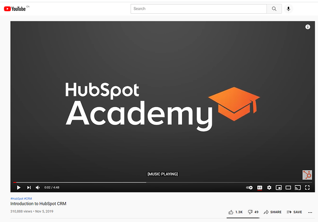
First, head to YouTube and find the video you want to embed. In this case, we’re using the Introduction to HubSpot CRM video.

the youtube video page for a HubSpot Academy video

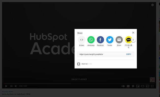
2. Click “Share”.

Next, click Share at the bottom right side of the screen, which will give you this pop-up menu:

a youtube video page with the share modal open

Here, you can choose if you want the embedded video code or simply want to share the link on social media networks like Facebook or Twitter.

3. Select “Embed”.

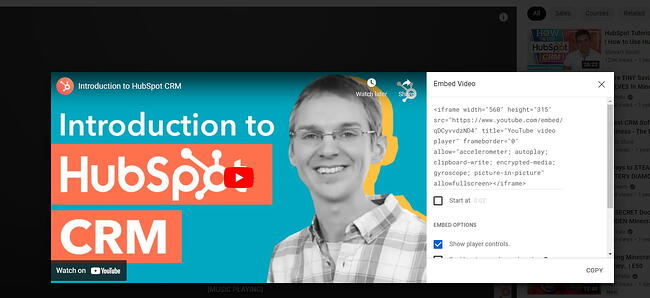
Select the Embed option on the far left-hand side. You’ll be given a snippet of HTML code, which you’ll paste into your website page to embed the YouTube video.

the html code snippet for embedding a youtube video onto a website

4. Copy the HTML code.

Copy the displayed HTML and return to your website platform. To make things easier, YouTube offers a Copy button that will copy the code directly to your clipboard.

5. Paste the HTML code on your page.

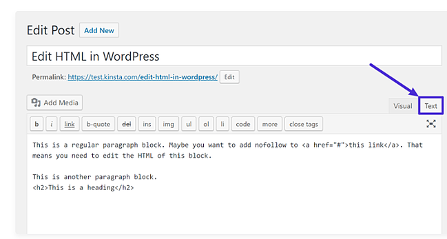
Depending on your website hosting platform, the steps for pasting your HTML embed code will differ. If you’re using WordPress, for example, open the post or page where you want to embed the video and then select Text on the right-hand side.

the classic editor in wordpress with the text button circled

Then, post your HTML code and select Update. When you navigate to the post or page again, you’ll see the embedded video.

If you’d rather not bother with HTML, you can also simply copy and paste the video’s URL into your visual WordPress editor. This process starts the same way as the HTML approach: Find your video on YouTube and click Share. Then, head to your WordPress page and paste your URL directly into the editor itself. WordPress will automatically convert the link to an embedded video.

Capturing Video Value

YouTube videos can add significant value to your website by making it easier for potential customers to find your content, retain key information, and better understand your brand.

The caveat? It’s not enough to simply post a video — to get the most value for your visual marketing efforts take the time to review and curate your content before posting to deliver maximum impact.

Editor’s note: This post was originally published in May 2011 and has been updated for comprehensiveness.New call-to-action

Categories B2B

Is Blogging Too Saturated? Here’s How To Avoid Failure

Want to start a blog but worried that blogging is an oversaturated market? You may be wondering how your blog will stand out amongst numerous ones in the same industry.

You may even fear that your blog won’t be successful because you’re unsure how to create a blogging strategy that will make you stand out. You may have even started your blog and are frustrated that you’re not seeing the results you want. → Download Now: 6 Free Blog Post TemplatesIn this article, we’re going to break down what you should consider about starting a blog, how to tell if a market is too competitive, and other ways to make your blog stand out.

Considerations for Starting a Blog in 2021

Starting a blog may feel like a daunting task. There are many questions around whether your blog will gain traffic and how to put your content in front of your desired audience.

The benefits of blogging, however, is a long-term game. Posting to your blog consistently is a fundamental first step. The second step is centering your blog around a specific topic or theme.

According to Website Setup, the number of blogs on the internet has reached over 600 million. If you’re looking to start a blog and worry that this number indicates that the blogging market is oversaturated, don’t panic.

While blogging may be competitive, there’s a lot of context to consider that can give you an advantage. It all depends on which niche you enter. While most blogs lie within a specific industry, every blog has a specific perspective in that industry.

For example, if you have a wellness blog that focuses on healthy eating and exercise, the perspective can be from someone who struggles with a specific disease or has advanced education on nutrition.

This specific perspective is your unique value proposition.

An audience that may be looking for specific, niche information will gain attention and traffic because your specific perspective creates value that is rare.

Overtime, your audience will understand that they cannot find that information with this unique value anywhere else. Your blog’s perspective is what will set it apart from others. Focusing on this specific value will set you up for long term success.

How to Tell if a Topic Is Too Competitive

Now that we understand that your blog needs to have a unique perspective that brings value to your industry, we’re going to explain how to determine if a blog topic is too competitive.

There are many ways to determine how competitive your niche is, but we’ll keep it to the most simple:

  • Keyword Volume (MSV)
  • Keyword Difficulty (KD)

In order to determine either of these, you’ll need to perform some research on the keyword landscape for your intended primary topic.

For example, if you want to blog about baking cookies, you’ll want to check out the keyword landscape for queries like, baking at home, cookie baking ideas, baking desserts, to start.

Search Engine Optimization (SEO) tools like Google Trends, Ubersuggest, Moz, or Semrush are great keyword research tools that can show you both the MSV and the KD for any query you’re interested in.

Keyword Volume

Otherwise known as Monthly Search Volume (MSV), keyword volume tells you how many times a certain keyword is being searched each month. Keyword volume can indicate how large the audience is for a certain topic, and therefore indicates how much potential traffic is available to you within this keyword’s landscape.

The higher the volume, the more opportunity for traffic from this keyword. Now, you won’t be able to capture all of the traffic available. Your opportunity is highly dependent on another factor — keyword difficulty.

Keyword Difficulty (KD)

Keyword difficulty gives you an idea of the likelihood that your content will rank in search engines for that keyword by telling how difficult it is to rank for that keyword. Other blogs are also competing for this keyword, so KD gives you a sense of your competition.

Different SEO tools consider various factors to calculate the difficulty of ranking, like number of backlinks and search volume, for instance. Overall, keyword difficulty is a helpful way to tell if a market is highly competitive.

Tips for Blogging in a Competitive Market

If you find that your niche topic has a high keyword difficulty, don’t worry. There are a number of actionable steps you can take to ensure you can still rank and get traffic.

There are ways to optimize your blog to ensure you target the right audience, rank in search engines, and keep viewers coming back. Let’s cover those now.

1. Know your audience. 

Having a foundational understanding of your blog’s goal and purpose is fundamental to standing out in a competitive market. And knowing who your audience is and what they want to read comes just before that.

You can start by building a persona to target with your content. That way, you’ll have an intimate understanding of who your target audience is and will be able to serve them.

In order to get to know your audience, you should ask yourself the following questions:

  • Why are you blogging this information?
  • What impact do you hope to bring with your blog?
  • What does your audience need to learn?
  • How does your audience like to consume information?
  • What demographics define your audience?

2. Incorporate SEO guidelines.

Search Engine Optimization (SEO) is the key to bringing your blog to a wider audience. Essentially, you want to center your blog content on a few primary keywords that align with what your audience is interested in learning. We already discussed above how to determine the MSV and KD for your target keywords, but there’s a lot more to SEO.Your blog’s content should focus around your primary keyword. Those keywords should show up throughout your content.

For example, if your blog is about fishing, that would be considered your primary keyword topic. Relevant keywords that would appear throughout your blog are how to fish, fishing guidelines, and how to prepare for a fishing trip. The more relevant keywords appear in your blog, the more it helps search engines understand what your blog is about.

Don’t flood your content with your keywords simply to rank. This is called keyword stuffing, and it’s a black-hat SEO practice. The focus should be to create quality content that helps users. If you’re creating content that gives information that answers your audience’s needs, then it’s likely they will come back to your blog for more.

3. Build relationships.

Networking applies to online marketing, too. Try to build relationships with online leaders in your industry or those who have parallel audiences.

By building a network, you can also create opportunities for backlinks to your content, which is helpful to build authority. Backlinks help bring more traffic to your blog as the audience from one blog is being redirected to yours. This over time helps you optimize your visibility on the search engine results pages (SERPs).

Backlinks can be in the form of a guest post. For example, if you have a cooking blog and feature a guest post on Food Network, that creates a backlink. They can also come from referral links from other sites that may have a bigger name in your industry. For example, if Entrepreneur.com links to your article on startups, that is also considered a backlink.

4. Be helpful. 

If your blog solely promotes your product or services, it may be overly promotional. Find out what your target audience is really interested in and pursue those topics — it’s always better to be helpful than promotional. Successful bloggers put their community’s needs before their financial gain.

“Providing accurate, useful information that informs in a non-self-promoting manner gains credibility,” writes Greg Sweval, a direct-to-consumer consultant. “It may take a little longer to build the buzz, but once the momentum gets rolling, it has exponential effects.”

5. Blog about your expertise.

Blog about the aspects of your business that you’re passionate about. “Be yourself and blog about the things that excite and interest you (without sounding like a commercial, of course) and you’ll be fine,” suggests Steve Early.

When you write with passion and offer real value, you will most likely attract a bigger audience. With all the information we have at our fingertips, readers can sense authenticity. Your goal should be to create content for humans who are curious and seeking helpful, unique information. Aim to make your readers as passionate about your subject as you are.

6. Be authentic. 

You will stand out from the noise and the crowd of bloggers if you are truly authentic. Transparency can earn you credibility in the blogosphere. In addition, it will add a more personal element to your writing style. Be authentic and let your readers see you clearly and identify with your message.

A successful blog takes time, strategy, and research.

Building a profitable and successful blog has no shortcuts. If you perform market and keyword research, you will get a feel for what your audience’s needs are and what they want to see. Once you know what your audience wants, understand your blog’s unique value, and incorporate SEO tactics, you will ensure the longevity and overall success of your blog.

Starting a successful blog in a saturated market doesn’t have to mean failure. However, it will take consistent effort, focus, and dedication to become successful. Start planning your blog strategy today and watch your audience grow.

Editor’s note: This post was originally published in July 2009 and has been updated for comprehensiveness.

Categories B2B

A Beginner’s Guide to Web Analytics

Pageviews, unique pageviews, new visitors, and returning visitors — they all sound similar, but these metrics are not the same. If you don’t know the difference, you could be misinterpreting your website analytics and making some ill-informed decisions. Let’s make sure that doesn’t happen.

In this guide, we’ll be covering everything you need to know about web analytics, so you can truly understand which data points mean what, interpret your findings correctly, and make data-backed decisions for your website and business.

We’ll be covering the following points below — click on any of the jump links to skip to that section:

Free Guide: How to Run a Technical SEO Audit


There are tons of data you can collect to understand how people interact with your website and identify opportunities for improvement. You can track overall traffic, bounce rate, traffic sources, new and returning visitors, time spent on site, and much more.

The amount of data can be overwhelming at first. That’s why it’s important to identify a few key metrics, particularly as you’re getting started. For example, you might start by focusing on the bounce rate for a few key pages on your site. If visitors are quickly bouncing from your homepage, then that indicates they’re not finding the information they’re looking for quickly or easily enough. From there, you can identify possible next steps, like redesigning your website navigation.

Let’s take a closer look at why web analytics is important below.

Importance Of Web Analytics

Web analytics is critical to the success of your business. It enables you to better understand your site visitors and use those insights to improve the experience on your site. For example, if you discover that the majority of users on your site are using a mobile device, then you can focus on making your website more mobile-friendly.

Web analytics can also shape your content and SEO strategy. Looking at your top viewed posts, you can begin to identify what types of content and topics perform best with your audience. If you notice how-to WordPress tutorials make up the majority of your top viewed posts, for example, then you might shift and narrow your focus from definition articles about anything web-related to how-to WordPress tutorials. Or maybe you look at your site’s traffic sources and notice that organic and email traffic are your top drivers and paid channels are your lowest. In that case, you might shift resources to invest more in your organic strategy than paid.

Now that we have an idea of what web analytics is and why it’s important, let’s look at some key metrics you might track to measure progress against — and eventually meet — overarching business objectives, like increasing website traffic, leads, and revenue.


Before you read on, it’s important to note that various analytics tools may have slightly different definitions of the following terms. It’s best to consult your particular tool’s documentation to understand exactly how each is calculated.

Pageviews

Pageviews are the total number of times a page was viewed on your site. A pageview (or view) is counted when a page on your site is loaded by a browser. So if a person were to view a page on your site and reload the page in their browser, that would count as two views. If a person viewed one page, viewed a second page on your website, and then returned to the original page, that would count as three views.

Pageviews can give you an idea of how popular a page on your site is, but it’s important to look at this number in context with other metrics — something a traffic analysis tool can help with. A page with a high number of views for a post isn’t necessarily popular since a small group of visitors could be responsible for a lot of those views. A high number may also indicate that a page was confusing and required visitors to return to it multiple times.

Unique Pageviews

Unique pageviews is the total number of times a page was viewed by users in a single session. In other words, a unique pageview aggregates pageviews that are generated by the same user during a session (which we’ll define below). So if a person viewed the same page twice (or more times) during an individual session, unique pageviews would only count that pageview once.

Since this metric discounts instances in which a user reloads or visits the same page in the same session, unique pageviews help you get a better understanding of how many visitors are viewing pages on your site and how popular individual pages are.

Sessions

A session is a group of interactions — including not only page views, but activities such as CTA clicks and events — that take place on your website within a given time frame.

The timeframe of a session varies by web analytics tool. For example, sessions in Google Analytics and HubSpot’s traffic analytics tools last 30 minutes by default. A session ends and a new session starts for a user when either A) there has been 30 minutes of inactivity and the user becomes active again, B) the clock strikes midnight, or C) a user arrives via one traffic source, leaves, and then comes back via a different source.

That means if a user lands on your site, leaves, and returns within 30 minutes, Google Analytics and HubSpot will count it as one session, not two. On the other hand, if a user is inactive on your site for 30 minutes or more but then clicks on a CTA or takes another action, Google Analytics and HubSpot will count it as two sessions, not one, even if the user never left your site.

New Visitors

New visitors — also termed new users, unique visitors, or new visitor sessions, depending on the web analytics tools — is the number of unique visitors on your website.

As the name implies, a new visitor is an individual who visits your site for the first time. Healthy websites will show a steady flow of new visitors over time to make up for those who lose interest.

These individuals are identified by a unique identifier. For example, when using HubSpot, the HubSpot tracking code is installed on your site. Then, visitors on your site are tracked by the cookie placed in their browser by this tracking code.

Two important notes to keep in mind: First, a single visitor can have multiple sessions and pageviews on your site. Second, unique visitors is not an entirely accurate metric. That’s because most web analytics tools use cookies to track visitors, which doesn’t always distinguish new visitors from returning ones (which we’ll define below). For example, if a person visits your site via their mobile phone and then on their personal computer, they’ll be counted as new visitors on both occasions.

Returning Visitors

Returning visitors (or users) is the number of visitors on your website who have visited before. Not all web analytics tools include this metric, but some — including Google Analytics — do. In Google Analytics’s Audience reports, you can look at behaviors to see the ratio of new to returning users on your site.

Looking at both new and returning visitors metrics are great for getting a sense of how well you’re retaining your visitors, and how effective you are in attracting net new visitors at the top of the funnel.

Your ratio of new to returning visitors will depend on several factors including your industry, how long you’ve been around, and whether you offer incentives to return to your site. But, if you’re an established website that’s seeing returning (or new) visitors top 80% of your traffic, attempt to balance this out by attracting more new visitors or retaining old ones.

Again, keep in mind that this metric won’t be completely accurate if the web analytics tool uses cookies to track visitors.

Traffic Sources

Traffic sources show where your site visitors are coming from. Like visitor information, this metric is usually collected via the tracking code on your site.

The number of traffic sources you can track will vary depending on the web analytics tool. HubSpot’s traffic analytics tools track multiple categories, including:

  • Organic Search
  • Referrals
  • Organic Social
  • Email Marketing
  • Paid Search
  • Paid Social
  • Direct traffic

Ideally, you want to increase all sources of traffic. But, your biggest focus should be organic search, which is traffic that comes from non-paid search results in search engines like Google. This source has the potential to drive huge amounts of traffic to your site. Plus, improving this channel often improves other channels, like referrals and social.

Bounce Rate

Bounce rate is the percentage of visitors that leave your website after viewing a single page. You can look at bounce rate as a site-wide metric or a page-level metric. At the page level, bounce rate is the percentage of sessions that started on the page and did not move to another page on your site.

Generally, a bounce rate of 40% or lower is considered good, 40% to 70% is average, and anything above 70% is considered high.

If your site’s overall bounce rate is high, it might help to identify individual pages with high bounce rates. A high average page bounce rate might indicate there’s a problem with the page’s loading time, or that external links are not opening in a new tab or window, among other reasons.

To learn what actions you can take to reduce bounce rate, check out our 6 Steps to Reduce Your Bounce Rate.

Web Analytics Best Practices

Many aspects of web analytics are specific to your business: what metrics you track, how you build out reports, what tools you use. But there are some best practices to help anyone collect, analyze, and report website data more effectively. Let’s look at a few.

1. Pick metrics that align with your business objectives.

Focusing on only one or two metrics won’t provide enough insight into how visitors are interacting with your site — but tracking every single metric might provide too much information to be actionable.

To make sure you’re focusing on the right metrics, start by plotting your business objectives. Think about what the top priorities are for your website. Do you want to lower your site bounce rate? Are you looking to attract more new visitors, or better retain existing ones?

Once you have one or more objectives in mind, come up with specific strategies you’ll implement to achieve these objectives, such as fixing broken links and images, changing your site’s copy, or better optimizing for your mobile audience, which probably makes up around half of your traffic.

You’re now ready to narrow down what metrics will help you track your progress for achieving your goals and ultimately your business objectives.

2. Use data to drive decision-making.

After collecting your data, determining whether or not you met your goals is only the first step. The next — and arguably more important — step is using that data to test, experiment, and make changes on your site.

For example, say you identified some high-value content, like your Services and Pricing page, through user testing and feedback in your web design process. However, these pages aren’t getting much traffic.

In this case, you might move the navigation links for these pages to a more visible part of your site, or implement SEO measures on these pages to rank higher and capture more organic search traffic.

3. Don’t limit your focus to traffic.

Understanding and reporting traffic data — including pageviews, top traffic sources, and most viewed pages — is important. But it’s just one piece of your website performance. High traffic doesn’t necessarily mean success.

For example, if you’re getting millions of pageviews but no conversions, then you’re probably not meeting all your business objectives. Or, if new visitors consistently make up a high proportion of your traffic, consider why that might be and how you can attract return visitors more effectively.

4. Always pair data with insights.

If you report that your website received 1 million unique pageviews and 400,000 new visitors this month, that doesn’t mean all that much. Reporting only the numbers provides an incomplete picture of your website performance. For all we know, these numbers could indicate:

  • an increase from last month.
  • a decrease from last month.
  • little to no change in pageviews or visitors month-over-month.
  • an increase last month, but a major year-over-year decrease.

That’s why you must pair your data with insights. If you instead report that your website got 1 million unique pageviews, which exceeded last month’s unique pageviews by 20% and also showed a significant increase year over year, then the data is much more meaningful and actionable to you and fellow stakeholders.

5. Look at your data in context.

While collecting and analyzing data, think about it in context. What variables or larger forces could be impacting the numbers? For example, algorithm updates, seasonality, and bots can all have a major impact on your traffic and other metrics.

Imagine that a few pages on your site saw major spikes in traffic. These posts weren’t updated recently, so you look where this traffic came from. If the traffic mostly came from one country where you usually don’t see much traffic, this was likely malicious bot traffic, which accounts for a quarter of all internet traffic.

Viewing your data in context can help you better understand, analyze, gain insight, and make informed decisions with your data.

6. Share and ask for feedback from stakeholders.

As an analyst, you want to provide information to stakeholders in a way that is understandable and actionable. You also want to ask for information and ideas from these stakeholders. They can provide valuable feedback on how they use the data, what else they want to see or understand about their users or website, and how they think they can improve the user experience or other issues the data uncovers.

Web Analytics Tools

Measuring organizational success requires more than one metric — and more than one tool. Let’s take a look at three web analytics tools you could use together.

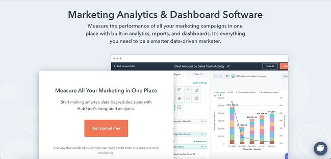
HubSpot Marketing Analytics & Dashboard Software

web analytics tools: HubSpot marketing and analytics dashboard software

With HubSpot’s free marketing analytics and dashboard software, you can measure the performance of all your marketing assets — from website and landing pages, to emails, blog posts, social media accounts, calls-to-action, and more — from one dashboard.

You’re able to track your customers’ complete lifecycle, measure traffic overall or on a page-by-page basis, and add multiple reports to your dashboard so you’re tracking your most critical metrics in one easy-to-access place. You can even break down reports by user characteristics for more fine-grained analysis.

HubSpot’s free tool is ideal for anyone looking for built-in analytics, reports, and dashboards so they can make smarter, data-driven decisions.

What we like: Analytics is fully integrated into everything you do in HubSpot, ensuring you always have the right data available when you need it. There’s no more digging through spreadsheets or datastreams — with HubSpot, everything is accessible and actionable, whether you’re a beginner or a seasoned expert.

Google Analytics

web analytics tools: google analytics dashboard

Used by over 28 million websites, Google Analytics is the most popular web analytics tool. With it, you can track pageviews, unique pageviews, bounce rate, traffic channels, user retention, average session duration, sessions by country, sessions by device, and more. You can also build reports about your audience, acquisition channels, engagement, and conversions.

Understanding the value, flexibility, and popularity of Google Analytics, some platforms offer unique integrations with this tool. Analytics Amplifier, for example, is a HubSpot app that allows users to match HubSpot customer behaviors — including “hot leads” and “deal amount” — with real-time Google Analytics data.

If you want to learn more about this tool, check out our Ultimate Guide to Google Analytics. However, the sheer amount of metrics, reports, and integrations that can be tracked or created using Google Analytics might be overwhelming. Users without SEO or technical expertise, like content creators, may find it difficult and prefer a Google Analytics alternative.

What we like: Google Analytics is unmatched in popularity. It gives website owners an all-encompassing view of their site activity, and is relatively easy to set up and link to any live site. Plus, Google Analytics offers many powerful capabilities for free.

Crazy Egg

web analytics tools: crazy egg homepage

Used by over 300,000 users, Crazy Egg is a unique web analytics tool that provides heatmaps, scroll maps, and other visual reports to show you exactly how your visitors are interacting with your site. Thanks to Crazy Egg’s tracking code, you’ll be able to watch what visitors are hovering over and clicking on in real-time via heatmaps.

Crazy Egg also offers comprehensive A/B testing so you can test various content variables like color, copy, and content placement, to see how it affects the user experience and conversions. This makes Crazy Egg an ideal alternative or supplement to Google Analytics for users interested in conversion optimization.

What we like: Crazy Egg is a user-friendly tool for conducting heatmap and scroll map testing, A/B testing, and screen recordings of user interactions. These are great means to better understand users in qualitative and quantitative ways, and gain insights to improve the user experience on your site.


For example, Google Analytics offers several APIs that you can use to automate complex reporting and configuration tasks. One such API is the Google Analytics Reporting API. With this API, you can build custom dashboards to display your Google Analytics data, automate complex reporting tasks to save time (like getting data in two date ranges with a single request), and integrate your GA data with other business applications.

Another popular example is Chartbeat’s Real-Time API. This API consists of data that is updated every three seconds so you can see how your visitors are interacting with your content in real-time. You can use this data to improve audience engagement, inform editorial decisions, and increase readership, which is why Chartbeat is used by bigwig news organizations including The New York Times and The Washington Post.

To understand what APIs are and how they work, check out The Ultimate Guide to Accessing & Using APIs.

Using Web Analytics to Improve Your Website

Whether you’re a small business, ecommerce site, or enterprise company, web analytics can help you and your company grow. By collecting, reporting, and analyzing data about your website, you can improve the user experience on your site and meet larger business objectives like increasing online sales.

Editor’s note: This post was originally published in July 2014 and has been updated for comprehensiveness.

seo audit

Categories B2B

What Are Content Managers, and How Do You Become One?

Content managers build a company’s content strategy, create targeted and relevant content, and distribute marketing communications to audiences online. They are organized, well-versed in fostering a brand voice, and often know their way around a blog post.

Download Now: Free Content Marketing Mapping Template

You might just be learning about the content management role and want to know the basics. Or, maybe you know this is the job for you, but want to make sure you’re prepared to be successful.

Below, you’ll find everything you need to know about content managers, from what they do to how to become one. Let’s take a look.

What are content managers, and what do they do?

Content managers develop and distribute timely, relevant content for audiences. To do that, they have a deep understanding of their company’s brand voice and use it to communicate with customers.

In addition to creativity, being a content manager usually involves the management of projects and a content team. They also might collaborate across other teams for projects.

This role is not entry-level — content managers are generally expected to lead their team and foster growth, so it’s a job that’s filled by someone with a couple of years of experience in marketing, communications, and project management.

That was just an overview of content managers and the job role. Next, we’re going to talk about some specific duties of a content manager.

The role of a content manager can depend on company structure and size. For instance, a startup’s content manager might be their only marketer, while an enterprise company might have content managers assigned to multiple teams.

You might find a content manager taking the ownership over an editorial calendar, developing content topic strategy, compiling data reports, managing social media accounts, or writing long-form editorial pieces.

Alicia Collins, Global Brand Marketing Manager at HubSpot, says, “Content managers wear many hats. Their job consists of so many moving parts — managing blogs, managing social, managing offers … in some cases, they can be a one-person marketing team.”

Even so, there are common responsibilities that define a content manager. Let’s take a close look.

Content manager responsibilitiesContent Manager Responsibilities

The responsibilities of a content manager include:

  • Audit the existing content on the company’s website for brand voice, relevance, and optimization
  • Research competitors to find content gaps and keyword gaps that your company hasn’t yet covered
  • Create a new content strategy that can help your company reach its traffic goals
  • Promote a consistent brand identity through the company’s social media profiles
  • Create a long-term and short-term content publishing calendar and social media calendar
  • Write the new content or manage a team of freelancers and writers to create the new content
  • Monitor the performance of the content through online tools such as Google Analytics, Ahrefs, and Google Search Console

What sorts of skills do you need to carry out these responsibilities? We’ll dive into more detail up next.

So, you know what a content manager does. What about some of the skills you’ll need to exceed as one?

Content managers are brand advocates and know that the way stories are delivered reflect their company’s brand and audience preferences. We’ve lightly touched on a few of the skills you need to be a content manager, including creativity, writing, data interpretation, and organization.

But it’s also imperative to have working knowledge of a few other things.

1. SEO Copywriting and Blogging

Content managers need to have a general understanding of SEO. That way, you can effectively reach audiences through organic search. In addition, you’ll also have to know how to be a storyteller using the voice of a brand, and how to connect with customers using that brand voice.

Take it from Senior Podcast Producer Matt Brown, who says, “Empathizing with your audience and telling a story worth listening to is always the greatest skill a content manager should have.”

In order to deliver those stories, you’ll need to be familiar with copywriting and editing. Writing skills would be applied to writing marketing communications and blog posts. You’d also use them when editing the work of others.

If you’re worried about the grammar and comprehension front when it comes to writing, check out Hemingway Editor or Grammarly. Hemingway Editor is a free website that checks your writing for technical errors and readability, while Grammarly is software that analyzes your work, spell-checks it, and offers suggestions on how to improve sentence structure.

2. Data Analysis

As a content manager, you’ll spend some time analyzing datasets. Data from past campaigns, SEO research, and audience behavior are all helpful numbers to look at in order to execute job functions, because they inform leadership decisions and collaborative projects.

If you don’t analyze the results from your content performance, you won’t know if your messages are accurately connecting with your customers.

3. Basic Coding

By no means do you need to be a code whiz to become a content manager, but knowing some HTML and CSS can help you jump in when you don’t have a web developer on hand. As a content manager, you’ll be tinkering around with your website’s content management system. That may sometimes necessitate inserting a line or two of HTML and CSS code.

4. Content Management System Proficiency

On that note, you should know your way around popular content management systems such as CMS Hub and WordPress. You’ll be directly editing the content on your company’s website, so you’ll want to know how to use a CMS.

CMS Hub offers a 14-day trial that can help you get acquainted with a top-of-the-line content management system in an intuitive drag-and-drop environment. Once you learn CMS Hub, you can try your hand at a more complicated system such as WordPress.

You’ll also want to know your way around a few other tools. Generally, knowledge of one or two marketing tools for every facet of content production and management will cover your bases. This includes programs to enhance content as well, such as automatic grammar check software or graphic design tools.

It’s also a good idea to know about how social media is used as a business tool, and when that applies to marketing campaigns for your company. To help with social media management, knowing how to use a tool like HubSpot would be beneficial.

5. Strategic Planning

As a content manager, you’ll spend ample time strategizing how to deliver targeted messages to your audience. That means you won’t throw out messaging willy-nilly, but very carefully and strategically craft the messaging’s wording and timing.

Justin Champion, Principal Product Manager at HubSpot, says, “An effective content manager needs to have a vision of what story they’re trying to tell. This will help them create a cross-platform content strategy that will give the best experience possible to their audience.”

6. Time Management and Organization

As a content manager, you’ll be handling various content calendars and juggling a wide variety of responsibilities. That makes organization and time management skills a top quality of the best content managers out there.

Luckily, you don’t have to be innately organized or a strict time-keeper. You can use project management apps to keep everything going along smoothly. Remember, as a content manager, you’ll likely be the leader of a team and the go-to person for status reports. As such, you’ll want to be as organized as possible. That way, you’ll have access to the information you need when you need it.

7. Leadership

A good content manager has some leadership skills under their belt — but this doesn’t necessarily mean that you need to be an extrovert speaking at the front of the room. You can be a leader by keeping the content management projects progressing smoothly, sending reports before higher-ups ask for them, and launching new campaigns to keep your company top-of-mind for leads and customers.

In some cases, you may need to manage a team of content coordinators or writers. That’s where more traditional leadership skills come in, such as being a great people manager and adopting a leadership style that helps your team grow. Pay close attention to the wording in any job listing for a content manager. You could be the only person in your team or the leader in your team.

So, you know what it takes to be a content manager. But how do you get there? Time to find out.

How to Become a Content Manager

1. Take a content marketing certification course.

No matter your background or years of experience, if you’re shifting from another career into content management, you’ll want to re-learn the ropes of content marketing to ensure you’re up-to-date. Take a course to help you strengthen your content marketing skills. I recommend starting with our certification course. Upon completion, you’ll get a certificate that verifies your comprehension of content marketing (plus, you can add it to your LinkedIn profile).

2. Get familiar with SEO.

At countless firms, content marketing is synonymous with SEO, so you’ll want to have a firm grasp of the concept as you seek a content manager role. If you don’t know the rules of SEO, you might write content that’s not appropriately targeted or that doesn’t serve a purpose other than filling up your company’s blog.

You’ll need to know how to carry out keyword research and use the appropriate software to find “green space” for your company’s website. Green space refers to keywords with low competition and high potential for serving your audience’s needs.

3. Create a personal website.

There’s no better way to start content management than by building a personal website with content that you uploaded and wrote yourself. This website could be for your own personal brand, for a company idea you’ve had for a while, or simply for fun. Whatever it is that you create, you want to get familiar with creating a website from start to finish, so that when it’s time to manage your future employer’s site, you can do it easily.

You’ll learn a few things through this process, including how to upload content and media, how to manage that content once it’s been uploaded, and how to effectively structure your site. It’ll also teach you how to get around a content management system.

Use your learnings from this process to give thoughtful answers to your interviewers when you’re applying for content management roles.

4. Apply for an entry-level marketing role.

It’s time to search for a role. Unfortunately, content management is a mid-level role, meaning that most content managers have been in the marketing industry for a few years. If you’re just now getting started with marketing, you’ll want to start with an entry-level role first, then move up into content management.

Not all marketing roles are created equal. Look for the following words in the job posting to ensure you’re starting on the right foot:

  • SEO
  • Blogging
  • Writing

If the job posting seems too general or if it seems to concern more traditional marketing methods, such as live event marketing or advertising, you’ll want to avoid it. Content managers work almost exclusively on the digital side of marketing.

5. Take on content management tasks within your role.

In your entry-level role, you’ll want to take on the duties of a content manager without yet being a content manager by name. For instance, if your team is missing a content calendar, could you volunteer to create one (without stepping on anyone’s toes)? What about volunteering to upload the week’s new content onto the CMS?

It’s important to continue expanding your technical and practical content management skill set as you gear up to apply to an actual content manager role.

6. Apply for a content manager role.

Once you have enough experience under your belt, it’s time to move into content management — either by becoming the manager of a content team or taking on more strategic roles within a marketing team.

Remember to use every piece of experience you’ve gathered thus far to show how well you can communicate with an audience and how well you’ve distributed content in the past. Lead with the results of your actions and measure them in numbers. Content reach, organic traffic, and other engagement metrics are just a few data points you can use to show how effective you can be as a content manager.

Start Sharpening Your Content Management Skills Today

If you’re looking to become a content manager, it’s critical to deepen your knowledge of content marketing and SEO. Refining your skill set ensures that you’re staying up-to-date as the industry changes. This is a must for content managers. If you don’t know how the industry is changing, you won’t be able to effectively connect to your audience — and connecting to your audience is what will make you an excellent content manager.

Editor’s note: This post was originally published in April 2020 and has been updated for comprehensiveness.

Blog - Content Mapping Template

Categories B2B

What is AdTech [+Types Worth Investing In]

Emerging technologies always encourage scrutiny and critical analysis, and ad tech is no different.

This discipline has been around for a few years, but it’s only recently caught the attention of savvy ad tech agencies. In the era of big data, they’ve recognized having ad tech company relationships makes them more powerful and attractive to clients.

The age of social media has forced agencies to investigate innovative ways to interact with relevant users, rather than relying on typical broadcast or digital media buys. And the advantages for agencies investing in ad tech are plentiful. Global advertising is forecast to recover to 10.4% growth, reflecting a total spend of $634 billion

But there’s still one issue: many young ad agencies are still trying to figure out what exactly ad tech is — and how they can best use it to their advantage.

Download Now: Free Ad Campaign Planning Kit

If you’ve ever scratched your head at the terms “programmatic” or “omnichannel,” you’ve likely already heard a little about what ad tech does (though you may not have even realized it). Programmatic advertising, for instance, buys target audiences instead of time slots: Think about buying ad space that reaches a particular demographic wherever it is instead of buying a prime time TV spot and hoping the right people are watching.

Omnichannel marketing reaches target consumers across all channels — mobile, video, desktop, and more — within the context of how they’ve interacted with a brand (those first seeing an ad will receive a different message from those who have engaged with that brand a number of times). Omnichannel and programmatic aren’t the only two tools within ad tech, but they are two of the most revolutionary.

That said, ad tech is designed to help advertisers make better use of their budgets. Ad tech methodologies deliver the right content at the right time to the right consumers, so there’s less wasteful spending.

Today, ad tech methods supported by influential data allow agencies to make wiser placements that effectively position advertisements when and where they are needed most. This helps reduce wasted efforts and gets ads to users at critical touchpoints, meaning it’s helpful for both brands and consumers.

Instead of the standard sort of placement buys, ad agencies can integrate their ads using high-level data and technology. It’s a logical next step toward seamless integration and high-impact, value-added placements. And it’s redefining how agency planning and strategy teams look at media.

The Benefits of Advertising Technology (AdTech)

Ad tech has plenty of moving parts, which means there are countless opportunities for agencies to set themselves apart. The diversity of ad tech data allows for more granular and relevant targeting and integration. It also necessitates leaning upon trusted ad tech solutions and platforms to get the most out of every ad campaign.

One major effect for agencies and their clients is a noticeable improvement in prospect interactions. Thanks to ad tech, brands can now connect all advertising channels. This means saying goodbye to clunky, unnatural advertising that irritates users and frustrates agencies and their clients. Instead, cross-platform uniformity ensures brands are reaching users consistently and logically.

Ad tech has also allowed retargeting to enjoy growing popularity — so much that it represents about 90% of all advertising costs. In other words, it’s not going away.

The problem is that it can be too intrusive, which leads to reduced effectiveness. By taking advantage of RTB options fueled by ad tech data, agencies can drill down and target only those audiences most likely to convert, without badgering those who aren’t.

Connecting the Dots Between Ad Tech Companies and Agencies

Knowing that they need each other to thrive, agencies and ad tech companies are on a joint mission to figure out how to forge long-lasting relationships. Deeper connections tend to occur naturally through regular communications, realistic expectations, and thoughtful customization.

Communication

Touching base regularly and working transparently between both parties is essential. There can no longer be a “set it and forget it” attitude in the online ad industry.

With new integrations between data, tech, and content, there needs to be consistent party involvement from start to finish. To this end, media publishers are having more discussions with their agency partners about content and other creative efforts than ever before. That makes it imperative for ad tech organizations and agencies to have an “open door” policy.

Expectations

Quick turnarounds are another key factor to keep an eye on in the relationship between agencies and ad tech pros. Everyone wants rapid turnarounds, but sometimes things can get lost when too much is happening at one time, and sometimes quality is compromised.

Do you want something mediocre that’s finished tomorrow or something impressive you have at the end of the week? You likely want the latter. Project management helps smooth out the flow between ad tech and agencies and ensures more successful campaigns.

Customization

Imagine you’re a consumer who just saw a mobile ad that piqued your interest. When you go to browse on your laptop, you see the same ad. Then you see the same next time you’re on YouTube, then again before your next Hulu binge session. Seeing the exact same content becomes annoying, and your interest inevitably lowers.

That said, there can’t be a repurposing of content and strategy across all channels — that’s a dinosaur-era approach destined to backfire. Agencies and brands are realizing that they need to customize creative assets for each channel and integration. It’s no longer acceptable to have a mentality of “matched luggage” when it comes to media. Agencies can work hand-in-hand with an ad tech partner to achieve exceptional outcomes through data interpretation.

Advertising Technology Trends

1. AI AdTech

Programmatic advertising has continued to grow and one of the evolutions of the process is using automated, artificial intelligence. AI can automate the ad purchasing process so advertisers can target more specific demographics.

As advertising technology becomes more complex, the demand for it to be automated will continue to grow. Not only does it make media buying easier, but AI can also make real-time adjustments across all channels.

2. Self-Service AdTech

One of the latest trends in ad tech is the adoption of new technologies that offer self-serve options. For example, with AdVendio users can significantly reduce operational costs and time needed to manage clients by providing a branded platform for end-to-end ad campaign management. This means low-budget advertisers can scale their business efforts.

This gives advertisers more control and makes it simpler for advertisers to set up and manage advertising campaigns.

3. Header Bidding

Header bidding is an automated auction technology, which allows publishers to sell their inventory to advertisers through many Demand Side Platforms (DSPs) while receiving bids from multiple advertisers simultaneously.

With header bidding, publishers can receive bids from multiple advertisers at the same time. We anticipate this becoming a bigger trend because it ensures that advertisers receive a reasonable demand base price for their ad inventory.

AdTech Solutions

Mobile AdTech

When it comes to finding ad tech solutions, you might consider breaking down what type of advertising you’re doing. For example, if you’re only going to be advertising on mobile devices, you can use mobile ad tech solutions.

One mobile ad tech solution is Basis. With this software, you can plan, buy, analyze, and streamline your mobile ad campaigns. This software has robust business intelligence, workflow automation, and is powered by artificial intelligence.

Another example of mobile ad tech is Celtra. With Celtra, marketing teams can design, approve, and deliver digital assets for their mobile advertising campaigns.

Online Advertising Technology

Online advertising technology is a solution that will help you advertise online, regardless of device type. A great example of this is AdRoll. With this ad tech solution, you can find more customers, build profitable relationships, protect your customer data, and improve your advertising results.

adtech software: adroll

Image Source

Another example of online advertising technology is the Google Marketing Platform. You can manage all your campaigns, from search engine display advertising, to retargeting, to display and video campaigns.

Video Advertising Technology

When you’re creating your ad campaigns, it’s important to be creative and think beyond display search advertising. You can use video ad tech solutions such as Tik Tok Ads. With this solution, you can tap into unique engagement solutions and immersive formats to creatively and authentically connect with audiences around the world.

adtech solutions: tik tok ads

Image Source

Another example is StackAdapt. StackAdapt is a self-serve advertising platform that specializes in multi-channel solutions including native, display, video, connected TV, and audio ads.

Native Advertising Technology

Native advertising is when paid ads match the look, feel, and function of the media format in which they appear. One ad tech solution for native advertising is Taboola. With Taboola, you can reach new audiences and place your ads in a media format that’s similar to that of your ad.

Another example is Outbrain. This advertising platform helps global to emerging brands connect with consumers on the open web through engaging ad formats that inspire action.

Reaching Higher With Ad Tech

Ad tech has grown rapidly, and it’s showing zero signs of slowing down.

As it continues its spread, agencies will be able to take advantage of ad tech’s opportunities to develop more integrations, more data sharing, extended reach across all channels, and cleaner integrations against content.

When ad tech and agencies partner up, user experiences will be increasingly polished and positive, and agencies will get the reward for their commitment to embracing the benefits of a lasting relationship with ad tech providers.

advertising plan

Categories B2B

How to Create an Editorial Calendar in Google Calendar [Free Templates]

One of the most frequent questions we get from aspiring and current inbound marketers is, “How do you manage all of that content?”

The answer: we rely on an editorial calendar in Google Calendar to stay keep our content organized.

Free Download: Marketing Editorial Calendar Template

There are a lot of great calendar tools out there you can choose from. In fact, for those of you who are HubSpot customers, there’s a marketing calendar built right into HubSpot’s software. But after trying a ton of other solutions, our team found that we really operated the best with just a simple Google Calendar. In fact, this has actually been the longest-running editorial calendar solution our team has ever seen.

Here’s how we set it up.

Follow Along With Free Editorial Calendar Templates

HubSpot's Blog Editorial Calendar - Free Template in ExcelDownload the Template for Free

1. Download HubSpot’s free editorial calendar templates.

First thing’s first: Download the calendar templates, above (they’re free.) By doing this, you’ll have three editorial calendar templates on your computer to use at your leisure: one for Google Calendar, one for Excel, and one for Google Sheets. In this blog post, we’ll be going over how to import the Excel template into Google Calendar.

2. Customize your template and prepare for import into Google Calendar.

By default, the publish dates on the templates you download will be stamped for the year 2016. Feel free to change them to the present year in the spreadsheet itself — you can also drag them to the dates of your choosing after you upload the file into Google Calendar.

Google Calendar makes it easy to load a calendar you might have pre-created in another program into Google. This includes Microsoft Excel. Here’s how to import the Excel calendar template you downloaded in the previous step into Google Calendar:

3. Open Google Calendar.

Once you’ve downloaded (or, for that matter, created) a calendar that opens in Microsoft Excel, it’s time to open Google Calendar. Just make sure you’re already logged into the Gmail account you want this calendar to give access to.

4. Use the lefthand dropdown menu to create a new calendar.

Now it’s time to set up your Google Calendar to accommodate the information in your Excel spreadsheet. First, go into your Google Calendar and click the plus sign to the right of “Other Calendars,” as shown in the screenshot below. In the dropdown menu that appears, select “Create new calendar.”

Adding a New Calendar in Google Calendar

5. Fill out the details of your new calendar.

Fill out the fields that appear on the next screen. This includes a brief description of your calendar, as shown below, to give people proper context when you invite them into this calendar. When you’re done filling in the details, click “Create calendar.”

Adding Details in Google Calendar to Create New Calendar

6. Import your XLS or CSV file from the same dropdown menu.

Using the same dropdown menu you used to create your editorial calendar, you’ll now import the Excel file itself into Google Calendar. Click that plus sign and select “Import.”

Click the upload box that reads “Select file from your computer,” and locate the file entitled “Blog Editorial Calendar – Excel” that was included in the ZIP file you downloaded in Step 1, above.

7. Select which calendar to add this file to.

In the second box below your imported file, click the “Add to calendar” dropdown. Be sure to choose the name of the calendar you just created from the dropdown menu, as shown below. Then, click “Import.”

Import Excel Calendar in Google Calendar

8. Click Import.

Once you’ve uploaded your Excel file and selected the calendar you want to add this file to, click “Import.” You should see an Import calendar dialog box telling you that seven events were successfully imported. Click “Close.”

Now, if you didn’t change the dates of the first seven assignments in the original Excel document, you can now. Navigate to January 3, 2016, which is the start of your calendar. Be sure all of your other calendars are temporarily hidden by clicking the colored box to the left of the calendar name. On the week of January 3, 2016, you should just see one “Blog TBD” calendar event on each day from 10 a.m. to 11 a.m.

Use the edit window of each assignment to change the publish date. For example, if you’re satisfied with the 10 a.m. publish time, you can simply change the date from January X, 2016 to January X, 2021. Each assignment will then appear as event blocks in your 2021 monthly calendar view.

9. Determine your publishing schedule.

Now that you have your calendar created, it’s time to fill it in with assignments for the year. This is when you have to make some decisions about your blog’s publishing schedule.

While the Excel file you imported accounts for one blog post per day, this doesn’t mean you need to publish seven days a week. Maybe you want to publish every Monday, Wednesday, and Friday. Or perhaps you plan on publishing on just Thursdays. Remember, the key to successful blogging is quality over quantity.

Don’t overcommit to a blogging schedule if the quality of your content will take a hit. How often your company should blog will vary depending on your business goals and resources. 

If you decide to decrease the number of days you want to publish, click on the calendar event of that day and select “Delete.”

Even if you wanted to publish multiple times a day, updating this calendar is as easy as adding an event. Select a slot on your calendar to add another “Blog TBD” event and copy the default description from another one of the events you imported.

Next, it’s time for some minor adjustments. Currently, the “Blog TBD” events are set for 10 a.m. Feel free to move these events to whichever time your blog publishes during the day. 

10. Set up recurring events.

Now that you have your publish dates and times set, you can make these recurring events on your calendar. If you have a regular publishing schedule, like every Monday, Wednesday, and Friday at 10:00 a.m., then put that in as a recurring “slot” on your calendar. It’s okay if you don’t have a piece of completed content — or even a working title — to put there yet. It’s just a reminder that you want to publish something that day.

To add your recurring slot, click on your first “Blog TBD” event and click the pencil icon to edit your event. This will take you to the details of the post, where you can create a custom recurring schedule for each assignment, as shown in the screenshot below.

Setting Custom Repeat Schedule in Google Calendar for Recurring EventYou can set the post up as a recurring post so it automatically appears every Monday, Wednesday, and Friday at 10:00 a.m. (or whatever days and times you want).

Setting Custom Recurrence in Google Calendar for Recurring Event

Once you’ve selected the recurring days, hit “Done” and “Save,” and you’ll have an editorial calendar framework to work with.

For now, keep the title of the event as “Blog TBD,” but feel free to customize the description with any extra details you want to be sure you include for each post. Wait to invite any guest, as we’ll use this to assign posts to an author once you begin filling in your topics. With everything complete, click “Save.”

If you don’t have a recurring schedule like this, you might not be in need of an editorial calendar just yet — but it is a good way to set goals for yourself. If you know you want to publish a certain number of posts each week, even if you don’t hit every single slot, it’s a good reminder for yourself and your team that this is something you should all be striving for.

11. Fill your publishing slots.

Now that you know all of the slots you want to fill, you gotta actually … you know … fill ’em. (If you don’t have topic ideas yet, check out this free topic idea generator. It’ll give you some good ideas for content to put in the calendar.)

Let’s say one of the posts you want to write is “10 Surprising Facts About Tapirs,” and one of the posts you’ve already written and want to publish later is “Think You’re Cut Out to Own a Tapir? Read This First.” Cool! Just add ’em both to the calendar by clicking on “Post – TBD” on the correct date, choosing “Edit Event,” and then changing the “Post – TBD” text to the actual title of the post.

Changing Name of Post in Google Editorial Calendar

Now, let’s say you don’t actually want to write “10 Surprising Facts About Tapirs,” and you want your colleague to write it instead. To assign the post an author, you’ll invite them to the event as a guest. To do this, click on the event, hit “Edit Event,” then invite that colleague to the post by typing his or her name or email address into the “Add guests” box, selecting “Add” when their name pops up, and hitting “Save” on the event once you’re done.

Adding Guests in Google Calendar

Now, anyone can see who is responsible for writing the post that’s going up in that time slot.

You can take it a step further by adding details to the “Description” box of the event, as shown in the large box in the screenshot above. You might include a quick synopsis, the keywords you plan to target the post for, the target audience you’re trying to reach, and the offer or CTA you will direct the reader to at the end of the post. Don’t forget a due date for the draft.

Before Google Calendar will let you save the event, you’ll see a dialog box asking if you would like to change just this event or all of the events in the series. Select “Only this event.”

Edit Recurring Event to Save Only This Event

Repeat these steps to assign each blog topic today and in the future.

12. Share your editorial calendar with others.

Now that you have your calendar set up, you can start to invite people to see it. I’d recommend you start with your immediate team and regular contributors — as well as anyone who regularly asks you about publishing content on your company blog.

To share this editorial calendar with people, simply find your editorial calendar under “My Calendars,” as shown below. Click the three dots next to the calendar name and then select “Settings and sharing” when it appears in the dropdown menu. You’ll be taken to the same screen we saw when you first filled out the details of your editorial calendar in Step 2.

Sharing Settings in Google CalendarThen, you can add in the names of people with whom you’d like to share the calendar and set the right permission levels for each invitee.

It’s wise to keep those with the permission settings to manage changes and sharing to a minimum so there aren’t too many cooks in the kitchen — but I recommend you let everyone see all event details so it’s clear exactly what content is going up in each slot.

Under the “Share with specific people” heading, enter the email addresses of those on your content team and decide if they have viewing, editing, or admin privileges. Save your updated settings.

Why Using Google Calendar as an Editorial Calendar Works

I mentioned earlier that we tried a lot of different editorial calendar solutions, and this is the only one that’s stuck for more than a couple of months. I think one reason for that is because we use Gmail for our corporate email, which means everyone on our team is already in Gmail (and their calendar, specifically) all day. As a result, it isn’t hard for people to form a habit of checking the editorial calendar, because it’s not difficult for them to find it.

Image of an editorial calendar in Google Calendar made from a templateGoogle Calendar also makes things really easy to move around and schedule because … well … it’s already a calendar. It has all the functionality you need to schedule stuff out and let the people who need to know about it know. When we were using other solutions for this, we were trying to hack a calendaring function instead of just relying on one that already existed.

Along those lines, adding people to view your calendar is simple, which makes it easy for multiple teams to collaborate, see what’s being published, and figure out when they might be able to launch content and campaigns.

Finally, this sets a precedent for other teams to coordinate with you in a really simple way. You can have a calendar for upcoming campaigns, offers, social media pushes, product launches — you name it. And you can all share those calendars with one another for a single-screen view of everything that’s going on so you can coordinate more easily.

Are there other solutions of there for maintaining an editorial calendar? Of course. But if you’re looking for a minimum viable product, and a free one at that, this ain’t too shabby. It’s kept our content team sane, agile, and transparent for quite some time — and I think it could do the same for you.

New Call-to-action

Editor’s note: This post was originally published in January 2019 and has been updated for comprehensiveness.

Categories B2B

Should You Worry About YouTube AdBlock? 4 Tips for Video Marketers

Imagine watching the Super Bowl without any commercials — or driving through a bustling city with blank billboards.

Now imagine watching YouTube without ads.

For some people, this is a reality. With YouTube Adblock, viewers can block ads from appearing in videos and on the webpage.

This begs the question: should video marketers worry about ad blocking?

→ Free Templates: How to Use YouTube for Business [Download Now]

Let’s learn more about YouTube Adblock, if consumers actually use it, and tips from real video marketers on how to get around them.

Ad blockers may feel like a marketer’s worst nightmare. But there is power in understanding why people use them.

Here are some quick stats: 48% of ad blocker users felt there were too many ads online. And 47% of users found these ads annoying or irrelevant.

Think of your own experience — have you ever been bombarded with pop-up ads while reading an article? Or watched a video ad that wasn’t relevant to your interests… at all?

This study signals a clear trend: Users want a less intrusive experience with digital ads. And they’re willing to guard their time and attention with ad blockers.

Do Consumers Use YouTube AdBlock?

We know the motivations behind using YouTube Adblock, but how many people actually use it? Take a look at HubSpot’s survey about ad blocker use on YouTube:

More than half (63%) of respondents do not use any type of ad blocking software on YouTube, whereas a slim 11% of respondents do.

Does this mean marketers can breathe a big sigh of relief? Not so fast.

While the adoption of ad blockers is low, it is slowly increasing year-over-year. It may not be an immediate threat to your digital marketing strategy, but this could change in the coming years.

And, if your target audience consists of millennials, you may feel the effects of ad blocking more. People in the 18-to-24 range are the highest users of ad block software, while people younger than 12, and 65 and older, are among the lowest.

Marketers must get creative to leverage YouTube without ad blockers getting in the way. Here are four tips from video marketers on how to get started.

4 Tips for Navigating YouTube AdBlock, According to Video Marketers

1. Keep it in perspective.

Don’t let the fear of ad blockers drive you away from YouTube entirely.

For Nicole Ondracek, marketing manager, paid advertising at HubSpot, advertising on YouTube still proves effective — even with pesky ad blockers.

“You’re still able to reach so many people on YouTube that [AdBlock] doesn’t really play a factor in our strategy.”

Ondracek adds, “For example, one of our audiences is a Custom affinity audience, which is a type of audience that targets people with interests in B2B CRM software. This segment alone can still reach 500 million to 1 billion impressions a week.”

While ad blockers “mute” a portion of your audience, YouTube still provides access to billions of users (2.1 billion to be exact), along with plenty of opportunities to reach them.

2. Diversify your ad channels.

It’s never a good idea to put all your eggs in one (marketing) basket.

For instance, if your digital marketing solely revolves around YouTube advertising, you may want to diversify your marketing strategy to include “ad blocker-proof” channels, such as social media or content marketing.

Jennifer Brault, channel promotions manager at HubSpot, tells me, “When running any sort of digital marketing campaign, it’s important to meet your audience where they are.”

Brault continues, “By diversifying your advertising spend across multiple channels, you’re not only reaching a variety of audiences, but you’re also learning more about what platforms your audience spends their time on, which can help inform future ad spend and organic efforts.”

3. Create a meaningful ad experience.

“Rather than trying to find ways around ad blockers, focus on finding ways to make advertising more meaningful and appealing to end users,” says Bernard May of National Positions.

As ad blocker usage slowly rises, video marketers must put their audience at the center of their video strategy. This means getting to the heart of customers’ interests, questions, and pain points — and then finding ways to address them.

Remember, consumers don’t hate advertising — they hate bad advertising.

4. Focus on targeting.

While we can’t necessarily get around ad blockers, we can focus on putting ads in front of the right people.

With Google AdWords (YouTube’s ad platform), video marketers can target people who already demonstrate an interest in specific topics or keywords relating to your business.

Affinity Audiences is an especially helpful targeting mechanism in Google Adwords. With Affinity Audiences, you can reach people based on their browsing history and place them in certain segments such as “bargain hunters” or “DIY.”

For example, a marketer selling outdoor sports equipment could target users who recently searched for “ice fishing” or “best hiking trails near me.”

Final Thoughts

Ad blocking technology isn’t going away soon. Fortunately, all isn’t lost for digital marketers who can still benefit from YouTube by auditing their current practices, diversifying their marketing channels, and identifying areas for innovation.

New call-to-action

Categories B2B

The 22 Best Conference Website Designs You’ll Want to Copy

A conference website is a powerful way to generate buzz about your event, answer commonly asked questions, and boost ticket sales and attendance.

Since 2020, the majority of events have been hosted virtually — and this trend will likely continue in 2022 and beyond. In fact, the global virtual events industry is expected to grow 23.7% each year from 2021 to 2028, according to data from Grand View Research

In an increasingly digital-first world, a conference website is more important than ever. As many people’s first introduction to your event, it can influence whether someone buys a ticket, or abandons the page entirely. 

Below we’re going to explore over 20 of the coolest conference websites we’ve found. You can use these examples as inspiration when designing your own site.

Learn More About HubSpot's CMS Software

Conference Website Design Best Practices

Before we dive into the examples we’ve collected, let’s explore some best practices to keep in mind when designing your own conference website.

A good conference website design should follow these best practices:

  • Put your location and date above-the-fold: People should know immediately where, and when, your event is taking place. If they can’t find it easily, they could abandon your website. Before you dive into speakers or any other information, ensure your visitors know whether they can attend in the first place.
  • Use interactive elements: Videos or animated graphics can go a long way towards making your website look sleek and professional. Plus, video is a good opportunity to showcase highlight reels from past events.
  • Center the page around your visitor: What’s in it for them? Great speakers to inspire their work? A chance to network with industry leaders? Ensure your copy outlines — clearly and concisely — how your website visitor will benefit from your event.
  • Have a clear call-to-action: Your page is ultimately meant to convert web visitors into event attendees — so make this easy to do. Create a bold “Register Here” or “Buy Tickets” button so your visitors can easily convert when they’re ready.
  • Include fun visuals: One thing that’s apparent in all the conference web designs we chose is interesting, unique, fun visuals. Too much white space will likely bore visitors and not pique their interest enough to purchase a ticket. Use visuals to grab your visitor’s attention, and communicate through images what your event is all about.
  • Create time-pressure by including a countdown feature: In a few of the websites we’ll look at below, you’ll see a countdown that outlines how many days, hours, or minutes visitors have left to sign up for the event. This is a fantastic way to create a sense of urgency and encourage visitors to sign up immediately — or risk missing out.
  • Align with your brand identity: A conference is a great way to generate brand awareness to a much larger audience. With that goal in mind, you want to make sure your conference website aligns with your brand identity. Using the same or similar typography, color schemes, and logos can ensure you achieve a consistent look and feel across your marketing collateral. 

Now that we’ve covered some conference website best practices, let’s see how these 20+ conferences put those ideas into practice.
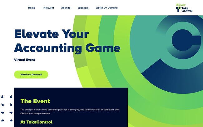
1. FloQast’s Take Control

conference websites: FloQasts Take Control home page

Less than three months before Floqast’s annual user conference was scheduled to take place, it had to shift from in-person to virtual. Using CMS Hub, FloQast and its web design partner agency Aptitude8 was able to deliver a seamless conference experience and website.

FloQast’s Take Control conference website revamps its well-recognized green and navy blue colors in a unique color scheme, using brighter and more analogous colors. It also has two clear CTA buttons above-the-fold encouraging visitors to watch the event on demand. 

What we like: The website design is unique, but consistent with FloQast’s branding. 

Pro tip: Expand your color palette with analogous colors to provide your conference website with an enhanced look and feel. 

Great example of: Consistent brand identity
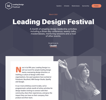
2. Leading Design Festival 

conference websites: leading design festival homepage

Color is an important factor to consider when designing any web page, and this homepage for the Leading Design Festival does a good job using complementary colors to evoke a sense of warmness. Additionally, you have everything you need at the top of the page — including a button to purchase tickets, the date of the festival, and what you’ll get for attending (a month of design leadership activities). This page proves that oftentimes, less is more.

What we like: This website clearly provides visitors with all the information they’re looking for about this year’s Leading Design Festival. 

Pro tip: Use one accent color to highlight important elements on the page, like the date of the conference and CTAs.

Great example of: Minimalist design
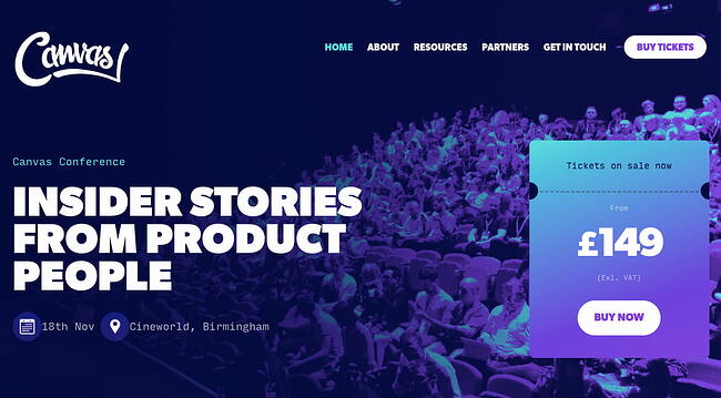
3. Canvas Conference 

conference websites: Canvas Conference home page

To underscore the value of the Canvas Conference — insider stories from product people —  an image of people chatting and networking at a previous event serves as Canvas’ backdrop image for the 2021 conference homepage. Additionally, the page doesn’t shy away from bright, vibrant colors — like purples, greens, and blues — to attract the visitors’ attention.

Plus, the price is clearly stated front-and-center, which helps visitors know whether they can afford the event before exploring anything further.

What we like: Everything on Canvas Conference’s homepage — from the background image to the copy — emphasizes that the event is community-centric

Pro tip: Try to center your website around your event’s value proposition so everything from the layout to the copy is emphasizing the event’s benefits for attendees. 

Great example of: Copy that underscores the event’s value
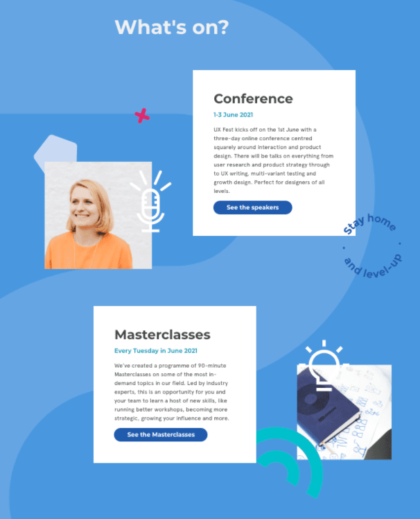
4. UX Fest 

conference websites: The UX Fest homepage

This scroll-triggered, interactive page is so fun, I scrolled it a few times. As you move down the page, you’re introduced to new information about the conference, with fun, unique design elements, like the “Stay Home and Level Up” image to the right of the first Conference box. Best of all, the page is incredibly simple, with plenty of blue space on either side, to evoke a sense of calmness as visitors learn about the conference.

What we like: UX Fest’s interactive website invites users to scroll and click on different CTAs to learn more about the speakers, masterclasses, and festival and purchase tickets.

Pro tip: Use animations and other interactive elements to guide the user down the page to the “Get Tickets” CTA button. 

Great example of: Interactive design
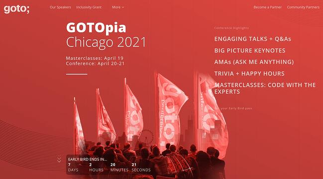
5. GOTOpia Chicago

conference websites: The GOTOpia homepage

One of the best features of this conference page is the “Early Bird Ends In…” countdown that appears above-the-fold as soon as a visitor enters the site. The sense of urgency encourages visitors to sign up immediately, or risk losing out on a good deal. The page also does a good job outlining all the critical information you need to know in just a few words — including “Engaging Talks”, “Keynotes”, and “Trivia + Happy Hours”.

Plus, who doesn’t love the bright vibrancy of a red-and-white color scheme?

What we like: The countdown timer shows how much time is left before early bird registration ends. It’s a subtle but effective way to generate ticket sales.

Pro tip: Use a countdown timer to encourage visitors to buy tickets as soon as possible, but keep the design simple and unobtrusive so it doesn’t seem overly promotional.

Great example of: Creating a sense of urgency

6. Consumer Technology Association

conference websites: Consumer Technology Association home page

The CES conference page combines bold colors with interesting visuals to grab a visitor’s attention immediately, with a simple “Beyond the everyday” tagline. The page offers all necessary information, including date, location, and a CTA, from the very top of the page, ensuring CES-fans can sign up immediately.

What we like: Consumer Technology Association’s CES 2022 homepage provides users with an immediate event registration path. 

Pro tip: Make registering for your event as easy and quick as possible. 

Great example of: Signup flow

7. UX+ Conference

conference websites: UX+ Conference 2021 home page

The UX+ Conference website is an excellent example of using interactive elements to engage and delight visitors. There’s a background animation and several text and hover animations that immediately grab visitors’ attention.

Combining past attendees’ testimonials with an animated speaker lineup, this is a powerful page that makes the most of its real estate to demonstrate why the UX+ Conference is a must-attend event for anyone in the UX industry.

What we like: The UX+ Conference home page uses interactive and visual elements to engage and impress the UX professionals visiting the site.

Pro tip: Create a website that will attract and delight your unique audience. 

Great example of: UX design
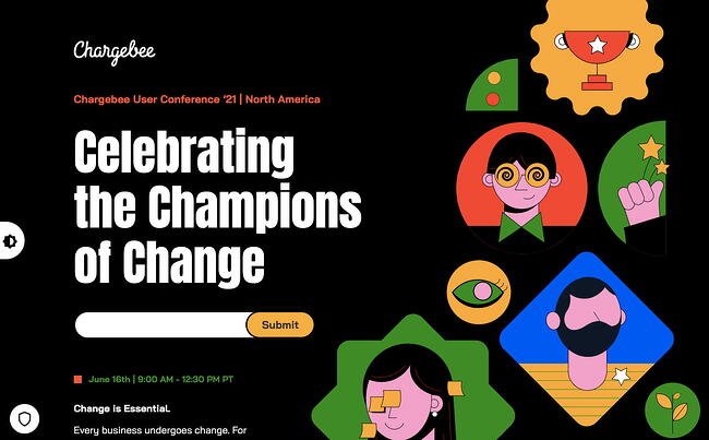
8. Chargebee User Conference

conference websites: Chargebee User Conference home pageThis sleek-looking homepage uses bold colors, typography, and animation to evoke a futuristic vibe. What I loved most about this conference website was the moving, interactive elements they’ve used to keep your interest as you scroll the page, including spinning visuals and continuously-moving text. This also reinforces the theme of the conference — “change is essential” — and its calls-to-action to adapt, evolve, and innovate.

Visit and scroll through the site yourself — it’s more entertaining than you might think.

What we like: Centered around the conference theme — “Change is essential” — Chargebee’s website is thoroughly dynamic and interactive.

Pro tip: Your theme should inform the color scheme, animations, CTAs, and every other part of your website design. 

Great example of: Theme-centric design

9. Circles Conference 

conference websites: Circles Conference home page

When attendees are choosing which conferences are worth their time and resources, one of the first questions they’ll ask is, “Why this conference over all others?”

This question is answered immediately on the Circles Conference homepage, and it’s answered using powerful, engaging text. For instance, the first sentence you’ll read in response to “Why Unmasked?” is “Shed layers of fear and doubt, and reveal your inner creativity” — convinced yet?

What we like: Circles Conference does an excellent job of persuading visitors to attend their 2022 event by clearly explaining this year’s theme and speaker lineup and displaying highlight reels from previous years and recordings of past sessions. 

Pro tip: Clearly explain why visitors should attend your specific event. 

Great example of: Answering “why this event?”
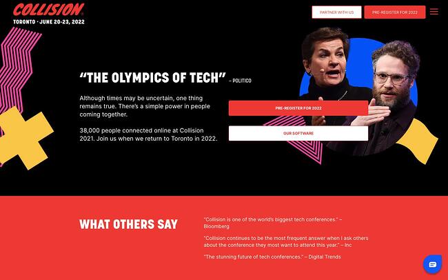
10. Collision Conference 

conference websites: Collision Conference home pageSeeing Seth Rogan at the top of the page is undoubtedly reason enough to pause on the site for anyone who’s a fan. Plus, “The Olympics of Tech”, a quote from Politico, does a good job demonstrating the value of the conference.

But what impressed me the most was the slider right below the hero image and “What Others Say” testimonials section. The slider displayed how many attendees, countries, startups, journalists, partners, and investors were represented in the event. For anyone whose unsure whether to attend, this is a compelling argument to not miss out.

What we like: Collision Conference uses a carousel slider to display impressive stats about its audience. 

Pro tip: Instead of telling website visitors how large your conference is, show them in terms of real numbers to persuade them that they can’t miss it.

Great example of: Creating FOMO

11. An Event Apart 

conference websites: An Event Apart home page

Consider standing out from the crowd by using in-house designs on your homepage, like An Event Apart does. The page is cheerful and colorful, and provides all critical information in only a few words. Before a visitor has even scrolled, they’ve learned where (online), when, and for whom the conference benefits.

For those that need more convincing, they can visit the “Why Attend?” page to see attendee testimonials (displayed as text messages), key reasons to attend, and answers to common objections.

What we like: An Event Apart clearly explains where, when, and who the event is for, and why UX and front-end designers should attend. 

Pro tip: Consider how to say more with less. 

Great example of: Concision

12. Startup Grind Global Conference 

conference websites: Startup Grind Global Conference home page

Using a mixture of photography and unique design shapes works well in this case, and the bright purple, pink, and green colors you see at the top of the page contrasts well against a simple off-white backdrop. The page is sleek and uses three bold CTA buttons above the fold to provide all information a visitor will need to attend the event, either as a startup, “scale up” business, or individual attendee.  

What we like: Startup Grind Global Conference provides clear and distinct paths for different groups, including startups, scale-up businesses, and individuals, as soon as they land on the homepage.

Pro tip: Clearly explain how different segments of your audience can participate in your event. 

Great example of: CTAs

13. The Martech Summit Singapore 

conference websites: Martech Summit Singapore home page

If you’re hosting a conference in a unique or exciting location, consider using an image of that location as a compelling backdrop. In this case, The Martech Summit used an image of Singapore to remind website visitors of the other benefit they’ll get if traveling from another location for the conference — a trip to a vibrant city. Plus, the attendee count helps persuade hesitant buyers who likely don’t want to feel like they’re missing out.

What we like: The Martech Summit clearly emphasizes that its location is another benefit of attending the event. 

Pro tip: Identify what will excite attendees about your event and showcase it in your design and copy. 

Great example of: Emphasizing location as an event benefit

14. React Day New York 

conference websites: React Day New York home page

First off — who doesn’t love hot dogs?

This React Day page does a great job using humor to stand out. Not only is there a big illustration of a hot dog — which hooked me immediately — but there are multiple mentions of hot dogs, including below Buy Tickets (“Psst: There will be hot dogs”), and used in response to “Why” to the right of the page.

What we like: Humorous illustrations and copy about hot dogs makes this conference website about a slightly intimidating topic — React — more accessible. 

Pro tip: Use humor on your own conference website to surprise and delight new audiences. 

Great example of: Humor
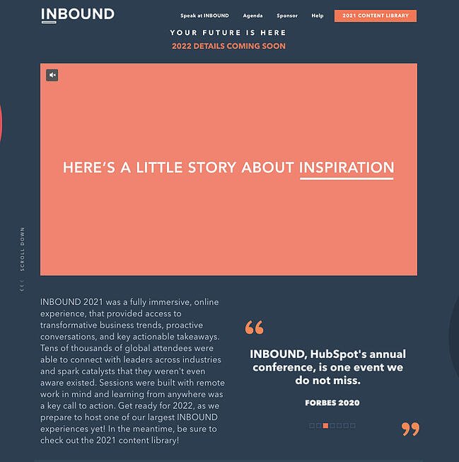
15. INBOUND

conference websites: INBOUND home page

Okay, okay — I might be biased, but hear me out.

This INBOUND page does an excellent job of exciting visitors about INBOUND 2022, even thought INBOUND 2021 just happened. It shows a video outlining this year’s speakers to excite and impress visitors with the possibilities of similar popular speakers in 2022. This is a good idea if your conference has pulled in some big names in conferences’ past, to give visitors a sense for what they can expect at an upcoming conference if you haven’t officially released upcoming speakers.

The rest of the page also effectively outlines all necessary information, including prominent CTAs to view the 2021 Content Library and sign up for a newsletter to get the latest INBOUND announcements. 

What we like: HubSpot generates excitement for INBOUND every year by making past content and future announcements accessible to existing and prospective attendees.  

Pro tip: Add elements like a highlight reel, email opt-in form, and content library to get people exciting about next year’s event. 

Great example of: Generating excitement for an annual event
16. ProductCon 

conference websites: ProductCon home page

One element that made this #ProductCon page, a conference held by the Product School, stand out to me was the easy-to-find “Get Free Ticket” box, which is front-and-center for new visitors. Particularly if your conference is online and free — which creates minimal barriers to entry — it’s a good idea to make it easy for prospects to sign up instantly.

What we like: Product School encourages prospective attendees to get their free tickets to #ProductCon as soon as they land on the homepage.

Pro tip: If pricing is a competitive differentiator of your conference, emphasize that in your design. 

Great example of: Emphasizing free admission as event benefit

17. NRF 2022: Retail’s Big Show

conference websites: NRF 2022 home page

One of the cleaner, sleeker designs in this list, NRF’s Conference Website employs a bold background image and minimal text to simplify the user experience. You’ll find everything you need to know at the top of the page — including the theme of the conference, location, dates, and how to register.

If you need more convincing, then you can scroll to the “Why Attend NRF 2022” to learn four key reasons this event is so valuable for retailers and vendors to attend.

What we like: NRF’s conference is designed to “not just to help retail move forward, but speed ahead.” This idea is captured not only by the theme (“Accelerate”) and copy, but also by the graphics used throughout the website.

Pro tip: Pair powerful and concise language with visuals to tell new visitors what your conference is all about.

Great example of: Copy and visuals supporting the theme
18. AdWorld Conference

conference websites: AdWorld Conference home page

If you’re going to have some impressive companies attending or sponsoring your event — including Google, Facebook, and IBM — it’s a good idea to showcase them on your conference’s homepage, like AdWorld does in the example above. Plus, what really stands out about this example is the small videos of various speakers that move across the page, creating a dynamic and unique experience.

What we like: AdWorld Conference showcases its speakers in a completely unique way, displaying video thumbnails of speakers moving across the screen. 

Pro tip: Re-think how to display common sections of a conference website — like the speaker line-up or agenda — to create a unique user experience.

Great example of: Showcasing speakers

19. Growth Marketing Summit

conference websites: Growth Marketing Summit home page

One element I appreciated about this page was the clear, “No Risk. Order Can Be Cancelled Free of Charge…” text right below the CTA, which helps dissuade any visitors’ concerns over being unable to attend and losing money. The page effectively leverages bright colors and a futuristic-looking heart to grab visitors’ attention from the get-go.

What we like: Objection handling is a common term in the sales world and applies to conferences as well. The Growth Marketing Summit anticipates and resolves one common objection of prospective attendees — non-refundable tickets — immediately on the homepage. 

Pro tip: Identify and alleviate common concerns of your prospective attendees on your homepage. 

Great example of: Objection handling

20. Design Thinkers

conference websites: Design Thinkers home page

Design Thinkers begins its DesignRethinkers conference home page with a fun, interactive section. If you click inside the hero image banner, you can add sticker elements to change words like “Define” and “Consider” to “Redefine” and “Reconsider.” The homepage is modern yet retro-looking, particularly with the black-and-white images and what looks like scrapbook materials in the corner. The unique combination of muted and neon colors also helps. 

What we like: Users are invited to re-examine and re-work parts of the website design by clicking and hovering over different elements on the page. 

Pro tip: Invite users to engage with your site by clicking on CTA buttons and other design elements, scrolling, and more.  

Great example of: User-centric design
21. From Business to Buttons

conference websites: From Business to Buttons home page

Since From Business to Buttons took place in a never-seen before digital platform, their website design had to strike a balance between distinctive and familiar. The website, which reminded me a little bit of a carnival ride, uses bright colors and an unusual typography to stand out. The page is fun and unique, and has a clean navigation menu at the top to help visitors find exactly what they’re looking for.

What we like: The website design is unusual but still user-friendly. 

Pro tip: Pair non-traditional typography and image overlays with traditional navigation menus and links to make your website one-of-a-kind but still easy to navigate and use. 

Great example of: Unique design to reflect uniqueness of event
22. Red Hat Summit

conference websites: Red Hat Summit

We round out this list with an incredibly simple yet sleek page from Red Hat Summit, which states the theme — “Open Your Perspective” — and a brief summary of the conference above-the-fold. The use of white space and minimal design elements helps to highlight this minimal copy, which piqued my interest in the conference. Plus, the “Register” button is clear and easy-to-find.

What we like: Red Hat Summit’s theme, “Open your perspective,” informs every part of the design, from the logo to the layout to the use of whitespace. 

Pro tip: Reflect your conference theme in your website’s design. 

Great example of: Conference logo

Conference Website Templates

Ready to create your own?

Fortunately, there are plenty of templates available to help you craft a compelling conference website.

1. WordPress Conference Templates

If your website is hosted on WordPress, for instance, you can use one of WordPress’s themes to create an inspiring, sleek, professional website to attract and convert event attendees.

Best of all, you can start with a pre-designed theme, and then use WordPress’s easy website builder to add unique features to make your conference stand out. WordPress offers a free version, and the Business plan is $25/month.  

Take a look at 21 Best Conference WordPress Themes of 2021 for more WordPress theme inspiration.
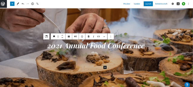
conference websites: wordpress template for conference web design

2. Wix Conference Templates 

Another great option is Wix, which has a large compilation of clean, interactive conferences and meetups website templates. Wix has a free option available, and the Professional version is relatively inexpensive at just $23/month.  

You can also edit your site for mobile, ensuring your mobile site visitors will want to attend your conference just as much as your desktop visitors.
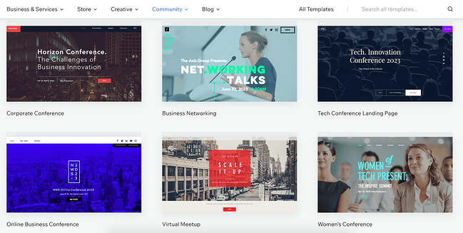
conference websites: The Wix Conference templates page

3. Canva Conference Templates

Finally, take a look at Canva’s conference and event program templates. Canva is incredibly easy-to-use, with drag-and-drop features, color schemes, and high-quality stock photos, illustrations, and graphics.

Best of all, if you’re designing with your team, you can easily share your editable file from Canva and then place your colleagues’ suggestions right into Canva.

conference websites: canva template for conference web design

Building Your Conference Website

And there you have it! Now you’re ready to begin creating your own conference website to attract visitors and increase attendees to your own branded event. Who knows — maybe your company will make it on this list in the future. Good luck! 

Editor’s note: This post was originally published in April 2021 and has been updated for comprehensiveness.

Discover videos, templates, tips, and other resources dedicated to helping you  launch an effective video marketing strategy.