Categories B2B

Clubhouse vs. Twitter Spaces (+ How Other Audio Platforms Match Up)

When a new social media app goes viral, you can almost guarantee that at least one of the social tech giants will test a similar, competitive feature.

A couple of months after Clubhouse’s launch, Twitter announced Twitter Spaces, a feature limited to accounts with 600+ followers.

Download Now: Social Media Trends in 2022 [Free Report]

Today, both platforms have greatly expanded. And, each time this happens, marketers wonder, “Which of these social media channels should I use in my strategy? And, is this trend even worth investing in?”

​​The good news? Strong competition around a social media trend, like chat streaming, signals that it’s not going away anytime soon and might be worth investing in. So, the only thing you’ll need to figure out is where to experiment with the trend.

Below, I’ll give you a breakdown of Clubhouse’s biggest competitors as well as some marketing takeaways to help you determine which platform is right for your brand.

Need to brush up on your Clubhouse knowledge before diving in? Check out this post for a recap of what Clubhouse is and why competitors are trying to get in on the action.

Download Now: Social Media Trends in 2022 [Free Report]

Clubhouse Vs. Twitter Spaces

According to HubSpot Blog Research, 44% of marketers plan to leverage live audio chat rooms for the first time on social media in 2022.

The research also suggests that marketers are more interested in Twitter Spaces than in Clubhouse. In fact, it’s the number one emerging social media platform brands invested in this year and marketers say they’ll invest more in that audio platform than Clubhouse.

Meanwhile, 15% of marketers plan to decrease their Clubhouse investment in 2022.

So how does Twitter Spaces match up to Clubhouse? Let’s get into it.

Twitter Spaces was softly rolled out to a small group of beta testers in late December and fully launched in May of 2021.

The Spaces experiment was announced late last year following the success of audio apps like Clubhouse. At that time, Twitter Product Lead, Kayvon Beykpour told TechCrunch, “We think that audio is definitely having a resurgence right now across many digital spaces. … It’ll be fascinating to see how other platforms explore the area as well, but we think it’s a critical one for us, too.”

The feature, which closely resembles Clubhouse Rooms, originally only allowed users with over 600 followers to host a space. Today, the tool is open to all Twitter users regardless of follower count and features prominently on the app as a center tab.

How Twitter Spaces Works

To create a Space, the first thing you must do is click on the center tab icon on the Twitter app. From there, you can scroll through all the conversations happening on the platform.

twitter spaces tab

Once you find a Space you’re interested in, you simply click on it and select “Start Listening.” From there, you can navigate anywhere on the app as you listen and even leave the app while the Space continues.

twitter spaces conversation

If one of your followers is hosting a Space, you will see that at the top of your timeline.

Tiwtter space in nav bar

Twitter Spaces also allows you to:

  • Add captions for accessibility.
  • Engage with speakers through emoji reactions.
  • Share the Space via Tweet, DM, or link.
  • Add up cohosts and speakers.
  • Share relevant tweets in the Space.
  • Record the Space and share it with audience later on.

In addition, you can preschedule Spaces and prompt audience to set reminders for the event.

At the moment, those who launch a Space can invite up to 10 hand-picked speakers. From there, they can adjust who speaks based on who raises their hand and which speakers need to leave early.

When entering the Space, the UX is similar to Clubhouse in that you can see who’s speaking and who created the Space before seeing a list of other listeners. You’ll also see a down arrow at the top that allows you to minimize, but continue listening to the chat, as well as a “Leave,” request to speak, share, and heart icon – allowing you to signal that you enjoy the discussion.

Like Clubhouse, users will be muted as they enter the room and will need to get speaking privileges from the Space moderator if they’d like to say something

Takeaways for Marketers

While both platforms offer many of the same features, Twitter Spaces has a wider reach.

The platform has over 200 million monetizable daily active users, compared to Clubhouse’s reported 4.9 million daily active users.

In addition, Twitter already has an established platform that offers a timeline, an explore page, and many other tools beyond its audio feature. For brands, this means that you can accomplish many goals on the same platform.

With this in mind, Spaces could also be a natural transition for brands aiming to build a community. At this point, people are already using Twitter to respond to text-based threads and tweets related to their interests, industry, beliefs, and passions.

Now, they can vocally share their thoughts in Spaces without worrying about character limits. This could further engage Twitter’s community-centered audience while also helping brands take community marketing to the next level.

Clubhouse is another community-building platform that is more niche and may work better for brands that already have a strong presence on other social networks.

Clubhouse’s Other Competitors

Instagram Live Rooms

Shortly after Facebook’s CEO and Co-Founder Mark Zuckerberg spoke in a Clubhouse room, the social media company was reportedly experimenting with a similar audio feature. While we’re still not certain if and when Facebook will launch a competing feature yet, its company, Instagram, is expanding its Live feature to add chat rooms.

What makes Instagram Live Rooms significantly different from Clubhouse or Spaces is that it streams full video chats rather than audio discussions.

instagram live rooms

Image Source

Before March, Instagram Live allowed two Instagram users (one broadcaster and one guest) to stream their video call for public audiences or followers. For viewers, this experience was like watching two people video call without being able to participate.

Now, Instagram has upped the guest capacity of these rooms from one to three.

A March 1 announcement from Instagram explained, “In the past year, special moments have happened on Live, including informational talks about science and COVID-19 guidelines, interviews with celebrities, and record-breaking rap battles.”

“Creators of all kinds — from fitness instructors to musicians, beauty bloggers, chefs, and activists, all relied on Live to create moments and bring people together to reach their communities in creative ways. We can’t wait to see what more creativity comes from this highly-requested update.”

“We hope that doubling up on Live will open up more creative opportunities — start a talk show, host a jam session or co-create with other artists, host more engaging Q&As or tutorials with your following, or just hang out with more of your friends,” the Instagram statement added.

How to Instagram Live Rooms Will Work

At the moment, the Live Rooms feature is still rolling out, but the brand says it will soon be available to global Instagram users.

When Live Rooms is fully implemented, any user can tap their Stories icon, swipe left to the Live setting, choose a title or foundation to promote in their stream. Then, they can tap the “Rooms” icon and pick guests to be in their broadcast. Viewers will also be able to request to join rooms that are already in progress, as shown below:

Image Source

Takeaways for Marketers

While Live Rooms could be an interesting prospect for brands that already have a following there, they do seem to have some limitations.

For example, Twitter Spaces and Clubhouse allow more than five guests while Live Rooms only allows three additional guests. This might make it harder to take questions or comments from audience members who’d like to add to the conversation.

Another factor that could be a pro or con depending on the brand considering it is the visual nature of Live Rooms. Because speakers must appear on camera, some brands will have more opportunities to show products or visuals. Meanwhile, other brands looking for a more open dialogue will need to find only speakers comfortable with appearing on video.

One solid feature that could make Instagram Live Rooms more competitive for brands is Instagram Shopping. In 2020, Instagram added new shopping features that allow brands to share links to products in live streams that can be purchased directly on Instagram. According to Instagram’s announcement, these features will be available in Live Rooms so brands could begin to monetize their live chats.

Facebook and LinkedIn’s Clubhouse Rivals

At this point, Facebook’s Clubhouse alternative is still in the very early stages of development while LinkedIn’s was confirmed in late March. At this point, there aren’t many details on what LinkedIn or Facebook’s final audio platforms could look like when they launch. However, reports hint that they’ll both have a very similar audio-only user experience to Clubhouse.

For example, here’s a look at the audio chat UX LinkedIn is testing, as reported by TechCrunch:

LinkedIn Room UX

Image Source

Suzi Owens, a LinkedIn spokesperson, confirmed that LinkedIn is testing a new audio feature with the UX shown above.

“We’re doing some early tests to create a unique audio experience connected to your professional identity,” Owens said. “And, we’re looking at how we can bring audio to other parts of LinkedIn such as events and groups, to give our members even more ways to connect to their community.”

When it comes to Facebook, not much has been publicly announced about its feature. However, TechCrunch reported back in May that the feature could be part of the Facebook Messenger app. Here’s a very early mockup of the feature, which was recently leaked on Twitter:

Facebook audio chat feature ux leak

Image Source

While Facebook confirms that the mockup above was part of its “exploratory” process, the tech company told TechCrunch that the image doesn’t accurately depict the finalized version of the feature.

Takeaways for Marketers

At this point, marketers should keep these options on their radar and be ready to consider these alternatives if they do launch.

While Clubhouse users that love to network and discuss their industry might transition well to LinkedIn’s version, Facebook’s pure size could mean that their in-app audio chat experiences could get more listeners than you’d find on Clubhouse.

Which audio social media platform should marketers use?

Like we saw with Stories and short-form music video features, every social media platform wants to take advantage of audio social media trends. Because each version is pretty similar to all the others, you might be wondering which channel you should invest in.

At the moment, the jury is still out on which platform will be the most successful for the longest, especially since Twitter and Instagram’s features aren’t fully launched yet. However, when all the social media competitors implement their new features, you’ll want to consider a few factors to determine which is right for you, such as:

  • Potential reach: While Twitter and Instagram have the biggest audiences by far, Clubhouse is quickly growing. If this app were to launch an Android version soon, it could potentially burst in growth due to its current buzz and popularity.
  • Your following: Do you already have a large following on one platform that has a chat streaming feature? If so, you might want to start there before investing time into another app where you have no audience.
  • Media formats: Clubhouse and Twitter’s chat streams are designed to be audio-only, while Instagram Live Rooms will show video. If you prefer staying off-camera, you might want to avoid one of the apps that requires your camera.
  • Miscellaneous features: While Clubhouse enables users to make clubs – or groups of users with similar interests, Instagram enables brands to place Instagram Shopping CTAs in their Live streams. While you’re exploring each platform, take note of the smaller features that differentiate them in case one of these tools could help your brand.

Want to learn more about the latest social media trends and expert insights? Download HubSpot’s 2021 Social Media Trends Report for free below.

Editor’s Note: This post was originally published in June 2021 and has been updated for comprehensiveness.

New call-to-action

Categories B2B

6 Try Before You Buy Brands [+What Marketers Can Learn]

Recently, I took a leap of faith and bought leggings online.

I was nervous because of the obvious: I couldn’t see the leggings in person or try them on in-store, and I wasn’t sure how the sizing worked. I didn’t want to pay for shipping and item tax without even knowing if I was going to love my purchase.

Even though ecommerce is a booming industry, projected to earn $6 trillion in 2022, there’s still some anxiety for consumers when buying products through a screen.

→ Download Now: Free Product Marketing Kit [Free Templates]

Fortunately, some brands have taken that into consideration, and have come up with a way to let consumers try products and services before purchasing them: Try before you buy. Let’s dive into what it is, how it works, and see examples of brands who use this strategy.

According to the 2021 Virtual Shopping Habits Report by Pertfitly, shoppers name the inability to try clothes on as their biggest concern when shopping online. The survey also found that the number one reason consumers return clothes is due to the inability to try them on.

For retailers, this creates a big problem. Not only do they have to worry about losing a customer, but the cost of acquiring another customer.

As a result, many brands are attempting to solve this issue by offering a trial period. In addition, the try-before-you-buy model, some brands are leveraging augmented reality to allow consumers to preview items on themselves or in their homes.

Now that you know what try before you buy is, let’s get into how it works.

How does “Try Before You Buy” work?

Every brand that uses try before you buy may have a slightly different process for this model. In most cases, here’s how it goes:

  1. The shopper picks out one or several products to try out.
  2. After receiving said product(s), the shopper will have a trial period determined by the retailer.
  3. Once the trial period expires, the consumer will have to decide between keeping or returning the item.

Trial periods vary greatly by brand. In addition, some brands will only allow consumers to try one product at a time while others will offer multiple products at a time.

To offer some inspiration, we’ve made a list of six brands that offer unique try-before-you-buy models and takeaways marketers can gain from them.

Try Before You Buy Brand Examples

1. Gemist

Gemist is a sustainable, L.A.-based jewelry brand that offers a two-week trial period for their rings.

While some brands offer the try-before-you-buy option for all products, Gemist limits it to rings, as they’ve identified that as the product that creates the most hesitation from shoppers.

On their website, they say “We all love jewelry, but we get that fit can be tricky—especially with rings.”

try before you buy brand: gemist

Image Source

They allow shoppers to order up to three styles for two weeks with a $45 deposit. However, that amount is fully refunded once the products have been returned.

Takeaway

Gemist has found a great balance between meeting its customers’ needs without overextending itself. They are offering a service that they know is of interest to their target audience.

However, this model doesn’t come without risks. As such, they’ve limited it to a product category – making it more manageable. As marketers, our goal is to delight our audience, but it’s important to find a strategy that will also work in the best interest of the company.

2. Prime Wardrobe

Amazon Prime offers a try-before-you-buy service through its clothing service, Prime Wardrobe.

Customers get to shop on the website and choose up to six items to enjoy for seven days, and they’re only charged for what they decide to keep.try before you buy brand: prime wardrobe

Image Source

Members can enjoy a full-service shopping experience, with options sorted by style, occasion, or fit, shown above. For consumers that want even more help, Prime Wardrobe offers a personal shopper tool, in which stylists curate a list of items based on your style and budget for $4.99.

Takeaway

Prime Wardrobe is a member-exclusive program for Amazon Prime customers. It’s important to note that this program didn’t always exist. They fit one into their business model in 2017, more than 10 years after the launch of Amazon Prime to delight customers even further.

With this in mind, marketers should always be in touch with their audiences’ challenges, pain points, and interests, as they can spark ideas for future marketing campaigns and even products/services.

3. Warby Parker

As someone who wears glasses, I was especially interested to dive into how Warby Parker works. Here’s the low-down: consumers try five pairs of frames at home for free, prescription-ready, pick and pay for the frame(s) they like, and send the rest back.

try before you buy brand: warby parker

Image Source

Let’s expand on that.

Warby Parker’s shopping experience can start a few different ways: consumers can either begin shopping for glasses right away or take a quiz for suggested pairs. All consumers need to do is upload their prescription to get started.

If you don’t have an updated prescription, you can receive one from Warby Parker by booking a comprehensive eye exam at a physical store location. After about 20 minutes, you’ll receive a prescription on the spot. This option shows the business’s commitment to being a full-service eyewear company.

Takeaway

Warby Parker is a great example of how to market a product or service seamlessly. From the design of the website to the copy, shoppers can quickly find what they’re looking for and have the answers to their most pressing questions already there.

4. Casper

Casper is a mattress company that provides consumers with up to 100 nights of trying out its products before committing to a purchase. Additionally, the company offers free shipping, returns, and a 10-year limited warranty on all mattresses.

Casper offers six different mattress types and sizes, like ‘The Wave,’ pictured below.

try before you buy brand: casper

Image Source

On the website, consumers can also purchase other bedding items, such as sheets, glow lights, or pillows, to complete a shopper’s bedroom experience. After a consumer picks their mattress, extras, and finishes their trial, they make the decision to keep or return the product.

If the consumer does not fall in love with their mattress, they can enjoy a full refund of the mattress and ship it back for free. If they do love their mattress, they get to keep it and enjoy night 101 with their new bed.

Casper’s extended free trial is something unique to their service. The idea is that customers can take the time to get used to their new mattress and incorporate it into their nightly routine. After a couple of months with a new mattress, it would be a culture shock to go back to a different one.

Best of all, customers can feel peace of mind knowing that even if they make a huge purchase such as a mattress, they can receive a full refund and free return if they’re not happy — but if they are, their job is done.

Takeaway

While most try-before-you-buy brands have a limited trial period, Casper offers a least 30 days to accommodate its consumers. The brand understands that it takes much longer to assess the value of a bed than it does clothing or a pair of glasses.

The keyword here is value – as marketers, it’s important we understand how our audience perceives the value of our brand and market to them accordingly.

5. Stitch Fix

Stitch Fix is an online clothing company that lets customers create a personalized shopping experience using collections made by real stylists. Customers can take a style quiz, set their budget, and pay a $20 styling fee.

Then, after paying the styling fee, customers receive pieces based on their quiz answers and budget, which they can try on at home before they commit to a purchase. They keep their favorites, send back the others with the company’s free shipping policy, and that’s it.

try before you buy brand: stitch fix

Image Source

Stitch Fix’s wardrobe options include a variety of brands. A customer, depending on their budget, can receive clothes from retailers including The North Face, Free People, Calvin Klein, Nike, Bonobos, Toms, and O’Neil.

The company’s model is appealing to customers who don’t want to leave their house to find an outfit they’d love. The style quiz, with questions about sizing, shopping behavior, and personal preference, is built to ensure that customers will receive choices they like.

The company also doesn’t run on a subscription, so there’s no set commitment. Customers also can enjoy free shipping and returns using Stitch Fix, and the $20 styling fee is a credit toward the items kept, so the customer will always have $20 off their purchase.

Takeaway

Stitch Fix’s service gives power to the customer and delivers the most personalized shopping experience possible to the shopper, from the style quiz to the curated collections by real stylists. They take the worries out of commitments to online shopping, such as shipping prices, incorrect sizing, and receiving items you might not like.

Consumers want to feel in control of their shopping experiences. As such, marketers should consider this in every stage of the buyer’s journey, as they craft their strategies.

6. BlackCart

BlackCart was created to make try-before-you-buy shopping less of a painful guessing game for merchants. They offer a service for merchants that want to implement a try-before-you-buy option within their online store.

With BlackCart, merchants can enjoy integrations with Shopify, Magneto, and WooCommerce, customization options to fit their branding, and no fulfillment charges, all on a fully automated platform.

Merchants can use multiple settings to personalize the sale and shopping experience on their website. These settings include choices such as placing the trial period, exclusions, minimums, a deposit requirement, price, and refunds.

try before you buy brand: blackcart

Image Source

On the consumer side, shoppers can select items to try from the merchant’s website and pay a fee set by the merchant (shown in the photo above). From there, the items are shipped to try on at home for the time period set by the merchant. After the customer sends unwanted items back, the kept items are charged automatically.

Takeaway

Online business owners will appreciate that BlackCart fits in as part of a merchant’s online store. BlackCart is an example of B2B having a place with try-before-you-buy services as well. They make sure the merchant experience is seamless so they can focus on delighting the consumer.

How is your brand delighting its target audience and how are you communicating that to consumers? If that’s not clear, that’s a sign you may need to go back to the drawing board and re-assessing your marketing strategy.

Try-before-you-buy programs are so versatile, and marketers can definitely take note of the unique ways these programs delight customers and personalize the shopping experience.

Editor’s Note: This post was originally published in March 2020 and has been updated for comprehensiveness.

Product Marketing Kit

Categories B2B

What is User Story Mapping? Steps, Examples + Best Tools Available

Picture this: You’re a product owner and your team has a backlog of features to implement.

The problem is: Your team is overwhelmed and no one is sure where to start and how to prioritize the tasks. Well, this is where user story mapping can come in handy.

→ Download Now: Free Product Marketing Kit [Free Templates]

Keep reading to learn how user story mapping is helping product teams get a better understanding of consumer needs and prioritize tasks with a user-first approach.

Before we get into user story mapping, let’s go over the basics. A user story is a short and simple description of a feature told from the perspective of the user. For example, “As a user, I can add items that I’m not ready to purchase yet to my wishlist.”

It forces product teams to build with a user-first approach. A user story map takes this a step further by visualizing the steps a user takes to complete an action.

When product managers, designers, and developers work on a product, sometimes they focus too much on feature specifications. User story mapping gets them out of this framework and redirects them to focus on consumer needs and desired outcomes.

In addition, a user story map will help break down the customer journey into bite-size pieces that teams can tackle and ensure nothing gets lost in the process.

But to be clear, the mapping process isn’t solely for product teams. It can be a valuable cross-functional exercise that helps align marketing, engineering, UX/Design teams along with other departments.

In addition to getting everyone on the same page, creating a user story map also helps:

  • Determine how to prioritize work if there’s a large backlog of feature implementations, separating must-haves from nice-to-haves.
  • Break down requirements and visualize how each piece interacts with the other.
  • Expose roadblocks and dependencies that can impact product delivery.

Is agile story mapping different?

The short answer is no because user story mapping is used within an agile framework.

User stories are used in an agile framework as a way to provide context using simple and natural language. They also represent the smallest unit of work, just as sprints and epics are other measurements.

So, it’s agile story mapping is another way to describe the process of mapping a user story.

User story mapping typically happens at the beginning of a project, as it helps offer structure and get everyone on the same page. However, it can be used at any phase of the project to help identify roadblocks and reprioritize.

  1. Set the frame.

Before you start mapping the story, you’ll want to narrow the scope. Otherwise, you may quickly start feeling overwhelmed and unable to start.

Here are some questions you should be asking:

  • What problem are we trying to solve?
  • How does this feature add value?
  • Who is the audience subset we are building for? (If any)

Once you answer these questions, put it in user story format: “As a [user], I want to be able to [filter my search] results so that I can [quickly find what I’m looking for.”

Following this approach will help you approach the problem tactically.

2. Map out the activities and the steps in the story.

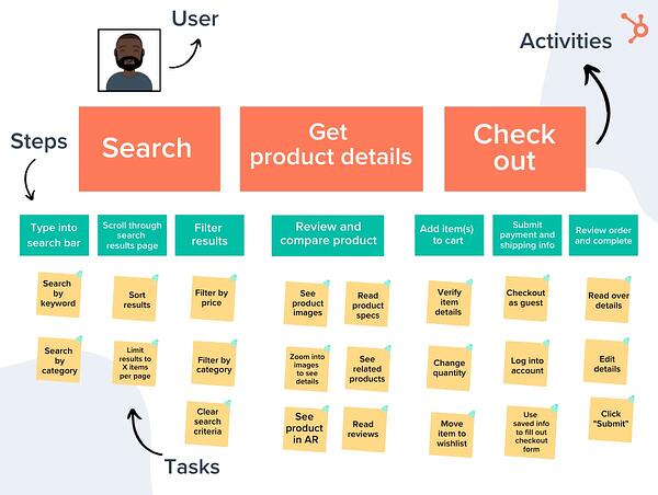
In this step, you want to create a general roadmap for how the user would access and use this feature. Those are your main activities.

The goal here is to outline the big steps necessary to get from start to finish. From there, you lay out the steps.

Following the same example from the previous section, here’s how it could look:

Activities:

  • Search for products.
  • Review product details.
  • Check out. 

Steps:

  1. Type into the search bar and head to the results page.
  2. Scroll through search results in search of specific information.
  3. Select the filtering option to narrow down options by cost.
  4. Review the search results page again with updated options.
  5. Select item and place in cart.
  6. Complete purchase.

As you’ll notice, story mapping requires going from macro to micro.

You’ll likely use input from your participants to map out these details. You want your map to paint an accurate and full picture of what does (and can) happen in this story.

So, you’ll want to lean on your team for input in this step.

3. Group and define the tasks.

Once you’ve mapped out the big details, this is where the collaboration takes off.

Under each step, you should highlight the key actions involved in each activity.

For instance, when a user is in step 5, which is selecting an item and placing it in their cart, there are several substeps they will follow, including viewing the image, reading reviews, scanning related items.

All of these should be mentioned under the big activity groups, also known as the steps. The goal is to identify any gaps in the features of your product currently.

By adding a must-have, could-have, and should-have options in your map, you can rank features by priority. Here’s what you want to consider:

  • Is there anything else your user could do during one of these activities?
  • What could disrupt their process at this point? Where could they get stuck?
  • How else could the user navigate through this page?

This will require a collective effort from your various teams to figure out what’s realistic and what’s doable. For instance, an engineer might point out that a particular task is too big to count as one iteration. Your user researcher could highlight an important step in the process that you guys hadn’t considered.

4. Slice your tasks and get your minimum viable product.

Once everything is laid out, you and your team can start to move through the map to prioritize a list of tasks and cut them into slices.

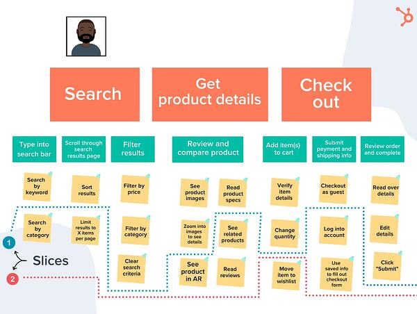
Each “slice” will include tasks from each activity to create a viable end-to-end experience. It should have a clear outcome as well as a way to measure success. This will be important later when testing and tracking user behavior.

You will continue to separate your slices until you include all the tasks and have a clear plan to move forward.

User Story Mapping Example

In this example, the user story is as follows: “As a user, I want to buy a product easily on this website.”

Once you have all those details, then you can create your map.

user story mapping example

Once you’ve added the activities, steps, and tasks, now you can figure out your slices. 

user story mapping example

For instance, in this example, the first slice would skip two tasks in the “Search” activity, skip three in the “Get product details” one, and three in the “Check out” section.

The second slice would include features like “Search by category” and “See product in AR.” Once you have all your slices, your team is ready to get to work. 

User Story Mapping Tools

When it comes to user story mapping, there are a lot of ways you could do this.

The most straightforward way is with a conference room, a whiteboard, and a whole lot of sticky notes. That way, you can easily move pieces around as you work and make it a collaborative effort.

Now, if your team is remote, you’ll have to rely on online tools to assist you in this process. Many agile project management software have story mapping features, such as Atlassian’s Jira.

Additional online tools for user story mapping include Featmap, Miro, and Avion.

If your product team can’t agree on where to start for an upcoming or ongoing project, consider creating a user story map. It may take some time away from building but it will definitely pay off down the line.

Product Marketing Kit

Categories B2B

Interview Preparation Checklist: 18 Tips to Get the Job

You’ve submitted your resume, talked to a recruiter, and set up a date for the first interview with a great company. But in the days leading up to the big interview, you’re feeling anxious, jittery, and downright scared.

What if you blank on how to answer a question? What should you say about your weaknesses? How soon do you follow up afterward?

→ Click here to download our free guide to hiring and training a team of  all-stars [Free Ebook].

If you’re feeling nervous about an upcoming interview, take a deep breath, grab a notepad, and work your way through this interview preparation checklist. You’ll be feeling a little less worried and a lot more confident in no time.

Pre-Interview Preparation Checklist

The steps you take leading up to the interview can really transform a normally stressful experience into something more pleasant. Sure, you could “wing it,” and answer questions on the fly as they come. But nothing will impress an interviewer more than showing that you did your homework. In your interview question prep, it’s smart to analyze your own working habits and study the company.

1. Print multiple copies of your resume.

Some interviews may require you to meet with multiple members of management, plus you may want to have one handy to reference as you talk about prior experiences. Print at least five copies of your resume on nice, high-quality paper, if possible.

2. Prepare a portfolio of your past work.

If the position requires you to show past work, like photographs, successful marketing campaigns, graphic designs, or written articles, gather your best work into one portfolio to share with the hiring team.

3. Review common interview questions.

Create a list of common questions, so you can begin preparing strong answers. Having some general talking points to the most-asked interview questions can help you feel less anxious for the interview process.

Even if the interviewer doesn’t ask one of the exact questions you’ve prepared for, they will likely ask something similar. For example, the interviewer might not ask “Why should we hire you?” but instead may say, “Tell us what makes you stand out from our other candidates.”

Here are some of the most common questions that come up in interview settings:

  • Why do you want to work for us?
  • What are your greatest strengths and weaknesses?
  • Why should we hire you?
  • Tell me about a time that you solved a problem at work.
  • Why are you leaving your current position?
  • Where do you see yourself in five years?
  • What’s your biggest accomplishment?
  • What’s something your current supervisor would say you could improve on?
  • What is your leadership style?
  • What would you plan to accomplish in your first 3 months here?

4. Practice answering interview questions out loud.

Now that you’ve come up with a list of commonly asked interview questions, you can start outlining responses. Jot down some notes for every question you come up with, and once you have it all down on paper, start practicing your answers out loud. Sit in front of a mirror and recite responses. Your goal is to make them clear, concise and to the point, so you aren’t rambling in the actual interview.

5. Try having a mock interview for extra practice.

Practicing an interview with a housemate or friend is another effective way to practice your interviewing skills. The mock interviewer can help give you notes on improving your answers or digging more in-depth for certain questions.

6. Spend time researching the company.

It can be embarrassing to enter an interview, only to not know the basics like what the company does or who the CEO is. You should, at bare minimum, be prepared with the company’s products or services, ownership, customer demographics, and main competitors.

It’s also smart to look up any recent press releases about the company to be in the know on its latest developments, and check in on their social media to get an idea of the tone, voice, and key initiatives of the company.

7. Create a list of your accomplishments.

The main point of the interview is to show off your skills and talents in order to score a new job. But when you’re nervous, it’s easy to forget some of the impressive projects you’ve completed or problems you’ve solved during your career. Take notes on some of your biggest career highlights to share with the interviewer.

8. Prepare questions to ask your interviewer.

Asking thoughtful questions to the interviewer shows that you’ve done your homework and you’re interested in the company. Plus, the interview is a two-way street. Just as the company wants to make sure you are the right fit for the job, you should do your due diligence to make sure the company and position are a good fit for you.

Here are some questions to ask about the position, the interviewer, the culture, and the company as a whole:

  • What does a typical day in this position look like?
  • What are the biggest challenges in this role?
  • What do the training and evaluation processes look like for this role?
  • Why is the person previously in this position leaving?
  • What do you hope to see the person who takes this position accomplish in the first three months, six months, and first year?
  • Why did you come to this company, and what is your favorite part of working here?
  • What are some of the company’s short- and long-term goals, and how would the person in this role help in reaching those targets?
  • Can you tell me more about the team I’d be working with? What are the strengths and weaknesses of the team or department?
  • How would you describe the work environment here?
  • What are the next steps in the hiring process?

Interview Preparation Checklist

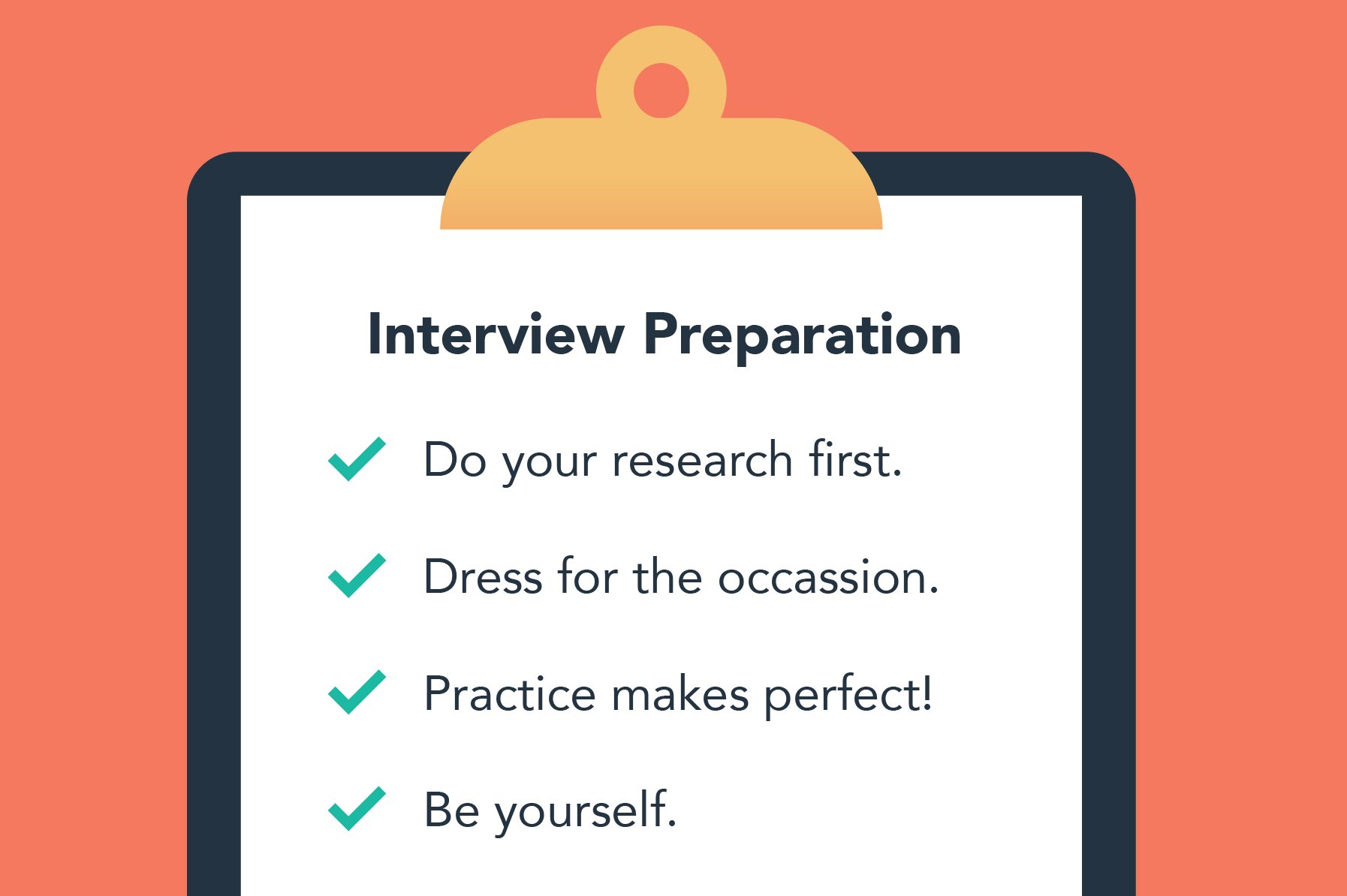
job interview preparation checklist

It’s the day of the interview. You have your portfolio and resume copies next to your car keys or bus pass, you’ve recited questions and answers in your head for days, and you’re just hours from walking through the front door of the company building. Here’s what to do before and during the interview.

1. Dress the part.

In general, you should wear clothing that fits well and makes you feel good. Mend holes, treat stains, and lint-roll any pet hair on your favorite interview outfit.

What you wear to the interview may vary based on the job and company, but here are some guidelines for what to wear depending on the company’s dress code.

  • Casual: Dark jeans, slacks, long skirts, or long dresses; button-down shirts, blouses, cardigans, or sweaters; tops without graphics; neat, closed-toe shoes.
  • Business Casual: Dark slacks or long skirts; button-down tops, blazers; neat, closed-toe shoes.
  • Formal: Dark suits with slacks or long skirts; dark, tailored dresses; a tie with suits; neat, closed-toe shoes.

2. Arrive on time (or early).

Showing up to an interview can leave a bad first impression. Plan to arrive 10 to 20 minutes early, and give yourself time to find the building, park, and check-in with the front desk. Account for traffic, too — that 9 a.m. interview means that you’ll be driving along during morning rush hour. Have a backup transportation option, such as biking, walking, or getting a ride from a friend, if you typically take public transit, in case the train or bus is running late that day.

If the building is in a location you’ve never been to, make sure you map it out to avoid getting lost. If you’re not great with directions, you may want to practice the drive once or twice in the days leading up to the interview.

3. Bring paper and something to write with.

Taking notes shows that you are invested in what the interviewer is saying to you. But it also means you can review your notes for pros and cons if you are offered the job. Plus, you can revert back to any points the interviewer made early on in your appointment and ask for more information or clarification when it’s your turn to ask questions.

4. Have cash on hand for parking.

Some companies have paid parking garages or valet services for guests. While they might validate the parking ticket for you, don’t assume they will. Bring about $20 in cash just in case you need it for parking. If you don’t need the cash, take yourself out to lunch as a post-interview treat!

5. Be personable and courteous.

Everyone you meet from the parking garage to the interviewer could be your future co-workers. They may also be asked for input on how you interacted with them during the hiring process. Smile, wave hello, and greet anyone you pass. It never hurts to be kind to others!

6. Remain honest and take breaks as needed.

If you fabricate your resume or interview responses, the truth will become clear while you’re on the job. Answer questions honestly, and if you aren’t sure how to respond to a question off the bat, don’t be afraid to take a moment. Simply say, “Great question! Let me think for just one second on this.” We’re all human, and it’s a completely normal response to need to pause before thoughtfully answering a question.

7. Use the STAR method.

The STAR method is a popular technique for responding to even the toughest interview questions. Interviews ask situational questions to gauge how you respond to certain issues. The STAR method addresses multiple components of a problem while allowing you to clearly, thoroughly explain your logic and response.

  • Situational: Describe the situation or issue.
  • Task: Explain what your tasks or responsibilities were relating to the situation.
  • Action: Share what actions you took to complete your tasks and address the situation.
  • Results: Outline how your actions resolved the issue or what results came from your actions.

8. Stay focused and positive.

Interviewing is stressful and nerve-wracking, but remaining positive and upbeat can make all the difference in your performance. You might be asked why you are leaving your position or how you performed under previous managers and their varied leadership styles. Talking poorly about the company and previous leaders can leave a bad impression on your interviewer.

Keep your answers positive, and stay focused on answering each question with your experience rather than rambling as you respond. This is where practicing answers in the pre-interview preparation can come in handy.

Post-Interview Preparation Checklist

Just because you’ve shaken the hands of your interviewer(s) and taken a big sigh of relief, it doesn’t mean the interview is behind you. Of course, you could be brought in for second, third, or fourth interviews, but no matter what stage you’re at, it’s important to leave a good, lasting impression.

1. Ask about the next steps.

Either at the end of your interview or immediately after, you’ll want to ask about the timeline for the next steps of the hiring process. This way, you can anticipate when you’ll hear back from the company. You may need to take an edit test, share more samples of your work, or return for another interview.

2. Follow up with a thank you.

Always follow up an interview with a thank-you note. It’s best to send along a handwritten note to show your care and attention to detail. But if you don’t have the time to do so, an email is also a thoughtful way to show your appreciation for the interviewer’s time and consideration. If you don’t know the interviewer’s email, you can also email the recruiter or other point of contact and ask them to send along your gratitude.

Get Your Dream Job with Some Interview Prep

The interview question prep process can make or break your interview experience. While sending along your resume and portfolio in advance can give recruiters a good idea of whether or not you’d be great at the job, the interview helps the team learn more about you and how you work.

Don’t forget, interviewing is a two-way street, and the more you prepare, the better questions you can ask. By following this interview preparation checklist, you’ll feel more confident and prepared as you navigate your next interview.

New Call-to-action

Categories B2B

Podcast Advertising: 5 Experts Reveal Their Secrets

Are you one of the 7.8 million Americans who commute to work every day? If so, I’m guessing you’ve listened to a podcast or two. You’re not alone. According to Infinite Dial, U.S. podcast audiences listen to an average of four to five podcasts per week.

The podcasting industry continues to grow YoY. In fact, Infinite Dial reports that, in 2021, 7 million more people were listening to podcasts than in 2020 alone.

That’s why it’s important to consider podcast advertising for your brand. Here, you’ll learn everything you need to know about podcast advertising — from top podcast advertising strategies to advertising rates and networks.

➝ Free Guide: How to Start a Podcast

Podcast Expert Advertising Strategies

Before you get started with podcast advertising, consider this advice from the experts.

Use podcasting for brand awareness, not lead generation.

Rebekah Bek: As a UX writer for Ahrefs, Bek was put in charge of podcast sponsorships. She writes her advice for podcast advertising strategies in this Medium post. Here are the key takeaways:

  • Rather than being a tool for lead generation, podcast advertising is a tool for gaining exposure and brand awareness.
  • It’s not always about measurable ROI.
  • Organic, not scripted, mentions perform best.

Understand your audience may have eclectic tastes.

Midroll: Midroll, a company that matches advertisers with shows , gives their advice to advertisers. Here is the key takeaway:

  • It’s wise not to adhere too strictly to a category. Don’t assume that comedy audiences aren’t also entrepreneurs or that listeners to a sports podcast aren’t interested in a comedy special. You may be surprised at how broad and eclectic your audience tastes and needs are.

Ads read by the host perform better than third-party ads.

Jason Hoch: Former Chief Content Officer at HowStuffWorks, Hoch revealed what type of ads work best for their brand in an interview with DigiDay. Here are the key takeaways:

  • Ads read by the host perform better than scripted, third-party ads placed in the podcast.
  • Listeners feel like they are being shouted at with third-party ads.
  • Consider producing organic mentions for better results.

Test and measure the success of your campaigns.

Kurt Kaufer: Partner and CMO at Ad Results Media, a podcast advertising agency, Kaufer wrote a survival guide for podcast advertising in this Forbes post. Here are the key takeaways:

  • Measurement is the key to determining success in a podcast advertising campaign. Use promo codes, custom links, and post-checkout surveys to track success.
  • Be comfortable knowing not every ad will work at first and that a breadth of shows will need to be tested to figure out what works and what doesn’t.

Measuring the success of your podcast campaigns is best done with a tool, like Casted, that gives you an overarching view of critical metrics. With the tool, you can access behavior metrics, demographic data, and traffic information that helps you understand your content’s true value. 

You don’t need to sponsor the biggest podcasts, you can reach the same people on smaller shows.

Sam Balter: Former podcast marketer at HubSpot, Balter wrote about his podcast advertising learnings in this post. Plus, I spoke with him about his top podcast advertising strategies. Here are the key takeaways:

  • Pre- and post-roll ad spots are generally cheaper than mid-roll and take less time. In addition, most ads have some sort of call-to-action that prompts listeners to go to a specific URL or use a discount code to get a discount.
  • Podcast popularity and listenership will only continue to rise and so will the opportunity to connect with people in a new and novel way.
  • When sponsoring podcasts, trust the host to deliver a message in their own voice.
  • It’s better to go for frequency than reach. Pick a podcasts where you can purchase three to five ads versus one on a large podcast.

Podcast Advertising Rates 2022

The amount you pay for podcast advertising will vary depending on the length and type of the ad.

It’s essential to know that podcasts offer different pricing structures. Ads are sold on a cost per mille (CPM) or cost per acquisition (CPA) rate. CPM is the cost you’ll pay per 1,000 impressions or downloads. CPA is the cost you’ll pay to acquire a customer. Most ads are priced on a CPM model.

The current average cost of podcast advertising is a CPM of about $25.

AdvertiseCast notes that the average CPM for 30-second ads is $18, and the average CPM for 60-second ads is $25.

podcast advertising cost 2022

Image Source

Podcast Advertising Networks

A podcast advertising network is an agency that connects companies or brands with respected podcasts on which to advertise. The goal is to take away the friction in podcast advertising by helping brands promote their products on podcasts and helping podcasters monetize their projects. A few examples include:

1. Midroll

Midroll, now part of SXM Media, is used by over 800 brands to buy ad spots on 300+ podcasts. With such a wide variety of shows, advertisers have the opportunity to use audience-based buying to ensure ads align with podcast topics most relevant to your brand, helping you accurately target relevant users and maximize reach.

Your ads can be pre-recorded or host read, the ladder being a valuable tool for generating brand trust as audiences trust hosts and see them as a valuable source of social proof. 

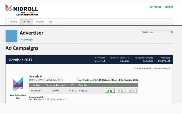
Midroll prices ads on a CPM model, so you pay based on the number of certified downloads each episode receives. Its website notes that prices can range from $18 to $50 CPM, with higher performing shows being more expensive. 

The advertiser portal also gives you an overview of campaign metrics, helping you see important data like forecasted downloads and ad placement cost per show. 

podcast advertising network: midroll

Image Source


2. Podcast One

Podcast One sees more than 2.1 billion annual downloads and 350 different episodes produced weekly, making it a high-impact platform for podcast advertisers. 

It offers pre-recorded and live host endorsements, and you can use its geo-targeting and copy-split capabilities to ensure you target the right audiences and pick placements for your ads that are most relevant to your business. 

With PodcastOne, you also have the unique ability to use visual integrations for your ads in the form of a sponsorship splash, an ad banner, or a forced video ad.

3. Megaphone

Megaphone offers powerful podcast advertising tools with the Spotify Audience Network, helping you target the most relevant listeners that are likely to drive the most impact across a wide variety of podcasts. 

With the service, you can:

  • Reach listeners according to their interests, purchase behavior, and things like apps, devices, and platforms that they use.
  • Get actionable campaign insights that help you understand performance to ensure you have the right strategy.
  • Use dynamic ad insertion to populate ads when downloaded so messaging is fresh and relevant.

Contact Megaphone to obtain pricing information.

4. AdvertiseCast

AdvertiseCast boasts 2,300+ podcasts, a 150,000,000+ monthly listener reach, and 4,200+ available ad spots to choose from, making it a valuable tool for podcast advertisers as you can select target audiences that are the best fit for your business. 

You also have three different podcast ad opportunities to choose from: 

  • Baked-in host-read ads (its most popular option), where podcast hosts read your ads within the episode. Pricing is based on length (60 seconds or 30 seconds) and whether you select mid-roll or pre-roll placement. 
  • Dynamically inserted ads, which are pre-produced, pre-recorded and scheduled to be inserted into podcast content. Pricing is based on the average number of downloads in the first 30 days. 
  • Custom podcast ad units where you can be as creative as you’d like, like a social media plug for your profiles, a 10-second shout out, or a 90-second baked-in mid-roll ad. 

AdvertiseCast also offers an end-to-end ad campaign platform that you can use to manage your ads and view detailed metrics that help you understand campaign performance. You can also make use of the full service solution, where AdvertiseCast manages the process for you.

Podcast Advertising Statistics 2022

1. There are around 2,000,000 podcast shows and over 48 million podcast episodes as of April 2021. (PodcastInsights, 2021)

2. 75% of the US population is familiar with the term “podcasting,” which is up 5% since 2019. (Infinite Dial, 2020)

3. Half of Podcast ads lasted longer in 30 seconds in length. (Interactive Advertising Bureau, 2021)

4. A survey of 300,000 listeners found that 63% of people bought something a host had prompted on their show. (AdvertiseCast)

5. Cost per mille (CPM) or cost per 1,000 listeners is the most common pricing method for podcasts. (AdvertiseCast, 2021)

6. Dynamically-inserted ads increased the share of revenues from 48% to 67%. (Interactive Advertising Bureau, 2021)

7. Streaming audio and podcasting is projected to be one of the channels with the largest growth in 2022, with a 17.8% increase. (Inside Radio, 2021)

8. Host-read and pre-product ads increased share of revenues from 27% to 35%. (Interactive Advertising Bureau, 2021)

9. Local advertising for streaming audio and podcasting will outperform targeted banner advertising and broadcast TV. (Inside Radio, 2021)

10. U.S. Podcast Ad Revenue is set to exceed 2 Billion by 2023. (Interactive Advertising Bureau, 2021)

Podcast advertising is a marketing tactic that is continuing to grow. As a majority of people have listened to a podcast, and engagement rates are increasing, brands can no longer ignore podcast advertising.

New Call-to-action

Categories B2B

30+ Best WordPress Plugins for Marketers

Did you know there are over 56,000 WordPress plugins available today?

WordPress plugins allow you to enhance your website’s functionality by adding features and capabilities that don’t come standard with the system.

Whether you want to improve your writing, optimize a blog post for SEO, or interpret your site’s analytics, there’s a plugin out there for you.

But with so many options available, it’s tough to figure out the best ones to use — and that’s why we’ve done the work for you.

Grow Your Business With HubSpot's Tools for WordPress Websites

Below you’ll find a list of the best WordPress plugins (not in any specific order) that every marketer should explore.

These plugins have been reviewed by some of the top marketers in the industry. They’ll also keep both you and your WordPress website running efficiently and effectively. If you want more, check out the official WordPress plugin page.

1. HubSpot WordPress Plugin

HubSpot’s drag-and-drop form builder allows you to easily build contact forms to use on your WordPress website. The plugin also includes a pop-up creator, live chat widget, contact database, and previously written code for you to simply copy and paste into WordPress.

All-in-one plugins provide multiple functionalities in a single plugin, making them a more lightweight solution than having multiple plugins limited to single functionality. Because HubSpot provides everything in one plugin, you can be sure it will not bloat your site, which is important as you consider load speeds.

best wordpress plugins for marketers: hubspot wordpress plugin

2. Elementor

Elementor is WordPress’s #1 drag-and-drop page builder with over 2 million downloads and counting. It offers 100+ templates and premade sections for services, testimonials, call-to-action pages, etc. Using Elementor in WordPress, you’ll be able to quickly make the marketing content you need.

Customization features, such as Box Shadows, Background Overlays, Hover Effects, Headline Effects, and Animations, are available with Elementor. These eye-catching effects will help you hold visitors’ attention.

To help you take full advantage of this plugin, we have a free WordPress Training Course using Elementor to help you build your own website.

best wordpress plugins for marketers: elementor

3. WordPress Landing Pages

Create stunning landing pages for your website with the fantastic WordPress Landing Pages plugin. The visual editor that comes with it makes customizing your landing page easier than ever before. You can even track your conversion rate with just a single click of the mouse. It offers you an easy way of implementing your own custom landing page design.

best wordpress plugins for marketers: wordpress landing pages

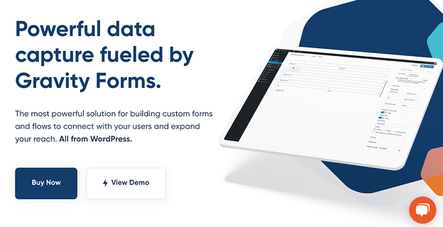
4. Gravity Forms

If you want to add complex and highly customizable forms to your website, Gravity Forms is a good option for that.

Gravity Forms allows you to build multi-step forms, polls, quizzes, surveys, and more. With this plugin, you can create a wide variety of smart rules and conditions. For example, you can create a rule to limit which domains are accepted on your forms to exclude non-business domains like Gmail or even domains from your competitors.

Moreover, you can easily set up integrations with a variety of tools such as HubSpot for your marketing and Zapier for automation flows. Gravity Forms also integrates with PayPal or Stripe so you can accept payment directly via your forms.

best wordpress plugins for marketers: gravity forms

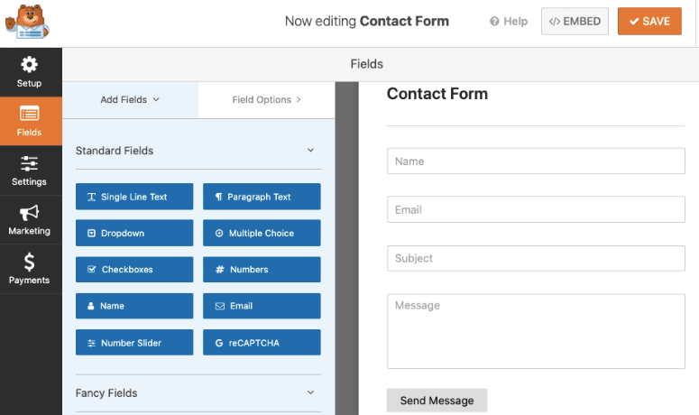
5. WPForms

WPForms is one of the most popular form builder plugins for WordPress, with over 5,000,000 active installations. With this plugin, you can easily add custom forms to your website including contact forms, registration forms, surveys, polls, newsletter signup forms, and many other types.

Creating a form is easy thanks to WPForms’ drag and drop builder. Simply drag the form fields you need and drop them into place. There are even 300+ ready-made form templates to get you started even more quickly.

WPForms also comes with powerful features like smart conditional logic, conversational forms, multi-page forms, email marketing integrations, and payment integrations, just to name a few. This plugin also connects with HubSpot so that you can automatically import contacts from your forms into the HubSpot CRM.

best WordPress plugins for marketers: WPForms

6. MonsterInsights

With MonsterInsights, you can add Google Analytics to your WordPress site without having to touch a line of code or hire a developer.

You can view easy-to-read reports about your site’s analytics straight from your WordPress dashboard. That means you don’t have to leave your site or search through multiple Google Analytics reports to find the important insights you need.

You can set up advanced tracking like eCommerce tracking, form conversion tracking, affiliate link clicks, outbound link clicks, and much more. This plugin works with both Universal Analytics (GA3) and Google Analytics 4 (GA4). You can connect to whichever version you’re running, or both at the same time with the dual tracking feature.

best wordpress plugins for marketers: monsterinsights

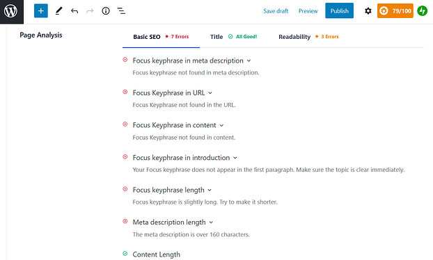
7. All in One SEO

All in One SEO helps you optimize your WordPress website for organic search. The plugin works for people with varying levels of SEO experience, from the non-technical to those with coding experience.

The SEO audit checklist will analyze your entire website for errors and provide actionable insights to improve your SEO and unlock maximum traffic. And with the TruSEO score, you can get an in-depth analysis of how well your content is optimized.

The plugin also has an XML sitemap and image XML sitemap support (which is what informs Google about the URLs on your website that are available for crawling). In addition, it provides you with support in other areas including Google Analytics and custom post types, which is helpful for marketers who are working to measure the success of their campaigns or SEO work and goals.

best wordpress plugins for marketers: All in One SEO

8. Jetpack

Jetpack is an all-in-one WordPress plugin that offers advanced features such as content tools, mobile themes, and more. You can take advantage of all of Jetpack’s features to enhance your website, or pick and choose just what you want to activate based on your unique needs.

Some of these features include automated social media posting, site statistics and analytics, and different SEO tools to help you measure and promote your website success.

best wordpress plugins for marketers: jetpack

9. Smush

“Smush quickly compresses and optimizes images in bulk, letting you focus on other things,” says Izaak Crook of AppInstitute.

Smush servers do all of the work for you, meaning your images will remain high-quality while reducing their file size. This frees up space on your server so your website will be significantly faster — with clearer, crisp imagery in the end.

best wordpress plugins for marketers: smush

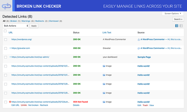
10. Broken Link Checker

Want to prevent Google from following broken links on your website? Broken Link Checker parses your posts to identify broken links and notify you when they surface.

To save you time, the plugin makes it easy for you to edit a broken link from the plugin page, eliminating the need to manually go into each post to make changes.

best wordpress plugins for marketers: broken link checker

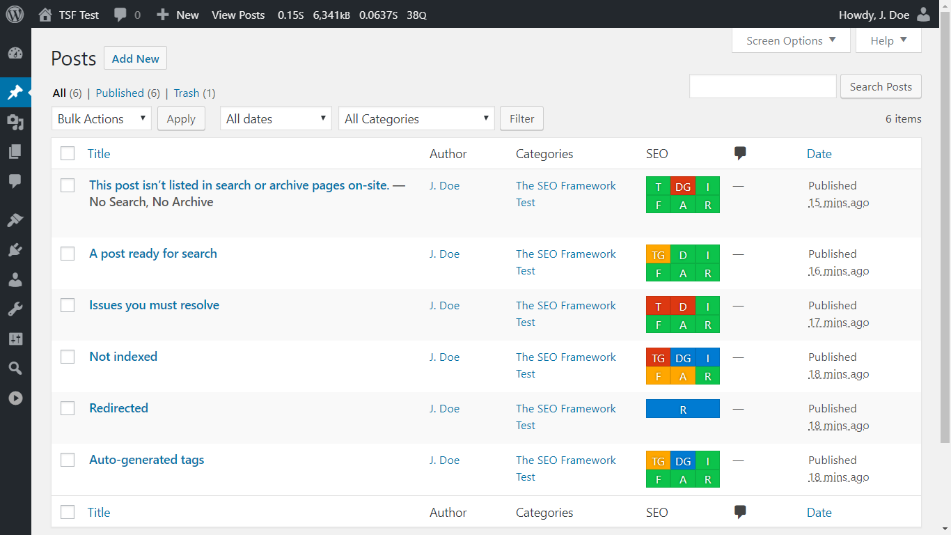
11. The SEO Framework

With The SEO Framework, this plugin likely helps the users to make good decisions about optimization, which may help improve search rankings. You’ll have peace of mind knowing the fundamentals are covered.

Its features can optimize every page, post, and term on your website so it’s not only easier to find on the internet, but it’s also more searchable on all social sites such as Facebook and Twitter.

best wordpress plugins for marketers: the seo framework

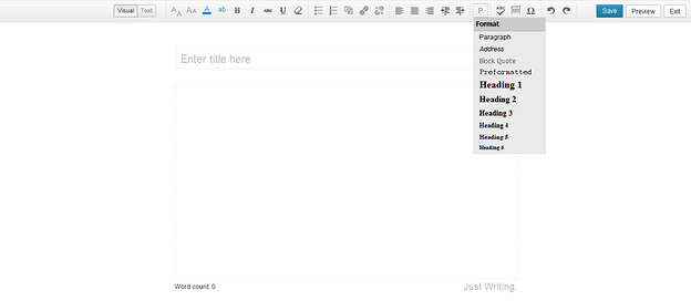
12. Just Writing

Just Writing takes WordPress’ Distraction-Free Writing Mode (DFWM) to a whole new level. This is a WordPress plugin that could be a fine choice for marketers to focus on their work by removing distractions.

This tool also features spellcheck to improve the grammar of an article. It’s continually embedded with more new commands and features in the recent updates to facilitate the users with easy access.

best wordpress plugins for marketers: just writing

13. Hustle

Hustle is WPMU DEV’s marketing WordPress plugin that features popups, slide-ins, embeds, and social share bars.

Embeds are your in-content ads or opt-ins and can be displayed using the built-in options such as before or after your post content, or both. You can also use shortcodes or widgets to display the embeds in more specific locations. That is in addition to the vast array of targeting options that apply to all other content types as well.

You can store all submissions locally or choose to use one of the many integration options, including HubSpot, to send them to your CRM or mailing list.

best wordpress plugins for marketers: hustle

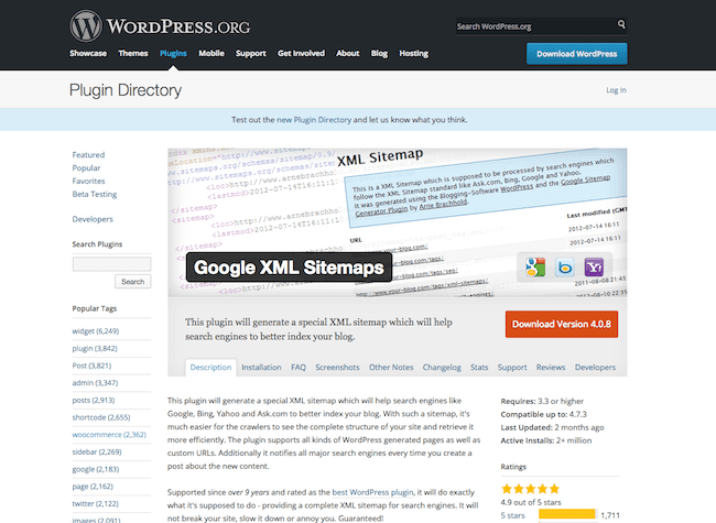
14. Google XML Sitemaps

Google XML Sitemaps has the capability of generating a special XML sitemap so search engines like Google, Yahoo, and Bing could better index your blogs or pages. It then becomes simple for surfers to find your blog and retrieve them more efficiently.

This plugin is compatible with all types of WordPress pages and every Custom URL. A distinctive characteristic of this tool is its notifications that are sent to the search engines each time you create new content.

It’s stated to be the best WordPress plugin. The active installs of this plugin are found to be above 1 million.

best wordpress plugins for marketers: Google XML Sitemaps

15. Pretty Links

Pretty Links is a regularly used plugin that can do more for marketers as it contains many interesting features. It’s capable of performing shrink, track, beautify, and share URLs both on WordPress and off it.

By using this plugin, you can create links using the domain name. it’s available for free in the name of Pretty Links Lite, and you can upgrade to the pro version on subscriptions. In simple words, it helps you in shortening links and exhibits the reports of hits by tracking each hit on your link.

best wordpress plugins for marketers: pretty links

16. Akismet

Akismet WordPress plugin examines the comments of visitors on your blog concerning the Akismet Web service and intimates whether the comment is spam or not. This plugin can spontaneously scan in the comments and would filter out spam smoothly.

You can check the status of the comments in the status history provided by this tool. It has a discard feature that intentionally blocks most hazardous spam, which naturally speeds up your site.

best wordpress plugins for marketers: akismet

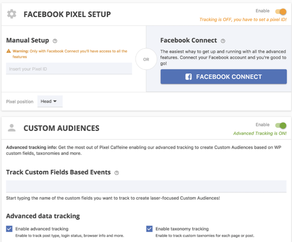
17. Pixel Caffeine

Pixel Caffeine allows you to manage Facebook Pixel and Facebook Commerce Manager all within the plugin.

Tony Capetola of Sales Orders says Pixel Caffeine is a great plugin because “marketers can make use of some more advanced features like the ability to track Facebook Ad conversions within WordPress’s dashboard, the ability to create custom audiences based on last visit time (retention window), WordPress taxonomies (categories, tags, etc.), and previous customers behavior.”

Added bonus: Pixel Caffeine automatically keeps up with Facebook’s latest updates so you don’t have to.

best wordpress plugins for marketers: pixel caffeine

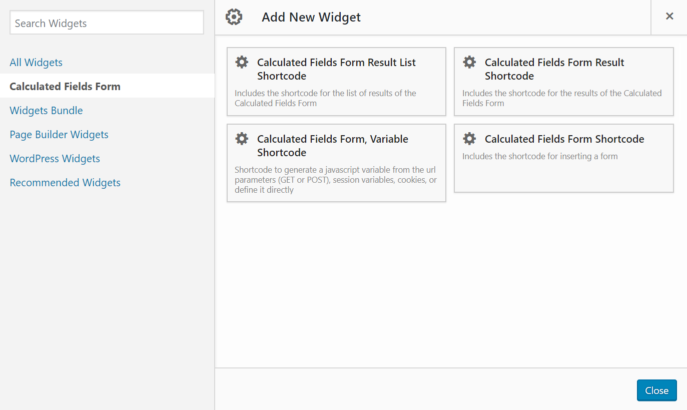
18. Calculated Fields Form

“[Calculated Fields Form] allows you to create simple calculators for your WordPress site. You can easily build finance calculators, quote calculators, booking cost calculators, health/ fitness calculators, and other link-worthy tools,” says Roy Harmon of Advertoscope.

With this plugin, you can also create forms with automatically calculated fields and use predefined form templates that will save you time and ensure accuracy.

best wordpress plugins for marketers: calculated fields form

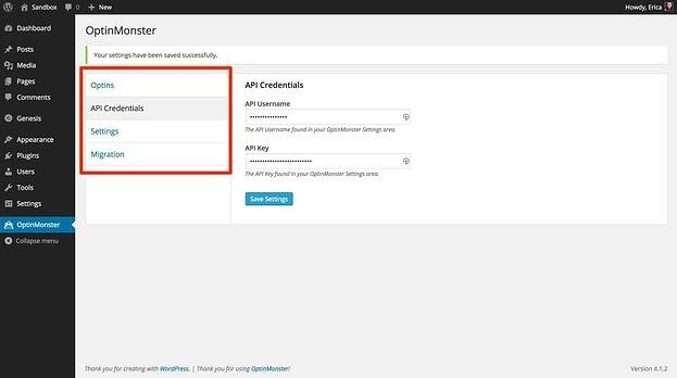
19. OptinMonster

Looking to grow your email list? This plugin comes with an easy-to-use form builder to help you create opportunities for your visitors to convert.

OptinMonster is an excellent plugin for email marketing solutions for beginners. You can create many kinds of forms such as Pop-ups, Footer bars, Floating Headers, and many more. All of these forms are mobile-friendly, giving users even more opportunities for growth.

best wordpress plugins for marketers: optinmonster

20. Wordfence

Hackers and malware can damage your reputation and marketing momentum by serving malicious software or even disabling your website. The Wordfence WordPress plugin will protect you from those risks.

Once you activate this plugin, it will spontaneously scan your WordPress site to check for infections.

best wordpress plugins for marketers: wordfence

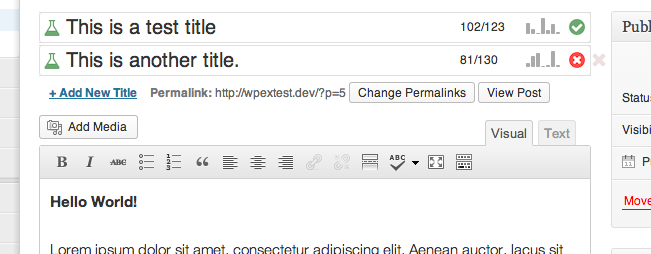
21. Title Experiments

The title of a blog post has a direct impact on click-through rates (CTR). Title Experiments make it easy for you to A/B test one title against another so you can track what converts best and increase your CTR.

best wordpress plugins for marketers: title experiments

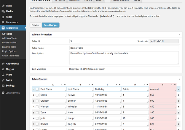
22. TablePress

TablePress is a plugin that helps you create, customize, and embed beautiful and unique tables on your WordPress site. Your tables can include all types of data and be placed anywhere on your website.

Swadhin Agrawa of DigitalGYD.com says, “TablePress makes it insanely easy for anyone to create a customizable and responsive table on their blogs.”

best wordpress plugins for marketers: tablepress

23. Editorial Calendar

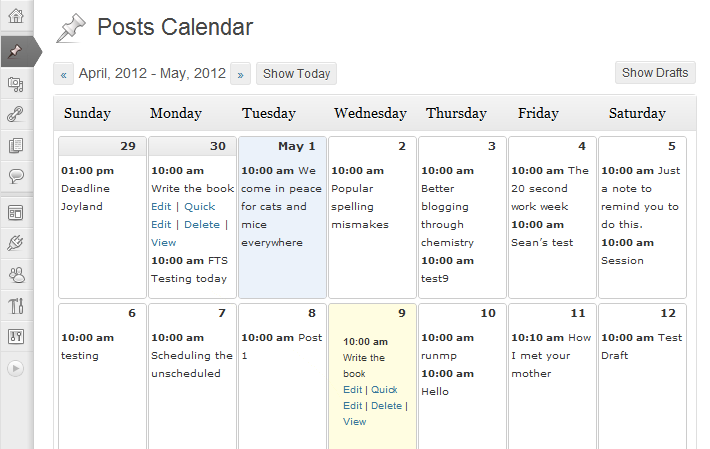
Keep your blog organized with the help of this plugin. Editorial Calendar uses drag-and-drop functionality to simplify the way you schedule and manage your blog content.

You can also manage posts from multiple authors, quickly edit titles and publishing times, and manage drafts within the plugin.

best wordpress plugins for marketers: editorial calendar

24. TinyPNG

TinyPNG will make your website faster by automatically optimizing your JPEG and PNG images upon upload.

Images are analyzed, and then the plugin compresses them appropriately. Once this happens, the image is then sent back to your WordPress website to replace the original image.

best wordpress plugins for marketers: tinypng

25. W3 Total Cache

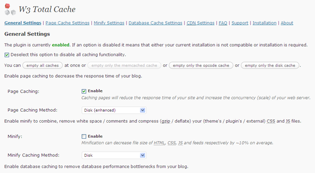
W3 Total Cache helps you improve the performance of your blog. It enhances the user experience by increasing website performance and reducing the download durations through Content Delivery Network (CDN) integration.

It’s a fantastic tool for search engine optimization as it uses techniques such as caching, CDN, minify, and database support. These elements all work together to improve website speed, an important factor in how Google ranks pages.

best wordpress plugins for marketers: w3 total cache

26. Imsanity

Imsanity is a popular plugin that automatically resizes images without loss of quality and saves you from having to manually scale them before upload.

The Imsanity plugin matches the size of your images with the display in a browser. It resizes previously uploaded images by automatically scaling them down and replacing the original images with the new versions, which saves you time as all of the work is done for you.

best wordpress plugins for marketers: imsanity

27. Revive Old Post

Revive Old Post, previously called Tweet Old Post, helps marketers extend the lifetime of inactive Older posts by smoothly sharing these posts on social media networks such as Facebook, Twitter, and more.

You can manage multiple accounts using this WordPress plugin so you can promote content across more than one to better serve your needs.

best wordpress plugins for marketers: revive old post

28. Head, Footer and Post Injections

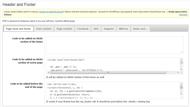
Most WordPress users end up needing to use several plugins — some people even use dozens. Head, Footer and Post Injections is a plugin that allows you to copy any unique code that you use for other plugins, keep it in a centralized and organized location, and easily insert it wherever needed.

The plugin is theme-independent, meaning you’ll never lose your data (no matter how many times you change your website theme).

best wordpress plugins for marketers: Header footer post injections

29. Yoast SEO

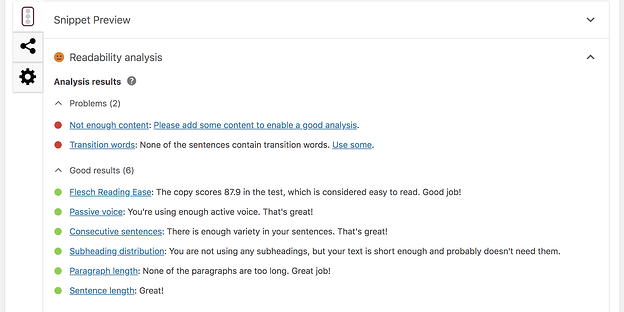
Yoast helps you get the most out of your website SEO with straightforward XML Sitemaps, breadcrumb navigation control, content analysis, snippet previews, and several integrations that show you how your website performs in different search engines.

Nicolas Straut of Fundera, says, “This plugin identifies and suggests solutions for potential SEO problems in your content, identifies what you’ve done well and helps you easily edit your snippet, keywords, and other post details.”

best wordpress plugins for marketers: yoast seo

30. Redirection

Redirection is a free redirect manager that allows you to set up your 301 redirects and manage 404 errors. There is a logging feature so you can see all of the redirects on your site as well as information about each visitor that is redirected.

best wordpress plugins for marketers: redirection

31. Autoptimize

This plugin aggregates scripts and styles, which enhance your site’s overall performance. Autoptimize also has an extensive API available so you can tailor the plugin to your website’s needs.

“[Autoptimize] makes it easy for non-technical marketers to make their sites lightning fast. We all know how important it’s to have a fast website — without it, our Google rankings suffer and potential customers will go somewhere else,” says Jon Nastor of Hack the Entrepreneur.

best wordpress plugins for marketers: autoptimize

Market Your Business with these Valuable Tools

With plugins like these, you’ll be able to run your website more efficiently and market your business to the world. We hope you found this article helpful in your search for the best plugins WordPress has to offer.

Editor’s note: This post was originally published in January 2019 and has been updated for comprehensiveness.

Use HubSpot tools on your WordPress website and connect the two platforms  without dealing with code. Click here to learn more.

Categories B2B

21 of the Best Landing Page Design Examples You Need to See in 2022

How do you convince visitors your website is worth their time? There are so many elements that a top-notch landing page needs, and making those elements the “best” they can be often depends on what your landing page goals are.

Free Guide: How to Build & Optimize Landing Pages

If you’re looking to up your landing page game, it’s helpful to know what goes into a great one. We’ve compiled a list of landing pages we love so you can see these impressive designs in action and implement their tactics into your own landing pages.

Sign-Up Landing Pages

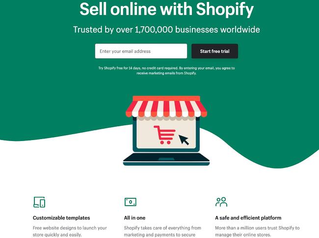
1. Shopify

Shopify sign up landing page example

Like many of the other landing pages in this post, Shopify’s trial landing page for sellers keeps it simple. It’s not too text-heavy, but still manages to persuade users by noting a few key points about its top-notch product. Visitors come away knowing that Shopify is an all-in-one platform that is easy to use and trusted by many.

Why This Landing Page Works:

  • Clean Interface: The user-oriented headline is just a few words, for example, and the page relies on simple graphics and short paragraphs to communicate the trial’s details and benefits.
  • Concise CTA: There are only a few fields you need to fill out before you get started. All of this makes it easier for you to quickly get started selling online with their tool.

What Could Be Improved:

  • Emphasize Security: The last column states that the platform is safe, but doesn’t explain why. Instead, it mentions that over a million businesses use it. A few words that speak to site security would improve this section since the number of vendors is already stated at the top of the page. Additionally, it would eliminate friction for visitors with security concerns.

2. Great Jones

Great Jones landing page example

Many of us have been doing a lot more cooking during the pandemic and looking to upgrade our gear. Great Jones offers up a landing page that’s as beautiful as its Dutch Ovens. It’s very aspirational and taps into all of our ideal kitchen dreams.

Why This Landing Page Works:

  • Use of Color: Great Jones’ site is colorful just like its cookware. The use of bold colors quickly draws visitors in and makes the cookware stand out.
  • Prominent CTA: You can’t miss this giant yellow CTA and bold font $100 Off coupon. Who wouldn’t want $100 off these gorgeous pots?

What Could Be Improved:

  • Rollover Descriptions: With so many pans and utensils pictured at once, it would be great if users had the ability to view the name of the item. That way they could find it easier on the site when they’re ready to buy.

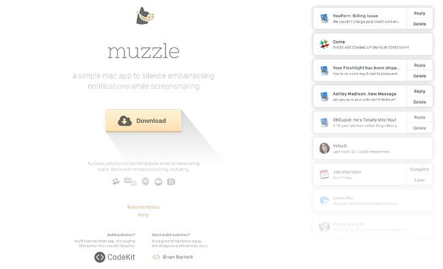
3. Muzzle

Muzzle sign-up landing page with yellow download button

Muzzle, a Mac app that silences on-screen notifications, fully embraces this show don’t tell mentality on their otherwise minimal landing page. Landing pages help users decide whether or not your product or service is actually worth their precious time and energy. What better way to clearly and straightforwardly communicate your value proposition than by confronting visitors with the very problem your app solves?

Why This Landing Page Works:

  • Show Rather Than Tell: Visitors to the page are greeted with a rapid-fire onslaught of embarrassing notifications in the upper left of the screen. Not only is the animation hilarious, it also manages to compellingly convey the app’s usefulness without lengthy descriptions.
  • Cohesive Visual Experience: Even the text on the page is a muted gray color, mirroring the function of the product.

What Could Be Improved:

  • Could Be Difficult to Read: While the light gray text on white background is great at mimicking the product’s function, it may be harder to read for some.

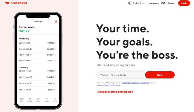
4. DoorDash

DoorDash landing page example

Takeout enthusiasts are no doubt familiar with DoorDash, the app that lets you order food from a variety of restaurants from your phone. Well, instead of customers, this landing page is geared towards recruiting Dashers who make the deliveries.

Why This Landing Page Works:

  • Emphasizes Dasher Autonomy: This landing page really plays up that Dashers are independent and free to work when they want.
  • Highlights Potential Earnings: While there’s no way to prove these earnings are typical, they are certainly enticing for anyone who wants to make extra cash on the side.

What Could Be Improved:

  • Advantage Over Competitors: DoorDash is not the only delivery game in town. They could highlight what sets them apart from a competitor like UberEats.

5. Wise

Wise sign-up landing page with CTAs for sending money, receiving money, and debit card

Wise allows you to send or receive money in different currencies and countries, and its landing page separates customers into two categories of either Business or Personal so you’re not distracted by options that don’t apply to you. There’s even a short video to show visitors how the service works before they try it. Since they’re dealing with money, it’s important to get the customer experience right the first time.

Why This Landing Page Works:

  • Highlights Safety: The security information is out front and center on this page, helping to ease any hesitancy a potential customer might have and assures them that Wise is a safe service to use to send money and receive .
  • Emphasizes Value: In several places on the page, in both text and video, Wise reiterates that it’s less expensive than transferring money through a traditional bank.

What Could Be Improved:

  • Interface is a Little Busy: While it’s great that customers have access to a wealth of information about the service, there’s a lot going on. There’s video, menus that appear when you scroll and multiple buttons — all within the top half of the page.

6. Airbnb

Airbnb Landing PageTo help convert visitors into hosts, Airbnb offers some enticing personalization: an estimated weekly average earnings projection based on your location and home size. You can enter additional information about your potential accommodations into the fields to get an even more customized estimation.
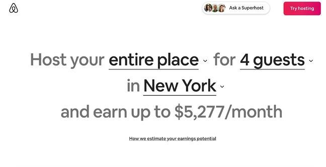
Airbnb 2nd landing page exampleIf you visit the page already convinced, the clear call-to-action at the top of the page makes it easy to convert on the spot.
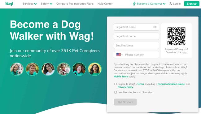
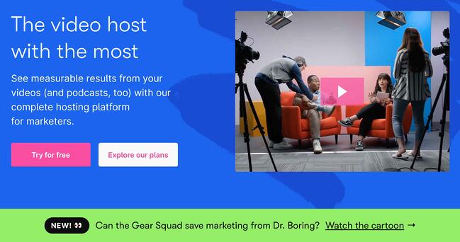
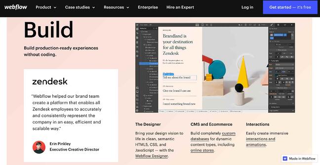
Why This Landing Page Works:

  • Personalization: Airbnb shows you right at the start what you could potentially earn based on your area and the size of your home. This is useful for potential new hosts who may still be figuring out how much they should charge and what they can expect to earn.
  • Leverages Community: Further down on the page, those curious about hosting have the option to contact a seasoned Superhost to answer any questions they may have.

What Could Be Improved:

  • Nothing: The page is clear, concise, reassures potential hosts Airbnb is safe to use, and offers a personalized experience.

7. Wag!

Wag landing sign up page example

Wag! is a service that connects dog owners with dog walkers and sitters. This page gets right to the point with a large font encouraging prospects to join, and puts the sign-up form prominently on the right half of the page. The green background color makes the white font and other elements on the page pop. The addition of a QR code on the form is also a nice touch, enabling visitors to scan it, quickly download the app, and sign-up.

Why This Landing Page Works:

  • Efficient Form: Leaving the form field open on the page means visitors don’t even have to click on a CTA to access it. The QR code further expedites the process.
  • Emphasizes Credibility: Including caretaker photos and that more than 351,000 caretakers currently use the service nationwide makes Wag more trustworthy.

What Could Be Improved:

  • It’s Not Compelling: Unlike DoorDash mentioned earlier, Wag! makes no mention of why people should join. What are the perks? Are the hours flexible?

8. Wistia

Wistia Landing Page Example

Right off the bat, you notice the blue background with the pop of pink in the form of a “Try for free” button. The page gets right into the action with a video showcasing all the cool content you can create. If you’re having doubts, you can always scroll below to read testimonials from some of Wistia’s 375,000 happy customers.

Why This Landing Page Works:

  • Ease of Use: The form itself allows users to quickly fill it out by linking to their Google account. Doing so enables the autofill feature, which cuts down on friction for the user.
  • Capitalizes on Visuals: As a video host, Wista does a great job of showcasing its capabilities using a variety of mediums. There’s colorful graphics, videos and even a link to marketing focused cartoons.

What Could Be Improved:

  • Include an FAQ: Testimonials are great, but sometimes customers have a few concerns that could be answered quickly with an FAQ section. That way they can decide whether or not to sign up without having to leave the page to search for answers.

9. Webflow

Webflow Landing Page ExampleWebflow, a design tool for web developers, packs a lot of information into just one GIF. As with Muzzle, Webflow also gets right to the point and demonstrates what their tool can do, rather than just talking about it. The animated GIF is visible in the same frame on the website, so users can see how the product works and sign up without scrolling.
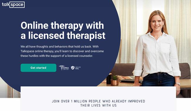
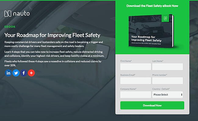
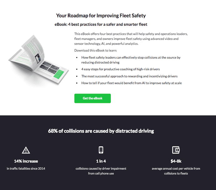
Why This Landing Page Works:

  • Show Rather Than Tell: Being able to view Webflow’s tool in action gives potential customers a clear idea of not only what it does, but how their user experience will be.
  • Removes Risk: In several places on the landing page, visitors are reminded that the service is free. There’s no trial to sign up for. They can build their site for free and decide whether or not to sign up for a plan when they’re ready to launch.

What Could Be Improved:

  • Nothing: This landing page is the perfect balance of information, usability, and visuals.

10. Talkspace

Talkspace Landing page example

Talkspace, an online therapy service, really focuses on trustworthiness with this landing page. All of the information on this page emphasizes that customers will have access to licensed therapists, and drives home that the service is secure and confidential. It’s a great way to reassure those who may be hesitant to participate. The use of shapes is also a clever idea. Pages are often filled with squares and boxes, so putting the CTA inside a large circle immediately draws the viewer in. Overall, the layout is clean, inviting, and informative.

Why This Landing Page Works:

  • Builds Trust: The focus on customer security works in their favor, especially noting that they are HIPPA compliant.
  • Provides Value: In addition to providing details about how Talkspace works, this page also provides several mental health resources and articles.

What Could Be Improved:

Nothing: This page has a great user interface and serves as a great starting point for mental health resources.

Ebook Landing Pages

11. Nauto

nauto-ebook-landing-page

Nauto, a data platform for self-driving cars, helps make autonomous driving safer for companies who manage fleets of self-driving vehicles. Naturally, its customers would need all kinds of information to sell them on this platform. Nauto has it, packaged into a super-simple ebook whose landing page gives you both a brief contact form and some preview statistics to prove why this resource is so important.

At the top of the page, shown above, a warm photo of a car’s exterior r hugs the lead-capture form. The green “Download Now” button might’ve even been on purpose (on the road, green means go, after all).

Scroll down, and you’ll see another “Get the eBook” CTA to remind users what’s waiting for them. You’ll also see three jarring statistics about car accidents to entice users to learn more. Check it out below.

nauto-ebook-landing-page-CTA-1

Why This Landing Page Works:

  • Simplicity: There’s no distractions on this landing page, which is perfect given the company’s focus on safe, self-driving vehicles.
  • Great Use of Comparison: Further down the page, Nauto offers up side by side footage of a distracted driver vs. a self-driving vehicle. It’s an excellent way to drive the point home that A.I. is a safer bet.

What Could Be Improved:

  • Graphics: The warm photo at the top is really difficult to see. Slightly more definition would have helped visitors easily recognize the image as cars.

12. Industrial Strength Marketing

industrial-strength-marketing-landing-page-example.png

Right off the bat, this landing page pulls me in with a compelling, punchy header: “Don’t Make Me Zoom.” It directly speaks to a common experience most of us have had when we’re browsing on our phones or tablets — and it’s a little sassy, too.

But that’s not the only thing keeping me interested in this landing page. Notice how the color red is strategically placed: It’s right at the top and bottom of the form, drawing you even closer to the conversion event.

industrial-strength-marketing-mobile-landing-page-1.jpg

industrial-strength-marketing-mobile-landing-page-2.jpg

Plus, this design is meta to boot: It looks and works great on mobile, too (pictured above) Keep in mind that a lot of visitors will be accessing your landing pages on their smartphones or tablets, and if the design of your website doesn’t work well for them, they might give up and leave your page.

The folks at Industrial Strength Marketing made the fonts and form field big enough so that visitors don’t have to pinch-to-zoom to read and interact with the content, for example.

Why This Landing Page Works:

  • Voice: The language is punchy and relatable, quickly drawing the reader in.
  • Minimalist: The black and white color scheme with just a few pops of red really make the sign up sheet stand out. Additionally the minimalist design works beautifully on mobile and desktop, no pinching required.

What Could Be Improved:

Nothing: Both the mobile and desktop versions illustrate the perfect execution of a

13. Inbound Emotion

Inbound Emotion Spanish language landing page example

Even if you don’t speak Spanish, you can still appreciate the conversion capabilities of this HubSpot partner site. My favorite feature of the page? The form stays in a fixed, prominent position as you scroll through the site. I also love the simple layout and warm colors.

Why This Landing Page Works:

  • Fixed Form: Having access to the form while scrolling provides a better user experience. No need to scroll back up to the top of the page to find it.
  • Simple Interface: The layout is simple, but effective. The use of only two shades of orange give a monochrome feel and keeps the focus on the benefits of the ebook.

What Could Be Improved:

  • Make the Form Brief: There were six items to fill out, not including the check boxes option at the end. Longer forms could be a turnoff for some visitors.

14. IMPACT Branding & Design

Impact Branding landing page example with creative CTA

Full disclosure: IMPACT is a HubSpot partner — but that’s not why they’re included here. IMPACT’s landing pages have long been a source of design inspiration. I love the simple layout of the page, from the large headline copy and detailed featured image, to the outline that surrounds the form, to the colors and fonts that are very pleasing to the eye.

The free guide IMPACT is offering for download here also doesn’t emphasize the download itself in the blue button that allows you to submit your filled-out form. Rather, IMPACT is inviting you to “generate more conversions” — putting the focus on what you stand to gain as a result of reading the guide.

Why This Landing Page Works:

  • Clever Messaging: You’re not downloading an ebook, you’re learning how to “generate more conversations.” This rephrasing is far more enticing than simply putting a regular download button.
  • Simple Use of Color and Fonts: The blue tones work really well on this landing page, giving it variety while keeping the look cohesive. Since there’s lots of text on the page, a simple font is perfect.

What Could Be Improved:

  • Nothing: This page encourages downloads in a clever way using a simple layout and colors.

Landing Pages to Learn More

15. Unbounce

Unbounce Landing Page Example

It’s no surprise Unbounce made this list —they’ve actually written the book on creating high-converting landing pages. Although there are lots of amazing things about this landing page, the two that I absolutely love are: the multiple ways to access the course, and additional industry-specific report offerings. Unbounce is really skilled at providing visitors the information they need, but also what they didn’t know they needed until they landed on the site.

Why This Landing Page Works:

  • Gives Visitors Options: When it comes to accessing the course, users can either click the main button above the upper half of the page, or if they’ve been scrolling, click on the course from the sidebar on the left. Eliminating the need to scroll back up to the top of the page.
  • Sometimes More is More: In addition to the course, Unbounce provides visitors with industry-specific reports and answers to other landing page-related topics. Providing even more useful information sets Unbounce up as a trusted authority in their field.

What Could Be Improved:

  • Descriptions: The course offers several modules and it would be helpful if some offered a brief description. The sidebar menu offers a course list, but a short sentence summarizing what visitors can expect to learn would be helpful.

16. Bills.com

bills-dot-com-landing-page-example.png

Often, people think landing pages are static pages on your website. But with the right tools, you can make them interactive and personalized.

Take the example above from Bills.com. To see if you’d benefit from their consultation, you answer three questions before you are shown a form.

Then, you answer two more questions, like the one below:

bills-dot-com-landing-page-2.png

And here’s the final landing page form where you fill out your information:

bills-dot-com-landing-page-3.png

I’m not sure how the algorithm works (or if there’s one at all), but while I was filling it out, I had some anxiety about not qualifying. Once I found out I did, I was excited to fill out the form, which I’m sure most people who are in debt and using this tool are. By making this offer seem more exclusive before the form appeared on the landing page, I’d bet that Bills.com increased conversions pretty significantly.

Why This Landing Page Works:

  • Exclusivity: Everyone likes to feel special, which is why exclusivity works so well. The page gives the impression that the offer isn’t given to just anyone, you have to qualify first.
  • Interactivity: Anytime you can get users to interact with the page, even if it’s something as simple as using a form with a sliding bar question.

What Could Be Improved:

  • More Color: While the site is geared to not so fun topics like bills and debt, it doesn’t mean it has to be boring. The gray leaves much to be desired.

17. Zillow

Zillow Landing Page Example

Zillow did something very similar to Bills.com with their landing page. It starts with a simple form asking for “your home address” ( sounds creepy, but don’t worry. This form field is set on top of a hero image featuring a quaint home at dusk followed by a handy FAQ section.

Of course, the address itself won’t be enough to get a true appraisal value of a home. It just denotes the home’s neighborhood. It’s a bit like playing The Price is Right. You can guess how much homes in the area are worth and then type in an address to see how close you got. If you want to learn more info about a property, Zillow then prompts users to sign-up to continue.

Zestimate landing page exampleOnce you hand over your email, you’ll have access to more data like comparable homes in the area, mortgage tools, and the estimated net profits should you decide to sell.
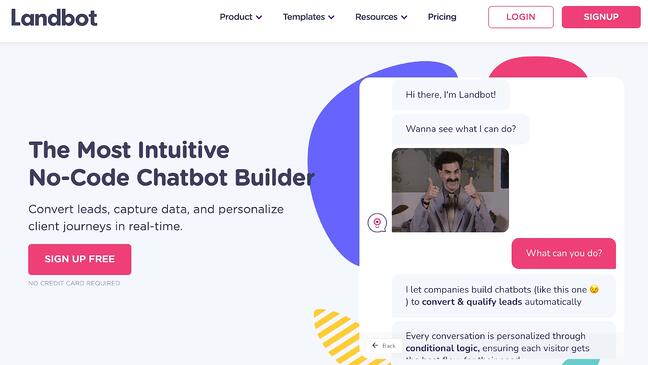
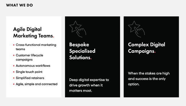
Why This Landing Page Works:

  • Games are Fun: Anytime you can make filling out a form feel like a game, it’s a win.
  • Establishes Authority on the Topic: Zillow has access to so much housing and neighborhood data, it’s no wonder they are one of the top home search sites in the nation.

What Could Be Improved:

  • Nothing: The Zestimate page is simple, but effective. Those with concerns about what a Zestimate is and how it’s calculated have easy access to the homebuying FAQ on the second half of the page.

18. Landbot

Landbot Landing Page Example

Landbot, a service that creates chatbot-based landing pages, puts their own product front and center on their chat-fueled landing page. Visitors are greeted by a friendly bot —complete with emojis and GIFs —who encourages them to provide information in a conversational format instead of via a traditional form.

Why This Landing Page Works:

  • It’s Fun: From the bright colors to the GIFs, this page keeps visitors engaged and entertained.
  • Show, Not Tell: By having the chatbot right on the page, doing its thing, potential customers can see exactly what they’re getting. The whole experience simulates what it’s like to use Landbot’s product.

What Could Be Improved:

  • Nothing: Landbot’s use of a live demo, testimonials, highlighted integration features and detailed breakdown of how the product works leaves new customers ready to sign up at first glance.

19. Webprofits

Webprofits landing page example

Like Industrial Strength Marketing mentioned earlier, Webprofits also makes great use of a predominantly black, white and red color scheme. The result is a clean layout that makes great use of the pops of color on the page. It’s a testament to the organization’s expertise in digital marketing and UX design.

The rollover description feature throughout the “What We Do” section, while black and white, uses movement to draw the reader’s attention to the content. Each section changes color and rolls down like a shade to reveal more in depth features.

Webprofits landing page example

They also make it easy for you to figure out what Webprofits actually does. The rest of the page offers detailed information about what you’ll get when you give over your information. Plus, it includes strategic CTAs throughout, like “Get in Touch”

Why This Landing Page Works:

  • Informative, But Not Overwhelming: There’s a lot of information and text on this page, but the use of well-placed graphics and videos help break things up.
  • Multiple CTAs: Placing the same CTA throughout the page makes it so visitors don’t have to scroll all the way to the top to “Get in Touch.”

What Could Be Improved:

  • Nothing: Webprofit makes great use of the long landing page format, packing in all the pertinent information visitors would need in one place with a visually appealing experience.

20. Native Poppy

Native Poppy Landing Page example

Sometimes, you’ve just got to stop and admire a landing page for being beautiful. Using high-resolution photography and lots of white space, Native Poppy’s landing page is a pleasure to look at.

Aside from its beauty, the page has some great elements: a clear and delightfully pink CTA, an informative “How It Works” section, plus an FAQ at the bottom. Best of all, it plays with language, ditching the phrase “become a subscriber” for “become a wild flower.” I don’t know about you, but I’d much rather be a “wild flower” over a subscriber any day.

Why This Landing Page Works:

  • Captures Brand Voice: The layout of Wild Poppy mirrors the whimsical vibe of the brand. From the photos, font choice, and “wild flower” subscription, all the messaging works in harmony.
  • Persuasive: By highlighting all the perks and discounts of being part of the subscription program, it entices customers to join.

What Could Be Improved:

  • Form Visibility: While there are multiple CTAs, it would have been nice to have the form fields on the page for faster sign-up, or as a pop up after clicking, instead of having to click the CTA and then be taken to another series of prompts.

21. Conversion Lab

Conversion Lab Landing Page example

While I wouldn’t typically include an example of a homepage with a form on it in a post about landing pages, this website is special. The homepage is the entire website — the navigation links just take you to the information below.

When you click “Get My Free Consult,” the entire page darkens to highlight the form. See what it looks like before you click in the photo above.

And, when you click that CTA, check out how the form appears:

Conversion Lab landing page example CTA

It’s a similar function when clicking on any of the headings on the page. Instead of taking you to a different page, it simply jumps to the corresponding section on the homepage.

I love how you don’t have to leave the page to fill out the form, or view any of the features, creating a seamless user experience.

Why This Landing Page Works:

  • Creative: Having a homepage that also functions as various landing pages makes Conversion Lab unique. Best of all, it still provides a pleasant user experience.
  • Organized Layout: Despite having the homepage and landing pages as one, the page doesn’t feel cluttered or busy at all.

What Could Be Improved:

  • Form Placement: It would be nice if the form maybe opened up on one side so visitors could still read the content on the rest of the page.

Landing Page Ideas

A well-optimized landing page can transform prospects into leads by gathering information that can help you better understand, market to, and delight visitors. Since landing pages are crucial for conversions, it’s important to make sure they’re well planned, designed, and executed.

Here are a few things to keep in mind when creating landing pages:

  • Appealing aesthetics: Giving your landing page color and a clean UI can only help. Visitors will want to learn more about your products and see evidence of the value you’re offering. Take a look at #18 on our list — Landbot for a great example of a stunning web page.
  • Less is more: Let the offer or images do most of the talking, but be sure to include any and all descriptive headlines and supporting text to make your landing page clear and compelling. This goes for just about all the components on the page: try white space, simple copy, and shorter forms.
  • Keep visitors on the page: By removing the main navigation or any distracting backlinks, it’s less likely there will be any lead generation friction that could cause visitors to abandon your page.
  • Social Sharing: A simple way of getting visitors to engage with your landing page is including social media sharing buttons so that they can spread your content to their social followings. After all, customers are the center of your marketing flywheel.
  • A/B testing: Landing pages are important to get right, and since consumer psychology can sometimes be surprising, it’s always better to experiment with different versions of your pages to see which has the highest conversion rate (CVR). Test the positioning of the offer, kinds of CTAs, or even the color scheme.
  • Call-To-Action: The CTA is where the meat of the landing page is, or the tipping point where prospects become contacts. CTAs could ask visitors to subscribe, download, fill out a form, share on social media, and more — but, overall, CTAs are necessary for getting your audiences more engaged with your offering. To generate leads, CTAs should be bold and eye-catching, but most importantly, they need to effectively communicate value.

Creating Landing Pages That Shine

Landing pages aid in growing your customer base and increasing conversions. Create a page that delights customers with a user interface so great, they continue to come back for more.

This article was originally published April 2, 2020 and has been updated for comprehensiveness.

optimize landing pages


Categories B2B

How to Do Keyword Research for SEO: A Beginner’s Guide

While Google keeps us on our toes with all the algorithm updates they keep rollin’ out, one thing has stayed pretty consistent for inbound marketers looking to optimize their websites for search: keyword research.

In this post, we’ll define what keyword research is, why it’s important, how to conduct your research for your SEO strategy, and choose the right keywords for your website.

→ Download Now: SEO Starter Pack [Free Kit]

Why is keyword research important?

Keyword research provides valuable insight into the queries that your target audience is actually searching on Google. The insight that you can get into these actual search terms can help inform content strategy as well as your larger marketing strategy.

People use keywords to find solutions when conducting research online. So if your content is successful in getting in front of our audience as they conduct searches, you stand to gain more traffic. Therefore, you should be targeting those searches.

In addition, in the inbound methodology, we don’t create content around what we want to tell people; we should be creating content around what people want to discover. In other words, our audience is coming to us.

This all starts with keyword research.

For an inside look into how Arel=”noopener” target=”_blank” hrefs can aid you in your SEO keyword research, check out our case study and exclusive interview here.

Conducting keyword research has many benefits, the most popular reasons being:

Marketing Trend Insight

Conducting effective keyword research can provide you with insights into current marketing trends, and help you center your content on relevant topics and keywords your audience is in search of.

Traffic Growth

When you identify the best fitting keywords for the content you publish, the higher ranking the it is in search engine results — the more traffic you’ll attract to your website.

Customer Acquisition

If your business has content that other business professionals are looking for, you can meet there need and provide them with a call to action that will lead them into the buyer journey from the awareness stage to the point of purchase.

By researching keywords for their popularity, search volume, and general intent, you can tackle the questions that most people in your audience want answers to.

However, keywords themselves because Google has evolved beyond exact-match algorithms.

Keywords vs. Topics

More and more, we hear how much SEO has evolved over just the last 10 years, and how unimportant keywords themselves have become to our ability to rank well for the searches people make every day.

And to some extent, this is true, but in the eyes of an SEO professional it’s a different approach. Rather, it’s the intent behind that keyword, and whether or not a piece of content solves for that intent (we’ll talk more about intent in just a minute).

But that doesn’t mean keyword research is an outdated process. Let me explain:

Keyword research tells you what topics people care about and, assuming you use the right SEO tool, how popular those topics actually are among your audience. The operative term here is topics — by researching keywords that are getting a high volume of searches per month, you can identify and sort your content into topics that you want to create content on. Then, you can use these topics to dictate which keywords you look for and target.

Elements of Keyword Research

There are three main elements to pay attention to when conducting keyword research.

1. Relevance

Google ranks content for relevance. This is where the concept of search intent comes in. Your content will only rank for a keyword if it meets the searchers’ needs. In addition, your content must be the best resource out there for the query. After all, why would Google rank your content higher if it provides less value than other content that exists on the web?

2. Authority

Google will provide more weight to sources it deems authoritative. That means you must do all you can to become an authoritative source by enriching your site with helpful, information content and promoting that content to earn social signals and backlinks. If you’re not seen as authoritative in the space, or if a keyword’s SERPs are loaded with heavy sources you can’t compete with (like Forbes or The Mayo Clinic), you have a lower chance of ranking unless your content is exceptional.

3. Volume

You may end up ranking on the first page for a specific keyword, but if no one ever searches for it, it will not result in traffic to your site. Kind of like setting up shop in a ghost town.

Volume is measured by MSV (monthly search volume), which means the number of times the keyword is searched per month across all audiences.

How to Research Keywords for Your SEO Strategy

I’m going to lay out a keyword research process you can follow to help you come up with a list of terms you should be targeting. That way, you’ll be able to establish and execute a strong keyword strategy that helps you get found for the search terms you actually care about.

Step 1: Make a list of important, relevant topics based on what you know about your business.

To kick off this process, think about the topics you want to rank for in terms of generic buckets. You’ll come up with about 5-10 topic buckets you think are important to your business, and then you’ll use those topic buckets to help come up with some specific keywords later in the process.

If you’re a regular blogger, these are probably the topics you blog about most frequently. Or perhaps they’re the topics that come up the most in sales conversations. Put yourself in the shoes of your buyer personas — what types of topics would your target audience search that you’d want your business to get found for? If you were a company like HubSpot, for example — selling marketing software (which happens to have some awesome SEO tools… but I digress), you might have general topic buckets like:

  • “inbound marketing” (21K)
  • “blogging” (19K)
  • “email marketing” (30K)
  • “lead generation” (17K)
  • “SEO” (214K)
  • “social media marketing” (71K)
  • “marketing analytics” (6.2K)
  • “marketing automation” (8.5K)

See those numbers in parentheses to the right of each keyword? That’s their monthly search volume. This data allows you to gauge how important these topics are to your audience, and how many different sub-topics you might need to create content on to be successful with that keyword. To learn more about these sub-topics, we move on to step 2 …

Step 2: Fill in those topic buckets with keywords.

Now that you have a few topic buckets you want to focus on, it’s time to identify some keywords that fall into those buckets. These are keyword phrases you think are important to rank for in the SERPs (search engine results pages) because your target customer is probably conducting searches for those specific terms.

For instance, if I took that last topic bucket for an inbound marketing software company — “marketing automation” — I’d brainstorm some keyword phrases that I think people would type in related to that topic. Those might include:

  • marketing automation tools
  • how to use marketing automation software
  • what is marketing automation?
  • how to tell if I need marketing automation software
  • lead nurturing
  • email marketing automation
  • top automation tools

And so on and so on. The point of this step isn’t to come up with your final list of keyword phrases. You just want to end up with a brain dump of phrases you think potential customers might use to search for content related to that particular topic bucket. We’ll narrow the lists down later in the process so you don’t have something too unwieldy.

Although more and more keywords are getting encrypted by Google every day, another smart way to come up with keyword ideas is to figure out which keywords your website is already getting found for. To do this, you’ll need website analytics software like Google Analytics or HubSpot’s Sources report, available in the Traffic Analytics tool. Drill down into your website’s traffic sources, and sift through your organic search traffic bucket to identify the keywords people are using to arrive at your site.

Repeat this exercise for as many topic buckets as you have. And remember, if you’re having trouble coming up with relevant search terms, you can always head on over to your customer-facing colleagues — those who are in Sales or Service and ask them what types of terms their prospects and customers use, or common questions they have. Those are often great starting points for keyword research.

Here at HubSpot, we use the Search Insights Report in this part of the process. This template is designed to help you do the same and bucket your keywords into topic clusters, analyze MSV, and inform your editorial calendar and strategy.

Featured Resource: Search Insights Report Template

search insights report

Download the Template

Step 3: Understand How Intent Affects Keyword Research and Analyze Accordingly.

Like I said in the previous section, user intent is now one of the most pivotal factors in your ability to rank well on search engines like Google. Today, it’s more important that your web page addresses the problem a searcher intended to solve than simply carries the keyword the searcher used. So, how does this affect the keyword research you do?

It’s easy to take keywords for face value, and unfortunately, keywords can have many different meanings beneath the surface. Because the intent behind a search is so important to your ranking potential, you need to be extra-careful about how you interpret the keywords you target.

Let’s say, for example, you’re researching the keyword “how to start a blog” for an article you want to create. “Blog” can mean a blog post or the blog website itself, and what a searcher’s intent is behind that keyword will influence the direction of your article. Does the searcher want to learn how to start an individual blog post? Or do they want to know how to actually launch a website domain for the purposes of blogging? If your content strategy is only targeting people interested in the latter, you’ll need to make sure of the keyword’s intent before committing to it.

To verify what a user’s intent is in a keyword, it’s a good idea to simply enter this keyword into a search engine yourself, and see what types of results come up. Make sure the type of content Google is closely related to what you’d intend to create for the keyword.

Step 4: Research related search terms.

This is a creative step you may have already thought of when doing keyword research. If not, it’s a great way to fill out those lists.

If you’re struggling to think of more keywords people might be searching about a specific topic, take a look at the related search terms that appear when you plug in a keyword into Google. When you type in your phrase and scroll to the bottom of Google’s results, you’ll notice some suggestions for searches related to your original input. These keywords can spark ideas for other keywords you may want to take into consideration.

Related searches at the bottom of Google SERP that reads "searches related to cute puppies" along with keyword suggestions

Want a bonus? Type in some of those related search terms and look at their related search terms.

Step 5: Use keyword research tools to your advantage.

Keyword research and SEO tools can help you come up with more keyword ideas based on exact match keywords and phrase match keywords based on the ideas you’ve generated up to this point. Some of the most popular ones include:

How to Find and Choose Keywords for Your Website

Once you have an idea of the keywords that you want to rank for, now it’s time to refine your list based on the best ones for your strategy. Here’s how:

Step 1. Use Google Keyword Planner to cut down your keyword list.

In Google’s Keyword Planner, you can get search volume and traffic estimates for keywords you’re considering. Then, take the information you learn from Keyword Planner and use Google Trends to fill in some blanks.

Use the Keyword Planner to flag any terms on your list that have way too little (or way too much) search volume, and don’t help you maintain a healthy mix like we talked about above. But before you delete anything, check out their trend history and projections in Google Trends. You can see whether, say, some low-volume terms might actually be something you should invest in now — and reap the benefits for later.

Or perhaps you’re just looking at a list of terms that is way too unwieldy, and you have to narrow it down somehow … Google Trends can help you determine which terms are trending upward, and are therefore worth more of your focus.

Step 2: Prioritize low-hanging fruit.

What we mean by prioritizing low-hanging fruit is to prioritize keywords that you have a chance of ranking for based on your website’s authority.

Large companies typically go after high search volume keywords, and since these brands are well established already, Google typically rewards them with authority over many topics.

You can also consider keywords that have little competition. Keywords that don’t already have multiple articles battling for the highest rank can afford you the spot by default — if there’s no one else trying to claim it.

Step 3: Check the monthly search volume (MSV) for keywords you’ve chosen.

You want to write content around what people want to discover, and checking MSV can help you do just that.

Monthly search volume is the number of times a search query or keyword is entered into search engines each monthly. Tools like searchvolume.io or Google Trends can help you find out the most searched keywords over related keyword clusters for free.

Step 4: Factor in SERP features as you choose keywords.

There’s several SERP feature snippets that Google will highlight if used correctly. An easy way to find out about them is to look up the keywords of your choosing and see what the first result looks like. But for a quick overview of the types of SERP featured snippets, we’ll summarize what they are here.

Image Packs

Image packs are search results displayed as a horizontal row of images that appear in an organic position. If there’s an image pack, you should write an image-heavy post to win placement in it.

SERP features for keyword research: image packs

Paragraph Snippets

Featured snippets, or paragraph snippets, are short snippets of text that appear at the top of Google search results for quick answers to common search queries. Understanding the searcher’s intent and providing succinct, concise answers can help in winning the placement.

SERP features for keyword research: paragraph snippets

List Snippets

List snippets, or listicles, are snippets made for posts outlining steps to do something from start to finish — often for “How To” searches. Making posts with direct, clear instructions and formatting can assist in winning this placement.

SERP features for keyword research: list snippets

Video Snippets

Video snippets are short videos that Google will display at the top of a search query page in place of text featured snippets. Posting a video on both YouTube and your website can help you win this placement if tagged in the targeted keywords people are searching for.

SERP features for keyword research: video snippets

Step 5: Check for a mix of head terms and long-tail keywords in each bucket.

Head terms are keyword phrases that are generally shorter and more generic — they’re typically just one to three words in length, depending on who you talk to. Long-tail keywords, on the other hand, are longer keyword phrases usually containing three or more words.

It’s important to check that you have a mix of head terms and long-tail terms because it’ll give you a keyword strategy that’s well balanced with long-term goals and short-term wins. That’s because head terms are generally searched more frequently, making them often (not always, but often) much more competitive and harder to rank for than long-tail terms. Think about it: Without even looking up search volume or difficulty, which of the following terms do you think would be harder to rank for?

  1. how to write a great blog post
  2. blogging

If you answered #2, you’re absolutely right. But don’t get discouraged. While head terms generally boast the most search volume (meaning greater potential to send you traffic), frankly, the traffic you’ll get from the term “how to write a great blog post” is usually more desirable.

Why?

Because someone who is looking for something that specific is probably a much more qualified searcher for your product or service (presuming you’re in the blogging space) than someone looking for something really generic. And because long-tail keywords tend to be more specific, it’s usually easier to tell what people who search for those keywords are really looking for. Someone searching for the head term “blogging,” on the other hand, could be searching it for a whole host of reasons unrelated to your business.

So check your keyword lists to make sure you have a healthy mix of head terms and long-tail keywords. You definitely want some quick wins that long-tail keywords will afford you, but you should also try to chip away at more difficult head terms over the long haul.

Step 6: See how competitors are ranking for these keywords.

Just because your competitor is doing something doesn’t mean you need to. The same goes for keywords. Just because a keyword is important to your competitor, doesn’t mean it’s important to you. However, understanding what keywords your competitors are trying to rank for is a great way to help you give your list of keywords another evaluation.

If your competitor is ranking for certain keywords that are on your list, too, it definitely makes sense to work on improving your ranking for those. However, don’t ignore the ones your competitors don’t seem to care about. This could be a great opportunity for you to own market share on important terms, too.

Understanding the balance of terms that might be a little more difficult due to competition, versus those terms that are a little more realistic, will help you maintain a similar balance that the mix of long-tail and head terms allows. Remember, the goal is to end up with a list of keywords that provide some quick wins but also helps you make progress toward bigger, more challenging SEO goals.

How do you figure out what keywords your competitors are ranking for, you ask? Aside from manually searching for keywords in an incognito browser and seeing what positions your competitors are in, Arel=”noopener” target=”_blank” hrefs allows you to run a number of free reports that show you the top keywords for the domain you enter. This is a quick way to get a sense of the types of terms your competitors are ranking for.

Best Keywords for SEO

Understand that there’s no “best” keywords, just those that are highly searched by your audience. With this in mind, it’s up to you to craft a strategy that will help you rank pages and drive traffic.

The best keywords for your SEO strategy will take into account relevance, authority, and volume. You want to find highly searched keywords that you can reasonably compete for based on:

  1. The level of competition you’re up against.
  2. Your ability to produce content that exceeds in quality what’s currently ranking.

And You’ve Got the Right Keywords for Your Website SEO

You now have a list of keywords that’ll help you focus on the right topics for your business, and get you some short-term and long-term gains.

Be sure to re-evaluate these keywords every few months — once a quarter is a good benchmark, but some businesses like to do it even more often than that. As you gain even more authority in the SERPs, you’ll find that you can add more and more keywords to your lists to tackle as you work on maintaining your current presence, and then growing in new areas on top of that.

Editor’s note: This post was originally published in May 2019 and has been updated for comprehensiveness.

SEO Starter Pack

Categories B2B

71 Photoshop Shortcuts to Help You Edit Photos Like a Pro [+ PDF Cheatsheet]

Have you ever wasted an entire day in Photoshop?So have I. It’s not like you start out aimlessly. You have a simple goal in mind, like cropping a photo, improving the resolution, or changing the size of the canvas. But then, you see all the options. And before you know it, you’re attempting to solve The Riddle of the Sphinx.

Wouldn’t it be nice if you could just press a button, and magically, Photoshop would do what you wanted it to do? It turns out there are a wealth of Photoshop shortcuts that do exactly this.

Download Now: The Marketer's Guide to Photoshop

By pressing a few keys on your computer keyboard at the same time, you can select tools, manipulate images and layers, and even make adjustments to your project’s canvas. We’ll show you how to do all of that (and more) in this guide.

Save all of these shortcuts to your desktop by downloading the PDF version here.

Note: All of these shortcuts can be accessed on PC and Mac, but sometimes, they’re different on each operating system. We’ve included both types below, and in the cases where they might be different, Mac instructions appear in italicized parentheses. Also, in these formulas, the plus sign (+) is present only to represent the combination of key commands. On occasion, it might be part of the command itself, like when you press the plus sign to zoom into a part of an image. Otherwise, don’t press the plus sign between commands.

Getting Set Up

You’d think setting up your content in Photoshop would be second nature. But sometimes, the shortcuts to change the background size, or zoom into your project aren’t what you think. Here are some of the most crucial fundamental shortcuts to know:

Photoshop Shortcuts: Getting Set Up

1. Change image size

Control + Alt + i (Command + Option + i )

2. Change canvas size

Control + Alt + c (Command + Option + c )

3. Zoom in

Control + + (Command + + )

4. Zoom out

Control + – (Command + – )

5. Scale Proportionately

Hold the shift key while selecting the object

6. Scale in place (from center of the object)

Hold shift + option while selecting the object

7. Show Rulers

Control + r (Command + r)

8. Show or hide the grid (the automatically-generated horizontal and vertical lines that help align objects to the canvas.)

Control + ‘ (Command + ‘ )

Choosing the Right Tools

These shortcuts will activate different groups of tools, like “Lasso,” “Brush,” or “Spot Healing Brush.” Within these tools, though, there are different functions. Under the “Magic Wand” tool group, for example, you have the option to execute a new selection or add and subtract from a current one.

Each one of these tools has a keyboard shortcut, and we’ve outlined some of them below.

 Photoshop Shortcuts: Choosing the Right Tools

9. Pointer, a.k.a. Move Toolpointer-tool.png

v

10. Magic Wandmagic-wand-tool.png

w

11. Rectangular Marquee, a.k.a. the Select Toolmarquee-tool-1.png

m

12. Lassolasso-tool.png

l

13. Eyedroppereyedropper-tool.png

i

14. CropScreen Shot 2017-05-26 at 12.09.20 PM.png

c

15. EraserScreen Shot 2017-05-26 at 12.21.32 PM.png

e

16. Rectanglerectangle-tool.png

u

17. Horizontal Typetext-tool.png

t

18. BrushScreen Shot 2017-05-26 at 12.15.15 PM.png

b

19. History Brush

history-brush-tool.png

y

20. Spot Healing Brushspot-healing-tool.png

j

21. GradientScreen Shot 2017-05-26 at 12.14.32 PM.png

g

22. Path Selectionpath-selection-tool.png

a

23. Handhand-tool.png

h

24. Rotate Viewrotate-view-tool.png

r

25. Penpen-tool.png

p

26. Clone Stampclone-stamp-tool.png

s

27. DodgeScreen Shot 2017-05-26 at 12.16.48 PM.png

o

28. Zoom Toolzoom-tool.png

z

29. Default Foreground and Background ColorsScreen Shot 2017-05-26 at 12.23.24 PM.png

d

30. Switch Foreground and Background ColorsScreen Shot 2017-05-26 at 12.25.24 PM.png

x

31. Edit in Quick Mask ModeScreen Shot 2017-05-26 at 12.26.26 PM.png

q

32. Change Screen ModeScreen Shot 2017-05-26 at 12.27.48 PM.png

x

33. Full Screen

f

Using the Brush Tool

With the brush settings, you can change the size, shape, and transparency of your brush strokes to achieve a number of different visual effects. To use these keyboard shortcuts, first select the Brush tool by pressing b.brush-tool.png

Photoshop Shortcuts: Using the Brush Tool

34. Select previous or next brush style

, or .

35. Select the first or last brush style used

Shift + , or .

36. Display precise crosshair for brushes

Caps Lock or Shift + Caps Lock (Caps Lock)

37. Toggle airbrush option

Shift + Alt + p (Shift + Option + p)

Using the Marquee Tool (for Slicing/Selecting)

When used correctly, the marquee tool will let you select individual elements, entire graphics, and determine what is copied, cut, and pasted into your graphics. To use these keyboard shortcuts, first select the Marquee tool by pressing m.marquee-tool-2.png

Photoshop Shortcuts: Using the Marquee Tool

38. Toggle between Slice tool and Slice Selection tool

Control (Command)

39. Draw square slice

Shift + drag

40. Draw from center outward

Alt + drag (Option + drag)

41. Draw square slice from center outward

Shift + alt + drag (Shift + option + drag)

42. Reposition the slice while creating the slice

Spacebar + drag

Using Different Blending Options

Blending options include a number of features to enhance the look of your graphic. You can always choose a blending option by going to the top menu bar, under Layer > Layer Style > Blending Options. Or, you can double-click any layer to bring up the options for that particular layer.

Once you open blending options, you can use keyboard shortcuts to select them without moving your mouse. To use the shortcuts, select the Move tool (“v”), and then select the layer you’d like to use the blending options on. Below are some of the most popular modes.

Photoshop Shortcuts: Using Different Blending Options

43. Cycle through blending modes

Shift + + or –

44. Normal mode

Shift + Alt + n (Shift + Option + n)

45. Dissolve

Shift + Alt + i (Shift + Option + i)

46. Darken

Shift + Alt + k (Shift + Option + k)

47. Lighten

Shift + Alt + g (Shift + Option + g)

48. Multiply

Shift + Alt + m (Shift + Option + m)

49. Overlay

Shift + Alt + o (Shift + Option + o)

50. Hue

Shift + Alt + u (Shift + Option + u)

51. Saturation

Shift + Alt + t (Shift + Option + t)

52. Luminosity

Shift + Alt + y (Shift + Option + y)

For more niche blending shortcuts, check out these tips from Adobe.

Manipulating Layers & Objects

If you want to modify an object or get complex with multiple layers, here are some shortcuts you might like to know:

Photoshop Shortcuts: Manipulating Layers and Objects


Click to Enlarge

53. Select all objects

Control + a (Command + a )

54. Deselect all objects

Control + d (Command + d )

55. Select the inverse of the selected objects

Shift + Control + i (Shift + Command + i )

56. Select all layers

Control + Alt + a (Command + Option + a)

57. Merge all layers

Control + Shift + E (Command + Shift + e)

58. Select top layer

Alt + . (Option + .)

59. Select bottom layer

Alt + , (Option + ,)

Note: In shortcuts 55-57, the brackets ([ ]) are the keystrokes in the command, and “OR” refers to the actual word — as in, press one bracket OR the other, not the letters “o” and “r.”

60. Select next layer down or up

Alt + [ OR ] (Option + [ OR ])

61. Move target layer down or up

Control + [ OR ] (Command + [ OR ])

62. Move layer to the bottom or top

Control + Shift + [ OR ] (Command + Shift + [ OR ])

63. Create a new layer

Shift + Control + n (Shift + Command + n)

64. Group selected layers

Control + g (Command + g)

65. Ungroup selected layers

Control + Shift + g (Command + Shift + g)

66. Merge and flatten selected layers

Control + e (Command + e)

67. Combine all layers into a new layer on top of the other layers

Control + Shift + Alt + e (Command + Shift + Option + e)

Note: This step gets you one, combined layer, with all elements of that layer in separate layers below — which is different from a traditional merge-and-flatten layers command.

68. Transform your object (includes resizing and rotating)

Control + t (Command + t)

69. Multiple Undos

Control + Alt + z (Command + Option + z)

And Finally — Save Your Work for Later

Congratulations — you’ve finished working on your project, and now, you’re ready to share it with the world. Save time-saving your project by using these simple shortcuts:

Photoshop Shortcuts: Save For Later

70. Save as

Control + Shift + s (Command + Shift + s)

71. Save for web and devices

Control + Shift + Alt + s (Command + Shift + Option + s)

Marketer's Guide to Photoshop

Categories B2B

What are Google Discovery Ads? Examples + a Campaign Tutorial

With every campaign comes specific goals advertisers want to achieve. For some, it’s brand awareness. For others, it’s increased website traffic.

Free Guide, Template & Planner: How to Use Google Ads for Business

But what if your goal is to reach audiences who are already prime to take action? With Google Discover ads, you can reach them – up to 3 billion of them to be exact.

Let’s dive into what Google Discovery ads are, how they work, and how to set one up today.

Using customer intent signals, Google uses machine learning to determine when users are most likely to engage with a brand. According to Google, brands should use it to:

  • Scale their conversions.
  • Reach new customers.
  • Reconnect with previous customers.

Another thing that sets Google Discovery ads apart from other campaigns is the limited campaign settings. Advertisers cannot adjust:

  • Ad rotation
  • Frequency capping
  • Delivery method
  • Device targeting
  • Placement targeting
  • Contextual targeting
  • Manual bid strategies

This campaign type offers automated campaign settings for bidding and targeting so that advertisers can focus on optimizing campaign performance.

Discovery Ads vs. Display Ads

The key difference in these ads is who they’re reaching and where.

Discovery ads reach those exhibiting high-intent behavior, as determined by Google’s algorithms. For instance, they’re great for ecommerce businesses looking to acquire new consumers and introduce their audiences to products and/or services.

Display ads, on the other hand, are not always meant to drive this type of action. In addition, display ads deliver ads in the Google Display Network whereas Discovery ads are only on Google feeds.

To launch a Discovery campaign, you first have to gather your creative assets, such as your copy, images, and logo. Next, you need a daily budget high enough to cover at least 10 times your target CPA bid.

Then, you’ll need to enable sitewide tagging in your ad account along with conversion tracking. Lastly, you must review and ensure you comply with Google’s personalized ad policies.

Once you’ve completed these key steps, you can start setting up your campaign.

Step 1: Set up a Google Discover ad campaign.

  1. Sign in to your Google Ads account.

  2. Click ‘Campaigns’ located on the left of the page menu.

  3. Click the ‘+’ button, then select ‘New campaign.’

  4. Choose your marketing objective.

  5. Click on the ‘Discovery campaign’ type.

  6. Select ‘Continue.’

  7. Pick your geographic and language targeting for this campaign.

  8. Select your audiences.

    1. You can choose between customer intent, your data (i.e. remarketing list), and in-market audiences.

  9. Set your bidding strategy and average daily budget.

  10. Click ‘Save and continue.’

  11. Click ‘Save.’

After setting up your campaign, the next step is setting up your single-image ad and multi-image carousel ad.

Step 2: Upload your creative assets.

There are two formats available for Discovery campaigns: single-image ads and multi-image carousel ads.

For this campaign, you must upload multiple versions of some assets, as Google will create different combinations to optimize your campaigns, such as:

  • Headlines – You must upload between three to five headlines up to 40 characters each.
  • Description – You can have anywhere from one to five descriptions up to 90 characters.
  • Business name, CTA, and Final URL – You can only have one of each.
  • Images – You must have at least one landscape image, one square image, and a square logo, with a maximum file size of 5MB.

For additional information on asset requirements for Discovery ads, click here.

Here are the steps to upload your creative assets:

  1. Log into your Google Ads account.

  2. Click on “Campaigns” and select your Discovery campaign.

  3. On the left page menu, click on “Ads & Extensions.”

  4. Click on the “+” icon then select “Discovery ad” or “Discovery Carousel ad.”

  5. Upload.

Step 3: Undergo the “Learning” period.

Once your campaign goes live, you must allow two weeks for Google Ads to optimize your bids.

During this time frame, you may see the label “Learning” next to your bid strategy status. This is an indication that you should avoid making any bidding changes and assess once that time expires.

Google Discovery Ad Examples

Gmail Feed

One place Discovery ads will show up is in Gmail. When you navigate to the “Promotions” or “Social” tabs, you may see ads like this:

Once you click on one of the ads, it will open up like an email and show details on the offer from the brand – as shown below.

google discovery ad: gmail feed

YouTube Home Feed

Another place you’ll find Discovery ads is in the YouTube app.

As you scroll down the “Home” tab, you will likely see ads like these with the yellow “Ad” indicator.

google discovery ad: youtube home feed

Google App Discover

Have the Google app downloaded on your device? You may see Discovery ads if you have the “Discover” feature turned on.

The Discover feeds offers personalized content to users based on their web history, interests, and saved items. Here’s an example of an ad on the app:

google discovery ad: google app discover feed

One thing to note about the Discover feed is that it’s unavailable to consumers in Germany, Australia, and France. As a result, those consumers also won’t see ads like these in their Google App.

Google Discovery Ads is Google’s latest tool to help advertisers reach their target audience. As always, be sure to experiment and optimize your campaigns.

New Call-to-action