A personal website is your chance to showcase your personality and credentials in an engaging format. But without strong personal website examples to guide you, you may not know how to get started or what will work best for your personal branding.
![→ Download Now: 80 Professional Bio Examples [Free Templates]](https://i4lead.com/wp-content/uploads/2022/09/4eb63650-d315-42e5-9ac7-8d0fcba29324-1.png) In this post, we’ll cover the best examples of personal websites we’ve seen — including resume websites, portfolios, blogs, and demo websites.
In this post, we’ll cover the best examples of personal websites we’ve seen — including resume websites, portfolios, blogs, and demo websites.
Why create a personal website?
Here’s the thing about resumes and cover letters: No matter how unique you try to make your own, for the most part, they tend to read dry. And there’s a good reason for it: It’s supposed to be a single, no-frills page that documents your work experience. And while being concise is good, there’s very little opportunity to convey your uniqueness, or for your personality to shine through at all for that matter.
While a resume is a sole, largely unchanging document, a personal website can be customized and updated according to what you’re working on, or what you want to emphasize. It’s both fluid and current.
In addition, 80% of businesses say a personal website is important when evaluating job candidates. Recruiters are looking you up online, and a personal website that tells the story you want to tell can make all the difference between you and a competing candidate.
If you’re thinking about creating a personal website of your very own, check out the examples below that hit the nail on the head. Inspired by a particular type of website?
Click one of the following links to jump to that section of this article:
Personal Resume Websites
Whether you create a single-page site or a larger portfolio, the web resume serves as a more personalized option for sharing information and demonstrating your technological skills — and it can be used by all types of jobseekers.
Even if you have very little work experience, you can leverage a website to build a better picture of your capabilities and yourself as a candidate, while leaning on your traditional resume to provide the basic background information.
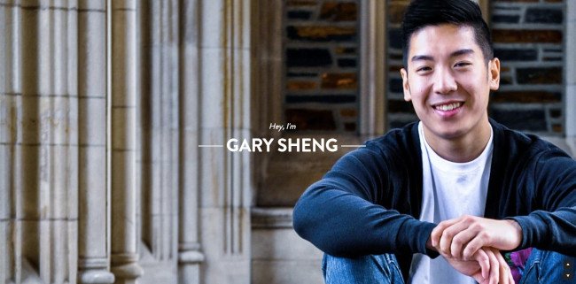
Unlike a standard resume document, Sheng’s website makes it easy for him to include logos and clickable links that allow his software engineering and web development skills to shine.
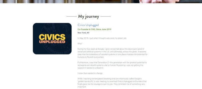
We love that visitors can choose to scroll down his page to view all of the website’s categories (“About Me,” “My Passion,” etc.), or jump to a specific page using the top navigation.
The “My System” section reads like a company mission statement, and this personal touch helps humanize his work and make him more memorable.

Johnson’s incredible resume must be seen to be believed. Beautiful images of planets help to complement his planetary science background, and animations make his resume more of an experience than a document.
In terms of design, the textured, multi-layered background adds greater depth to the two-dimensional page in a way that evokes feelings of space and the planetary systems, which Johnson’s work focuses on.
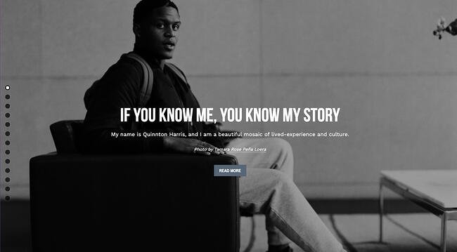 Harris’ resume uses photos to tell his personal story — and it reads kind of like a cool, digital scrapbook. It covers all the bases of a resume — and then some — by discussing his educational background, work experience, and skills in a highly visual way.
Not to mention, the copy is fantastic. It’s clear that Harris took the time to carefully choose the right words to describe each step of his personal and professional journey.
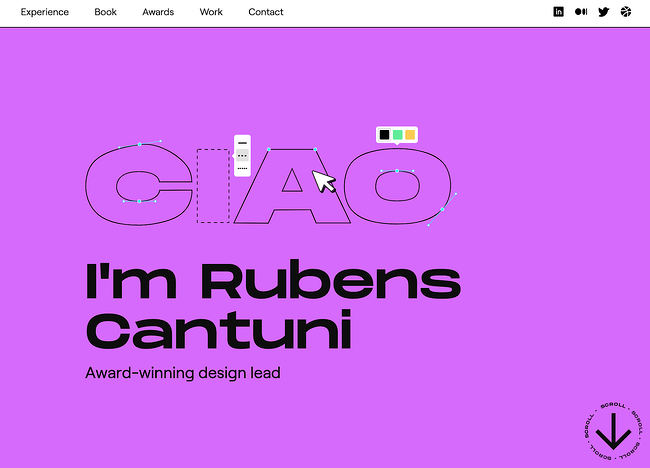 Rubens Cantuni’s resume website hits all the right notes: First, it showcases what he does with a playful GIF showing the word “CIAO” getting edited point-by-point, just as it would in a design tool. Second, it summarizes Cantuni’s key strengths in a personable summary. Third, it lists his experience in a user-friendly collapsible format, so if you want to read more, you can click each individual role. He then leads into his book and portfolio.
At every step, you get to appreciate Cantuni’s strong sense of design, user-first thinking, and sharp business acumen. The designer ends with a call-to-action for visitors to reach out to him. He also prompts recruiters to inquire about his work by mentioning that he can only share certain pieces of his work privately. On your own site, you can leverage projects with non-disclosure agreements as “gated content.”
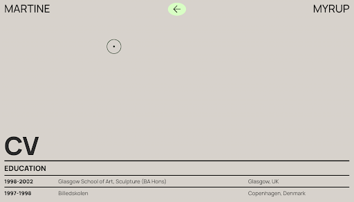 Martine Myrup’s website comes up twice on this list — first, as one of the best resume websites, and second, as one of the best portfolio websites we’ve ever seen. As a practicing artist, Myrup must emphasize visuals in her website’s design. But she also includes an HTML curriculum vitae for potential employers and other interested parties to see her degrees, exhibitions, awards, and publications.
The CV is formatted in a way that is clear and easy-to-scan, with bold headings separating each section and dates on the left-hand side. While artists’ CVs are formatted differently than professional CVs, Myrup’s formatting would work in virtually any field with some adjustments.
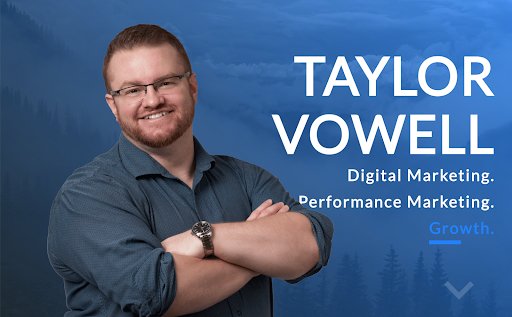 Taylor Vowell’s resume website is an excellent example of how to introduce yourself in a personable way while highlighting your professional experience. He begins with a summary about his personal life: “I am a father of 3, an avid comic and sports card collector, and a huge Avs and Broncos fan.” That draws readers in immediately and gives them a way to break the ice when they reach out to Vowell.
Later down the page, he includes his experience in a carousel with cards for each of his employers. If you’re interested in seeing more of his experience, you can click to the next card, or you can keep scrolling to see his skills in marketing, product design, and technology, as well his strengths and recommendations. This is a strong resume website that ends with a compelling, eye-catching call-to-action.
 Johannes Schüchner’s film resume website is an example that demonstrates how to showcase your creativity and personality while still highlighting your most important professional achievements. While the resume is in German, you can still get an understanding of the actor’s key strengths.
At the bottom, casting directors have an option to download a PDF version of Schüchner’s film credits and theater work. This website shows that you can tastefully break the rules on your own site, so long as you remain mindful of your target audience.
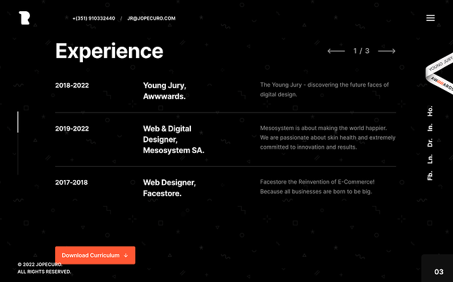 José Rocha is a designer who uses delightful parallax effects on his site to engage viewers and visitors. He introduces himself as a full-stack designer, covers his key strength areas, and then invites readers to scroll through his experience in a concise, interactive section.
At the top is a transparent navigation bar with his contact information, allowing website visitors to get in contact with him promptly if they want to. At the bottom is a formal form where people can submit an inquiry.
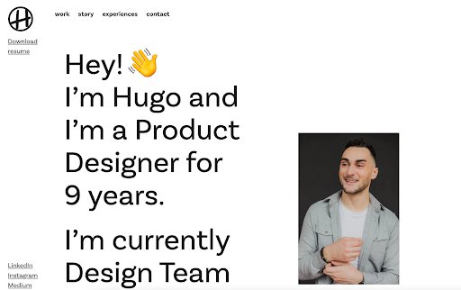 Hugo Bazin is a product designer whose resume website combines friendliness with engaging user design. On the top left-hand corner, he includes a sticky button to download his resume in PDF format, but if you’re interested in getting an overview, you can scroll down to the “Experience” section, where you can see his current and previous employers.
Throughout the copy, Bazin uses emojis to showcase his personality, but he’s selective. He keeps emojis out of the “Experience” section of the webpage, where it’s essential to maintain a serious, professional tone.
 Christian Kaisermann’s resume website employs unique visuals to keep viewers on the page and showcase his strong coding skills. On the upper right-hand side, you have the option to switch from channel to channel, like you would on an old TV. He also only includes two paragraphs of copy on the homepage, showing that remaining brief is key if you want visitors to focus on your website’s design.
On the bottom left-hand corner, users can access Kaisermann’s crawlable HTML resume, email, Twitter, and LinkedIn. You can also activate “Space Mode,” which brings up a remote control to change the channels — very cool!
Best Practices for Resume Websites
- Code your resume so it can be crawled by search engines.
- Offer a button to download your resume in PDF so the hiring manager can add it to your file.
- Keep branding consistent between the website and document versions: Use similar fonts, colors, and images so you’re easy to recognize.
- Be creative and authentic to yourself. Think about the colors, images, and media you want to be a part of your story that you couldn’t include in a document resume.
Personal Portfolios
Building an online portfolio is a highly useful personal branding and marketing tool if your work experience and skill set call for content creation. In fact, photographers, graphic designers, illustrators, writers, and content marketers can all use web portfolios to show off their skills in a more user-friendly way than a resume or hard copy portfolio.
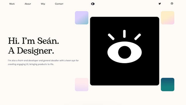 Halpin’s portfolio is short, sweet, and to the point, which is authentic to his voice and personal branding outlined on the site. Instead of a lot of copy, Halpin presents large thumbnail cards so that his projects speak for themselves and allow the user to delve deeper if one catches their eye.

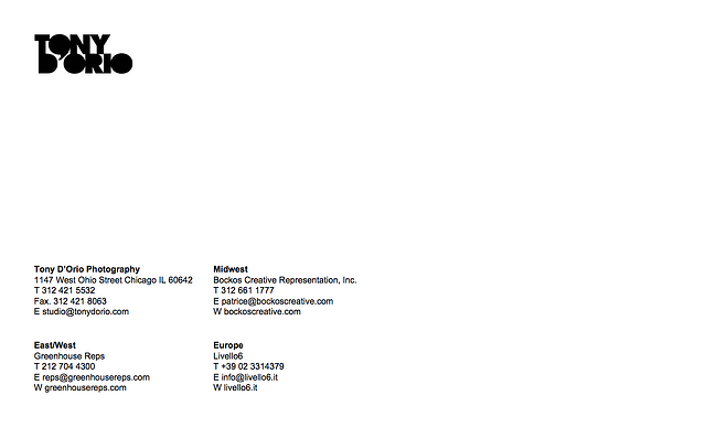
It’s important to keep the design of your visual portfolio simple to let images capture visitors’ attention, and D’Orio accomplishes this by featuring bold photographs front-and-center on his website. His logo and navigation menu are clear and don’t distract from his work. And he makes it easy for potential customers to download his work free of charge.
Want to give it a try? Click on the hamburger menu in the top left corner, then select + Create a PDF to select as many images as you’d like to download.
Once you open the PDF, you’ll notice that it comes fully equipped with D’Orio’s business card as the cover … just in case you need it.
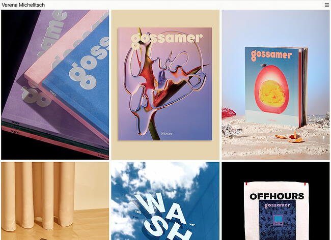 When you’re a designer, not one pixel on your personal website should go unused. Verena Michelitsch’s portfolio, shown above, is covered end to end in artwork. From her extensive library of work, she chose to exhibit multiple colors, styles, and dimensions so visitors can see just how much range she has as a designer. It’s a perfect example of the classic adage, “show, don’t tell.”
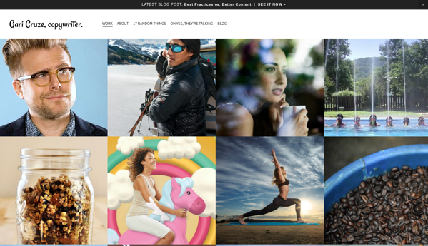
Cruze is a copywriter. But by turning his website into a portfolio featuring images from different campaigns he’s worked on, he makes visitors want to keep clicking to learn more about him. Also, there’s a great CTA at the top of the page that leads visitors to his latest blog post.
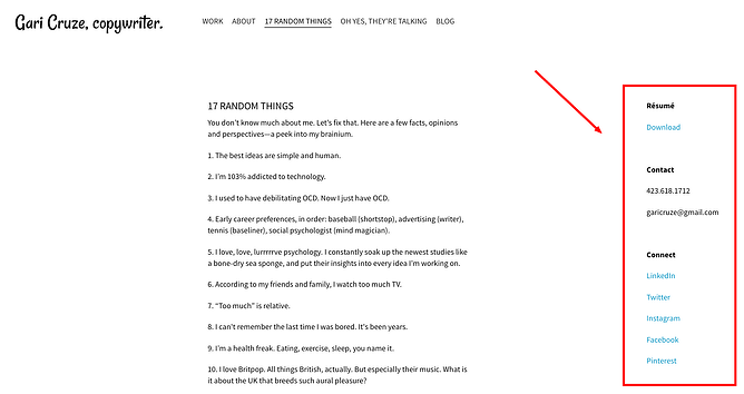
His site’s humorous copy — specifically in the “17 Random Things” and “Oh Yes, They’re Talking” sections — serves to show off his skills, while making himself more memorable as well. These pages also include his contact information on the right-hand side, making it easy to reach out and connect at any point:
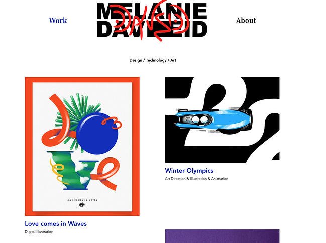 Daveid’s website is a great example of “less is more.”
This developer’s portfolio features clear, well-branded imagery of campaigns and apps that Daveid worked on, and she shows off her coding skills when you click through to see the specifics of her work.
While it might seem overly minimal to only include just a few examples of her work, Daveid did her portfolio a service by including her best, most noteworthy campaigns. At the end of the day, it’s better to have fewer examples of excellence in your portfolio than many examples of mediocrity.
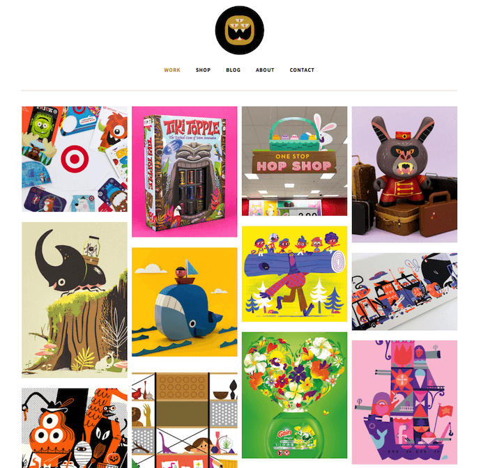
Christopher Lee’s portfolio is busy and colorful in a way that works. When you read more about Lee on his easily navigable site, you realize that such a fun and vibrant homepage is perfect for an illustrator and toy designer.
Known by his brand name, “The Beast Is Back,” Lee’s web portfolio highlights eye-catching designs with recognizable brands, such as Target and Mario, along with links to purchase his work. This is another gallery-style portfolio with pops of color that make it fun and give it personality, thus making it more memorable.
 This freelance videographer is another example of a simple but sleek portfolio, allowing his potential clients to browse deeper into his “Work” and “Stills” sections. The opening video on the homepage — as shown on the still image above — also ensures his site visitors know that he’s actively creating beautiful work.
 In his portfolio, Byron McNally doesn’t immediately include his work but rather a photo of himself, which immediately fosters a connection between him and website visitors. This minimal website design also invites users to continue engaging with the website’s content and see some of his recent film, commercial, and music productions.
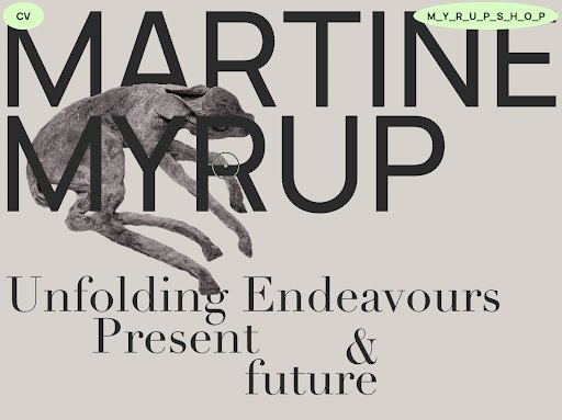 Martine Myrup was also in our list of best resume websites, but her portfolio is worth a mention, too. With its muted colors and creative use of typography, it immediately conveys her artistic vision and aesthetic. The page also includes a sticky bright green button prompting you to check out her CV. As you scroll down the page, you can see a preview of her work and click on the one that most interests you, then get in contact with her using the email at the bottom.
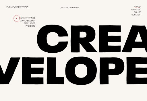 Davide Perozzi uses his website to showcase his strong design skills and creative typography, as well as his previous work. When you hover over each item in his portfolio, an image preview pops up, giving you the opportunity to check out more. The website uses scrolling effects and bold text to keep viewers engaged.
Best Practices for Portfolio Websites
- Use mainly visuals. Even if you’re showcasing your written work, using logos or other branding is more eye-catching for your visitors.
- Don’t be afraid to be yourself. Your personality, style, and sense of humor could be what sets you apart from other sites!
- Organization is key. If your portfolio is full of photos, logos, and other images, make sure it’s easy for visitors to navigate to where they can contact you.
- Brand yourself. Choose a logo or icon to make your information easily identifiable.
Personal Blogs
Consistently publishing on a blog is a great way to attract attention on social media and search engines — and drive traffic to your site. Blogging is a smart way to give your work a personality, chronicle your experiences, and stretch your writing muscles. You might write a personal blog if you’re a writer by trade, but virtually anyone can benefit from adding a blog to their site and providing useful content for their audience.
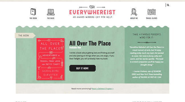
This blog looks a bit busier, but its consistent branding helps visitors easily navigate the site. The travel blog uses globe iconography to move visitors around the site, making it easy to explore sections beyond the blog.
Owned by writer Geraldine DeRuiter, this blog also features a “Best Of” section that allows new visitors to learn about what the blog covers to get acclimated. The color scheme is warm, neutral, and free of excess clutter that could distract from the content.
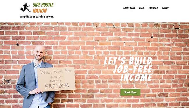
Side Hustle Nation is the business blog of Nick Loper, an advisor whose website offers tons of valuable financial advice for individual business owners. His homepage, shown above, sets a lighthearted yet passionate tone for his readers. It suggests you’ll get friendly content all committed to a single goal: financial freedom. The green call to action, “Start Here,” helps first-time visitors know exactly how to navigate his website.
On Nick’s blog page, you’ll see content that shows readers how Nick, himself, creates content that helps his business grow. These content types give people a peek behind the curtain of your operation, showing them you practice what you preach and that your insight is tried and true.
 The website fifty coffees chronicles the author’s series of coffee meetings in search of her next job opportunity, and it does a great job of using photography and visuals to assist in the telling of her lengthy stories.
The best part? Each post ends with numbered takeaways from her meetings for ease of reading comprehension. The high-quality photography used to complement the stories is like icing on the cake.
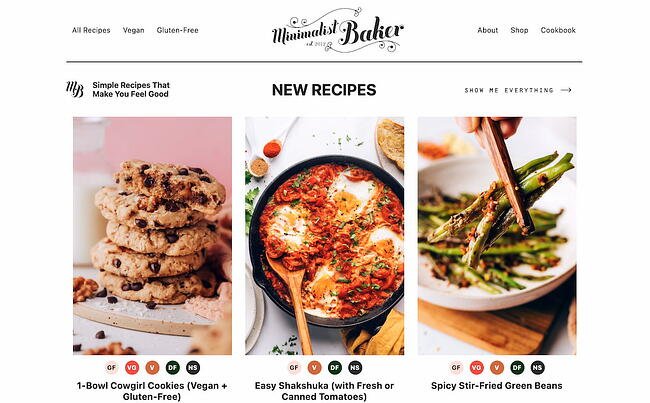 I’m not highlighting Dana’s food blog just because the food looks delicious and I’m hungry. Her blog uses a simple white background to let her food photography pop, unique branding to make her memorable, and mini-bio to personalize her website.
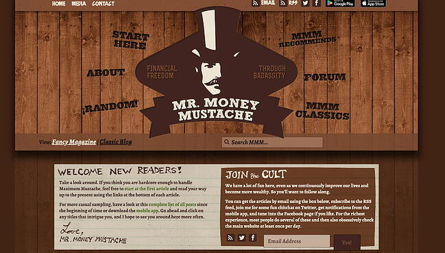 Mr. Money Mustache might take on an old-school, Gangs of New York-style facade, but his blog design — and the advice the blog offers — couldn’t be more fresh (he also doesn’t really look like that).
This financial blog is a funny, browsable website that offers sound insight into money management for the layperson. While his personal stories help support the legitimacy of his advice, the navigation links surrounding his logo make it easy to jump right into his content without any prior context around his brand.
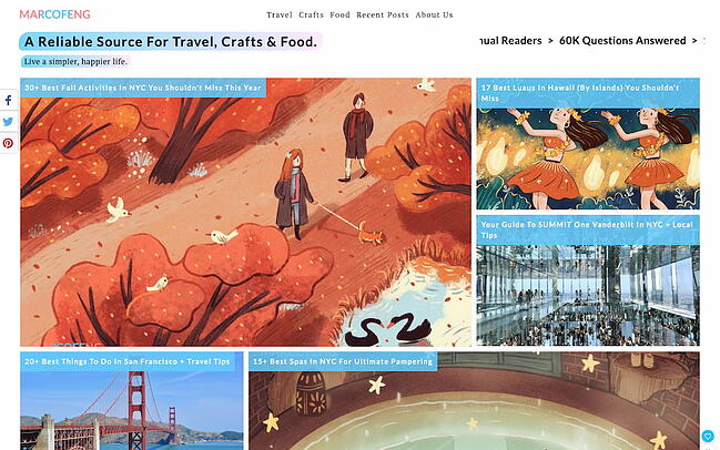 Marco Feng’s travel blog is colorful, unique, and informative. When you arrive at the site, you can immediately jump in to the blog post that draws your attention the most, or explore by destination. Our favorite part of the site is the scrolling banner at the top that provides social proof: As a reader, you’d be joining 3 million others. Leveraging your audience size will help you look more authoritative and establish your site as a go-to.
 Miramono is a unique photography blog created by Fernando Puente, where he curates a “selection of photographers he deeeeply loves.” In it, he includes interviews, essays, and photo selections. At the bottom is an eye-catching graphic prompting viewers to subscribe. We love the simplicity of the website’s design, as well as its unique value proposition.
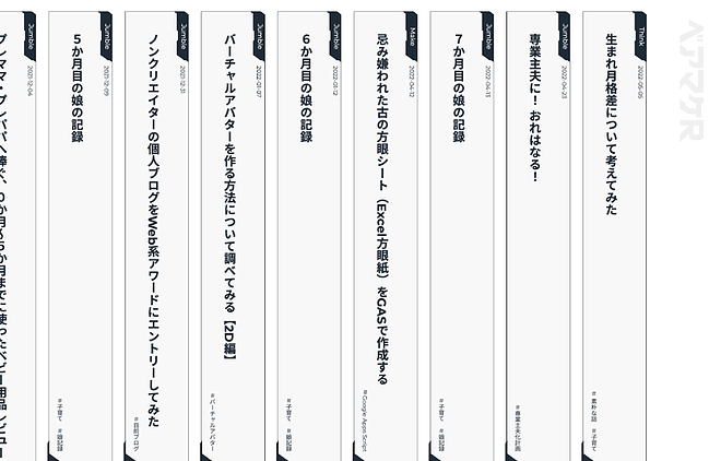 This blog combines engaging visual design with user-friendliness. Since Japanese is written vertically, the home page includes a series of vertical cards, each for a different blog post. You can then click on each card to expand a specific post. The writer divides his musings into three categories: Make, Think, and Jumble. He discusses his personal life at home as well as his life at work, epitomizing what a personal blog should contain.
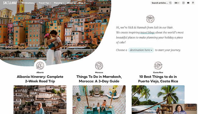 Salt in Our Hair is a travel blog with exceptional user design. The bloggers, Nick and Hannah, introduce themselves on the welcome screen. Users then have the option of choosing a specific destination to read about or finding a specific topic using the menu up top.
 Daniel See uses the blog section of his website to share his thoughts on design. As a designer, he uses his subject-matter expertise to write blog posts about creative processes. He also prompts readers to submit their feedback and ideas by including a button to “let him know your thoughts.”
Best Practices for Blogs
- Keep your site simple and clutter-free to avoid additional distractions beyond blog posts.
- Publish often. Those who prioritize marketing efforts are 13x more likely to see positive ROI.
- Experiment with different blog styles, such as lists, interviews, graphics, and bullets.
- Employ visuals to break up text and add context to your discussion.
Personal Demo Websites
Another cool way to promote yourself and your skills is to create a personal website that doubles as a demonstration of your coding, design, illustration, or developer skills. These sites can be interactive and animated in a way that provides information about you and also shows hiring managers why they should work with you. This is a great website option for technical and artistic content creators such as developers, animators, UX designers, website content managers, and illustrators.
 Tonnina is showcasing advanced and complicated web development skills, but the images and storytelling methods he uses are simple and easy to understand. In the process, you get a demo of the depth of his animation and coding experience.
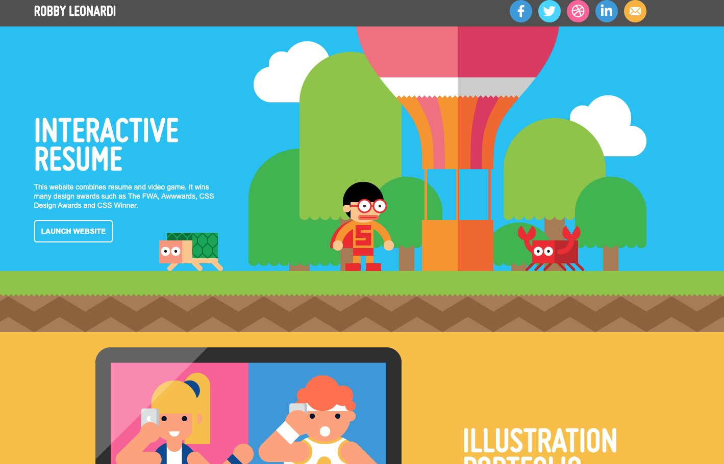 Leonardi’s incredible demo website uses animation and web development skills to turn his portfolio and resume into a video game for site visitors. The whimsical branding and unique way of sharing information ensure that his site is memorable to visitors.
 Reed uses his page as a start-to-finish demo of how to code a website. His website starts as a blank white page and ends as a fully interactive site that visitors can watch him code themselves. The cool factor makes this website memorable, and it makes his skills extremely marketable.
 Renaud Rohlinger’s demo site does a great job of showing his 3D design chops, and it takes it a step further by telling visitors all about him and his passions. It’s the perfect balance of a demo and a mini-portfolio.
Plus, we love the video he includes as the background, as well as the parallax effects that activate as you scroll down the page.
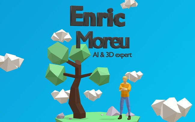 Enric Moreu showcases his 3D design skills by creating an interactive 3D resume. As users scroll, the page smoothly takes them through Moreu’s spoken languages, coding languages, skills, and work experiences. It’s engaging, light on text, and visually striking.
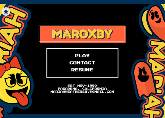 Mariah Weathersby has coded a striking “playable” resume that pays homage to old-school games and showcases her strong design skills. If you love experiencing nostalgia, this demo website will reel you in. If you only want the resume, you have the option of downloading a text-based version — a win-win.
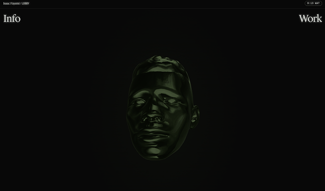 Isaac Fayemi’s demo website is subtle and striking at the same time. Rather than loading the page with excessive graphics, he has created a 3D version of his head that follows your cursor as you move around. You have two options: To find out more about him or check out more of his work. This demo website is a stellar example of how to keep it simple while still delighting the senses.
Best Practices for Demo Websites
- Brand yourself and use consistent logos and colors to identify your name and your skills amongst the bevy of visuals.
- Don’t overwhelm your visitors with too many visuals at once — especially if your demo is animated. Be sure to keep imagery easy to understand so visitors aren’t bombarded when they visit your site.
Developing a Personal Website
Regardless of the type of personal website you’re building, there’s plenty of inspiration above on how to convey personality while connecting with your audience. Keeping the above tips in mind, remember to design for your audience’s experience, and most importantly, have fun.
Editor’s note: This post was originally published in April 2019 and has been updated for comprehensiveness.

![]()

![Download Now: 150+ Content Creation Templates [Free Kit]](https://i4lead.com/wp-content/uploads/2022/09/5478fa12-4cc3-4140-ba96-bc103eeb873e-1.png)

![Free Ebook: The Marketer's Guide to TikTok for Business [Download Now]](https://i4lead.com/wp-content/uploads/2022/09/2c7242e4-ad54-4f63-8627-a15aa6a2ea50.png)
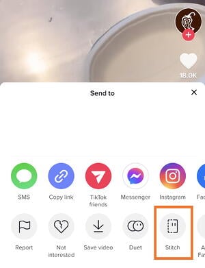
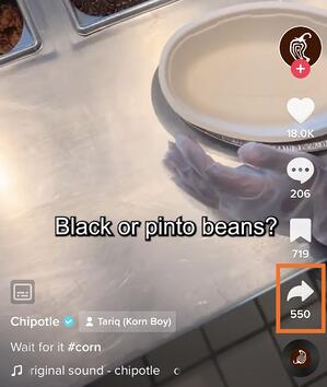 Then, tap Stitch. This will open an editing tool where you can select five seconds of the video to use in yours.
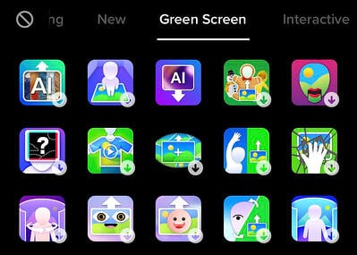
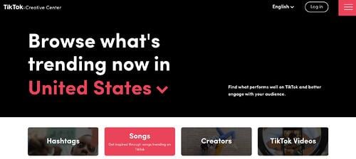
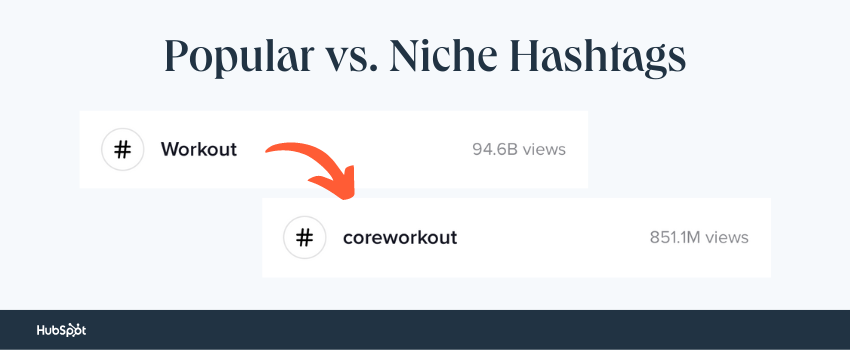 A well-rounded hashtag strategy should include both niche and popular hashtags. Take a look at the example below.
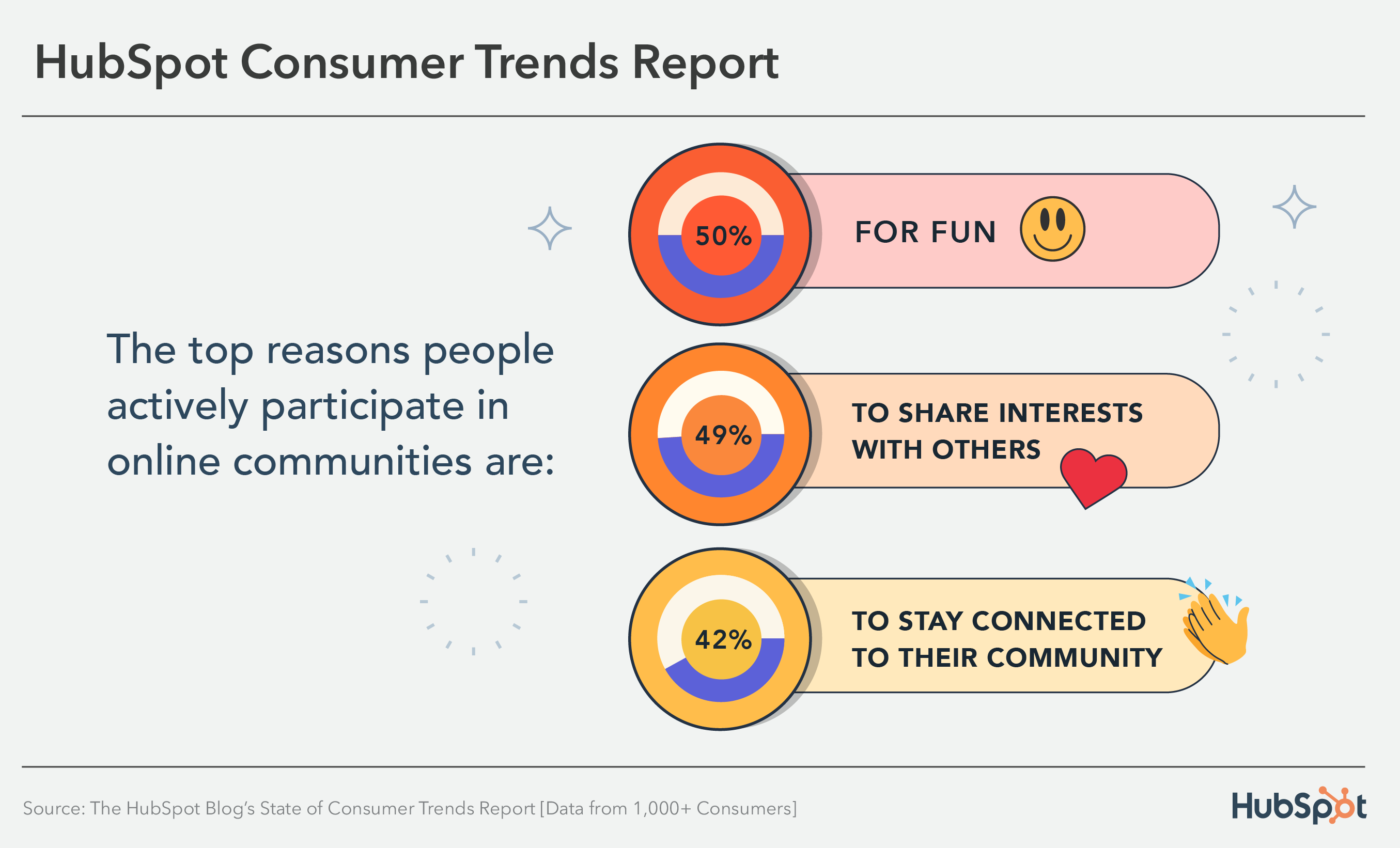
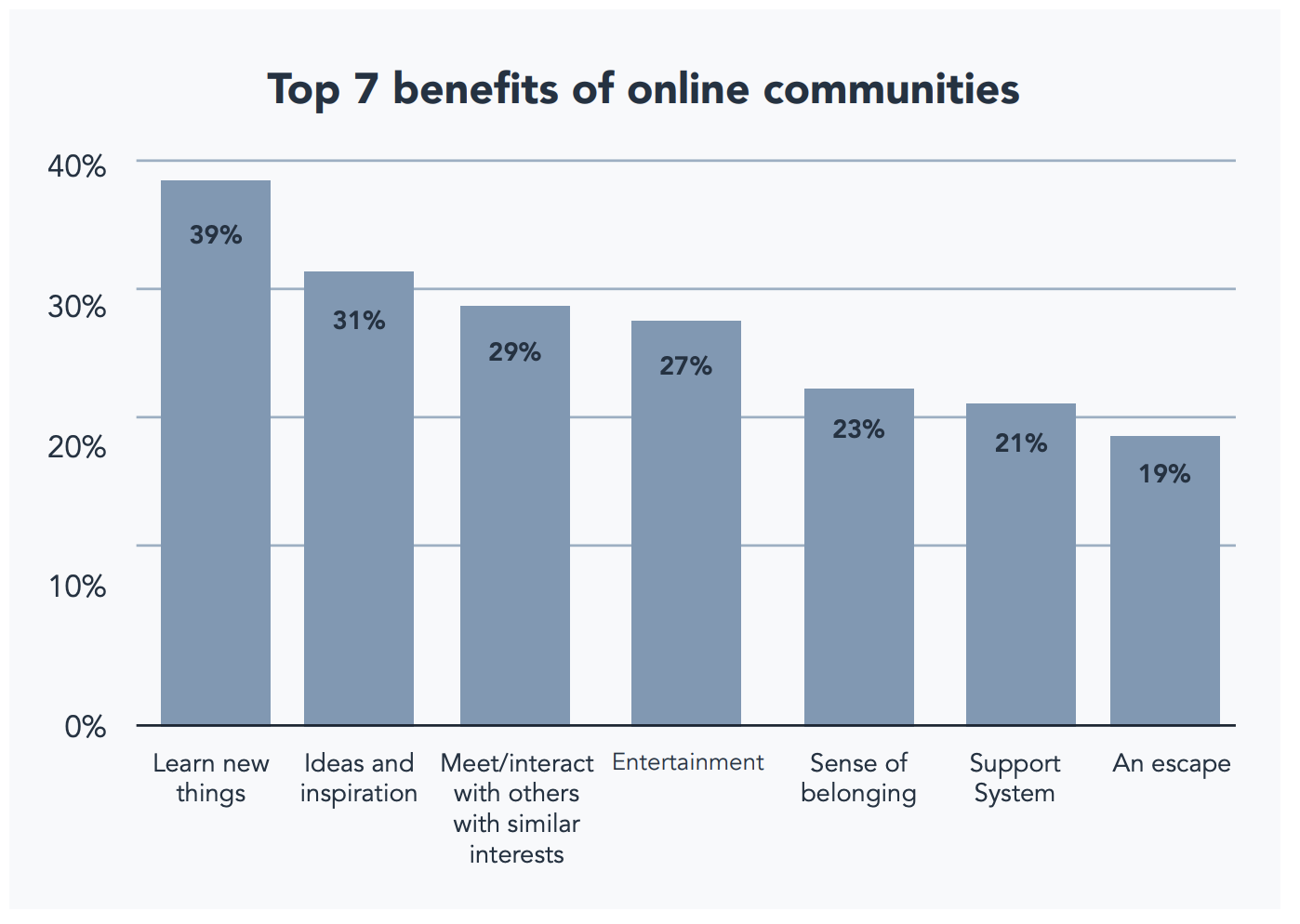
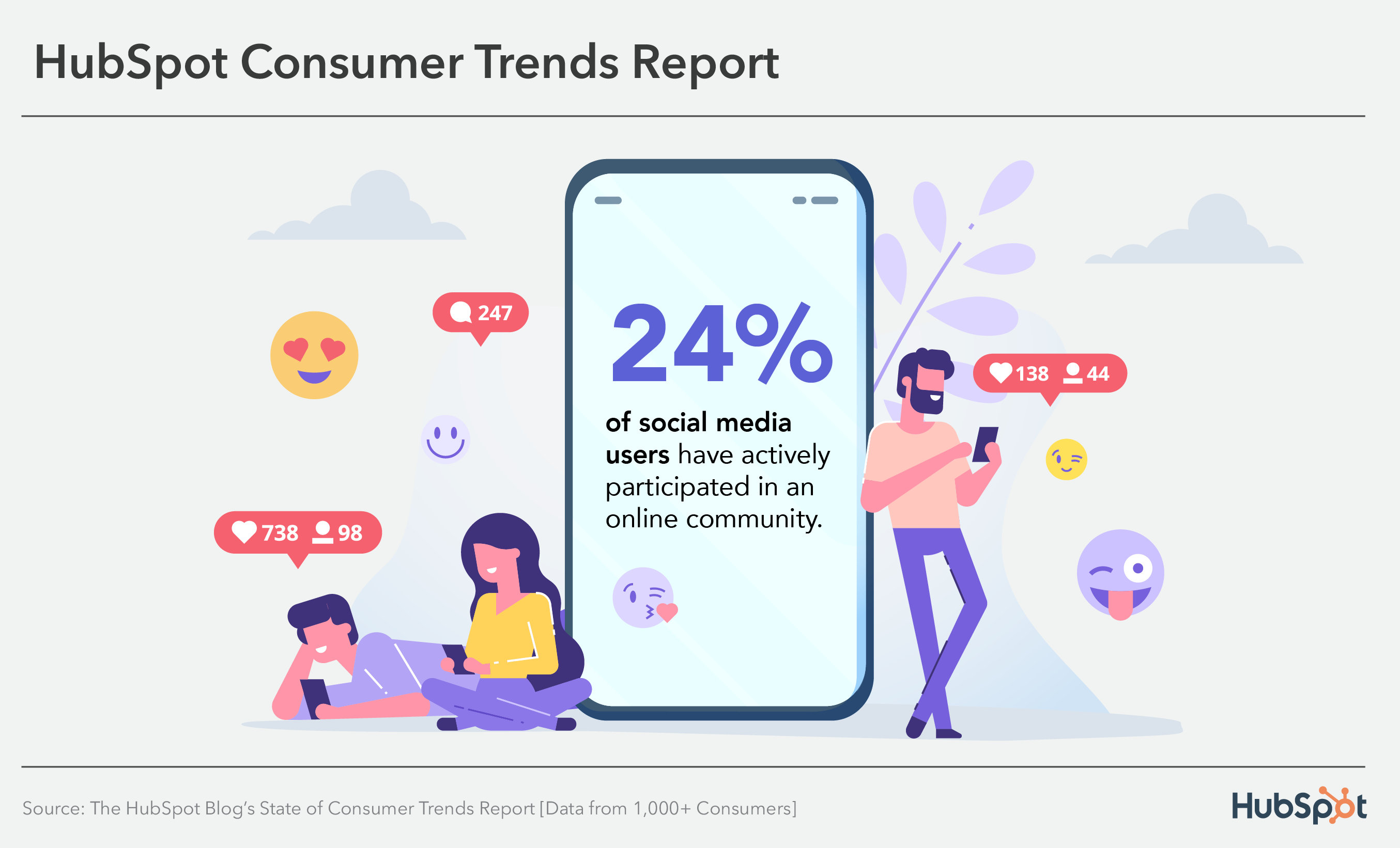 This post will delve into why consumers join online communities, the benefits they get from participating in them, and what this means for marketers.
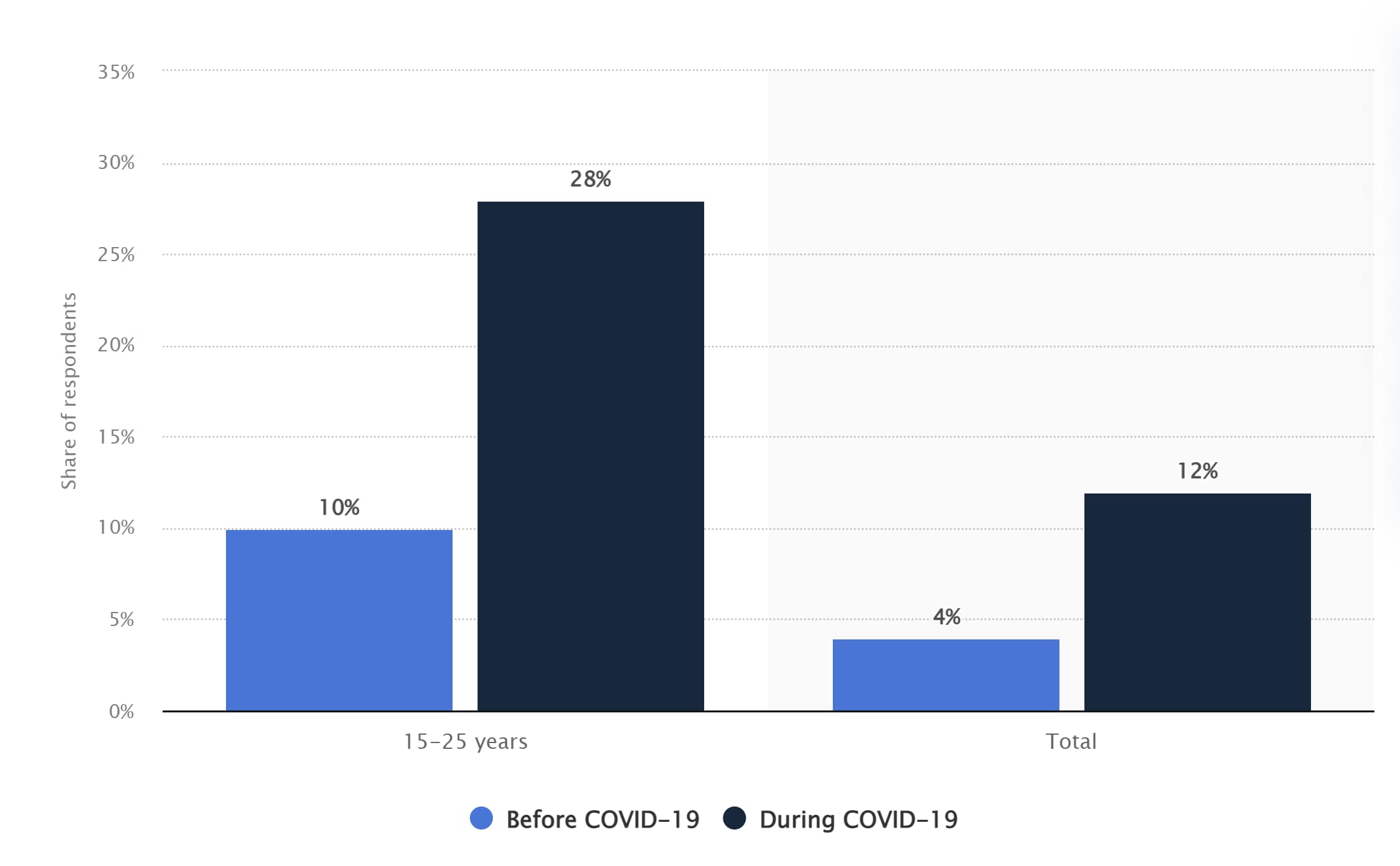
 Online communities are especially impactful for Gen Z, who value in-the-moment connection. In the past three months,





![→ Download Now: 80 Professional Bio Examples [Free Templates]](https://i4lead.com/wp-content/uploads/2022/09/4eb63650-d315-42e5-9ac7-8d0fcba29324-1.png)


 Harris’ resume uses photos to tell his personal story — and it reads kind of like a cool, digital scrapbook. It covers all the bases of a resume — and then some — by discussing his educational background, work experience, and skills in a highly visual way.
 Rubens Cantuni’s resume website hits all the right notes: First, it showcases what he does with a playful GIF showing the word “CIAO” getting edited point-by-point, just as it would in a design tool. Second, it summarizes Cantuni’s key strengths in a personable summary. Third, it lists his experience in a user-friendly collapsible format, so if you want to read more, you can click each individual role. He then leads into his book and portfolio.
 Martine Myrup’s website comes up twice on this list — first, as one of the best resume websites, and second, as one of the best portfolio websites we’ve ever seen. As a practicing artist, Myrup must emphasize visuals in her website’s design. But she also includes an HTML curriculum vitae for potential employers and other interested parties to see her degrees, exhibitions, awards, and publications.
 Taylor Vowell’s resume website is an excellent example of how to introduce yourself in a personable way while highlighting your professional experience. He begins with a summary about his personal life: “I am a father of 3, an avid comic and sports card collector, and a huge Avs and Broncos fan.” That draws readers in immediately and gives them a way to break the ice when they reach out to Vowell.
 Johannes Schüchner’s film resume website is an example that demonstrates how to showcase your creativity and personality while still highlighting your most important professional achievements. While the resume is in German, you can still get an understanding of the actor’s key strengths.
 José Rocha is a designer who uses delightful
  Hugo Bazin is a product designer whose resume website combines friendliness with engaging user design. On the top left-hand corner, he includes a sticky button to download his resume in PDF format, but if you’re interested in getting an overview, you can scroll down to the “Experience” section, where you can see his current and previous employers.
 Christian Kaisermann’s resume website employs unique visuals to keep viewers on the page and showcase his strong coding skills. On the upper right-hand side, you have the option to switch from channel to channel, like you would on an old TV. He also only includes two paragraphs of copy on the homepage, showing that remaining brief is key if you want visitors to focus on your website’s design.
 Halpin’s portfolio is short, sweet, and to the point, which is authentic to his voice and personal branding outlined on the site. Instead of a lot of copy, Halpin presents large thumbnail cards so that his projects speak for themselves and allow the user to delve deeper if one catches their eye.

 When you’re a designer, not one pixel on your personal website should go unused. Verena Michelitsch’s portfolio, shown above, is covered end to end in artwork. From her extensive library of work, she chose to exhibit multiple colors, styles, and dimensions so visitors can see just how much range she has as a designer. It’s a perfect example of the classic adage, “show, don’t tell.”

 Daveid’s website is a great example of “less is more.”
 This freelance videographer is another example of a simple but sleek portfolio, allowing his potential clients to browse deeper into his “Work” and “Stills” sections. The opening video on the homepage — as shown on the still image above — also ensures his site visitors know that he’s actively creating beautiful work.
 In his portfolio, Byron McNally doesn’t immediately include his work but rather a photo of himself, which immediately fosters a connection between him and website visitors. This minimal website design also invites users to continue engaging with the website’s content and see some of his recent film, commercial, and music productions.
 Martine Myrup was also in our list of best resume websites, but her portfolio is worth a mention, too. With its muted colors and creative use of typography, it immediately conveys her artistic vision and aesthetic. The page also includes a sticky bright green button prompting you to check out her CV. As you scroll down the page, you can see a preview of her work and click on the one that most interests you, then get in contact with her using the email at the bottom.
 Davide Perozzi uses his website to showcase his strong design skills and creative typography, as well as his previous work. When you hover over each item in his portfolio, an image preview pops up, giving you the opportunity to check out more. The website uses scrolling effects and bold text to keep viewers engaged.

 The website fifty coffees chronicles the author’s series of coffee meetings in search of her next job opportunity, and it does a great job of using photography and visuals to assist in the telling of her lengthy stories.
 I’m not highlighting Dana’s food blog just because the food looks delicious and I’m hungry. Her blog uses a simple white background to let her food photography pop, unique branding to make her memorable, and mini-bio to personalize her website.
 Mr. Money Mustache might take on an old-school, Gangs of New York-style facade, but his blog design — and the advice the blog offers — couldn’t be more fresh (he also doesn’t really look like that).
 Marco Feng’s travel blog is colorful, unique, and informative. When you arrive at the site, you can immediately jump in to the blog post that draws your attention the most, or explore by destination. Our favorite part of the site is the scrolling banner at the top that provides social proof: As a reader, you’d be joining 3 million others. Leveraging your audience size will help you look more authoritative and establish your site as a go-to.
 Miramono is a unique photography blog created by
  This blog combines engaging visual design with user-friendliness. Since Japanese is written vertically, the home page includes a series of vertical cards, each for a different blog post. You can then click on each card to expand a specific post. The writer divides his musings into three categories: Make, Think, and Jumble. He discusses his personal life at home as well as his life at work, epitomizing what a personal blog should contain.
 Salt in Our Hair is a travel blog with exceptional user design. The bloggers, Nick and Hannah, introduce themselves on the welcome screen. Users then have the option of choosing a specific destination to read about or finding a specific topic using the menu up top.
 Daniel See uses the blog section of his website to share his thoughts on design. As a designer, he uses his subject-matter expertise to write blog posts about creative processes. He also prompts readers to submit their feedback and ideas by including a button to “let him know your thoughts.”
 Tonnina is showcasing advanced and complicated web development skills, but the images and storytelling methods he uses are simple and easy to understand. In the process, you get a demo of the depth of his animation and coding experience.
 Leonardi’s incredible demo website uses animation and web development skills to turn his portfolio and resume into a video game for site visitors. The whimsical branding and unique way of sharing information ensure that his site is memorable to visitors.
 Reed uses his page as a start-to-finish demo of how to code a website. His website starts as a blank white page and ends as a fully interactive site that visitors can watch him code themselves. The cool factor makes this website memorable, and it makes his skills extremely marketable.
 Renaud Rohlinger’s demo site does a great job of showing his 3D design chops, and it takes it a step further by telling visitors all about him and his passions. It’s the perfect balance of a demo and a mini-portfolio.
 Enric Moreu showcases his 3D design skills by creating an interactive 3D resume. As users scroll, the page smoothly takes them through Moreu’s spoken languages, coding languages, skills, and work experiences. It’s engaging, light on text, and visually striking.
 Mariah Weathersby has coded a striking “playable” resume that pays homage to old-school games and showcases her strong design skills. If you love experiencing nostalgia, this demo website will reel you in. If you only want the resume, you have the option of downloading a text-based version — a win-win.
 Isaac Fayemi’s demo website is subtle and striking at the same time. Rather than loading the page with excessive graphics, he has created a 3D version of his head that follows your cursor as you move around. You have two options: To find out more about him or check out more of his work. This demo website is a stellar example of how to keep it simple while still delighting the senses.
![Download Now: Free State of Marketing Report [Updated for 2022]](https://i4lead.com/wp-content/uploads/2022/09/b0f73a5e-16e4-41fd-9511-8564efc560a7-1.png)


