Categories B2B

The 23 Best WordPress Video Themes in 2022

If you produce video content or sell video footage, the right WordPress video theme will allow your content to shine. You’ll also create a compelling experience for your visitors the moment they enter your site.

Are you looking for a WordPress video theme to put your video content on full display? There are a lot of WordPress Video themes out there to choose from. But not to worry, we did the legwork for you. Explore this list of 16 WordPress video themes (in no specific order) to help you choose the best theme for your site.

Grow Your Business With HubSpot's Tools for WordPress Websites

We’ll break down our list by the following categories:

Before you continue, you can also watch this useful video on WordPress video themes from
themesCode:

Multi-Purpose Video Themes

These WordPress themes aren’t wholly video-focused. However, they have solid and unique video-related features. These themes are ideal for anyone who doesn’t need their website to revolve around their videos and would benefit from a wide range of additional features.

1. Revolution Pro

wordpress video themes in 2022, revolution pro

Revolution Pro is a responsive, minimalist theme that focuses on your content. It’s built on the Genesis Framework, known for its speed and ease of configuration. It’s compatible with the Gutenberg editor, so you can easily embed videos using the Video block.

Revolution Pro also comes fully configured with HubSpot upon installation, so you’ll be set up with HubSpot’s marketing and CRM tools from the start. If you’re already a WP Engine hosting plan user, you get free access to all other StudioPress themes.

Core Features

  • Section video backgrounds
  • Video transitions included
  • Slider feature

2. Bridge

wordpress video themes 2022, Bridge

Bridge is a multipurpose, creative theme for sharing videos with your customers. Bridge comes fully featured with multiple options for integrating your video content via sliders, overlays, and more. For example, you can use section video backgrounds to make your video take up the entire screen width for an immersive experience.

You can also add different transitions, like fades, animations, and more to the beginning or end of your videos. The video slider feature lets you place multiple video clips in one section so visitors can slide right and left through all of your clips.

Core Features

  • Gutenberg compatible
  • Fully configured with HubSpot’s free suite of marketing and CRM tools
  • Minimalist design to highlight your videos

3. Brooklyn
wordpress video themes 2022, Brooklyn

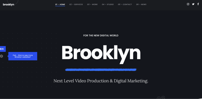
Brooklyn is a multi-purpose WordPress video theme that can make a beautiful site for any type of business. Brooklyn is renowned for its drag-and-drop editor, which makes adding video content to your site a breeze.

In addition, there are options to feature photo and video galleries on different website pages and create fullscreen video backgrounds. There is also a video widget to make adding, editing, and formatting your website’s videos quick and straightforward.

Core Features

  • Drag-and-drop page builder
  • Video galleries
  • Fullscreen video backgrounds

Blogging Video Themes

If you’re a video blogger, these themes are for you. They’re built for people who want to include written blog content alongside videos on their website.

4. Videoblog
wordpress video themes 2022, Videoblog

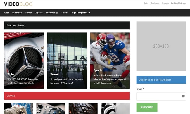
Videoblog is a blog and magazine video theme that allows you to list your latest or featured posts on your homepage. Videoblog is a traditional style theme that focuses on readability and content. The design is intuitive, and customers will appreciate the familiarity of the two-column layout format.

Core Features

  • Ideal for blogs and magazines
  • Latest and featured posts listed on your homepage
  • Two-column layout

5. Video by Templatic
wordpress video themes 2022, Video by Templatic

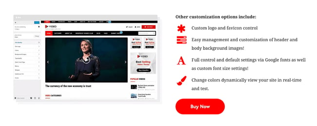
Video by Templatic is a mobile responsive WordPress video theme that is an excellent choice for creating blogs with video content as the primary focus. This theme makes it simple to add video and other content types. You can also manage your posts with categories and sub-categories.

With Video by Templatic, you’ll have deep customization abilities, automatic thumbnail generation, and the option to let users submit and upload video content from the front end.

Core Features

  • Automatic thumbnail generation
  • WooCommerce compatibility
  • Real-time customizer feature

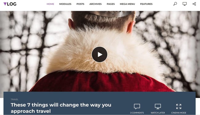
6. Vlog

wordpress video themes 2022, Vlog

Vlog is a WordPress video theme optimized for blog and magazine content, with a focus on videos. The theme is compatible with YouTube, Vimeo, and Dailymotion to simplify sharing your video content.

You can group your videos into playlists to keep related content together, so it’s easy to find for your visitors. You can also quickly set your video’s thumbnail as your featured image with a click.

Core Features

  • Created for blogs and digital magazines
  • Compatible with YouTube, Vimeo, and Dailymotion
  • Can group videos into playlists

Portfolio and Photography Video Themes

If you want to share your portfolio, feature your videos and photos in a gallery, and possibly sell your work straight from your website, these themes may suit your needs.

7. Fargo
wordpress video themes 2022, Fargo

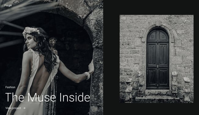
Fargo is a WordPress theme marketed toward wedding photographers. It is an elegant theme that certainly lends itself well to that. However, the theme’s photo sharing and portfolio features would benefit any type of photographer looking to show off their work.

Fargo’s Smart Galleries allow you to move from written content to photo content to video content seamlessly. In addition, Fargo’s flexible navigation includes customizable transitions that create an interactive, 3D experience for your visitors while they browse your different site pages.

Core Features

  • Created for sharing photography and video content
  • Smart Galleries
  • Flexible navigation with customizable transitions

8. Inspiro PRO
wordpress video themes 2022, Inspiro PRO

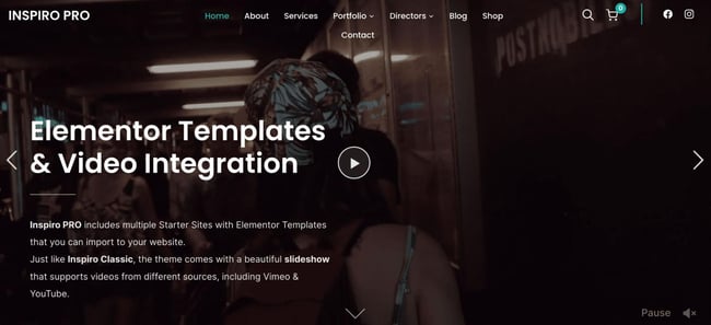
Inspiro PRO is a professional portfolio theme based on the Elementor page builder, a drag-and-drop website builder plugin. If you already use the Elementor page builder, Inspiro PRO could be a great option.

This theme provides excellent features for photo and video professionals to show off their work in style. It’s user-friendly and features many custom modules, dynamic elements, and video features. That includes video backgrounds and play-on-hover videos. It is also fully compatible with the WordPress Gutenberg editor.

Core Features

  • Built for professional photo and video creatives
  • Custom, fullscreen slideshows, and videos
  • Based on the Elementor page builder plugin

9. Pronto

wordpress video themes 2022, Pronto

Pronto by Flothemes is an elegant WordPress theme for displaying your photography online. Pronto is fully integrated with the Gutenberg editor and comes stocked with a complete library of Flex blocks, or content blocks from Flothemes’ proprietary drag-and-drop editor plugin.

Unlike other themes on this list, Pronto is offered on a subscription basis, making it a little more expensive. However, the extra cost is worth it for the access to premium support and full integration of Flothemes’ features and designs.

Core Features

  • Elegant and minimalist design
  • Premium support with a subscription
  • Access to Flothemes templates and starter sites

Filmmaking Video Themes

Videographers, directors, and producers may benefit from these WordPress themes. They have layouts and customizable options for sharing and displaying videos of many lengths, topics, and genres.

10. Cinerama
wordpress video themes 2022, Cinerama

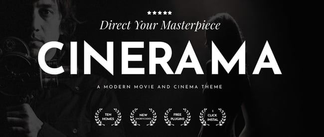
Cinerama is a premium WordPress video theme by the makers at Edge Themes. Cinerama is focused on videographers and filmmakers, allowing them to create beautifully designed portfolio sites. The theme features a variety of custom shortcodes, an easy-to-use admin interface, and video carousel functionality. Cinerama makes it simple to present your video content in an attractive and eye-catching manner.

Core Features

  • Ideal for videographers and filmmakers
  • Extensive collection of custom shortcodes
  • Retina-ready

11. Pelicula

wordpress video themes 2022, Pelicula
Pelicula is another premium WordPress offering from Edge Themes. This modern portfolio design is great for the film industry and video production pros. The theme comes fully stocked with 13 pre-designed, attractive homepages so you can get your site up and running quickly.

In addition, it is fully compatible with the Elementor Page Builder plugin so that you can create new site pages rapidly with a drag-and-drop interface.

Core Features

  • Ideal for film industry professionals and videographers
  • Compatible with Elementor Page Builder plugin
  • Parallax effects and infinite scroll functionality

12. Superflick

wordpress video themes 2022, Superflick

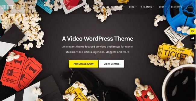
Superflick is another video-oriented WordPress theme for movie studios and video professionals. Despite this, Superflick is robust enough to meet the needs of all types of creatives, vloggers, agencies, or anyone looking to display their video work in an elegant portfolio format.

Superflick is responsive, retina ready, and comes ready to go out of the box. The theme also offers advanced customization options so users can build bespoke websites for themselves or their clients.

Core Features

  • Created for showcasing video work
  • Over 100 pre-made site page templates
  • Highly rated customer support

13. Silverscreen
wordpress video themes 2022, Silverscreen

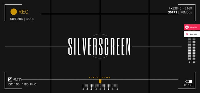
If you are a filmmaker or production company, Silverscreen can help you showcase your movie projects and video work. Silverscreen comes stock with stunning parallax scrolling effects, a variety of distinct homepages, and practical inner website pages for displaying awards and portfolios. If you are serious about cinema, Silverscreen might be your theme!

Core Features

  • Ideal for movie and video producers
  • Fullscreen video backgrounds
  • Smooth parallax effects

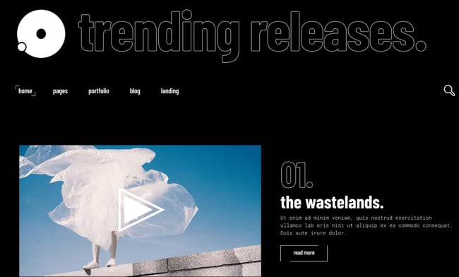
14. Leitmotif

wordpress video themes 2022, Leitmotif

Leitmotif is a modern WordPress theme for film and cinema. If you are an independent filmmaker or simply enjoy the indie aesthetic, Leitmotif might be for you. The theme is simple to use and easy to set up. Plus, it features all the bells and whistles you can expect from similar themes above.

Leitmotif is also a good option for music festivals, portfolios, or any creative project you want to showcase. There are many film-centric WordPress video themes on this list, but we think Leitmotif’s edgy and cool design aesthetic sets it apart from the rest.

Core Features

  • Modern design aestetic
  • WooCommerce Integration
  • Smooth parallax effects

Creative Video Themes

Creative video themes are versatile and flexible enough for various industries. However, they’re still all explicitly created for video-based websites.

15. VideoPro
wordpress video themes 2022, VideoPro

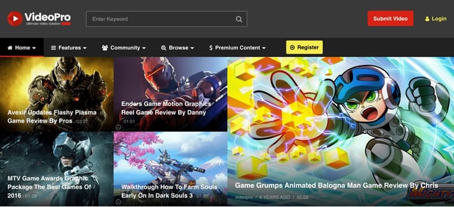
VideoPro is a creative video theme with a responsive design and layout options ideal for various video types. This theme can showcase movies, games, news, entertainment, education, and more.

In addition, VideoPro integrates with sites like YouTube and social media platforms such as Facebook. Here, you can easily embed, import, and share your content. VideoPro also has a feature that allows you to create a multi-episode video series on your website — displaying related videos below whatever is being watched by a visitor at any given moment.

Core Features

  • Responsive design
  • Video and social media integrations included
  • Multi-episode video series feature

16. VideoBox

wordpress video themes 2022, VideoBox

VideoBox is an excellent solution for anyone looking to show off their video or audio content. The theme features an attractive video slider as the homepage’s main attraction to capture site visitors’ attention.

VideoBox is a straightforward and easy-to-use WordPress video theme option that is intuitive enough to suit a variety of business needs. Plus, it’s compatible with WooCommerce and is fully responsive.

Core Features

  • WooCommerce integration
  • Homepage slider
  • Minimalist design with a dark color scheme

17. Pisces
wordpress video themes 2022, Pisces

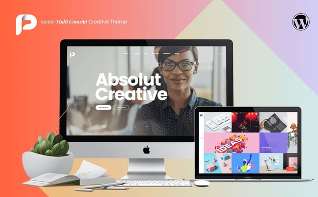
Pisces is a multi-concept creative theme flexible enough to suit almost all website-related needs. You can create portfolio pages, business sites, share video content, or sell products with their WooCommerce integration. Pisces features an intuitive drag-and-drop website builder, making it an easy-to-use WordPress theme solution.

Core Features

  • Responsive design
  • Video and social media integrations included
  • WooCommerce integration

18. Oshine

wordpress video themes 2022, Oshine

Oshine is a creative, multi-purpose WordPress video theme that can do it all. It is a trendy theme with over 30,000 customers, for a good reason. This solid theme handles video content beautifully and can help you create almost any type of website with style. It’s super customizable, WooCommerce ready, and comes stock with smooth AJAX animated transitions available.

With 100s of pre-built sample pages, 52 demo sites, and an entirely visual page builder, your options are limitless with Oshine.

Core Features

  • Highly versatile
  • Top-rated and frequently updated theme
  • WooCommerce integration

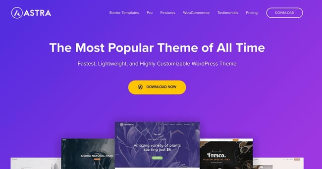
19. Astra

wordpress video themes 2022, Astra

Astra is an extremely popular WordPress theme that you can use to create virtually any type of website. Astra is renowned for being fast and lightweight, with a 100% speed score on Pingdom and a 91% speed grade from Yslow. When using Astra, you never have to worry about your site’s load time being an issue. Astra’s drag-and-drop page builder makes customization a breeze, but if you want to take a more straightforward approach, you can drop in any of their 230+ pre-built websites to get started.

Core Features

  • Highly versatile
  • Best-in-class speed and load times
  • WooCommerce integration

Streaming and Membership Themes

Streaming and membership themes allow you to create websites with subscription tiers to host your premium content. Check out four options to get you started.

20. Vayvo
wordpress video themes 2022, Vayvo

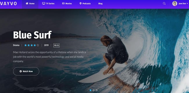
Vayvo by Progression Studios is a media streaming and membership theme that you can use to create a video or audio streaming website akin to Netflix or HBO Go. Using Vayvo, you can create subscription tiers for members to access your premium content.

In addition, you can make free trials and restrict access to certain content based on membership tier. For a fully featured and powerful theme, Vayvo is simple to use and easy to set up. So, if you are a content creator or podcaster looking to create a gated membership community for streaming your premium content, look no further than Vayvo.

Core Features

  • Media streaming and membership theme
  • Subscription tiers and free trials
  • Tablet and mobile friendly

21. Streamit
wordpress video themes 2022, Streamit

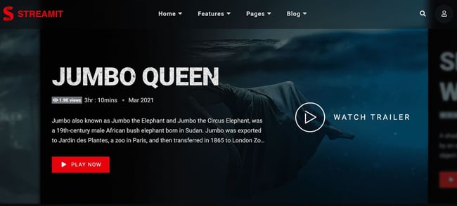
Streamit is a WordPress streaming and membership theme similar to Vayvo. It offers the ability to create a premium streaming environment for your content, be it movies, shows, web series, or podcasts.

Streamit is integrated with WooCommerce, so you can create an online store. Here, fans of your content can buy branded merchandise. We like the dark and impactful design of Streamit and the easy-to-use drag-and-drop page builder courtesy of Elementor.

Core Features

  • Media streaming and membership theme
  • WooCommerce integration
  • Elementor page builder

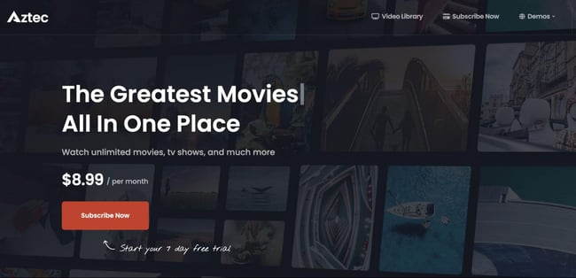
22. Aztec

wordpress video themes 2022, Aztec

Aztec is another WordPress streaming and membership theme that can help you monetize your videos via a subscription model. Like the above themes in the same category, Aztec is eCommerce integrated, features a drag-and-drop page builder, and supports third-party video and audio players.

One nice feature is the Pay-Per-Post option, which lets users purchase single content pieces at a time if they prefer not to sign up for a subscription.

Core Features

  • Media streaming and membership theme
  • Par-Per-Post ability
  • Advanced search functionality

23. ViewTube
wordpress video themes 2022, Viewtube

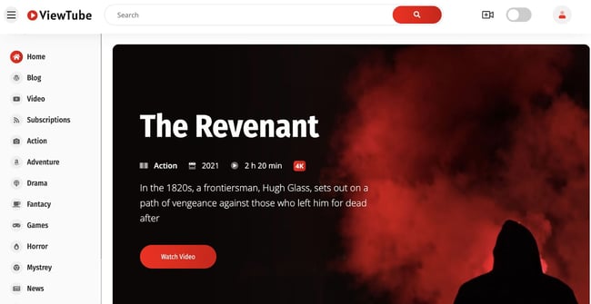
ViewTube is a WordPress video streaming theme that takes some not-so-subtle design inspiration from YouTube. If you want to create a YouTube-inspired streaming website, then ViewTube is the answer.

This theme is designed to host a large amount of user-uploaded content. For example, it can help create a company-wide knowledge base or a custom submission site for video auditions. ViewTube is highly customizable, so you aren’t stuck with the red-and-white YouTube vibe if you want to change things up.

Core Features

  • YouTube-inspired streaming theme
  • Can handle large libraries of video content
  • Elementor page builder

Choose the right video theme for WordPress.

WordPress video themes allow you to display your content, mix and match your videos with photos and written content, sell your content, and more. Whatever your needs, there is a video theme that will work for your WordPress website.

Try installing one of the themes above, or check out the number of other video themes in the WordPress theme library. By applying your unique content, you can create a website that works for your business needs.

Editor’s note: This post was originally published in December 2018 and has been updated for comprehensiveness.

Use HubSpot tools on your WordPress website and connect the two platforms  without dealing with code. Click here to learn more.

Categories B2B

What to Post on Instagram: 18 Photo & Video Ideas to Spark Inspiration

Instagram isn’t just a go-to social network for individuals anymore. Many marketers have caught wind that it’s a powerful social network where they need to have some sort of presence.Access Now: 22 Free Business Instagram Templates

The platform’s heavy emphasis on visual content like photos, videos, illustrations, and GIFs is becoming a critical way for brands to communicate their story and message. Plus, it’s an excellent way for businesses to humanize their brand, recruit future employees, showcase their products and content, and delight and engage customers.

Check out these 18 ideas for videos, photos, and other content you can post on Instagram. (And for more inspiration, check out our list of the best brands to follow on Instagram.)

18 Content Ideas for Videos, GIFs & Photos to Post on Instagram

1. Behind-the-Scenes Content

Instagram is a great platform for humanizing your brand, and giving your audience a sneak peek at what goes on behind the scenes is one way to do that. It’s also a good way to show followers what it’s like to work there, which is great for your recruiting efforts.

Here’s an example from the Boston Red Sox, showing what batting practice looks like close-up (with a really cool, fish-eye shot).

red-sox-instagram-behind-the-scenes.jpg

Image Source

And here’s one from a small arts and crafts store called Cherry Tree Beads. We love how this one uses the hashtag #employeetakeover to share one of the faces behind the brand, giving followers the chance to get to know who’s on the inside.

An Instagram post by Cherry Tree Beads showcasing one of their employees.

Image Source

Pro Tip: Posting candid photos of your work environment can help humanize your business and allow your customers to connect with your employees, which can translate into stronger brand loyalty.

2. User-generated Content

Some of the best photos on brands’ Instagram accounts are curated by fans and followers. (In fact, FedEx‘s Instagram feed is almost entirely made up of curated photos.)

Check out the posts people have tagged you in, and if you love them, consider reposting them to your followers. Not only does it make the original poster feel good, but it also shows everyone that you’re listening to your fans. Just be sure the photos you’re reposting are high-quality and that you @-mention the original poster in your caption.

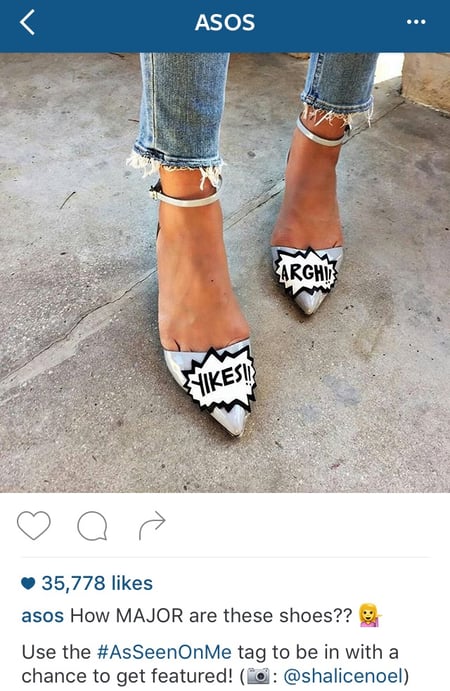
Here’s a reposted image from ASOS. Take note of how they write the caption: They write an entirely new caption, which includes a tidbit on how their followers can get featured on their Instagram page (by using the hashtag #AsSeenOnMe). Then, they credit the original poster using the camera emoji and the poster’s username.

asos-instagram-repost-followers.jpg

Image Source

To repost a photo on Instagram, you can simply screenshot and crop it. You can also repost a photo to your Instagram story by tapping the share icon below the post you want to repost and tapping “Add video to your story.”

3. Inspirational or Motivational Quotes

Some people poke fun at the number of quotes on Instagram. But if you post them sparingly, they tend to encourage your followers. If the post speaks to your audience, people love to share it and tag their friends in the comments. Quotes are also a great opportunity to share what your brand stands for, whether it’s spiritual, inspiring, funny, or something else.

To create a quote image, you’ll want to download an app that lets you upload a photo and overlay it with text. Here are some good ones:

  • Canva: A free app that you can use to create graphics with text overlays to share on social media.
  • Phonto: A free app that you can use to overlay text on photos with text resizing, alignment, and positioning tools.
  • Snapseed: A free app with professional photo editing tools that pairs fonts with different photo filters.

You can also create a quote post through your Instagram story. To create a quote post on your Instagram story, simply upload an image from your gallery to use as a background and add a text overlay of the quote.

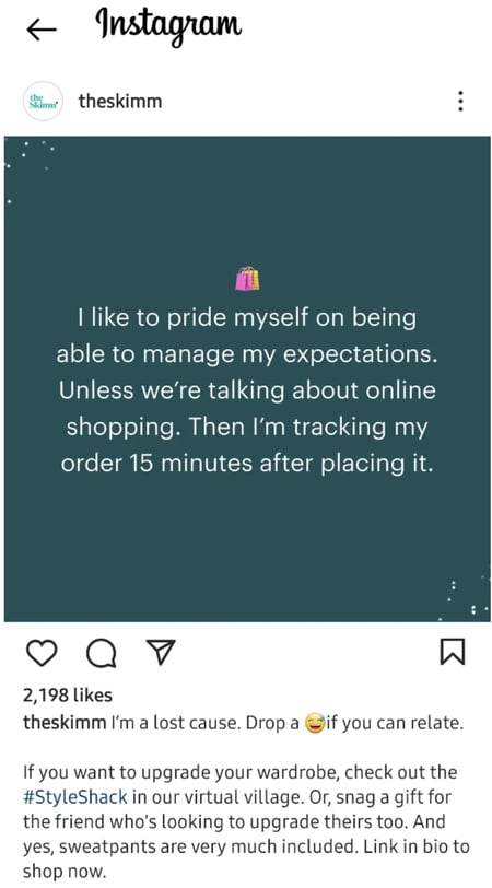
Here are a few examples of quotes done well, starting with this one from TheSkimm. The key to this post’s success is that it’s hilarious to their specific audience — which shows that the quote doesn’t have to be fancy to delight people.

what to post on instagram: inspirational quote from the skimm

Image Source

Here’s a more beautifully designed quote from activewear brand Lorna Jane, which carries an empowering message from their founder:

An Instagram post by activewear brand Lorna Jane with the quote, "To be beautiful is to be yourself." by Lorna Jane.

Image Source

Pro Tip: Want to play around with words and images? WordFoto is a $2 app that lets you turn your pictures into images made of words instead of just adding words on top of photos.

what to post on instagram: wordfoto app image

Image Source

4. Interesting Statistics

Another cool way to overlay text on an image is by posting a statistic that resonates with your audience. Try using statistics from your own research or finding some relevant to your message, your value proposition, and so on. (Read this blog post to learn how and where to find accurate, compelling data.)

Here’s an example from the meditation app Headspace, with a simple text box overlaying a colored, nondescript background.

headspace instagram statistic post

Image Source

5. Timely or Current Events Posts

Is something cool happening in the world or the country where your target market lives? A specific holiday? National Puppy Day? Get in on the action by posting something delightful. Remember to use good judgment when newsjacking — the last thing you want to do is publish inaccurate information or offend anyone.

What are some examples of delightful, timely posts? Here’s one from a Mediterranean restaurant called Cava Mezze Grill to celebrate Halloween.

An Instagram post by Cava Grill of a dog dressed as a pita for Halloween.

Image Source

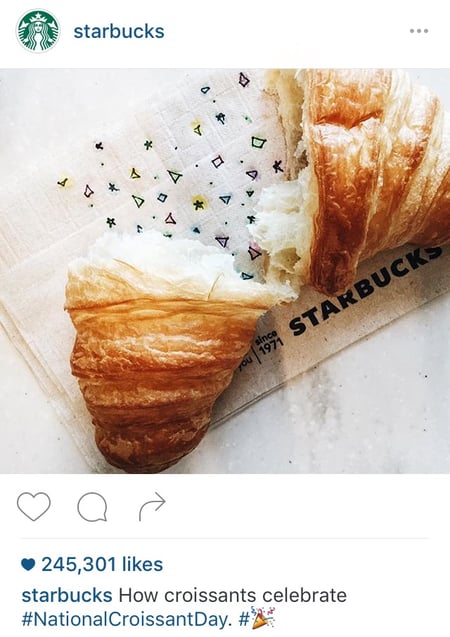
And here’s a fun example from Starbucks for National Croissant Day.

starbucks instagram post for national croissant day

Image Source

Pro Tip: Set up Google Alerts to get notified of breaking news related to your business’s industry. News stories are a great source of inspiration for timely social media posts.

6. Humorous Images or Videos

If you can make your followers laugh, they’ll likely enjoy your photo — and may even share it with others. After all, sometimes the most memorable photos are the ones that make us laugh.

Try posting photos and images you think will make your audience laugh like Oreo did with this fake text message conversation with “Milk.”

An Instagram post by Oreo of a fake text message conversation with "Milk."

Image Source

Here’s another example from BuzzFeed Parents, which shows how simple a super shareable post can be.

An Instagram post by Buzzfeed Parents that says "Welcome to parenting. Your house will never be clean again."

Image Source

And in this one from Pabst Blue Ribbon. All they did was put an empty case of Pabst beer on a dog’s head, and it worked like a charm.

An Instagram post by Pabst Blue Ribbon of a dog with an empty case of Pabst beer on its head.

Image Source

7. Compelling Drawings or Graphics

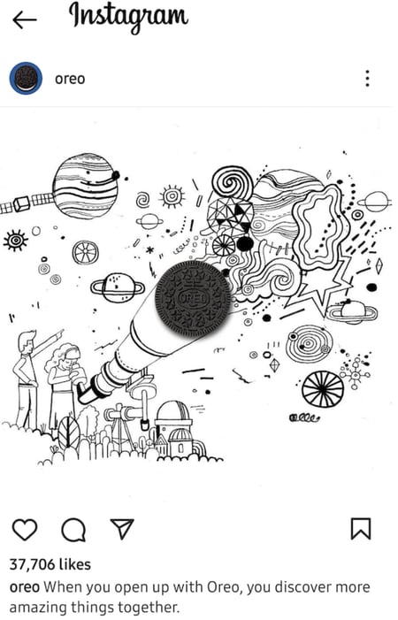
Have any artists on your team? One way to stand out in a sea of images is to post a cool, compelling illustration. They don’t even have to be super fancy — check out this simple, black-and-white example from Oreo:

An Instagram post by Oreo of an illustration of two kids. One kid looking through a telescope to see planets and different shapes and the other is pointing to the shapes. The lens of the telescope is an Oreo cookie.

Image Source

Here’s a more complex one from Pabst Blue Ribbon:

black and white drawing from Pabst instagram post.

Image Source

8. Content Promotions

Beautiful images are critical to your Instagram marketing strategy because they tell a story and draw people in. Colored visuals increase people’s willingness to read a piece of content by a whopping 80%.

So if you’re creating a piece of compelling written content like a recipe, a report, or a blog post, why not use a visual platform like Instagram to promote it?

Simply pair an interesting and relevant image with a caption that promotes the content, and then ask people to follow the link in your bio or post description. (Again, be sure to make that link trackable.)

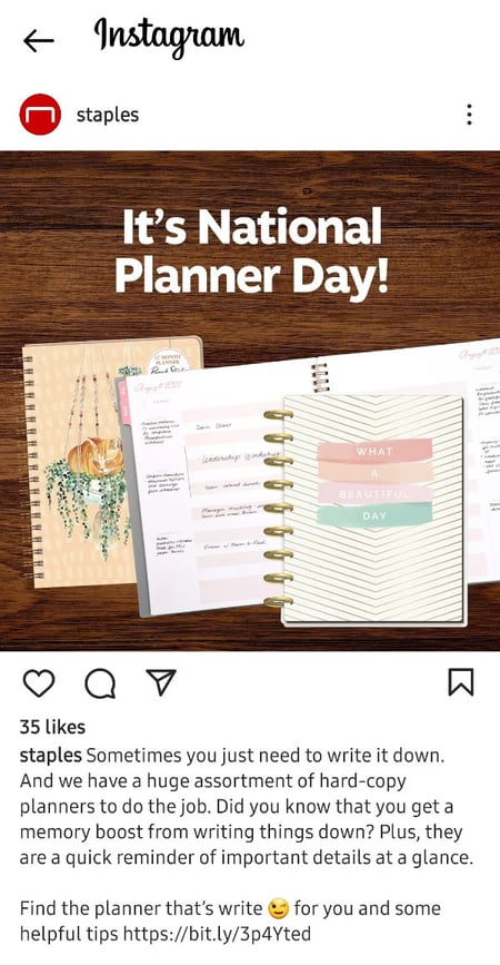
Here’s an example from Staples that promotes their hard-copy planners for National Planner Day:

Staples promotional Instagram post for National Planner Day.

Image Source

And here’s an example from Nature’s Path Organic, which shows off the finished product of a recipe that’s linked in their bio:

Natures Path instagram post showcasing recipe photo

Image Source

9. Product Promotions

Instagram isn’t the place to publish product-centric posts every day — but that doesn’t mean you can’t use it to showcase products every once in a while. We suggest using the 80/20 rule on social media: 80% of the content you post to social media should be helpful and valuable to your audience, and 20% can be self-promotional.

Making promotional content that’s fun, compelling, and lovable is even more important when posting on Instagram. To highlight a specific product, post a picture or video about it, and then tell people where they can find the product using the product names and codes or a trackable link in your bio.

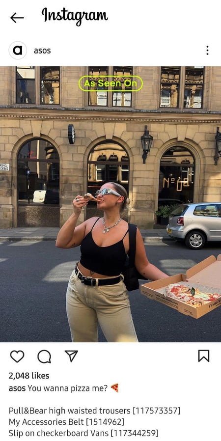
Here’s an example from the online clothing company ASOS. (Check out how casual and cool the caption is.)

A product promotion Instagram post by Asos.

Image Source

Here’s another one from Frank Body, which uses an image and some humor in the caption to pique followers’ interest in the product without being overly promotional.

An Instagram promotion by frank_bod of shiny brown fabric. The caption reads, "Your skin after you win The Golden frank and spend a week frolicking in Thailand and scrubbing with me. See the link in my bio for details. #thegoldenfrank"

Image Source

Pro Tip: When you post is almost as important as what you post. We suggest posting to Instagram on Saturdays in the mid-to-late afternoon.

10. Compelling Videos, Reels, and Stories

Instagram users can record and upload videos up to 60 seconds long, reels of multiple video clips that are each up to 15 seconds long, and stories composed of images and short videos that disappear after 24 hours.

When executed well, videos, stories, and reels are a great way for your Instagram content to stand out. You can record a video from scratch (including recording multiple video clips) or upload videos to your feed, stories, or reels from your phone’s library the same way you’d upload a photo.

Pro Tip: By default, every Instagram video will start playing without sound — after which viewers can choose whether or not to turn the sound on. Because of this, you’ll need to upload videos that don’t need sound to be well understood or entice people to turn the sound in the first second or two.

Here’s a great video from Purina that delights viewers with some cute puppy love.

11. Hyperlapse Videos

Want to use video to stand out from the crowd while also solving for your followers’ short attention spans? Try creating a Hyperlapse video.

Hyperlapse is a free app by Instagram that condenses videos into brief, moving, hyper-speed videos. The videos use built-in stabilization technology to film these time-lapse videos without keeping your hands still. (Want to make your own? Here are step-by-step instructions.)

Here’s one of our favorite examples, which comes from Starbucks.

12. Fun, Lighthearted GIFs

GIFs are everywhere nowadays, and people love them because they help accurately convey ideas, messages, thoughts, and feelings in a snackable (and often laughable) way. On Instagram, you can upload a GIF just like a video (as long as it’s less than 60 seconds long).

Check out the examples of GIFs on Instagram below for some inspiration. (Click here for instructions for creating your own animated GIF using Photoshop.) Here’s an example from Staples.

And one from Starbucks.

13. Contests and Giveaways

Are you trying to support the launch of a new product? Contests are one of the best ways to expand your reach and engage your community on Instagram. A study by Tailwind found that hosting an Instagram contest or giveaway can help you grow your followers 70% faster over three months than not holding a contest.

Instagram doesn’t make capturing leads and information from your followers easy, but a contest or giveaway is one way to do it.

Just be sure to call your followers to take action by using the space in your caption to explain the contest and even guide them to a link in your bio.

Pro Tip: Make the link trackable so you can see how much traffic your Instagram post is driving. Learn how to add a trackable link to your Instagram bio by reading #6 in this blog post.

There are many, many different types of contests you can post on Instagram. Here are a few ideas, starting with the one below from Social Print Studio. Their call-to-action asks for comments on the post, from which they’ll choose winners.

contest example from social print giveaway

Image Source

Here’s one from Root Well Being Studio asking people to enter a contest by liking the post and following their account. Participants can earn an extra entry by sharing the post to their Instagram story and tagging Root Well Being Studio.

An Instagram post by Root Wellbeing Studio asking people to enter a contest.

Image Source

14. Mosaics

Not many brands use this tactic, but it’s a really cool, unique user experience. It’s also a clever way to get users to visit your business’ account page.

Most of your followers won’t look at your Instagram photos from your account page, as they’ll typically look at them in their Instagram feed.

When you start scrolling through the images below from MyStory Wiesbaden in your feed, it may take you a second to figure out what’s happening. MyStory Wiesbaden posted snippets of a tattoo, which is a cool teaser that entices you to go to their main account page, where you can see the full picture.

An Instagram photo mosaic of a back tattoo by MyStory Wiesbaden

Image Source

15. Asks to “Tag A Friend.”

While you can tag friends on Facebook and Twitter posts, it happens most regularly on Instagram. There’s a culture around tagging your friends if you see a post that resonates with you or reminds you of someone. This helps you both increase engagement and broaden your reach.

If you want to encourage your followers to share the post with others, sometimes all you’ve got to do is ask. In the caption, include a call-to-action asking people to tag their friends and give them a prompt to do so.

For example, the post below from Rent the Runway asks followers to “Tag your future RTR BFF!”

Instagram post below by Rent the Runway that asks followers to "Tag your future RTR BFF!"

Image Source

Our post below from HubSpot asked followers to tag their office coffee buddy.

Hubspot tag a friend instagram post example encouraging users to tag coworkers

Image Source

In this cute video from Headspace, they asked followers to tag someone they love to help celebrate Valentine’s Day.

Similar to asking your followers to tag a friend, you can ask them to “double-tap,” which is how your followers can like your photo or video. The standard language for a request like this is: “Double-tap if…”

In the example below from The Parentologist, she asks followers to double-tap if they’re looking for a last-minute gift for a parent, which is a fun way to engage her fans.

An Instagram post by The Parentologist that asks followers to double-tap if they are looking for a last-minute gift for a parent

Image Source

16. Reposts From Your Employees

Reposting your employees is an awesome way to showcase what happens behind the scenes at your company, while really helping your followers “bond” with the people who work there.

For example, the people behind the Boston Red Sox’s Fenway Park account often repost photos and videos from their grounds crew.

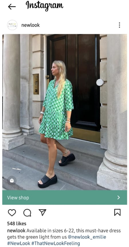
New Look has a really cool approach: They repost Instagram content from their employees, who function as brand lifestyle ambassadors with accounts specifically associated with New Look. Their deputy manager @newlook_georgia and their dress designer @newlook_emilie are a couple of New Look’s employees who act as brand ambassadors.

While the main New Look account posts mostly their own content, they often repost from their employees, like in the image below.

An Instagram repost by @newlook from their dress designer @newlook_emilie.

Image Source

17. Cross-promotion of Another Social Media Account

Cross-promotion of other social media accounts on Instagram is a great way to let your Instagram followers know where else on social media they can find you. That way, you can get your Instagram followers to become your followers on Facebook, Twitter, and so on.

18. “We’re Hiring.”

Finally, let your followers know you’re hiring every once in a while by posting a simple call-to-action on your Instagram page, including a trackable link to your jobs page in your bio.

Here’s an example of a “we’re hiring” post from Arey’s Pond Boat Yard:

An Instagram post by Arey’s Pond Boat Yard advertising a job opening as a seasonal service technician.

Image Source

Post Like A Pro

Now that we’ve gone over some tips to get your creativity flowing, it’s time to create a post of your own. Use these content ideas for Instagram to increase brand awareness and connect with your community in new ways.

Editor’s note: This article was originally published in October 2019 and has been updated for comprehensiveness.

New Call-to-action

Categories B2B

Google Ad Grants: Everything You Need to Know (+ 10 Helpful Tips)

If you’re a nonprofit, you should be a member of Google for Nonprofits, a program that includes a free membership and access to various products. One product that should be on your radar is Google Ad Grants.

With Google Ad Grants, qualifying nonprofits have access to up to $10,000 per month in search ads shown on Google.com. Nonprofits like DonorsChoose, Days for Girls, and We Care Animal Rescue all use Google Grants in their campaigns and drive more traffic through organic search.

Free Guide, Template & Planner: How to Use Google Ads for Business

You can use Google Grants to:

  • Reach donors, volunteers, and consumers when they’re searching keywords relevant to your nonprofit
  • Raise awareness by choosing relevant keywords and creating unique ads to highlight your work
  • Track online donations, newsletter sign-ups, and volunteer registrations
  • Promote your organization’s website on Google with in-kind AdWords advertising

According to Google Support, there are a few limitations to Google Ad Grants, including a $2.00 max cost per click — but that can be circumvented by using the Maximize conversions strategy. Another rule is that your ads will be shown below paying AdWords advertisers.

Many Google Ad Grant members under-spend their budget, with an average recipient spending approximately $330 a month (out of $10,000). To help you get the most out of Google Ad Grants, here is what you need to know about eligibility, plus 10 helpful tips.

Who is eligible for Google Ad Grants?

Tip #1: Create a campaign for every organizational goal or project.

Tip #2: Use keyword research tools to expand your list of core words.

Tip #3: Use all three match-type options when creating your keyword list.

Tip #4: Write compelling and succinct copy.

Tip #5: Drop users on the most relevant page within your website.

Tip #6: Keep subscription and contact forms as short as possible.

Tip #7: Direct traffic to a targeted landing page instead of your homepage.

Tip #8: Use statistics to introduce the problem.

Tip #9: Share information that potential supporters want.

Tip #10: Keep forms as short as possible.

Who is eligible for Google Ad Grants?

To be eligible for Google Ad Grants, a nonprofit must:

  • Be registered as a charitable organization in a country where Google for Nonprofits is available.
  • Meet the requirements in its country
  • Agree to the Google for Nonprofits Additional Terms of Service

A nonprofit is ineligible if:

  • It is a government entity or organization
  • A hospital or healthcare organization but charitable arms or foundations associated with healthcare organizations are eligible.
  • A school, academic institution, or university, but philanthropic arms of educational organizations are eligible.

Now that you know who’s eligible, here are some tips to keep in mind:


Tip #1: Create a campaign for every organizational goal or project.

Your ad groups should have 15-30 similar keywords that align with a specific page on the website. The more focused the ad group, the better the ad targeting. To get the right traffic to your website, here are a few do’s and don’ts when developing your keyword lists for your campaign(s):

  • Do: Create a robust keyword list. You never know what users will respond to.
  • Don’t:Start with a small keyword list and wait to expand.
  • Do: Leverage all variations of the brand, product, and service terms as keywords.
  • Don’t: Assume target users are familiar with your brand.
  • Do: Include problem- and solution-oriented keywords.
  • Don’t: Assume all target users have the same search tendencies.

Tip #2: Use keyword research tools to expand your list of core words.

Your keywords should be particular to the content on the website or landing page to which you’re sending your visitors. Using a keyword research tool will allow you to pinpoint the keywords that will give you the best results and higher ranking in Google. Get a good mix of short- and long-tail keywords to help capitalize on the traffic that’s difficult to rank for and highly qualified traffic that will help your conversions.

Tip #3: Use all three match-type options when creating your keyword list.

Use broad match, phrase match, and exact match to find keywords with higher search volume. Different match types for your keywords will trigger your ad for a potential visitor’s search in different ways. It’s a good idea to use these three match types so you can attract a variety of audiences.

Tip #4: Write compelling and succinct copy.

Do not assume that all of your target audience will respond to the same creative language. Ads with high-level language should be tested alongside ads with language geared toward more savvy users. Test 3-4 variations targeted to different types of audiences and see which performs the best.

Tip #5: Drop users on the most relevant page within your website.

Before creating your ads, consider all your organization’s assets — blog articles, landing pages, and annual reports. Provide the information your visitor is looking for when they click your ad by dropping them on the most relevant page. This will increase your landing page conversion rate and reduce your AdWords campaigns’ bounce rate.

The bounce rate is the rate at which visitors leave your site without clicking on another page on your website.

Tip #6: Keep subscription and contact forms as short as possible.

For a newsletter or blog subscription form, asking for just an email address is enough. Contact Us forms should ask for the person’s full name, email, phone number, and possibly where they live, if necessary. But before you add more fields to your forms, ask yourself, “Do I need this information at this point in the relationship?” Don’t require fields unless it’s for a good reason, as it can negatively impact your submission rate.

Tip #7: Direct traffic to a targeted landing page instead of your homepage.

Ensure the page you’re sending visitors to is relevant to the ad. Nonprofit Futures Without Violence’s homepage conversion rate was 0%. However, its ad that led to a targeted landing page resulted in a conversion rate of 12.59% for that page — getting the nonprofit 1,000 new email addresses.

Tip #8: Use statistics to introduce the problem.

Since targeted landing pages have a higher conversion rate for email acquisition, you should focus on optimizing them for your ad campaigns. Statistics make a significant impact and are digestible pieces of content that will help visitors understand a bit more about your cause and what you’re trying to accomplish. They are also attention grabbers that draw new visitors in to learn more.

Tip #9: Share information that potential supporters want.

Your AdWords campaigns aim to bring in new traffic, so providing basic information about your cause and organization is a great way to educate your new audience. Also, ensure that the information provided on the landing page is relevant to the headline of your ad. If you’re offering a fact sheet about your organization, make sure the landing page you send the visitor to is where the fact sheet is located.

Tip #10: Keep forms as short as possible.

When providing educational information in the form of a download, requiring more than an email address can drastically impact your conversion rate when working with PPC ads. But, if you are planning to nurture individuals who download your content via email, ensure you collect their first name, last name, and email address. Four form fields are a reasonable maximum for your landing page forms for new visitors from PPC.

Google Ad Grants is only available to Google for Nonprofit members. Signing up as a Google for Nonprofits member is free, with some restrictions that you can review online before applying. There are other products to take advantage of, including Google’s new mobile application One Today. You can also see all the organizations using Google Grants in the Google for Nonprofits community.

How has your organization used Google Grants?

New Call-to-action

Categories B2B

5 Blogging Trends to Leverage in 2023, According to HubSpot Leaders

A key to a successful marketing blog strategy is to keep a pulse on the latest blogging trends. However, that can be difficult if you’re a marketer with several different responsibilities and platforms to manage. Fortunately, I spoke to a few of the blog leaders at HubSpot to get their recommendations on the right blogging trends to leverage in 2023.

From custom graphics to original data and unique content, these blogging trends can help boost your blog’s traffic and conversions.

Download Now: The State of Media & Content Planning in 2022 [Free Data Report]

5 Blogging Trends Marketers Should Leverage

Here are five trends our blog leaders say marketers should incorporate into their blogging strategy.

Custom Graphics

I spoke to HubSpot Blog Manager Clint Fontanella, who says custom graphics are becoming increasingly popular in marketing blogs.

“It doesn’t seem like you can just talk the talk and have great written content alone,” he said. “You need to accompany it with a compelling visual that’s unique and unlike what your competitors are offering. HubSpot has been doing this a lot with its developer content.”

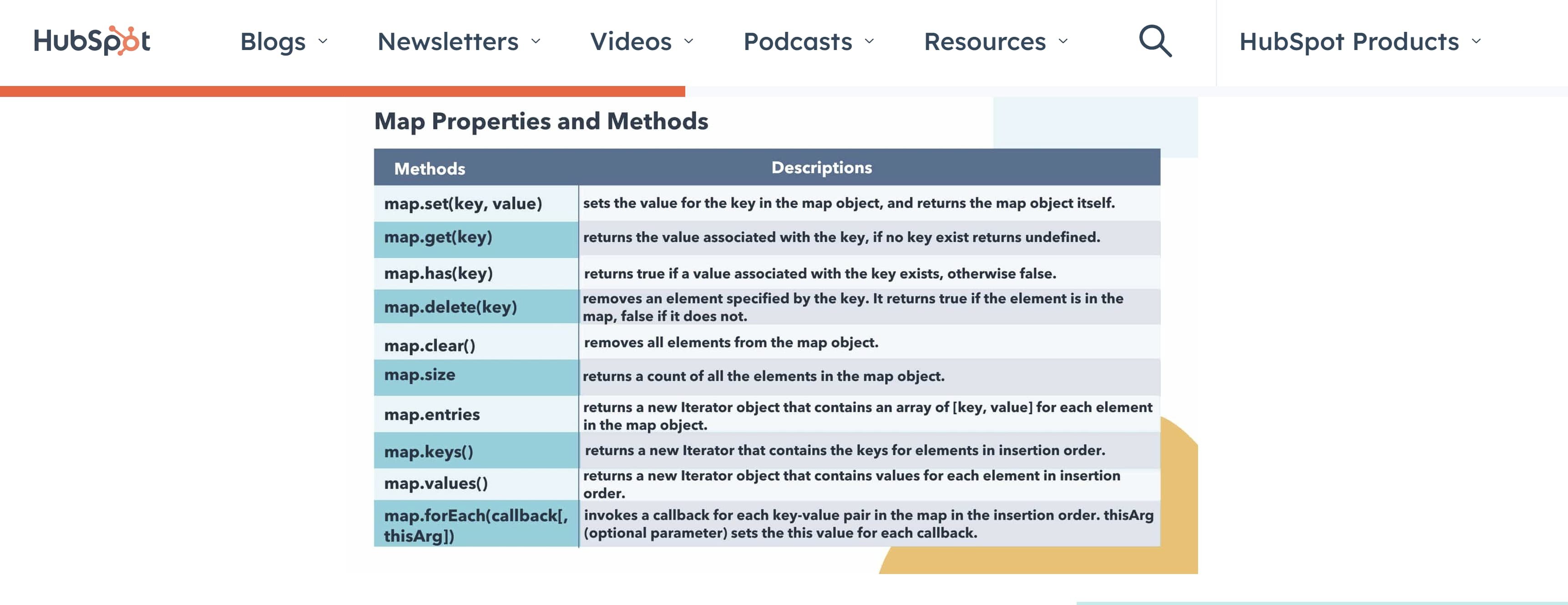
He pointed to one of our own blog posts as an example. The post “How to Use Map in JavaScript” uses several custom HubSpot graphics to illustrate different types of code and how they work.

Screenshot of a custom graphic showing how to use certain types of code.

If you’re not much of a graphic designer — don’t worry! Many online tools like Canva Canva make designing custom graphics simple for even novice designers. Even better, many of Canva’s tools are free!

Interactive Content

Interactive elements allow visitors to engage with your blog in a way that goes beyond just reading it. It gives a more fun and immersive experience that makes your content stand out.

“I definitely have seen this. We actually piloted this type of content when I managed the Service Blog,” Fontanella said. “The best performing one was a ‘Do you know your customers?‘ quiz, but my favorite was a ‘Which customer service rep from The Office are you?’ quiz. We didn’t do much with it in the past, but interactive content is something we are definitely looking at for the future.”

Screenshot of an answer from our "The Office" quiz, featuring an image of Clark Green.

Quizzes are a great type of interactive content because they can serve multiple purposes. For example, you can use them to grow your email list by adding a sign-up form to the quiz. You can also use a quiz to educate users about a product or service you want them to purchase, boosting conversions.

Other forms of interactive content include, but are not limited to:

Legitimacy

One of the most important blogging trends marketers will need to leverage in 2023 is legitimacy — in other words, ensuring your content has valuable and educational components, accordion to HubSpot Managing Editor Jay Fuchs.

“Successful marketing blogging is the art of making your readers see the educational element of your content so clearly that they forget about the promotional one — and that fact is becoming increasingly reflected in both reader preferences and how Google ranks content,” he said.

Fuchs says the key to projecting legitimacy in your blog is ensuring your writing is specific, accurate, and actionable.

“Try to make sure the points you make are supported by meaningful context, detailed examples, thoughtful advice, or perspective on why they matter —all backed by a professional, confident tone,” he said. “Even if you’re not an authority on a particular subject, you need to sound like one — and do what you can to provide the same kind of value that an expert on that topic would offer.”

You can add legitimacy to your post by quoting experts, sourcing data from reputable sources, citing peer-reviewed sources, using relevant examples, or including images to illustrate your point.

Original Data

Another way to add legitimacy to your blog content is to include original data. Original data helps reinforce the information you’re stating in your content. It helps solidify to your audience that your content is factual and backed by research.

“Original data is a massive asset for any blog to have at its disposal — a trend reflected in how well our content that references original HubSpot research like our Sales Strategy and Consumer Trends reports have performed,” said Fuchs.

You can gather original data via surveys, performance analytics, polls, and focus groups.

There are a variety of tools available to help you gather data for your next post, such as:

  • Mention, a social listening tool that can give insight into what audiences are saying about your brand or agency
  • Google Trends, a website that analyzes different trending topics across several regions and languages
  • Google Forms, which is a free online tool for creating surveys

Another great perk to including original data is that it can boost traffic to your blog, according to HubSpot Marketing Blog Editor Martina Bretous.

“While you can always refer to third-party studies, creating original data will help you stand out in your industry,” she said. “Not only will you gain credibility with your audience, but this data will also help your discoverability, as other publications will likely reference yours.”

However, that doesn’t mean you should disregard the importance of third-party data when you need it.

“Original research like that often isn’t accessible for many bloggers, but incorporating data into your content is still incredibly valuable — for both SEO and educational purposes,” Fuchs said. “So even if your organization doesn’t have the resources to generate original data, you shouldn’t skimp on including facts and hard numbers in your blogs. Third-party data is still a big help when putting together effective blog content.”

If you cannot gather original data, remember that data and statistics from reputable sources can be just as valuable. Just make sure to fact-check any information before including it in your content.

Original Topics

Regarding originality, blog content centered around original or niche topics is another trend marketers should consider.

“Original and niche content has never been more important for setting yourself apart from the internet noise,” said HubSpot Senior Manager of Content Meg Prater. “It’s not enough to write organic-only content just to rank. It’s crucial to set yourself apart with high-quality quotes, media, original data, and authoritative insight in order to provide value in the crowded content space.”

This trend will require creativity and social listening, but it’s worth it. For example, one of my favorite pieces I’ve written had to do with Gen Alpha and the future of marketing. The topic was unique and required much research on my part — and it ended up being one of our top-performing blog posts!

Blogging trends are constantly changing, especially in the world of marketing. Thankfully, you’ll be able to get ahead of the curve with the above tips from blog leaders at HubSpot. Which trends do you plan on leveraging in the coming year?

content planning in 2022

Categories B2B

Why Your Digital Product Isn’t Selling — and How to Fix That [Expert Insights]

You’ve created a digital product, put it up on your website and announced it to your audience. But despite the hard work you poured into bringing your online course, ebook, or other digital product to life, it’s not selling. 

When you’re in this situation, it’s tempting to give up. To throw your arms in the air and declare, “nobody wants my product — it was all a waste of time.” That’s the easier option. 

But you created your digital product for a reason. Perhaps you wanted to add a new income stream to your business so you could stop trading time for money. Or maybe you wanted to create a new way for people to work with you at a more affordable price point than your services. 

As the host of Imperfect Action podcast, which is part of the Hubspot Podcast Network, I regularly have listeners write in, asking me why I think nobody is buying their digital product. And in my work as a digital product launch strategist, I’ve helped dozens of clients turn around products that weren’t selling. Most of the time, they’ve been just a few tweaks away from a highly profitable product.

I’ve also been in this sticky situation a few times myself. I’ve had some huge digital product wins — selling $20,000 worth of a $20 Canva template, over $1 million worth of a $197 guide, and $400,000 worth of a $2,000 course. But before each of these success stories came many mistakes and lessons. Using the same strategies I’m sharing in this article, I’ve rescued my own products that weren’t selling and turned them around.

Whether you’ve created a low-ticket digital product or one in the thousands of dollars, these are the most common reasons why it isn’t selling — and how to fix that. 

→ Click here to download our free guide to digital marketing fundamentals  [Download Now].

5 Reasons Your Digital Product Isn’t Selling [+ Solutions]

Reason #1: Your audience doesn’t see the value in your product.

Five years ago, I built a digital product that flopped. My audience kept asking me questions about marketing their businesses on Instagram, so I created an online course about Instagram marketing. Desperate to make it the most valuable course possible, I stuffed it full of content and information. I knew it was valuable, but hardly anyone bought it. 

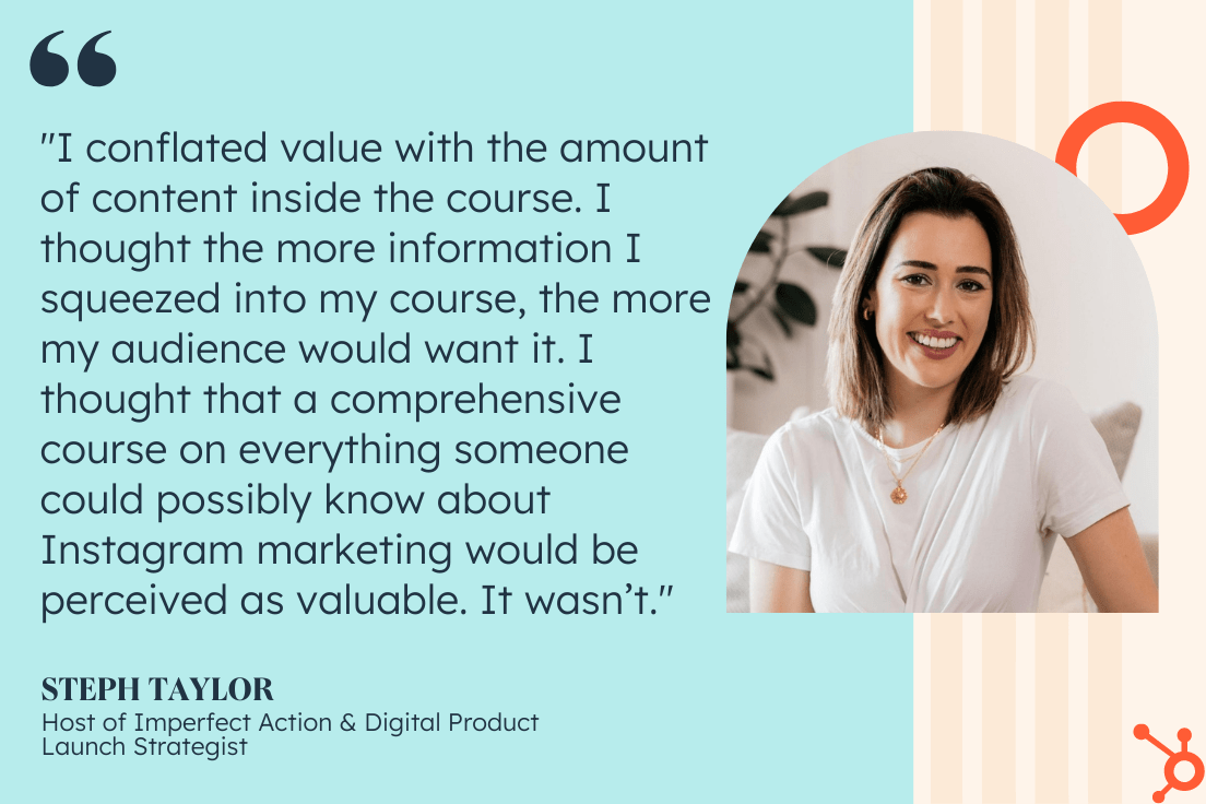
That’s because I conflated value with the amount of content inside the course. I thought the more information I squeezed into my course, the more my audience would want it. I thought that a comprehensive course on everything someone could possibly know about Instagram marketing would be perceived as valuable. It wasn’t. 

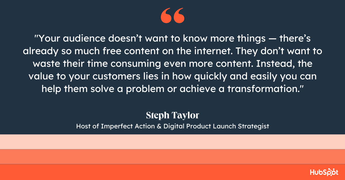
If you know your product is bursting with value, but you keep hearing “I can’t afford it,” or “I don’t need it,” chances are your audience doesn’t see the same value you do. Usually, that’s because your audience doesn’t want to know more things — there’s already so much free content on the internet. They don’t want to waste their time consuming even more content. Instead, the value to your customers lies in how quickly and easily you can help them solve a problem or achieve a transformation. 

steph taylor on her digital product mistakes

How to fix it: 

  1. Identify the outcome of your digital product — that is, the problem your customers will solve, or the transformation they will achieve.
  2. Tweak your marketing and messaging so it positions your product as the vehicle to achieve this outcome, rather than being a “comprehensive” guide.

If you’re struggling to show the value in your digital product, the below podcast episodes will help: 

Reason #2: It’s not the right offer for your audience. 

As a podcaster, I kept getting asked, “Steph, how do I launch a podcast?”. After walking several friends through the process, I decided to turn it into a digital product. I thought a group program format would work best as I could help several students at the same time. But when I launched it to my email list, only two people signed up. 

Confused, I surveyed my audience to find out why they didn’t buy. The answers were clear: They didn’t want to launch a podcast in a group program format. They couldn’t commit to attending live calls. They wanted to launch their show in fewer than eight weeks, or they wanted to work through it in their own time, over the next six months. 

If your product isn’t selling, it could be that your assumptions about what your customers want were wrong. The good news is that once you find out where you went wrong, a few tweaks to your product can lead to loads of sales. I took my audience’s feedback on board, turned the group program outline into a self-paced guide, and launched it again. A year later, that product has sold more than 3,800 copies.

How to fix it:

  1. Send your audience a non-buyer survey to find out why they aren’t buying your digital product. You’ll be amazed at what you learn from the question, “Why didn’t you buy?”
  2. If several people give you similar feedback, it’s a sign that you need to either tweak your product, or change the way you’ve positioned it. 

steph taylor on why your digital product isnt selling

Reason #3: They don’t trust that it’ll work for them.

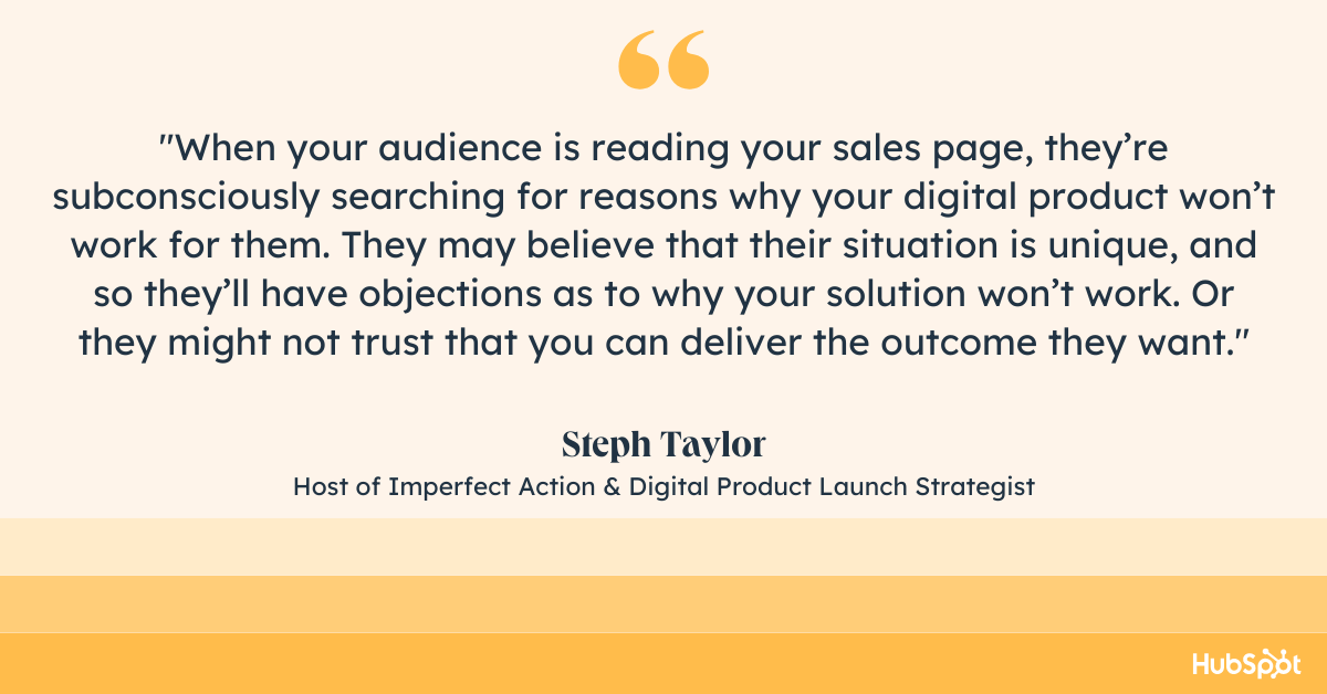
When your audience is reading your sales page, they’re subconsciously searching for reasons why your digital product won’t work for them. They may believe that their situation is unique, and so they’ll have objections as to why your solution won’t work. Or they might not trust that you can deliver the outcome they want. 

Getting your audience to know you, like you, and trust you enough to buy from you can take a while. Content marketing is the key to this. I’ve had strangers come up to me and tell me they feel like I’m their friend, because they’ve listened to my podcast so much. And sharing social proof (like testimonials and case studies) helps to build trust and overcome objections about why it won’t work for them. 

How to fix it: 

  1. Collect and share social proof from your customers and clients. Ensure that it’s not just about the outcome they achieved, but also tells the story of where they were before they bought your digital product. 
  2. Think of all the reasons a potential buyer would think that it won’t work for them. Show them why it will work for them with real-life examples on your sales page. Listen to episode 529 of Imperfect Action to learn how to write a million dollar sales page.
  3. Start regularly sharing content online. It doesn’t matter whether you start a podcast or a TikTok account, as long as you’re showing up consistently in one place. In episode 559 of Imperfect Action, I coach a student through the process of identifying what content topics will be most effective for her digital product launch.

steph taylor on digital product launches

Reason #4: They don’t know about it.

One of my online courses was consistently getting fewer sales than any of my other products, and I couldn’t figure out why. When I surveyed my email list, I was shocked. More than 75% of my subscribers didn’t even know the course existed. No wonder they weren’t buying it! 

“Build it and they will come,” doesn’t apply to digital products. You could have the most valuable course with perfect messaging and powerful social proof, and still not hit your sales goals because you’re simply not getting it in front of enough people. It might be because you don’t have enough people in your audience yet, or it might be that you’re not promoting it enough online. 

How to fix it: 

  1. Review your website analytics. How many people are visiting your digital product sales page? 
  2. Commit to promoting your product more, and get creative with it. Could you interview past customers about their experience? Could you give your audience 24 hours to test drive the first module? 

Reason #5: There’s no reason why they should buy it right now.

A human tendency is to procrastinate things that evoke negative emotions. Buying your digital product likely brings up negative feelings in your potential customers, too. Spending money on something — no matter how much they want it — might feel painful, and so they’ll delay the pain for as long as possible.

Aside from the pain of spending money, your digital product likely evokes other negative feelings. A workout guide requires them to set their alarm a whole hour earlier and get up while it’s still dark outside. My guide for starting a podcast might bring up a customer’s fear of being judged. So someone will put off buying it until the reasons to act right now outweigh the reasons not to. 

How to fix it:

  1. If your product is available to buy at any time, consider whether the “doors open” and “doors closed” model could work for your business, where you launch it a few times per year rather than allowing purchases at any time. 
  2. Alternatively, consider other limited-time incentives, such as bonuses, to help make your prospect’s decision easier.  

I’m a big proponent of the live launch model as a way to encourage your prospects to buy now, rather than put it off. These are some podcast episodes to help you better understand how that could work for you: 

By creating your digital product and putting it out into the world, you’ve already conquered the hard part. Now you begin the fun part: Understanding why it’s not selling, making changes, and measuring the impact of those changes. You might need to work through more than one of the above strategies before you see measurable results. 

Think of it as an experiment where each tweak you make brings you one step closer to the winning formula. 

New Call-to-action

Categories B2B

7 Dos and Don’ts of Attending or Hosting Twitter Spaces

With new social media platforms and features popping up every day, ever wonder about the etiquette you should follow?

Download Now: Social Media Trends in 2022 [Free Report]

In this article, we’ll be covering Twitter Spaces etiquette for attendees, hosts, and speakers.

Twitter Spaces Etiquette for Attendees

1. Listen more than you speak.

On Twitter Spaces, everyone has a role to play. The host is there to set the tone and guide the conversation. Speakers are chosen to share their knowledge. Moderators are there to ensure the space remains safe.

As an attendee, your role is to listen and participate upon request.

Too often, attendees will show up to a Twitter Space, ask to speak, then monopolize the entire conversation. This is considered inappropriate and can be deemed disrespectful to the speakers already designated in the Space.

A good rule of thumb is to listen at least 80% of the time and contribute 20% of the time. However, that can vary depending on the topic, the host, and the Space.

With this in mind, allow the host of the Space to set the expectations for that particular session.

2. Stay on task.

If you are chosen to share your thoughts, make sure your comments are relevant to the topic.

Every time you speak during a Space, you have the ability to move the conversation forward or derail it. One trick to make sure you stay on topic is to write notes for the key points you want to address.

When you veer off-topic, not only does it lower your chances of being chosen again to speak but it can also confuse incoming listeners.

On that same note, Twitter Spaces usually run for one hour or less. With this in mind, attendees should keep their comments concise and to the point.

3. Don’t interrupt others.

If you’re invited as a speaker on a Twitter Space, it’s key that you are considerate of others.

Just as you wouldn’t interrupt a co-worker during a Zoom presentation, you shouldn’t interrupt another speaker during a Twitter Space event.

The only time you should jump in is if something’s going wrong — say someone forgot to mute or unmute themselves, loud noises, etc. In that case, you can quickly notify the involved party and reset the conversation.

Twitter Spaces Etiquette for Hosts and Moderators

1. Make sure your background is quiet.

As the host of a Twitter Spaces event, it’s important that your listeners hear you clearly and you’re able to guide the conversation. This will require you to prepare your environment.

Before you start the event, make sure you’re in a quiet room. This will make sure loud noises don’t come through the microphone as you engage your listeners.

Secondly, limit distractions by turning off your devices and notifying your roommates.

2. Welcome listeners.

As a host, you set the tone for the entire event. The first step is welcoming your listeners to the event.

Start by introducing yourself and telling them the agenda for the event. You can also thank users for joining, shouting them out by username.

As people trickle in, you can repeat these key points until you’re ready to officially start.

3. Introduce speakers.

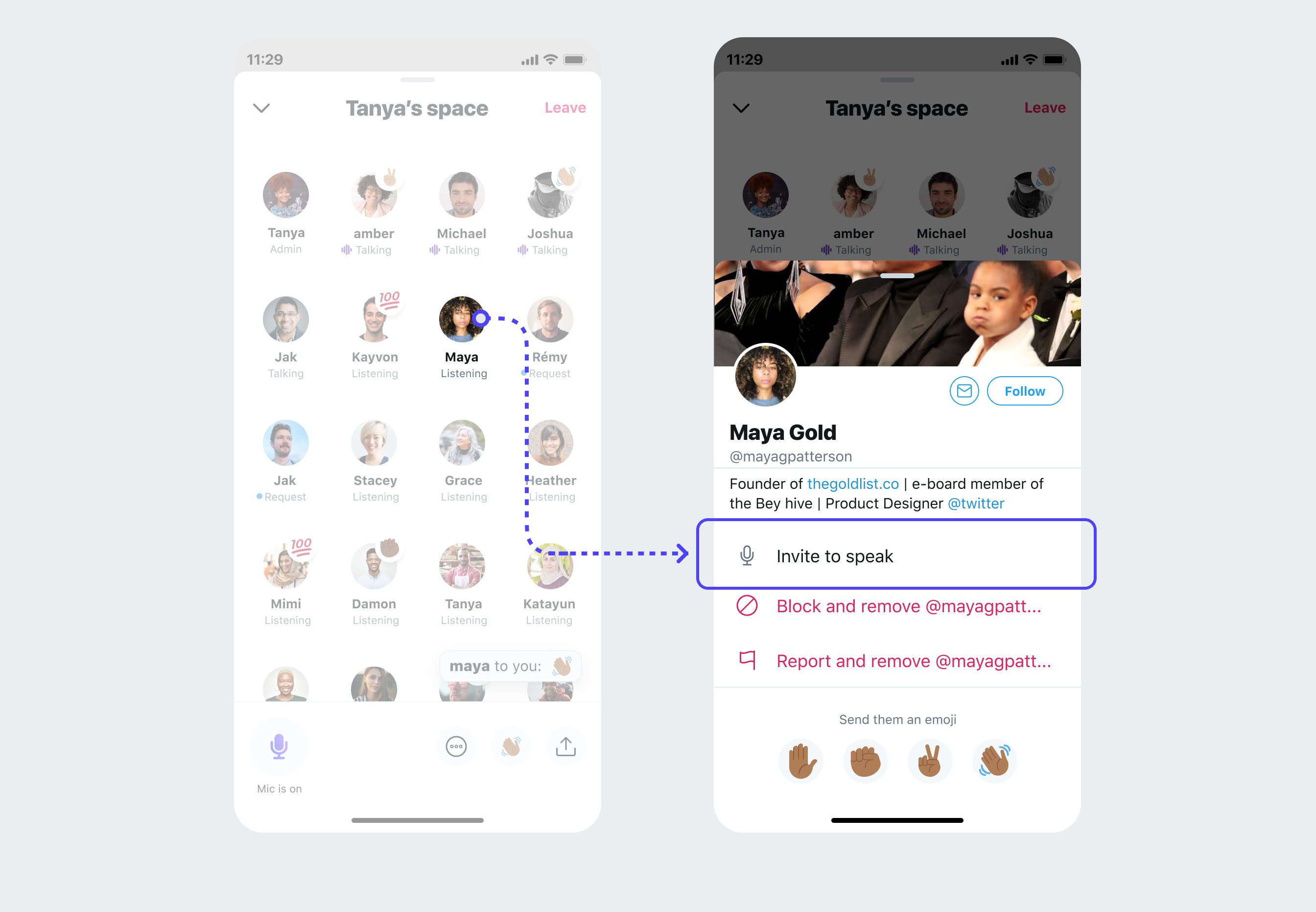
twitter spaces

Image Source

If you were attending a webinar, you’d want to know who the presenters are, right? The same concept applies to Twitter Spaces.

Once you’re ready to start the event, share a 30-second short bio on each speaker.

While some listeners may be familiar with your speakers, others may not. Short bios will help listeners understand the value each speaker brings to the conversation.

4. Stay on topic.

This etiquette tip applies to attendees but even more to hosts and speakers.

When attendees join your event, they’re expecting you to cover a particular topic. While it’s normal for conversations to cover unplanned topics, as a host, it’s your responsibility to bring it back around.

For instance, say your event is on email marketing tips and you spend half of the time covering social media. Even if the advice is valuable, it’s not what listeners signed up for. And as a result, it’s not relevant information.

To maintain your audience’s trust and keep them coming back for more, it’s vital that you stick to the agenda.

Now that you have all of these etiquette tips, you’re ready to take on Twitter Spaces.

New call-to-action

Categories B2B

Nostalgic Websites: What 32 Popular Sites Used to Look Like

It’s no secret that website design trends (and best practices) have changed dramatically since the internet’s debut. Reflecting on nostalgic websites and comparing them to their present-day counterparts is an excellent way to understand why updating your site is so necessary

Free Workbook: How to Plan a Successful Website Redesign

With the help of the Wayback Machine, we can see what our favorite websites looked like in years past.  Whether you’re planning a website redesign and could use some inspiration, or you’d enjoy reflecting on nostalgic websites, we’ve rounded up 32 sites to peruse.

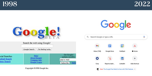
1) Google

Nostalgic websites: Image shows Google homepage from 1998 side by side with 2022 Google homepage.

While Google essentially maintains its branding with its colorful logo and whitespace on the homepage, there are other aspects of the site that look entirely different today. In the 1990s, Google had unique offerings underneath the search bar. Today, the company leans into creating a personalized homepage for users by bookmarking their frequently visited websites.

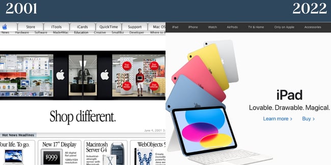
2) Apple

Nostalgic websites: Apple. Image shows 2001 Apple homepage and 2022 homepage.

Apple always takes a product-centric approach to its homepage. Even in 2001, you’ll notice that the company’s items were the website’s primary focus. In 2022, Apple chooses to keep branding minimal yet distinctive. It features just one product to make the center focus of the homepage. The current homepage is also a testament to compelling copy; in just three adjectives, Apple paints a complete picture of why you should get an iPad.

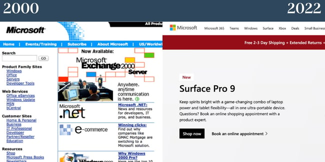
3) Microsoft

Nostalgic websites: Microsoft's homepage in the 2000s and 2022 are compared.

In 2000, Microsoft’s website was clunky and over-complicated. The abundance of words on the website and lack of whitespace made for an overwhelming user experience. Today, Microsoft’s site takes a cue from Apple and centers on its products. The site, as a result, is less dizzying and more digestible for visitors.

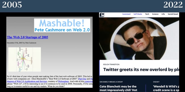
4) Mashable

Nostalgic websites: Mashable in 2005 compared to Mashable homepage in 2022.

Once upon a time, Mashable had a gradient background — not to mention a serious lack of imagery. Now, the site balances visuals with text. The company branding also no longer takes center stage and focuses on featured stories.

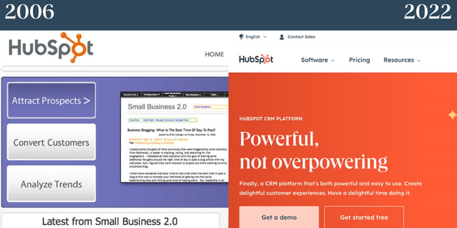
5) HubSpot

Nostalgic websites: HubSpot in 2006 is shown next to HubSpot's homepage in 2022.

In 2006, the tech and marketing world was focused heavily on surviving and succeeding in a web 2.0 world. Small businesses were popping up worldwide, and HubSpot’s website was focused on showing how the product could add value for these companies. Today, HubSpot still caters to small businesses but also medium and enterprise corporations. Now, our website focuses more on the product and features a lot more color than it initially did.

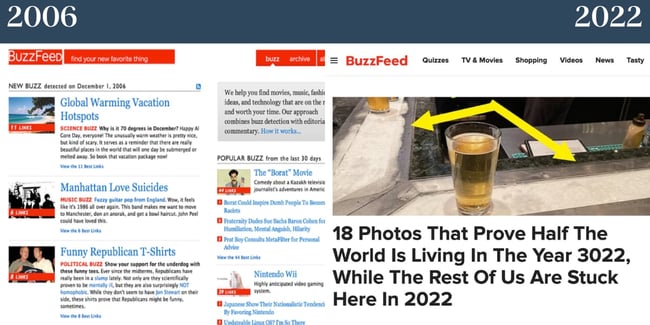
6) BuzzFeed

Nostalgic websites: Buzzfeed's homepage in 2006 is compared to 2022's. Both feature text, but 2006 features significantly more.

BuzzFeed was created to help users find their favorite things, including movies, music, fashion, ideas, and technology. The site still achieves this with a more visual and interactive approach. Today, the website balances images and text more seamlessly, but the site’s overall feel is still intact.

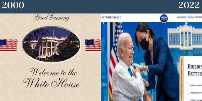
7) The White House

Nostalgic websites: The White House homepage in 2000 compared to 2022. In 2000 you see a picture of the whitehouse itself and in 2022 you see President Biden getting his coronavirus vaccine.

In 2000, Bill Clinton was the President of the United States, Al Gore was Vice President, and the White House’s website had a very different look and feel. Then, the website featured a Declaration of Independence-esque script font and didn’t emphasize imagery — or storytelling, considering the text just welcomed visitors to the page. When you visit the site today, you’ll notice a large image and copy that focuses on current initiatives. We also love how the refreshed site focuses on accessibility with options to change the text contrast and size. 

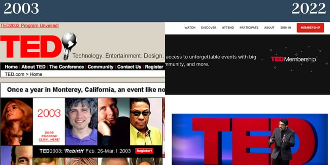
8) TED

Nostalgic websites: TED. Left features early 2000s website homepage and right side features 2022. There are more images in 2003 than there are on the 2022 homepage.

Though TED’s 2003 website still looks outdated by today’s standards, it was ahead of its time, with most of the homepage featuring visual content. In 2022, their site still features various images but also balances copy — and there’s only one main image above the fold. The site’s overall feel today is less cramped and overwhelming than it was in years past.

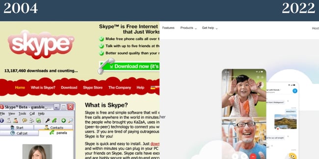
9) Skype

Nostalgic websites: Skype. Left shows the old website homepage and the right side shows the present.

In the early 2000s, Skype’s homepage featured several colors and lacked hierarchy. (And who knew the video call platform once had a red logo?) Today, Microsoft owns Skype, and the latter takes a cue from the larger organization’s look and feel. The site features whitespace, excellent visual hierarchy, and offers a compelling image of the product in action.

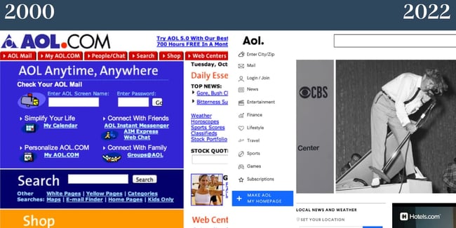
10) AOL

Nostalgic websites: AOL. Left side shows AOL in 2000, right side shows AOL in 2022.

In 2000, AOL’s site had a variety of colors that weren’t cohesive, ultimately making the site appear messy. Today, the site features enough whitespace to balance the amount of copy and imagery it has. We’re also fond of the site’s new font, as it’s visually appealing and easy to read.

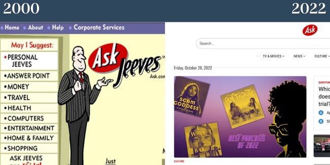
11) Ask

Nostalgic websites: ASK. On the left it shows the site before the rebrand and on the right you'll see the site after.

Ask Jeeves rebranded as Ask. In 2000, the site lacked whitespace and featured a character — part of the site’s unique branding. Since dropping the second half of the name, there’s no longer a character on the site’s homepage. Today, the site looks much more like a news or publication site than a platform to ask questions and get quick answers.

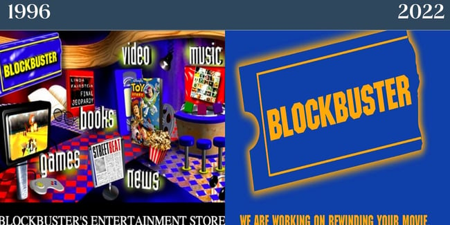
12) Blockbuster

Nostalgic websites: Blockbuster. Left: shows the website in the 1990s during the company's prime. The right shows the website now, in 2022.

Remember the good old days of going to Blockbuster to pick out your movie and grab a few snacks? We sure do. What Blockbuster’s 1996 site lacked in hierarchy, it made up for in personality. Today, Blockbuster’s site is out of commission — and features a cheeky note that the company is working on rewinding your movie.

13) Coca-Cola

Nostalgic websites: Coca Cola. Left features their site from 2000 which is remarkably ahead of its time. The right features the site from 2022.

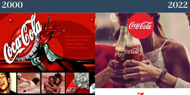
We’ll give it to Coca-Cola: Their branding is timeless. Coca-Cola’s website from 2000 doesn’t look too shabby compared to many of the outdated websites on this list.  The brand understood the importance of visual content and simplicity in 2000, and they still do today. In 2022, their site focuses more on imagery and features less red than in the past, but it still feels cohesive with the rest of their branding.

14) Pepsi

Nostalgic website: Pepsi. Website on the left is from the 2000s, the website on the right is the homepage from 2022.

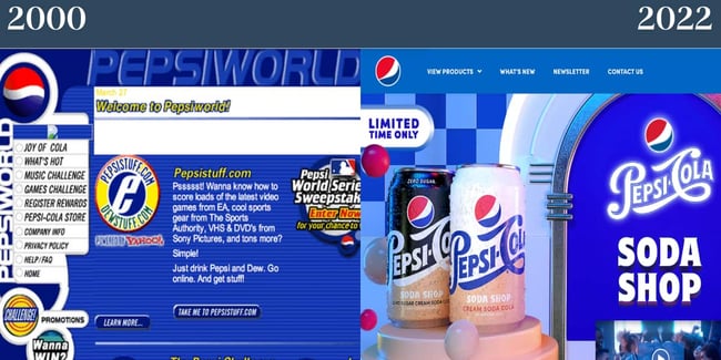
Pepsi’s site in 2000 was cluttered, lacked visual hierarchy, and had too much going on. Today, we’re huge fans of Pepsi’s nostalgic homepage. It features a font that’s easy to read, plus the site doesn’t feel too cluttered. The company has also since moved its menu to the top of the page and cut back on how many tabs there are which is much better from a user experience standpoint. 

15) Macy’s

Nostalgic websites: Macy's. Left side shows Macy's from 2000 and the right side shows Macy's in 2022.

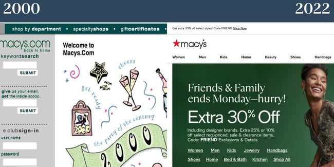
While Macy’s 2000 website doesn’t conform to today’s standards, we appreciate how cohesive the colors are. Interestingly, products aren’t at the forefront of Macy’s nostalgic site. Today, however, the Macy’s website tells an extremely different story. The website has a neatly organized menu and excellent visual hierarchy.

16) Amazon

Nostalgic websites: Amazon. Image to the left shows the site in 1999 and image to the right shows Amazon in 2022.

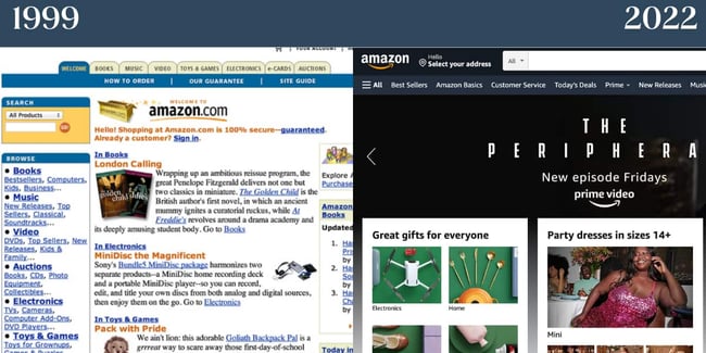
In 1999, Amazon’s website was highly text-heavy, making it dizzying to look at. The vertical menu was also cluttered and difficult to digest. Today, Amazon’s menu appears on the top of the page, and the site seems significantly less overwhelming despite the fact that it still advertises various products. 

17) Yahoo

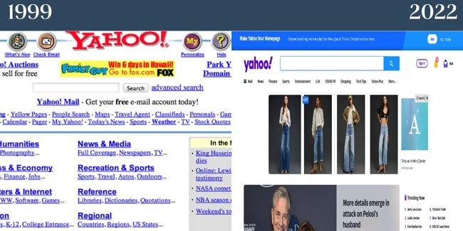
Nostalgic websites: Yahoo. On the left is the homepage in the 1990s, on the right is the homepage now.
In 1999, Yahoo’s website focused mainly on text and featured no imagery. Today, a very different story is told when you visit the platform’s site. Because Yahoo is a news site, there are images to accompany every story, plus a summary of what you can expect when you read the piece. We’re also a fan of the trending column on the right side of the site, as it makes it easy for users to understand what’s in the news at a glance.

18) Tumblr

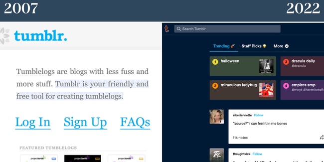
Nostalgic websites: Tumblr. Site on the left is from 2007 when the platform was in its infancy, the right shows the homepage now.

In its infancy, Tumblr referred to blogs as Tumblelogs and had a text-centric website. Today, if you visit Tumblr while not logged in, you’ll see a mock dashboard that shows visitors what theirs could look like if they create an account. Today’s Tumblr site is also significantly more image-focused.

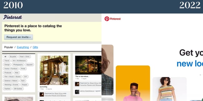
19) PinterestNostalgic websites: Pinterest. Left side shows Pinterest in 2010 when it debuted, the right side shows Pinterest in 2022.

Remember when Pinterest was invite-only? As you can see from the screengrab of the 2010 Pinterest site, the platform had a completely different logo and a less sleek appearance. If you visit Pinterest today, you can create an account instantly — no request necessary. In addition, the platform features a live image that changes yet loads quickly. The copy is simple yet compelling.

20) Reddit

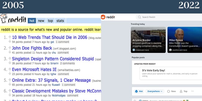
nostalgic-websites-REDDIT

In 2005, Reddit was all about text. Reddit is still more text-focused than most modern sites. However, it does feature a balance of images. We like how the font Reddit uses today is still semi-nostalgic but is easier to read than it has been in the past. The site is also more visually compelling as it appears more like a news site.

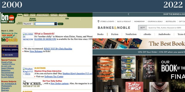
21) Barnes & Noble

Nostalgic websites: Barnes and Noble. Left features B&N's older website, the right side features Barnes and Noble's site today.

You’re probably starting to notice a theme at this point: The websites of years past were text-focused. Barnes & Noble is no exception. In 2000, the bookseller had a dense, visually unappealing vertical menu. The images took a long time to load — if they did. There’s also a lack of visual hierarchy, so it’s difficult for visitors to decide where to look. Today, the company’s site is significantly more digestible. It balances whitespace with imagery and text, and the designers cleaned the menu up.

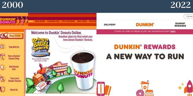
22) Dunkin’

Nostalgic websites: Dunkin. The left features an early 2000s version of the website's homepage, and 2022 shows the present version in 2022.

We’ll hand it to Dunkin’: They’ve stayed true to their signature color scheme for decades. This screengrab from their site in the 2000s is one of our favorites on this list. It’s shockingly minimalistic and features an image that wasn’t standard for the time. Today, Dunkin’ has plenty of whitespace, features cohesive branding, and balances graphics with the copy. The website also has an easy-to-follow menu and includes the company’s striking pink and orange colors. 

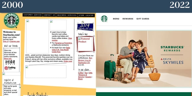
23) Starbucks

Nostalgic websites: Starbucks in 2000 versus Starbucks in 2022. In the 2000 version, the images do not load.

In 2000, Starbucks got a few things right: Their menu is straightforward, and they featured images on their site, though they didn’t load. (Psst: These plugins can help ensure your content loads quickly if you have a “heavy” page so your website avoids a similar fate.) You’ll also notice their consistent logo. In 2022, Starbucks effortlessly offers a pop of color on its site without overwhelming visitors. The site features Starbucks’ signature font and includes an image promoting a recent collaboration with another company. The image itself also feels on-brand. We also want to call out Starbucks’ sparse yet effective navigation at the top of the page.

24) Walmart

Nostalgic websites: Walmart. The past version of the Walmart website is shown next to its 2022 counterpart.

For its time, Walmart’s site in 2002 was quite successful. It featured images and text which still dominate the website today. In addition, it had a better visual hierarchy than some of the other examples we’ve investigated. Similar to Dunkin’, one thing that Walmart does incredibly well is translating its famous color scheme to its site. In 2022, Walmart’s website has plenty of imagery and concise copy that enhances the graphics.

25) Target

Nostalgic websites: Target. On the left you see Target's site in 2004 and 2022 on the right.

There are also plenty of things Target got right in 2004. For one, the brand used its well-known color scheme. The site features images, too, and its branding is still largely the same. In 2022, Target’s site puts a much larger emphasis on visuals than it does on text. The branding is minimal yet effective, and the site features a simple menu that expands when visitors click on it. 

26) The New York Times 

Nostalgic websites: NYTimes. On the left, the NYTimes from 2000 and on the right, its 2022 counterpart. Both resemble a physical newspaper.

We’re impressed: While New York Times has reworked its website since 2000, the website is remarkably similar. Even in 2000, figuring out where to direct attention was easy. The New York Times scores major points because its 2022 website resembles a newspaper. It features visual hierarchy, balances images with copy well, and we like how the font is distinctive yet easy to read. 

27) Lay’s

Nostalgic websites: Lay's. Left features an image of the 2008 site and the right features an image of the 2022 site. The left has green background and poor text contrast the right features Lay's well-known yellow color.

In 2008, Lay’s website was green and featured very poor text color contrast. This makes it difficult for people to read the copy. Luckily, Lay’s has since reworked its site. Today, it’s still colorful but features better contrast. You’ll also notice the site has plenty of Lay’s illustrious yellow. The 2022 site seems far more on-brand than it has in the past. 

28) McDonald’s

Nostalgic websites: McDonald's. The left image is from 2001 and features a red background and yellow text. The right image is McDonald's present homepage.

In 2001, McDonald’s website featured a red background and yellow text, which wasn’t exactly optimal for readers. Now, McDonald’s site is minimalist. It features few colors aside from the brand’s distinct yellow and offers a variety of options for visitors to select from on the menu section. However, the menu isn’t overwhelming because the rest of the website is so straightforward. The brand also taps its signature font for the 2022 website. 

29) Sephora

Nostalgic Websites: Sephora. The image on the left is Sephora's website in the early 2000s and the right is from 2022.

Sephora’s website in the early 2000s featured a balance of images and text. For its time, it was an example of a compelling website design. Today, the site adheres to modern web design trends. It has large images that are visually appealing and includes  straightforward copy. 

30) Netflix

Nostalgic websites: Netflix. On the left is the 2005 homepage and on the right is the 2022 homepage.

In 2005, Netflix featured an image-focused homepage, which is quite different from today. In 2022, copy is the star of the show on Netflix’s homepage. The company also cleverly places a call to action at the center, so you’ll provide your email address and get started. In both 2004 and 2022, the main focus of the homepage was a call to action, which is noteworthy. We like the image in the background, which the text overlays as it features shows and movies you can enjoy with a Netflix subscription.

31) eBay

Nostalgic websites: eBay. On the left is eBay's homepage in 2004 and on the right is eBay's homepage in 2022.

In the early 2000s, there was a lack of hierarchy on eBay’s site, which made it tricky for visitors to understand where to begin. This is also detrimental from a user experience standpoint. That has since changed, however. In 2022, eBay has a carousel above the fold on its site. It features a few products and promotions the company is currently offering. The site also features more whitespace than in the past, and the menu is paired back by comparison.

32) Burger King

Nostalgic websites: Burger King. The left side of the image shows the nostalgic homepage from 2006 and the right side of the image shows the 2022 update.

In 2006, Burger King did feature a primary image on their site. The menu was also at the top of the site, but the font was difficult to read. In 2022, Today, Burger King features a neutral background and keeps the focus on its imagery. Copy is sparse yet effective. In addition, the company uses a font that offers a pop of personality yet is readable.

Take Site Redesign Inspiration from These Nostalgic Websites

If you’re seeking inspiration for your site redesign, look at these nostalgic websites to get an idea of how you can rework your landing page. These nostalgic websites prove that by using your unique branding, balancing images and text, and including a clear visual hierarchy, your site will look great for years to come.

Editor’s note: This post was originally published in April 2014 and has been updated for comprehensiveness. 

Blog - Website Redesign Workbook Guide [List-Based]

Categories B2B

9 Black Friday Marketing Strategies for 2022

The holiday season is around the corner, so it’s time for marketers everywhere to gear up for Black Friday. From optimizing your website to launching outstanding deals and giveaways — there’s a lot that marketers need to account for. If you’re unsure what to do, here are nine marketing strategies that will wow your customers and boost your company’s revenue.

What is Black Friday?

Best Black Friday Marketing Ideas

  1. Incorporate social media commerce.
  2. Leverage email marketing.
  3. Optimize your website for shopping.
  4. Audit product pages.
  5. Give longtime customers irresistible deals.
  6. Follow up with customers after Black Friday.
  7. Provide minimum spend rewards.
  8. Create a sense of urgency.
  9. Create a holiday marketing calendar.

Black Friday Marketing Tips

→ Download Now: Free Marketing Plan Template

What is Black Friday?

Black Friday is the Friday after Thanksgiving in the United States and marks the start of the holiday shopping season. It’s also when many companies (including your competitors) begin rolling out numerous deals and discounts on products.

To stay competitive, your company must prepare a marketing strategy to boost revenue and delight customers.

Best Black Friday Marketing Ideas

Below are nine Black Friday marketing ideas you should consider for 2022.

1. Incorporate social media commerce.

Social media is now becoming where consumers make purchases and learn more about products and brands. In 2020, social media commerce earned $26.97 billion in sales, which is expected to double to $56.17 billion by 2023. So why not incorporate social commerce into your Black Friday marketing strategy?

To do this, connect your online store with platforms like Facebook, Instagram, and YouTube — which all provide avenues for users to make purchases. You can also run social media-exclusive Black Friday deals on these platforms, like Buy-1-Get-1 free deals.

What We Like: Not only will you generate more revenue online, but you will also draw new social media followers to your brand.

2. Leverage email marketing.

Ahead of Black Friday, start building an email list of potential customers to keep them informed of upcoming Black Friday deals. One way to do this is via pop-up forms, like the one below, that collect email addresses.

thredup-promoImage source

Make sure to offer an incentive. For example, offer the customer 30% off their next purchase just for signing up for the email list. Once you have your email list together, you can start sending personalized content based on the customer’s needs. According to an eMarketer survey, customized emails have an ROI of 122%.

What We Like: By leveraging email marketing and personalized email content, you can encourage customers to stay subscribed long after Black Friday passes.

3. Optimize your website for shopping.

No one likes to wait for a slow website to finish uploading, especially on Black Friday when great deals are at stake. Ideally, you’ll want your website to load fully within one to four seconds because the time frame has a 12% to 30% conversion rate. The longer your site and its pages take to load, the more likely users will lose patience and abandon their purchases.

You also want to optimize your website to avoid crashes or outages from the high volume of Black Friday shoppers.

What We Like: Not only will optimizing your website improve conversion rates and avoid Black Friday mishaps, but it will also improve your website’s overall functionality — which is essential year-round.

4. Audit product pages.

Visitors to your site will spend most of their time browsing your product pages, looking for the items they want. So, you’ll need to audit those pages to ensure they provide a pleasant and efficient shopping experience. In your audit, make sure to:

  • Update product descriptions with sensory words to describe the product and SEO keywords to boost it in SERPs.
  • Group your products based on the recipient and purpose. For example, “Gifts for Kids” or “Home Decor.”
  • Include 6-8 product photos from different angles, so customers get a clear picture of what the product looks like.

What We Like: Auditing your product pages helps improve your customers’ experiences on your site. And similar to optimizing your website — these changes are essential all year-round.

5. Give longtime customers irresistible deals.

Show your longtime customers that you appreciate their commitment to your brand by offering exclusive deals. Be it giveaways, discounts, or BOGO, rewarding your customers for being longtime patrons will incentivize them to keep coming back long after Black Friday.

What We Like: Giving exclusive discounts and giveaways can help you clear your inventory in preparation for the new year.

6. Provide minimum spend rewards.

Another way to encourage customers to spend is by offering minimum spend rewards. Every time customers spend over a certain amount, and they receive a reward. The reward could be a percentage off their purchase, free shipping, a coupon code, or a gift.

What We Like: Minimum spend rewards can incentivize customers to spend more and serve as a “thank you” for their trust in the company.

7. Create a sense of urgency.

Urging consumers to act quickly is an excellent way to boost Black Friday sales. One Entrepreneur Marcus Taylor said building a sense of urgency helped him to increase sales by 332%. There are several ways to entice consumers into acting immediately, including:

  • Flash sales that only a few hours or just one day.
  • Showing when an item is low in stock
  • Using time-sensitive language like “last chance,” “today only,” or “now.”

What We Like: Marketers can promote flash sales via email or hold pop-up social media contests to get shoppers excited and ready to purchase.

8. Follow up with customers after Black Friday.

Just because Black Friday is over doesn’t mean the marketing stops. Reach out to customers via email and ask about their shopping experience. Are they satisfied with their purchase? You can also recommend other products based on their bought items or get them excited for Cyber Monday deals.

What We Like: This is an excellent opportunity to send personalized emails asking for honest feedback or recommending other products.

9. Create a holiday marketing calendar.

Of course, the key to any marketing strategy is to be organized. Create a holiday calendar to keep track of your Black Friday marketing strategies. You may even need separate calendars for different marketing channels, such as social media or email.

What We Like: Running other sales and discounts through various marketing channels can feel overwhelming. By creating at least one marketing calendar, you’ll be able to keep track of your strategies and progress confidently.

Black Friday Marketing Tips

No matter what strategies you choose to use this year, always remember to do the following:

  • Stay organized and create one or more calendars to keep track of your Black Friday strategies.
  • Ensure your website and product pages are optimized to handle high traffic from holiday shoppers.
  • Leverage social media and email marketing to stay top-of-mind with your customers.

Black Friday doesn’t have to be a stressful time of year for your business. By implementing any of the above strategies, you’ll be able to boost revenue and delight your customers ahead of the holidays.

Blog - Content Mapping Template

Categories B2B

What to Do if Your Email is Hacked (+ Sample Messages To Send)

If you’ve received an email from someone claiming to have hacked your account, don’t panic. It’s important to stay calm and take the necessary steps to protect yourself and your data.

This blog post will provide sample emails you can send to your contacts after being hacked. We will also share tips on protecting yourself from future hacking attempts.

Free Download: 30 Follow-Up Email Templates

What To Do if Your Email is Hacked

You can’t always tell if you were hacked immediately. Some hackers may send corrupted emails to your contacts without leaving a trail.

Other times, filter settings might catch suspicious messages and automatically place them in “Spam” or “Trash,” so you never even see them.

Luckily, there are a few signs to watch out for if you suspect someone has hacked your account:

  • You receive strange or unsolicited emails from someone with your own name or a third-party name. Look for blurred images, poor grammar, and strange email addresses.
  • People you know tell you they’ve received unusual emails from you. They’ll likely delete them immediately, so don’t be surprised if no one has any to show you.
  • Your password stops working out of nowhere. One day, you just can’t log into your account anymore.
  • You see unexpected activity on your account, such as new contacts or messages you didn’t write.

If all signs point to hacking, keep calm. Hacking is a hassle, but it’s nothing you can’t resolve in a few steps.

Steps to Follow After You’ve Been Hacked

hacked email next-steps: changes your password, set up two-factor authentication, keep your software up-to-date, and email your contacts.

1. Change your password.

If you think someone’s hacked your email, the first thing you should do is change your password. It might seem obvious, but it’s an effective way to stop the hacker from further accessing your account.

2. Set up two-factor authentication.

After you’ve changed your password, we recommend enabling two-factor authentication (if it’s not already enabled). Two-factor authentication adds an extra layer of security to your account by requiring you to enter a code from a second device when you sign in.

If you’re unsure how to change your password or enable two-factor authentication, contact your email provider for help.

3. Keep your software up-to-date.

Another way to protect yourself from hackers is to ensure that your software is always up-to-date. This includes your operating system, web browser, antivirus software, and any other programs you use.

Outdated software can have security vulnerabilities that hackers can exploit to gain access to your account. Keeping your software up-to-date can help close these security holes and make it harder for hackers to get into your account.

4. Email your contacts.

Once you’ve changed your password and enabled two-factor authentication, email your contacts, letting them know someone hacked your account. They’ll know to be cautious of any emails they received from you.

Doing this as soon as possible ensures they remain on high alert and protect them from future attacks.

Sample Letters for Hacked Email

Messages in this situation serve two purposes: to inform people of what happened and to provide directions on how to protect themselves. Being brief and apologetic will allow them to quickly turn their attention to the necessary steps, such as remaining vigilant.

Use the templates below if you ever are hacked.

1. Hello, This is [Your Name], and I’m writing to let you know that my email account was hacked.

sample letter for hacked email: subject line, email account recently hacked; tone, formal; best for colleagues.

Hi [Recipient Name],

I wanted to let you know that my email account was recently hacked. I’ve changed my password and taken steps to secure my account, but I wanted to warn you in case you received any suspicious emails from me.

If you received any suspicious messages, please delete them, and do not click on any links.

I’m sorry for the inconvenience. Thank you for understanding.

Take care,

[Your Name]

2. Sorry, my account was hacked.

sorry my account was hacked; tone, casual, familiar; best for friends and family.

Hey [Recipient Name],

If you got any weird emails from me over the past few days, I’m sorry. My account was hacked, but I’ve since changed my password and added two-factor authentication.

Delete any suspicious emails you’ve received, and don’t click on any links.

Sorry about this, and thanks for bearing with me.

[Your Name]

3. Hey, it’s [Your Name] ― I got hacked.

sample letter for hacked email: subject line, Hey, it’s [Your Name] ― I got hacked; tone, professional; best for acquaintances.

Hi [Recipient Name],

Today, I discovered that someone had hacked my email and social media accounts. Any unwanted emails and messages you’ve received are spam — many of my contacts have gotten spam emails from my account.

My apologies for any inconvenience this may have caused you. I have taken steps to ensure that it won’t happen again.

Thanks for your patience!

[Your Name]

4. Sorry [Recipient Name], I was hacked.

 sample letter for hacked email: subject line, Sorry [Recipient Name], I was hacked; tone, professional, apologetic; best for acquaintances and new contacts.

Hello,

I apologize for any unwanted emails you might have received in the last [timeframe]. My email account was hacked around [date], and spam messages were sent to my contacts, including you.

I’d never voluntarily sent this out to anyone, so I’m sorry if it made a wrong impression. Rest assured, I’ve secured everything already, so things should be secure moving forward.

Thanks for understanding,

[Your Name]

5. Team, my email was hacked.

sample letter for hacked email: subject line, Team, my email was hacked; tone, familiar; best for your core work team.

Hey Team,

I got hacked on [date], and I think spam messages have been going out [timeframe]. Sorry about that — I just noticed it and took the necessary steps to fix everything on my end.

Keep an eye out for anything suspicious, and ‌let me know if you continue getting any strange messages.

Thanks,

[Your Name]

Stay protected with HubSpot

Getting hacked is never fun, but it doesn’t have to be the end of the world. By taking some simple steps, you can quickly get your account back under your control. Plus, you can help protect yourself and your contacts from future attacks.

At HubSpot, your security and safety are paramount. Our CRM platform for front office teams ensures the privacy of the data you entrust to us. Check out our site to learn more about how we keep you protected.

Free Resource: How to Reach & Engage Your Audience on Facebook

Categories B2B

The Best B2B Lead Gen Campaigns for Every Channel

As a marketer, you’re always on the hunt for more leads. However, building the best lead generation strategy involves an in-depth understanding of tried-and-tested channels. Then, you’ll need to find the most effective combination of tactics for your unique goals.

In this post, you’ll gain insights into each major channel for B2B lead generation, including social media, PPC, blogging, and email. Best of all, you’ll learn effective strategies and impressive real-world examples for each.

Table of Contents

What is B2B lead generation?

B2B lead generation is the process of bringing prospective customers to your organization. These leads should be potential buyers who would benefit from your business’ product or service.

The types of leads generated vary by campaign and marketing platform. Disciplined B2B marketers understand the different dynamics, budgets, and expectations typical of each lead generation channel.

Learn more about B2B lead generation in the video below.

Social Media Marketing Strategies

Social media is a critical component of B2B marketing. Social media marketing is typically less expensive than traditional advertising costs and offers broad mileage. In fact, 44% of marketers identified social media as their top channel for acquiring new customers, according to 2022 HubSpot Research.

best b2b lead generation, top marketing channels

Image Source

Here’s how your team can perfect your social media strategy.

What is the conversion rate of social media?

While there’s no single answer for B2B social media conversion rates, there are some calculated assumptions you can use to gauge efficacy. For B2B companies, social media conversion rates fall around 1.55% on average, according to 2021 research from Ruler Analytics.

Best B2B Lead Generation Strategies Rule Analytics Conversion Rates

Image Source

While social media is an important means of generating leads, these platforms have a lower conversion rate compared to other B2B digital channels. Ruler Analytics found that social media had the lowest average conversion rate for B2B companies when compared to paid marketing, organic search, email marketing, and referrals.

Remember: Social media is an important channel for top-of-the-funnel awareness. Even if you see higher conversion rates elsewhere, social media can keep your brand top-of-mind for potential buyers.

To increase conversion rates, focus on promoting helpful content behind lead capture forms. For example, you might promote a downloadable ebook to capture quality leads with an initial offer.

There are two main channels you should focus on:

  • LinkedIn Ads.
  • Facebook Lead Ad.

Let’s dive into each of these primary B2B social media channels now.

LinkedIn Ads

It’s no surprise that LinkedIn, the go-to B2B social network, has above-the-board figures when it comes to social media conversion. LinkedIn is the top social media platform for B2B marketers, so it’s a viable channel to pursue.

social media platform usage b2b lead generation best practices

Image Source

However, investing your energy in a channel with high engagement rates doesn’t automatically guarantee success. On LinkedIn, you must:

  • Target your audience based on buyer persona.
  • Make sure your ads have a newsworthy, topical angle.
  • Continuously test CTAs, images, and copy.

Pro tip: LinkedIn can be a helpful platform to display social proof. Consider sharing testimonials or case studies. Potential customers can then see which brands in their network you’ve already helped with your offering.

You can learn more about the nitty-gritty of LinkedIn Ad strategies from this LinkedIn-HubSpot 2-week free course.

Facebook Lead Ads

Ninety-one  percent of B2B buyer searches are carried out on a mobile device, according to 2022 research from Frost & Sullivan. Using Facebook lead ads in your marketing strategy can help you navigate the shift to mobile.

B2B lead generation mobile usage percentage, Frost and Sullivan

Image Source

Facebook lead ads allow your prospects to sign up for offers inside a mobile interface. These ads also allow you to generate leads generation inside the world’s largest social media channel.

Designed to be both targeted to your audience and highly customizable, Meta launched this service in 2015. Customers can now sign up for your offer in just two taps, without leaving the social network.

B2B lead generation best practices, Facebook Lead Ad example

Image Source

Remember: Facebook lead ads aren’t designed to replace your landing pages. While Facebook Lead Ad helps you capture leads inside Facebook, your landing pages are still necessary for capturing leads from organic search and PPC.

For more details, check out this step-by-step procedure on how to create Facebook Lead Ads.

Tip for Running Great Social Media Lead Generation Campaigns

Case 1. Using Scarcity and Exclusivity

Virgin Active South Africa used scarcity (a limited-time offer) to increase the value of their offer. Their slogan — “Is summer ready for you?” — rings of seasonality. The question, along with the related offer, is only for the summer season.

What we like: In addition to seasonal messaging, the accompanying image emphasizes summer fun. The key messages and CTAs are also clearly highlighted.

B2B lead generation best practices, Virgin Active Facebook Lead Ad example

Image Source

Case 2. Giving Before You Get

DigitalMarketer doesn’t sell — it gives something valuable away for free. That’s a compelling deal. By creating a clear value proposition, leads are more likely to share information with DigitalMarketer.

Their image amplifies the message and the CTA is clear but subtle. DigitalMarketer hooks leads through the law of reciprocity, which makes users feel they should return the favor through a later engagement.

DigitalMarketer Top Performing Facebook Lead Ad B2B Lead Generation Best Practices

Image Source

What we love: Digital Marketer’s copy emphasizes how templates can both save time and generate sales. Find ways to demonstrate your value ad to entice leads to your offering.  

Case 3. Finding the Right CTA

Your call-to-action should be enticing and tell readers exactly what will happen when they click. The phrase “Book Now” creates a sense of urgency. The viewer feels like they should book their ticket for the Van Gogh event before time runs out.

best b2b lead generation example, Van Gogh Sacramento

Image Source

What we love: This ad describes the art installation in the text and shows the experience visually. The viewer can picture the experience in their head when they click “Book Now.”

PPC Lead Generation Strategies

Pay-per-click (PPC) lead generation campaigns focus on a wide range of paid advertising platforms — the most popular being Google AdWords and Display Network. However, you’ll find a wide range of PPC lead generation options outside of Google, including:

  • B2B review directories or comparison sites.
  • Trade media display ads.
  • Social media advertising.
  • Affiliate marketing.

What is the conversion rate in PPC lead generation?

Adwords conversion rates fall around 2.41% for B2B companies, according to 2021 data from WordStream. Meanwhile, display conversion is averaged at 0.77%. However, rates vary depending on your industry.

It’s important to know your industry benchmarks. A good starting point is to ask each PPC vendor for their average conversion ratio across the board. This lets you evaluate your campaign results better.

Should PPC replace organic marketing? No — they complement each other. For instance, many high-value keyword searches have only PPC ads above the fold like this.

B2B lead generation best practices Google search for “best small business accounting software”

In other words, even if you have a good organic ranking, it may be buried under PPC ads.

An Example of an Efficient PPC Lead Generation Channel

Among the PPC platforms mentioned above, B2B review directories and comparison sites can provide a uniquely fresh lead source. Other PPC channels are likely already saturated by big players in your space, the ones with deep pockets.

For instance, in SaaS, a highly competitive industry across verticals, AdWords bidding is highly competitive. To win, you’ll need to target a lot of relevant keywords. Sometimes competitors even bid for keywords against your own brand — like this example, where Netsuite ranks higher for “Intuit Accounting.”

B2B lead generation best practices Google search for “intuit accounting”

For many SaaS startups and SMBs, having another lead source like B2B review sites provides the option to meet and even surpass monthly lead quotas.

Let’s take a closer look at which popular marketing tools are used for lead generation by such sites. For example, here’s what FinancesOnline, one of the top software review platforms, offers:

  1. Lead generation campaigns: The review site can link directly to a vendor’s sign-up landing page, encouraging people who read your review to try out your free trial next. These campaigns can generate as much as a 24% conversion rate.
  2. Premium placement: In an increasingly commodified SaaS category, like a CRM where features are more standardized than unique, being included in a premium placement can make or break your sales opportunity. You have a much higher chance of attracting new leads if you’re listed among the most popular solutions, as prospects will usually only try out a few products. Make sure you get on such a list, because your competitors are probably already there.
  3. Industry awards: When buyers are comparing your product to your closest competitors, having your product stand out thanks to a featured quality award can have a critical impact on your sales. FinancesOnline, like many other review platforms, can give your product an edge with such awards.

B2B lead generation best practices FinancesOnline SaaS directory help desk software

Image Source

Look for a third-party online marketplace in your industry, and get in touch with these intermediaries to ensure your product is listed.

Blogging Lead Generation Strategies

Blogging is at the core of content marketing. This strategy focuses on creating content that is interesting or valuable to your defined audience. The goal is to attract and sustain online engagement for leads down the road.

A lot has been said about the benefits of business blogging. Let’s reiterate the major benefits.

  1. You can drive traffic to your website. With the right SEO planning, your blog gives you search presence, linking you to keywords relevant to prospects. Every blog post you write is one additional indexed page that helps get your content on Google.
  2. You can convert traffic to leads. A well-placed CTA in a compelling blog post can direct prospects to your landing page for leads.
  3. You can gain repeat business. A blog can delight existing customers with fresh content for repeat business or referrals.

Blogging also establishes niche authority and places prospects within your sphere of influence. Blogging is a large part of the HubSpot Strategy. Just search “inbound marketing” or its derivatives, and you’ll come across HubSpot consistently.

B2B lead generation best practices Google search “what is inbound marketing”

How effective is blogging in the long run? At HubSpot, about 90% of the leads our marketing team generates each month come from blog posts that were published many months — or sometimes years — ago.

Which content types drive lead generation?

If you’re planning on just writing a blog or only working with video, you’re out of luck. Robust content marketing strategies use a variety of formats to engage their audiences. Video, blogs, and images are among the top media that marketers use.

Best B2B lead generation, top media formats marketers use

Image Source

When building your content marketing strategy, consider including the following content.

  1. Authoritative posts are blog posts about subjects you’re an expert in. Readers should leave understanding with a better understanding of the topic at hand.
  2. Solid opinion pieces can help you spread brand awareness. However, this shouldn’t just be your ideas and thoughts. Persuading option pieces are backed by data and research.
  3. Original research is commissioned for industry consumption. Focus on questions that have yet to be answered or data sets that need a refresh.
  4. How-tos provide tips and tutorials to address prospects’ problems. By the end, they’ll have their issue resolved and you to thank.
  5. Trending content can help you capitalize on popular topics. Have any headlines and trends been related to your business? Consider a blog post that connects the dots.
  6. Infographics turn information into digestible visual bits for easy consumption. Encourage your audience to share these images where applicable.
  7. Videos on the upswing in content marketing. In fact, 72% of prospects prefer to watch a video over reading about a product. If your company does not have video talent in-house, consider contracting a team to help you produce this content.

Remember: These content types are most effective when they align with your marketing goals. In short, the hard work is still on you — you have to develop topics that are lead magnets to your audience.

Examples of Great B2B Blogging Campaigns

Case 1: Running Your Blog Like a Media Pro

HubSpot is influential when it comes to inbound marketing. But it didn’t happen by accident — HubSpot’s marketing team works hard to run its blog as a media site with a full editorial calendar.

HubSpot’s blog publishes tips, listicles, ideas, inspiration, insights, reports, ebooks, white papers, videos, and more. All of this content relates to inbound methodology across its niche segments in marketing, sales, website, and service. The blog even outperforms entrenched business media like Forbes and CNN Money in SERPs about inbound marketing.

B2B lead generation best practices HubSpot blog

Image Source

Case 2: Knowing Your Audience

FreshBooks is clear about its target audience. In fact, the first step to having great content is to know your audience (your “Ideal Customer” personas). For FreshBooks, this means delivering “actionable insights into all aspects of running a small business.”

B2B lead generation best practices FreshBooks blog

Image Source

Case 3: Leveraging Thought Leaders

Have any die-hard supporters or thought leaders in your base? Have them put their insights and opinions about your industry in your blog posts.

Your thought leader should be writing regular posts to leverage SEO and brand association, both of which can result in more leads down the road.

Email Marketing Lead Generation Strategies

Email is often the bridge between marketing automation and CRM, two cloud solutions most widely used by marketers today. The email opt-in is still the starting point of lead generation and email marketing is the core of lead nurturing.

How does email marketing hold up today? Actually, it was the best B2B digital marketing channel in 2019, according to a Statista study. 99Firms released its B2B Marketing Statistics report, which showed email marketing is right at the top of digital channels driving leads and revenues for U.S. B2B marketers in 2022.

channels producing leads with the highest roi b2b lead generation

Image Source

The advent of automated lead scoring, predictive analytics, and AI algorithms only reinforces email marketing with laser-focused, personalized touches, and real-time delivery. In short, email marketing is still one of your best tools to engage intent signals, distribute content, and deliver pitches.

What is the conversion rate of email marketing?

You’re looking at two variables when it comes to email marketing:

  • Open rate.
  • Click-through rate (CTR).

A GetResponse study puts the overall email open rate average at 82.20% and CTR at 21.69%. The report further divided the figures by location, with North America at a 23.53% open rate and 3.86% CTR.

By industry, internet marketing has a 14.97% open rate and 1.66% CTR, as of 2022.

Meanwhile, Marketing Insider Group puts email marketing conversion into another perspective: You earn $44 for every dollar spent on email marketing. The consensus is, yes, email marketing has one of the highest conversion rates, corroborating the DemandWave findings above.

Which factors influence email marketing conversion?

It takes creativity to brainstorm your content or offer, but with that aside, email marketing is more of a science. You can measure it, analyze it, and improve it. Here are the key factors that affect your email marketing conversion rates:

  1. Value offers. You must have a lead magnet to attract email sign-ups, whether it’s value content, freebies, deals, or anything that is interesting to your audience.
  2. Landing pages. Optimize these pages by having a clear offer of your lead magnet, compelling CTA, permission, and appealing visuals.
  3. Email subject lines. Keep your subjects short, crisp, and compelling with clear benefits to the recipient.
  4. Segmentation. Split your list into sublists for more targeted messages, which will allow you to increase your open and click-through rates.
  5. Analytics. Run analytics to do regular clean-up of your lists and update it as necessary based on past recipient actions.

Examples of Great B2B Email Marketing Campaigns

Case 1: Storytelling

At its core, email marketing is about your message, and here’s where your skill in storytelling can weave magic into a bland topic like a business workshop, captivating the prospect’s interest. 

Perry Marshall, the best-selling author of Ultimate Guide to Google AdWords, is a master of storytelling. He can hook seemingly unrelated subjects together, all leading to his value offer.

Perry Marshall good and bad habits, b2b lead generation storytelling best practices

Case 2: Use of Humor/Allegory

Email marketing favors the clever, and this message from Grammarly is a great example. To emphasize the benefit of spell-checking software, the email visually alludes to the alphabet. By turning the “A” into rocket exhaust, the brand emphasizes the importance and adventure of your grammar journey.  Grammarly is witty and helps engage readers for those few critical seconds.

grammarly level up your writing email b2b best practices lead generation

Image Source

Remember: The use of humor is tricky and can backfire if executed poorly. Make sure any humor or allegory is something everyone can understand.

Case #3: Housekeeping

Email marketing isn’t all about the welcome — some goodbyes are in order, too. Cleaning up your list is one step toward qualifying leads for higher conversions down the funnel. 

Framebridge makes sure its list is updated by sorting out inactive subscribers.

ReEngageEmailSubscribers b2b lead generation best practices

Image Source

Pro tip: Breakup emails like the one above are a great way to reengage folks on your list and clean out inactive emails.

The 10 Best Lead Generation Strategies

In this post, we’ve shared best practices for different types of lead generation. Below are best practices that work across channels. Put these best practices into action, and maximize your lead generation.

1. Target the right audience.

Know your buyer personas. In B2B, your audience could be different people in different departments. Often, you don’t have a single audience, but micro-audiences with varying interests and pain points.

2. Create lead magnets.

Develop content or offers that pique the interest of your target audience. The best lead magnets use NLP techniques in marketing, such as, clear, tangible benefit, urgency, exclusivity, social proof, authority, and immediate gratification.

3. Explore new lead channels.

Search, social media, and top media sites are unsurprisingly crowded with high-value sponsorships. You can, however, discover unique PPC channels and similar third-party marketplaces for your industry. Because these sites cater to your customers, they tend to have higher conversion rates and dominate high-value general organic search keywords.

4. Capture the right information.

The rule of thumb is to get only the most basic customer data at the initial stage (e.g., name and email address) and, as you work the lead down the pipeline, ask for a little more data.

5. Score, sort, and segment leads.

Not all leads are valuable and not all have the same value. Based on your metrics, run a lead scoring tool to sort leads into proper segments. This will let you target your micro-audiences with personalized messages and offers. Today’s marketing automation software, like HubSpot, are very powerful and can automate this important process.

6. Blog consistently.

Regularly posting content improves your SEO, authority, brand awareness, industry stickiness, and, generally, your web presence.

7. Integrate organic and PPC.

These two marketing channels complement each other. When executed together, they can fill in the gaps. For example, you can run paid search for any organic keywords for which you’re not ranking highly.

8. Benchmark your conversion rates.

Don’t be content with seeing your rates improve month-to-month or year-to-year. Compare them with the competition. That’s the true picture of your business’ competitiveness.

9. Automate. 

The best marketing automation will put your lead generation into a workflow. The software can then capture leads from your campaign, score them, nurture them throughout the lead pipeline, and qualify them. Then, your leads will be ready for your sales team.

10. Go mobile. 

Mobile marketing is the next battlefield for B2B leads. More business buyers are using their smartphones in the purchase journey. Make sure your forms, emails, websites, and ads are optimized for mobile.

Those are some of the best B2B lead generation campaigns and techniques at your fingertips. Apply or reapply these time-tested techniques and share with us how much they improve your lead volume.