Order confirmation emails have a 65% open rate, the highest average open rate of all emails. Optimizing these emails is a sure way to get more eyes on your brand.
Beyond brand-building, email confirmations bring peace of mind to your valued customers by verifying that a transaction on your website was successful. Without this confirmation, your customers may feel confused. The consequence is a shaky brand experience and potentially an increase in inquiries for your customer service team.
Let’s explore how you can optimize your confirmation emails with actionable examples and templates. In this article, you’ll explore:
- Confirmation Email Best Practices
- Order Confirmation Email Template
- Order Confirmation Email Examples
- How to Create and Send Order Confirmation Emails
- Order Confirmation Page
Confirmation Email Best Practices
Many confirmation emails are part of a workflow. Once a customer completes a transaction, an email automatically comes out recapping what they bought. Even though this email follows a formal structure, there are still best practices your brand should implement.
For instance, it’s critical your order confirmation email be:
- Mobile-friendly. Many recipients will check their email on their phones to see whether an order was processed.
- Skim-able. Many customers are on-the-go and don’t have time to read dense text. If you have important delivery information you’d like to include, consider linking to it instead of including it in the body text.
- Provides an email and phone number of your customer support, in case the recipient’s order is incorrect.
- Outlines next steps. That includes when the customer can expect an order to ship, or how the customer can track their order.
- Includes shipping address, payment method, and order number.
- Offers upselling opportunities, like products that complement their purchase or upgraded plans to consider in the future.
Additionally, consider how you can include brand voice in your text to cultivate customer loyalty, particularly with first-time customers. You might also add links to your social media accounts or blog, so new customers can find other ways to engage with your brand.
10 Order Confirmation Email Examples
Before you get started on your confirmation email, take inspiration from our round-up of the best email examples. Then, read on for some templates that your team can use.
1. Offer a next step.
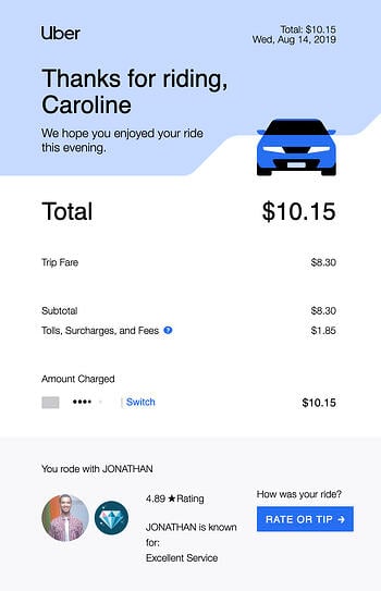
Uber’s order confirmation emails are sleek, clean, and aesthetically pleasing. Their design makes use of large text, plenty of white space, and a blue call-to-action to incentivize the rider to “rate or tip” the driver.
What we love: The email is organized so the rider sees the most critical information above-the-fold — a “thank you” followed by the price. The recipient only needs to scroll if they want to.
2. Affirm the purchase.
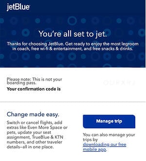
JetBlue’s order confirmation email opens with their fun and clever slogan, “You’re all set to jet.” This phrase immediately reassures the recipient that their order was successfully processed.
Additionally, the text below the initial slogan promises the recipient “the most legroom in coach, free wi-fi & entertainment, and free snacks & drinks.” Even though the recipient has already paid, JetBlue uses the order confirmation email as another opportunity to cultivate stronger customer loyalty.
What we love: Below the confirmation, JetBlue provides a simple “Manage trip” CTA, so the customer can easily update a seat assignment, add extras, or switch flights. Best of all, they’ve included a link to their mobile app. Customers receiving order confirmations from JetBlue will need their app to access their mobile ticket, so it’s a smart strategy for JetBlue to include the app link.
3. Create a sleek design.
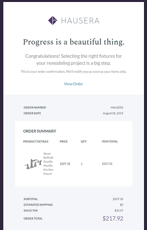
Hausera, an ecommerce site that sells kitchen and bathroom fixtures, does an excellent job ensuring their order confirmation email is sleek, all while offering the recipient any information they may need. They start with positive messaging like “progress is a beautiful thing” and “congratulations” to thank the customer for their order.
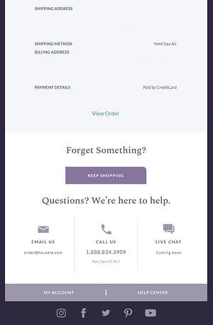
What we love: Below the order summary, they include helpful CTAs such as “Keep Shopping,” as well as options to either email, call, or live chat with a support rep. Whether a customer has an issue with their order or simply wants to continue perusing Hausera, the ecommerce site ensures the customer can find the next steps from within the order confirmation itself.
4. Put the most important details up top.
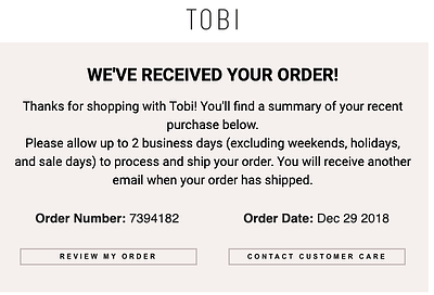
Tobi’s order confirmation email is simple and straightforward. The ecommerce site offers two critical CTAs — “review my order” and “contact customer care” — within the email itself. The recipient is able to immediately check and correct any information if their order doesn’t look right.
What we love: Tobi also effectively outlines their order process within the body text of their email. They tell the customer to ” allow up to 2 business days to process and ship your order.” By including this information in their email, Tobi ensures minimal outreach from customers who are wondering when their order will ship, or why they haven’t received shipping information already.
5. Say, Thanks!
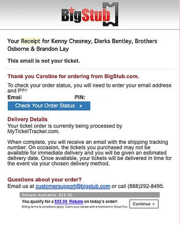
BigStub’s order confirmation email, while admittedly text-heavy, does a good job providing the customer with plenty of critical information throughout their email, including a CTA to check order status, a phone number to contact customer support, and a note regarding delivery details for the recipient’s ticket.
What we love: BigStub offers a $25 rebate within the order confirmation email with enrollment in Great Fun. Even if the customer doesn’t apply for the rebate, the inclusion is still an effective method that allows BigStub to potentially boost positive brand perception.
6. Make it shoppable.
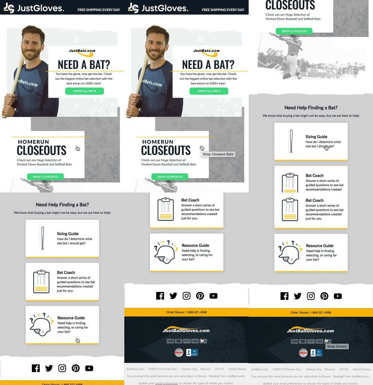
JustBats, an ecommerce site that sells baseball and softball equipment, does an excellent job of cross-selling other products in their order confirmation emails. For instance, if you purchase a glove on their site, you’ll receive an email with the following message — “You have the glove, now get the bat.”
The rest of the email is designed to help a user choose a bat, with CTAs like “Shop all bats” and “Shop closeouts.” The email also features helpful resources to ensure the recipient is able to find the right bat for his or her needs.
What we love: JustBats proves an order confirmation email can be an effective opportunity to suggest other relevant products or services, particularly since the order can help you understand the customer’s needs. In the above example, a glove is a logical next step for someone who has just purchased a bat, and vice versa.
7. Be helpful.
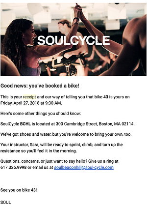
SoulCycle’s order confirmation email effectively provides all relevant information and demonstrates SoulCycle’s ability to go above-and-beyond in customer service. Once they’ve outlined when, where, and on which bike the customer will be riding, SoulCycle includes other useful information including the studio address and a note that shoes and water will be provided.
At the bottom of their email, they send a cheerful invitation that reads “Questions, concerns, or just want to say hello?” with both a phone number and email if the recipient needs to reach customer support.
What we love: SoulCycle pays attention to the language in their order confirmation email, and looks for areas where they can add brand voice.
8. Reinforce meaningful actions.
Take a look at the order confirmation received from Massachusetts’ Franklin Park Zoo upon a recent purchase:

This email provides all the information needed, but it also makes the recipient feel good about the purchase by letting them know that their money was helping support conservation efforts.
9. Teach users about new technology.
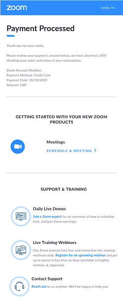
Zoom’s confirmation email contains three parts:
- It confirms the purchase.
- It encourages the recipient to use the service by jumping with “schedule a meeting.”
- For the recipients who might be less savvy, Zoom offers demos, webinars, and support.
What we love: The sleek and minimal design underpins the ease of use of Zoom’s meeting software. The email is well-designed with a lot of white space. This makes it easy to read and draws the eye to the most important elements like the iconography representing support and training opportunities.
10. Stay on brand.
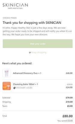
SKINICIAN uses a consistent tone throughout its confirmation email. The text at the top is friendly and personable. It affirms the buyer’s purchase with “Happy Healthy Skin is around the corner.” The intro ends with a friendly “we hope you love your new skincare.”
What we love: At the top of the email the recipient can take two actions: “View your order” or “Keep shopping.” An effective addition to this email is the “You saved £5.00,” which reminds the user of the value of shopping at their site.
11 Order Confirmation Email Templates
Looking to craft the perfect confirmation email? Try these email templates to create a confirmation sequence that serves your customers and supports your brand.
1. Educating Customers
![order confirmation template, Thank you for your order. Please take a moment to review the details below. Order Number: [order number] Order Date: [order date] Payment Date: [order payment] Now, let’s get you started with [product]. [Information on how to use the product.] Dig into some of the guides, webinars, and training materials, below. Contact customer support.](https://i4lead.com/wp-content/uploads/2022/12/confirmation-email-template-education.jpg3Fwidth3D35026height3D50926name3Dconfirmation-email-template-education.jpg) What we love: This template gives the recipient everything they need to affirm their purchase, then, it preempts their next needs by offering educational materials.
What we love: This template gives the recipient everything they need to affirm their purchase, then, it preempts their next needs by offering educational materials.
Either the recipient will know what they need to do next, or they might appreciate guidance to get the most out of their new purchase.
This template also connects the brand to the consumer. The addition of “Contact customer support” shows the brand cares about the user by giving easy access to support.
2. Supporting Your Sales Funnel
![confirmation email template, You’ve purchased [item]. Thank you for choosing us! Purchase date: [date of purchase] Order number: [order number] Amount: [cost of order] [Order status] [Add sections with related items to bring the buyer back into the shop.]](https://i4lead.com/wp-content/uploads/2022/12/confirmation2520email_092022-Nov-14-2022-03-51-15-1201-AM.jpeg3Fwidth3D35926height3D33226name3Dconfirmation2520email_092022-Nov-14-2022-03-51-15-1201-AM.jpeg)
What we love: Shoppable email confirmation is likely to take your user back to the website. Plus, it shares products that you know the customer might be interested in.
3. Sharing brand values.
![Thank you for shopping with us today! Here are the details of your latest purchase: Purchase date: [date of purchase] Order number: [order number] Amount: [purchase cost] [Track My Order] [Add a “Did you know?” section taking the user to relevant pages on the website.]](https://i4lead.com/wp-content/uploads/2022/12/confirmation-email-template-values.jpg3Fwidth3D35026height3D50526name3Dconfirmation-email-template-values.jpg)
What we love: Remember, 65% of people open confirmation emails, and your buyer might not know everything about your brand yet. Informing your buyers about what sets you aside from the competition can help turn them into loyal customers and brand advocates.
4. Making the Buyer Feel Good
![Hey [name], You’ve done something incredible today by donating [amount]. Thanks to your generosity we will be able to [what the donation money accomplishes]. It’s people like you who make a difference and we really appreciate it.](https://i4lead.com/wp-content/uploads/2022/12/confirmation2520email_092022-4.png3Fwidth3D35026height3D32026name3Dconfirmation2520email_092022-4.png)
What we love: There’s nothing like the affirmation that you’ve done a good thing. With something like a donation you can expect the donor to feel good already, but they might not appreciate the scale of their contribution. This email template helps to do just that, and it quietly reinforces exactly what the nonprofit is achieving.
5. Welcoming a Buyer Into the Community
![email confirmation template, Hey [name], You signed up for [subscription]. It’s great to have you! Here are the details. Subscription start date: [date] Subscription length: [time period] Amount: [cost] Payment date: [date of payment] Your subscription is active until [date] and will automatically renew. You’re now part of a [size] community, and we’re all here to [mission]. Why not head over and introduce yourself to the community? You’ll find threads and channels dedicated to introductions and our moderators are there to welcome you. Find us on [Slack link], [Facebook Group link], and [LinkedIn link].](https://i4lead.com/wp-content/uploads/2022/12/confirmation2520email_092022-3.jpeg3Fwidth3D35026height3D50626name3Dconfirmation2520email_092022-3.jpeg)
What we love: The email covers the details of the purchase and subscription at the top. It eliminates questions about automatic renewal and affirms that the decision is a good one by telling the recipient that others have subscribed too. Finally, the email aims to make the transition into the community easy by encouraging them to introduce themselves and where to do it.
6. Reaffirming the Purchase
![Hello [name]! You’ve taken action today! Here's more about your order. Invoiced amount: [cost] Status: [paid or pending] Payment date: [date of payment] [Order details] You should be proud of the good work you’ve done today. By purchasing [service] you can expect. Got questions? Reach out to customer service.](https://i4lead.com/wp-content/uploads/2022/12/confirmation2520email_092022.jpeg3Fwidth3D35026height3D48326name3Dconfirmation2520email_092022.jpeg)
What we love: There’s nothing like a quick affirmation of a good decision. This email does that, but it also gives the reasons why the recipient can be happy about the decision by outlining the expectations. The customer service details at the end are a nice addition, just in case there are any nagging worries.
7. Confirming a Booking
![Dear [name], Thank you for choosing us for your upcoming visit. We can’t wait to meet you. Here’s confirmation of your booking: Booking number: [order number] Arrival date: [date] Nights: [number of nights] Room: [room number if applicable] Total rate: [nightly rate if applicable] Amount paid: [cost] Balance outstanding: [remaining balance if applicable] Before you arrive, there are a few things to note: [Provide specific instructions.] Here’s how to find us. [Detailed directions.] Any questions, don’t hesitate to pick up the phone and call us at [number].](https://i4lead.com/wp-content/uploads/2022/12/confirmation2520email_092022-Nov-14-2022-03-51-13-0797-AM.jpeg3Fwidth3D35026height3D53126name3Dconfirmation2520email_092022-Nov-14-2022-03-51-13-0797-AM.jpeg)
What we love: This confirmation template provides all the next steps that the recipient needs to see their hotel or room booking was a success. Additionally, the email is advising the recipient on what they can do next. That includes covering the location and any specific instructions the purchaser might need to be aware of.
8. Opting for Simplicity
![Hello [name], Thanks for choosing us. Your order for [product/service] was successful. You can expect delivery in [number] business days. Order number: [order number] Payment received: [cost] [Track order status]](https://i4lead.com/wp-content/uploads/2022/12/confirmation-email-simple.png3Fwidth3D40026height3D36926name3Dconfirmation-email-simple.png) What we love: Although simplistic, this confirmation email does everything that it needs to. It’s suitable for brands who want to get to the point and deliver all the core information.
What we love: Although simplistic, this confirmation email does everything that it needs to. It’s suitable for brands who want to get to the point and deliver all the core information.
9. Encouraging Referrals
![confirmation email template: Hello [name], It’s time to celebrate! Your order is being processed and will be with you in [number] business days. Your order details: Order number: [number] Order date: [date] Amount paid: [cost] Don’t forget! We offer 10% off your next order if you refer a friend. Just share your referral code [code] with a friend, and we’ll sort the rest!](https://i4lead.com/wp-content/uploads/2022/12/confirmation-email-template-referral.jpg3Fwidth3D37026height3D37626name3Dconfirmation-email-template-referral.jpg)
What we love: The tone of this email template is friendly and informative. At the end, the brand prompts the customer to share with a friend for 10% off their next order. You can reinforce this messaging in later emails too, which is especially useful when the order arrives.
10. Upselling
![Hello [name], Please find the details of your order below. You’ll receive a shipping notification in 1-2 days. Your order details: Order number: [number] Order date: [date] Amount paid: [cost] Your items would look amazing with these accessories! [Related items] [Revise Your Order]](https://i4lead.com/wp-content/uploads/2022/12/confirmation2520email_092022-1.jpeg3Fwidth3D37026height3D41326name3Dconfirmation2520email_092022-1.jpeg)
What we love: Similarly to the JustBats and SKINICIAN examples above, this template is giving users an opportunity to go back to the website. The related items next to a “revise your order” button are effective. This CTA can inspire an upsell before the order is fully processed.
11. Incentivize Action
What we love: The notion of a soon-to-be-ending sale encourages users to take action. The shop button makes viewing the sale items easy.
Subject Line Templates
Looking for some quick inspiration for subject lines? Here are a few popular options that you can use in your confirmation emails.
Note: Subject lines vary based on the type of item that is for sale and the action that has been completed.
Ecommerce Purchases
- 🙌🏻 You did it!
- Your purchase is on its way.
- We’ve got your order!
Email Sign-ups
- Email confirmation! You’re one click away.
- You’re almost there! Confirm your email.
- Click here to confirm your email.
- Click to join 10,110 subscribers.
Donations
- Confirm your email for access.
- You’re making a difference.
- You changed a life today.
- You’re amazing! 💙 Thank you for your donation.
How to Create and Send Order Confirmation Emails
There are plenty of online sites with email templates that can help you create confirmation emails.
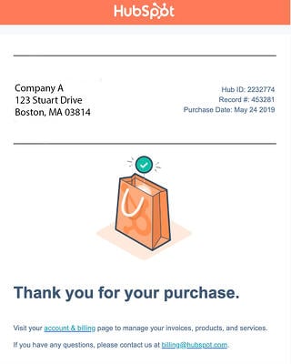
For instance, you can create an order confirmation email within the HubSpot Email Marketing tool for free. You can choose a pre-made template and customize text, images, and overall design. Or, you can create an email from scratch.
Here’s an example of an order confirmation email made with HubSpot’s email tool.
There are plenty of other order confirmation email templates available through tools such as Stripo and Squarespace.
Alternatively, if you use an ecommerce website builder like X-Cart, you can use one of their email tool add-ons to create your own order confirmation email.
Order Confirmation Page
Typically, when a customer places an order, they’ll see a confirmation page before they even receive the confirmation email.
For instance, here’s what you’ll see when you place an order on Amazon.
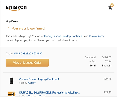
This page is where you’re redirected when you click the “Buy” or “Purchase” button and signifies that an email should be on its way. An online confirmation page is a temporary notice that tells your customer that their transaction went through correctly. If a customer doesn’t see this page, he or she will likely assume their transaction didn’t work.
When you’re creating an online confirmation page, here are a few things you should include:
- Messaging such as “Success! Your order is confirmed”, as well as a note that the customer should expect an email in their inbox soon.
- An order number, delivery details, and order summary (including total cost).
- Images of the products or services bought.
Additionally, you might include other relevant purchases on a customer’s order confirmation page. For instance, if they’ve purchased a blender on your site, perhaps you want to show them a smoothie recipe book on their order confirmation page.
Ultimately, it’s critical to create order confirmation pages and emails. These details ensure your customer feels supported throughout their entire buyer’s journey.
Editor’s Note: This post was originally published in Aug. 2019 and has been updated for comprehensiveness.
![]()


![confirmation email template, Hey [name]! Your order is processed. Check out the order details below. Order number: [number] Order date: [date] Amount paid: [cost] [Review Order] Before you go, did you check out our sale ending in [hours/days]? It’s not too late, you can pick up [items] for up to 50% off. [Shop]](https://i4lead.com/wp-content/uploads/2022/12/confirmation2520email_092022-Nov-14-2022-03-51-14-5604-AM.jpeg3Fwidth3D33026height3D36226name3Dconfirmation2520email_092022-Nov-14-2022-03-51-14-5604-AM.jpeg)
