The “about” section of your website should include your mission, purpose, and who’s on your team. The right about us or about me template can help you expertly lay out your vision. That’s why our team gathered five templates to help you build the perfect about page.
This post includes best practices for crafting a stellar about page. You’ll explore:
- What makes a good about page?
- How to write an about page
- The Best About Us Page Templates and Examples
- The Best About Me Page Templates and Examples
Featured Resource: Our 29 Favorite ‘About Us’ Pages
Download the guide to review what we love about these amazing ‘About Us’ page examples, plus a few tips about how to make one of your own.
What makes a good about page?
A remarkable about page is genuine, approachable, and distinguished. It should give the visitor a glimpse into what working with you might be like. You can include personal interests, stories, and photos that convey the unique story of your business. You may also include information about who’s on your team and what their roles are.
About pages are personal to you and your company, so the structure of your about page will vary based on what you want to highlight. However, you’ll start with the same writing process.
Let’s explore the set-by-step guide to building your about page.
1. Establish a mission statement.
Your about page can and will be more comprehensive than a single mission statement. However, to draw people in, you need to succinctly state your goal in the industry up front.
What is your business here to do? Why should your website visitors care? This information will give the reader something to remember about your company long after they leave your website.
2. Outline your company story.
Every business has a story to tell. Even if you’re running a start-up with a short history, you’ll want to share your company’s origin. Talk about how you got to where you are today on your about page.
Pro tip: Isolate the milestones before your company’s founding, and use them to give readers some backstory on your current venture.
3. Reveal how you’ve evolved.
There’s no shame in admitting how your business strategy — or even your way of thinking — has changed since you began. In fact, these evolutions can improve the story you tell to website visitors.
About pages are perfect spaces to talk about where you started, how you’ve grown, and the ideals that have helped your organization mature. Use these moments to show people that you’re always ready to change and adapt to the needs of your industry.
4. State your “aha!” moment.
Every good company was founded on an idea — something the current marketplace might not yet offer. What was your idea?
Use this “Aha!” moment as a pivot point when telling your company story. What was a challenge you faced while developing your company? How did this challenge or discovery shape what you are today?
5. Explain who you serve.
As much as you want as many eyeballs on your about page as possible, you won’t do business with every single website visitor. That’s why you must identify and mention your core customer.
Your about page should explain who your business is dedicated to helping. This allows prospects to identify if your service is aligned with their needs.
6. Explain what you’re offering them.
Companies often generalize their offering in the website copy, making it hard to understand what the customer is actually paying for. In a sentence or two, explain exactly what a potential customer will gain from your business. This succinct summary will keep visitors on your website for longer and get them interested in learning more.
Pro tip: Sometimes, businesses are afraid that in-depth explanations of their products aren’t interesting enough or will sound unappealing in writing. And that’s a fair concern. Start by explaining what problem your offering solves. Then, link to a page with more information.
7. Cite examples of clients you’ve served.
Got some loyal customers in your portfolio? Use your about page to let the world know who already benefits from your work. Consider naming your most successful clients and linking to a case study.
Knowing about your company’s past successes can influence your prospects’ purchasing decisions. They can envision their future success through the stories of your best customers.
8. Describe your values.
Customers want to be treated like human beings. For that to happen, they need to feel that they’re being served by human beings. When finishing your about page, describe who you are as a person or a team. What’s your company culture like? What bigger picture in life drives your business?
Pro tip: Remember, future employees are a secondary audience of your company’s about page. This is another reason describing your personal values is a good idea. The key to your job candidates’ hearts is to show them you have one too.
Keep in mind a secondary audience of your company’s About page consists of your future employees. This is another reason describing your personal values is a good idea — the key to your job candidates’ hearts is to show them you have one too.
About Us Page Template & Examples
About Us Template
You can create an About Us template for your company website easily. We lay out the standard “about us” page below.

No matter your business, your about page should include the following elements.
- A mission statement. This describes the purpose of your business as it relates to the industry or market you serve.
- A vision statement. The future of your business is outlined in this section.
- Your values. Core values help the reader connect with you and your business on a personal level.
- A target market summary. Your site visitors want to know that they’re in the right place and that your company can help them.
- A brief company history. In addition to piquing your visitors’ interest, a brief company history can help the press describe your business accurately.
After you write a draft, you can use one of HubSpot’s done-for-you website templates to create your about page’s layout. These website templates can be installed and customized in minutes.
Done-For-You About Us Page Templates
While the copy is an important element of your about page, you’ll also want to showcase your brand story and identity to the world. These “about us” page templates create a compelling, customizable user-experience.
1. Touraza Template (WordPress)
If you want something with a little flavor, the Touraza template is a tasteful choice. With the “meet the team” section near the top, geometric designs, and striking typography, you’ll be able to showcase the humans behind your brand.

2. Logan Template (Shopify)
This template makes use of large images in a modern layout to break up the ample white space. The result: A clean and enjoyable reading experience.
The top of the page puts the brand story (or other introductory text) first, supported by a large image that speaks for itself. The pops of color can be customized to your brand style, drawing emphasis to the most important elements you want to highlight.

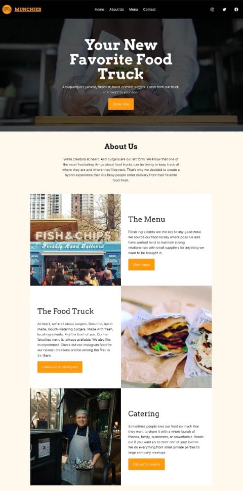
3. Munchies Template (WordPress)
This theme from Automattic is great for small businesses with a brief company history. You can start by explaining your mission concisely, then jump right into important links.
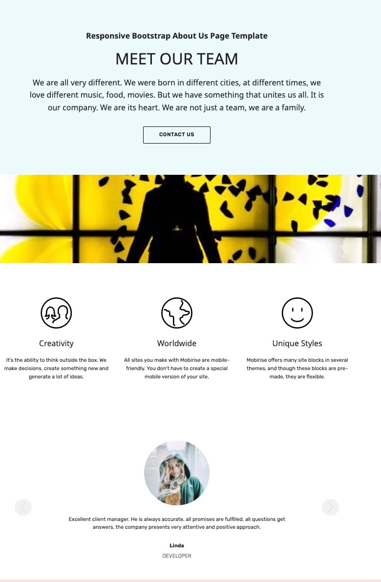
4. Mobirise Template (WordPress)
This visually compelling page allows you to evenly disperse information. Your webpage visitors won’t be scared off by a giant wall of text.
Instead, you can briefly describe your history at the top of the page. Three icons allow you to lay out your most important values. Plus, the page also features a carousel, so you can include headshots and titles for your teammates.
Best About Us Page Examples
1. Yellow Leaf Hammocks
Good stories humanize your brand, providing context and meaning for your offering. What’s more, good stories are sticky — which means people are more likely to connect with them and pass them on.
Yellow Leaf Hammocks tells users about its product by describing how the hammocks empower artisan weavers and their families. The company breaks down different pieces of the story into sections that combine words and easily digestible graphics.
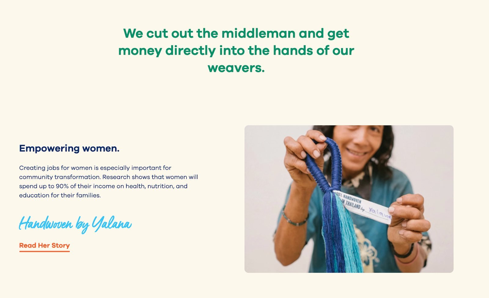
Pro tip: Put your storytelling skills to work on your about us page. Using descriptive and emotive copy and gorgeous graphics, an about us page with a story works harder for your business than a generic one.
2. Eight Hour Day
People tend to think that about us pages have to sound formal to gain credibility and trust. But most people find it easier to trust real human beings, rather than a description that sounds like it came from an automaton. Keep your about page us page friendly and real.
Take inspiration from Eight Hour Day. This brand showcases the people behind the company and humanizes its brand.
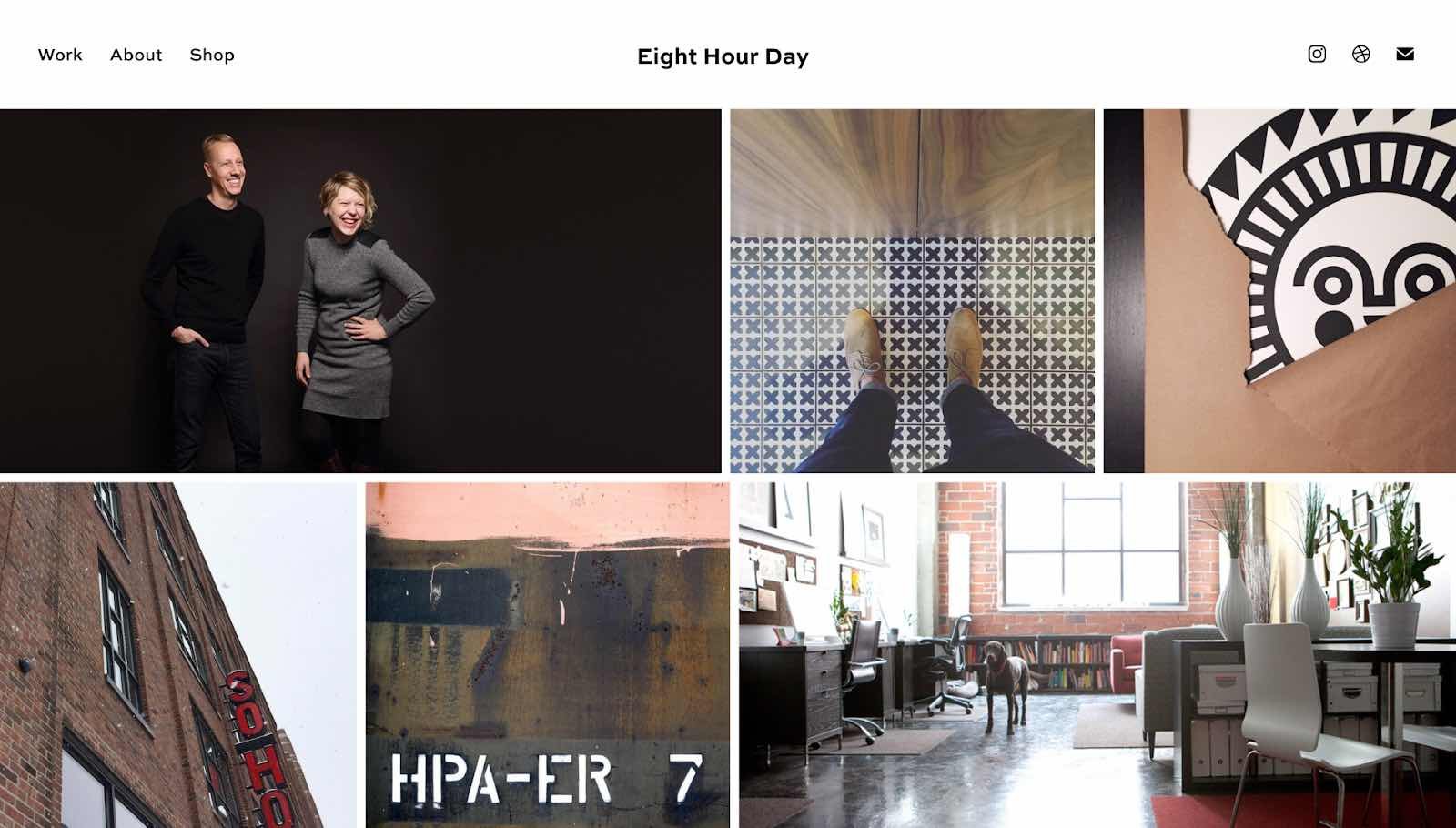
What we love: Introducing the founders with inviting photos on this about us page drives home the point that Nathan and Katie are — as they so astutely put it — “two individuals with a passion for creativity — creativity makes us happy.”
3. Apptopia
People want to know what your business does and how it can help them. After all, if people can’t figure out what you do, how will they know they need your product or service?
So, skip the industry lingo — that’s what Apptopia does on its About Us page. The startup’s simple but polished language effectively communicates the company’s offering while still allowing the Average Joe to understand it.
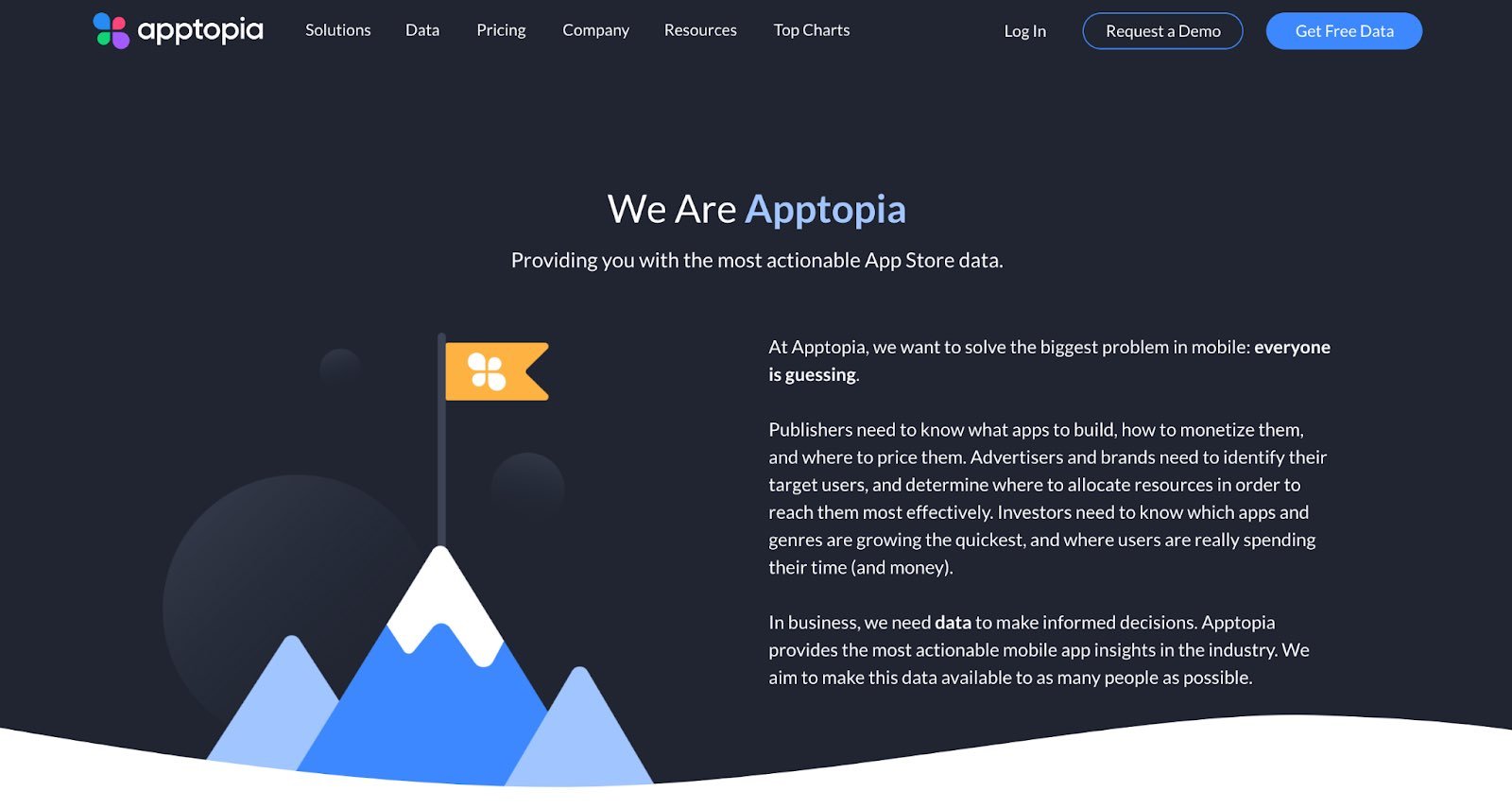
What we love: Apptopia uses short and punchy sentences to explain complex products and ideas in a way that isn’t patronizing. The copy on this About Us page leads with empathy.
4. Moz
Instead of following the classic about us script, try something different. Take Moz, for example. A lot has happened since it was founded in 2004, so the company chose to share those milestones using a fun, clean design.
Moz’s about us page incorporates clear headers, concise blurbs, and little graphics to break up the text.
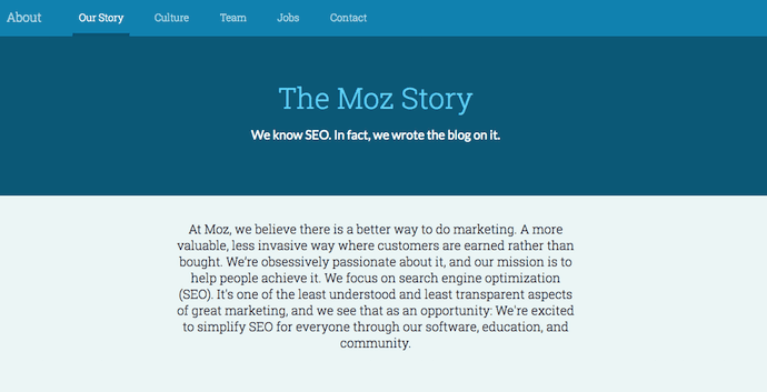
What we love: Take note of the humble references to how Moz received funding, how it switched its brand positioning — and most importantly, how it switched back to its original model. This speaks volumes about the value honesty and humility can play to your customers.
5. Yokel Local
On its about page, Yokel Local spotlights its clients, its story and mission, and the team behind the brand. This last element is key because Yokel Local knows that its “vibe” wins over prospective clients. After all, when you hire an agency, you’re hiring its people. And people have personalities.
What we love: Because “Yokel Local” is a bit of a kooky name that gives people pause, the company pokes fun at it by providing the definition. This then leads to photos of the team at work (and at play), the agency’s story, its mission and values, and the people who make the magic happen. This magic is included all over the about page as its employees make goofy faces, wear ugly Christmas sweaters, and work/play hard.
6. Nike
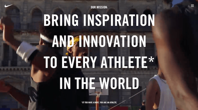
Nike began on the campus of the University of Oregon at the hand of the college’s track coach, Bill Bowerman. Even though he no longer works at the company, one of his beloved quotes still brands the bottom of Nike’s about us page below: “If you have a body, you are an athlete.”
This bold sentence, referenced by the asterisked “Athlete” in the words right above it, sheds important light on Nike’s audience. The brand may be big today, but Nike is all about the rising stars — whom the company depends on, according to the rest of its about us page, to “expand human potential.”
What we love: Nike clearly knows its audience and makes its mission obvious to them as soon as they land on the about us page. There’s no question that the visitor is in the right place and understands exactly what Nike has set out to do.
7. Bulldog Skincare
The best about us pages are infused with color, have personality, and stay true to a company’s unique brand voice. Let’s take a look at Bulldog, a men’s skincare brand.
The about us page is pithy and leads with an adorable bulldog — fitting the name and the brand. It also states the purpose of the products — to help customers from waking up with the (admittedly adorable) wrinkly face you see when you visit Bulldog’s website.
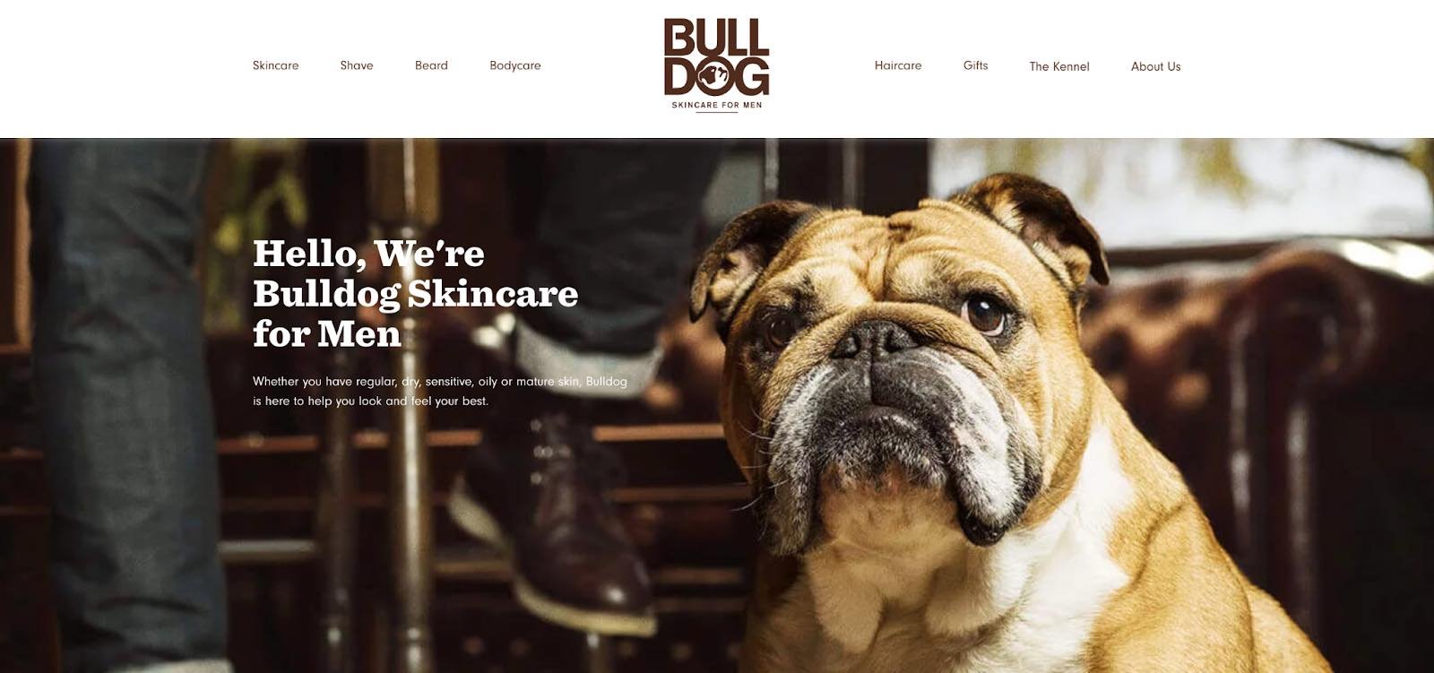
What we love: Bulldog isn’t afraid to have fun with its brand. That bit of humor makes this about us page anything but typical. It primes visitors for a story in a way that makes them immediately feel connected to Bulldog’s mission and vision.
8. Doomtree
Made up of talented artists with thriving solo careers, Doomtree brings these musicians together to work on creative projects as a crew. The group “started as a mess of friends in Minneapolis, fooling around after school, trying to make music without reading the manual.”
As soon as you arrive on Doomtree’s About Us page, you’re greeted with big, bold photos of those friends.

As you scroll down, users are treated to even more interaction with the crew’s events and music tracks. That makes sense because it gives visitors an instant sample of Doomtree’s product.

Pro tip: Find ways to use multimedia elements. One minute of video is worth 1.8 million words, according to Forrester Research’s Dr. James McQuivey. Consider combining your unique story with audio and visuals like in the example above.
9. Below the Fold
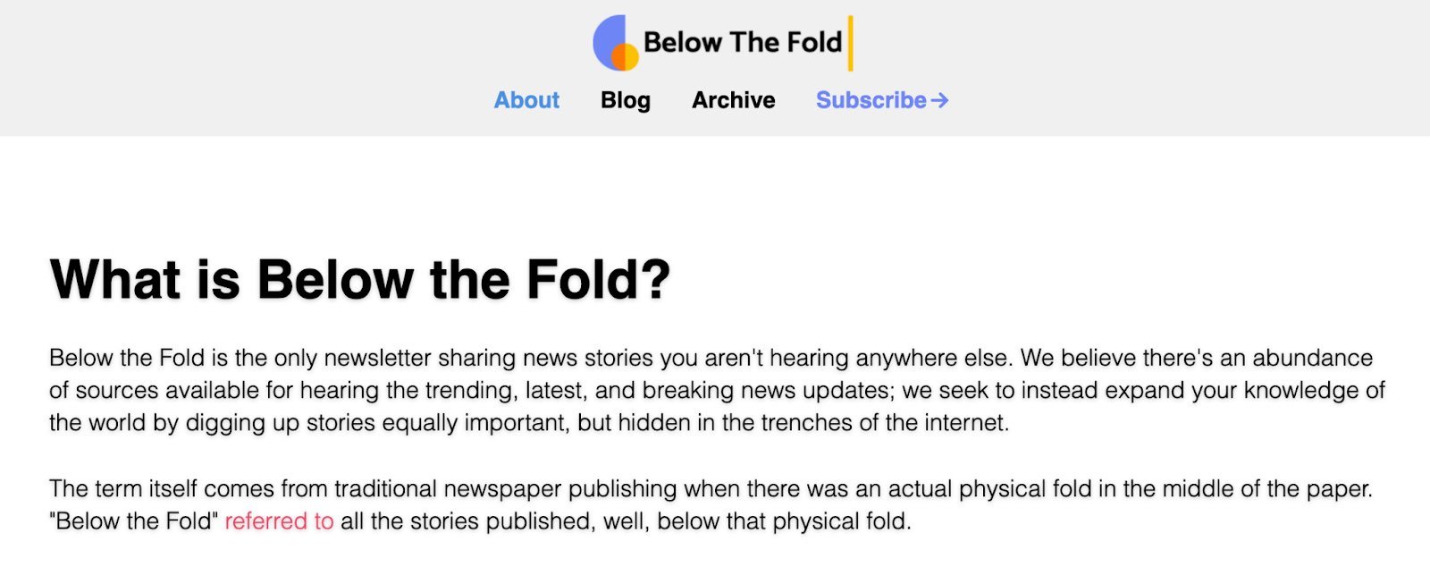
Below the Fold is a company committed to “sharing news stories you aren’t hearing anywhere else.” With that in mind, the big headline on the about page introduces the company’s purpose. Further down, you’ll find four core values, how the business generates revenue and more details about the team behind the scenes.
What we love: This page gets straight to the point about what Below the Fold is, who it serves, and why it exists. The simple design lacks color, embellishments, and sensational imagery so the reader can focus on what the company has to say — a direct nod to the mission statement.
10. Ceros
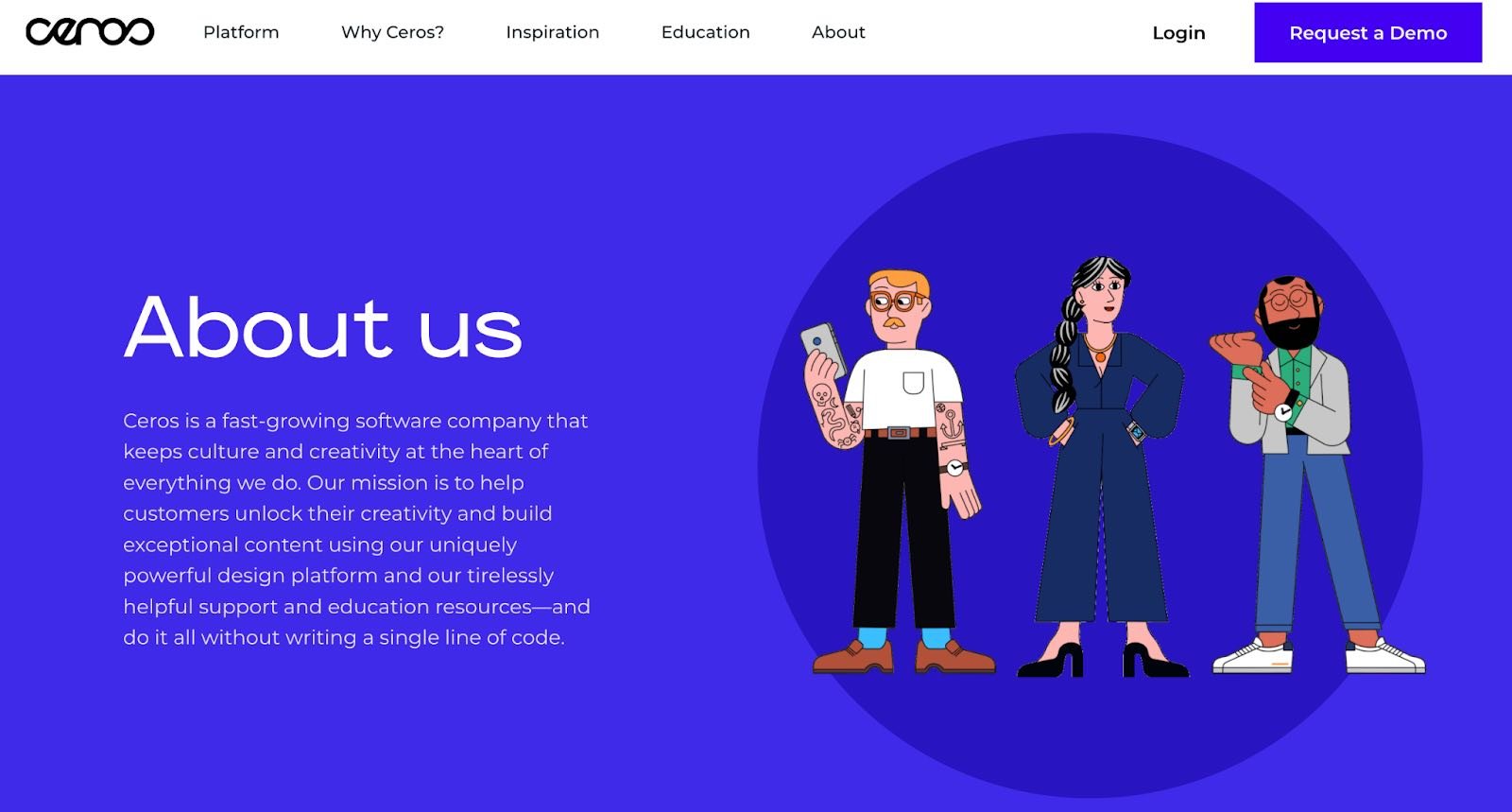
Ceros’ About Us page is interactive and engaging. As you scroll, the images move across the page with punchy designs. Additionally, Ceros’ uses these images of its impressive, unique office space to further personalize the page.
What we love: Ceros keeps the text on the page short-and-sweet, with powerful statements like “we exist to unlock creativity”. The culture section further demonstrates Ceros’ playful brand voice, with core values like “we wear our chicken suits”.
11. Marketive
Marketive’s about us page leads with a solid value statement: “Got a solid product? We tell your target audience that you exist.”
Additionally, Marketive’s About Us page displays original designs rather than photos to support the text. This makes the page compelling to scroll through.
What we love: The interactive milestone calendar at the bottom is especially impressive. It authentically represents some humble beginnings (including two unsuccessful startups that inspired present-day Marketive) and features a fun scroll element.

12. Sweet Loren’s
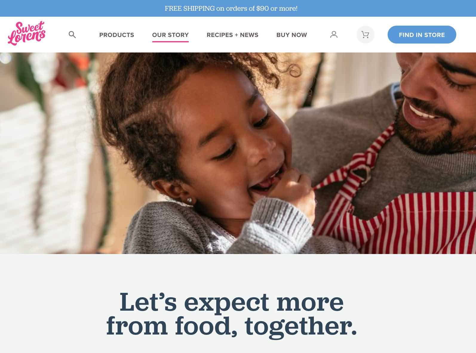
Start-to-finish, Sweet Loren’s about us page is playful, engaging, and colorful. The page starts with a 60-second video and even incorporates cookie dough-scooping gifs. As you scroll, you’ll move through some of Sweet Loren’s impressive values, including inclusivity and refusing to compromise.
What we love: Sweet Loren’s yummy products are last on the page, ensuring you’re fully primed to purchase only after learning about Sweet Loren’s mission.
13. TalEx
TalEx began when two women left a major recruiting firm to build their own. TalEx has since seen unprecedented growth at 4,900% in the three years. The company’s about page captures this history and more.
What we love: The company’s emphasis on social responsibility takes up nearly half the page, making this core value clear. The statement explains TalEx’s commitment to donate 5% of its annual net profit to philanthropic organizations. People who visit the website know immediately that giving back is important to the team at TalEx.

14. LoveBug Probiotics
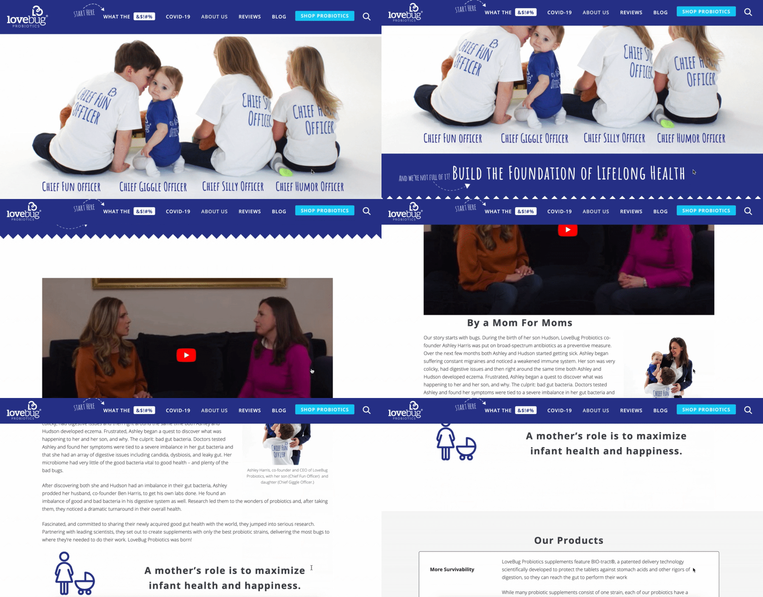
LoveBug Probiotics’ page effectively includes all the information you’d need on the company to make an informed purchasing decision. That includes how the founder came up with the idea, her personal ties to the vision, and the science behind her probiotic.
While the products are science-backed, the About Us page doesn’t confuse visitors with difficult-to-understand facts. Instead, the page is simple, straightforward, and helpful.
What we love: This about us page features an image of the founder’s four young children wearing “Chief Fun Officer”, “Chief Giggle Officer”, “Chief Silly Officer” and “Chief Humor Officer” t-shirts. There aren’t many pages with cuter introductions than that.
15. Brown and Coconut
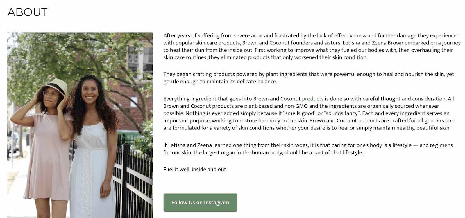
Sometimes, simpler is better — as is the case with Brown and Coconut. This about us page features a photo of the two co-founders alongside a few paragraphs of text outlining the brand’s vision.
Brown and Coconut’s About page uses no-fuss language to describe the business.
What we love: Rather than ending with a CTA directing visitors to its products, the co-founders instead choose to include a CTA to follow the business on Instagram, promoting a more effective, long-term lead generation strategy that starts with brand awareness.
16. Kuno Creative
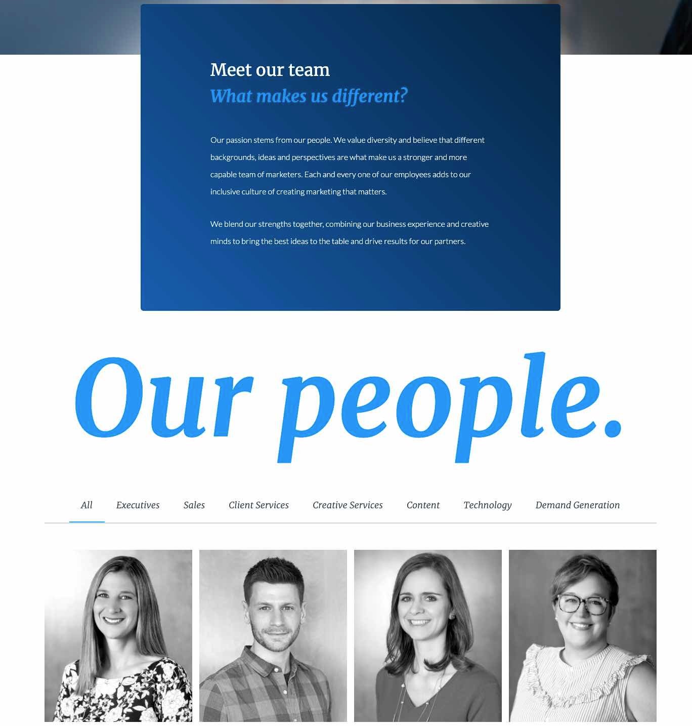
Kuno Creative’s page effectively focuses on what makes the company different: its people. While the first paragraph describes the origin of the digital marketing agency, the majority of the page is taken up by black-and-white headshots of all its employees along with descriptions of each member.
What we love: If you’re unsure what you want to include on your about us page, consider taking note of how Kuno Creative focuses on its people, rather than its product. This offers a great way to humanize your brand.
About Me Page Templates & Examples
About Me Template
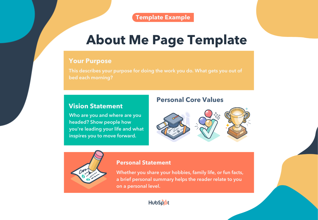
About me pages vary in detail, but most great pages include a few standard elements. You can see a suggested template from HubSpot below.
Make sure you include the following information on your page.
- Your purpose. This describes your purpose for doing the work you do. What gets you out of bed each morning? Try using the Ikigai map for guidance here.
- A vision statement. Who are you and where are you headed? Believe it or not, people are looking to you for leadership in some way. Show them how you’re leading your life and what inspires you to move forward.
- Your core values. Personal core values help the reader connect with you and find common ground.
- A brief personal statement. Whether you share your hobbies, family life, or fun facts, a brief personal summary helps the reader relate to you on a personal level.
Next, you’ll see these elements in action in the examples below.
Done-For-You About Me Page Templates
1. Coax Template (WordPress)
The Coax template allows the typography and copy to take center stage. This text-centric approach highlights your personal accomplishments and sells your services. Consider laying out content like a resume with big subheads on the left and descriptive text on the right.
Plus, this template is powered by Elementor, a page builder that makes customization easy.
2. One Page Portfolio Template
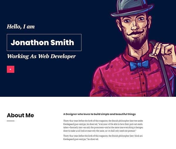
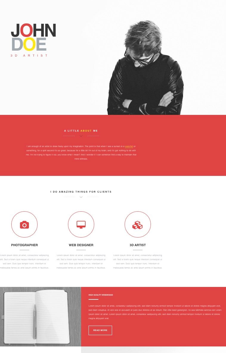
Instead of a wall of text, this about me page is neatly divided into separate sections. The text at the top of the page allows you to describe your mission and background.
The icons in the next section call attention to three specific services you provide. Further down the page, you can explain those services in greater detail. You can also include photos to show what you can do.
3. Beckham Template
Your about me page should provide a highlight of your accomplishments, as well as an overview of your service. This template can help you put your best foot forward.
The Beckham template includes a suggested place to link your resume, as well as sections to show off previously completed projects.
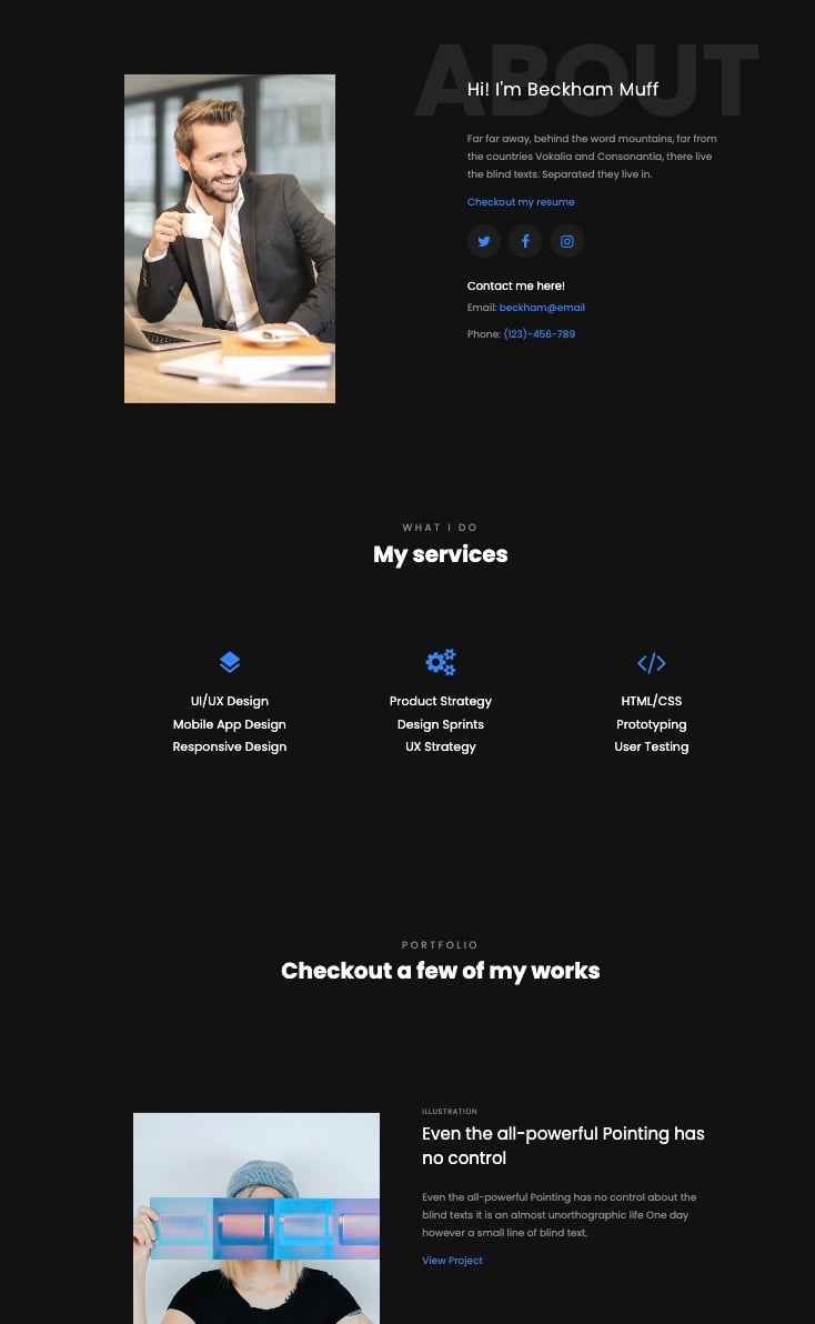 What we love: Near the bottom of the page, you can show off important numbers. That includes how many clients you have, how many projects you’ve completed, and how much coffee you drank.

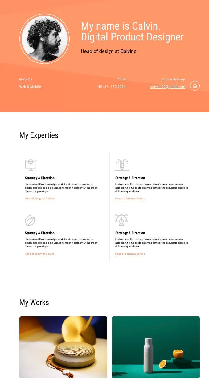
4. Calvin Template
For personal websites, consider placing your contact information front and center. Your visitors shouldn’t have to search to see how they can reach out.
The Calvin template makes integrating your contact information and personal story seamless. This template leads with email and phone numbers. Then, you can lay out the services you provide, before including links to your work.
Best About Me Page Examples
1. Joe Payton
The style and tone of your about page should match the services you provide. Let’s look at Joe Payton’s website as an example.
Not only does Joe’s illustrative self-portrait give him a personal brand that customers will remember, but it also demonstrates his expertise as a designer and animator. His website visitors can learn what he does in an easily digestible way.
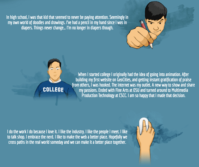
What we love: Joe freely expresses his values as a creative professional on a well-organized page. He tells a story that guides the reader through each section, without having them scroll endlessly to the bottom of the page.
2. Kero One
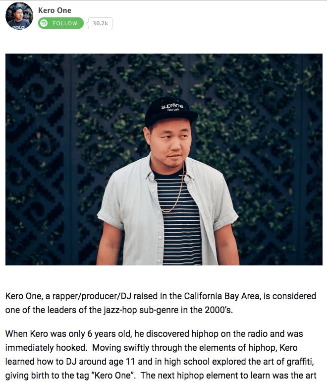
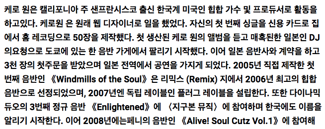
Kero One is a hip-hop artist and DJ from San Francisco. His About Me page carries a valuable lesson to personal brands that cater to more than one audience — especially if those audiences speak different languages.
Kero One’s about me page tells his story in English, Japanese, Korean, and Chinese. Including these East Asian languages helps Kero One connect with listeners in these different communities.
Pro tip: If your services are global or your offerings come in multiple languages, consider having your about me page in several languages.
3. Aja Frost
Alright, we might be biased in highlighting this professional, as Aja is our very own Director of English Growth at HubSpot. Nonetheless, the ingenuity she brings to the company isn’t lost on her website’s About Me page.
Being a data-driven professional, Aja knows her clients are looking for more than her writing skills — they want to see how her content has performed. With that in mind, her About Me page tells a story of her career growth, which peaks — no pun intended — at an impressive line graph showing the result of an SEO strategy she implemented for the HubSpot Blog.
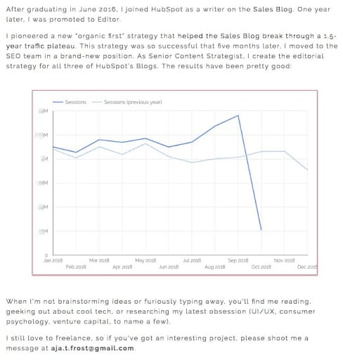
What we love: Aja understands the value of being personable even in a digital space like an About Me page. She closes out her about page with a personal note on what she does in her spare time — a great way to humanize yourself in the eyes of your potential customers.
4. Madison Butler
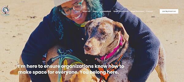
Madison Butler is an HR change-maker “committed to deconstructing the status quo and rebuilding corporate America, one organization at a time.” She does this through her DEI work and her advocacy.
Her about page, which doubles as the site’s homepage, calls this out at the very top in one bold statement: “I’m here to ensure organizations know how to make space for everyone.”
What we love: Madison’s About page is effective because it stays true to her mission while being simple, effective, and to the point. The second sentence in the headline, “you belong here,” underscores the inclusivity of Butler’s mission and work.
5. Sara Dietschy
This professional YouTube content creator has an eclectic collection of videos related to technology and culture and expresses that diversity all over her About Me page.
In addition to the vibrant self-portrait at the top of the page, Sara’s first sentence tells you just how many people subscribe to her channel: 780,000. This is an important number to know for her potential video advertisers and collaborators who want to know how much exposure they’d get by working with her or advertising on her channel.

What we love: The colored tiles lining the page — starting with the red one, as shown above — segment her work by the types of projects she’s worked on. This helps the reader navigate the page and understand what’s important for them to know.
6. ShaDrena
ShaDrena is a graphic artist whose mission is to “visually build creative rebellious brands beyond a logo.” In three sections — about, bio, and random facts — the audience gets the full ShaDrena experience, which is more than just design. It’s also about voice and personality.
As a self-described “creative hustler,” “rule-breaker,” and “designer of dope brands,” the language ShaDrena uses on her site comes across as edgy and authentic.
What we love: ShaDrena’s about page is counterintuitive to what someone might expect from a graphic artist. Most of the content is presented in black, white, and gray which puts all the focus on the composition of her design.

7. Marc Ensign
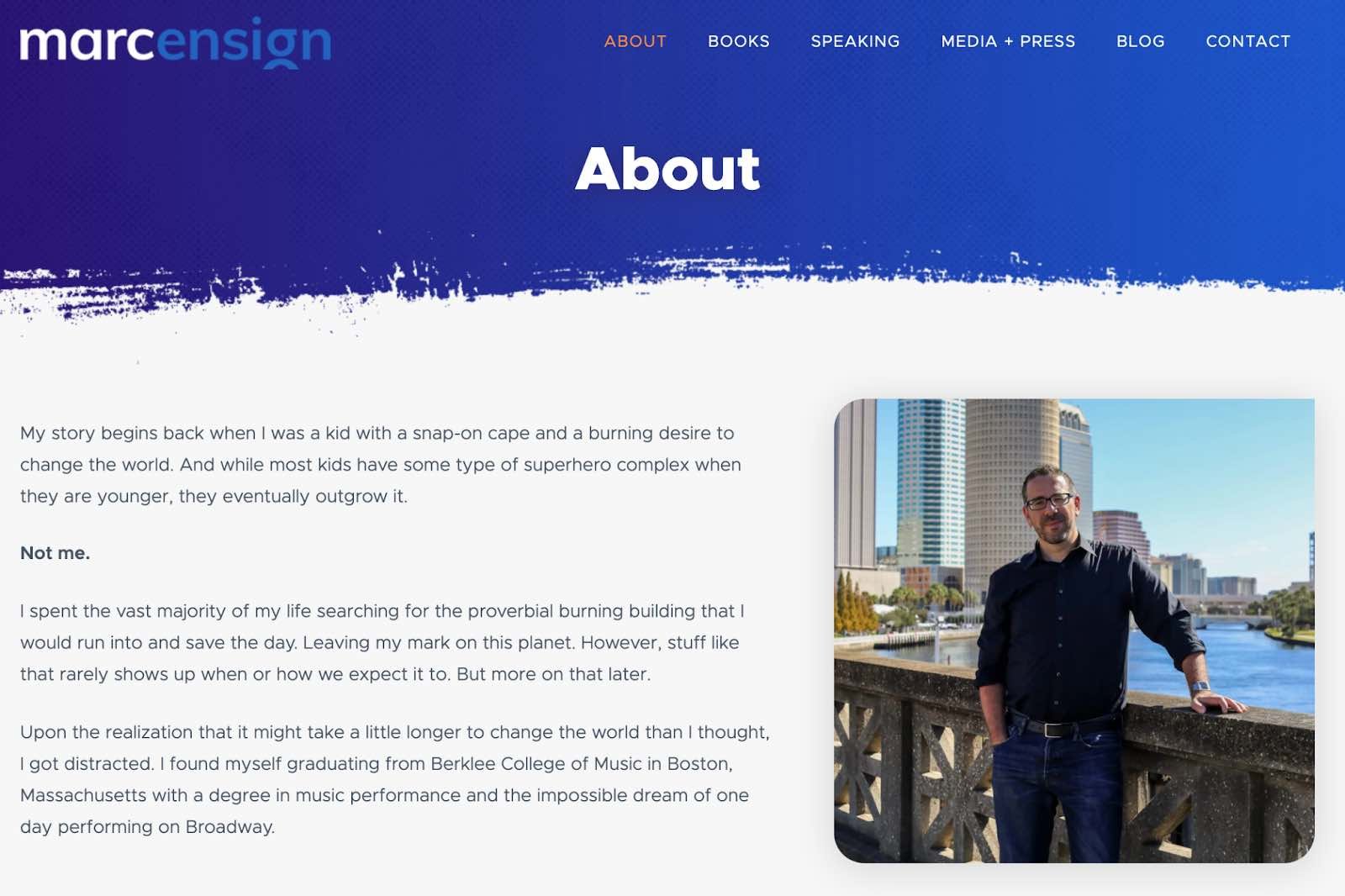
On his about page, Marc Ensign takes his work seriously without taking himself too seriously. Marketers know there’s value to keeping a casual tone in the content they create, but to attract customers, you need to prove you have discipline and integrity. This often proves to be a tough balance to get right.
What we love: Marc Ensign nails the balance between friendly and formal with a confident opening statement. This not only draws the reader in but also establishes Marc as a relatable partner to work with.
8. Miracle Inameti-Archibong
With an excellent design that emphasizes her copy, Miracle Inameti-Archibong’s site is a masterclass on how to do a one-page website well. The content is presented with large clear images, cool and bold colors, dynamic angles and blocks, and simple typography.

What we love: Miracle’s about me section spans over a decade but is laid out in just four sentences. The reader can easily understand her career span without being overwhelmed with too much information.
9. Haley Shapley
Haley is a freelance writer and editor who uses a single-page format for her website to showcase her personality, writing samples, and professional services. The site also features a very cool animated video effect in the background, creating a sense of space and movement.
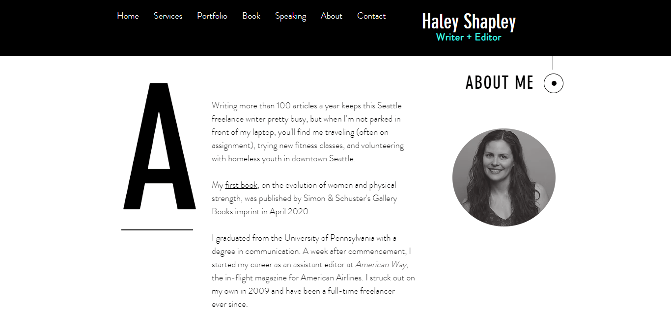 What we love: Haley leads with an important number: She can write over 100 articles a year. Starting with an impressive data point helps show her level of experience.
10. Amy Blaschka
Amy Blaschka’s portfolio features plenty of white space, balanced out with a bright blue header that really pops, and orange buttons for conversion actions (i.e. “Let’s talk”). Additionally, her use of video to explain what she does helps her stand out in a crowded space.
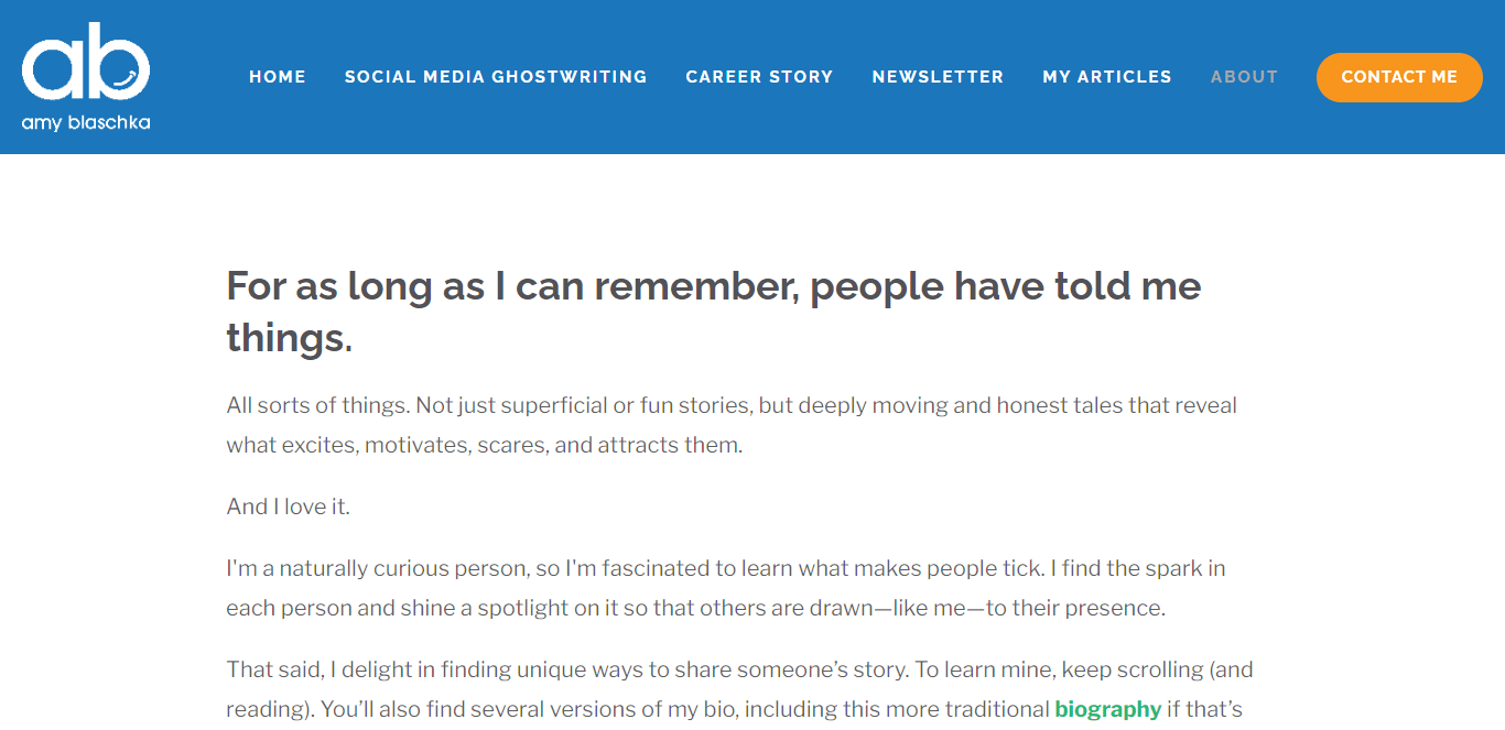
What we love: To showcase her creativity and individuality, Amy has a list of bullet points of things she loves and things she doesn’t love. She also provides website visitors with three (yes, three!) different versions of her bio: a short one (under 75 words), one that’s a bit longer (under 150 words), and her full bio which takes up an entire page.
By doing this, she’s demonstrating her talent for crafting messaging and educating prospective customers on who she is. Very sneaky, Amy!
11. Cathy Derus
Cathy Derus’ site features bold images and crisp text. The site also highlights Cathy’s appearances in major media outlets and publications, like Entrepreneur and Cosmopolitan.
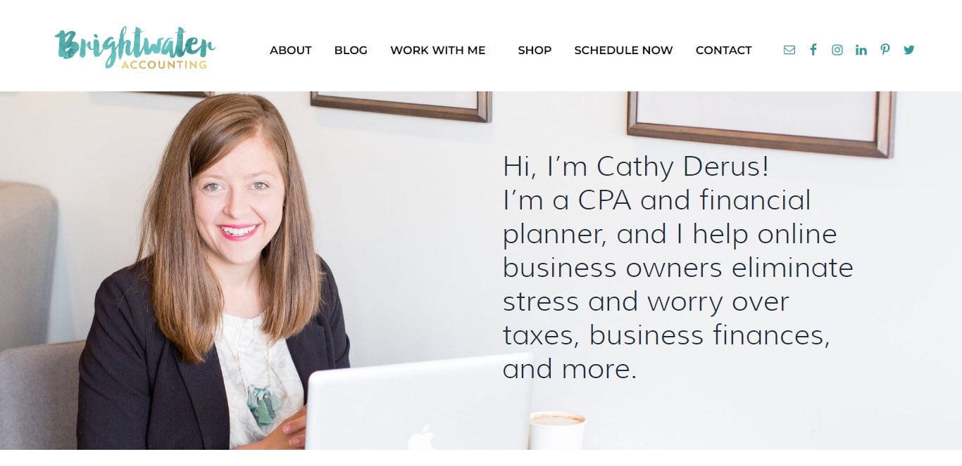 What we love: Cathy’s about section features a full-page image of Cathy on her laptop, with a brief text introduction directly to the right of her. Instead of breaking up the image with text, Cathy overlays the text on the actual image, so website visitors get the feeling they are actually in her office with her. This is a great way to build credibility.
12. Matt Gray
Matt is a serial entrepreneur who now manages a portfolio of “soulful businesses”. His website is designed to promote the paid courses he’s developed for entrepreneurs and the 1:1 coaching he provides to those looking for a more personalized touch.
Matt’s site provides plenty of content to help visitors understand who he is and what he does. The focus of the site is very simple: to get visitors to convert by signing up for his email newsletter.
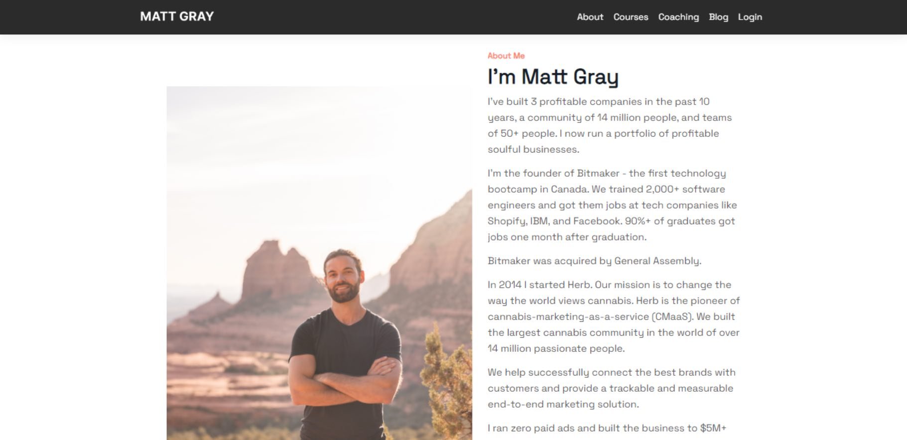 What we love: Below the bio section, Matt breaks down his offerings in a simple 1-2-3 format, providing something for everybody. Lower on the page, visitors find a mailing list sign-up form with a commitment of what subscribers will receive by signing up.
Tell the World All About You
Now that you’ve seen examples, it’s time to build your own about page. With a good story to tell, creative copy, humility, and digestible visuals, you’re on your way to an eye-catching user experience.
You’ll be standing out from a sea of about us and about me pages in no time. So, tell us, What makes you different? We’re eager to learn more…about you.
Editor’s note: This post was originally published in October 2020 and has been updated for comprehensiveness.
![]()

![→ Download Now: About Us Pages Guide [Free Lookbook]](https://i4lead.com/wp-content/uploads/2022/10/f3ca18eb-3e09-4cf6-9f6b-c23d8a48a49a.png)
