Running a successful website means staying alert for errors like broken pages or slow performance. However, sometimes there are problems that you just can’t avoid, and 404 errors are one of them.
A 404 occurs when a user requests a page on your website that doesn’t exist, thus throwing a 404 error page prompting users to return to the right place. No matter how many resources you put into ensuring your website never goes down … there’s always a chance that users could end up here.
It’s inconvenient, but a fact of life. And the reaction of visitors when they land on a nonexistent page can range from “taking it in stride” to “totally losing their minds.”
While there’s nothing you can do about the latter, you can make things a little less of a pain by having a creative error 404 message. This can do wonders to make your website visitors crack a smile in an otherwise frustrating situation.
To get your website design juices flowing, this post will showcase some of our favorite website error pages. Hopefully, you’ll be able to take away a few ideas to snazz up your own 404 message.
What is a 404 Error?
A 404 error is a standard HTTP error message code that means the website you were trying to reach couldn’t be found on the server. It’s a client-side error, meaning either the webpage was removed or moved and the URL wasn’t changed accordingly, or the person just typed in the URL incorrectly.
For the most part, you can configure your server to create a customized 404 error page. (If you’re a HubSpot customer, click here to learn how to customize your 404 page in HubSpot.)
Some customized 404 error pages include a hero image, witty description, site map, search form, or basic contact information.
The Best 404 Web Page Examples
Over the years, websites have found different ways to inform visitors of a 404 error and channel them back to the right place, some simply, some creatively, and some hilariously. Let’s start by looking at some creative 404 pages, then check out some funny examples that are sure to delight anyone who comes across them.
Page Not Found: TK Creative 404 Error Pages
1. Pipcorn
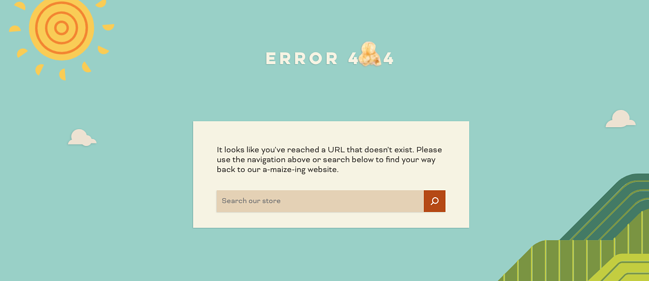
While a 404 page can easily stick out from a website, Pipcorn’s error page aligns perfectly with the rest of the site’s branding. There’s a nice animated background, a friendly text prompt directing visitors to search the website (complete with a clever pun), and a piece of popcorn used as the “0” in “404.”
2. Spotify
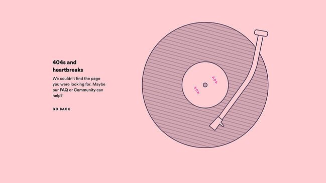
Music streaming giant Spotify has covered its bases with a clever 404 page. With a witty pun off Kanye West’s album “808s and Heartbreak” and a record animation, the website briefly entertains and then sends visitors back to the page they came from.
3. Genially
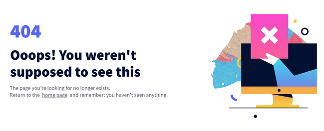
One simple way to ease the tension on your 404 page is to add a quick “Oops!” message — it helps your site feel more personable as you guide users back to the right place. In the case of Genially’s site, the page also includes a nifty illustration paired with some playful copy.
4. Adobe
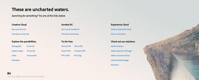
As you would expect, Adobe’s 404 error page is both useful and visually pleasing. It lists out popular links that visitors might want alongside some cool digital artwork serving as a visual metaphor for a broken or lost page. Honestly, websites should use visual metaphors more often.
5. Clorox
The 404 page for Clorox cleaning products rotates between three lighthearted photos to signal to visitors that they’ve made a misstep. It’s a smart use of branding to add a brief delight moment while helping out lost users.

6. Duma Collective
Other times, you might not need a witty blurb — just tell visitors that there’s no page at the address and let them move on. Entertainment consulting agency Duma Collective does just this with its error page, though it’s complemented by a background image for some minor flair.

7. Chillhouse
Speaking of flair, self-care brand Chillhouse has put in the extra work to reroute its visitors in style. The 404 page is branded appropriately and even takes visitors on a little journey through a few image stills before they go back to the homepage.

8. Bitly
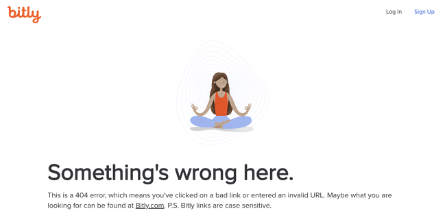
If you enter an incorrect Bitly link, you’ll be taken to Bitly’s 404 page. We assume this happens a fair amount, which is why the 404 page gets straight to the point. It explains what might have gone wrong and prompts users to visit the Bitly homepage if that’s what they’re after.
9. Ikea
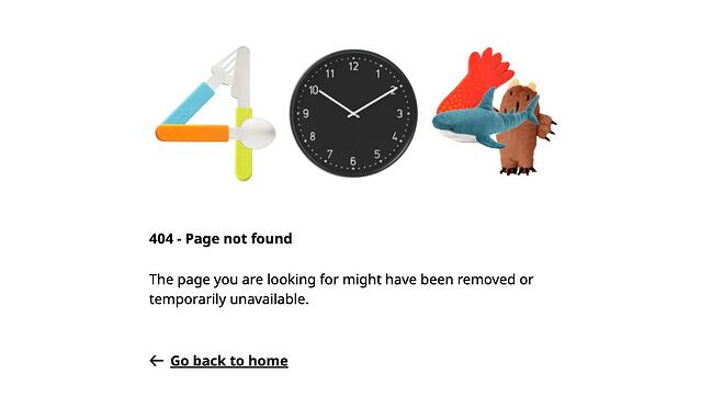
Ikea’s 404 page is similarly minimalist but still manages to sneak some smart branding in there. This example shows that your error pages don’t need to be elaborate to get the point across, but there’s nothing wrong with injecting some fun either.
10. Moxie Design Co.
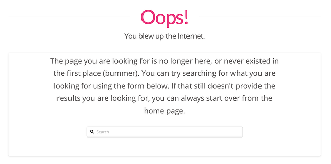
Sure, “blew up the Internet” might be a bit hyperbolic, but it tells visitors that Moxie Design Co. doesn’t take itself too seriously with small slip-ups like this one. Also, a search bar is conveniently placed at the bottom to send you on your way.
11. McKissack & McKissack
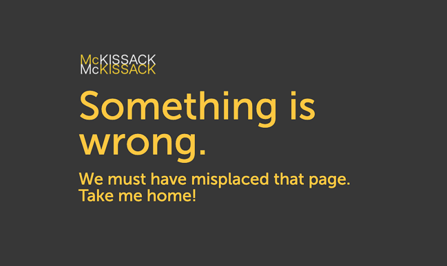
Ah, the classic “we lost the page” trick. Again, an easy way to present a 404 without alienating your audience. If you’re an agency like McKissack & McKissack that manages many client interactions, clear and concise copy is essential for all of your site’s pages, including error pages.
12. CSS Tricks
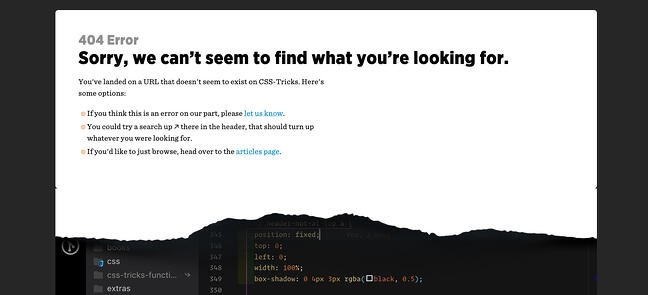
Ever ripped away a website’s wrapping to see what’s underneath? That’s the concept that CSS Tricks was going for in their 404 error page. This is both witty and reminiscent of what the website is all about: smart use of page styling.
13. Good Old Games
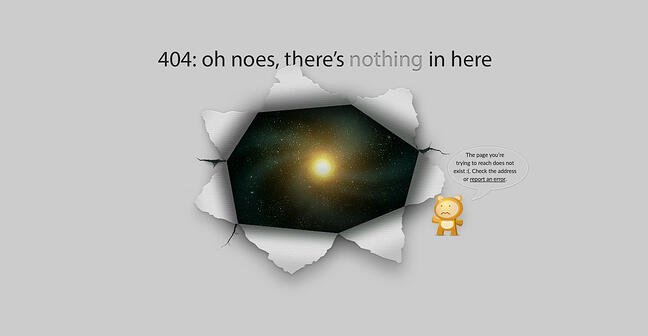
For other websites, you unwrap the front end and there’s … just the vast emptiness of space. This page is a clever reference to GOG Galaxy, which is Good Old Games’ native video game client. Thankfully, a little video game character is there to give visitors a place to report an error if they want.
14. Canva
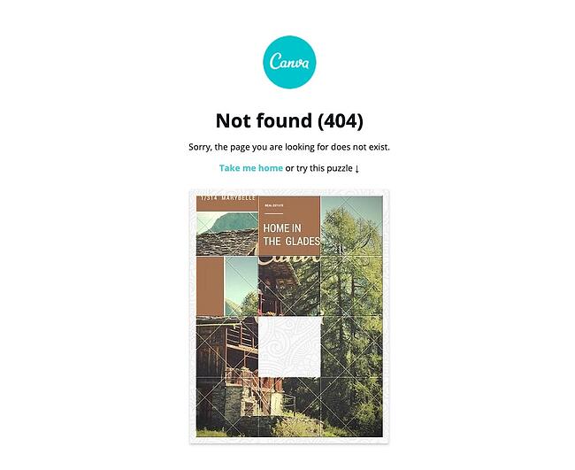
For something a little different, check out Canva’s 404 page. It includes not just an error message, but a nifty tile puzzle visitors can play for some brief entertainment. There’s no harm in letting your visitors slack off for a couple of minutes, right?
15. Innotech
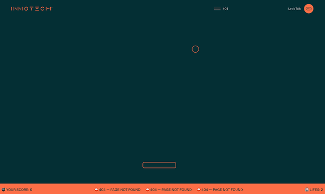
Similar to Canva’s approach, Innotech features a Pong-esque game on its 404 page to provide some brief entertainment. Chances are you’ll remember a website like this. Plus, the fun detour complements a truly impressive website — seriously, when you’re done playing, head to the home page and take it all in.
16. Myriad
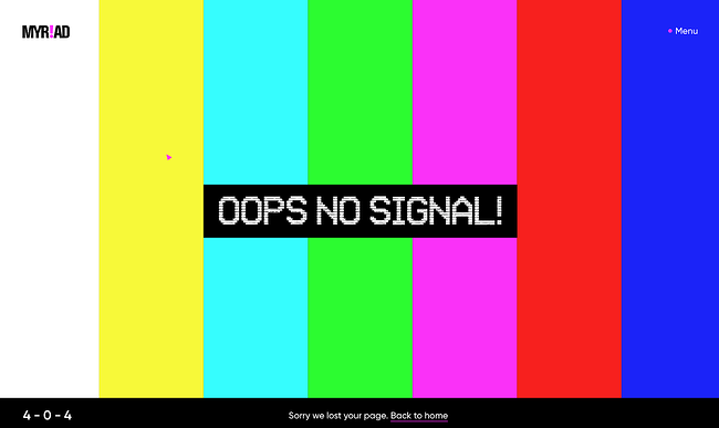
Video agency Myriad has opted for a quirky, on-brand 404 page design that mimics the classic SMPTE color bars that appear on old tapes and TVs. It’s a funny throwback to older technologies while representing the more modern problem of a nonexistent web page.
17. KonMari
Known for her popular cleaning and organization methods and brand, Marie Kondo has brought a similar feel to her website’s 404 page. The copy briefly and humorously harkens back to her tidying philosophy — a small but well-branded detail that fans will recognize.

18. BrandCrowd
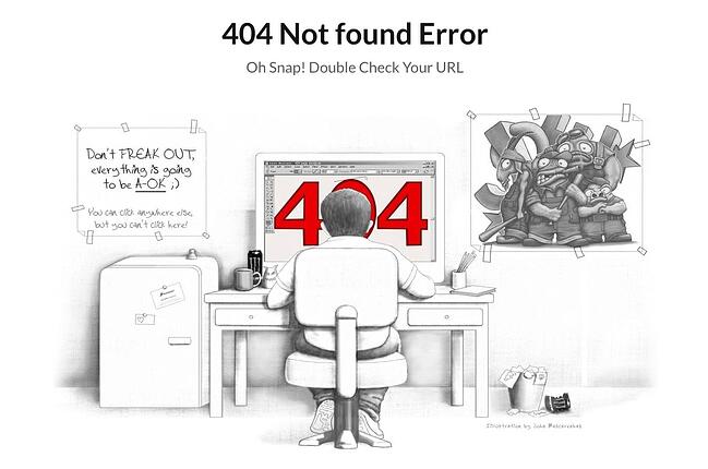
Not only is the illustration on this error page detailed and engaging — the copy is clever, too. We love the reference to the Semisonic song “Closing Time”: “You can click anywhere else, but you can’t click here.”
19. Hot Dot Productions
Hot Dot’s error page stays true to its tagline, “the intersection of new technologies and design.” The page is animated by hundreds of tiny dots that change direction in response to where you move your cursor. It’s mesmerizing and a great showcase of the agency’s design capabilities.

20. OrangeCoat
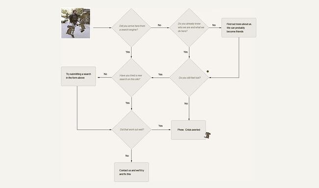
If you’re going to give an error message, why not entertain the user for a few seconds while you help them out? Following a friendly greeting, OrangeCoat offers a flowchart that actually helps users figure out why they reached an error page in the first place.
21. Ervin & Smith
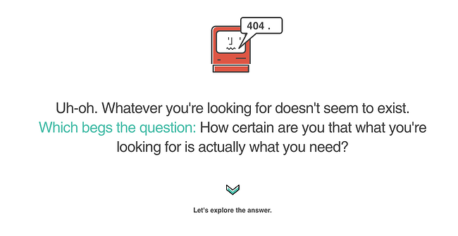
This 404 page does more than redirect users back to active pages. Instead, Ervin & Smith’s 404 page invites you to scroll down and learn why you need a digital marketing agency, and why to choose Ervin & Smith in particular, capped off with a contact form. True to its mission, this agency shows that any page can be a conversion opportunity.
22. DayCloud Studios
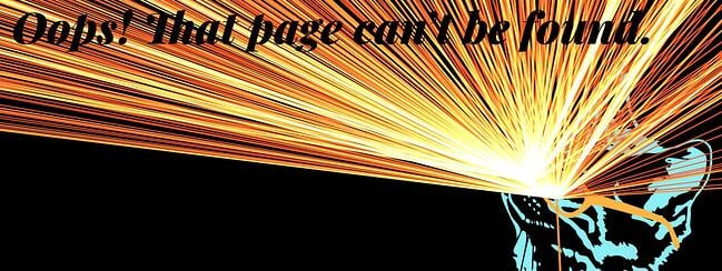
… or, your 404 can just be a place to waste time for a minute, as can be seen on the website for DayCloud Studios. Moving the cursor around the screen reveals a 404 message illuminated by lasers shooting from a cat’s eyes. Because why not?
23. Headspace
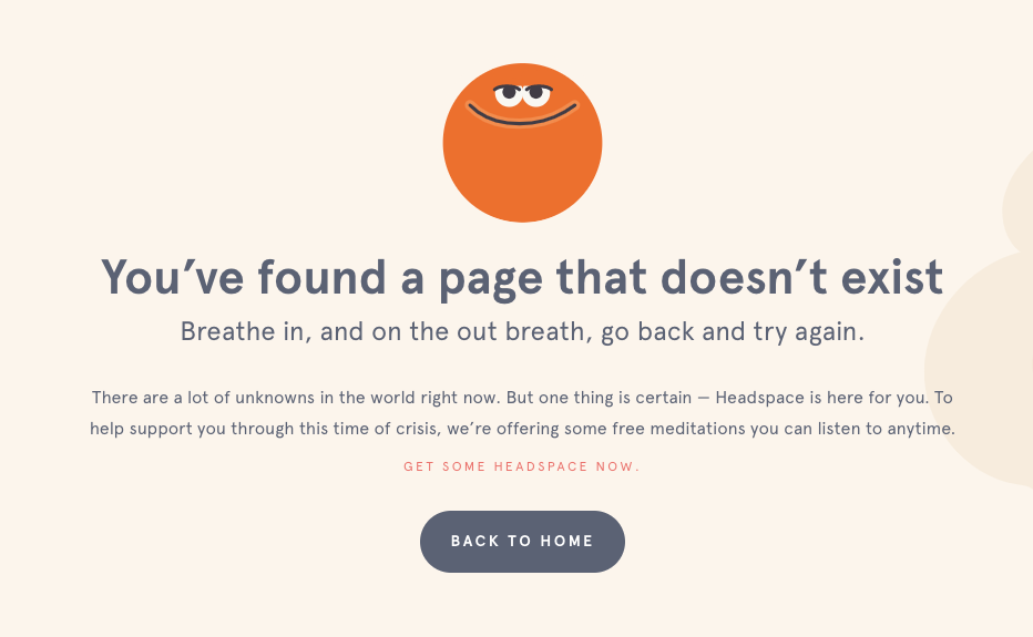
Another instance of a website smartly incorporating its brand messaging into a 404 page — guided meditation app Headspace makes the effort to calm users, encouraging us to take a deep breath, then return to the main site.
24. Wildwood Bakery
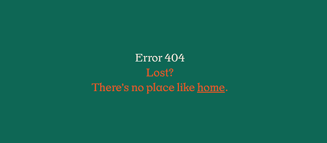
Some websites thus far have integrated clever branded copy in their pages, while others have hosted full-blown online games on theirs. But, there’s nothing wrong with a brief push back in the right direction. Wildwood Bakery’s exquisite site keeps things short and sweet (literally).
Page Not Found: TK Funny 404 Error Pages
25. Astuteo
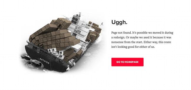
Design agency Astuteo’s 404 page is a perfect balance of elegant visuals, humor, and helpfulness. The minimal layout gives users the information they need alongside another amusing visual metaphor, a sinking cargo ship and a fleeing figure.
26. LEGO
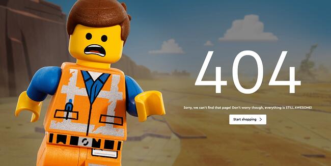
There’s few words needed on LEGO’s 404 error page — the character’s expression makes everything clear. Plus, fans of the LEGO movie franchise will enjoy the fun reference in the copy.
27. Magnt
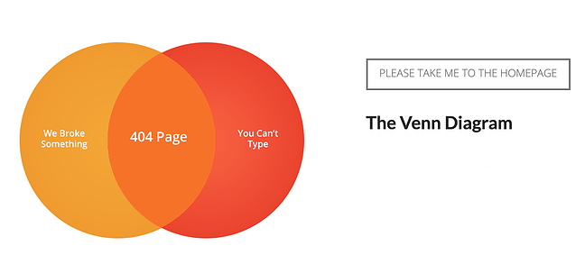
In this funny error message, Magnt pokes fun at the fact that, yes, they could have broken something — or, you just can’t type. The visual serves as a quick way to quickly illustrate their point.
28. IconFinder
IconFinder’s error page is simple but delightful. The company’s mascot wearing a robe and appearing weary is a relatable nod to lost visitors. No worries though, since the site lists some of its links to visit down below.
![]()
29. Sweet Dreams
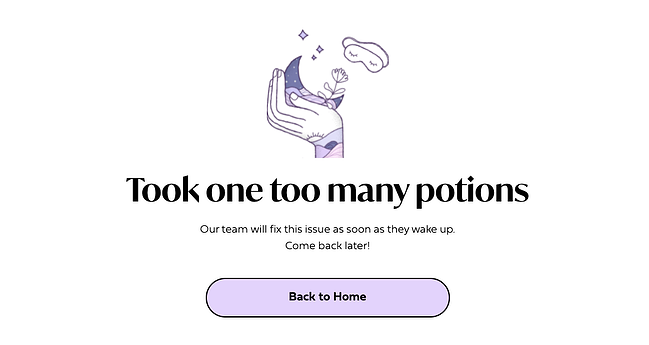
Apparently, the team at sleep aid company Sweet Dreams took too many of its products according to the website’s 404 page. Not only is this page humorous — it also blends well with the rest of the site’s front-end aesthetic and messaging for a cohesive feel.
30. GitHub
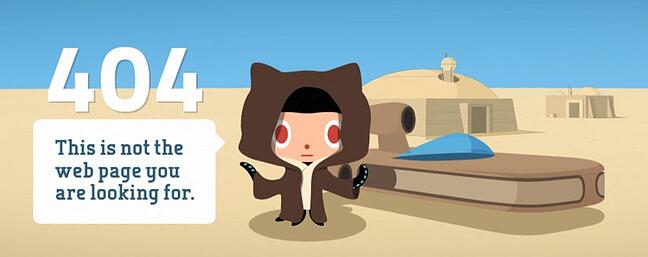
The line “These aren’t the droids you’re looking for” refers to Obi-Wan Kenobi’s Jedi mind trick on Stormtroopers in Star Wars Episode IV, and it’s become a well-known phrase used to tell someone they’re pursuing the wrong course of action. GitHub plays on this famous line in their 404 error message.
31. Patagonia
Patagonia’s custom 404 page captures the brand’s vibe perfectly, complete with a boomerang video of a frisbee twirler, a clever pun combining “404” and “aloha,” and links to its product pages. It’s a friendly and funny way to greet visitors who wound up in the wrong place.

32. Cloud Sigma
Check it out: Cloud Sigma’s letting us in on some behind-the-scenes action. Their 404 error page pretends to be a “junior developer’s homepage” — that junior developer being, well, a cat.

33. AMC Theatres
You might have been to an AMC movie theater before, but you’ve hopefully never seen their website’s 404 page. The website makes use of a quick, funny, and relevant one-liner before it sends you back to the right place.
34. Bruno
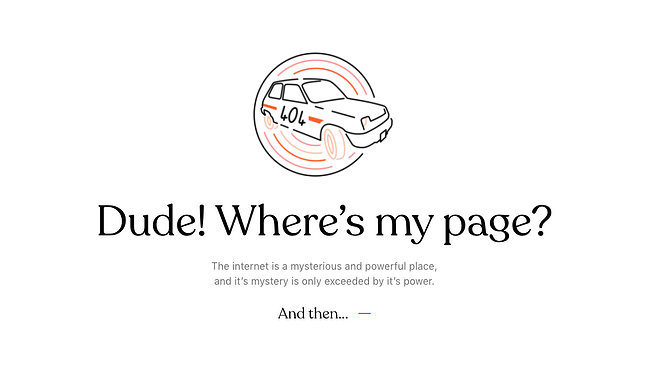
It’s no coincidence that creative agencies are great at coming up with cool 404 pages. Here’s another one from the creatives at Bruno that plays off the 2000 cult comedy classic Dude, Where’s My Car? No, it has nothing to do with the company or website, but it’s sure to get a chuckle.
35. NPR
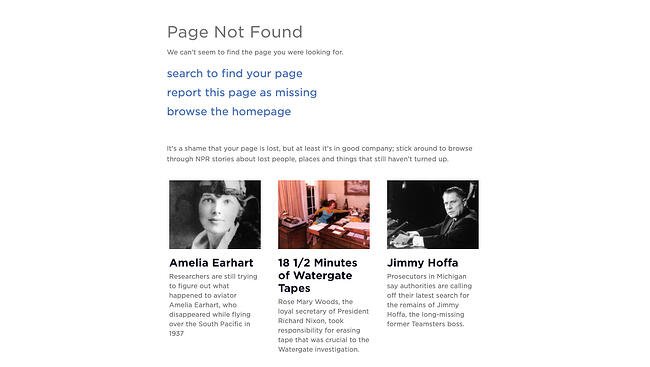
At first, NPR’s error page seems like nothing special. But keep reading and you’ll see how they cleverly link to some of their great stories about lost people, places, and things, like a piece on Amelia Earhart and one on Waldo. This might just make lost users feel a little less alone.
36. Medium
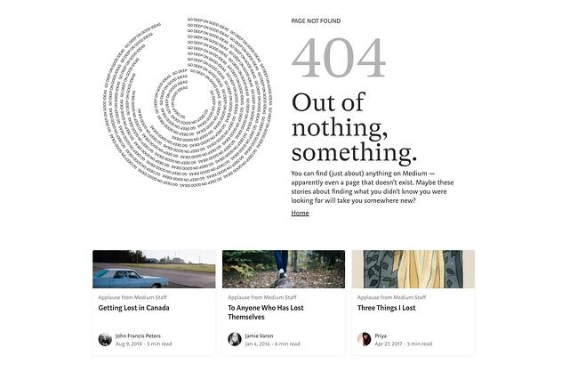
Medium takes a similar approach to NPR’s 404 page, recommending articles about getting lost and losing things. Check these articles out if you have time — they’re quite good reads.
37. HomeStarRunner
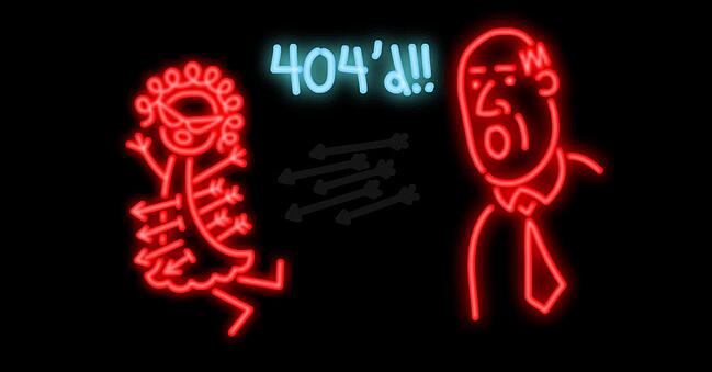
HomeStarRunner.com, home to a Flash-animated cartoon series, has had a series of hilarious 404 error pages over the years. The most recent features characters from the cartoon series in a scene that could’ve come straight out of one of their episodes. If you turn the sound on when you load the page, you’ll hear their character Strong Bad — known for yelling phrases out loud — saying, “404’d!”
38. Blizzard Entertainment
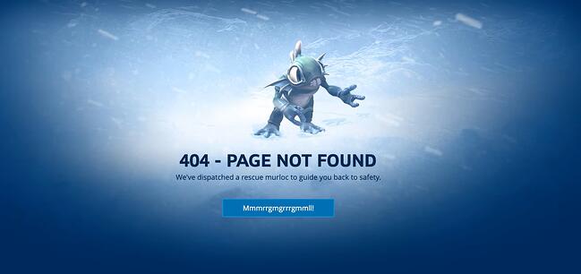
Here’s a simple idea that ends up looking slick: Blizzard Entertainment’s 404 page features an animated character lost in an actual blizzard and some humor that World of Warcraft fans will appreciate.
39. Hello Big Idea
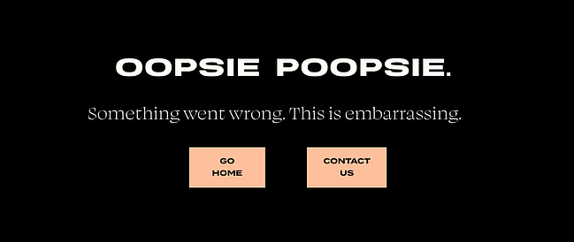
A quick trip around marketing and social media experts Hello Big Idea’s website will tell you what you need to know about its bold and blunt style of copy. And, of course, its 404 error page is no exception.
40. HubSpot
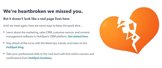
It happens to us, too! This is the message we put up to tell our site visitors that there are some website issues. Our goal was to stay true to HubSpot’s brand voice by being as lovable, empathetic, and helpful as possible.
Turn a 404 Error Page Into a Delight Moment
Nobody wants to land on a 404 page — they’re annoying and unexpected. However, you can’t really avoid them, so it’s always a good idea to have a 404 page to fall back on for your website.
And, from a user experience perspective, your 404 page should be a small speed bump, not a brick wall. The right design can be the difference between a frustrated bounce and a possible conversion, so why not make it fun?
Editor’s note: This post was originally published in December 2015 and has been updated for comprehensiveness.
![]()


