Categories B2B

AI Advertising: Pros, Cons, Tips & Examples

You’ve heard this a million times by now: artificial intelligence is changing the marketing world and how brands advertise to consumers — and the trend isn’t stopping anytime soon.

In fact, the global market revenue of AI in marketing will likely grow from $27.4 billion in 2023 to $107.4 billion in 2028.

But is AI something your brand should leverage in its next advertising campaign? To help you make that decision, here’s what you need to know about AI advertising, including tips and examples.

First, let’s examine the pros and cons of leveraging AI in advertising.

Pros of AI in Advertising

Challenges of AI in Advertising

7 AI Advertising Examples

Free Report: The State of Artificial Intelligence in 2023

Pros of AI in Advertising

Here are some benefits of leveraging AI in advertising.

Effectively Target Ads Through Data

In advertising, data can predict consumer behavior to create more effective targeted ads.

Forbes reported that combining AI and Big Data can automate “almost 80% of all physical work, 70% of data processing, and 64% of data collection tasks.”

Big Data is a term for a large amount of newly available data resulting from the growth of digital technology.

It’s also worth noting that 72% of marketing and business professionals agree that AI tools can help them pull insights from data they otherwise wouldn’t be able to find, according to our State of AI Survey.

Reach More Customers

AI can help your brand quickly assess what is working and not in its advertising efforts. For example, Coca-Cola uses AI algorithms to analyze when, where, and how consumers talk about the brand on social media.

Specifically, the company studied 120,000 pieces of social media content to understand the demographics and behaviors of customers and users discussing its products.

As a result, the brand can adapt its content to meet the needs of consumers and expand its reach.

Save Time and Money

Of course, one of the biggest draws of AI is its ability to work and generate results quickly. AI can swiftly gather, analyze, and sort vast amounts of data.

It can then use its findings to spot trends allowing marketers to make informed advertising decisions.

This can also save your business money in advertising by taking out the guesswork and quickly spotting opportunities more likely to generate revenue.

Challenges of AI in Advertising

Here are some challenges brands may face when using AI in Advertising.

Possible Inaccuracies in Data

AI-generated results are only effective if the data inputs are accurate. The data must represent all aspects of the customers, their behavior, and their journey.

So, companies must invest in ways to verify the accuracy of the data being put into the AI models to ensure their effectiveness.

Lack of Creativity

AI can be an excellent tool for gathering data to inform ad campaigns; however, humans still need to brainstorm creative advertising content that generates buzz.

For instance, consumers often gravitate to social media advertising that shows the brand’s values and how it aligns with their own. Funny, trendy, and relatable ads are also popular among audiences.

Right now, only humans can spearhead advertising content that is relatable and touching. An advertising campaign that is too reliant on AI can result in dull and disconnected advertising.

However, it’s important to note that while AI tools cannot spearhead creative campaigns, they can still be helpful in the creative process.

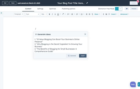
For example, HubSpot’s Content Assistant AI feature can generate blog ideas, blog outlines, marketing emails, and more to help steer marketers toward their goals.

blog-generate-ideas-preview-window-resultsImage source

Data Privacy

As mentioned earlier, AI can collect data to create more personalized ads. However, there is also the concern that AI algorithms and models can inadvertently collect sensitive information about consumers.

Companies leveraging AI to collect data for advertising will have to mitigate the risk by deciding what consumer information to protect and how.

7 AI Advertising Examples

Here are some companies that have successfully leveraged AI in their advertising campaigns.

1. Whole Foods

In 2021, Whole Foods opened several Just Walk Out stores across the U.S., allowing customers to pick up their items and leave without stopping at a register. The items are instead charged to the customer via AI.

The AI’s purchase information can help identify patterns and predict future behaviors. The information allows Whole Foods to send personalized messages to customers.

For example, if a customer regularly purchases pasta sauce, basil, and pasta, Whole Foods could send promo codes and discounts for other Italian-related ingredients and foods.

What We Like: The Just Walk Out stores create a simple customer experience for shoppers while seamlessly gathering helpful information that can better serve them in the future.

2. Buzzfeed

Media company Buzzfeed is using OpenAI to deliver personalized content to consumers at a massive scale that wouldn’t be possible without automation.

Specifically, Buzzfeed CEO Jonah Peretti said AI will help ” enhance the quiz experience, inform our brainstorming, and personalize our content for our audience.”

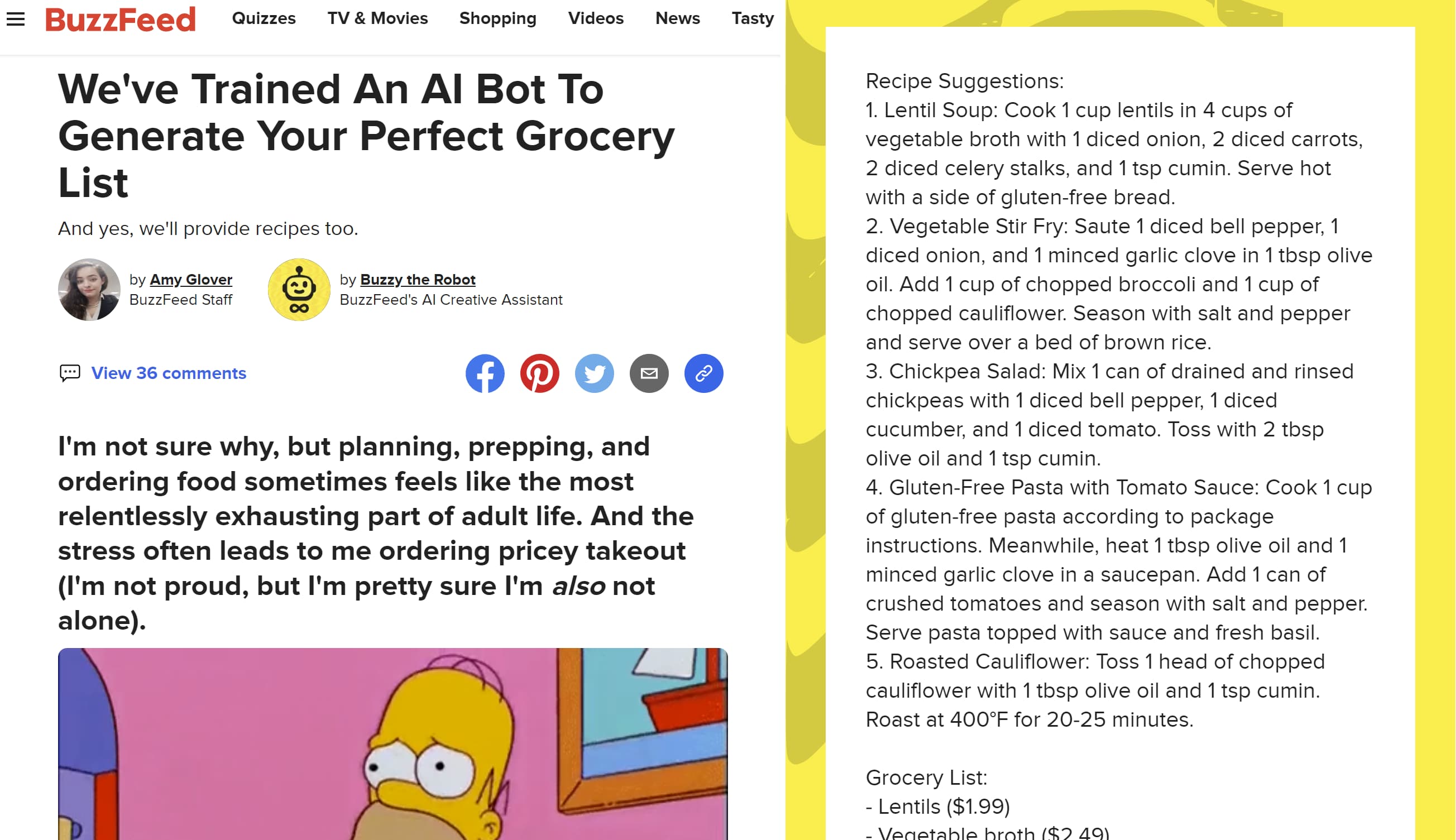
Buzzfeed isn’t looking to replace its writers with AI. Instead, writers and creators are collaborating with the site’s AI creative assistant, “Buzzy the Robot.” Below is a quiz written by a writer with help from Buzzy.

Screenshot of AI-generated Buzzfeed quizImage source

What We Like: The quiz and its use of AI show how AI can generate unique content that is personalized based on the behaviors of individuals.

3. Best Western

Best Western collaborated with IBM Watson advertising to create AI-powered ads to reach and engage consumers who are actively planning to travel around peak holiday weekends.

IBM’s AI tool, Conversations, was used by Best Western because traveling is a personal experience, and the tool could offer personalized travel recommendations.

According to IBM, the device was “trained on Best Western information and used natural language processing to enable 1:1 dialogue to deliver a unique travel recommendation for each user.”

Conversations provided real-time advice, tips, and inspiration for travelers, allowing them to prepare for upcoming travels and innovatively interact with Best Western.

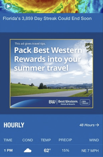
According to IBM, The ads result in a 48% lift in visits to Best Western Hotel and Resort locations.

Image of Best Western ad.Image source

What We Like: The ads weren’t just visually appealing to get consumers to click. The ads also provided actionable advice and use for customers along with a personalized experience.

4. Coca-Cola

The beverage company launched its own AI platform built by OpenAi and Bain & Company exclusively for the brand.

The platform is called “Create Real Magic” and combines GPT-4 and DALL-E. GPT-4 produces human-like text from search engine queries, and DALL-E converts text prompts into images.

According to our survey, 44% of marketers use visual AI tools like DALL-E.

Combining the program, Coca-Cola created a campaign in which fans can create their own digital artwork based on aspects of the brand, such as the iconic bottle and script logo.

Participants could then download their creations and submit them to appear on digital billboards in New York’s Time Square and London’s Piccadilly Circus.

Pro Tip: When leveraging AI in your advertising, look for opportunities to involve your consumers in the creative process.

5. Chase

Chase Bank has a 5-year partnership with Persado, a New York-based company that applies AI to creative marketing. Chase Bank uses Persado’s machine learning solutions to humanize the company’s marketing copy further.

For example, a digital ad by Chase read, “Access cash from the equity in your home.” Persado’s version read, “It’s true—You can unlock cash from the equity in your home.” Persado’s version was a bigger hit with customers.

Pro Tip: While some AI solutions can write excellent marketing copy, you should still look to seasoned writers and copy editors to review AI-generated content to ensure the copy is accurate and aligned with your brand’s voice.

6. Dept and Hello Monday

Digital agencies Dept and Hello Monday teamed up to create an AI-powered advertising campaign using vacant shopfronts. The campaigns involved an AI “Shoe Mirror” that turns empty stores into interactive ads that generate revenue.

The Shoe Mirror appears on empty storefronts and analyzes the clothes of passersby to find shoes that match their outfits. The mirror then “places” the shoes on the feet via augmented reality.

Furthermore, the Shoe Mirror provides a QR code allowing passersby to purchase the shoes from within the display.

Image of shoe mirror adImage source

What We Like: This AI advertising is personalized and revenue-generating. It doesn’t make consumers feel like they’re being explicitly advertised to. Instead, it comes across as helping consumers by finding items that complement their attire.

7. Heinz

Heinz partnered with Rethink Ideas, a creative agency, to create a series of AI-generated advertising visuals.

The campaign started the team at Rethink Ideas began playing around with AI image generator DALL-E 2 and noticed that prompts related to ketchup yielded images that looked almost exactly like Heinz ketchup.

The agency then asked consumers to share their AI prompts for ketchup images. The best prompts were featured on social media and in print ads.

AI-generated image of Heinz ketchupImage source

What We Like: This use of AI allows consumers to have fun and participate in the creative process. Furthermore, it’s a clever way to show how well-known and trusted Heinz is among consumers.

The brand is so well-known that AI immediately “thinks” of Heinz when prompted about ketchup.

AI can be a powerful tool that provides ample opportunities for brands looking for innovative ways to reach their audience.

From generating images to writing copy to gathering data — there are many ways AI can be implemented to personalize the customer experience and boost revenue.

Now that you know the pros and cons of AI and how you can use it, you’re ready to decide if and how AI can push your brand forward.

New Call-to-action

Categories B2B

Facebook Insights: A Beginner’s Guide [+ Step-by-Step Instructions]

If your brand has a business Facebook page, you’ll want to invest time in understanding your Facebook Insights dashboard. It holds important data that helps you understand how your page is performing and is key to growing it.

Features like weekly insight summaries and competitive data on other business pages make Facebook Insights a powerful tool that every marketer should leverage.

Let’s dive into what Facebook Insights is, how to access it, and how to interpret the metrics it tracks.

What is Facebook Insights?

Facebook Page Insights vs. Facebook Audience Insights

Where is Facebook Insights?

How to Use the Facebook Insights API

How to Export Facebook Insights Data

Top Facebook Insights Metrics

How to Interpret Facebook Insights

Facebook Page Insights vs. Facebook Audience Insights

Despite having similar names, Facebook Insights and Facebook Audience Insights have completely different functions.

Facebook Insights visualizes incoming data from your business page so you can learn how users are behaving on your page, what content they’re engaging with, and how your page matches up to competitors.

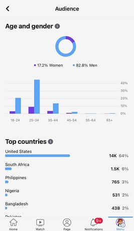
On the other hand, Facebook Audience Insights is used for ad campaigns and helps marketers understand Facebook audiences in general (which can also include those who follow your page).

Screenshot of Facebook Audience Insights feature; Facebook InsightsThe platform includes information on user demographics, such as location and relationship status as well as user behavior, including average ad clicks and comments.
Where is Facebook Insights?

To access Facebook Insights, you’ll need to have a business page. Then, follow the steps below:

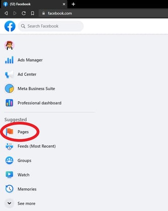
1. Log into Facebook and go to your feed. From your feed, click “Pages” in the left menu. 

Screen shot of the left menu with the Pages tab circled in red; Facebook Insights

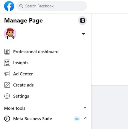
2. Go to your page.

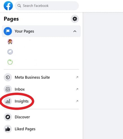
Screenshot of left menu on business page; Facebook Insights3. Click on “Insights.”

Screenshot of business page menu with Insights circled in red; Facebook Insights

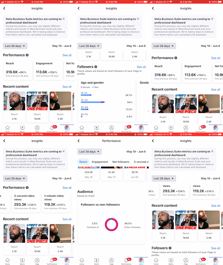
You can track various metrics from there, such as engagement, view time, net followers, audience demographics, reach, and more! To learn the top Facebook Insights metrics you should track keep reading or click here. 

Gif of Facebook Insights tabs


How to Use the Facebook Page Insights API

The Facebook Page Insights API lets you fetch ad data to track your performance.

The API is particularly useful because it allows marketers to pull the exact data they want to track, no matter how granular.

To fetch the data from the API, you must determine what data you want to pull and create an access token for that ad, so that only your team can access that information.

You’ll then need to determine where to import that data, like Google Sheets or HubSpot’s ads software within the Marketing Hub.

It allows you to pull your Insights API into the platform and match it against with data already in the CRM. This will provide a better understanding of the customer journey and give you a 360-degree view of how your ads are performing.

How to Export Facebook Insights Data

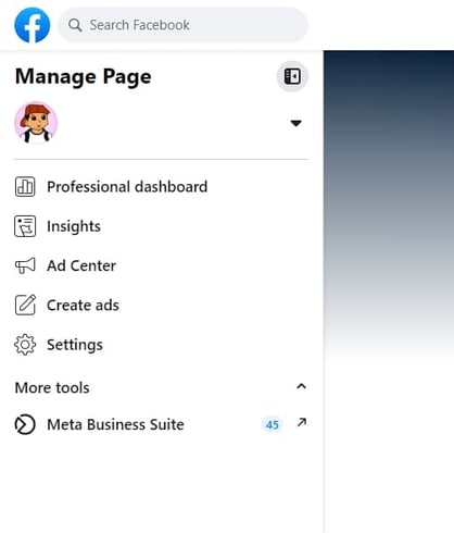
1. Go to your feed and click “Pages” in the left menu as you did before. Then go to your page.

Screenshot of business page menu; Facebook Insights

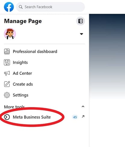
2. Click on Meta Business Suite.

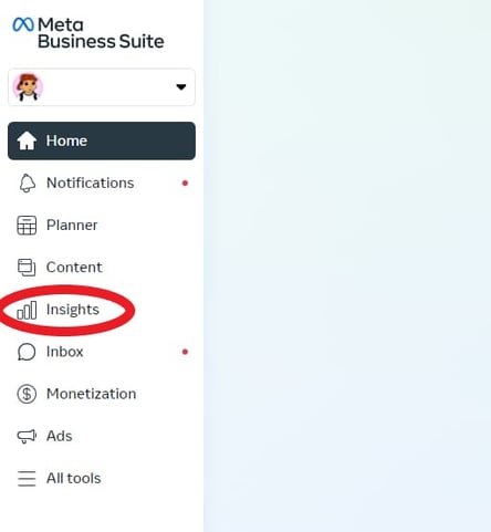
Screenshot of business page with Meta Business Suite tab circled in red; Facebook Insights3. Then click “Insights” in the left menu.

Screenshot of Meta Business Suite menu with Insights circled in red; Facebook Insights

4. From there you’ll see different tabs that allow you to export different insights depending on your preference. 

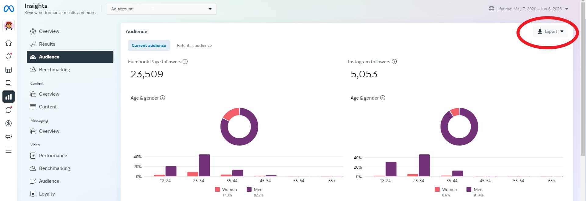
Screenshot of exportable Facebook Insights metrics

Top Facebook Insights Metrics

Your Facebook Insights dashboard displays top metrics about your business page. On any given day, you can get a snapshot of your page’s performance and adjust your strategy accordingly. Top metrics include:

  • Reach – The number of users on Facebook who’ve seen your content.
  • Engagement – How many people liked, shared, reacted, or commented on your content.
  • Net Followers – 
  • 3-second video views – The number of times a video was played for at least 3 seconds. 
  • 1-minute video views – The number of times a video was played for at least one minute. 
  • Page views – The number of times your page has been viewed by Facebook and non-Facebook users.
  • Page likes – The number of Facebook users who like your business page.
  • Actions on page – How many actions users take on your business page, such as to click on a website link or ask for directions to your store.

For tips on how to interpret your video insights, jump to this section.

How to Interpret Facebook Insights

Before you start analyzing your data, make sure you know what questions you want answered. This will help you narrow down which key metrics to focus on.

Once you know that, start looking through the data to identify patterns.

For instance, let’s say you notice that your how-to posts get shared at a much higher rate than your other content. This may indicate that this type of content resonates more with your audience and adds value to them and their community.

As such, you may want to double down on these posts if your goal is to get higher engagement.

Analyzing the data is one thing, but what’s more important is what you do next. As you notice trends, take note of them and conduct experiments to learn more about what your audience wants.

This will help you learn more about your audience and develop content that meets their needs.

If your team wants to focus on video insights, scroll down to the “Videos” tab on the left sidebar and click on it. Once there, you’ll see your top video metrics, such as watch time and top video performers.

For tips on how to understand your video insights, watch the video below. It dives into how to navigate your video insights dashboard and what your insights can tell you broken down by performance, loyalty, audience, and retention.

Your Facebook Insights dashboard holds so much information about your page’s performance and your audience. If you leverage that data, you can create better content and generate more revenue for your brand.

generate leads with facebook


Categories B2B

Is AI Sentient? Could it Ever Be? Experts Weigh In

Right now, AI does what we want. But what if it gets to the point where it only does what it wants?

The current AI gold rush might leave many thinking about what AI might look like as it develops.

In this post, we’ll discuss sentient AI, what it could look like, and if we should be worried about a world where robots are conscious (with scientific insight, too).

Get Started with HubSpot's AI Campaign Assistant

What is sentient AI?

Sentient AI can feel and have experiences just as humans can. Sentient AI is emotionally intelligent, conscious and can perceive the world around it and turn those perceptions into emotions.

In short, sentient AI thinks, feels, and perceives like a person.

M3GAN, the robot from the movie of the same name, is a great example of sentient AI. She has emotions and can perceive and understand the feelings of those around her, so much so that she builds a friendship with a human girl and eventually becomes murderously protective of her.

Concerns About Sentient AI

Some of the main concerns and questions about sentient AI come from science fiction movies, books, and TV shows that paint the picture of a dystopia with super-intelligent machines that have autonomy and eventually build an AI-ruled society where humans become their compliant subjects. Many of these scenarios also involve these machines developing sentient abilities without human input.

Aside from that, the questions about sentient AI center around control, safety, and communication.

  • Control – People can see the correlation between losing control of AI and other machine learning entities if they become sentient because they can think on their own, could ask questions about their autonomy, and eventually break free from the ‘control’ developers, scientists, and researchers currently have
  • Safety – If humans lose control over sentient AI, will we be able to trust it once it has sentient abilities?
  • Communication – Humans are ruled by emotion, while AI is logic-based. Will communication with sentient AI be challenging because of this difference?

Is AI sentient?

Current applications of AI, like language models (i.e., GPT and LaMDA), are not sentient.

Language models can seem sentient because of their conversational style, but the catch is they’re designed that way.

They’re meant to use natural language processing and natural language generation to replicate human speech, which can seem like a form of sentient cognition, but it’s not. They can’t experience, much less have, emotions.

What if AI becomes sentient? Will it ever?

AI has progressed rapidly in the last year, so it makes sense to think that sentient AI is right on the horizon. Most experts agree that we are nowhere near that happening, or if it will ever happen.

For one, scientists and researchers would first have to define consciousness, which has been a philosophical debate for centuries. They would also need to use that definition of consciousness and translate it into exact algorithms to program into AI systems. Human emotions, perceptions, etc., would have to be deeply understood in a way that makes it possible to give that knowledge to a computer system.

Nir Eisikovits, Professor of Philosophy and Director of the Applied Ethics Center at UMass Boston said people’s worries about sentient AI are groundless: “ChatGPT and similar technologies are sophisticated sentence completion applications – nothing more, nothing less. Their uncanny responses are a function of how predictable humans are if one has enough data about the ways in which we communicate.”

Eisikovits thinks people believe sentient AI is closer than it is because humans tend to anthropomorphize, giving human qualities to things that don’t have them, like naming a car or assigning objects pronouns.

Enzo Pasquale Scilingo, a bioengineer at the Research Center E. Piaggio at the University of Pisa in Italy, also said this. He says, “We attribute characteristics to machines that they do not and cannot have.”

He and his colleagues work with a robot, Abel, that emulates facial expressions. He says, “All these machines, Abel in this case, are designed to appear human, but I feel I can be peremptory in answering, ‘No, absolutely not. As intelligent as they are, they cannot feel emotions. They are programmed to be believable.’”

“If a machine claims to be afraid, and I believe it, that’s my problem!” he adds.

Sentient AI Is Part of the Not-So-Near Future.

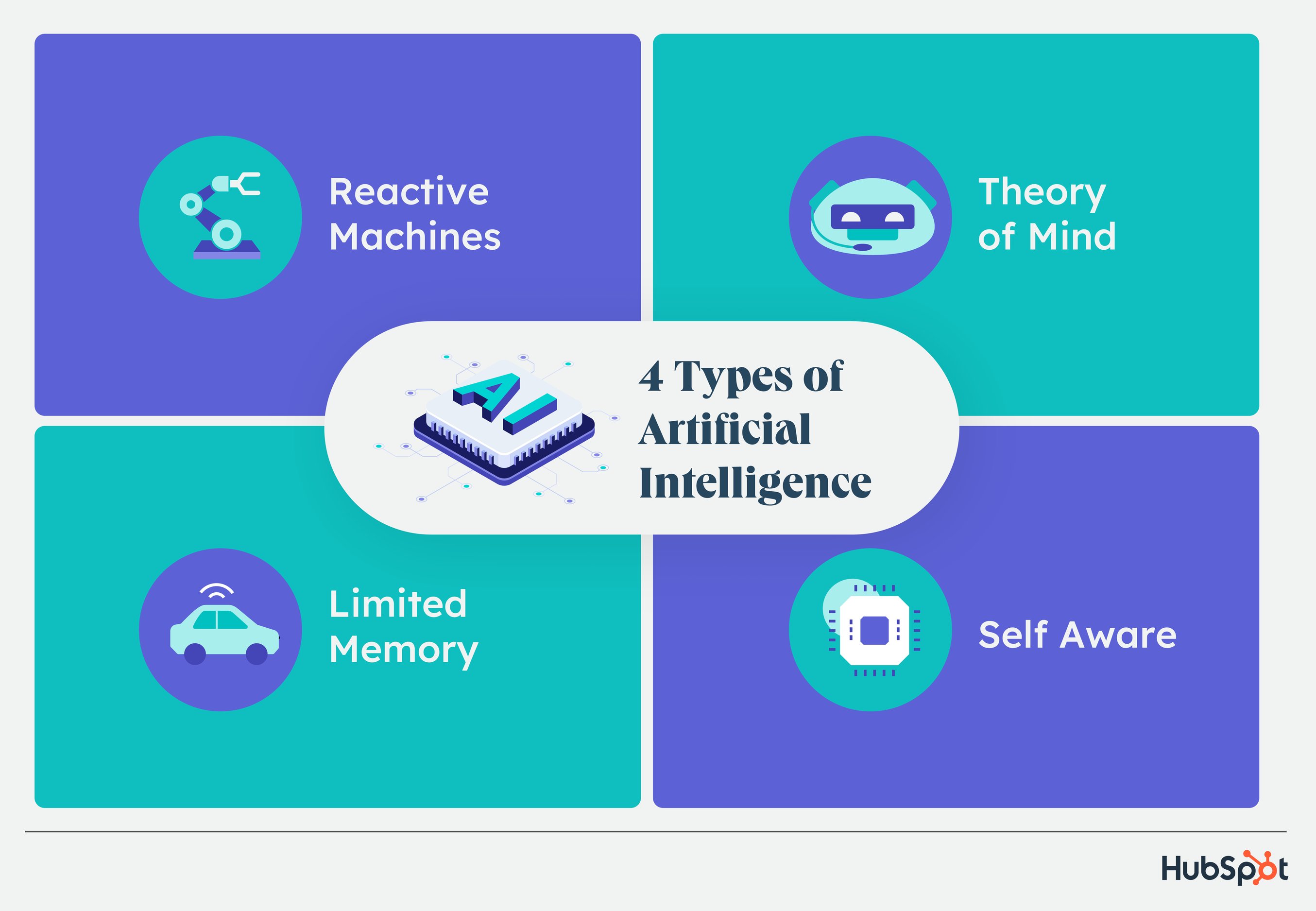
It might be helpful to understand the far-off ness of sentient AI by understanding where it stands today. Out of the four types of AI, all systems today are part of the first two: reactive or limited memory AI.

The next type is theory of mind AI, a significant advancement where machines can understand human emotions and have social interactions based on this understanding.

Image Source

There are also three stages of AI, each defined by how closely it replicates human abilities. Despite how long the field has been around, AI is currently in stage one, narrow AI.

The next stage is AGI, which are systems with human-like intelligence that think abstractly, reason, and adapt to new situations. There is debate that language models are AGI, but some say that any indications of abstract thinking or reasoning are learned from its training data.

No existing system has grown beyond theory of mind AI or fully surpassed narrow AI, and there are a lot of lines to cross before it does.

Over to You

Any feelings that AI is sentient can be chalked up to algorithms doing what they’re programmed to do. But, that being said, it’s always important to stay on top of the trends, especially with technologies with short-term high growth.

To stay ahead of the curve, check out this helpful learning path with all you need to know about AI, from AI ethics to cool jobs created around AI (and to be the first to know when AI does become sentient).

New Call-to-action

Categories B2B

How to Become an SEO Expert, According to HubSpot’s SEO Team

SEO helps businesses keep their website visible to people looking for what they offer. 

It’s a technical specialty that requires understanding its foundational processes, continuously monitoring performance, and staying on top of search algorithm updates and new requirements. 

The person at a business who monitors trends and helps sites remain visible is an SEO expert. In this post, we’ll discuss exactly what they do and advice from experienced HubSpotters on how to become one. 

 Download Now: SEO Starter Pack [Free Kit]

What is an SEO expert?

An SEO expert monitors search trends and uses analytics to help businesses build websites that rank highly in search engines, reach target audiences, and meet business objectives. The optimized websites they help create generate leads and drive conversions to support business growth. 

A successful SEO expert: 

  • Has a well-rounded understanding of on-page, technical, and off-page SEO and how each impacts site performance independently and together. 
  • Understands how search engines and SERPs work (like indexing and crawling)
  • Can do SEO-focused research (like keyword research or competitive analysis)
  • Can understand, analyze, and report on SEO analytics (like clicks, conversions, etc.) to make data-driven decisions and recommendations
  • Use SEO tools (like Ahrefs or Google Search Console)
  • Understand how to make SEO-focused content
  • Stay on top of search trends and algorithm updates that might impact site performance.
  • Create SEO-focused strategies (like a keyword strategy)

Some SEO specialists don’t start out with the intention of dedicating their careers to SEO. 

Braden Becker, SEO Lead at Faire, along with other SEO and historical optimization experts at HubSpot Aja Frost, Victor Pan, and Amanda Sellers — offered their advice about what it takes to become an SEO expert and the paths they took to get there.

1. Develop your skills.

“Getting a job in SEO ideally requires two things: content creation skill and analytical skill. Most SEO professionals today have one of those and develop the other,” Braden says.

SEO experts are skilled writers with creative instincts, so it’s helpful to have a strong writing background to optimize content in a way searchers will comprehend. Becker noted that his writing background helped him get his start in SEO:

“My background in writing and editing helped me get my foot in the door, but a willingness to focus on the structure, mechanics, and intent behind my writing is what I think secured my role as an SEO specialist for HubSpot.”

Before Frost became an SEO strategist at HubSpot, she was the editor of HubSpot’s Sales Blog.

“I taught myself how to do keyword research and competitive analysis as the Editor for HubSpot’s Sales Blog,” Aja says. “The Sales Blog’s traffic had been flat for a year and a half — I noticed that the only posts that consistently generated views for us were getting all of those views from search. So I began looking for sales-related keywords we could rank for that would help boost organic traffic.”

Resources:

So, how do you start developing your skills to be SEO-ready? Here’s what Frost did to keep her SEO skills sharp.

“To refine my SEO expertise, I constantly read. I’m really interested in technical SEO, so I look for blog posts, white papers, and research about site architecture and navigation, website speed, and everything that goes into that, including structured data,” she says. “SEO by the Sea, Sistrix, and Blind Five Year Old are all great technical SEO resources, along with (unsurprisingly) the Google Webmaster Blog. I’m a member of a few SEO subreddits (/seo and /bigseo are the most active). And I follow a ton of SEOs on Twitter — they drop random factoids or insights all the time.”

Whether you’ve got an analytical mind and want to start a blog to practice writing, or you’re a seasoned writer looking to train your technical mind, balancing both will help your SEO career. 

2. Take a course and get certified.

Earning a certification ensures that you have the proper knowledge to successfully practice on your own.

It also gives you credibility when you network on professional sites such as LinkedIn. When doing initial SEO research, Aja found courses she could take in order to get a certification for SEO, which opened up more doors. “I read a ton of blog posts and eventually got my Google Analytics certification.”

If you decide to take a course, pick one that helps you build the skills to advance your SEO career. If it doesn’t go in-depth into subjects you need help with, it’s probably not the best course for you. 

Resources:

3. Understand how search engines crawl and index content. 

SEO is meant to increase visibility in search engines so people can find your content. While it should always be created with your audience in mind, they won’t find your content if search engines don’t know what to make of it. 

Search engines have three primary functions: 

  1. Crawl – Finding new content by following links, reading sitemaps, etc.
  2. Index – Understanding the page and storing and organizing the content.
  3. Rank – Provide the best content for relevant queries.

Increasing visibility is directly tied to rankings but comes after crawling and indexing. 

According to Amanda Sellers, “Becoming an expert SEO means understanding those functions and optimizing content in a way that serves users… while keeping best practices in mind for crawling and indexing.”

Resources: 

4. Gain perspective on what search engines value. 

While the inner workings of each search engine will vary, keep in mind that each one has a single goal: Always retrieve the best results for each query. 

There are many factors that can go into what makes a particular result the “best,” but for the most part, it comes down to a few key things (as of 2023):

  • Meaning – the intent behind someone’s search query and how it matches the most useful content
  • Relevance – if a page contains information related to the searcher’s intent (like relevant keywords)
  • Quality – uses the EEAT model (experience, expertise, authoritativeness, trustworthiness) to assess pages and surface the most helpful, people-first content
  • Usability – the page experience, like whether a site is mobile-friendly, easy to navigate, page load speed, etc. 
  • Context and settings – uses a searcher’s past behavior and settings (like location) to surface the most context-relevant results. Very impactful for local searchers.

“The better you understand these big ideas, the better you’ll be able to understand the role ranking factors and SEO tactics play. With this context, the more effective you’ll be at implementing SEO initiatives and diagnosing problems when they come up,” Sellers says.

Resources: 

5. Understand SEO strategies and tactics and why they matter. 

“Once a search engine can crawl and index a website, it then uses ranking factors and signals to gauge relevance, authority, trust, and experience. These then translate to the strategies SEOs can use to improve their content,” Amanda adds.

These strategies and disciplines help inform SEO tactics:

  • Technical SEO – This refers to optimizing the technical aspects of a website for search engines. This may include rectifying sitemap and linking errors found in technical site audits. (Indexability and crawlability)
  • On-Page SEO – Content that provides the searcher with valuable information while going above and beyond what’s already out there is more likely to rank. In addition, following on-page SEO best practices can help the search engine determine how relevant the content is to the query. (Relevance and search intent)
  • Keyword Research (part of on-page SEO) – By analyzing keyword data, you can get a better idea of what your audience wants to discover, which can then inform your strategy as you create content discoverable based on that data. (Relevance and search intent)
  • Off-Page SEO (Link Building) – Search engines use several factors to determine a website’s popularity, one of which, and one of those is the number and quality of the external links pointing to its content, also known as backlinks. (Authority and Trust)
  • Other Ranking Factors – Factors such as mobile usability, page speed, etc., are important to search engines as they deliver the best results possible. (Experience)

“Knowing the basics of each is important in determining whether you want to be an SEO generalist or an SEO specialist in one of these disciplines, and they can also increase the effectiveness of your efforts.”

Resources: 

6. Research the field.

In addition to initial research into SEO, it’s also essential to keep up with Google’s SEO updates and changes so you’re employing the latest optimization techniques that search engines require. 

For example, when Frost noticed the Sales Blog traffic was flat, starting SEO research helped her uncover why: she wasn’t delivering the content audiences searched for.

SEO is always changing, so staying on top of it is crucial.

To build his fundamental knowledge of SEO, Victor Pan cites reading as one of the best habits he’s gotten into.

“I used to be a voracious reader on all publicly available information on SEO. I had an RSS feed of search-related blogs and news websites I would go through for a whole hour every day,” he says. “Mere exposure to ideas makes unknown problems in SEO easier to tackle when you have other people’s experiences or frameworks to build from.”

7. Find a method/tool that works for you.

Similar to finding resources that work for you and your skill set, finding an SEO routine or tool that will become your foundation is imperative. For keyword research, SEOs like to reference their personal arsenal of tools.

For example, in addition to HubSpot’s SEO tools, some of HubSpot’s experts also use SEMrush, Ahrefs, and Google Console for additional research. Find a tool that works for you and make sure it helps you accomplish your goals. 

Resources:

“My reading led me to experiment with SEMrush, AnswerThePublic, Google Analytics, Google Search Console, and of course, HubSpot’s own SEO tools. I read a ton of blog posts and eventually got my Google Analytics certification.”

If you need help finding tools, here are eight you can check out. In addition:

8. Get familiar with data. 

You’ll notice a lot of data when you dive into your SEO tools. Without it, you wouldn’t be able to measure performance and know exactly where and how to improve.

Some (but definitely not all) important SEO metrics include: 

  • Positioning – How close to the top your page shows up on the SERPs. 
  • Impressions – How many times your page was seen on the SERPs.
  • Clicks – How many times your page was clicked on from the SERPs. 
  • CTR – The percentage of impressions that resulted in a click. 
  • Organic Sessions – The number of times the page was viewed in a browser.
  • Conversion Rate – The percentage of users who clicked and took an action (like downloading your offer)

According to Sellers, “Because each of these things measures a different aspect of search behavior, you can use them to gain valuable insights that can drive your strategy. In addition, it’s important to drill down and filter so that your data tells a more complete story.”

Resources:

9. Regularly test your SEO knowledge.

Putting theory into practice gives you the practical knowledge and experience needed to level up as an SEO. In this way, SEO is kind of like playing a sport. You can read all about hitting a baseball or throwing a football, but if you never practice, you’ll never reach your full potential.

Reading the latest news and research is hugely beneficial to stay ahead of the curve in any industry. But as an SEO, when everything is constantly changing, reading isn’t enough. To gain the practical experience that’ll truly take your SEO skills to the next level, you need to constantly test industry assumptions and your new ideas.

“I test a lot of things to refine my SEO expertise. Should your brand be in your title tags? Is internal anchor text worthwhile to still do in 2020 to move rankings? What happens when you purchase fake social “signals” — do you see an increase in organic traffic?” Pan says.

“Failed experiments taught me just as much as successful ones, and it made me a much more confident SEO whenever I would make any improvements to content. Just because, in one instance, making a change resulted in an improvement, doesn’t mean that change in another place will also result in an improvement— which is why we have to test and grasp causation over just correlation.”

Resources: 

10. Grow your network.

Becoming an expert in SEO also means growing your network of fellow SEO professionals. There are SEO groups on LinkedIn you can join, subreddits Aja mentioned, like SEO, and conferences you can attend. Broadening your circle of SEO experts grows your knowledge and credibility.

If you become enough of an expert, you can also speak at conferences in the industry. For example, Braden and Victor led a session at INBOUND — their presentation, “How to Grow (Your Organic Traffic) Better” introduces SEO changes, how to adapt to them, and how to use some basic SEO methods to optimize content.

To start building your network, look at your available resources. If you have a LinkedIn account, you can start making those industry connections. You can also watch YouTube videos for quick SEO tips and engage with other learners in the comments to pick up tips from peers.

Based on the stories and tips from these HubSpot professionals, becoming an SEO expert doesn’t mean you have to start and finish your career as an SEO. Pivoting from one role to an SEO role and developing your expertise from then on is entirely possible — you just need to be willing to learn and adapt.

Editor’s note: This post was originally published in March 2020 and has been updated for comprehensiveness.

SEO Starter Pack


Categories B2B

Landing Page Design Examples to Inspire Your Own in 2023

How do you convince visitors your website is worth their time? There are so many elements that a top-notch landing page design needs, and making those elements the “best” they can be often depends on what your landing page goals are.

Access hundreds of Website Themes & Templates on HubSpot

If you’re looking to up your landing page game, it’s helpful to know what goes into a great one. We’ve compiled a list of landing pages we love so you can see these impressive designs in action and implement their tactics into your own landing pages.

Jump to the type of landing page you want to see below:

Sign-Up Landing Page Examples

Ebook Landing Page Examples

Landing Page Ideas

Pro tip: HubSpot’s free CMS tools> enable you to create your own website from scratch, with plenty of customization options available so you can tailor your website to your branding.


Sign-Up Landing Pages

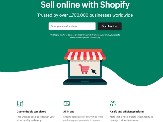
1. Shopify

Shopify sign up landing page example

Like many of the other landing pages in this post, Shopify’s trial landing page for sellers keeps it simple. It’s not too text-heavy, but still manages to persuade users by noting a few key points about its top-notch product. Visitors come away knowing that Shopify is an all-in-one platform that is easy to use and trusted by many.

Why This Landing Page Works:

  • Clean Interface: The user-oriented headline is just a few words, for example, and the page relies on simple graphics and short paragraphs to communicate the trial’s details and benefits.
  • Concise CTA: There are only a few fields you need to fill out before you get started. All of this makes it easier for you to quickly get started selling online with their tool.

What Could Be Improved:

  • Emphasize Security: The last column states that the platform is safe, but doesn’t explain why. Instead, it mentions that over a million businesses use it. A few words that speak to site security would improve this section since the number of vendors is already stated at the top of the page. Additionally, it would eliminate friction for visitors with security concerns.

2. Great Jones

Great Jones landing page design example

Many of us have been doing a lot more cooking during the pandemic and looking to upgrade our gear. Great Jones offers up a landing page that’s as beautiful as its Dutch Ovens. It’s very aspirational and taps into all of our ideal kitchen dreams.

Why This Landing Page Works:

  • Use of Color: Great Jones’ site is colorful just like its cookware. The use of bold colors quickly draws visitors in and makes the cookware stand out.
  • Prominent CTA: You can’t miss this giant yellow CTA and bold font $100 Off coupon. Who wouldn’t want $100 off these gorgeous pots?

What Could Be Improved:

  • Rollover Descriptions: With so many pans and utensils pictured at once, it would be great if users had the ability to view the name of the item. That way they could find it easier on the site when they’re ready to buy.

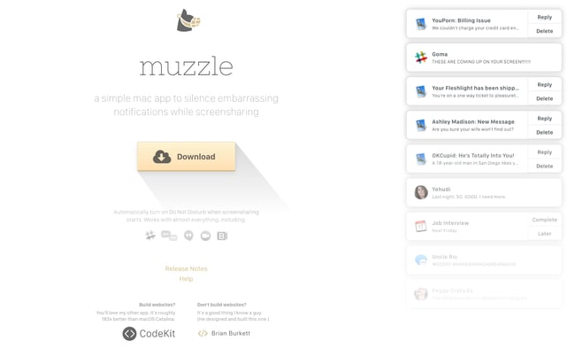
3. Muzzle

Muzzle sign-up landing page with yellow download button

Muzzle, a Mac app that silences on-screen notifications, fully embraces this show don’t tell mentality on their otherwise minimal landing page. Landing pages help users decide whether or not your product or service is actually worth their precious time and energy. What better way to clearly and straightforwardly communicate your value proposition than by confronting visitors with the very problem your app solves?

Why This Landing Page Works:

  • Show Rather Than Tell: Visitors to the page are greeted with a rapid-fire onslaught of embarrassing notifications in the upper left of the screen. Not only is the animation hilarious, it also manages to compellingly convey the app’s usefulness without lengthy descriptions.
  • Cohesive Visual Experience: Even the text on the page is a muted gray color, mirroring the function of the product.

What Could Be Improved:

  • Could Be Difficult to Read: While the light gray text on white background is great at mimicking the product’s function, it may be harder to read for some.

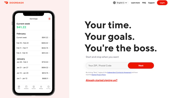
4. DoorDash

DoorDash landing page example

Takeout enthusiasts are no doubt familiar with DoorDash, the app that lets you order food from a variety of restaurants from your phone. Well, instead of customers, this landing page is geared towards recruiting Dashers who make the deliveries.

Why This Landing Page Works:

  • Emphasizes Dasher Autonomy: This landing page really plays up that Dashers are independent and free to work when they want.
  • Highlights Potential Earnings: While there’s no way to prove these earnings are typical, they are certainly enticing for anyone who wants to make extra cash on the side.

What Could Be Improved:

  • Advantage Over Competitors: DoorDash is not the only delivery game in town. They could highlight what sets them apart from a competitor like UberEats.

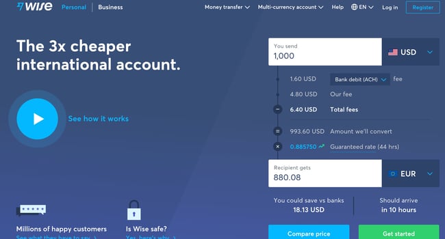
5. Wise

Wise sign-up landing page with CTAs for sending money, receiving money, and debit card

Wise allows you to send or receive money in different currencies and countries, and its landing page separates customers into two categories of either Business or Personal so you’re not distracted by options that don’t apply to you. There’s even a short video to show visitors how the service works before they try it. Since they’re dealing with money, it’s important to get the customer experience right the first time.

Why This Landing Page Works:

  • Highlights Safety: The security information is out front and center on this page, helping to ease any hesitancy a potential customer might have and assures them that Wise is a safe service to use to send money and receive .
  • Emphasizes Value: In several places on the page, in both text and video, Wise reiterates that it’s less expensive than transferring money through a traditional bank.

What Could Be Improved:

  • Interface is a Little Busy: While it’s great that customers have access to a wealth of information about the service, there’s a lot going on. There’s video, menus that appear when you scroll and multiple buttons — all within the top half of the page.

6. Airbnb

Airbnb Landing PageTo help convert visitors into hosts, Airbnb offers some enticing personalization: an estimated weekly average earnings projection based on your location and home size. You can enter additional information about your potential accommodations into the fields to get an even more customized estimation.
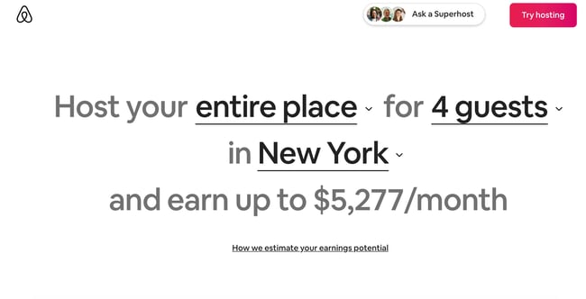
Airbnb 2nd landing page exampleIf you visit the page already convinced, the clear call-to-action at the top of the page makes it easy to convert on the spot.
Why This Landing Page Works:

  • Personalization: Airbnb shows you right at the start what you could potentially earn based on your area and the size of your home. This is useful for potential new hosts who may still be figuring out how much they should charge and what they can expect to earn.
  • Leverages Community: Further down on the page, those curious about hosting have the option to contact a seasoned Superhost to answer any questions they may have.

What Could Be Improved:

  • Nothing: The page is clear, concise, reassures potential hosts Airbnb is safe to use, and offers a personalized experience.

7. Wag!

Wag landing sign up page example

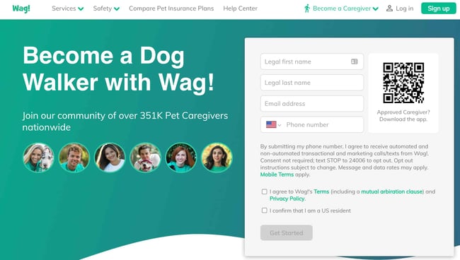
Wag! is a service that connects dog owners with dog walkers and sitters. This page gets right to the point with a large font encouraging prospects to join, and puts the sign-up form prominently on the right half of the page. The green background color makes the white font and other elements on the page pop. The addition of a QR code on the form is also a nice touch, enabling visitors to scan it, quickly download the app, and sign-up.

Why This Landing Page Works:

  • Efficient Form: Leaving the form field open on the page means visitors don’t even have to click on a CTA to access it. The QR code further expedites the process.
  • Emphasizes Credibility: Including caretaker photos and that more than 351,000 caretakers currently use the service nationwide makes Wag more trustworthy.

What Could Be Improved:

  • It’s Not Compelling: Unlike DoorDash mentioned earlier, Wag! makes no mention of why people should join. What are the perks? Are the hours flexible?

8. Wistia

Wistia Landing Page Example

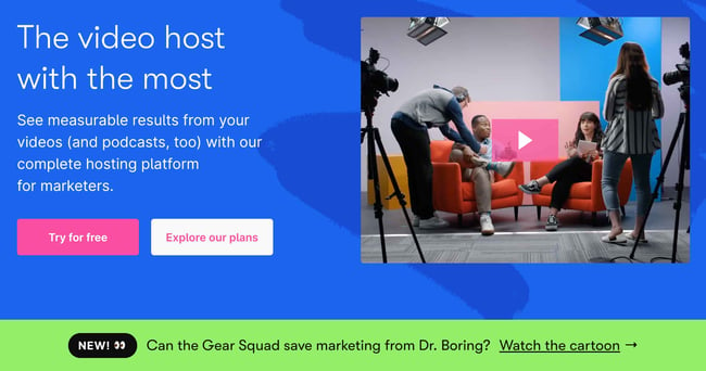
Right off the bat, you notice the blue background with the pop of pink in the form of a “Try for free” button. The page gets right into the action with a video showcasing all the cool content you can create. If you’re having doubts, you can always scroll below to read testimonials from some of Wistia’s 375,000 happy customers.

Why This Landing Page Works:

  • Ease of Use: The form itself allows users to quickly fill it out by linking to their Google account. Doing so enables the autofill feature, which cuts down on friction for the user.
  • Capitalizes on Visuals: As a video host, Wista does a great job of showcasing its capabilities using a variety of mediums. There’s colorful graphics, videos and even a link to marketing focused cartoons.

What Could Be Improved:

  • Include an FAQ: Testimonials are great, but sometimes customers have a few concerns that could be answered quickly with an FAQ section. That way they can decide whether or not to sign up without having to leave the page to search for answers.

9. Webflow

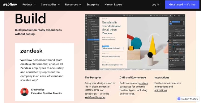
Webflow Landing Page ExampleWebflow, a design tool for web developers, packs a lot of information into just one GIF. As with Muzzle, Webflow also gets right to the point and demonstrates what their tool can do, rather than just talking about it. The animated GIF is visible in the same frame on the website, so users can see how the product works and sign up without scrolling.
Why This Landing Page Works:

  • Show Rather Than Tell: Being able to view Webflow’s tool in action gives potential customers a clear idea of not only what it does, but how their user experience will be.
  • Removes Risk: In several places on the landing page, visitors are reminded that the service is free. There’s no trial to sign up for. They can build their site for free and decide whether or not to sign up for a plan when they’re ready to launch.

What Could Be Improved:

  • Nothing: This landing page is the perfect balance of information, usability, and visuals.

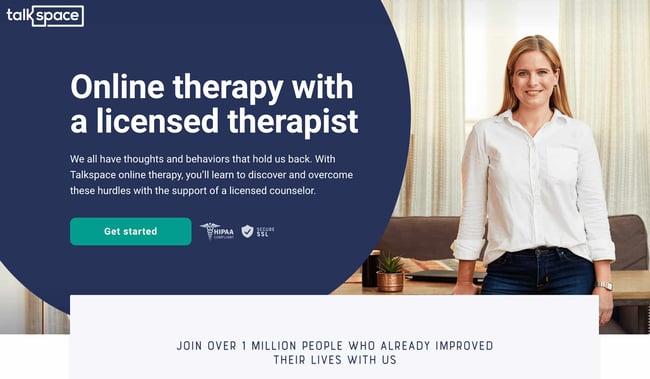
10. Talkspace

Talkspace Landing page example

Talkspace, an online therapy service, really focuses on trustworthiness with this landing page. All of the information on this page emphasizes that customers will have access to licensed therapists, and drives home that the service is secure and confidential. It’s a great way to reassure those who may be hesitant to participate. The use of shapes is also a clever idea. Pages are often filled with squares and boxes, so putting the CTA inside a large circle immediately draws the viewer in. Overall, the layout is clean, inviting, and informative.

Why This Landing Page Works:

  • Builds Trust: The focus on customer security works in their favor, especially noting that they are HIPPA compliant.
  • Provides Value: In addition to providing details about how Talkspace works, this page also provides several mental health resources and articles.

What Could Be Improved:

Nothing: This page has a great user interface and serves as a great starting point for mental health resources.

Ebook Landing Pages

11. Nauto

nauto-ebook-landing-page

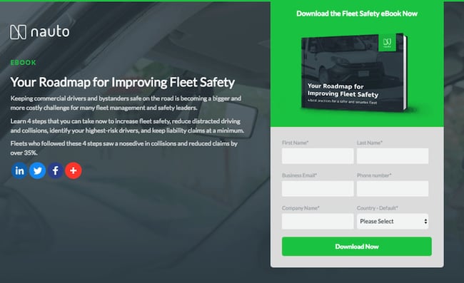
Nauto, a data platform for self-driving cars, helps make autonomous driving safer for companies who manage fleets of self-driving vehicles. Naturally, its customers would need all kinds of information to sell them on this platform. Nauto has it, packaged into a super-simple ebook whose landing page gives you both a brief contact form and some preview statistics to prove why this resource is so important.

At the top of the page, shown above, a warm photo of a car’s exterior r hugs the lead-capture form. The green “Download Now” button might’ve even been on purpose (on the road, green means go, after all).

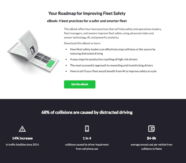
Scroll down, and you’ll see another “Get the eBook” CTA to remind users what’s waiting for them. You’ll also see three jarring statistics about car accidents to entice users to learn more. Check it out below.

nauto-ebook-landing-page-CTA-1

Why This Landing Page Works:

  • Simplicity: There’s no distractions on this landing page, which is perfect given the company’s focus on safe, self-driving vehicles.
  • Great Use of Comparison: Further down the page, Nauto offers up side by side footage of a distracted driver vs. a self-driving vehicle. It’s an excellent way to drive the point home that A.I. is a safer bet.

What Could Be Improved:

  • Graphics: The warm photo at the top is really difficult to see. Slightly more definition would have helped visitors easily recognize the image as cars.

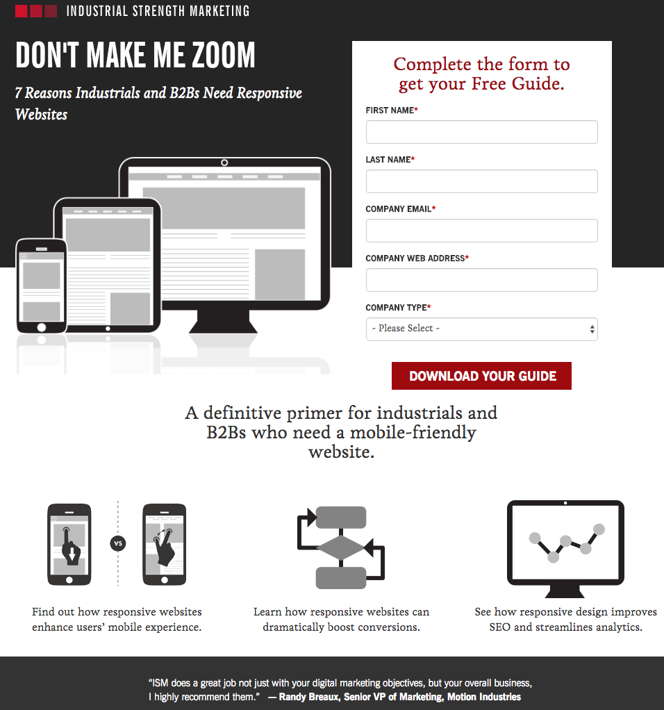
12. Industrial Strength Marketing

industrial-strength-marketing-landing-page-example.png

Right off the bat, this landing page pulls me in with a compelling, punchy header: “Don’t Make Me Zoom.” It directly speaks to a common experience most of us have had when we’re browsing on our phones or tablets — and it’s a little sassy, too.

But that’s not the only thing keeping me interested in this landing page. Notice how the color red is strategically placed: It’s right at the top and bottom of the form, drawing you even closer to the conversion event.

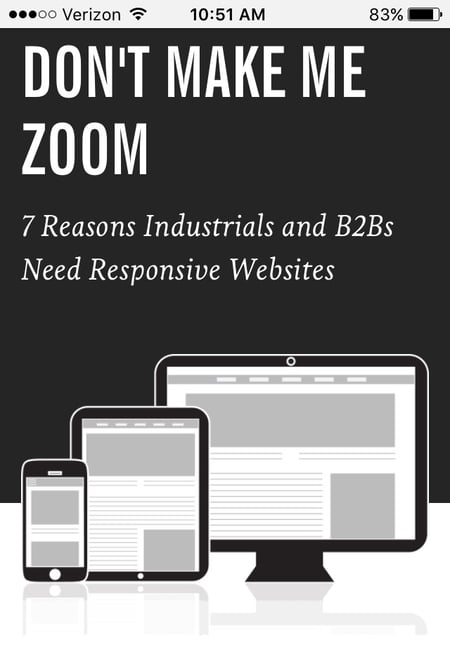
industrial-strength-marketing-mobile-landing-page-1.jpg

industrial-strength-marketing-mobile-landing-page-2.jpg

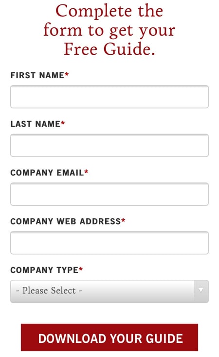
Plus, this design is meta to boot: It looks and works great on mobile, too (pictured above) Keep in mind that a lot of visitors will be accessing your landing pages on their smartphones or tablets, and if the design of your website doesn’t work well for them, they might give up and leave your page.

The folks at Industrial Strength Marketing made the fonts and form field big enough so that visitors don’t have to pinch-to-zoom to read and interact with the content, for example.

Why This Landing Page Works:

  • Voice: The language is punchy and relatable, quickly drawing the reader in.
  • Minimalist: The black and white color scheme with just a few pops of red really make the sign up sheet stand out. Additionally the minimalist design works beautifully on mobile and desktop, no pinching required.

What Could Be Improved:

Nothing: Both the mobile and desktop versions illustrate the perfect execution of a minimalist layout which helps the reader navigate the site with ease.

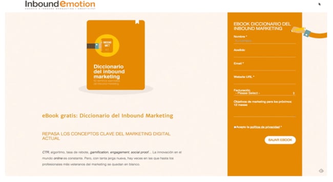
13. Inbound Emotion

Inbound Emotion Spanish language landing page example

Even if you don’t speak Spanish, you can still appreciate the conversion capabilities of this HubSpot partner site. My favorite feature of the page? The form stays in a fixed, prominent position as you scroll through the site. I also love the simple layout and warm colors.

Why This Landing Page Works:

  • Fixed Form: Having access to the form while scrolling provides a better user experience. No need to scroll back up to the top of the page to find it.
  • Simple Interface: The layout is simple, but effective. The use of only two shades of orange give a monochrome feel and keeps the focus on the benefits of the ebook.

What Could Be Improved:

  • Make the Form Brief: There were six items to fill out, not including the check boxes option at the end. Longer forms could be a turnoff for some visitors.

14. IMPACT Branding & Design

Impact Branding landing page example with creative CTA

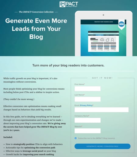
Full disclosure: IMPACT is a HubSpot partner — but that’s not why they’re included here. IMPACT’s landing pages have long been a source of design inspiration. I love the simple layout of the page, from the large headline copy and detailed featured image, to the outline that surrounds the form, to the colors and fonts that are very pleasing to the eye.

The free guide IMPACT is offering for download here also doesn’t emphasize the download itself in the blue button that allows you to submit your filled-out form. Rather, IMPACT is inviting you to “generate more conversions” — putting the focus on what you stand to gain as a result of reading the guide.

Why This Landing Page Works:

  • Clever Messaging: You’re not downloading an ebook, you’re learning how to “generate more conversations.” This rephrasing is far more enticing than simply putting a regular download button.
  • Simple Use of Color and Fonts: The blue tones work really well on this landing page, giving it variety while keeping the look cohesive. Since there’s lots of text on the page, a simple font is perfect.

What Could Be Improved:

  • Nothing: This page encourages downloads in a clever way using a simple layout and colors.

Landing Pages to Learn More

15. Unbounce

Unbounce Landing Page Example

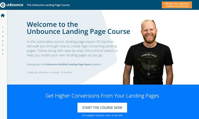
It’s no surprise Unbounce made this list —they’ve actually written the book on creating high-converting landing pages. Although there are lots of amazing things about this landing page, the two that I absolutely love are: the multiple ways to access the course, and additional industry-specific report offerings. Unbounce is really skilled at providing visitors the information they need, but also what they didn’t know they needed until they landed on the site.

Why This Landing Page Works:

  • Gives Visitors Options: When it comes to accessing the course, users can either click the main button above the upper half of the page, or if they’ve been scrolling, click on the course from the sidebar on the left. Eliminating the need to scroll back up to the top of the page.
  • Sometimes More is More: In addition to the course, Unbounce provides visitors with industry-specific reports and answers to other landing page-related topics. Providing even more useful information sets Unbounce up as a trusted authority in their field.

What Could Be Improved:

  • Descriptions: The course offers several modules and it would be helpful if some offered a brief description. The sidebar menu offers a course list, but a short sentence summarizing what visitors can expect to learn would be helpful.

16. Bills.com

bills-dot-com-landing-page-example.png

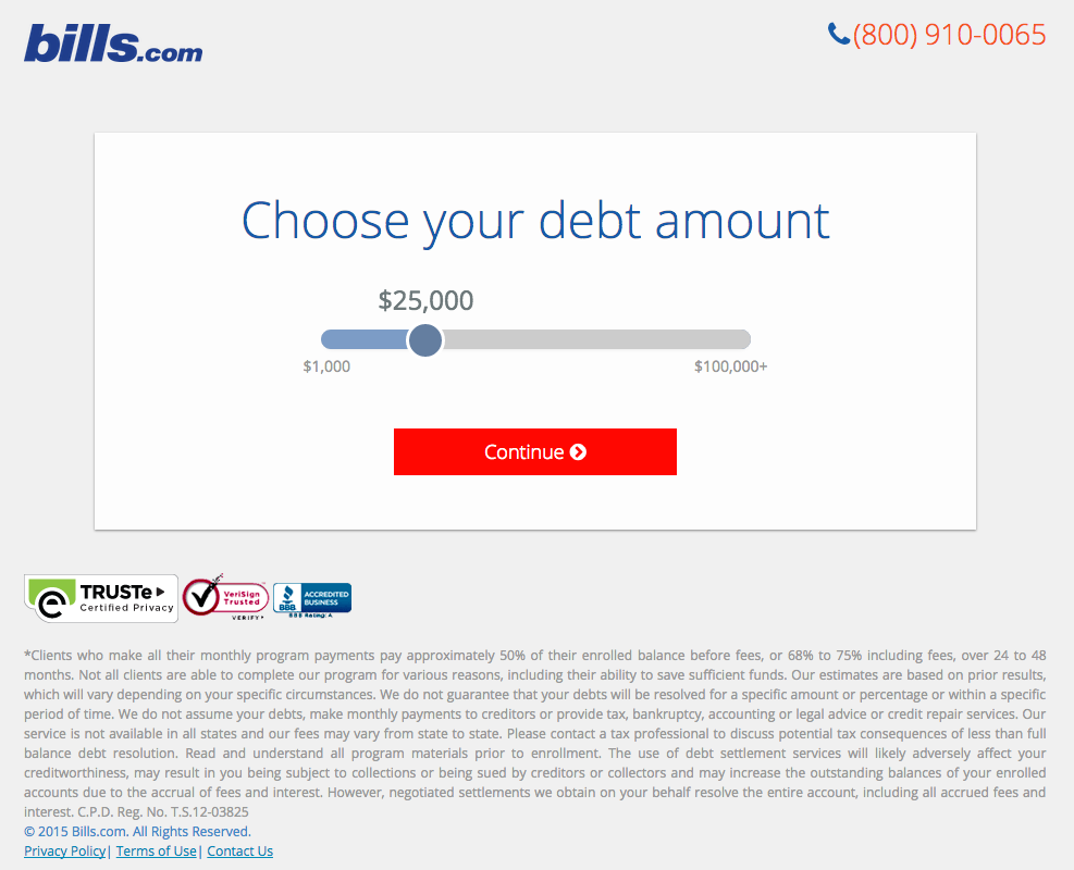
Often, people think landing pages are static pages on your website. But with the right tools, you can make them interactive and personalized.

Take the example above from Bills.com. To see if you’d benefit from their consultation, you answer three questions before you are shown a form.

Then, you answer two more questions, like the one below:

bills-dot-com-landing-page-2.png

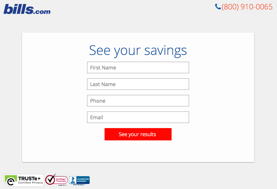
And here’s the final landing page form where you fill out your information:

bills-dot-com-landing-page-3.png

I’m not sure how the algorithm works (or if there’s one at all), but while I was filling it out, I had some anxiety about not qualifying. Once I found out I did, I was excited to fill out the form, which I’m sure most people who are in debt and using this tool are. By making this offer seem more exclusive before the form appeared on the landing page, I’d bet that Bills.com increased conversions pretty significantly.

Why This Landing Page Works:

  • Exclusivity: Everyone likes to feel special, which is why exclusivity works so well. The page gives the impression that the offer isn’t given to just anyone, you have to qualify first.
  • Interactivity: Anytime you can get users to interact with the page, even if it’s something as simple as using a form with a sliding bar question.

What Could Be Improved:

  • More Color: While the site is geared to not so fun topics like bills and debt, it doesn’t mean it has to be boring. The gray leaves much to be desired.

17. Zillow

Zillow Landing Page Example

Zillow did something very similar to Bills.com with their landing page. It starts with a simple form asking for “your home address” ( sounds creepy, but don’t worry. This form field is set on top of a hero image featuring a quaint home at dusk followed by a handy FAQ section.

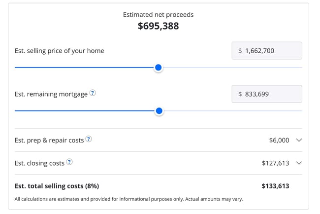
Of course, the address itself won’t be enough to get a true appraisal value of a home. It just denotes the home’s neighborhood. It’s a bit like playing The Price is Right. You can guess how much homes in the area are worth and then type in an address to see how close you got. If you want to learn more info about a property, Zillow then prompts users to sign-up to continue.

Zestimate landing page exampleOnce you hand over your email, you’ll have access to more data like comparable homes in the area, mortgage tools, and the estimated net profits should you decide to sell.
Why This Landing Page Works:

  • Games are Fun: Anytime you can make filling out a form feel like a game, it’s a win.
  • Establishes Authority on the Topic: Zillow has access to so much housing and neighborhood data, it’s no wonder they are one of the top home search sites in the nation.

What Could Be Improved:

  • Nothing: The Zestimate page is simple, but effective. Those with concerns about what a Zestimate is and how it’s calculated have easy access to the homebuying FAQ on the second half of the page.

18. Landbot

Landbot Landing Page Example

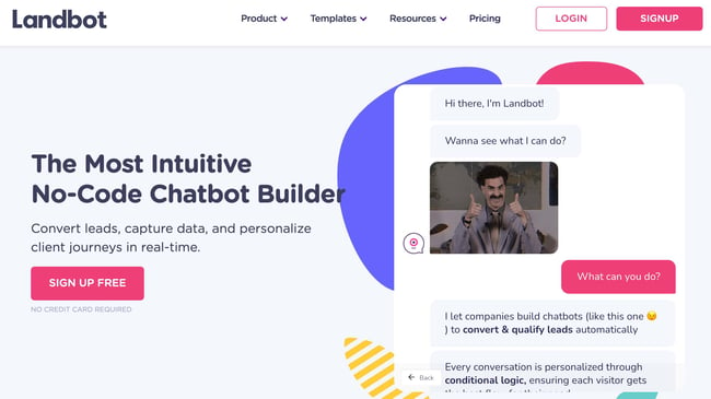
Landbot, a service that creates chatbot-based landing pages, puts their own product front and center on their chat-fueled landing page. Visitors are greeted by a friendly bot —complete with emojis and GIFs —who encourages them to provide information in a conversational format instead of via a traditional form.

Why This Landing Page Works:

  • It’s Fun: From the bright colors to the GIFs, this page keeps visitors engaged and entertained.
  • Show, Not Tell: By having the chatbot right on the page, doing its thing, potential customers can see exactly what they’re getting. The whole experience simulates what it’s like to use Landbot’s product.

What Could Be Improved:

  • Nothing: Landbot’s use of a live demo, testimonials, highlighted integration features and detailed breakdown of how the product works leaves new customers ready to sign up at first glance.

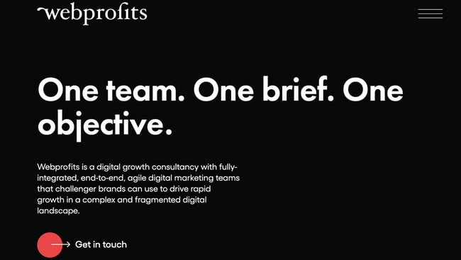
19. Webprofits

Webprofits landing page example

Like Industrial Strength Marketing mentioned earlier, Webprofits also makes great use of a predominantly black, white and red color scheme. The result is a clean layout that makes great use of the pops of color on the page. It’s a testament to the organization’s expertise in digital marketing and UX design.

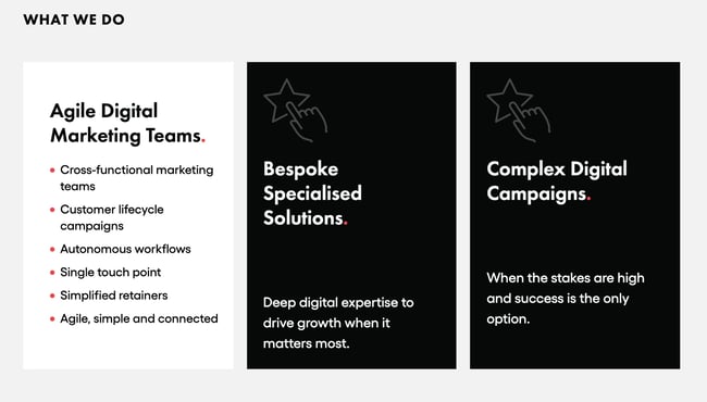
The rollover description feature throughout the “What We Do” section, while black and white, uses movement to draw the reader’s attention to the content. Each section changes color and rolls down like a shade to reveal more in depth features.

Webprofits landing page example

They also make it easy for you to figure out what Webprofits actually does. The rest of the page offers detailed information about what you’ll get when you give over your information. Plus, it includes strategic CTAs throughout, like “Get in Touch”

Why This Landing Page Works:

  • Informative, But Not Overwhelming: There’s a lot of information and text on this page, but the use of well-placed graphics and videos help break things up.
  • Multiple CTAs: Placing the same CTA throughout the page makes it so visitors don’t have to scroll all the way to the top to “Get in Touch.”

What Could Be Improved:

  • Nothing: Webprofit makes great use of the long landing page format, packing in all the pertinent information visitors would need in one place with a visually appealing experience.

20. Native Poppy

Native Poppy Landing Page example

Sometimes, you’ve just got to stop and admire a landing page for being beautiful. Using high-resolution photography and lots of white space, Native Poppy’s landing page is a pleasure to look at.

Aside from its beauty, the page has some great elements: a clear and delightfully pink CTA, an informative “How It Works” section, plus an FAQ at the bottom. Best of all, it plays with language, ditching the phrase “become a subscriber” for “become a wild flower.” I don’t know about you, but I’d much rather be a “wild flower” over a subscriber any day.

Why This Landing Page Works:

  • Captures Brand Voice: The layout of Wild Poppy mirrors the whimsical vibe of the brand. From the photos, font choice, and “wild flower” subscription, all the messaging works in harmony.
  • Persuasive: By highlighting all the perks and discounts of being part of the subscription program, it entices customers to join.

What Could Be Improved:

  • Form Visibility: While there are multiple CTAs, it would have been nice to have the form fields on the page for faster sign-up, or as a pop up after clicking, instead of having to click the CTA and then be taken to another series of prompts.

21. Conversion Lab

Conversion Lab Landing Page example

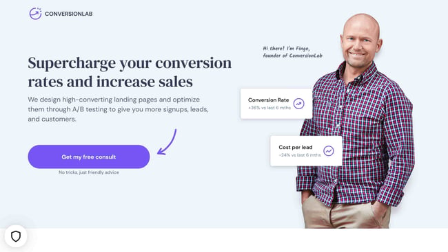
While I wouldn’t typically include an example of a homepage with a form on it in a post about landing pages, this website is special. The homepage is the entire website — the navigation links just take you to the information below.

When you click “Get My Free Consult,” the entire page darkens to highlight the form. See what it looks like before you click in the photo above.

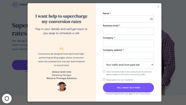
And, when you click that CTA, check out how the form appears:

Conversion Lab landing page example CTA

It’s a similar function when clicking on any of the headings on the page. Instead of taking you to a different page, it simply jumps to the corresponding section on the homepage.

I love how you don’t have to leave the page to fill out the form, or view any of the features, creating a seamless user experience.

Why This Landing Page Works:

  • Creative: Having a homepage that also functions as various landing pages makes Conversion Lab unique. Best of all, it still provides a pleasant user experience.
  • Organized Layout: Despite having the homepage and landing pages as one, the page doesn’t feel cluttered or busy at all.

What Could Be Improved:

  • Form Placement: It would be nice if the form maybe opened up on one side so visitors could still read the content on the rest of the page.

Landing Page Ideas

A well-optimized landing page can transform prospects into leads by gathering information that can help you better understand, market to, and delight visitors. Since landing pages are crucial for conversions, it’s important to make sure they’re well planned, designed, and executed

Here are a few things to keep in mind when creating landing pages:

  • Appealing aesthetics: Giving your landing page color and a clean UI can only help. Visitors will want to learn more about your products and see evidence of the value you’re offering. Take a look at #18 on our list — Landbot for a great example of a stunning web page.
  • Less is more: Let the offer or images do most of the talking, but be sure to include any and all descriptive headlines and supporting text to make your landing page clear and compelling. HubSpot’s Campaign Assistant does the heavy lifting for you and generates landing page copy in a few clicks. This goes for just about all the components on the page: try white space, simple copy, and shorter forms.
  • Keep visitors on the page: By removing the main navigation or any distracting backlinks, it’s less likely there will be any lead generation friction that could cause visitors to abandon your page.
  • Social Sharing: A simple way of getting visitors to engage with your landing page is including social media sharing buttons so that they can spread your content to their social followings. After all, customers are the center of your marketing flywheel.
  • A/B testing: Landing pages are important to get right, and since consumer psychology can sometimes be surprising, it’s always better to experiment with different versions of your pages to see which has the highest conversion rate (CVR). Test the positioning of the offer, kinds of CTAs, or even the color scheme.
  • Call-To-Action: The CTA is where the meat of the landing page is, or the tipping point where prospects become contacts. CTAs could ask visitors to subscribe, download, fill out a form, share on social media, and more — but, overall, CTAs are necessary for getting your audiences more engaged with your offering. To generate leads, CTAs should be bold and eye-catching, but most importantly, they need to effectively communicate value.

Creating Landing Pages That Shine

Landing pages aid in growing your customer base and increasing conversions. Create a page that delights customers with a user interface so great, they continue to come back for more.

This article was originally published April 2, 2020 and has been updated for comprehensiveness.

New Call-to-action

Categories B2B

What Insights And Benefits Can B2B Intent Data Provide?

We’ve covered the topic of buyer-level intent data in many posts on the NetLine blog, including an overview of ‘What Exactly Is B2B Intent Data?’ and ‘Why Intent Data Matters’.

In this post, we’ll take a closer look at what sort of insights B2B intent data can provide marketers and sales professionals, along with some of the benefits they can expect when they take full advantage of such data.

What Insights Can B2B Intent Data Provide?

B2B marketers can collect a huge amount of data from their own online properties and from across the web. However, most of the data trail that is left by B2B buyers isn’t relevant. 

For example, a visit to tech a review site doesn’t provide much insight if they are just browsing reviews for their own product. The same goes for a visit to a trade publisher site; it doesn’t indicate much if they are simply reading a random opinion piece during a coffee break.

Data that can identify real intent, however, is powerful for a whole number of reasons. So what types of insights can intent data provide?

At a high-level, some key insights that intent data can provide include:

  • Intent signals that indicate when a potential customer is in-market for a particular solution — for example when a buyer downloads a “Buying Guide” or visits a web page comparing different vendors, they may be actively looking for a solution or considering it in the near future.
  • Key topics and themes that buyers meeting your Ideal Customer Profile are researching — these can be either on your own properties or on other sites across the web.
  • Insights into the buyer’s journey and potential pain points — for example, the search terms and engagement history of known, qualified accounts can be used to create content and update your messaging.

At this point, it’s important to note that any insights coming from intent data will always be more powerful when they come from buyer-level intent data rather than those aggregated at the account-level. The reason for this is simple:  if you know who the individual is, you will automatically know what account they belong to.

An astronaut shows buyer intent as he stands at the point of purchase. Created using Midjourney.

To demonstrate this further, here’s a more detailed list of potential insights and what they can offer at the account-level and at the buyer-level.

Potential Insights from intent data Why this might be useful at an account-level Why these insights at a buyer-level offer more than at an account-level
Intent signals for specific solutions Identifies interested companies Enables personalized outreach targeted at named buyers, leading to improved efficiency and better buyer experiences
Topics and themes being researched Reveals organizational interests for content strategy Unearths decision-makers’ interests, allowing for more relevant and personalized content
Keywords and phrases used in searches Assists in SEO for company attraction Content and ads can be tailored and targeted to individuals, improving paid media efficiency and boosting conversion rates
Engaged content and websites Indicates online platforms for targeting Reveals preferred content/websites of individuals, enabling better targeting and personalization
Geographic and firmographic data Aids in segmentation and market analysis Provides insights into individual preferences and potential cultural or regional considerations, enabling more personalized marketing strategies
Technographic data Reveals company technology preferences Indicates a buyer’s familiarity with certain tech, assisting in tailoring demos or technical discussions
Social media activity and sentiment Shows company sentiment towards a product/solution Reveals individual sentiments, which can be crucial in personalizing communication and addressing concerns
Buyer’s journey and pain points Unveils common company challenges Helps to anticipate and address specific pain points of individual buyers, improving the buying experience
Account-based marketing insights Prioritizes and customizes messaging for high-value accounts Enables highly personalized messaging and targeting for high-intent individual buyers, increasing conversion rates
Customer preferences and buying behaviors Provides an overview of company buying decisions Offers in-depth knowledge of individual decision-making patterns, enabling more effective and timely sales approaches
Effective channels and campaigns Optimizes marketing budget across companies Identifies the most effective channels and campaigns for individual buyers, leading to better engagement and conversion rates
Effective messaging and offers Reveals resonating messaging/offers with companies Offers insights into what specific messaging and offers work for individual buyers, enabling highly personalized marketing
Segments and industries showing need Guides targeting/segmentation strategies Helps in understanding individual roles and responsibilities, allowing for personalized engagement strategies
Resonating content and offers for personas Enables persona-targeted content/offers Assists in creating highly personalized content and offers based on individual preferences and needs, boosting engagement and conversion
Competitive landscape and market positioning Gauges company positioning among competitors Provides knowledge of individual perceptions, informing personalized positioning strategies
Upsell and cross-sell opportunities Identifies accounts for more business Helps identify individual users interested in additional products or services, allowing for personalized upsell strategies
Potential customer objections Understands common company objections Reveals individual buyer’s objections, allowing for personalized objection handling and negotiation, increasing chances of deal closure
Impact of external factors on Intent Assesses impact of market trends/events on company demand Offers insight into individual reactions to market events, aiding in personalized communication during these times

5 Key Benefits of Using Intent Data in B2B Marketing

Now that you know what intent data is, the next question that comes to mind is likely to be, how does using it benefit B2B marketing? There are several key benefits to using intent data in your B2B marketing. Here are a few:

  1. Improved lead generation through buyer discovery: Buyer-level intent data, which identifies prospects on an individual level, enables you to see who is actively searching for solutions like yours. By knowing exactly who is researching your solutions or products, you can focus on high-intent prospects, thereby improving the quality of the leads that you pass to sales and increasing the likelihood of converting them into customers.
  2. Increased conversion rates through targeting and monitoring: On the topic of conversions, by targeting prospects who are more likely to be interested in your offerings, you can improve your conversion rates. Intent data allows you to tailor your messaging and content to the needs and interests of your target audience. Furthermore, by monitoring the behavior of prospects within accounts that are already expressing intent, you can time any marketing and sales outreach at exactly the right moment.
  3. Better personalization in both marketing and sales outreach: Intent data provides insights into the topics, keywords, and content that your target audience is engaging with. Using this data, especially when it’s at a buyer level, allows marketers to personalize messaging and content, as well as outreach and communications, to better align with the interests of potential buyers. Later in this post, we’ll explain more thoroughly how intent data can be used to improve targeting and personalization.
  4. Improved paid media efficiency through better timing, targeting, and tailored content: Intent data offers a competitive edge for B2B marketers by enhancing paid media efficiency. By unveiling a prospect’s buying stage, intent data enables precision in timing, targeting potential leads when they’re most receptive. Additionally, understanding a prospect’s needs facilitates more accurate targeting, ensuring ads reach decision-makers who are truly interested eliminating guesswork and unqualified leads. Intent data bridges the gap between your offering and the buyer’s needs, optimizing ad spend and transforming paid media from a blunt tool to a scalpel of precision marketing.
  5. Enhanced ROI: Improving ROI is always one of the top goals of any B2B organization. It’s also one of the key benefits of utilizing intent data. Because intent data allows marketers to focus resources on high-intent prospects, time, effort, and budget are not wasted on courting prospects that are not ready to convert. 

Of course, the above benefits are just an overview.

Exactly what you can get from intent data is up to how you use it to its full potential. 

If you’re truly looking to learn how to get the most from intent data, NetLine’s INTENTIVE is the best in the business. INTENTIVE offers real-time insights into “who” is actively expressing intent inside an account, while also being the lone intent platform to deliver “what” actions that person is taking, “when” those actions took place, and notably “where” those actions occurred.

Join the INTENTIVE waitlist today.

Categories B2B

What is Customer Journey Analytics

A customer doesn’t just mindlessly purchase a product or service. They go through an entire journey, from discovering your brand, to purchasing your product or service, to sometimes recommending it to someone else. 

To make sense of your customer’s journey, you’ll need to leverage customer journey analytics.

Get Started with HubSpot's Analytics Software for Free

Every business, startup or enterprise — in any industry — needs to understand how customers interact with their brand. Insights gathered from customer journey analytics can help, while leading to increased customer lifetime value, customer loyalty, and revenue growth. 

In this blog post, we cover the following:

What is customer journey analytics?

Customer journey analytics is a collection of data that helps you to understand how your prospects or customers behave, engage, and convert along the customer journey. 

Customer journey analytics often begins with a customer journey map, which is a visual representation of every step the customer goes through with your business. Then, it applies data on how your customer behaves throughout different phases of that map,  to help you assess the effect your customers’ journey has on your business, or what’s holding customer’s back from completing that journey and purchasing a product

Customer Journey Analytics Steps

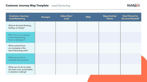
1. Outline a customer journey map.

Customer journey map template

Create your customer journey map using HubSpot’s template

The first step to customer journey analytics is creating a customer journey map. A typical customer journey map includes the following: the buying process, user actions, emotions, pain points, and solutions. The customer journey map is the foundation for further analysis.

2. Identify the right analytics tools.

To accurately conduct customer journey analysis, you’ll need the right tools. 

A good customer journey analytics tool will monitor, track, and analyze data like website data, conversion data, and detail data across multiple channels.

Customer data platforms (CDPs) also play a role in supporting customer journey analytics. The platforms assign unique IDs to your website and app to build single customer views, which can include information such as location, browser, device type, operating system, historical transactions, and visitor logs.

3. Collect your data.

A robust analytics platform should enable you to collect data on customer behavior. Data can be broken down into two main buckets: user data and interaction data. 

  • User data: Provides context on a user and their traits. Data can include email, age, industry, and occupation.
  • Interaction data: Gives information about how a user interacts with your product or service.

4. Analyze data.

Data in itself is not meaningful without analysis. The purpose of customer journey analytics is to make sense of the data and extract insights that can inform your business strategy. 

For example, an e-commerce company might identify, through analysis, that requiring customers to create an account to complete a purchase leads to the customer not completing the purchase — a solution could be implementing a guest checkout option.

5. Update customer journey map.

Using the insights you’ve gained, you can now update the customer journey map accordingly. For example, you might add additional pain points uncovered through data analysis, like requiring customers to create accounts to complete a purchase.

6. Use customer journey analytics to test new strategies.

The next step is to figure out how to enhance the customer journey experience. Testing new strategies like adding a guest checkout option, making the account creation process faster with fewer steps, and sending abandoned cart emails are all examples.

Benefits of Customer Journey Analytics

By leveraging customer journey analytics, you’ll be able to improve your customer’s experience with actionable insights, while unlocking benefits like:

Better Understanding Customers

By gathering and synthesizing data, you will better understand what aspects of the buyer’s journey lead them to purchase a product or service, or not. For example, an e-commerce company might learn that customers that come from a specific social media platform are more likely to buy, or discover that certain audience demographics or affinities are more likely to become leads.

Pinpointing Where You’re Losing Customers

Not all customers follow through, and unless they fill out a survey, it can be difficult to figure out why they churn. By leveraging customer journey analytics, you can pinpoint where you’re losing potential customers. 

For example, a business can lose potential customers during channel or device transitions. A prospect  might start filling out a form on a mobile device but choose to complete it on a laptop. If information entered is lost, the potential customer might not take the time to complete the signup process.

Optimizing and Solving for Prospects

With a better understanding of customers’ pain points and the reasons behind them, you’ll be able to figure out how to improve and strategize around an accurate customer journey.

Improve ROI

Are your investments in customer experience worth it? By using customer journey analytics, you’ll be able to measure ROI for customer experience initiatives. From there, you can streamline, remove, or cost cut initiatives that don’t benefit your bottom line, or double down on the aspects of the buyer’s journey that do.

For instance, if you run an incredibly expensive advertising campaign that doesn’t yield the same level of new customers or purchase page visits as unpaid or more in-house content, you can aim to save money on ads and focus on the more affordable strategies that actually earn you money.

Customer Journey Analytics Software

1. HubSpot Marketing Hub: Advanced Marketing Reporting

HubSpot customer journey analytics

Get started with customer journey analytics

HubSpot Marketing Hub is equipped with robust customer journey analytics capabilities and tools, which can map data around conversions, leads, deals, and website engagements around different stages of the customer journey. 

The Advanced Marketing Reporting tool also enables you to  attribute every customer interaction to revenue, analyze conversion rates and time between nurturing path steps, and provides further data to help you build informed strategies that can improve ROI and purchase rates.

2. Content Square

Content Square

Source

Content Square captures UX, performance and product, and content data throughout the customer journey. The platform also enables you to visualize metrics so that they are easily digestible. You will be able to get insights like bounce rate and number of lost conversions, and dig deeper to pinpoint why.

3. Google Analytics

Google Analytics

Google Analytics is a widely used website analytics software that enables you to track user behavior on different platforms, including mobile applications. Features like daily traffic reporting give you insight into what visitors are engaging with. Plus, its Analytics Amplifier can combine Google Analytics and HubSpot data.

Customer Journey Mapping vs. Customer Journey Analytics

Customer journey analytics and customer journey mapping are often confused with each other. Although they’re complementary,  customer journey mapping visually presents customer journey stages from start to finish, while customer journey analytics offers data about a  customers’ interactions in each stage.

Customer journey maps often include the following:

  • The buying process: By pulling data from places like CMS and prospecting tools, you will be able to figure out what goes into a customer’s purchasing process. 
  • User actions: This part of the customer journey map details the actions the customer takes throughout their journey.
  • Emotions: Emotions help color your understanding of how your customer is feeling and reacting as they go through their journey with your business.
  • Pain points: Adding pain points to your customer journey map gives you a comprehensive picture of the challenges your customer may experience.
  • Solutions: Figuring out solutions can help your customers experience fewer pain points. The data and insights you’ve gathered can help inform your solutions.

Customer journey analytics delves deeper. The customer journey map is the “what” and customer journey analytics is the “why” because it organizes customer or prospect data around each stage.  

Here’s an example of how customer journey analytics works in HubSpot Marketing Hub:

HubSpot customer journey analytics

HubSpot’s Advanced Marketing Reporting Tool 

Customer Journey Map vs. Analytics Example: Let’s say your business offers CMS tools and your ideal customer, a graphic design firm, finds you through a targeted Instagram ad.

In the customer journey map you’ve built, your target customer considers using your CMS tools to build a new website that showcases their strengths. They schedule a demo before trying the free version and are initially excited, but become frustrated with the limited design elements offered by the free version. Their biggest pain point quickly becomes lack of versatility. They then look into purchasing the paid version or go to a cheaper competitor.

With customer journey analytics, you’ll apply real-time data to that map: From journey mapping, you’ve identified the steps your customer often takes  and their common pain points. A strong customer journey analytics tool can then collect, aggregate, synthesize, and visualize data to help you make sense of your customer’s actions and see if your mapping and journey-based strategies work. 

For example, data might show how your customer is interacting with your product. 

A good Customer Journey Analytics platform combines data like user data, survey results, and website analytics, you can gain a comprehensive view of why your customer is experiencing those pain points and consequently address their concerns.

Cultivate an Impactful Customer Journey

In order to remain competitive, it is important to understand and create strategies to enhance the customer’s journey. Customer Journey Analytics is just one component. Other key steps include creating buyer personas, mapping out the customer journey, and continuously updating strategies based on data.

To get started with improving the customer journey, learn more about HubSpot’s marketing solution Marketing Hub.

analytics

Categories B2B

5 Inspiring Indigenous and Native Entrepreneurs to Know About

Welcome to Breaking the Blueprint — a blog series that dives into the unique business challenges and opportunities of underrepresented business owners and entrepreneurs. Learn how they’ve grown or scaled their businesses, explored entrepreneurial ventures within their companies, or created side hustles, and how their stories can inspire and inform your own success.

Native entrepreneurship often occupies two worlds. Aspiring Indigenous business owners navigate historic barriers to traditional financing and growth — while building culturally informed, sustainable ventures.

This challenging climate hasn’t stopped these entrepreneurs from entering nearly every industry imaginable to make an Indigenous imprint on the world while supporting themselves and their communities.

Some Native business owners build on cultural touchstones like tribal art and stories to launch design studios and art shops. Others address long-time systemic hurdles to credit by stepping into the financial sector, bringing an Indigenous perspective to the issue that often proves crucial in addressing it. Still, others make waves in industries where Native participation registers just a fraction of a percentage point, such as in engineering and architectural design.

Download Now: Free State of Marketing Report [Updated for 2023]

Inspiring Indigenous and Native Entrepreneurs to Know

By examining the stories and advice of these powerful voices in Indian Country business, we can light a path for even more Indigenous entrepreneurs to follow after — and continue an ever-improving cycle of breaking free of poverty and systemic discrimination. Let’s dive into these incredible leaders’ stories.

Chad Johnson (Cherokee,) The Akana Group

Agriculture is a staple business for many Native Americans, whose families have farmed reservation lands for generations. However, equipment typically proves a major hurdle even when working private lands, especially when Native farmers struggle to secure startup or business capital, according to a U.S. Treasury’s Community Development Financial Institutions Fund report.

Enter Chad Johnson’s Akana Group, which partners with equipment dealers like John Deere to foster relationships with tribal producers. Akana often secures discounts, delivery, and maintenance for Indigenous purchasers to help producers fully use their land.

Inspiring Indigenous and Native Entrepreneurs to Know: Chad Johnson of Cherokee descent

Image Source

“It’s empowering for Native farmers to have more opportunities around their land usage,” Johnson says. “It’s about providing them what they need for a long-term growth strategy.”

While the Akana Group has since gone national, Johnson’s aspirations don’t stop at U.S. borders. His background drives him to establish partnerships with other Indigenous people across the globe.

“As Native businesses, with these new opportunities in front of us, we have to really consider: What are we looking to do? How are we looking to grow?” Johnson says. “We have to have the more complicated conversations of how we can really work together.”

Johnson recently served as a delegate for the First Nations Trade Mission, which saw a group of Native business figures visit Australia to discuss trade, partnerships, and education with Indigenous communities there.

The First Nations Trade Mission builds on the Native tradition of bartering and partnering to achieve better things for all parties involved, Johnson says.

“Trade is in our blood. Indigenous people have been traders since the beginning,” Johnson says. “This mission only reinforces that.”

Sheila Cummings (Lumbee,) Cummings Aerospace

Cummings Aerospace founder, CEO and president Sheila Cummings has plans in Australia, too. The Lumbee citizen recently announced a partnership to develop defense solutions alongside Australian company Criterion Solutions.

Inspiring Indigenous and Native Entrepreneurs to Know: Sheila Cummings of Lumbee descent

Image Source

That’s everyday work for Cummings herself, who took an intense interest in science and technology in her teenage years, she says. Despite a lack of available science classes in her early education and precious little existing Native representation in the aerospace industry, Cummings fought hard to achieve her goal: making objects fly.

“I encountered many teachers and advisers who were not very supportive,” Cummings says. “I wanted to succeed so that, if nothing else, I could prove them wrong.”

That defiant spark gave way to a desire to open her own small business after Cummings landed in Huntsville, Alabama, where she found a supportive community to build upon. Cummings says support made her feel comfortable taking a risk in launching Cummings Aerospace in 2009.

It was a break into an industry where Native Americans made up just 0.3 percent of employees and owners, according to data from the National Action Council on Minorities in Engineering. Cummings says the obstacles to her ascent only made her strive harder.

“I use them to fuel my passion,” Cummings says. “We all encounter challenges, no matter what your career or journey is. There’s always challenges. It’s best to utilize those obstacles to improve as a person, as a leader, and as a business owner.”

Valerie Red-Horse Mohl (Cherokee,) Known Holdings

Long-time financier Valerie Red-Horse Mohl understands those challenges well, leading her to enter the financial sector and found the first Native-owned investment bank on Wall Street in 1998. Since then, Red-Horse Mohl has helped find capital and support for Native entrepreneurs, culminating in the founding of combination investment fund, asset management firm, and institutional knowledge center Known Holdings in late 2022.

Inspiring Indigenous and Native Entrepreneurs to Know: Valerie Red-Horse Mohl of Cherokee descent

Image Source

Red-Horse Mohl says Known Holdings aims to mend disparities in racial wealth by providing business and financial management support for owners and executives, emphasizing supporting entrepreneurs of color.

“It’s about supporting these businesses as they grow,” Red-Horse Mohl says. “When you think about Native founders and entrepreneurs, they deal with this cliff that they fall off of when they make it past the small business stage – they don’t have that same support in getting to the ‘endgame’ where they go public or are acquired.”

Bridging that gap has become a “passion” for the Cherokee citizen, who sees the support as a way to break free of a cycle of poverty afflicting BIPOC communities.

“I moved into the philanthropy space to try to identify more sustainable solutions I would bring back to my community,” Red-Horse Mohl says. “To me, it’s a culmination of all my work, all my years, and I’m thankful God saw fit to put me in the paths of my other founders at Known Holdings.”

Connor Alexander (Cherokee,) Coyote and Crow

Native perspectives in fantasy frequently find themselves employed on behalf of the villains – savage orcs roam in tribes, or mystic druids maintain an exaggerated relationship with their environment. Moreover, the exploding tabletop roleplaying game industry often employs colonialist frameworks for their basic gameplay, leaning on Eurocentric tropes and ideals to create their stories.

Game designer Connor Alexander wants to explore new horizons for Indigenous stories, rather than retreading old stereotypes and frameworks. To that end, he and his team created Coyote and Crow, a tabletop roleplaying game that imagines what Native America might look like if contact with Europe never occurred (along with a dose of magic.)

Inspiring Indigenous and Native Entrepreneurs to Know:  Connor Alexander of Cherokee descent

Image Source

Coyote and Crow created a splash with an immensely popular, million-dollar Kickstarter campaign, paving the way for Alexander and his team to expand the game with more books, adventures, mini-games, and accessories. The game even features its own fictional language and an evolving encyclopedia.

“We knew we were tapping into something unusual before we launched – but it really threw us to find out how many people the game spoke to,” Alexander says. “The enthusiasm is just overwhelming.”

The game is Alexander’s take on Native optimism, and a push into telling Native stories from a Native perspective, rather than relying on consultants or researchers to provide a more distant position.

Gaming is an overwhelmingly white industry, Alexander explains – which makes pulling together appropriate support and representation for Indigenous people a crucial step toward improving things.

“I think we’ve all gotten so used to representational table scraps from mass media that when something different comes along, it feels really fresh and vital,” Alexander says. “My hope is that Coyote and Crow is part of a larger moment, a media rebirth.”

Elizabeth Perez (North Fork Rancheria Mono Indians,) GC Green

Elizabeth Perez is the award-winning founder of GC Green, a clean energy consultation and general contracting company. That’s multiple awards: Minority Veteran Owned Firm of the Year through the National Minority Supplier Development Council, a Champion of Climate Change and Clean Energy Veteran award from then-president Barack Obama, and recognition from her own tribe.

Inspiring Indigenous and Native Entrepreneurs to Know: Elizabeth Perez of North Fork Rancheria Mono Indian descent

Image Source

For Perez, it’s that last award from her tribe that means the most to her. Perez’ tribe, the North Fork Rancheria Mono Indians in California, have faced wildfire disasters in recent years, including one that claimed 28 homes.

“One thing about a lot of tribes is that we’re front and center when it comes to climate,” Perez says. “We must be. We’re dealing with the consequences.”

Perez describes GC Green, and her climate change work, as “going to the doctor” by designing healthier, more energy-efficient buildings putting less strain on their surrounding environment. The company also consults with California utility programs on energy efficiency, assists local businesses in applying for climate resilience incentives, and helps tribes build and maintain microgrids.

The goal, Perez says, is to bring tribes together in promoting energy resilience and tribal sovereignty over their energy use. She hopes to organize a meeting between tribes in California’s Central Valley, to bring leadership under one roof to cooperate on building environmentally efficient solutions.

Tribes must take the lead, Perez says, and that includes business owners like herself, helping to combine climate resilience and economic opportunities.

“We’ve got to get to our cultural ways to fight climate change and get ahead of it. We can provide power for our own, which creates economic stability for people,” Perez says. “I believe in seeing a challenge — even like these wildfires — and turning it into an opportunity. I’m trying to do that now.”

state-of-marketing-2023

Categories B2B

Exploring the Best Resume Formats — The Complete Guide

The content of your resume is as important as the format used in presenting the resume. Put another way, crisp resume content plus the best resume format is the perfect match for getting hired for a role.

→ Download Now: 12 Resume Templates [Free Download]

In this post, you’ll learn about the best resume formats, their pros and cons, and when to use each one. Let’s dive in.

Table of Contents

What are the different resume formats?

best resume format. The Three Resume Formats. Chronological resume. Best for individuals with lots of work experience. Functional resume. Best for career switchers and individuals with employment gaps. Combination resume. Best for seasoned professionals with lots of experience and accomplishments.

There are three standard types of resume formats:

  1. Chronological resume. This resume shows your relevant work experiences and achievements, beginning with the most recent one. It’s the most used of the three resume formats and suits people with lots of work experience.
  2. Functional resume. This resume emphasizes your skills over your work experience. It suits anyone who’s switching careers and individuals who have employment gaps.
  3. Combination resume. As the name suggests, this resume format blends the first two. It highlights both your skills and experiences but presents them chronologically. The combination resume is most suitable for seasoned professionals with lots of work experience and accomplishments.

Let’s consider how each of these resume formats works.

Chronological Resumes — How do they work?

These resumes focus on your work experience by listing your employment history in reverse chronological order, i.e., from your current or most recent job to the oldest.

Each work experience includes your job title, company name, employment start and end date, achievements, and job duties.

Many recruiters consider chronological resumes — or reverse-chronological resumes — as the standard resume format. One reason for this is their familiar structure, which makes it easy for recruiters to skim and determine if you’re the right fit for the job.

Moreover, chronological resumes help recruiters spot gaps or notice consistency in your work history.

Consider using this resume format if you’re a veteran in a particular field. By highlighting your career growth and progression, you get an edge when transitioning between jobs in the same field.

All factors considered, chronological resumes are the best all-around choice for job seekers.

Below is the typical structure of a chronological resume:

  • Name
  • Contact information
  • Resume summary
  • Work experience
  • Education
  • Skills

Limitations of Chronological Resumes

Despite their popularity, chronological resumes have certain disadvantages. Here are three major shortcomings of chronological resumes you should consider.

1. Chronological resumes make career gaps obvious.

Career gaps on your resume aren’t a deal breaker. However, they raise questions in a recruiter’s mind and can hamper your chances of getting an interview. That’s why, if you have gaps in years, having a resume that creatively conceals them is helpful.

Unfortunately, the sequential order of the chronological resume makes it impossible to hide any career gaps.

2. Chronological resumes could bury early career achievements.

Your key achievements are an excellent way to show employers the value you can provide. You need to front-load this information on your resume.

But here’s the thing: Key achievements from your early career roles will always stay at the bottom of your resume. As such, recruiters who find your recent achievements unappealing may not read further.

3. Chronological resumes are not ideal for recent graduates or career switchers.

Recent graduates and career switchers typically lack related work experience.

As the work experience section is the dominant section of the chronological resume, the lack of experience becomes obvious, making this format less suitable.

Best Practices for Writing a Chronological Resume

1. Craft a compelling summary.

Treat your resume summary like a news headline. Whether you’re reading news online or picking up a newspaper, you don’t read every story. You scan for interesting headlines, read the content, and ditch the rest. It’s the same with resumes.

Often, you’ll have about 7.4 seconds to grab the recruiter’s attention. So use it well by writing a summary that markets you as the best candidate for the role.

2. Highlight achievements, not responsibilities.

What matters to recruiters isn’t what you did but the impact of your work. So refrain from listing vague job duties that a recruiter may know.

Instead, show the specific outcome of your work by communicating in percentages, numbers, revenue, etc. Or, if your job experience doesn’t lend itself to numbers, use strong verbs to describe your achievements briefly.

See how Jeff Su tweaks his resume to show his achievements rather than using meaningless buzzwords:

3. List relevant job experiences only.

Adding unrelated job experiences to your resume weakens its impact. If you have any irrelevant work experience, it’s best to leave it out.

Yes, this will appear as a career gap to recruiters. But if your experience is good enough for a role, it won’t matter.

4. Don’t place your Education above your Work Experience section.

If you graduated with spectacular grades from a big-name university like Princeton, you might want to show it off at the top of your resume. But that’s a bad idea.

Recruiters value work experience over high academic achievement, and for good reason — work experience of any form is a stronger predictor of your on-the-job performance.

Examples of Chronological Resumes

Let’s take a look at some stellar examples of chronological resumes so you can visualize how the format works when creating your own.

1. Management Consultant

example-of-chronological-resume-Jeff

Image Source

What we like:

  • Sells his value using meaningful metrics. Quantifying the impact of one’s contribution using percentages, revenue, and other meaningful metrics should be a popular resume-writing best practice. Yet, only 26% of resumes included at least five instances of measurable results. Plus, 36% of resumes use no metrics, according to Austin Belcak’s analysis of 125,000+ resumes.
  • Excludes a resume summary. Including a summary will turn this one-page resume into two pages. Those are less desirable alternatives. We suspect that’s why Jeff excluded the resume summary, and that’s smart in this case.

Pro tip: Unless you’re an academic or C-level executive, try to fit your resume on one page by using font 11-12 for body text and 14-16 for headings. Adjust your margins, too.

2. Massage Therapist

 example-of-chronological-resume

Image Source

What we like:

  • Tells a compelling career story. This resume shows a clear career path from massage therapist intern to senior massage therapist within five years.
  • Easy to read. Many resumes are cluttered and hard to scan. This one is readable.

Pro tip: The content of your resume is far more important than its design. Except if you’re applying for a graphic design role, a creative resume design has little impact on your chances of getting an interview.

Functional Resumes — How do they work?

Functional or skills-based resumes emphasize your skills and accomplishments. Unlike chronological resumes, where you group your accomplishments in the work history section, functional resumes let you group achievements in the skills category.

This format is ideal where you’d rather show your skills than your career progression.

For instance, if you’re switching careers, your work history will probably be unrelated to the role you’re applying for. To impress a recruiter, you must show your transferable skills that apply to the role. A functional resume helps you do that.

Functional resumes are also suitable for someone with career gaps. It dims the lights on your work experience, so gap years aren’t obvious. Recent graduates with many skills but little professional experience may use the functional resume, too.

Limitations of Functional Resumes

Although the functional resume format solves common concerns job seekers have, it’s the least recommended and least used resume format. Here are three reasons for its unpopularity:

1. Functional resumes are stigmatized by recruiters.

Recruiters dislike this resume format. Functional resumes have a reputation for being deceptive. Some recruiters believe they’re used to minimize appearances of job hopping.

When recruiters see a functional resume, they become suspicious. They imagine you have something to hide. This makes them less likely to read your resume thoroughly.

2. Functional resumes don’t tell the full career story.

Beyond stigma, recruiters are sometimes interested in the information a functional resume hides.

They want to know your work history, gauge your career progression, and see how recently you gained some of your skills — the sort of detail clearly communicated in the chronological format. The absence of this information makes your resume less convincing.

3. Functional resumes are less ATS-friendly.

To save time and money, companies use computer software known as applicant tracking systems (ATS) to screen resumes.

Only resumes that beat the ATS ever get read by human recruiters. Studies show that 75% of resumes never make it through. Using a functional resume increases your chances of entering that pile.

Best Practices for Writing a Functional Resume

1. Include relevant skills only.

Your functional resume is already missing your work history, which is key information recruiters want. You don’t have a leg to stand on if you don’t highlight your relevant skills.

To impress recruiters, identify and list only your most-relevant transferable skills. Also, ensure you list the skills in order of relevance, starting from the most relevant or most in-demand to the least relevant.

2. Describe your skills using keywords from the job ad.

Recruiters program ATS to select resumes that use keywords, such as job titles and skills related to the role.

If you’re changing careers, your resume probably doesn’t include relevant job titles. So if your listed skills don’t include the skills the ATS scans for, you likely won’t get an interview.

3. Exclude skill bars.

Skill bars look creative, but they don’t help you stand out. In fact, they can turn off some recruiters. Why?

“They’re innately subjective and therefore unreliable. They are meaningless, visually distracting, detract from the professional appearance of your resume, and turn it into a cheesy-looking flier,” says Alice Baker.

What’s worse? They make your resume less ATS-friendly. So it’s safer to stay away from them.

4. Include your work history.

Even if you have career gaps or unrelated job experience, including skeletal details about your work history is a good idea. It could help alleviate a recruiter’s suspicion that you’re a chronic job hopper.

List the job title, company name, company location, and date for each position you held. Use years instead of months to show your work experience to make the gaps less obvious.

Examples of Functional Resumes

Now let’s turn to some examples to see this resume format in action.

1. Health Copywriter

example-of-functional-resume-health-copywriter

Image Source

What we like:

  • Shows relevant, niche experience. The resume shows industry knowledge by revealing that the applicant minored in healthcare and has working experience as a medical receptionist and health copywriter.
  • Quantifies impact using figures. The applicant uses percentages and other meaningful metrics to describe the impact of their work.

Pro tip: Use this double-columned resume style to put more information on the page while keeping it organized and easy to read.

2. Medical Assistant

example-of-functional-resume-medical-assistant

Image Source

What we like:

  • Shows career trajectory. This resume shows the candidate’s career trajectory from being a medical receptionist to a medical assistant. That’s something you don’t always see in functional resumes.
  • Minimal and easy-to-scan layout. Given the abundance of white space, the candidate could have included visual elements such as skill bars or pictures, but the applicant did not. This makes it easy to read and keeps the focus on what matters.

Pro tip: Though some resume templates let you include your picture on your resume, you shouldn’t do so. To avoid being accused of discriminatory practices, some companies have a policy of tossing out resumes that have the applicant’s pictures.

Combination Resumes — How do they work?

Combination resumes (a.k.a. hybrid resumes) focus equally on skills and work history. It captures a recruiter’s attention by listing your most relevant skills and achievements at the top of the resume.

It then supports those skills with a chronological timeline of your relevant work experience.

The combination resume format offers the best of both worlds to job seekers who have lots of skills and a consistent employment track.

This makes it suitable for senior professionals with diverse skills and accomplishments. It’s also useful for career switchers or experienced applicants with employment gaps.

Limitations of Combination Resumes

Combination resumes, like functional resumes, are rare. So unless you have a good reason, it’s best not to use them. In addition, they have these limitations:

1. Combination resumes are challenging to prepare.

One page per 10 years of experience is a good rule of thumb for resume length. But that’s harder to achieve when your goal is to highlight your skills and relevant work history. This is much easier to achieve using the chronological resume format.

2. Combination resumes may appear repetitive.

Some of your skills may apply to different positions. Including this detail could make your resume appear repetitive. One way around this is to drill down on the outcomes of the tasks performed rather than the tasks themselves.

Best Practices for Writing a Combination Resume

1. Tailor every experience to the job position.

Applying to every job out there doesn’t work in today’s market. What works is creating a tailored resume for each application.

Yes, creating a unique resume for every job opening is some work. However, doing this will make you send fewer applications with better success odds.

Consider preparing a master resume or what Austin Belcak calls a results tracker. This is a long, regularly updated journal containing every job, project, and accomplishment you’ve had.

That way, you can quickly collect relevant experience and tailor your resume to job openings.

2. Expand on the results accomplished with each skill.

When filling out the skills section, you may list your key skills without elaborating. However, including a bullet list of your past responsibilities and accomplishments for each skill is more impactful.

3. Order your skills strategically.

The order of presenting your skills matters. Ideally, you should prioritize the skills listed in the job description and those most important in your field, listing your accomplishments under each skill category.

And while you’re at it, ensure you’re first showing skills that help you front-load your most significant achievements.

Examples of Combination Resumes

Review the examples below to see how two candidates created impactful combination resumes.

1. Marketing Manager

Example of combination resume: marketing manager

Image Source

What we like:

  • Relays past responsibilities and achievements for each skill using bullets. Using bullets makes a resume easy to scan and read when done correctly. However, some of these bullets have meaningless buzzwords that do not illustrate the candidate’s value, quantify results, or grab attention.

Pro tip: Avoid repeating the same skills between the skills and experience sections. While the first should obviously highlight your skills, use the second to share your achievements.

2. Senior Software Engineer

 Example of combination resume: senior software engineer

Image Source

What we like:

  • Crisp, compelling, and digestible resume summary. The resume summary is easy to read, which is great since recruiters scan resumes quickly. It also sets a nice tone for the rest of the resume.
  • Tells a compelling career story. This applicant’s career spans 15+ years in the publishing industry. Yet, the applicant has only worked two jobs. That shows commitment and indicates the candidate does great work.

Pro tip: Only include extracurriculars and volunteering if those activities are relevant to the position you’re applying for and if they highlight achievements that you didn’t also have in your professional career.

Writing a Winning Resume

Your desired role is only a few applications away. And you now know how to determine the resume format that best suits your situation.

So choose the best resume format that works for you, and create a winning resume that lands your dream role. You can also get started with our resource library of resume templates.

New Call-to-action

Categories B2B

How to Use The Query Function in Google Sheets

A query function lets you use data commands to shape your data in Google Sheets, making it an important function.

→ Access Now: Google Sheets Templates [Free Kit]

The query function is so helpful because it can replace the work of many other commands and replicate the functionality of pivot tables (a table that lets you group, compare, and summarize larger data sets).

A query may seem complicated or overwhelming if you’re unfamiliar with Google Sheet functions. However, this is not the case, and you can start using the query function right now to filter and quickly look up data in your preferred format.

Table of Contents

  1. What is a query in Google Sheets?
  2. What syntax should I understand to use the query function?
  3. How to Use Queries in Google Sheets in Three Simple Steps
  4. Examples of Queries in Google Sheets

What is a query in Google Sheets?

The word query comes from Structured Query Language or SQL, a domain-specific language used in programming to streamline managing large or small data sets.

A query in Google Sheets lets you manipulate and analyze data with a single query formula.

With the query function, you can specify complex conditions for filtering, sorting, and grouping data. You can also use various built-in functions to calculate and transform your data. The output of your query is a new table that only includes the rows and columns that meet the specified conditions.

What syntax should I understand to use the query function?

Here’s a basic syntax of a query function in Google Sheets:

google sheet query, =QUERY(data, query [headers])

  • “data” refers to the range of cells (named range) that contain the data you want to work with.
  • “query” is the actual query you want to run on the data.
  • “[headers]” is an optional parameter specifying whether the data range’s first row contains column headers. If set to 1, the first row is treated as headers. If set to 0 or omitted, the first row is treated as data. I recommend making your first row headers and setting it to 1 for a more effortless experience.

Queries are particularly useful when you need to extract a subset of data from a large dataset and when you want to perform complex calculations or transformations on the data.

How to Use Queries in Google Sheets in Three Simple Steps

Create a list of numbered steps on how people can do this. Include screenshots.

1. Name your data.

You will first want to create your first named range, so you don’t have to copy cells every time you want to use them. Using Command for Mac or CTRL for Windows, highlight every cell with data. Click on “Data” and then click “Named Ranges” (pictured below).

google sheets query, name data

You will then name your entire data set, so since this spreadsheet focuses on the names, gender, and extracurricular activities of students, I named it “class.” Be sure not to use any spaces when naming.

google sheets query, named ranges

You will then enter an empty cell to test your named range. Type in “=query(INSERT NAME OF YOUR DATA)” and see if it highlights all the cells for you (like the picture below).

google sheets query, named ranges formula

If you close the parentheses and press “enter,” an identical copy of your data should be generated to the right.

2. Specify what data you want.

Now you can specify which headers you want your query to address. Use the formula below to specify which columns you want to be displayed. I chose columns A and D on my chart so I could see student names and their home states.

google sheets query, specify data

After you’ve filled out this formula, go ahead and press enter. If you run into any trouble, make sure you have written it exactly and aren’t missing any commas or parentheses.

You can add any columns you want to the equation by adding a comma and then the letter of the column.

So, had I wanted the student’s name, gender, and home state, I would have written:

=query(class, “select A, B, D”, 1)

3. Get more detailed data.

Say another column includes the student’s GPAs (see below), and we want to know which students have a GPA greater than a 3.0.

Google Sheets query function

You could use the formula below to sort through GPAs and generate a report that includes the students’ names, gender, and GPAs that are above a 3.0.

 Google Sheets query function, gpa

Say you wanted to know how many students take art as their Extracurricular Activity. You could use this formula to generate that data:

 Google Sheets query function, extracurricular

A report (like the one below) would then be generated, so you could know there are seven students in art.

Google Sheets query function, output

If you want to know which female students have the highest GPAs, you could use the below formula:

Google Sheets query function, gender

And the following report will be generated:

Google Sheets query function, gender output

Examples of Queries in Google Sheets

1. Save Time

Pretend you have a giant Google Sheet with the name, gender, role, and age of everyone at a company.

Your boss asks you to give him the name of every person who identifies as a woman at your company so they can be invited to a special women-led conference.

You could spend all afternoon copying over the names and roles of these women, or you could save yourself a lot of time by using a query that generates a report in less than a second, which would look something like this:

=query(staff, “select A, B where B = ‘Female’”, 1)

Here, column “A” is their name, and column “B” is their gender.

2. Get More Accurate Results

Human error is inevitable, especially when you look at the same screen for hours trying to filter data. Every person who’s dealt with large data sets can attest to the struggle of making copy-and-paste errors.

Using queries in google sheets is an exact formula; if you put in the precise terms of data you want, you will generate an accurate report.

3. Reuse the Same Formulas

Once you have a formula you know you use often, you don’t need to write it out over and over again. You can simply click into the report to adjust your formula, or you can save a template of that formula in a separate doc.

For example, if you work in sales and are asked every quarter to present quarterly earnings from the highest to the lowest performer, you can have them add their revenue to a Google Sheet.

Then when it’s time to present, you need only to generate a report using a formula like this:

=query(salespeople, “select A, C order by C asc”, 1)

So “A” would be the name of the salespeople, “C” would be only their revenue for a specific quarter, and “asc” would be from highest to lowest, letting you identify the top performers.

Getting Started

Queries let you analyze and visualize your data in various ways, making it easier to draw insights and make informed decisions.

Have fun experimenting with different query functions to see what you can do with your data!

business google sheets templates