Categories B2B

How to Conduct a Competitor Analysis — The Complete Guide

Are you wondering why competitor analysis is important? Like sports teams study their opponents to find weaknesses, businesses can examine their competition to improve their SEO strategy.

By closely looking into your competitors, you learn what works and what doesn’t. Let’s get into it.

Table of Contents

What is a competitor analysis?

Imagine a competitor analysis as if you were going snorkeling in your competitor’s SEO ocean. You get to explore how they’ve set up their SEO strategies and the keywords they’re aiming for. Pretty neat. It’s like having your secret map to find the treasure before your competition.

Simply put, it’s like stealing a glance at the playbook of the top dogs in your industry. You get to see what they’re doing with their SEO and use that intel to plan your strategies. It’s quite an adventure if you ask me.

The Benefits of a Competitor Analysis

Now, let’s look at why competitor analysis is your secret weapon.

Competitor Analysis Benefits Uncover new keyword opportunities. Gain a deeper understanding of the SEO landscape. Inform your content strategy. Discover link-building opportunities.

1. Uncover new keyword opportunities.

Doing a competitor analysis opens up a treasure trove of keyword opportunities.

Think of all the keywords your competitors are ranking for that you might have overlooked. It’s like finding a hidden treasure map.

2. Gain a deeper understanding of the SEO landscape.

A thorough competitor analysis provides a clear view of the SEO landscape.

What are your competitors doing right? What strategies are they using? These insights will help you to fine-tune your technique, giving you an edge in the SEO game.

3. Inform your content strategy.

Have you ever hit a roadblock trying to develop new content ideas? Not anymore! By analyzing your competitors’ content, you can draw inspiration for your own.

Plus, you can identify gaps in their content that you can fill, setting you apart from the competition.

4. Discover link-building opportunities.

Here’s the cherry on top: competitor analysis can help you find potential link-building opportunities. You can see who’s linking to your competitors’ websites and identify potential sites to target for your link-building efforts. Neat, right?

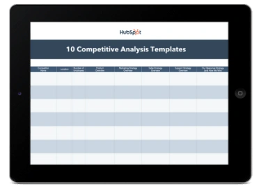
We’ve discussed why competitor analysis is crucial, but how do we do one? That’s where the SEO competitor analysis template comes into play.

Competitor Analysis Template

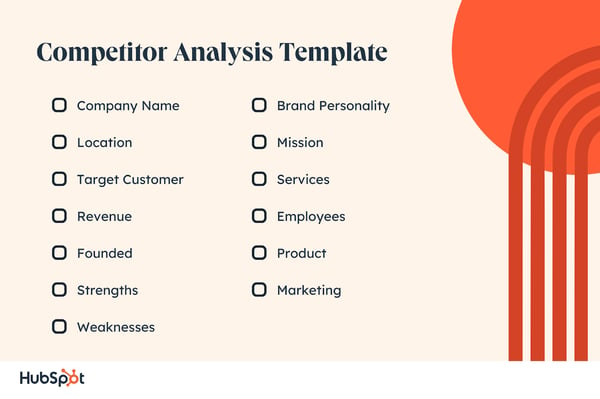
Competitor Analysis Template. Company Name. Location. Target Customer. Revenue. Founded. Strengths. Weaknesses. Brand Personality. Mission. Services. Employees. Product. Marketing.

1. Company Name

This portion should list the name of the competitor. The company name provides an explicit identifier for analyzing the rest of the information.

2. Location

Location refers to the geography of the competitor’s headquarters and any significant branches or areas where they have a presence.

The site can provide insights into local markets, resources, and the business environment that the competitor is operating within.

3. Target Customer

This area should outline the key demographics and psychographics of the competitor’s customer base. It includes details such as age range, income levels, occupation, gender, interests, and other defining characteristics of their typical consumer.

4. Revenue

In this section, you will detail the competitor’s revenue figures. The profit could be overall annual revenue, revenue by product/service, or any other significant measure. It gives you an idea of their business’s scale and financial health.

5. Founded

Include the year and circumstances of the company’s founding on the template. This information can give insights into the company’s history, experience, and potential durability.

6. Strengths

This section should analyze the competitor’s strengths. Strengths include brand recognition, innovative products or services, strong leadership, effective marketing strategies, etc.

7. Weaknesses

Here, you should detail any areas where the competitor may be lacking. Weaknesses could be poor customer service, high prices, weak online presence, etc. These weaknesses can provide opportunities for your business.

8. Brand Personality

Brand personality refers to the human characteristics or traits associated with a brand. It could be anything from being sophisticated, exciting, sincere, competent, or rugged.

Understanding a competitor’s brand personality can give insights into their brand strategy and position in the market.

9. Mission

The company’s mission statement outlines its purpose, values, and goals. Analyzing a competitor’s mission can provide an understanding of what drives their business and how they view their role within the industry.

10. Services

In this section, list and describe the services the competitor offers. Include pricing, service features, and unique selling propositions in the services section.

11. Employees

The employees’ portion should include information about the number of employees the competitor has, the structure of their team, key leadership, and any notable talent or expertise they possess.

12. Product

Describe the products that the competitor offers. This section should include details about product features, benefits, pricing, packaging, and anything else that could provide a competitive advantage.

13. Marketing

Composing a comprehensive competitor analysis can seem daunting, but it doesn’t have to be.

To make things seamless and more organized, you might find this Competitor Analysis Template extremely helpful. It’s a practical tool that can assist in structuring your research, making it more manageable and ultimately more effective.

How to Conduct Competitor Analysis

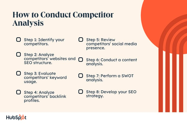
How to Conduct Competitor Analysis Step 1: Identify your competitors. Step 2: Analyze competitors' websites and SEO structure. Step 3: Evaluate competitors' keyword usage. Step 4: Analyze competitors' backlink profiles. Step 5: Review competitors' social media presence. Step 6: Conduct a content analysis. Step 7: Perform a SWOT analysis. Step 8: Develop your SEO strategy.

Step 1: Identify your competitors.

The first step in conducting an SEO competitor analysis is identifying who your competitors are. Companies that directly compete with yours sell similar goods or provide similar services.

In contrast, indirect rivals may not provide identical goods or services but still compete for the same customers. Use Google and industry-specific directories to identify these competitors.

Step 2: Analyze competitors’ websites and SEO structure.

Once you have a list of competitors, visit their websites and analyze their structure, design, and content.

Please pay close attention to their keywords usage, site speed, mobile optimization, URL structure, and other SEO factors.

Step 3: Evaluate competitors’ keyword usage.

A crucial part of SEO competitor analysis involves understanding the keywords your competitors are targeting. Then, use SEO tools to discover the keywords driving traffic to their websites.

Step 4: Analyze competitors’ backlink profiles.

Backlinks are important ranking factors in SEO. Check the quantity and quality of your competitors’ backlinks using SEO tools.

Evaluate their linking domains, the quality of these domains, and the type of content that is getting most of the links.

Step 5: Review competitors’ social media presence.

Social signals can impact SEO, so evaluating your competitors’ social media presence is essential. Look at their platforms, the frequency of their posts, their engagement, and how they integrate SEO with their social media strategy.

Step 6: Conduct a content analysis.

Content is a significant aspect of SEO. Analyze your competitors’ content in terms of its quality, diversity (blog posts, videos, infographics, etc.), frequency of updates, and relevance to the target audience.

Step 7: Perform a SWOT analysis.

Now, compile all your data into a SWOT (Strengths, Weaknesses, Opportunities, Threats) analysis.

SWOT should highlight where your competitors are outperforming you and where their vulnerabilities lie that you can potentially exploit.

Step 8: Develop your SEO strategy.

Develop your SEO strategy using the insights gained from your SEO competitor analysis.

This technique could involve targeting new keywords, improving your website’s technical SEO, building high-quality backlinks, creating diverse and high-quality content, and enhancing your social media strategy.

Remember, SEO competitor analysis is an ongoing process. Search algorithms change, and so do your competitors’ strategies. Therefore, regularly updating your analysis ensures you stay competitive in your industry.

And, of course, make sure to consider utilizing SEO competitor analysis tools like Website Grader. This invaluable tool provides comprehensive insights into a website’s performance, SEO, and overall online presence.

Competitor Analysis Report Best Practices

1. Embrace simplicity.

Let’s keep things simple, shall we? Refrain from cluttering your report with jargon. Instead, please keep it clean, clear, and to the point. Simplicity is all about making it a smooth read for anyone who picks it up.

2. Stay tidy and orderly.

Trust me on this one. The organization is your best friend when it comes to competitor analysis. Keep your data neat and unearth all the info you’ll dive into. Don’t shy away from charts, tables, and graphs. They’re great visual aids!

3. Make it mean something.

Don’t just list data. Interpret it. An excellent report goes beyond presenting facts—it tells you what to do with them. So, look at your data, find those gems of insight, and translate them into actionable steps for your team.

4. Keep it fresh.

You wouldn’t read yesterday’s news, right? The same goes for your competitor analysis. Businesses evolve, and so should your report. So make updating your report a regular habit. It’s like staying one step ahead in a business marathon.

5. Buddy up for a review.

Have you encountered the quote, “Two heads are better than one?” So get a fresh perspective to look over your report. They might catch something you missed or offer a new perspective. Plus, it’s always good to have a second opinion, right?

Remember, be passionate about your work! Let your love for your business shine through in your analysis. After all, you’re its number-one fan!

Competitor Analysis Example

Let’s conduct a hypothetical example using this template. For this example, let’s say you own a fictional local coffee shop called “Java Hut.” Here’s how the competitive analysis might look in a table format using the “Java Hut” example.


Java Hut

Starbucks

Peet’s Coffee

Dunkin’ Donuts

Location

Local city

Worldwide

Nationwide

Nationwide

Target Customer

Local community, hipsters

Broad consumer market

Coffee enthusiasts

Busy people on the go

Revenue

$100,000 (hypothetical)

$20 billion (approx.)

$500 million (approx.)

$1 billion (approx.)

Founded

2022

1971

1966

1950

Strengths

Locally sourced coffee, cozy atmosphere

Variety, convenience

Quality of coffee

Fast service, low price

Weaknesses

Limited marketing budget, one location

Higher prices, less community feel

Fewer locations than Starbucks/Dunkin

Lower quality coffee than competitors

Brand Personality

Warm, community-oriented

Efficient, professional

Passionate, artisanal

Fun, fast-paced

Mission

Serve quality local coffee in a community space

Inspire and nurture the human spirit

Deliver a superior coffee experience

Make and serve great coffee fast

Services

Coffee, pastries, community events

Wide range of beverages and food, mobile ordering

Quality coffee and tea, bakery items

Coffee, donuts, breakfast sandwiches

Employees

10

300,000

5,000

260,000

Product

Coffee, pastries

Coffee, tea, pastries, merchandise

Coffee, tea, food items

Coffee, donuts, sandwiches

Conducting a competitive analysis involves several steps, as highlighted in the creation of the table for the Java Hut example.

Identifying Competitors

The first step is identifying your key competitors. These could be local businesses if you’re a local business, or they could be global corporations if you’re in a broader market.

For the Java Hut example, we identified Starbucks, Peet’s Coffee, and Dunkin’ Donuts as competitors.

Establishing Categories for Comparison

Next, determine what aspects you want to compare. Our table uses categories like location, target customer, revenue, the company’s founding year, strengths and weaknesses, brand personality, mission, services offered, number of employees, and the main product.

Research

Now, it’s time to gather the data. This section might involve online research, personal experiences, and contacting companies directly.

You could also use industry reports, customer reviews, and social media to gather important data concerning your competitors.

In our Java Hut example, we hypothetically collected data on each competitor’s revenue, number of employees, brand personality, and more.

Analysis

After filling out the table, you must analyze the data. Look for trends, strengths, weaknesses, opportunities, and threats.

For example, in our table, Java Hut might notice that it can differentiate itself with its locally sourced coffee and community-oriented atmosphere.

It might also see that it needs to expand its marketing efforts to compete with these well-known brands.

Strategic Planning

Use this analysis to inform your business strategy. If a competitor excels in an area in which your business is weak, consider how you might improve. If your company has a unique strength, consider how you can use that as leverage.

Monitor and Update

The market constantly changes, so updating your competitive analysis is essential. Monitor your competitors to see if they’re changing strategies, launching new products, or showing any shifts in their business.

This process can help you understand your market better, identify opportunities and threats, and make informed decisions to help your business succeed.

Conducting A Competitor Analysis

So, there you go! You’ve just journeyed deep into the land of SEO competitor analysis. Pretty cool, right? It’s like you’ve been on an epic digital safari, examining the mysterious creatures of the SERP landscape.

We’ve uncovered the big “what is a competitor analysis in SEO” question, explored the benefits, and even mapped out a template for you. Remember, it’s not about outsmarting your competitors but learning from them.

Now you’ve got the scoop on how to do an SEO competitor analysis. You’ve got your magnifying glass to scrutinize their SEO strategies, the treasure map to their keywords, and even a spyglass for their backlinks. This isn’t just data; it’s pure gold.

Categories B2B

The Best Fonts for Your Resume in 2023, According to HubSpot Recruiters

Besides your content, using one of the best fonts in your resume may help you get a recruiter’s attention. Studies have shown recruiters typically scan a resume for six to thirty seconds before deciding if an applicant is fit for a role.

With only a few seconds to demonstrate your qualifications for a position, every detail counts – including the font you use. The question is, what are the best resume fonts to pass the six to thirty-seconds scan?

We asked HubSpot recruiters to reveal the seven best fonts for your resume and what they consider in terms of design ‌so your resume can stand out in a pile.

Expert Advice on Choosing the Right Font

Best Fonts for Resumes

Does Using The Best Resume Fonts Even Matter?

Worst Fonts for Resumes

Ideal Resume Font Sizes

Featured Resource: 12 Free Resume Templates

resume-cover

Download Now

Expert Advice on Choosing the Right Font

To evoke a sense of style, professionalism, and uniqueness, you must put effort and consideration into your font choice. When speaking with recruiters, it quickly became apparent that classic fonts are still the best options.

“I’m a big fan of the ‘classics’ for resumes – Times New Roman, Arial, Calibri, Helvetica, and Cambria. I’m a little old school, but I think they are the cleanest and exude professionalism,” said Johanna Fleming, a former senior recruiter at HubSpot.

Riley Kundtz, the former senior MBA campus recruiter at HubSpot, agreed.

“I find the classic formatting and Times font helpful when reading a dense resume from an experienced MBA candidate.”

Times New Roman has become a bit controversial lately. It was the go-to font for many years because it’s traditional and recognizable, but lately, some are opting against it.

“For me, it’s all about legibility and cleanliness – I prefer sans-serif fonts like Helvetica, which is modern and elegant, over serif fonts like Times New Roman,” says Glory Montes, a technical recruiter at HubSpot.

“Overall, I would just stay away from a font like Times New Roman; it’s overused and reminds me of long nights writing course papers in college,” adds Glory.

Georgia is one font The New York Times uses and is similar to Times New Roman. It’s a bit wider, making it easier to read.

Paulina Valdez Franco, executive recruiter at HubSpot, agrees with this take.

“My two favorite fonts are Helvetica if you’re looking for a clean and classic look, and Georgia, if you want a more modern and fun look,” she said. “The latter is also designed to read well on screens.”

Helvetica is widely used in advertising and works equally well for text-heavy pages and documents.

A lesser-known font that’s a great option for your resume is Garamond, recommended by our current team lead of engineering recruiting at HubSpot, Rich Lapham.

“Recruiters have an idea of the skills they are looking for on a resume, so if you try a new style or format, it can be tougher for recruiters to find the information they are looking for,” he said. “Keep it clean and simple.”

Franco added that Arial and Calibri are great choices to play it safe.

Bridget LeMon, HubSpot’s global emerging talent and university recruiting manager, echoes this.

“It’s totally acceptable – and becoming more common – for candidates to stray away from the resume norms of Times New Roman and Calibri,” she said. “Avenir Next and Muna are two excellent font options if you are looking to break the status quo.”

Ultimately, you‘ll want to consider the position you’re applying for when choosing a font. To Glory Montes’ point, certain more creative roles might benefit from a unique font than Times New Roman.

1. Times New Roman

resume bullet point in times new roman

Times New Roman font has been popular for resumes for decades. This serif option is easy-to-read and communicates formality. Online, the font is uniform and accessible across various platforms and operating systems.

Advantages

Times New Roman has a classic and professional look, making it an excellent choice for applicants targeting corporate positions. Additionally, it is a standard font used in most word processors, making it an accessible option for any device.

Moreover, Times New Roman is easily readable in print and on-screen.

Best for: Word documents. PDFs can host unique fonts. However, a standard font will be helpful if your resume is uploaded as a Word document.

Disadvantages

The font’s outdated look may not appeal to all industries, and some may consider it bland or generic. Additionally, this font may make your resume blend in with the rest due to its ubiquity.

Times New Roman is also a heavy serif font, taking up more space than other options.

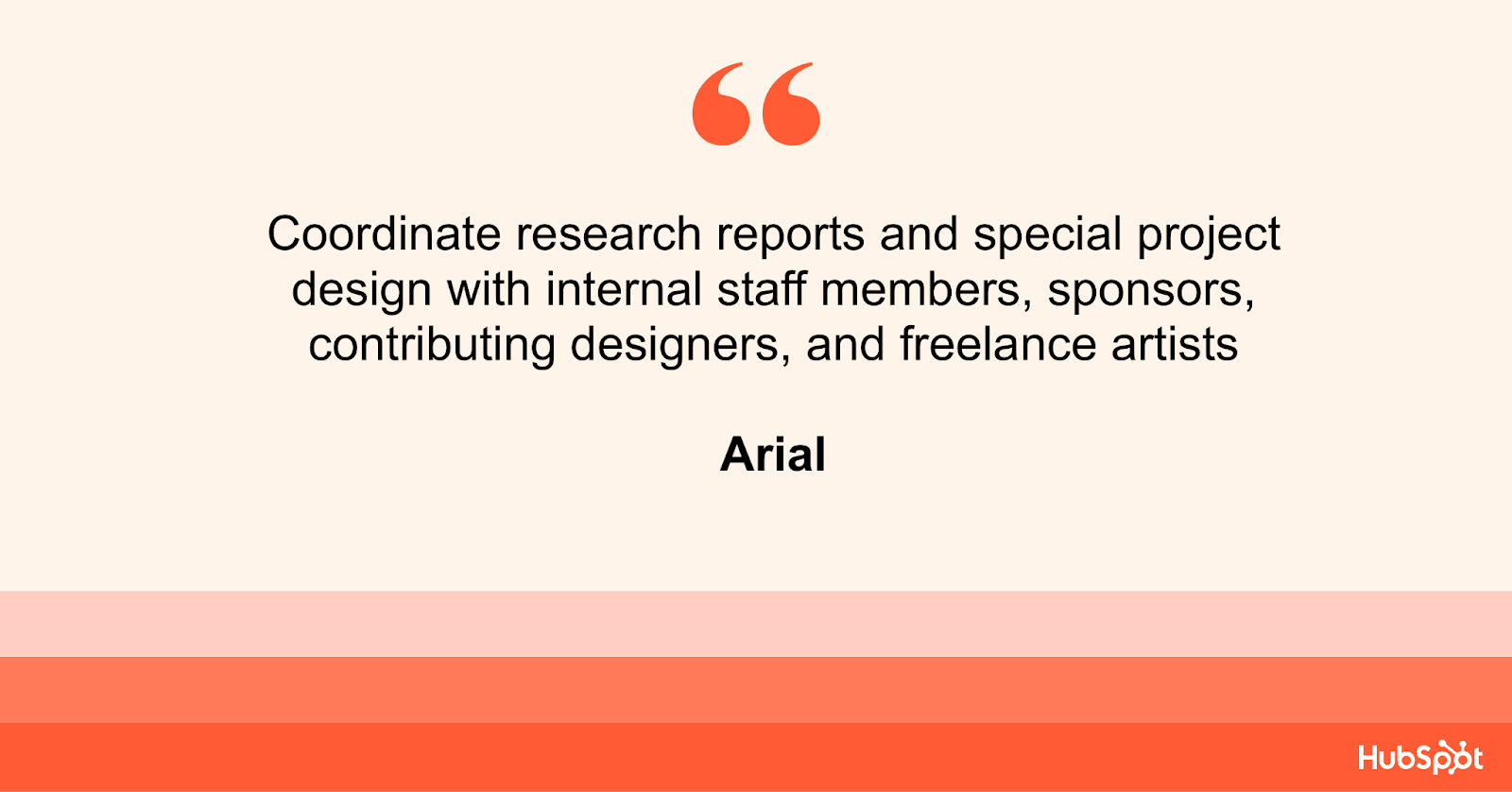
2. Arial

resume bullet point in arial

Arial is a sans-serif font that has become popular for its clean and modern look. Arial’s straightforward and minimalist design has made it a popular choice for applicants targeting creative positions.

Advantages

Arial offers simplicity, which allows your content to stand out. Arial’s legibility in small font sizes, even in print, makes it ideal for applicants trying to fit all the necessary information in their resume on a single page.

Best for: Resumes submitted online, where readability is essential for Applicant Tracking Systems (ATS) used in recruitment.

Disadvantages

The font’s overuse in branding and design has led to its association with a non-innovative style. This may make your resume less attractive to recruiters looking for unique personalities who can bring new ideas to their team.

Arial’s uniformity may not suit industries such as graphic design or creative writing seeking to showcase creativity and flair.

Conversely, Arial may make the text appear less formal and inappropriate for specific job applications.

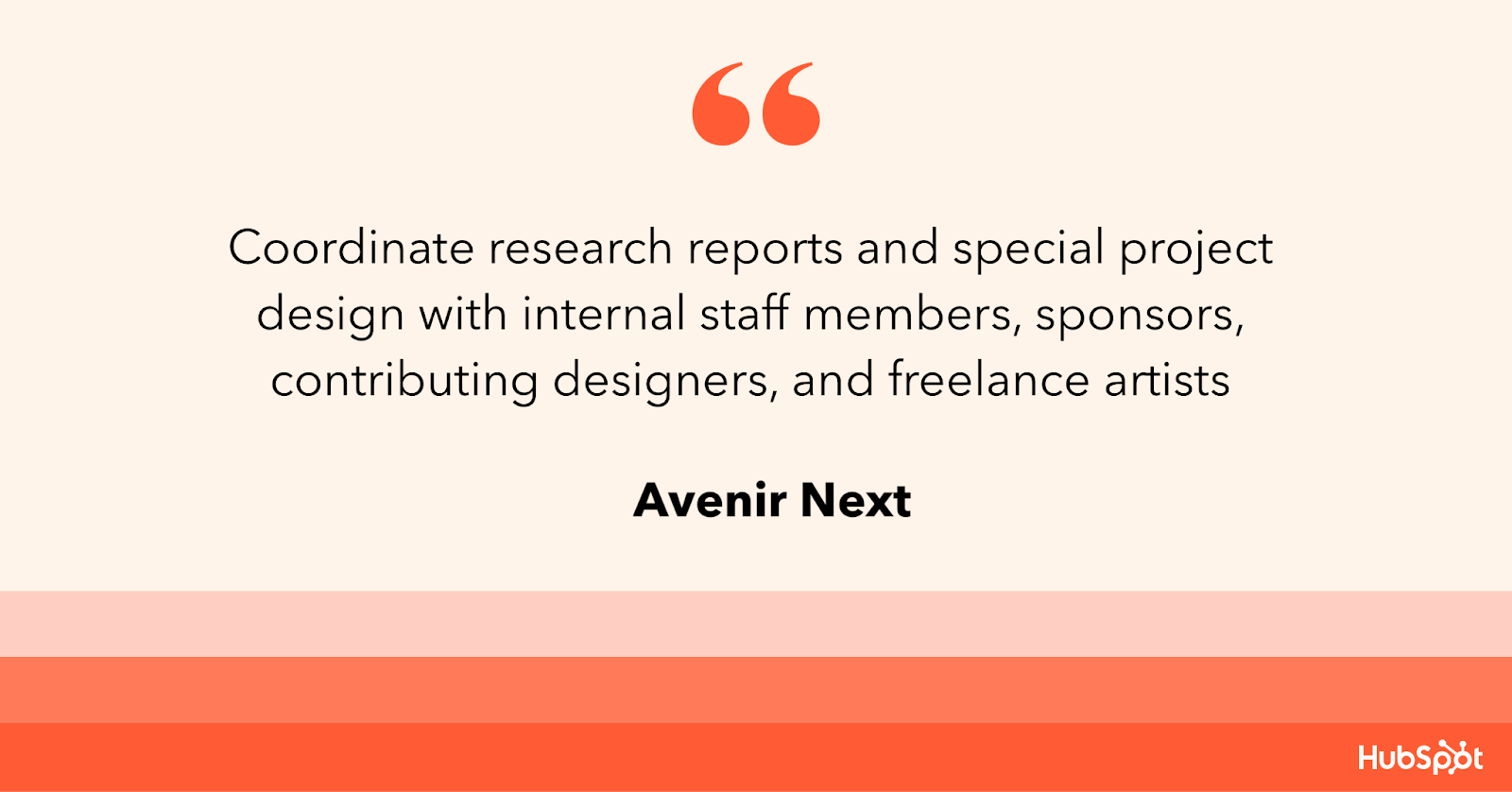
3. Avenir Next

resume bullet point in avenir next

Avenir Next is a modern typeface gaining popularity among designers and recruiters. Avenir Next’s appearance is characterized by its geometric shapes, open contours, and strong lines.

Its clean, contemporary look has become a popular font choice for resumes.

Advantages

Avenir Next’s sleek and modern design makes it an excellent choice for applicants targeting creative industries. Its clear, simple lines offer a sense of elegance, while its legibility gives recruiters a sense of professionalism.

What we love: Avenir Next is a scalable font. It maintains its readability even at small sizes, and its geometric shapes make it a perfect choice for digital resumes.

Disadvantages

Avenir Next may not be as widely recognized, which could make it difficult to read on some computer systems without the font installed. Further, Avenir Next is a premium font with a higher price tag.

This might not be affordable for some applicants.

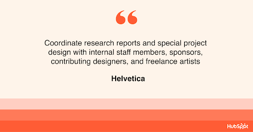
4. Helvetica

resume bullet point in helvetica

Helvetica is a widely recognized and popular font used on resumes, particularly in the design industry. It’s clean, classic, and timeless. This font is popular with professionals, design enthusiasts, typographers, and Wes Anderson.

Advantages

Helvetica is easy to read and has a professional, straightforward appearance. The font‘s popularity means that job recruiters and hiring managers are familiar with it.

Helvetica’s clean lines give the resume a structured and well-organized look, making it ideal for those in finance, law, and business management.

What we love: The font is available in multiple weights, making it easier to differentiate headings and sections in the resume.

Disadvantages

The font’s ubiquity in resumes may make it feel overdone and uninspired. With so many applicants using the font, your resume may struggle to stand out.

Helvetica‘s minimalist design can also work against you if your resume has limited content. This can make the resume look empty and as if it lacks substance.

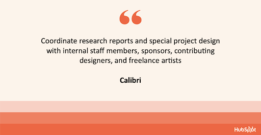
5. Calibri

resume bullet point in Calibri

Calibri is a contemporary design, making it a popular choice for creating a visually appealing and easy-to-read resume.

Advantages

The font has been designed with legibility in mind, making it an excellent option for resumes.

Additionally, Calibri’s modern look creates a sleek and professional appearance, making it ideal for job seekers looking to highlight their contemporary skills and qualifications.

Calibri is also lighter than other font options, making it an ideal choice for job seekers trying to fit their resumes onto a single page.

What we like: Calibri offers a sense of uniformity across different platforms, making it an accessible and reliable option for applicants.

Disadvantages

Calibri is one of the default fonts available in most word-processing programs. Your resume might not appear as unique and tailored to your personal branding as it would with a more distinct font.

The font can be perceived as informal, making it less than ideal for formal industries, like law or finance, where a more traditional look would be preferred.

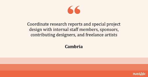
6. Cambria

resume bullet point in cambria

Cambria’s classic design features elegant serifs, making it a perfect choice for job seekers. You can easily create a traditional, professional-looking resume that stands out.

Advantages

Cambria has a classic yet modern appearance. The font‘s serifs give it a timeless look that is perfect for job seekers in more traditional industries such as finance or law.

Additionally, the font is highly readable, even in smaller font sizes, which makes it an excellent choice for job seekers looking to fit more information on their resumes.

What we like: Cambria’s generous spacing between characters and lines makes the resume much easier to read and stands out from other fonts.

Disadvantages

Some recruiters and hiring managers might view the font as old-fashioned or generic. Further, Cambria’s heavy serifs may be problematic for those trying to keep their resume to a single page as it can take up more space than other fonts.

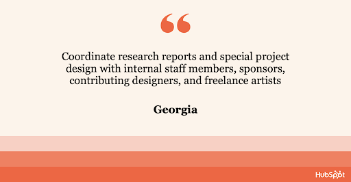
7. Georgia

resume bullet point in georgia

Georgia is a traditional serif font that has been a popular choice for resumes due to its elegant and classic look. Georgia’s unique design features distinguishable serifs that give it a professional appearance.

Advantages

Georgia’s design is easy to read even in smaller font sizes, making it a perfect choice for job seekers trying to highlight their accomplishments in a limited space.

Additionally, Georgia can be customized, which makes it an excellent option for applicants looking to add their personal touch.

What we like: The font’s design combines traditional and modern aesthetics, making it a versatile option for job seekers applying for a wide range of positions.

Disadvantages

The font’s traditional appearance may not be suitable for applicants targeting creative or non-traditional fields, where a more contemporary font may be preferred.

Also, Georgia is a serif, making it difficult to read in small sizes on a digital screen. This might not be the best option for those mainly applying online.

Does Using The Best Resume Fonts Even Matter?

Most recruiters I spoke with were hesitant to offer a font. Instead, they focus on the content.

“I rarely pay too much attention to fonts,” said Heta Patel, a former HubSpot recruiter. “I’m more concerned to see a resume that’s formatted neatly – submitting a PDF is helpful with this, so your formatting doesn’t shift.”

Sales Recruiting Manager Kelsey Freedman agreed.

“Honestly, I care little about the font of a resume, as long as it’s clear and in PDF format,” Freedman said. “I typically review a resume for 20 to 30 seconds, so a traditional font is good.”

Freedman continued, “I would advise avoiding script font or bubble font, or similar fonts that are distracting.”

Ultimately, and as expected, your content still matters most. However, a clear font will help avoid any irritability you might cause a recruiter with a distracting, messy design.

“What I get most excited about is the content. Depending on the role, I look to see that candidates are sharing direct and compelling snapshots of their work,” said Ashley Hodder, a global recruiting manager at HubSpot.

“I look for indicators that show data orientation, autonomy, and thoughtfulness about business impact,” she said.

Worst Resume Fonts

While some recruiters may not have suggestions for the best fonts, many can agree on some of the worst ones.

“Anything that is cursive or too bubbly is too hard to read. For instance, I’d stay clear of Comic Sans,” says Holly Peterson, team lead for UX recruiting HubSpot.

Another resume font type to avoid is Script.

With text-heavy documents, Scripts, and any of their derivatives make text hard to read because they look like they’re written by hand.

They’re generally used in hand lettering and calligraphy for artistic projects and shouldn’t be present anywhere near your resume.

Ideal Resume Font Size

When asked which font size is best, Fleming said 12 is ideal. Most recruiters would agree.

Your text should be large enough to read comfortably without straining but small enough that there’s space to include all key elements, such as your objective, contact information, skills, and experience.

You can use larger font sizes for headings containing your name and section titles.

If your font is extensive, you can scale to 10.5 – but never go below it.

The critical takeaway is to make your resume clear and easy to read, which means keeping the font size around 12, sticking to classic fonts with modern twists, and forsaking your favorite script font.

Now that you know the best fonts for your resume, use these tips to write your resume and ignite your creative spark with this ultimate collection of resume templates.

Editor’s note: This post was originally published in November 2018 and has been updated for comprehensiveness.

New Call-to-Action

Categories B2B

The 24 Best Motivational Speeches Our Employees Have Ever Heard

It was halftime during one of my 7th-grade football games. And we were losing 14 – 0. With our knees planted in the grass, my team was quietly huddled, drenched in sweat and defeat. Suddenly, it was game over.

That’s when our assistant coach burst into our circle and shattered our pity party, delivering one of the best motivational speeches I’ve heard to this day.

I can’t directly quote him because he said some inappropriate things for a blog post (and, in hindsight, probably for a bunch of 13-year-olds too).

The point is he harnessed the power of words to rejuvenate a physically and emotionally drained team. And we came back clawing to win the game.

→ Click here to download leadership lessons from HubSpot founder, Dharmesh  Shah [Free Guide].

Motivational Speech

A motivational speech can come from anywhere or anyone, but it usually has a specific audience in mind.

Whether it’s a graduation speech, an all-company meeting, a championship sporting event, or a conference keynote, these speeches are designed to change how their listeners see the challenges facing them in the future.

Like in sports, being motivated at work is crucial for your performance. This rings especially true when you have a looming deadline, an important meeting, or colleagues or customers depending on your performance.

Think about the last time you felt generally unmotivated. What brought you out of that feeling? Sometimes all it takes to get you going is a good night’s sleep or witnessing the benefits of your labor.

Still, other times, you might listen to someone say something that resonates with you — that alters how you’ve been looking at a particular task or problem.

Motivational speeches and speakers can come in all different forms, but this is the one thing they have in common — resonance. They resonate with the right listener at the right time and in the right way.

Who knows, this article is doing some for you right now. (I can dream, can’t I?)

We selected 24 of the best motivational speeches from business, sports, entertainment, and other fields to help you stay motivated no matter what your work throws at you. Watch these videos if you want to feel inspired by a project.

Trust me, I was wiping my eyes after I saw them. And while the messages vary from speech to speech, they can put you in the optimal frame of mind for tackling and crushing your next big challenge.

(Disclaimer: Some speeches may contain NSFW language.)

Elon Musk: “The Importance of Never Giving Up” (2020)

Angela Ahrendts: “Leading with Empathy” (2023)

Arianna Huffington: “The Power of Sleep” (2023)

Tim Cook: “Inclusion and Diversity” (2023)

J.K. Rowling: “The Fringe Benefits of Failure, and the Importance of Imagination” (2008)

Sheryl Sandberg: “Lean In” (2021)

Jim Carrey: Commencement Speech at Maharishi University of Management (2014)

Steve Jobs: “How to Live Before You Die” (2005)

Matthew McConaughey: “The Pursuit of Happiness” (2022)

Denzel Washington: “Fall Forward” (2011)

Vera Jones: “But the Blind Can Lead the Blind…” (2016)

Oprah Winfrey: “The Power of Self-Belief” (2020)

Charlie Day: Merrimack College Commencement Speech (2014)

Brené Brown: “The Power of Vulnerability” (2013)

Kobe Bryant: “The Path to Greatness” (2020)

David Foster Wallace: “This Is Water” (2005)

Carol Dweck: “The Growth Mindset” (2020)

Al Pacino: “Inch by Inch” (1999)

Satya Nadella: “Empowering Others” (2023)

Sylvester Stallone: Speech from Rocky Balboa (2006)

Will Smith: Speech from The Pursuit of Happyness (2006)

Mel Robbins: “The 5 Second Rule” (2020)

Angela Duckworth: “The Power of Grit” (2020)

Kurt Russell: “This is Your Time” (2004)

The Best Motivational Speeches of All Time

1. Elon Musk: “The Importance of Never Giving Up” (2020)

Theme of Speech: Perseverance and Resilience

Elon Musk’s “The Importance of Never Giving Up” speech about perseverance and determination is decisive.

In this speech, Musk emphasizes failing and learning from failures as keys to success. He recounts his life and career, demonstrating how he overcame challenges.

One key takeaway from Musk’s speech is his advice to adopt a growth mindset.

Musk encourages listeners to view setbacks as learning experiences. He also highlights the value of perseverance, persistence, and taking risks.

Elon Musk’s word serves as an upbeat reminder that perseverance, patience, and the desire to attempt things repeatedly in the face of difficulty are essential for success.

“If something is important enough, even if the odds are against you, you should still do it.”

2. Angela Ahrendts: “Leading with Empathy” (2023)

Theme of the Speech: Empathetic Leadership…

The “Leading with Empathy” talk by Angela Ahrendts emphasizes the importance of emotional intelligence and compassion in leadership.

According to Ahrendts, leaders must view their employees as whole people with lives outside of work. Leaders can instill trust, respect, and mutual support in their employees and organizations.

Ahrendts emphasizes the importance of team mission as well. Leaders can inspire their teams by connecting them to a greater goal.

She believes that working together fosters creativity, innovation, and growth.

“Leading with Empathy” is a powerful reminder that leadership requires more than technical knowledge. To truly inspire and motivate their employees, leaders must understand their emotional needs and create a supportive, inclusive environment.

“Empathy is the glue that holds relationships together, whether they are personal or professional.”

3. Arianna Huffington: “The Power of Sleep” (2023)

Theme of the Speech: Sleep and Productivity

The Huffington Post’s founder, Arianna Huffington, emphasized the importance of sleep to overall health. In her 2023 speech, “The Power of Sleep,” she discusses how sleep deprivation affects our health, productivity, and happiness.

Huffington observes that we have been taught to sacrifice sleep for success. She also mentions that well-rested employees are more creative, efficient, and effective.

To address these issues, Huffington proposes a cultural shift that recognizes sleep as essential to health and wellness.

She advises individuals and organizations to prioritize sleep, avoid technology before bedtime, and create a restful sleep environment. Sleep, according to Huffington, is a necessity, not a luxury.

By recognizing the importance of sleep, people and businesses can enhance their health, productivity, and general well-being.

Arianna Huffington’s “The Power of Sleep” speech in 2023 emphasizes the importance of sleep and the dangers of sleep deprivation.

It promotes a culture where getting enough sleep is essential for health and well-being.

“Sleep is the Swiss Army knife of health, it does everything.”

4. Tim Cook: “Inclusion and Diversity” (2023)

Theme of the Speech: Inclusion and Diversity

Apple CEO Tim Cook advocates for inclusion and diversity. He has been instrumental in the company’s initiatives to advance fairness and equality inside its ranks and across the technology sector.

Cook has prioritized diversity and inclusion at Apple because he believes it is proper and necessary for innovation and business success.

Unconscious bias training, diverse recruitment, and employee resource groups contributed to his success.

Outside of Apple, Cook has advocated for LGBTQ+ rights and immigration reform. He has raised awareness of these issues and advocated for social change as a business leader.

Tech leaders and others have lauded Cook’s commitment to diversity and inclusion. He has raised awareness of these issues, leading to significant change at Apple and elsewhere.

“Inclusion and diversity are not just buzzwords, they are fundamental values that drive innovation and creativity.”

5. J.K. Rowling: “The Fringe Benefits of Failure, and the Importance of Imagination” (2008)

Theme of Speech: Failure

In J.K. Rowling’s 2008 Harvard commencement speech, the Harry Potter author explored how two phenomena — failure and imagination — can be crucial to success.

While failure can help you understand where your true passion lies, and where you should focus your energy moving forward, imagination is what will allow you to empathize with other people so you can use your influence to do good.

“We do not need magic to change the world, we carry all the power we need inside ourselves already: we have the power to imagine better.”

“You have to understand your own personal DNA. Don’t do things because I do them or Steve Jobs or Mark Cuban tried it. You need to know your personal brand and stay true to it.”

6. Sheryl Sandberg: “Lean In” (2021)

Theme of the Speech: Gender Equality and Leadership

Sheryl Sandberg’s 2021 talk, “Lean In,” encourages women to lean into their careers and leadership roles. She urges women to stand up for one another and themselves to overcome societal and cultural hurdles.

Sandberg highlights the need to have distinct objectives and goals and be prepared to take calculated risks to achieve them.

She also underlines how crucial it is for more female leaders to advance diversity and gender equality across all industries.

Sandberg’s speech also emphasizes collaboration. She urges women to mentor other women and look for sponsors and mentors themselves.

The “Lean In” talk by Sheryl Sandberg emphasizes women’s voices and perspectives in all aspects of society.

To remove barriers and foster more inclusive and varied workplaces and communities, Sandberg urges women to pursue their professional ambitions with confidence and with the help of their communities.

“We need women at all levels, including the top, to change the dynamic, reshape the conversation, to make sure women’s voices are heard and heeded, not overlooked and ignored.”

7. Jim Carrey: Commencement Speech at Maharishi University of Management (2014)

Theme of Speech: Taking Risks

Jim Carrey might make a living as the goofiest comedian around, but in 2014, he combined classic Carrey humor with unforgettable insight at Maharishi University of Management’s graduation ceremony.

Jim Carrey opened his speech dishing punchlines, but he eventually opened up about his upbringing and the role fear plays in our lives. You can actually hear the amazement in the students’ reactions in the video above.

“I learned many great lessons from my father — not the least of which is that you can fail at what you don’t want, so you might as well take a chance on doing what you love.”

8. Steve Jobs: “How to Live Before You Die” (2005)

Theme of Speech: Life and Career

Considering the YouTube video of Steve Jobs’ 2005 Stanford commencement speech has 24 million views, it’s likely that you’ve seen this one already.

In the speech, Jobs plays on two themes: connecting the dots (anecdote: how taking a calligraphy class helped inspire the design of the Mac) and love & loss (anecdote: how getting fired from Apple helped inspire his greatest innovations).

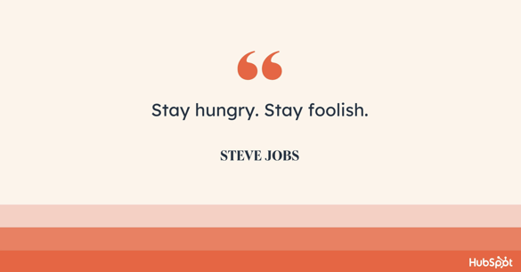
Perhaps the most memorable part his speech comes at the end, when he quotes the (now-famous) lines from the final issue of his favorite publication, The Whole Earth Catalog:

“Stay hungry. Stay foolish.”

steve jobs

9. Matthew McConaughey: “The Pursuit of Happiness” (2022)

Theme of the Speech: Discovering True Happiness and Fulfillment in Life.

In “The Pursuit of Happiness,” famed actor and motivational speaker Matthew McConaughey provides his enlightened viewpoint on obtaining true happiness and fulfillment.

McConaughey presents a genuine and approachable study of what it means to live a fulfilling life through sincere storytelling and personal anecdotes.

The speech discusses the significance of authenticity and remaining true to oneself. McConaughey encourages people to define their success rather than succumb to social pressures or external expectations.

He stresses aligning our behaviors and decisions with our fundamental values and passions.

McConaughey expresses his conviction in the power of thankfulness and the importance of living in the present moment. He encourages people to create a grateful mindset, recognizing the blessings and possibilities surrounding them.

By appreciating the present and finding joy in the journey, individuals can experience more profound happiness and fulfillment.

“Happiness is not a destination. It’s a state of mind, a journey, and a choice we make every day.”

10. Denzel Washington: “Fall Forward” (2011)

Theme of Speech: Failure

In his 2011 UPenn commencement speech, Denzel Washington highlighted three reasons why we need to embrace failure in order to be successful. First, everybody will fail at something at some point, so you better get used to it.

Second, if you never fail, take that as a sign that you’re not really trying. And third, at the end of the day, failure will help you figure out what path you want to be on.

“Fall forward. Here’s what I mean: Reggie Jackson struck out twenty-six-hundred times in his career — the most in the history of baseball. But you don’t hear about the strikeouts. People remember the home runs.

Fall forward.

Thomas Edison conducted 1,000 failed experiments. Did you know that? I didn’t know that—because #1,001 was the light bulb. Fall forward. Every failed experiment is one step closer to success.”

denzel

11. Vera Jones: “But the Blind Can Lead the Blind…” (2016)

Theme of Speech: Perseverance

Last year at INBOUND, Vera Jones told a moving story about the life lessons she’s learned from raising her blind son.

She explains how having faith in your future and letting it lead you toward your true purpose will help you overcome blinding obstacles.

She also discusses how following your passion and trusting your vision develops empathy, which is a critical leadership skill.

“Passionately play your position no matter how bad things get. You are significant. Why we are here is not for our own glory. Ultimately, we’re here to lead and serve everybody else. By doing that, we encourage others to do the same.”

12. Oprah Winfrey: “The Power of Self-Belief” (2020)

Theme of Speech: Self-Belief and Confidence

Oprah Winfrey’s 2020 speech “The Power of Self-Belief” emphasized the importance of self-assurance. She attributed her success to her unwavering self-assurance.

According to Oprah, self-belief is not about being arrogant or overconfident. She stresses the significance of overcoming self-doubt and fear, which can prevent people from reaching their goals.

Oprah used personal stories to demonstrate how self-confidence has aided her in life and work. She encouraged her audience to believe in themselves and to embrace their inner strength.

The Power of Self-Belief” reminded us how important it is to have faith in ourselves and our ability to succeed.

“The biggest adventure you can ever take is to live the life of your dreams.”

oprah-2

13. Charlie Day: Merrimack College Commencement Speech (2014)

Theme of Speech: Taking Risks

Best known for his role in the sitcom It’s Always Sunny in Philadelphia, actor Charlie Day had lots of wisdom to share during the 2014 commencement speech at his alma mater, Merrimack College.

Day explained to the audience how college degrees are inherently valueless, since you can’t trade them in for cash. Instead, it’s you, your hard work, and the risks you take that provide real value in life.

“You cannot let a fear of failure or a fear of comparison or a fear of judgment stop you from doing the things that will make you great. You cannot succeed without the risk of failure.

You cannot have a voice without the risk of criticism. You cannot love without the risk of loss. You must take these risks.”

14. Brené Brown: “The Power of Vulnerability” (2013)

Theme of Speech: Failure

The video above is an animated excerpt from researcher Brené Brown’s speech, “The Power of Vulnerability.” In the speech, Brown explores how our fear of not being good enough (among other fears) drives us to shield ourselves from our own vulnerabilities.

The alternative to wearing this emotional suit of armor: Embrace vulnerability through empathizing with others.

“Empathy is a choice, and it’s a vulnerable choice. Because in order to connect with you, I have to connect with something in myself that knows that feeling.”

brene

15. Kobe Bryant: “The Path to Greatness” (2020)

Theme of the Speech: Embracing Dedication, Perseverance, and a Relentless Pursuit of Greatness.

Bryant emphasizes setting ambitious goals and working tirelessly to achieve them. Through captivating storytelling and personal anecdotes, he reveals the sacrifices and relentless effort required to excel at the highest level.

Bryant’s speech is a testament to the power of hard work, discipline, and a growth mindset in attaining greatness.

The speech also explores embracing failure as a stepping stone to success. Bryant shares how setbacks and challenges can fuel personal growth and resilience.

He encourages individuals to embrace failure, learn from it, and use it as motivation to push beyond their limits.

Bryant’s speech goes beyond the realm of sports, offering valuable insights and life lessons applicable to all areas of life.

His relentless pursuit of greatness and unwavering commitment to excellence inspires individuals striving to achieve their goals and dreams.

“I have self-doubt. I have insecurity. I have fear of failure. I have nights when I show up at the arena and I’m like, ‘My back hurts, my feet hurt, my knees hurt. I don’t have it. I just want to chill.’

We all have self-doubt. You don’t deny it, but you also don’t capitulate to it. You embrace it.”

16. David Foster Wallace: “This Is Water” (2005)

Theme of Speech: Life and Career

From the opening minutes of David Foster Wallace’s 2005 Kenyon College commencement speech, in which he questions commencement speech conventions, it’s clear that Wallace has some serious wisdom to share.

The crux of his speech: Many of us are oblivious to our own close-mindedness. We picture ourselves as the centers of our own, individual universes, instead of seeing the bigger, more interconnected picture.

“If you’re automatically sure that you know what reality is and who and what is really important, if you want to operate on your default setting, then you, like me, probably won’t consider possibilities that aren’t annoying and miserable.

But if you’ve really learned how to think, how to pay attention, then you’ll know you have other options.

It will actually be within your power to experience a crowded, hot, slow, consumer hell-type situation as not only meaningful, but sacred — on fire with the same force that lit the stars: love, fellowship, the mystical oneness of all things deep down.”

david-Jun-30-2023-03-47-48-7304-PM

17. Carol Dweck: “The Growth Mindset” (2020)

Theme of the Speech: Cultivating a Growth Mindset for Personal and Professional Development.

In “The Growth Mindset,” Carol Dweck, a renowned psychologist, and author, delivers an enlightening speech on the power of adopting a growth mindset for personal and professional growth.

Dweck’s extensive research on mindset and achievement provides the foundation for her impactful message.

Dweck explains the difference between a fixed mindset, where individuals believe their abilities are fixed traits, and a growth mindset, where individuals believe their abilities can be developed through effort and learning.

She demonstrates how a growth mindset fosters resilience, learning, and innovation through relatable stories and compelling examples.

Dweck’s speech resonates with individuals seeking personal and professional development, as she provides insights into how adopting a growth mindset can positively impact all areas of life.

Her research-based approach and engaging speaking style make “The Growth Mindset” an inspiring resource for individuals striving for continuous growth and improvement.

“The passion for stretching yourself and sticking to it, even when it’s not going well, is the hallmark of the growth mindset.”

Famous Short Speeches With Inspirational Takeaways

18. Al Pacino: “Inch by Inch” (1999)

Theme of Speech: Teamwork

Yes, this speech is from a football movie (Any Given Sunday), but trust me: This isn’t your stereotypical rah-rah-go-get-’em sports speech. It’s deeper than that. It’s about life, and loss, and … gosh darn it just listen to Al Pacino.

He’s pouring his soul out!

“Either we heal as a team or we’re gonna crumble, inch by inch, play by play, till we’re finished. We’re in hell right now, gentlemen, believe me.

And we can stay here and get the $&#@ kicked out of us, or we can fight our way back into the light. We can climb out of hell, one inch at a time.”

al p

19. Satya Nadella: “Empowering Others” (2023)

Theme of the Speech: Empowerment and Collaboration

Satya Nadella’s 2023 lecture, “Empowering Others,” emphasizes the importance of leadership that empowers others rather than focusing on personal success.

He emphasizes the importance of leaders cultivating a culture of inclusion and belonging in which everyone feels respected and able to accomplish their best work.

Nadella also discusses the significance of technology in positive development. Some of society’s most important issues may be resolved by technology, but proper development and application are required.

According to Nadella, empathy and emotional intelligence are essential for outstanding leadership. He suggests that Leaders listen to and understand. their team members’ needs and motivations.

Leaders can develop a culture of trust and collaboration that will help the team flourish.

Satya Nadella’s “Empowering Others” provides a special message about leadership in the current day. By emphasizing diversity, empathy, and responsible innovation, Nadella encourages audiences to strive for excellence while being mindful of their impact on others and the world.

“Success is not just about what we achieve individually, but what we enable others to achieve.”

20. Sylvester Stallone: Speech from Rocky Balboa (2006)

Theme of Speech: Never Give Up

I had to put this one next since it plays along the same themes as Denzel Washington’s UPenn speech. In the scene above, from the 2006 film Rocky Balboa, the title character (played by Sylvester Stallone) is having a heart-to-heart with his son.

The advice he gives him: Don’t let your failures or the adversity you face slow you down. Keep. Moving. Forward.

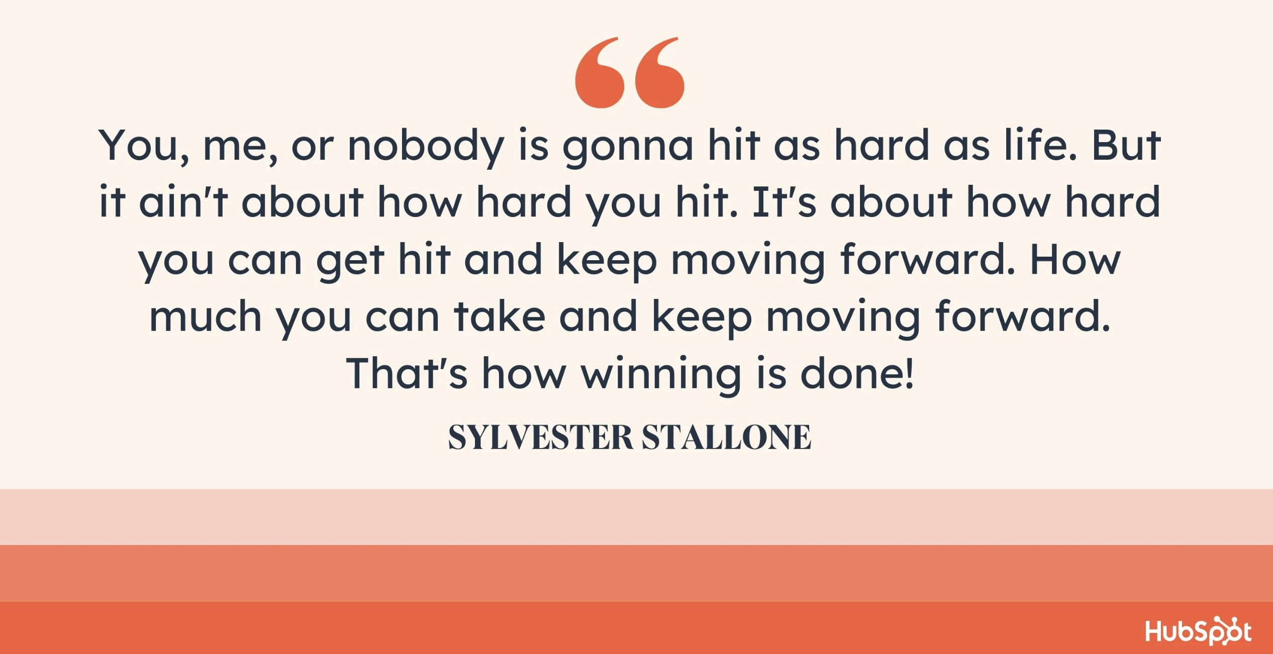
“Let me tell you something you already know. The world ain’t all sunshine and rainbows. It’s a very mean and nasty place, and I don’t care how tough you are, it will beat you to your knees and keep you there permanently if you let it.

You, me, or nobody is gonna hit as hard as life. But it ain’t about how hard you hit. It’s about how hard you can get hit and keep moving forward. How much you can take and keep moving forward. That’s how winning is done!”

syl

21. Will Smith: Speech from The Pursuit of Happyness (2006)

Theme of Speech: Don’t Let Them Bring You Down

Here’s another speech from the big screen, this time from the 2006 film The Pursuit of Happyness.

In the scene above, Will Smith’s character explains to his son why he shouldn’t pursue basketball (because he’ll end up being “below average”) before having a major change of heart.

“Don’t ever let somebody tell you … you can’t do something. Not even me. All right? You got a dream. You gotta protect it. People can’t do something themselves, they want to tell you can’t do it. If you want something, go get it. Period.”

22. Mel Robbins: “The 5 Second Rule” (2020)

Theme of the Speech: Action and Overcoming Self-Doubt

The “The 5 Second Rule” speech by Mel Robbins promotes action to achieve goals and overcome concerns and doubts.

When confronted with a decision or action that needs to be completed but you are hesitating or procrastinating, countdown from 5, and then act. According to Robbins, this method breaks habit loops that keep us unhealthy.

Counting down and taking action may assist us in overcoming uncertainty and self-doubt and moving toward our objectives. For success, Robbins also promotes mentality and self-talk.

She believes that to realize our potential, we must consciously reframe negative thoughts and limiting beliefs.

Mel Robbins’ presentation “The 5 Second Rule” is a practical and efficient technique to overcome procrastination and achieve goals.

Robbins inspires listeners to take command of their lives and achieve by emphasizing attitude, self-talk, and positive actions.

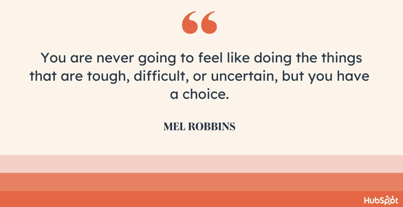
“You are never going to feel like doing the things that are tough, difficult, or uncertain, but you have a choice.”

mel r

23. Angela Duckworth: “The Power of Grit” (2020)

Theme of the Speech: Spirit and Perseverance

Angela Duckworth examines the significance of perseverance and resilience in achievement in her book “The Power of Grit.” According to Duckworth, grit—passion and determination—is essential for long-term success and overcoming obstacles.

Duckworth addresses grit and mentality, believing that people who view challenges and setbacks as opportunities for growth rather than threats will develop resilience and determination over time.

She advocates for a growth mindset, which believes people can acquire intelligence and other qualities through hard work. Duckworth places a premium on rigorous practice to achieve skill and mastery.

She recommends soliciting feedback, setting challenging goals, and intentionally improving abilities and succeeding. Angela Duckworth’s “The Power of Grit” illuminates long-term achievement.

Duckworth emphasizes attitude, focused practice, and resilience to urge listeners to acquire grit and pursue their passions with tenacity.

“Grit is passion and perseverance for very long-term goals. Grit is having stamina. Grit is sticking with your future, day in, day out, not just for the week, not just for the month, but for years, and working really hard to make that future a reality.”

24. Kurt Russell: “This is Your Time” (2004)

Theme of Speech: Inspiring and Believing in Your Team

The Miracle on Ice is still considered the biggest upset in Olympic hockey history. And for good reason. The Soviet Union won six of the last seven Olympic gold medals, and the U.S. team consisted only of amateur players.

It was obvious the Soviets were better. But, in the movie Miracle, which told the incredible story of the 1980 U.S. Olympic Hockey Team, Kurt Russell’s character — Coach Herb Brooks — knew that this game was different.

The U.S. was better than the Soviets that day. And his speech conveyed such a strong belief in his team that they pulled off one of the greatest sports moments of the 20th century.

“If we played ’em ten times, they might win nine. But not this game… Not tonight. Tonight, we skate with them. Tonight, we stay with them. And we shut them down because we can!

Tonight, WE are the greatest hockey team in the world. You were born to be hockey players, every one of you. And you were meant to be here tonight. This is your time.”

kurtWant more? Read How to Motivate Yourself When You’re Absolutely Exhausted.

New Call-to-action

Categories B2B

404 Error Pages: The Ultimate Guide

Chances are you’ve landed on a 404 error page before. Whether you’ve arrived on a 404 error page because of a simple typo or because you were seeking a page that no longer exists, most people find being unable to find what they’re looking for to be a frustrating experience. A major part of running a successful website is staying alert for errors like broken pages or slow performance. However, sometimes there are problems you just can’t avoid, and 404 errors are among them. The good news? With a little ingenuity, you can transform your 404 error page into a marketing asset

Access hundreds of Website Themes & Templates on HubSpotA 404 occurs when a user requests a page on your website that doesn’t exist, thus throwing a 404 error page and prompting users to return to the right place. No matter how many resources you throw into ensuring your website is as seamless as possible, there’s always a chance users will end up on a 404 error page. Here’s what you need to know about 404 error pages, how to fix 404 error pages, and even some examples of creative examples that will help mitigate the frustration of landing here. 

What is a 404 Error?

First things first: What even is a 404 error? This standard HTTP error message code signals the website you were trying to reach couldn’t be found on the server. It’s a client-side error, meaning either the webpage was removed or moved, and the URL wasn’t changed accordingly, or the person just typed in the URL incorrectly. There are also other reasons a 404 error might pop up, including a problem with DNS or an error with caching. 

For the most part, you can configure your server to create a customized 404 error page. (If you use HubSpot, click here to learn how to customize your 404 page in HubSpot.)

Some customized 404 error pages include a hero image, witty description, site map, search form, or basic contact information. Our 404 error page also includes more links visitors can click — which is a valuable add as it keeps them on the website. 

How to Fix 404 Error Pages 

There are a few ways to fix 404 errors on your website and ensure your visitors land on a viable page where they can find the information they need. Let’s walk through some of the best ways to tackle fixing a 404 error page. 

Redirect to a functional page. 

Perhaps the best way to handle a 404 error is to redirect your visitors to a functional page on your website. This keeps the visitor on your site, which is a major plus. However, remember the goal of a successful 404 error page is to reduce visitor frustration. Therefore, redirecting visitors to the ecommerce portion of your site when they’re seeking an information page about your team probably isn’t the best fit. 

Ensure you don’t have hyperlinks leading to deleted pages. 

If you have a blog on your website and your posts feature hyperlinks to pages that have since been deleted, visitors reading the posts will experience a 404 message popping up. By looking through your blog posts (or other pages) and ensuring that your hyperlinks are up to date, you can reduce the likelihood that visitors will have a pesky 404 error message on their screen anytime soon.

Mention that clearing caching can help. 

Another quick-and-easy solution? On your 404 error page, you can mention to visitors that sometimes, caching issues cause these messages to appear. Therefore, you can suggest that visitors simply clear their cache to resolve the issue efficiently.  

Note frequent spelling mistakes. 

As we mentioned earlier, sometimes the reason why error pages pop up is because visitors are incorrectly typing in the domain. If you notice that visitors often misspell the path that leads to your pages, you may consider redirecting that misspelling to the desired page.  

The Best 404 Error Web Page Examples

The good news? Your 404 error page is an opportunity to make a memorable impression on your visitors when they don’t land exactly where they hoped.

Over the years, websites have found different ways to inform visitors of a 404 error and channel them back to the right place, some simply, some creatively, and some hilariously. Here are some 404 error page examples that delight. 

Page Not Found: Creative 404 Error Pages

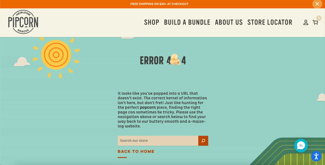
1. Pipcorn

While a 404 page can easily stick out from a website, Pipcorn’s error page aligns perfectly with the rest of the site’s branding. There’s a visually appealing animated background, a friendly text prompt directing visitors to search the website, and a piece of popcorn used as the “0” in “404.”

404 error page example: Pipcorn

2. Spotify

Music streaming giant Spotify has covered its bases with a clever 404 page. With a witty pun and a light-hearted record animation, the website briefly entertains and then sends visitors back to the page they came from. Or, they can easily navigate to the FAQ or Community page. 

404 error page: spotify example

3. Genially

One simple way to ease the tension on your 404 page is to add a quick “Oops!” message — it helps your site feel more personable as you guide users back to the right place. In the case of Genially’s site, the page also includes a nifty illustration paired with some playful copy.

404 error page: Genially

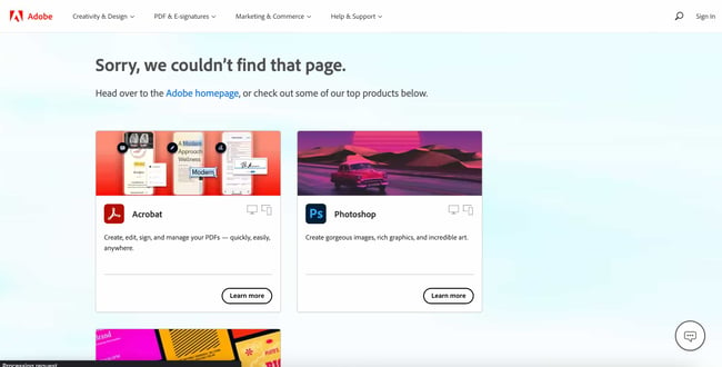
4. Adobe

As you would expect, Adobe’s 404 error page is useful and visually pleasing. One of the most unique things it does is offer easy access to Adobe’s most popular products. 

404 error page: Adobe

5. Clorox

The 404 page for Clorox cleaning products rotates between three lighthearted photos to signal to visitors that they’ve made a misstep. It’s a smart use of branding to add a brief delight moment while helping out lost users.

404 error example from the website clorox

6. Duma Collective

Other times, you might not need a witty blurb — just tell visitors that there’s no page at the address and let them move on. Entertainment consulting agency Duma Collective does just this with its error page, though it’s complemented by a background image for some minor flair.

404 error page examples: Duma Collective

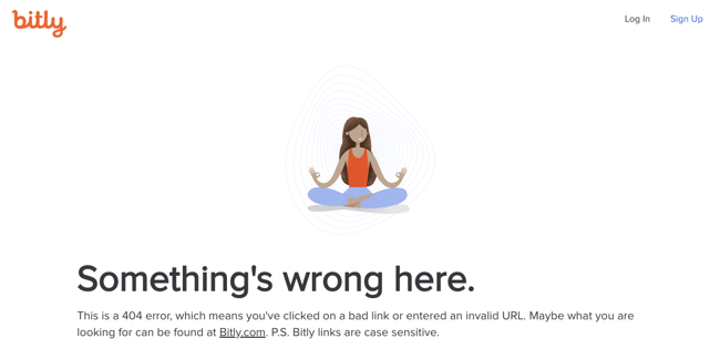
7. Bitly

If you enter an incorrect Bitly link, you’ll be taken to Bitly’s 404 page. We assume this happens a fair amount, which is why the 404 page gets straight to the point. It explains what might have gone wrong and prompts users to visit the Bitly homepage if that’s what they’re after.

404 error page example from the website bitly

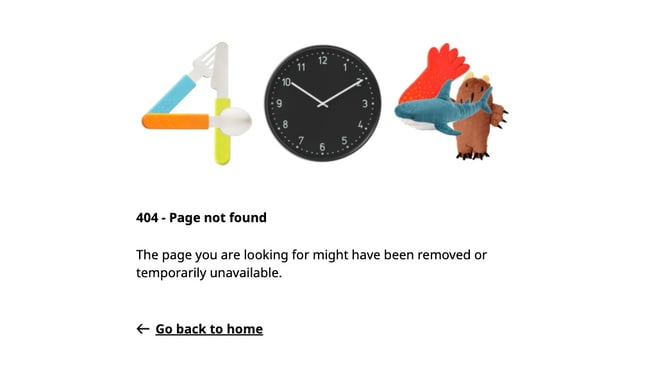
8. Ikea

Ikea’s 404 page is similarly minimalist but still manages to sneak some smart branding in there. This example shows that your error pages don’t need to be elaborate to get the point across, but there’s nothing wrong with injecting some fun, either.

404 error page example from the website ikea

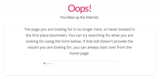
9. Moxie Design Co.

Sure, “blew up the Internet” might be a bit hyperbolic, but it tells visitors that Moxie Design Co. doesn’t take itself too seriously with small slip-ups like this one. Also, a search bar is conveniently placed at the bottom to send you on your way.

404 error page example from the website moxie design

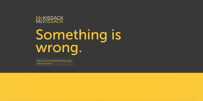
10. McKissack & McKissack

Ah, the classic “we lost the page” trick. Again, an easy way to present a 404 without alienating your audience. If you’re an agency like McKissack & McKissack that manages many client interactions, clear and concise copy is essential for all your site’s pages, including error pages.

404 error page mckissack and mckissack

11. CSS Tricks

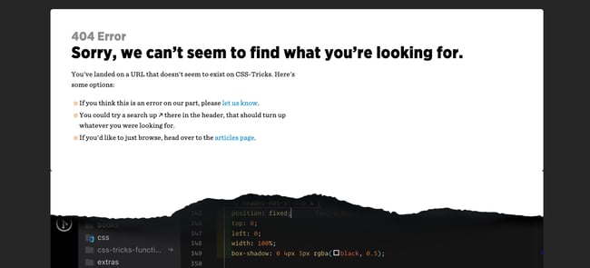
Ever ripped away a website’s wrapping to see what’s underneath? That’s the concept that CSS Tricks was going for in their 404 error page. This is both witty and reminiscent of what the website is all about: Smart use of page styling.

404 error page example from the website css tricks

12. Good Old Games

For other websites, you unwrap the front end and there’s … just the vast emptiness of space. This page is a clever reference to GOG Galaxy, which is Good Old Games’ native video game client. Thankfully, a little video game character is there to give visitors a place to report an error if they want.

404 error page example from the website good old games

13. Myriad

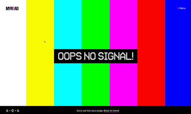
Video agency Myriad has opted for a quirky, on-brand 404 error page design that mimics the classic SMPTE color bars that appear on old tapes and TVs. It’s a funny throwback to older technologies while representing the more modern problem of a nonexistent web page.

404 error page example from the website myriad

14. KonMari

Known for her popular cleaning and organization methods and brand, Marie Kondo has brought a similar feel to her website’s 404 page. The copy briefly and humorously harkens back to her tidying philosophy — a small but well-branded detail that fans will recognize.

404 error page example from the website mario kondo

15. BrandCrowd

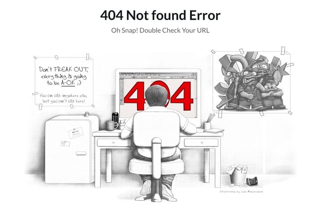
Not only is the illustration on this error page detailed and engaging — the copy is clever, too. We love the reference to the Semisonic song “Closing Time:” “You can click anywhere else, but you can’t click here.”

404 error page example from the website brandcrowd

16. Hot Dot Productions

Hot Dot’s error page stays true to its tagline, “the intersection of new technologies and design.” The page is animated by hundreds of tiny dots that change direction in response to where you move your cursor. It’s mesmerizing and a great showcase of the agency’s design capabilities.

404 error hot dot productions

17. OrangeCoat

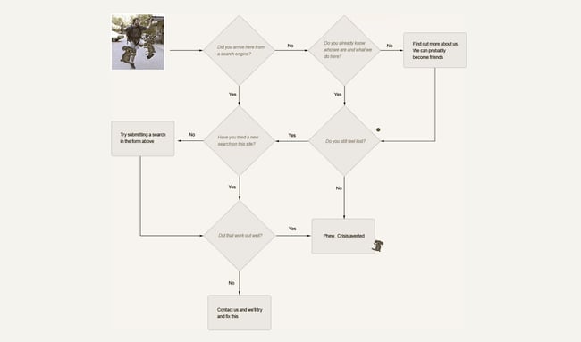
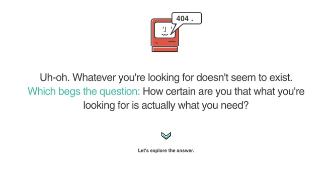
If you’re going to give an error message, why not entertain the user for a few seconds while you help them out? Following a friendly greeting, OrangeCoat offers a flowchart that actually helps users figure out why they reached an error page in the first place.

404 error page example from the website orangecoat

18. Ervin & Smith

This 404 page does more than redirect users back to active pages. Instead, Ervin & Smith’s 404 page invites you to scroll down and learn why you need a digital marketing agency, and why to choose Ervin & Smith in particular, capped off with a contact form. True to its mission, this agency shows that any page can be a conversion opportunity.

404 error page example from the website ervin and smith

19. DayCloud Studios

… or, your 404 can just be a place for visitors to enjoy your website for a minute, as can be seen on the website for DayCloud Studios. Moving the cursor around the screen reveals a 404 message illuminated by lasers shooting from a cat’s eyes. Because why not?

404 error page daycloud studios

20. Headspace

Another instance of a website smartly incorporating its brand messaging into a 404 page — guided meditation app Headspace makes an effort to calm users, encouraging us to take a deep breath, then return to the main site.

404 error pages headspace

21. Wildwood Bakery

Some websites thus far have integrated clever branded copy in their pages, while others have hosted full-blown online games on theirs. But, there’s nothing wrong with a brief push back in the right direction. Wildwood Bakery’s exquisite site keeps things short and sweet (literally).

404 error page example from the website wildwood bakery


Page Not Found: Funny 404 Error Pages

22. Astuteo

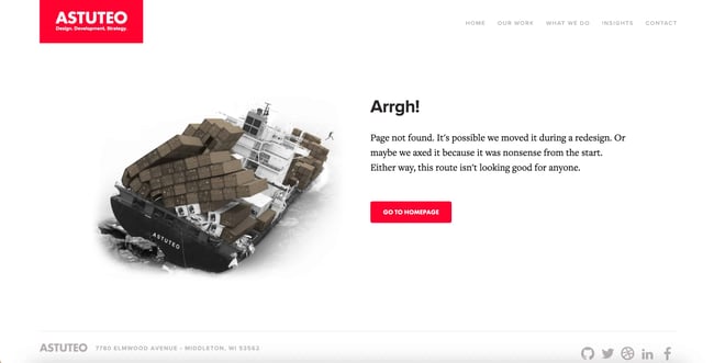
Design agency Astuteo’s 404 page is a perfect balance of elegant visuals, humor, and helpfulness. The minimal layout gives users the information they need alongside another amusing visual metaphor, a sinking cargo ship and a fleeing figure.

404 error astuteo

23. LEGO

There are few words needed on LEGO’s 404 error page — the character’s expression makes everything clear. Plus, fans of the LEGO movie franchise will enjoy the fun reference in the copy.

404 error page lego

24. Magnt

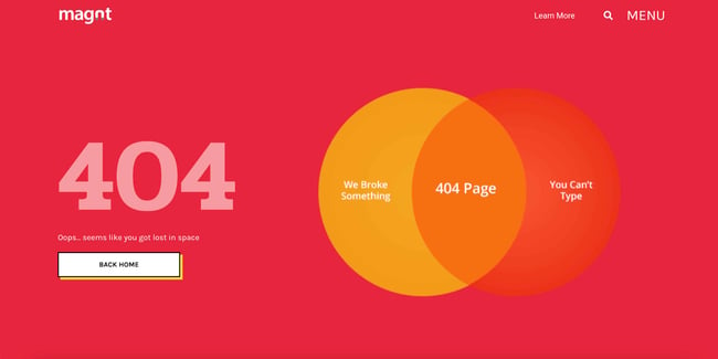
In this funny error message, Magnt pokes fun at the fact that, yes, they could have broken something — or, you just can’t type. The visual serves as a quick way to quickly illustrate their point. Plus, it’s effective, as it reminds visitors to check their URLs and make sure they’ve spelled everything right. 

404 error page magnt

25. IconFinder

IconFinder’s error page is simple but delightful. The company’s mascot wearing a robe and appearing weary is a relatable nod to lost visitors. No worries though, since the site lists some of its links to visit down below.

404 error page iconfinder

26. GitHub

The line “These aren’t the droids you’re looking for” refers to Obi-Wan Kenobi’s Jedi mind trick on Stormtroopers in Star Wars Episode IV, and it’s become a well-known phrase used to tell someone they’re pursuing the wrong course of action. GitHub plays on this famous line in their 404 error message.

404 error page example from the website github

27. Patagonia

Patagonia’s custom 404 page captures the brand’s vibe perfectly. We love the cheeky text that reads “Please try sticking the landing on another page.”

404 error page patagonia

28. AMC Theatres

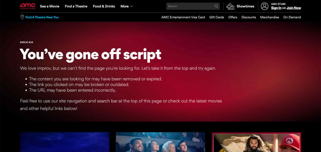
You might have been to an AMC movie theater before, but you’ve hopefully never seen their website’s 404 page. The website makes use of a quick, funny, and relevant one-liner before it sends you back to the right place.

404 error page amc theatres

29. Bruno

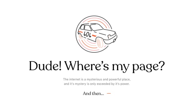
It’s no coincidence that creative agencies are great at coming up with cool 404 pages. Here’s another one from the creatives at Bruno that plays off the 2000 cult comedy classic Dude, Where’s My Car? No, it has nothing to do with the company or website, but it’s sure to get a chuckle.

404 error page example from the website bruno

30. NPR

At first, NPR’s error page seems like nothing special. But keep reading and you’ll see how they cleverly link to some of their great stories about lost people, places, and things, like a piece on Amelia Earhart and one on Waldo. This might just make lost users feel a little less alone.

404 error page example from the website npr

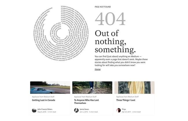
31. Medium

Medium takes a similar approach to NPR’s 404 page, recommending articles about getting lost and losing things. Check these articles out if you have time — they’re quite good reads.

404 error pages medium

32. HomeStarRunner

HomeStarRunner.com, home to a Flash-animated cartoon series, has had a series of hilarious 404 error pages over the years. The most recent features characters from the cartoon series in a scene that could’ve come straight out of one of their episodes. If you turn the sound on when you load the page, you’ll hear their character Strong Bad — known for yelling phrases out loud — saying, “404’d!”

404 error page example from the website homestarrunner

33. Blizzard Entertainment

Here’s a simple idea that ends up looking slick: Blizzard Entertainment’s 404 page features an animated character lost in an actual blizzard and some humor that World of Warcraft fans will appreciate.

404 error page example from the website blizzard entertainment

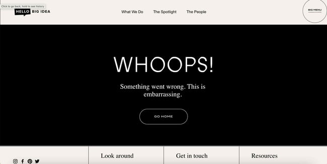
34. Hello Big Idea

A quick trip around marketing and social media experts Hello Big Idea’s website will tell you what you need to know about its bold and blunt style of copy. And, of course, its 404 error page is no exception.

404 error page hello big idea

35. HubSpot

It happens to us, too! This is the message we put up to tell our site visitors that there are some website issues. Our goal was to stay true to HubSpot’s brand voice by being as empathetic and helpful as possible.

404 error page hubspot

Turn a 404 Error Page Into a Delightful Moment

Nobody wants to land on a 404 page — they’re annoying and unexpected. However, you can’t really avoid them, so it’s always a good idea to have a 404 page to fall back on for your website.

And, from a user experience perspective, your 404 page should be a small speed bump, not a brick wall. The right design can be the difference between a frustrated bounce and a possible conversion, so why not make it fun?

Editor’s note: This post was originally published in December 2015 and has been updated for comprehensiveness.

New Call-to-action


Categories B2B

How to Rebrand as a Content Creator and Stay Relevant [Expert Tips]

When it comes to the term “rebrand,” most people think of major company rebrands like Dunkin’ or Lego. However, companies aren’t the only entities that may find themselves in need of a change.

Sometimes, content creators will need to rebrand, too, especially if the creator’s interests have changed or the creator needs to keep up with the latest consumer trends or adhere to new platform guidelines.

If you want to rebrand, you may wonder how to rebrand as a creator and remain relevant. To get some insight, I spoke with creator, blogger, and YouTuber Lisa De La Cruz, who recently went through a rebrand herself.

Here’s her story and tips for creators looking to switch up their content.

Why a rebrand?

The Challenge of Rebranding as a Creator

How to Stay Relevant Through a Rebrand

Download Now: Free Brand Building Guide

Why a rebrand?

As I mentioned earlier, there are many reasons a content creator may choose to rebrand. In De La Cruz’s case, the COVID-19 pandemic plays a role in her decision to change her content.

“I rebranded because, at the height of the pandemic, the content I was creating was very local,” she says, recalling her content that was geared toward her hometown of Reading, PA. “And due to regulations, I couldn’t continue interviewing people in person. It also wasn’t making me happy anymore.”

De La Cruz began shifting her focus toward the anime and manga industry to find her spark and keep creating amid pandemic restrictions.

She would interview voice actors, cosplayers, and anime enthusiasts for her podcast, The Wonder of Anime, and review anime and manga for her YouTube channel and blog of the same name.

“I had slowly started shifting my content in this new direction, and it was really making me happy,” she says. “I realized this is a topic where I can interview people from all over because I don’t have to see them in person. I can use Zoom.”

The Challenge of Rebranding as a Creator

Of course, pivoting to a different niche as a creator isn’t easy, especially if your followers aren’t interested in your new direction.

“There definitely was a change in my audience because, at the time, most of my audience was local, and they were not fans of anime,” De La Cruz says. “So I definitely had a drop in audience in the beginning.”

Fortunately, De La Cruz’s platform grew as she continued in her new niche.

“If I know myself and know the heart of what I’m doing, then I know this is true to me and I just have to push forward that way,” she says.

How to Stay Relevant Through a Rebrand

So, how did De La Cruz grow her platform post-rebrand, and what can you do to make your rebrand a success? Here are some expert tips she says can make for a smooth transition.

1. Consider appealing to an untapped market.

“The new type of content that I was making was unique in the sense that I was covering things that didn’t have much of a spotlight,” she explains, “such as an old series or nostalgic things that people may have forgotten about.”

Over time, De La Cruz says her content began to attract anime and manga enthusiasts who were happy to see her shine a light on cult classics.

“I tapped into a new audience and a specific niche that hadn’t been touched on,” she recalls. “I think that really helped because people were excited to see someone give representation to a series they enjoy but isn’t often talked about.”

2. Know why you want to rebrand.

While creators must keep up with the latest consumer trends, De La Cruz warns shifting trends and numbers shouldn’t be your sole motivator.

“Really think about why you want to rebrand,” she says. “For me, it wasn’t about growing a different audience — I just wanted to stay true to what I like and am passionate about. I would warn against switching because of numbers.”

Viewers are very perceptive, and De La Cruz says they’ll know if you’re rebranding just to stay in the spotlight. Doing so can foster distrust and make your brand seem inauthentic — and authenticity is invaluable in branding.

In fact, 88% of consumers say authenticity is key when deciding what brands they like and support.

3. Go all in.

“Go 100% in. If you are in-between and you’re teasing your audience by doing some old stuff and new things at the same time, you can lose people and confuse people,” she says. “That could be a turn-off to your audience.”

De La Cruz says if you do a pivot, make it a hard one.

“I find it helps establish your new audience because you’re not giving people false hope that you’re still going to create your previous style of content.”

4. Communicate your rebrand to your audience.

Depending on how long you’ve been a creator, your audience may have followed you for years before you rebranded your platform.

De La Cruz says it’s important to respect the relationship you’ve built with your viewers and to keep them in the loop of your new era.

“There is a relationship between you as a content creator and the audience consuming your content,” she says. “Sometimes doing a hard pivot without making it clear can feel distrustful to your audience, especially if they didn’t see it coming.”

De La Cruz suggests making a clear statement to show appreciation and to allow your audience to decide if they want to follow you on your new journey.

This statement can come in a YouTube video, a social media post, an email, or a newsletter.

Above all, De La Cruz says to be confident in your decision.

“Your rebrand is likely something you’ve been thinking about and weighing on you for some time, so be confident that your rebrand will do as well as your previous content,” she explains.

“You need to believe it so your old audience and newcomers will believe in it and follow your new journey.”

brand consistency

Categories B2B

How to Get Sponsored on Instagram (Even if You Currently Have 0 Followers)

It’s no surprise you want to become a paid Instagram influencer, but the idea of getting your posts sponsored might seem laughable if you’re just posting pictures of your brunch instead of skydiving pictures in Australia.

You’re probably more marketable than you think, as Instagram is a popular channel for influencers to partner with all kinds of businesses to post all kinds of content across topic areas for all types of influencers, from micro-influencers to viral celebrities.

Download Now: Free Instagram for Business Kit + Templates

Here, we’re going to show you everything you need to do to get sponsored on Instagram. Keep reading to get started or click the links below to jump to a specific section of this article.

Table of Contents

1. Define your brand.

You’ll see the best engagement if you’re able to define your niche. Do you want to post food and health-related content or focus on fashion? Whatever the case, it’s important to establish your brand.

In addition to the type of content you post, branding has a lot to do with your overall aesthetic. How do you want to style your posts? What’s your messaging? To further solidify your brand, you might want to consider creating a cohesive feed theme (use these feeds for inspiration).

Consistency is key. A good influencer’s posts are distinguishable and unique— a user flipping through their feed should be able to recognize the content as belonging to one influencer. Trust builds as a user continues to see the same influencers’ content.

Additionally, you might want to connect your Instagram brand with any other online presence. Creating a website with similar aesthetic and messaging is a good way to do this — the more you unify your social media accounts, the easier it will be for brands to distinguish how you can help them.

2. Know your audience.

Knowing your audience is critical for convincing a brand to work with you. It’s mutually beneficial for you, as well — if you understand your audience, you’re can correctly identify which brands will see the most success from using you as their sponsor.

Start by gathering the basics — what is the gender, age, and geographical location of your core demographic? Which of your posts do they like the best? What times of day do they respond best to content, and what can you infer from this?

The demographic information you gather will help you pitch partnerships with brands. Brands want to know who they can reach if they work with you. Explaining, “You’ll be reaching thirty-something, working women, primarily from New York, who often use Instagram first thing in the morning and prefer fitness content” is certainly more powerful than saying, “You’ll be reaching women.”

3. Post consistently.

How frequently you post on social media will depend on several factors: how the platform works and the ecosystem on each platform you choose.

Posting frequently on Instagram is important to getting brand sponsorship because it shows you maintain a presence on the platform. Instagram is algorithm based, so a high frequency isn’t as defining a factor as sharing quality content, especially since the algorithm ensures that users don’t see too many posts from one single author at once.

Adam Mosseri, head of Instagram, suggests sharing a couple of in-feed posts per week and a couple of stories per day.

According to our State of Social Media in 2022 report, the best time to post on Instagram are mid to late evening, specifically from 6 PM -9 PM, 12 PM – 3 PM, and 3 PM – 6 PM. The best day to post is Saturday, and the worst is Monday.

Besides this research, figuring out the best posting schedule on Instagram requires looking at your profile analytics and seeing when you get the most interaction and engagement with your content.

4. Use hashtags and geotags.

Instagram hashtags make your content discoverable, so they’re necessary for growing your following. You can use up to 30 hashtags per post, but Instagram recommends creators use no more than three to five hashtags per post.

You also want to use hashtags as relevant to your content as possible and ensure they aren’t broken or banned.

It’s critical you choose hashtags that aren’t too broad. #Healthyliving, for instance, has over 20,000,000 posts, while #healthylivingtips only has 13,000. The less competition, the easier it will be for your content to get discovered.

When you peruse a hashtag’s page, you can also get a deeper sense of what types of content your post will be up against. #Healthylivingtips might typically feature posts with food recipes, while your post is about cycling — this could defer you from using that hashtag.

Location tags are equally important, but for a different reason. Geotags can help people find you if they’re interested in a certain location. This helps you gain more followers, and it also helps you appeal to brands that are interested in reaching a certain demographic. For instance, maybe a boutique sees you often post fashion tips from the California area, and they’re looking to appeal to people in that region — it’s a win, win.

5. Tag brands in your posts.

Okay, now you’re officially ready to begin reaching out to brands. You’ve defined your brand and audience and have created quality, authentic posts. Now, you should have a pretty good idea of what types of businesses would benefit from a partnership with you.

It’s important to start small. If you’re interested in skincare, don’t go straight for Estee Lauder — instead, try tagging small skincare start-ups you’ve seen across Instagram already. Engage with your audience by responding to comments like “Where can I get one?” or “How much?” the brand will soon see you’ve proven yourself a suitable sales partner.

6. Include contact information in your bio.

Consider your bio a chance to signal your interest in becoming an influencer. Include an email or website so they can reach you, and include a press kit if possible.

For instance, @brittany_broski doesn’t waste her bio space and includes her email in her bio.

brittany

Image Source

Furthermore, you should use a website or blog as your chance to expand on your brand and demonstrate your versatility. Consider adding a Press Page to your website, so brands can take a look at your services. Once you begin sponsoring brands, you can add them to this page so brands can see you have influencer experience.

7. Pitch paid sponsorships.

There’s nothing wrong with reaching out to brands and offering your services. With the right pitch, you might be able to land some gigs without waiting for brands to find you.

Look for brands that clearly invest time and money into their Instagram presence. You might start by researching what similar influencers in your industry already sponsor. Remember, it’s okay to start small. Working with smaller brands will allow you to build a portfolio.

Once you’ve curated a list of brands that might want to partner with you, send them an email. In your pitch, clearly and briefly outline who you are, what you do, and any achievements you have in the field that make you an expert. Then, explain why you’re a good fit for the brand, and include data such as follower count and average engagement rate.

Alternatively, you might consider sending a brand a DM straight from Instagram. It’s certainly more relevant to the job you’re vying for, but it might get lost if a brand get hundreds of DMs a day.

8. Join Instagram’s creator marketplace.

The creator marketplace helps brands find influencers to partner with on Instagram. As an influencer or creator, you can join the creator marketplace to get your content and profile seen by brands looking for people like you.

You can indicate which brands and interests are relevant to you so you are contacted by people relevant to you, and you can easily message brands in the Partnership Messaging inbox.

9. Know your worth.

Make sure you know how much you’re going to charge when brands reach out to you. HubSpot Blog Research found that marketers typically pay between $501 and $10K for nano, micro-influencer, and macro-influencers, with $10K+ budgets reserved for mostly mega influencers.

While you’ll want to have a minimum set, you can negotiate to encourage brands to pay more. Perhaps for $300, you’ll throw in five Instagram Story posts, and a link in your bio to their website for 24 hours. You can use other Instagram features to sweeten the deal. As you grow, you’ll be able to charge more.

What’s a Sponsored Instagram Post?

There are two main types of sponsored Instagram posts: A brand creates a post and pays Instagram for access to a custom audience, and a brand that pays an influencer or creator to share content that features the brand/business in some way.

Here’s more detail on each type of sponsored post:

Promoted Posts & Ads

Just like Twitter, LinkedIn, and Facebook, Instagram comes with a native ad management platform. Advertisers can use this tool to customize a target audience — using attributes like age, sex, location, and interests — and invest a specific amount of money to getting their post in front of Instagrammers who identify with this audience.

The thing to remember here is that the advertiser is making and publishing the post. They’re paying Instagram for the audience they want access to, but the post is theirs to create.

Paid Sponsorships

Paid sponsorships happen between a brand and an influencer or realtor on Instagram. The creator will have a brand and an audience that is relevant to the business.

Think of it like social media product placement; just like a business might pay a TV show to have their brand of soda on the countertop in the series finale, they can also pay a person on Instagram to hold that same soda in a picture on their Instagram feed.

There are numerous influencers for each industry. Here’s a big list of today’s known influencers and the types of audiences they attract.

Using #ad and #spon Hashtags

Brands have come under fire in the past for working with influencers but not making it clear that the influencers were paid to share content.

Department store Lord & Taylor, for instance, settled charges with the FTC in 2016 after paying 50 influencers to wear a dress in their posts without hashtagging #sponsorship or #ad.

Instagram prefers that influencers mark paid sponsorships as paid partnerships so their audiences know the intention behind the post. It’s critical your followers know if you’re getting paid to promote a product. Ethics aside, it could destroy your account’s credibility if you’re caught, and lose everything you’ve worked hard to build — namely, an authentic, trusting community.

In 2017, Instagram released a paid partnership feature to combat this issue — if you tag a brand in a post and the brand confirms the relationship, the ad will be marked at the top with a “paid partnership” label. This also helps the brand gather data regarding how well the campaign is performing.

If you truly don’t want to post #ad or #spon, there are some ways around it — for instance, Airbnb created the hashtag #Airbnb_partner, to signal a paid partnership without using the word “ad”.

When in doubt, adhere to Instagram’s policies. You can read Instagram’s branded content policies in full here.

How to Disclose Paid Partnerships on Instagram

It’s a best practice to disclose paid partnerships to followers so they know that you and your partner will profit from the engagement you bring them. You can easily disclose partnerships with brands for Feed, Stories, Live, Reels, and videos.

Note: This feature is only available for business and creator accounts, and the steps are the same for desktop and mobile devices.

Add Paid Partnership Label to Instagram Feed Posts

  1. Upload your content and add your preferred caption and any filters or effects, then tap Next.
  2. Tap Advanced settings.
  3. Toggle Add paid partnership label underneath Branded content.
  4. Tap Add brand partners to search for the brand and add them to your post. You can add up to two brands.
  5. Optional: If your agreement with the brand allows them to use your content to run ads, toggle Allow brand partner to promote into the on position.
  6. Tap Done to post your content.

add paid partnership label to instagram post

Image Source

Add Paid Partnership Label to Instagram Stories

  1. Once you’ve uploaded the story and added elements like text or a filter, tap the tag icon at the top of the screen.
  2. Tap Add paid partnership label.
  3. Tap Add brand partners and search for the brand you’re working with. You can add up to two brands.
  4. Optional: If your agreement with the brand allows them to use your content to run ads, toggle Allow brand partners to promote into the on position.
  5. Tap Done to post your Story.

Add Paid Partnership Label to Instagram Reels

  1. After you’ve uploaded your Reel and edited it to your choosing, tap Next.
  2. Tap Advanced Settings.
  3. Toggle Add paid partnership label into the on position.
  4. Tap Add brand partners and search for the brand you’re working with. You can up to two brands.
  5. Tap Done to post your Reel

The video below shows the Paid Partnership label in a sponsored Reel from Yes Williamsburg.

Add Paid Partnership Label to Instagram Live

Note: When you’re Live, you can only tag brands you have approval from

  1. When you go live, tap Details

2. Tap Add brand partners and search for the brand you’re working with to add a tag to your Live.

Things to Consider Before Accepting an Instagram Sponsorship

1. The brand’s audience.

Before accepting an Instagram sponsorship, the most important thing to do is make sure your connection to the brand is there, which is why it’s important to work with brands in your niche. For example, if you’re a fitness influencer, it would make sense to partner with athletic wear companies or local fitness studios, but not relevant to partner with a travel agency.

Research the brand and look at its Instagram presence, the type of content shared, and the audience that engages with the content to see if it aligns with your brand and interests.

2. A brand’s partnership eligibility requirements.

Brands have their eligibility requirements when they partner with influencers, so you should always review their criteria to ensure you meet their qualifications and that their capabilities don’t have unrealistic expectations for you and your processes.

3. The fine print of your contracts.

Protecting your content and ensuring the brand won’t misuse it is essential. You can read the fine print of your contract and partnership to see exactly how your content can be used, and you can register for a DCMA account to make sure it’s protected by copyright law and can’t be misused.

4. Instagram’s partner monetization policies and guidelines.

To use Instagram’s Monetization and Promotional tools on Instagram, you have to meet a few specific requirements.

  • Reside in a country where monetization and promotional tools are available.
  • Adhere to and comply with all community guidelines.
  • Comply with content monetization policies.
  • Refrain from sharing misinformation.
  • Only monetize authentic engagement (you can’t monetize artificial views or engagement)
  • Comply with payment terms
  • Must have an authentic presence

You should also be familiar with rules and laws created by the Federal Trade Commission (or the equivalent in your country). Not complying with requirements and being transparent can cause significant legal issues and may make it harder for you to engage in partnerships in the future.

5. The type of content you can monetize.

All content that helps creators and publishers earn must follow specific rules:

  • You can’t monetize static videos, static image polls, slideshows of images, looping videos, text montages, or embedded ads.
  • You can’t monetize engagement bait, where you incentivize people to click a link or respond to a post through likes or comments, soliciting engagement,
  • You can’t monetize content that is misinformation, misleading medical information, unoriginal content, or drugs.

6. Payment amount and payment terms.

It’s always important to evaluate the offers to make sure you’re compensated fairly and in alignment with your rate, partnership requirements (like how much content you share), and the effort you put in to create the content.

If payment doesn’t align with your level of work, you have the right to negotiate a rate that matches what you’ll have to do, or you can step away if they don’t compensate you against your rate.

Pros and Cons of Instagram Sponsorships

Pros

  • Building trust – Working with reputable brands can build your credibility with your viewers and audience because you work with a source they know, and the trust builds even higher if you recommend a product or service they purchase that positively impacts their life.
  • Expanding your reach – Partnering with a brand expands your reach to your partners’ audience, helping you grow your awareness and draw in new followers eager to hear from you.
  • Monetization – Partnering with brands can help you monetize your platform and get paid for the posts or campaigns you run and are already an expert at creating.

Cons

  • Loss of authenticity – Sponsored content can feel inauthentic to viewers, especially if the content seems too sales-y. Since consumers prefer authentic content over all else, they may be skeptical of your ads.
  • Legal issues – If you don’t comply with legal requirements and Instagram’s content monetization and sponsorship requirements, you risk non-compliance and losing the ability to use the Instagram feature or even the platform.
  • Time-consuming – Sponsored partnerships can require a lot of time and effort to coordinate and create content, which can detract from your other content creation efforts.

Over to You

Getting sponsored on Instagram can be challenging — it takes time, effort, and perseverance. But if you work hard to differentiate yourself in the industry, and connect on a personal level with your followers, it can be extraordinarily rewarding.

New Call-to-action

Categories B2B

6 Best Free Website Builders to Check Out in 2023 [+Pros & Cons]

In my half-decade as an SEO content marketer, I’ve spent a good chunk of my time either testing or working with any number of free website builders: CMS Hub, WordPress.com, WordPress.org, Wix, Weebly, Webflow, you name it.

These website builder tools have been essential for me to publish content, either for my current employer or for my side projects. I’ve therefore been able to get well acquainted with their capabilities over time.

Learn More About HubSpot's CMS with Free Web Hosting

But if you’re new to the website builder game, you might be confused about where to start. What is the best choice if you don’t know how to code? Which one would give you the most bang for zero bucks? And which options include a good domain name, versus a garbled, messy subdomain?

I’m going to cover that and more, but first, let’s go over the basics.

If you’ve been considering building a website for some time, then you’re likely familiar with the options you have. The most common method is to buy a web hosting plan and a domain name, and then install your preferred CMS on your website, such as WordPress.org or Joomla.

The problem with that option is that when you install WordPress or Joomla out of the box, it comes with no handbook or content. When I’ve used this method before, I found that my website was literally like a blank page, which meant that unless I hired a developer or spent a lot of time building it, the end result would look quite unfinished and unprofessional.

When I was testing out free website builders such as CMS Hub or WordPress.com, I found that I was able to shorten my workflow considerably. The themes came with placeholder text and images, for instance, that made my website feel more complete than if I’d started with an out-of-the-box CMS.

How I Tested the Best Website Builders

When trying to find the best website builders for this post, I considered workflow to be the most important factor. Is it easy to set up a website from the start, or do you need extensive time and experience to do it?

Chances are, if you’re looking for a free website builder, you’d like the set up to be painless and seamless. For that reason, I chose tools that had:

  • The standard required features: placeholder content, blogging tools, SEO tools, and templates and themes
  • A fully free option with strong capabilities out of the box — no need to upgrade at every turn
  • A relatively easy workflow from signup to completion

With that, let’s go over the absolute best website builders I’ve used and tested before.
1. Best Free Website Builder for Growing Businesses: HubSpot Drag-and-Drop Website Builder

best free website builder: HubSpot

Get started with HubSpot’s free drag-and-drop builder!

I use HubSpot’s drag-and-drop website builder (inside CMS Hub) as a content marketer on the HubSpot blog team, and have used it for two of my side website projects.

Hands down, this is one of the best website builders available for free — not only because of the ease of signing up, but also because it includes built-in tools for a handful of other functions, such as marketing and sales.

The website creation process is so easy, anyone could do it — mainly because the setup dashboard includes an interactive checklist for you to build your site step-by-step. I loved this signup workflow when I was building a few side projects. It’s one of the best in terms of user- and beginner-friendliness.
best free website builder: HubSpot full checklist

Once you install a free theme, you can right away start customizing the site with your preferred colors and fonts. At the top of the page is a bar that shows you where you are on the setup workflow, which is supremely useful for skipping between tasks. Note that this is only active during the onboarding phase.
best free website-builder: husbpot task

After you’re finished, you’re taken right back to the user guide, where you can begin exploring HubSpot’s suite of tools for business. You also have the option of connecting a custom domain, which is free. All you have to do is buy the domain through a domain registrar such as GoDaddy, then go through the domain connection process.

This might be the most difficult part of signup due to the verification step. But you can always move forward with a free HubSpot domain name, which looks like this:

[randomly generated token].hs-sites.com

It’s not beautiful, and definitely my least favorite feature, so I’d recommend moving forward with a custom branded domain.
best free website builder: HubSpot checklist

Now, it’s time to edit our site. The website editing process is a little more compartmentalized than in other tools. Whereas others might right away take you to the page editor, HubSpot takes you to the entirety of its suite dashboard, allowing you to access its marketing, sales, and service tools in addition to its website tools (located under the “Marketing” menu).

To access it, simply go to Marketing > Website > Website Pages.
best free website builder: hubspot menu

Then, click Create. Something I loved here was the option to create either a website page or a landing page. This makes HubSpot a great fit if you’re using your site to drive leads in any capacity.
best free website builder: creating a new page in HubSpot

After you create your first page, the process is then easy and familiar. You can choose a template, but be sure to install a theme first (which is part of the setup workflow).

The free themes and templates are very good, and there are plenty of options in the HubSpot marketplace. That said, most themes are business-oriented; if you’d like to build an artsy or eclectic website, other website builders include more “fun” designs.
best free website builder: HubSpot themes

One thing I loved was that you can switch between themes and mix and match them. Other tools don’t allow you to use different themes on the same site, so if you’re concerned about limited design options, CMS Hub is a great choice.

Once you’ve chosen your template, you’re ready to begin editing. CMS Hub pulls in demo content so you can see what your page will look like when you’re finished. I can’t tell you the amount of times I’ve used a template on WordPress, only to get a fully blank page with the “Hello World!” heading. The demo content is a definite plus.

Finally, the drag-and-drop page builder is nothing to scoff at. The page builder works based on modules, which you drag onto the page. It then creates a live element you can edit directly, allowing you to see your changes in real time, as opposed to having to open a preview tab.
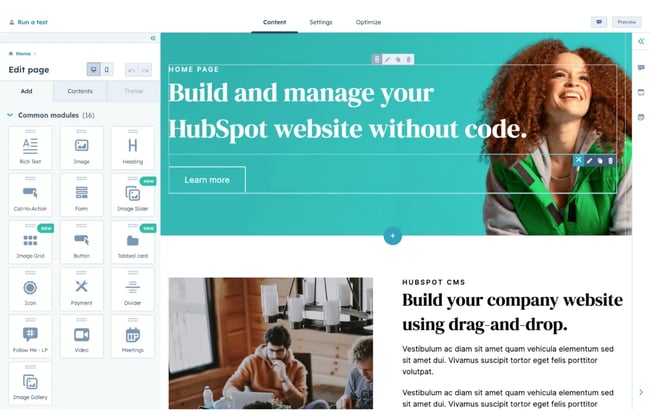
best free website builder: HubSpot page builder interface

Another thing I loved is that it’s easy enough to use for a beginner, but also gives developers the ability to create advanced custom modules and tinker with the site’s source code. For instance, in your settings, you can upload a custom CSS stylesheet.
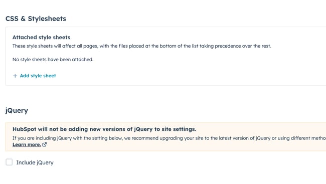
best free website builder: HubSpot developer customization

Here’s the impressive part: For all of its simplicity and user-friendliness, HubSpot’s website builder is more than equipped to handle business-level demands, with marketing, sales, and service software already built-in. Most of those are free to use at the basic tier, allowing you to send an email a month, for example, and use HubSpot CRM without paying a single cent.

Of course, it comes with everything you need to build a website, including content management system (CMS) tools, themes and templates, security features, and a built-in content delivery network (CDN) to ensure pages load quickly. Overall, I can’t recommend this tool enough for any type of business that wants more than a basic website builder.

Core Features
Advantages
  • Includes web hosting
  • Personalization (thanks to HubSpot’s CRM)
  • Security
  • Responsive themes and templates
Disadvantages
  • The free version displays HubSpot’s branding
  • If you want to build custom modules and templates, you’ll need to learn HuBL, HubSpot’s templating language
Pricing

A limited free plan is available. The premium CMS plans with additional features start at $23 a month when billed annually.

Brands Using HubSpot

2. Best Free Website Builder for Beginners: WordPress.com
best free website builder: wordpress home page

I can’t count the number of WordPress.com sites I’ve built for fun. It’s easy to sign up, it’s free, and its included domain name is not as ugly (and more recognizable) than others on this list. “Brandname.wordpress.com” has a nice ring to it, right?

First, though, I’d like to point out that WordPress.com is different from WordPress.org. WordPress.com is a free, fully-hosted website-building service, whereas WordPress.org is a content management system you can install on your website.

If you’re looking for a simple free website builder, WordPress.com is the way to go. But if you have a little bit of website development knowledge and are willing to learn the ins and outs of WordPress hosting, WordPress.org is a great choice.

For this list, though, I recommend WordPress.com. Why? It’s an all-in-one option that doesn’t require you to buy separate WordPress hosting or test out different WordPress page builders.

It’s not as customizable as WordPress.org, but it’s more than sufficient for beginners, bloggers, and hobbyists. Due to the free tier’s limitations on bandwidth and lack of CDN, business owners should probably consider another tool.

Just like CMS Hub, setting up your website on WordPress.com is very easy. As it guides you through the setup process, WordPress will ask you about your goals and immediately prompt you to choose a free theme for your website.

best free website builder: WordPress themes

The themes are modern and mobile-optimized — I was surprised to find that I liked quite a few of the designs. When I’ve used WordPress in the past, I found the themes lackluster, but it seems to have updated its library.

From there, WordPress will take you to an abbreviated checklist that’s similar to HubSpot’s. By the time you’ve picked your theme, you’ve already completed the first three steps. All you have to do is publish your first blog post, edit the website’s design, and launch your site.
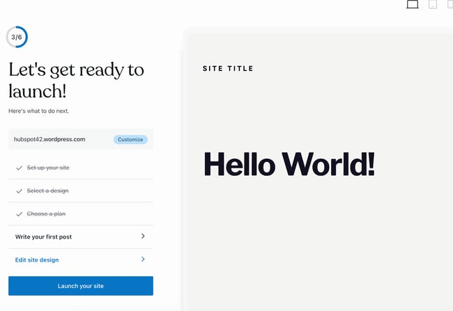
best free website builder: wordpress checklist

Keep in mind that the site is still in the bare minimum stages — you still need to go into the dashboard and add pages and content. Unfortunately, on the free version, you can’t install plugins, including the HubSpot WordPress marketing plugin.

Now, let’s talk about the drag and drop page builder. WordPress.com’s is much more minimal than other options on this list, and that’s because it primarily includes plain content formats such as paragraphs, headings, lists, and tables. It’s also not a live editor; if you want to see your chances on the page, you have to preview it on another tab.

That said, its simplicity makes it a great option for beginners just starting to build their first website — no need to fiddle with complicated modules.
best free website builder: WordPress editor interfaceIf you are looking for more built-out modules — such as banners, headers, pre-built sections, and more — you’d be better off with a website builder that offers these options on the free tier, such as HubSpot’s CMS Hub or Webflow.

Core Features
  • Large collection of themes
  • Mobile-friendly and optimized for SEO
  • Managed website hosting and security
Advantages
  • Customizable
  • Flexible
  • Mobile and desktop apps available
Disadvantages
  • The free version displays ads
  • More limitations compared to WordPress.org
  • Although intuitive, it’s more difficult to learn than other drag-and-drop builders
Pricing

A limited free plan is available. Premium plans start at $4 a month when billed annually.

Brands Using WordPress.com

3. Best Free Website Builder for Ecommerce Websites: Weebly
Weebly-Web-Builder

Weebly is a classic website builder that offers a unique bundle of web hosting, domain registration, web design, and built-in ecommerce functions. This last feature is of note. For instance, on WordPress, you’d have to install an ecommerce plugin to start a shop, and even on CMS Hub, you’d need a third-party integration.

On Weebly, you can open up a store as part of the sign-up process. For that reason, I highly recommend it if you’d like to build an ecommerce website. This website builder is already integrated with Square, a popular online payment gateway.

As part of my test, I chose to create a website for an online store. What I liked about this part of Weebly’s setup is that it’s so simple — you don’t have to go on and on about your goals or the type of website you’d like to build.

During the next few phases, you’ll be able to choose a name for your store, as well as designate the type of products you’ll be selling. I’m not sure what this step is for — it must be for metadata or for Wix’s tracking purposes, but it’s good to fill out either way.
best free website builder: weebly store questionnaire

As with CMS Hub and WordPres.com, you’ll be prompted to choose a theme. If you’re setting up an ecommerce website, Weebly will automatically sort the themes so that you get storefront options first — no need to go hunting for them.

I did find the theme selection a little less diverse than other options on this list, but for a free ecommerce site builder, the options are reasonable.
best free website builder: weebly store themes

As I was testing this website builder, I also found that it offers a nifty product listing tool that allows you to set up your inventory for sale immediately. I loved how easy and simple this was. It could make a great fit for someone who’s trying ecommerce out for the first time.
best free website builder: weebly product builder

If you think Weebly will leave you without help or guidance, I have good news. Like the previous tools, it includes a checklist for you to work through so that you can set up your store correctly.
best free website builder: weebly checklist

I’ve used Weebly before and have abandoned it due to a laggy page editor. During my test this time around, I found that the drag-and-drop editor is still somewhat laggy but more serviceable than when I was using Weebly for fun.
best free website builder: weebly page builder interface

It includes the standard text, image, and rich content modules, with more variety and complexity than WordPress.com’s options. It also features helpful SEO tools and resources to get you started with an SEO strategy.

Core Features
  • Drag-and-drop editor
  • Integrated CMS solution
  • Free SSL certificate
  • SEO tools
  • Analytics and reporting
Advantages
  • Helpful SEO resource tools
  • Good selection of paid and free apps in the app center
  • The free plan has ecommerce functionality
Disadvantages
  • Limited choice of themes
  • The free and basic paid plans display ads
  • Limited SEO functionality
Pricing

A limited free plan is available. Premium plans start at $6 a month when billed annually.

Brands Using Weebly

4. Best Free Website Builder for Web Developers: Webflow
best free website builder: web flow

Webflow is a fantastic free website builder for those who have more coding experience and who’d like a more customizable website builder tool. Because of its ability to include multiple workspaces and multiple websites for clients, I especially recommend it for freelance web developers and agencies.

(And if you happen to be a fan of Adobe Creative Cloud, you’ll find that Webflow has a similar UX — another plus.)

Webflow is a winner when it comes to the setup workflow. Straightaway, you’ll have the option to build a website for your company, your clients, or yourself. I chose “Clients” to test its capabilities for freelancers and agencies.
best free website builder: webflow setup

Next, you’ll be asked to identify the type of website you’re building. Blog websites are an option, but if you’re planning to start a blog, I recommend CMS Hub or WordPress.com instead. Both of those offer powerful blogging options and a much more beginner-friendly interface.

I was surprised to see that Webflow includes different workspaces, something I didn’t run across in other tools (except CMS Hub, which allows you to have access to different portals). This makes Webflow an excellent choice for large teams where you might have different workspaces depending on permissions or job function.
best free website builder: webflow workspaces

The free theme selection in Webflow is, though limited, very good. I told the tool I wanted to create a portfolio website, and it automatically suggested a portfolio theme for me to try.
best free website builder: webflow themes

After you choose a theme, you’ll be taken straight away to the website builder. Webflow’s page builder is complicated and the learning curve is steep. While the tool does include a setup checklist, it’s not as simple to follow as others on this list.

For instance, right away, you’ll be prompted to change CSS classes — which can be daunting if you’re new to web development.
best free website builder: webflow checklist

The actual page builder, though, is pretty familiar. You can add HTML elements such as sections, containers, divs, lists, buttons, headings, and so on. The tool does include more technical language, so you’ll encounter terms such as “V Flex,” which refers to a vertical flexbox.

I can see this being difficult for beginners and even intermediate users, so if you identify as either of those, you might want to opt for another tool. (Or you can use Webflow to learn web development terms!)
best free website builder: web flow page builder interface

One thing I loved that could make Webflow a good fit for beginners is its inclusion of “Libraries.” If you’re at all intimidated by the language and the learning curve, you can simply import pre-designed components and sections without needing to tinker excessively with the tool itself.

Webflow includes a free domain for you to use, but it only publishes to a staging environment — another reason why this tool is such a great fit for developers. The only thing you’ll need to purchase when using Webflow is a domain you can publish your site to.
best free website builder: webflow publication options

Core Features
  • A drag-and-drop website builder
  • Widgets to add features like maps and media
  • Third-party integrations
Advantages
  • Offers complete control over your site’s design
  • Drag-and-drop what-you-see-is-what-you-get (WYSIWYG) builder
  • Responsive interface
Disadvantages
  • After building a website on Webflow, you need to transfer it to a content management system
  • Requires some knowledge of HTML and CSS to access full features
  • It has a complex free and paid plan structure
  • You need to sign up for both a Site and Workspace plan
Pricing

A limited free plan is available. Premium plans start at $12 a month when billed annually.

Brands Using Webflow

5. Best Free Website Builder for Local Business Owners: Wix
best free website builder: wix

Wix is one of the most popular free website builders, and probably one of the first options you thought of when you first started researching tools. The easy-to-use, fully-hosted platform offers an easy drag-and-drop editor, an extensive collection of apps, and professional-looking templates.

I first used Wix in 2010-2013, when it was still just a simple website builder with a reputation for being laggy and poorly optimized. It’s now turned into one of the most robust options on the market.

Wix’s most noteworthy feature is its focus on providing all the tools necessary for business owners to get their business up and running online.

When you’re setting up your site, you will have the option of choosing the type of business you run. Unlike on other website builders, where this information is used for internal cataloging purposes, Wix creates a customized dashboard depending on the type of business you choose.

I set up a blog, an online store, and a brick-and-mortar shop, and all three had different checklists and integrated apps on their dashboards.
best free website builder: wix setup website type

For this test, I chose to set up a local shop. Instead of right away taking me to the website builder, the Wix setup assistant tried to get as much information about “my business” as possible.

I was thoroughly impressed by the effort to get my business’ information in a beginner-friendly questionnaire. The information would later be used for Wix’s Point of Sale tool and on my website. This makes Wix a specially good fit for local businesses who want to set up an robust online presence, but don’t want to mess with different tools to do so.
best free website builder: wix setup

Depending on your answers to some of the questions on the questionnaire, Wix will include different widgets, tools, and checklist items on your dashboard. For instance, below, I told the tool I wanted to accept online and in-person payments, send automated emails, and more—
best free website builder: wix multiple options

—and when I went to my dashboard, Wix had created a checklist that allowed me to set up everything I wanted, including signing up on its Point of Sale tool. A local business owner would find this highly convenient and seamless. That said, the list can be overwhelming to look at.
best free website builder: wix checklist

I was maybe half an hour into the setup, and Wix had yet to prompt me to start designing my website. The first few steps in the checklist, in fact, all have to do with internal administration and finance.

That tells me that Wix wants to be the one administration portal for business owners to manage their online presence beyond designing a website.

When you do finally begin to set up your site, Wix gives you the option of either manually choosing a template or using Wix’s creation assistant. This is a unique feature I’ve yet to run into in my tests. It will likely be a game changer for local business owners who are short on time.
best free website builder: wix creation assistant

I chose the option for Wix to create a site for me. It then prompted me to pick a theme and began preparing home page designs based on my preferred aesthetic.
best free website builder: wix homepage generator

Since I chose “Fresh,” it then delivered earthy and clean designs. The selection is limited, but good for a local business.
best free website builder: wix site creation assistant

After, you have the option of adding pages to your site with demo content already imported.
best free website builder: add a new page to wix

My least favorite aspect of Wix is the page builder itself. It’s cluttered, difficult to navigate, and overly complicated. That could potentially lengthen the learning curve on this tool.
best free website builder: wix page builder interface

Another aspect I found strange is that when you insert a new element, it doesn’t snap to the grid. Instead, it stays right where you place it. That means it could be difficult to reliably align different elements with the exact same amount of padding and margin. But if you don’t add new elements and simply edit the demo content, this shouldn’t be much of a problem.

Core Features
  • A drag-and-drop editor
  • A large collection of apps and templates
  • Analytics and reporting
Advantages
  • Easy to use
  • Large collection of apps and templates
  • Optimized for mobile
Disadvantages
  • The free version displays prominent ads
  • The premium plans are pricey when compared to others on this list
  • The only way to change templates is by creating a new site and transferring your premium plan to it
Pricing

A limited free plan is available. Premium plans start at $16 a month when billed annually.

Brands Using Wix

6. Best Free Website Builder for No-Fuss, Short-Term Websites: Google Sites
best free website builder: google sites

Google Sites is Google’s proprietary website builder and absolutely worth a spot in this list, if only for its ease-of-use and for the fact that it’s 100% free — no upgrade required. You can use it just as you would Google Docs, Google Sheets, or Google Slides. Simply go to sites.google.com, choose a template from the list, and start editing.
best free website builder: google sites home

Google Sites offers different types of templates for employees, small businesses, individuals, and students. Due to the limited features and lack of integrations, I wouldn’t recommend this website builder for any type of business, whether freelance, local, small, or enterprise. Google Sites is simply too limited for a business’ demanding needs.

If you’d like to build a website for any other reason, though — for a project, a personal update, or an FAQ — Google Sites is a fantastic choice. Once you choose a template, you’re taken right to the editor, where you can start editing the demo content.

best free website builder: google sites interface

The interface is as seamless and familiar as you’d expect from Google. No overly complicated jargon and no overabundance of options, but what it does offer is plenty enough to build a strong site. The learning curve is very mild.

(In fact, the learning curve is so mild that I would actually not recommend this as a learning tool for those building a site for the first time. To truly learn how to create a website, consider a more robust tool that includes traditional web design elements.)

Like with any other Google tool, you can collaborate with others and limit permissions. That makes it a great option if you need to build a team site for any reason.

Once you hit publish, it will be published to a subdirectory of a subdirectory on Google’s domain. For instance, here’s the URL I published my site to when I was doing my test:

https://sites.google.com/hubspot.com/tinasmithphdtest/about

There is no option to connect a custom domain through the Google Sites portal, but you can always purchase a custom domain (I recommend using Google’s own domain buying service, domains.google.com) and setting up a 301 redirect.

Core Features
  • A drag-and-drop editor
  • The traditional Google Workspace interface
  • Analytics and reporting (through Google Analytics)
Advantages
  • Very, very easy to use
  • Simple to set up for current Google users
  • Optimized for mobile
Disadvantages
  • This is a limited tool for any sort of business need
  • The templates skew toward outdated
  • Custom domains can’t be connected via Google Sites; 301-redirect needed
Pricing

Free.

Brands Using Google Sites

No brands that I know of use Google Sites — this tool is best for personal projects.

Website Builder Features You Need

Choosing a website builder tool is easier when you know what you’re looking for. Here are the features to look out for.

1. Themes and Templates
website features: hubspot theme marketplace

The above drag-and-drop themes are available in CMS Hub — sign up for free.

Having an assortment of fully customizable themes and templates on the website builder’s theme marketplaces makes it easier for users to change their site’s look.

In that sense, website builders should have theme options that cater to specific niches so users don’t waste time creating new templates from scratch. For example, the website builders on our list have options for blogs, portfolios, ecommerce websites, and more.

Templates should be pre-structured and pre-populated with images, text, and other elements commonly found on websites. For example, every site needs a home page, about page, and contact page. All you need to do is pick one and replace the sample content with your own.

Themes and templates should be easy to customize — with multiple options for backgrounds, layouts, fonts, and colors.

2. Media (Video, Photo, Audio, and Graphics)

Solely having text on your website can be monotonous, so including different forms of media helps break up text and can help information stick. Fill out your website with highly engaging multimedia content and graphics to support vital information and engage users.

You can easily bring your website to life using visual aids and mediums like stock photos, vector images, background images, stock video footage, sound effects, and video editing templates. There are tons of websites that provide media resources that are free to use for content. Freepik is a well-known website that provides illustrations and images.

Many sites also incorporate icons into their sites like within the call-to-actions and resources sections. Flaticon is a great source of icons.

Using these resources will transform your website into something memorable and visually appealing, while also providing a user-friendly experience.

Some website builders offer more robust media capabilities, with multiple gallery layouts, customization options, and editing features.

3. WYSIWYG Editor
website WYIWYG editor: cms hub

Besides an assortment of themes and templates, the best website builder tools make it easy for users to customize their websites with drag-and-drop tools and what-you-see-is-what-you-get (WYSIWYG) editors.

There’s no need to learn how to code when you can update your site in a few clicks. Simply drag and drop elements to the page and see the changes implemented to your website immediately.

4. Malware Scanning

Security is a top consideration when choosing a website builder.

Security features vary depending on the website builder tool you select, but consider it a keeper if it offers malware scanning. Automated malware scanning allows you to address threats before they progress into something catastrophic.

5. Web Application Firewall (WAF)

A web application firewall (WAF) is another must-have security feature.

WAFs sit between your web server and the internet to protect your website from common attacks. You’ll be able to avoid SQL injections and cross-site scripting (XSS) by filtering, monitoring, and blocking malicious traffic from entering the network.

WAFs can come in the form of software-as-a-service (SaaS), and you can customize them to meet your website’s unique needs.

6. Content Delivery Network (CDN)

Besides site security, you should also consider optimizing for page speed. After all, it affects everything from customer experience to conversions and revenue.

According to Portent, a site that loads in one second has a conversion rate 5x higher than a site that loads in 10 seconds.

There are many ways to improve page speed, and a content delivery network (CDN) is one way to do so. CDNs store heavy and static content on distributed servers located worldwide and load the cached content from a location nearest to the user to speed up its delivery.

7. Web Hosting

What good are website builders when they can’t get your website online?

Some solutions only offer website builder tools to make your site. You have to pay separately for web hosting services to get your site online.

The best website builders make it convenient to start websites by offering web hosting. Free website builders offer limited bandwidth and storage just for personal use. You can upgrade to shared, dedicated, or managed hosting for an additional fee.

8. Storage

Web hosting works by providing two services: bandwidth and disk space (or storage).

Most free website builders offer ample (limited) storage for a beginner site but require you to purchase additional storage should you need it.

9. Blogs

People often confuse websites and blogs with each other — they’re similar but not the same.

A blog is a type of website that contains information about different topics. They’re often updated with new articles or posts, while websites only receive updates when needed. In a nutshell, all blogs are websites, but not all websites are or have blogs.

Organizations build websites for different reasons: to sell, showcase a portfolio, or inform — and for those reasons, a blog can be helpful.

Blogs can help your website by:

  • Increasing visibility through SEO.
  • Generating new leads.
  • Building trust and loyalty.
  • Creating brand awareness.

Most free website builders come with basic blogging tools and post creation and comment management features.

10. SEO Capabilities
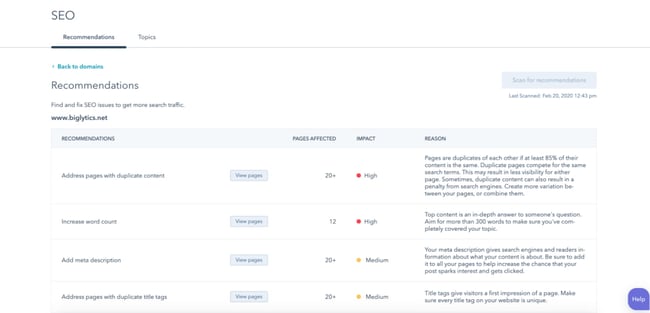
website builder features: seo recommendations inside cms hub

According to BrightEdge, 53% of traffic comes from organic search. If you want to bring in more traffic and views, your website needs to be search engine-optimized.

Most website builders help with technical SEO by offering free SSL certificates and supporting schema markup and XML sitemaps. They also support on-page SEO by allowing you to enter and modify URLs, meta tags, and image alt attributes.

11. Customer Support

While using website builder tools, you’ll likely run into a problem you can’t troubleshoot. That’s where customer support comes in.

Customer support assists you with anything you need help with — technical, sales, billing, payments, or experiences. Depending on the website builder, assistance can come in any (or a mix) of the following channels:

  • FAQs.
  • Chatbot support.
  • Live support.
  • A knowledge base.
  • Video tutorials.

The best website builders keep a mix of channels and answer inquiries promptly.

12. Ecommerce Capabilities

Are you planning on selling physical or digital products in the future? Consider choosing a website builder with ecommerce capabilities.

There are dedicated ecommerce website builders, but these are often paid solutions with robust functionality such as apps for payment and shipping.

Free website builders often integrate with a third-party ecommerce application or support a simple built-in store.

13. Third-party Integrations

There’s nothing worse than realizing your existing tech stack doesn’t work with the website builder you chose. Thus, it’s crucial to consider whether a website builder allows third-party integrations.

Your website builder should integrate with external tools, such as email marketing, ecommerce, and social software.

14. Analytics and Reporting

Your website builder should also have an analytics and reporting function to measure important metrics like the site’s popular pages, bounce rate, average duration per visit, and more.

Alternatively, you can track your website metrics in an analytics and reporting tool. When you bring your web analytics together with other key funnel metrics like trials or activation rate onto a dashboard, you give everyone on your team the ability to explore your data and uncover insights.

Picking Your Website Builder

There you have it! Since most of these website builders are free, try out a couple if you’re unsure of the best fit. In particular, take note of what you really want to get out of your site to ensure your needs will be met by one of these builders.

Editor’s Note: This post was originally published in November 2018 but has been updated for comprehensiveness.
cms


Categories B2B

20 Great Landing Page Examples You’ll Want to Copy in 2023

While many landing pages look different and use a variety of exciting strategies to pull in audiences, they all serve one major purpose — to convert to the next stage in the buyer’s journey.

Free Guide: How to Build & Optimize Landing Pages

Rather than serving as a basic advertisement that shows a customer a product, a landing page aims to engage and delight a customer by offering them something that relates to the product or the company’s industry. When they fill out the form and receive a reward of interesting content, they might be even more likely to trust your brand and become a customer.

Quick tip: Want an easy way to add a form to your landing page? HubSpot’s free form builder tool can help you fill your CRM with leads from your website.

Let’s talk through an example of when a landing page can be especially effective. If a business wants to sell an AI product that helps salespeople, they might create a landing page that offers audiences a free video on how to use AI in the sales industry. Interested audiences might offer their contact information in exchange for the valuable information. If they enjoy the video they’ve received, they might be more likely to respond to or purchase a product from a company rep who calls them.

Another quick tip: How about an AI product that helps with landing pages? HubSpot’s Campaign Assistant turns your key value props into effective landing page copy in just a few clicks. 

In another scenario, a publishing company that targets an audience of chief executives might create a landing page that invites audiences to sign up for a webinar hosted by an executive at a major company.

After giving their email address on the signup form presented on the landing page, the leads get an email with the webinar dates and log in information, as well as instructions on how to sign up for the publication’s newsletter or subscription. If the user is pleased by the webinar, they might sign up for the newsletter or a subscription to keep up with similar publication content.

Although their purpose is simple enough in theory, actually designing a successful landing page requires some detailed planning and creative testing.

Even after launching your landing page, you’ll want to pay attention to conversion rates to see how well it’s doing.


To determine your conversion rate, simply divide the number of conversions a web page generates by the number of people who visited that page.

If your conversion rate isn’t close to the average just yet, don’t worry. Nailing those percentages can be a bit challenging at first, especially if you have a lot of regular page visitors. Luckily, there are a number of simple conversion rate optimization strategies that can help you boost your current rate quickly.

Regardless of what your business is selling or the conversion action you hope to instigate, it’s helpful to get inspired by seeing what other great landing pages look like.

And because there’s no one “right” way of designing a landing page, you’ll want to check out examples from lots of different industries for different stages of the buying process.

Want to get inspired? Check out the great landing page examples below.

We don’t have access to the analytics for each of these landing pages, so I can’t tell you specifically how well they convert visitors, contacts, leads, and customers. But many of them do follow best practices while also implementing a few new experiments that could give you ideas for your own landing pages.

Great Examples of Landing Page Design

1. AirBnB

This AirBnB landing page is a one-stop shop for visitors curious about hosting. It features testimonials from current hosts, articles offering advice, and even a calculator to estimate your weekly average earnings based on your location.

If all this info convinces you to start hosting, the vibrant pink CTA in the header makes it easy to convert on the spot.

fantastic landing page examples: airbnb

How to Implement This Yourself:

AirBnB’s design style is clean and platform agnostic, which makes for a pleasant site for users on iOS and Android. Follow conventions on important elements like navigation, system iconography, contextual actions, and interactions for a similar experience.

2. Wix

Wix has turned its landing page into a creative playground with a stunning and captivating digital illustration that follows you down the page. It’s not overwhelming or distracting — it’s carefully balanced with white space and clear text.

We love the use of design to emphasize certain touchpoints on the page. For instance, the mountain’s peak in the illustration points to the main CTA encouraging visitors to get started.

fantastic landing page examples: wix

How to Implement This Yourself:

Explore your brand’s color palette and story. Make it reflect your mission and identity in an eye-catching way that differentiates yours from competitors. And if you need guide, create a custom color palette for your brand here.

3. ExpressVPN

What do we love most about this landing page? It’s not what it has, but what it doesn’t — a navigation bar! By removing the navigation bar, ExpressVPN shines a spotlight on the primary CTA.

Why do we take an anti-navigation stance for landing pages? They tend to distract visitors and lead them away from the intended action. Not only is this a landing page design best practice, but we’ve also conducted A/B tests that show removing navigation links from landing pages increases conversion rates.

fantastic landing page examples: expressvpn

How to Implement This Yourself:

The choice to use a serif typeface speaks to ExpressVPN’s established trust and authority. Differentiate your brand from the current trend of straight lines and rigid, sharp edges and try to find fluidity and warmth in your style.

4. Row House

Besides its sleek design, this landing page gets bonus points for the autoplay video in the background, which adds a degree of movement to an otherwise static page. Speaking of movement, the video shows people working out at Row House, which offers a great introduction to the brand.

If it suits your brand, try enticing visitors with a video component. It could be the difference between passive and active engagement.

fantastic landing page examples: row house

How to Implement This Yourself:

Row House focused it’s website design to be minimal and get people straight to sign up. When you design your own landing page, ditch a fussy design and focus on how you can turn prospects to customers quicker.

5. Codeacademy

I like this page because it’s simple in both copy and design. The form on the page is simple and only requires an email address and password. Or, you can use your LinkedIn, Facebook, GitHub, or Google Plus login, shortening the conversion path even further.

The landing page also offers real-life success stories, testimonials, and other forms of social proof for visitors who need more information before creating an account. This helps make the potentially intimidating world of coding more approachable for beginners.

fantastic landing page examples: codeacademy

How to Implement This Yourself:

Lead your landing page design centered on value. Let your webpage be more of a blank canvas to showcase your satisfied customers.

6. Sunbasket

Sunbasket takes a competitive approach to its landing page, directly comparing its meal delivery service to its main competitor, Blue Apron. As you scroll down the page, a table highlights where Sunbasket’s features exceed those of Blue Apron.

By comparing your products or services to another, you can highlight why yours is the clear winner. It’s a smart way to provide “evidence” to potential customers as to why they should choose you.

fantastic landing page examples: sunbasket

How to Implement This Yourself:

Don’t be afraid to show your cards in your landing page. If your product or service has more benefits than a competitor, call it out. Just make sure not to make false claims or talk down on other’s in the market.

7. Curology

I’d argue that the top fold is the most important element of a landing page, alongside the CTA. Curology’s top fold is clean, visually appealing, and to-the-point — and the copy is less than 50 characters long. Users immediately understand the offer and how it can benefit them.

Even if the brand is new to you, its message is loud and clear — regardless of your skin issues, Curology has a custom solution for you.

fantastic landing page examples: curology

How to Implement This Yourself:

Make your landing page reflect how your customer will feel when they use your product. An open and clear visual of a room with plants and clean tile gives a pleasant impression that your audience may be looking for.

8. Breather

Here’s another example of clever, delightful design on a landing page. As soon as you visit Breather.com, there’s an instant call to action: indicate where you want to find a space. Plus, it uses location services to figure out where you are, providing instant options nearby.

We love how Breather used simple, to-the-point copy to let the visitor know what the company does, followed immediately by the CTA to select a city. The negative space and soothing color scheme also align with the product –– essentially, room to breathe.

fantastic landing page examples: breather

How to Implement This Yourself:

You want to make customer signups as easy as possible. Place your CTA as a focal point and design your landing page in a way that guides users to click them.

9. Mailchimp

For starters, check out that sunny yellow background color — it’s impossible to ignore. It’s a bold departure from its more subdued home page, yet still on brand.

Besides the color, this landing page gets a shoutout for its CTA placement. It displays a consistent CTA (“Sign Up”) not once or twice, but three times on the page. No matter how far down you scroll, you will see the same button.

This is a solid strategy since the CTA operates as a gateway for converting clients. It should be available to visitors as they move down the page — not just once on the top fold.

fantastic landing page examples: mailchimp

How to Implement This Yourself:

Soft colors are modern norm, but that doesn’t mean your brand has to fall in line. Go against the grain like Mailchimp and make a bold landing page background with cool tone CTAs to compliment.

10. Paramount Plus

This landing page design has it all. It’s visually appealing, interactive, and offers scannable yet descriptive headers – such as Peak Streaming, Peak Originals, and Peak Family Team. Plus, the background makes each fold look slightly different, creating a captivating scrolling experience.

The landing page also features a repeatable CTA (“Try It Free”) and several strategically-placed content offers, culminating in multiple touchpoints for visitors to convert.

fantastic landing page examples: paramount+

How to Implement This Yourself:

Don’t be afraid to place more than one CTA on your landing page. Space them out appropriately and even experiment with the wording to see which get the most clicks.

11. CarMax

CarMax is ready to empower visitors to do their own research right on the landing page. It features a search bar that leads to a large database of cars and a calculator that allows visitors to estimate their ideal monthly budget.

For those looking to sell their car, it also includes a form that users can fill out to receive a quote.

It’s clear CarMax wants the buying or selling experience to be as painless as possible. By translating the company’s customer-centric approach on its landing page, CarMax effectively turns a universally dreaded event — purchasing a new car — into a straightforward process without gimmicks or barriers.

great landing page examples: carmax

How to Implement This Yourself:

Sometimes you don’t need to do a lot of convincing on your landing page. Instead of relying on text heavy monologue or testimonials, present customers with a means to get the information they want first, and then get into the details as they explore your site.

12. Edupath

Who is your landing page’s target audience? While most of Edupath’s website content is directed toward students, there are sections dedicated to advising parents on helping their teenagers through college applications and SAT preparation. The landing page below is in one of these sections.

When parents fill out their teenager’s name, email address, and mobile number, a link to download the Edupath app is sent directly to them. The folks at Edupath know students are likely to do something if their parents ask them to — especially if it means they don’t have to surrender their phones.

Plus, it’s an easy, one-click process. This whole conversion path is a clever and helpful way to get the apps on more students’ phones by way of their parents.

great landing page examples: edupath

How to Implement This Yourself:

Optimize and simplify your conversion path for your target audience. In Edupath’s case, parents have enough on their plates, so by making the landing page an easy step by step signup process. It leaves a great first impression — and even peace of mind.

13. Startup Institute

Visitors to your website won’t hand over their personal information without knowing what they’re going to get in return. On its landing page, Startup Institute makes abundantly clear what will happen after you apply by listing a Q&A right beside the form. It might prompt some people to say, “They read my mind!”

To avoid hesitancy to fill out a form, use your landing page to set expectations upfront. That clears the air, and can also weed out the people who don’t take your content, product or service seriously.

great landing page examples: uber

How to Implement This Yourself:

Make your value known from the first page visit. If the product or service offering can be explained in a way that demonstrates value — instead of just listing features — then you’ll have a better chance of converting.

Simple Landing Pages

14. Uber

People are flooded with information online. This is why creating a skim-able landing page is essential — like this one from Uber.

It features a black and white color scheme, short and easily-digestible sentences, and a simple form. The combination of these elements results in a professional and approachable page.

How to Implement This Yourself:

If your product or service doesn’t target a specific or niche market, but instead a broad range of people, you should focus your web design on conveying a clear message over complicated design styles. Anyone can use Uber, don’t drive any customers away.

15. Spotify

This landing page takes a dramatic detour from Spotify’s classic green and black colors — and perhaps that’s the point. It could be a way to signal to visitors that the page serves a different purpose from its other content.

Even though the landing page is relatively simple, the stark color contrast emphasizes the text and CTAs. To entice visitors even more, it lists the most played artist, song, album, and podcast of the year —all of which are available on Spotify. It’s a creative way to promote its content library while attracting visitors to sign up.

great landing page examples: spotify

How to Implement This Yourself:

Incorporate some original graphic design elements to your landing page to add to the visuals on your landing page. We’ve already discussed how important it is to display clear CTAs, but a visual indicator of what the product or service is like can further push prospects to convert.

16. Canva

Sometimes you need to admire a landing page for its attractive and straightforward design. Similar to the example above, this one features an abundance of white space that accentuates the text and balances the bright colors throughout.

To seal it off, the page ends with a FAQ section. If you suspect visitors will have additional questions about your products or services, you may want to include a similar section too. It lets potential customers better understand what you’re trying to sell them, and sends a message that you’re open to questions.

great landing page examples: canva

How to Implement This Yourself:

Canva incorporates its product as a part of its landing page design, and so can you. If you want people to see the product range or capabilities of your service, show them upfront.

Product Landing Pages

17. Mooala

Playful isn’t usually the first word that comes to mind when you think of dairy-free milk, but Mooala’s bright and colorful landing page is exactly that.

This example illustrates how you can embrace simplicity while using relatively bold striking colors — like neon green — to highlight important headers and CTAs. To pull this off, stick with colors that correspond with your brand while also capturing the attention of visitors.

great landing page examples: mooala

How to Implement This Yourself:

Mooala uses a distinct color story to off its product range, and it’s done with earth tones intentionally. There’s an added layer of trustability when your product/site design looks trustworthy, and for an organic product line, earthy tones add to that motif.

18. Nauto

When writing website copy for a product or service, a helpful rule of thumb is to expand on the benefits rather than the features. Such advice also applies to writing landing pages.

For example, instead of bombarding visitors with technical information, Nauto, a fleet safety platform, chooses to highlight its benefits with clear and engaging copy (“Your roadmap for fleet safety”). In doing so, Nauto makes its content offer more appealing.

great landing page examples: nauto

How to Implement This Yourself:

Focus your landing page on what your product or service can do for the people that come across it. They need to know how it will improve their lives or processes, not the specs or minute details.

19. Rover

Putting your pets in the care of another person can be nerve-wracking. Which is why Rover, an on-demand pet care service, leans on social proof to build trust with visitors. The landing page includes testimonials from real clients and copy about its “Rover Guarantee” and 24/7 support. Of course, the cute pictures of animals help too.

great landing page examples: rover

How to Implement This Yourself:

Rover knows what its customer base is visiting its website for, and that’s to easily book pet services. When you think about what your customer base is trying to accomplish, meet them with a solution as soon as they get to your landing page.

20. Gong.io

There are many intelligence platforms on the market, and Gong knows that. So how did it make its landing page stand out? By leading with a rotating wheel of value and statistics to back it up.

Gong is a revenue intelligence platform, and when you go into the site, you may be curious to know what all that means — you may want to see conversion analytics, sales training capabilities, or more depending on your business. Gong solves that need on its landing page by displaying messages such as ,“Turn customer interactions into strategic insights”, “Turn customer interactions into team insights”, “Turn customer interactions into strategic insights”. 

And to make it even more convincing, Gong adds a row of rotating statistics with each message. Customers want to know what they’re reading is true, and stats give even more credibility to an already great offering.

great landing page examples: gong

How to Implement This Yourself:

Try out an interactive landing page. Look at different themes or code that can move automatically or with the viewer as they scroll your site to reveal more interesting and positive information about your product or service.

Ready to build your landing page?

Whether you’re using a landing page template or building one from scratch, it’s essential to keep these best practices top of mind. And remember to test your landing pages to improve their effectiveness.

Editor’s note: This article was originally published in January 2022 and has been updated for comprehensiveness.
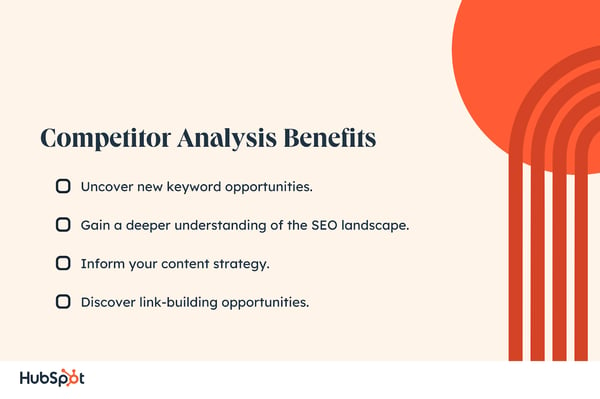
New Call-to-action

Categories B2B

What is a Marketing Plan & How to Write One [+Examples]

For a while now, you‘ve been spearheading your organization’s content marketing efforts. Your team’s performance has convinced management to adopt the content marketing strategies you’ve suggested.

Now, your boss wants you to write and present a content marketing plan, but you‘ve never done something like that before. You don’t even know where to start.

Download Now: Free Marketing Plan Template [Get Your Copy]

Fortunately, we‘ve curated the best content marketing plans to help you write a concrete plan that’s rooted in data and produces results. But first, we’ll discuss what a marketing plan is and how some of the best marketing plans include strategies that serve their respective businesses.

The purpose of a marketing plan is to write down strategies in an organized manner. This will help keep you on track and measure the success of your campaigns.

Writing a marketing plan will help you think of each campaign‘s mission, buyer personas, budget, tactics, and deliverables. With all this information in one place, you’ll have an easier time staying on track with a campaign. You’ll also discover what works and what doesn’t. Thus, measuring the success of your strategy.

Featured Resource: Free Marketing Plan Template

HubSpot Mktg plan cover

Looking to develop a marketing plan for your business? Click here to download HubSpot’s free Marketing Plan Template to get started.

To learn more about how to create your marketing plan, keep reading or jump to the section you’re looking for:

Marketing plan definition graphic

If you’re pressed for time or resources, you might not be thinking about a marketing plan. But a marketing plan is an important part of your business plan.

Marketing Plan vs. Business Plan

A marketing plan is a strategic document that outlines marketing objectives, strategies, and tactics.

A business plan is also a strategic document. But this plan covers all aspects of a company’s operations, including finance, operations, and more. It can also help your business decide how to distribute resources and make decisions as your business grows.

A marketing plan is an important subset of a business plan that shows how marketing strategies and objectives can support overall business goals.

Keep in mind that there’s a difference between a marketing plan and a marketing strategy.

Marketing Strategy vs. Marketing Plan

A marketing strategy describes how a business will accomplish a particular goal or mission. This includes which campaigns, content, channels, and marketing software they’ll use to execute that mission and track its success.

For example, while a greater plan or department might handle social media marketing, you might consider your work on Facebook as an individual marketing strategy.

A marketing plan contains one or more marketing strategies. It’s the framework from which all of your marketing strategies are created and helps you connect each strategy back to a larger marketing operation and business goal.

For example, your company is launching a new software product, and it wants customers to sign up. This calls for the marketing department to develop a marketing plan that’ll help introduce this product to the industry and drive the desired signups.

The department decides to launch a blog dedicated to this industry, a new YouTube video series to establish expertise, and an account on Twitter to join the conversation around this subject. All this serves to attract an audience and convert this audience into software users.

To summarize, the business’s marketing plan is dedicated to introducing a new software product to the marketplace and driving signups for that product. The business will execute that plan with three marketing strategies: a new industry blog, a YouTube video series, and a Twitter account.

Of course, the business might consider these three things one giant marketing strategy, each with its specific content strategies. How granular you want your marketing plan to get is up to you. Nonetheless, every marketing plan goes through a particular set of steps in its creation.

Learn what they are below.

1. State your business’s mission.

Your first step in writing a marketing plan is to state your mission. Although this mission is specific to your marketing department, it should serve your business‘s main mission statement. Be specific, but not too specific. You have plenty of space left in this marketing plan to elaborate on how you’ll acquire new customers and accomplish this mission.

For example, if your business’s mission is “to make booking travel a delightful experience,” your marketing mission might be “to attract an audience of travelers, educate them on the tourism industry, and convert them into users of our bookings platform.”mission-statement-examples

Need help building your mission statement? Download this guide for examples and templates and write the ideal mission statement.

2. Determine the KPIs for this mission.

Every good marketing plan describes how the department will track its mission‘s progress. To do so, you’ll need to decide on your key performance indicators (KPIs). KPIs are individual metrics that measure the various elements of a marketing campaign. These units help you establish short-term goals within your mission and communicate your progress to business leaders.

Let’s take our example of a marketing mission from the above step. If part of our mission is “to attract an audience of travelers,” we might track website visits using organic page views. In this case, “organic page views” is one KPI, and we can see our number of page views grow over time.

These KPIs will come into the conversation again in step 4.

3. Identify your buyer personas.

A buyer persona is a description of who you want to attract. This can include age, sex, location, family size, and job title. Each buyer persona should directly reflect your business’s current and potential customers. So, all business leaders must agree on your buyer personas.

buyer-persona-templates

Create your buyer personas with this free guide and set of buyer persona templates.

4. Describe your content initiatives and strategies.

Here‘s where you’ll include the main points of your marketing and content strategy. Because there is a laundry list of content types and channels available to you today, you must choose wisely and explain how you’ll use your content and channels in this section of your marketing plan.

A content strategy should stipulate:

  • Which types of content you’ll create. These can include blog posts, YouTube videos, infographics, and ebooks.
  • How much of it you’ll create. You can describe content volume in daily, weekly, monthly, or even quarterly intervals. It all depends on your workflow and the short-term goals you set for your content.
  • The goals (and KPIs) you’ll use to track each type. KPIs can include organic traffic, social media traffic, email traffic, and referral traffic. Your goals should also include which pages you want to drive that traffic to, such as product pages, blog pages, or landing pages.
  • The channels on which you’ll distribute this content. Popular channels at your disposal include Facebook, Twitter, LinkedIn, YouTube, Pinterest, and Instagram.
  • Any paid advertising that will take place on these channels.

5. Clearly define your plan’s omissions.

A marketing plan explains the marketing team’s focus. It also explains what the marketing team will not focus on.

If there are other aspects of your business that you aren‘t serving in this particular plan, include them in this section. These omissions help to justify your mission, buyer personas, KPIs, and content. You can’t please everyone in a single marketing campaign, and if your team isn’t on the hook for something, you need to make it known.

6. Define your marketing budget.

Your content strategy might use many free channels and platforms, but there are several hidden expenses a marketing team needs to account for.

Whether it’s freelance fees, sponsorships, or a new full-time marketing hire, use these costs to develop a marketing budget and outline each expense in this section of your marketing plan.

marketing-budget-templates

You can establish your marketing budget with this kit of 8 free marketing budget templates.

7. Identify your competition.

Part of marketing is knowing whom you’re marketing against. Research the key players in your industry and consider profiling each one.

Keep in mind not every competitor will pose the same challenges to your business. For example, while one competitor might be ranking highly on search engines for keywords you want your website to rank for, another competitor might have a heavy footprint on a social network where you plan to launch an account.

competitive-analysis-templates

Easily track and analyze your competitors with this collection of ten free competitive analysis templates.

8. Outline your plan’s contributors and their responsibilities.

With your marketing plan fully fleshed out, it‘s time to explain who’s doing what. You don‘t have to delve too deeply into your employees’ day-to-day projects, but it should be known which teams and team leaders are in charge of specific content types, channels, KPIs, and more.

Now that you know why you need to build an effective marketing plan, it’s time to get to work. Starting a plan from scratch can be overwhelming if you haven’t done it before. That’s why there are many helpful resources that can support your first steps. We’ll share some of the best guides and templates that can help you build effective results-driven plans for your marketing strategies.

Ready to make your own marketing plan? Get started using this free template.

Types of Marketing Plans

Depending on the company you work with, you might want to create various marketing plans. We compiled different samples to suit your needs:

1. Quarterly or Annual Marketing Plans

These plans highlight the strategies or campaigns you’ll take on in a certain period.

marketing plan examples: forbes

Forbes published a marketing plan template that has amassed almost 4 million views. To help you sculpt a marketing roadmap with true vision, their template will teach you how to fill out the 15 key sections of a marketing plan, which are:

  • Executive Summary
  • Target Customers
  • Unique Selling Proposition
  • Pricing & Positioning Strategy
  • Distribution Plan
  • Your Offers
  • Marketing Materials
  • Promotions Strategy
  • Online Marketing Strategy
  • Conversion Strategy
  • Joint Ventures & Partnerships
  • Referral Strategy
  • Strategy for Increasing Transaction Prices
  • Retention Strategy
  • Financial Projections

If you’re truly lost on where to start with a marketing plan, this guide can help you define your target audience, figure out how to reach them, and ensure that audience becomes loyal customers.

Download Now: Free Marketing Plan Template [Get Your Copy]

2. Social Media Marketing Plan

This type of plan highlights the channels, tactics, and campaigns you intend to accomplish specifically on social media. A specific subtype is a paid marketing plan, which highlights paid strategies, such as native advertising, PPC, or paid social media promotions.

Shane Snow’s Marketing Plan for His Book Dream Team is a great example of a social media marketing plan

A successful book launch is a prime example of data-driven content and social marketing. Using data to optimize your social strategy spreads more awareness for your book, gets more people to subscribe to your content, converts more subscribers into buyers, and encourages more buyers to recommend your book to their friends.

→ Free Download: Social Media Calendar Template [Access Now]

When Shane Snow started promoting his new book, “Dream Team,” he knew he had to leverage a data-driven content strategy framework. So, he chose his favorite one: the content strategy waterfall. The content strategy waterfall is defined by Economic Times as a model used to create a system with a linear and sequential approach. To get a better idea of what this means, take a look at the diagram below:

Contently's content strategy waterfall.

Snow wrote a blog post about how the waterfall‘s content strategy helped him launch his new book successfully. After reading it, you can use his tactics to inform your own marketing plan. More specifically, you’ll learn how he:

  • Applied his business objectives to decide which marketing metrics to track.
  • Used his ultimate business goal of earning $200,000 in sales or 10,000 purchases to estimate the conversion rate of each stage of his funnel.
  • Created buyer personas to figure out which channels his audience would prefer to consume his content.
  • Used his average post view on each of his marketing channels to estimate how much content he had to create and how often he had to post on social media.
  • Calculated how much earned and paid media could cut down the amount of content he had to create and post.
  • Designed his process and workflow, built his team, and assigned members to tasks.
  • Analyzed content performance metrics to refine his overall content strategy.

You can use Snow’s marketing plan to cultivate a better content strategy plan, know your audience better, and think creatively about content promotion and distribution.

3. Content Marketing Plan

This plan could highlight different strategies, tactics, and campaigns in which you’ll use content to promote your business or product.

HubSpot’s Comprehensive Guide for Content Marketing Strategy is a strong example of a content marketing plan:

marketing plan examples: hubspot content marketing plan

At HubSpot, we‘ve built our marketing team from two business school graduates working from a coffee table to a powerhouse of hundreds of employees. Along the way, we’ve learned countless lessons that shaped our current content marketing strategy. So, we decided to illustrate our insights in a blog post to teach marketers how to develop a successful content marketing strategy, regardless of their team’s size.

Download Now: Free Content Marketing Planning Templates

In this comprehensive guide for modern marketers, you’ll learn:

  • What exactly content marketing is.
  • Why your business needs a content marketing strategy.
  • Who should lead your content marketing efforts?
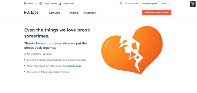
  • How to structure your content marketing team based on your company’s size.
  • How to hire the right people for each role on your team.
  • What marketing tools and technology you’ll need to succeed.
  • What type of content your team should create, and which employees should be responsible for creating them.
  • The importance of distributing your content through search engines, social media, email, and paid ads.
  • And finally, the recommended metrics each of your teams should measure and report to optimize your content marketing program.

4. New Product Launch Marketing Plan

This will be a roadmap for the strategies and tactics you‘ll implement to promote a new product. And if you’re searching for an example, look no further than Chief Outsiders’ Go-To-Market Plan for a New Product:

marketing plan examples: chief outsiders

When you’re looking for a marketing plan for a new product, the Chief Outsiders template is a great place to start. Marketing plans for a new product will be more specific because they target one product versus its entire marketing strategy.

→ Download Now: Free Product Marketing Kit [Free Templates]

After reading this plan, you’ll learn how to:

  • Validate a product
  • Write strategic objectives
  • Identify your market
  • Compile a competitive landscape
  • Create a value proposition for a new product
  • Consider sales and service in your marketing plan

5. Growth Marketing Plan

Growth marketing plans use experimentation and data to drive results, like we see in Venture Harbour’s Growth Marketing Plan Template:

marketing plan examples: venture harbour

Venture Harbour’s growth marketing plan is a data-driven and experiment-led alternative to the more traditional marketing plan. Their template has five steps intended for refinement with every test-measure-learn cycle. The five steps are:

  • Goal
  • Projection
  • Experiments
  • Roadmap
  • Insights

Download Now: Free Growth Strategy Template

This is a great option if you want to experiment with different platforms and campaigns.

1. Visit Oxnardmarketing plan examples: visit oxnard

This marketing plan by Visit Oxnard, a convention and visitors bureau, is packed with all the information one needs in a marketing plan: target markets, key performance indicators, selling points, personas, marketing tactics by channel, and much more.

It also articulates the organization’s strategic plans for the upcoming fiscal year, especially as it grapples with the aftereffects of the pandemic. Lastly, it has impeccable visual appeal, with color-coded sections and strong branding elements.

Why This Marketing Plan Works

  • States clear and actionable goals for the coming year
  • Includes data and other research that shows how their team made their decisions
  • Outlines how the team will measure the success of their plan

2. Safe Haven Family Shelter

marketing plan examples: safe haven family shelter

This marketing plan by a nonprofit organization is an excellent example to follow if your plan will be presented to internal stakeholders at all levels of your organization. It includes SMART marketing goals, deadlines, action steps, long-term objectives, target audiences, core marketing messages, and metrics.

The plan is detailed, yet scannable. By the end of it, one can walk away with a strong understanding of the organization’s strategic direction for its upcoming marketing efforts.

Why This Marketing Plan Works

  • Confirms ongoing marketing strategies and objectives while introducing new initiatives
  • Uses colors, fonts, and formatting to emphasize key parts of the plan
  • Closes with long-term goals, key themes, and other overarching topics to set the stage for the future

3. Wright County Economic Development

marketing plan examples: wright county

Wright County Economic Development’s plan drew our attention because of its simplicity, making it good inspiration for those who’d like to outline their plan in broad strokes without frills or filler.

It includes key information such as marketing partners, goals, initiatives, and costs. The sections are easy to scan and contain plenty of information for those who’d like to dig into the details. Most important, it includes a detailed breakdown of projected costs per marketing initiative — which is critical information to include for upper-level managers and other stakeholders.

Why This Marketing Plan Works

  • Begins with a quick paragraph stating why the recommended changes are important
  • Uses clear graphics and bullet points to emphasize key points
  • Includes specific budget data to support decision-making

4. The Cultural Council of Palm Beach County

marketing plan examples: cultural council of palm beach county

This marketing plan presentation by a cultural council is a great example of how to effectively use data in your plan, address audiences who are new to the industry, and offer extensive detail into specific marketing strategies.

For instance, an entire slide is dedicated to the county’s cultural tourism trends, and at the beginning of the presentation, the organization explains what an arts and culture agency is in the first place.

That’s a critical piece of information to include for those who might not know. If you’re addressing audiences outside your industry, consider defining terms at the beginning, like this organization did.

Why This Marketing Plan Works

  • Uses quality design and images to support the goals and priorities in the text
  • Separate pages for each big idea or new strategy
  • Includes sections for awards and accomplishments to show how the marketing plan supports wider business goals
  • Defines strategies and tactics for each channel for easy skimming

5. Cabarrus County Convention & Visitors Bureau

marketing plan examples: carrabus county

Cabarrus County’s convention and visitors bureau takes a slightly different approach with its marketing plan, formatting it like a magazine for stakeholders to flip through. It offers information on the county’s target audience, channels, goals, KPIs, and public relations strategies and initiatives.

We especially love that the plan includes contact information for the bureau’s staff members, so that it’s easy for stakeholders to contact the appropriate person for a specific query.

Why This Marketing Plan Works

  • Uses infographics to expand on specific concepts, like how visitors benefit a community
  • Highlights the team members responsible for each initiative with a photo to emphasize accountability and community
  • Closes with an event calendar for transparency into key dates for events

6. Visit Billings

marketing plan examples: visit billings

Visit Billing’s comprehensive marketing plan is like Cabarrus County’s in that it follows a magazine format. With sections for each planned strategy, it offers a wealth of information and depth for internal stakeholders and potential investors.

We especially love its content strategy section, where it details the organization’s prior efforts and current objectives for each content platform.

At the end, it includes strategic goals and budgets — a good move to imitate if your primary audience would not need this information highlighted at the forefront.

Why This Marketing Plan Works

  • Includes a section on the buyer journey, which offers clarity on the reasoning for marketing plan decisions
  • Design includes call-outs for special topics that could impact the marketing audience, such as safety concerns or “staycations”
  • Clear headings make it easy to scan this comprehensive report and make note of sections a reader may want to return to for more detail

Marketing Plan FAQs

What is a typical marketing plan?

Most marketing plans are documents that outline the following aspects of a business’s marketing:

  • Strategies
  • Objectives
  • Target audience
  • Tactics

Each marketing plan should include one or more goals, the path your team will take to meet those goals, and how you plan to measure success.

For example, say a tech startup is launching a new mobile app. Its marketing plan would usually include:

Featured resource: Free Marketing Plan Template

What should a good marketing plan include?

A good marketing plan will create a clear roadmap for your unique marketing team. This means that the best marketing plan for your business will be distinct to your team and business needs.

That said, most marketing plans will include sections for one or more of the following:

  • Clear analysis of the target market
  • A detailed description of the product or service
  • Competitive analysis
  • Strategic marketing mix details (such as product, price, place, promotion)
  • Measurable goals with defined timelines

This can help you build the best marketing plan for your business.

A good marketing plan should also include a product or service’s unique value proposition, a comprehensive marketing strategy including online and offline channels, and a defined budget.

Featured resource: Value Proposition Templates

What are the most important parts of a marketing plan?

When you‘re planning a road trip, you need a map to help define your route, step-by-step directions, and an estimate of the time it will take to get to your destination. It’s literally how you get there that matters.

Like a road map, a marketing plan is only useful if it helps you get to where you want to go. So, no one part is more than the other.

That said, you can use the list below to make sure that you’ve added or at least considered each of the following in your marketing plan:

  • Marketing goals
  • Executive summary
  • Target market analysis
  • Competitive analysis
  • Marketing strategies
  • Tactics
  • Budget
  • Metrics

What questions should I ask when making a marketing plan?

Questions are a useful tool for when you‘re stuck or want to make sure you’ve included important details.

Try using one or more of these questions as a starting point when you create your marketing plan:

  • Who is my target audience?
  • What are their needs, motivations, and pain points?
  • How does our product or service solve their problems?
  • How will I reach and engage them?
  • Who are my competitors? Are they direct or indirect competitors?
  • What are the unique selling points of my product or service?
  • What marketing channels are best for the brand?
  • What is our budget and timeline?
  • How will I measure the success of marketing efforts?

How much does a marketing plan cost?

Creating a marketing plan is mostly free. But the cost of executing a marketing plan will depend on your specific plan.

Marketing plan costs vary by business, industry, and plan scope. Whether your team handles marketing in-house or hires external consultants can also make a difference. Total costs can range from a few thousand dollars to tens of thousands. This is why most marketing plans will include a budget.

Featured resource: Free Marketing Budget Templates

What is a marketing plan template?

A marketing plan template is a pre-designed structure or framework that helps you outline your marketing plan.

It offers a starting point that you can customize for your specific business needs and goals. For example, our template includes easy-to-edit sections for:

  • Business summary
  • Business initiatives
  • Target market
  • Market strategy
  • Budget
  • Marketing channels
  • Marketing technology

Sample Marketing Plan

Let’s create a sample plan together, step by step.

Follow along with HubSpot’s free Marketing Plan Template.

HubSpot Mktg plan cover

1. Create an overview or primary objective.

Our business mission is to provide [service, product, solution] to help [audience] reach their [financial, educational, business related] goals without compromising their [your audience’s valuable asset: free time, mental health, budget, etc.]. We want to improve our social media presence while nurturing our relationships with collaborators and clients.

2. Determine the KPIs for this mission.

For example, if you wanted to focus on social media growth, your KPIs might look like this.

We want to achieve a minimum of [followers] with an engagement rate of [X] on [social media platform].

The goal is to achieve an increase of [Y] on recurring clients and new meaningful connections outside the platform by the end of the year.

3. Identify your buyer personas.

Use the following categories to create a target audience for your campaign.

  • Age:
  • Gender:
  • Profession:
  • Background:
  • Interests:
  • Values:
  • Goals:
  • Pain points:
  • Social media platforms that they use:
  • Streaming platforms that they prefer:

For more useful strategies, consider creating a buyer persona in our Make My Persona tool.

4. Describe your content initiatives and strategies.

Our content pillars will be: [X, Y, Z].

Content pillars should be based on topics your audience needs to know. If your ideal clients are female entrepreneurs, then your content pillars can be: marketing, being a woman in business, remote working, and productivity hacks for entrepreneurs.

Then, determine your omissions.

This marketing plan won’t be focusing on the following areas of improvement: [A, B, C].

5. Define your marketing budget.

Our marketing strategy will use a total of [Y] monthly. This will include anything from freelance collaborations to advertising.

6. Identify your competitors.

Use the following questions to clearly indicate who your competitors are:

  • Which platforms do they use the most?
  • How does their branding differentiate?
  • How do they talk to their audiences?
  • What valuable assets do customers talk about? And if they are receiving any negative feedback, what is it about?

7. Outline your plan’s contributors and their responsibilities.

Create responsible parties for each portion of the plan.

Marketing will manage the content plan, implementation, and community interaction to reach the KPIs.

  • Social media manager: [hours per week dedicated to the project, responsibilities, team communication requirements, expectations]
  • Content strategist: [hours per week dedicated to the project, responsibilities, team communication requirements, expectations]
  • Community manager: [hours per week dedicated to the project, responsibilities, team communication requirements, expectations]

Sales will follow the line of the marketing work while creating and implementing an outreach strategy.

  • Sales strategists: [hours per week dedicated to the project, responsibilities, team communication requirements, expectations]
  • Sales executives: [hours per week dedicated to the project, responsibilities, team communication requirements, expectations]

Customer Service will nurture clients’ relationships to ensure that they have what they want. [Hours per week dedicated to the project, responsibilities, team communication requirements, expectations].

Project Managers will track the progress and team communication during the project. [Hours per week dedicated to the project, responsibilities, team communication requirements, expectations].

Get started on your marketing plan.

These marketing plans serve as initial resources to get your content marketing plan started. But, to truly deliver what your audience wants and needs, you’ll likely need to test some different ideas out, measure their success, and then refine your goals as you go.

Editor’s Note: This post was originally published in April 2019, but was updated for comprehensiveness. This article was written by a human, but our team uses AI in our editorial process. Check out our full disclosure to learn more about how we use AI.

New Call-to-action

Categories B2B

What Do Marketers Need To Make The Most Of B2B Intent Data?

As B2B marketing becomes more complex, high-quality, buyer-level, and validated intent data is necessary to drive success. But as B2B marketers start using intent data, what do they need to get the most out of it?

In this post, we will explore the essential skills, competencies, internal processes, technologies, and tools that B2B marketers need to deliver high-quality leads and impact pipeline using intent data.

The amount of B2B marketing data can be overwhelming, but with the right foundations, you can use intent data to its full potential.

The skills and competencies needed to get the most value out of intent data

B2B marketers are faced with what seems like an ever-changing landscape where buying cycles are longer and often more complicated. Added to that, is the preponderance of competition. Vendors are attempting to grab the attention of buyers who are choosing to do most of their research online before getting in touch with a vendor. Truly, they are the ones in control. And, while the number of marketing technologies out there meant to make their jobs easier is growing every year, data analysis has long been a much sought-after skill set.

Despite all this complexity, many B2B marketers have been able to get results—even when they feel their knowledge and understanding is at a basic level. It’s clear, though, that outsized results are possible for those that look to get ahead of others. So, with that in mind, what skills and competencies do marketers need to get the most out of intent data? 

Understand what buyer intent data is and what it offers

First and foremost, it’s important for marketers to understand what buyer-level intent data is and how it works. 

The definition of buyer-level intent or buyer intent data is “the measure of an individual prospect’s readiness to make a purchase within a given timeframe. This measurement is based on a group of signals presented by a prospect over the course of their digital journey.” Where it differs from company- or account-level intent data is it hones in on who is showing intent, giving you a human to target because, as we’ve said before, it’s humans that make decisions, not accounts.  

Buyer-level intent data provides insights into what content a prospect is consuming and what sites they are visiting. A very valuable signal this sort of data provides goes beyond just what type of content a potential buyer is engaging with, but also the frequency in which they are engaging with it. These two elements can indicate when a prospect is ready to make a purchase. 

For instance, our research found that the more content a prospect consumes the more likely they are to make a purchase decision within the next 12 months. Alongside that, “white paper registrations are a greater indication that a user is in a late stage of a purchase decision”, while those who register for webinars are 29% more likely to make a purchase decision within six months of registering compared to other content formats. 

The content format prospects consume is a strong indicator of buying intent. Source: NetLine’s How Buyer-Level Intent Data Reveals “Who” is Ready to Buy?

Possess a data-driven and data-aware mindset

Taking full advantage of B2B intent data requires that B2B marketers and organizations, in general, develop a data-driven mindset. Embracing a data-driven approach and learning to analyze data will help you draw actionable insights from intent data and make informed decisions. Encouragingly, research from 2020, shows that nearly 70% of marketers were using data in their decision-making process at least most of the time.

Being data-driven also means that you are aware of the common issues that B2B buyer data has and that you also have an awareness of the limitations of the data in your company’s own systems. This can help to both avoid taking decisions or using data incorrectly, and to be proactive in addressing such issues.

In the case of intent data, potential limitations or issues can include:

  • Data quality and accuracy issues, especially when using third-party intent data that is created through unknown (“black box”) methods.
  • Data silos between different teams, systems and suppliers.
  • Data decay as buyers change jobs, contact details, and preferences.
  • Data privacy and security issues that could result in numerous issues, from annoyed prospects to serious legal and reputational damage.
  • Data standardization and integration issues.
  • Incomplete buyer and account profiles, leading to missed opportunities with sales and lower-quality buyer experiences.

Knowledge of how to use core B2B marketing technology

Having a data-driven mindset goes together with being proficient in the technologies that uncover and make use of that data. Mastering your CRM and marketing automation tools enables you to seamlessly integrate intent data into your workflows and campaigns. 

Furthermore, being comfortable with technology allows you to be creative in making the most of your intent data—whether that’s in the form of orchestrating exciting new campaigns or thinking of new ways to empower your sales team to use intent data.

A positive and productive relationship with sales

A contributor to any successful B2B marketing strategy is alignment between sales and marketing. This holds true when getting the most value out of intent data. Collaborating with your sales team to align on lead qualification and scoring criteria is essential, as it informs marketers what signals to look for in the intent data and increases the likelihood that prospects will eventually convert.

Effective communication and storytelling with stakeholders

To be completely frank, none of these skills or competencies will matter if you don’t have buy-in from internal stakeholders. A way to get stakeholders on board is by using storytelling and persuasive communication to educate internal stakeholders about the value of using buyer-level intent data. Show them the benefits of using visualization tools, which we will discuss later. 

The internal processes that should be in place to use intent data effectively

In addition to having a foundation of skills and competencies, your marketing team (and the wider revenue team) needs to have a baseline set of processes that determine the lead-to-revenue process in your company.

A clear and agreed definition of what makes a lead or account qualified

Alongside having buy-in from internal stakeholders, there are certain internal processes a B2B organization needs to have in place to use intent data to its fullest potential. One of the most important processes that must be in place is a smooth working relationship between sales and marketing. 

We touched on this earlier, but it bears repeating: marketers need to collaborate with their sales team to establish a clear definition of a qualified lead. This is not something that marketing departments should define on their own. In an upcoming post, we’ll point out the various types and definitions of sales leads that exist, including how one organization’s sales team may define a lead can vary from another organization’s team. 

Bringing marketing and sales together to nail down exactly what a qualified lead looks like to them can save time and resources later on. If this doesn’t happen, marketing won’t necessarily have a firm grasp on what signals they should be looking for in the intent data. What may seem like a lead that looks like they are prime to make a purchase to a marketer can be a dud in the eyes of an experienced salesperson. However, if marketers and sales align on what a quality lead looks like and what signals to look for, marketers can start to use intent data to identify leads that sales can convert.

Lead scoring and account qualification is in place to identify sales-ready buyers

Another process that needs to be in place to effectively use intent data is implementing a lead scoring system. HubSpot defines a lead scoring model as “the process of assigning values, often in the form of numerical “points,” to each lead you generate for the business.” While scoring is often based on criteria such as demographic criteria such as industry, company size, job title or company revenue, there are also behavioral criteria to consider. 

It’s within the behavioral criteria that intent data comes into play, but first marketers must determine what behaviors a prospect should display to show purchase intent. This is why working with sales to define what a quality lead looks like is so important. Once that is determined, scoring can be assigned. A prospect displaying all or most of the behaviors mapped out in the scoring model will receive a higher score and be prioritized higher compared to a prospect displaying fewer of those behavioral signals.

Example of lead scoring points based on behavioral criteria. Source: Gartner.

Lead nurturing programs to warm up buyers and accounts that aren’t ready just yet

So, what about those prospects that, while showing some interest, aren’t scoring high enough to make you believe they are ready to purchase? Those are the leads that need a little more care and attention before they are ready to be handed over to sales. 

This is why it’s so important that your organization develop a lead nurturing program. 

Surprisingly, 2021 data from Ascend2 revealed that 45% of marketing professionals reported that their organization didn’t have a lead nurturing program. This is even though an overwhelming majority of respondents also agreed that allocating more time and resources to lead nurturing would improve conversion rates.

How does intent data fit into a lead nurturing program? Quite simply, buyer-level intent data tell you who your lead is. By knowing who they are and how they are progressing on their journey, you can reach out to them on a more personalized level, tailoring your messaging to address their needs and gently move them closer to a purchase decision. 

As we have discussed in a previous post, one important trait marketers need for a successful lead nurturing program is patience. While marketers are eager to see leads progress through the buying journey, they must resist the urge to push too much on buyers that are showing intent. 

For example, having sales approach a few minutes after a content download is more likely to irritate than delight. Instead of jumping on the phone or shooting off an email, give the lead about 48 hours to download, consume and digest what they’ve requested.

Closed-loop feedback to optimize results 

Last but not least, to successfully use intent data make sure to create a closed-loop feedback process between marketing and sales. Because no strategy or campaign is perfect, you’ll want to continuously refine lead qualification and scoring criteria. 

Having a system of ongoing collaboration and feedback between sales and marketing teams will drive continuous improvement and help you get the most out of your intent data.

The right technology and tools to make the most of intent data

There are plenty of technologies and tools out there that promise to help make the most of intent data. But how do you really know if it’s the tech that’s going to work for you? 

Here is a rundown of a few things to look out for to choose the right intent data provider and make full use of it: 

Choose a reputable intent data provider: This one practically goes without saying, but we will say it anyways. Of course, you want to deal with a reputable provider who isn’t going to disappear overnight and leave you hanging —or perhaps even worse, provide you with useless data. Research the solutions out there and make sure they offer buyer-level and validated data. 

Choose a vendor matched to your marketing capabilities: As with all marketing technology investments, you will only get a return on your investment if you can get more value out of the product than what you put in. This means that if your organization is very small or only has basic marketing and sales processes, a complex enterprise-grade product is highly unlikely to be a good fit. At the other end of the spectrum, a low-cost vendor might not provide the features and functionality needed to drive results in more advanced organizations.

Evaluate integration capabilities of intent data providers with your existing technology stack: Integration of marketing and sales solutions, or lack thereof, continues to plague organizations. Unfortunately, full integration looks a long way off for many organizations, with a report from SharpSpring and Ascend2 that only 11% of marketers report that their technology stack is fully integrated into a single platform

You want intent data to work for you and add to the data you already have, so you can get a complete picture of your buyers. So, it stands to reason that any intent data solution you choose should easily integrate with your existing stack to avoid having this valuable data in a silo. 

In particular, take a careful look at exactly how any integration works. Many native integrations that vendors offer do not have the same data or functionality as offered by their core product. Also, they may only be useful “off the shelf” for organizations that have a particular set of sales and marketing processes.

Implement a data governance process to ensure the accuracy and privacy of intent data: While the term ‘data governance’ might sound complex, your approach doesn’t necessarily have to be. Google defines data governance as, “everything you do to ensure data is secure, private, accurate, available, and usable. It includes the actions people must take, the processes they must follow, and the technology that supports them throughout the data life cycle.”

The key terms to focus on here are accuracy and security. Simply put, intent data, or any data for that matter is worthless if it’s not accurate and complete. Alongside that, keeping your data secure not only keeps you in compliance with regulations such as GDPR and CCPA but it’s also just good practice. There is a growing concern about personal data and what companies are doing with it, so being responsible with your data makes good business sense. 

Bonus tip: Many vendors make their data privacy certifications publicly available—for example, NetLine’s Privacy Shield Certification or Google’s List of Compliance Reports. Look to add these to any of your own documentation to demonstrate how your chosen vendors address data protection and privacy standards.

Use visualization tools to help analyze and interpret intent data insights effectively: There are some people who salivate when they are presented with a bunch of data points on a spreadsheet. They are magically able to pull out insights from the columns and rows of data. However, the rest of us mere mortals, need data to be presented in more easily consumable way, preferably in a nicely formatted graph or chart with colors and visual cues that make insights pop out. 

Using visualization tools, even if it’s simple graphs in Excel or automated reports from your current tech providers, can help you and your marketing team better understand intent data insights. What’s more, decision-makers within your organization don’t have the time to decipher a ton of data to make decisions. Instead, presenting them with clear visual representations of the insights they are after helps them make data-driven decisions with far less fuss. 

Insights around content consumption, event attendance, and engagement can help sales reps to decide what approach they should take with their outreach.

The 3 key factors to successfully implement buyer intent data 

We’ve discussed some of the elements that need to be in place first in order to get the most out of B2B intent data. So now what? What factors do you need to consider to successfully implement intent data into your B2B marketing? 

Have a roadmap showing how intent data will fit into your go-to-market strategy

Your journey in using intent data will likely consist of a series of steps, from getting quick wins to maximizing use across the entire buying cycle. To help your team with this process, establish a clear roadmap outlining how intent data will be used to support your overarching objectives and how it aligns with your marketing strategy. 

Look for places where intent data can enhance your marketing and sales processes. This could mean using it to determine which accounts to target in your account-based marketing strategy or create content and messaging that helps buyers through their purchase journey. In the meantime, sales can look to intent data to inform them when a prospect is ready to convert. 

Trial your use of intent data before a full rollout

In your excitement to reap the benefits of intent data, you may want to jump into using it with both feet, but it’s suggested that you dip your toe in the water first. Test the waters by implementing small-scale intent data projects before committing to broader adoption, as you may uncover problems that need fixing first.

Consider some of the following use cases to trial:

  • Updating target account lists with companies showing intent.
  • Notifying sales teams of individual buyers within accounts that are worth targeting.
  • Triggering alerts to account owners when target buyers start showing intent.
  • Launching tailored campaigns and content promotion based on intent activity.
  • Incorporating personalized messaging into sales outreach efforts.
  • Enriching and augmenting existing campaigns with intent data insights.

Communicate what intent data is and how it can be used across sales and marketing

Successful implementation and adoption of intent data requires buy-in from your marketing and sales teams. If they don’t understand the value and benefits of something like buyer-intent data, they might not be receptive to changing the way they are doing things. After all, change is difficult. 

Training and education will help both teams understand the importance of intent data, enabling them to apply it effectively in their respective roles. So, set up training sessions for your teams so they not only see how intent data will be useful in their roles but also so they can ask questions. 

Remember: it’s fine to start small and learn by doing

There’s a chance that all the advice given above can make intent data seem daunting. However, you don’t need to be perfect to start getting value from using intent data. Like everything in business, best practice is an ideal to aspire to rather than a realistic reflection of what everyone is doing.

The important thing is to look to prepare as much as possible to deliver the best possible results for your organization, and to be realistic in setting goals for what you can achieve by when. 

Find out how intent data can help you today

Whatever your current level of marketing skills, processes, or technology, NetLine is here to help. We don’t want anyone to miss out on the potential of intent dataTo explore the possibilities and see how your marketing and sales performance can take off, reach out to our team of experts today.