Categories B2B

The Ultimate Guide to Pinterest Analytics

What’s the best way to increase your reach on Pinterest?

Meet Pinterest Analytics — Pinterest’s free tool lets you analyze metrics like impressions, saves, clicks, and pin clicks. Using these analytics, you can better understand how your pins perform, figure out what resonates with your audience, and make data-driven decisions to get more people to see your content.

Free Resource: 12 Pinterest Templates for Business

To help you measure your Pinterest efforts, we’ve put together this comprehensive guide. Here’s what we’ll cover:

What is Pinterest Analytics?

Pinterest Analytics is a free yet powerful, built-in tool provided by Pinterest to help users measure their performance on the platform.

Pinterest Analytics lets you measure a variety of metrics, including but not limited to impressions, saves, pin clicks, and many more. This way, you can modify your strategy to better meet your users’ needs.

To access Pinterest Analytics, you’ll need a business account, which unlocks the ability to create advertisements and promote Pins.

Why does Pinterest Analytics matter?

Pinterest Analytics gives you the ability to sort data from any time period.

Whether you’re doing monthly, bi-yearly, or yearly reporting, you can use Pinterest Analytics to identify patterns, analyze trends, and track the progress of your Pinterest efforts over time.

You can also sort the data by device, which can be helpful when figuring out how you should optimize for mobile versus desktop.

Last but not least, Pinterest Analytics gives you the ability to export your stats in a CSV file, which will come in handy for your next report or audit.

Now that we know more, let’s see what tools you can use to track your Pinterest performance.

3 Pinterest Analytics Tools to Smartly Track Your Performance

Here’s a list of three Pinterest Analytics tools that you can try to smartly measure your performance on the platform:

Let’s dive into these tools one by one.

1. Pinterest Analytics
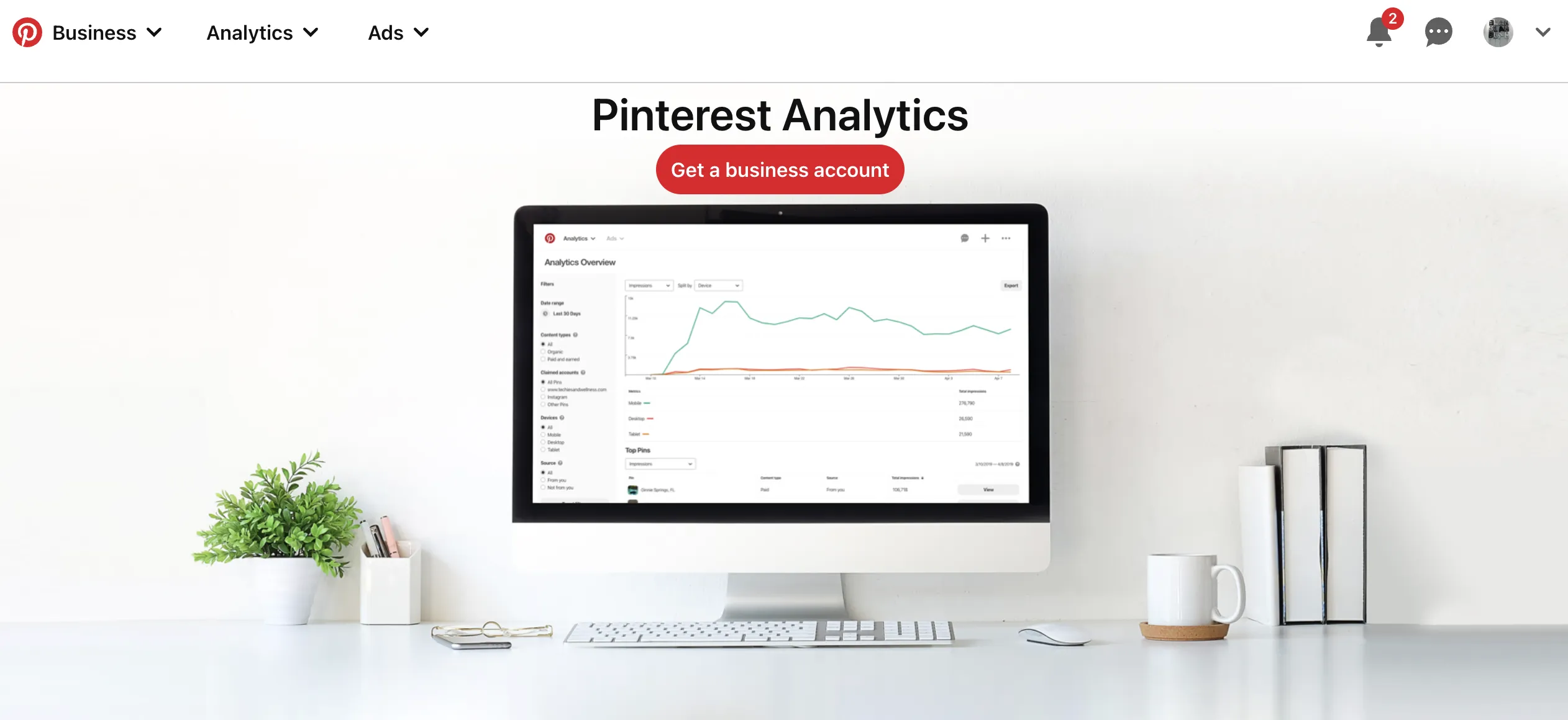
Image Source

As mentioned before, Pinterest Analytics is Pinterest’s free built-in tool that you can use to measure the performance of your Pinterest efforts. To access Pinterest Analytics, you’ll need a business account.

When you head over to Pinterest Analytics on mobile, you’ll see the following four metrics at the top:

  • Impressions — the number of times your Pins have been viewed. This could be through a user’s home feed, category feed, or search.
  • Engagements — the total number of engagements on your Pins, including clicks and saves.
  • Total audience — the total number of people who have seen or engaged with your Pins.
  • Engaged audience — the number of people who have engaged with your Pins.

You can either measure analytics for your whole account or for individual pins or boards.

2. Tailwind
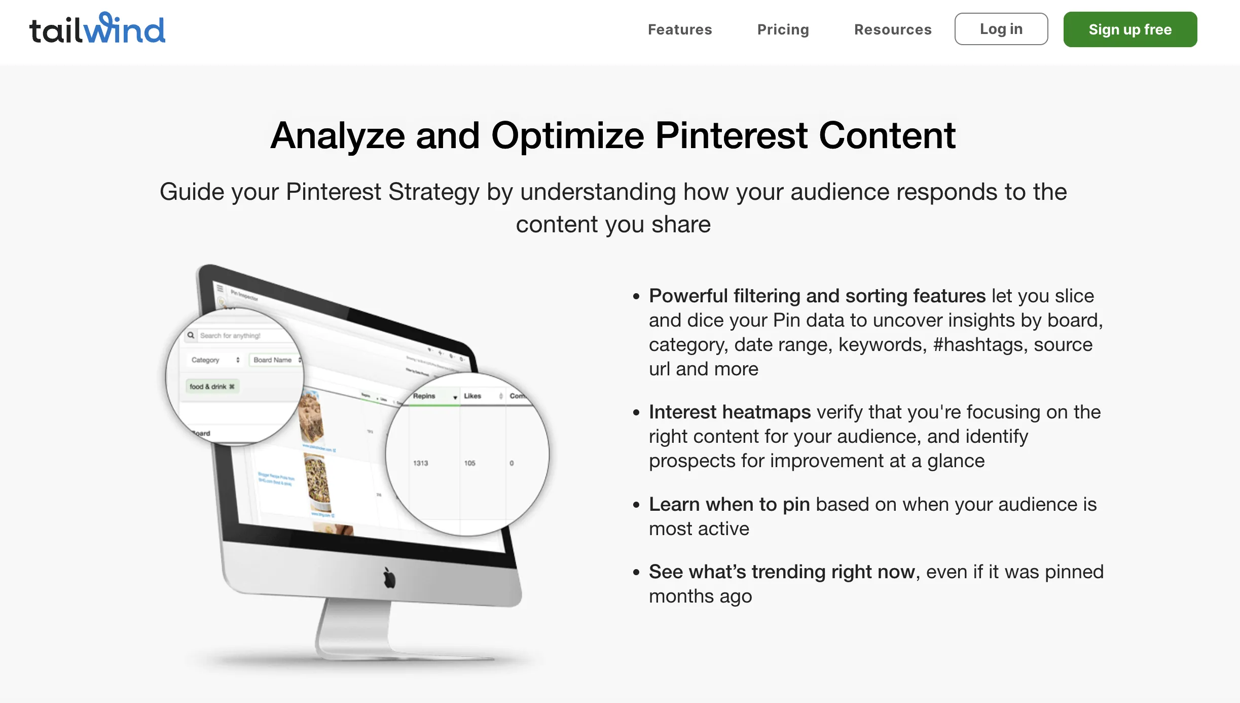
Image Source

Another great tool you can use to analyze your Pinterest metrics is Tailwind. Tailwind is a social media scheduling tool for Pinterest and Instagram that includes analytics.

The tool goes beyond vanity metrics and tracks followers, engagement, and even virality. You can even track your ROI by looking at visits, transactions, and revenue down to the specific pin.

Additionally, there are powerful filtering tools so you can uncover insights by board, interest heatmaps to verify that you‘re focusing on the right content, and trending reports to see what’s trending right now, even if it was pinned months ago.

If you’re looking for a detailed tool with lots of insights, Tailwind might be worth exploring.

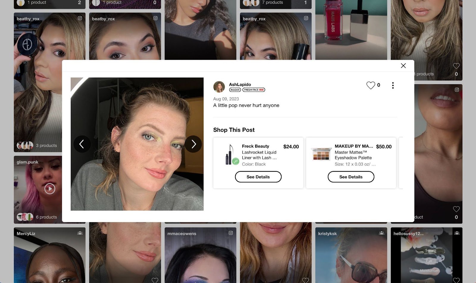
3. Olapic
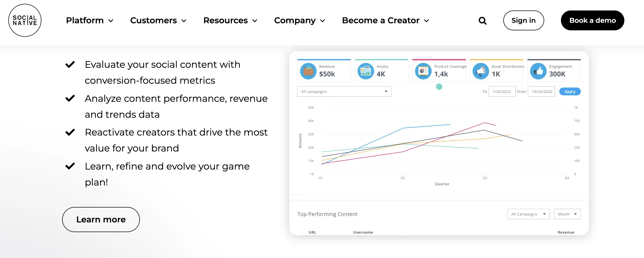
Image Source

Olapic is an all-in-one, user-generated, influencer, short-form video enterprise content platform that helps brands drive engagement.

With its scheduling and analytics tool, you can track ROI, influencer interactions, and engagement.

That being said, let’s learn which metrics you should track to measure the effectiveness of your Pinterest marketing efforts.

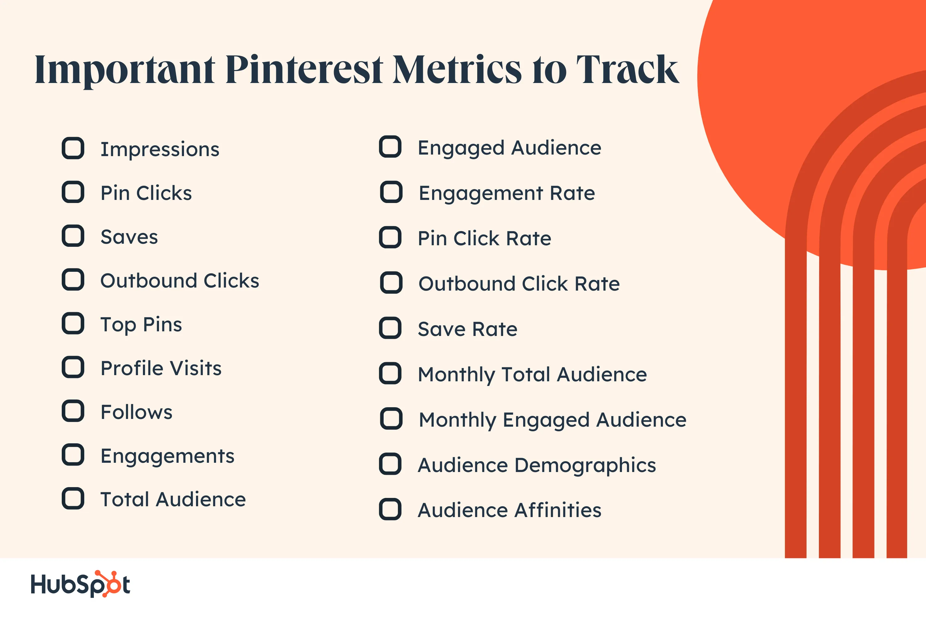
18 Important Pinterest Metrics to Track

Here are seventeen important Pinterest metrics you should keep an eye on.
1. Impressions

As with any other social media network, impressions measure the number of times your content is displayed.

Pinterest impressions include the number of times your content appears in a user’s feed, search results, or a different category feed. You can track this metric either for a specific pin or for your overall Pinterest account.

To get a sense of what your audience is searching for, look for patterns within your content to see which categories and keywords gain the most impressions.

For instance, if you notice your “Quotes from impressive marketing leaders” post performs exceptionally well, you might want to lean more heavily into thought leadership content on Pinterest.

2. Pin Clicks

Pinterest defines pin clicks as the total number of clicks on your ad or pin such that it opens in closeup.

Your Pins can have thousands of impressions, but if they are not driving any clicks, it’s important to reassess your strategy. Maybe the Pins with low impressions are not visually appealing. Or maybe they don’t resonate with your target audience.

This metric gives you an indication of how your audience is interacting with your Pins. You can track this metric either for a specific pin or for your overall Pinterest account.

To increase the chances of your audience clicking through, you can consider implementing these tactics:

  • Create visually appealing pins that resonate with your target audience.
  • Write compelling descriptions.
  • A/B test different pin variations to understand what works for your business.
  • Add keywords to your Pin title and description.

3. Saves

The saves metric (formerly repins) helps you understand what type of content your audience resonates with and is loving enough to save for future reference.

If people are saving your content, it’s a good sign. This means they care about your content and will save it for future reference. You can track this metric either for a specific pin or for your overall Pinterest account.

You can analyze what kind of content people are saving the most. Based on that information, we highly recommend finding the reason behind it. Try to understand why. And if it aligns with your content strategy, make more of that content.
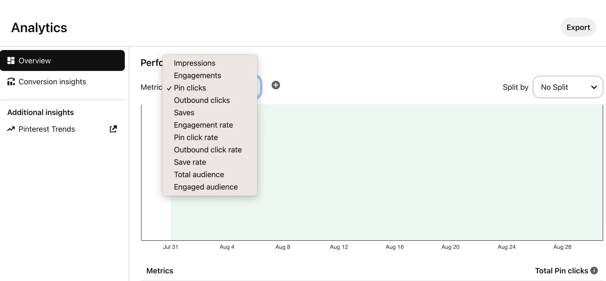
Image Source

4. Outbound Clicks

Many people confuse pin clicks with outbound clicks. Pin clicks refer to the total number of clicks on your ad or Pin that enlarges the image.

On the other hand, outbound clicks is the total number of clicks to the destination URL associated with your pin. You can track this metric either for a specific pin or for your overall Pinterest account.

When someone opens one of your pins close up, that’s counted as one pin click. But if that same person takes it one step forward by clicking on the destination URL associated with that pin, that’s counted as one outbound click.

Measure link clicks against outbound clicks to understand the effectiveness of your Pinterest strategy and the engagement rate.

5. Top Pins

Pinterest content has a long lifespan. This means that your content can accumulate metrics over a longer period of time than they do on other platforms.

Your Top Pins will be useful in determining your best content over time. If you launched an extremely popular campaign that resonated with your audience a year ago, you’ll be able to go back and see the actions taken on that content.

You can use that information to inform the strategy of your next campaign. You can sort your top pins by impressions, engagements, pin clicks, outbound clicks, or saves, depending on your goals.
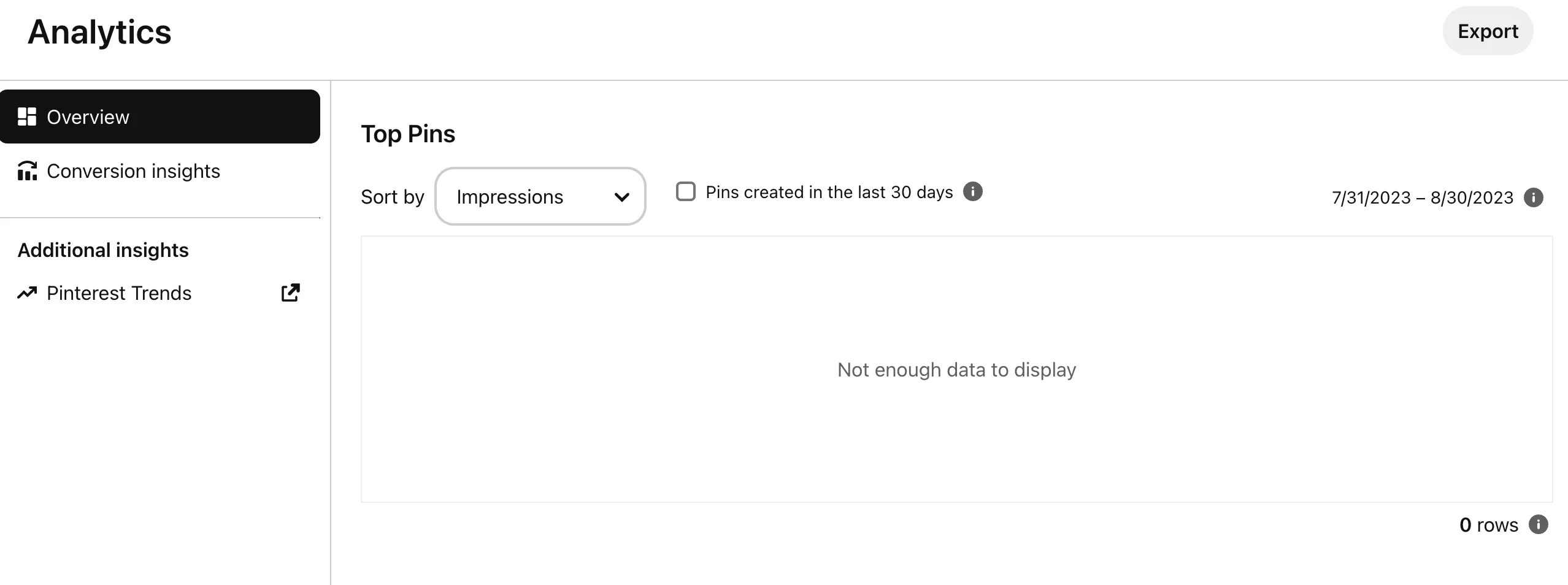
Image Source

6. Profile Visits

The profile visits metric allows you to understand the number of times people visited your profile after viewing your idea pin.

Note that we have used the term “idea pin” in the definition. An idea pin is different from a regular pin. It’s similar to Instagram stories. You can’t upload videos to regular pins. However, in the case of idea pins, it’s possible to do so.

Idea pins are meant to increase brand awareness and grow your Pinterest presence, as you can’t add a destination URL to them.

That’s one of the reasons Pinterest allows you to track the number of profile visits for your idea pins (you can’t track this metric for regular pins).

7. Follows

The follows metric allows you to track the number of followers attributed to your idea pin. In simple words, it’s the number of people who have followed your account after interacting with your idea pin.

You can’t track this metric for a regular pin. Instead, it is only possible in the case of idea pins, similar to the profile visits metric.

8. Engagements

There’s no point in having thousands of people following your account if there’s little to no engagement on your pins.

If you’re spending your time and effort on Pinterest marketing, you need to make sure that people are engaging with your posts.

Pinterest’s engagement metric allows you to do that. The engagements metric shows you the total number of engagements on your Pins, including saves and clicks.

You can find the engagement metrics by heading over to your account, clicking on the analytics metric in the top-left corner, and selecting analytics under Business tools.

9. Total Audience

The total audience is the total number of people who have seen or engaged with your pins. This metric gives you an understanding of the number of unique users who have seen or interacted with your Pins.

Don’t confuse it with impressions. The impressions metric measures how many times your Pins were displayed.

On the other hand, the total audience metric signifies the unique individuals who have been exposed to your pin. This metric allows you to see how many unique people you’re reaching out to.

10. Engaged Audience

Unlike total audience, the engaged audience metric takes into account the total number of unique people who have engaged with your pins. This metric tells you how many people commented, saved, reacted to, or clicked on your pin.

You can track this metric to see how many unique people are engaging with your pins, allowing you to gauge the level of engagement and interaction on Pinterest.

11. Engagement Rate

Engagement rate is the percentage of total engagements (clicks and saves) with your pins divided by the number of times your pins were seen. Basically, you’re dividing engagements with impressions.
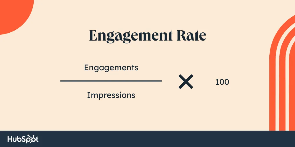
This metric can help you understand how well your audience is connected with your content.

We highly recommend tracking this metric month-over-month along with other metrics to see how your Pins are performing and measure the effectiveness of your Pinterest strategy.

12. Pin Click Rate

Pinterest defines pin click rate as the percentage of the total number of clicks on your pin to content on or off Pinterest (user’s feed, search engine, or any other place) divided by the number of times your pins were on screen.

Here’s the formula to calculate pin click rate:
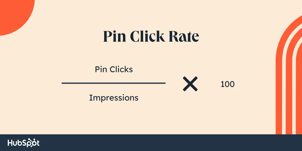
By tracking this metric, you can gain an understanding of how effective your Pins are in driving user engagement and click-throughs to your content, both within and outside of Pinterest.

13. Outbound Click Rate

Outbound click rate is the percentage of the total number of clicks to the destination URL of your pins divided by the number of times your pins were on screen.
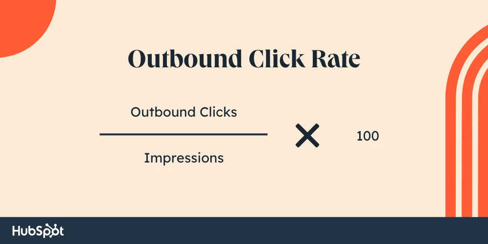
To increase your outbound click rate, take these tips into consideration:

  • Create attractive and clickable pins — you can try an easy-to-use tool like Canva or pin templates.
  • Don’t give away all the information on your pin – this will increase the chances of your audience clicking through.
  • Experiment with different call-to-action variations.
  • Do more of what’s working.

14. Save Rate

Save rate is the percentage of the total number of saves of your pins divided by the number of times your pins were on screen.

Here’s the formula used to calculate save rate.
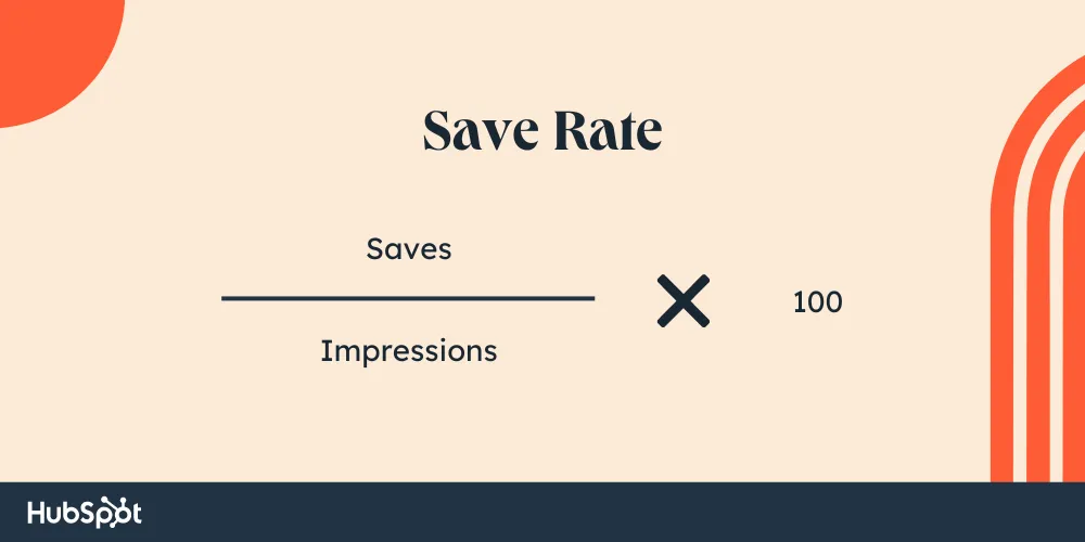
We believe that this metric is even more important than outbound clicks or outbound click rate.

That’s because when people are saving your content, this means they are connecting with what you’re putting in front of them. They’re either saving it for reference or to share it with someone they know.

15. Monthly Total Audience

Monthly total audience is the total number of people who have either seen or engaged with your pins in the last 30 days. It’s the same as the total audience metric but calculated specifically for the duration of one month (last 30 days).

Tracking this metric every month can help you gain insights into your monthly growth, identify seasonal trends, set future goals, optimize content planning, and assess the effectiveness of your campaign.

16. Monthly Engaged Audience

Monthly engaged audience is the total number of people who have engaged with your pins in the last 30 days.

Just like in the case of monthly total audience, monthly engaged audience is the same as the engaged audience but calculated specifically for the duration of one month (last 30 days).

We encourage tracking this metric to understand your engagement each month, assess the level of interaction and engagement your content receives within a specific timeframe, and identify trends in user engagement.

17. Audience Demographics

You can learn more about your audience (total and/or engaged) by viewing their demographics, which include age, gender, location, and device.

Using the Compare feature, you can also compare data for two audiences side-by-side to identify notable differences and similarities.

Based on this data, you can make informed decisions and tailor your Pinterest marketing strategy to maximize engagement and reach your target audience effectively.

18. Audience Affinities

In this section, you will see a breakdown of the categories your followers engage with and the top boards to which your content is pinned. This will help you understand your audience and what attracts them to your content.

Now that we know which metrics to track, let’s understand how to check your Pinterest analytics.

How to Check Your Pinterest Analytics

First of all, you need to make sure that you have a Pinterest Business account.

Otherwise, you won’t be able to access the analytics. If you don’t have a Pinterest Business account, you can learn how to create one for yourself here.

Once you create your Pinterest business account or if you already have one, you can measure Pinterest Analytics across both mobile and desktop. Whether you’re looking to track analytics on your mobile or desktop, we’ve got you covered.

Let’s understand how to access Pinterest analytics on both devices one by one.

We’ll start with desktop.

How to Check Pinterest Analytics on Desktop

To check Pinterest Analytics on desktop, follow these steps:

1. Head over to www.pinterest.com and log in to your business account.

2. Once logged in, hover your mouse over to the Analytics tab on the top left-hand corner.
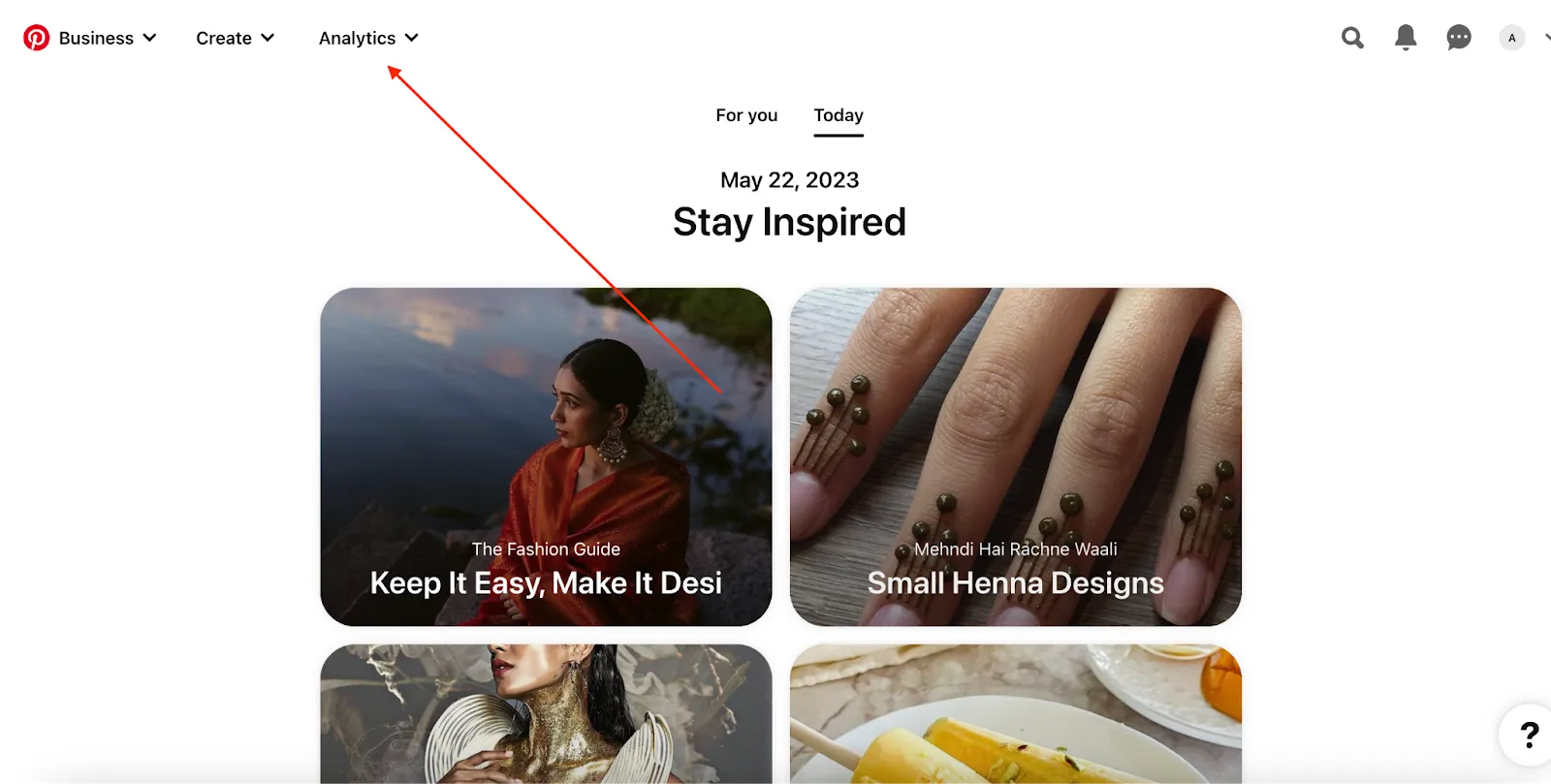
Image Source

3. Hovering over Analytics, you’ll see these options:

  • Overview to track the performance of your boards and pins.
  • Conversion insights to measure the impact of both your paid and organic performance on Pinterest.
  • Audience insights to track audience data. You can also compare different audiences.
  • Trends to see what’s popular on Pinterest.

Note: You can access more metrics on the Pinterest desktop application vs. metrics on mobile. So we highly recommend accessing Pinterest Analytics on Desktop.

That being said, if you’re looking to access analytics on mobile, we’ve got that covered next.

How to Check Pinterest Analytics on Mobile

To access Pinterest Analytics on mobile (Android and iOS), follow these steps:

1. Launch your Pinterest mobile application.

2. Log in to your business account.

3. Click on your profile picture in the bottom-right corner.

4. Next, click on audience analytics in the top-left corner.

5. This will launch Business Tools, under which you can find:

  • Analytics: to measure overall Pinterest account analytics.
  • Audience insights: to track audience data.

Note: You can also track metrics like saves, clicks, and impressions for individual pins or boards.

Take a look at The Ultimate Guide to Pinterest Marketing to learn more about how to use Pinterest for your business.

Excited to track your Pinterest performance?

There are plenty of metrics that Pinterest provides that will be helpful for your business. However, it’s important to note that what works for one business‘s Pinterest strategy may not work for your company’s unique voice and positioning.

Using Analytics can allow you to test different content formats, which will ultimately add value to your customers’ overall experience with your brand.

Editor’s note: This post was originally published in April 2019 and has been updated for comprehensiveness.

Pinterest Templates

Categories B2B

19 Creative Pop-Up Shop Examples

I’ll admit it — I’m slightly obsessed with pop-up shops. They’re usually a little quirky, fun, and have an air of exclusivity that puts my FOMO into overdrive.

But as a marketer, I also see the benefit of pop-ups from a business perspective. They enable consumers to get up close and personal with their favorite brands, driving awareness and interest in the process. 

Download Now: Event Planning Checklist [Free Download]

That said, pulling off a pop-up event is no easy feat. Here, we’ll discuss how to find the next big pop-up shop idea, how to run and market one effectively (from HubSpot’s Events team), and the 19 best pop-up event examples for inspiration.

Let’s dive in.

Consumers love the lure of exclusivity, and brands love the unmatched opportunity for experimentation.

Pop-Up Shop Ideas

Your goals will dictate the type of pop-up experience you want to create and how you’ll implement it.

1. Temporary Retail Space

If you’re transitioning your business from online to brick-and-mortar, a pop-up shop is a way to simulate the retail experience and gain valuable insights into considerations such as operations and demand… without the risk of commitment and overhead.

2. One-Time Event

From my experience, an event-style pop-up — where the press and public can attend — generates a ton of buzz due to its fleetingness. By leveraging the exclusivity of the occasion, you can use the event to pique interest. Make it a party!

3. Immersive Experience

I like physical spaces because they give customers the opportunity to see, feel, and experience your brand. In my experience, the more you play to people’s senses, the more memorable the experience.

With that in mind, you can use your pop-up shop to provide a unique, immersive environment. That might mean interactive displays or other unexpected physical elements that add a wow factor.

How to Do a Pop-Up Shop

It’s an undertaking to pull off a successful pop-up, requiring a lot of planning, scouting, and marketing leading up to a launch. Here are the main steps you’ll want to consider as you set up:

1. Evaluate your goals and select a theme.

Are you testing the market for a more permanent location? Or are you generating buzz? Knowing your goals will help you determine what kind of space to look for, what type of pop-up shop to run (see above), what supplies to purchase, and how to market and operate it.

2. Scout for a location.

Because your pop-up is temporary (to start, anyway), you don’t have the benefit of word-of-mouth or brand/location recognition. That means you’ll need to choose a location with plenty of foot traffic to maximize your impact.

This consideration, of course, needs to be balanced with the cost of renting the space and the availability of a short-term lease.

Good places to consider include:

  • Outdoor stands or kiosks
  • Empty storefronts
  • Art or gallery spaces
  • Marketplace or tradeshow booths

You can also use services such as Peerspace or We Are Pop Up to scout locations.

3. Shop for fixtures and supplies.

Once you know where you’re setting up shop and how long you’ll be there, you can plan your space. I suggest picking a theme or concept, and then purchasing key features like shelving, fixtures, and decor to bring it to life.

4. Plan the launch and opening.

Because your pop-up is a fleeting experience, you don’t get the benefit of long-term clientele building. In my experience, building momentum leading up to the event is critical for its success. For this reason, you’ll want to give yourself enough lead time before the opening to generate interest and also create an experience that will get people talking.

4. Launch and enjoy.

Remember, the purpose of a pop-up shop is connecting with your customers. Sure, it’s all about your brand, but your brand is for them. Your intricate planning sets the stage for an incredible experience, but so does your interactions with them. Be prepared to provide a level of service that has your customers spreading the word, coming back, and remembering your brand once you’ve gone.

5. Analyze and determine what went well.

Take a look at the foot traffic you got, the sales you made, the revenue you generated, and the social media engagement you received.

What worked, and what didn’t? What was your ROI? Is it worth opening a permanent shop or repeating the experience elsewhere? What would you do differently?

Tips for Running and Marketing a Pop-Up Event, from HubSpot’s Events Team

1. Think from a “value-add” perspective.

To create a successful pop-up experience, it’s crucial to identify your customers and deliver an experience that adds value to their time,” Casie Nguyen, Senior Production Manager at HubSpot, told me.

In other words, make sure your event has a unique “pull” to get people through the door. This could mean offering unique products, experiences, or insights that they can’t easily get elsewhere.

2. Have a clear call to action.

The last thing you want is for your customers to leave your pop-up shop thinking, “Well, that was fun. What’s next?”

That’s why Nguyen recommends giving attendants a clear call to action. For example, this could mean signing up for a newsletter, posting a photo with a specific hashtag, purchasing a product, signing up for a giveaway, or attending another event.

3. Don’t be afraid to do PR.

The media will be your friend in getting the word out. Reach out to local publications to see if you can earn a feature and draft a press release to see if you can earn coverage. It may even be worthwhile to send exclusive invites to a few journalists for the date of your launch.

4. Reach out to local influencers and bloggers.

Influencers and bloggers may have smaller reach than traditional media outlets, but their followings will likely be highly targeted and engaged. Find out how much promotion might be, and don’t be afraid to offer perks!

5. Create an event on Facebook.

Promote to your existing Facebook followers by creating a Facebook event and inviting them. This will spread awareness to your existing fans and increase the reach of your pop-up marketing efforts.

6. Advertise on Facebook.

Facebook has advanced targeting options for audience type and geographical area, making it an ideal channel to spread the word to prospects who don’t know you yet. Read more about how to create a Facebook ad.

7. Email your database.

Tap into your existing customer base and let them know about your pop-up with email marketing. Your campaign will be even more successful if you can segment your database and target your customers in the area.

8. Leverage direct mail.

One of the best ways to promote a local event is through direct mail campaigns to residents in the nearest zip codes. Mailers function as invites to the general public. You’ll also be able to push the promotions you’re running.

9. Generate buzz and FOMO with promotions.

FOMO (fear of missing out) can motivate buyers to show up and engage. You can tap into this with exciting promotional strategies such as contests, freebies, discounts, and door-buster deals.

10. Put out signage.

Signage will help you get the attention of nearby foot traffic, so invest in flyers, banners, and window clings that are attractive and catch the eyes of passers-by. QR codes are a great way to allow customers to scan a code and get more information even if they are on the go. You can use a QR code generator to produce a new code and add it to existing signs and displays.

To inspire your next branded experience, we’ve curated a list of these innovative and visually stunning pop-up events.

19 Examples of Next-Level Pop-Up Events

1. ShopRunner x Coach

For most pop-up shops, the goal is to move inventory. But this event by ShopRunner and Coach had other things in mind.

Over three days, guests could visit the ShopRunner branded truck, sign up for their app via QR code, and, in exchange, receive a free flower bouquet to gift a loved one for Mother’s Day.

The results? Over 2,500 app sign-ups over three days. Not too shabby, right?

creative pop up events: shoprunner and coach (Image Source)

2. Museum of Ice Cream

If you’re an ice cream fan, this one’s for you.

The Museum of Ice Cream brought its famous sprinkle pool to New York’s Hudson Yard to celebrate National Ice Cream Day (it’s July 16th, in case you want to make a note in your calendar). The cherry on top — pun intended — was their collab with Friendly’s, who supplied complimentary ice cream. Guests could also participate in games and win raffles.

creative pop up events: museum of ice creamcreative pop up events: museum of ice cream

(Image Source)

3. Spotify x BLACKPINK

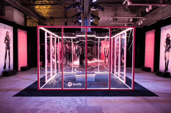
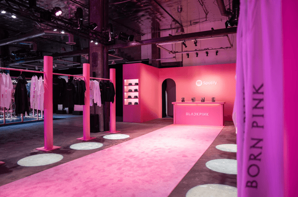
To celebrate BLACKPINK’s new album, BORN PINK, Spotify presented a three-day immersive pop-up that was dreamed up by the group’s four members. It included photo rooms, a pink boba bar, giveaways, and — who could miss it – a cube of mirrors at the center of it all. 

One standout feature of the event was the merchandise store, which offered exclusive items only to those in attendance. Such exclusivity is a powerful strategy to enhance perceived value and drive fans to events in the first place.

creative pop up events: spotify x BLACKPINKcreative pop up events: Spotify x BLACKPINK

(Image Source)

4. Jongga

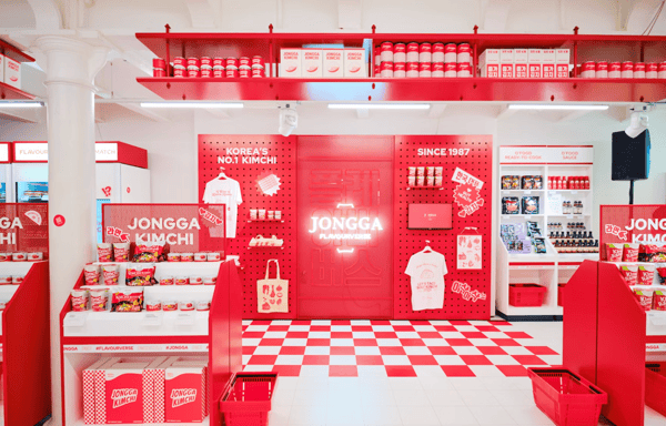
How do you bring the flavors of South Korea to London? With an immersive, multi-room pop-up that appeals to all your senses, that’s how!

Jongga Kimchi, one of Korea’s leading kimchi brands, created a pop-up that spanned three rooms, each showcasing the history of kimchi and its role in Korean cuisine and culture.

The stand-out room, in my opinion, was “Kimchi Alley,” where a rotating lineup of London’s top chefs crafted mouthwatering dishes, all starring kimchi. Londoners could see first-hand how to infuse Korean flavors into their favorite dishes.

creative pop up events: Jonggacreative pop up events: Jongga(Image Source)

5. Only Murders in the Building

Ahead of its third season, fans of Hulu’s Only Murders in the Building could stop at the United Palace Theater in New York City — a real-life filming location from the show – and investigate the murder of Ben Glenroy, played by Paul Rudd.

Upon entering the United Palace, guests were presented with a playbill and flashlight, and were free to roam around for clues throughout the theater. This two-day event proved to be a fun, immersive experience for fans, with mystery and photo-ops aplenty.

creative pop up events: only murders in the buildingcreative pop up events: only murders in the building(Image Source)

6. Fast Food Aid

Creative directors Ikkyu and Junya Sato noticed that young adults in Harajuku had a serious fast food problem — and they decided to do something about it.

To promote organic food chain Dohtonbori, they launched Fast Food Aid, a pharmacy-inspired pop-up that offers a selection of health supplements aimed at junk food lovers. And all it will cost you is a receipt from a fast food place.

creative pop up events: Fast Food Aid

(Image Source)

After a guilty indulgence, exchange your receipt for a customized bottle of supplements that will replenish the nutrients missed at your last meal. Each canister is aimed at a particular junk food — ramen, pizza, hamburger, etc. — to make sure your system gets what it needs.

Although Dohtonbori isn’t actually selling anything for profit at the shop, its been able to educate visitors about health and wellness, hopefully driving them to opt for healthier food options in the future – like Dohtonbori’s own restaurant.

7. COS Los Angeles

Experimental architecture firm Snarkitecture was inspired by mirrored surfaces and simple silhouettes when designing this temporary retail space for LA-based fashion label COS.

The folks at Snarkitecture transformed an empty industrial space into two identical, monochromatic rooms — one white and one pale pink ‚ leaving the focus on two racks of minimal clothing. The reflected space “creates an unexpected and altered world for visitors to experience and share.

creative pop up events: COS LA

(Image Source)

8. Arnsdorf

What’s a designer to do when they’re facing a tight budget? Experiment with creative materials. This pop-up retail space for Australian clothier Arnsdorf was created by using 154 pairs of neutral-colored pantyhose, and the effect is otherworldly.

creative pop up events: arnsdorf

Image Credit: Fast Company

9. Pantone Café

What does color taste like? If anyone knows the answer to that question, it’s Pantone.

The world’s most well-known color company has been running a pop-up café in Monaco for the past two summers, selling a minimal menu of pastries, lunch options, coffees, and fresh juices — all branded with Pantone’s signature color swatches.

So does this mean Pantone is permanently branching out into cuisine? Not quite. The seasonal eatery is perfect Instagram-bait, and it has successfully generated a ton of buzz in the press. It’s a perfect example of a pop-up event enabling a company to take creative risks with its brand by stepping outside of its typical business model.

creative pop up events: Pantone Cafe

(Image Source)

10. The Period Shop

For one weekend, Kotex launched a pop-up in New York aimed at alleviating negativity and spreading love for women during their periods.

The store, which was developed by ad agency Organic, featured ice cream, manicures, chocolate, comfy clothing, and Kotex U products for sale. Women were invited to browse the brightly colored offerings and share their experiences. And it was all for a good cause, too. Proceeds were donated to a women’s homeless shelter.

creative pop up events: the period shop


(Image Source)

11. Milani

Makeup brand Milani took its pop-up event on wheels. Fans of Milani had the opportunity to stop by their newsstand truck to purchase their new lip oils, snack on some tasty macaroons (flavored after the news lip oil scents), and even snag a product bundle. Fans could also snap a Polaroid picture in front of the truck, covered with Milani branding.

@explorenewyorkcity FOLLOW for nyc pop-up alerts 🩷🍇 @Milani POP-UP LOCATION👎🏼 〰 Sat, Sept. 30 1-6pm📍SoHo between Prince & Spring St. (around 541 Broadway) 〰 Sun, Oct. 1 4-7pm📍220 36th St. in Industry City, Brooklyn 〰 FREEBIES: 1 lip oil, 1 macaron, 1 polaroid (25% off coupon on back), 1 sticker sheet & 1 poppi soda 〰 1 @mixed.feelings zine
#milanicosmetics
#milanipopup
#milanilipoils
#nycpopup
#nycpopupalert
#nycpopups
#nycfreebies
#nycfreeevents
#nycfall
#nycfallbucketlist
#thingstodoinnyc
#nycactivities
#nycrecs
#dasominnewyork
#explorenewyorkcity
♬ Little Omens – Alfie Jukes

12. Real Life At Work

To offer passersby a glimpse into its world, London-based ad agency Wieden+Kennedy invited graphic artist Emily Forgot to transform the front window of its office into an imaginative, cartoon-inspired pop-up workspace.

Using exaggerated monochrome imagery, Forgot crafted a whimsical office scene from paper, complete with a typewriter and a clock that ran backward.

For a few weeks, real agency employees took turns “working” in the window. The whole thing was then broadcast live via webcam on the agency’s website for anyone who was curious enough to watch.

The pop-up was a unique way for W+K to shrug off the stereotype of the ad agency that takes itself too seriously — plus it was a creative chance for the team to engage with the community.

Real Life at Work

(Image Source)

13. Früt

How do you make inexpensive, packaged underwear appeal to high-end consumers? Just create a “luxury” lingerie pop-up with a fake, fancy-sounding name.

CP+B Boulder helped client Fruit of the Loom open up an intentionally pretentious and ludicrously over-priced boutique for its underwear, complete with colorful intimates hanging from over-the-top tree displays.

Früt sold only Fruit of the Loom undergarments, but shoppers who usually wouldn’t deign to buy the brand were lured in by the high-end guise.

Real Life at Work

(Image Source)

14. Organic Valley Coffee Shop

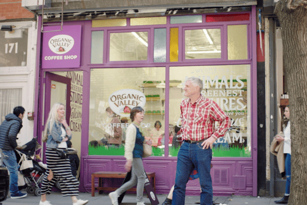
In a clever shot aimed at the artisanal coffee movement, creative branding agency Humanaut opened up a pop-up cafe to promote its client Organic Valley’s new coffee creamer.

Screenshot 2023-10-20 at 5.07.13 PM(Image Source)

The temporary Manhattan storefront adhered to all of the typical hipster tropes — a minimal logo featuring arrows and X’s, modern glass mugs, and trendy sizes — Lil Bit, Double, and Lotta. And they cast a real Organic Valley farmer as the shop’s folksy proprietor.

There was one catch: The shop only sold measured portions of half-and-half. You ordered your creamer at the counter from a barista and added your coffee separately. The spoof was a major success. Unperturbed by the irony, New Yorkers lined up to order shots of plain cream for $2 a pop. “No one had a problem paying $2 for a pour of organic half-and-half,” said Humanaut’s creative chief David Littlejohn. “In the end, the idea wasn’t as crazy as we thought it was.”

15. 5-Minute Internship

Solve, a Minneapolis-based creative agency, wanted to re-vamp its summer intern hiring process to attract recruits who can really think on their feet. So, naturally, they created a portable, small-scale replica of their office — complete with a receptionist-staffed micro lobby — and set off on an epic college-campus road trip.

Students at participating campuses were given a 5-minute challenge based on their area of interest — and those who performed the best were invited to interview on the spot. The pop-up event tripled the amount of applications the agency received to its internship position.

5 Minute Internship

Image Credit: Adweek

16. The Picture House

Capitalizing on the Instagram food photography craze, Birdseye opened up a temporary restaurant in London where diners could settle their bill with an Instagram post — all they had to do was take a snap of their meal and add the hashtag #BirdsEyeInspirations.

The event was a creative social media experiment that helped generate free publicity for the frozen food company’s Inspirations line of products. Branding agency Slice was behind the world’s first pay-by-picture pop up.

The Picture House

Image Credit: Slice

17. Birchbox’s Tour

Pop-ups give online retailers the chance to show off their goods in person, interact directly with their fans, and take their brand to the next level.

Birchbox – which sells subscription boxes of curated beauty products – went on a national tour in 2015, opening up temporary brick-and-mortar stores in multiple cities with the help of mobile container event company Steel Space.

In addition to selling beauty products, they offered manicures and astrology readings to entice beauty lovers inside.

Birchbox

Image Credit: Racked LA

18. Fendi Spring/Summer Flower Shop

The mobile flower shop that botanical designer Azuma Makoto created for Fendi is proof that not all pop-ups need to be large scale productions. The artist adorned a three-wheeled Italian vehicle with an intricate floral display and outfitted the side of the truck as an open storefront. The vendor/driver sold limited edition Fendi bags and vases of Makoto’s floral arrangements to promote the fashion label’s 2016 Spring/Summer collection.

Fendi

Image Credit: My Modern Met

19. The Poundshop

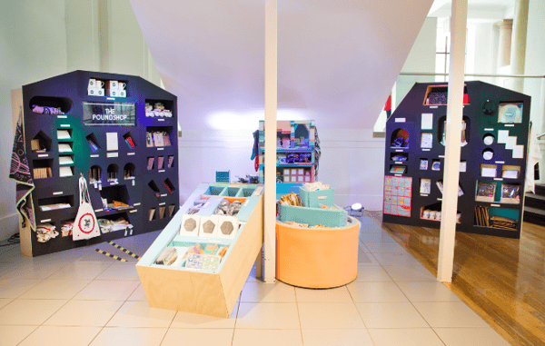
This design collective is a recurring pop-up platform for artists to offer their goods for affordable prices. “The aim of The Poundshop is to spread design to a wider audience by making it accessible through price and engagement,” the website explains.

The pop-up shops are just as visually interesting as the art they sell.

The Poundshop
The Poundshop

Image Credit: The Poundshop

With a little planning and a lot of preparation, you can make a splash with a pop-up that delights your customers and spreads interest in your brand. 

Editor’s note: This post was originally published in July 2018 and has been updated for comprehensiveness.

New call-to-action


Categories B2B

10+ Reasons Why Overworking is Bad for Your Health (and Your Career)

Overworking has become the norm for many professionals. While being constantly plugged in can make us feel safe, connected, and in the know — both at work and at home — it also means we never really clock out.

We reply to emails after work hours, take work calls at home, and even take a few hours out of our weekend for some work. The rise of remote work has even further blurred the lines between the end of the work day and time on the clock.

Download Now: How to Be More Productive at Work [Free Guide + Templates]

Studies consistently show that chronic overwork can damage your health, hurt your career, and lead to early burnout. Read on to learn exactly what happens and why.

Table of Contents

Why Overworking is Bad For Your Health

Overworking has serious consequences for our health.

“While a person’s body and brain have an unbelievable capacity to be resilient and adaptable, they have their limits and need to be taken care of in order to be able to function well,” said Dr. Adam Pelman, director of integrative health and well-being at Mayo Clinic Florida, in an interview with Medical News Today.

“When we overwork and fail to prioritize self-care, we don’t give the body or the brain what it needs to rest and recuperate,” Pelman says.

Our body and mind can only take so much stress. Here are just a few ways overwork can impact you and your health.

1. Overwork causes stress.

Many different factors add to the stress.

A study investigating the primary causes of stress for Americans in 2023 concluded that workload was the key contributor to stress, affecting 39% of workers, followed by interpersonal issues (31%), juggling work and personal life (19%), and job security (6%).

Constant stress can catalyze various health issues ranging from obesity and anxiety to health conditions like depression, heart disease, and mental disorders.

2. Stress prevents sleep.

When you work long hours, you skip sleep.

Not taking the recommended 7-8 hours of uninterrupted sleep or sleep deprivation causes a disruption of the circadian rhythm.

Circadian rhythms are physical, mental, and behavioral changes that are dependent on our 24-hour cycle. When these patterns are disturbed, they leave you with low energy until you get a proper eight hours of sleep.

Hormonal imbalance and metabolic disturbances are common side effects of sleep deprivation and disorders. These exhibit themselves through high blood pressure, heart disease, obesity, and diabetes.

Think you‘re one of those “lucky people” who can get by fine with only five or six hours of sleep? You probably aren’t.

While researchers have found genes in people that enable them to be well-rested after less than eight hours of sleep, they also say the incidence of either is incredibly rare.

3. Stress gets in the way of healthy eating habits.

Too tired to cook or go to the gym? That’s typical for the days you overwork, as it gets in the way of your daily exercise, healthy eating, and other good habits.

When you’re overworked and tired, you tend to make unhealthy food choices. Working out seems like a chore, and you rely on caffeine to get you through the day.

Cleveland Clinic reports that stress due to overwork leads to over-eating or making poor diet choices. How? Stress triggers the release of cortisol, also known as the stress hormone.

Cortisol prompts cravings for sugary, salty, and fatty foods as your brain seeks fuel to cope with whatever threat is causing stress.

4. Stress is bad for your heart.

Your heart is one of the first things that gets affected by stress and overwork.

A WHO survey concluded that people working 55 or more hours per week face a 35% higher risk of stroke and a 17% higher risk of dying from ischemic heart disease compared to those working 35-40 hours per week.

Also, reports from WebMD feature accounts of people who developed heart conditions as a result of overworking.

Examples of heart-related problems included death due to heart disease, non-fatal heart attacks, and angina, a condition caused by low blood supply to the heart.

Wondering why overwork causes heart disease?

Clinical social worker Iris Waichler, while talking to Medical News Today, explains that stress from overworking can increase the production of the hormone cortisol, elevating the risk of heart attack or strokes.

It can also cause other problems like backache, neck ache, and tightening of muscles, she added.

5. Stress affects your concentration and impairs your judgment.

Overworked, stressed, and sleep-deprived people often have impaired judgment and foggy memory.

You may have noticed developing a short temper after a stressful couple of days.

Intense emotional responses, snapping at your partner, or getting easily frustrated with coworkers are all signs that you’re exhausted.

This happens as overwork causes a lack of sleep, which affects the hippocampus, an area of the brain involved in memory creation and consolidation.

This makes you lose concentration and compromises your judgment.

6. Overworking may lead to bad habits.

Aside from health risks, overworking links to habits that are unhealthy and detrimental.

In 2015, the Finnish Institute of Occupational Health studied the correlation between work patterns and alcohol consumption.

They found that when people worked more than 48 hours per week, they were more likely to engage in “increased risky alcohol use.”

Aside from alcohol consumption, researchers also found that long hours were linked to smoking.

A 2018 paper from Welltory added to the list of bad habits, showing that overworking can also lead to more social media consumption, which can endanger your level of stress recovery when you’re not working.

7. Overwork causes depression.

In addition to physical exhaustion, excessive workload, long hours, and unsociable shifts can significantly impact your mental health.

“Long hours and the burden of overwork can have serious consequences like clinical depression and even suicidal behavior in employees,” states WHO in the “World Mental Health Report: Transforming mental health for all.”

8. “Karoshi” or overwork death has been documented.

Karoshi is a Japanese term that translates to “overwork death” or “death from overwork.”

It refers to a phenomenon where individuals develop serious diseases and mental disorders because of working excessively for long hours, facing constant intense stress and pressures.

A study investigating the causes of Karoshi and preventive measures to avoid it revealed that it led to heart and brain diseases in people in their 50s while people in their 30s experienced mental disorders.

Why Overworking is Bad for Your Career

If better health and happiness aren’t enough of an incentive to do something about chronic overwork, it turns out overworking can have a legitimately negative impact on your performance.

Let’s dig deeper into the reasons why your productivity decreases when you’re overworked and stressed.

1. More input doesn’t necessarily mean more output.

Do longer work hours equate to more work getting done? Occasionally, yes — but not when “overtime” becomes the norm.

This theory is reinforced by a study of 40 countries, which examined the correlation between productivity per person and average working hours.

Results showed that countries like Colombia and Mexico, which have lower productivity, had longer working hours and fewer paid holidays.

On the other hand, countries like Norway and Luxembourg, where work-life balance is prioritized and the standards of living are high, performed better with higher productivity per person.

2. You call in sick because you are.

Overworked employees call in sick. Either because they are actually sick or they’re too exhausted to work.

Tristan Wright, a business coach, says long working hours can negatively impact business performance as it leads to increased absenteeism and higher turnover rates.

Employee productivity declines, and they become less motivated to go to work. This also causes overall business to suffer.

3. You lose sight of the bigger picture

Have you ever let a project consume you and your time? We’ve all been there.

While it’s not bad to get consumed by a project occasionally, it becomes risky if you make it a regular pattern.

When this happens, we lose sight of our long-term dreams and aspirations and channel our focus and energy into daily duties and tasks.

Our ambitions start to diminish. We develop a sense of resentment towards our job and the people we work for.

A study by Gallup shows that such low levels of morale and disengagement from jobs are contributing to a growing trend of “quiet quitting.”

It’s when employees may still physically show up for work but lack enthusiasm and passion for their tasks. They avoid taking on new responsibilities, stop contributing innovative ideas, and become less involved in team activities.

Likewise, HubSpot’s study discovered that, on average, marketing leaders think 17% of their employees are engaged in quiet quitting.

4. You pose a risk to yourself and others.

Overwork and longer hours are significant occupational safety and health (OSH) hazards as they lead to fatigue. We’ve already established that tired people make more mistakes.

Work-related fatigue makes you less alert, increasing the likelihood of accidents and errors. This can be particularly risky if you’re working in physically demanding jobs or in a sensitive environment like construction, hospitals, or laboratories.

A 2022 study by the Australian Medical Association on overworked and exhausted doctors showed that a staggering 60% were concerned about making clinical errors due to fatigue, up from 51% in 2021 and 48% in 2020.

Studies in the US have shown similar findings: Overworked doctors are prone to making more errors, endangering patient safety and resulting in more lawsuits.

5. Overworking hinders creativity.

A lack of sleep, stress, and other issues caused by overwork drains your energy and motivation and, ultimately, affects your creativity.

Research on overwork consistently shows that it can lead to decreased focus.

Why? Because creativity stems from a relaxed mind.

When you’re tired and overworked, you develop a myopic focus on completing immediate tasks, leaving little room for exploring new possibilities and thinking out of the box.

So, if you want to be creative, it‘s important to limit your work hours, get a good night’s sleep, and take time off when you feel like your mind is being drained of creative thoughts.

Pro tip: When you do take time off, keep a notepad or a phone nearby. Be sure to note your ideas down quickly when creativity strikes.

6. Exhaustion makes multitasking harder.

Your cognitive resources become depleted when your mind is exhausted, making it more challenging to switch between tasks and focus on multiple things at once.

Completing a single task takes longer. Therefore, the inability to be as productive as your usual self may add to your frustration.

The Symptoms of Overwork

How do you know you’re overworked?

When your mind and body are tired, they send you warning signs like persistent drowsiness, fatigue, or a general feeling of melancholy.

Here are some more symptoms to look out for.

Sleep Disorders

Disorders like insomnia or poor sleep patterns can occur as a result of stress and overwork.

This can look like unintentional sleeping or dozing off during the day, waking up frequently during the night and having difficulty getting back to sleep, or taking more than 30 minutes to fall asleep when you eventually go to bed.

Work-Related Fatigue

If you’re having chronic tiredness, lack of energy, headache, dizziness, sore or aching muscles, muscle weakness, and slowed reflexes for days on end, this could very well mean that you have worker fatigue.

Lack of Concentration

Difficulty recalling minor details like names and dates from slips of memory, struggling to stay focused, inability to make decisions, and making careless mistakes. This can significantly affect your ability to complete daily tasks.

Weakened Immune System

Frequent colds, digestive issues, skin infections, increased anxiety, chest pains, and stress-induced headaches indicate that your work is compromising your immunity.

Emotional Exhaustion

Feeling overwhelmed or melancholic, irritable, withdrawing from social interactions, and heightened pessimism are clear signs that your work is draining you emotionally and physically.

Weight Fluctuations

Frequent meal skipping due to lack of time or snacking on junk excessively leads to weight fluctuations and bad health.

Who’s to blame for overworking?

Chronically overworking isn‘t fun. It doesn’t feel good to realize you have to work through yet another family dinner or relaxing weekend.

So why do people do it? Is it because our bosses told us to? Or because we want to make more money? Or do we have some deep-seated psychological need?

Over-ambitious managers?

In many cultures, bosses expect employees to put in long days, make themselves available via email 24/7, and work nights, weekends, and vacations without protest. In this version, Carmichael writes, “We overwork because we’re told to.”

This is especially evident in the three countries — America, South Korea, and Japan — where employees work longer hours.

Company culture?

The hustle culture in many companies today also pressures employees to overwork.

When a company’s climate encourages employees to overwork, making it a norm and something that is appreciated and incentivized, employees have no other choice but to be a part of that culture by behaving the same way.

“Hustle culture ideology says that people are overworking not because they’re economically driven to, but simply because this is the way go-getters get what they want,” BBC quotes Nick Srnicek, co-author of “After Work.”

When people perceive overworking as the only way to be accepted and get what they want, they’re setting the wrong examples for others. This relentless pursuit of becoming the “perfect employee” eventually takes a toll on your well-being and your performance.

… Or ourselves?

Many times, we push ourselves because that‘s the way our brains are wired. We either think that it’s the only way to achieve our goals, or we think overworking will get us where we want to be in life faster.

Either way, we set unreal and high expectations for ourselves and put all our energy towards achieving them, only to be demoralized when we’re unable to meet them.

How to Tackle Overwork

1. Try psychological detachment.

Understanding that your work is an integral part of your life and not letting it consume your existence is crucial to maintaining a healthy work-life balance.

“Psychological detachment” is a powerful concept that allows you to disassociate from work once your work hours are over.

According to a study examining the effects of overwork exhaustion and psychological detachment, employees who were able to effectively detach from their work experienced lower levels of physical exhaustion.

However, those whose jobs were over-demanding and hindered their ability to detach from work faced adverse health outcomes.

Another study on the topic showed that psychological detachment is crucial to recovering from work-related stress, and the inability to do so can cause early burnout.

Leave work at the office, and if you work from home, set strict timings for starting and ending work. Set clear boundaries, making sure to log off mentally and on your computer at the end of your work day.

Logging off but continually worrying about your work will keep you from enjoying your personal life, keep you stressed, and affect your performance the next day.

2. Take breaks using the 52/17 rule.

Research suggests that taking regular breaks is good for health and focus.

Boost your productivity levels by following the 52/17 rule. It’s a valuable time management technique where you work for 52 minutes and then take a 17-minute break. This way, you’ll prevent mental fatigue and save yourself from burning out.

Set a timer for 52 minutes, and when it goes off, take your break. Do a crossword, get some shut-eye, watch some Netflix, or have a light snack. Repeat the cycle throughout the day. Or adjust the time intervals to see what works best for you.

Some people prefer working for 30 minutes and taking a 5-minute break — the so-called Pomodoro technique.

3. Stick to your routine.

Self-determination is your biggest asset if you wish to maintain a healthy work-life balance. Follow a strict routine and prioritize tasks to help you allocate time for work, breaks, and personal activities appropriately.

A better routine helps reduce stress and improves mental and emotional health, making you sharp and energized. By sticking to a routine and holding yourself accountable, you are less likely to extend your workday or bring your work home.

4. Set boundaries.

Establishing boundaries is crucial to achieving a healthy work-life balance.

Set firm boundaries early and let everyone know, including your colleagues and superiors.

Occasionally replying to emails or text messages after work hours is OK. But make sure to put all emails and messages on hold once you’re home until the next morning.

Also, learn to say “no.” Get comfortable saying no if you‘re asked to work after hours or do something that is out of your jurisdiction and stick to your guns. Don’t feel guilty or pressured.

LendingTree chief credit analyst Matt Schulz says setting firm professional boundaries can help people feel better about their jobs.

Image Source

Asserting your boundaries early on not only helps you avoid overwork but also communicates your limits to others sooner.

5. Keep in touch with your social circle.

Your friends and family serve as a valuable support network even when it comes to your professional life.

They provide honest feedback and identify destructive patterns. They’re the first to notice when you’re agitated, seem fatigued, or lose focus.

Keeping in touch with them on a regular basis can help you recognize symptoms of overwork early. Plus, hanging out with friends helps to take your mind off work and significantly improve your mental health.

6. Take time out for self-care.

Taking time out for yourself is not selfish. It’s necessary. Especially today when mental disorders and anxiety levels are at an all-time high.

“We must look after ourselves as well as we can because it will enable us to continue to perform well at work and in life,” Katrina Bannigan talks about the “Always On” culture in her book Skills for Practice in Occupational Therapy.

“If we monitor ourselves regularly, we should be able to identify warning signs (of stress, anxiety, and burnout),” she adds.

When we prioritize ourselves, it gives us a chance to recharge and keeps us from burning out. It takes some of the stress away, boosts creativity, enhances performance, and even improves our quality of life.

7. Talk to your boss.

If you feel constantly overwhelmed, it is time to talk to your boss.

Schedule a meeting with your manager to discuss your excessive workload and ask for support. Share your feelings of overwhelm and provide a detailed overview of your tasks and duties.

Work together to find which tasks can be delegated and to whom.

Your company culture can play a huge role in encouraging you to share your concerns openly.

Image Source

If your company culture doesn’t support open communication about overwork, consider privately reaching out to your boss, a superior, or a colleague who may offer valuable advice and guidance. If you find it challenging to do so, it may be time to explore other job options.

Pro tip: Join the gym, schedule a spa date, or meditate with some yoga. Detach your work regularly and see how it improves your productivity and focus.

Now that you know six awesome ways to combat overwork, follow these tips to improve your work-life balance.

Know When It’s Time to Log Off

Working long hours may feel rewarding, especially when we think it brings us closer to becoming the ideal employee. But it’s detrimental to our mental and physical health and can lead to early burnout.

Research constantly suggests we work smarter, not harder, while keeping our work life in balance. Remember, prioritizing your mental, physical, and emotional well-being should never take a backseat to work commitments.

Put yourself first, get your priorities in order, and hold yourself accountable to benefit your health and career in the long run.

Editor’s Note: This blog post was originally published in June 2016, but has been updated for comprehensiveness and freshness.

New Call-to-Action

Categories B2B

Can You Create a Wikipedia Page for Your Company? [Best Practices & Guidelines to Know]

For many Millennials and Gen-Zers, Wikipedia has become like a broad encyclopedia for all sorts of things, from random animal facts, to information about our favorite TV shows.

One of the driving forces behind Wikipedia‘s endless wealth of information is its community of writers and editors all around the web. And, because of Wikipedia’s notoriety and traffic, you might wonder, “How can I get my brand in on this action?” or even ask yourself, “Can I make a page for my business on Wikipedia?”

Wikipedia is one of the best third-party sources for ranking on page one of Google. We‘ll dive into the ins and outs of page creation, some of the best business pages, and the guidelines and legalities related to publishing Wikipedia business pages that you’ll need to know this year and beyond.

Download Now: Free Brand Building Guide

Can You Create a Wikipedia Page for Your Business?

While you can create a page for Wikipedia with the right administrative privileges, you should always be cautious of Wikipedia guidelines and objective when adding information — and, importantly, avoid advertorial content at all costs.

Benefits of Having a Wikipedia Page

Wikipedia was built as a community-driven, objective, non-biased encyclopedia. By nature and because of its mission, over-promotional content and biased content can go against its guidelines or even be removed. Ultimately, it’s somewhat discouraged to create or edit pages of a business you own or are paid by as this can make it pretty hard to keep your listing objective and non-promotional.

1. Brand credibility and authenticity.

Having a presence on Wikipedia can enhance your brand’s credibility and authenticity. Wikipedia is a trusted platform that is used by millions of people as a primary source of information. Having a well-written and properly sourced page can demonstrate to potential customers, partners, and investors that your business is legitimate and established.

2. Increased online visibility and search engine rankings.

Wikipedia pages often rank high in search engine results pages (SERPs). Having a Wikipedia page can increase your business’ online visibility, making it easier for potential customers to find and discover your brand. This can improve organic search rankings, drive traffic to your website, and ultimately lead to more conversions and business opportunities.

3. Access to a global audience.

Wikipedia is available in multiple languages and is accessed by people from all over the world. By having a Wikipedia page, you can reach a vast global audience, including potential customers, partners, and investors who may not be familiar with your brand. This can help expand your reach and open up new business opportunities in various markets.

Legal Disclaimer: The steps below will highlight screenshots of the Wikipedia site which include logos and other assets trademarked by the Wikimedia Foundation.

Wikimedia and Wikipedia wordmarks, name, and/or logos as listed here are trademarks of the Wikimedia Foundation and are used with the permission of the Wikimedia Foundation. HubSpot in no way is endorsed by or affiliated with the Wikimedia Foundation.

1. Create a Wikipedia account.

Go to Wikipedia’s homepage and click “Create account” in the top right.

Image Source

Enter the necessary information, including username and password, then click “Create your account”.

2. Get promoted to an auto-confirmed user.

When you first join Wikipedia, you’ll see a box pop-up that reads, “Help improve Wikipedia” with a link to start editing an article:

Image Source

Before creating your page, you’ll need to become an autoconfirmed user.

These are Wikipedia’s typical guidelines for an autoconfirmed user: “Although the precise requirements for autoconfirmed status vary according to circumstances, most English Wikipedia user accounts that are more than four days old and have made at least 10 edits (including deleted ones) are considered autoconfirmed.”

Here, you‘ll need to practice patience — spend the first couple days once you open an account editing other people’s pages. Once you click “Edit a page”, there are links on the top right of every paragraph with the word “Edit”, so it shouldn’t be too time-consuming.

Once you’re autoconfirmed, proceed to the next step.

3. Create the page.

Now we’ve reached the most challenging part — creating the page.

First, go to Wikipedia’s “Writing an article” page. As you scroll down the page, you‘ll see a blue button that reads, “Article wizard: an easy way to create articles.” Click this button (as long as you’re autoconfirmed):

Image Source

Next, you‘ll be redirected to Wikipedia’s Article Wizard. Here, you have two options — immediately begin creating your page by clicking “Next”, or practice editing your page in Wikipedia’s sandbox, first.

For our purposes, we’ll click “Next”:

Image Source

It‘s important to note — since there’s likely no Wikipedia page already available for your company, you can include as much or as little information as you want. Additionally, you’ll want to structure the page for easy readability, featuring some of the most important and basic information (like what your company does), first.

For instance, take a look at how HubSpot’s Wikipedia page is structured:

Image Source

The page starts with a two-sentence overview of what HubSpot does, followed by a table of contents on the left, and a “fact sheet” on the right. Below the table of contents, you‘ll first find HubSpot’s history, followed by a description of HubSpot’s software and services.

On HubSpot‘s Wikipedia page, the above-the-fold information is likely most useful for a new visitor who hasn‘t heard of HubSpot before — a quick glance at the page can tell her, for instance, what HubSpot does, how much revenue HubSpot makes, what third-party sources such as Forbes say about HubSpot, and who HubSpot’s founders are.

While readers can continue scrolling for more product-specific information, it’s critical Wikipedia is mainly used as a broad brand awareness platform.

We’ll look at more examples later on.

4. Provide citations.

Wikipedia is ultimately an encyclopedia, so to prove the validity of your topic, you must include citations to various articles and third-party sources.

Before you begin creating your page, Wikipedia warns you of this, stating — “the topic of an article must already be covered in reliable sources that are independent of the subject. These include journals, books, newspapers, magazines, and websites with a reputation for fact-checking. social media, press releases, or corporate/professional profiles do not qualify”:

Image Source

Ultimately, citations give your business credibility and allow the reader to trust your company is real. Look for magazine or newspaper articles that mention your company, other websites that backlink to your website as a resource, or directories that link to your company’s profile.

5. Ensure you’re following Creative Commons guidelines.

When using imagery or anything pulled from Wikipedia’s Creative Commons, you should also follow Wikipedia’s Creative Commons Attribution Share-Alike 4.0 Guidelines, which state:

  • Attribution — You must give appropriate credit, provide a link to the license, and indicate if changes were made. You may do so reasonably, but not in any way that suggests the licensor endorses you or your use.
  • ShareAlike — If you remix, transform, or build upon the material, you must distribute your contributions under the same license as the original.
  • No additional restrictions — You may not apply legal terms or technological measures that legally restrict others from doing anything the license permits.
  • You do not have to comply with the license for elements of the material in the public domain or where an applicable exception or limitation permits your use. No warranties are given. The license may not give you all the permissions necessary for your intended use. For example, other rights such as publicity, privacy, or moral rights may limit how you use the material.”

6. Maintain and audit neutrality.

Even when you feel like you’re being as objective as possible about your company or a company paying you, remember that you might subconsciously be adding information that might feel biased or over-promotional.

To avoid having an over-promotional page, read the content you‘ve added or edited before it goes live and put yourself in the shoes of a reader who’s not a member of the business. If anything you’ve said about your brand sounds salesy, or aggressively against your competition, consider moving it.

When in doubt — add citations or links from sources other than your company. Citing or linking to other Wikipedia pages, news publication articles, and trusted company databases can help readers feel like they aren’t just reading one big company advertisement.

Lastly, for an absolute final gut-check, deeply read and review Wikipedia’s Conflict of Interest Guidelines one last time to ensure you’ve covered all of your needed bases.

7. Submit the page for review.

When you’re finished with your page, submit it for review. Once Wikipedia deems it a credible source, it will be uploaded as an official Wikipedia page.

I’ve personally discovered that if you heed the Wikipedia Article Wizard Common Mistakes page, you‘ll be able to meet the website’s guidelines during submission. Places where many people get rejected, are:

  • Using overpromotional language instead of objective.
  • Copy-pasting material instead of submitting original writing.
  • Failure to include enough citations to build credibility.

8. Update it regularly.

Remember — the hard work isn‘t over just yet. As your Wikipedia page begins ranking on page one of Google for your company name, it’s vital you regularly update it to ensure it provides the most up-to-date information regarding your products or services.

Additionally, by updating it regularly with company developments, you’re maintaining transparency, which is comforting for both your customers and leads.

Best Wikipedia Page Characteristics

There are over 6.7 million articles in the English Wikipedia. A good chunk of those are company pages. The best company pages share the following characteristics:

  • Adequately describe the company
  • Maintain a neutral point of view
  • Include references to notable, independent sources
  • Includes a link to the company website
  • Ideally discloses that the post was initially published or has been edited by members of the company or entities paid by the company and how these editors have aimed to keep the content neutral.

Below, we’ll look at two examples of company pages that can inspire your own.

Examples of Company Pages on Wikipedia

1. World Wide Technology

World Wide Technology’s Wikipedia page is an excellent example of a company page. First, it offers a brief overview describing what type of company it is, how much revenue it earns, and how many people it employs. It then provides a timeline of notable events, starting with when it was founded and ending with its latest recognition in TIME magazine in 2021.

The page ends with a comprehensive list of independent reliable sources, which have been published about the organization. Such a list helps Wikipedia understand why the organization is notable and avoids the appearance of a conflict of interest. Without such a list of references, your company page could be deleted.

2. Urban One

Urban One‘s Wikipedia page is another excellent example of a company page. It begins by describing what the company is, who its primary audience is, and how large it is. While details like the fact that it’s the largest African-American-owned broadcasting company and one of the highest-earning African-American-owned businesses in the United States are impressive, it’s stated objectively and cited properly to avoid the appearance of self-promotion.

Wikipedia requires significant coverage in multiple independent sources for articles on organizations to be considered noticeable — a requirement that Urban One has easily met. Towards the bottom of the page, you’ll find a references section with over 54 entries.

Getting Your Company on Wikipedia

Nowadays, a quick Google search provides us with an abundance of information — including social media profiles, directories, and press releases — on a given subject. By ensuring you have an up-to-date Wikipedia page, you’re covering your bases and giving viewers a trustworthy source of information about your business or brand.

Editor’s note: This post was originally published in October 2019 and has been updated for comprehensiveness.

brand consistency

Categories B2B

How to Write a LinkedIn Recommendation in 2023 [Quick Tip + Examples]

Writing a LinkedIn recommendation for a colleague is a great and easy way to support their career development. But figuring out how to write one that is specific, honest, succinct, and impactful isn’t always easy. 

In this post, I’ll share the best writing tips I’ve picked up in my professional years to help you write stellar LinkedIn testimonials, along with templates and high-quality examples of LinkedIn recommendations you can use as inspiration.

write-linkedin-recommendation_1

1. Explain the nature of your professional relationship.

I know it seems serious, but it’s simply a helpful piece of context that helps you easily write an intro for your recommendation.Whether it’s a coworker you’ve worked closely with for years or a recent agency point of contact, it sets the stage for the reader to learn why you’re writing this recommendation.

For Example:

I’ve worked alongside Lisa for close to two years now.

2. Offer details about the position this person is working toward.

Are you recommending this person for their work in one position? Or are you writing about their work across multiple jobs they’ve held while you worked with them?

I’d recommend focusing on the notable parts of their job. It may feel strange — like you’re listing out their job description. But, it will help anyone reading the recommendation get a feel for what they did in their job. 

Similarly, I’d also caution against creating a laundry list of their job duties. If they’ve worn that many hats, you can contact them to see if they’d like you to emphasize a specific part of their role.

For Example:

In those two years, I’ve seen her excel at the core elements of her job — like copywriting and copyediting — also learn other tasks that extend well beyond the scope of her role. These include email marketing, event planning, and even championing our company’s internal communications.

3. Explain how they’ve grown at the company.

If you’re writing a recommendation for a direct or former direct report, this part of your recommendation can go a long way. Explaining how the person you’re recommending has grown — either in their role or from one role to another — can show an ability to adapt as the organization expands.

My advice is not to overstate any low points in the person’s career that can dilute the value of the growth you’re trying to highlight. 

For Example:

Lisa has grown as quickly as our business has, and her willingness to learn and take on these new responsibilities is something sought-after in any professional.

4. Show how their contribution helped grow the team or company.

This could be an explanation of how their performance helped hit hard metrics. You could also talk about contributions like leading their teammates or fostering new initiatives.

Whenever I’ve updated my resume and focused on my contributions or effectiveness in a role, I follow the “show don’t tell principle.” Instead of just telling a reader that the person I’m recommending is good at their job, I’m proving it by doing things like including a metric that shows their success. It’s much more impactful than simply saying “I’m good at doing this!”

For Example:

Lisa’s mastery of both her core role and extra projects have been critical to the company’s growth. In fact, her taking on internal company communication aligned with a sharp increase in employee happiness (+28 quarterly eNPS).

5. Explain what these achievements reveal about that person.

By now, you’ve included some specifics — so let’s explain what those specifics mean for the larger theme of your recommendation. Do the examples you’ve detailed reveal that person is hard-working? Ambitious? Great for team morale? Connect their accomplishments with their attributes.

For Example:

This rare mix of productivity and ambition sets a great example for the rest of the team. It also explains why everyone loves working with Lisa — no matter where they fall on the org chart.

6. End with a note about the personal aspect of working with them.

In this section, I’d suggest message home with a mention of how you felt working with the person, your hopes for their career, or a prediction about their future.

For Example:

Lisa’s work has continued to pay dividends long past her tenure here, and I still miss working with her every day. I can’t wait to see what she does with the next step in her career trajectory.

LinkedIn Recommendation Examples

Recommendation From an Employee

Acccording to a 2022 Gartner survey, 50% of employees have different employer expectations than they did before the pandemic.

Employee recommendations show that a stakeholder respects the opinions of the people they manage. It also shows how they lead from the bottom up.

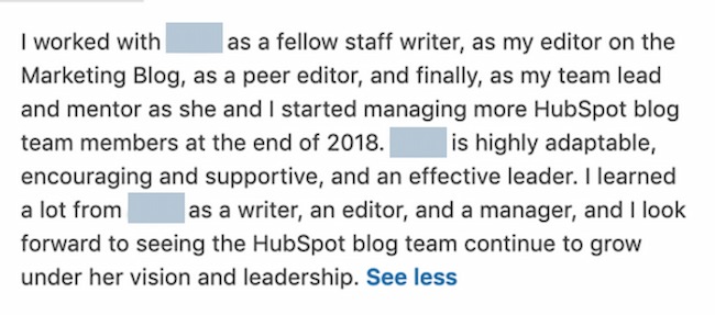
In the recommendation below, a person discusses how their supervisor progressed at the company and how this person mentored them so they too could grow as an employee.

Example 1:

How to write a LinkedIn recommendation example: Employee

Why I like this LinkedIn recommendation:

This recommendation shows how the relationship between employee and manager evolved over time. Work relationships that shift from peer to manager can be tough. They can sometimes create power struggles, miscommunication, and more, but I think this recommender does an excellent job at highlighting the employees’ mutual respect, care, and professional growth.

Example 2:

How to write a LinkedIn recommendation example: Employee

Why I think this is a good LinkedIn recommendation:

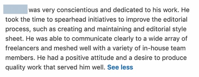
Soft skills can be difficult for recruiters and employers to assess. I pulled the recommendation above as a valuable example because it talks about a manager/employee relationship essential to this employee’s development, giving readers a sense of how this manager might engage with and leave a lasting impact on their new team.  

Example 3:

How to write a LinkedIn recommendation example: Employee

Why I like this LinkedIn recommendation:

We can all agree that an authentic recommendation is much more helpful than a formulaic recommendation that you could reasonably adapt to anyone’s qualifications. The rec above shows how this manager is unique in balancing kindness, critique, and composure on his team.

Recommendation from an Employer

Employer recommendations may be a replacement or a complement to the job requirements for many positions, which can make an employer recommendation an important LinkedIn addition. Unlike a standard recommendation you’d include in a job application, those on LinkedIn are short and to the point. Instead of a full page, most are even short but dense paragraphs like the examples below.

For example, in this recommendation, an employer explains how an employee progressed and executed projects that made a big impact on their company.

Example 1:

How to write a LinkedIn recommendation example: Employer

Why I like this LinkedIn recommendation:

I appreciate that the recommendation jumps immediately into specific job functions, technical skills, and soft skills. A quick scan of this letter can show any employer what this person does best and how those skills can translate to other jobs or employers.

Example 2:

How to write a LinkedIn recommendation example: Employer

Why I think this is a good LinkedIn recommendation:

Connecting actions to outcomes can make it easier for prospective employers to understand the value an employee can bring to their team. I believe this rec does an excellent job at outlining what a new hire did, how she approached changes, and the results she brought to her team. 

Example 3:

How to write a LinkedIn recommendation example: Employer

Why I like this LinkedIn recommendation:

This recommendation letter uses industry-specific terms to show the activities and outcomes this employee was responsible for. This makes it easy for employers to understand how that performance could translate to their business and team.

Recommendation from a Coworker

Over 20% of LinkedIn users are 18-24 years old. This means that many LinkedIn users are recent graduates who might have limited job experience.

linkedin age group

Employers are looking to LinkedIn for a sense of your commitment, engagement, and soft skills at work; coworkers are a great source to highlight these areas. Let’s look at some excellent coworker recommendations from LinkedIn.

Example 1:

How to write a LinkedIn recommendation example: Coworker

Why I like this LinkedIn recommendation:

This letter quickly highlights how long they’ve worked together, what they did, and the candidate’s strongest soft skills. It stays positive but also showcases how this person responds to pressure.

Example 2:

How to write a LinkedIn recommendation example: Coworker

Why this is a good LinkedIn recommendation:

I’d be elated to receive a review like this from a coworker. It’s full of job-specific details that emphasize abilities and shows off the recipient’s unique qualities that might not come out in a job interview. Outlining teaching skills and continuing education shows potential employers how the candidate is preparing for the future. 

LinkedIn Recommendation Sample (for a Manager)

Now, writing a LinkedIn recommendation can seem easy, but it’s not. What if the employee you’re recommending is your superior? This can make it more difficult to recommend the person — even if you’re saying stellar things about them.

Here’s a sample LinkedIn recommendation template — written in full — that a manager would be proud to receive.

I’ve worked for Lisa for two years. During that time I’ve seen her quickly take on new responsibilities while making time to teach these new skills to her employees.

By inheriting tasks like campaign analytics and email A/B testing — both of which extend beyond the scope of our team — she’s made our department much more agile and set me up for promotion last month. Lisa is a great person and manager, and her next employer will be lucky to have her.

Now proofread, and hit send. Remember, the person you’re writing your recommendation for can review and request changes. So, you’ll have a chance to make changes and submit a recommendation that they’ll appreciate.

Write a Recommendation on LinkedIn Today

LinkedIn isn’t just job hunting and your professional reputation—it’s about building relationships. The sooner you start writing recommendations with the steps above, the better your professional relationships can be.

write-linkedin-recommendation_0 (1)

Categories B2B

20 Email Best Practices That Actually Drive Results

Even as new marketing channels crop up, email marketing continues to be an effective way to generate leads and convert more prospects for your business.

According to a HubSpot survey, 94% of marketers find email marketing effective for reaching their business goals.

→ Download Now: The Beginner's Guide to Email Marketing [Free Ebook]

To get the most out of your email marketing strategy, check out these best practices.

Table of Contents

17 Inbound Email Marketing Best Practices

1. Don’t purchase contact lists.

This first tip should come as no surprise, but given the General Data Protection Regulation (GDPR), it bears repeating.

Email campaigns depend on a healthy open rate. If you’re contacting people whose information you bought — rather than earned from a previous interaction — you‘ll quickly see your emails’ performance drop.

The GDPR also requires each European recipient’s consent before you contact them. Purchased email lists usually do not come with that consent.

For help reaching your target audience, consider Versium Reach — a platform for B2B marketers that allows you to own data on your target audience across multiple marketing channels.

2. Avoid using ‘No-Reply’ in the sender’s email address.

Have you heard of CAN-SPAM? This long-standing legislation is a popular and important guideline for all email marketers in the U.S.

One major rule in CAN-SPAM is to never use the words “no reply,“ or a similar phrase, as your email sender’s name (for example, ”[email protected]”).

“No reply” in an email message prevents recipients from responding and even opting out of further emails, which CAN-SPAM protects their right to do so at any time.

Instead, have your automated emails come from a first name (for example, [email protected]). Your customers are much more likely to open emails if they know a human being wrote them. Plus, it keeps you compliant with email regulations.

3. Stick to fewer than three typefaces.

The less clutter you have in your email, the more conversions you’ll get.

Don’t junk up your message with more than two fonts or typefaces, as that can distract readers and ruin your email’s visual appeal.

In the email example below from recruiting SaaS company Greenhouse, the company sticks to just two fonts.

Not only does this make it easy to read, but readers can focus on the context of the email rather than get distracted by the styling.

Image Source

In addition, use web-safe fonts with sizes between 10-point and 12-point. This ensures your email will be legible on all readers and devices.

4. Optimize the email’s preview text.

If you subscribe to any newsletter, you’ve likely seen a message like this at the top of your email: “Email not displaying correctly? Click here.”

While it’s a helpful message, keeping it in the preview text of your email (also known as the preheader) can significantly impact your email’s open rate.

Firstly, because you’re telling recipients, “Hey, this email might not work.” Secondly, it doesn’t provide any insight into what the email is about.

Your preview text should supplement your subject line by adding details to capture your audience’s attention and encourage them to open.

By default, preview text pulls in the first several words of the email body and displays it next to the subject line before the person opens it.

The problem is that custom email templates often stick with conditional statements like “Can’t see images?” or “Not displaying correctly?” at the top banner, allowing it to slip right into the preview when it goes out.

As a rule of thumb, always write a custom preheader that teases what your email will offer.

Pro tip: HubSpot users can fix this problem by customizing the preview text themselves in the backend of their email marketing newsletter.

5. Include an email signature.

Even if your newsletter is technically being sent to your contacts on behalf of the company, rather than an individual, the email should include the signature of a specific person.

In a 2020 State of Business Email Marketing study, 62% of marketers said they use email signatures to increase visibility around their branding.

When you consider that every email sent on behalf of your company is another branding opportunity, it makes sense to include a signature.

Your email signature should include some sort of CTA, whether that’s a link to your website, social media, or a specific landing page.

Image Source

Another reason you should include your email signature is that it’s a touch of personalization.

People are naturally more inclined to read an email if they know it came from a human being, not just a collective marketing team. Your email signature is your ticket to their attention.

Want a quick way to make a beautiful email signature? Use HubSpot’s Email Signature Generator. We also have an Out-of-Office Email Generator to make your response to incoming messages just as delightful.

6. Clean your mailing list regularly.

Some of your email contacts might not opt out of your email campaign but will still never open your emails.

According to a HubSpot survey, over 32% of marketers say low open rates are one of their biggest challenges with their email marketing strategy.

Emailing as many people as possible is tempting, but keeping your least-engaged recipients on your mailing list can kill your open rate.

People who never open emails make your campaign look worse since you‘re not analyzing the campaign’s quality against your most loyal recipients.

Review your list of subscribers who haven’t engaged with your emails over a certain period, and remove them regularly.

This gives you a more accurate email open rate and keeps your email campaign clean of people no longer interested in hearing from you.

You can also implement a workflow in which they’re gradually moved to a less frequent email list based on activity.

For instance, say you have a daily newsletter. You could implement a workflow in which subscribers who do not open your email in two consecutive weeks are moved to the weekly email.

Then, those subscribers could be moved to the monthly newsletter if they don’t open four consecutive emails. And so on.

It keeps you from bombarding your subscribers with emails they’re not interested in, all while keeping your list clean.

7. Keep the main message and call-to-action above the fold.

Above the fold refers to the information visible to the reader before they scroll down.

Even though recent research suggests that consumers scroll more than they used to — because of social media and vertical timelines — above-the-fold content still gets the most attention when considering that people don’t have long attention spans.

According to a 2022 report from Litmus, people spend an average of nine seconds looking at an email.

With this in mind, place your main message and CTA above the fold. It’s the first thing your recipients will see once they open your email, increasing your conversion rate.

You can also run an A/B test first to validate the hypothesis and see if it works for your emails.

8. Personalize the email greeting.

How often do you read emails that begin with “Dear Member?”

You might segment your email audiences by their customer type (member, subscriber, user, etc.), but it shouldn’t be the first thing recipients see in your company messages.

Personalizing the greeting of your emails with your contacts‘ first names grabs each reader’s attention. For HubSpot users, this is called a personalization token, and creating one looks like this:

Then, the address line of your email would automatically produce the contact’s first name by fetching this personalization token in the email’s HTML, like this: Hi, !

Don‘t worry; personalizing an email’s greeting line with 50 recipients‘ names doesn’t mean you’ll have to manually write and send 50 different emails from now on.

Many email marketing tools today allow you to configure the greeting of your email campaign so that it automatically sends with the name of the people on your contact list — so everyone is getting a personal version of the same message.

9. Keep your email around 500 to 650 pixels wide.

If your email template is wider than 650 pixels, your email won’t show up correctly and will require users to scroll horizontally to read the full email.

This is a pain, to say the least, and will likely affect your conversion, especially when many users read emails on mobile.

Nearly 30% of marketers say that optimizing emails for mobile is one of the most effective strategies for increasing the click-through rate (CTR), according to data from HubSpot.

Having your template fit within the standard format will make for easier readability, better conversions, and an overall better user experience.

10. A/B your subject lines and calls to action.

If you can‘t seem to increase your email’s open and click-through rates, a couple of things might be wrong: You‘re not emailing the right people (if you’re buying your contact list, see the first tip at the top of this blog post), or the content needs to be improved.

To start, focus on the latter, and conduct an A/B test. 18% of marketers have found success with increasing click-through rates when they used A/B testing.

A/B tests can be used to improve almost any of your digital marketing content.

In an email, this test splits your recipients into two groups: Group A receives the regular newsletter, while Group B receives the newsletter with a specific variation. The variation can be anything from a different subject to another CTA.

This variation tests to see if your audience would be more or less likely to take an action based on that element.

HubSpot Marketing Hub users can conduct email A/B tests on anything from the subject line to the call-to-action (CTA) inside it.

For example, you might change the color of your CTA from red to green to see if your email‘s clickthrough rate increases. If it does, the test indicates that you should change all of your emails’ CTA color to green from now on.

11. Include your logo.

Logos are essential when it comes to emails.

A 2021 study by Red Sift and Entrust found that logos positively impact email engagement as well as brand recall.

The study found that when businesses include a logo in their emails, open rates increased by 21%.

Brand recall increased by 18% after a five-second exposure when including a logo in the email. Consumer confidence in the legitimacy of an email also increased by 90%.

With this in mind, add your logo to your email design to ensure that it’s always included.

12. Name the offer in your subject line.

You can drastically increase your open rates by including an incentive in your subject line.

31% of marketers say that emails with special offers or promotions have the highest open rate, and 30.7% of marketers say these emails also have the highest click-through rate.

If you’re running a promotion, use incentive-focused subject lines like “Free shipping when you spend $25 or more” or “Receive a free iPad with a demo.”

Here’s an example of an email with an enticing subject line and warm, welcoming body copy. The subject line for this email from Elementor says, “Up to 50% off when upgrading!”

However, be careful not to overwhelm your readers with savings- or product-related emails.

Customer loyalty starts with casual industry insights — only after nurturing should you start introducing offers.

13. Allow recipients to subscribe to your newsletter.

You might be thinking, “Wait, if they received the email to begin with, shouldn’t they have already subscribed?”

Usually, yes. Therefore, adding a “Subscribe” button to your email doesn’t help those who’ve already agreed to receive your emails.

But great content is shareable content, and if your current subscribers are forwarding your emails to their friends and colleagues, you’ll want to help them subscribe, too.

Add a small but visible CTA that allows the recipient to subscribe to the newsletter if they received this email from someone else.

This email newsletter called Contentment is a great example of how to include a sign-up CTA in your email without distracting from the rest of the content:

Image Source

But remember, because your newsletter should already be driving another action, such as downloading an ebook or signing up for a webinar, make sure this “Subscribe” button doesn’t distract or confuse users, weakening your main campaign goal in the process.

14. Write compelling (but concise) subject lines.

A good subject line should contain between 30 and 50 characters, including spaces. The reason why you do this is that email providers often cut off subject lines that go beyond this length.

Your email subject line should also create a sense of urgency while giving readers some indication of what to expect once they open the email.

15. Create automated emails for opt-ins.

Be prepared for your readers to forget they opted in.

Set up an automated email flow that reminds people they opted into your email database. The auto-responder should be sent out one day, five days, and 10 days after the person subscribes.

Each automated email should also include additional content or bonus material to reward the reader for opting into the newsletter — or your readers might not feel they have enough incentive to actually stay on your list.

16. Closely tie emails to landing pages.

If you’re promoting a specific landing page in your email, the landing page should match the email in terms of headline, copy, and content.

The look and feel of your landing page should also match the email to help create consistency, which goes a long way toward earning a customer’s trust.

Also, make sure you‘re using tracking tools to see which emails and landing pages performed the best so you can keep sending what’s working.

17. Conduct a five-second test.

Send a copy of the email to a friend or colleague. Can they quickly tell what your CTA is? If so, you’re ready to hit send. If not, figure out how you can tweak your subject line. Or, if there’s a different landing page, you should link to it.

3 Outbound Email Best Practices

If you’re sending emails for lead generation — for example, in a sales position — then there are a few more outbound email best practices to employ.

Following these best practices ensures you’re effectively forming strong connections that can lead to potential business opportunities.

1. Make it personal.

Sending an outbound email isn’t too different from sending a marketing email.

You should still be personal, but even more so when you know your email is only being read by the receiver.

Start by letting them know how you know them. Have you already connected on Twitter or in a Slack group? Is this a completely cold email? Figure out where you stand so you know how best to personalize the greeting and message.

2. Include a clear CTA.

What do you want the receiver to do next? Set up a call? Book a demo? Make your CTA clear from the beginning so there isn’t any question about what the purpose of your email is.

Also, don’t close with a vague, open-ended message like, “Let me know what you think!” Instead, offer a clear statement or question, such as, “When is a good time to set up a call?” Being direct and clear helps limit the time the receiver spends figuring out what you want.

3. Follow up.

Follow up when necessary, but don’t bombard the receiver with a million follow-up emails.

Be aware of the typical response time from people in your industry or people you reach out to. Anywhere from two days to one week is a reasonable amount of time between sending your first email and sending a follow-up.

Getting Started

There are a lot of new tools at a marketer’s disposal that are getting attention these days. But email marketing has stood the test of time regarding its influence on your users.

This old, reliable, and faithful tool can ensure you get the most out of your marketing initiatives if you follow these effective email best practices.

Editor’s Note: This post was originally published in June 2019 and has been updated for comprehensiveness.

New Call-to-action

Categories B2B

16 of the Best Facebook Ad Examples That Actually Work (And Why)

On average, Facebook is home to over 3 billion daily active users — from CEOs to students to companies. And while the community is clearly there, connecting with them from a marketing standpoint isn’t always easy.

For brands, posting on Facebook alone isn’t enough anymore, especially for ones just starting out. Sure, you can invest in promotional content to drive users to your Facebook Page and website, but this requires more than an ad budget: it requires strategy.

Free Lookbook: 50 Facebook Ad Examples That We Actually Clicked

One way to get the most out of your Facebook ad strategy is to create optimized Facebook Ads targeted at the right audience. By leveraging optimized ads, you can better allocate your PPC budget and better promote your brand.

We’ll show you how to make a great ad to achieve these goals through the best Facebook ad examples and practices we’ve seen yet.


So, what does optimized Facebook advertising actually look like? To gain some inspiration for your next Facebook ad campaign, take a look at our list of the best Facebook ad examples from across industries.

Featured Resource: 50 Amazing Facebook Ad Examples

See these best practices in action with our collection of 50 Facebook Ad Examples from real businesses that we admire.

50 Facebook Ad Examples

1. SofaLush

Video Ad

sofalush facebook ad

Why This Ad Works

  • It’s visual: The video in the ad clearly demonstrates how the product works. Also, the video opens with a pressure cooker that seemingly “disappears” during the course of the video. This Easter egg prompted a lot of engagement in the comments, which further improved the ad’s performance.
  • It’s relevant: It’s relevant to me because I was recently looking for new couches. This product shows an alternative to replacing my couch, on the off-chance that I might want to get more mileage out of my existing couch before making a new purchase.
  • It’s valuable: The “how-to” style of the video is meant to underscore the value proposition: making your existing furniture more stylish… without a lot of hassle.
  • It has a solid call to action: The ad states that there are over 150 designs to choose from and has a button that prompts me to “shop now” and see if one of them would fit my style.

2. Lume Deodorant

Photo AdLume deoderant facebook ad example

Why This Ad Works

  • It’s visual: The vibrant, purple hues of the text, packaging, and background guide the user to the most important information on the ad like how Lume deodorant “Stops Odor BEFORE it starts.” The smiling model may showcase where you most commonly apply deodorant — your underarms — but the text makes a bold value statement that you can actually use it all over your body. This ad makes you feel better about a topic that doesn’t always feel so good — sweating — by making you feel confident in your antiperspirant protection.
  • It’s relevant: I have been recently researching skincare products to begin a new regime. With this behavior cue, Lume knows that organic deodorant is better for skin but many brands fall short of being able to block odor, and some even cause rashes. This is also aluminum-free deodorant, an increasingly desirable option amongst consumers like their target audience.
  • It’s valuable: Knowing where other organic deodorants fall short, Lume positions their brand without those drawbacks, and they do it in a clever and engaging way (the song).
  • It has a clear call to action: The end of the photo ad prompts the user to click “Get Offer” so they claim their starter pack — a hassle-free proposition for consumers new to their products and unsure of where to start.

3. Kay Jewelers

Video Ad

Facebook video ad by Kay Jewelers

This Facebook video ad from Kay Jewelers tells a quick but moving story — something Kay Jewelers is well-known for — using just a few seconds of your time. You don‘t even need the sound on in the video above to know what’s happening and the message Kay is sending.

If you‘re advertising a product with sentimental value, like Kay Jewelers, video ads are the way to go. Just be sure your video has a clear (and happy) ending — people view videos more passively on Facebook than they would on YouTube and don’t have time to interpret your ad if it’s too long or complex.

Why This Ad Works

  • It’s visual: Even though this is a video, I have a general idea of what I will be watching, thanks to the screen capture it started with. Additionally, I can understand the gist of this ad without playing with the sound on, which is important given that most users are more likely to view videos with the sound off.
  • It’s relevant: It’s relevant to me because I was recently scouring jewelry websites, specifically for necklaces like the one in the ad.
  • It’s valuable: Kay shows potential customers the value of purchasing with the help of the happy reaction from the woman receiving the gift in the ad. Plus, who doesn’t love dogs?
  • It has a solid call to action: This ad is set up to drive Page Likes, which is an easy, one-click way for me to get more relevant content served up to me.

4. Monday.com

Photo Ad

Facebook photo ad by Monday.com

Monday.com is a task-management tool that caters to multiple operating systems, both desktop, and mobile. But in the photo ad above, the company used its compatibility with Mac computers to remix its own logo in the original rainbow colors of the Apple brand.

For growing businesses like Monday.com, it‘s a smart idea to pivot off the brand awareness of household names. By filling the Monday logo with Apple’s famous rainbow color-way, the ad above captures the attention of Mac users who’d recognize those vintage rainbow stripes anywhere (and could use a new task-management tool that works on their computer).

Why This Ad Works

  • It’s visual: The rainbow colors filling the Monday logo are both eye-catching against the black background and familiar to any Mac user.
  • It’s relevant: For Mac users, and those who need to organize their tasks on a regular basis, this ad is relevant to their lifestyle in more ways than one.
  • It’s valuable: The ad calls attention to Monday‘s compatibility with Mac computers, making the product’s user experience more valuable to Mac users as a result.
  • It has a clear call to action: The “Learn More” CTA on the bottom-right of the ad is a clear invitation to find out more about this product’s usage on Apple hardware.

5. Amazon

Event Ad

Facebook event ad for litter box by Amazon

This is how an event ad from Amazon looks in the News Feed on a desktop. This ad works well on a few different levels: A sample product is clearly displayed, the ad shows an impressive (but honest) rating of that product, and you know which event Amazon is promoting right away — Black Friday.

Ecommerce companies like Amazon use event ads to boost sales at specific points during the year, and Facebook event ads make this easy. When investing in event advertising, build a list of the holidays, shows, conferences, and awareness months your business cares about. That way, you know exactly which market campaigns line up with these occurrences and when to promote them on your Facebook Business Page.

Why This Ad Works

  • It’s visual: Not only is this image larger than the right column ad display, but it also uses warm colors, white space, and directional lines, which drew my eye toward the featured product.
  • It’s relevant: As a cat mom, this offer is clearly tailored to my consumer needs.
  • It includes an enticing value prop: Amazon has advertised a self-cleaning litter box here, which is of tremendous value for any cat owner. Additionally, it shared the strong customer ratings below an image of the product. (Social proof, anyone?)
  • It has a clear call to action: Amazon instructs me to click on its ad today, after which point the deal for the litter box will presumably disappear. “Now” is strong CTA language that compels clicks.

6. NatureBox

Photo Ad

NatureBox Facebook Ad

This photo ad by NatureBox features a creative point-of-view shot that is perfect for the angle at which you‘d dive into the company’s various healthy snacks. The ad makes you imagine your next house party… I thought the peanuts spilling out onto the table was a nice touch.

In your next Facebook photo ad, play around with live-action photography and digital design in the same image. As you can see in the ad above, NatureBox was able to design a vibrant “free trial” icon right on top of an image that would’ve worked just as well on its own.

Why This Ad Works

  • It’s visual: The image shows you exactly what you’re getting, and it calls out the “free trial” CTA well.
  • It’s relevant: Everyone likes to snack. In all seriousness, the person who saw this is a fan of several lifestyle subscription companies, which is what NatureBox is.
  • It’s valuable: This ad is full of value. First, the “free trial” callout is the first thing your eyes go to when looking at the image. Second, it clearly mentions the healthy aspects of the goodies in its product.
  • It has a clear call to action: NatureBox is asking you to try its free sample. It couldn’t be easier to know your next step.

7. Winc

Retargeting Ad

Facebook retargeting ad by Winc

Here’s an example of a short and sweet (literally) retargeting ad from Winc (formerly known as Club W). This ad is displayed on the right column of Facebook specifically for users who browse wine-related content online. When your ad caters to people who you know would be interested, modeling the product the way Winc does above can be a home run for your brand.

Why This Ad Works

  • It’s visual: The visual is clear, simple, and appealing to all types of wine lovers wine-lovers.
  • It’s relevant: This came up in my wine-obsessed colleague’s News Feed. Need I say more? Two thumbs up on relevance.
  • It includes an enticing value prop: Three bottles for $19? What a steal. They also pull the viewer in with an additional value: a discount on their first order of wine.
  • It has a strong call to action: The word “get” is strong call-to-action language, and it’s used twice here. A time limit on this offer would have made it even stronger.

8. Shutterfly

Multi-Product Ad

Shutterfly mutli-product facebook ad example

Here’s an example of a multi-product ad from Shutterfly, along with the additional images that are used in the ad. Each image has a different offer, to appeal to many different demographics in one ad.

In each image, the product being promoted is consistent in the look and feel of the Shutterfly brand — this is an important quality of ads that showcase more than one item and picture.

Why This Ad Works

  • It’s visual: This series of images leans on a consistent color palette, making it feel both cohesive and on-brand. (Including delicious-looking cupcakes doesn’t hurt either.)
  • It’s relevant: The person who saw this loves taking photos of life events like graduations and creating sentimental gifts from these moments. Spot on, right?
  • It’s valuable: There is a clear value for the user, 50% off each of the products being advertised. The sale details aren’t stated and it only alludes to a fastly approaching end date but this also encourages users to click through to the website in order to find this information. This ad also has an added level of value, it is showing the many different ways people can create grad cards and gifts using Shutterfly, in ways many may not be aware of.
  • It has a clear call to action: I know I need to use this before February 17th when this deal expires, so I would be encouraged to take action right away.

9. MU Campus Dining

Reach Ad

MU Campus Dining Facebook Ad

This Facebook Reach ad from Mizzou Campus Dining promotes amenities at the University of Missouri, using two familiar logos and a marketplace that anyone on campus might recognize.

The ad copy beneath the image invites customers in “after the game” — a reference to campus life that helps Facebook users imagine when they might want to stop in for a sandwich.

Why This Ad Works

  • It’s visual: This image has college pride, a variety of salty and sweet treats, and a well-known logo to attract hungry college students.
  • It’s relevant: This ad is likely only being shown to students on campus who are in its target audience. It also mentions the sports game that was going on at the time and plays to the student’s current needs: snacks and Subway sandwiches.
  • It’s valuable: Mizzou Market is telling hungry college students that it has everything students need for the big game.
  • It has a clear call to action: This ad has the option to show directions, making it extremely easy for a college student on the go to follow the walking directions to this market.

10. Boston Sports Clubs

Offer Ad

Facebook offer ad by Boston Sports Clubs

All consumers really need to see is the boxer pictured above to know what this ad by Boston Sports Clubs (BSC) is offering. The woman in the photo even looks like she’s staring at the text to her left, getting viewers to shift their attention to the promotion right away.

This Facebook Offers Ad makes it obvious what customers would be signing up for when they click the “Sign Up” CTA button below the picture. Offer ads can easily mislead viewers into pressing their CTA just to get them to click on it, but it ultimately doesn‘t convert viewers into customers. BSC’s approach above is clear and upfront about what it’s offering throughout its conversion path.

Why This Ad Works

  • It’s visual: The featured photo uses bold colors and clear typography to draw my attention to the details of the offer, and the woman exercising gives me an idea of what I could gain from purchasing the offer.
  • It’s relevant: I recently moved to Boston and have been searching for gyms in my area online, so this ad is highly relevant to my recent Facebook and search activity.
  • It’s valuable: Paying $5 for a monthly gym membership is a great deal. Even though the price may increase in the future, the low price definitely makes me want to click.
  • It has a clear call to action: The CTA emphasizes that the discount offer is limited and should be claimed quickly using the word “hurry” and telling me when the offer expires.

11. Allbirds

Video Ad

Facebook video ad by Allbirds

This video ad by Allbirds, a shoe maker, uses simplicity and whitespace to its advantage. The video only lasts nine seconds, but Allbirds demonstrates the product in a way that catches your attention and resonates with the individual wearer.

There’s a lot of ad content on Facebook, and when Facebook users scroll through their News Feeds, that content starts to blend together. Sometimes your best chance at sticking out on Facebook is by using subtle movements and details — like Allbirds did, above. Let every other video on Facebook be quick and flashy, and yours will be a breath of fresh air to your audience.

Why This Ad Works

  • It’s visual: The video has a clear focus on a subject, and that subject is engaging in a movement that means something: These shoes are comfy. I subconsciously started wiggling my own toes as I saw this ad for the first time.
  • It’s relevant: I’m always interested in finding new shoes — I probably search or click on something related to footwear once a week. This ad feeds that interest in a unique way.
  • It’s valuable: The opening quote above the video is reason enough for me to want to learn more about why these shoes are so comfortable. Allbirds also sweetens the deal with “free shipping,” “free returns,” and a note below the video that the product is “machine washable” — all without taking the focus away from the video itself.
  • It has a clear call to action: If I want these shoes, there’s a “Shop Now” CTA button to the bottom-right of the ad, waiting for me to take a closer look at them.

12. The New York Times

Photo Ad

New York Times article Facebook photo ad example

This photo ad by The New York Times is driving traffic to a written article with an intriguing illustration. The drawing literally depicts the article’s ideal audiences — working men and women raising children. For parents who are even a little interested in understanding burnout and mental health, this image (along with the statistically backed report in the headline) clearly shows a tired mom trying to catch some rest with her children.

When publishers advertise on Facebook, they need to connect with their audience through featured images that evoke emotion — if their main product is a reading experience; the photo they choose has to complement their written content perfectly. The New York Times’ ad above is an example of photo ads done right.

Why This Ad Works

  • It’s visual: This ad is emotionally impactful — if you have not been a tired, working parent then it is you’ve seen them, and that sight can make you feel immense compassion towards them. By including a visual that makes a user care enough about the ad to read it and click through, NYT is accomplishing the goal to which every ad aspires.
  • It’s relevant: Especially, in the wake of COVID with parents simultaneously balancing work and personal life within the same space, the topic is incredibly relatable. This is an article I would personally be interested in reading, and it helps that the ad appears like a native post promoting an article in my News Feed.
  • It includes an enticing value prop: The ad states that you can find help if you recognize the signs of parental burnout, which can feel like being tossed a life jacket — especially to the parents reading the report. This social proof makes you more likely to click and read the article.
  • It has a clear call to action: This ad is dedicated to helping parents make sense of the signs and get help for their fatigue, so by encouraging parents to ”Learn More”, the call to action makes you want to click the article to finally find answers.

13. Tortuga Music Festival

Event Ad

Tidal Wave Music Festival Facebook event ad example

Successful event ads have at least two important qualities: the event‘s schedule and something to justify why people should attend. The event ad above for the Tortuga Music Festival accomplishes both of those things — it displays the date and time and the bands playing and shows you a picture of the amazing time you’ll have if you come.

Why This Ad Works

  • It’s visual. The picture alone is worth a thousand words about how much fun this concert would be. Not only is it on the beach, it was also taken on a gorgeous day and the stage looks amazing. Also, it clearly represents what to expect during the event, and it catches the eye as someone scrolls through their News Feed. (The beautiful ocean water definitely helps.)
  • It’s relevant. The person who saw this ad is a fan of Kenny Chesney and has been to his concerts before. They’re also originally from Florida, which is where this event takes place.
  • It’s valuable. Since the image was taken on a beautiful day, it looks like an ideal place to be — especially to those of us viewing it from our office desks. It also clearly tells you the cost of the ticket so you know before you click. (This is also good for the advertiser: By including the price, the ad allows users to self-select based on whether they can afford the ticket. If they can‘t afford it, they won’t click through, thus saving the advertiser money on unqualified clicks.)
  • It has a clear call to action. The CTA is clear: “Buy.” The advertisers also add urgent wording with the title “Time is running out!”, encouraging you to purchase your ticket now before it’s too late.

14. Adrianna Papell

Retargeting Ad

Adrianna Papell Facebook Ad

Last week, I started shopping around for a bridesmaid dress for an upcoming wedding I’ll be in. Today, the ad above appeared in my News Feed.

Retargeting ads enable you to get in front of those viewers who are already looking for what you‘re offering. This retargeting ad by Adrianna Papell doesn’t just show me what I‘m on the market for — it excites me about how beautiful our own wedding party pictures will look on my friend’s big day.

Why This Ad Works

  • It’s visual. The image gives me a good idea of what to expect from the designer’s website, and it definitely helps that the gowns are both unique and stunning. Talk about a showstopper.
  • It’s relevant. The ad called out that I was already shopping for bridesmaid dresses, and what’s more, I had previously looked at dresses on this exact website, so this ad is highly relevant to my search.
  • It’s valuable. The variety of dresses in the ad’s image and in the description make this website worth a visit for someone trying to find the perfect gown out of thousands of options.
  • It has a clear call to action. The CTA is “Shop Now,” which encourages me to click to purchase the beautiful dresses in the ad’s image.

15. Bustle

Boosted Post

Bustle Facebook Ad

Here‘s an example of a boosted post from Bustle, which promoted one of its articles on Facebook. Paying to “boost” a post you already posted organically to your Facebook Business Page can greatly benefit content that has mass appeal — versus a post that targets a specific segment of your audience. Bustle’s choice of a boosted post here falls into that first category.

From Amazon‘s vibrant neon sign in the photo to the high number of examples included in the article (42, to be exact), Bustle’s boosted ad is sure to pique the interest of many Amazon and Bustle followers.

Why This Ad Works

  • It’s visual: Lots of people are familiar with the Amazon Prime logo, but not in neon lights in a window display. It made me do a double-take while scrolling through Facebook.
  • It’s relevant: As we’ve already learned from the earlier examples, I like shopping on Amazon and also read Bustle, so this article is a combination of those two behaviors.
  • It’s valuable: “Brilliant” is a strong adjective to describe products, which makes me curious to learn more about purchasing them.
  • It has a clear call to action: The ad entices me with information about useful and “brilliant” gadgets I can get delivered to my door within two days, which I’m happy to click to learn more about.

16. La Colombe Coffee Roasters

Offer Ad

facebook ad example: la colombe coffee roasters

This ad from La Colombe Coffee Roasters is promoting its canned Oatmilk Salted Caramel Latte with a 20% off discount. It emphasizes that the drink has all the same flavor and creaminess of a regular latte — without the dairy.

Offer ads can be a highly effective way for businesses to attract new customers, drive conversions, and generate buzz around special deals. By leveraging Facebook’s ad targeting capabilities, La Colombe is able to present their discounted offer to customers directly on their feeds.

Why This Ad Works

  • It’s visual: The vibrant colors in the photo instantly caught my eye as I was scrolling through my Facebook feed. Plus, the offer is highlighted in bright red, making it stand out in the image.
  • It’s relevant: I’m an avid coffee drinker and I had been searching for canned coffee brands earlier in the day.
  • It’s valuable: The ad offers a 20% off discount code on the first purchase, which gives me more incentive to try out the product.

It has a clear call to action: The CTA “Shop Now” invites me to find a new canned coffee that I can use the discount on.

Facebook ads can be a great way to reach out to potential customers, but it’s important to make sure yours stands out from the rest. Creating a great ad is all about understanding your audience and what they want to see, these insights will show you how to leverage Facebook ads so that they work for you.

To invest in Facebook Ads effectively, you first need to know who your ads are directed toward. When creating a new ad on Facebook, you can create a new audience that includes many customizable characteristics. Among them are:

  • Location.
  • Age.
  • Sex.
  • Languages spoken.
  • Interests and behaviors.
  • Their connections to your other business-related pages on Facebook.

You can also create what’s called a Lookalike Audience, which permits Facebook to create an audience for you that best resembles a particular “source.” This source can include some or all the information listed above.

Facebook Ad Formats

After you define the audience you want your ads to reach, it’s time to choose the Facebook Ad format you think they’ll find most engaging from these eight options:

Format 1: Photo Ad

Photo Ads are still images that can help to promote a product or event you want to specifically call attention to. If you have a special promotion going on, for example, this ad format puts a crisp snapshot of your product or venue at the center of your ad.

For ads shown in a Facebook News Feed, the recommended image resolution is at least 1080 x 1080.

Format 2: Video Ad

Video Ads have a GIF or video as the centerpiece of the advertisement and can be used to demonstrate a product or event. Video Ads help you form deeper connections with your audience by aligning your brand with a type of content online users are quickly consuming more of (nearly 80% of all data consumed on mobile devices will be in video form by 2021, according to a Facebook study).

There are six types of video ads you can invest in on Facebook:

  • Short Videos and GIFs
  • Vertical Videos
  • Instagram Stories
  • Video Carousels
  • Video Collections
  • In-stream Videos

Format 3: Stories Ad

Stories Ads are a part of Facebook Stories, one of the newest content types rolled out by Facebook that allows users to post temporary clips and images of their day for their friends to see. This type of ad is fitted to the dimensions of a mobile device and can be played on both mobile and desktop.

As users browse their friends‘ Stories, these ads can appear in the same format inside a stream of Stories. For this reason, it’s best to create Stories Ads that reflect the same candid and entertaining look and feel that people see from their friends. Stories Ads can be placed on Facebook, Messenger, and Instagram.

Format 4: Messenger Ad

A Messenger Ad appears as a direct message in a user‘s message list when they’re inside Facebook’s Messenger app. These ads allow you to interact with your audience, showing them offers you think they would like, and listening to their responses to better tailor your next message to their interests.

Let‘s say your ad’s first message is “What product might you be interested in?” The user can then select from three different responses, triggering your ad to produce a more specific product offer directly in the message thread.

Format 5: Carousel Ad

Carousel Ads contain a series of images or videos that users can rotate through, all of them helping to describe a single product, service, or event the ad is promoting. Each Carousel Ad can contain up to 10 images or videos at a time and link to their own individual web pages. Because these ads carry so much media, according to Facebook, they’re ideal for:

  • Endorsing multiple products.
  • Promoting multiple features of the same product.
  • Telling a story or sequence of events that unfold over the course of multiple pictures or videos.
  • Explaining a process to potential customers.

Format 6: Slideshow Ad

Similar to Carousel Ads, explained above, Slideshow Ads segment your ad into individual images that users view one after another. The difference between these two ad formats is that Slideshow Ads only play images (not videos), and the ad compiles these images into a slideshow that plays automatically in the form of a video. According to Facebook, Carousel Ads are ideal for:

  • Creating a video-like experience for users quickly and with a small budget.
  • Advertisers who want to choose from a library of pre-created images and music (a unique perk of Facebook’s Slideshow Ad).
  • Simplifying an otherwise complicated concept or process for potential customers.
  • Reaching people who have slower internet connections (Slideshow Ads use five times less data than video ads on Facebook).

Format 7: Collection Ad

A Collection Ad allows advertisers to bring the buying process directly into Facebook, so potential customers can move from “discovery” to “purchase” more easily when they see a product they like. This ad format features a central image or video promoting a product, with a collection of four smaller images below it that viewers can click on to learn more about the product. There are four types of Collection Ads you can invest in:

  • Instant Storefront: This ad is ideal for displaying multiple products as part of the same ad campaign, and driving traffic to each product’s respective product page.
  • Instant Lookbook: This ad is ideal for demonstrating or modeling a product in various contexts for your audience.
  • Instant Customer Acquisition: This ad is ideal for driving traffic to, and prompting them to take a specific action on, a product’s landing page.
  • Instant Storytelling: This ad is ideal for telling a story about your brand or helping your audience learn more about the business.

Format 8: Playables

Playables cater specifically to app developers. This ad format allows your audience to watch, preview, and even play an abbreviated version of your new app directly from inside the ad.

So let’s take a look at the different ad placements that you can use to best position your brand promotion.

Facebook Ad Placements

After customizing your ad’s audience, you need to consider how the ad will look on both desktop and mobile. This ensures you design your ad for easy viewing no matter where it appears on Facebook. Here are three different places you can see your Facebook Ads show up:

Placement 1: Right Column

facebook ad: Right Column Facebook Placement

Image Source

This type of ad is the most traditional on Facebook, it appears on the right side of a user’s Facebook News Feed. This is the first type of advertising Facebook had, and it still exists today.

Although ads in the News Feed are likely to get higher engagement metrics due to its native advertising features, right column ads shouldn’t be forgotten. We often see less expensive clicks and conversions when using these ads. In order for a right column ad to be successful, it needs to be relevant, have a value proposition, a good visual, and have a call to action.

Placement 2: Desktop News Feed

facebook ad: desktop news feed placement

Image Source

This type of ad appears directly in a user’s News Feed when they access Facebook on a desktop computer, and it looks more like native advertising. In our experience, these ads have a higher engagement rate than right column ads, but they can also be more expensive. These ads must follow organic Facebook posts’ best practices and be both engaging and visual.

Placement 3: Mobile News Feed

facebook ad: Mobile Facebook Ad Placement

Image Source

Like the desktop News Feed ad, this type of ad appears in the user’s mobile News Feed and displays like an organic post from the people and Pages they follow.

Pro tip: When picking your ad placements, think about the best position to showcase the Facebook ad format you choose, as well as, the ad template you use to add color to your marketing vision.

Facebook Ad Templates

Facebook Ads can be used to accomplish a number of different goals for your business. Here are a few real ads that you can use as templates of inspiration when creating an ad that targets the same goal:

Video Product Demo Facebook Ad Template

Facebook ad template for video

Image Source

Video ads appear fairly large in the user’s News Feed and offer more engaging content than static posts. And with 100 million hours of video being watched on Facebook every day, it serves as an interesting — and potentially profitable — ad type for marketers to try out.

How can you create your own video ad? First, understand Facebook video ad requirements including length and video size. We suggest keeping your video as short as possible, even though Facebook allows you to upload a much larger video. Create a video that displays your product or service, and upload it directly to the Facebook ads manager by following these instructions.

Photo Model Ad Template

Facebook ad template for photo

Image Source

Another type of rich media advertising on Facebook is a post of an image. This is one of the most popular types of ads ever since Facebook began favoring visual content. The optimal size for News Feed photo ads is at least 1080 x 1080 pixels, otherwise, your image will get cropped. Adjust your image based on the target audience’s needs and by what will appeal to them the most.

Multi-product Ad Template

Facebook ad template for multi-product

Image Source

Multi-product ads allow advertisers to showcase multiple products within one ad. Viewers can scroll through the images and click on individual links to each product. You can promote multiple of anything, not just products — like different blog posts, ebooks, or webinars. These ads can be created in Facebook Ads Manager.

Reach Ad Template

Facebook ad template for reach ad and local awareness

Image Source

Reach ads on Facebook are designed to grow your local awareness. They only work if your business has a physical location to which you’re trying to drive real foot traffic. If you fall into this category, locally targeted Facebook ads might be a great fit for you, as you can hyper-target on Facebook down to the mile.

If your business has an offer or event going on at your store, set up a few Facebook Reach ads that appear only to people within a short distance of your store. Have these ads appear a few days prior to the event and on mobile devices while the event is happening. You may want to reach some people the day of the event who happen to be in the area and check their Facebook accounts on their smartphones.

Special Offer Ad Template

Facebook ad template for offer

Image Source

An offer ad is a form of Facebook advertising wherein a business can promote a discount on a product or service that can be redeemed on Facebook. The benefit of this? It eliminates one step in the buyer’s journey, which ultimately increases sales.

The offer ad has many benefits. First, it drives the user directly to the offer. The user claims it directly on Facebook, removing any added friction of needing to go to your website for the offer. You also can reach any type of audience that you want, as all the Facebook targeting options are possible.

Finally, you can include all the information needed for the user to decide if they want it or not, including the time period it is usable, the number of people who have already claimed it, and the exact amount the offer is. This will eliminate any unqualified clicks, which cost you money.

Event Ad Template

Facebook ad template for event

Event ads promote a specific event. The CTA on these ads usually sends users directly to the ticket purchase page, wherever that happens to be hosted.

Using this type of ad will help drive a targeted group of people to attend your event. These will show up in the News Feed of the specific audience you’ve chosen. Events are a big part of most businesses, but getting people to attend even a small event can be tricky. Promoting your event to a targeted specific audience on Facebook can help drive the right kind of attendees.

A good ad in this format will clearly show the benefit of attending the event: the price, dates, and a clear CTA to purchase a ticket.

Boosted Ad Template

Facebook ad template for boosted post

Image Source

A boosted post is an organic Facebook post that was originally on the homepage of a company’s Facebook, and that later was boosted with advertising money.

This is different from the above ads because it’s not created in the Facebook Ads Manager. You can include more in the description, as there is no limit to word count on boosted posts like there is in ads. You can also have a link in the copy.

The cons? Boosted posts leave you fewer options for bidding, targeting, and pricing. You also cannot run any types of A/B tests because you‘re promoting a post that has already been created; you’re not creating one from scratch.

Retargeting Ad Template

A retargeting ad promotes an ad to a specific list of previously identified people. Have you ever seen ads follow you across the internet after visiting a certain website? Then you’ve seen a retargeting ad.

Facebook has the same capability. An advertiser can advertise to a list of leads or customers by uploading a list of email addresses it already has into Ads Manager to make a custom audience. A good retargeting ad acknowledges that the brand knows you‘re already interested in its product. (Because let’s face it… retargeting can be a little creepy.)

Now that we‘ve covered the best ad examples, main formats, placement possibilities, and standard templates, let’s dig into ad best practices that help optimize your Facebook campaign.

The key to making great Facebook ads is about understanding your audience and what they want to see. By creating a promotion that is relevant and attention-grabbing to your target audience, you’re more likely to see a return on your investment.

Despite all of the advantages that Facebook offers advertisers, seeing success with Facebook ads ultimately comes down to your strategy and how well you implement it.

1. Target your ads to a specific audience.

Audience quality is more important than size because, with Facebook advertising, the goal is engagement and/or conversions. Casting a wide net to individuals who are not your target audience will tank your relevance scores and give you bad data to work from.

The good news is that Facebook’s targeting capabilities are more robust than any other platform, including demographics, interests, location, and even behavior. That means you can get far more specific on who you want to see your ads.

For example, you don’t have to settle for “women between ages 25 and 45” when you can target “women between ages 25 and 45 who like reading and whose favorite author is Suzanne Collins.”

By getting granular, you end up excluding users who are not your target market, showing ads to only those who will find it most relevant and who are most likely to convert.

2. Make your ads relevant to your audience.

Relevance is critical for success when using Facebook advertising. Remember, you are spending money when someone views or clicks on your ad (depending on the settings you use). If you‘re showing ads that aren’t relevant to your target audience, you’re wasting your time and money and will likely not see success with any advertising.

Facebook determines ad relevance through its ad relevance diagnostics (formerly ad relevance score). Several factors are evaluated to determine the relevance of your ad, including feedback from users (such as ad hides or negative feedback), engagement (such as clicks, likes, or shares), and predicted positive actions (such as conversions or video views).

Additionally, Facebook provides diagnostics for three specific dimensions: quality ranking, engagement rate ranking, and conversion rate ranking. Ultimately, the more relevant your ad is, the more favorably Facebook will treat them.

3. Include a visual element.

Visual content is not only treated more favorably in the Facebook algorithm, but it’s also more likely to be shared and remembered than written content. The lesson for Facebook marketers? No matter what type of ad you create, your image needs to be visually appealing.

Check out this blog post for a detailed guide to image sizes for various ad units on Facebook along with some tips on posting visual content.

4. Align your ads’ visuals and copy.

Let‘s say you’re running an ad for astrological jewelry. You’re targeting people who like astrology and whose birthday is coming up.

You could use a generic “buy a bracelet with your astrology sign” copy paired with an image/video of all the jewelry.

A better strategy, however, would be to target those whose birthdays are coming up and create a more specific ad targeting that astrological sign (e.g. “All you Geminis out there will love this” paired with a video of a specific Gemini product).

Aligning copy and visuals in a way that‘s relevant to the targeted audience provides a feeling of personalization which increases the likelihood of engagement and/or conversion. You’ll also see better ad performance due to higher relevance scores.

5. Include an enticing value proposition.

A value proposition tells the reader why they should click on your ad to learn more about your product. How is your product or service different from any other? Why should the viewer click on your ad to see your website?

Your value proposition should be believable. For example, saying you have the greatest sandwiches in the world will not make people come to your business’s Page, but maybe offering 20% off will. Or, perhaps adding social proof will help — something like, “Sandwiches loved by over one million people every year! Come try yours today and get 20% off your order with this coupon.”

6. Have a clear call to action.

A beautiful and relevant ad is great, but without a CTA, your viewer might not know what to do next. Add a CTA like “Buy now and save X%,” or “Offer ends soon” and add a sense of urgency to your viewer. Your CTA should encourage people to click on your ad now.

7. Test different ad formats.

Experimenting with various ad formats in your Facebook ads allows you to optimize your campaigns by identifying the most effective formats for your audience, objectives, and budget. It can also help you increase engagement, improve creative effectiveness, and maximize the impact of your advertising efforts.

You can test different ad formats by creating multiple ad sets within your Ads Manager account. Just make sure to keep other variables, such as targeting, audience, or placement, consistent across the ad sets you’re testing.

8. Continually monitor ad performance.

Review the performance of your ads regularly and optimize them based on key metrics such as click-through rates (CTR), conversion rates, engagement, or return on ad spend (ROAS). This enables you to gain valuable audience insights, prevent ad fatigue, make real-time adjustments, and drive long-term campaign success.

Use Facebook’s Ads Manager or other analytics tools to monitor the performance of your ads. Review metrics and assess how each ad is performing relative to your objectives.

Pay attention to trends, patterns, and deviations from expected results. Keep an eye for underperforming ads so you can prioritize them for optimization.

Based on what you find in your analysis, take specific actions to improve the performance of your ads. This could involve making adjustments to ad creative, testing different headlines, refining targeting parameters, or modifying your bidding strategy. Experiment with different optimization strategies to see what works best.

Facebook Ad Resources

Engage Your Target Audience with Ads That Make an Impact

The first step to reaching potential customers or retargeting your customers to bolster brand loyalty is by visually and expertly promoting your products and services where they can see them: on their Facebook News Feed. So draw inspiration from our list of the best Facebook ads we’ve seen to keep your promotions relevant to your target and visually impactful as you test different ad formats.

Editor’s note: This post was originally published in May 2020 and has been updated for comprehensiveness in June 2022.

FB Ad Examples


Categories B2B

11 Skills You Need in the AI Era [Data + Tips]

“Will AI steal my job?” For the last few decades, this question has been on the lips of nearly every working person — from baristas in coffee shops to project managers in decacorn companies. The launch and impact of ChatGPT in November 2022 added fuel to the fire and has made this conversation more popular than ever.

Now that it seems that a robot or computer can do just about any job these days — writing software code, generating content outlines, and completing tax forms — how can human beings remain employed in the future?

Free Report: The State of Artificial Intelligence in 2023

Turns out, there are some non-technical skills that AI cannot replicate. If you’re going to be navigating the employment space in this AI era, you’ll need to develop these intangible skills. They’ll not only give you an edge over AI, but they’ll also enhance your overall work performance and career growth.

In this article, you’ll learn the skills you need to work with AI, the skills AI can’t replace, and how to boost your critical thinking skills to stay afloat in the AI era.

Table of Contents

Skills Needed to Work With AI

If you use AI tools at work, here are some skills you need to make the most of these tools.

1. Intellectual Curiosity

Intellectual curiosity is a person’s desire and willingness to dig deeper than the surface to learn new things.

As a professional working with AI-powered tools, this soft skill helps you analyze the information the tool generates and ask the necessary questions to determine whether that information can help you achieve your goals or not.

For example, a social media manager can ask ChatGPT to whip up a social media strategy for the kind of company they work for (e.g., SaaS, tech, law firm).

However, the social media manager won’t just implement the AI-generated strategy as is.

Instead, they’ll dig deeper into the base strategy to figure out what part each component (social media platform, post format, etc.) plays and how to customize it to align with the company’s product(s), target audience, and goals.

Intellectual curiosity helps you approach your work with more creativity. Instead of sticking with what worked in the past, you’ll leave your comfort zone, think outside the box, and come up with solutions — sometimes unconventional — that are more effective than anything you’ve tried before.

2. Adaptability

No matter what your industry is or what role you occupy, the ability to adapt to change quickly is something you need, even when you’re using AI in your work.

The business world is constantly evolving, but once an AI tool is programmed, it can’t change without outside intervention. So, it’s up to you as an employee to be willing to adapt to the changes in the workplace environment and take on different responsibilities as required.

Being adaptable doesn’t only give you the opportunity to try out new strategies, but it also displays your leadership skills and showcases your ability to be resourceful, analytical, and determined. These are all qualities that hiring managers look for in a potential employee.

3. Objectivity

One of the most common misconceptions about AI is that it is an inherently objective and impartial work partner that has all the right answers. This couldn’t be further from the truth.

Humans are biased in nature and are predisposed to subjective truths. The AI tools they create also inherit that bias. Google’s Chief Decision Scientist, Cassie Kozyrkov, uses the Cat vs. Not-Cat example to illustrate this pitfall.

Say an AI expert creates a machine-learning model that determines which animals in these six pictures are cats and which ones aren’t.

From image 1 to image 5, it’s pretty obvious which animals are cats (versus not cats). However, the way the ML model will categorize the sixth image depends on whether the AI expert considers a tiger to be a cat or not.

We all know the tiger belongs to the cat family, but is it actually a cat compared to the animals in images 1, 3, and 4? Is it a different type of cat? And if it is, will it be right to put it in the same category as domestic cats?

The answer depends on the subjective truth the AI expert believes in.

In her piece, “Why AI and decision-making are two sides of the same coin,” Cassie Kozyrkov writes, “AI cannot set the objective for you — that’s the human’s job and machine learning’s ‘right’ answers are usually in the eye of the beholder, so a system that is designed for one purpose may not work for a different purpose.”

If, in the example above, the AI expert programs the model to determine that the animal in image 6 isn’t a cat, they’d be right in a sense. But if you, who uses the model, think the animal is a cat, you’d be right, too.

“From the experiments our team has performed, AI works best when the result can be subjective (art, writing, idea generation, etc.) or when some error is tolerable (data classification),” says Blake Burch, the co-founder at Shipyard.

“When you need something to be 100% right, you can only rely on the AI output if you have other ways to verify the accuracy like code execution or undergoing human-in-the-loop review.”

There’s never a “right” way for AI to define categories that everyone would agree with. It’s up to you to choose what to believe and replicate.

4. Holistic Understanding

Holistic understanding is the understanding of the relationship between the components of a whole system.

In business, a holistic approach connects every department in an organization and helps them work as one team toward achieving the business’s overall goals.

If you use AI tools, it’s important to understand how your work benefits the company as a whole and figure out how to work with other teams, no matter how far removed they may seem from you.

For example, it’s easy to see how the Product and Marketing teams are related and how their work impacts each other, but it’s harder to see how the Product and Legal teams are related. Holistic understanding helps you make that connection.

As Brian Rhea from JobLens.ai puts it, “Humans are remarkably good at Holistic Understanding: our ability to connect seemingly unrelated information and experiences in order to draw a meaningful, creative insight.

All those ‘What I Learned about Marketing from Game of Thrones’ posts resonate for a reason. We are much better than AI at drawing lessons from recurring — but unrelated — patterns in life.”

Pro tip: A great way to foster holistic understanding in the workplace is to use project management and communication tools like Trello, Asana, and Slack to communicate and distribute information across teams.

5. Ability to Write Good Prompts

If there’s anything ChatGPT has taught us, it’s that knowing how to write good prompts makes all the difference in the quality of information we get from generative AI tools.

Thankfully, newer generative AI tools allow you to be *really* specific and creative with your prompts. This increases your chances of getting information that’ll be useful to you.

For example, say you’ve been tasked to explain quantum chromodynamics (hey, Young Sheldon fans!) to students in middle school and college.

Instead of racking your brain trying to turn this complex concept into something 12-year-olds can understand, you can ask ChatGPT, specifying the age or grade the students are in.

So instead of, “Explain what quantum chromodynamics is,” your prompt could be “How can I explain quantum chromodynamics to a middle school student/12-year-old child?”

And here’s what you’ll get:

Notice the parallels ChatGPT draws between gluons and magnets. That’s something a kid would understand. But if you ask ChatGPT to explain quantum chromodynamics to a college or postgraduate student, here’s what you’ll get:

Notice how the answer is longer and has more complex terms like “hadrons,” “asymptotic freedom,” and “large hadron collider.” But this won’t be a problem because you’ll be discussing with people with a higher understanding of the topic.

The point here is: If you want to make the most of AI tools, you need to know how to write great prompts. Be as specific and direct as possible, and adjust your prompts accordingly to get different results.

Skills AI Can’t Replace

AI might be really effective at some things humans used to do as part of their work, but there are some skills humans have that AI can’t replace. Here are some of them.

1. Critical Thinking

In a Q1 study of LinkedIn job listings, over 564,000 of them listed “critical thinking skills” as a requirement for a role. This goes to show just how much importance companies place on an employee’s ability to think well.

Crystal King, a professor at HubSpot Academy says, “Great inbound marketers and salespeople think critically and creatively, share thoughts and opinions, use good judgment, and make sound, educated decisions.”

And therein lies the Achilles’ heel of artificial intelligence.

Despite the superior ability of AI tools to analyze data, they cannot make well-informed judgments and decisions — a skill that’s necessary in different fields, including business, law, and medicine.

For example, a law firm can use advanced AI tools to find relevant documents in legal cases, but we still need a human judge and jury to listen to the facts of the case and adjudicate a decision.

2. Empathy

AI tools can assess a situation and respond to it. A human being, however, has to figure out the best way to communicate that response to others, especially in distressing situations.

For example, doctors may use AI to identify diseases on a scan, but they wouldn’t break the news of a cancer diagnosis to a patient via robocall.

The reason is simple: AI tools can’t genuinely understand human emotions and respond to them appropriately — at least not yet.

It’s not only the field of medicine that requires empathy, though. Customer service teams in all kinds of companies also need empathetic people.

“AI-powered customer success systems can assist with ticket routing, but nothing beats the human touch when it comes to sensitive or urgent concerns,” says Seth Besse, the CEO of Undivided.io.

“In moments of crisis, a compassionate approach and tailored support can make all the difference. Striving for excellence in customer service requires finding a balance between the efficiency of AI and the personal touch of human interaction. This approach ensures clients’ unique needs are met with care and effectiveness.”

Besse’s right. Despite the progress we’ve made with affective computing, jobs that require empathy won’t be outsourced to AI any time soon.

3. Emotional Intelligence

Emotional intelligence is the ability to manage your emotions and understand the feelings of people around you.

Working in a team means people with different personalities and emotions surround you. And since AI doesn’t have emotions itself, it’s near impossible for it to effectively understand, let alone manage, your emotions and those of your team members.

On being emotionally aware and sensitive, Dominik Maka, the Head of SEO at LVBET, delineates, “AI‘s cool, but can it understand that sigh of relief from a client when you solve a problem they’ve been stressing over? Or that excitement in a team member‘s voice when they have a breakthrough idea? That’s the magic of empathy and emotional intelligence.

“It‘s something that’s been invaluable in my journey, especially when navigating the diverse cultures and markets. While I‘m all for AI and its wonders, there’s a warmth that we humans bring to the table. It‘s like comparing an AI-generated song to one where you can feel the artist’s soul.”

Whether it’s a team leader helping employees through a difficult project, hiring managers finding the best candidate for a role, or salespeople trying to convert leads into paying customers, emotional intelligence is a necessary ingredient to success.

In granular teams, emotional intelligence helps you keep the peace, boost innovation, and enhance productivity.

On a larger scale, it keeps a brand in tune with its customers, which, according to Kristin Harper, the CEO of Driven to Succeed, helps it “develop and charge a premium for innovative products and services, deliver more relevant advertising, and engage with customers in a way that is distinct and preferred versus their competitors.

4. People Management

People management is the process of hiring, training, and developing employees to support the organization’s mission, increase workplace productivity, and promote professional growth.

Sure, AI can sort through resumés during the hiring process, list tasks, and assign deadlines, but it doesn’t hold up well when it comes to actually leading and motivating employees.

Successful people management takes a combination of creativity, innovation, and emotional intelligence — a talent that people develop through experience and time.

It’s that talent that helps human leaders delegate tasks to the right individuals, put processes in place to help employees through difficult projects, resolve conflicts in the workplace, and inspire a team to achieve their goals.

5. Creativity

Creativity (and innovation) is the reason we have amazing inventions like music, automobiles, smartphones, search engines, and artificial intelligence.

Sure, AI is now being used to make these products more advanced, but even that is a product of the creativity that their human inventors possess — something that AI cannot, by itself, replicate.

On the one hand, AI is programmed. And on the other, creativity is spontaneous and requires imagination and inspiration.

An obvious example is content creation — something many marketers use ChatGPT and other generative AI tools for.

Gabriel Ramuglia, the founder of IOFLOOD used GPT4 to produce SEO content articles.

Based on his experience, Ramuglia says, “While AI tools can generate many types of factual content, they struggle to reflect genuine human experience. This nuance, the intangible value of lived experiences, personal anecdotes, and wisdom from past situations, remains a blind spot in AI-generated content.”

This sentiment is echoed by Andrew Boyd, the co-founder of Forte Analytica.

While Boyd recognizes that AI can beat humans at writing content at a large scale, he recognizes that it cannot “give a personal take on a product or service that is authoritative and grounded in real-world experience.

“You can tell it to write from the perspective of someone who has done or used something, but even then it is still skin deep and tends to make sweeping generalizations. It lacks the nuance of a human since it cannot experience life as a human.”

6. Strategic Thinking

Many businesses are starting to automate a large chunk of their marketing practices — and rightly so. It is generally cost-effective and frees up time for employees to do work that matters.

However, human employees have to create the overall strategy themselves before automating any part of it.

For example, you can tell an AI-powered scheduling tool to send a Tweet (or is it Xeet?) for you at a specific time of day from Monday to Friday. However, the automation of those tweets is likely a small part of a larger strategy to distribute content, drive traffic, and generate qualified leads for the company.

The creation of that strategy is not the work of AI; it’s the work of the employees who had to apply critical thinking and their unique skills to formulate a plan that, when executed, will promote business growth.

How to Boost Critical Thinking Skills

Critical thinking is about being inquisitive and objective about every piece of information you come across.

It’s about analyzing information based on hard evidence, rather than personal opinions, to get a better understanding of it. This understanding is what helps you solve problems efficiently and make good decisions.

Just like programming or marketing, you can learn — and improve on your — critical thinking skills. Here are some ways to do that.

1. Take online courses.

Critical thinking is one of the most popular soft skills required in job postings across all industries. So, if you‘re trying to get a job — or you’re an employee — you can improve your critical thinking skills by taking online courses on the topic.

A course you can explore is HubSpot Academy’s Critical Thinking course. In it, you’ll learn about thinking dispositions, learning styles, and cognitive biases.

You’ll also learn how to ask better questions, be emotionally intelligent, cultivate curiosity, brainstorm productively, solve problems effectively, and make better decisions.

2. Practice active listening.

Research from the University of Missouri suggests that we only remember 25% of what we hear. How, then, can we critically analyze the information we have if said information is only one-quarter the actual amount of information there is?

That’s where active listening comes in.

As a foundational element of critical thinking, active listening compels you to listen carefully — not just hear — to what other people are telling you.

“When we are involved in really active conversations, there is a positive exchange of energy between speakers,” says Crystal King, the instructor of HubSpot’s Critical Thinking course. “The speaker feels heard, and the listener learns and understands.”

Empathy plays a huge role here as it helps you put yourself in the other person‘s shoes so you can fully understand their perspective and what they want/need. If the situation calls for it, ask questions that’ll let them know that you’re listening to them.

The trick is to intentionally listen to others without judgment. Keep your eyes and ears open, and let your body language be welcoming.

3. Ask questions.

When presented with information, whether it’s an article you stumbled upon online or a piece of data given to you at work, ask questions about it.

Start with what you already know and confirm that all the information you have is correct. If you‘re in a meeting, ask questions to ensure that you understand. If needed, ask for certain points to be repeated to make sure you don’t leave anything out.

Channel your childlike curiosity, and ask lots of open-ended questions about the information you have. What? When? Where? Who? Why? How?

Consider the source of the information. Is it trustworthy? Why did it carry this information? What goal does it hope to achieve? Is there more to this information than what this source presents?

Asking questions is a great way to verify information and avoid making wrong assumptions and/or mistakes.

4. Question your biases.

Asking questions about certain information can uncover the biases of the source.

But what about your own biases?

It‘s no secret that our likes, dislikes, beliefs, experiences, and preferences can affect the conclusions we draw in certain situations. While this isn’t always a bad thing, it is the antithesis of critical thinking.

To make a conclusion without bias, you need to take a step back and challenge the assumptions you might be making. Ask yourself:

  • Am I making assumptions about this information?
  • Are there any perspectives or viewpoints I’m missing?
  • Are there any variables/components I haven’t factored in yet?
  • Have I analyzed this information from every angle?

If you realize that your cognitive biases are involved in your decision-making, you’ll need to put them aside and evaluate the information with a fresh eye (and mind).

5. Seek out diverse opinions.

Diversity isn‘t just some criterion to be ticked off during the hiring process. It’s an integral part of a critical thinking process.

It’s normal for people who think and act alike to band together. It gets intense online because social media algorithms analyze our past interactions to serve up content that aligns with our individual beliefs.

The problem is: If everyone we surround ourselves with thinks exactly as we do, our thought process will become rigid and we’ll be increasingly less likely to change our beliefs when faced with new (more compelling) information.

Asking for the opinions of people who have different cultural/ethnic backgrounds, ages, belief systems, and experiences can help you get a fuller, more encompassing picture of a situation.

You’ll be able to see things in a different light, and that may influence the conclusion you draw from the information available to you. Not only does this prevent groupthink, but it also expands your knowledge.

Note: If you’re not sure how to get diverse opinions, start by cultivating relationships with people who are different from you. Engage in conversations with people who are younger and older than you. At work, make friends with people in different teams.

If you’re a senior staff member, go on lunch breaks or games with your junior colleagues. Being friends with different kinds of people makes it easier to ask for their opinions when you need them.

AI Won’t Replace You — If You Have The Right Skills

Despite the progress artificial intelligence has made in the past few decades, it’s not at that stage where it can replace humans at all jobs.

Having the right soft skills, such as critical thinking, emotional intelligence, intellectual curiosity, and creativity, can help you retain your job in this AI era.

This doesn‘t mean you won’t use AI in your work. You might, but instead of it taking your place, you’ll be combining your irreplicable soft (and hard) skills with the efficiency of AI tools to deliver the best work you possibly can.

New Call-to-action

Categories B2B

Should your brand be on Threads? What to Consider Before Signing Up

Threads launched in the summer of 2023 and was almost immediately dubbed the “Twitter Killer” and was projected to be a strong competitor to the newly named X (formerly Twitter).

All the hype at the start of Meta’s newest property may have you wondering, “Should my business use Threads?”

Social media apps come and go, plus time is precious in the marketing world, so you’re probably hesitant to try expanding your brand on such a new platform.

Here are some benefits and concerns surrounding Threads to provide clarity and help you make the decision that best aligns with your business.

Download Now: The 2023 State of Social Media Trends [Free Report]

Pros & Cons of Instagram’s Threads

There are benefits to having a Threads account for your business. However, the platform is still very new and has some drawbacks.

Pros of Threads

Instant Following

Since Threads connects to your Instagram account, your followers from Instagram are transferred to Threads — so long as they have their accounts.

The feature makes building a large platform on the app easier because you won’t have to start from scratch.

Your verification badge, profile photo, and bio are all transferred to your account, making consistent branding between platforms simple.

Increased Awareness and Engagement

Threads is still in its infancy. As I’m writing this article, Threads has only been available for less than three months. There is typically a first-mover advantage brands benefit from when signing up for newer platforms.

Leveraging a new platform sooner rather than later will allow your business to establish strong brand recognition and following before algorithms change and brand engagement opportunities are put behind a paywall.

Chance to Reach a Younger Audience

If you‘re looking to attract a Gen-Z audience, Threads will help you toward your goal.

Right now, there isn’t much information to cite regarding the platform’s user demographic, but 40.1% of Gen-Zers who downloaded the app did so because it looks fun, according to Statista.

Around 38% said they downloaded it to try a new platform, and 1 in 5 said they were looking for an alternative to X.

There is little data about how many Gen Z social media users are on Threads, but they are there and have an interest in the app.

Since Threads is relatively new, you can build a longstanding relationship with Gen Z on the platform before future changes make engagement more difficult.

Cons of Threads

Can’t Delete Threads

Well, you can delete Threads, but not without deleting your Instagram account — so you wouldn‘t be able to delete Threads without seriously harming your brand’s social media presence.

This is especially troublesome if you rely on eCommerce tools like Instagram Shopping.

Lack of Some Discoverability Features

Threads recently rolled out a keyword search feature, allowing users to find posts featuring the words in their queries.

However, Instagram Threads still does not support hashtags, so they can’t be used to help you find your target audience or for your audience to find your brand.

Threads also doesn’t have a Discovery page like Instagram, which would show content from accounts you may not follow but would be interested in.

The absence of crucial discovery features could make growing your audience or tapping into new ones difficult.

Fortunately, Threads is constantly rolling out new updates to make the platform more user-friendly and functional for consumers and brands.

Can’t Track Impressions or Engagement

Unlike Instagram, X, Facebook, or other social media sites, Threads does have any tools to track KPIs like engagement rate, impressions, watch times, etc.

While you can see post likes, replies, and comments, tracking your brand’s performance and ROI on the platform is difficult.

As a result, you may have issues figuring out what kind of content resonates the most with your followers.

App Seems to be Losing Steam

Within a day of its launch, Threads gained 30 million users, making it the fastest-growing platform in history — surpassing ChatGPT. A month later, Threads user count dipped by 82% from launch.

Our recent Glimpse survey regarding Threads and X found that 62% of X users have used the app for at least an hour since July 2023. Only 21% said the same about Threads.

Furthermore, as of August 1, Threads’ average time spent on the app fell to just 2.9 minutes daily. Unfortunately, data shows Threads’ daily active user count continues to fall by about 1% per day.

Should your brand be on Threads?

So, should your brand leverage Threads? My answer — why not?

Yes, the platform struggles to keep momentum and still needs certain discoverability and data-tracking features.

However, its integration with Instagram still provides plenty of opportunities for your brand to expand on social media, build community, and boost awareness.

Threads is especially beneficial if you already have an Instagram account.

As I said, the app immediately imports your followers, profile photo, verification badge, and bio to your Threads account — giving you a head start in growing your platform.

If you want the limited chance to be among the first brands to build a strong community on an upcoming platform, then Threads could be right for you.

However, if building community on social media is not a priority, the app doesn’t have to be a priority right now.

New call-to-action

Categories B2B

10 User Generated Content Campaigns That Actually Worked [+Expert Insights]

User-generated content (UGC) has become increasingly important over the past few years. 

In fact, in a recent HubSpot survey of 500+ marketers who sell content via social shopping features, 92% say user-generated content increases brand awareness of their products.

And, as Emplifi’s Chief Strategy Officer Kyle Wong told me, “User-generated content is a 24/7, 365-day marketing channel and opportunity.”

Here, we’ll dive into 10 examples of impressive UGC campaigns to inspire your own campaigns. Plus, hear Wong’s five tips for taking your UGC strategy to the next level.

Keep reading, or skip to:

Examples of user-generated campaigns

Kyle Wong’s 5 tips for creating your own UGC campaign 

Download Now: The Ultimate Guide to User-Generated Content [Free Ebook]

10 Examples of Excellent User Generated Campaigns

1. Sephora

Cosmetics powerhouse Sephora describes its on-site Beauty Insider Community as “your one-stop destination to share beauty advice, inspiration, news, and recommendations with real people in real time.”

In addition to text threads and groups that users can interact with, Sephora’s Community Gallery features UGC from real customers in an aesthetically-pleasing, interactive design.

Sephora sources this content from social media and direct uploads, and UGC is made shoppable so site visitors can easily explore products featured in pictures from community members.

The gallery automatically updates as new UGC is approved, demonstrating Sephora’s dedication to its customers while driving conversion and product discovery.

2. Farrow & Ball

Manufacturer Farrow & Ball is known for its bold wallpapers, paints, and creative product names — as well as a knack for inspiring its customers. With several active displays of UGC across the brand’s blog posts, product pages, and other site pages, Farrow & Ball celebrates its talented community while showcasing ideas for up-and-coming interior designers and everyday shoppers alike. A dedicated community gallery also allows visitors to filter UGC by color, room, style, and product type.

Farrow & Ball boasts an impressive, engaged community of 1.6 million followers on Instagram, and UGC makes up the majority of the brand’s posts.

3. The Cosmopolitan of Las Vegas

The Cosmopolitan of Las Vegas is one of the most Instagrammed hotels in the world, and doesn’t pass up the chance to proudly showcase its guests’ impressive photos.

The Cosmopolitan features dazzling UGC on category pages for its different offerings, from restaurant shots to casino moments. Blending influencer content with UGC on the hotel’s Instagram has ultimately driven over 250 million impressions, engaging followers and contributing to site traffic.

4. Article

Article is an online-only furniture brand known for creating chic, Scandinavian-inspired modern pieces. Selling directly to customers, Article lacks conventional showrooms that allow customers to visualize products in real life.

That’s where UGC comes in: Article gives its customers a plethora of authentic images showing how people style the brand’s furniture in their spaces.

Article displays real customer photos and furniture pairing recommendations on product pages to increase time on site and lower bounce rates, in addition to a shoppable inspiration gallery of UGC.

5. Vitamix

Vitamix offers its customers a wide selection of juicers, blenders, and other food processors, and takes a creative approach to engaging its culinary community. In addition to sharing recipes and UGC on Instagram, Vitamix ran a “Smoothie of the Year” contest asking fans to vote for nutrient-dense “nourish” smoothies or Instagram-worthy “flourish” smoothies.

The two opposing teams were led by nutrition influencers, and Vitamix spotlights nourish and flourish UGC carousels on the contest’s landing page.

6. Crocs

Iconic brand Crocs is one of the biggest names in footwear, catering to shoppers of all ages and giving customers the opportunity to customize their looks with diverse Jibbitz shoe gems.

To celebrate its global community and showcase how they style their Crocs, the brand invites customers to share UGC on social media with the trendy hashtag #MyCrocsEra.

As a brand with an already established userbase, Crocs skillfully adds an element of community to its on-site and social content strategy, boosting customer retention and purchase confidence.

7. Revel Nail

Revel Nail increases their conversion rate and reduces product page abandonment while adding a splash of fun to its marketing strategy with colorful, gorgeous UGC across the brand’s digital channels.

In addition to displaying customer photos on product pages, social media, and an on-site photo gallery, Revel Nail features shoppable TikTok videos from customers showing how they create stunning nail designs with the brand’s products.

8. Jones Soda

Beverage brand Jones Soda boasts one of the most unique approaches to UGC, allowing fans to submit UGC via Instagram or direct upload for the chance to have their photo featured on a physical bottle label. Site visitors can vote on submissions through an interactive UGC gallery.

In 2021, Jones Soda took this opportunity to a new level with its Reels Label campaign, encouraging social users to share Instagram Reels to potentially be printed on soda bottles and viewable via augmented reality (AR) with the brand’s app.

9. Northumbria University

Universities and other educational institutions may not come to mind when you think about user-generated content. However, Northumbria University in England embraces its students and faculty through various creative, on-site displays of UGC.

For one, Northumbria promotes an #IAmNorthumbria community gallery, which illustrates university life through community photos. Additionally, Northumbria’s Newcastle Business School even spotlights UGC from real students on course and masters pages to give site visitors a look at a day-in-the-life of students.

10. NAVY Hair Care

Last but certainly not least, NAVY Hair Care is a spectacular leader when it comes to sharing and celebrating the authentic experiences of its customers — through visual UGC, detailed ratings and reviews, and more.

Founded in 2018 on social-forward values, NAVY Hair Care drove a 264% increase in repeat-visit rate and website engagement upon championing UGC on social and website pages. Combining customer visuals with reviews adds an additional level of social proof for the brand, showing customers what it’s really like to use their products.

How to Run Your Own User-Generated Content Campaign, According to Emplifi’s Chief Strategy Officer

When I spoke with Kyle Wong, he began by highlighting the importance of user-generated content for small and big businesses alike. 

As he puts it, “Every company has three branches of marketing: Earned, paid, and owned. And one aspect of earned media is PR, but the other part is from your customers, which has traditionally been mostly word-of-mouth marketing.” 

Wong adds, “The biggest shift that’s happened over the past couple of years is word-of-mouth marketing from your happy customers has become infinitely more scalable.”

He continues, “So when investing in a strategy around user-generated content, it’s important to understand the basics, which is this: We are investing in a strategy to essentially help capture more positive word-of-mouth marketing from our customers.”

Your customers are already providing positive feedback of your products — whether that’s through customer support phone calls, product review pages, or via social channels. A user-generated campaign, then, is critical for simply amplifying the messages already being shared by your customers. 

Let’s launch into Wong’s five steps for creating a strong campaign now. 

1. Create a repository for your customers’ positive stories — and offer diverse options for customers’ to leave reviews. 

There are plenty of customer stories already being shared about your brand. These stories might be in a written format, photo format, video format, or audio format. And there are innumerable places to find these stories: Review sites, customer support messages, social media channels, email, post-product reviews, and more. 

Wong told me: “If people are posting good stories about your brand, the first question you need to ask is: ‘What are we going to do with it? Are we going to do nothing, or leverage it to grow our business?’ Step one is collecting that content, and encouraging more of it.” 

You’ll want to figure out a process for collecting and storing positive stories for your marketing team to leverage in future UGC campaigns.

As Wong puts it, “I don’t think a lot of brands have a good repository for all of that content. There needs to be a central library for those customer stories. Our platform does a lot of that, but even if you don’t use us, there should be a central library somewhere.”

Additionally, Wong encourages business owners to create as many opportunities for positive feedback as possible. For instance, you might:

  • Create feedback forms
  • Have a positive story section of your website
  • Create testimonial pages
  • Ensure you’re active on all major social channels

This makes it easy for customers to share their positive reviews where, when, and how they’d prefer. 

As you design your promotion for a UGC campaign, consider the types of “entries” that you’ll accept. Pictures, videos, or testimonials are all powerful content types that can be easily converted for advertising purposes.

2. Figure out where the right place(s) are to amplify this content. 

Now you have a repository — great. What’s next? 

You’ll want to figure out how you’re going to amplify these messages. One major opportunity to share UGC is via social media channels. At the bare minimum, you might retweet or repost someone else’s content. You could also share the post to your Instagram Stories, and have a dedicated UGC Stories collection saved on your profile. 

But you can also create a landing page to showcase customers’ content, or create a section on your product pages or homepage. These sections will allow your site visitors to see how other consumers are using your products, which is undeniably helpful as they consider purchasing your product.

There are major benefits to featuring user-generated content on your website. Wong told me, “We’ve found that user-generated content performs better than traditional stock imagery when it comes to conversion rates. There’s a couple of reasons for this. One is, of course, the authenticity element.”

“But two,” He adds, “Is that it’s virtually impossible to replicate the variety of the content that you get from your community because you get the product used in so many different variations, different forms, and different places. Sure, a photographer could get you the same quantity of images — but they couldn’t come up with the same variety of images as your customers can.” 

Simply put, variety helps sell your product. Once I see the different ways customers are already using your solution, I am more likely to understand how it can solve a problem in my life, as well. 

3. Have a call-to-action for your customers. 

Wong suggests having a call-to-action for your customers when they post user-generated content.

For instance, you might create a specific hashtag for the campaign, or ensure they tag you so the content is affiliated with your brand. Alternatively, maybe you ask them to fill out a form for a chance to be featured in your campaign. 

CTAs allow you to display all user-generated content in one place. A hashtag, for instance, allows users’ to see all related posts when they click on the hashtag. 

Wong points out that there’s a major advantage to this: As more people see your brand sharing user-generated content, they naturally begin to share more, as well. 

He says, “I’ve seen that happen across every single company we work with. The more a company features their customers — whether it’s on the website or through social — the more everybody else begins to share more about that company.”

He adds, “A lot of the brands who have grown quickly, especially in the SMB space, are typically strong on social and strong with their community efforts.” 

4. Use UGC content to inform product lines or marketing positioning. 

It’s important to call-out the bigger ramifications of listening to your customers’ positive reviews. 

Positive reviews can inform your product strategy just as much as negative ones. 

Wong told me, “User-generated content is a strong vantage point on what people are doing with your brand, and what they’re already happy about. And I’ve found it can be a source of inspiration for many business owners. The ‘user’ in user-generated campaigns can help you with rebranding, product lines, market positioning, and more.”

Ultimately, you’ll want to leverage your user-generated campaigns to make decisions when it comes to how you build and market your product moving forward. 

5. Straighten out any legal issues.

If you’re conducting a giveaway as part of your campaign, you’d be wise to consult legal counsel on two important issues: the rights you’ll hold over any content submitted to your promotion, and any restrictions that govern giveaways.

First, you need to inform participants about what will happen to the content they create following submission in clear, easy-to-understand language.

But also, if your state or municipality (or the mediums through which you run the contest) control how, when, and under what circumstances giveaways can occur, you’ll want to be sure your promotion is in compliance before running afoul of the law.

Given the breadth of the different industries highlighted above, it’s clear that any brand can follow a similar model to promote customer engagement and generate favorable publicity.

New call-to-action