Categories B2B

How to Give a Great Presentation (+ Expert Tips)

In your career as a business professional, there’s a good chance you’ll be asked to give a presentation, be it in the office or at an event.

So we’ve spoken to experts across several industries who shared some presentation tips that can help you overcome the fear of public speaking, which affects 75% of the general population.

→ Free Download: 10 PowerPoint Presentation Templates [Access Now]

In this piece, you’ll also learn the elements of a great presentation and the breakdown of a real-life TED talk that encompasses most of the tips provided by experts.

Table of Contents

What makes a presentation great?

A great presentation is one that starts off in a compelling manner that grabs the audience’s attention from the start.

It maintains a clear and structured narrative throughout, seamlessly transitioning between key points while incorporating engaging visuals to reinforce each idea.

In the end, a great presentation leaves a lasting impact that inspires and empowers the audience and encourages them to take action, both in their personal lives and in their surroundings.

Here are five elements of a great presentation.

1. Confidence

People who attend your presentation do so because they believe that you’re an authority on the topic about which you’re speaking.

In other words, they expect you to speak with confidence, as an expert and thought leader. That’s the only way for them to feel interested in what you’re saying.

A great way to build confidence, even when you have terrible stage fright, is to prepare and rehearse your presentation way in advance. This prevents you from working too hard to recollect the point you’re trying to make during the main presentation.

2. Clarity

Clarity during a presentation is a multifaceted thing. On one hand, you need to be clear about the purpose of your presentation.

Explain to your audience why you’re giving this presentation and what they should expect throughout the duration of your speech.

On the other hand, you need to deliver your presentation clearly. Enunciate your words and speak at a medium pace, peppering your speech with gesticulations that emphasize the point you’re trying to convey.

Clarity also applies to how you structure your slide deck if you’re using one. Don’t stuff your slides with too much information. If you do, your audience will focus more on reading the slides than on what you’re saying. Slides should accompany your presentation — not replace it.

3. Imagery

Speaking of slides, people understand presentations better when the speaker uses visual aids to demonstrate their points. Some examples of visual aids include images, infographics, diagrams, videos, charts, and graphs.

Elizabeth Pharo, the CEO at Divorce.com, understands the importance of imagery in a presentation.

“Incorporating relevant images, graphs, and videos significantly enhances the audience‘s understanding and retention of the information presented,” Elizabeth acknowledges. “It’s about creating a visually stimulating experience without overwhelming the senses, striking the right balance between content and design.”

Note: High-quality imagery is arguably better than text on a slide deck because an audience doesn’t have to struggle to read text and listen to you at the same time. You can use text in your slides, but only when it’s essential.

4. Conciseness

No matter how interesting your topic is or how passionate you are about it, keep your presentation brief.

This involves axing any stories, data points, or examples that aren’t directly related to the subject matter. Only use words that are necessary to convey information.

The same goes for your slides. Instead of cramming large blocks of text into your slides, only use short sentences and bullet points to describe salient points.

5. Engagement

Presentations aren’t supposed to be dead silent. Sure, the crowd will mostly not say anything until the Q&A session, but a good presentation involves a calm interaction between the speaker and the audience.

This interaction can come in different forms. For example, the audience may nod in agreement with a relatable scenario the speaker painted during the speech.

The speaker may also call on members of the audience to answer specific questions that lend legitimacy to the central idea of the speech. Or the audience may laugh at something funny the speaker said. That calm engagement keeps the audience’s attention on the presentation until the speaker is done.

At the end of the presentation, a more lively interaction can happen when the speaker encourages listeners to ask any questions they may have.

Presentation Tips to Follow

Ready to start practicing? Below are some expert-provided tips on how to give a great presentation to an audience.

1. Start strong.

Just like in a novel, the first few sentences of a presentation are some of the most important because they determine whether your audience will be interested in what you have to say or not. So you have to start your presentation with a bang.

There are many ways to do this. You can ask a rhetorical question — which encourages listeners to shape their answer based on the contents of your speech.

You can start with a quote from an influential person to provide context and situate your topic in the minds of your listeners. Or, you can invite your audience right off the bat by directly asking them questions and basing your presentation on the answers they give.

Whatever method you use, ensure that it is hard-hitting, solid, and poignant enough to grab your listeners’ attention and keep it till the end of the presentation.

Pro tip: Some other effective ways to start off a presentation include making a shock-inducing statement or fact, showing an interesting chart, image, or statistic, and playing a brief video to set the tone of your presentation.

2. Focus on the needs of your audience.

The way you give your presentation, the stories you tell, and the language you use depend largely on the people you’re speaking to. So, customize your presentation to fit them.

“Don’t get caught up in what you want to say without considering why it matters to them. Put yourself in their shoes and craft the presentation to connect with their interests and provide something useful,” says Christoph Trappe, the director of content strategy at Growgetter.

“This may require learning about the audience beforehand to understand what they want to get out of it. Tailor the style, content, length, and other elements based on their needs, so they come away feeling it was time well spent.”

Trappe’s right. Familiarizing yourself with your audience’s interests, needs, backgrounds, and expectations helps you alter your presentation in a way that they understand.

For example, if you’re presenting to engineers, you’ll concentrate on the technical details. But if you’re speaking to executives, you’ll emphasize cost savings and ROI.

Pro tip: According to Erin Pennings, the Brand Messaging Strategist at CopySnacks, here are some ways to learn more about your audience before you present:

  • If it’s your event, ask your audience questions on the registration form. You can use their answers in your presentation.
  • If it’s an event you were asked to speak at, ask people questions as they walk in to get a sense of what they’re looking to learn.
  • If you’re pre-recording a presentation, ask your audience questions on social media to gauge their expectations.
3. Keep it simple.

In his evergreen piece, How to Give a Killer Presentation, Chris Anderson, TED Talks’ curator, wrote:

“The biggest problem I see in first drafts of presentations is that they try to cover too much ground… If you try to cram in everything you know, you won’t have time to include key details, and your talk will disappear into abstract language that may make sense if your listeners are familiar with the subject matter but will be completely opaque if they’re new to it.”

The scenario Anderson describes is pretty common. The presenter tries to cover their entire career in a single talk, which results in a superficial presentation that sweeps too broadly and has no real message.

For your presentation to be successful, your message has to be easy to understand. Ask yourself, “What key points do I want people to take away from this presentation?” Focus on that.

In Anderson’s words, “Go deeper. Give more detail. Don’t tell us about your entire field of study — tell us about your unique contribution.”

Pro tip: Per advice by the founder of Rephrasely, Matthew Ramirez, instead of overwhelming your audience with a long list of bullet points, choose one central concept that you wish to convey and craft a narrative that demonstrates this idea.

4. Share personal anecdotes.

My favorite presentations are those that start with a well-framed, preferably true story. People love a good story because it helps them relate to situations they mightn’t have believed applied to them.

A good story also helps your audience feel more comfortable and connected to you. This, in turn, makes them more receptive to your presentation.

Eric Doty, the Content Lead at Dock, described how stories and personal anecdotes added more power to the presentations he’s given.

“When I worked at a real estate marketing agency about five years ago, I was asked to give a presentation on personal branding to a crowd of successful real estate agents. I was probably the most junior person in the room,” Doty recounts.

“But I had unique personal experience that they didn’t at the time—I had grown a big audience on Twitter. This calmed the nerves and lent legitimacy to my presentation.”

“All the advice I gave in the presentation was peppered with personal anecdotes and examples, which made it more meaningful and memorable. I ended up having the top-rated talk at the conference based on audience feedback.”

Doty’s not the only person who thinks stories are a great vehicle to deliver the message of your presentation. Cody Candee, the founder and CEO of Bounce shares the same sentiment: sharing stories = connecting with your audience.

“Many presenters make their data the focal point of their presentation, but this approach fails to take into account how people connect information to their own experiences or how the human brain creates relational memories.”

Candee continues: “Talking about your own personal experiences, employing mild self-deprecating humor, and adding observational tales can create the connection between the data you are dispensing and the parts of your audience’s brains that take in and store information.”

“Adding storytelling to your presentation helps you move away from sterile data distribution and toward the human element that makes your data meaningful.”
5. Frame your presentation with data.

In presentations, especially business-focused ones, you’ll make quite a lot of claims. But those claims mean nothing without the appropriate data to bolster them.

As you prepare your presentation, do your due research. Find examples and studies to support your message and frame your presentation with them.

The operative word here is “frame.” You don’t want to make your presentation chock full of data and research that there’s little to no room for light-hearted humor, interesting personal anecdotes, and audience interaction.

Pro tip: Let the data and research you cite be few and far between. Whenever you cite one, expand on it by explaining the meaning and implications of the research, sharing personal (or non-personal) anecdotes, and asking the audience yes/no questions to demonstrate the authenticity of the data.

6. Pause to breathe.

The prospect of giving a presentation to a (semi)large group of people is enough to set anyone’s nerves on fire.

A common byproduct of this is getting on stage and reeling off the entire presentation in one breath, leaving your audience half-confused, half-startled.

To prevent that from happening, take strategic pauses to emphasize key points. Not only does this give you a moment to breathe and collect your thoughts, but it also gives the audience time to absorb information.

In many cases, strategic pauses also help you develop suspense and put some weight behind your data.

Pro tip: Ray Slater Berry, the founder and director of DSLX has a cool tactic that can help you deliver your presentation at a good pace.

“Deliver 1-2 lines, and then picture yourself standing up from one chair, taking a step to the left, and sitting down on the chair next to it—before you continue talking. This is adequate time to give your listeners a moment to digest and for you to breathe,” Berry says.

7. Don’t be tied to slides.

Slides are the customary visual aid used in presentations — and for good reason, too. They’re efficient, and you can add both text and images to them. They get the job done, but they’re not the be-all and end-all of visual aids.

Hand-drawn charts and short videos work just as well, too. Or you can take the daring route and rely on just the power of your own voice.

On this, Christoph Trappe lends his opinion again. “When it comes to delivery, think beyond just PowerPoint slides. While visuals can be helpful, rely more on connecting through storytelling, audience interaction, and conversational speaking. Slides full of bullet points tend to lose people’s attention quickly.”

Pro tip: Slide decks are not detrimental to a presentation, but you can switch things up by finding a different medium (or combination of media) to convey your points in an engaging way.

And if you do use slide decks, don’t inundate them with bullet points and read directly from them. Instead, let them contain sentences, images, charts, and graphics that are complementary to your presentation.

8. Follow the 10-20-30 rule.

If you are planning to use slides in your presentation, a good rule to follow is the 10-20-30 rule proposed by prominent venture capitalist Guy Kawasaki.

The 10-20-30 rule of PowerPoint presentation is simple:

  • Your presentation should have no more than 10 slides.
  • Your presentation should be no longer than 20 minutes.
  • The text on each slide should be no smaller than 30 points in size.

This rule emphasizes the importance of brevity, focus, and visual appeal when giving presentations. Kawasaki believes that people generally can’t comprehend more than ten concepts in a meeting, hence the cap of ten slides.

He also believes that, to keep the audience’s focus, it’s best to present all ten slides in 20 minutes, with roughly 2 minutes for each slide. This makes a lot of sense, especially when you realize that most, if not all, TED talks (and your favorite sitcom episodes) last approximately 20 minutes.

The final rule stems from Kawasaki’s observation on how presenters fit text in slides wrongly.

On his blog, Kawasaki writes, “The majority of the presentations that I see have text in a ten-point font. As much text as possible is jammed into the slide, and then the presenter reads it.”

“However, as soon as the audience figures out that you’re reading the text, it reads ahead of you because it can read faster than you can speak. The result is that you and the audience are out of sync.”

Kawasaki goes as far as saying that many presenters use small fonts because they haven’t memorized their presentations well enough. His solution? Use a font no smaller than 30 points.

“I guarantee it will make your presentations better because it requires you to find the most salient points and to know how to explain them well,” Kawasaki writes.

Note: Using a font size of 30 and above in your slides is also beneficial for audience members who have visual impairments.

9. Show your passion.

Have you noticed that it’s quite easy to spot when someone is actually excited about the topic they’re presenting — as opposed to someone who doesn’t care?

That’s because passion can’t be faked.

You can spend months getting the outline, words, and delivery right for your speech, but if you aren’t fascinated by what you’re presenting, the audience will catch on. You can’t expect people to be enthusiastic about your presentation when you aren’t excited yourself.

Showing genuine passion for your topic fosters a sense of intimacy between you and your audience. Your listeners will catch the “excitement bug” from you and become interested in what you have to say.

Pro tip: Before you give a presentation, take awesome time to remind yourself why the topic is so fascinating to begin with. When you know why, you’ll be able to pass on that energy to your listeners.

10. Develop stage presence.

The first time I had to give a speech, I was eight years old, and the speech was directed to my elementary schoolmates. My heart was beating so fast, and my hands were shaking.

When the time came, I stood in front of the crowd, stared at some tree in the distance, and reeled off the entire speech without moving a muscle.

My stage presence was zero. Nothing.

If you’re reading this, chances are, you’re not in elementary school, and you’re about to give a serious presentation. While standing stiff as a board with your arms stuck to the sides of your body won’t cut it, you don’t need to do too much either.

In his piece, Chris Anderson, TED Talks’ curator, wrote, “Getting the words, story, and substance right is a much bigger determinant of success or failure than how you stand or whether you’re visibly nervous. And when it comes to stage presence, a little coaching can go a long way.”

According to Chris, the biggest mistake people make with their stage presence is moving their bodies too much.

“People do this naturally when they’re nervous, but it’s distracting and makes the speaker seem weak. Simply getting a person to keep his or her lower body motionless can dramatically improve stage presence.”

Pro tip: If walking around the stage comes naturally to you, you can do that. If not, it’s best to stand still (not stiffly) and rely on hand gestures for emphasis.

11. Engage with the audience.

Earlier, I mentioned that you can start off your presentation by asking your audience questions. Well, the engagement shouldn’t stop there; it should continue throughout the entire presentation, however long it is.

There are many ways to engage with your audience. The most common method is to ask questions they can easily answer. How many of you have experienced this? Can you raise your hand if you’re familiar with this situation?

You can ask direct questions to your audience members to explain a point. Or you can use a person from the audience (whose name you should know) to illustrate a situation or an idea.

12. Practice, practice, practice.

Reading your entire presentation from a slide deck is a recipe for disaster. Slide decks (and other visual aids) are meant to be complementary, which means you’ll have to memorize the bulk of your speech.

“The only way to give a relaxed talk that sounds like it isn’t rehearsed is to rehearse it a lot,” says Dr. James Whitehead, the CEO of My Green Window.

“When you can relax a little and rely on muscle memory to do most of the talk for you, you will be able to enjoy the experience and build a more positive relationship with the audience through your body language and clear pronunciation.”

Dr. Whitehead is right. Practice makes perfect. After writing out your presentation speech, you’ll need to practice continually until you know the speech inside out.

There are several ways to practice your speech, including:

  • In front of the mirror (it’s cliche, but it works).
  • Doing mock presentations to your friends and family.
  • Rehearsing your presentation with your colleagues.

Pro tip: Choose a quiet place to memorize your speech so you can concentrate. If you’re rehearsing in front of others (friends, family, colleagues, etc.), ask for honest feedback. You’ll know where to improve. You can also time your presentation so you’ll know how long it’ll take you to deliver it.

13. Triple-check your technology.

There’s always a chance of technology tripping up, but you can minimize its occurrence by preparing for it.

Test your presentation beforehand with the same equipment you’ll use in the main event. Learn how to link your computer to the projector and ensure that all the links to videos and web pages are working well.

If possible, bring backups of your documents and hardware equipment just in case something goes wrong.

Pro tip: If a piece of technology you’re using fails, don’t panic. If you’re prepared for it, you’ll be able to handle it with calm and grace.

14. Have a strong closing statement.

Your presentation’s closing statement should be just as memorable as your opening statement. So be as firm as reasonably possible.

While some speakers make their closing statement a conclusion of their entire presentation, many TED talk speakers like to put a call-to-action (CTA) at the end of the presentation. You’ll hear phrases like, “I urge you to think deeply about X idea” and “I’ll leave you with one question: [insert question here].”

The CTA method works well because it means that you’re not just leaving your audience hanging after you’re done. Instead, you’re giving them something to think about long after they leave the venue.

Pro tip: At the end of your presentation, tell your listeners what you want them to do next. Do you want them to ponder on an idea? Do you want them to take certain topic-related actions within their immediate environment? Whatever it is, tell them.

15. Offer a Q&A session.

For the most part of your presentation, your listeners will be silent, taking in the information you’re imparting and formulating questions to ask you. Encourage them to ask those questions at the end of your presentation.

Not only does this help you ensure that they understood what you spoke about, but it also gives them the opportunity to learn more and gain clarification on points they couldn’t quite comprehend.

Pro tip: To prevent that feeling of being put on the spot, anticipate questions your audience might have and prepare some responses in advance. You can also run your presentation by your friends and family, so they can help you come up with questions and brainstorm how to respond to them.

Presentation Tips in Action

Bevy Smith’s TED talk, How to Discover Your Authentic Self — At Any Age, is one of the most popular TED talks from 2022. And for good reason, too.

Bevy’s talk encompasses all the elements of a great presentation, starting with her opening line, “I am a late bloomer.”

This is a strong start because it’s hard to imagine that Bevy Smith, a prominent TV personality and business professional, didn’t achieve success early in life.

Throughout her presentation, Bevy shared personal anecdotes with the central idea that you can be whatever you want to be, no matter how old you are.

She spoke confidently about how, as a 38-year-old fashion advertising executive, she quit her job when she realized that she was unhappy with her life. She segued into telling uplifting stories about her 94-year-old mother, Lolly, who’d always known what she wanted and who she was at heart.

During the presentation, Bevy peppered her speech with funny quips, like calling Jay-Z a Brooklyn poet and talking about how ‘Black don’t crack’ in the segment about the literal beauty of aging. So, while she didn’t directly ask interrogative questions, Bevy still interacted with the crowd through humor.

For her closing statement, Bevy challenged the common maxim, “Be your most authentic self,” by asking thought-provoking questions like: “What if you don’t really know who you are because you’ve suppressed your inner self?”, “Who am I at my core?” and “How am I perceived — and how would I like to be perceived?”

This is the train of thought that’ll linger in the minds of the audience after Bevy’s long left the stage. That’s her call-to-action.

Throughout the entire presentation, Bevy used no slides. She didn’t move around a lot on the stage, either. Instead, she relied on the power of her voice, her gesticulations, and the substance of her speech to make the necessary impact.

And it worked superbly.

Give a Powerful and Impactful Presentation

Giving a great presentation is a daunting task, but it isn’t exactly rocket science.

Quite a lot of people experience presentation jitters, but you can drastically reduce your chances of delivering a bad presentation by following the tips outlined above.

While every audience is different, a general rule is that knowing your topic in and out and practicing your speech well ahead of time will give you the confidence you need to give a great presentation.

Don’t forget to enlist the help of your friends, family, and colleagues; they can look over your slides, help you predict audience questions, and give you pointers on where to improve.

Blog - Beautiful PowerPoint Presentation Template [List-Based]


Categories B2B

12 Email Marketing Trends Marketers Should Know [According to My Inbox]

I send HubSpot’s Marketing Blog email newsletter daily (a not-so-subtle reminder to subscribe). So, it’s my job to keep a pulse on the latest email marketing trends.

As a marketer, I often stay on top of trends by reading up on marketing news, but when it comes to email, there’s a much simpler method — scanning my inbox.

I subscribe to a ridiculous amount of email lists, and while seeing 54,188 (and counting) unread emails on my phone is a little hair-raising, it provides a large pool of emails to draw from to find trends that stick out.

So, without further ado (and probably a little judgment), we’re going through my inbox to spot trends marketers need to know going into 2024.

Download Now: Free State of Marketing Report [Updated for 2023]

Email Marketing Trends for 2024

The first few email trends we‘ll cover have to do with privacy changes and Apple’s latest developments, and the rest are straight from my overcrowded inbox. Let’s get started.

1. More Focus on Data Protection and Privacy

64% of online consumers have quit doing business or working with an organization for asking for too much personal information.

Furthermore, 86% of consumers believe companies and organizations collect more information than needed.

As a consumer, I‘ve declined products and services from businesses that seem too eager to gather personal information or indicate they know more about me than I’m comfortable with.

For instance, last year, I contacted a moving company to assist me as I relocated from Florida to Pennsylvania. I gave the company my email address and phone number but ultimately decided not to use movers.

Days after exchanging information, I was bombarded with emails from several other companies advertising their moving services. Somehow, after opting into the initial company’s mailing list, I was also added to several others.

The idea of my email and phone number being added to many strange lists that I did not sign up for made me uncomfortable. I immediately unsubscribed from them all — including the first company.

Data protection and privacy are important to consumers, so don’t ask for or use more information than you need in your email campaigns. Instead, give email recipients the option to unsubscribe and allow them to change their email preferences.

This improves data privacy, builds trust, and ensures a more engaged email list.

Data protection and privacy aren’t just trends; they’re also a legal obligation. Your emails must also comply with the General Data Protection Regulation (GDPR) and follow its guidelines for practices such as cold emails and mailing list building.

2. Less Focus on Open Rates

Speaking of privacy, I can‘t be the only email marketer trying to make sense of my open rates with Apple’s new Mail Privacy Protection (MPP).

In a small survey conducted with Glimpse, we found that almost one-third of marketers list open rates among the top two metrics they track when sending and reporting marketing emails.

However, MPP stops senders from using invisible pixels to collect information about a user, according to Apple. It also prevents senders from knowing when recipients open an email, and it hides their IP address so it can’t be linked to other online activity or be used to determine their location.

In other words, this Apple update prohibits marketers from seeing when and where users open their emails, the device the email is opened on, and the activity used to open it.

Now that open rate is no longer a reliable metric, we must shift our focus to the following metrics to get an accurate read on the success of our marketing emails:

  • Click rate – The percentage of recipients who click a link in the email
  • Conversion rate – The percentage of recipients who take action, such as making a purchase
  • List Growth – How fast you’re gaining and losing subscribers
  • ROI – Revenue generated for every dollar invested in email marketing

The metrics you track are going to depend on the goals of your email marketing campaign. So, I suggest evaluating what you want your next email marketing campaign to accomplish and tailoring the metrics you track to its purpose.

3. More Niche Content

At HubSpot, we recently started experimenting with newsletters focusing on specific niches within our content.

For example, our newsletter, The Lead, covers the latest news and trends in marketing. The newsletter has featured timely commentary on the “Barbie” and “Oppenheimer” marketing campaigns, Popeye’s use of TikTok’s “Girl Dinner” trend, and more.

“Our marketing news content really compliments the educational, evergreen content in HubSpot’s repertoire,” Principal Marketing Manager and The Lead editor Lestraundra Alfred, explains.

She said, “By showing how companies are applying the latest marketing strategies in real-time, we’re able to keep our audience engaged, taking them behind the scenes of the latest and greatest campaigns to inspire their own work.”

Consider ways to amplify specific brand niches that interest your target audience. For example, if you’re a clothing brand, you can send out a newsletter focusing on the latest fashion trends and use it as a chance to showcase products that fit those trends.

4. GIFs

Maybe it‘s the millennial in me, but I still adore GIFs and use them despite Gen-Z’s overall disinterest in them. While GIFs may have fallen out of fashion on social media, I often notice them in my email subscriptions.

For example, the email below is from ThredUp and features a GIF emphasizing the opportunity for email recipients to win $500 of credit with the store.

GIFs are a great way to make your emails stand out and leave an impression on recipients. Use GIFs to emphasize deals and special events or illustrate jokes.

5. Gamification

Who doesn’t love games? Many brands entice email subscribers by offering a game-like experience. For example, I received this email from the clothing brand Midnight Hour.

The email announces I‘ve earned 176 points from my past purchase, bringing me closer to the number of points I’d need to win prizes such as free shipping.

Gamify your emails to create a fun, rewarding experience for your subscribers.

To gamify your emails, you can use a point system that customers can redeem for rewards and perks (like Midnight Hour), or you can encourage subscribers to purchase products through email for a chance to win a prize like free onboarding or three free months of a product feature that’s usually paid.

6. Challenges

This may fall into the gamifying trend, but I love this method so much that it deserves its own section.

One trend I‘ve seen pick up steam is including challenges in your email. For example, this email I received from Canva challenges subscribers to design a mood board using the platform’s design tools.

If I make a mood board and share it with Canva, I could win a prize! Cool, right?

From a consumer perspective, I love that Canva is giving me the chance to be creative and have fun in exchange for a possible prize.

From a marketer‘s perspective, it’s clever because it showcases Canva’s different tools and features by having users try them independently.

The challenge also integrates with social media by having users showcase their work on Instagram and X (formerly Twitter) along with the brand’s hashtag #CanvaDesignChallenge.

Canva can then repost and share these creations as user-generated content.

So, in short, this one challenge:

  • Creates a fun and engaging experience for users
  • Showcases the brand’s tools and features
  • Boosts brand awareness on social media via hashtags and content sharing
  • Leverages user-generated content

In other words, it’s a versatile trend that can be the gift that keeps giving. For your own email campaign, think about a challenge that will entertain your consumers, create shareable moments, and showcase the best qualities of your product or services.

7. Engaging Feedback Surveys

I never really thought of feedback surveys as interesting until I started seeing emails like the one below from New York Comic Con.

I love that this email suggests the con doesn’t just want feedback; it wants attendees to help shape the con for the future.

It’s much more engaging and personal than a “How did we do?” survey. When sending feedback surveys, steer away from asking how consumers liked the product or service.

Instead, let them know their feedback and opinions are valuable in shaping the direction of your business.

It’s true. Consumer feedback is crucial to ensuring your organization is meeting the needs of your audience, so let them know their input has value.

8. Emojis

If you‘re like me, you’re subscribed to way too many email lists and find yourself aimlessly scrolling past hundreds of email subject lines. After a while, they blur together, but the ones that stand out typically include emojis.

Again, let‘s look at this screenshot from my inbox. At a glance, which email catches your eye first? It’s likely the ones with the emojis.

Bear in mind the blue dots indicate emails that remain unread, and it‘s no coincidence the only emails I’ve opened feature emojis.

And I’m not the only person dazzled by emojis; 53% of email recipients are likelier to open an email with emojis in the subject line.

So, in your next marketing email campaign, think about emojis that can illustrate and emphasize your message and capture attention. For instance, use snowflake emojis (❄) to underscore a winter sale.

9. Emphasis on Numbers

Almost every subject line in the marketing emails I receive focuses on quantitative information — just look at the screenshot below.

“50% off NOW … $7 rewards … 25% off everything.” Including quantitative information about deals immediately lets subscribers know why they should click and open your email.

So, if you’re offering holiday deals, include how much consumers can save in the headline.

10. Personalization

Personalization is less of a trend and more of a necessity in email marketing — but brands like Spotify are taking it to a whole new level with personalized incentives, news, and rewards.

I scroll past many emails in my inbox. But, if there is one sender I never ignore, it‘s Spotify. That’s because Spotify takes my listening history and uses it to recommend relevant concerts in my area.

For example, I love pop-punk and reggaeton, so Spotify emails me when artists like Fall Out Boy and Bad Bunny come to a city near me. Even better, Spotify alerts me to exclusive releases from artists I listen to the most.

A few months ago, Remi Wolf partnered with Spotify to release an exclusive EP for Spotify listeners. Spotify emailed Remi’s top listeners (including me) about the one-of-a-kind recording, saying, “Remi Wolf made you something special.”

Of course, I’m delusional — so I immediately clicked, thinking she knew who I was. And I bought the record.

On a serious note, brands are taking email personalization to higher heights by offering personalized experiences. To leverage this trend, use the information you’ve gathered about your consumers to deliver personalized deals, invites, relevant news, and exclusive products or services.

11. Exclusivity

Many brands add value to their marketing emails by providing exclusive offers only subscribers can access.

Recently, Amazon Prime sent exclusive invites to a screening of its game show “007: Road to a Million.” The email‘s subject line clarifies that the offer is special by reading, “You’re invited to an exclusive screening.”

Exclusivity can spark a fear of missing out (FOMO) and encourages subscribers to stay subscribed. For example, I have no interest in game shows, so I’m not attending the screening.

However, I am a fan of other Prime programming, and emails like this keep me subscribed so I can experience exclusive screenings of the shows I do enjoy.

12. FOMO

And exclusivity takes us to the final trend I spot in my inbox — the fear of missing out. No one wants to miss an opportunity to save money, get exclusive products, or have a one-of-a-kind experience.

And brands seem to know that because almost every email in my inbox plays on my intense FOMO.

Notice the emails above have a sense of urgency:

  • “Hurry! 25% off boots is almost gone.”
  • “LAST CALL Halloween Sale”
  • “Last Chance for 45% off …”

Instilling a little FOMO in your emails will encourage swift action because consumers will know time is of the essence and they need to act now.

So, if your holiday sale is about to wrap up, or a product is about to sell out, let your audience know they’re about to miss out on the deal of a lifetime.

Sometimes it pays off to have an overflow of emails in your inbox.

If you’re an email marketer like me, it can inspire your next campaign and keep you informed on the latest trends.

When you get a chance, look through the thousands of emails in your inbox and take note of the trends you spot. Were there any that I missed?

state-of-marketing-2023

Categories B2B

How to Run a Marketing Campaign on a Tight Budget [Expert Tips & Free Tools]

Many of us have been there with the cup of noodles diet when money is tight. 

Sometimes, marketing teams also run into tight budgets. But that doesn’t mean you should stop your operations. There are still clever ways to run lean marketing campaigns.

In this post, we’ll highlight budget-friendly marketing campaign tips straight from experts.

Sign Up to Try HubSpot's AI Tools

Low-Budget Marketing Campaign Tips

Media Campaigns

Be Realistic

When you have few resources, one of the worst things you can do is have unachievable expectations. You’ll have to scale them down and be realistic.

“If you’re working with a tight budget, make sure that you have clear measurable KPIs and stop yourself from thinking of ways to grow the product from a paid perspective outside of the budget you have to spend,” says Dréa Hudson, Head of New Media Growth at HubSpot.

She adds that this can be challenging if you’re an ideas-first person, but also a lesson in prioritizing time, resources, energy, and budget. 

“Get creative with your earned and owned media, pull together a clear, concise value proposition that’s easy to share, highlighting what you’re able to offer any partner that can help you reach your goals,” Hudson explains.

Focus on Targeted Advertising

When you can’t afford an ineffective campaign, it’s crucial to ensure that your advertising efforts are reaching the right audience. 

Instead of casting a wide net, focus on targeted advertising to maximize your budget. 

Use platforms like Facebook Ads or Google AdWords, which offer robust targeting options based on demographics, interests, and behavior. This way, you can ensure that your ads are shown to people who are most likely to engage with your brand.

Pitch to the Press

Getting press coverage for product releases and campaign launches is a good way to generate buzz at no cost. 

Drafting a succinct press release and keeping media contacts organized is a good start to garnering coverage.

Use Free Promotional Channels

Social media

Source

Social media marketing and email marketing are both powerful ways to reach audiences on a tight budget. 

Editorial Campaigns

Embrace Collaboration

No one should operate in a silo — it takes teamwork to run a successful campaign. 

“Identify teams you’d like to work with within your company, then brainstorm or pitch mutually beneficial collaborations that can align your work around a unified goal.” says Pam Bump, Content Growth Team Manager at HubSpot. “If your team creates text-based blog content or marketing emails, but you need videos for your campaign to work, offer the video team content promotion in your text-based content if they create media related to your campaign topic.”

She adds that cross-team collaboration is beneficial for all parties involved.

“This way, you get the content you need to drive time on page or video search, and they benefit from the views, awareness, and potential channel subscriptions that come with promotion in your content,” Bump concludes.

Leverage User-Generated Content

Encourage your customers to create and share content related to your brand. 

User-generated content not only promotes your brand but also builds trust and credibility. 

Tory Bullock, YouTube Marketing Manager at HubSpot, says, “As brands look for new ways to extend their reach in a rapidly growing digital space, UGC is becoming a more viable and cost effective marketing strategy than ever…People trust people.” 

Run contests, social media challenges, or ask for testimonials and reviews to encourage user-generated content creation. This approach isn’t only cost-effective, but also helps in building a strong community around your brand.

Brand Campaigns

Outsmart, Not Outspend

When you’re on a budget, your best bet is to outsmart the competition. 

“Look for creative efficiencies by producing assets in waves or batches. And for brand media, find ways to outsmart, not outspend, your competition with memorable, contextual ad placements to drive outsized impact,” says Callie Wilkinson, Principal Brand Marketing Manager at HubSpot.

Use Affordable Tools to Streamline or Optimize Campaign Work

HubSpot Campaign Assistant

Get started with HubSpot’s Campaign Assistant

Software comes in handy when you’re running campaigns on a tight budget. Tools like HubSpot’s Campaign Assistant can help you generate content for campaigns ranging from emails to landing pages.

HubSpot Campaign Assistant

For example, I took on the role of owner at a costume store and created a landing page for a Halloween sale. 

Campaign Assistant prompted me to summarize the campaign, list key factors people should know about, decide a call to action, and choose a writing style. In seconds, I got ready-to-use landing page copy.

If you’re looking for another tool, HubSpot’s AI Content Writer can help you generate copy in a pinch. While Campaign Assistant is designed specifically for campaigns, AI Content Writer casts a wider net. You can play around with both tools.

AI software are not the only tools at your disposal. You can also leverage HubSpot’s Branding Kit that contains free templates.

Embrace Virtual Events

In-person events are often costly. Virtual events, on the other hand, are a smart and cost-effective way to get people to interact with your brand on a personal level.

“The dirty little secret of in-person events is you’re all competing for the biggest number — but the bigger the number, the worse the experience for the attendees,” said Bob Bejan, Microsoft’s VP of Global Events in a past interview with HubSpot. 

“The power and effectiveness of virtual events is just so convincing from a data perspective that it’s hard to imagine they’re ever going away,” Bejan explained.  “Virtual events at every dimension are so much more effective than in-person events.”

Get Started With Marketing Campaigns

You don’t need to be extremely well-funded to run a successful marketing campaign. All you need is creativity, understanding of your audience, and the right tools.

Tools like HubSpot’s Campaign Assistant can help you generate content for your campaign. 

campaign-assistant

Categories B2B

How Private AI Tools Will Help You Supercharge Your Advertising Strategy, According to Experts at Mekansim

While AI is a hot topic as of late, it’s been around for a long time.

At our agency, Mekanism, we are seeing beyond the hype and exploring how AI will impact all aspects of marketing, including research, strategy, creativity, and performance. 

And one area poised for disruption? Advertising. 

Here, let’s explore how private AI tools can transform your advertising strategy.

Free Report: The State of Artificial Intelligence in 2023 

An AI Tool is Only as Powerful As the Data You Provide

Through our adoption of AI tools there’s one common trait we’ve noticed in our evaluations: There’s nothing inherently special about many of the AI tools out there. What’s special is the inputs we put into them, and the data we provide each tool.

Like many people will tell you with AI: It’s garbage in, garbage out. You want to make sure that the dataset you are using with any AI tool is the best you can provide.

This means collecting whatever first-party data you can to make your outputs from AI as productive and personalized as possible.

For instance, to receive a powerful AI-generated marketing plan, you’ll want to incorporate client expectations, first-party data around the consumers you’re trying to reach, past examples of campaigns and their performance, etc. 

Our thesis for the solution to this problem: The future of AI in advertising will be setting up bespoke internal AI tools that safeguard clients’ data, and providing personalized marketing.

The Five Elements You’ll Need to Incorporate Into Your AI Tools for Stronger Advertising

There are a few key elements that a corporate AI tool will need to be successful when it comes to advertising. Let’s jump into those, now.

1. A shared prompt library. 

A shared prompt library is a collective resource across your organization that allows for anyone to share their best prompts for completing work. By sharing this information, you help onboard your team members to better leverage AI.

Consolidating and protecting your prompt libraries also address privacy concerns. Prompt libraries help centralize the knowledge around AI, and reduce any loss of productivity when people leave the organization.

2. A document library. 

A document library inside of an internal AI tool is the personalized training that you bring to any LLM (large language models). This library is the “brain” of your organization’s AI and should include any relevant documentation that can train the AI to provide more personalized results.

The library can include a brand’s past campaigns, competitors’ campaigns, results of campaigns, data around your consumer, and results from past brainstorms.

3. Brand tone and voice guidelines.

As part of that library, there should be a Brand Tone and Voice Guideline document that clearly states what would and wouldn’t be in any communications from your brand. This document should be weighted heavier than others in training to help maintain your brand in any generated content.

4. Approval flows. 

An internal AI tool should also include an approval flow that allows any generated content from the AI to be audited and checked for things like hallucinations and biases before being used outside of the tool.

As part of this approval process, other things can be checked by AI, such as any claims being made with citation or any regulatory issues that certain brands may encounter within the used language. This approval flow is key to keeping the work human. By applying the good taste that only a human can harness, we can avoid work that feels robotic.

5. Security. 

Lastly, and most importantly, these tools should include a robust suite of security measures to make sure that all generations remain private before they receive approval to become public. This security should also keep the document library secure, and perhaps offline, to better protect any first-party data provided to the LLM.

What Personalized Results Look Like with Private AI Tools

With significant first-party data added into a private AI tool, a company could expect results that are both personalized as well as potentially predictive in performance. It’s a tall order to place on generative AI, but with enough past performance information, AI could produce responses that mimic the best practices of top performers from the past.

Asking a simple question like, “create 10 ads about going back to school” would yield results not only with more brand-appropriate responses using private AI, but also with predicted results alongside each response.

These tools could also plug directly into the API’s of e-commerce platforms, as well as social platforms, to track organic and paid content performance to optimize its generations in real time.

Private AI Tools That Continue To Learn

If our private AI tools are learning from qualitative data points such as click-throughs, likes and shares, why not qualitative, as well? That’s truly the power of LLM tools, the ability to manipulate and compute the written word just like numbers. These tools will be able to also take into account consumer sentiment via comments and reviews to create better generative outputs for brands.

One area Mekanism is currently exploring is collecting and measuring the rich conversation with TikTok comments to better understand what consumers are thinking. With the waning usefulness of social listening from platforms like Twitter, comments in videos are becoming increasingly more important.

A common workflow for our social strategy team whenever they are researching a brand or topic is to pull the comments of the top videos in that space and then run those conversations through an LLM like ChatGPT’s Code Interrupter to better understand topics of conversation. After this data is entered into ChatGPT, our strategies can then have a “conversation” with these consumers and ask them more questions based on this data to better craft their understanding of the brand or topic.

What’s Next

So many organizations are currently looking around and asking how they will use AI, and many are running into the same issues around copyright and security. Our hope is that we’ve provided a framework on how the advertising and marketing industry can move forward with adoption of these tools by investing in private AI.

If we want AI tools to meet our expectations of the future, we’ll need to provide more useful data. And, in order for everyone to feel safe doing so, developers of these tools will need to provide options for organizations to run these tools on-site, off the cloud, or with strict security options.

It’s a pretty exciting time out there for humans and AI.

New Call-to-action

Categories B2B

How to Create a Landing Page: The Ultimate Guide

As a marketer, I understand the importance of landing pages. A landing page can be the designated page visitors are taken to when they click on an ad.

It can also be the page that follows a call-to-action button or serve as the homepage of a website.

Regardless of how my audience “lands” on a landing page, it encourages them to convert to a lead or customer. Hence, landing pages are uniquely powerful components of a business’s digital marketing strategy.

What is a landing page?

A landing page is a website page with a specific purpose — the objective of a landing page is to convert visitors into leads. While there are many landing pages, the intent is the same — get more leads.

Landing pages contain lead forms that ask visitors for their contact information in exchange for something of value, otherwise known as an offer.

The video below will help drive that definition home.

Now, think about how protective you are of your personal information. What would make a person want to give up their contact information over the internet?

Well, that’s where landing page best practices come in. A targeted, well-crafted landing page with a solid format and sound copy will get almost anyone to submit their information.

Use HubSpot's AI Campaign Assistant to Generate Landing Page Copy

Why do you need a landing page?

Why would you create a unique page for people to complete a form? Why not just use your homepage or About page? Great questions.

After reading this article, you’ll likely be able to answer those questions yourself.

Still, the short answer is this: A landing page eliminates distractions by removing navigation, competing links, and alternate options so you capture your visitor’s undivided attention.

Complete attention means you can guide your visitors where you’d like them to go, i.e., to your lead form. In sum, landing pages are specifically designed to create conversions.

Now that you understand their importance, let’s cover landing page best practices to ensure your pages are set up to convert.

Was that a lot? I’ll break down these landing page best practices below.

1. Craft a benefit-focused headline.

Over the years, I’ve learned that for every 10 people visiting a landing page, at least seven will bounce off the page. To keep that number low, visitors must understand what’s in it for them within seconds of arriving.

My headline is the first thing they’ll read, and it should clearly and concisely communicate the value of my landing page and offer. The same goes for your own landing page, so craft a clear, direct, and engaging headline.

2. Choose an image that illustrates the offer.

I always include images in my landing pages. The purpose of an image is to convey a feeling — it should illustrate how visitors will feel once they receive the offer.

Specific images may work better than others, so you should always split-test your options (which we’ll cover below).

3. Write compelling copy.

An engaging headline and image can be crucial, but experience has shown me that it can fall flat without well-crafted copy. Your copy must be clear and concise and guide your visitors to the action you want them to complete.

Compelling copy also speaks directly to the visitor using “you” and “your” to engage them. We’ll go more in-depth on copy tips below.

Pro tip: Speed up the writing process by using generative AI to create a rough draft of your landing page copy and refine it to match your brand voice and tone.

With Campaign Assistant, HubSpot users can plug in their main points, features, and CTA and generate a first draft in seconds.

4. Include the lead form above the fold.

Your lead form needs to be readily accessible should your prospect want to convert immediately — you don’t want them searching and scanning your landing page to find your offer.

“Above the fold” means visitors don’t have to scroll to get to the form — it’s in view when someone hits the page.

This could be a form or an anchor link to the form. Even better: Design your layout to scroll with the user as they move down the page.

5. Add a clear and standout call-to-action.

The call-to-action (CTA) is arguably the most crucial element on your landing page — it’s one of many elements that encourage conversion. The CTA button must stand out, meaning you should use a color contrasting with other elements on the page.

Be clear about what you want visitors to do; that is, use an action verb that spells it out for them, like “submit,” “download,” or “get it now.” More on CTA best practices below.

6. Give away a relevant offer.

Think of your landing page as part of your lead’s journey to your ultimate offer — your product or service. Your offer is the thing you give in exchange for your lead’s personal information.

Not only should it be compelling enough for your visitor to provide their contact info, but it should also be relevant to your business. Say you sell horseshoes.

Your offer might be something like “10 Simple Ways to Size Your Horse’s Hooves” because, ultimately, you will ask that lead to buy your horseshoes.

You wouldn’t hook them with an offer about organic farming because that puts them on a different path.

We’ll talk more about how compelling offers are below.

7. Only ask for what you need.

You want to gather as much information as possible about your lead, but how much you ask for depends on several factors: how well-acquainted they are with you, where they are in their buyer’s journey, and how much they trust you.

Ask for as little info as you need in your lead form to create a low barrier to entry. A name and an email are more than sufficient to nurture a new lead.

8. Remove all navigation.

Your landing page has one objective and one objective only: to convert visitors into leads. Any competing links — including internal links to other pages on your website — will distract from that goal.

Remove other links on your page to draw your visitors’ attention to your call to action.

9. Make your page responsive.

Like every other page on your website, your landing pages must be responsive to accommodate every viewing experience. The last thing you need is for your form to fall out of view on mobile devices.

Give your visitors every possible opportunity to convert, no matter how they view your page.

You can use tools to help accomplish this. For example, HubSpot’s drag-and-drop landing page editor, available in Marketing Hub Starter, makes creating mobile-optimized landing pages and forms effortlessly easy.

10. Optimize for search.

Sure, you’ll be driving visitors to your landing page through email blasts, social posts, and other marketing methods, but your page should also be optimized with target keywords for your paid campaigns and organic search.

When someone searches for your key phrase, they should find your landing page. Similarly, when you target a keyword with paid ads, those words should exist on your landing page.

11. Remember to use a thank you page.

A thank you page is where you send leads once they’ve completed your form. Now, you could just show a thank you message on the same page or ditch the thank you altogether, but there are many reasons why that’s not the best option.

A thank you page serves three essential purposes:

  • It delivers the offer that you promised (usually in the form of an instant download)
  • It allows you to interest your new lead in additional relevant content
  • It serves as a chance to thank them for their interest, which goes a long way in promoting them to a customer.

How to Design Your Landing Page

Often, design means creativity, colors, and pretty pictures. We take design a step further for a landing page to mean functional, direction-oriented, and practical.

So, to craft a well-designed landing page, you’ll have to tap into both your right and left brain.

But don’t get me wrong — you still need fantastic imagery and attractive colors to convert your visitors. We’ll touch on how to incorporate all of this below.

Landing Page Structure

The good news is you don’t need to get too creative here. I’ve found that most landing pages follow a very similar structure because it’s been proven to work.

You can infuse your creativity through branded elements and images, but stick to a landing page format people are used to seeing.

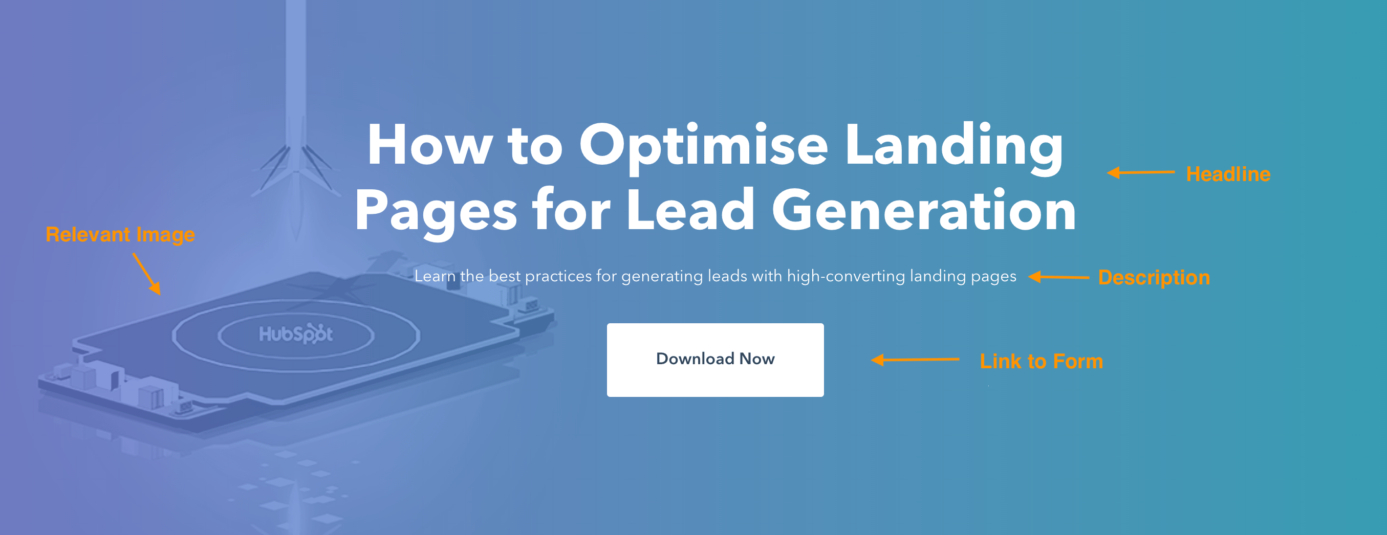
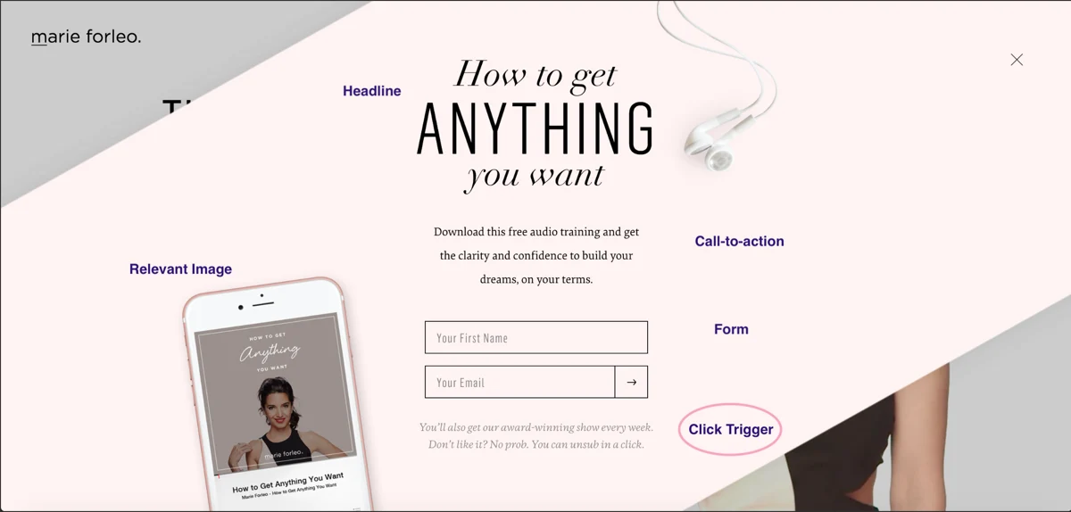
A good landing page has five elements (check out the landing page example below to see these elements in practice):

  1. Headline that grabs the visitors’ attention
  2. Relevant image that is relevant to your audience
  3. Lead form that sits above the fold to capture visitors’ information
  4. CTA that is action-oriented and compelling
  5. Copy and description that informs and entices your visitor to complete your form

Source

Can your landing page include more than this? Absolutely. (Think of social share buttons visitors can use to spread the word about your offer). This is simply the bare minimum.

You need to know your audience, where they are coming from, and where they are in their buyer’s journey to understand how much you need to include. The rule of thumb is to have as much information as you need to get people to convert.

Landing Page Layout

Trust me when I say most people don’t read every word of your cleverly crafted copy. Instead, they skim through and pull out the most important tidbits. Your job is to make those tidbits stand out so your visitor doesn’t miss anything important.

That means a few things …

  • Keep the most important information above the fold so your visitor doesn’t need to scroll to get to it.
  • Perform a blink test on your page, meaning a visitor should be able to gather the main message in less time than it takes them to blink, i.e., less than five seconds.
  • Use white (or unfavorable) space to keep your visitors engaged and focused and to help them comprehend your message.
  • Write with bullets and short paragraphs to make your copy easy to digest.

Try to work the critical copy into an F-pattern, which is the direction that most people scan a page online. Work with the flow of visual patterns to drive people to the key points that will get them to convert.

Landing Page Colors

The design of your landing page — including the colors you use — should reflect that of your website.

You’re aiming to form a long-term relationship with the people who visit your landing page, which means they need to become familiar with your branding colors and unique style.

The more they recognize your brand, the more they trust you (and the more they trust you, the easier it is to get them to do what you want them to do).

The areas where you should consider using alternate colors are on the elements of your page that need to stand out — ahem, your CTA button.

Contrast is the name of the game here. Say your branded colors are primarily green; you’ll want to choose a color that can draw users’ attention, say purple.

What colors perform well? We did a little research for you to determine which colors convert best.

Landing Page Images

The image on your landing page is one the first things people see, and since people process visuals far quicker than text, it sets the tone for their entire experience.

But how can you choose between millions of stock photos and that company photo shoot that’s taking up all the space on your computer?

Let’s narrow down the selection with a few essential questions:

Who is my target audience?

What does your persona look like? How old are they? How do they dress? What are they interested in? The answers to these questions are important in determining what image you will place front and center on your landing page.

If it will appeal to your audience, it needs to represent them somehow.

Where on my landing page do I want them to look?

This might seem odd, but it’s based on the idea that people follow directional cues, like where someone is looking or pointing. If you want visitors to fill out a form, consider an image that drives their attention toward that form.

Will this image reinforce my message?

Every element on your landing page serves an essential purpose. Since your image is one of the first things people see, it should help clarify what visitors can expect from your page. Make sure that your image adds value.

Here are other important things to consider when creating excellent landing page images.

Call-to-Action (CTA)

We’ve discussed your CTA a few times, but since it’s the most crucial part of your landing page, it’s worth mentioning again. When it comes to the design of your CTA, there are a few tricks that will make it so alluring that visitors feel compelled to click.

To clarify, your CTA includes the button and the copy you use to draw attention to it; these tips cover both.

  • Give your CTA a vibrant and contrasting color
  • Focus your CTA copy on the benefit to your visitor
  • Get to the point — try using no more than five words
  • Tell your visitor what you want them to do using action verbs, e.g., Get, Download, Click
  • Make your button large enough to stand out on the page
  • Give it some negative space — don’t crowd the area around your CTA
  • Follow the flow of the page and place your CTA where your readers’ eyes will go, such as to the right of or below the copy
  • Test your button shape, test your copy … as a matter of fact, test everything (we’ll cover how to do this below)

Source

Mobile Landing Page

More than half of website traffic comes from mobile devices; therefore, the user experience should be the same regardless of the device visitors use. By making your landing page responsive, you give them every opportunity to view and convert, whether on a desktop, phone, tablet, or otherwise.

Landing Page Copywriting Tips

After design comes excellent copy; your objective is to be compelling, instructive, likable, concise, effective, trustworthy, and informative. How? Keep reading.

1. Cover the main points.

No matter how you position it, there are a few main points that you need to hit with your copy.

Those main points are your persona’s pain point, the solution to that pain point, how your solution works (features), how your solution will improve their situation (benefits), and verification that it works (social proof).

Most of what you write needs to address how you can help your prospect, not how awesome you are (because that’s implied). Let’s go more in-depth on these points.

The Pain Point

The pain point that you focus on should be the one that your offer solves. Not to sound negative, but it’s important to touch on the problem your persona is facing so they know you understand what they’re going through.

Empathy is an effective way to build trust. And if they know you get their problem, they’re more likely to trust your solution.

Your Solution

The solution to their pain point is what you’re offering in exchange for their information. Illustrate a clear path between their problem and how your solution is the remedy they need.

Features

Knowing your solution may not be enough to convert leads, so you need to mention what’s included in that solution. If it’s an ebook, what are the subjects you cover?

If you’re promoting a webinar, how will it work, and what will you teach?

If it’s a service, what can they expect? Give your potential lead all the information they need to make a decision.

Benefits

Your copy should be heavy with benefits to the user because that’s what they care about — what’s in it for them. While features list what your offer has, benefits tell visitors how their situation will be improved.

Using your solution paints a vivid picture of how much better their life could be.

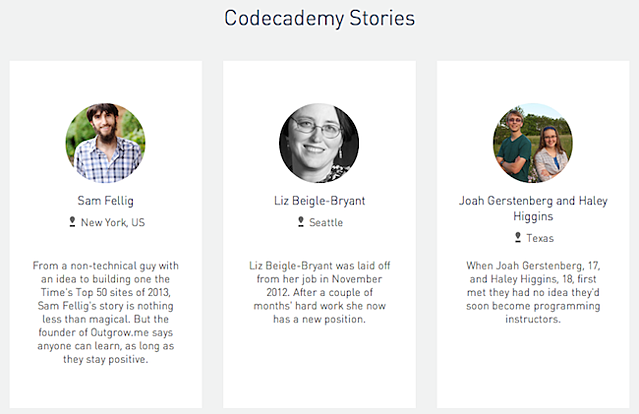
Social Proof

Studies show that social proof is adequate for persuading people to take a desired action.

Social proof comes in the form of logos of brands you’ve worked with, testimonials from previous clients, reviews of your product, or confirmation that others have purchased your service.

In essence, people also want to know that others have used and benefited from your solution. You validate your offer without saying anything by including social proof on your landing page.

Source

Touching on each of these points will provide you with well-rounded copy that answers all of your visitors’ questions … which brings me to my next point.

2. Preemptively respond to objections.

A key part of writing persuasive copy (copy that gets people to convert) is dismantling objections before they even come up. Now, this takes some skill … or at least some help from a friend.

Once you’ve laid your foundation by addressing all the main points, put yourself in your prospect’s mind and think about where they might protest or challenge you as they read.

For instance, if you say, “We’ve helped Fortune 500 companies bring in customers,” your reader might scoff or doubt it unless you follow that statement with social proof.

Do this exercise for every section of your page (or ask an unbiased friend to help) until you’ve covered every possible objection. When you get questions from people visiting your landing page, use that as feedback to further sharpen your copy.

To ensure your landing page meets every need, seek constructive criticism from your first few converted leads.

3. Build trust with your prospect.

You read a sales page, and the company wrote, “Our product has helped 100 people, and it might work for you, too!” Meh. I’d probably pass and find a company with a solution that can work for me.

Your goal is to build trust with your visitor, and the way to do that is to come across as an authority.

Besides using social proof, some other ways to build trust are:

  • Write how you speak and address your prospects like a live customer.
  • Cite statistics that support your message.
  • Use case studies that highlight customers similar to your target.
  • Be relatable. Show your audience that you’re human by admitting failures, opening up about doubts you’ve had, and being honest. The caveat is you should only share what is relevant to their struggle; don’t just divulge anything.

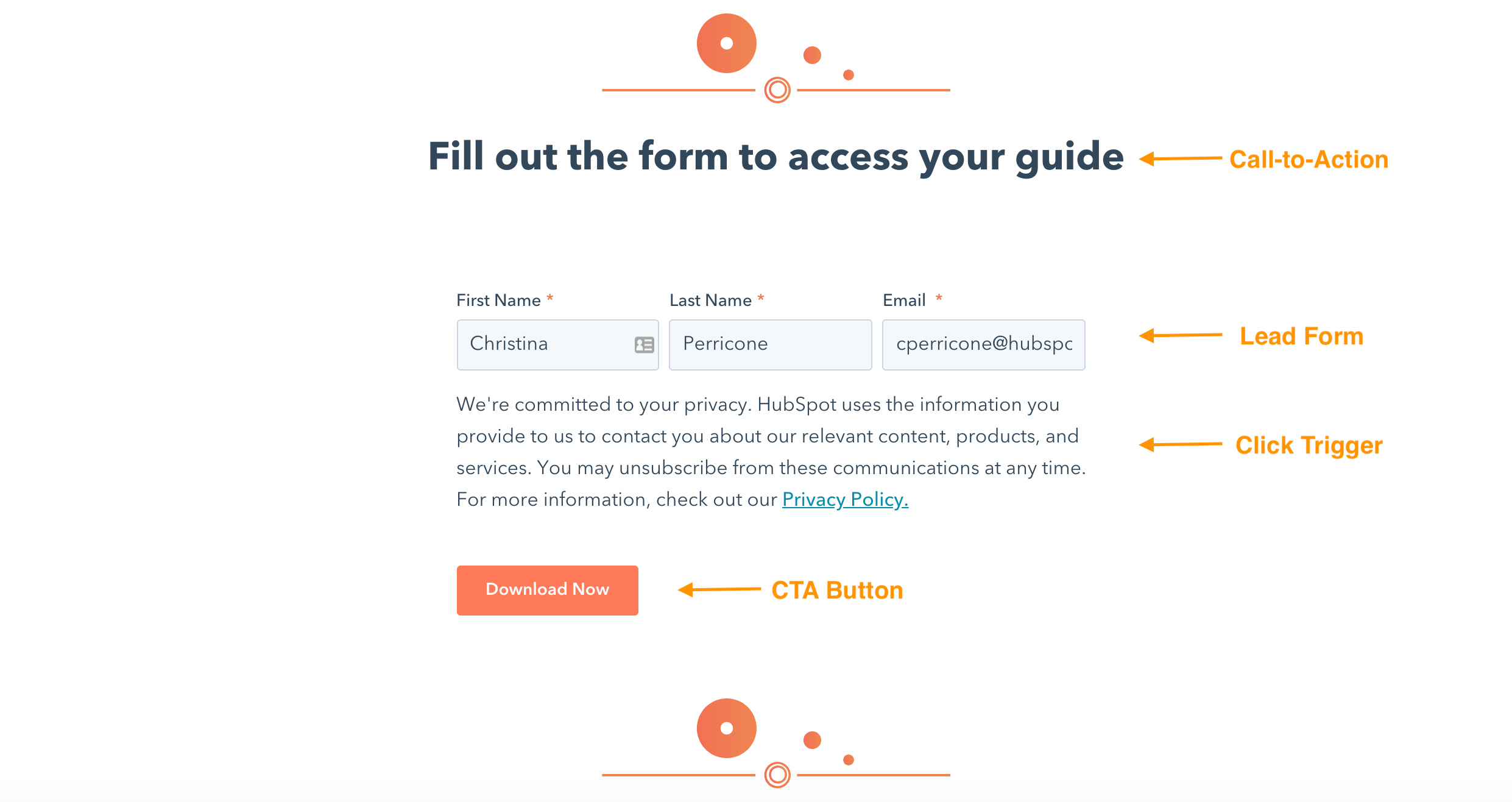
4. Use click triggers.

Click triggers eliminate that last bit of doubt before a visitor converts. You can think of them as lick Probability Enhancers (yes, I made up that term).

They are copy-positioned next to your CTA, which pushes your prospect over the edge by easing their mind and mitigating the risk of converting.

Below are some practical ways to employ click triggers:

  • Money-back guarantee
  • Easy unsubscribe
  • Quote from a successful or happy customer
  • Blurb on “what to expect”
  • Price slashing
  • Privacy policy
  • Some other creative method

Source

Whatever you choose, click triggers will give your conversions the boost they need.

A/B Testing Your Landing Page

Everything we’ve discussed until this point is great … in theory. However, your business differs from others, and your target audience is unique. How do you know if the copy you chose is working?

Or if your CTA placement is correct? Or what colors perform best?

Or which image to choose?

You test it. That’s how. Split testing (or A/B testing) is probably nothing new to you as a marketer, and split testing your landing page is just one more experiment to add to your list.

Let’s briefly go over how to best A/B test your landing pages.

What is A/B testing?

A/B testing simply splits your traffic into two (or more) page variations to see which performs better.

While you could do this manually by launching one take for some time, then another for the same amount of time, it’s far more efficient to use software that allows you to split test and track your results.

The main components of an A/B test are variants, or the two versions of the page, the champion, or the original page, and the challenger, or the page you modified to test against the original.

How to A/B Test

The most essential trick to split testing is minor tweaks with each experiment.

For instance, you don’t want to split-test your headline and image simultaneously because you won’t know which element garnered the results.

For this reason, stick to testing one element at a time. If the “winner” becomes your champion, you can create a new challenger to test the next element.

You repeat this cycle until you reach a conversion rate that you’re happy with (and that falls within realistic expectations, which we’ll cover below).

What should you test?

You can test virtually anything on your landing page. But while that’s possible, you may want to limit your test to a few of the most impactful elements of your page, like:

  • Headline copy
  • Image
  • CTA color
  • Click triggers
  • Copy on the page
  • Lead form length and fields

These tests will have the most significant impact on your conversion rates. Try starting with the simplest change, like a headline or CTA color, then work your way to the more significant undertakings, like your page copy.

Landing Page Metrics to Track

Metrics will tell you everything you need to know about how well your landing page is performing and give you some insight on improving it. It’s hard to know exactly what will work when you launch a page.

Measure and track meticulously in the beginning until you reach a relatively good conversion rate; then, you can track your metrics less frequently.

Page Visits

How many visits are you getting on your landing page? The more visits, the more you increase your probability of conversions. Adjust your paid strategy or redefine your keywords to drive more traffic to your page.

You can also inform your current followers about your offer through emails, social media, and your website.

Traffic Source

Knowing where your traffic is coming from will let you know where to double down or ditch your efforts.

Submission Rate

This is the number of people who complete your lead form and land on your thank you page. You can tweak your page to increase this number, but make sure to A/B test so you know what’s working.

Contacts

Contacts refer to the number of leads that you generate from your form. This differs from submissions because duplicate contacts are only counted once, meaning if a current lead fills out your form to get your offer, they don’t affect the count.

Heat Mapping

This is more of an observation of how people interact with your page than a metric. Heat mapping can show where people scroll, what they read, and how they engage with your page. This is all valuable data when thinking about your page layout and structure.

Bounce Rate

If visitors are coming to your page and leaving immediately, you must examine whether the content aligns with the offer. Does your copy capture visitors’ attention, and do visitors automatically know what to do when they land on your page?

Is your page a reflection of the copy you used to get people to visit it?

Form Abandonment

This metric tells how many people start filling out your form but don’t complete it. If this number is particularly high, some adjustments to consider are introducing new click triggers, shortening your form, or making it more transparent what you want your visitor to do.

Benchmarks

You must judge your landing page against industry norms and across a similar audience to know if it’s performing as expected. Check out some industry benchmarks to set as your baseline, but don’t be discouraged by other company’s results.

No matter what’s going on, diagnosing and healing your landing pages is possible if you pay attention to the metrics.

How to Make Your Landing Pages More Effective

There are always tweaks you can make to boost landing page performance. Below are a few great tips to get your landing pages leveled up.

Optimize your landing page.

Optimize is such a confusing word, isn’t it? Are we talking about imagery, copy, keywords, or UI? The answer is yes — we’re talking about all of it. Optimize just means to make your landing page the best it can be, and that can include a myriad of modifications.

You’ll need a pretty expansive guide if you want to know everything you can do to optimize your landing page. And, guess what, we have one here.

Present an outstanding offer.

You could argue that anything free qualifies as “good,” but that isn’t exactly true. Not only should your offer be free (we’re not talking sales pages here), but it must also be good enough to warrant a stranger giving you their personal information.

Let’s face it — many companies are competing for your audience’s attention, asking for their information and soliciting them via email. So, what’s going to make you stand out from the pack? An outstanding offer, that’s what.

Here are a few questions to determine if you have a compelling offer or not:

  • Does my offer solve a pain point for my target audience?
  • Is there a clear benefit that a lead can gain from this offer?
  • Can my offer rival the competition?

Decrease page load time.

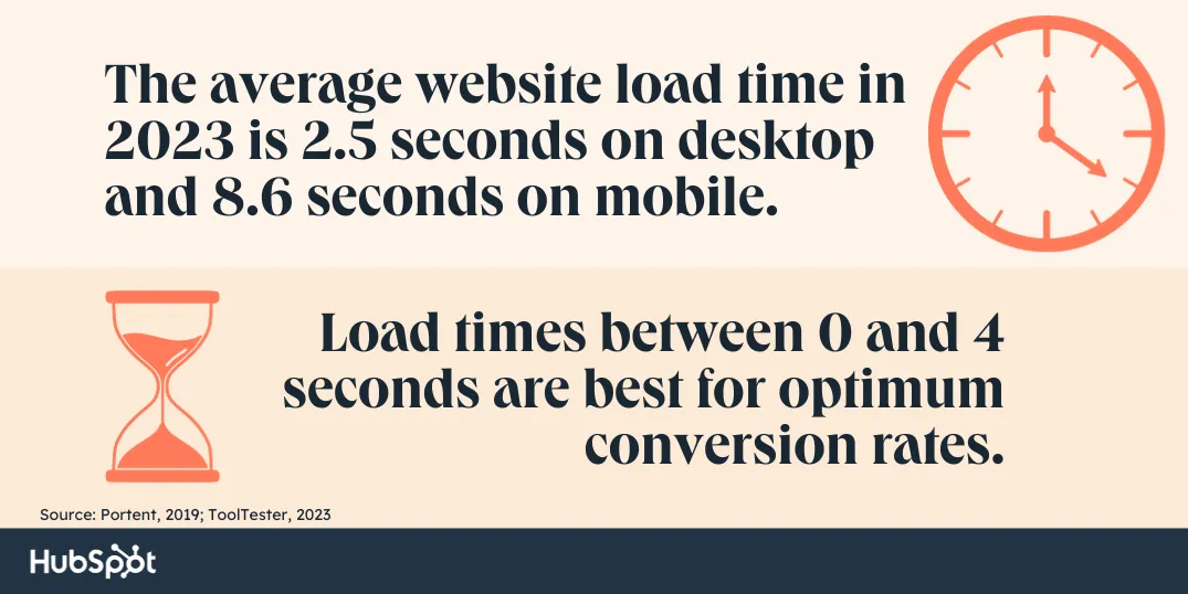
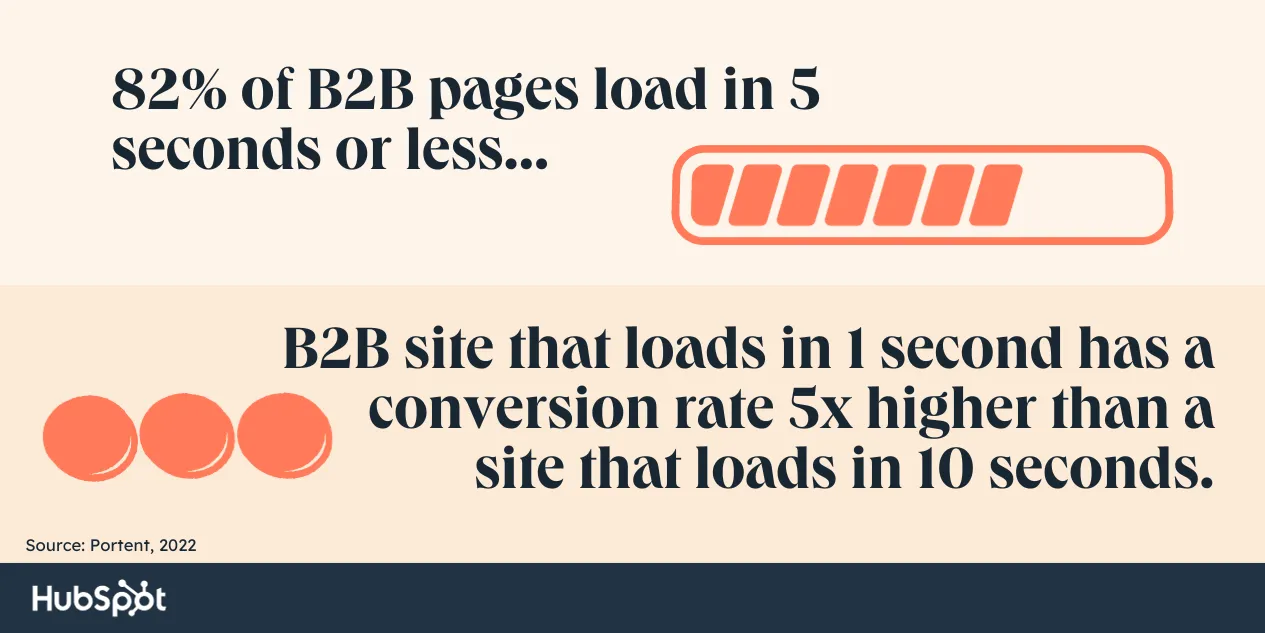
A single-second delay in page load time means 7% fewer conversions and 11% fewer page views. Slow page load times can also result in customer dissatisfaction and frustration.

Landing page load time is a metric to take seriously. If you need some tips, check out this resource on decreasing page load time.

Keep the buyer’s journey in mind.

Since you’re driving traffic to your landing page, you should know where your visitors are in their buyer’s journey. That means you’ll see if they’re trying to diagnose a problem (awareness), looking for a solution to their problem (consideration), or are ready to close (decision).

Your copy and offer should reflect this if you want to convert. It’s no different from other marketing materials — meet your visitors where they are.

Create a seamless experience.

No one should be surprised when they arrive on your landing page. It should be exactly as advertised, meaning it should be consistent with your copy.

Use the exact words on your landing page that you used to get people to arrive there, whether it was a paid ad, social post, blog CTA, or email. If you want people to stick around, you must avoid the bait and switch at all costs.

Create a clear path to conversion.

There should be no guesswork involved in navigating your landing page. Once someone arrives on your page, what you want them to do should be clear — submit their info to your lead form. Your goal is to guide visitors to your form using creative directional cues.

Here are some ways to point your visitor to a conversion:

  • Choose an image of a person that is either gazing in the direction of or meaning to your form
  • Make your CTA a contrasting color to draw attention to it
  • Use arrows that point to your lead form
  • Insert anchor text that brings people back to the form when clicked
  • Give your CTA some negative space on the page
  • Frame your lead form with a bold color or outline

Add scarcity to your offer.

Few emotional marketing tactics work as well as fear and the fear of missing out (more formally known as FOMO). Consumers don’t like to lose their ability to choose, and once you make it clear that your offer is in high demand and/or short supply, they’re going to clamber to get it.

The other reason this technique works is that people want things that are hard to obtain — that signifies value and exclusivity.

To show scarcity, mention how little of your offer is left, include a countdown timer, and use words like “ends soon” or “last chance.” We want you to be genuine, so only employ actual tactics for your business.

Bottom line: there are many ways to use and benefit from this technique.

Use video.

Video marketing is becoming increasingly popular for good reason. Not only do customers prefer to see videos from companies, but 88% of video marketers say that video gives them positive ROI.

The key is to create a compelling video that doesn’t distract visitors from your ultimate goal: the call to action.

If you’re on the fence about using video, here are some reasons that might push you over the ledge:

  • Increases conversion rates
  • It is a more personable way to share a message and connect with prospects
  • It can be more engaging than an image and will get visitors in the habit of clicking (and converting)
  • Can reduce the number of support calls or tickets you receive
  • It is processed 60,000 times faster than text

If you plan to employ this tactic, VidYard has some helpful landing page video guidelines to follow.

Are you excited yet about how you can improve your landing pages? Sure, there are quite a few, but that just means that a poor-performing landing page doesn’t have to stay that way. Take it one tactic at a time and build as needed.

What to Do Post-Conversion: Lead Nurturing

So, you have an optimized landing page that converts like a charm. Now what? You don’t want to leave those leads hanging. Instead, you want to nurture them into becoming customers, then nurture them more. Here’s how.

Optimize your thank you page.

I hope you’re not tired of optimizing yet. Your thank you page is the first thing someone sees after they convert, so it is an excellent opportunity to delight your new lead even more than you already have.

Your objective is twofold: deliver your promised offer and get them interested in something else on your site.

Your thank you page should:

  • Thank your new lead (go figure)
  • Provide links to relevant content on your site
  • Invite your lead to follow you on social media
  • Ask your lead to subscribe to your blog
  • Automate a follow-up email with the offer

Guide them along their buyer’s journey.

Your new lead will make their way to the decision stage with or without you. You want to be the one to help them get there. You’ve gathered valuable information about your lead to anticipate what they need next.

Provide content or resources to bring them to the subsequent stage of their journey; you might just be their option for the decision stage. After all, we know that prospects buy from companies that they know, like, and trust.

Form a relationship.

Once someone signs up to receive information from you, they become a potential customer with whom you should work hard to build a relationship and connection.

The good thing is you already know what they’re interested in and their pain points so you can target them with additional, helpful content and personalized marketing.

If you’re still stuck, get some inspiration from some of the best landing pages we could find.

Grow Better with Landing Pages

Landing pages will account for most of your new leads, demanding your attention. With the many tweaks, additions, and variations you can implement, there’s no reason you can’t have a landing page that converts well.

As long as you follow the best practices we covered above, you’ll be on your way to a high-performing landing page.

Editor’s note: This post was originally published in August 2019 and has been updated for comprehensiveness.

New Call-to-action

Categories B2B

11 Website Page Load Time Statistics [+ How to Increase Conversion Rate]

Page load time is a critical metric that influences your entire site’s performance.

Even a few milliseconds can significantly impact the user experience (UX), conversion rates, and, ultimately, revenue that your site drives.

Speed Up Your Website with HubSpot's Built-In CDN

In this post, you’ll learn why your page load speed is important, how it affects your business, and some quick and easy tips to improve your performance.

Table of Contents

What is website load time?

Website load time — or page load time — refers to how long it takes for a website, or web page, to fully load and appear ‘on-screen’ when a user requests to visit that site.

Or, simply put, it is how quickly the content of a web page is displayed when a user clicks on the site.

Factors That Influence Website Load Time

Website or page speed depends on a wide range of factors.

“Internal” factors such as page elements, file sizes, code efficiency, plugins/widgets, etc can all impact page speed.

Similarly, “external” factors, such as server/host response times, network connections, etc., can significantly impact how quickly a page loads.

But even aside from these, the type of device a user accesses a site from can also determine how quickly the site loads.

According to Jillian Streit, a website strategist at Blue Frog, “Unfortunately, most mobile pages take much longer to load than their desktop counterparts, and mobile users expect pages to load much faster on their mobile devices.”

So, it is essential to carefully consider and optimize all these factors (internal and external) to ensure that your site loads quickly and efficiently.

For step-by-step instructions on how to do this, check out this guide that walks you through measuring and improving page speed and this post that shares 19 actionable website optimization strategies.

What is the average page load time?

The average website load time in 2023 is 2.5 seconds on desktop and 8.6 seconds on mobile, according to a recent report that analyzed over 4 billion web visits.

What is a good page load time?

Although the 2023 study is one of the more recent page load time studies, several older studies have found that much lower page speeds are required to be truly competitive.

For example, a study by Portent found that a load time between 0-4 seconds is best for optimum conversion rates.

For this reason, simply consider the average speed from the 2023 Website Loading Times Report mentioned above as a benchmark or reference point to measure and compare your current performance against the general average across an extensive range of sites.

Case in point, the study also found that only 34% of the top 100 websites (which formed a significant basis of the analyses in the study) passed their Core Web Vitals.

11 Page Load Time Statistics

Here are 11 statistics that will give you a better understanding of how your website load time could impact your site’s performance, specifically conversion rates.

Let’s get started.

  • The average page load speed of B2B sites hasn’t improved over the last four years, according to a 2022 study by Portent.

  • However, simply being within the industry benchmarks might not be enough. The Portent study also found a significant correlation between load speeds and conversions. According to the findings of that study, a B2B site that loads in 1 second has a conversion rate 3x higher than a site that loads in 5 seconds.
  • And this impact becomes even more pronounced when the difference is further exaggerated. The study found that a B2B site that loads in 1 second has a conversion rate 5x higher than a site that loads in 10 seconds.
  • But even more interesting is that B2C eCommerce might potentially be even more unforgiving regarding website load times. In 2019, 81% of B2C ecommerce sites loaded in less than 5 seconds — similar to the number of B2B sites today. However, in 2023, that number has jumped up to 86%.

  • Interestingly, the performance difference for sites that load within this 5-second bracket is similar to that observed in B2B sites. An ecommerce site that loads within a second converts 2.5x more visitors than a site that loads in 5 seconds.
  • But what exactly do these “improvements” look like in the real world? Vodafone recently conducted an A/B test to measure the impact of optimized Web Vitals. The results showed that a 31% improvement in LCP (which measures the loading performance of a page) led to a 15% improvement in their lead-to-visit rate, an 11% improvement in their cart-to-visit rate, and 8% more sales.
  • So, how can you improve your page load times and potentially generate similar results? Well, a quick and easy win is simply optimizing your website for mobile devices. Although mobile currently accounts for more than half of the web traffic worldwide, several studies have found that mobile page load speeds are still significantly worse, on average, than desktop.
  • A 2023 report found that web pages load 70.9% slower on mobile devices than on desktops. Interestingly, this study also found that mobile site performance was significantly worse across every website-building platform analyzed.

  • And, on website builders, another easy but significant page speed boost could be found by changing your current provider. One study analyzed 400 websites built by the top 12 website builders. This research found an almost 2-second difference in average page load times between the top and worst-performing platforms.
  • And keep in mind that these numbers were for desktop sites. According to this report, load speeds for mobile pages dropped drastically to an average of 6.40 seconds for even the best performer, Godaddy, while the worst performer had an average load speed of 15.26 seconds.
  • Finally, as you begin to optimize your website, you should initially direct your focus to pages that attract high-intent traffic. The Portent Page Speed Study report also found that faster speeds on checkout pages, login pages, etc, made the most impact.

Other than these, several strategies can help you significantly improve your page load speeds. So, make sure to check out the guides recommended in the previous sections of this post.

Page Load Time Takeaways for Marketers

Optimizing your page load speed is integral to boosting conversion rates and sales revenue.

While a few extra seconds may not seem like a big deal, statistics show that as each second passes, the potential to lose out on prospective customers increases.

If you’re concerned your website’s page load speed could be hindering your company’s growth, there are a few solutions to decrease the time it takes for your website to load.

Online tools like Pingdom Website Speed Test, GTmetrix, and Google PageSpeed Insights allow you to time and test your website’s page speed. You can also cache your website or enable browser caching to speed up your page load time.

Ensuring your load time is as efficient as possible doesn’t necessarily take a long time or significant effort, but it requires some thought.

So, start thinking about optimizing your web page speed — and you’ll see an improvement in your UX, conversions, time-on-page, and revenue in no time.

Editor’s note: This post was originally published in March 2017 and has been updated for comprehensiveness.

New Call-to-action

Categories B2B

14 Essential Design Tips for Beginners: Transform Your Skills and Create Stunning Graphics

From logos, posters, magazines, product packaging, and ads, we see graphic design at work every day.

It’s an industry that’s always in demand. Why? Because brands always need designers, whether it’s to create branding assets or design an upcoming event flyer.

Take our free Graphic Design Essentials Course on HubSpot Academy to learn  design fundamentals and how to create simple designs.

If it’s an industry you’re interested in, discover the tips you can use today as you start your career.

There isn’t one way to become a graphic designer, but there are some tips that can lead you in the right direction to improve your skills and set yourself up for success.

1. Learn fundamental design principles.

Graphic design is a visual communication tool that combines graphics, typography, color, and illustration to communicate a message.

And while there are endless ways to communicate a message (that’s where the creative part comes into play), there are fundamental principles that every graphic designer must follow:

  • Hierarchy
  • Alignment
  • Contrast
  • Space
  • Color
  • Proximity
  • Repetition
  • Balance

These fundamental concepts ensure a design is cohesive, impactful, and clear.

In addition to these principles, other elements come into play, such as typography and color theory.

2. Enroll in a graphic design course.

Contrary to popular belief, having an eye for design isn’t an innate trait – it’s a learned skill.

Courses can teach you about the history of graphic design, the various subdivisions within the discipline, the psychology behind design principles, and the tools you’ll need.

Here are the top online resources for graphic design courses:

Then, of course, there’s always YouTube University. The best thing about this university is that it’s 100% free. Though, it‘s not guaranteed that you’ll receive the same depth in the material on YouTube, and you won’t have the support of a professor. However, it can be an excellent place to start if you’re on a budget or learning on your own time.

3. Master a design program of your choosing.

It’s hard to think of graphic design without immediately considering the tools they use.

So much of graphic design work relies on using tools like Adobe Illustrator, Adobe InDesign, Adobe Photoshop, and Sketch.

These are all powerful software that allows you to create everything from logos and illustrations to website designs.

While they aren’t accessible to use, consider them investments in your career, as you will likely use them for every project you take on.

4. Network with fellow designers.

In addition to the knowledge you’ll gain from your courses, it’s essential to speak with designers who are currently working in the field. This will help you get a 360-view of what it’s like working as a graphic designer and what it takes to succeed in your role.

Start on social networks like Facebook and LinkedIn. You’ll find plenty of design communities and groups that share information and opportunities.

You can also use sites like MeetUp to find designers in your area who are interested in meeting up, as well as Eventbrite, to find fun events you can join.

Networking across is as important as networking up. Make sure you lean on your community for support and advice as you develop your skills as a graphic designer.

5. Practice, then practice some more.

When learning anything new, practicing is key. It’s not enough to take in the knowledge — you have to use it and learn how it works in real-time. Search for graphic design exercises online to further hone in your skill.

For instance, Type Connection and  KernType allow you to test your typography skills. You can also use sites like Sharpen to find design prompts to work on. They have prompts in various categories, from branding to marketing and user experience (UX).

Once you feel confident in your ability, consider taking on a design project of your own. It could be a passion project you give yourself or seek out. Getting real-world experience in what it takes to take a project from start to finish, and all of the non-design implications, are important to consider.

6. Follow design influencers and industry leaders.

There‘s much to learn from influencers or leaders in the field of graphic design. They’re highly knowledgeable in their niche and are often willing to share the secrets to their success in their content.

If you seek out their content regularly, you’ll become more familiar with the graphic design world, discover more tips from industry leaders, become comfortable with relevant terminology, and stay on top of trends.

Wondering how to engage? Turn to YouTube, X (Twitter), Instagram, and even Tiktok.

And don’t be afraid to reach out to them. You never know who might respond to your questions – and any positive connection you make will only help you move further along in your journey.

What I Recommend

  • Build a X List of influential designers, so you can follow their daily insights without picking out their tweets from a sea of friends, coworkers, and news sources on your timeline.
  • Have a mix of well-known designers who inspire you and those whose work you do not enjoy. That last point may seem counterintuitive, but consistently observing the work of that group can help you understand why you don’t like it, which is a crucial part of understanding design.

7. Build an inspiration catalog.

Start building a catalog of work that is successful.

That can be as simple as bookmarking images in your web browser, making a Pinterest board, or saving items to a folder on your computer.

Sifting through a catalog of inspiring work will help you to identify trends – both past and present – and can inform your style.

What I Recommend

  • Get acquainted with leading designer portfolio sites like Dribbble and Behance. These platforms showcase an abundance of high-quality work from leading designers across the spectrum – everyone from web and UX designers, to graphic designers and typographers.
  • Set aside time in your day to review these sites and use apps like Panda to make the collection process easier.

8. Dissect the process.

Dissect designs you admire to understand the steps and techniques involved.

One of the most pivotal moments in my design journey was when I recognized that every single illustration, infographic, and icon I had ever ogled over was the product of someone mastering how to combine shapes and lines.

Analyzing the process behind a design will allow you to understand the steps required to produce a piece of work. Depending on your current skill level, you may have a leg up in knowing which tools were used, or which aspect was created first. But if you‘re a beginner, don’t let that stop you – examining the construction of a design will let you flex your creative muscle.

What I Recommend

  • Download a free vector or PSD design resource, and dig through the layers to see how the designer constructed the object. You can find a number of those files here.
  • Once you pick your file, open it in Photoshop, then open the Layers Panel (which you can learn to use here) and un-collapse some of the folders, so that you can see the layers contained within them.

By simply changing the visibility of the layers, you can begin to see how the designer used each shape to build upon one another. You can also begin to understand how to use Photoshop Effects, like drop shadows and strokes.

9. Get specific with your online search queries.

As you begin creating your own designs, you’ll likely hit an obstacle where you think to yourself, “Hmm, how the heck do I do that?

Chances are, others have wondered the same thing.

Like many self-taught disciplines these days, the majority of my own technical design knowledge was gained by watching a YouTube tutorial while I actively followed along.

The key is to be really specific with your searches, so you can find a highly relevant tutorial.

Searching for something like “How to Create an Icon” might deliver really broad search results. Instead, type in exactly what you want to learn, like, “How to Create a Flat Icon with a Long Shadow.” Boom.

What I Recommend

Browse a design terminology glossary to find the specific terms for techniques you‘re trying to learn. That can help you find what you’re looking for online much more easily, in addition to helping you familiarize yourself with the language.

10. Replicate your favorite work for learning purposes.

Let me be clear: Under no circumstances should you infringe on anyone‘s copyrighted work. Never reproduce someone else’s work and try to pass it off as your own.

That said, re-creating a design you like is helpful to gain a deeper understanding of design techniques.

You‘ll have to get creative with the method you choose to recreate the design. Don’t get frustrated if you can’t duplicate a design exactly – remember, the process is more important than the result.

What I Recommend

  • Find a design piece you think is successful, which should be easy if you’ve created an inspiration catalog.
  • Open up your go-to design software to recreate it.
  • Start dissecting the design and recreating it using your own process.
  • If you get stuck, use specific search queries and lean on your design community.

11. Embrace negative space.

Beginner and advanced designers alike often overlook the proper use of negative space.

What is negative space, or white space? It‘s the space in your design that’s not occupied by any visual or written element. A design piece that doesn’t incorporate enough negative space is like a sentence with no spaces: itisdifficulttocomprehend.

What I Recommend

Remember, there’s no hard-and-fast rule to using white space. It takes practice. Eventually, exercises in resizing elements of your composition and changing the layout will lead to a natural understanding of the amount of breathing room required.

12. Seek constructive feedback.

On some level, everyone is afraid of criticism. Learning to accept constructive criticism is no easy task, but it’s key to becoming a better designer.

Paul Arden, who was the creative force behind Saatchi & Saatchi at the pinnacle of its success, wrote this in his best-selling book, It‘s Not How Good You Are, It’s How Good You Want to Be:

“If, instead of seeking approval, you ask, ‘What’s wrong with it? How can I improve it?’ you are more likely to get a truthful, critical answer. You may even get an improvement on your idea. And you are still in a position to reject the criticism if you think it is wrong. Can you find fault with this?”

Design critics allow us to incorporate others‘ viewpoints into our work and improve our ideas. You always have the option to reject the feedback, but considering it in the first place is what’s important.

What I Recommend

  • Have a one-on-one conversation with an experienced designer. If you don’t know anyone in the design world, join an online community of designers.
  • Post on Reddit’s Design Critiques.
  • Publish your work on social media and ask for feedback from fellow designers.

13. Undertake a passion project.

Engage in design projects that align with your interests and passions. These projects will motivate you to push through challenges and provide direction during the early stages of your learning journey.

What I Recommend

  • Align your interests or current situation with your projects. If you’re a blogger, try creating the header image for your next post. V
  • Voice your willingness to work on an offer with your content team.

There are several ways to work design into your day, but it’s up to you to pick something that matters to you. And if you’re trying to market your work to the world from a personal portfolio or website, use HubSpot’s SEO Marketing Software.

content-management-seo tool

Present your hard work in a format where professionals can see it clearly, and let the tool do the heavy lifting for you, generating copy and meta descriptions that target the niche your work caters to.

14. Just start.

It’s easy to be intimidated by the sheer amount of learning associated with graphic design, but remember that even the most talented designers were newbies once, too.

What makes the creative field so special is that everyone‘s journey is unique – there’s no one way to approach DIY design. You’ll find your own means to discern what you want and need to learn.

Furthermore, design is an iterative process, so keep reworking your ideas and projects.

Grow Your Career in Graphic Design

As you progress, you‘ll develop your own workflow, and one day, that design that took you all day will only take you a mere fraction of time. Trust me, I’m living proof.

Editor’s Note: This post was originally published in June 2017 and has since been updated for comprehensiveness.

New Call-to-action

Categories B2B

Why Intent Data Should Be An Essential Part Of Sales Enablement

In a previous post, we covered how to get the sales handoff right and why first-party and validated buyer data is essential in this process

It’s important to realize that although intent data has played a major role in discovering and nurturing leads before being handed over to sales, its job isn’t finished at that handover. There is still work that intent data can do.

Here’s a look at sales enablement and why intent data should play a part in this vital part of the sales process. 

Luna is hard at work on her flux capacitor, fusing intent data into her sales approach. [Image via ChatGPT]

How does intent data support the sales enablement process?

Let’s start off with a quick definition, as Oracle defines it:

Sales enablement is the set of tools and content provided to your sales teams to help them sell smarter and sell more.

Sales enablement also includes the processes that marketers undertake to help sales reps sell. This encompasses everything that’s done to generate leads, manage those leads and then hand those leads over to the sales team.

According to Gartner, sales enablement is owned by both sales and marketing, with marketing being responsible for creating resources, including content, messaging, and training. In fact, sales enablement is the top sales activity that marketing is actively involved in

But where does intent data fit into the equation? If you are unsure what intent data is, have a look at our post on buyer-level intent for a detailed exploration of this crucial form of data.

Intent data, especially at the buyer level, reveals the interests and behaviors of your target buyers. 

Think of intent data as the digital footprints left by your prospects, revealing insights into what they are searching for, the content they engage with, and the online behavior that points towards their readiness to purchase. 

This game-changing intelligence is key for sale enablement as it arms sales teams with valuable information about their buyers: They know who the buyer is and what their needs are. 

This, in turn, permits sales to custom-fit their outreach and messaging so that it’s meaningful, personalized, and relevant

Additionally, buyer-level intent data allows sales teams to discern between lukewarm leads and those showing high engagement and interest. Being able to prioritize allows sales teams to concentrate their efforts more efficiently and funnel their attention to those leads that are most likely to convert. 

What are the benefits of incorporating intent data into sales enablement initiatives?

We have already covered how intent data supports sales enablement by providing sales teams with useful and relevant data about buyers, but what are the tangible benefits of integrating intent data into your sales enablement initiatives? Let’s have a look.

Improved lead quality:
This benefit starts well before a buyer appears on sales’ radar. Buyer-level intent data ensures better quality leads are being passed from marketing to sales because marketing is able to see what a buyer is engaging with, why they are doing so, and, most importantly, who that buyer is.

When that lead is handed over to sales, they already know who they are engaging and their pain points. They also know that the buyer is in the late stage of their journey and ready to make a purchase decision.

More efficient sales processes:
Sales can be tricky business, especially if you don’t really know who you are selling to. If you are relying solely on account-level intent data, you’ll have some inkling into the account but you don’t know
who you are selling to.

Not knowing the who can often feel like you’re wasting time and resources on chasing an account and never getting to a person. However, with buyer-level intent data, sales processes are more efficient because you have access to the who but also the why and when.

As Matt Heinz, Founder/President of Heinz Marketing, explains in NetLine’s The Proof is Out There report: 

Buyer-level intent data answers both of these questions. It’s not just about ‘who’ to call. When you add ‘why’ and ‘when,’ it’s like adding rocket fuel to your sales engagement, productivity and conversion metrics.

Matt Heinz, Founder/President of Heinz Marketing, from NetLine’s The Proof is Out There eBook.

Increased conversion rates:
We saved the best for last because the ultimate goal in sales is to convert a prospect into a customer. It’s not always an easy task, but understanding a buyer’s needs and preferences is half the battle won.

By using customer intent data, sales teams are able to tailor their messaging and outreach in a way that resonates with the buyer’s interests and solves their pain points, leading to higher engagement and, subsequently, higher conversion rates.

How can sales teams use intent data to improve their understanding of buyer needs and preferences?

So, how can sales teams use intent data to improve their understanding of buyer needs and preferences?

We already know that buyer-level intent data reveals who the buyer is. If you have the right technology, you can also answer the all-important questions of what, when, and where.

What actions is the buyer taking? When are these actions taking place? And, where did the actions occur? 

With this information, sales can hold much more efficient discovery calls because they already have answers to many of the basic questions.

They are aware of the topics the buyer has been exploring and, therefore, have a much firmer grasp of the buyer’s pain points and the problems they are trying to solve. This enables sales to style their outreach in a more personalized and precise way. 

Moreover, with improved lead quality, sales will only be approaching buyers who are in-market and receptive to what’s on offer. No more wasting time and effort on prospects who aren’t ready to buy or aren’t showing interest in your product or service. 

Finally, because sales know who the buyers are, they are able to identify the most important decision-makers and influencers within the target account. Again, this knowledge enables sales to focus their efforts on those individuals who have a say in buying decisions and can provide them with messaging and content that is relevant to their role. 

How can intent data be used to create more effective sales collateral and resources?

Beyond informing outreach, intent data can be used to create more compelling sales collateral and resources. With the insights gained from intent data, sales teams can identify the themes that are most important to their target buyers. This information can then be used to develop engaging and relevant content that effectively addresses the needs of your audience.

Furthermore, intent data can shed light on the preferred formats and channels for content consumption. With this knowledge, sales teams can create resources that not only resonate with the target audience but are also delivered via the channels they’re most comfortable with.

When you enable your sales team with intent data, the space you can dominate is boundless. [Image via ChattGPT]

In the fast-paced, highly competitive world of B2B sales, buyer-level intent data provides the edge you need. The trail of useful data that your prospective buyers leave behind is waiting to be explored—don’t miss out on the insights it holds.

Categories B2B

How to Use Excel Like a Pro: 29 Easy Excel Tips, Tricks, & Shortcuts

Sometimes, Excel seems too good to be true. All I have to do is enter a formula, and pretty much anything I’d ever need to do manually can be done automatically.

Need to merge two sheets with similar data? Excel can do it.

Need to do simple math? Excel can do it.

Need to combine information in multiple cells? Excel can do it.

In this post, I’ll go over the best tips, tricks, and shortcuts you can use right now to take your Excel game to the next level. No advanced Excel knowledge required.

Download 10 Excel Templates for Marketers [Free Kit]

What is Excel?

Microsoft Excel is powerful data visualization and analysis software, which uses spreadsheets to store, organize, and track data sets with formulas and functions. Excel is used by marketers, accountants, data analysts, and other professionals. It’s part of the Microsoft Office suite of products. Alternatives include Google Sheets and Numbers.

Find more Excel alternatives here.

Excel is primarily used for creating financial documents because of its strong computational powers. You’ll often find the software in accounting offices and teams because it allows accountants to automatically see sums, averages, and totals. With Excel, they can easily make sense of their business’ data.

While Excel is primarily known as an accounting tool, professionals in any field can use its features and formulas — especially marketers — because it can be used for tracking any type of data. It removes the need to spend hours and hours counting cells or copying and pasting performance numbers. Excel typically has a shortcut or quick fix that speeds up the process.

You can also download Excel templates below for all of your marketing needs.

After you download the templates, it’s time to start using the software. Let’s cover the basics first.

Excel Basics

If you’re just starting out with Excel, there are a few basic commands that we suggest you become familiar with. These are things like:

  • Creating a new spreadsheet from scratch.
  • Executing basic computations like adding, subtracting, multiplying, and dividing.
  • Writing and formatting column text and titles.
  • Using Excel’s auto-fill features.
  • Adding or deleting single columns, rows, and spreadsheets. (Below, we’ll get into how to add things like multiple columns and rows.)
  • Keeping column and row titles visible as you scroll past them in a spreadsheet, so that you know what data you’re filling as you move further down the document.
  • Sorting your data in alphabetical order.

Let’s explore a few of these more in-depth.

For instance, why does auto-fill matter?

If you have any basic Excel knowledge, it’s likely you already know this quick trick. But to cover our bases, allow me to show you the glory of autofill. This lets you quickly fill adjacent cells with several types of data, including values, series, and formulas.

There are multiple ways to deploy this feature, but the fill handle is among the easiest. Select the cells you want to be the source, locate the fill handle in the lower-right corner of the cell, and either drag the fill handle to cover cells you want to fill or just double click:

excel autofillSimilarly, sorting is an important feature you’ll want to know when organizing your data in Excel.
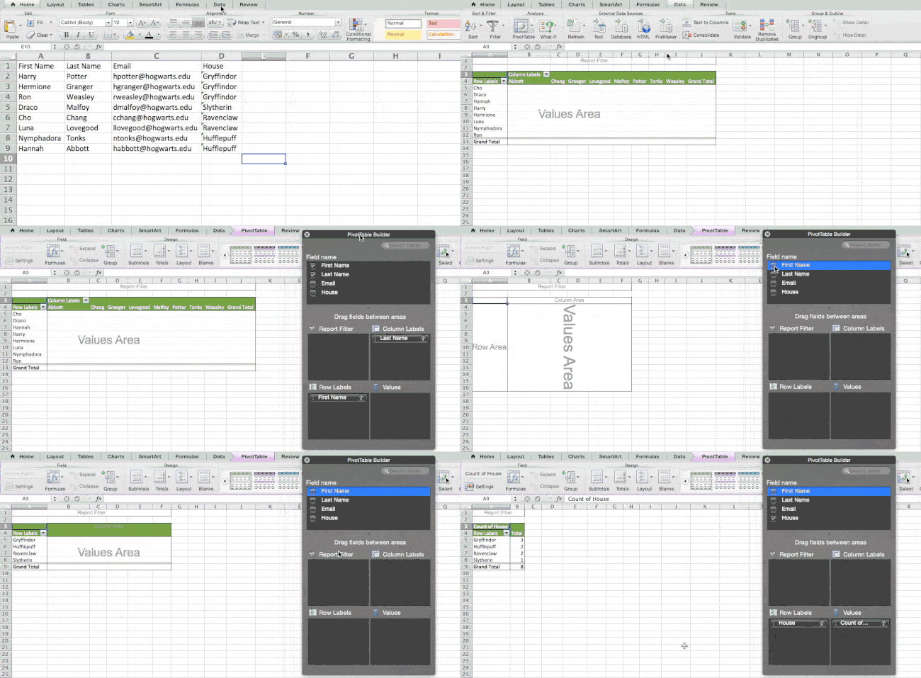
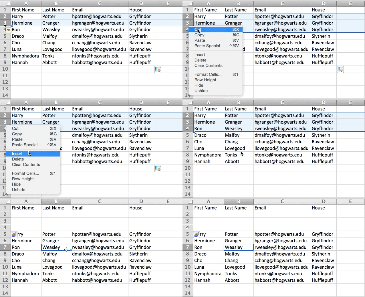
Sometimes you may have a list of data that has no organization whatsoever. Maybe you exported a list of your marketing contacts or blog posts. Whatever the case may be, Excel’s sort feature will help you alphabetize any list.

Click on the data in the column you want to sort. Then click on the “Data” tab in your toolbar and look for the “Sort” option on the left. If the “A” is on top of the “Z,” you can just click on that button once. If the “Z” is on top of the “A,” click on the button twice. When the “A” is on top of the “Z,” that means your list will be sorted in alphabetical order. However, when the “Z” is on top of the “A,” that means your list will be sorted in reverse alphabetical order.

Let’s explore more of the basics of Excel (along with advanced features) next.

How to Use Excel

To use Excel, you only need to input the data into the rows and columns. And then you’ll use formulas and functions to turn that data into insights.

We‘re going to go over the best formulas and functions you need to know. But first, let’s take a look at the types of documents you can create using the software. That way, you have an overarching understanding of how you can use Excel in your day-to-day.

Documents You Can Create in Excel

Not sure how you can actually use Excel in your team? Here is a list of documents you can create:

  • Income Statements: You can use an Excel spreadsheet to track a company’s sales activity and financial health.
  • Balance Sheets: Balance sheets are among the most common types of documents you can create with Excel. It allows you to get a holistic view of a company’s financial standing.
  • Calendar: You can easily create a spreadsheet monthly calendar to track events or other date-sensitive information.

Here are some documents you can create specifically for marketers.

This is only a small sampling of the types of marketing and business documents you can create in Excel. We’ve created an extensive list of Excel templates you can use right now for marketing, invoicing, project management, budgeting, and more.

In the spirit of working more efficiently and avoiding tedious, manual work, here are a few Excel formulas and functions you’ll need to know.

Excel Formulas

It’s easy to get overwhelmed by the wide range of Excel formulas that you can use to make sense out of your data. If you’re just getting started using Excel, you can rely on the following formulas to carry out some complex functions — without adding to the complexity of your learning path.

  • Equal sign: Before creating any formula, you’ll need to write an equal sign (=) in the cell where you want the result to appear.
  • Addition: To add the values of two or more cells, use the + sign. Example: =C5+D3.
  • Subtraction: To subtract the values of two or more cells, use the sign. Example: =C5-D3.
  • Multiplication: To multiply the values of two or more cells, use the * sign. Example: =C5*D3.
  • Division: To divide the values of two or more cells, use the / sign. Example: =C5/D3.

Putting all of these together, you can create a formula that adds, subtracts, multiplies, and divides all in one cell. Example: =(C5-D3)/((A5+B6)*3).

For more complex formulas, you’ll need to use parentheses around the expressions to avoid accidentally using the PEMDAS order of operations. Keep in mind that you can use plain numbers in your formulas.

Excel Functions

Excel functions automate some of the tasks you would use in a typical formula. For instance, instead of using the + sign to add up a range of cells, you’d use the SUM function. Let’s look at a few more functions that will help automate calculations and tasks.

  • SUM: The SUM function automatically adds up a range of cells or numbers. To complete a sum, you would input the starting cell and the final cell with a colon in between. Here’s what that looks like: SUM(Cell1:Cell2). Example: =SUM(C5:C30).
  • AVERAGE: The AVERAGE function averages out the values of a range of cells. The syntax is the same as the SUM function: AVERAGE(Cell1:Cell2). Example: =AVERAGE(C5:C30).
  • IF: The IF function allows you to return values based on a logical test. The syntax is as follows: IF(logical_test, value_if_true, [value_if_false]). Example: =IF(A2>B2,“Over Budget”,“OK”).
  • VLOOKUP: The VLOOKUP function helps you search for anything on your sheet’s rows. The syntax is: VLOOKUP(lookup value, table array, column number, Approximate match (TRUE) or Exact match (FALSE)). Example: =VLOOKUP([@Attorney],tbl_Attorneys,4,FALSE).
  • INDEX: The INDEX function returns a value from within a range. The syntax is as follows: INDEX(array, row_num, [column_num]).
  • MATCH: The MATCH function looks for a certain item in a range of cells and returns the position of that item. It can be used in tandem with the INDEX function. The syntax is: MATCH(lookup_value, lookup_array, [match_type]).
  • COUNTIF: The COUNTIF function returns the number of cells that meet a certain criteria or have a certain value. The syntax is: COUNTIF(range, criteria). Example: =COUNTIF(A2:A5,“London”).

Okay, ready to get into the nitty-gritty? Let‘s get to it. (And to all the Harry Potter fans out there … you’re welcome in advance.)

Note: Some of the GIFs and visuals are from a previous version of Excel. When applicable, the copy has been updated to provide instruction for users of both newer and older Excel versions.

1. Use Pivot tables to recognize and make sense of data.

Pivot tables are used to reorganize data in a spreadsheet. They won‘t change the data that you have, but they can sum up values and compare different information in your spreadsheet, depending on what you’d like them to do.

Let‘s take a look at an example. Let’s say I want to take a look at how many people are in each house at Hogwarts. You may be thinking that I don’t have too much data, but for longer data sets, this will come in handy.

To create the Pivot Table, I go to Data > Pivot Table. If you’re using the most recent version of Excel, you’d go to Insert > Pivot Table. Excel will automatically populate your Pivot Table, but you can always change around the order of the data. Then, you have four options to choose from.

  • Report Filter: This allows you to only look at certain rows in your dataset. For example, if I wanted to create a filter by house, I could choose to only include students in Gryffindor instead of all students.
  • Column Labels: These would be your headers in the dataset.
  • Row Labels: These could be your rows in the dataset. Both Row and Column labels can contain data from your columns (e.g. First Name can be dragged to either the Row or Column label — it just depends on how you want to see the data.)
  • Value: This section allows you to look at your data differently. Instead of just pulling in any numeric value, you can sum, count, average, max, min, count numbers, or do a few other manipulations with your data. In fact, by default, when you drag a field to Value, it always does a count.

Since I want to count the number of students in each house, I’ll go to the Pivot table builder and drag the House column to both the Row Labels and the Values. This will sum up the number of students associated with each house.

excel pivot table creation

2. Add more than one row or column.

As you play around with your data, you might find you‘re constantly needing to add more rows and columns. Sometimes, you may even need to add hundreds of rows. Doing this one-by-one would be super tedious. Luckily, there’s always an easier way.

To add multiple rows or columns in a spreadsheet, highlight the same number of preexisting rows or columns that you want to add. Then, right-click and select “Insert.”

In the example below, I want to add an additional three rows. By highlighting three rows and then clicking insert, I’m able to add an additional three blank rows into my spreadsheet quickly and easily.

excel insert spaces

3. Use filters to simplify your data.

When you‘re looking at very large data sets, you don’t usually need to be looking at every single row at the same time. Sometimes, you only want to look at data that fit into certain criteria.

That’s where filters come in.

Filters allow you to pare down your data to only look at certain rows at one time. In Excel, a filter can be added to each column in your data — and from there, you can then choose which cells you want to view at once.

Let‘s take a look at the example below. Add a filter by clicking the Data tab and selecting “Filter.” Clicking the arrow next to the column headers and you’ll be able to choose whether you want your data to be organized in ascending or descending order, as well as which specific rows you want to show.

In my Harry Potter example, let’s say I only want to see the students in Gryffindor. By selecting the Gryffindor filter, the other rows disappear.

excel filtersPro Tip: Copy and paste the values in the spreadsheet when a Filter is on to do additional analysis in another spreadsheet.

4. Remove duplicate data points or sets.

Larger data sets tend to have duplicate content. You may have a list of multiple contacts in a company and only want to see the number of companies you have. In situations like this, removing the duplicates comes in quite handy.

To remove your duplicates, highlight the row or column that you want to remove duplicates of. Then, go to the Data tab and select “Remove Duplicates” (which is under the Tools subheader in the older version of Excel). A pop-up will appear to confirm which data you want to work with. Select “Remove Duplicates,” and you’re good to go.

excel duplicates removal

You can also use this feature to remove an entire row based on a duplicate column value. So if you have three rows with Harry Potter’s information and you only need to see one, then you can select the whole dataset and then remove duplicates based on email. Your resulting list will have only unique names without any duplicates.

5. Transpose rows into columns.

When you have rows of data in your spreadsheet, you might decide you actually want to transform the items in one of those rows into columns (or vice versa). It would take a lot of time to copy and paste each individual header — but what the transpose feature allows you to do is simply move your row data into columns, or the other way around.

Start by highlighting the column that you want to transpose into rows. Right-click it, and then select “Copy.” Next, select the cells on your spreadsheet where you want your first row or column to begin. Right-click on the cell, and then select “Paste Special.” A module will appear — at the bottom, you’ll see an option to transpose. Check that box and select OK. Your column will now be transferred to a row or vice-versa.

excel transpose

On newer versions of Excel, a drop-down will appear instead of a pop-up.

Excel transpose tool in newer versions

6. Split up text information between columns.

What if you want to split out information that‘s in one cell into two different cells? For example, maybe you want to pull out someone’s company name through their email address. Or perhaps you want to separate someone’s full name into a first and last name for your email marketing templates.

Thanks to Excel, both are possible. First, highlight the column that you want to split up. Next, go to the Data tab and select “Text to Columns.” A module will appear with additional information.

First, you need to select either “Delimited” or “Fixed Width.”

  • “Delimited” means you want to break up the column based on characters such as commas, spaces, or tabs.
  • “Fixed Width” means you want to select the exact location on all the columns that you want the split to occur.

In the example case below, let’s select “Delimited” so we can separate the full name into first name and last name.

Then, it‘s time to choose the Delimiters. This could be a tab, semi-colon, comma, space, or something else. (“Something else” could be the “@” sign used in an email address, for example.) In our example, let’s choose the space. Excel will then show you a preview of what your new columns will look like.

When you‘re happy with the preview, press “Next.” This page will allow you to select Advanced Formats if you choose to. When you’re done, click “Finish.”

excel text to column

7. Use formulas for simple calculations.

In addition to doing pretty complex calculations, Excel can help you do simple arithmetic like adding, subtracting, multiplying, or dividing any of your data.

  • To add, use the + sign.
  • To subtract, use the – sign.
  • To multiply, use the * sign.
  • To divide, use the / sign.

You can also use parentheses to ensure certain calculations are done first. In the example below (10+10*10), the second and third 10 were multiplied together before adding the additional 10. However, if we made it (10+10)*10, the first and second 10 would be added together first.

Excel simple formulas in action

8. Get the average of numbers in your cells.

If you want the average of a set of numbers, you can use the formula =AVERAGE(Cell1:Cell2). If you want to sum up a column of numbers, you can use the formula =SUM(Cell1:Cell2).

9. Use conditional formatting to make cells automatically change color based on data.

Conditional formatting allows you to change a cell’s color based on the information within the cell. For example, if you want to flag certain numbers that are above average or in the top 10% of the data in your spreadsheet, you can do that. If you want to color code commonalities between different rows in Excel, you can do that. This will help you quickly see information that is important to you.

To get started, highlight the group of cells you want to use conditional formatting on. Then, choose “Conditional Formatting” from the Home menu and select your logic from the dropdown. (You can also create your own rule if you want something different.) A window will pop up that prompts you to provide more information about your formatting rule. Select “OK” when you’re done, and you should see your results automatically appear.

Excel conditional formatting

10. Use the IF Excel formula to automate certain Excel functions.

Sometimes, we don’t want to count the number of times a value appears. Instead, we want to input different information into a cell if there is a corresponding cell with that information.

For example, in the situation below, I want to award ten points to everyone who belongs in the Gryffindor house. Instead of manually typing in 10‘s next to each Gryffindor student’s name, I can use the IF Excel formula to say that if the student is in Gryffindor, then they should get ten points.

The formula is: IF(logical_test, value_if_true, [value_if_false])

Example Shown Below: =IF(D2=“Gryffindor”,“10”,“0”)

In general terms, the formula would be IF(Logical Test, value of true, value of false). Let’s dig into each of these variables.

  • Logical_Test: The logical test is the “IF” part of the statement. In this case, the logic is D2=“Gryffindor” because we want to make sure that the cell corresponding with the student says “Gryffindor.” Make sure to put Gryffindor in quotation marks here.
  • Value_if_True: This is what we want the cell to show if the value is true. In this case, we want the cell to show “10” to indicate that the student was awarded the 10 points. Only use quotation marks if you want the result to be text instead of a number.
  • Value_if_False: This is what we want the cell to show if the value is false. In this case, for any student not in Gryffindor, we want the cell to show “0”. Only use quotation marks if you want the result to be text instead of a number.

Excel IF formula in action

Note: In the example above, I awarded 10 points to everyone in Gryffindor. If I later wanted to sum the total number of points, I wouldn‘t be able to because the 10’s are in quotes, thus making them text and not a number that Excel can sum.

The real power of the IF function comes when you string multiple IF statements together, or nest them. This allows you to set multiple conditions, get more specific results, and ultimately organize your data into more manageable chunks.

Ranges are one way to segment your data for better analysis. For example, you can categorize data into values that are less than 10, 11 to 50, or 51 to 100. Here’s how that looks in practice:

=IF(B3<11,“10 or less”,IF(B3<51,“11 to 50”,IF(B3<100,“51 to 100”)))

It can take some trial-and-error, but once you have the hang of it, IF formulas will become your new Excel best friend.

11. Use dollar signs to keep one cell’s formula the same regardless of where it moves.

Have you ever seen a dollar sign in an Excel formula? When used in a formula, it isn’t representing an American dollar; instead, it makes sure that the exact column and row are held the same even if you copy the same formula in adjacent rows.

You see, a cell reference — when you refer to cell A5 from cell C5, for example — is relative by default. In that case, you‘re actually referring to a cell that’s five columns to the left (C minus A) and in the same row (5). This is called a relative formula. When you copy a relative formula from one cell to another, it‘ll adjust the values in the formula based on where it’s moved. But sometimes, we want those values to stay the same no matter whether they’re moved around or not — and we can do that by turning the formula into an absolute formula.

To change the relative formula (=A5+C5) into an absolute formula, we’d precede the row and column values by dollar signs, like this: (=$A$5+$C$5). (Learn more on Microsoft Office’s support page here.)

12. Use the VLOOKUP function to pull data from one area of a sheet to another.

Have you ever had two sets of data on two different spreadsheets that you want to combine into a single spreadsheet?

For example, you might have a list of people‘s names next to their email addresses in one spreadsheet, and a list of those same people’s email addresses next to their company names in the other — but you want the names, email addresses, and company names of those people to appear in one place.

I have to combine data sets like this a lot — and when I do, the VLOOKUP is my go-to formula.

Before you use the formula, though, be absolutely sure that you have at least one column that appears identically in both places. Scour your data sets to make sure the column of data you’re using to combine your information is exactly the same, including no extra spaces.

The formula: =VLOOKUP(lookup value, table array, column number, Approximate match (TRUE) or Exact match (FALSE))

The formula with variables from our example below: =VLOOKUP(C2,Sheet2!A:B,2,FALSE)

In this formula, there are several variables. The following is true when you want to combine information in Sheet 1 and Sheet 2 onto Sheet 1.

  • Lookup Value: This is the identical value you have in both spreadsheets. Choose the first value in your first spreadsheet. In the example that follows, this means the first email address on the list, or cell 2 (C2).
  • Table Array: The table array is the range of columns on Sheet 2 you‘re going to pull your data from, including the column of data identical to your lookup value (in our example, email addresses) in Sheet 1 as well as the column of data you’re trying to copy to Sheet 1. In our example, this is “Sheet2!A:B.” “A” means Column A in Sheet 2, which is the column in Sheet 2 where the data identical to our lookup value (email) in Sheet 1 is listed. The “B” means Column B, which contains the information that’s only available in Sheet 2 that you want to translate to Sheet 1.
  • Column Number: This tells Excel which column the new data you want to copy to Sheet 1 is located in. In our example, this would be the column that “House” is located in. “House” is the second column in our range of columns (table array), so our column number is 2. [Note: Your range can be more than two columns. For example, if there are three columns on Sheet 2 — Email, Age, and House — and you still want to bring House onto Sheet 1, you can still use a VLOOKUP. You just need to change the “2” to a “3” so it pulls back the value in the third column: =VLOOKUP(C2:Sheet2!A:C,3,false).]
  • Approximate Match (TRUE) or Exact Match (FALSE): Use FALSE to ensure you pull in only exact value matches. If you use TRUE, the function will pull in approximate matches.

In the example below, Sheet 1 and Sheet 2 contain lists describing different information about the same people, and the common thread between the two is their email addresses. Let’s say we want to combine both datasets so that all the house information from Sheet 2 translates over to Sheet 1.

Excel VLOOKUP function

So when we type in the formula =VLOOKUP(C2,Sheet2!A:B,2,FALSE), we bring all the house data into Sheet 1.

Keep in mind that VLOOKUP will only pull back values from the second sheet that are to the right of the column containing your identical data. This can lead to some limitations, which is why some people prefer to use the INDEX and MATCH functions instead.

13. Use INDEX and MATCH formulas to pull data from horizontal columns.

Like VLOOKUP, the INDEX and MATCH functions pull in data from another dataset into one central location. Here are the main differences:

  • VLOOKUP is a much simpler formula. If you’re working with large data sets that would require thousands of lookups, using the INDEX and MATCH function will significantly decrease load time in Excel.
  • The INDEX and MATCH formulas work right-to-left, whereas VLOOKUP formulas only work as a left-to-right lookup. In other words, if you need to do a lookup that has a lookup column to the right of the results column, then you’d have to rearrange those columns in order to do a VLOOKUP. This can be tedious with large datasets and/or lead to errors.

So if I want to combine information in Sheet 1 and Sheet 2 onto Sheet 1, but the column values in Sheets 1 and 2 aren‘t the same, then to do a VLOOKUP, I would need to switch around my columns. In this case, I’d choose to do an INDEX and MATCH instead.

Let‘s look at an example. Let’s say Sheet 1 contains a list of people‘s names and their Hogwarts email addresses, and Sheet 2 contains a list of people’s email addresses and the Patronus that each student has. (For the non-Harry Potter fans out there, every witch or wizard has an animal guardian called a “Patronus” associated with him or her.) The information that lives in both sheets is the column containing email addresses, but this email address column is in different column numbers on each sheet. I‘d use the INDEX and MATCH formulas instead of VLOOKUP so I wouldn’t have to switch any columns around.

So what‘s the formula, then? The formula is actually the MATCH formula nested inside the INDEX formula. You’ll see I differentiated the MATCH formula using a different color here.

The formula: =INDEX(table array, MATCH formula)

This becomes: =INDEX(table array, MATCH (lookup_value, lookup_array))

The formula with variables from our example below: =INDEX(Sheet2!A:A,(MATCH(Sheet1!C:C,Sheet2!C:C,0)))

Here are the variables:

  • Table Array: The range of columns on Sheet 2 containing the new data you want to bring over to Sheet 1. In our example, “A” means Column A, which contains the “Patronus” information for each person.
  • Lookup Value: This is the column in Sheet 1 that contains identical values in both spreadsheets. In the example that follows, this means the “email” column on Sheet 1, which is Column C. So: Sheet1!C:C.
  • Lookup Array: This is the column in Sheet 2 that contains identical values in both spreadsheets. In the example that follows, this refers to the “email” column on Sheet 2, which happens to also be Column C. So: Sheet2!C:C.

Once you have your variables straight, type in the INDEX and MATCH formulas in the top-most cell of the blank Patronus column on Sheet 1, where you want the combined information to live.

Excel INDEX and MATCH functions in action

14. Use the COUNTIF function to make Excel count words or numbers in any range of cells.

Instead of manually counting how often a certain value or number appears, let Excel do the work for you. With the COUNTIF function, Excel can count the number of times a word or number appears in any range of cells.

For example, let’s say I want to count the number of times the word “Gryffindor” appears in my data set.

The formula: =COUNTIF(range, criteria)

The formula with variables from our example below: =COUNTIF(D:D,“Gryffindor”)

In this formula, there are several variables:

  • Range: The range that we want the formula to cover. In this case, since we’re only focusing on one column, we use “D:D” to indicate that the first and last column are both D. If I were looking at columns C and D, I would use “C:D.”
  • Criteria: Whatever number or piece of text you want Excel to count. Only use quotation marks if you want the result to be text instead of a number. In our example, the criteria is “Gryffindor.”

Simply typing in the COUNTIF formula in any cell and pressing “Enter” will show me how many times the word “Gryffindor” appears in the dataset.

Excel COUNTIF function

15. Combine cells using &.

Databases tend to split out data to make it as exact as possible. For example, instead of having a column that shows a person‘s full name, a database might have the data as a first name and then a last name in separate columns. Or, it may have a person’s location separated by city, state, and zip code. In Excel, you can combine cells with different data into one cell by using the “&” sign in your function.

The formula with variables from our example below: =A2&“ ”&B2

Let‘s go through the formula together using an example. Pretend we want to combine first names and last names into full names in a single column. To do this, we’d first put our cursor in the blank cell where we want the full name to appear. Next, we’d highlight one cell that contains a first name, type in an “&” sign, and then highlight a cell with the corresponding last name.

But you‘re not finished — if all you type in is =A2&B2, then there will not be a space between the person’s first name and last name. To add that necessary space, use the function =A2&“ ”&B2. The quotation marks around the space tell Excel to put a space in between the first and last name.

To make this true for multiple rows, simply drag the corner of that first cell downward as shown in the example.

Excel combination of cells

16. Add checkboxes.

If you‘re using an Excel sheet to track customer data and want to oversee something that isn’t quantifiable, you could insert checkboxes into a column.

For example, if you‘re using an Excel sheet to manage your sales prospects and want to track whether you called them in the last quarter, you could have a “Called this quarter?” column and check off the cells in it when you’ve called the respective client.

Here’s how to do it.

Highlight a cell you’d like to add checkboxes to in your spreadsheet. Then, click DEVELOPER. Then, under FORM CONTROLS, click the checkbox or the selection circle highlighted in the image below.

Excel checkboxes

Once the box appears in the cell, copy it, highlight the cells you also want it to appear in, and then paste it.

17. Hyperlink a cell to a website.

If you‘re using your sheet to track social media or website metrics, it can be helpful to have a reference column with the links each row is tracking. If you add a URL directly into Excel, it should automatically be clickable. But, if you have to hyperlink words, such as a page title or the headline of a post you’re tracking, here’s how.

Highlight the words you want to hyperlink, then press Shift K. From there a box will pop up allowing you to place the hyperlink URL. Copy and paste the URL into this box and hit or click Enter.

If the key shortcut isn’t working for any reason, you can also do this manually by highlighting the cell and clicking Insert > Hyperlink.

18. Add drop-down menus.

Sometimes, you‘ll be using your spreadsheet to track processes or other qualitative things. Rather than writing words into your sheet repetitively, such as “Yes”, “No”, “Customer Stage”, “Sales Lead”, or “Prospect”, you can use dropdown menus to quickly mark descriptive things about your contacts or whatever you’re tracking.

Here’s how to add drop-downs to your cells.

Highlight the cells you want the drop-downs to be in, then click the Data menu in the top navigation and press Validation.

Excel drop-down menu option

From there, you’ll see a Data Validation Settings box open. Look at the Allow options, then click Lists and select Drop-down List. Check the In-Cell dropdown button, then press OK.

19. Use the format painter.

As you’ve probably noticed, Excel has a lot of features to make crunching numbers and analyzing your data quick and easy. But if you ever spent some time formatting a sheet to your liking, you know it can get a bit tedious.

Don’t waste time repeating the same formatting commands over and over again. Use the format painter to easily copy the formatting from one area of the worksheet to another. To do so, choose the cell you’d like to replicate, then select the format painter option (paintbrush icon) from the top toolbar.

20. Create tables with data.

Converting your data into a table not only makes it visually appealing but also provides improved data management and analysis capabilities.

To get started, you’ll need to select the range of cells that you want to convert into a table. Then, go to the Home tab in the Excel ribbon. In the Styles group, click on the Format as Table button — it looks like a grid of cells. Then, choose a table style from the available options, or customize a table if desired.

In the Create Table dialog box, make sure the range you selected is correct. If Excel did not automatically detect the range correctly, you can adjust it manually. If your table has headers (column names), ensure that the “My table has headers” option is checked. This allows Excel to treat the first row as the header row.

Once everything is ready, click the OK button, and Excel will convert your selected data into a table.

create tables with data in excel

After your data is converted into a table, you’ll notice some additional features and functionalities become available:

  • The table is automatically assigned a name, such as “Table1” or “Table2,” which you can modify if needed.
  • Filter drop-down arrows appear in the header row, allowing you to filter data within the table easily.
  • The table is formatted with alternating row colors, making it visually appealing.
  • Total rows are automatically added at the bottom of each column, allowing you to perform calculations like sum, average, etc., for the data in that column.

21. Use tables to conduct a what-if analysis.

In addition to making your data more organized, tables can also help you conduct what-if analyses. This allows you to test various combinations of input values and observe the resulting outcomes.

A what-if analysis can be beneficial when it comes to decision making, planning, forecasting, financial modeling, sensitivity analysis, resource planning, and more.

To get started, you’ll need to set up your worksheet with the necessary formulas and variables you want to analyze. Then, determine the input values that you want to vary. Typically, you will choose one or two input variables.

Select the cell where you want to display the results of your what-if analysis. Then, go to the Data tab in the Excel ribbon and click on the What-If Analysis button. From the dropdown menu, select Data Table.

In the Table Input dialog box, enter the input values that you want to test for each variable. If you have one variable, enter the different input values in a column or row. If you have two variables, enter the combinations in a table format.

Select the cells in the table area that correspond to the formula cell you want to analyze. This is the cell that will display the results for each combination of input values.

Click OK to generate the data table. Excel will calculate the formula for each combination of input values and display the results in the selected cells. The data table acts as a grid, showing the various scenarios and their corresponding outcomes.

Once your table is created, you can use it to identify trends, patterns, or specific values of interest. Play around with the input values and see how it may affect the final results.

22. Make formulas easier to comprehend with named ranges.

Instead of referring to a range of cells by its coordinates (e.g., A1:B10), you can assign a name to it. This makes formulas more readable and easier to manage.

To get started, select the cell or range of cells that you want to name. Go to the Formulas tab in the Excel ribbon and click on the Define Name button in the Defined Names group. Alternatively, you can use the keyboard shortcut Alt + M + N + D.

In the New Name dialog box, enter a name for the selected cell or range in the Name field. Make sure the name is descriptive and easy to remember. By default, Excel assigns the selected cell or range’s reference to the Refers to field in the dialog box. If needed, you can modify the reference to include additional cells or adjust the range.

Click the OK button to save the named range. Once you’ve named a range, you can use it in your formulas by simply typing the name instead of the cell reference. For example, if you named cell A1 as “Revenue,” you could use =Revenue instead of =A1 in your formulas.

Using named ranges offers several benefits:

  • Improved formula readability: Named ranges make formulas easier to understand and navigate, especially in complex calculations or large datasets.
  • Flexibility for range adjustments: If your dataset changes, you can easily modify the range assigned to a named range without updating each formula that references it.
  • Enhanced collaboration: Named ranges make it easier to collaborate with others, as they can understand the purpose of a named range and use it in their own calculations.
  • Simplified data analysis: When using named ranges, you can create more intuitive data analysis by referring to named ranges in functions like SUM, AVERAGE, COUNTIF, etc.

To manage named ranges, you can go to the Formulas tab, click on the Name Manager button in the Defined Names group. The Name Manager offers functionalities to modify, delete, or review existing named ranges.

23. Group data to improve organization.

Grouping data in Excel provides a way to organize, analyze, and present information more effectively, making it easier to identify patterns, trends, and insights within your data. For instance, if you have a list of leads generated, you can group the data by month to create a monthly performance report.

Grouping data especially makes it easier to navigate and work with large data sets. It helps in organization and reduces clutter by collapsing the groups that are not immediately needed.

To group data in Excel, select the range of cells or columns that you want to group. Make sure the data is sorted properly, if needed.

On the Data tab in the Excel ribbon, click on the Group button. It is usually found in the Outline or Data Tools group.

group and ungroup buttons in excel

You can specify the grouping levels by choosing options like Rows or Columns. For example, if you want to group data by month, you can select Months. You can also set additional options such as Summary rows below detail or Collapse the outline to the summary levels. These options affect how the grouped data is displayed.

Once you have the options you want selected, click on the OK button, and Excel will group the selected data based on your settings.

After your data is grouped, you will see a plus (+) or minus (-) button next to the grouped rows or columns. Clicking on the plus button expands the group to show the individual records, and clicking on the minus button collapses the group to hide the details.

24. Use Find & Select to streamline formatting.

Why format and clean up your spreadsheet manually when you can do it in just a few clicks? Using the Find & Select tool can help you maintain accuracy and consistency in your documents.

To get started, open the Excel worksheet that contains the data you want to search. Press the Ctrl + F keys on your keyboard or go to the Home tab and click on the Find & Select drop-down menu. Then, select Find from the menu. The Find and Replace dialog box will open.

excel find and select tool

In the Find field, enter the specific data you want to find. Optionally, you can narrow down your search to specific cells, rows, columns, or formulas by choosing the appropriate options in the dialog box.

Click on the Find next button to search for the first occurrence of the data. Excel will highlight the cell containing the data.

To replace the found data with new information, click on the Replace button in the dialog box. This will replace the highlighted occurrence with the data you enter in the Replace field.

To replace all occurrences of the data at once, click on the Replace All button. Once you have finished finding and replacing, you can close the dialog box.

Note: Be cautious when using the Replace All feature, as it replaces all occurrences without confirmation. It is always a good practice to review each replacement carefully before using the Replace All option.

25. Protect your work.

Protecting your work in Excel is essential for data security, maintaining data integrity, preserving intellectual property, and complying with legal or regulatory requirements. It allows you to have control over who can access and modify your work, minimizing risks and maintaining the quality and confidentiality of your data.

Here are a couple ways you can protect your work:

Protect a Worksheet

  1. Open your Excel worksheet and navigate to the Review tab.
  2. Click on the Manage Protection button in the Protection group.
  3. A Manage Protection dialog box will appear. There, you can select whether or not you want to protect the sheet. Set a password if desired and choose the options you want to apply, such as preventing users from making changes to cells, formatting, inserting/deleting columns or rows, etc.

protect worksheet in excel

Protecting a Workbook

  1. Open your Excel workbook and navigate to the File tab.
  2. Click on Info and select Protect Workbook from the options.
  3. Choose Encrypt with Password and enter a password if desired.
  4. Click OK to protect the workbook.

protect workbook in excel

Taking these extra steps ensures your work is protected. Just make sure to keep your passwords safe and secure.

26. Create custom number formats.

To display data in unique ways, use custom number formats. Doing this can help with data presentation, data clarity, consistency, localization, and masking sensitive data.

To get started, select the cell or range of cells that you want to format. Right-click on the selected cells and choose Number Format from the context menu. Then, find the Category list and select Custom.

number formatting in excel

In the Type field, you can enter a custom number format code to define your desired format. Here are some examples of custom number formats:

  • To display numbers with a specific number of decimal places, use the 0 or # symbol to represent a digit, and a zero or hashtag without a decimal point to represent optional digits. For example, 0.00 will display two decimal places, 0.### will display up to three decimal places, and ### will display no decimal places.
  • To display a specific text or character alongside numbers, use the @ symbol. For example, $0 will display a dollar sign before the number.
  • To display percentages, use the % symbol. For example, 0% will display the number as a percentage.
  • To create custom date or time formats, use codes such as dd for day, mm for month, yy for two-digit year, hh for hours, mm for minutes, and ss for seconds. For example, dd/mm/yyyy will display the date in the format of day/month/year.

As you enter your custom number format in the Type field, you will see a Sample section that shows a preview of how the format will be applied. Click OK to apply the custom number format to the selected cells.

27. Customize the Excel ribbon.

Although the Excel ribbon already contains various tools that are used to execute common functions and commands, you can customize it to fit your specific needs and preferences.

This can help streamline your workflow and make commonly used commands more easily accessible. It also allows you to remove unnecessary elements that you don’t use, making it easier to navigate and find the tools you need.

excel ribbon

To make customizations, start by right clicking on an empty area of the ribbon and select Customize the Ribbon. In the Excel Options window that appears, you’ll see two sections. The left section displays the tabs currently visible in the ribbon, while the right section displays the tabs you can add.

To customize the ribbon, you have several options:

  • To add a new tab, click on New Tab in the right section and give it a name.
  • To add a group within an existing tab, select the tab in the left section, click New Group in the right section, and name it.
  • To add commands to a group, select the group in the right section, choose commands from the left section, and click Add. You can also customize the order of the commands using the Up and Down buttons.

You can also remove tabs, groups, or commands from the ribbon. Select the item you want to remove in the left section and click Remove.

To change the order of tabs and groups, select the item in the left section and use the Up and Down buttons to rearrange them.

Click OK in the Excel Options window to save your changes and apply the customized ribbon.

To extend Excel’s functionality even further, you can customize the ribbon with additional applications by clicking on the Add-ins button in the Home tab.

excel add ins

Note: Customizing the ribbon is specific to your Excel installation and won‘t affect other users’ ribbons.

28. Improve visual presentation with text wrapping.

wrap text in excel

Even though spreadsheets aren’t always the most interesting things to look at, you can still take the time to make them easier to read by wrapping text.

Doing this lets you display multiple lines of text within a single cell. It’s particularly handy when you need to include line breaks or break up paragraphs of information within a cell without increasing the row height.

Select the cell(s) with the text you want to wrap. Navigate to the toolbar at the top of the Excel window and locate the Wrap Text button (an icon with an angled arrow). It is typically found in the Alignment section. Then, click on Wrap Text.

29. Add emojis.

Give your spreadsheets a little personal touch by adding in emojis.

To get started, click on the cell where you want to insert an emoji. Then, open the emoji keyboard. This step may vary based on your operating system.

  • Windows: Use the keyboard shortcut Win + . or Win + ; to open the emoji keyboard.
  • macOS: Use the keyboard shortcut Ctrl + Cmd + Space to access the emoji keyboard.

Browse through the available emojis and click on the one you want to insert. The selected emoji should now appear in the selected cell.

add emojis in excel

Emojis may appear small by default in Excel cells. If you want to make them larger to improve visibility, you can adjust the cell size by dragging the row height and column width accordingly.

You can also copy emojis from external sources on the web or other applications and paste them directly into Excel cells.

Note: The ability to use emojis in Excel depends on the version of Excel and the device you are using. Some older versions or platforms may not support emojis or display them correctly. Therefore, it’s important to ensure compatibility with the Excel version and platform you are working with.

Excel Keyboard Shortcuts

Creating reports in Excel is time-consuming enough. How can we spend less time navigating, formatting, and selecting items in our spreadsheet? Glad you asked. There are a ton of Excel shortcuts out there, including some of our favorites listed below.

Create a New Workbook

PC: Ctrl-N | Mac: Command-N

Select Entire Row

PC: Shift-Space | Mac: Shift-Space

Select Entire Column

PC: Ctrl-Space | Mac: Control-Space

Select Rest of Column

PC: Ctrl-Shift-Down/Up | Mac: Command-Shift-Down/Up

Select Rest of Row

PC: Ctrl-Shift-Right/Left | Mac: Command-Shift-Right/Left

Add Hyperlink

PC: Ctrl-K | Mac: Command-K

Open Format Cells Window

PC: Ctrl-1 | Mac: Command-1

Autosum Selected Cells

PC: Alt-= | Mac: Command-Shift-T

Other Excel Help Resources

Use Excel to Automate Processes in Your Team

Even if you’re not an accountant, you can still use Excel to automate tasks and processes in your team. With the tips and tricks we shared in this post, you’ll be sure to use Excel to its fullest extent and get the most out of the software to grow your business.

Editor’s Note: This post was originally published in August 2017 but has been updated for comprehensiveness.

Categories B2B

Social Impact Done Right: Why Nike and Dove Are Teaming Up to Advocate for Girls Sports

We recently discussed whether or not consumers want brands to make social statements with our sister publication, The Hustle. The main consensus is instead of making broad social media statements, consumers want brands to make tangible changes to improve broader communities.

Nike and Dove are doing just that with their recent partnership which is incredibly on-brand and has the potential to make a positive impact.

Last month, Nike and Dove announced a new initiative called Body Confident Sport — a package of coaching tools and resources to build body confidence among 11 to 17-year-old girls through participation in sports.

The two brands conducted a global survey of 2,000 participants to better understand trends related to girls’ participation in sports worldwide. The survey found:

  • 45% of girls drop out of sports during their teenage years due to impacts on body image and self-esteem associated with puberty
  • 74% of the girls surveyed said their coaches positively impacted their confidence

Body Confident Sport equips coaches with the tools and resources they need to instill confidence in their female athletes, making them more likely to continue participating in sports.

Participating in sports has various benefits for women and girls including:

  • Increased confidence and self-esteem
  • Decreased risk of health issues like breast cancer and osteoporosis
  • Better academic performance
  • Increased leadership, teamwork, and goal-setting skills

Why this partnership makes sense for Dove and Nike

Dove has been a champion for positive body image for years. Through the Dove Self-Esteem Project, the brand has developed various campaigns and resources to support body literacy and confidence in young girls worldwide.

As a leading fitness apparel brand, Nike has a vested interest in the world of athletics and is focused on increasing girls’ participation in sports.

Earlier this year the brand premiered “You Got This” — a YouTube series highlighting the impact of athletic participation for young girls. Nike also partnered with Spotify to develop the Make Moves Fund, which awarded grants to UK-based organizations that support physical and creative activities for girls.

The Body Confident Sport initiative is an example of companies putting resources behind a social cause that aligns with each brand’s values and customer base.

New call-to-action