The right B2B website makes all the difference when it comes to converting visitors into buyers. In this post, we’ll share the best B2B website examples we’ve ever seen, then dive into three tips for building your site.
By the end, you’ll be able to create a site that drives conversions and keeps buyers coming back. Let’s get started.
With a host of great B2B website examples out there, we’ve curated a list of sites that stand out.
1. Blake Envelopes
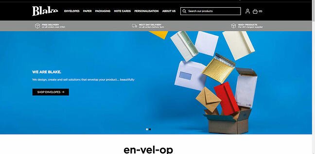
Are envelopes exciting? Not really, but you wouldn’t know it from the Blake Envelope website. The colors are vibrant, the envelopes are everywhere, and the site manages to convey a sense of movement that makes you want to click through and see exactly what they have to offer. That’s exactly what you want from a B2B website.
2. Pixelgrade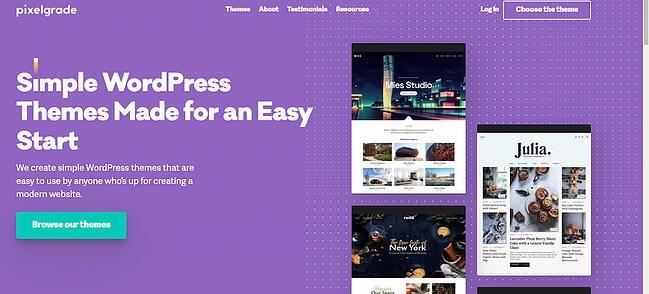
Pixelgrade makes it clear up front what they’re about: Offering simple WordPress themes to help anyone get their website up and running quickly. There’s no extraneous information here — they state their value proposition and offer a direct link to browse the themes they offer.
3. Reputation Squad
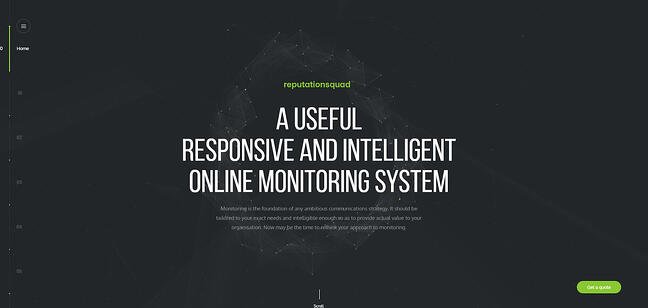
Reputation management is key to online success for organizations. If companies can’t see what customers are saying about them, they could miss critical opportunities to improve.
Reputation Squad helps companies track their reputation online with a responsive monitoring system. Scrolling through their website gives the feeling they’re operating in the future; backgrounds move and shift as you head down the page and the content is set up in a way that’s easy to view, read, and contextualize.
4. Evernote
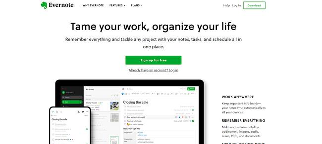
Evernote isn’t new to the B2B space, but their site continues to make it abundantly clear what they’re good at: Taming your work and organizing your life by making it easy for you to take notes and keep schedules. Even more telling is their aim to help you “remember everything”, which suggests this isn’t just a single-function solution but a multipronged performance tool.
5. Dropbox
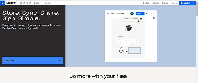
The five “S’s” here quickly communicate what Dropbox is all about. Not only can you store and sync files but easily share them and even add eSignatures. That’s it. That’s the value proposition. No fancy graphics, no beating around the bush — just getting straight to the point about how they can help.
6. Shepper
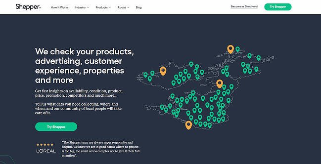
Shepper is all about collecting data. And not just any data — the data you tell them you need to collect and analyze. This could be product or advertising information, or data about the overall customer experience. No matter what data you need or where it’s stored worldwide, Shepper can help.
7. HubSpot
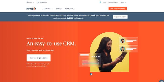
We’ll admit it. We’re also pretty great at this B2B stuff. We’re also modest — you’ll notice HubSpot isn’t first on the list — but our site makes it clear what we offer: An easy-to-use CRM than can streamline your current processes and revolutionize the way you work. With both free and premium options, you’re in good hands with HubSpot.
8. Orbital Sidekick
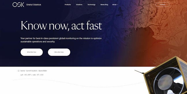
Orbital Sidekick delivers information from space to help government and commercial organizations meet their goals around environmental, social, and governance objectives. Using what’s known as “hyperspectral analysis” from a fleet of satellites, Orbital Sidekick gives companies the data they need to make decisions on-demand.
9. Trello
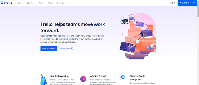
Trello is a collaboration tool designed to streamline operations. Given the increasing number of these tools on the market — and the fact that some hinder more than help — Trello makes it clear that no matter where or how teams prefer to work, the solution can help teams move forward.
10. Hootsuite
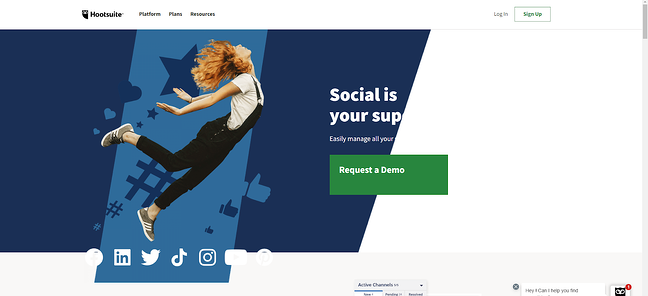
Hootsuite’s tagline is simple: “Social is your superpower”. Combined with an image of a woman seemingly taking off into the air and backed by familiar social images and icons, it’s clear right away that Hootsuite is all about helping you get the most of your social media channels.
11. Yapstone
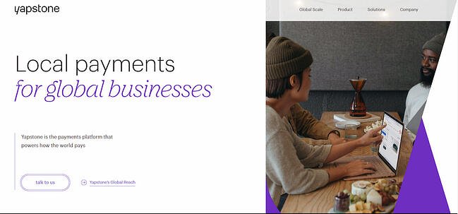
It’s a funny name with a great B2B angle: Local payment for global businesses. Not only does this tagline provide a sense of confidence and familiarity, but also manages to simultaneously suggest that Yapstone can help businesses anywhere power their payment platform.
12. Grammarly
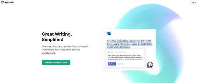
Grammarly cuts right to the chase to showcase what it does best: Detecting and correcting grammar and spelling mistakes. An animated image takes users through a quick demonstration of what Grammarly has to offer, making it clear what users will get when they download and install the app.
13. Acme
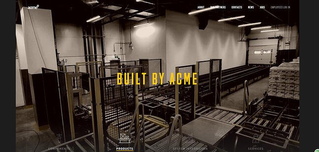
Acme automates industrial warehouse operations. The sepia tones of its website combined with warehouse images and a clear message about what Acme does leave no room for misinterpretation. If you’re their target audience, you’ll click through. If not, you’ll leave.
14. Mailchimp
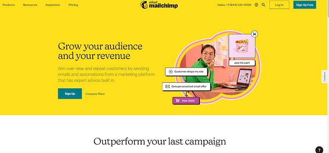
Email platform Mailchimp is well-known for its work in marketing emails, and its website makes it clear that the goal of the platform is to grow both business audience and revenues with the help of automated tools and expert advice. With the goal of outperforming your last campaign, it’s a solid pitch for B2B sales.
15. Packlane
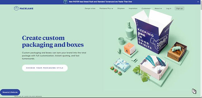
Consumers don’t just want great products. They want great packaging that is interesting to look at, fun to open, and (ideally) environmentally sustainable. Packlane lets companies create custom packaging and boxes that best suit their products, and provides instant quoting to help companies quickly make a decision.
16. HireLevel
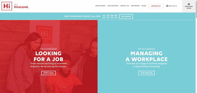
Aside from making a great pun (higher level — get it?), HireLevel also does a great job of clearly defining what they do. Need a job? They can help. Looking to improve workplace management? They’ve got services to bridge the gap.
17. Netbase Quid
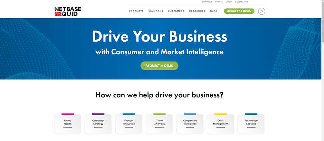
Netbase Quid is all about consumer and market intelligence. The seven colored tabs on the homepage make it clear exactly how they can help, from tracking brand health to delivering trend analytics to improving crisis management.
18. Square
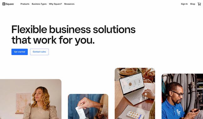
Square is a payment platform that immediately prompt customers to get started as a first step to entering the site. It’s the first — and nearly only — thing a visitor encounters upon landing on the home page. That information allows Square to offer customers what feels like a much more customized web experience.
1. Make your website about the customer — not about you.
After reviewing hundreds of B2B websites across every major industry, we found only a handful that purposefully invite customers into a conversation. To do that, suppliers need to stop talking so much about themselves.
Rather, they should provide customers with an opportunity to share something about who they are and what they’re looking to do.
Really, it’s no different than common courtesy at a cocktail party. No one wants to be stuck talking to the person droning on about who they are and what they do. Yet that’s precisely what the vast majority of B2B websites do.
Not only is that kind of self-centered approach disengaging, but it also leaves the buyer wondering, “Do they even know who I am? Or what I actually do?” Or worse, “Do they even care?” It’s impersonal at best, and off-putting at worst — fostering questions rather than connections, and distance rather than assistance.
That said, we found a handful of websites that do, in fact, actively invite customers to engage on their terms. One example is vAuto.com. A division of Cox Automotive, vAuto sells enterprise software to auto dealers around world. Among those dealers are both used and new car sellers, along with wholesalers — some franchise-based, and some independent.
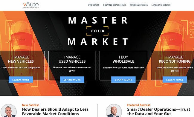
Those distinctions matter — not only for finding the appropriate vAuto solution, but they help to identify how that customer thinks about themselves.
vAuto has designed the front page of its website to allow buyers to self-identify along the dimensions most important to them, prior to going any deeper. The customer’s first choice upon landing at vauto.com is declaring, “I manage new vehicles,” “I manage used vehicles,” “I buy wholesale,” or “I manage reconditioning.”
Notice that even the pronouns are specifically chosen to position the website as a learning and buying tool for customers, rather than a broadcasting tool for the supplier.
Questions to ask yourself:
- How do our customers define themselves?
- In their minds, which aspects of their identity most affect the way they look at suppliers like us?
2. Emphasize your customers’ outcomes.
Just as the best websites invite customers into a conversation, they also guide buyers to supplier solutions using the language of customer outcomes — rather than supplier capabilities.
The best companies take the time to understand the specific business objectives customers are seeking to achieve, then organize their sites using language immediately recognizable to customers along those particular outcomes. That way, customers don’t have to translate.
Here’s another place where vAuto excels. The company employs actual customer-articulated business problems as the organizing framework for diving deeper into their broad solution set. It organizes this information around headings like, “Show me how to beat the competition,” and, “Show me to source more profitably.”
At every step, the goal is to make online learning and buying as easy and as resonant as possible — all through an easy-to-follow path of breadcrumbs leading directly to vAuto’s unique solutions.
Questions to ask yourself:
- What help are customers seeking from a supplier in your category?
- What specific language would best resonate with your customers to describe that help?
3. Help customers do what they are on your site to do.
Finally, the best websites identify and then facilitate the specific tasks that customers come to your website to complete.
Take something like a cost calculator embedded directly into a website. A tool like that enables customers to independently calculate the costs of (in)action, rather than relying on sales reps to make the case for change. It’s a simple, practical idea, but it’s deployed with single-minded purpose: to allow the buyer to easily progress along the journey, while remaining in her preferred channel of choice.
Questions to ask yourself:
- What specific buying tasks are your customers coming to your website to complete?
- How easy is it to find support for those tasks on your site right now?
Building a Better B2B Website
There’s a great deal to be learned from the handful of world-class websites we found. When it comes to building a better B2B site, it’s all about giving buyers an easy entry point, communicating your solutions in language they understand, and making it simple for them to do what they want to do.
Not sure where to get started? Check out the examples above for inspiration and then grab HubSpot’s free ultimate workbook for redesigning your B2B site.
Editor’s note: This post was originally published in January 2018 and has been updated for comprehensiveness.
![]()


![Blog - Website Redesign Workbook Guide [List-Based]](https://i4lead.com/wp-content/uploads/2022/08/4b5bb572-5d0e-45b8-8115-f79e2adc966b.png)