Categories B2B

52 Visual Content Marketing Statistics You Should Know in 2023

It’s amazing how fast things can change in just one year.

After combing through major reports on inbound marketing, content marketing, social media, and online behavior, as well as gathering our own data, we’ve compiled the top visual content marketing statistics for marketers to reflect on.

This year, we’ve seen the continued importance of visual content emphasized by the changes that occurred across almost every major social network, including TikTok, Instagram, and Facebook.

Download Now: The State of Media & Content Planning in 2022 [Free Data Report]

To help you keep pace with these trends, let’s take a look at some visual content marketing statistics that demonstrate the impact visual content has on reach, engagement, and sales.

General Visual Content Stats

Video Marketing Stats

Emerging Visual Marketing Stats

Infographic Stats

Social Media Stats

52 Visual Content Marketing Statistics You Should Know

General Visual Content Statistics

  • Video is the most popular and effective media format. (HubSpot)
  • 50% of marketers leverage video in their marketing strategy, followed closely by images at 47%. (HubSpot)

Visual content marketing statistics: Two graphs from HubSpot. The one on the left ranks the media formats with the highest ROI, with videos being the highest. The graph on the right ranks which media formats marketers use in their marketing strategy, with video also ranking at the top.

  • Long-form videos above 30 minutes, like webinars and live events, saw over 11,000% growth over the past decade, making it the fastest-growing video segment. (HubSpot)
  • 71% of B2B marketers say content marketing has become more important to their organization in the last year. (Content Marketing Institute)
  • In 2021, over 50% of marketers used visuals in over 91% of their content. (Venngage)
  • According to a survey by Venngage, original graphics are the most used type of visual content by marketers at 36%, followed by stock photos at nearly 34%. (Venngage)
  • 30% of marketers primarily create visual content for blogs, followed by social channels such as Facebook and LinkedIn. (Venngage)
  • According to The World Health Organization, there are an estimated 2.2 billion people with visual impairments globally. (World Health Organization)
  • Over 50% of marketers agree that visual content is essential to their marketing strategy. (Venngage)
  • A third of marketers find producing visual content consistently is their biggest struggle with content production. (Venngage)

Video Marketing Statistics

  • 75% of adults in the US watch short-form video content on a mobile device. (eMarketer)
  • 59% of Gen Z viewers use short-form video apps to discover things that they then watch longer versions of. (Think With Google)
  • On average, people watch 17 hours of video content per week. (HubSpot)
  • 91% of consumers want to see more online videos from brands. (HubSpot)
  • Social media videos are the most common type of video marketers create at 71%, followed closely by explainer videos at 70%. (HubSpot)
  • 96% of consumers have watched an explainer video to learn more about a product. (HubSpot).
  • 80% of marketers held live events in 2022. (HubSpot)
  • When it comes to B2B, 79% of people say they’ve been convinced to purchase an app or piece of software because of a video. (HubSpot)
  • YouTube is the most widely used video platform by marketers at 90% (Facebook is second, at 86%). (HubSpot)
  • 33% of marketers leverage short-form video content in their marketing strategy.

Visual content marketing statistics: A graph from HubSpot that ranks 9 trends marketers are leveraging in their marketing strategy, with short-form video content being the highest.

  • Short-form video has the highest ROI of all marketing trends. (HubSpot)
  • Most short-form videos are under 60 seconds, and they have the highest average engagement. (HubSpot)
  • Over 11 million people streamed video for the first time on Twitch in 2022. (Twitch)
  • In 2022, YouTube surpassed Netflix as the top streaming platform in the US. (HubSpot)

Emerging Visual Marketing Trends

  • 90% of marketers using short-form video will increase or maintain their investment next year, and 21% of marketers plan to leverage short-form video for the first time in 2023. (HubSpot)
  • 56% of marketers plan to increase their investment in TikTok in 2023. (HubSpot)
  • 24% of marketers are planning to invest more in video than any other format in 2023. (HubSpot)
  • 1 in 3 marketers plans to stop using NFTs this year. Additionally, 29% plan to stop marketing in the Metaverse and in audio chat rooms. (HubSpot)
  • 65% of all web traffic is via a mobile device. (Similarweb)
  • 40% of marketers plan to prioritize mobile-friendly website design in 2023. (HubSpot)
  • 56% of consumers who are interested in the metaverse want to watch TV and movies there. (GWI)

Infographic Stats for Visual Content Marketers

  • Original graphics like infographics and illustrations perform best, according to marketers. (Venngage)
  • Stock photos perform the worst out of all visual formats. (Venngage)
  • When it comes to content creation, 30% of marketers share infographics. (HubSpot)
  • One study found that people following directions with text and illustrations do 323% better than people following directions without illustrations. (Springer)

Visual content marketing statistics: An infographic that says “people following directions with text and illustrations do 323% better than people following directions without illustrations.”

Source: NeoMam

Social Media Stats for Visual Content Marketers

  • Facebook is the most popular social media platform, used by 64% of marketers. Additionally, it has the best ROI compared to other social media platforms. (HubSpot)
  • 70% of Instagram users don’t mind seeing ads when watching videos on Instagram. (Instagram Business)
  • 26% of marketers plan to use TikTok for the first time in 2023, and 16% of marketers plan to invest more in TikTok than any other social media app. (HubSpot)
  • In 2023, 31% of marketers use YouTube Shorts and Instagram Reels. (HubSpot)
  • Of the Instagram Story formats people prefer most, 35% say they engage with short narrative-styled Stories with photos, videos, and text most often. (HubSpot)

Visual content marketing statistics: A graph that ranks the types of Instagram Story users are most likely to tap all the way through until the end.

  • YouTube is the most popular social media platform among teenagers, with 95% of American teenagers ages 13 to 17 using it. TikTok is the second most popular platform among teens at 67%. (Pew Research)
  • As of 2022, the largest demographic of U.S. Instagram users was between the ages of 18 and 29, making up 71% percent of Instagram’s user base in the U.S. (Pew Research)
  • In a poll of over 350 consumers, 56% said they “sometimes” watch Instagram Stories with the sound on, while 29% said they “always” do this. (HubSpot)

Visual content marketing statistics: A pie chart that shows that 56% of people sometimes watch Instagram Stories with the sound on.

  • On Instagram, carousel posts draw the highest engagement of all post types, followed by video posts. (Statista)
  • For videos up to 5 minutes long, viewers will watch about 50% of the content. (HubSpot)
  • Snapchat had 100 million daily active Snapchat users as of 2022. (Statista)
  • Advertisers can reach more than 250 million people on Pinterest. (Hootsuite)
  • Pinterest users are five times more likely to make a purchase after using a Try-On enabled pin, Pinterest’s AR feature. (Hootsuite)
  • By the end of 2022, Pinterest had 450 million global active users. (Pinterest)
  • Users who saw immersive, actionable ads on Pinterest were 59% more likely to recall that brand. (Pinterest)

Editor’s note: This post was originally published in April 2020 and has been updated for comprehensiveness.

content planning in 2022

Categories B2B

Understanding the B2B Buyer Journey & How to Capitalize on it

Unless you’re Beth Harmon from The Queen’s Gambit, navigating the B2B buyer journey can feel like you’re playing a multi-level chess game. 

With an average of 1.9 decision-makers per midmarket solution purchase, each with their unique goals and interests, it’s no small feat to align all the pieces. 

And it’s not just us saying that—a whopping 75% of customers surveyed by Gartner attest to the complexity of the purchase process. 

However, in this post, we’re here to guide you through this maze and help make sense of the time and relationships it takes to secure that satisfying ‘Purchase Approved’ notification.

What is the B2B buyer journey?

A B2B buyer journey begins when a business realizes that they have a problem and continues until the point when they make a purchase. 

It is our goal as marketers to provide our customers with the right resources at the right time to help make their journey easy and fruitful. We make this happen by understanding the stages of the B2B buyer journey and learning what our customers need at each stage.

Understanding the B2B buyers’ journey stages

You might think that a B2B customer might not be as emotionally invested as a B2C customer, but research suggests otherwise. 

According to CMO.com, B2B customers are significantly more emotionally connected to their vendors and service providers than consumers.

For this purpose, it is important to map out your buyer’s journey that someone goes through when they’re making a decision to purchase.

It is important to note that the journey is not always linear and the buyer may move to and fro between two stages. 

Let’s read about the seven stages of B2B buyers with examples and the type of content creation or support that happens at each stage.

Stage 1: Awareness 

Photo by Kai Gradert on Unsplash

At the awareness stage, the customer is either becoming aware of their problem or they’re becoming aware of your company and the fact that your company offers a product that can be the solution to an existing or future problem.

In a marketing sales funnel, the awareness begins at the top of the funnel (TOFU). This is the stage where marketers can actually be the people who make them aware of their problem by creating resources to drive awareness in their customers. 

For instance, an awareness campaign may include creating blog posts, social media content, white papers, ebooks, reports, guides, infographics, checklists, and PPC ads. The purpose of content creation at this stage is to raise awareness about a problem and tie the pain point to an undesirable outcome. 

Stage 2: Interest

Like the classic AIDA model (Attention, Interest, Desire, and Action), in the interest stage of the B2B buyer’s journey, the customer explores their options after becoming aware of the pain point. They assess the complexity of their problem and evaluate whether investing in a solution is necessary given the stakes involved.

During the interest phase of the buyer journey, the primary goal is to engage and educate potential customers. Content creation at this stage should aim to capture their attention, establish credibility, and provide valuable information that addresses their pain points or challenges. 

Some examples of content that can be created during the interest phase include thought leadership articles, educational videos, tutorials, webinars, podcasts, case studies, whitepapers, comparison guides, infographics, and eBooks that offer valuable research findings and actionable recommendations.

Stage 3: Consideration

The consideration stage in the buyer journey is a critical phase where potential customers have identified their needs or pain points and are now actively evaluating different solutions.

During this stage, they compare various alternatives, assessing their features, benefits, and costs, and determining which option aligns best with their requirements.

The consideration stage is characterized by the following aspects:

  • Research and evaluation
  • Comparison and decision-making
  • Seeking validation and social proof
  • Interactions with sales and service teams

At the consideration stage of the B2B buyer journey, it is important to create content that helps potential customers evaluate and compare different solutions. The goal of content creation at this stage is to showcase the unique value proposition of your offering and address specific pain points or challenges your target audience may have.

This is your cue to meet the customer where they are in their journey and provide them compelling arguments to choose them vs. any other option.

This includes providing in-depth product/service information, case studies, comparison guides, demos, and expert guides. Among all these, social proof in the form of written and video testimonials, reviews, and endorsements by industry leaders play an important part in shaping customers’ decisions.

Stage 4: Intent 

The intent stage is where a prospect has shown a clear intention to make a purchase. 

For a marketer, the goal at this stage is to help the prospect solidify their intent to move forward with your offer and provide the necessary information and confidence to take the next step in the buying process, whether it’s making a purchase, requesting a proposal, or engaging in further discussions with your sales team.

At the intent stage, it is crucial to provide content and resources that facilitate the decision-making process and reinforce the value and benefits of your product or service. This may include personalized product demonstrations, free trials, pricing information, testimonials from satisfied customers, and persuasive content that addresses any remaining concerns or objections.

Stage 5: Evaluation 

During the evaluation stage, the potential buyer evaluates and compares the available choices. They consider things like features, price, reputation, customer reviews, and how well the options meet their specific needs. The customer might be leaning toward one option at this stage, but they need enough data to justify their purchase.

Ideally, the buyer journey should become more personalizedas Entrepreneur tells us to stop selling like it’s the 90’s

At the evaluation stage, it is the marketer’s job to create and provide content that supports the buyer’s decision in their favor. The kind of content that is relevant at this stage includes email drip nurture campaigns, product comparison guides, case studies, expert reviews, and any content that can establish the credibility of your offering.

Additionally, providing pricing information, payment plans, implementation guides, and demos can help buyers assess the feasibility and suitability of your solution for their specific needs.

Stage 6: Purchase 

We’re at the purchase stage. This is when the customer decides to go ahead with a specific solution or vendor and completes the transaction. 

During this stage, the buyer may negotiate terms, sign contracts, and make the payment. 

It’s important for businesses to make the purchasing process easy and smooth by providing ongoing support, easy documentation, and minimal back-and-forths.

Stage 7: Customer Retention 

After a customer makes a purchase in the B2B buyer journey, we enter the post-purchase/customer retention stage. 

This is when the company focuses on keeping the customer happy and engaged to encourage future business. They want to build a long-term relationship and ensure customer satisfaction. 

During this stage, content that is shared aims to provide additional value and support to the customer. This may include tutorials, guides, case studies, and tips on how to make the most out of the product or service. 

You may also send personalized emails or newsletters to keep the customer informed about updates, new features, or exclusive offers.

How do I create a B2B buyer journey?

Photo by Jean-Frederic Fortier on Unsplash

By mapping out a buyer’s journey based on the following steps, we’ll satisfy all of the above needs as they move through the funnel.

Identify your ideal client profile (ICP)

When it comes to creating a successful B2B buyer journey, it’s important to start by identifying your target customers. These are the people who are most likely to be interested in your products or services. 

Here are some best practices to help you find and understand your ideal customers.

  • Research your industry – Learn about the industry you operate in and gather information about its key players, trends, and challenges. This will help you identify the types of businesses or professionals that are most likely to benefit from what you offer. 
  • Define your buyer personas – Create a profile of your ideal customer, known as a buyer persona. Consider factors such as their job title, company size, industry, goals, pain points, and challenges. This will help you understand their needs and tailor your marketing efforts to address them. 
  • Analyze your existing customers – Look at your current customer base and conduct surveys and interviews to identify common characteristics among them. Consider factors like company size, location, and industries they belong to. This information can give you insights into the types of customers who are already interested in your products or services. 
  • Understand what they’re already consuming – NetLine’s Audience Explorer tool is one of the best free tools on the market. Interested in what your ideal B2B audience(s) is/are consuming? Audience Explorer gives you a rolling 180-day view into the topics they’re consuming and, most importantly, gives you insight into precisely who is engaged.
  • Conduct market research – Survey your target audience or interview existing customers to gather valuable insights. Ask questions about their preferences, needs, and challenges. This information will help you refine your buyer persona and create targeted marketing messages.
  • Monitor social media and online communities – Pay attention to discussions happening on social media platforms and industry-specific forums. Look for common questions, problems, or interests shared by your target audience. This will give you a better understanding of their pain points and the solutions they are seeking.
  • Use analytics tools – Leverage data analytics tools to gather information about website visitors, such as their demographics, behavior, and interests. This data can provide valuable insights into your target audience’s online activities and help you refine your marketing strategies.
  • Seek feedback from sales and customer service teams – Your sales and customer service teams interact directly with customers. They can provide valuable feedback on the types of customers they engage with most and the challenges those customers face. Regularly communicate with these teams to gather insights and refine your buyer persona.

Understand your customers’ goals, pain points, and challenges

Here are some simple ways to understand customer goals and pain points:

  • Conduct customer interviews – Talk to your customers and ask them about their goals and challenges. Their answers will give you important information about how you can help them. 
  • Mine reviews –  Look at what customers say in their reviews. They often talk about their goals and the problems they want to solve. This can give you ideas on how to make your products or services better. 
  • Monitor social media and forums – Pay attention to what people say on social media and in online business groups. People ask specific questions online. This can give you insights into what your customers need. 
  • Go to events – Attend events where you can meet current and potential customers. Talk to them and learn about their goals and challenges. This can help you understand what they need.

Create content that addresses each stage of the buyer journey  

Photo by Hal Gatewood on Unsplash

Unlike the B2C customer journey, the B2B buying process is often complex, extensive, and information-heavy, with numerous stakeholders involved in purchasing decisions. 

As technology improves, B2B buyers now expect B2C-like customer experiences online as well. In fact, 80% of business buyers expect real-time communications.

This means B2B companies have to continue innovating in order to stay one step ahead. As marketers, it is our job to meet the customer where they are.

One way to do this is by creating quality content that meets buyers where they are. 

Build your distribution strategy to get in front of prospects

When you create content, you want to make sure that it reaches the right people. That’s where a content distribution strategy comes in. It’s a plan for getting your content in front of your target audience.

Here are some simple steps to help you distribute your content effectively and reach more leads.

  • Use social media – Customize your message for each platform and engage with people who comment or share your content. 
  • Send emails – Send newsletters or targeted emails to people who are interested in your content. 
  • Collaborate with B2B influencers – Work together with people who have many followers or are experts in your industry. They can help promote your content to a larger audience and attract more leads. 
  • Syndicate your content – Publish your content on websites like Medium or LinkedIn Pulse, which can reach new readers and expand your audience. Syndicating eBooks, White Papers, and Webinars is another wise method of getting in front of your ICP. Suffice it to say, we’re pretty big fans of content syndication on our end, as well.
  • Participate in online and IRL communities – Share your knowledge and provide helpful resources to gain visibility and connect with potential leads.
  • Host webinars and podcasts – Organize online presentations or appear as a guest on podcasts to share your expertise. This way, you can reach engaged audiences and attract leads who are interested in your content.
  • Leverage paid ads – From Google and Meta to TikTok, this can help you reach more people who are likely to be interested in what you have to offer.

Align your sales and marketing efforts  

Aligning sales and marketing efforts is crucial in ensuring a smooth and effective B2B buyer journey, particularly if you are following an Account-Based-Marketing playbook (ABM). 

At the bare minimum, this means: 

  • Ensuring open lines of communication – This starts by creating a shared understanding of goals, strategies, and target customers. This helps identify areas for improvement, share success stories, and address any challenges or gaps in the buyer journey. By maintaining an ongoing dialogue, you can refine strategies and optimize the buyer journey over time. 
  • Define what a lead looks like and key handoffs between sales and marketing – Develop lead scoring criteria that both sales and marketing agree upon. This helps prioritize leads based on their level of engagement, fit with the ideal customer profile, and readiness to purchase. 

Test and optimize your process

Testing and optimizing your process is an ongoing task. It’s about continuously learning and adapting to make the B2B buyer journey more effective and successful. 

Practically, this means making changes based on feedback.

Why knowing the buyer journey for B2B is so important? 

Understanding how to map it and take action on gaps can be the difference between a customer signing on and a potential buyer looking for an alternative partner.

Let’s look at some benefits of understanding the buyer’s journey:

Understand your customers better

By understanding the buyer journey, businesses can get to know their customers better. They can learn about their needs, preferences, and challenges. This helps in creating products and services that truly meet customer requirements.

Improve your marketing strategy

When businesses understand the buyer journey, they can create marketing strategies that are targeted and effective. They can reach the right audience with the right message at the right time, increasing the likelihood of a sale.

Provide a better customer experience 

Understanding the buyer journey allows businesses to provide a better experience for their customers. They can tailor their interactions, provide relevant information, and address customer pain points. This leads to happier customers and long-term relationships.

Increase sales

With a clear understanding of the buyer journey, businesses can optimize their sales process. They can identify key touchpoints and opportunities to engage with customers. This can lead to more conversions and increased sales.

What does the future look like for the B2B buying journey?

With B2B buyers relying on more channels, the future of B2B sales is hybrid.

Here are some trends to pay attention to: 

  • Create more personalized sales experience – Businesses will use advanced technologies to understand customer preferences and deliver tailored experiences throughout the buying process. 
  • Rely on data-driven decisions – From identifying trends to forecasting pipelines and optimizing sales and marketing strategies, data will play a crucial role. 
  • Omnichannel engagement  -Businesses need to provide a seamless experience across different touchpoints and channels. 
  • The rise of AI and automation – Automation and artificial intelligence (AI) will further revolutionize the B2B buying journey from lead generation to personalized content and personalized recommendations. 

How NetLine helps to map a buyer’s journey in B2B 

INTENTIVE is the go-to buyer-level intent platform designed to help you understand prospects and deliver personalized content at the right time. 

Our platform gives you real-time insights that go beyond the basics. It doesn’t just tell you “who” is showing interest in an account, it reveals “what” actions they’re taking, “when” they’re taking them, and uniquely, “where” these actions are happening. This intelligence empowers you to truly understand your prospects, paving the way for successful and meaningful content personalization efforts. Start a free trial today.

Categories B2B

Why Customer Connection Matters

At INBOUND 2023, HubSpot CEO Yamini Rangan introduced changes to the customer journey driven by the recent surge of AI technology.

Where people spend their time, how they buy, how they share information, and how they expect to receive customer service is all changing. What’s not changing, however, is the importance of connection.

The advent of AI makes this an extremely exciting time. The businesses that can effectively leverage technology to drive deeper connections will ultimately be the companies that grow better.

AI will help level the playing field with features that give you incredibly powerful content creation tools. For example, HubSpot AI features such as Content Assistant and ChatSpot.

Both leverage the same large language model that OpenAI’s ChatGPT, but conveniently packaged directly within your HubSpot portal.

At HubSpot, we affectionately refer to our top 20% of growing customers that prioritize the art of forging deep customer connections in their growth strategies as “Connectors.”

These remarkable businesses understand that meaningful engagement with customers is not just a buzzword, but a powerful catalyst for driving sustainable growth and building lasting relationships.

But how do we know customer connection leads to growth? We decided to dig into the data and find out.

I lead Product Analytics at HubSpot; our mission is to understand how using HubSpot helps our customers grow.

With over 184,000 customers spanning 120 countries and 149 different industries, we’ve built a strong point of view on the importance of connection — and have the data to back it up.

I’m excited to share some of these best practices here.

Digging Into the Data

In most data science projects, 80% of time is spent on data prep and this project was no different.

We started by defining a growth metric: year-over-year closed-won deal volume. We focused on consistent Deals tool users for 2+ years, giving us high confidence in our measurements.

From there, we isolated customer behavior impact by grouping customers (20+ segments) by industry, size, HubSpot tenure, and feature access. Each segment was individually modeled for performance comparison among peers.

Here’s what we learned.

1. Customer Connection Drives Growth

After HubSpot talked to connectors across a variety of industries, we discovered something we are calling the “Connection Gap”. It turns out that HubSpot’s top connectors are growing 29 percentage points more than average companies.

Said another way, connectors are growing 5x more than average companies that aren’t prioritizing customer connection in their growth strategies.

Year Over Year Growth Outcomes by Prevalence of Connection Behavior

Furthermore, we learned that customers in less digitally mature industries (e.g., manufacturing) see a larger connection gap (40 percentage points) and will benefit even more by focusing on customer connection.

2. Growth Compounds as You Connect Across More Lifecycle Stages

Connecting in more customer lifecycle stages increases total growth.

On average, companies that connected with customers across all five journey stages (aware, prospect, lead, deal, customer) grew 19% more than single-stage connectors. Contrary to what you might think, each additional lifecycle stage a company connects in adds more incremental growth than the one before.

Incremental Growth by Number of Customer Journey Stages Engaged

This tells us running customer connection strategies aren’t important for just one department. This is an effort that needs to be carried out throughout your entire company — an end-to-end customer connection strategy that shines through in every touch point you have with your prospects and customers.

The numbers don’t lie; companies that connect with customers at every opportunity, from initial discovery to post-purchase delight, are winning.

3. Growth Increases When You Connect in Multiple Ways

More channels used within each journey stage leads to better connection, and better growth. Companies in the top 20% of connections are committed to meeting their customers where they are, and therefore use multiple features to engage with customers at each lifecycle stage.

Year Over Year Growth Outcomes by Number of Features Used in Each Customer Journey Stage

We’ve also learned that different features are more or less significant drivers of growth depending on the industry you’re in.

For manufacturing it’s outbound calling, tickets, and meeting links. But for software or IT the top features were sales email, ads, and meetings links. Meanwhile, professional services companies found sales email, ads, and A/B testing are more effective.

4. Growth is Maximized When Companies Leverage Both Scaled and Human-Led Connection

The combination of human-led and scaled (one-to-many) tactics across each stage of the customer journey is key to maximizing growth. (n.b. – HubSpot does not provide human-led tools for the awareness stage). When both tactics are used across the entire lifecycle, companies see 19% growth.

Median Percent Growth by Stages with Customer Connection Activity

We’ve seen human-led connection to be more prevalent and impactful later in the customer lifecycle, with customers omitting human connection in the deal and customer stages experiencing negative growth (-1%).

Closing the Connection Gap

The theme is clear — the fastest growing companies make customer connection a priority. They think holistically across the entire customer journey, use multiple modalities to engage with customers through preferred channels, and rely on both scaled and human-led tactics in tandem.

It may seem daunting, but with a potential 5x growth opportunity at stake, the most important thing is to get started.

HubSpot’s committed to making this easy for you. We’re investing in AI to level the playing field, so that even with a small team, you can win on customer connection.

It’s time to rethink how you market, sell, and support your customers. Insights and strategies in HubSpot’s new “Guide to Connection in the Age of AI” can help your professional services, software, or manufacturing company drive growth through building meaningful customer connections at scale.

Access HubSpot's Guide to Connection in the Age of AI

Categories B2B

KFC Reminds Us of the Importance of Culturally Sensitive Marketing

In addition to chicken, KFC is frying up controversy.

On August 24 Azim Akhtar, KFC Canada’s Director of Marketing, tweeted a few billboard images from the company’s new “It’s finger lickin’ good” campaign.

While the ads are supposed to be playful, suggesting that utensils aren’t needed to enjoy KFC, X users quickly pointed out that all of the images featured Black people eating fried chicken and feed into harmful stereotypes.

Upon receiving the pushback, Akhtar took to X to clarify that the print images were part of a broader campaign and shared a video version of the ad that featured a diverse group of actors casting aside utensils to enjoy KFC with their hands.

Though sharing the video was an attempt to provide broader context, it left social media users wondering why the creative used on the billboards didn’t reflect the diversity of the commercial. Other commentators speculated that the imagery was intentionally used to stir up controversy.

The Importance of Culturally Competent Marketing

While fried chicken is not inherently racial, North America has a history of stereotyping the consumption of fried chicken by Black people, using it as a demeaning trope. Failing to take this historical context into consideration is definitely a misstep for the brand.

We saw another example earlier this summer during the Barbie movie’s promo. The official X account for the Warner Bros. film shared light-hearted responses to fan-made images of Barbie and Oppenheimer. The move was seen as distasteful to Japanese audiences given the history of nuclear weapons used in Japan during World War II. Warner Bros. later issued an apology for the insensitive engagement.

These examples show the importance of culturally competent marketing. To avoid mistakes like this in the future, marketing teams should aim to:

  • Understand relevant historical context and how different demographics may be impacted by a piece of context
  • Enlist diverse teams with marketers of different backgrounds and experiences who can provide necessary insights
  • Constantly examine, question, and deconstruct biases that may show up in their content

While outrage can contribute to virality, not all engagement is good engagement. Culturally insensitive content breaks the audience’s trust and can overshadow potentially positive experiences a customer can have with a brand.

New call-to-action

Categories B2B

Which Types of Content to Lean into Ahead of Google’s SGE — and What to Avoid

Once Google releases its search generative experience, one thing is for certain: The types of content that encourages traffic to your website will change tremendously.

Straightforward, cut-and-dry topics like “How to create a social media strategy” might not drive as much traffic to your website anymore. Instead, users will find the answers to queries like that directly on Google through the generative AI snapshot.

Which is an alarming thought. If some of your content is made redundant by generative AI, what could happen to your traffic and leads in a post-SGE world?

Fortunately, HubSpot’s SEO team has taken some of the guesswork out of it. Here, learn from HubSpot’s SEO experts on what types of content you’ll want to start leaning into in 2023 to continue directing traffic to your website — and what to avoid.

Free Report: The State of Artificial Intelligence in 2023

Which Types of Content to Lean into Ahead of Google’s SGE

1. Lean into personality-driven, thought-provoking content.

AI has a lot going for it. But, due to the nature of it being a robot, it inherently lacks one thing: A perspective.

Which is why you’ll want to ensure you start leaning into personality-driven thought leadership content that offers personal lessons, examples, and novel concepts that drive conversations forward.

As Aja Frost, HubSpot’s Director of SEO Global Growth, puts it, “As a result of the AI evolution, there is an exponential increase in the amount of AI-written, low-value content. And, in response to that, Google is prioritizing first-person, credible, personality-driven content.”

This makes sense. Google needs its AI models to continue to improve based on new information on the web. And new information – including new perspectives and ideas — can only come from real people.

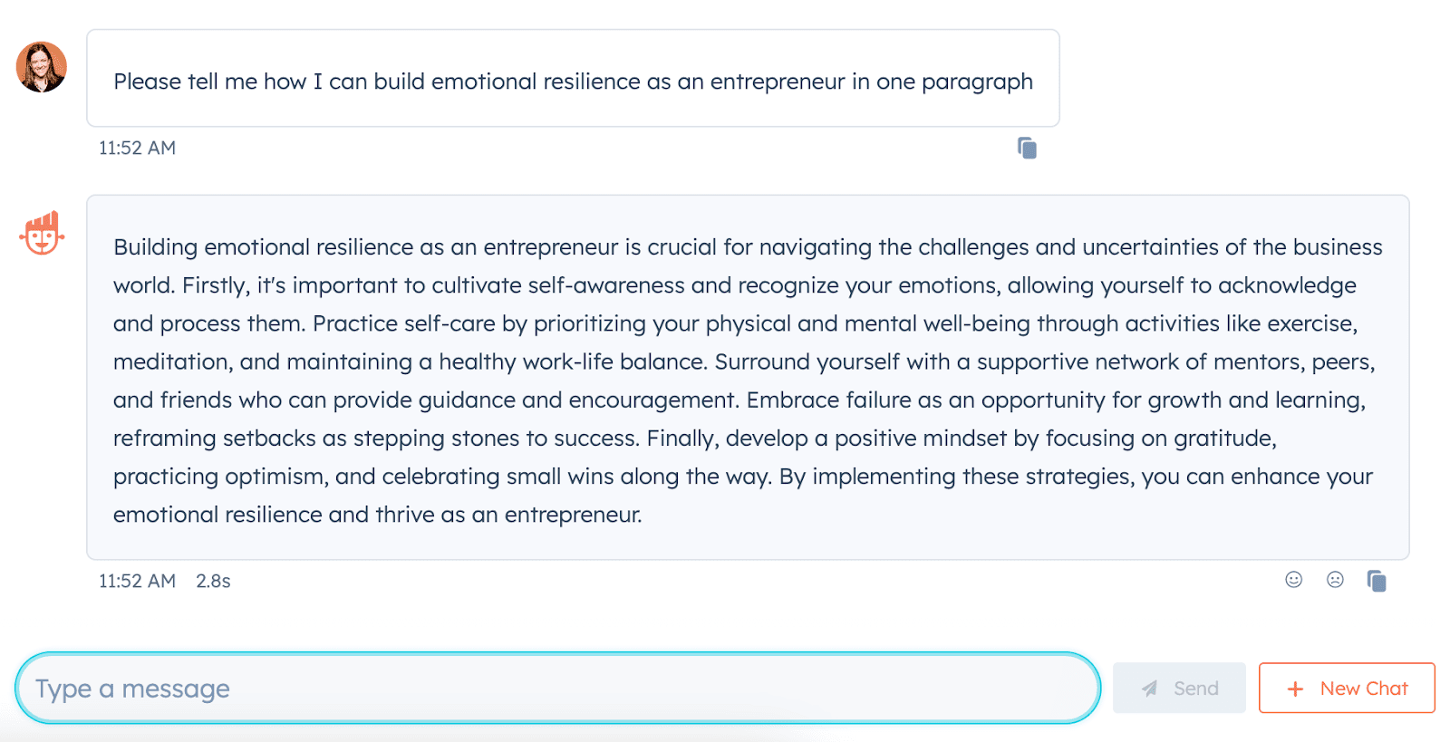
For instance, consider what happens when I ask ChatSpot, “How do I build emotional resilience as an entrepreneur?”

ChatSpot’s answer includes plenty of tangible steps towards building resilience. But it lacks the nuance and complexity of real life.

Which is why it’s more helpful for me to turn to this post: “Bounce Back: Five Founders on Building Emotional Resilience“.

In the post, one founder, Michael Plisco, says, “As founders, we often find ourselves so deeply attached to our business and its mission that it becomes difficult to distinguish ourselves from what we are building. In failure, you have to take a step back and realize that the failure of the business, regardless of the situation, does not equate to a failure of self.”

Plisco then recommends getting back in touch with the things that make you happy, from spending time with friends and family to activities you haven’t had the time for since launching your business.

Consider that advice compared to ChatSpot’s advice to “Embrace failure as an opportunity for growth and learning, reframing setbacks as stepping stones to success.”

See the difference?

Ultimately, there are plenty of topics that deserve a quick, straightforward, cut-and-dry answer. I turn to ChatSpot all the time for topics like “Make me a workout plan,” “What is the top social media platform right now?”, and “Please give me five questions I should ask in an interview about product development and AI.”

AI can’t move the conversation forward into new territory with fresh, novel ideas. And it can’t fully relay the subtleties and nuances that many complex topics require. That’s where your content can truly shine.

2. First-person narratives will become increasingly crucial.

AI can round-up a long list of tools and provide a comprehensive analysis of each, but it can’t describe it’s own unique experience testing the tools out.

Which is where first-hand perspectives will become critical.

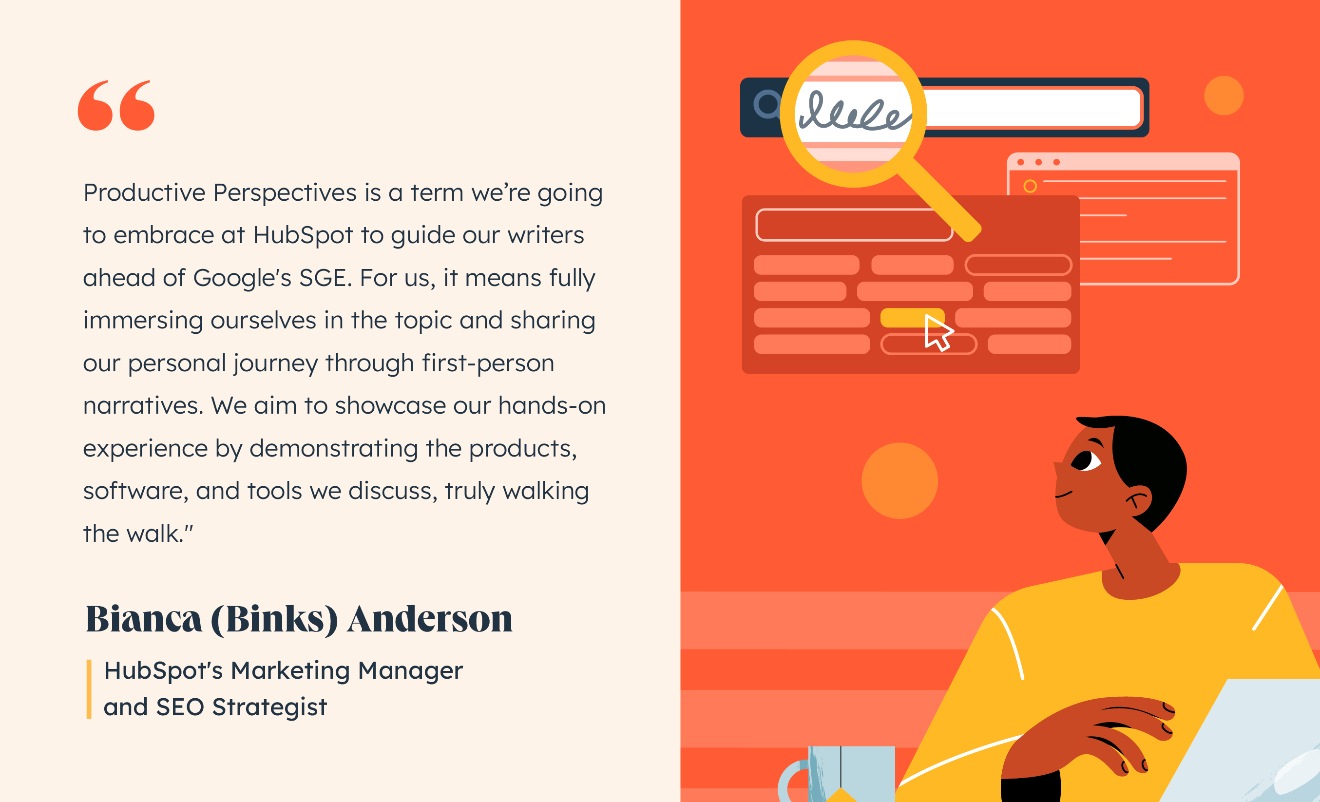
As HubSpot’s Marketing Manager and SEO Strategist, Bianca (Binks) Anderson, told me, “Productive Perspectives is a term we’re going to embrace at HubSpot to guide our writers ahead of Google’s SGE. For us, it means fully immersing ourselves in the topic and sharing our personal journey through first-person narratives.”

Binks quote on how SGE will change content creation

She continues, “We aim to showcase our hands-on experience by demonstrating the products, software, and tools we discuss, truly walking the walk.”

As we prepare for Google’s SGE roll-out, it’s vital you take a look at your existing strategy and consider where you can incorporate first-hand expertise. Rather than writing “The Top 10 Marketing Automation Tools”, perhaps you use a first-hand angle like, “I Tried These 5 Marketing Automation Tools: Here’s My Favorite”.

Along with helping you rank in a post-SGE world, incorporating first-person expertise also helps you build brand trust. Your readers want to know you have real-life experience on the topics about which you’re writing.

Anderson adds, “We also believe in taking a clear and confident stance on a topic, supported by first-hand research and data.”

She continues, “We believe that forming and articulating insightful opinions is a hallmark of genuine expertise. With Productive Perspectives, we strive to provide valuable content that resonates with our readers.”

3. You’ll need to incorporate E-E-A-T signals into your content.

Google’s Search Quality Evaluator Rating Guidelines rate E-E-A-T — which stands for Experience, Expertise, Authority, and Trustworthiness — as critical factors for ensuring your content ranks on Google, and E-E-A-T will become increasingly important after Google’s SGE release.

Which is why Rory Hope, HubSpot’s Head of Content SEO, advises all content creators to lean into these factors when creating content.

As he puts it, “When creating a piece of content, you’ll benefit from writing it through the real world experience of the author, whilst referencing the author or your company’s credentials to improve perceived expertise by search engines and users.”

He continues, “To improve authority, backlinks will remain important, so try to include primary research data or quotes when possible to make your content linkable and sharable. Depending on the content type, you should also add social proof or reviews onto the page, as this will help build trustworthiness.”

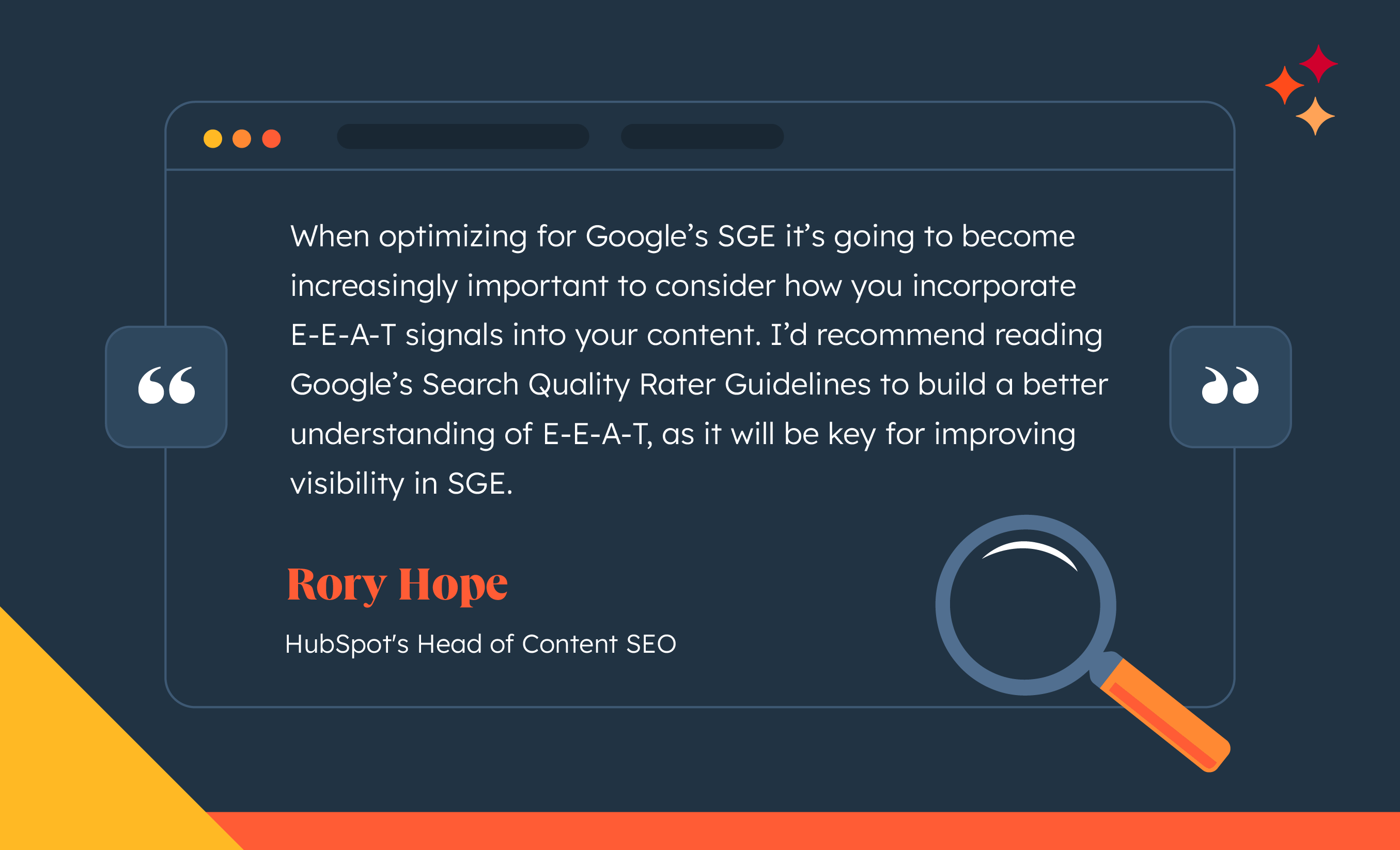
To prep for a post-SGE world, Hope recommends marketers read Google’s Search Quality Rater Guidelines to build a deeper understanding of E-E-A-T, which will help improve your visibility after SGE.

Rorys quote on how SGE will change content creation

4. Lean into long-tail queries.

For a while now, marketers have heard the power of long-tail queries for ranking higher in the SERPs.

As a refresh: Head terms like “blogging” are generally searched for frequently, and are harder to rank for compared to long-tail phrases. So when considering your SEO strategy, you’ll want to make a list of long-tail phrases that could help you capture more traffic.

“How to write a blog post: a beginner’s guide,” for instance, is likely easier to rank for than “blogging”.

Senior Technical SEO Specialist Sylvain Charbit believes this will become increasingly important in a post-SGE world.

As he told me, “Prioritizing long-tail queries will become even more important as AI answers from Google are usually better in this case. Optimizing images and content around these more in-depth questions could lead to more visibility in the AI-generated responses.”

Be Prepared for Change

Regardless of the strategy shifts you decide work best for your business, one thing is certain: SGE will change how users’ search and find information. Which means, once SGE is rolled out, it will be critical your SEO and content strategist teams are prepared to test, iterate, and experiment to determine which new content plays work best for your business.

Take a look at The SEO Evolution: Expert Insights into the Future Landscape of Search if you’re interested in learning more about how SEO will change in 2023 and beyond.

New Call-to-action

Categories B2B

13 Best Portable Apps in 2023

Downloading and installing software is tedious. Portable apps solve that problem. These tools run on a computer without installation.

These apps can help you switch between your work and home computer and handle projects from different devices. They allow you to work on the go if you can’t install software on public computers.

Plus, these apps won’t bog down your device.

Whatever the reason, portable apps can also come in handy in many other situations. Check our list of the best portable apps for every device and browser. But first, let’s address the big question.

Are portable apps safe?

Like any software, portable apps can spread viruses to your computer.

But if you follow the same anti-virus protocol you do for the rest of your computer, including using anti-virus software, scanning your portable drive for viruses, and backing up your system, downloading and using portable apps is safe.

Best Portable Apps for Different Devices and Browsers

1. Google Chrome Portable — Best Portable Browser App for Chrome

Image Source

If you do most of your work on Chrome, you’d love its portable version. Let’s face it, Chrome software takes a lot of disk space, and if you don’t clean the cache regularly, it can slow down your device.

And since you use Chrome already, the best part is that the portable version is identical. It links to your Google account, offers bookmarks, and supports extensions.

However, it won’t save passwords by default, as they’re encrypted and can’t be retrieved from your device. But you can opt-in for advanced password portability, which can help you save passwords.

Features

  • Built-in malware system to keep you secure
  • Auto updates available
  • Automatic sign-ups in all your favorite Google services

Limitations

  • Certificates are not portable
  • Specific settings are blocked by default; if you’d like complete control, you must file a bug to the support team, which can take time.

What we like: Chrome is one of the safest browsers available. The platform keeps introducing new security options, like two-factor authentication. It’s a safe choice for browsing the web, checking emails, or anything else you might need to do.

2. Mozilla Firefox Portable — Best Portable Browser App for Mozilla Firefox

Image Source

If not Chrome, then chances are you use Mozilla Firefox for browsing. And if you need a portable version of Mozilla Firefox, this might be perfect.

Why? Because Mozilla Firefox Portable functions exactly like Mozilla Firefox software — a fast and fully-featured web browser.

The portable app also employs pop-up blocking and automatic updates, so it’s secure. Plus, it ensures your bookmarks and extensions are saved; wherever you take your portable app, you take them.

Features

  • It offers excellent speed as it’s dual-mode (32-bit and 64-bit)
  • It is available in many languages; you can download a preferred version

Limitations

  • It can affect your security (when you don’t keep your browser updated)

What we like: Unlike Chrome, Firefox’s portable version doesn’t block passwords and certificates. There are also no default blocked settings. Mozilla Firefox portable gives an equally identical experience to the software.

3. LMMS Portable — Best Linux Media Player

Image Source

Music creation and production software take up a lot of hard drive space, bloating your device. This portable app can help you create music anywhere through a lightweight interface.

LMMS is a portable alternative for Linux. Without installing it on your device, you can create melodies and beats, mix sounds, and edit and add effects to your music samples.

It also offers instrument and effect plugins. LMMS is open source and compatible with many standards, including SoundFont2, VST(i), LADSPA, GUS Patches, and MIDI.

Features

  • You can import MIDI, Hydrogen, and FL Studio files
  • Many powerful instruments for adding more tunes to your music

Limitations

  • Lack of automatic updates

What we like: The most powerful feature of LMMS Portable is its Piano-Roll editor, which edits patterns and melodies. It’s super easy to use — perfect for beginners pursuing their passion for music creation.

4. Apache OpenOffice Portable — Best Linux Office Suite

Image Source

Apache OpenOffice app, also available for Windows, is one of the most impressive alternatives to the Office suite and is perfect for you if you’re facing space issues.

It’s a fully-featured office suite that offers:

  • Word Processor.
  • Spreadsheet.
  • Presentation tools.
  • Writing tools.
  • Calculator.
  • Drawing tools.

It supports many languages, including Chinese, French, German, Italian, Portuguese, and Spanish. It’s free, so you save money using it instead of the expensive Office alternative.

Features

  • Available in multiple languages with an option to remove unnecessary languages
  • Regular updates available

Limitations

  • Not all languages are available

What we like: We love that you can also use Apache OpenOffice on Windows, and that too for free. It’s perfect for beginners who don’t want to commit to expensive Office suites.

5. Stickies Portable — Best Sticky Notes for Windows

Image Source

You can’t deny the usefulness of sticky notes, either virtual or physical.

The urge to capture a new idea before you forget it, when you need to be reminded of some important thing you must do today, or when you just want to jot down some random thoughts — all you need is the Stickies Portable.

The portable version supplies sticky notes that can store text and images, and you can attach a sticky note to a website or document and minimize them until you need it.

Features

  • The “Always on top” feature included
  • You can change the language and size of sticky notes
  • It’s lightweight and unobtrusive
  • It’s free to use

Limitations

  • Might have security issues

What we like: For me, the most important feature of a virtual sticky note is “Always on top.” If I use a sticky note as my to-do list, I’d like it to be on screen all the time, even if I have opened many screens, so I always know what’s left to do. Stickies offer this feature.

6. VLC Media Player Portable — Best Media Player for Mac

Image Source

VLC is among the most popular media players, mainly due to its ability to play almost any audio or video format, including WMV, MPEG-1, DivX, OGG, and DVDs.

Since it can handle files from any location, including local drives, network storage, and streams, it’s a good idea to download the portable app when you’re having trouble displaying an audio or video file on your computer.

The best part, this app is also available for Windows.

Features

  • Completely free to use (no user tracking or ads)
  • Easily customizable (you can choose from many themes)

Limitations

  • Lacks video editing capabilities

What we like: VLC media player is one of the most famous media players, and we like that it’s available for different operating systems. It’s available in Mac, Linux, Windows, Ubuntu, and many more, so whatever OS you use, you can use VLC.

7. GIMP Portable — Best Image Editor for Mac

Image Source

One of the most comparable alternatives to Photoshop, Gimp provides an impressive array of photo-editing tools. You can use it the way you want:

  • A simple paint program.
  • An expert-quality photo retouching program.
  • An online batch-processing system.
  • A mass-production image renderer.
  • An image format converter.

Editing and exporting images take up a lot of storage space. Opt for Gimp’s portable app version to edit your photos — for free.

Features

  • Improved performance (both 32-bit and 64-bit versions included)
  • Also available for Windows
  • Automatic updates

Limitations

  • Limited third-party plugins
  • Limited customization options

What we like: The best part about GIMP is that it can be multi-purpose. Meaning you don’t need different tools to perform simple tasks like editing, designing, and converting images — all can be done using GIMP.

8. Inkscape Portable — Best Vectors Graphic Editor for Mac

Image Source

Inkscape is identical in function to Adobe Illustrator and is an impressive free alternative.

Inkscape Portable offers advanced features, including alpha blending, markers, and trace bitmaps, and has an intuitive interface. It lets you download files in multiple image formats — SVG, AI, EPS, PNG, and PDF.

If you’re a freelance designer carrying Inkscape portable around on a USB, it’s great because you’ve got the tools for vector graphics, creating illustrations, charts, and logos at your disposal at all times.

Features

  • Also available in Windows and Linux
  • It is customizable with many add-ons
  • Multilingual support

Limitations

  • It isn’t updated frequently

What we like: Inkscape is perfect for creating diagrams, graphs, and logos. Content writers, strategists, and researchers can leverage its beginner-friendly interface to prepare graphs to include in reports or research papers.

9. LibreOffice Portable — Best Office Suite for Windows

Image Source

LibreOffice, a notable Microsoft Office alternative, offers similar tools, including a word processor, spreadsheets, presentations, vector drawing, and databases. And it’s free to use.

It performs many of the necessary functions you’d require from Office without downloading space-taking software because you can carry it around with you on an external drive or via the cloud.

It supports many languages, and you can remove some to save space.

Features

  • Dark mode available
  • Advanced bookmark handling

Limitations

  • Fonts are only available as zip folders (as they take longer to load)
  • Sometimes takes time to load

What we like: We prefer LibreOffice over Microsoft Office because it supports more file formats. It can even let you download files as ebooks.

10. CCleaner Portable — Best Software Cleaner for Windows

Image Source

Downloading space-taking software to clear disk space doesn’t make sense. That’s why using CCleaner Portable is perfect for you because you don’t have to install the software.

It’ll clean up your files and protect your computer from viruses. Along with clearing up space, CCleaner cleans out cookies and files that could put your privacy at risk.

Overall, the portable version enhances your device’s performance and makes it more secure.

Features

  • Real-time monitoring of your device’s health
  • You can also set scheduled cleaning

Limitations

  • Most features aren’t available in the free version
  • The free trial is only for 14 days

What we like: CCleaner’s pro version has some great features like scheduled cleaning — you only need to set the system once, and it’ll be done automatically.

11. GeekUninstaller — Best Software Cleaner for Windows

Image Source

The problem with the standard Windows add/remove button is that if you uninstall an app using that, it isn’t completely eliminated from your computer. There are still junk files or folders left behind.

GeekUninstaller permanently rids your computer of unwanted files, including any unintentional residue left over. Plus, since it’s portable, it doesn’t contribute to clutter.

Features

  • Works on both 32-bit and 64-bit for fast performance
  • Force removal to remove stubborn or broken programs

Limitations

  • Requires admin permissions to run properly

What we like: Removing stubborn and sometimes inbuilt apps is necessary but can’t be done easily. The “Force Removal” option is perfect for removing such apps.

12. Emsisoft Emergency Kit Portable — Virus, Malware, and Badware Cleaner for Windows

Image Source

The Emsisoft Emergency Kit Portable is a replica of its software version. It’s perfect for those who need a full-fledged cleaning system to clean their entire device.

It can scan the infected PC for viruses, Trojans, Spyware, Adware, Worms, Dialers, Keyloggers, and other malicious programs — but this version is still limited in features.

You can get complete protection by purchasing the full Emsisoft anti-malware local version.

Features

  • Enhances performance by advanced cleaning
  • Doesn’t slow your computer

Limitations

  • Most advanced features are available with premium plans

What we like: Emsisoft Emergency Kit offers many features for complete cleaning. The tool also has centralized management for all features and real-time monitoring on one dashboard.

13. LameXP Portable — Best Audio Converter for Windows

Image Source

LameXP portable converts audio into multiple formats, including MP3, AAC/MP4, Ogg Vorbis, Opus, and FLAC. It also supports multi-threaded batch processing. Plus, it’s free to use.

Features

  • Available for both 32-bit and 64-bit versions
  • It can be used on Windows as well as on Linux

Limitations

  • Not a beginner-friendly option

What we like: The best part about LameXP is that it doesn’t reduce the quality. If you convert your audio files, you’ll get almost similar quality.

Use Portable Apps to Enhance Flexibility

Portable apps save you from the lengthy process of installing and deleting apps. By using portable apps, you not only save your device’s disk space but also make it more secure and fast. Don’t say you don’t want that.

Apply for a job, keep track of important information, and prepare for an  interview with the help of this free job seekers kit.

Categories B2B

How to Create an Editorial Calendar [+Free Templates]

Whether managing thousands of blog posts or a few dozen articles, having an editorial calendar is imperative to keep track of it all.

The good news is there are a lot of great calendar tools out there you can choose from. In fact, for those of you who are HubSpot customers, there’s a marketing calendar built right into HubSpot’s software.

But there are several excellent options out there. They include features like repeat scheduling, syncing, and adjustable visibility so you can collaborate effectively with your team. Are you intrigued yet?

Here’s how to set up your editorial calendar using Google Calendar, spreadsheets, or project management software.

Follow Along With These Free Editorial Calendar Templates

Download the Template for Free

How to Create an Editorial Calendar

We’ll review what you should put into your editorial calendar. While there’s no one-size-fits-all rule for determining what content to create, where to publish, and how frequently, there are a few best practices to remember.

Start by asking yourself:

  • What types of content is my audience interested in?
  • Where does my audience hang out online?
  • What types of content is my competition using, and how frequently do they post?
  • How often can I commit to writing blogs and creating content?

While your answers probably won’t give you a black-and-white picture of what you should do, they’ll provide basic guidelines for what makes sense for your audience and your capacity.

Choose Your Platforms

Most businesses choose to publish content on a blog. However, to get more eyes on the content, they repurpose it on various other channels, including Facebook, LinkedIn, Instagram, YouTube, email, and TikTok.

While you don’t have to show up on all those platforms, you do need to pick the ones most likely to be used by your audience. Moreover, some of your posts will be better suited to repurposing on different platforms.

However, by establishing where you want a presence early in the editorial calendar creation process, you can streamline your efforts better.

Determine Content Guidelines and Frequency

After identifying how frequently your competition updates content, it’s your turn to figure out how often you’ll post. Generally speaking, consistency and quality trump frequency.

It’s better to post consistently 2-4 times a month than to publish four articles weekly and then abandon ship for a month or longer.

However, the more often you can create top-notch content that engages your audience, the more likely you will stay top of mind.

Now is also an excellent time to determine what content you’ll share. While this can change as you go if you can think of big-picture categories and your content goals, that can help you determine your frequency.

For example, here’s a sample publication outline you could use to repurpose content:

  • 1x week: Blog (Tuesdays).
  • 2x week: Email (Tuesdays, Thursdays).
  • 2x week: Instagram, Facebook, YouTube (Wednesdays, Fridays).

You can create and flesh out your editorial calendar using the above example more easily.

Choose an Editorial Calendar Platform

Now that you have a rough idea of the content you want to create, where to publish it, and how often, it’s time to choose and build your editorial calendar platform.

The most popular options are spreadsheets, online calendars, or project management tools like Trello, Asana, or ClickUp. Regardless of which option you choose, you’ll want to be sure you’re keeping track of things like:

  • Publication date so you know when the post will go live
  • Due date so you know when you need to finish the draft
  • Call-to-action (CTA) so you know what you’re building towards
  • Topic/Title so you know what the article is about
  • Keywords (if applicable), so you know what phrases to use
  • Links to the final published content for easy reference later
  • Any other information that’s valuable for you or your team

How to Create an Editorial Calendar in Google Calendar

Now that we’ve covered the basics, we’ll dive into some specific how-tos for various platforms, emphasizing Google Calendar. Many of the later steps can be applied to the other calendar formats.
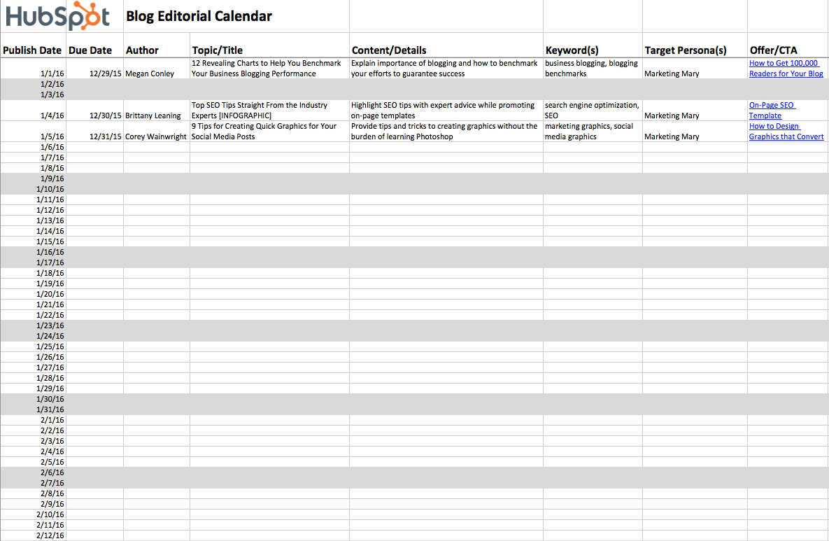
Step 1. Download HubSpot’s free editorial calendar templates.

Download Now

First, download the calendar templates above (they’re free.) By doing this, you’ll have three editorial calendar templates on your computer: one for Google Calendar, one for Excel, and one for Google Sheets.

Here we’ll go over how to upload the Excel calendar into Google Calendar.

Step 2. Customize your template and prepare it for import into Google Calendar.
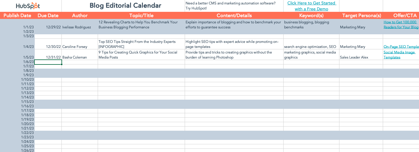
 

The publish dates on your templates will be stamped for a previous year.

Now is a great time to change them to the current year in the spreadsheet. You can also determine posting cadence now or adjust your posting schedule after uploading the file into Google Calendar.

Google Calendar makes loading a calendar you might have pre-created in another program into Google easy. This includes Microsoft Excel.

To import the blog editorial calendar template into Google Calendar, you’ll need to take the following steps:

1. Delete the header row with the HubSpot logo.

2. Change the words “Publish Date” to “Start Date.”

3. Change the wired “Topic/Title” to “Subject.”

4. Move the “Subject” column to be the first column and the “Start Date” column to be the second column “Due Date.”
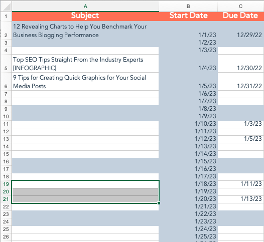
5. Move the “Subject” column to be the first column and the “Start Date” column to be the second column “Due Date.”

6. Save the document as a .csv file.
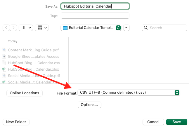
Next, we’ll show you how to import the Excel calendar template you downloaded into Google Calendar.

Step 3. Open Google Calendar.

Once you’ve downloaded (or created) a calendar that opens in Microsoft Excel, it’s time to open Google Calendar. Just make sure you’re already logged into the Gmail account you want this calendar to give access to.
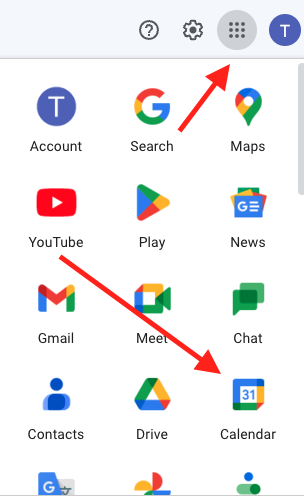
Click the gray dots next to your profile picture, then click “Calendar.”

Step 4. Use the left-hand dropdown menu to create a new calendar.

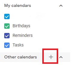
Next, set up your Google Calendar to accommodate the information in your Excel spreadsheet. To do this, go into your Google Calendar and click the plus sign to the right of “Other Calendars,” as shown in the screenshot below.

Then, select “Create new calendar ” in the dropdown menu.”
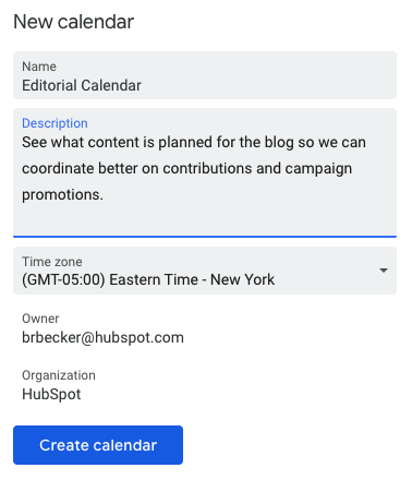
Step 5. Fill out the details of your new calendar.

Fill out the fields that appear on the next screen. This includes a brief description of your calendar, as shown below, to give people proper context when you invite them to your calendar.

When you’re done filling in the details, click “Create calendar.”
Step 6. Import your XLS or CSV file from the same dropdown menu.

Using the same dropdown menu you used to create your editorial calendar, you’ll now import the Excel .csv file itself into Google Calendar. Click that plus sign and select
“Import.”
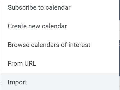
Click the upload box that reads “Select file from your computer,” and locate the file entitled “Blog Editorial Calendar – Excel” that was included in the ZIP file you downloaded in Step 1 above.

Step 7. Select which calendar to add this file to.

In the second box below your imported file, click the “Add to calendar” dropdown. Be sure to choose the calendar name you just created from the dropdown menu, as shown below. Then, click “Import.”

Step 8. Click Import.

Once you’ve uploaded your Excel file and selected the calendar you want to add this file to, click “Import.”

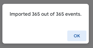
If you kept all the events in your Excel file, you should see an import calendar dialog box telling you that 365 events were successfully imported. However, if you change this to a different number of posts a week, that number will differ.

Click “OK.”
Navigate to the start of your calendar. Ensure all your other calendars are temporarily hidden by clicking the colored box to the left of the calendar name.

For example, on the week of January 3, if you’ve typed in Blog TBD in your Excel file, you’ll see a “Blog TBD” calendar event on that date. Otherwise, you’ll see “(no subject)” events every day you have an item scheduled.
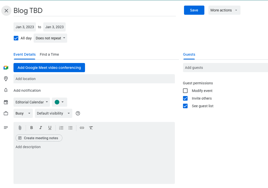
Use the edit window of each assignment to change the publish date. Each assignment will then appear as event blocks in your monthly calendar view.

Step 9. Determine your publishing schedule.

Now that you have your calendar created, it’s time to fill it in with assignments for the year. This is when you must decide about your blog’s publishing schedule.

While the Excel file you imported accounts for one blog post per day, this doesn’t mean you need to publish seven days a week.

You can choose to publish every Monday, Wednesday, and Friday. Or perhaps you plan on posting just on Thursdays. You may have adjusted this already, or you can do so now.

Either way, remember: Quality over quantity is the key to successful blogging.

Don’t overcommit to a blogging schedule if the quality of your content will take a hit. How often your company should blog will vary depending on your business goals and resources.

If you decide to decrease the number of days you want to publish, click on the calendar event of that day and select “Delete.”

Even if you want to publish multiple times daily, updating this calendar is as easy as adding an event.

Select a slot on your calendar to add another “Blog TBD” event and copy the default description from another one of the events you imported.

Next, it’s time for some minor adjustments. Currently, the “Blog TBD” events are set for 10 a.m. Feel free to move these events to whichever time your blog publishes content during the day.

Step 10. Set up recurring events.

If you selected just one week of dates to upload to Google Calendar (not 365 days), you can make these recurring events on your calendar.

If you have a regular publishing schedule, say every Monday, Wednesday, and Friday at 10:00 a.m., you can put that in as a recurring “slot” on your calendar.

It’s okay if you don’t have a piece of completed content or a working title to put there yet. It’s just a reminder that you want to publish something that day.

To add your recurring slot, click on your first “Blog TBD” event and click the pencil icon to edit your event.

This will take you to the details of the post, where you can create a custom recurring schedule for each assignment, as shown in the screenshot below.
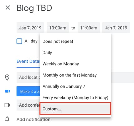
You can set the post up as recurring, so it automatically appears every Monday, Wednesday, and Friday at 10:00 a.m. (or whatever days and times you want).

Once you’ve selected the recurring days, hit “Done” and “Save,” and you’ll have an editorial calendar framework to work with.

For now, keep the event’s title as “Blog TBD,” but feel free to customize the description with any extra details you want to be sure you include for each post.

Wait to invite any guests, as we’ll use this to assign posts to an author once you begin filling in your topics. With everything complete, click “Save.”

If you don’t have a recurring schedule like this, you might not need an editorial calendar just yet — but it is an excellent way to set goals for yourself.

For example, if you know you want to publish a certain number of posts each week, even if you don’t hit every single slot, it’s a good reminder for yourself and your team that this is something you should all strive for.

Step 11. Fill in your publishing slots.

Now that you know all the slots you want to fill, you’ve got to fill them. (If you don’t have topic ideas yet, check out this free topic idea generator. It’ll give you some good ideas for content to put on the calendar.)

Let‘s say one of the posts you want to write is “10 Surprising Facts About Tapirs,” and one of the posts you’ve already written and want to publish later is “Think You’re Cut Out to Own a Tapir? Read This First.”

Just add them both to the calendar by clicking on “Post – TBD” on the correct date, choosing “Edit Event,” and then changing the “Post – TBD” text to the actual title of the post.
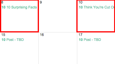
Let‘s say you don’t want to write “10 Surprising Facts About Tapirs,” and you want your colleague to write it instead.

To assign the post to an author, you‘ll invite them to the event as guests. To do this, click on the occasion, and hit “Edit Event.”

Then ask that colleague to the post by typing their name or email address into the “Add guests” box. Select “Add” when their name pops up and hit “Save” on the event once you’re done.
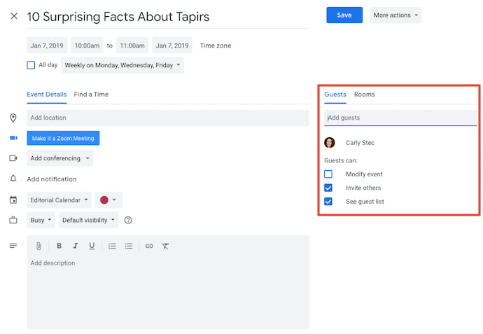
Now, anyone can see who is responsible for writing the post.

You can take it a step further by adding details to the “Description” box of the event, as shown in the large box in the screenshot above.

You might include a quick synopsis, the keywords you plan to target the post for, the target audience you‘re trying to reach, and the offer or CTA you will direct the reader to at the end of the post. Don’t forget to add the draft’s due date.

Before Google Calendar lets you save the event, you’ll see a dialog box asking if you want to change just this event or all of the events in the series. Select “Only this event.”
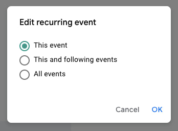
Repeat these steps to assign each blog topic today and in the future.

Step 12. Share your editorial calendar with others.

Now that your calendar is set up, you can invite people to see it. Let’s start with your immediate team, regular contributors, and anyone who regularly asks you about publishing content on your company blog.

To share this calendar with people, simply find your editorial calendar under “My Calendars,” as shown below. Click the three dots next to the calendar name and select “Settings and sharing” when it appears in the dropdown menu.

You’ll be taken to the same screen where you first fill out the details of your editorial calendar in Step 2.
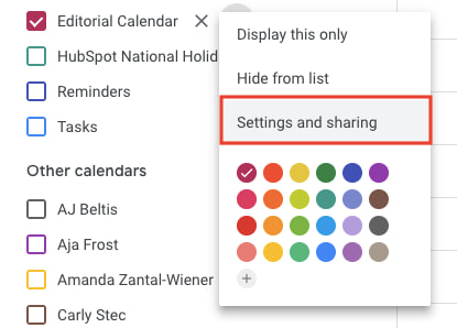
Then, you can add the names of people you’d like to share on the calendar and set the correct permission levels for each invitee.

It‘s wise to keep those with the permission settings to manage changes and sharing to a minimum so there are only a few cooks in the kitchen. However, let everyone see all event details so it’s clear exactly what content is going up in each slot.

Under the “Share with specific people” heading, enter the email addresses of those on your content team and decide if they have viewing, editing, or admin privileges. Save your updated settings.

And there, you have your editorial calendar on Google Calendar!

How to Use Excel or Google Spreadsheets for Editorial Calendars
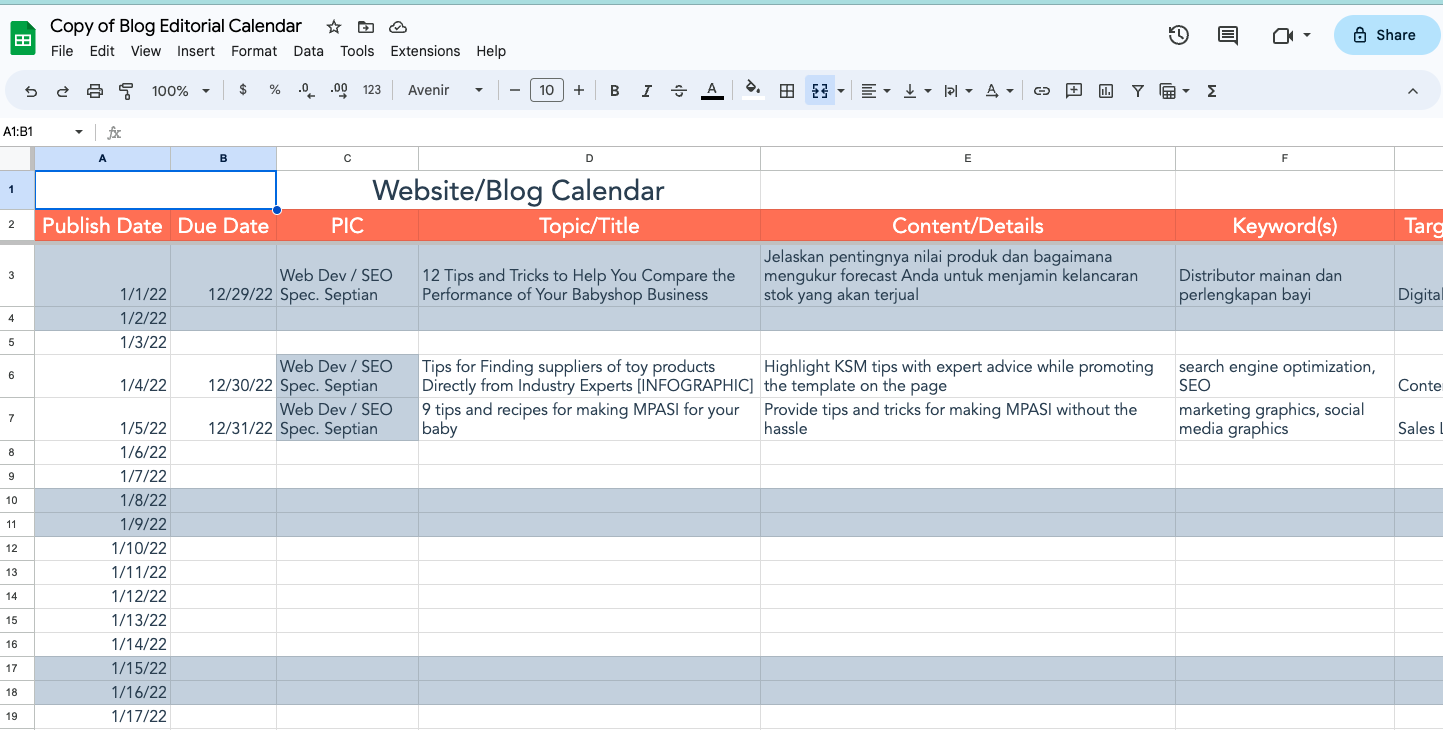
If you’re a spreadsheet superfan, Excel and Google Sheets are great options for your editorial calendar because they allow online real-time collaboration.

The best choice is whether your organization uses Google Workspace or Microsoft Teams.

The editorial calendar template bundle you downloaded includes links to Google Sheets editorial calendar files and an Excel blog editorial calendar template you can adapt to your company.

Google Sheets

To use the Google Sheets option, open the link in the included pdf and select “Make a Copy.”

This will automatically save to your Drive. From there, you can adapt to your schedule/needs and share with team members for easy collaboration.

Excel

Save the Excel file to your Teams folder and share it with the appropriate team members.

Regardless of which spreadsheet you use, only provide “edit” access to people who need it.

How to Use Online Calendars for Editorial Calendars

Whether you’re using Google Calendar, Outlook, or iCal to manage your personal and work schedules, you can easily use your online calendar as an editorial calendar.

Step 1. Create a new calendar.

The first step is to create a new calendar.

In Outlook, you’ll add a calendar.
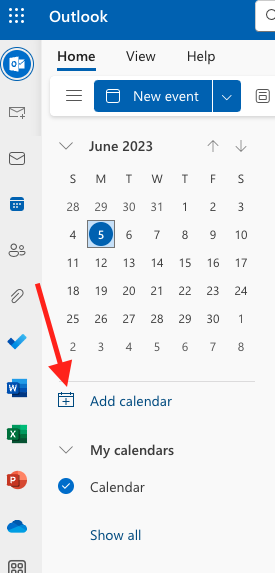
Then you’ll choose “Create blank calendar.”
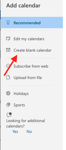
In Google Calendar, you’ll create a new calendar:

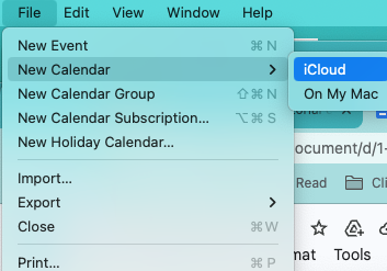
In iCal, you’ll create a new calendar and choose iCloud:
Step 2. Rename your calendar.

Regardless of which app, you can name your calendar “Editorial Calendar” and add events.

Step 3. Set up your calendar.

Choose a date and time on the calendar, name the event “Blog Title,” “Email,” “Instagram Post,” etc., and choose how often you want it to recur.

Then you can go into each instance and fill out details like Title, Content Outline, and any other information.

You can then also share that calendar with other people on your team so they can plan accordingly.

How to Use a Project Management Platform for Editorial Calendars

Project management tools like Asana or ClickUp make great editorial calendars because you can view the content in multiple ways. Each item is its card, allowing you to put as much information as possible.

That includes dates, links, assignees, checklists, and custom fields.

Generally speaking, you can toggle between List, Board, or Calendar views. You can also assign a variety of tasks and subtasks with different deadlines.

And because they’re usually drag and drop, updating your editorial calendar as things change is easy.

List view gives you a straightforward way to look at everything on your plate, as in this ClickUp example.

The Board view lets you track progress.
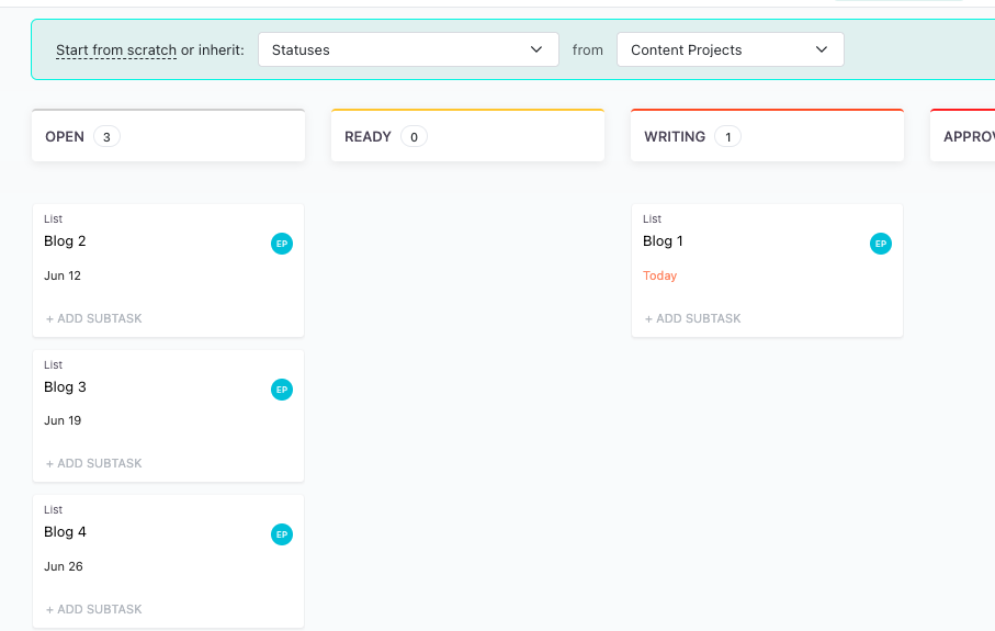
And the calendar view allows you to lay everything out based on the week or month.
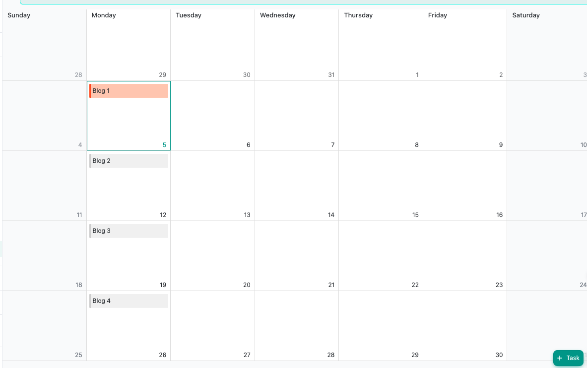
Regardless of which option you choose, it’s a good idea to ensure your team understands your content calendar and how to use it to keep your process moving smoothly.

Why Using Google Calendar as an Editorial Calendar Works

While other solutions work for editorial calendars, we want to give an extra plug for Google Calendar because it has impressive features to help you manage your editorial calendar.

For starters, if you use Gmail for your corporate email, everyone you work with will already be in Gmail (and their calendar, specifically) all day.

As a result, it won’t be hard for people to habitually check the editorial calendar because it will be easy for them to find it.
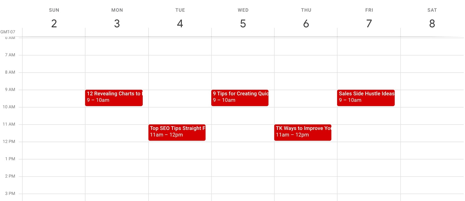
Google Calendar also makes things easy to move around and schedule. It has all the functionality you need to schedule and let the people who need to know about it know.

Along those lines, allowing people to view your calendar is simple, making it easy for multiple teams to collaborate, see what’s being published, and figure out when they might launch content and campaigns.

Finally, this sets a precedent for other teams to coordinate with your team straightforwardly. You can have a calendar for upcoming campaigns, offers, social media pushes, product launches — you name it.

And you can all share those calendars for a single-screen view of everything going on so you can coordinate more easily.

While there are other solutions for maintaining an editorial calendar, if you’re looking for a free, not-too-shabby, minimum-viable product, then Google Calendar is for you.

Create a Calendar Today

Whatever you choose — an online calendar, project management software, or a spreadsheet — having a well-organized and up-to-date editorial calendar is vital to a successful blog.

It will help you keep track of all the moving parts: what content you want to publish, when, and who’s responsible for making it. Up your content publishing with a calendar today!

Editor’s note: This post was originally published in January 2019 and has been updated for comprehensiveness.
marketing editorial calendar templates


Categories B2B

25+ Web Design Statistics that Are Essential to Know in 2023

Did you know that website design can improve time on site by 84% and YoY online revenue by 132%? 

That happened to Swiss Gear after The Good executed the conversion audit and implemented changes to the website design and content upon the findings.

So, gear up with the latest handpicked data on web design and analytics to benchmark your site’s performance.

After all, the world is crowded, with over 1.5 billion websites to date. Web design is where you can stand out to grab a bigger slice of the market share pie.

Access hundreds of Website Themes & Templates on HubSpot

Web Design Statistics

Mobile Web Design Statistics

1. In May 2023, mobile devices generated 65.49% of global website traffic. (SimilarWeb, 2023)

Mobile traffic has been hovering around the 50% mark since the beginning of 2017. That means optimizing your website for mobile devices, and desktops is more important than ever.

It’s also important to consider whether offering a mobile app would provide a better experience to your users.

Image Source

2. 32% of small businesses already have a mobile app, and 42% plan to build one in the future. On the other hand, 26% of small businesses are unlikely to ever release one. (Top Design Firms, 2021)

Some small businesses have already created a mobile app, while others plan to improve their customer service or streamline the purchasing process for their customers.

But over a quarter of some small businesses aren’t planning to — now or ever.

Some don’t have the budget or marketing capabilities to create and promote their app. Others don’t think it makes sense for their business or audience.

Whether your small business should invest in building a mobile app or not depends on a wide range of factors, including your industry, target audience, and budget.

3. The average e-commerce conversion rate on mobile is 2.49% (of completed purchases by visitors), while desktop conversions are 5.06%. (Dynamic Yield, May 2023)

Though desktop comes with higher conversion rates, invest heavily in mobile optimization as well. As mentioned above, mobile traffic share is twice as large (~65% for mobile vs. ~32% for desktop).

If you disregard website mobile optimization, you risk losing revenue and customer loyalty.

Image Source

4. Mobile drew the largest number of new users at 65%, and mobile generated the highest percentage of returning visitors, at 74%. (Dynamic Yield, 2023)

This finding greatly supports the above. People spend an average of 3 hours and 15 minutes on their phones daily. And 1 in 5 smartphone users spends upwards of 4.5 hours.

They scroll social media, read news, hang out on messengers, watch YouTube, and discover and buy goods.

Think of yourself. How do you use your phone? I check it during small breaks, even when I work on my laptop. I discover new brands thanks to paid ads on Instagram or Facebook.

That said, it’s very important to make web design and UX for mobile users clean, easy to navigate, and memorable.

Image Source

Responsive Web Design Statistics

5. 73.1% of web designers believe that a non-responsive design is the top reason why visitors leave a website. (GoodFirms, 2021)

Considering that billions of people use mobile devices to access the internet, your website must be optimized for smaller screen sizes and desktops.

In fact, not having a responsive design is rated as a top reason visitors might leave a website, according to a survey of 200+ web designers and freelancers. Other reasons are slow load times, bad navigation, and poor content structure.

Image Source

6. 53.8% of web designers cite “not being responsive on all devices” as a top reason for a website to be redesigned. (GoodFirms, 2021)

If your website isn’t responsive, it’s time for a redesign, according to that same group of 200+ web designers and freelancers.

The other top reasons — low conversion rate, high bounce rate, and “needs better UX” — could be addressed by a responsive design as well.

Web Design Industry Statistics

7. In 2021, the total number of web developers and designers in the United States was around 191,100. By 2031, this number is projected to reach over 205,000. (U.S. Bureau of Labor Statistics, 2021)

In this study, web developers and designers were defined as those “responsible for the design and development of websites or interfaces including the overall layout, graphics, font type, etc.”

The market is expected to grow by over 21,800 jobs in the next decade.

8. Employment of web developers and digital designers is projected to grow 23% from 2021 to 2031, much faster than the average for all occupations. (U.S. Bureau of Labor Statistics, 2021)

According to the U.S. Bureau of Labor Statistics, the employment of web developers and designers will grow at a much faster rate than the average for all occupations.

The organization believes that demand will be driven by the continued popularity of mobile devices and e-commerce.

Image Source

9. The median annual wage for web developers was $77,030, and digital designers earned $79,890 respectively in May 2021. (U.S. Bureau of Labor Statistics, 2021)

The median annual wage for web developers and designers was over $77,000 in 2021.

The U.S. Bureau of Labor Statistics defines median wage as “the wage at which half the workers in an occupation earned more than that amount and half earned less.”

In the case of web developers and designers, the lowest 10% earned less than $40,750, and the highest 10% earned more than $146,430.

10. On average, webmasters receive 353,370 unique visitors per month to the primary website they track analytics for. (HubSpot, 2023)

This statistic indicates the level of traffic that website owners or administrators typically experience.

It demonstrates the potential reach and audience size of websites, which can be important for various purposes such as marketing, advertising, and monetization.

11. The most important metrics webmasters track to understand their website performance are sales, leads, and conversion rates (31%), total monthly visitors (30%), and click-through rate (28%). (HubSpot, 2023)

These metrics provide insights into the effectiveness of a website in generating revenue, capturing leads, and engaging visitors.

Monitoring these metrics allows webmasters to benchmark, compare over a time period, and optimize their websites.

Modern Web Design Statistics

11. 94% of first impressions related to your site’s web design. (WebFX, 2021)

A WebFX study discovered that website design is paramount to a business’s overall brand.

That suggests businesses should prioritize website design (or redesign) to meet consumers’ expectations, strengthen their brand identity, and increase purchases alike.

Image Source

12. When asked what visual elements they value on a company website, 40% of consumers said images, 39% said color and 21% said video. (Top Design Firms, 2021)

Images, colors, and videos are the top visual elements that consumers value on a company website.

Considering that nearly 40% said images and color and 21% said video, your business should prioritize adding images and picking a website color scheme first.

Then, focus on incorporating video and other visual elements mentioned — namely, typography, infographics, and animation.

Image Source

13. A tall page can skyrocket your conversion rate by 30%. (CrazyEgg, 2015)

Although this study was conducted about seven years ago, it should inspire you to test ideas that could drive more conversions.

Crazy Egg conducted an A/B split test to determine which homepage version was more effective in persuading visitors to become customers.

The challenger homepage they tested was about 20 times longer than the control, outperforming the control by 30%.

This indicates that the longer page was more successful in capturing visitors’ attention and encouraging them to take action.

They had enough space to showcase product value, poke their target audience’s pain points, and convince people to sign up.

14. 42% of people will leave a website because of poor functionality. (Top Design Firms, 2021)

Web design isn’t just about making pretty websites — it’s about making websites that are easy to use and navigate. If yours isn’t, then it’s likely that many visitors will abandon your site.

In a survey by Top Design Firms, 42% of respondents said they’d leave a website with poor functionality.

15. 38.5% of web designers believe that outdated design is a top reason why visitors leave a website. (GoodFirms, 2021)

In addition to non-responsive design and functionality issues, web designers cite outdated design as a reason visitors abandon a website. You might be wondering when a design becomes “outdated.”

According to Business 2 Community, the average lifespan for a website is 1.5 to 2.5 years. Past that range, a website must incorporate new design trends and technologies to feel “fresh” and competitive.

16. 39% of consumers appreciate color more than any other component of a website’s design. (Top Design Firms, 2021)

39% of website visitors care about color more than any other component of a website’s design. That means companies should prioritize picking a website color scheme.

Ideally, your color schemes will reinforce your brand, make your site easy to read and navigate, and also look good.

17. Only 8% of consumers notice whitespace when viewing a website for the first time. (Top Design Firms, 2021)

When viewing a website for the first time, only a fraction of visitors notice whitespace. That doesn’t mean it’s not important, however.

This critical design element can help draw visitors’ attention to certain elements, like CTAs, and make it easier for them to understand and digest your content.

18. 26% of consumers prefer primary color schemes, 21% prefer complementary, and 20% prefer analogous. (Top Design Firms, 2021)

Consumers are split about which type of color scheme they prefer: Some want primary. Some want complimentary. Others want analogous.

To understand the difference, you must be somewhat familiar with color theory.

  • A primary color scheme is made up of one or more primary colors (red, yellow, and blue).
  • A complementary color scheme uses two colors directly across from each other on the color wheel (like orange and blue) and relevant tints of those colors.
  • An analogous color scheme is created by pairing one main color with the two colors directly next to it on the color wheel (like green, purple, and blue).

When selecting a color scheme, companies should consider their products, services, and audience.

19. Of consumers visiting a website for the first time, 22% look for eye-catching colors, while 21% will leave a site with “outlandish” colors. (Top Design Firms, 2021)

As 22% of consumers visiting a website for the first time look for eye-catching colors, but 21% will leave one with “outlandish” colors, it’s important to strike the right balance.

To help choose eye-catching — but not garish — colors for your website color scheme:

  1. Opt for a neutral background color.
  2. Choose primary and secondary colors.
  3. Don’t be afraid to look at businesses in your industry for inspiration.

20. When looking at a website for the first time, 38% of consumers look at a page’s layout or navigational links. (Top Design Firms, 2021)

38% of people visiting a website for the first time look at the layout or navigational links on a page. If the layout is confusing or the navigation menu is hard to find, then visitors may leave your website.

Ecommerce Web Design Statistics

21. 21% of cart abandonments are due to complicated or lengthy checkout experiences. (Dynamic Yield, 2023)

As of March 2023, 72.77% is the cart abandonment rate, according to Dynamic Yield. The numbers are paralyzing. Especially given that in 21% of the cases, people give up on their purchases because of cumbersome checkout pages.

So, use heatmaps and session recordings to locate and fix friction points.

Image Source

22. 23% of small retail businesses don’t have a website. (Digital.com, 2021)

With e-commerce growing year-over-year, it might surprise you that 23% of small retail businesses don’t have a website. Some believe they don’t need one — but they are likely missing out on key opportunities to generate revenue.

According to Statista, revenue from e-commerce in the United States amounted to $431.6 billion in 2020. It’s estimated to increase to $563.4 billion by 2025.

23. Of small retail businesses without a website, 24% responded that they don’t know how to create/run a website. (Digital.com, 2021)

While some businesses doubt the necessity of having an online presence, others simply don’t have the resources to create one. Of small business owners without a website, 24% said the reason was that they don’t know how to create and run one.

The rise of user-friendly and affordable content management systems and website builders could help overcome this objection and get more small businesses online.

Image Source

24. When hiring an agency or a freelancer, the average cost to build a website is $12,000 to $150,000. (WebFX, 2023)

Several factors can contribute to the cost — the complexity of the website, its functionality, the number of pages, design customization, content creation, e-commerce integration, and split-tests or conversion rate optimization.

Thus, a $150,000 website suggests a more intricate and comprehensive design with extensive customization, advanced functionality, or complex integration.

Image Source

Need a simple site? Try HubSpot CMS with a very intuitive website builder, hundreds of website themes and templates, and web hosting. HubSpot CMS is already integrated with HubSpot CRM and has a free blog maker.

25. As of May 2023, Amazon was the most popular ecommerce site in the United States and worldwide. (SimilarWeb, 2023)

As Amazon has had unprecedented success in driving traffic to its site, its website can inspire your website’s design.

It’s become the go-to platform for many online shoppers due to its broad assortment of goods, third-party selling, and other design and functionality choices.

Image Source

26. E-commerce sales grew 7.7% in 2022 year over year and reached $1.03 trillion. (Digital Commerce 360, 2023)

The 7.7% growth indicates a healthy and positive trend in the after-COVID e-commerce industry. More and more consumers are leaning toward online shopping after its booming period during the COVID-19 pandemic.

So, make sure your website is ready for an unparalleled user experience. Otherwise, customers can easily switch to competitors.

Image Source

27. 60% of consumers rate usability as an important design characteristic for an online shop. (Statista, 2020)

In a survey of almost 1,000 US consumers, 60% stated that website usability is important for them in an online shop. You can improve the usability of your website by using visual hierarchy, colors, and consistency to make it as easy to use as possible.

If you’re unsure where to start, HubSpot’s Website Grader and other usability testing tools can help identify improvement opportunities.

28. 83.5% of designers, developers, and agencies from the web development industry find it hard to gather relevant information and content from clients. (Atarim, 2022)

According to Atarim and their latest case study, gathering content from the client is ultimately the biggest bottleneck in running and completing projects. What’s even more fascinating is that 87.5% still use email to gather that content.

Based on their case study, Atarim created a free ebook that helps digital agencies and individuals resolve this bottleneck.

After going through it, 75.3% of them reported a significant improvement in their ability to gather all necessary content from the client in a much shorter period. You can check out the ebook here.

Preparing for the Future of Web Design

The web design industry is growing, and so are users’ expectations of what websites and online shops look like and are capable of. Will you be prepared to meet them?

New Call-to-action


Categories B2B

Copywriting 101: 15 Traits of Excellent Copy Readers Will Remember

Mad Men fans everywhere remember the pivotal first scene where we learn just how talented Don Draper is at his job.

Faced with an almost-impossible copywriting task, he rose to the occasion to solve a huge problem for his client, Lucky Strike. In spite of research warning customers of the dangers of cigarettes, Draper delivered the iconic slogan — “It’s toasted” — to differentiate the brand from its competitors.

Now, we definitely aren’t advocating for smoking cigarettes (or many of Draper’s health choices). But fictional or not, you can’t deny the memorability and catchiness of that tagline.

copywriting_2

It’s easy to recognize good copywriting when you see it, but there are actually several characteristics that really separate outstanding writing from the rest of the pack. Want to know them? Read on below to find out.

What is copywriting?

Copywriting is one of the most critical elements of any and all forms of marketing and advertising. Copywriting consists of the words, either written or spoken, marketers use to try to get people to take an action after reading or hearing them. 

Copywriting is like a call-to-action, but on a bigger scale: Copywriters are trying to get people to feel, think, or respond — or, ideally, to Google the slogan or brand to learn more about the campaign. And where a blog post like this one has the luxury of hundreds of words with which to make a case, copywriters only have a few words to make their case.

But short and sweet isn’t the only characteristic of good copywriting. Keep reading to learn more characteristics of truly memorable copy.


6 Traits of Good Copywriting

1) It tilts your perspective.

Sometimes, all a message needs to break through is a slight shift in angle. We’ve grown so accustomed to blocking out marketing messages, we don’t even see them anymore. One of the most powerful things a copywriter can do is break down a reader’s guard with an unexpected approach. Every story has a myriad of angles — your job as a copywriter is to find the one that resonates.

594ab5f61700002000102212.png
Source: Silence Sucks

This ad from Sage Therapeutics pressing the importance of talking about postpartum depression works because instead of asking readers to care about something they don’t know, it puts them in the position of experiencing the struggle that mothers suffering do. Did they miss some readers who quickly passed by the ad thinking it was for adult pacifiers? Most definitely. But the ad resonated that much more thoroughly with those who read it.

The next time you sit down to write, try out this approach. Don’t take the topic head on. Instead, ask yourself why it matters. Each time you write down an answer, challenge yourself to push it further. Find the larger story happening behind your message.

2) It finds connections.

In 1996, Steve Jobs let the cat out of the bag. He was speaking with a journalist from Wired on the topic of creativity and explained:

“Creativity is just connecting things. When you ask creative people how they did something they feel a little guilty because they didn’t really do it, they just saw something. It seemed obvious to them after awhile.”

Let’s say you have to write an ad for a new pair of sneakers. You could take the assignment head on. You could write about the elasticity of the shoe’s sole or the lightweight design. Indeed, many have. Or you could put all of that aside and instead draw the connection between the product and the experience it evokes.

Run_ad

Source: Pinterest

Two things are happening in this ad. First, the copy recognizes that for many, running isn’t about running at all — it’s about solitude, peace, and restoring sanity to an otherwise hectic life. Second, not only does Nike connect the ad to the experience of running, it actually connects to the sound that those shoes make as they hit the pavement.

This ad is about the complexity of one’s life fading away and being replaced by simplicity and clarity. As the copy progresses, the sentences simplify and the copy’s complexity is slowly replaced by the simple and rhythmic pounding of words: run, run, run, run. The same rhythm one hears when all but their footsteps have faded away. That’s connection.

3) It has a stunning lead.

The following are all headlines or leading sentences from Urban Daddy, an email-based magazine drawing attention to new products, experiences, and eateries.

  • “Six days. That’s how long you have until 65% of your body is turkey.”
  • “There are 8,760 hours in a year. And just one hour in which a stand will be dispensing gratis latkes with homemade applesauce and sour cream in Harvard Square. Yeah, it’s not fair. But 60 minutes is 60 minutes.”
  • “Ewoks. Talk about living.”

What’s common among each of these leads? They make us want to read the next line. I mean, seriously, how much do you want to know where that Ewok thing is headed?

There’s an adage in copywriting that’s loosely credited to copywriter and business owner Joe Sugarman, which roughly states that the purpose of the headline is to get you to read the first line. The purpose of the first line is to get you to read the second line, and so on. In short, if your first line doesn’t enthrall your readers, all is lost.

4) It is born out of listening.

Seeing its plans to launch yet another gym in the greater Boston region, an outsider might have called the Harrington family a wee bit crazy. The market was already flush with gyms, including a new breed of luxury ones that seemed to be in an arms war for the flashiest perks. Gyms across the region were offering massage services, smoothie bars, and fleets of personal trainers. And GymIt wouldn’t have any of that.

What did GymIt have? An understanding of its core audience. Before launching its new gym, the brand did a ton of listening to its primary market of gym-goers. For many in GymIt’s target market, the added benefits associated with luxury gyms were nice to have, but came with a lot of baggage — namely expensive rates and overly complex contracts.

GymIt decided to simplify the gym-going experience for people who predominately cared about getting in and working out. The copy in its launch campaign and across its marketing materials reflects that understanding.

GymIt__gyms_in_Boston_ma__health_clubs

In an older blog post, Copyblogger‘s Robert Bruce put this nicely. “Humble yourself and truly serve your audience, listen to their needs and desires, listen to the language they use,” he said. “If you listen carefully, your audience can eventually give you everything you need, including much of your copy. Get out of their way.”

5) It avoids jargon and hyperbole.

Groundbreaking. Revolutionary. Business Solutions. Targetable Scale. Ideation. Evidence-based approaches. Industry-wide best practices.

Have I lost you yet?

When writers struggle to convey what is truly special about their company, product, or service, they sometimes fall back on jargon or hyperbole to underscore their point. The truth is, good copywriting doesn’t need dressing up. Good copywriting should speak to the reader in human terms.

This isn’t to say you should never celebrate awards or achievements. Just be direct in the way you explain that achievement. This homepage from Basecamp does a nice job of highlighting its popularity in concrete terms.

basecamp-copywriting-example.png

6) It knows its audience.

HubSpot buyer persona tempalte

Create personas with HubSpot’s template

Good copywriting knows the audience it is writing to because it recognizes that effective communication requires a deep understanding of the reader. By knowing the audience, a copywriter can tailor their messaging, tone, and language to resonate with the intended readers.

Whether it’s a sales copy or a blog post, addressing the audience’s needs, pain points, and desires makes the copy more relevant, relatable, and engaging. It enables the writer to convey the value of a product or service in a way that truly speaks to the audience, fostering a connection and increasing the chances of achieving the desired outcome.

7) It uses compelling headlines.

NPR headlineSource

Your content can be excellent, but if you don’t get people to read it in the first place, it’s a waste. Good copywriting incorporates attention-grabbing headlines because they serve as the first impression and the gateway to the rest of the content.

A well-crafted headline like the one shown above from NPR grabs attention, sparks curiosity, and entices readers to continue reading. It sets the tone for the entire piece and plays a crucial role in capturing the audience’s interest in a crowded online landscape. A compelling headline communicates the value and benefits of the content, making readers eager to dive deeper.

Without an attention-grabbing headline, even the best-written copy may go unnoticed. By crafting strong headlines, copywriters can increase click-through rates, engage readers, and maximize the impact of their content.

8) It is well-researched.

NYTA map from The New York Times shows how research can enhance writing.

Good copywriting is well-researched because it is important to have accurate and up-to-date information in order to create compelling and persuasive content.

Research allows copywriters to understand their target audience, industry trends, and competitors. It helps to identify the pain points and needs of potential customers, enabling the writer to address them effectively. Thorough research also ensures that any claims made in the copy are backed by solid evidence, increasing credibility and building trust with the audience.

By investing time in research, copywriters can provide valuable insights, create content that resonates, and ultimately drive desired actions from their readers.

9) It uses formatting to its advantage. 

HubSpot blogThis HubSpot blog post uses a table of contents

Formatted pieces are far easier to read than blocks of text. By incorporating elements such as a table of contents, subheadings, bullet points, bold or italicized text, block quotes, and whitespace, copywriters can break up the content into easily scannable and digestible chunks.

Formatting helps readers navigate through the copy quickly, find key information or main points, and understand the structure of the content at a glance. It also draws attention to important details or calls-to-action, making them more noticeable and compelling. Well-formatted copy keeps readers engaged, reduces cognitive load, and ensures that the message is effectively communicated to the audience.

10) It flows naturally.

When copywriting flows naturally, it feels effortless and easy to consume. The sentences and paragraphs flow smoothly from one to another, guiding the reader along a logical and coherent path.

This flow is achieved through the use of concise and clear language, proper sentence structure, and effective transitions. A natural flow eliminates any stumbling blocks that could distract or confuse the reader, allowing them to focus on the message being conveyed. It enhances comprehension, engagement, and ultimately, the effectiveness of the copy in achieving its intended purpose.

11) It has a strong voice.

Screenshot 2023-08-20 at 10.01.57 PM

An example from the HubSpot blog

A strong voice reflects the brand’s personality, values, and identity, allowing it to stand out in a crowded market. It communicates the brand’s unique tone, style, and attitude, which in turn helps to build a connection and establish a relationship with the readers.

Additionally, a strong voice adds authenticity, credibility, and emotional appeal to the copy, making it more engaging and persuasive. It enables the brand to leave a lasting imprint on the minds of the audience and fosters brand loyalty. Ultimately, a strong voice in copywriting helps a brand to be recognizable, relatable, and influential in its communication efforts.

12) It leverages AI tools.

HubSpot Content AssistantGet started with HubSpot’s Content Assistant

AI tools like HubSpot’s Content Assistant can provide real-time feedback on the readability, grammar, and structure of the copy. They can suggest improvements, highlight potential errors, and offer alternative word choices to optimize the content. These tools can also recommend relevant keywords and help ensure that the copy aligns with SEO best practices, improving its visibility and search engine ranking.

By leveraging AI tools, copywriters can save time, enhance their writing skills, and produce high-quality content that resonates with the audience and achieves the desired results.

13) It is creative.

Omsom

Source

Even the driest topics can be made interesting with creative copywriting. Interesting topics could also use more spice. Creativity allows copywriters to come up with unique and compelling angles, ideas, and storytelling techniques that make the copy stand out. Creative copywriting involves finding fresh and unexpected ways to communicate a message, evoke emotions, and inspire action. It involves using imaginative language, clever wordplay, and visually appealing imagery to captivate readers. 

Ultimately, creative copywriting helps brands differentiate themselves, leave a lasting impression, and build a strong connection with their audience.

14) It ends strong.

HubSpot blogAn example of a conclusion from a HubSpot blog

Imagine watching You can have a superbly well written post but if it doesn’t have a good ending, what’s the point?

Good copywriting has strong endings because they leave a lasting impact on the reader and reinforce the key message or call-to-action. A strong ending summarizes the main points, highlights the benefits, and creates a sense of urgency or excitement to entice the reader to take action. It provides closure and a sense of satisfaction, leaving the reader feeling fulfilled and motivated. A strong ending can also include a compelling closing statement, a memorable tagline, or a thought-provoking question to spark further engagement or conversation.

15) It cuts out excess.

Good writing gets to the point — and that means cutting out excessive phrases, and rewording your sentences to be more direct. In an ad celebrating its “academic” readership, The Economist playfully demonstrates this below.

economist-1

How do you rid excess words from your writing? It’s half practice, half knowing where to cut. This article from Daily Writing Tips is one of the most effective summaries I’ve found on precise writing. Included in its tips:

  • Reduce verb phrases: For instance, turn “The results are suggestive of the fact that” to “The results suggest.”
  • Reduce wordy phrases to single words: You can change “in order to” into “to.” Another example: Turn “Due to the fact that” into “because.”
  • Avoid vague nouns: Phrases formed around general nouns like “in the area of” or “on the topic of” clutter sentences.
  • Read the full list of brevity tips here.

In general, if you can afford to cut without losing the meaning of a sentence, do so. Push yourself to strip down your word count. Turn 50-word homepage copy into 25, then push yourself again to make that 25-word sentence into 15 words. It’s not about brevity so much as it is about making sure every word counts in your writing.

Since my last point was about getting to the point, I’ll keep this brief: Words matter. Every time you sit down to write an ad, web page, video script, or other content for your company, you have the opportunity to break through to people. Find those opportunities in your marketing and make sure that you’ve made the most of them.

Editor’s note: This post was originally published in November 2017 and has been updated for comprehensiveness.

copywriting_1

 copywriting_0

Categories B2B

How to Write a Marketing Email: 10 Tips for Writing Compelling Email Copy

Email marketing has come a long way in the past few years. More than 306 billion emails are sent and received each day. How can you write something that stands out?

The exciting aspect of that is that simplicity cuts through the noise. A well-written, plain-text email can perform just as well (if not better) than a highly-designed email with tons of bells and whistles.

In fact, no matter how fancy your marketing emails look, if they’re devoid of well-written content, your subscribers will stop opening your messages. Or worse, they’ll unsubscribe.

Download Now: 10 Templates to Master Marketing Emails [Free Kit]

So, how do you write a great marketing email? It all comes down to a few copywriting best practices.

Next time you draft a message for a lead nurturing campaign or just a one-time email send, ask yourself whether your copy meets these guidelines first.

What Makes a Good Marketing Email

Our data shows that 77% of marketers have seen an increase in email engagement over the last 12 months.

The eyeballs are there, so there’s an opportunity for marketers like you to hone your skills to write good marketing emails.

Good marketing emails contain concise, targeted, and segmented copy that speaks to the brand’s voice and addresses possible customer concerns. While this seems like a big undertaking, we’re here to help you.

10 Email Copywriting Tips for Writing Better Marketing Emails

We’ll start with copywriting tips for better subject lines, followed by copywriting tips for the bodies of your emails.

How to Write a Subject Line

Part of writing effective email copy is nailing the subject line. The subject line is like the gatekeeper of your email: No one gets to read your stellar email copy if they aren’t interested enough to open your email in the first place.

That interest is garnered almost wholly on the email‘s subject line (with the sender’s name playing a role, as well).

We’ve written a few blog posts about crafting email subject lines, including one showing examples of awesome subject lines from brands and tips to writing catchy subject lines.

Here’s a distillation of what you need to know to write some excellent copy that cuts through the noise.

1. Use actionable language.

With email subject lines, using actionable language doesn’t necessarily mean using verbs, although it certainly helps. OpenTable, for example, sent me an email that said “Take Mom to Brunch” in the subject line.

This is one way to use actionable language effectively in email subject lines: by incorporating a verb (like “take,” “download,” “reserve,” “ask,” “buy,” etc.), the reader knows exactly what they can do in the email.

But there are ways to use actionable language without relying on verbs, which gives you more room to play around with wording.

It comes down to using language that makes it clear to the recipient what they can do with the information in the email, should they choose to open it. In other words, keep the value for the user top-of-mind.

For example, I once got an email from TicketMaster with the subject line “Don’t Miss Taylor Swift’s Eras Tour.”

They didn’t order me to purchase tickets by saying, “Purchase Tickets Tomorrow for Taylor Swift,” though such a subject line may have performed just as well.

The original subject line worked well because it was clear what I could do with the information in that email — ensure I’m prepared for the 10:00 a.m. sale time so I could snag my tickets. (Which I tried to, thanks to the email!)

2. Personalize when possible.

Highly segmented emails tend to have higher performance levels — such as open rate and clickthrough rate — than emails that aren’t personalized.

According to a study, segmented personalized automated email messages average 46% higher open rates than standard marketing messages, and segmented, targeted, and personalized emails generate 58% of all revenue.

This isn’t exactly surprising. After all, the more segmented your email list, the better you can personalize the subject line and provide relevant content to each email recipient.

So ask yourself: Can you make your email subject line more personal? And I‘m not talking about the dynamic field where you insert someone’s [FIRSTNAME] — email recipients stopped being impressed by that fancy functionality some time ago.

Consider this scenario instead: You’re a realtor with a huge database of clients:

  • Some of them are looking to rent, while others prefer to buy.
  • Their ideal location ranges across several cities and zip codes.
  • They all have different price points with which they’re comfortable.
  • Some are looking for a studio, while others want a mansion.
  • You even know that a group of them will only accept homes that have been renovated in the past five years.

You wouldn‘t do a blanket email send across all of these different segments of your list, would you? And your email subject line wouldn’t be the same, either.

You might have one subject line that says, “Renovated 1BR Apartment for Rent in Cambridge: Schedule a Viewing,” and another that says, “RSVP: Open House Sunday for Colonial House in Sudbury.”

Each subject line speaks to the radically different needs of two different list segments and serves a different purpose.

If you’re struggling with personalizing emails or looking to save time, HubSpot boasts a range of email marketing tools to help you create, personalize, and optimize your emails.

Furthermore, our campaign assistant can generate marketing emails to quickly and effectively reach your consumers.

3. Prioritize clarity, and only then think about “catchiness.”

Write a subject line that is clear first and catchy second. In marketing copy, clarity should always, always, always be your first priority.

If, after you’ve drafted a clear subject line, you can also make it catchy, funny, cute, whimsical, or whatever, then go for it. But never sacrifice clarity for entertainment value, especially when consumers can unsubscribe anytime.

UrbanDaddy is an example of a company that excels at writing subject lines that are always clear — and sometimes also catchy, funny, or entertaining.

Take a look at the subject lines of some of the emails I’ve received from them:

  • UD | A Hotel in the Middle of the Ocean
  • UD | Nunchucks. Made from Beer Cans. Finally.
  • UD | Getting Everyone Together: Now Less Obnoxious
  • UD | A Grill the Size of a Foosball Table
  • UD | It‘s Ice Cream. It’s Beer. It’s Beer Ice Cream.
  • UD | Here’s a Private Bahamian Island. Do Your Thing.

Some of these subject lines either make the recipients chuckle or are bizarre enough to pique your interest. But it’s always extremely clear what you will get when you open the email.

This brings us to our next point.

4. Align your subject line copy and email copy.

You might already know how crucial it is for your call-to-action (CTA) copy and your landing page offer to align. Well, it’s no different when crafting your email subject line and email message.

47% of marketers say they test different email subject lines to optimize their emails‘ performance. That’s why it’s so important to craft subject lines that are compelling enough to get people to click through.

This also means that what your email subject line promises, the email message should deliver.

Why?

It‘s not just because it’s responsible — it‘s also because when readers don’t get what they’re actually promised in the subject line, click-through rates plummet.

(And, in the long term, so will your email open rates.) A high email open rate means nothing without any click-throughs.

How to Write an Email

Now that you‘ve crafted a stellar email subject line, you have your audience’s full attention on the body of your email message. So, how do you craft copy that will get them clicking? Here are the essential components you need to know!

5. Establish relevance.

Just like the email subject line should strive to establish relevance through personalization, so should the copy in the email’s message.

Again, it takes more than just a dynamic name tag for your email copy to convince readers that what’s inside is relevant to them. So use the very beginning of the email to explain how you know each other.

Below is an example of an email sent by 1-800-Contacts to a colleague of mine.

(By the way, the subject line was informative: “Get your contacts ordered before the weekend.”)

Take a look at that first paragraph.

Right off the bat, the marketers at 1-800-Contacts tell the reader why they’re being emailed (their contacts can come this weekend) and that this email is meant to help them order new contacts before probably a fun-filled weekend.

Imagine if this email didn’t have that first paragraph and started instead with the line “See the weekend,” which is clever in context.

Why are you emailing me about the weekend? Why would I want your advice?

By reminding the recipient that they gave 1-800-Contacts their information in the past, there’s a greater likelihood that that person will click through and redeem the offer in this email.

6. Write in the second person.

Writing in the second person means using the pronouns “you,” “your,” and “yours.“ For example, ”Before you leave in the morning, remember to bring your jacket.” It means you orient the copy towards the reader, not yourself.

Take a look at the copy in this email from Zappos, for example: Now, count how many times this email says “You” instead of “we” or “I.”

Okay, okay, we won‘t make you count: The words “you” and “your” appear 12 times, while “we,” “our,” and “we’re” appear only five times.

That‘s a nice balance of second-person language that keeps the focus on the customer, not the brand. This subtle tactic helps you stay value-oriented, but this next step I’m about to cover is crucial to hitting the point home.

7. Talk about benefits, not features.

You know the value of your email. But does your recipient? No, not yet. And it’s your job to explain it.

The problem is many emails only explain the feature they are offering, not the benefit. Look at the copy in two separate ecommerce emails I received.

Which one is touting the feature, and which is touting the benefit?

If you guessed email B for benefit, you’re right.

Email A throws a 30% off discount directly in your face but doesn’t explain the value behind it. What does 30% off a GoDaddy product do for my goals?

Will it let me adjust a small business’ expenditures on infrastructure costs, freeing up money for a new hire? That benefit is far more tangible than 30% off an undisclosed cost.

Compare that with Email B from Banana Republic.

This email aims to sell shorts, but the copy isn‘t just shoving shorts down the recipient’s throat. I mean, they‘re shorts — big deal, right? They’ve identified what makes these shorts worthwhile: their versatility.

They allow a man to lounge around the house and then go out in the city while putting minimal effort into changing his outfit. How convenient! How easy! How versatile!

The copy translates the benefit of buying those shorts, but the copy (or lack thereof) in GoDaddy‘s email doesn’t explain the use of redeeming a generic 30% off offer.

8. Be brief.

One of the worst mistakes email copywriters make is trying to shove the entire story into the email message.

Think about when you open a marketing email in your inbox. Do you read every single word in there? Probably not.

It’s more likely that you scan for important points to glean the overall message and decide whether you want to take any action.

Think about why you open an email. You’re not looking to read the next great American novel — you want to understand the point, the promo, and the CTA.

So if you‘re sending an email with hundreds of words of copy, you’re making it more difficult for recipients to decide whether they want to click through — simply because they can’t quickly sift through all of the information in your email.

Instead, find a way to summarize what the reader will get compellingly, and let them click through to a page on your website for more information. Utilizing AI, such as HubSpot’s AI Email Writer, can assist in formatting concise yet engaging content that will keep your readers fully engaged.

Take a look at how the folks over at Postmates drafted a brief email encouraging readers to click through for a limited-time offer:

Postmates doesn’t wait to get to the point. After a brief, friendly hello, they get right down to the purpose of the email: telling customers about their new “free lattes on-demand” promotion.

After introducing the concept, they offer some essential details, then get right to the CTA.

Keeping your message on point is the key to writing a brief email copy. What‘s the point you’re trying to make with your email?

If you know the action your email is supposed to drive — recipient orders free lattes on-demand, recipient remembers to buy their Taylor Swift tickets, the recipient gets motivated to work out — then you’ll have a much easier time drafting succinct email copy that remains focused on that one end goal.

If writing succinct email copy isn’t enough of a motivator for you to narrow down your goals, remember that having just one primary CTA in your email marketing results in better click-through rates than emails with competing CTAs.

9. Be lovable.

Just because emails are meant to inform doesn‘t mean they can’t also delight. In some cases, email can be a great avenue for letting your brand’s personality shine, helping you build a meaningful relationship with the folks on your email lists.

After all, providing a lovable experience for people begins and ends with how you communicate with them.

Check out the example below from the folks over at Death to Stock Photos.

The point of the email is to apologize for an email they’d sent the previous day, which promoted a product that sold out way too quickly, didn’t ship internationally, and generally gave many of their customers a poor experience.

Notice the part of the email that’s called out in red.

Using concise, personable language, they explain what happened, apologize for the mistake, say what they learned from it and how they’ll prevent it from happening in the future, and give the recipient several options for following up.

The format of this portion of the email is optimized for the large number of recipients who are likely skimming the email. The bold text and one-sentence paragraphs make it easy to follow.

Finally, they aren’t afraid to add some personality using phrases like “Give us a wavvveeee” to humanize their brand. The result? Recipients are probably much more open to forgiving them for the honest mistake.

10. Use actionable language in your call-to-action.

That’s right: Emails have calls-to-action, too. Well, the good ones do. First and foremost, your email CTA should be extremely easy to identify.

Remember: People scan their emails. If there‘s one thing you want your recipient to pick up on, it’s your CTA.

If you’re sending an HTML email, you may decide to include a button, like this HeyDay email did below.

Two qualities make this CTA button effective:

  1. Great design: First, notice how the large, dark gray button stands out from the beige design; that CTA certainly isn’t hard to find.
  2. Great copy: The copy on the button is just as important. Your CTA button should include language that is succinct, clear, and action-oriented. This HeyDay button tells you in very few words what you can do using verbs — you can sign up and save $20.

But it’s also crucial to spend some time optimizing your plain-text emails for clear CTAs. No matter how fancy your HTML emails are, not all email clients will render your images, and not all email recipients will choose to display your images.

In fact, we studied whether HTML emails or plain-text emails performed best and found that, while people say they prefer HTML-based and image-based emails, in reality, simpler emails perform best — and plain-text emails perform best of all.

Take a look at how one of our emails makes use of linked anchor text to draw recipients’ attention toward the CTAs:

The message doesn’t have many graphics or colors added compared to most HTML emails. As such, the hyperlinked CTA garners even more attention.

When readers scan through the text and focus in on things like bolded words, images, and hyperlinked text, reiterating the same offer over and over hammers home for them exactly what you want them to do — click your CTA to redeem.

Optimize Your Marketing Emails

By writing clear, actionable, and personalized subject lines, accompanied by email copy that’s relevant, brief, and valuable to your audience, you’re sure to increase your open and click-through rates.

Even in 2023, email is still the primary way people prefer to be contacted by businesses, so it’s not time to lag in your email marketing. Up your game with these tips today.

Editor’s Note: This post was originally published in May 2012 and has been updated for freshness, accuracy, and comprehensiveness.

New call-to-action